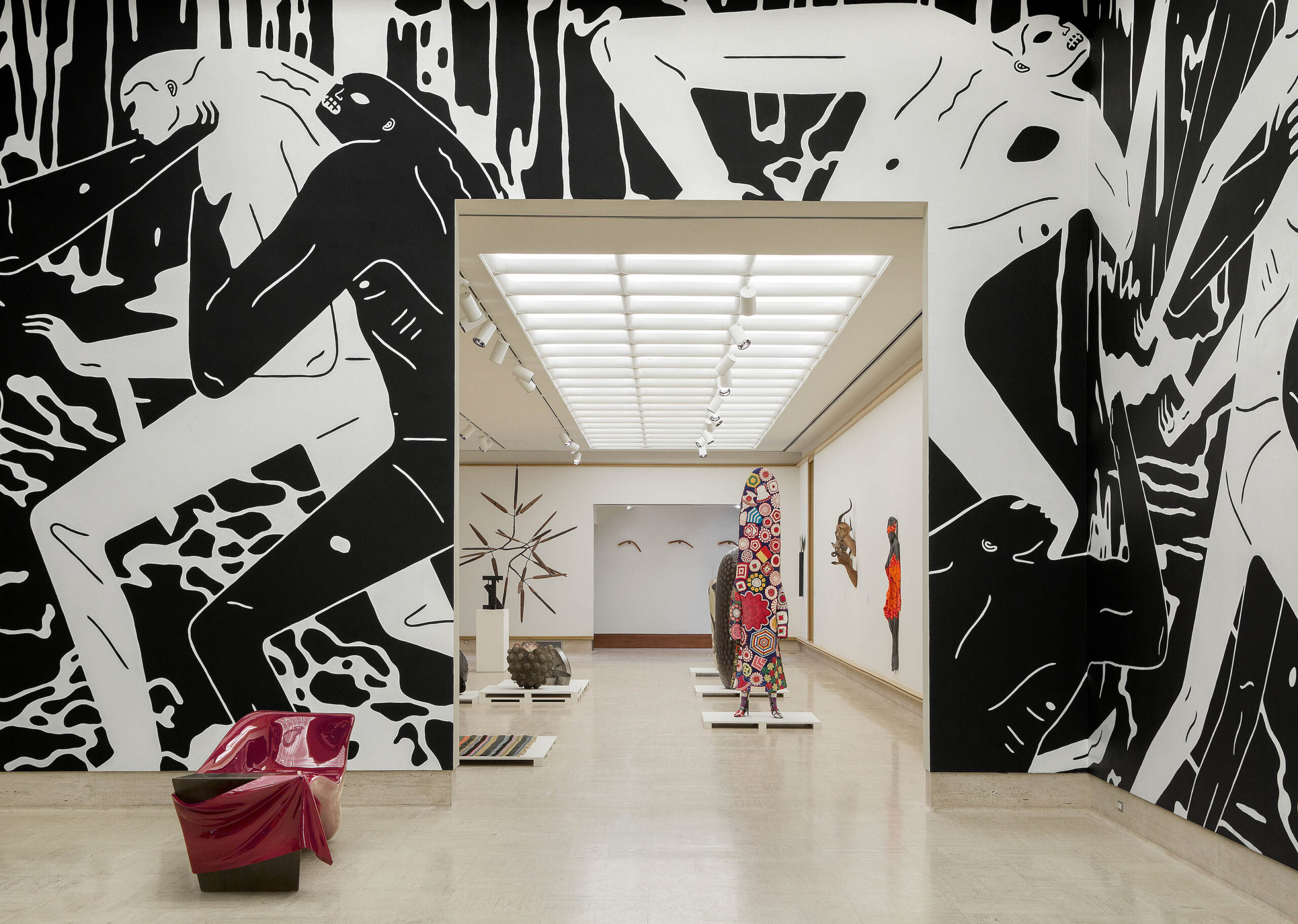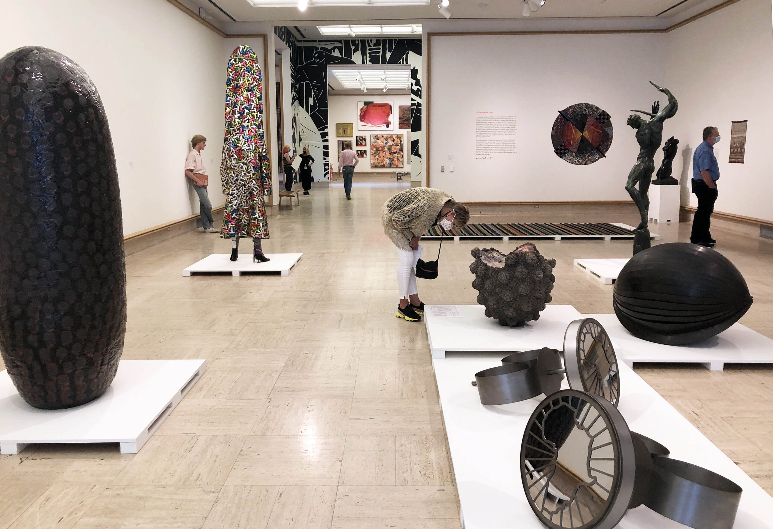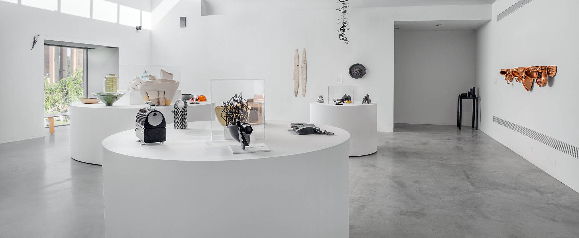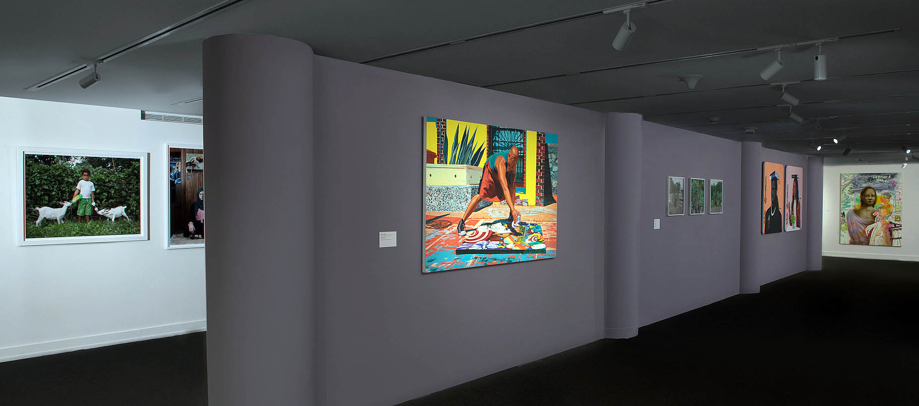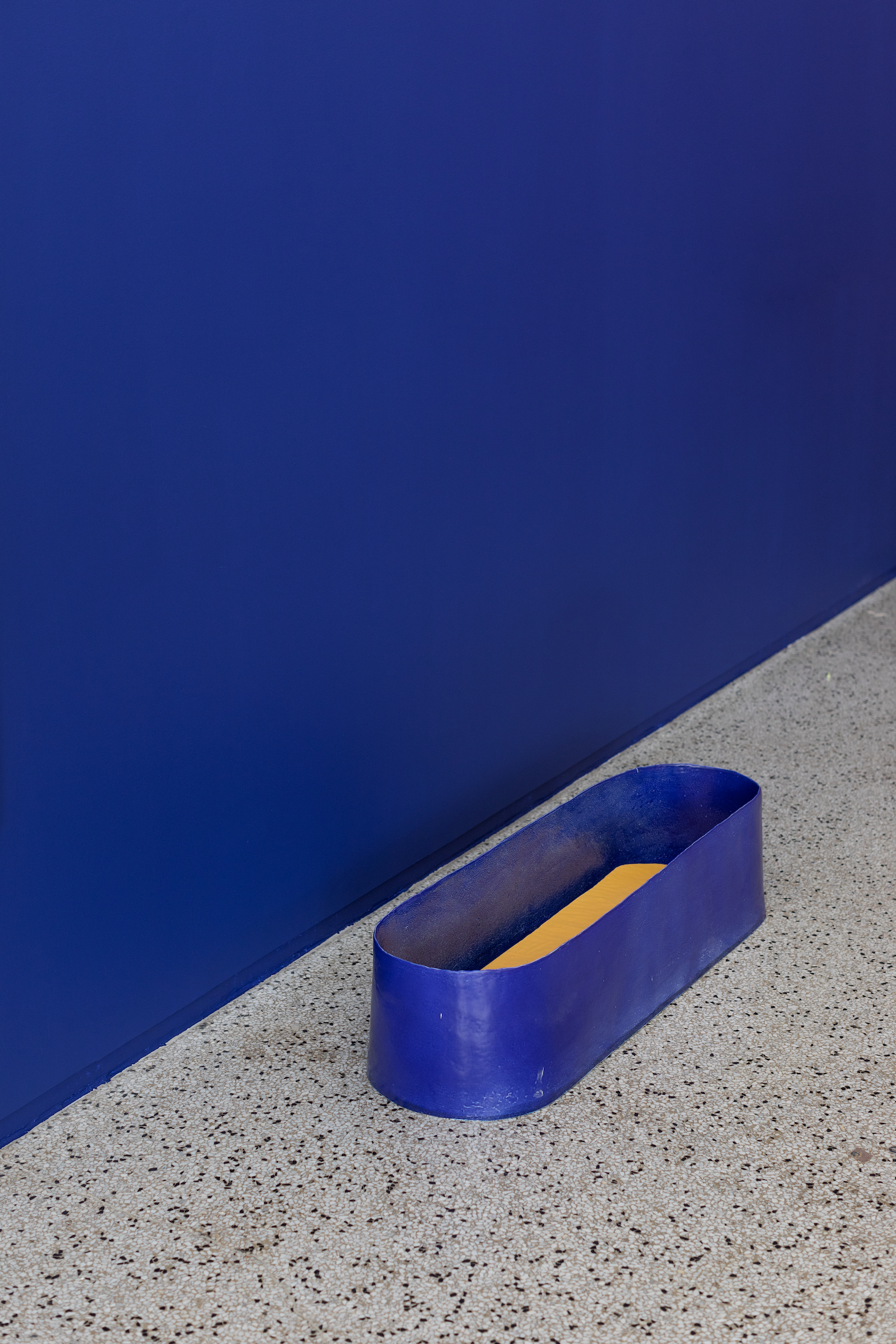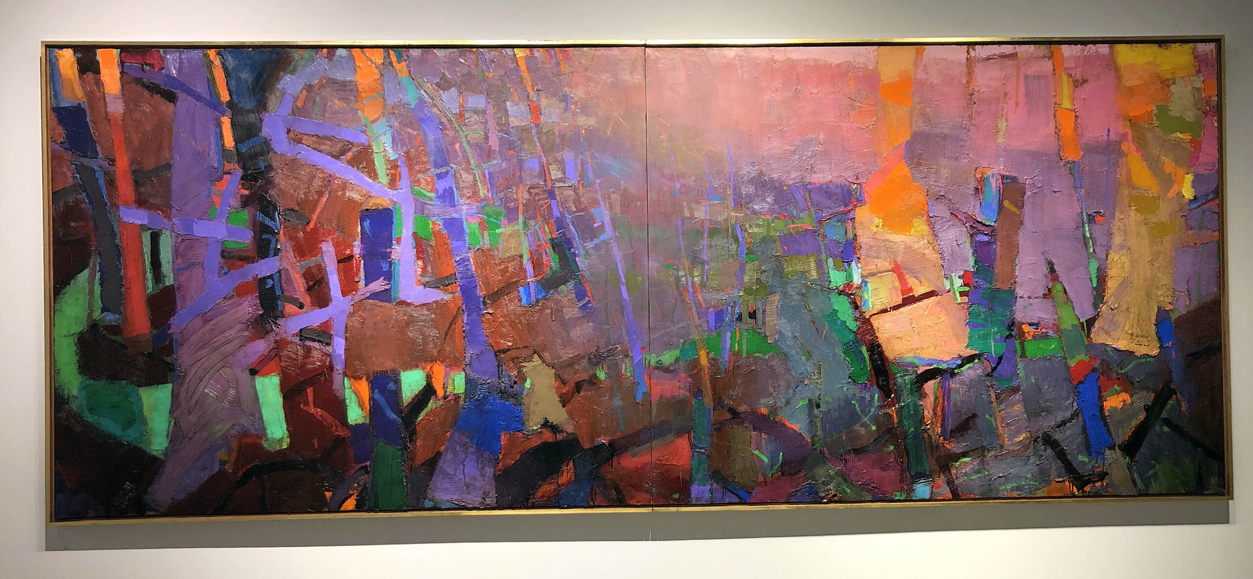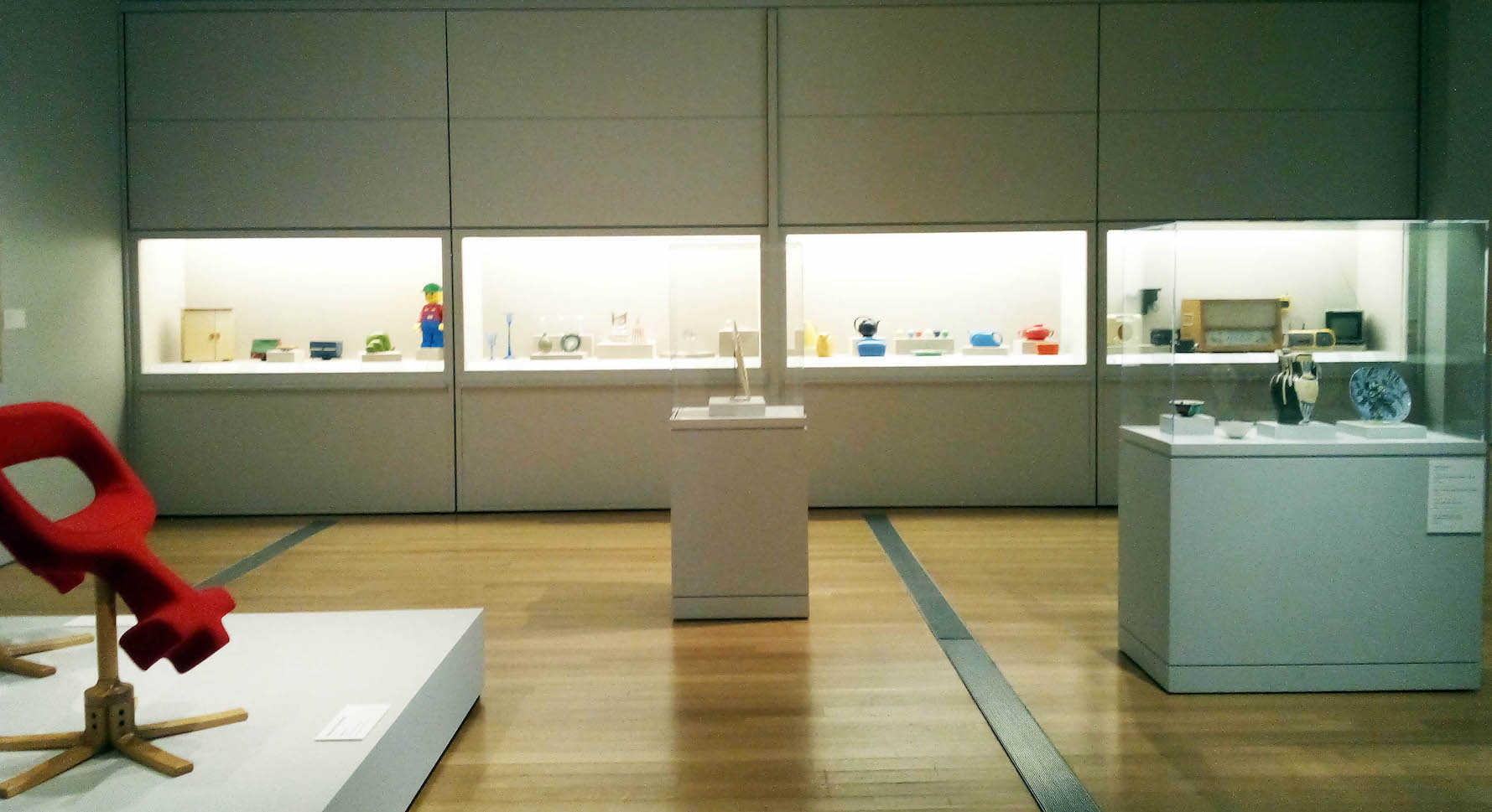
Design Highlights from the Permanent Collection, installation photo.
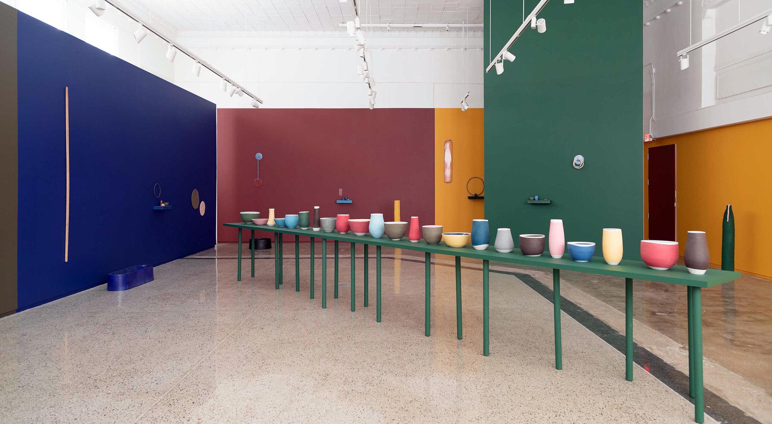
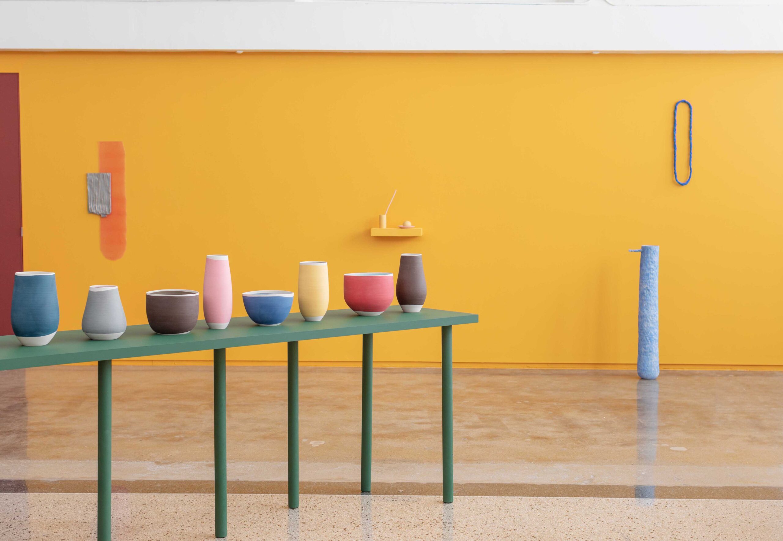
Grand Rapids is home to some of the Midwest’s finest contributions to applied art and design, particularly in the furniture industry, and the Grand Rapids Art Museum holds a muscular collection of applied arts, much of which comprises the exhibition Design Highlights from the Permanent Collection. This is a show which brings together work from 20th Century megastars, but also artists and designers who remain completely unknown. Filling the GRAM’s first-floor gallery suite, all these works stand as examples of how artists have sought to bring beauty into everyday life.
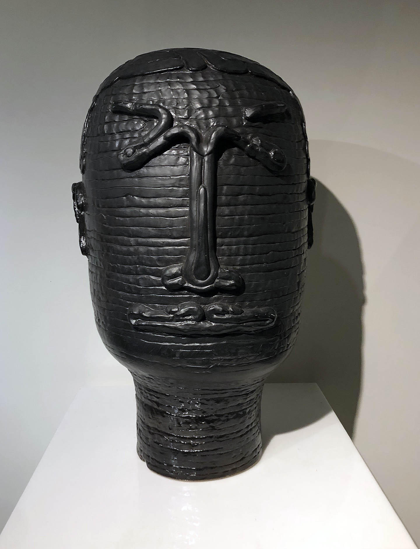
The works in this show represent a synthesis of decoration and function, and the distinction between the two is frequently blurred. It’s a point emphatically made by the inclusion of a ceramic plate, some vases, and a set of cups designed by Picasso for Madoura Pottery in France, all adorned with whimsical vignettes rendered in the artist’s abstract style.
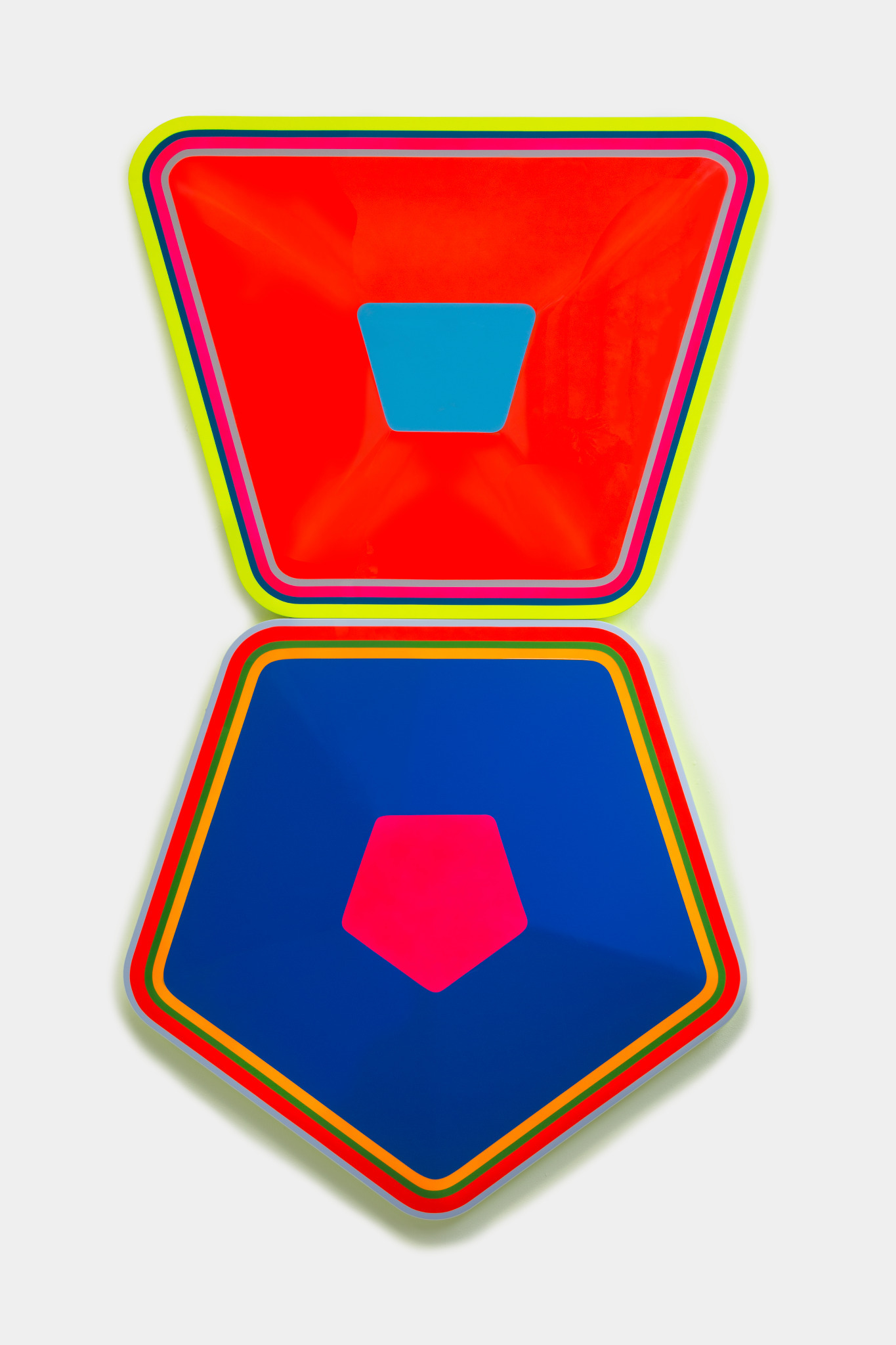
Some of these works explore design for its own sake. There are several lithographs in which Alexander Calder simply plays with basic abstract arrangements of shape, form, and color. And an iridescent, blow-molded acrylic wall-hanging by Gisela Colon is similarly non-functional, but in its luminescence and simplicity speaks to the potentiality of design alone to capture the viewer’s interest even in the absence of conventional subject matter.
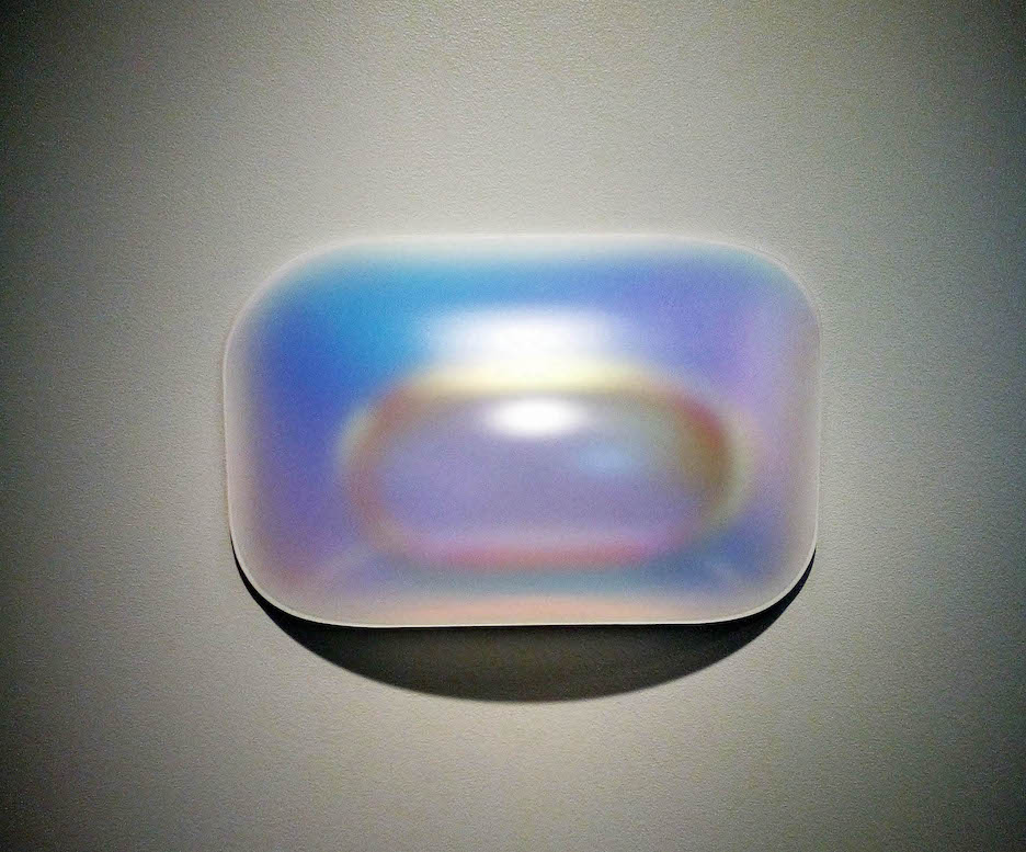
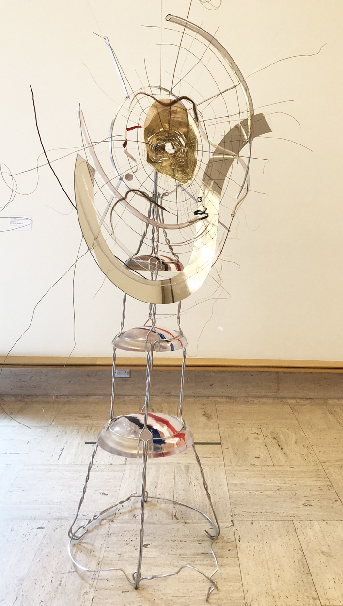
Ovoid Glo-Pod (Iridescent Lilac), Gisela Colon, 2016. Design Highlights from the Permanent Collection, installation photo
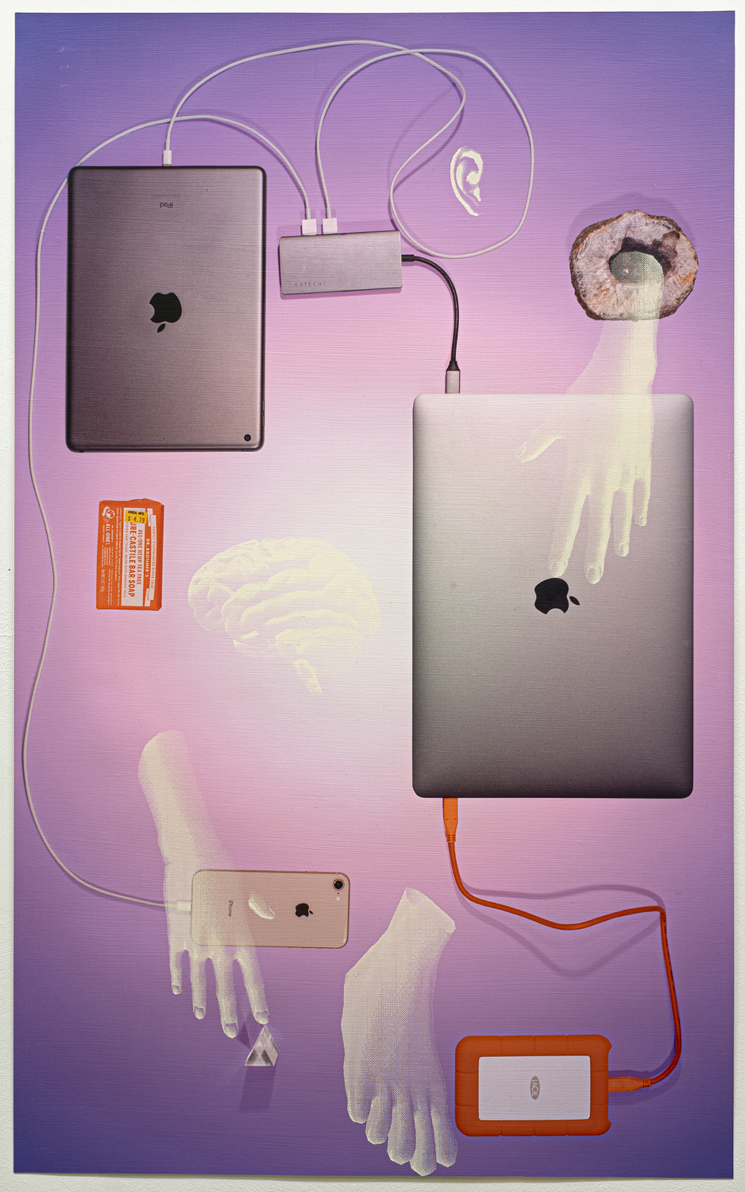
But the overwhelming majority of works here exemplify functional design, ranging from furniture, cutlery, advertising, household appliances, and electronics. A display case housing personal electronic devices underscore the rapidity of the evolution of technological design. An ensemble comprising several 1950s-era radios, an AM/FM Walkman, a cassette player, a TV, and some cameras is now collectively obsolete, rendered so by the advent of the smartphone.
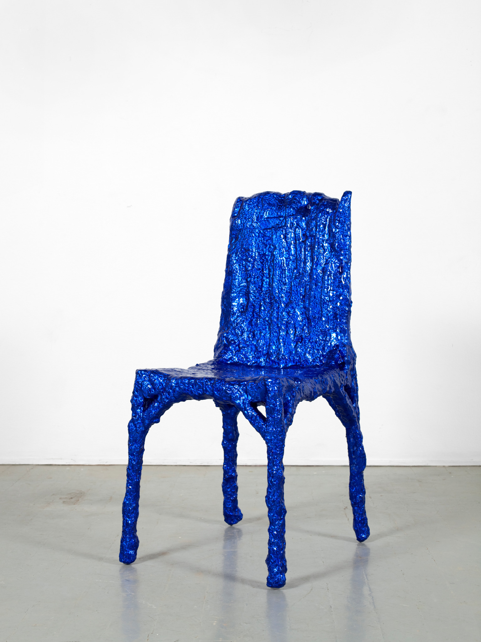
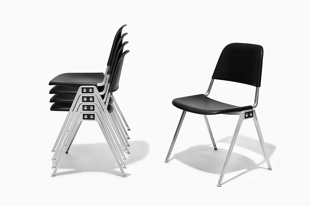
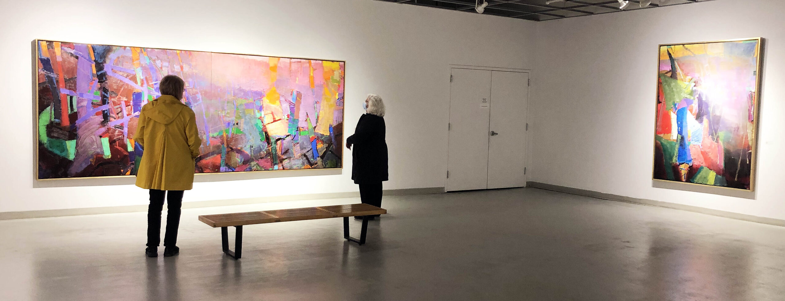
Grand Rapids is famous in the Midwest for its contributions to furniture design, and visitors to the GRAM can count on several iconic examples of 20th-century furniture always being on display. These often articulate the point that, like technology, furniture design can also substantially shift and evolve over a relatively short time. Here, there are some pieces by Gustav Stickley, Ray Eames, and Charles Eames. Certainly, the most visually striking pieces are the zainy, sculptural chairs produced by the Westnofa Workshop which manage to re-define the notion of what a chair even is.
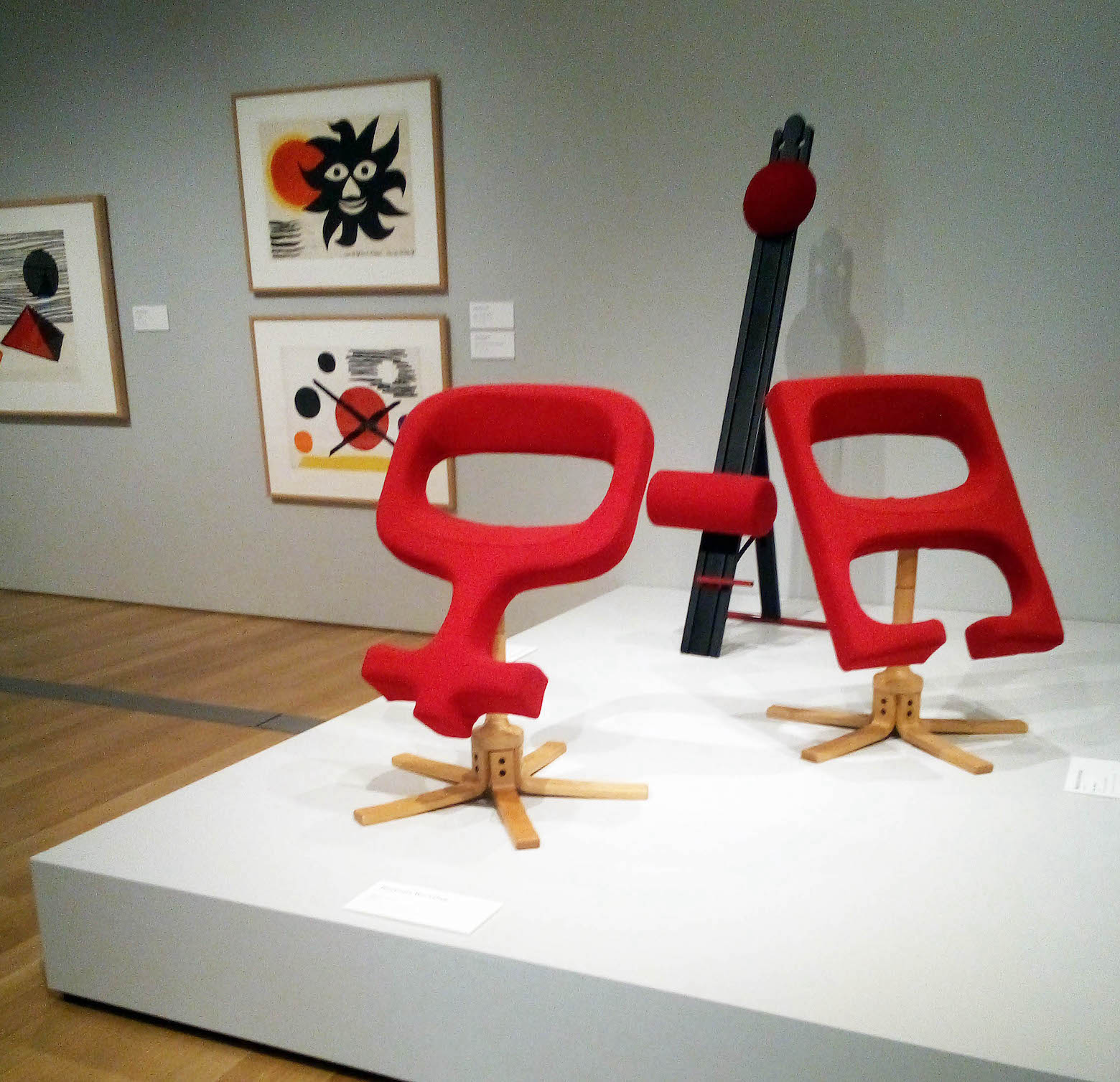
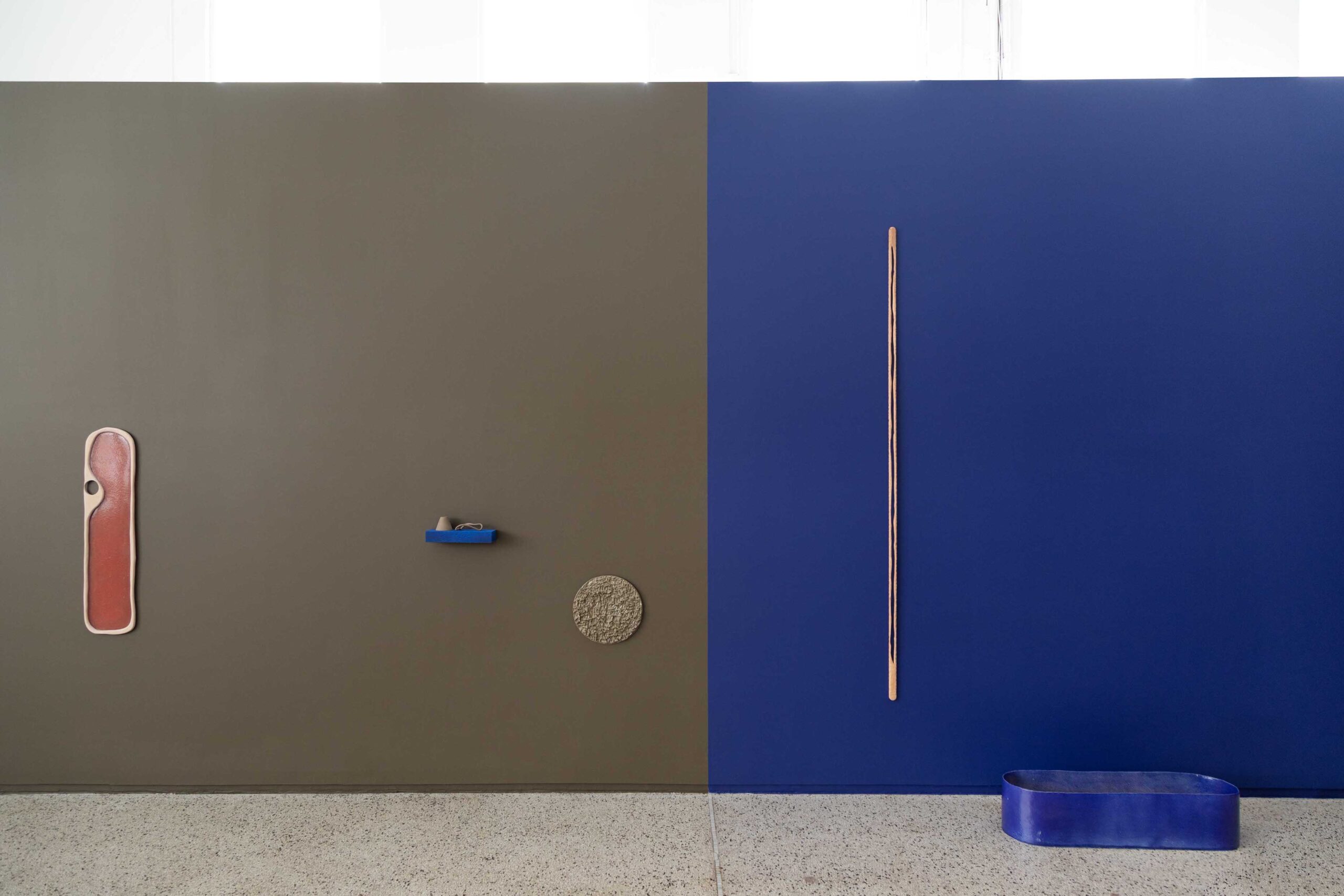
Design Highlights from the Permanent Collection, installation photo.
Similarly blurring the distinction between the beautiful and the functional, a concurrent exhibition features 80 works on loan from the collection of the American Folk Art Museum. This large exhibit fills most of the GRAM’s spacious second-floor gallery suite. By its nature, folk art is eclectic and perhaps hard to define, but these works collectively make the point that folk art has the capacity to be punchy, pertinent, and socially engaged.
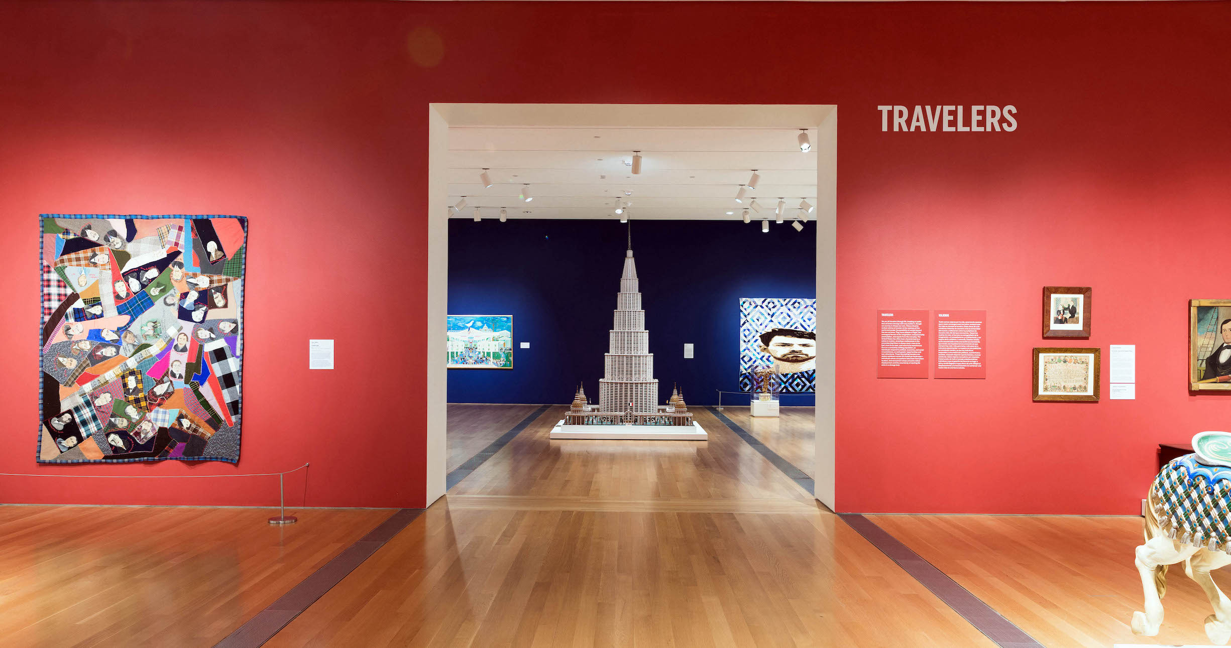
American Perspectives: Stories from the American Folk Art Museum Collection, installation image courtesy of the Grand Rapids Art Museum.
American Perspectives: Stories from the American Folk Art Museum comprises a varied assortment of media, and amplifies voices that have been traditionally absent from museum spaces. One of the most moving examples is a ceramic vase by David Drake, an enslaved African American who created an estimated 40,000 works of pottery in his lifetime, invariably signing them “Dave” and often inscribing witty rhyming couplets on their surfaces. His signature features prominently on the side of the vase, asserting his personhood and creative agency in triumphant defiance of the dehumanizing institution of slavery.
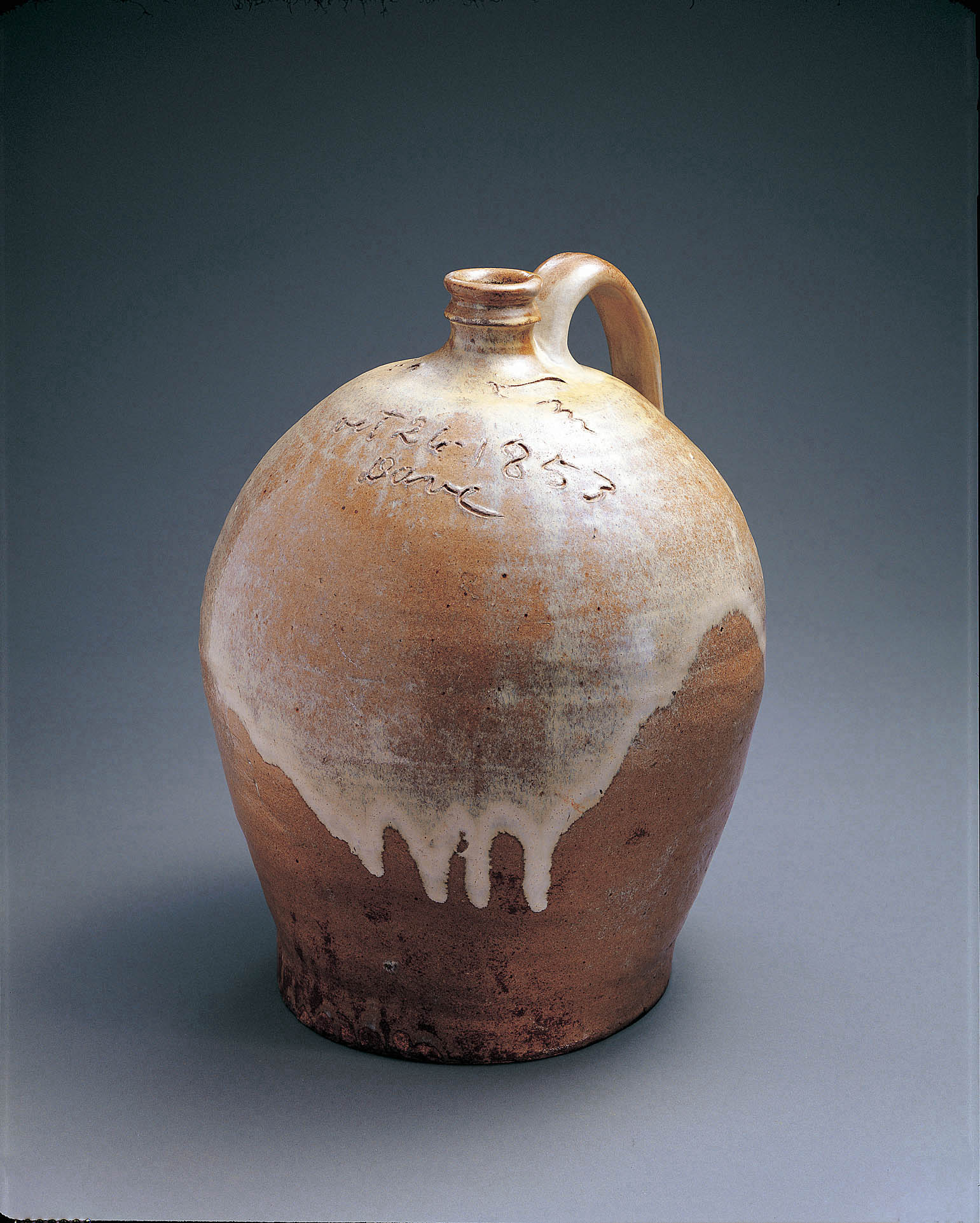
David Drake (c.1800–c. 1870).Jug,1853.Alkaline-glazed stoneware,14 1/2 x 12 x 11 1/2 inches.CollectionAmerican Folk Art Museum, New York, Gift of Sally and Paul Hawkins, 1999.18.1.Photo by JohnParnell.
Harnessing an entirely different media, the Grover Cleveland Quilt similarly amplifies a disenfranchised voice, the patches of the quilt declaring its anonymous creator’s support for Grover Cleveland’s candidacy approximately forty years before the vote was extended to women. Created almost exactly a century later, Jessie Telfair’s Freedom Quilt is a monument to the hard-fought rights secured during the Civil Rights Movement.
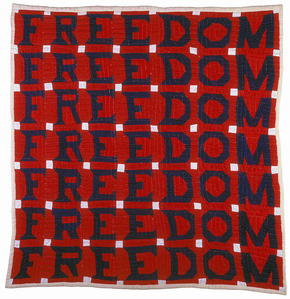
Jessie B. Telfair (1913–1986)Freedom Quilt,1983.Cotton,with pencil,74 x 68inches.CollectionofAmerican Folk ArtMuseum, New York,Gift of Judith Alexander in loving memory of her sister, Rebecca Alexander, 2004.9.1.Photo by Gavin Ashworth, New York.
Work by immigrants to America features prominently in the show. A visual centerpiece of the exhibit is Mariano Ariti’sArchitectural Palace, a model for a hypothetical museum celebrating human innovation. An Italian immigrant to the United States, he envisioned this colossal structure to stand in Washington D.C., and if realized, the building would have been as tall as Dubai’s Burj Khalifa. Its ambitious scale speaks to the artist’s optimistic vision of the nation’s capabilities.

American Perspectives: Stories from the American Folk Art Museum Collection, installation image courtesy of the Grand Rapids Art Museum.
Born to a family of immigrants in the Bronx, Ralph Fasanella’s Workers Holiday portrays the city’s working-class masses headed to Coney Island as a momentary escape from the daily grind, and indirectly speaks to his impassioned interest in worker’s rights. Not incidentally, just a few feet away from Fasanella’s painting is an original wooden carousel horse, itself a form of handcrafted folk-art, from the merry-go-round at Coney Island amusement park.
This is an ambitious pair of exhibitions, given that they bring together an eclectic assortment of art and design which we might not conventionally think of as museum art. As different in form and content as both of these exhibits are, together they bring together non-traditional media which assertively makes the point that visual culture isn’t simply the stuff of sterile and hushed museums and galleries, but that craft and design can frequently burst into real-world, real-life spaces.
Design Highlights from the Permanent Collection runs through August 14, 2021, and American Perspectives: Stories from the American Folk Art Museum runs through August 28, 2021.