Detroit Art Review

Critical art reviews of Detroit galleries and museums weekly

Castagnacci: Quarry Echoes & Wanderings @ BBAC

Vincent Castagnacci: Quarry Echoes & Wanderings at the Birmingham Bloomfield Art Center

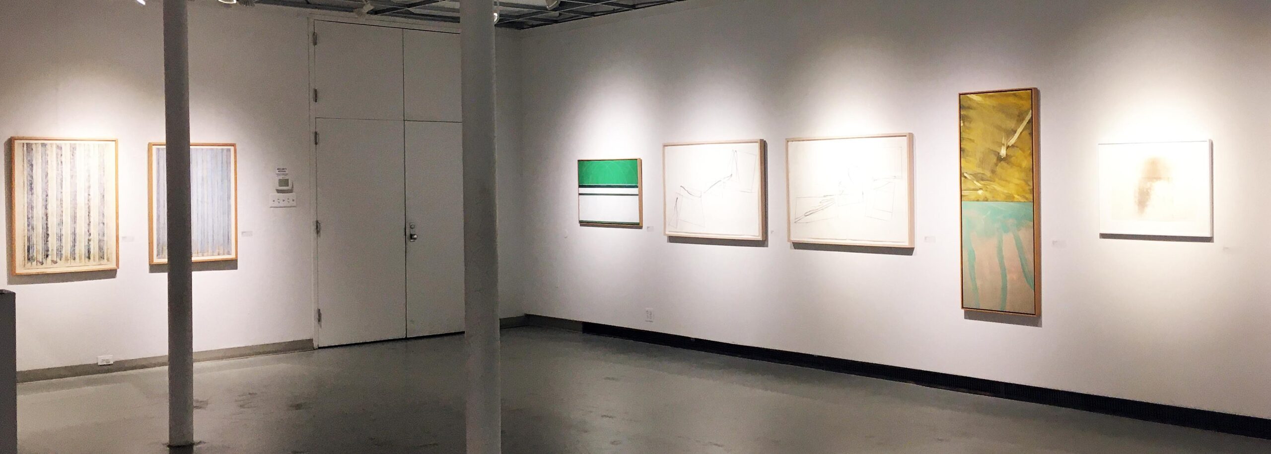
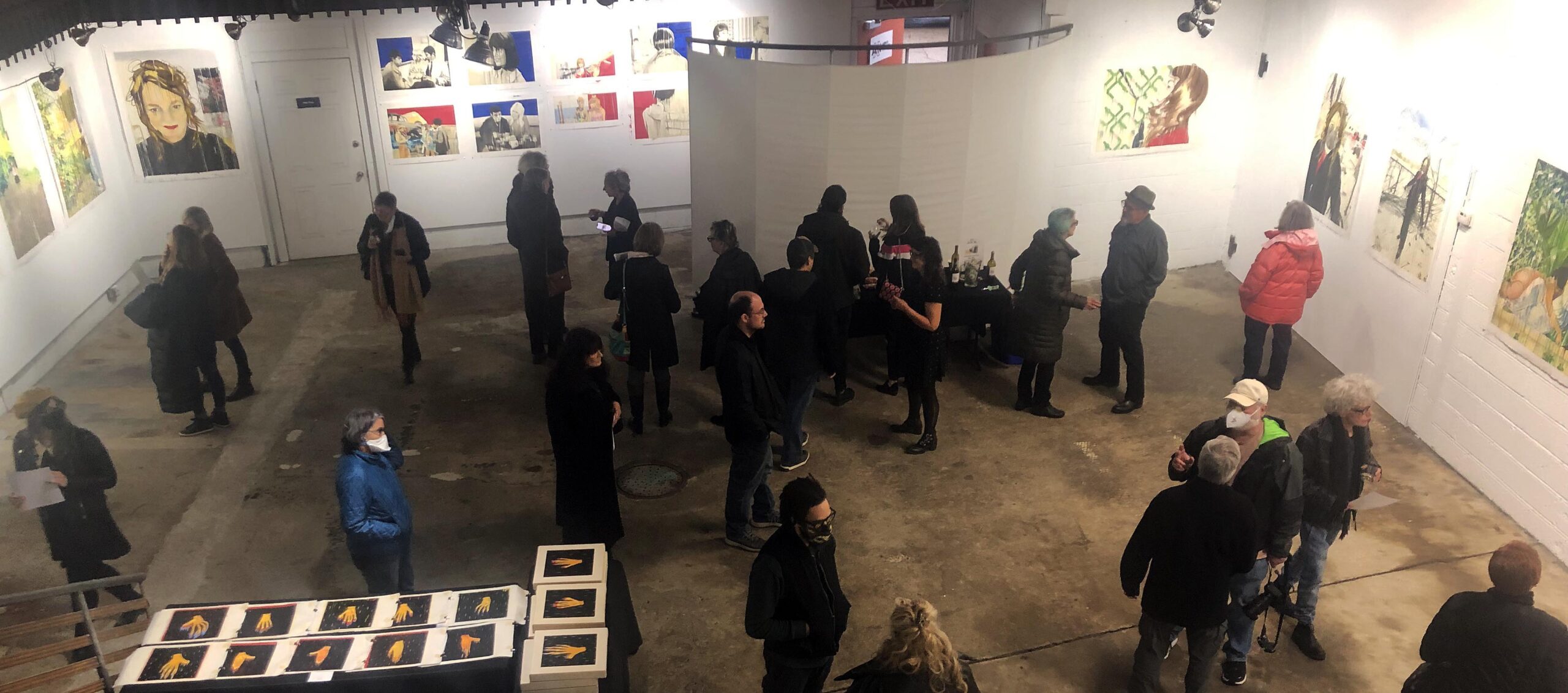
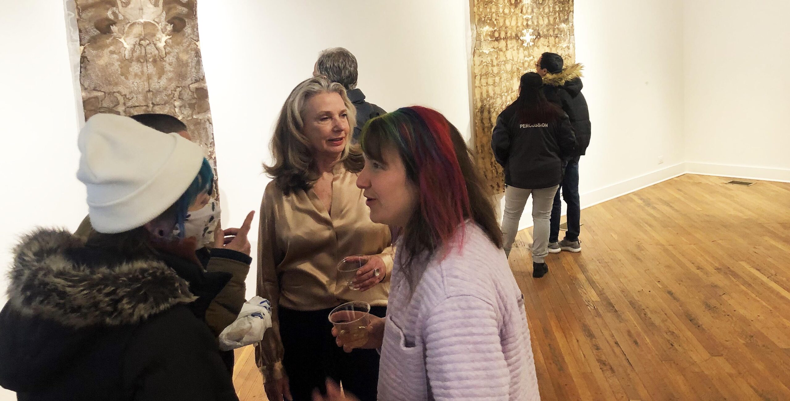
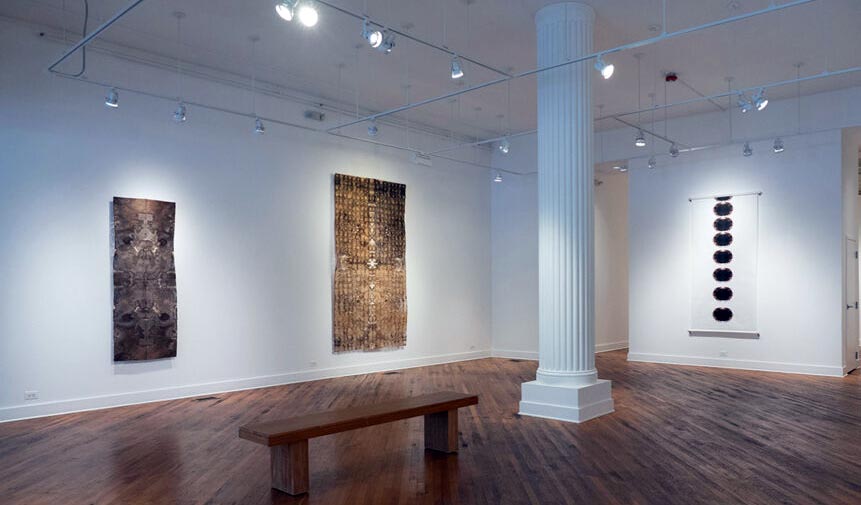
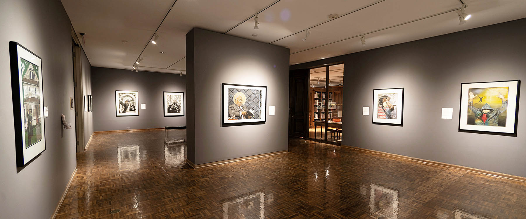
An installation view of Vincent Castagnacci: Quarry Echoes & Wanderings, which will be at the Birmingham Bloomfield Art Center until April 21.

 Vincent Castagnacci: Quarry Echoes & Wanderings (1984-2021) is an intriguing tour through abstraction with a distinctly geometric cast, and will be up at the Birmingham Bloomfield Art Center through April 21. Castagnacci, the University of Michigan’s Arthur F. Thurnau Professor of Fine Art Emeritus, takes rationalism’s standard forms – squares, semi-circles, triangles and parallel lines – and twists them to his liking, confounding conventional expectations.

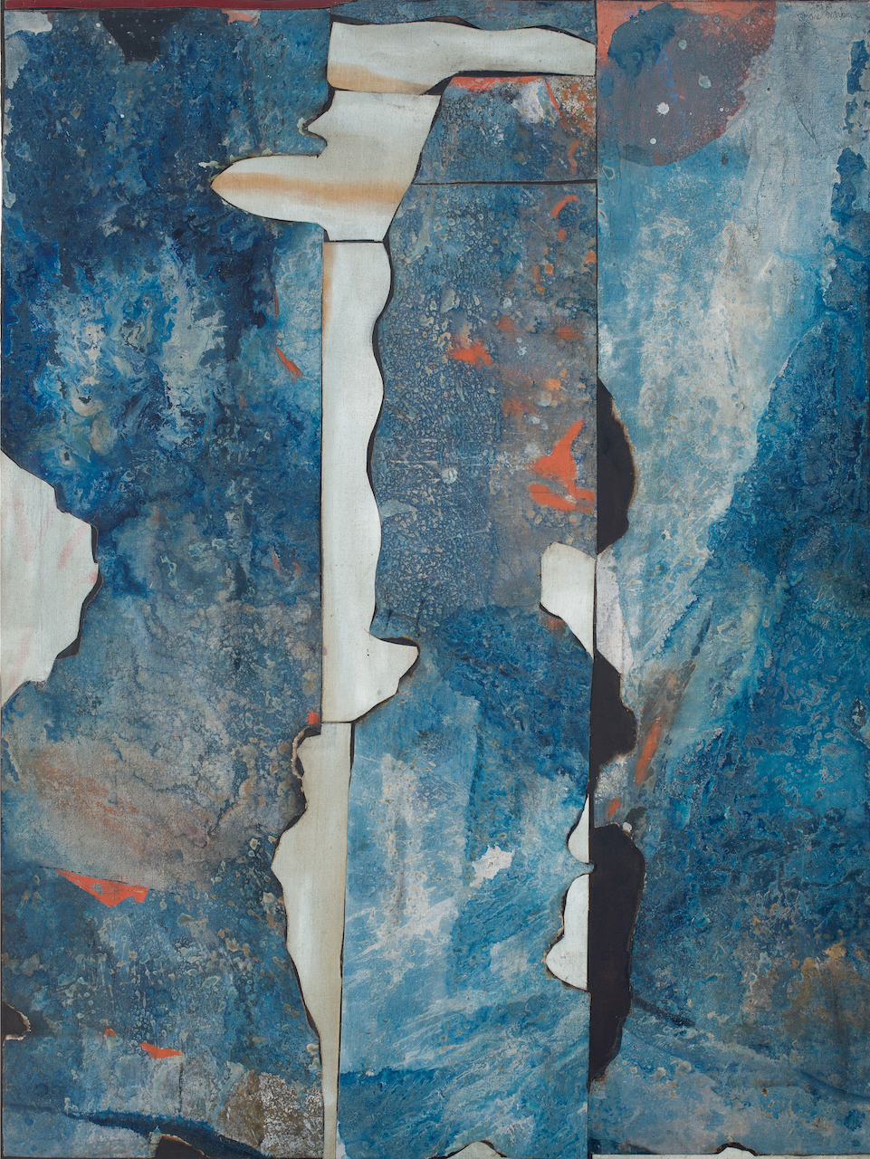
Take, for example, the large, black and white VII.06 – 19.VIII.06. This series of interconnected squares, some scored in dull red, has an undeniable momentum, and appears to be in the process of levitating from left to right. The piece is spare, and looks like it was sketched rather quickly — doubtless an illusion. In some respects, you could say it resembles a series of matchbooks or, more intriguingly, the sort of early renderings architects jot down to see how different building volumes will interact with one another.

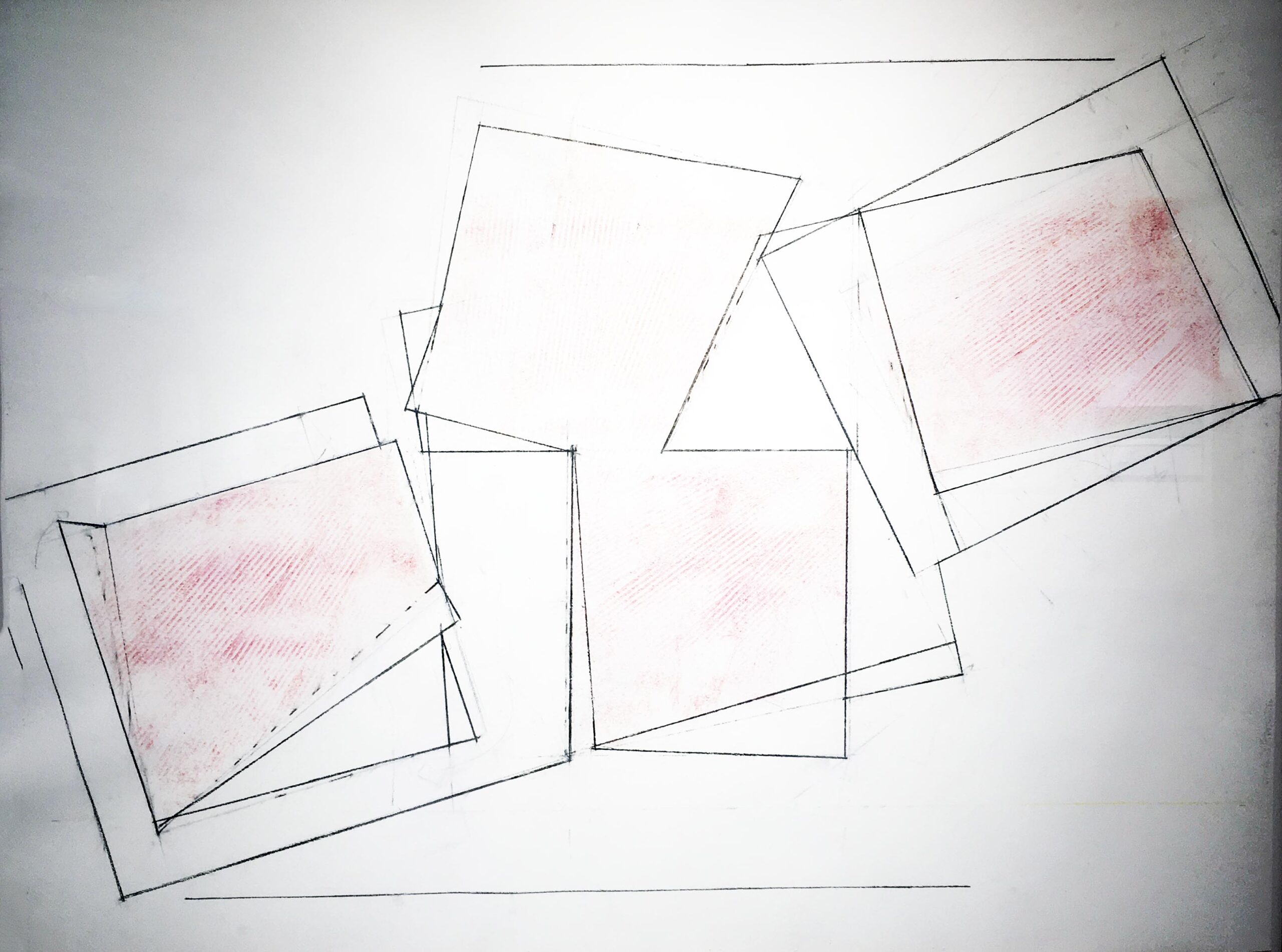
Vincent Castagnacci, VII.06 – 19.VIII.06, Charcoal pencil, Dry pigment, Gesso, 2007.

But Castagnacci, who maintains a studio locally in Pinckney and one in Gloucester, Massachusetts, attributes the genesis of his work to the geometry of natural landscapes, not man-made forms. In his artist’s statement Castagnacci cites the “coastal topography of Cape Ann” around Gloucester, with its boulder-tossed beaches and craggy granite bluffs, as both inspiration and defining aesthetic undergirding his point of view. So perhaps VII.06 – 19.VIII.06 is less architectural and more a tectonic rendering of rock and hillside.

Castagnacci, who arrived at the University of Michigan in 1973, studied at the Boston Museum School at Tufts University, then followed that with both a B.F.A. and M.F.A. from Yale. He was most recently a Mellon Fellow at Kalamazoo College, and has also been a visiting artist at the American Academy in Rome. His artistic interests range widely. Encouraged by the dean of the U-M School of Art & Design to reach across academic boundaries, Castagnacci collaborated with percussionist and composer Michael Gould in a five-year project that in 2005 yielded Into the Quarry, an installation celebrating the convergence of art and music in space and time.

Annie VanGelderen, BBAC president and CEO, praised Castagnacci’s “incredible body of work, one that demonstrates both restraint and a thread connecting through the years.” The pieces on display, she added, “unfold in geometric presentation, whether with painting, drawing or printmaking.”

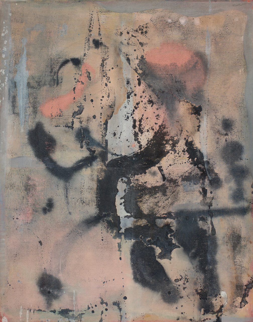
Vincent Castagnacci, Rome: III.25.80-20.VII.12, Oil and chalk, 2012

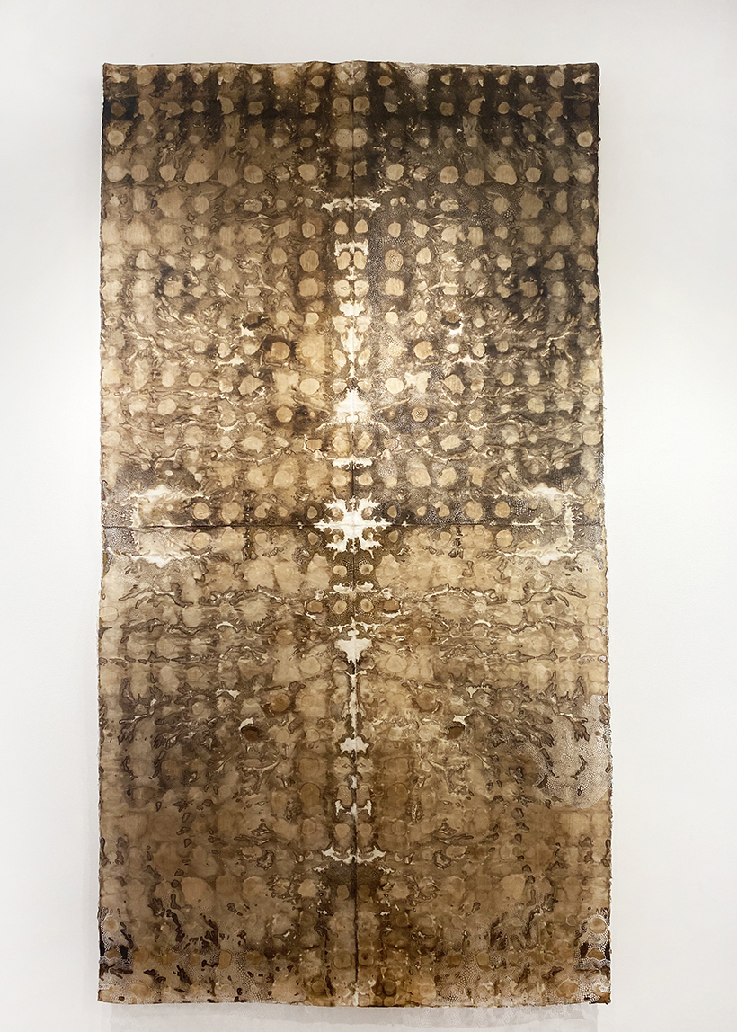
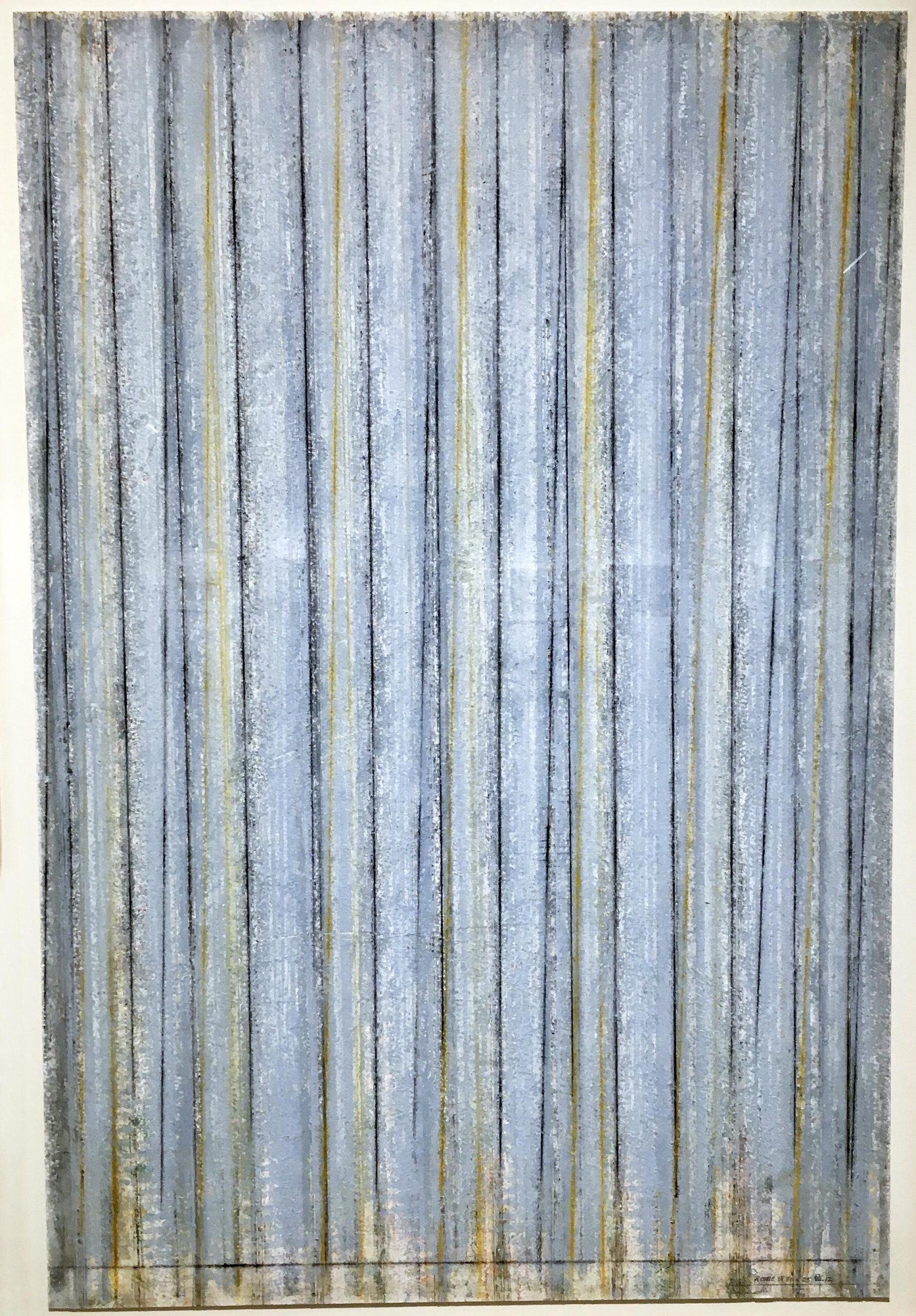
The contrast between Castagnacci’s spare black-and-white drawings and his colorful, texture-rich paintings, which pop like exclamation points, is part of what gives this exhibition its juice. The oil-and-chalk Rome: III.25.80-20.VII.12 offers a pleasing contrast to the “simpler” works, an essay in repetitive verticals that progress in color from dull, mottled shades of powder blue to nightingale brown. It’s a remarkably textured exercise. The effect, one viewer suggested, reminded her of the raw material for blue jeans, though for this visitor, it read more like a satisfyingly weathered, corrugated metal wall in tones of grayish-blue.

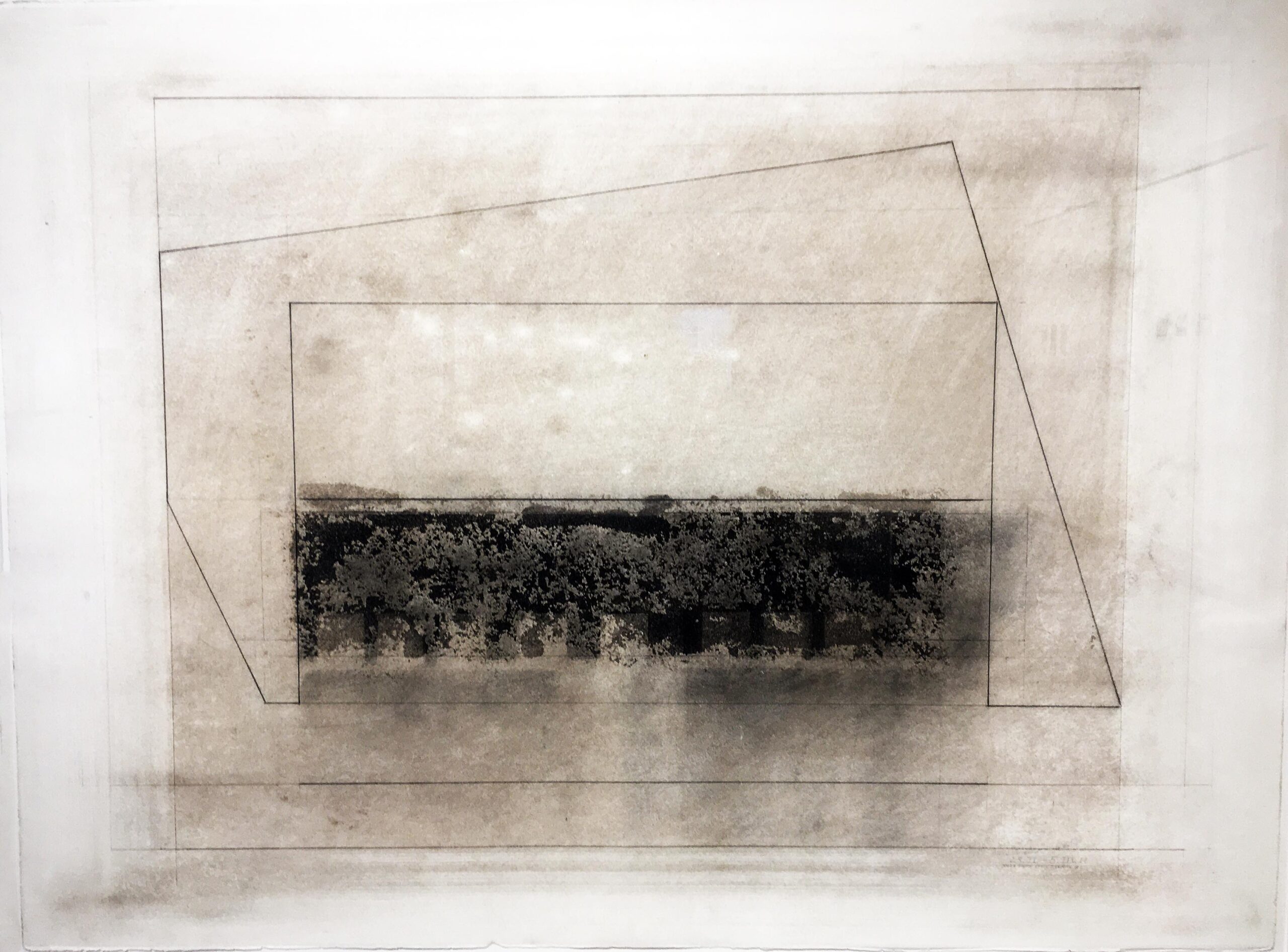
There are a number of absorbing essays in squares and rectangles here, including the austere, geometric 23.II-5.III.11#1, comprised of three or four superimposed frames. Two are squarish, while a third contained within the others tilts and lists into its fellows, like an unsteady parallelogram. Rendered in surprisingly rich tones of charcoal and ash, 23.II-5 almost amounts to a monochromatic color study, animated by a densely textured black rectangle that anchors the work and gives it its mesmerizing depth.

Vincent Castagnacci, 23.II-5.III.11#1, Oil, 1997

23.II-5.III.11#1, is a warm, color-saturated canvas in distressed shades of barn red, scored here and there with verticals and horizontals that almost suggest inset panels in a door. In some ways this lush, resonant piece feels thousands of miles from the Massachusetts coast and Cape Ann. In its warmth and seemingly ancient appearance, it calls up the Mediterranean more readily than the North Atlantic.

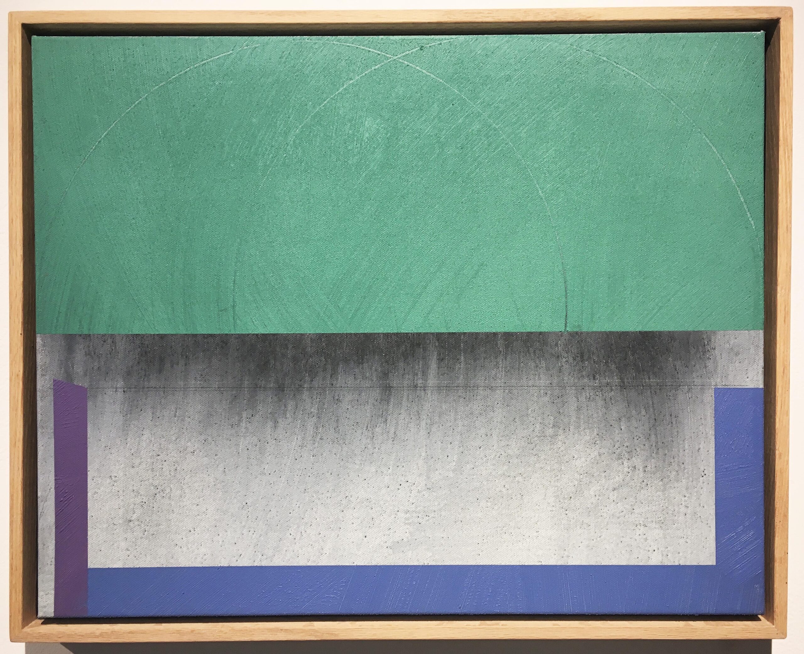
Finally, 7-11.X.19, one of the handsomest pieces on display, is a highly formalistic, acrylic-and-ash color study in green, periwinkle, lavender and shades of gray edging into black. Part of the charm of this composition is that while the strong colors all seem to occupy the same plane, the dark gray they frame looks downright three-dimensional, as if that quadrant of the canvas were receding several inches from the rest of the work. It’s an absorbing design that tiptoes to the edge of trompe l’oeil.

Vincent Castagnacci, 7-11.X.19, Acrylic, Ash, 2019.

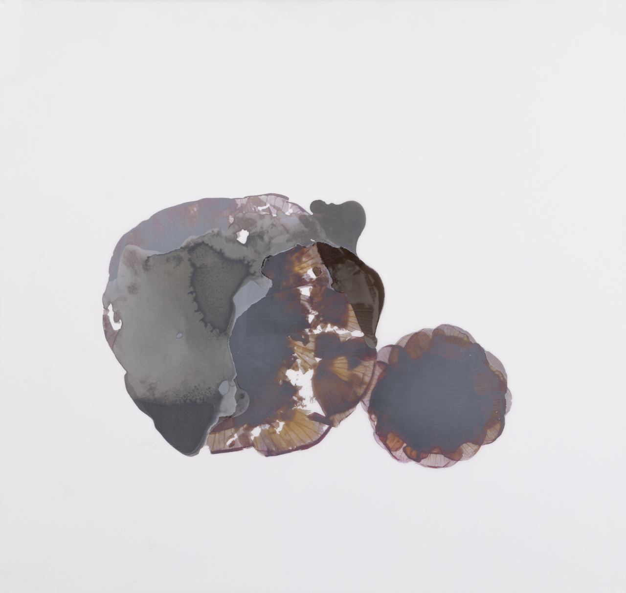
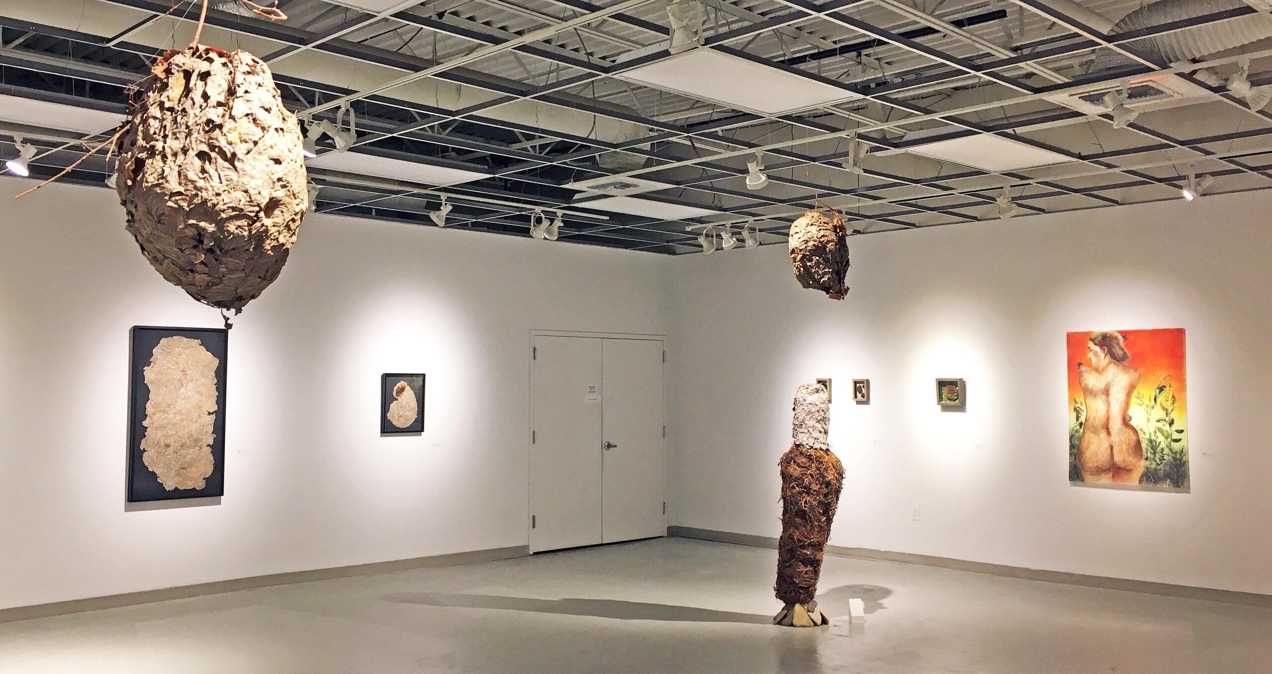
Get ready for something completely different when you pass from Castagnacci to the adjacent gallery housing Christine Welch’s Nature of Things, also up through April 21. The first work that greets you is a “wasp comb,” very much like a honeycomb, framed in a box atop a bed of greenish-yellow leaves. Wasp nests figure large in this unusual exhibition. Indeed, perhaps the most-striking elements are the several large paper-wasp nests hanging from the ceiling like so many cocoons of prodigious size.

Welch says she’s dazzled by our connection to nature, and in particular with the structural similarities beneath the surface of any number of natural forms, the human body included. With Nature’s Seamstress, she constructs a mannequin out of a clothing designer’s dress form, in a skirt made from large sheets of wasp paper, and a round wasp comb for a head. Completing the ensemble are two strands of large, brown seed pods strung together into a necklace.

The combination of oddball elements at first sounds like it might be amusing, a bit of a visual joke, but the actual assemblage is far more sobering than humorous, with suggestions of a totemic form constructed by a people far more intimate with the natural sphere than those of us in the “civilized” world.

An installation view of Nature of Things: Christine Welch, at the Birmingham Bloomfield Art Center through April 21.

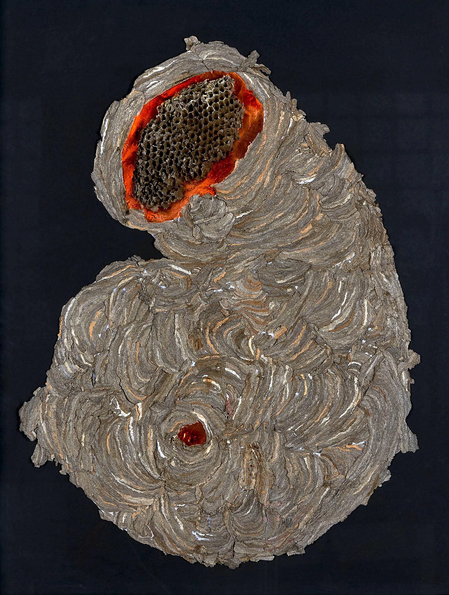
Christine Welch, Hive, at the Birmingham Bloomfield Art Center

Both Vincent Castagnacci: Quarry Echoes & Wanderings (1984-2021) and Nature of Things: Christine Welch will be up at the Birmingham Bloomfield Art Center through April 21.


Betty Brownlee @ The Annex Gallery at 333 Midland

Betty Browlee, Into the Woods, Installation image, Annex Gallery, All images Courtesy of DAR

The Annex Gallery at 333 Midland opened an exhibition, Into the Woods, of new work by the longtime Detroit painter Betty Brownlee. The artist, who transitioned from Landscape paintings in the 1990s, is now a well-known figurative painter (which includes self-portraits) where this body of work focuses on women and the female body.

Betty Brownlee, Briar Rose, Oil Paint on Paper, 51 x 90 inches, 2022

One of the most powerful paintings in this exhibition is Briar Rose where scale and composition make a difference. The choice of composition reminds this writer of 18th century neoclassic work by Jaques-Louis David. The contemporary attributes of Brownlee’s dripping paint provide a coeval effect that brings the artwork into the present. The six figures, most asleep, spread out horizontally against lush green surroundings, making the painting romantically inviting. It does what every painter wants: It brings the viewer back… again, and again.

Betty Brownlee, The Audience, 19 X 25 Inches, Penetrating Ink on Paper, 2022

The other elements present in these works on paper are the pencil grid, the dripping of paint, and the setting found in commercial illustration from the 1950s, maybe the 60s. The grid that Brownlee uses and leaves behind could be used with small illustrations and then enlarged to support the drawing process. Brownlee is not hiding this penciled grid from these works. It is as if she finds an attractive section from an illustration in the past and captures a moment in time in The Audience. Is the female character looking back at something that startles her? The artist remains very conscious of her use of color, relying on the interaction of primary and secondary color using a variety of penetrating inks.

Betty Brownlee, The Cook’s Revenge, 19 X 25 Inches, Penetrating Ink on Paper, 2022

Much of the show’s subject matter is contemporary, but the painting, The Cook’s Revenge, could skillfully go back to an earlier time when the artist successfully combines the figure with still life. This work is different from the smiles and cheery figures in most of the paintings. Instead, we find a sober expression surrounded by earth tones, Brownlee maintains her grid and the two-thirds/one-third composition formula that always works. Is there a throwback to Vermeer in there somewhere?

Betty Brownlee, Bouffant, 51 X 36 Inches, Oil on Paper,

Who doesn’t like a self-portrait included in a solo show? Brownlee sets herself, head and shoulders, left of center, dominates the composition in terms of scale, and includes a painting in the background (perhaps one of her own). She stares the viewer down with a smile and continues with what has become a signature: A penciled grid, and drips of paint. After observing these subjects in most compositions, the figures are not drawn from life but instead captured from photo compositions. And fair to say, this writer likes these consistent elements appearing in every piece. After all, it is a contemporary tool that separates her work from other similar work, something that one does not forget.

Betty Brownlee, You never have any ideas, Only Feelings, Penetrating Oil on Paper, 2019

I recall seeing this work at MOCAD, the Double Vision exhibition,  where artists were asked to work in couples (Betty Brownlee and Cristin Richard), and I liked this painting then. Again, it feels like a throwback to commercial imagery from the 1960s via the clothing and hairstyle. The pigmented ink captures the moment as the transparency of the light is casually illustrative. This painting is based on a film still from a Jean-Luc Godard film.

Betty Brownlee is a longtime artist residing in Detroit. Having received her MFA at Wayne State University, she has been included in many local exhibitions (30 plus) and remains a steadfast participant in the Detroit arts community. Her work is distinctive and deserves wider exposure.

Betty Brownlee, Installation image, South Wall, Penetrating Oils on Paper

Betty Brownlee earned her BFA and MFA from Wayne State University. Her work has been exhibited at the Detroit Institute of Arts, the Cranbrook Academy of Art Museum, the Kresge Art Museum in East Lansing, the legendary Willis Gallery in Detroit, and most recently at the Annex Gallery in Highland Park.

Located in a large, industrial site in Highland Park (a city within the borders of Detroit), 333 Midland is a historic factory, formerly the Lewis Stamping Plant, that provides extensive space to artists and sculptors, especially those who wish to create large-scale works. The owner, developer and sculptor Robert Onnes came to Detroit in 2013 from Whangaparaoa, just outside of Aukland, New Zealand to invest in the Detroit art community. This solo exhibition by Ms. Brownlee is her second solo exhibition, part of fifty art exhibitions & events at 333 Midland spaces since 2014.

The exhibition Into the Woods at the Annex Gallery at 333 Midland is on display through April 5.

Susan Goethel Campbell:  Second Nature @ David Klein Gallery

Susan Goethel Campbell, Installation Image, Second Nature, David Klein Gallery, photo by DAR.

“This exhibition is a marker of transitions, not permanence,” says multimedia artist Susan Goethel Campbell. In her solo show Second Nature, on view from March 12 – April 30 at David Klein Gallery in Detroit, the artist continues her collaboration with the environment, creating elegiac artworks that speak of impermanence and transition, loss and rebirth. In this latest, process-driven iteration of her ongoing art practice, she collects fugitive elements of the world around her—blossoms, fallen leaves, the shadowy stains of walnuts–and transforms them into potent meditative objects.

Although a printmaker by training, Campbell’s art practice has expanded over time to include video, installation, and environmental and community-based art. Second Nature builds upon her established art practice but adds an element of spirituality, a creative development in her work that she describes as “a reminder of the bridge between life, death, and reformation.” She has produced two separate but related bodies of work for this exhibition that complement and reinforce each other.

Susan Goethel Campbell, Seasonal No. 4, 2022, walnut stains with hand perforation and hand-sewing on Japanese paper, 108” x 59.” Photo: Samantha Bankle Schefman.

Seasonal Series

In Seasonal, a series of five large new works on paper, Campbell has made shadowy dye from walnuts and arranges the resulting translucent, circular brown blotches in loosely symmetrical compositions on sheets of Japanese rice paper. This repetitive dripping process is followed by folding the sheets onto each other and yields a tapestry-like image that seems both random and intentional. The artist employs the resulting dorsiventral symmetry, found throughout nature in most animals and many plants, to imply an adumbral presence. The artworks also immediately call to mind projective psychological Rorschach tests. Tiny, meticulously placed perforations that punctuate the ad hoc stains give emphasis and a kind of ceremonial dignity to the work. The sheets of paper are sutured together by the artist’s hand, creating the effect of subtle scarring, an implication of remembered pain.  The assembled layers have been mounted several inches away from the wall and cast shadows of the perforations on the wall behind the paper, forming a fugitive second artwork behind the foreground image. The resulting pattern drains away from the random quality of the staining in favor of the purely intentional punched design.

Susan Goethel Cambell, Hibiscus Years No. 3, 2022, archival inkjet print, 19” x 25.” Photo: Tim Thayer.

Hibiscus Years

The simple image of a hibiscus blossom, magnified to many times its original size, is the subject—or a pretext for–the digital photography series Hibiscus Years. The routine nature of the flower as a subject in art conceals the true preoccupation of this work: time, beauty, impermanence, and their relation to each other. Each hibiscus blossom, which lasts for only a day, has been fixed in time through digital photography, and the blooms are layered one on top of the other. The resulting composite images in Hibiscus 1-4 are simple re-iterations of the blossom shape; the layers create densely dark centers that transition at the edges to delicate chiffon-like veils of plum, mauve and buff. The torn edges and slightly faded colors undermine the natural prettiness of the image and give them psychological depth. Campbell adds a sense of linear time in Hibiscus Years No. 5 Scroll, with the symmetrical image repeated in a vertical format that calls to mind a roll of film.

Susan Goethel Campbell, Hibiscus Years No. 5, Scroll, 2022, archival inkjet print on Japanese paper, 92 ¼” x 48.” (scrolled) edition of 3. Photo: Tim Thayer.

Perhaps the most mysterious works in the exhibition, both in process and intent, are Hibiscus Years 6 and 7. The images seem both allusive and elusive while being the most purely abstract images in the series. These circular shapes invite and frustrate perceptions; they are both evocative but indistinct, circumventing an easy reading of the image. They withhold meaning that we reach for but can’t touch.  The flat gray of shadows against the milky whiteness of the paper hint at a transcendent reality just outside our field of vision.

Susan Goethel Campbell, Hibiscus Years No. 6, 2022, altered archival digital print, walnut stains, 38” x 12.” Photo: Tim Thayer.

In Second Nature, Susan Goethel Campbell has created a collection of fragile yet resilient poetic images that express the spirit of this moment, a visible and resonant record of the calamitous years we have just experienced.  It has been a time of the pandemic, climate change, political unrest–and now, war. But rather than suggesting that we dwell upon our losses, the artist has found us some solid ground to stand on. She tentatively proposes a spring of renewal, when death is followed by rebirth, growth proceeds from decay and hope wins over sorrow.

Susan Goethel Campbell – Hibiscus Years No. 7, 2022, altered archival digital print, walnut stains, 31” x 29.” Photo: Tim Thayer.

Installation image. Photo by Samantha Bankle Schefman.

Susan Goethel Campbell:  Second Nature @ David Klein Gallery is on view through April 30, 2022.

Romare Bearden: Abstractions @ UMMA

An installation view of “Romare Bearden: Abstractions,” at the University of Michigan Museum of Art through May 15.

“Romare Bearden: Abstractions” at the University of Michigan Museum of Art through May 15 tackles work the African-American artist produced between 1952 and 1964, what some scholars call Bearden’s “forgotten decade.” That characterization is intriguing since he exhibited and won commissions during those years. But the pieces he was showing at the time – abstract oils and watercolors, as well as highly stylized figurative works — have since been elbowed aside by the blistering originality of Bearden’s Cubist-inflected collages and photomontages depicting everyday Black life.

For contrast and context, a number of those are also on display in this exhibition. But there’s no disputing the collages are what won the Charlotte, North Carolina native his place in art history. Indeed, in its 1988 obituary, the New York Times called Bearden “the nation’s foremost collagist.”

“Abstractions,” organized by the American Federation of Arts and SUNY’s Neuberger Museum of Art at Purchase College, considers the artist’s formative period in Paris and New York, one that ultimately led to an epiphany about what his art was supposed to do. Bottom line? In an era defined by the Civil Rights struggle, Bearden and many other Black artists felt abstraction was too pure, too apolitical, too far-removed from the demands of the age. So he put it down and turned his energy elsewhere.

“I felt,” Bearden said, “that the Negro was becoming too much of an abstraction, rather than the reality that art can give a subject.” He realized he had to “establish a world through art in which the validity of my Negro experience could live and make its own logic.” That led to the collages – and co-founding Harlem’s Spiral arts collective, whose members tried to work out the responsibility of the Black artist in an era of political and racial upheaval.

Romare Bearden, The Blues Has Got Me, 1944; Watercolor and ink on paper 29 x 35 ½ inches, SCAD Museum of Art, Savannah, GA, Permanent Collection, Gift of Dr. Walter O. Evans and Mrs. Linda J. Evans©, Romare Bearden Foundation / VAGA at Artists Rights Society (ARS), NY Courtesy American Federation of Arts

American culture is the richer for Bearden’s shift into collages, but there’s no denying much of his earlier work is gorgeous. Particularly striking are four or five small, stylized water colors, all painted in exquisite tones, that straddle the line between the literal and the abstract. “The Blues Has Got Me” from 1944, for example, is a portrait of two musicians jamming, though only one instrument, a fiddle or violin, is recognizable. The painting is a pleasing mash-up of competing colors and colliding triangles that form legs, chairs and a table. It’s bursting with energy, and frankly fun to examine.

In tone and feel, however, it could hardly be more different from 1962’s “River Mist,” one of Bearden’s later oil abstracts that’s a dreamy, almost geologic study in blue water tones and soft terra cotta. Long versed in watercolor, Bearden had struggled through much of the 1950s with oils. But when he and his wife Nanette moved from Harlem to a downtown loft on Canal Street, where Bearden spent the rest of his life, the artist began experimenting with much larger-scale works and developed his signature approach to abstract art.

Romare Bearden, River Mist, ca. 1962; Oil on unprimed linen, and oil, casein, and colored pencil on canvas, cut, torn, and mounted on painted board 54 ¼ x 40 7/8 inches, Romare Bearden Foundation, Courtesy of DC Moore Gallery, New York© Romare Bearden Foundation / VAGA at Artists Rights Society (ARS), NY, Courtesy American Federation of Arts

During this period, he also started studying with a Chinese master, identified only as a Mr. Wu on Bayard Street, in the techniques of Chinese calligraphy and ink-wash painting. That influence is especially visible in “Eastern Gate” from 1961, a diaphanous exercise in shades of pinkish beige crisscrossed by what appear to be fragments of calligraphy.

Romare Bearden, Eastern Gate, ca. 1961; Oil on canvas 55 7/8 x 44 inches, Romare Bearden Foundation, Courtesy of DC Moore Gallery, New York©, Romare Bearden Foundation / VAGA at Artists Rights Society (ARS), NY, Courtesy American Federation of Arts

Romare Howard Bearden was born in 1911 in Charlotte, North Carolina, but his parents moved to Harlem when he was very small. His father was a pianist, while his mother was a political activist, and the two created a rich, intellectually vibrant household for a young person to grow up in. The Bearden apartment became a favorite stopping-off point for poet Langston Hughes and other members of the Harlem Renaissance.

The teenaged Bearden ended up finishing high school in Pittsburgh while living with his grandparents, but after a stint at Boston University, he transferred to New York University, where he studied with the great satiric German artist George Grosz. After enlisting in the army during World War II, Bearden took advantage of the GI Bill and spent 1950 at the Sorbonne reading philosophy. While in the City of Lights he met writer Richard Wright as well Pablo Picasso, George Braque, and Constantin Brancusi – becoming good friends with the latter.

“Abstractions” is organized more or less chronologically, so you pass through galleries hung with large abstracts, and then round a corner and suddenly find yourself surrounded by the later collages. It’s a bracing, delightful shift in dynamism and excitement. Simply put, the collages – which often mix the beautiful and the bizarre – bristle with energy and veiled meaning.

Romare Bearden, Melon Season, 1967; Mixed media on canvas 56 ½ x 44 ½ inches, Collection Neuberger Museum of Art, Purchase College, State University New York, Gift of Roy R. Neuberger, 1976.26.45 ©, Romare Bearden Foundation / VAGA at Artists Rights Society (ARS), NY, Courtesy American Federation of Arts

One of the most striking is the 1967 “Melon Season,” a startling collage of two African-American women, in which the Cubist influence is undeniable. The woman at left is austere and rather beautiful, her profile comprised of contrasting black squares. For her part, the woman on the right has a deformed face patched together with three or four different graphic elements, one eye a good inch above the other, giving her a slightly daft look. It’s a little shocking, frankly, yet it’s precisely that tension between composure and disturbance that gives this grave work its magnetism

You’ll find “Abstractions” on UMMA’s second floor, in the A. Alfred Taubman Gallery 1. But before ascending the grand curved staircase, consider wandering the small exhibition, “You Are Here,” hung in the apse on the first floor of the original, neoclassical building. This show features pieces from the museum’s own collection that vault across centuries and genres. The superstar here is Kehinde Wiley’s 2008 “Saint Francis of Assisi,” based on Giovanni Bellini’s “St. Francis in the Desert” from 1480. But all the works selected by Jennifer M. Friess, UMMA associate curator of photography, are compelling. And as she encourages us, by all means, do play with Harry Bertoia’s small, elegant sound sculpture. You won’t regret it.

An installation view of “You Are Here” at the University of Michigan Museum of Art through May 7.

“Romare Bearden: Abstractions” is at the University of Michigan Museum of Art through May 15. “You Are Here” will be up through May 7.


Sons: Seeing the Modern African American Male @ FIA

Sons: Seeing the Modern African American Male & Drawing from Life – Exhibition at the Flint Institute of Arts

Courtesy of the Flint Institute of Art and Jerry Taliaferro

Five years ago, the Flint Institute of Art presented the exhibition Women of a New Tribe, an immensely popular photography show which celebrated the physical and spiritual beauty of 49 Flint area African American women, all photographed by North Carolina-based artist Jerry Taliaferro. An accomplished artist and commercial photographer, Taliaferro’s work has been exhibited in shows on both sides of the Atlantic, including two exhibitions sponsored by the U.S. Department of State. Taliaferro now returns to the FIA with Sons: Seeing the Modern African American Male. This is a large body of work that fills the FIA’s spacious Henry and Hodge Galleries, and serves to confront perceptions and biases while celebrating some of Flint’s civic, business, and spiritual leaders.

Courtesy of the Flint Institute of Art and Jerry Taliaferro

Like Women of a New Tribe, this is a traveling exhibition that has different iterations at each host venue. Here, community members nominated men who had impacted Flint in a positive way, and these individuals became the subjects of the exhibit. Entering the gallery space, visitors first encounter a set of black and white photographs of each individual, and text on the wall poses the question “Who do you see when you look at me?” Each subject meets the camera’s gaze, unsmiling. Everything below their chins is cropped out, and their heads seem to hover in indeterminate space. The absence of any props or details invites viewers to encounter each face at, well, face value, and try to read the furrowed brows and creased foreheads for some hint at deciphering their respective stories and personalities.

Courtesy of the Flint Institute of Art and Jerry Taliaferro


This first series of images is answered with a second set of larger color photographs, and accompanying text on the gallery wall declares “I Am…” The same men pose for three-quarter portraits this time, sometimes whimsically (though always dignified), and the clothing they wear and the props they carry offer us substantially more insight into who these individuals actually are. Unlike the first series, these photographs are accompanied with the name and a brief biography of each individual. All deeply involved in their respective communities, these men are teachers, pastors, businessmen, entrepreneurs, musicians, philanthropists, volunteers, husbands, fathers, and sons.

Careful and thoughtfully posed compositions assist in the visual storytelling to elevate these images beyond a photographic directory of Flint’s Who’s Who. And there is thoughtful conceptual significance in presenting these two parallel sets of portraits. Taliaferro writes, “As a Black American male I have sensed the discomfort of others (and myself) in certain encounters, I have also been amazed how this discomfort dissipates as we learn more about one another and discover the many things we have in common. This simple exhibition is a humble attempt to dispel some of the fear and discomfort.” Indeed, after we’ve learned about these individuals and heard their stories, returning to the first set of photographs seems like returning to old acquaintances, and the exhibition invites us to reflect on the ways and the frequency with which we subconsciously and baselessly draw conclusions about individuals.

Courtesy of the Flint Institute of Art and Jerry Taliaferro

Courtesy of the Flint Institute of Art and Jerry Taliaferro

Drawing from Life, a concurrent (but unrelated) exhibition in the FIA’s single-space Graphics Gallery complements Sons with an exhibition of socially and spiritually resonant drawings by Ed Watkins, a Flint native who taught at the Genesee Area Skill Center and Mott Community College. The show takes its title both from the artistic practice of drawing from life, and also from Watkins’ philosophy of art, for which his creative practice is guided by his lived experience as a Black artist, and the Black experience is central to his work.

Courtesy of the Flint Institute of Art and Ed Watkins

Watkins’ ambitiously large drawings employ a visual magic realism; his figures are rendered with exquisite draftsmanship, and elements within his drawings add layers of symbolism and allegory. His drawings stylistically rhyme with the works of Chicago’s Charles White, whose drawings were also rendered ambitiously large and applied tight, representational draftsmanship relentlessly underscored by faith and a yearning for justice.

Some of his most socially resonant works are those inspired by the recent police shootings of Michael Brown (Surrender Jonesz) and the death of George Floyd (Breathe), the latter of which portrays Tristan Taylor, organizer of the “Detroit Will Breathe” march in the summer of 2020. Taylor’s face is largely covered by his facemask, but Watkins captures his impassioned eyes and furrowed brow, which speak to the moral weight of his cause.

Faith informs many of these images, some of which are richly freighted with spiritual symbolism. The Ravens: I Kings 17 depicts a volunteer distributing cardboard boxes of food to unseen recipients while under the watchful eyes of nearby ravens. The work references the Biblical story of Elijah, miraculously sustained in the wilderness by ravens who brought him food. It’s an image also inspired by the toll the Covid pandemic took on individuals suddenly displaced from their jobs, and the churches and community organizations that distributed provisions to the food-insecure.

The four works on view from his Preacher series are particularly forceful. Sometimes rapturously animated, sometimes soulfully contemplative, but always expressive, these drawings portray pastors, including some from the Flint area.  Watkins tactfully uses the stained-glass windows in the background to underscore the content of the sermons which directly inspired each work. Most of these drawings show each preacher mid-sermon, but his portrait of Marvin Jennings (Sr. Pastor Emeritus of Flint’s Grace Emmanuel Baptist Church) captures the subject in a moment of solitude and quiet reflection, the stained glass panels in the background portraying Ghanaian symbols for peace, unity, and other virtues.

Courtesy of the Flint Institute of Art and Ed Watkins

Courtesy of the Flint Institute of Art and Ed Watkins

Taliaferro’s photographs and Watkins’ drawings are most rewarding when viewed in person, where their comparatively large scale can be best appreciated. But much of Taliaferro’s show can be accessed digitally, including video interviews of each of the men featured in Sons.  While each of these two exhibitions apply different media to explore different facets of the Black experience, they certainly pair well together. Both shows are imbued with social relevance, and each is fortified by quiet dignity and relentless optimism.

Sons: Seeing the Modern African American Male is on view at the Flint Institute of Art through April 16, 2022.

Drawing From Life: Ed Watkins is on view through April 10, 2022.


Page 16 of 75

Powered by WordPress & Theme by Anders Norén