Detroit Art Review

Critical art reviews of Detroit galleries and museums weekly

Car Design in the Motor City @ DIA

Detroit Style: Car Design in the Motor City, 1950 – 2020 at the Detroit Institute of Arts

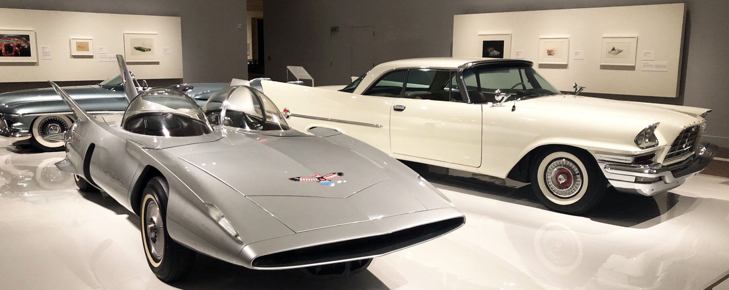
Installation: counterclockwise, Firebird III, General Motors, 1958; 300C, Chrysler Corporation, 1957; Le Sabre, General Motors, 1951

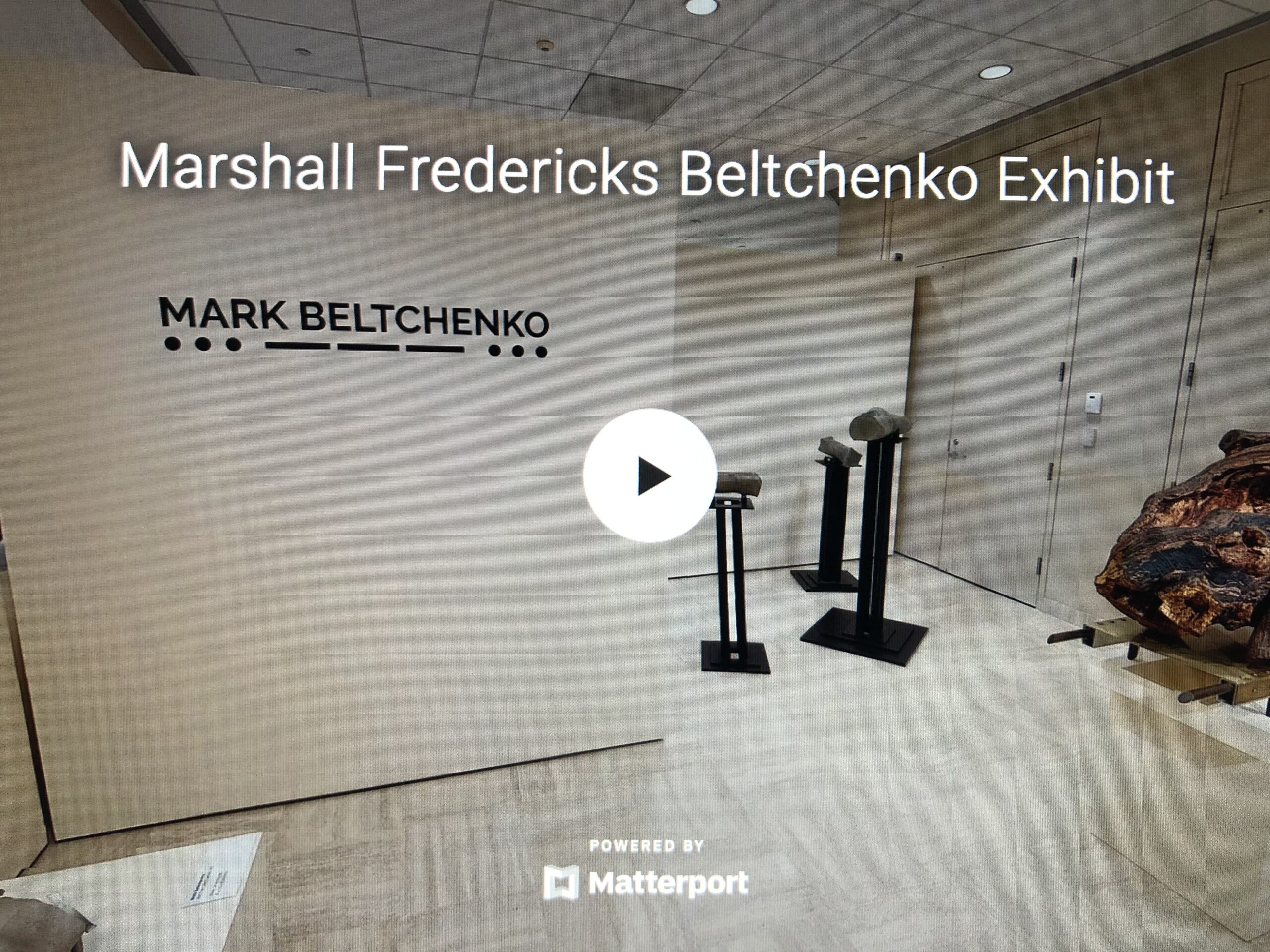
As a visitor arriving at the Farnsworth Street entrance of the Detroit Institute of Arts to take in “Detroit Style: Car Design in the Motor City, 1950 – 2020,” you’ve just begun your journey. After entering the Farnsworth doors of the South Wing of the building, one begins a colorful and eye-catching hike across the width of the museum. The tour passes through the hallowed halls and treasure laden galleries of the Institute until reaching the North Wing and the now deinstalled modern/contemporary galleries and the exhibition entrance. There, a wide doorway (definitely not a columned portal) leads into the first show-stopping gallery of “Detroit Style.” Unlike any other gallery in the DIA, arrayed before you is a breathtaking trio of sleek, shiny automobiles seemingly floating on an expansive white vinyl plinth: a silvery gray Firebird III (General Motors, 1958), a pristine white 300C (Chrysler Corporation, 1957), and a lush misty blue Le Sabre (General Motors,1951). Their elegantly understated hues allow the clean lines, crisp edges and creases, wings, fins, and upswept taillights to protrude and project into space. After all, as a curator once wittily claimed, “Automobiles are hollow, rolling sculptures.”

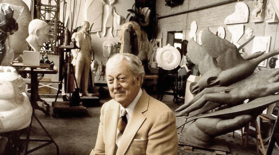
This, the first and largest gallery, focuses on the 1950s in an exhibition that unfolds chronologically decade by decade. Organized and overseen by DIA curator Benjamin Colman, twelve cars in all are displayed, four from each of the Big Three manufacturers. (And, tactfully, a different car graces three distinct covers of the indispensable catalog–in red, silver, or blue, your choice.) Each of the sequential galleries showcases one or more concept and/or production vehicles. In addition to automobiles, the show offers design drawings, archival photos, paintings, a sculpture, and short videos in which designers discuss their works. (Access the videos at end of this text.)

In the opening gallery, for instance, devoted to the 1950s and presenting the cars described above, a drawing by Art Miller, Rendering of Automobile Interior (1952), features a cutaway view of a gleaming red and black interior and the startling sight beyond the opposite window of a tiny, low flying jet zooming by in the distance, an apt reflection of the influence of aircraft forms on auto design then as well as of the au courant lingo of the 50s: “The Forward Look.”

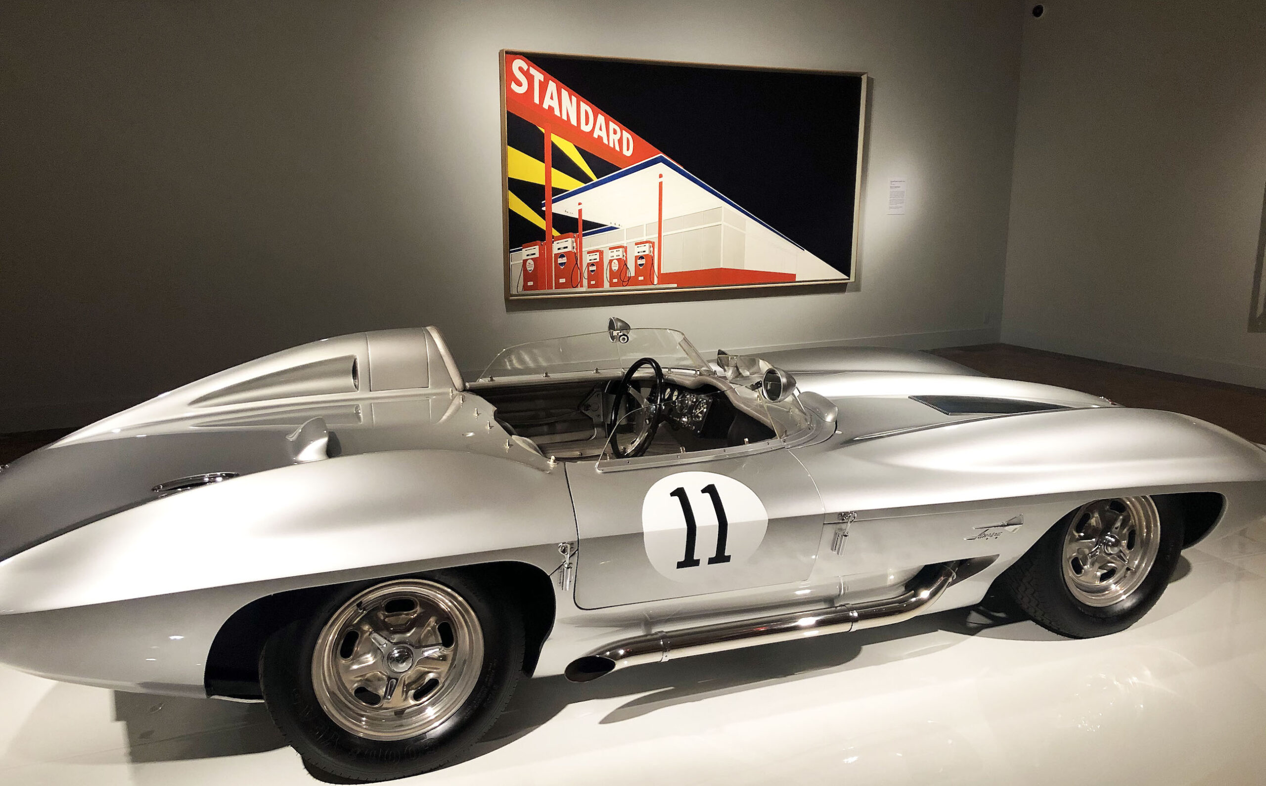
Installation: foreground, Corvette Stingray Racer, General Motors, 1959; background, Edward Ruscha, Standard Station, Amarillo, Texas, oil on canvas, 1963

In one of the subsequent galleries addressing the 1960s, a Corvette Stingray Racer (General Motors,1959) is backgrounded by Edward Ruscha’s Standard Station, Amarillo, Texas (1963). Sharp, crisp lines exaggerating length and emphasizing edges and creases earmark both objects. The iconic red, white, and blue gas station, defined by thrusting diagonals that recede into infinity, is silhouetted against a dark sky with criss crossing searchlights that highlight both the glowing filling station and silvery Stingray in the foreground.

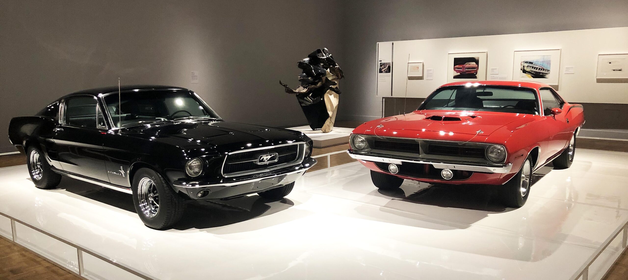
Installation: left, Mustang, Ford Motor Company, 1967; right, Plymouth Barracuda, Chrysler Corporation, 1970; middle, John Chamberlain, Coo Wha Zee, painted steel, 1962

Moving further along into the 60s, two so-called pony cars, the Mustang ((Ford, 1967) and Plymouth Barracuda (Chrysler, 1970), enter the scene. Viewed head on, as here, these sporty, youthful, and spirited vehicles present contrasting hues, one gutsy black, the other flaming red, each with a broad, mouthy grille suggestive of a tense, one-on-one confrontation. Nestled between them is John Chamberlain’s brawny black and white sculpture, Coo Wah Zee (1963). Fabricated from discarded car parts bent and contorted into a tall, rough-edged abstraction, it is, as the title intimates, one “crazy” sculpture. Two drawings, the rakishly tilted 71 Barracuda Front End Facelift Concept (1968) by Donald Hood and Howard Payne’s smoldering Ford Mustang(1965)–a ripe orange body profiled on red paper–attest to the visceral appeal of these feisty, automative rivals.

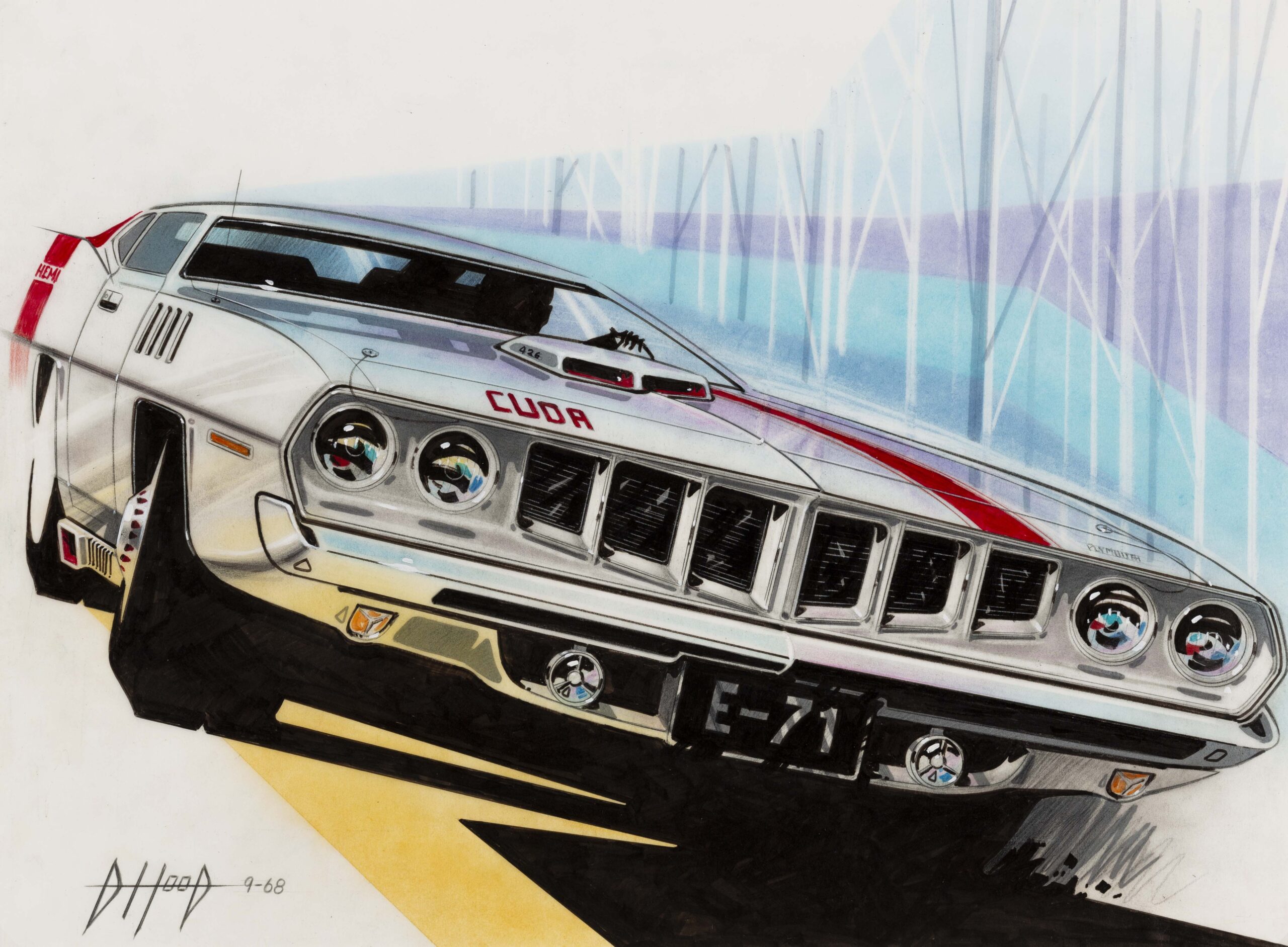
Donald Hood, ’71 Barracuda Front End Facelift Concept, mixed media on vellum, 1968


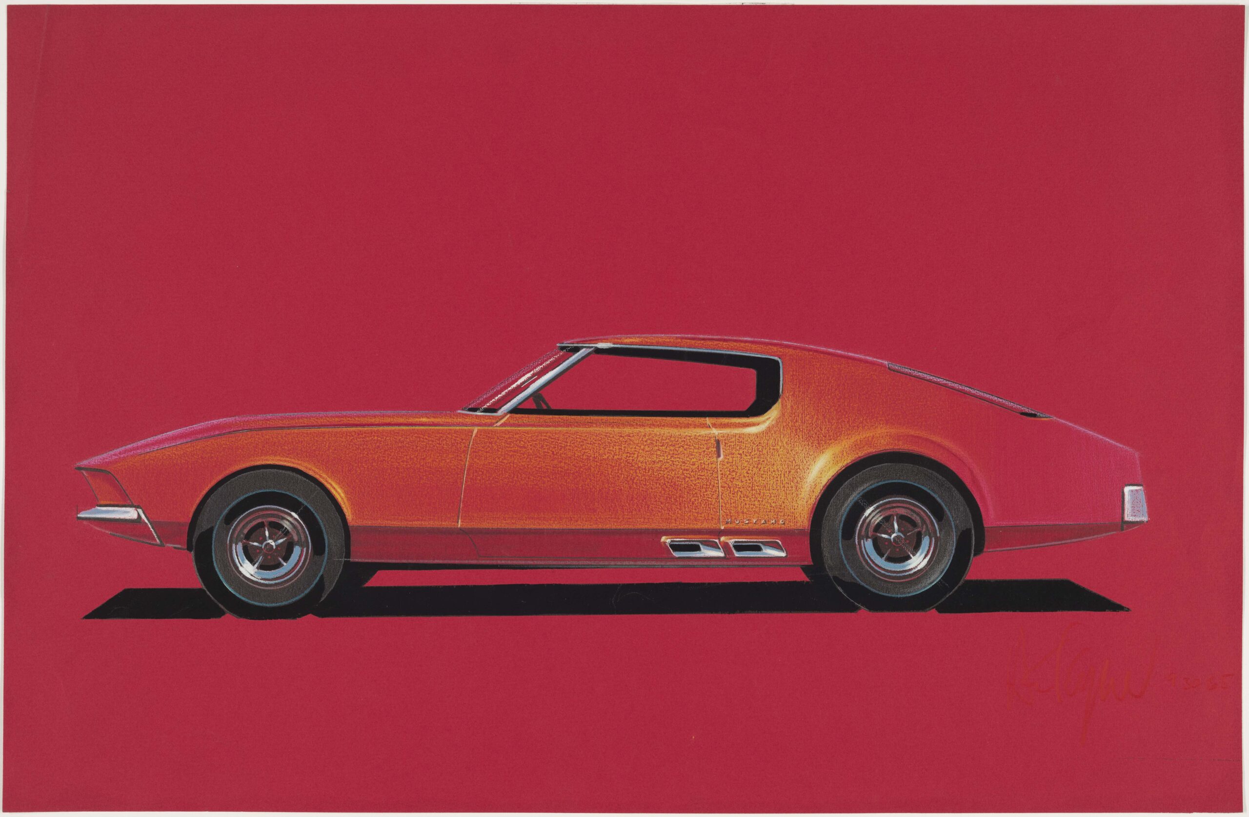
Howard Payne, Ford Mustang, Prismacolor and gouache on red charcoal paper, 1965

Just beyond midpoint in the exhibition, rather like a palate refresher, the 4-door, aerodynamic Probe IV (Ford, 1983) comes into view. Its soft, pristine white hue, integrated forms, rounded corners, quiet, whispering demeanor, and four wheel covers minimizing the presence of tires and implicit speed, denote what one commentator described as a “wind cheating supercar.”  Accompanying its calm presence are a number of fluid, ovoid renderings by Howard “Buck” Mook, Maurice Chandler, Taru Lahti, and Ken Okuyama (c. 1982 -1991).

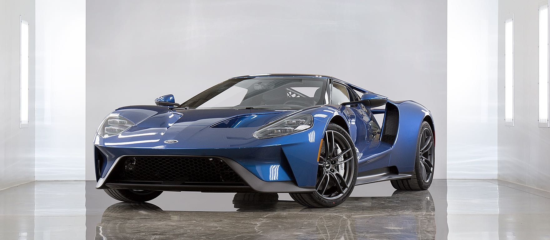
GT, Ford Motor Company, 2017


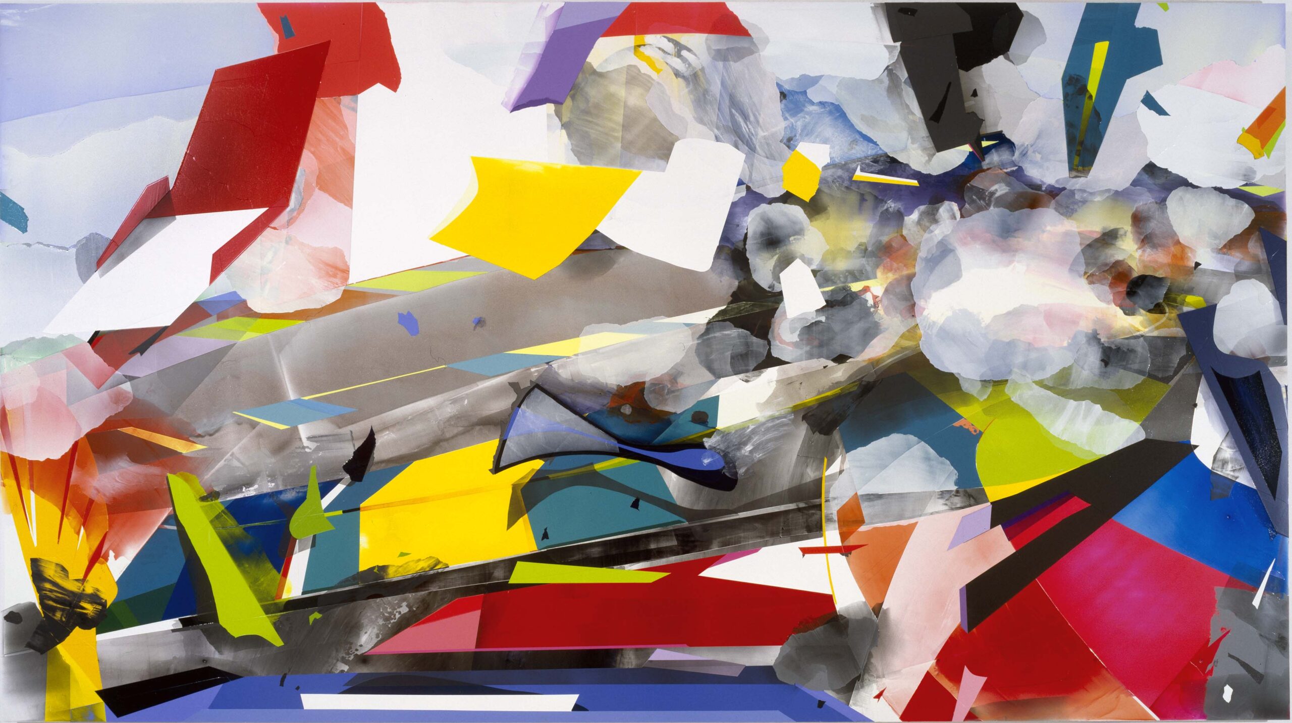
Kristin Baker, The Unfair Advantage, acrylic on PVC on board, 2003

The final gallery, sparely installed, is home to just two works: an electric blue, sinuous, teardrop shaped GT (Ford, 2017) and Kristin Baker’s large scale, mixed media composition The Unfair Advantage (2003). The swept-back lines of the low-slung GT, a reinterpretation of a racing car legend of 1966, telegraph power, speed, machismo. Baker, alternatively, presents a cautionary work, an updated Futurist scene (landscape, raceway?) that evokes jagged, colorful forms whizzing by AND, as a counterpoint, the blurred, roiling smoke and fire indicative of a catastrophic crash. Nothing like ending the show with a bang!

Videos, accessible here,  provide perspective on how Detroit’s iconic vehicles are created with this interview series featuring car designers Ralph Gilles, Emeline King, Craig Metros, and Ed Welburn.  The four designers share their insights on favorite cars, the use of materials, and the collaboration between designers and engineers.

“Detroit Style: Car Design in the Motor City, 1950 – 2020” is on display at the DIA through June 27, 2021. Keep in mind that to view the exhibition you will need to reserve in advance a specific day and time for your visit.

Sarah Rose Sharp @ UM Institute of the Humanities Gallery

Map of the Interior: Sarah Rose Sharp’s “Results or Roses” at UM Institute of the Humanities Gallery

Sarah Rose Sharp, Hand of Fate, 2019, screen print by Too x Nail, fabric, embroidery thread, charms, beads, etc., 11.5” x 6” x 2.5

During these Covid times, visual artists’ exhibitions have migrated to online locations, with mixed results. For some whose work is photographic or text-based in nature, the effect is hardly noticeable.  But for artists making very tactile or three-dimensional work, like the artworks in Detroit artist Sarah Rose Sharp’s Results or Roses at UM Institute of the Humanities Gallery, much is lost in translation.  I felt some guilty delight when the gallery curator, Amanda Krugliak, consented to open the gallery (now temporarily closed to the public during the pandemic) for my visit.

Sharp employs traditional needlework and sewing techniques to create a diaristic map of her interior life. The intimately scaled artworks illustrate several different trains of the artist’s thought and share the walls of the gallery and an adjacent vitrine, providing a virtual tour of the artist’s memories, observations and preoccupations. The overarching intention of the work seems to be located somewhere in the psychic territory between nostalgia and satire.

Sarah Rose Sharp, Immigrant Song, 2020, tablecloth by Rose Blaug, rice bag, embroidery thread, sequins, patches, beads, fake flowers, plastic table covering, etc., 24.75 x 24.75”

The modestly-sized but obsessively decorated wall hangings, flags, throw pillows–and some three dimensional assemblages too strange to name–add up to an untamed fantasia of tat and glitz. Sharp combines an improbable array of materials in her free-hand, free-associational compositions, some vintage, some newly minted. Found objects, beads, applique and embroidery seem to boil over the surfaces, threatening to encase the fabric ground entirely. Immigrant Song, perhaps the signature piece of the show, is a demented version of the Statue of Liberty, her single, oversized eye gazing out at the world and radiating energy. The surface is sequin-encrusted, and free-hand needlework decoration vies with store-bought embroidery patches for control of the surface. The fabric base for the artwork is part of a tablecloth that belonged to the artist’s great grandmother, which the artist cherishes as a meaningful collaboration with a woman she never met. Sharp has a real gift for the creative manipulation of materials, but is clearly more interested in their expressive potential  than with conforming to any conventional notion of craft.

Sarah Rose Sharp, Target, 2020, fabric, arrow, handkerchief, t-shirt salvage, beads, sequins etc., 10” x 7.5”, arrow 29”

A native of California, Sharp devotes a number of her works for Results or Roses to both critiquing and humorously celebrating the Hollywoodized cultural signifiers of the West.  In several pieces, she chooses mass market images of a heroic–and often imaginary–past: mustangs and buffalo, limitless deserts, child cowboys and cowgirls. In her flag-and–arrow assemblage Target, she deftly memorializes the near-demise of both Native Americans and buffalo herds, victims of America’s manifest destiny. In Native Daughter, Sharp makes a flag by embellishing a souvenir California handkerchief with appliqued and embroidered images that symbolize features of the state that may no longer exist.  Jupiter Rising conjures an improbably limitless landscape of mountains, horses running free, a child cowboy and a pickup truck with a mysterious figure (Cowboy Jupiter?) presiding. From this work, it appears Sharp is still engaged in the unresolved process of  locating her stance toward her childhood between appreciation and censure.

Sarah Rose Sharp, Detroit Patchwork IV, 2020, fabric, wool salvage, hem binding, corset wire, 32.5” x 15”

Sharp’s textiles referencing her more recent home, Detroit, are more straightforward appreciations of the substance of the city.  She pieces together fabrics that describe architectural features, the voids and recent architectural additions, metaphorical renditions of the urban landscape as it stitches itself back together. Detroit Patchwork III is particularly evocative of the highways that span the city, while the fabrics she has chosen reference the ethnic diversity of its many neighborhoods. Detroit Patchwork IV may be the most formally satisfying of the series, a jubilant combination of oranges, browns and blacks that is slightly reminiscent of work by African American textile artist Carole Harris.

With each piece Sharp engages in an ongoing search for a legible reality from found bits and pieces of her life, past and present. Her question:  are the symbols and images we get from mass media legitimate signifiers of some larger reality, or do the small, observed details painstakingly stitched together each day deserve equal weight in our construction of our own history and identity?

UM Institute of the Humanities Gallery 

This review is re-printed with permission from Pulp, the Ann Arbor District Library’s online culture magazine.

Luminous Visions and Path to Paradise @ Toledo Museum of Art

Phillip K. Smith III, Flat Torus 4. Photograph by Lance Gerber Studio

This year, the Toledo Museum of Art added to its permanent collection Flat Torus 4, an ethereal light installation by multimedia artist Phillip K. Smith III.  This work is the visual anchor of the exhibit Luminous Visions. Concurrent with this single-gallery show is a sprawling retrospective of the stained glass art of Judith Schaechter.  As different as these two exhibits are in form and content, they both directly engage with centuries of art history, they both take luminosity as their subject, and they’re both visually mesmerizing.  As such, these two separate shows compliment each other like the varied notes of a musical chord.

The centerpiece of Luminous Visions is Flat Torus 4, a series of wall-mounted concentric rings which, with the aid of computer software and LED lights, moodily project diffused light into the gallery space.  It’s an instillation which recalls the atmospheric light sculptures of Dan Flavin.  Flat Torus 4 is tactfully placed in conversation with an ensemble of other works from the TMA’s collection which literally or metaphorically take light as their subject.  These include a 19th Century painting by Sanford Robinson Gifford of Maine’s Mt. Katahdin, beautifully illuminated by a rising sun.  And a 15th Century sculpture of a seated Buddha speaks to the metaphorical and spiritual associations of enlightenment and illumination.  The works in this exhibit span nearly 700 years, but Flat Torus 4 is the undisputed star of the show; its soft light bathes the whole room in its shifting colors which slowly and satisfyingly cycle over the course of 40 minutes.  This micro-show is an interesting and visually satisfying vignette, and it seems like great starting point for what could be a larger exhibition addressing light and illumination in art across the TMA’s collection.

Phillip K. Smith III, Flat Torus 4. Photograph by Lance Gerber Studio

In contrast to the stately serenity of Luminous Visions, the glass works on view in the traveling show Path to Paradise are loud, irreverent, uncomfortable, and often violent. Yet they’re also undeniably beautiful and cathartic.  Glass artist Judith Schaechter takes her inspiration in equal parts from Northern Renaissance art and the aesthetics of Mad magazine.  Through January 3, the TMA is showcasing forty of her works, supplemented with original sketchbooks brimming with preparatory drawings which offer behind-the-scenes access into Schaechter’s creative process.  Path to Paradise is her first survey exhibition, and given the impressive scale and scope of her body of work, it seems like one that’s long overdue.

The Battle of Carnival and Lent, 2010-2011. Stained-glass panel, 56 x 56 in. Memorial Art Gallery of the University of Rochester, NY; Marion Stratton Gould Fund, Rosemary B. and James C. MacKenzie Fund, Joseph T. Simon Fund, R. T. Miller Fund and Bequest of Clara Trowbridge Wolfard by exchange, and funds from deaccessioning.

Beached Whale, 2018. Stained-glass panel, 27 x 40 in. Courtesy Claire Oliver Gallery, Harlem, and the artist.

Schaechter manages to take a medium that reached its apex in the Gothic era and masterfully translate it into a 21st Century vocabulary. By applying a technique of layering glass which results in subtle gradients and shading, she lends her work a contemporary illustrative quality that you wouldn’t see in a 12th Century rose window.  It’s a tedious process—each work takes months to complete– but much like the Old Masters of the Northern Renaissance, Schaechter delights in the details.

This show presents her earliest works in conversation with some of her most recent, surveying the trajectory of her career.  Among these include The Flood, a triptych which thrust Schaechter into the national spotlight when it was displayed at the Smithsonian’s Renwick Gallery when the artist was 29 years old. The figures that populate her fabricated worlds often seem caricatured, but she demonstrates an impressive ability to switch back and forth between cartoonish imagery and lucid realism, even within the same work.  New or old, all her works are rendered with astonishing detail.  In My One Desire, the background is teeming with plants, animals, and dazzling kaleidoscopic bursts of geometric patterns that snugly fill every bit of negative space, recalling a Renaissance tapestry. The work’s theme of a dying unicorn also situates this work in the tradition of Renaissance art, though the story here remains characteristically enigmatic. This horror vacui recurs frequently in her work. In A Play About Snakes, we encounter an elaborate pattern of twisting, writhing snakes that mimic the ornamental patterns found in medieval illuminated manuscripts– the Cross Page from the Lindisfarne Gospels, perhaps.  Regardless of the subject matter, all her works teem with ebullient detail; no wonder she describes herself as a “militant ornamentalist.”

Although her work is often thematically dark, it can at times be playfully whimsical.  Specimens shows a grid of various imaginary creatures preserved in little jars as if on display in a natural history museum; they seem plucked from the world of Hieronymus Bosch…or perhaps Dr. Seuss.  And her improvisatory Exquisite Corpse is an homage to the silly party game of the same name which famously originated at the dinner parties thrown by Surrealism’s founder Andre Breton.

But much of Schaechter’s work is unsettling. We encounter many images of violence and death, a surprising number of which are actually sourced in Renaissance-era paintings and illustrations. Some of these works directly speak to recent and contemporary events.  Sister is a disquietingly calm work in which the pose assumed by its lifeless subject references the haunting Vietnam-era photograph of the “Napalm Girl.”  But within the work, this young girl inhabits indeterminate space, and Sister (much like Picasso’s Guernica) comes across as a universal statement against wartime atrocity which could apply to any time and any place.  And in Emigration Policy, we see a dog drowning as it desperately tries to catch up with a departing ship (or was it thrown overboard?).  The violence in her work is never gratuitous, but rather serves to encourage empathy and compassion on the part of the viewer.

The Floor, 2006. Stained-glass panel, 36 x 34 in. Collection of Claire Oliver

The subject matter of Schaechter’s work runs the gamut between agony and ecstasy, and is Shakespearian in its scope.  As to the question of why her work is often so uncomfortable, Schaechter responds on her website with a passage excerpted from James Poniewozik essay The Art of Unhappiness: “What we forget…is that happiness is more than pleasure sans pain.  The things that bring us the greatest joy carry the greatest potential for disappointment.  Today, surrounded by promises of easy happiness, we need someone to tell us that it is O.K. not to be happy, that sadness makes happiness deeper.”  Bearing this in mind, as uncomfortable as many of her works might make us, it seems that the body of her work is– in the final analysis—ultimately life-affirming in its unashamed embrace of the totality of the human experience.

The Path to Paradise: An Interview with Artist Judith Schaechter

Toledo Museum of Art  –  The Path to Paradise: Judith Schaechter’s Stained-Glass Art   —  Jan. 3, 2021 | Levis Gallery

Mark Beltchenko @ MFSM

Marshall M. Fredericks Sculpture Museum at Saginaw Valley State University exhibits the work of Mark Beltchenko

Mark Beltchenko, Installation image, Images courtesy of MFSM.

The Marshall M. Fredericks Sculpture Museum conducted its 2018 Regional Biennial Juried Sculpture Exhibition, a state-wide competition for sculptors, and the first prize went to the Detroit Artist Mark Beltchenko.  Part of that process resulted in a one-person exhibition at the museum. The Detroit-area sculptor is highly skilled in multiple media can be currently viewed online at marchshallfredericks.org  The title of this virtual exhibition ‘SOS (or ***—*** in Morse Code) is often used to denote phrases such as ‘Save Our Ship’ and is comprised of six different series of works by Beltchenko: INSIDER, BIRTHWORKS, HISTORY LESSONS, NOT MY PRESIDENT, PEDESTAL, and DISTRESS, spanning from the year 2006 to the most recent works completed in May 2020.

Mark Beltchenko, MFSM, virtual exhibition at their website, 11.2020

Museums in Michigan and around the country have been hosting virtual exhibitions due to the Covid-19 regulations and have harnessed various technologies to assist in the process.  The MFSM used MatterPort technology, allowing the viewer to begin at the open of the exhibition and proceed for a self-controlled visit through the virtual space. https://www.marshallfredericks.net/mb

Mark Beltchenko, HISTORY LESSON – 3rd STONE steel, limestone, brass 6 x 11 x 8 inches

As mentioned, Beltchenko’s work is sorted by what he calls series, and these stone pieces are cut from building parts and then combined with other material. Steel, brass, and limestone carved to look like concrete structures are the ghosts of a man-made world in decay. The metals protrude from and through the concrete-appearing objects as the sculptor reclaims the man-made world’s parts.

Mark Beltchenko, PEDESTAL SERIES #2, limestone, steel

Another series is Beltchenko’s pedestals. This series is a dystopian view of what art could look like in a world void of artistic expression and freedom. The sculpture, Pedestal #1 has an engraved plaque that states “1 of 3 carved objects discovered on the North American continent of Earth.” Art encapsulates and makes possible reasonable communication throughout the history of humankind. The limestone has been carved to resemble human bone as the pedestals are made of steel vein structures that are bare, out of balance, and leaning uncomfortably on edge.

Mark Beltchenko, GOOD OLE NUMBER 45 – steel, 22 x 13 x 24 inches

Artists are people with political views, but few choose to bring those views into their art.  Mark Beltchenko is a three-dimensional artist who decides to devote a small part of his work to his view of the United States’ 45th President.  The artist uses thorns in this artwork represent the poisonous nature of the 45th President and his current administration; the hiring’s and the firings, the infighting, the tell-all book writing that now exists.  So much so, it requires the museum to place a disclaimer upfront: CAUTION This exhibition contains subject matter and imagery that some may find difficult, disturbing, and uncomfortable. Museum staff is available to discuss the works and the artist’s intent.

“The views and opinions expressed in this exhibition are those of the artist and do not necessarily reflect those of the Marshall M. Fredericks Sculpture Museum, Saginaw Valley State University, our funders or sponsors, including Michigan Council for Arts and Cultural Affairs.”

The director of MFSM, Megan McAdow, is quoted from a review, “Beltchenko is not a loud or verbose man, but his work screams at us with a dire urgency. That is not to say that his work is obvious; rather, it is not. It requires effort. One must spend time with the work and breathe into it. You may not immediately recognize the discourse; however, allow yourself to linger, and as one lingers, the layers begin to unfold and reveal its meticulous detail and dialogue. It affects and changes you.”

Equally comfortable working in stone, steel, aluminum, wood, and the non-ferrous metals, Beltchenko’s work serves as a meditation on the good and bad in our current lives: The environment, political hypocrisy, positive growth, greed, and human narcissism – not necessarily in that order, are all covered through his works.

His three-dimensional imagery communicates ideas in ways that are both primitive and profound.

The artist, through his work, is clear about his political views. Beltchenko states: “These works reflect extreme emotion because I’m highly affected by what is going on. I’ve never been politically motivated in the past, but we are at a point where we can’t take this anymore. I have a voice, and my voice is in my art.”

Mark Beltchenko earned his Bachelor of Fine Arts from Alma College, Alma, Michigan.

Marshall Fields, Sculptor, in his studio in the mid-1980s.

The exhibition at the Marshall M. Fredericks Sculpture Museum, Mark Beltchencko: • • • – – – • • • (SOS) runs through January 16, 2021.

To plan your visit:   https://www.marshallfredericks.net/mb


Tom Livo @ Image Works

Paintings by Tom Livo, Installation shot, All images courtesy of Image Works

Like many cultural institutions in the era of Covid-19, art galleries are struggling with economic pain that goes along with the physical peril of the pandemic. So it’s a pleasure to find an art venue that is both showing interesting work and managing to keep the lights on.  Image Works is the brainchild of photographer Chris Bennett, a recent arrival to the Detroit area from Portland, Oregon. While the back portion of Image Works is dedicated to Bennett’s day job as a provider of fine art and photographic printing, the front features a small but pristine gallery where the paintings of Tom Livo are on display until November 27.

In the roomful of Livo’s images  now at Image Works, the artist explores childhood memories, translating family snapshots into painterly compositions that recapture and give significance to  fleeting recollections of times past. Born in Garden City, Michigan in the 60’s, the CCS graduate describes his method: “I revisited family albums, shuffling through stacks of old Polaroids and snapshots, choosing which to paint. The people and situations come alive again, reigniting fond, half memories and themes that, I suppose, resonate universally.”

Tom Livo, Walking My Gargoyle, Oil on Board, 12×12″, 2019

Two bodies of the artist’s work are represented in the gallery, each quite different from the other in scale, palette, composition and mood. By comparing and contrasting them, we can find a way into the artist’s mind and discover both his ambivalence and his affection for family, friends and his own childhood.

One side of the gallery is packed, salon style, with small, usually colorful, paintings of figures, many of them children. Derived from photographs of long-ago holidays and parties, the kids are routinely costumed and mugging for the camera. The compositions emphasize the outsize personalities of the subjects; often the children are disguised as monsters.  The pictured adults are lumpy, unglamorous, almost as monstrous as their costumed offspring, but unembarrassed by their own imperfections. They boldly make eye contact with the viewer: while they know they are being watched, they are also watching us.

Tom Livo, The Hair Curlers, Oil on Board, 12×12″, 2019

Because the pieces in this collection are intimate in scale, the virtuosity of Livo’s brushwork surges to the fore–these small works are beautifully painted. Backgrounds are either (mostly) flat white or minimally detailed. The general effect of these paintings, while subtly menacing, is cheerful, even gleeful.

By contrast, the big monochrome paintings that make up the rest of the artworks in this exhibit are too chilly to be nostalgic. They are arms length recollections, replete with ambiguous meaning and emotion.   The painting She’s Not There, is an exercise in mid-tone gray that recalls the low resolution, low contrast images of pre-color television. An elderly woman (the artist’s grandmother, as it happens) stands in a featureless room, next to a television that is as much an enigmatic presence as she is. The blank face of the turned-off set is echoed in the glare of the woman’s glasses, obscuring her eyes, and implying, it seems, the diminished presence of old age.  The two companion figures, tv and woman, are relatively small within the blank expanse of the modest interior, a device the painter employs again in his painting N’Octover. In the picture, a young man reclines, apparently asleep in an armchair. The table lamp, centrally located, seems more sentient than the man. Here, the emptiness of the room suggests a barren psychic landscape where the inhabitants’ interior lives are unknown and unknowable.

Tom Livo, She’s Not There, Oil on Canvas, 64×48″, 2020

Livo explores a different compositional strategy in his portrait of a young, bespectacled girl. Her gray face fills the picture, like a woman in a particularly joyless Alex Katz painting, and we are hard pressed to penetrate the smooth surface of her skin to find the soul within.  The artist’s lens zooms back out for his most engaging black and white painting, The Riviera. Unlike She’s Not There and N’Octover, The Riviera  is set outdoors, in a neighborhood very much like the one outside the gallery walls of Image Works. A tidy brick ranch home with a lush yard provides the background for a sporty muscle car in the driveway. The two men in the picture seem relaxed and satisfied with their lot, comfortable at a time when the American Dream seemed like an entitlement. Today, the neighborhood remains, but the sense of ease has gone.

Tom Livo, The Riviera, oil on canvas, 48” x 60”, 2020

Livo’s paintings memorialize a time and place to which he can’t return, and it isn’t clear from the mood of the paintings if he even really wants to.   Instead they provide a frame of reference for the present, to help us remember when things were different, if not better.   The world we live in today is more consumer driven, more atomized, more diverse and less secure than ever. The past will remain forever out of reach, but with these paintings, Livo seems to be saying that, just sometimes, it’s a joyful and useful exercise to remind ourselves what those days, those people, those places–and we–were like.

Tom Livo, Polish Karen, oil on canvas, 48” x 48” 2020

During the pandemic, Image Works, located at 3726 Monroe St., Dearborn MI 48124, is open by appointment: call 313-768-5020 or email [email protected]


Page 27 of 75

Powered by WordPress & Theme by Anders Norén