Detroit Art Review

Critical art reviews of Detroit galleries and museums weekly

Bill Schwab @ Halsted Gallery

Detroit Photographer has a Survey Exhibition of Work at the Halsted Gallery

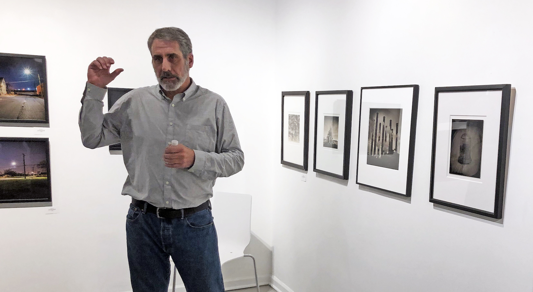
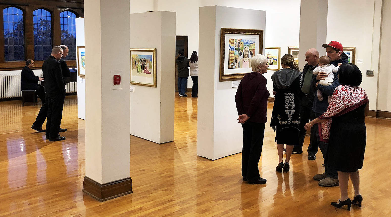
Installation, Bill Schwab talking at open, 2018

Photography celebrates its 180th anniversary in 2019. This art form has fascinated us from its early beginnings with its ability to record time and aide our memories of people, places and objects. Photographs are magical things, credited with the power to steal a person’s shadow and provide a mysterious interaction of silver and salt akin to alchemy. That was pre-digital era, of course.

If you are anywhere near my age (and studied art in the 1960s) you may have taken a class in photography in your college years. You may have purchased a Pentax, Cannon, or Nikon 35-millimeter single lens reflex (SLR) camera and exposed a series of rectangles that captured an image of your family, friends and possibly your pet. After loading the camera and recording images, you rolled your black-and-white Tri-X film back into its cannister, removed it in a darkroom under a mysterious red light, and developed the celluloid impressions, each producing a negative image. The negative was then placed into a photo enlarger which projected a lit image onto photo sensitive paper, usually Kodak or Afga, creating a sensation that when wiggled around in a developing solution, magically forms an image right before your eyes. Life’s moment became concentrated, condensed and captured in a split second of time.

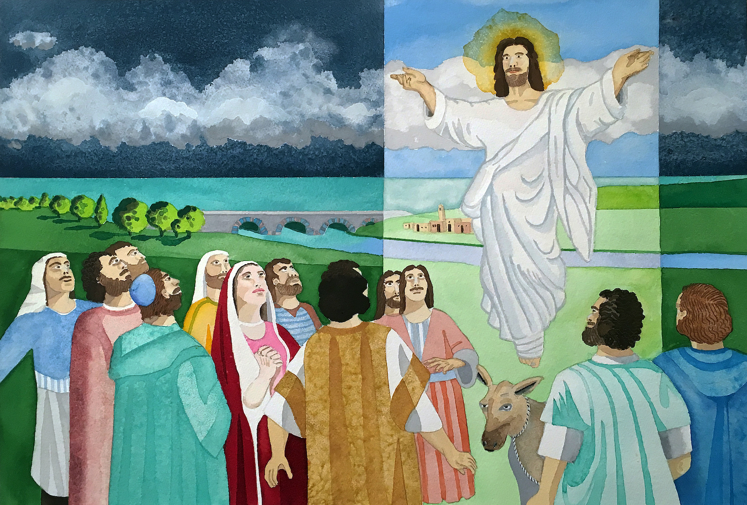
Bill Schwab, Metropolitan, Gum over Platinum Print, Detroit 2012

The Halsted Gallery was the only photo gallery in the Detroit metro area back in the early 1970s and, as part of the gallery archive, there are letters from photographers whom Tom Halsted represented, including: Henri Cartier Bresson, Andre Kertesz, Edward Weston, Edward Steichen, Ansel Adams, Berenice Abbott, and Imogen Cunningham to name only a few. In the year 2000, the Halsted Gallery had an opening for Bill Schwab, who was then a young and emerging photographer. The exhibit included small prints made from long exposures in the early morning fog of Belle Isle, Detroit. I bought his small, beautiful 36-page book and a limited-edition signed print.

Bill Schwab, House on Dearborn Street, 30 x 40″ Pigment Ink print, 2016

Fast forward to December 1, 2018, where the Halsted Gallery, now under the ownership of Wendy Halsted Beard, has reopened in a new location and mounted an exhibition, Relative Importance, of Bill Schwab’s photography that covers his work for the past two decades, including  his more recent digital, aerial and wet plate collodion photographs. As professional and artistic photography still exists in this world of “everyone is a photographer,” Bill Schwab has endured with a prodigious reputation that many admire and he rightly deserves. Just because we all have smart phone cameras doesn’t mean we can compose, acutely observe and most importantly understand light. Circumstantial light considers not only all the properties and behaviors of natural light, but also how that light interacts with the objects around (you), transforming those objects into light-shaping tools.

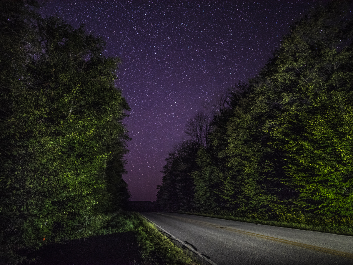
Bill Schwab, Van Road Stars, 30 x 40″, Pigment Ink print, 2017

The first digital camera was created by Steven Sasson of Eastman Kodak in 1975, but the first consumer products didn’t arrive until the late 1980s and early 1990s. It wasn’t until 2010 that digital cameras were integrated into smart phones and by 2003, digital cameras out-sold film cameras. According to Info Trends, 1.2 trillion photos were taken in 2017. The technological change has had a tremendous effect on photography and photographers, but that is not to say it hasn’t been a natural advancement of capturing an image. Schwab is a good example of how photographers have embraced the new technology and used its tools as leverage to produce new kinds work. The digital image Van Road Stars, is a good example of how the manipulation of light and exposure can produce a rather engaging image, in part due to scale and incredible detail.

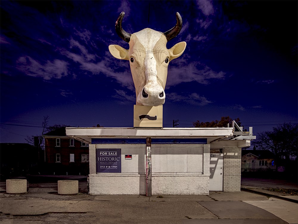
Bill Schawb, Mack at Lennox, Pigmented Ink Print, Detroit, 2016

What makes this Mack at Lennox image interesting has nothing to do with the recording device, but rather the sensibility to light, color and thought. You end up asking yourself how odd is that? Was it an ice cream stand or a dairy shop?  But the cow has horns making it either a he, or a she. Formal in its composition, he makes the print large, 30 x 40 inches, which adds to its strength as a photograph. And then there is the light. Where is the light source coming from?  Did he set a light up high against the darkened sky? These considerations are what set an artist apart from your average snapshot taker..

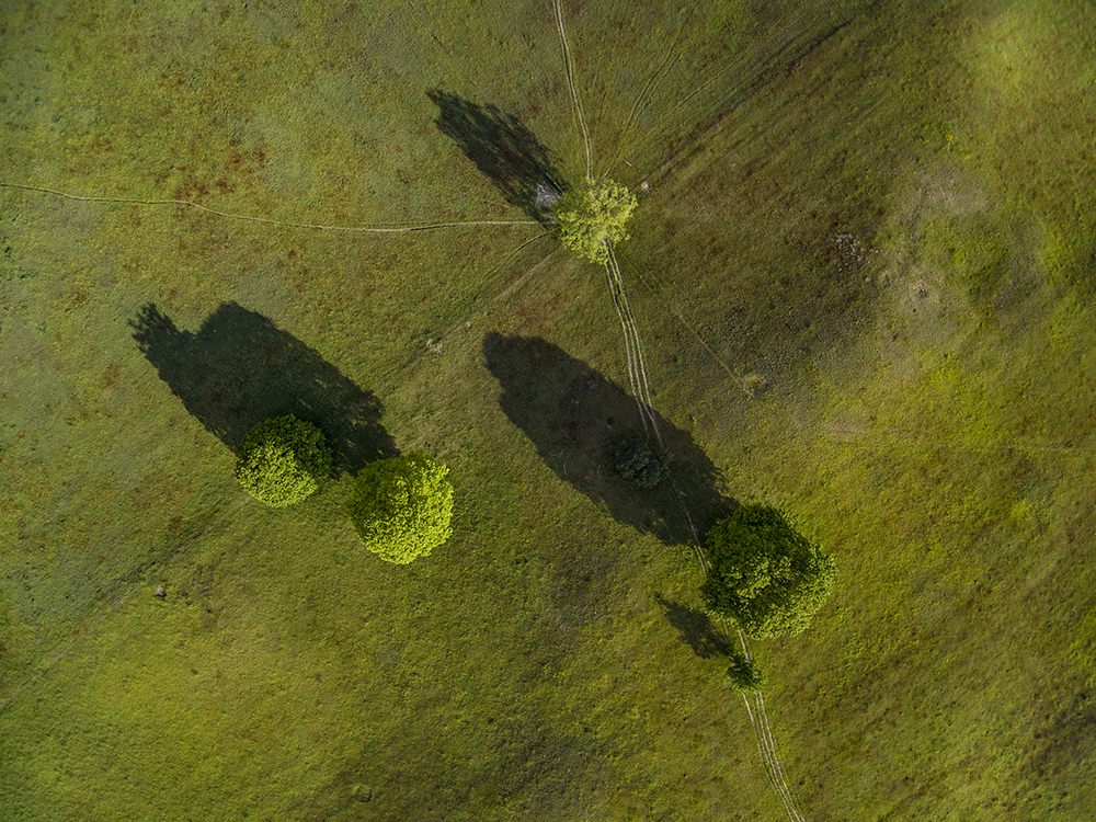
Bill Schwab, Five Trees in a Field, Pigment Ink Print, Detroit, 2016

Bill Schwab was early to take an interest in drone technology, something that most professional photographers now consider a necessary tool.  He has a series called the Human Stain, largely made up of a decade of images taken of crumbling farm houses in rural areas, but this aerial image is of five trees with low light shadows and tractor trails that become the marks of visual artists with respect to placement and composition.  It provides the viewer with a different point of view of the landscape, something that painters have been doing for hundreds of years.

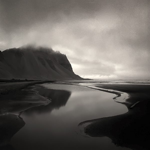
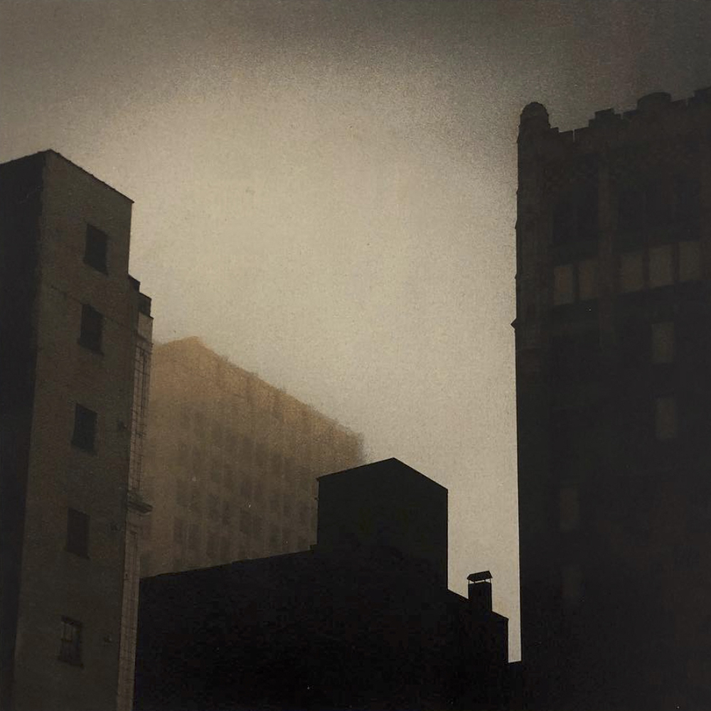
Bill Schwab, Tidal Flooding – Hofn, Silver Gelatin Print, Iceland, 2015

Photography captures reality in distinct ways that were rarely available to painters.  There once was debate over whether or not photography is fine art?  I am not sure when that got answered, but the answer is clear: yes and no. If you’re photographing a still life for a garden magazine or a car for a showroom brochure, it is commercial photography.  But when you are making abstractions, as Andre Kertesz or Ernst Haas did, or capturing precious moments in time based on light and composition as Henri Bresson did, it is fine art.  The difference might be analogous to the difference between illustration and painting, although in the case of Norman Rockwell, the debate drags on, at least in some critics’ minds.

Bill Schwab, Rouge Steel, Silver Gelatin Print, 1994

Beginning at an early age, Bill Schwab developed an interest in photography with his Kodak Brownie camera and a home darkroom kit he got from his father as a gift.  Like they say, give a person a fish and it’s a meal for that day, teach him how to fish, and it’s a lifetime of meals. Photography is Bill Schwab’s life, and great photography is about the depth of feeling, not the depth of field.

Bill Schwab earned his B.F.A in photography from Central Michigan University and worked for a short while in NYC assisting commercial photographer Alen MacWeeney before traveling the world as a commercial photographer.  He has taken students of photography on workshops to Iceland, founded the Northern Light Press and coordinates the Photostock Festival yearly each June, changing and influencing photographers in his path. He has published four books on his photography, and his work is part of many museum, corporate and personal collections.

Bill Schwab, Relative Importance, at the Halsted Gallery runs through   January 30, 2019

Charles White @ MoMA, NYC

Charles White: A Retrospective at the Museum of Modern Art, New York City, NY

Charles White (American, 1918–1979). General Moses (Harriet Tubman). 1965. Ink on paper, 47 × 68″ (119.4 × 172.7 cm). Private collection. © The Charles White Archives. Photo courtesy of Swann Auction Galleries

If there’s a fearsome female gaze that can make Manet’s icy Olympia seem coy and puerile by comparison, it’s that of the determined Harriet Tubman, rendered in ink by Charles White during the height of the Civil Rights movement.  Famous for liberating hundreds of slaves during the Civil War, here she becomes a contemporary symbol for racial equality, and could, with little imagination, plausibly be seen among those marching on the front lines across Pettus Bridge in Selma, Alabama.  She’s emblematic of White’s work, which unfailingly depicted black America with strength, regality, and dignity.

Born in 1918 on Chicago’s South Side, African-American artist Charles White began his career inauspiciously as a sign painter; he would later become one of the most accomplished draftsmen of his generation.  His style had extraordinary reach, ranging from the gently abstracted figures that peopled his WPA mural paintings of the late 1930s to his tight and refined graphite and ink drawings of the 1960s.  Charles White: A Retrospectiveis a muscular show that snugly fills half of the MoMA’s third floor with over 100 drawings, paintings, and other ephemera.  White’s first major show in 30 years, this traveling exhibition champions the enduring appeal of figurative drawing, and his socially-conscious subject matter keeps his work uncannily relevant.

Arranged chronologically, the retrospective begins with his early paintings, produced when White was a freshly minted graduate from the School of the Art Institute of Chicago in 1938. His early mural Five Great American Negros is an early tour de forcethat established several of the tropes that defined much of White’s subsequent career. Painted when he was just 21 for a fundraiser for Chicago’s South Side Community Art Center, the painting celebrates Booker T. Washington, Frederick Douglass, George Washington Carver, Marian Anderson, and Sojourner Truth.   The mural’s heaving landscape and figural distortions rhyme with the regionalist paintings of Thomas Hart Benton, but, as ever, White’s work also spoke to contemporary social injustices.  He painted the mural in 1939, the same year that gospel singer Marian Anderson was refused permission by the Daughters of the American Revolution to perform at Constitution Hall because of her race, and her inclusion in the work freights the painting with timely relevance and political weight.

Charles White (American, 1918-1979). Five Great American Negroes. 1939. Oil on canvas, 60 x 155″ (152.4 x 393.7 cm). From the Collection of the Howard University Gallery of Art, Washington D.C.© The Charles White Archives/ Photo: Gregory R. Staley

Charles White believed that artists had a moral obligation to contribute to social discourse, and to this end his work aggressively addressed racial injustice and economic disparity in America.  In the 1940s and 50s White produced soulful and moving works like There were no Crops This Year, a Steinbeckian depiction of a visibly distraught husband and wife; an empty sack which the woman holds is the only prop in the drawing, but it’s enough to tell their story.  And his poignant and incriminating proto-cubist Headlinesdepicts a visibly distraught woman flanked by a veritable blizzard of news headlines that reveal instances of racial inequality in America.  His use of collage and text mirrors the synthetic cubist experiments of Picasso and Braque, but here White masterfully harnesses the vocabulary of cubism and channels it toward social protest.

Charles White (American, 1918-1979). Headlines. 1944. Ink, gouache, and newspaper on board, 20 x 16″ (50.8 x 40.6 cm). Collection of William M. and Elisabeth M. Landes. © The Charles White Archives/ Photo: Gregory R. Staley

But while his works frequently addressed racial and economic inequality, White managed to avoid producing an oeuvre drearily burdened by politics.  His brightly painted Gospel Singers radiates joy, and the strong, pitchfork-wielding woman in Our Land (White’s witty response to Grant Wood’s American Gothic) radiates confidence, determination, and, above all, dignity.  

Music also played a significant role in his output, and he produced affectionate drawings of gospel singers Mahalia Jackson, Paul Robertson, and Bessie Smith.  White created cover designs for a series of jazz albums by Vanguard Records, and in 1965 his illustration for Gould: Spirituals for Orchestra received a Grammy nomination for best album cover.  But the musical collaboration this show especially highlights is that of Charles White and Harry Bellefonte, whose recorded voice croons uninterruptedly throughout the exhibition space.  Bellefonte commissioned works by White, often including them on his television show, and White responded with several portraits of the singer, head thrown back, utterly abandoned in music.  Fittingly, because of the close relationship White had with so many musicians, the MoMA has thoughtfully assembled a Spotify playlist of music inspired by the show—there’s everything from old spirituals to gospel music and James Brown.

In the 60s and 70s, White’s work continued to address social justice and civil rights, but his style became increasingly crisp, a marked departure from his previous abstracted depictions of the figure.  It’s a stylistic shift made apparent in his 12-part series J’Accuse (“I accuse”), a series of confrontationally large ink drawings collectively named after Emile Zola’s open letter to the French government in which Zola famously defended Richard Dreyfus, a Jew wrongfully convicted of murder.  The series’ title equated American racial inequality with European Antisemitism, but the drawings themselves refrain from directly referencing any instances of injustice.  Rather, White gives viewers affectionate and sensitively rendered portraits of black Americans, often set against a stark white background, and allows for their innate dignity to speak for itself.

Charles White (American, 1918-1979). J’Accuse #7. 1966. Charcoal on paper, 39 1/4 × 51 1/2″ (99.7 × 130.8 cm). Private collection. © The Charles White Archives/ Photo courtesy of Michael Rosenfeld Gallery LLC, New York, NY

The final room in the retrospective includes several works from his acclaimed Wanted Posterseries, a cycle of 21 monochromatic oil-wash and lithograph works which emerged from White’s frustration at the slow pace of the implementation of civil rights in America.  Appropriating the imagery of old wanted posters for runaway slaves, all the works in this series mimic the texture of crumpled newsprint in arresting tompe l’oeil.  Barely-discernable stenciled-in words help the viewer navigate the meaning behind these ambiguous works; in one especially poignant image, a mother stands behind her son, both their faces registering utter sorrow; above her head hovers the form of an eagle and the word “sold.”

One of the final images viewers encounter is White’s iconic Black Pope. Closely resembling the Wanted Posterseries in its color and texture, the painting depicts a man wearing clothing reminiscent of priestly vestments, flashing what could be interpreted both as the peace symbol, or the sign Christ makes in icons while bestowing a blessing.  Barely discernable, “Chicago” is stenciled atop the image, and the figure wears a sandwich board which proclaims with calculated ambiguity: “NOW”– an all-encompassing call to action.

Installation view of the exhibition Charles White: A Retrospective.October 7, 2018–January 13, 2019. The Museum of Modern Art, New York. Digital Image © 2018 The Museum of Modern Art, New York. Photo by Robert Gerhardt.

Charles White: A Retrospective is a massive show made even more impressive when we consider that the overwhelming majority of these works are fastidiously rendered figurative drawings—there are no easy shortcuts to quickly fill wall space.  Furthermore, while his drawings are impressively large, they always reward close inspection with their varied stippled and hatched-in textures.  Today, his work hangs in many of America’s great museums—the Metropolitan, the Chicago Art Institute, and the Smithsonian, to name a few. But his legacy isn’t just the art he created, but the many students who emerged under his shadow, such as Kerry James Martial, who stated that Charles White believed that one’s work “should be in the service of helping dignify people.”  His work did exactly that, and this retrospective triumphantly speaks to White’s unflagging and determined mission to portray black America with the dignity it deserved.

Charles White: A Retrospective, through January 13, 2019 at the Museum of Modern Art, NYC, NY.

Ryan Standfest @ WSU Art Department Gallery

Ryan Standfest: THIS MUST NOT BE THE PLACE YOU THOUGHT IT WOULD BE at the Wayne State University Art Department Gallery

Installation view with view of “Factory Heads” All Photo images by PD Rearick

Aside from the subversively compelling and diverse mix of genres and styles of his art making, the dominant feature of Ryan Standfest’s exhibition is his irreverent, comic graphic sensibility. Whether in dark comic video, social and political satire comic, joke books, painterly advertisements, agitprop theater, or comix strips, everything is subject to its scrutiny. In one of his remarkable “writings” found on his website he narrates the story of his boyhood adventure in a church parsonage storage shed, where he’d wandered, existential 9-year-old boy style, to experience an epiphany of the aesthetic value of comic books. There in the dark shed, in his prepubescent glory, sitting upon a stack of 15 years’ worth of discarded Detroit Free Press newspapers, dating back to 1968, he discovered and proceeded to search for, cut out and scrapbook, the “Dick Tracy” comic strips. The narrative itself is an arch-comic book style self-discovery! Most importantly it is where Standfest began to savor the essence of pulp paper culture and revel in its wanton working class virtues as well as create a method for art making. The rest is his story.

Ryan Standfest, “The Captain of Industry,” gesso, graphite, ink, enamel on cardboard, 34 ¾” x 42 ¼”,2018

The title of the Standfest’s exhibit at the Wayne State University Art Department Gallery “THIS MUST NOT BE THE PLACE YOU THOUGHT IT WOULD BE,” is typical ominous and foreboding language that you might find in a comic strip. Both physical and psychic displacement are the basic tropes of comic strips. In the small, but explosive, little boxes filled with minimal little drawings of “the comic section,” all sorts of mishaps, mysteries, surprises and aporia occur and– whether its Dick Tracy, Beetle Bailey, or Pogo—the comic strip world turns on the displacement of logic and the predictable; expecting Utopia and disappointingly ending in Dystopic visual gag of some kind. Standfest is all about language and his title here has it all: past tense, present tense, future tense; ironic surprise. Part of the issue of looking at his work is precisely unraveling the ball of time and space it encompasses. The exhibition itself proceeds a bit like a comic strip, going from inscrutable painting to painting, with only the barest of word play, letting the audience figure it out for themselves.

Standfest’s overall oeuvre is then one of bewildering sense of time and space, of nostalgia for promised future and the agony of a defeated utopia. His prime invention in this exhibition are the cardboard panels that seem to be 2-D “point-of-purchase” display cases of Standfest’s “Rotland MFG. Co., Detroit, Mi.,” and function almost as heraldic banners that parody the language of advertisements where things are either promised, promoting a bright future, or liquidated, suggesting collapse.  They suggest a time after World War l, when “Developers” were building Detroit and offering a utopian future for everyone.  Standfest’s “The Captains of Industry” painting is an ironic image composed of crisscrossed smoke stacks and canons (the mix of war and industrial culture can’t be missed) and filled with little token statuettes of, probably, Henry Ford, like the Catholic Dashboard statues of Jesus and Mary that people used to put on their car dashboards to protect them from evil. (There must have been a spiritual side to Ford.) There’s thirteen heraldic-like paintings and each, like heraldic coats of arm crests, celebrate moments (victories or defeats) of social and economic organization. “Unearthed Streetcar Rail” celebrates an ironic discovery of an already existing railroad system, made by workers when excavating Woodward Avenue for the new Q-Line and serves as reminder of the redundancy of Detroit’s city planning.  His painting “Vintage Union Handbooks,” ironically promotes the hand book as memorabilia of an institution (labor unions) that saved workers from abject abuse. Libraries, decommissioned schools and factories, dream houses, cheap land are all victims or promises of  utopia.

Ryan Standfest, “Welcome to Fordlandia,” Gesso, charcoal, enamel, and varnish on cardboard, 49 ½ x 31”, 2018

Complementing “The Captains of Industry” painting is Henry Ford’s experimental factory town in Brazil, Fordlandia, “celebrated” by a derelict looking banner painting suggesting the failure of Ford’s colonizing enterprise to build a Michigan style rubber factory in the Amazon jungle.

All of the banner paintings employ the graphic style of early 20thcentury Futurists and Russian constructivists, with their explosive, geometrical angularity, always suggesting machines and speed, such as the Italian and Russian designers Fortunato Depero and Gustav Klutsis; a mix of Industrial Capitalism and Bolshevik revolution, perhaps implying they were both failures. The image on the eroding Fordlandia banner seems to be a throne for Henry, the king of industry, himself.

There’s a host of Standfest’s heraldic-like paintings and images to unpack and sort through and they accumulate into a mapping of Detroit and Michigan’s industrial production and the havoc it rained on the city. There’s even a black painting of the outline of the mitten of the state of Michigan belching out a plume of oily smoke from Detroit, its catastrophic epicenter, and featuring locations of all of the products, from cars to copper, of the state.

Ryan Standfest, “A Child’s Picture Map,” gesso, acrylic, wood, oil, chalk, collage and mixed media on Arches, 47 ½ “x 47,” 2018

Standfest’s black humor, about which he writes on his website, is employed in a B&W digital video, “THE DIRT EATER,” which sees a broken Chaplinesqe character, Mister Ricky, played by himself, sitting down in a gloomy basement at a T.V. tray to eat a plate of dirt. Photos of Gramps, who was laid low by alcohol and tobacco, punctuate Mr. Ricky’s dinner of dirt, meanwhile Grammy sits by the old radio upstairs listening to Irving Berlin’s chestnut, “I Want to Go Back to Michigan,” a song about nostalgia for farm life in Michigan. The dirt that Mister Ricky eats is from Gramp’s garden behind the garage. While “The Dirt Eater” is a painfully humorous satire on the working-class nostalgia, it is a not a misrepresentation and is realistic in its portrayal of the dark, melancholia of the lives of the burned-out working family.

The diversity of Standfest’s art stretches to performance theater and is represented by an installation of three “masks,” called “Factory Heads,” that he employed in a performance at MOCAD with an accompanying musical composition of factory noise by created by Chris Butterfield and Mike Williams. In a sense Standfest’s “Factory Heads” sculptures and performance, covers of Bolshevik agitprop theater, are again in the Russian Constructivist spirit modeled after machine-like factory architecture with smokestacks and are accompanied by a Standfest poem that delineates the abject evolution of the working class.

Ryan Standfest, “Factory Head No.1,” archival inkjet on Epson, 32 ½ x 32 ½,” 2018

The quandary that we are left with in sorting out Standfest’s vision is the ultimate one that we are always left with: what to do with Modernism. Standfest’s comic satire of the machine age that left a wake of psychologically and physically maimed humans and a derelict social order was, at the same time, an emancipation from the tyranny of an old aristocratic ownership production and design. Standfest engages the Beckettian dilemma with a robustness which propels his excavations along with digging for and exposing another ironic gag.

Standfest is ruthlessly hilarious in his Dick Tracy-like comic strip satire of Adolf Loos’ famous critique “Ornament and Crime,” that helped define modernism, of how ornamentation in design is a crime against humanity. Standfest turns the scales, puts his detective Wolfe (Standfest’s version of Dick Tracy) on the case to expose the “villainous operation known as “International Style,” a crime wave of bare, spare, impersonal, and highly abstract architecture forced upon the innocent dwellers of the city by a group of European thugs.”  Humorously dark critiques of the festishization of modernist design and designers, including of LeCorbusier and Mies van der Rohe abound, as well the opposite, fetishization of worker’s clothing and lifestyle that fill out and balance Standfest’s salient humor.

Ryan Standfest, “Unearthed Streetcar Rail,” gesso, graphite, ink, enamel on cardboard, 36” x 20,” 2018

Ryan Standfest: THIS MUST NOT BE THE PLACE YOU THOUGHT IT WOULD BE –  at the Wayne State University Art Department Gallery  – through December 7, 2018. 


Sacred Art @ Marygrove College Art Gallery

Installation, Events in the Life of Jesus Christ, 2018

The contemporary chasm of indifference on the part of the haute art scene to Western religious art of a devotional nature (Christian art), is absolutely uncrossable to anyone in the world of art patronage and criticism. In rare instances, however, artists themselves have attempted tenuous bridges over that chasm. Georges Rouault managed to achieve recognition as an artist through his powerful images of Christian religious figures. Christian imagery, so long a significant theme of art in our culture has evaporated. The triumph of avant-gardism in a post-Christian secular age is dogma held with neo-religious fervor. In recent decades very few artists of renown have let it be known they might actually be devoutly Catholic. Andy Warhol was quiet about his Catholic faith but daily visited St. Vincent Ferrer Church in Manhattan for Mass or to pray. The cult of celebrity and splintering into theoretical camps keep artists of faith isolated from each other, but hopeful signs appear. There are some artists today who are actively working toward a re-emergence of a serious voice for Christianity in the arts, specifically, the visual arts. Catholic art societies have been established in New York, Chicago, and elsewhere. Artists who are Catholic are answering the call and challenge of St. Pope John Paul II in his “Letter to Artists,” to “enrich the cultural heritage of each nation and of all humanity.”

Ron Scott Teachworth is one such artist.

Mr. Teachworth has an MA from Wayne State University and has for years been an abstract and landscape artist, working primarily in acrylics on canvas and watercolors on paper. It was his encounter with Fra Angelico’s frescos at the San Marco Convent in Florence, Italy, particularly The Annunciation, which compelled Mr. Teachworth to express his own conversion experience through visual art. Beginning with an Annunciation of his own, he painted scenes from the life of Christ, not consciously working toward a series, but desiring to express his own deep allegiance to the Gospel. When his Annunciation was accepted into the juried biennial St. Vincent College Catholic Arts Competition in 2014, Teachworth was greatly encouraged to study the masters’ interpretations of the life of Christ. This effort would culminate in the current series of twenty paintings done over the course of a decade.

The exhibit is in the beautiful Marygrove College Liberal Arts building and is entitled Events in the Life of Jesus Christ. The watercolor paintings chronicling the life of Jesus are commensurate with Teachworth’s spiritual development as a Catholic. The works are an openly sincere expression of the faith that can transform a life by changing the heart. They contain nothing of the modernist’s obligatory irony, or the cynicism brought to bear when dealing with the main theme that formed and informed Western culture for two millennia. They are true, in the sense that they are an honest telling of the Gospel story by someone who believes in that story even now, in the face of brash materialism and hostile disbelief.

Ron Teachworth, Jesus Christ, 22 x 30″, Watercolor on paper, 2018

Upon entering the gallery space, one is met with an image entitled simply Jesus Christ, a recent painting (2018) of the mature Man Who’s story we are about to see unfold. Its composition is a fitting introduction to the manner of composition Teachworth employs in all of the paintings. Though the central figure or figures dominate, the backgrounds are always worthy of close scrutiny. They will contain other figures, symbols, buildings and landscapes whose meanings are sometimes obvious, other times open to interpretation. Always they are carefully patterned and painted, conveying a sense of thoughtful devotion to both the craft of the artist and the subject of the work.

Teachworth’s palette is richly chromatic but not overly so. His colors are lively without jarring, and though somber when appropriate, are never dreary. Forms are defined with subtle tones layered or placed next to each other to blend softly, while in other places, edges and values are sharply distinct to define contours; all done with an assurance of purpose. Watercolor can be an extremely difficult medium to control, but Teachworth seems to have accomplished it. The exhibit overall is consistently visually engaging and pleasing to look around at. Each piece shines on its own, and builds on what has come before; it then leads one to go on to the next painting and event in the story. Though done over a period of ten years, the paintings hold together well as a continuous narrative, making for a cohesive series and exhibit.

The majority of the pieces in the exhibit are based on incidents recorded in the Gospels. However, in Mary Visits Jesus, an incident is depicted which is not in the Holy Scriptures. Perhaps because the story is unfamiliar, the painting is all the more intriguing. The figures are shown outdoors. Jesus is shown as a young man at a workbench while His Mother is to the side as if having just entered the scene. Her right hand is on Jesus’ forearm; Her left hand and face seem to express an entreating manner. Jesus’ head is down, bent to His work, though He seems to be aware of His Mother’s presence. There is a river (the Jordan?) behind the figures, and on the other side, a continuous line of buildings indicating a city.

Ron Teachworth, Mary Visits Jesus, 22 x 30″, Watercolor on paper, 2012

Curiously, it is only Mary who has a halo of golden light around her head. Jesus does not have a halo, only a yarmulke. Does this indicate that she is, for this moment, the one inspired by the Holy Spirit? Is she entreating Her Son to look up from His work to the wider world beyond – across the river to the people who need Him? This is all reminiscent of a scene which is recorded in the Gospel of John, the wedding feast in Cana, when Mary simply informed her Son of a particular need, trusting the outcome completely to Him.

Ron Teachworth, Ascension of Jesus Christ, 22 x 30″, Watercolor on paper, 2017

In the Ascension of Jesus Christ, Teachworth demonstrates his graphic design sense to meaningful effect. The figure of Christ and three of His disciples (Peter, James, And John?) are shown enclosed in a column of light. Also in the light is the figure of a donkey, the animal Jesus rode into Jerusalem on Palm Sunday, when the common people hailed Him as their King. Jesus is shown in the air above the three looking up at Him. Is the light surrounding them meant to show the close friendship these three shared with Jesus? The entire group of the disciples and Mary are shown in a peaceful and expansive countryside as they look up to Jesus’ accent. The setting seems to speak of the calm reassurance the followers of Jesus must have felt seeing Him alive again and hearing His promise to “be with them always.” The sky, however, is filled with large cumulous clouds. Could they indicate the storm of persecutions that will break out when this little band upsets the whole world with their preaching of the Gospel of Jesus?

Though it has been denigrated for many years, figurative painting is currently undergoing a strong and widespread resurgence of practice and interest (it has always been an essential component to the expression of the Christian faith.) It is to be hoped this renewal of interest in depicting, and honoring, the highest good of the created order, the image of God in humanity, continues with a vital urgency. Visual art has endured the greatest degradations in the post-modern art world, as compared to other art forms. For most people, contemporary art no longer amuses or befuddles. They simply ignore it. The current art scene serves no purpose in their lives; its products and its heroes appear openly hostile, when not merely aloof. Most people return the favor in kind, and are uninterested in art, or are baldly contemptuous of art world pretentiousness. A new type of artist is needed. One who, while conversant with developments in visual culture, is not enslaved by fashionable trends or blinded by the pursuit of infamy and mammon, but who is a practitioner of lucid visual languages. People have need of a space for contemplation, a window to transcendence, an idea that can uplift, ennoble, and provide relief from the burden of banality. Artists can give that to people.
With this exhibit, Ron Scott Teachworth has taken his place among such artists.

The Event in the Life of Jesus Christ at Marygrove College art gallery, 8425, McNichols, Detroit, Liberal Arts Bldg. 4th fl.- runs through December 30, 2018.

Open to the public 9-5 pm daily or by appointment. 248-321-2979

Larry Cressman @ K.Oss Contemporary Art

Larry Cressman, Installation, Fieldwork, All images courtesy of K.Oss gallery

Larry Cressman: Fieldwork Exhibition at K.Oss Contemporary Art

Like a straightforward black and white film liberated from the distractions of color and spectacle, the “Larry Cressman: Fieldwork” exhibition at K.Oss Contemporary Art, given its elemental hues, might have been titled “Black and White.” Upon entering the snug, spartan gallery, Cressman’s reductive, purified palette, content (“fieldwork”), and elemental format (rectangles abound) immediately cue visitors: striking displays lie ahead. Whether framed and portable or installational (bare branches hovering an inch or two in front of a wall), the dozen and a half compositions, essentially shallow reliefs, proffer a bevy of intricate, engaging configurations.

Birthed, as they are, from excursions into the fields near his home and studio, Cressman collects the raspberry cane, dogbane, and dried daylily stalks that initiate the process of gestation. Then, as the slender, fragile branches and twigs are joined one to another with nearly invisible wires, dusted with graphite, and mounted on the walls with thin, sturdy pins, his “linear landscapes” fill out and mature. As many as 200 or more conjoined branches may be necessary to scale up to an easel size armature.

Larry Cressman, On Line, raspberry cane, powdered graphite, matte medium, wire, pins, 60 x 90 x 12 inches, 2017-18

In One Line, for instance, a zig-zagging single line, fabricated from a gross of raspberry canes, begins or terminates at upper left or lower right. Swiftly, it carries the eye, body, and psyche some five feet across (and to heights of nine feet) along the jerky, twitchy pathway, like a marathon runner, rock climber, or artist. Further enhancing the journey are the myriad shadows thrown upon the wall that seem to double or triple the length and aesthetic thrum of the journey. Such adrenal feats, like a host of durational endeavors, literal or figurative, both exhaust and exhilarate participants.

Larry Cressman, Podcast IV, dogbane with seedpods, powdered graphite, matte medium, wire, pins, 60 x 36 x 19 inches, 2018

Podcast IV, another large installation drawing, measures six feet in height, and rather than composed solely of branches, incorporates intact the delicate seedpods of the dogbane plant. The seedpods, intended by nature to be wafted to the four corners of the earth, add a decided note of ephemerality to this singular structure. The way a podcast links listener and speaker, albeit fleetingly, is evoked by the flanking vertical forms to either side. Their charged and electric bond, suggested by the overlapping branches and seedpods in tandem with the whiplashing shadows cast on the wall the length of the central section, is delicate and intimate. This ecstatic, sensual interlacing projects from the wall fully 19 inches, the farthest of any of the works in the show. Such animated liaisons between two entities, albeit reciprocal and intense, may however be short and fleeting. So goes the way of all flesh.

Larry Cressman, Gathering Lines, Raspberry cane, powdered graphite, matte medium, pins, 13 x 41 x 2 inches, 2018

Another striking work, distinctly different in kind from others in the show, is Gathered Lines, an ultra- simple constructed drawing (Cressman’s term for framed vs. installation examples of his art). Here, a densely packed, horizontal sprawl of tightly packed, five inch raspberry canes, thirty-three inches in width, floods one’s peripheral vision. Its concise, dark form seems to belie its “soft” title: gathered lines (as in a family gathering/a gathering of friends). Little breathing space or respite is allotted an observer, as the tug toward the tiny, self-protective cluster envelops one’s whole being, effectively obliterating everything on the margins.

This potent, powerful work, like others in the exhibition, embodies the resonance and spectrum of readings that the artist’s “fieldwork” sets into play, while simultaneously offering aesthetic forms and pleasures. Perhaps Cressman’s summary statement, in which he describes “imagery reflective of the structure, randomness, and fragile nature of the constantly changing Michigan landscape” might be amended to embrace the “changing world” in lieu of the “Michigan landscape.”

“Larry Cressman: Fieldwork” is on view at K.Oss Contemporary Art, 1410 Gratiot Avenue, Detroit, through Dec. 29, 2018. Cressman, who received his BFA and MFA degrees from the University of Michigan, is a Professor Emeritus of the university. An Ann Arbor resident, he has lived and worked in Michigan throughout his career, while exhibiting his works across the United States and Europe.


Page 42 of 75

Powered by WordPress & Theme by Anders Norén