Detroit Art Review

Critical art reviews of Detroit galleries and museums weekly

Basquiat @ Cranbrook Art Museum

BASQUIAT BEFORE BASQUIAT: East 12th Street, 1979-1980

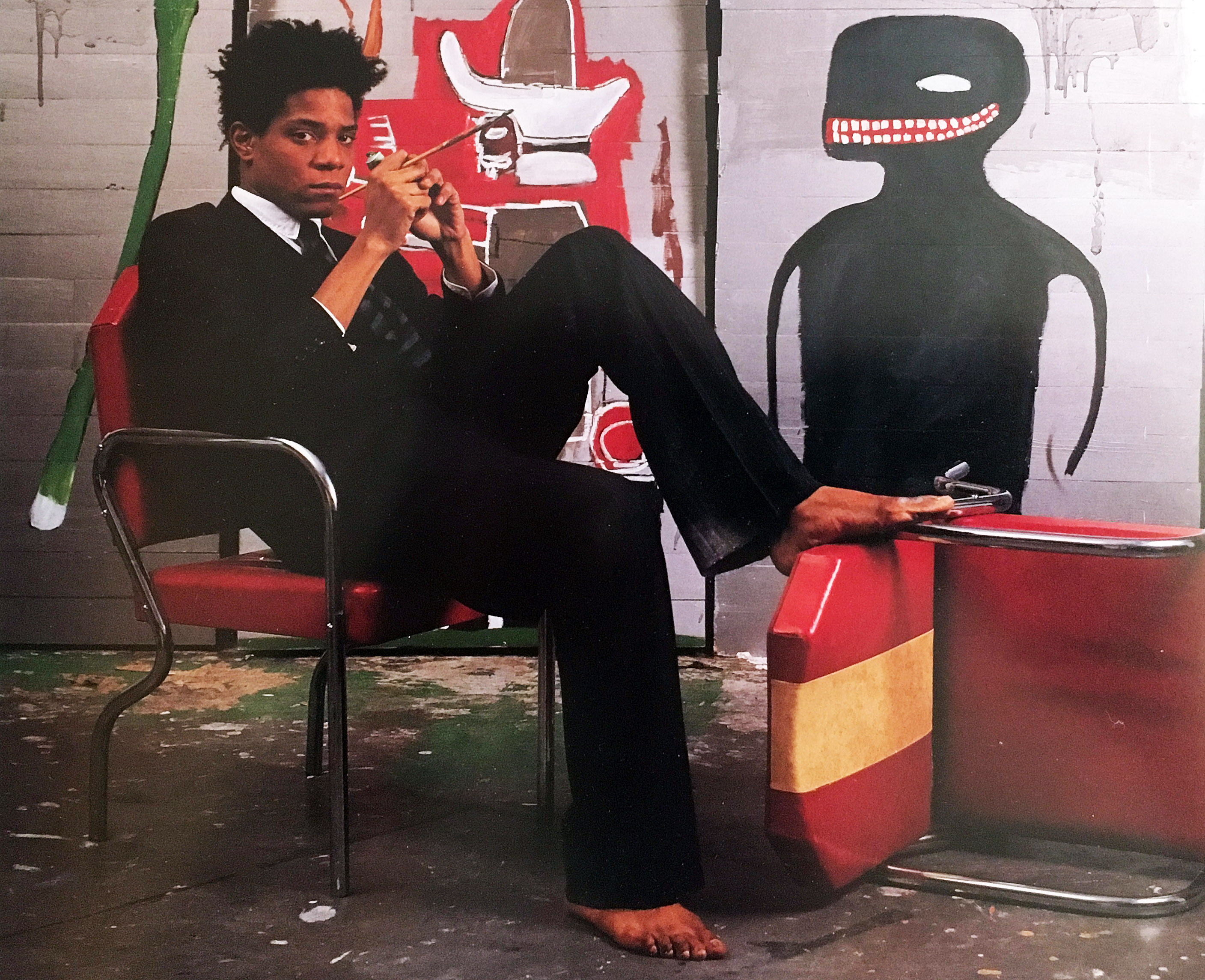
Jean-Michael Basquiat at Great Jones Studio, 1985

In the spring of 1971 when I had just graduated from Wayne State University with an M.A. in painting, I was making surreal landscape paintings. I had not heard of Jean-Michel Basquiat, of course, because he was only ten years old and attending St. Ann’s Catholic school in New York City. Soon after that he was bound for San Juan, Puerto Rico with his father and family for three years, before returning to Brooklyn and finishing high school.

And it wasn’t until the late 1990s when my son Julian Teachworth was finishing his senior year at The Cooper Union in NYC that he told me Basquiat’s work had influenced his painting. It was only then that I became familiar with his work, and that was ten years after his tragic death from a heroin overdose at the age of twenty-seven in 1988.

Andrew Blauvelt, Director of the Cranbrook Art Museum, said, “The exhibition and accompanying catalogue presents New York City in the late 1970s and early 1980s through the prism of Jean-Michel Basquiat’s art and provides a window into the art-rich time that he inhabited and impacted so profoundly. Ultimately, this exhibition will attest to Basquiat’s virtuosity in formation–the creative impulses that yielded a distinctive voice, but also the many diversions or paths he explored as he was developing a signature style.”

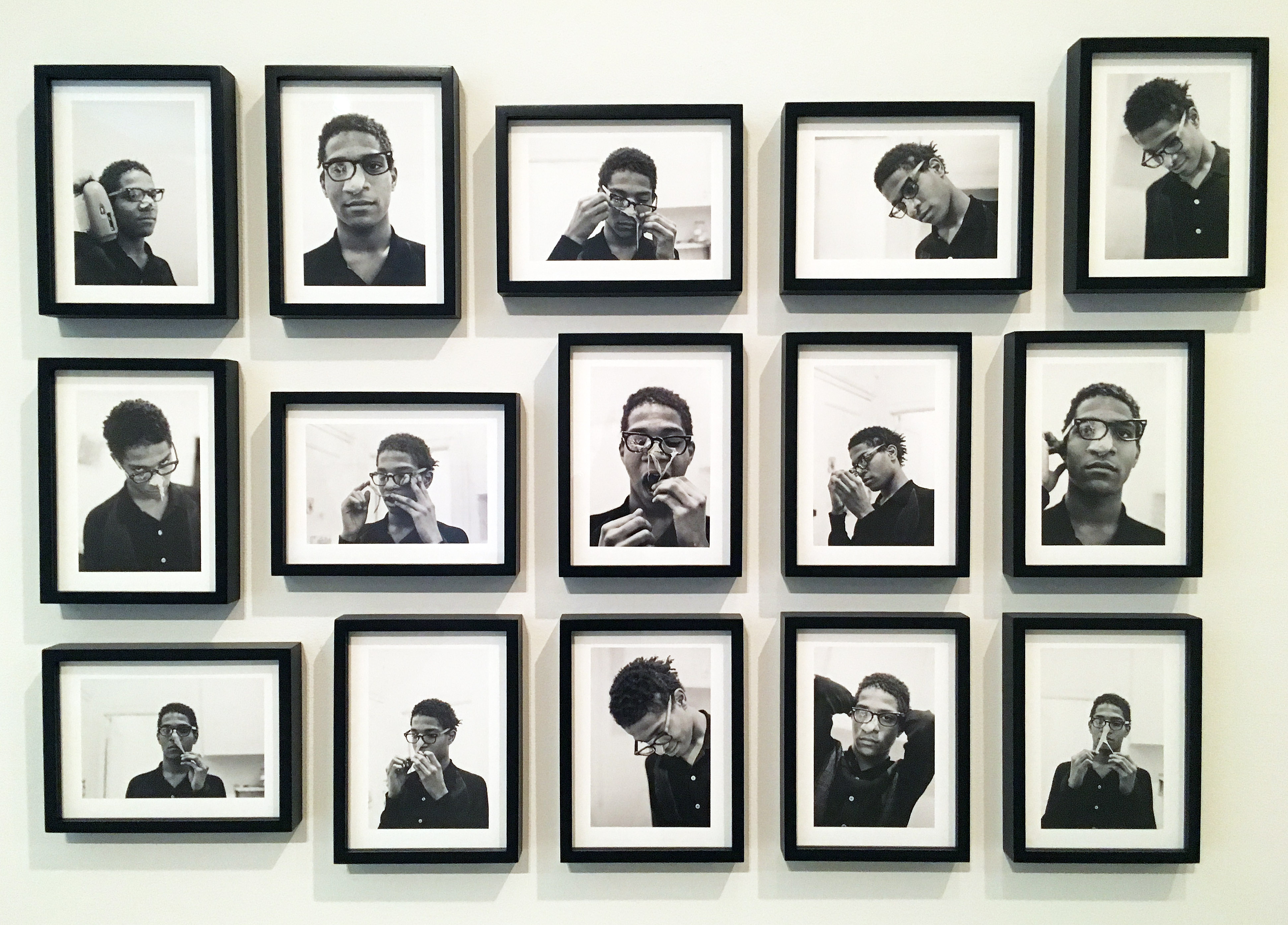
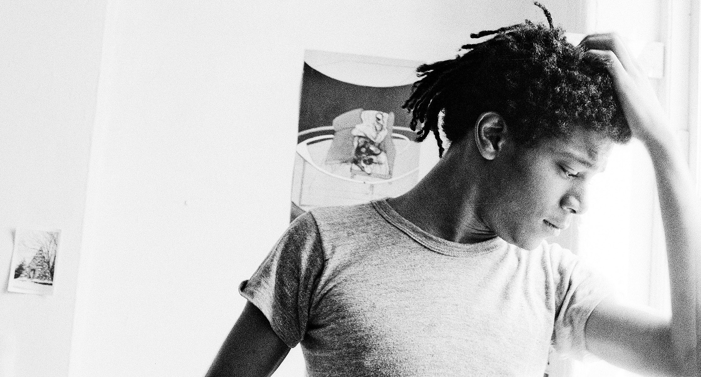
Alexis Adler, B&W photographic images of Basquiat performing in the apartment, 1979

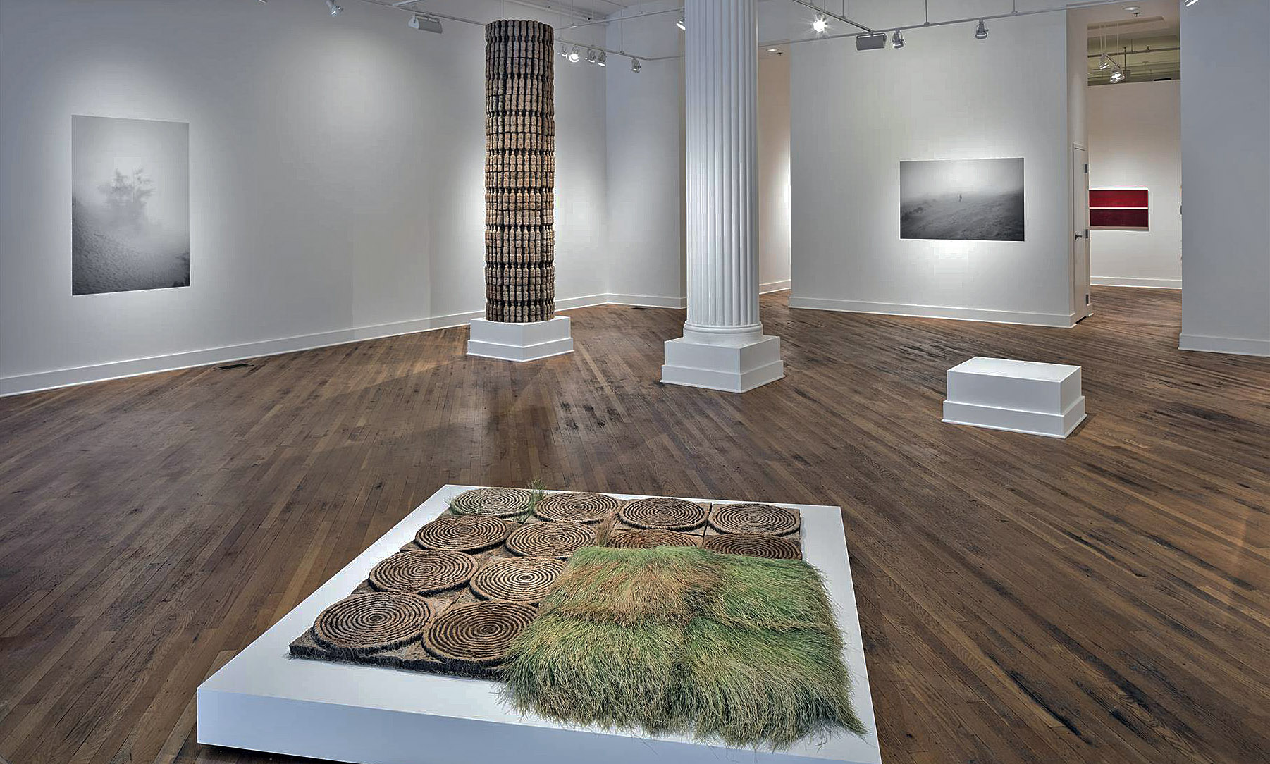
Jean-Michel Basquiat first appeared in New York City in 1980 depicting street graffiti using neat block letters and his SAMO© tags on the surrounding streets of lower Manhattan. It was these early years when Basquiat started dating Alexis Adler and living with a close friend, Felice Ralster, that is the subject for this new exhibition at Cranbrook Art Museum: BASQUIAT BEFORE BASQUIAT: East 12th Street, 1979-1980 that opened November 17, 2017. Basquiat and Adler moved into a small apartment at 527 East 12 Street, commonly referred to as the East Village, and became part of the punk culture largely based around musicians and artists at the Mudd Club scene.

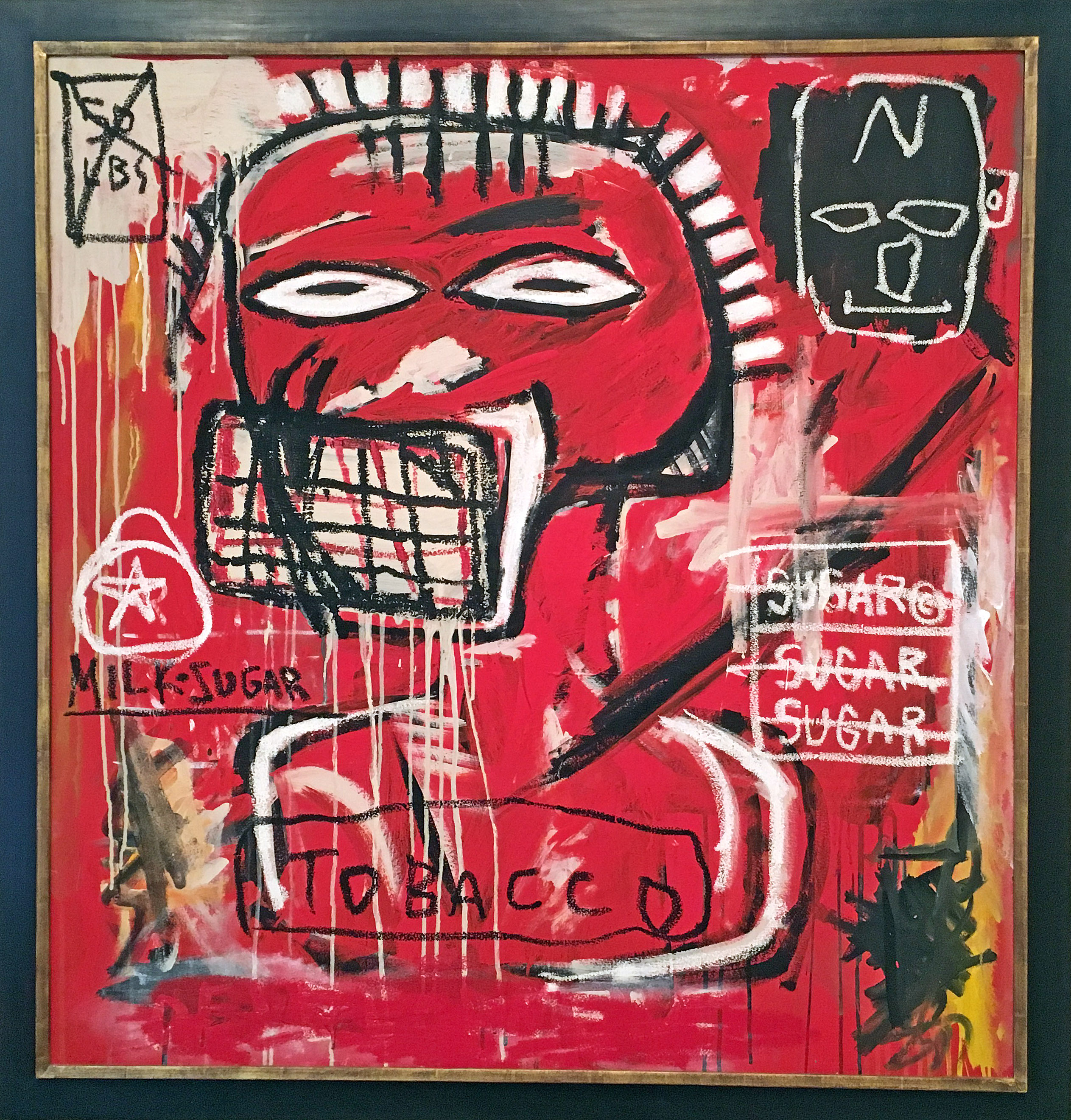
Jean-Michel Basquiat, Untitled, Acrylic and Oil Stick on canvas. 1984

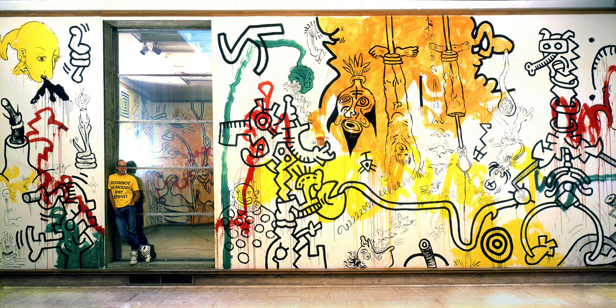
It was at P.S. 1 in a group survey show, New York / New Wave where his work was a step above graffiti street art, as illustrated by his ability for putting things together: masks, words, marks and disconnected phrases. The exhibition included Keith Haring, Robert Maplethorpe, and Andy Warhol. The day after the opening he returned home to Brooklyn around 6:00 in the morning to proclaim to his father, “Papa, I’ve made it!”

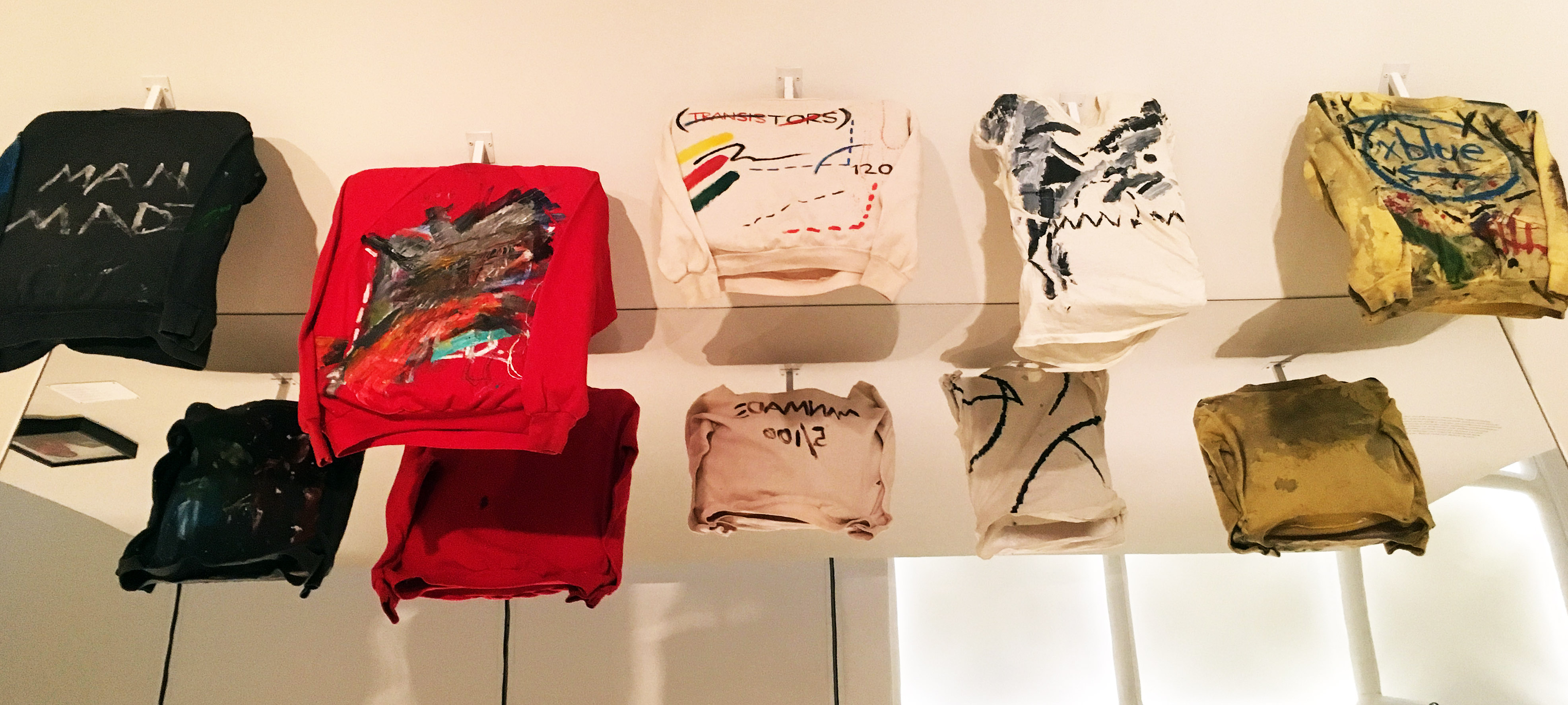
Basquiat made money for paint and his share of the rent by selling T-Shirts on the street. 1979

Basquiat’s riff with his father and his association with Keith Haring and Kenny Scharf, led him to Club 57 and a strong and close relationship with who would become his mentor, Andy Warhol. Back then, Basquiat made his living by selling clothing on the street. On display at the Cranbrook exhibition are T-Shirts he transformed into living works of art to be worn and celebrated as part of his artistic practice.

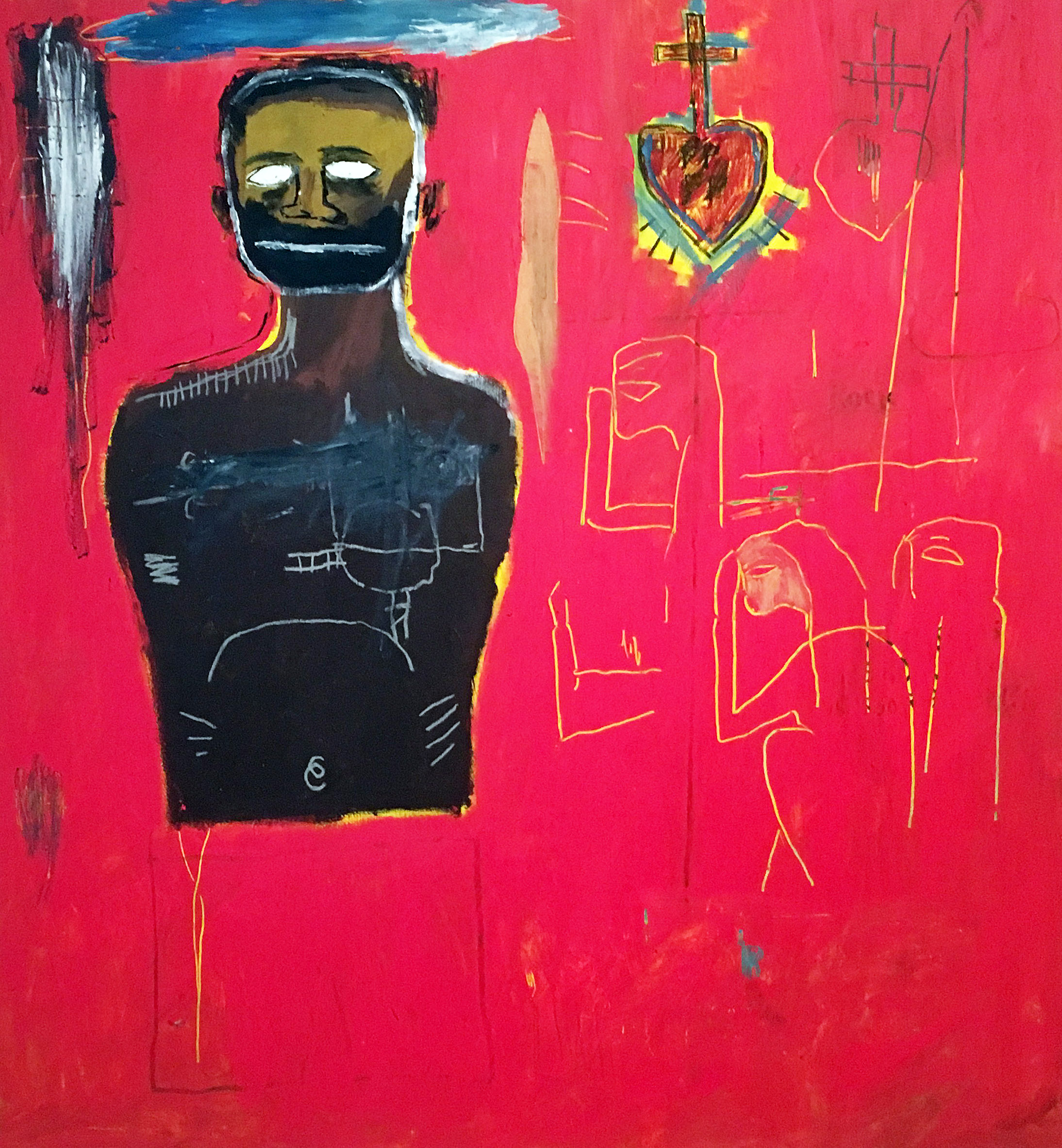
Jean-Michel Basquiat, Untitled (Cadmium) Oil, oil stick, acrylic on canvas 1984

Looking back, I think we see Jean-Michel Basquiat as an artist who emerged from being a graffiti artist during the “punk scene” era, and then ended up as a celebrated artistic phenomenon. Skillfully, he brought together disparate traditions, practices and unconventional styles that established a baseline for artists to come. He was an African-Caribbean artist, who came along at a time when the art world was dominated by exhibitions of Minimal and Conceptual art.

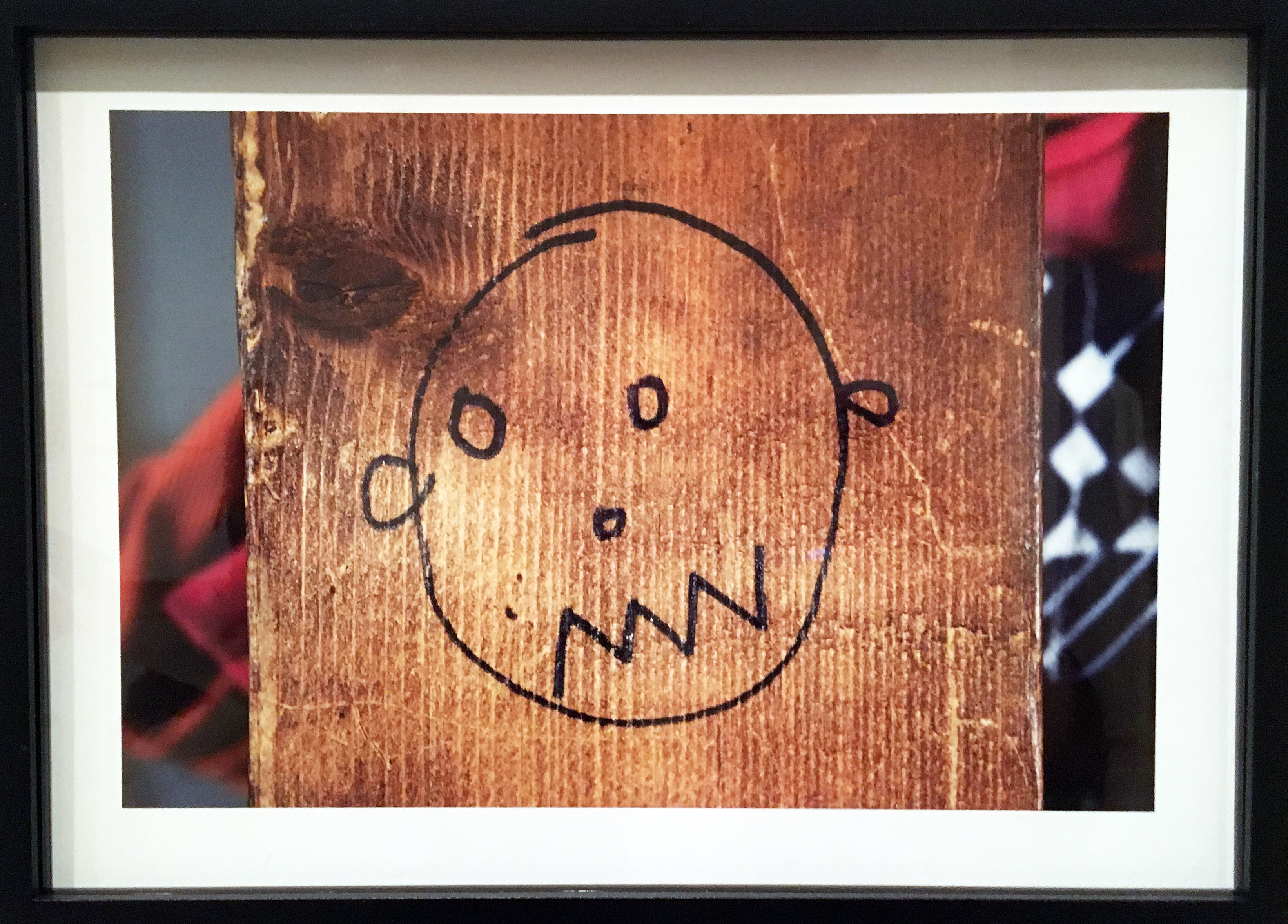
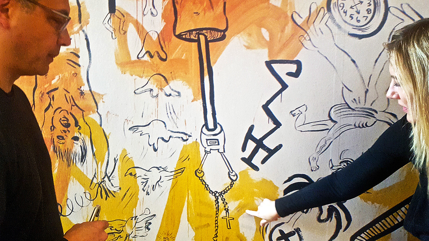
Alexis Adler, Drawing by Basquiat on wall of apartment, Archival pigment print, 1980

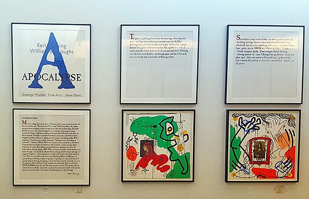
Using an archival approach, much of this exhibition comes from the collection of Alexis Adler, and a visit to the exhibition Basquiat Before Basquiat deepens your understanding of this artist while simultaneously providing the viewer with a context of his early work in 1980s New York City. Concurrently, the museum is hosting exhibitions by Keith Haring, Maya Stovall and Ryan McGinness.

Alexis Adler, B&W photograph of Baquiat in the apartment, 1981

BASQUIAT BEFORE BASQUIAT: East 12th Street, 1979-1980, organized by the Museum of Contemporary Art Denver.

Cranbrook Art Museum

Through March 11, 2018


Culture at the Crossroads @ Toledo Art Museum

Glorious Splendor: Treasures of Early Christian Art

Byzantine, Gold Pendant Cross with Openwork Decoration and Sapphires, 6th–early 7th century. 11.3 x 8.0 cm; weight: 64.8 g. Private Collection, North America


It was a family feud that would irrevocably shape the culture of the Western World. In 312, Constantine, who for years had challenged the legitimacy of Emperor Maxentius— his brother-in-law— led an army toward Rome seeking to depose the alleged usurper. Establishing an encampment near the Tiber River, on the eve of battle Constantine famously had a vision of a cross in the sky, which he interpreted as mystical assurance of victory. The following day, he ordered the symbol painted on the shields of his soldiers, who subsequently defeated Maxentius’ army at the Battle of Milvian Bridge, establishing Constantine as the emperor of Rome. Whatever the precise details of the account (and they do vary), it’s hard not to see the battle as one of history’s decisive turning points. It resulted in the legalization of Christianity in Rome and, eventually, the establishment of a second Roman capital in Constantinople, later the heart of the Byzantine Empire.

Glorious Splendor: Treasures of Early Christian Art, on view at the Toledo Art Museum through February 18, offers a compelling glimpse of cultures at the crossroads, revealing the fluidity of Roman visual culture during the empire’s slow transition toward Christianity. The exhibition is an intimate single-gallery display of 30 precious objects– mostly on loan from other collections– dating from the 2nd through 7th century. The instructive selection of objects highlights the perhaps surprising cross cultural exchange between Christian and Pre-Christian Rome, not merely in subject matter, but in media, style, and technique

Parthian, Gold Earrings with Woven Wire, Granulation, and Garnets, 1st century A.D. Length of each: 8.0 cm.; weight: 11.2   and 11.4 g. Private Collection, North America


Upon first appearance, these nearly two-thousand year old objects are perhaps disappointingly small, but they reward close inspection. Several pairs of magnifying lenses, thoughtfully supplied by the museum, allow visitors to get in close. Most of these artifacts loosely fall under the umbrella of decorative art, and include pendants, bracelets, broches, rings, earrings, cameos, belts, and other finely crafted jewelry. They’re almost all made of gold and are frequently adorned with precious stones.

Byzantine, Gold Openwork Bracelet Set with Gems and Pearls, 6th century. 10.5 x 9.5 x 4.0 cm; weight: 239.6 g. Private Collection, North America


Most of these artifacts are comparatively small, but all are exquisitely handcrafted. A Byzantine cross-shaped gold pendant is a tour de force, its surface adorned with vegetal patterns and sapphires. The exhibition’s pièce de résistance is a dazzling 6th century bracelet studded with gems and pearls, the sinuous intertwining tracery on its interior anticipating the elaborate 8th century Hiberno-Saxon decorative knotwork later made famous in illuminated manuscripts like the Lindisfarne Gospels and the Book of Kells. An explanatory note on the display case reminds us that these fine works were crafted after the fall of the Roman empire, checking the notion that the dark ages marked a universal cultural decline.

Byzantine, Silver Paten Depicting the Communion of the Apostles, 547–50. Diameter: 40.2 cm; weight: 1813.0 g. Private Collection, North America


Some of these objects are freighted with real historical significance. A small golden bust of the assassinated Emperor Licinius II is a rare image of the emperor that survived his damnatio memoriae (damnation of memory), a posthumous dishonor in which the Roman senate required all images of the disgraced emperor to be destroyed. And a silver patin (a plate used to hold the bread during the celebration of the Eucharist) from the 6th century portrays the earliest known depiction of the Communion of the Apostles.

Greek, Amethyst Intaglio Depicting Eros Binding the Arms of Herakles, Set in a Gold Pendant, 2nd Century B.C. 6.5 x 3.8cm; gem: ca. 4.8 x 3.0 cm; weight 39.3 g. Private Collection, North America

Perhaps the biggest surprise of the exhibition is that most of these works, despite the title of the show, are hardly “Christian” as we might expect. There’s an abundance of imperial propaganda, including a handsome silver shield portrait of Rome’s first emperor, Augustus, who more than any other Roman emperor capitalized on art as a means of political persuasion. There’s also an abundance of mythological characters which (in a very literal sense) make cameo appearances– Helios, Eros, Herakles, the Three Graces, and Venus (who also appears in her Greek iteration as Aphrodite). In some of these works we see prototypes for the more explicitly Christian visual culture which would follow. A golden pendant depicting the sun god Helios shows thorny rays of light emanating outward from the deity’s head, a visual precursor of the halo, so ubiquitous in subsequent Christian art.

Glorious Splendor is a small but worthwhile exhibition that hints at the gradual seismic shift in Western visual culture during Christianity’s first few centuries, reminding us that early Christian art didn’t emerge in a vacuum. While the battle of Milvian bridge is understandably viewed in retrospect as a decisive, watershed moment, this exhibition reminds us that the view from the ground was much more nuanced, and offers a rare opportunity to see lucid examples of Christian and Classical visual culture jostling at the crossroads.

Toledo Art Museum  – Through February 18, 2018


“Evidence of Things Not Seen” @ College for Creative Studies Center Galleries

Installation image & Four Artists: Rashaun Rucker, Sabrina Nelson, Richard Lewis, Mario Moore, 2017

The hardest part about drawing connections between the pieces in Evidence of Things Not Seen—a four-person show featuring works on paper by Richard Lewis, Mario Moore, Sabrina Nelson, and Rashaun Rucker, on display at CCS Center Galleries—is not the lack of bridges between the work, but the abundance thereof.

In simplest and most general terms, this is a drawing show, so all the large, stand alone works, as well nearly two dozen small works in Nelson’s Baldwinning series, are aesthetically unified as hand-drawn, mostly in graphite and charcoal. These are also all artist of color, dealing with issues of Black representation, and presenting Black subjects. Despite each artist having radically different interests, influences, and approaches to the way they look at their subjects, the gallery is utterly harmonious and unified in its aesthetics. Black on black, in shades of grey.

Installation image, CCS Center Galleries, 2017

Then, too, there are an abundance of interpersonal connections underpinning this group of artists. Lewis and Nelson were studio mates during their undergraduate years at College for Creative Studies (where Nelson now teaches), and she and another close fellow, poet Jessica Care Moore, appear as characters in Lewis’s works. Nelson is also mother to Mario Moore, who looked up to Lewis, by way of his connection to Nelson, and followed his exact educational path, starting from Cass Technical High School, through undergraduate studies at CCS, and on to pursue an MFA at Yale. Just as Lewis and Nelson hang together in one generation, Moore and Rucker represent the next (literally, in fact, because Nelson is Moore’s mother), and it is fascinating to see the generational divisions and similarities between the two cohorts.

Richard Lewis, Rent Party, 48 x 60″ Charcoal, Pencil 2016

For example, one might highlight the magical realism present in the works of Lewis and Rucker, who both favor the fantastic and the uncanny, rather than the more directly representational portraiture of Nelson and Moore. Rucker presents a body of work around a single theme: the visual merging of portraits of young black men with the bodies of pigeons. With mug shots as his source material, Rucker is seeking to emphasize the correlation often made between young, urban, black male populations, and undesirable vermin, such as pigeons. Faces morph into beaks, a head springs from the body of a pigeon, or wings and beaked head emerge from the twisted legs of a fallen human body. Likewise, Lewis’s subjects occupy a time-compressed and surrealistic world, where Sabrina attends a rent party with James Baldwin and Frida Kahlo, or drives home at night with an nkisi figure in the passenger seat. These nkisi are a traditional African spiritual sculpture form, often covered with individually driven nails, and seen as protector spirits, both in terms of their cultural origins, and in terms of Lewis’s repurposing of them as subjects.

Mario Moore, Lucia, 2015, Graphite on Paper

Or perhaps one could draw another parallel between Nelson and Lewis’s tendency to make cultural references, while Moore and Rucker are making portraits from everyday figures. In addition to using his studio-mate as muse, Lewis’s tableaux are recast and reconstructed scenes from film noir features, such as Shipwrecked and Saints and Sinners. Nelson, of course, takes James Baldwin as her muse, and the corner of the gallery devoted to her work is papered with nearly two dozen examples of individual portraits she has drawn of the writer, in addition to filling four complete sketchbooks with nothing but drawn and stitched James Baldwin portraits.

Sabrina Nelson, Baldwinning, 2016-17, Sketchbook drawings, Glclee prints, micon ink, gold ink, silver ink, thread, and video

“One of the reasons I started drawing James Baldwin is because Jessica Care Moore invited me to the James Baldwin conference in Paris,” said Nelson, during a tour of the gallery. “She was doing a plenary there with three other artists, called “What Would James Baldwin Do?” It was about him being an artist, and as an artist, what is your responsibility in the world? What do you say, and what is your weaponry? For her it is her poems, and for me it is my hands and my drawing and my painting.”

Sabrina Nelson poses with her many images of James Baldwin.

One sees the love of reading and writers transferred from mother to son, as all of Moore’s hyper-realistic, large-scale portraits feature women in his life, taking a break from reading to look at the viewer. Despite Moore’s extremely straightforward and beautiful renderings of women—many of whom were classmates at Yale, as well as his girlfriend—contain their own sly cultural references, in the telling detail of the book they are reading. But more arresting in these works is the ease and comfort with which these women seem to meet the gaze of the artist and the viewer on entirely their own terms. Unlike Rucker’s pigeon-hybrids, who seem to search the viewer for evidence that they can be seen at all, Moore’s women let you know that they are not to be objectified.

Richard Lewis, They Drive by Night, 26 x 40″ Conte crayon on Rives BFK

One could weave connections through these powerful works for days—the energy fairly radiates between them—but there’s only just time to catch this show before it closes, so I’ll end with an admonition to take some time with it before the December 16th closing. One can hardly build a case for the connections within Evidence of Things Not Seen, after all, if you don’t go see it for yourself.

Evidence of Things Not Seen continues at CCS Center Galleries through December 16.

Susan Goethel Campbell @ David Klein Gallery

Susan Goethel Campbell: Faulty Vision, David Klein Gallery

Installation image of front gallery.   All images courtesy of David Klein Gallery 2017

Susan Goethel Campbell’s installation “Faulty Vision” currently showing at the David Klein Gallery has all of the ingredients of the mise-en-scene of a surreal film. Like a Japanese garden it is challengingly eye-opening while meditative. In keeping with Campbell’s engagement with both architectural and “natural” space, “Faulty Vision” is designed as a response to the Beaux-Arts architecture of the Klein Gallery itself. The Grand Entrance, to use Beaux-Arts terminology, of the gallery, entering off of Washington Boulevard, Detroit’s premier Beaux-Art avenue, is activated by Campbell’s large, atmospheric black and white dune-scape photos seamlessly embedded into the walls; her uncanny, actual sized, cast earth and grass column echoes the classical Doric column next to it; magically engineered grassy, target-like images float in the middle of the gallery space; and black and white photos of planet-like orbs float around the space, all suggesting a strange landscape indeed. Each of the objects and images has evolved from the trajectory of recent related, but separate, projects that collectively comprise Campbell’s hybrid artistic practice. It is an elegant albeit enigmatic installation to contemplate.

Susan G. Campbell, “Dune No. 2,” 2017, Black and white digital print, 40” x 60”

Trained as a printmaker, it has become a method and process of her practice to see and think in multiple images and variations of those accumulations, as well to consider the processes of the “natural” world (germinating seeds and growth) and of the engineering processes of industrial manufacturing itself that compete with nature. For years now Campbell herself has become a kind of research and development factory, experimenting with organic materials such as seeds, plants, leaves, and even more ephemeral conditions like light, night sky and air itself. The overarching gesture then of “Faulty Vision” is to, it seems, if not challenge, then assay and respond to the symbolic permanence of that Beaux-Arts designed gallery space. Early in the twentieth century, Detroit and most American cities adopted a pared down version of Classical Greek and Roman architectural models, that have historically symbolized the enduring strength and permanence of European culture.

Susan G. Campbell, 4“ Ground no.6 (floor installation), 2017, 51”x51”

When closely examined the stunning earth work sculptures that are installed in the main gallery are all ironically modeled on what were once called “disposable” objects. Campbell’s column is made of hundreds of cast-earth and grass water bottles, grown in molds of the plastic bottles, to form a simulated, fluted Doric column. It is an over-the-top critique of the bombast of classicism and at the same-time beguilingly baroque.  Situated in the gallery’s windows facing Washington Blvd., as if window-displays of consumer goods, are stacks of cast-earth and grass cell phones modeled on the evolving i-Phone, 4, 5, and 6 series. (As in nature phones evolve too). And echoing larger engineered earthworks (such as center pivot watering circles in contemporary agribusiness) as in “Ground No.6 (floor installation),” suggesting also ancient Native American Mound-Builder’s “ruins,” as well as many ancient, rammed earth and mud constructions. All of the materials of Campbell’s sculptures are made of natural, decomposable materials and are serious parodies of the plastic and aluminum models.

At one point in a recent talk at the gallery, Campbell alluded to the earth work of artist James Turrell and fantasized an installation of an enormous field of her own cast-earth concentric rings. “I love multiple images of the same thing…like seeing a shelf of the same product in a grocery store.” Repeating any image, such as the cell phone shape or her concentric rings, is one of the basic tropes of modern art (Warhol) and architecture (Mies van der Rohe) and belongs in any discussion of printmaking as well as mechanical reproduction. Repetition seems to insure coherence and a sense of consistency and security, versus the chaos and uncertainty of the of fickleness of nature. Repetition also is the beginning of making a pattern that creates structure and strength.

Susan G. Campbell, “Dune No.1,” 2017, Black and white digital print, 40”x62”

In the smaller rear gallery, there is a large B&W photo of a sand dune with two human figures seeming to lean into a struggled walk across the horizon. In the grand scheme of things, of the world around them, with enormous emotional sky overhead and menacing mounds of sand dune and dune grass underfoot, they seem remarkably inconsequential and existentially without destination. In a sense this image is a key to the whole exhibition in projecting a heroic, man against nature, Romantically Sublime, vision, in contrast to the constructed space of the gallery. While this photographed landscape captures the same organic materials as her engineered works—earth and grass, such as in Ground No.6– it is chaotic and foreboding, the exact opposite of Campbell’s built organic world. Three other dune photos, with haunting fog and solitary figures, also suggest a counter to the controlled order of Campbell’s engineered pieces and create a narrative tension to the whole exhibition: nature versus the built world.

Susan G. Campbell, “Water Planet No. 5,” 2017, Digital print on polyester, spray paint 22 3/4 x 30 5/8″

A third group of images triangulate Campbell’s vision and offer a surreal contrast to the architectural and natural conditions of landscape or environment that determine the rest of Campbell’s projects. The “Water Planets” are a series of images of planet-like orbs pictured as composed of water, floating in a hauntingly empty space. “Water Planet No.5” has two truncated orbs, one eclipsed in shadow and one of water, situated in a matte gray ethereal space. Each “planet” exists in ultimate isolation and, one imagines, can virtually never touch another or conjoin with the other. The “Water Planets” are an uncanny and stunning invention and throw all of “Faulty Vision” into another realm of thought and are superior evidence of Campbell’s considered world.

In “Faulty Vision,” Campbell is responding to an architectural space with its own specific, highly evolved Classical ideology. The David Klein Gallery is not simply white walls upon which to hang her work. The Beaux-Arts history, of which the Klein gallery is a part, is virtually the result of the fantasy of authority and permanence that is western culture. It is the result of a weird evolution and Campbell’s fragile, water bottle, grass and dirt column, circles and i-Phones are a remarkable response to that history. There is an umbrella of ambiguity that protects the complicated equation of “Faulty Vision,” that allows for many readings and wonderings, and Campbell plays on that.

Susan Goethel Campbell: Faulty Vision, David Klein Gallery  Through December 16, 2017

Keith Haring @ Cranbrook Art Museum

Dark Haring Rises: 30 Years After its Installation, Keith Haring’s “The Detroit Notes” reappears at Cranbrook Art Museum

Keith Haring at Cranbrook Art Museum, 1987 Photograph by Tseng Kwong Chi, 1987 © Muna Tseng Dance Projects, New York Art work: © Keith Haring Foundation, New York.

Keith Haring is internationally known for his ebullient and evocative figure drawings, rising to art world fame in the mid-1980s on a wave of graffiti-influenced NYC street culture. Like many of his contemporaries, Haring was part of an early wave bringing art to market as a prestige commodity, and like many of his fellows, he died at a lamentably young age due to complications connected with AIDS—in Haring’s case, at the age of 31, in 1990.

Keith Haring, Apocalypse (1988), by Keith Haring and William S. Burroughs (installation view)

As part of its Fall program, the Cranbrook Art Museum presents a small suite of works by Haring that bookend his career, Keith Haring: The End of the Line. The centerpiece of the exhibition is a reconstruction of a temporary mural, “The Detroit Notes,” installed at Cranbrook in 1987, bracketed on either side by a gallery of very early and very late work by the artist.

Cranbrook Art Museum Director Andrew Blauvelt poses in the reconstruction of “The Detroit Notes” 1987 mural by Keith Haring

“There was the sort of public persona of Haring, and the kind of drawing that he would put out in public, versus the kind of things that he would do post his AIDS diagnosis,” said Andrew Blauvelt, Director of the Cranbrook Art Museum, by way of introducing a wall of documental photographs taken by Haring’s friend, artist Tseng Kwong Chi, who also died of AIDS in the 1990s. These photographs capture Haring at work adorning New York City subway station advertisements with his signature iconography, and are mounted opposite a rare example of one of the actual billboards. In the piece, Haring’s work is juxtaposed with and ad for Perdue Franks asking, “Should you buy a hot dog from this man?” and demonstrates the artist already in command of the cartoonish and highly abstracted figures that would populate and morph throughout the course of his career.

Also on display is Haring’s thesis project from SVA, a video titled “Painting Myself into a Corner,” wherein the young artist does literally that. “He did a lot of work that was floor-based, [Jackson] Pollack-esque,” said Blauvelt, “and then picked up the kind of iconography that he was known for. That video showed him working in a performative way, and we wanted to pull that out, because he always thought of his practice as performative.“

This aspect of Haring’s work stands in conversation with another of the shows in the Fall program, Maya Stovall’s Liquor Store Theatre Performance Films, which combine cultural anthropology, dance, and performative public spectacle into improvisational encounters between Stovall (and other dancers) and random Detroiters on their way in and out of liquor stores.

Blauvelt and Senior Curator Laura Mott point out details in the Keith Haring mural

“A lot of these historical art figures, like [Jean-Michel] Basquiat and Haring, didn’t quite fit into easy categories, and the same is true of Maya Stovall,” said Blauvelt. In her first solo museum show, Stovall presents a set of existing works, including those that were a part of this year’s Whitney Biennial, as well as a new piece in the series commissioned by Cranbrook. Just like Stovall’s newest video work, Haring’s mural was a commission for the museum, and the exhibition happens to coincide with the 30-year anniversary of the mural’s presentation, which was also accompanied by a lecture.

“I started drawing in the subway in New York City in 1980,” said Haring, during the lecture, which took place on September 25, 1987. “…The situation sort of presented itself almost by accident. …For the first time, it seemed like I had made something that made sense to be in public because it had a kind of communicative power.”

Indeed, while Haring’s style is instantly recognizable, it is perhaps the somewhat blank nature of his figures that make them so accessible and universal. But the Cranbrook murals reveal a new phase in Haring’s works, what Blauvelt characterizes as “dark Haring,” and speculates foreshadows the public revelation of his AIDS diagnosis.

“He’s officially diagnosed in ’88 or ’89 with AIDS,” said Blauvelt. “But I think he understood that he was going to succumb to it, because most of his friend by that time were diagnosed.” Though Haring’s themes were often political and social, the work at the end of his life and career took a turn toward the deeply personal, and the scale reconstruction of “The Detroit Notes”—including a video of Haring executing the project—captures some of this new style.

The original subway advertisement billboard ‘vandalized’ by Haring during his run of subway art in the early 1980s.

Haring worked for two solid days on the mural—which was always understood to be a temporary installation—first laying down washes of orange, yellow, red and green, then circling back to doodle in black paint over the backgrounds. Though definitely expressing a Surrealist bent—dismembered robot-aliens and frightening, mythical demon-beasts—the work is nonetheless some of Haring’s most figurative, giving faces, albeit grotesque and monstrous, in place of the usually blank bobble-heads for which is he is best known. Bodies are rendered with genitalia, and in various states of dismemberment, televisions blare telescoping stacks of figures, a rosary hangs from a disjointed robot spine. The imagery is immersive and disturbing, and the reconstructed hallway closes in on the viewer as did, perhaps, Haring’s unshakable sense that the demons that were claiming so many of his art world brethren were closing in on him, as well.

Those looking for respite are unlikely to find it at the end of the mural hall, where the final gallery presents two late-life collaborations between Haring and notorious beat poet William S. Burroughs—Apocalypse (1988) and The Valley (1989). One is a series of illustrations made by Haring in response to an existing text by Burroughs; the second presents large-scale prints combining Haring’s images with a new work by Burroughs, developed in conversation with Haring after hearing of the artist’s interest in his writing. It is a fine meeting of two souls on the brink of darkness—Burroughs, who had written himself up from darkness (that included “accidentally” shooting his second wife, Joan Vollmer) to flourish as a gentleman junkie, and Keith Haring, who had gone from rising star into meteoric fall, finding himself at last in a corner he couldn’t paint his way out of.

Keith Haring: The End of the Line runs through March 11, 2018 in the Wainger Gallery of the Cranbrook Art Museum.

Page 51 of 75

Powered by WordPress & Theme by Anders Norén