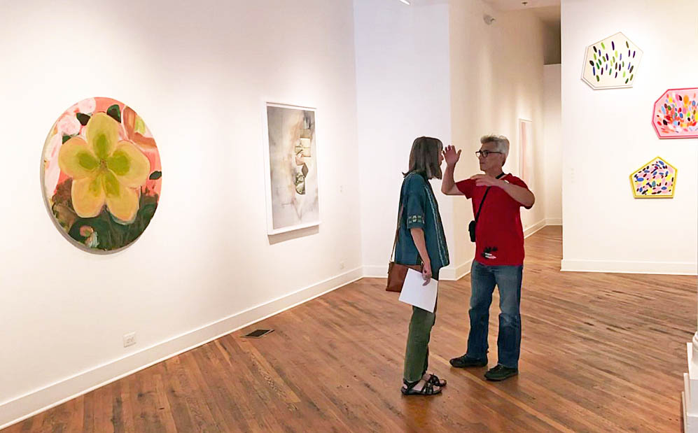
Best Times Installation at David Klein Gallery, photo: K.A. Letts
“They were the best of times, they were the worst of times…”
As Charles Dickens begins his 1859 novel, A Tale of Two Cities, he describes a historical period of political and social turbulence that is, in some ways, similar to our own. To those disposed to pessimism, 2021 might seem like a time to despair, but the artists now showing work in Best Times at David Klein Gallery beg to differ. They celebrate beauty–in the natural world, in art, in everyday objects–while remaining clear-eyed observers of contemporary life and its discontents. Color is the star of the show here; its emotional impact ranges from the giddy pastel polygons of Sylvain Malfroy-Camine to the contemplative gray formalism of Matthew Hawtin, with quite a lot in between.
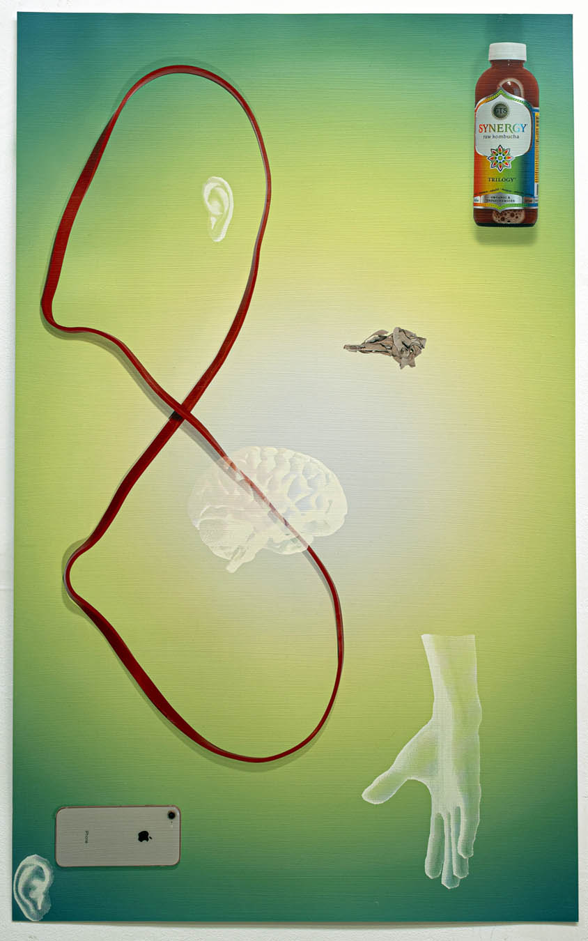
Late Stage, New Age (red exercise band infinity, sage, Kombucha, green aura) by Cooper Holoweski, 2020, mixed media, 40 x 24.75 inches, photo courtesy of David Klein Gallery
Cooper Holoweski sets the tone for the exhibit with conceptually and procedurally complex works on paper from his Late Stage, New Age series of works on paper. He seems both enamored by and critical of the technological ecosystem’s marvels. Each piece is a demonstration of complex digital processes such as inkjet printing and laser cutting in dialog with the images of technology that their use makes possible. The cheerful consumerist palette of these mixed media artworks sets up an uneasy resonance with ghostly, truncated human anatomy. Juxtaposed with mundane food and household products, digital devices intrude–a new, added component to daily life that alters the human experience of the self and the environment.
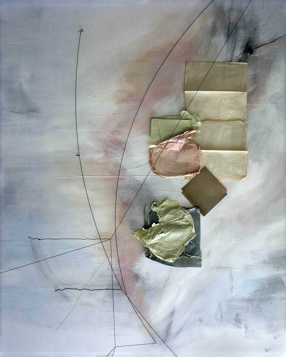
Untitled (January 15) by Lauren Semivan, 2021, archival pigment print, 50 x 40 inches, photo courtesy of David Klein Gallery
Similarly-sized archival pigment prints by Lauren Semivan make an interesting point of comparison to Holoweski’s work. Her lyrical photo collages are composed of humble detritus–fairly anonymous, slightly used paper napkins, net tulle fabric, and the like. Those diaphanous and often translucent elements are bisected with thin lines of color, transforming the shallow fictive space into elegant compositions that fool the eye. The artist describes color in her work as an “emotional descriptor.” Up close, the marks and scratches on the surface suggest imagined topographies and the physical records of human presence. Step back though, and the picture begins to pulse with the luminosity of a cloudy sky.
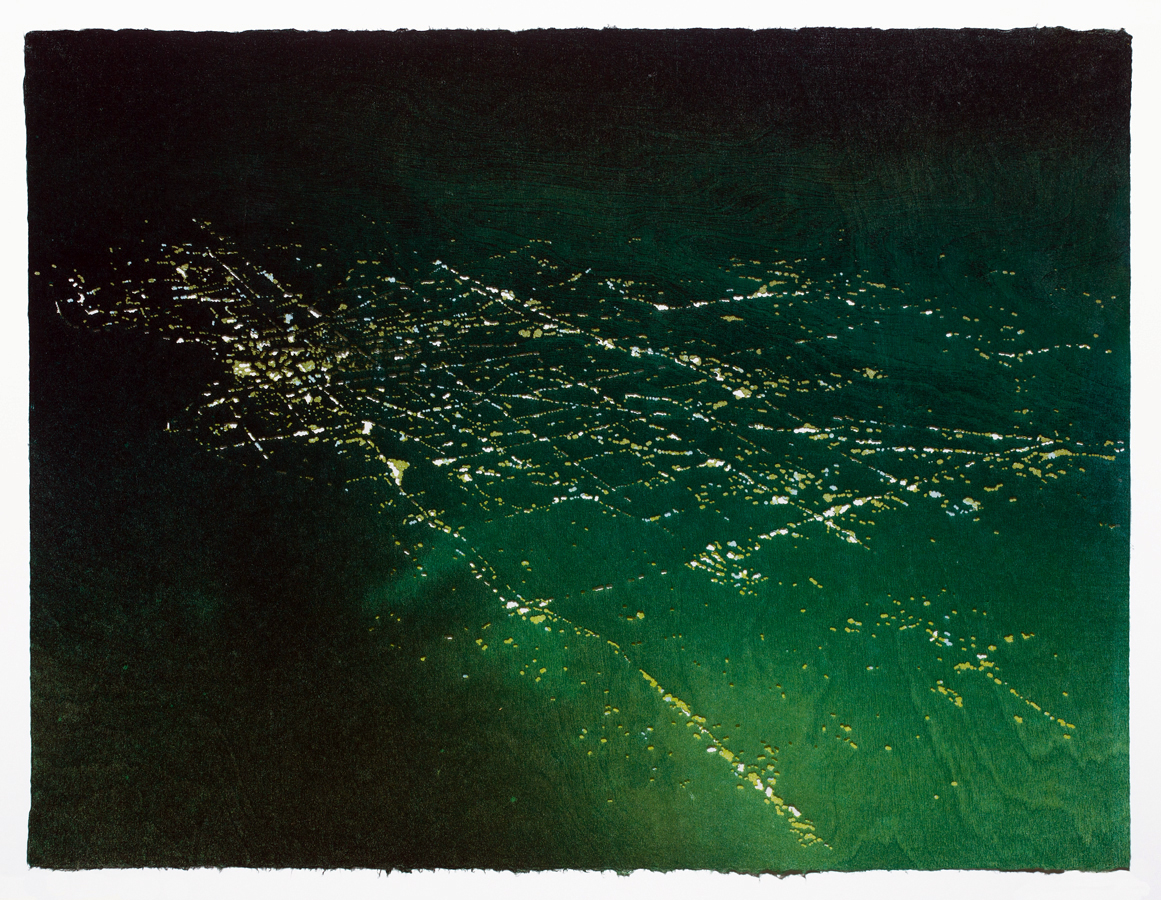
Lost City #2 by Susan Goethel Campbell, 2020, two-layered perforated woodblock print on Goyu paper, edition of 5, 23.5 x 31 inches, photo courtesy of David Klein Gallery
Susan Goethel Campbell’s color-saturated and heavily pierced works on paper describe tropical landscapes seen from above. From a distance their source in aerial photography is evident, but as we draw nearer, the subtle striations of the wood block printing plates she uses to apply color and the tiny pin pricks that admit hues from the layer beneath begin to make the landscape dissolve into a dreamy abstract matrix of lines and shapes. Goethel Campbell’s choice of colors–acid-y greens, deep blues and aquatic turquoise–are evocative of equatorial environments but avoid the picture postcard aesthetic of tourist destinations. The artist’s title for the series, Lost Cities, obliquely hints at the ephemeral nature of island ecosystems.
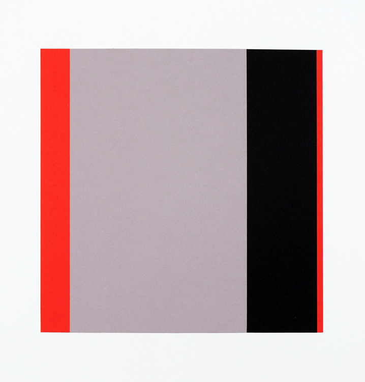
Sedition by Matthew Hawtin, 2020, collage on paper, 22 x 22 inches, photo courtesy of David Klein Gallery
In the middle gallery, Matthew Hawtin’s small, austere collages remain in the world of the handmade, but just barely. His specialty is the subtle variation of textures and lines within a minimalist esthetic. These intimate artworks force us into closer examination, where we begin to discern the tiny differences in each severely cut rectilinear line and shape. There is something restful about contemplating the warm grays juxtaposed with clear bright reds and yellows.
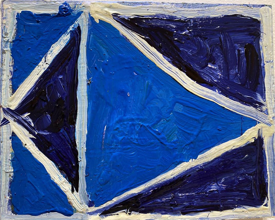
A Specificity by Ben Pritchard, 2021, oil on panel, 8 x 10 inches, photo courtesy of David Klein Gallery
For gallery visitors who hunger for something a little more visceral than Hawtin’s cerebral formalism, a collection of heavily textured, richly colored abstractions by Ben Pritchard occupies the opposite wall and might be just the thing. These lush, impasto-ed paintings in robust blues, greens, oranges and browns bring to mind the idiosyncratic paintings of the early modernist Arthur Dove. Pritchard is a painter of signs and symbols–cryptic shapes that might be stylized animals or kites or moons, but remain just outside the realm of the known. They are objects of meditation, nonspecifically directing the range of our thoughts and emotions.
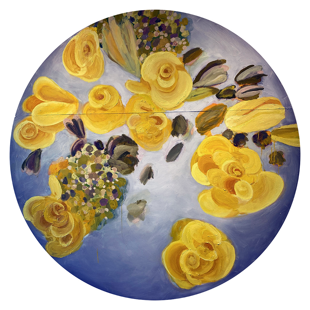
Yellow Rose Moon by Mitch Cope, 2021, oil on Masonite panel, 73 x 73 inches, photo courtesy of David Klein Gallery
From the two loosely painted floral tondos on view, Mitch Cope, who is best known for large-scale installations exploring the Detroit landscape and the objects within it, is taking a little vacation from all that. He seems to be having a great time. The frowsy, slightly retro painted blossoms on Masonite retain a kind of subtle urban surface that suggests found objects and undercuts the prettiness of the subject matter.
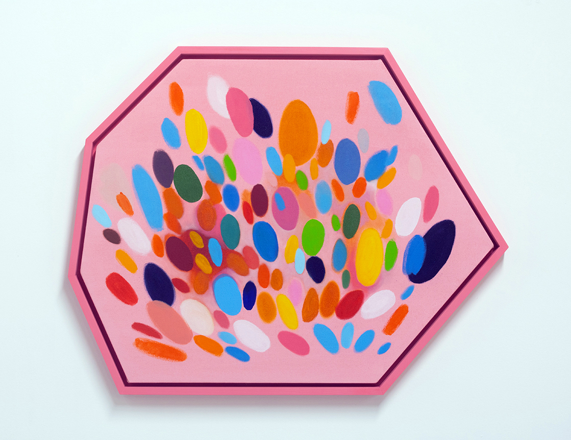
Rome by Sylvain Malfroy-Camine, 2021, oil and acrylic on canvas, 25 x 30.75 inches, photo courtesy of David Klein Gallery
Sylvain Malfroy-Camine’s many-sided paintings perhaps best describe the euphoric mood that pervades Best Times. Fenced within their polygonal pens, multi-colored ovals and swatches have escaped the earth’s gravity and float or explode inside the pictorial space. In addition to his studio practice, Malfroy-Camine is a musician, and the discrete spots of color in each artwork suggest musical notes in a jubilant symphony.
The artists in Best Times aren’t starry-eyed optimists. There are ample references to contemporary unease, from Cooper Holoweski’s cheerily ominous digital devices to Susan Goethal Campbell’s lush depictions of fugitive coastlines. But hope is a choice, and for right now, the joyful ambience of this summer collection seems right.
