
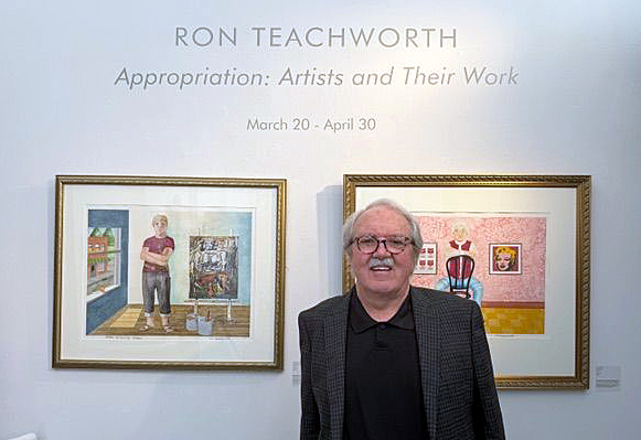
The installation of Ron Teachworth’s – Appropriation: Artists and Their Work, is currently at the Birmingham Bloomfield Art Center, through April 30. (All photos by Detroit Art Review except where noted.)
Artistic appropriation is a distinguished 20th-century practice, going back at least to Marcel Duchamp’s presentation of a porcelain urinal as an objet d’art, a metamorphosis famously extended by Andy Warhol to Campbell’s soup cans. With Appropriation: Artists and Their Work, up through April 30 at the Birmingham Bloomfield Art Center, painter Ron Teachworth gives this transformational practice a literal and engaging twist, with portraits of artists in front of prints of some of their most famous works.
Stylistically, these watercolors get much of their punch from juxtaposition: Teachworth renders the artists themselves, from Frida Kahlo to Picasso to Georgia O’Keeffe, in naïve, almost primitivist fashion, while their artworks behind them are actually tiny giclée prints – high-quality, inkjet reproductions of images – using archival adhesive, attached to the canvas surface.
Appropriation is hung in BBAC’s Ramp Gallery, an inclined corridor that, because of its intimacy, works particularly well for this show. You can spin around from Frida Kahlo to confront Wassily Kandinsky, just four feet away on the opposing wall. It all makes for an excellent compare-and-contrast exercise in an exhibition that, at heart, is an extended homage from a local artist to some of the great creative forces of the 20th century.
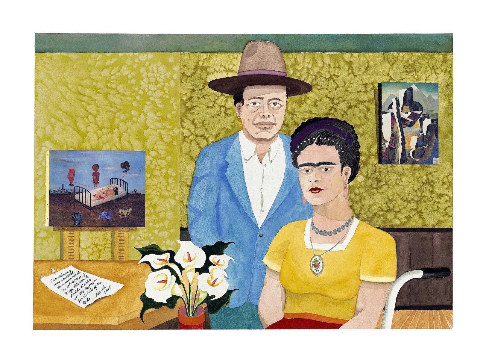
Ron Teachworth, Diego & Frida, Watercolor, 22 x 30 inches.
Diego & Frida turned out to be the catalyst for Appropriation’s other artist portraits, though at the time he executed it, Teachworth had no inkling it would turn into a series. “I wasn’t thinking about art appropriation or anything,” he said. “I just liked that show at the DIA, went to it a couple of times, and wanted to celebrate the two of them.”
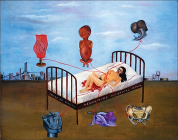
Frida Kahlo, Henry Ford Hospital, Oil on metal, 12 x 15 inches, 1932. (Courtesy of Dolores Olmedo Museum, Mexico City.)
Teachworth, who taught art and film for years in the Utica Community Schools and later at Oakland Community College, is something of a creative polymath, with several books to his credit and a 1983 feature film, Going Back. His artwork has been in any number of shows locally as well as in Pennsylvania and New York, and he also had an exhibition of paintings from Christ’s life that showed at Detroit’s Marygrove College and St. Mary’s of the Hills in Rochester. Additionally, in 2014, Teachworth got into the publishing business by founding the Detroit Art Review
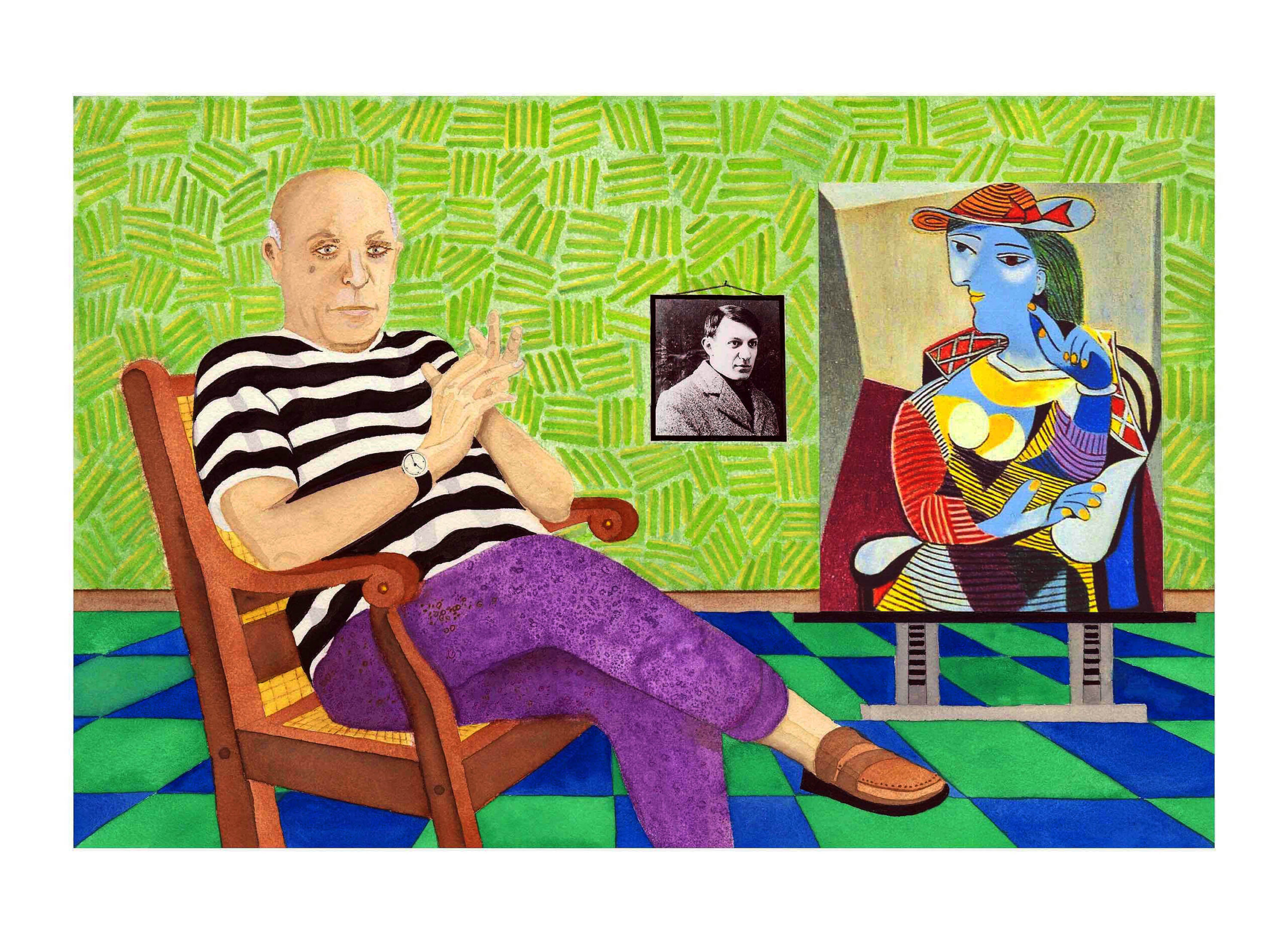
Ron Teachworth, Picasso, Watercolor, 22 x 30 inches.
Pablo Picasso in a black-and-white striped shirt stares out at the viewer from one of the most colorful canvases on display, framed by lime-green walls and a dark-blue and dark-green checkerboard floor. To the right on the wall is a black-and-white picture of the young Picasso (when he still had hair), and, on an easel, sits a large canvas, Seated Woman (Marie Therese), a Cubist portrait of the Spaniard’s lover.
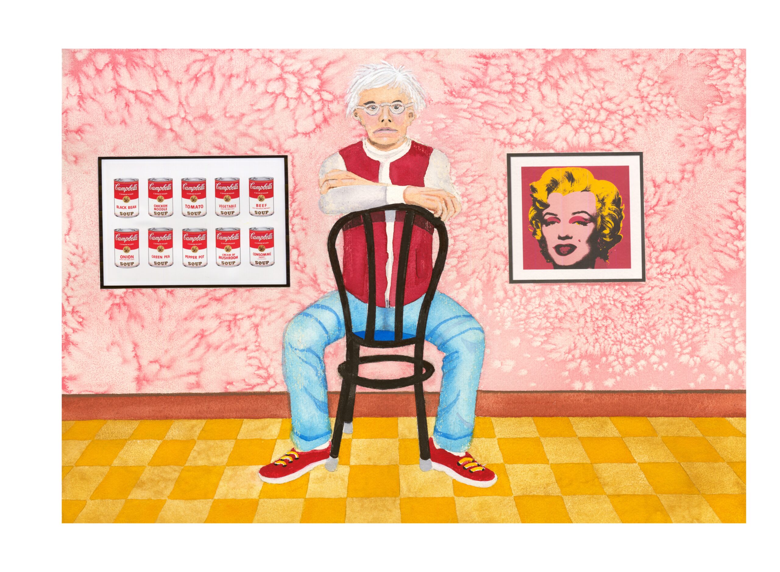
Ron Teachworth, Andy Warhol, Watercolor, 20 x 30 inches.
Pop-art celebrity Andy Warhol inhabits another color-filled frame, sitting astride a chair turned backward, his arms resting on its curved back. Red and pink dominate here, making the figure of the artist, with his white-blond hair, red vest, and red sneakers, pop out against the rosy wallpaper behind him. Continuing this theme on the left is the famous painting of the 10 Campbell’s soup cans, with their crimson-and-white label, and to the right, one of his portraits of Marilyn Monroe with incongruous red eye shadow and a red background.
Teachworth’s other artistic subjects include Georgia O’Keefe, Romare Bearden, Edward Hopper, William DeKooning, Andrew Wyeth, and Basquiat. In a helpful nod to the fact that not everyone will be familiar with every artist, Teachworth has added short biographies to the labels accompanying the works.
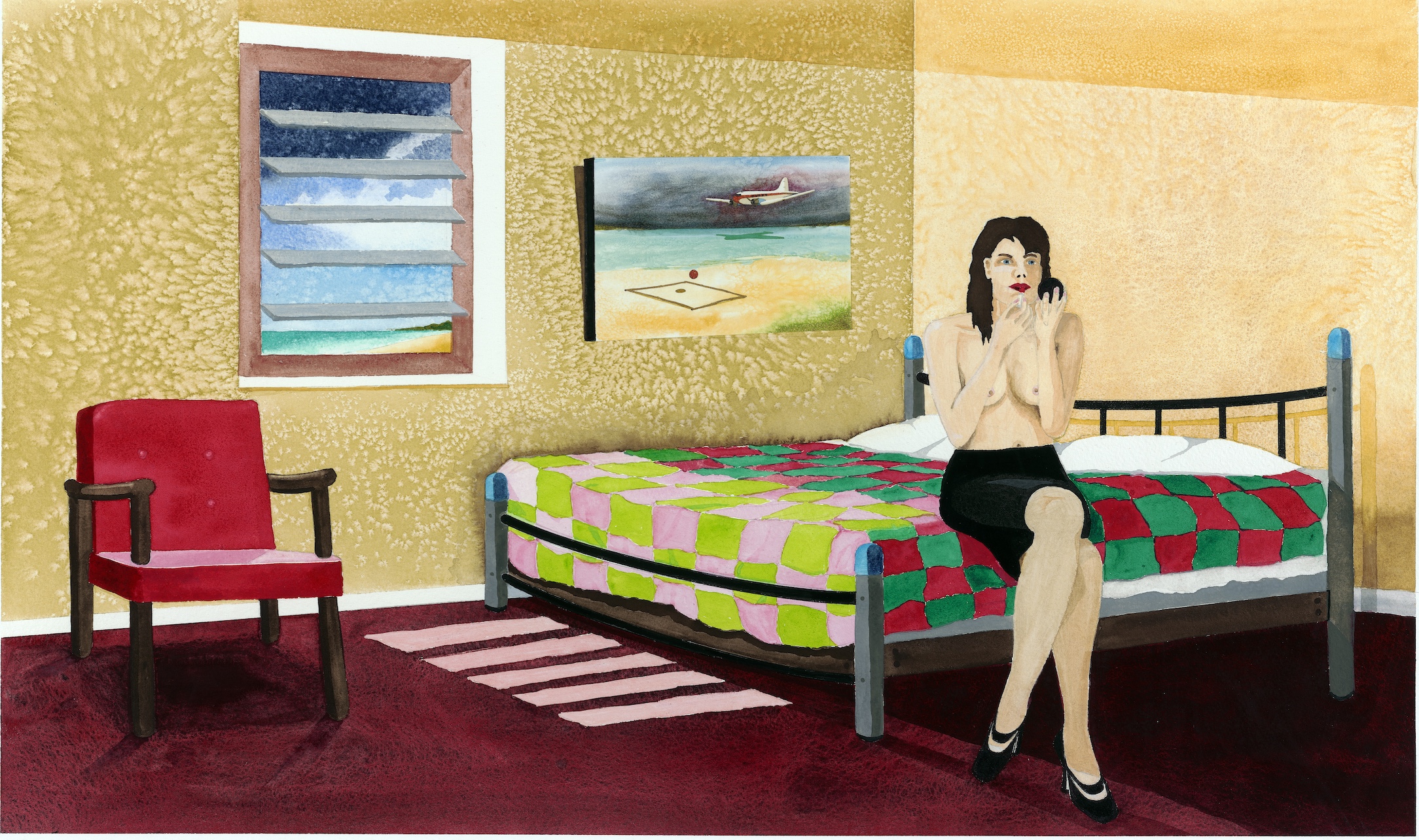
Ron Teachworth, Lipstick, Watercolor, 22 x 33 inches
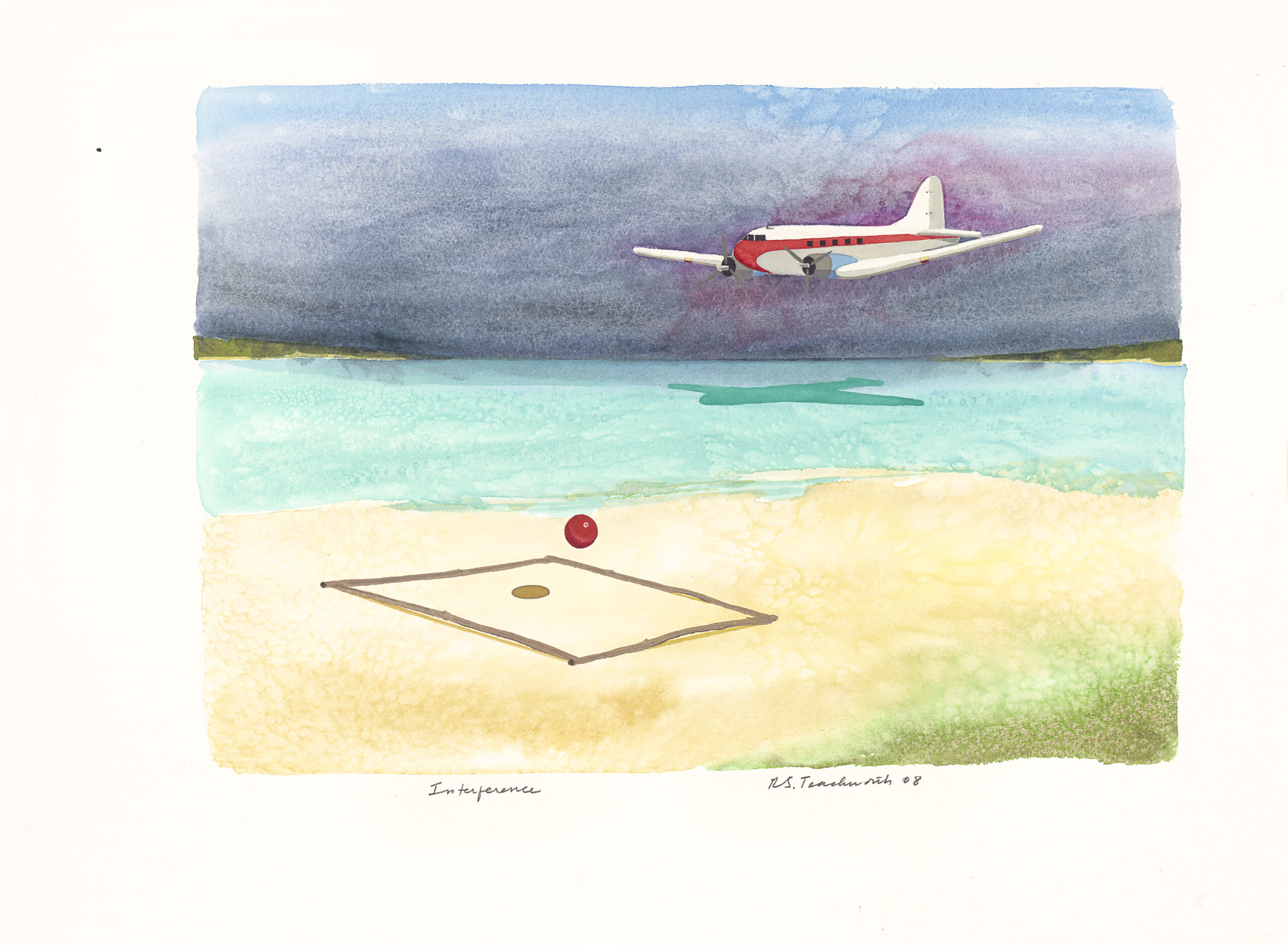
Ron Teachworth, Interference, Watercolor, 22 x 30 inches.
The one exception to this parade of artists is also one of the show’s most enigmatic works. In Lipstick, a pretty young brunette wearing a black skirt but no top sits on the edge of a bed covered by a colorful quilt, peering at a hand compact and applying ruby-red lipstick. The bedroom, which appears to be in the tropics judging by its slatted-glass window and a hint of aqua water beyond, reads like a set from some 1950s film noir.
And here, Teachworth the artist exploits his own artwork. Hanging to the left of the half-dressed woman intent on her cosmetics is a painting of a prop plane seemingly about to land on a sunny beach – a miniature giclée replica of Interference, Teachworth’s canvas hanging immediately to the left. It seems only fitting, and rather witty, that if the author is going to appropriate from others, he ought to dish out the same treatment to himself as well.
Ron Teachworth – Appropriation: Artists and Their Work, will be up at the Birmingham Bloomfield Art Center through April 30.


