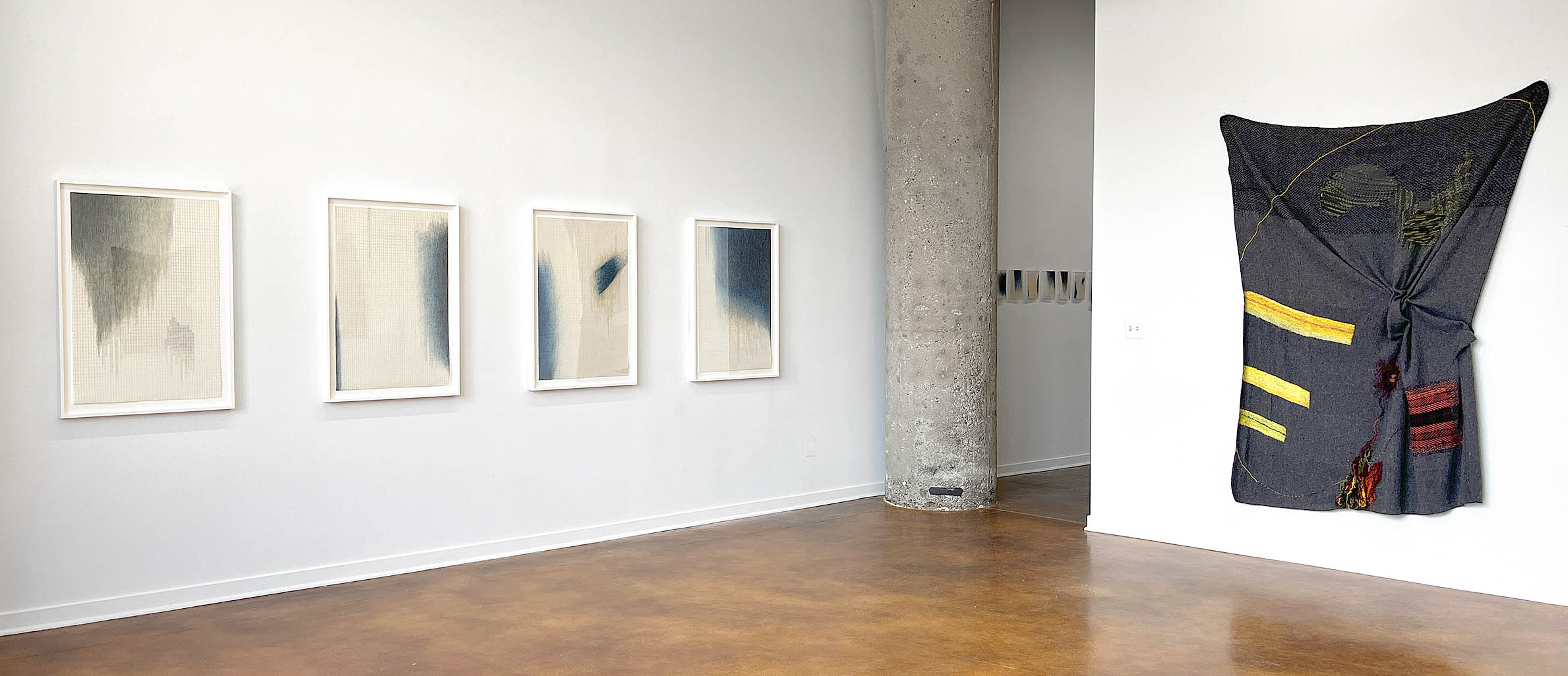
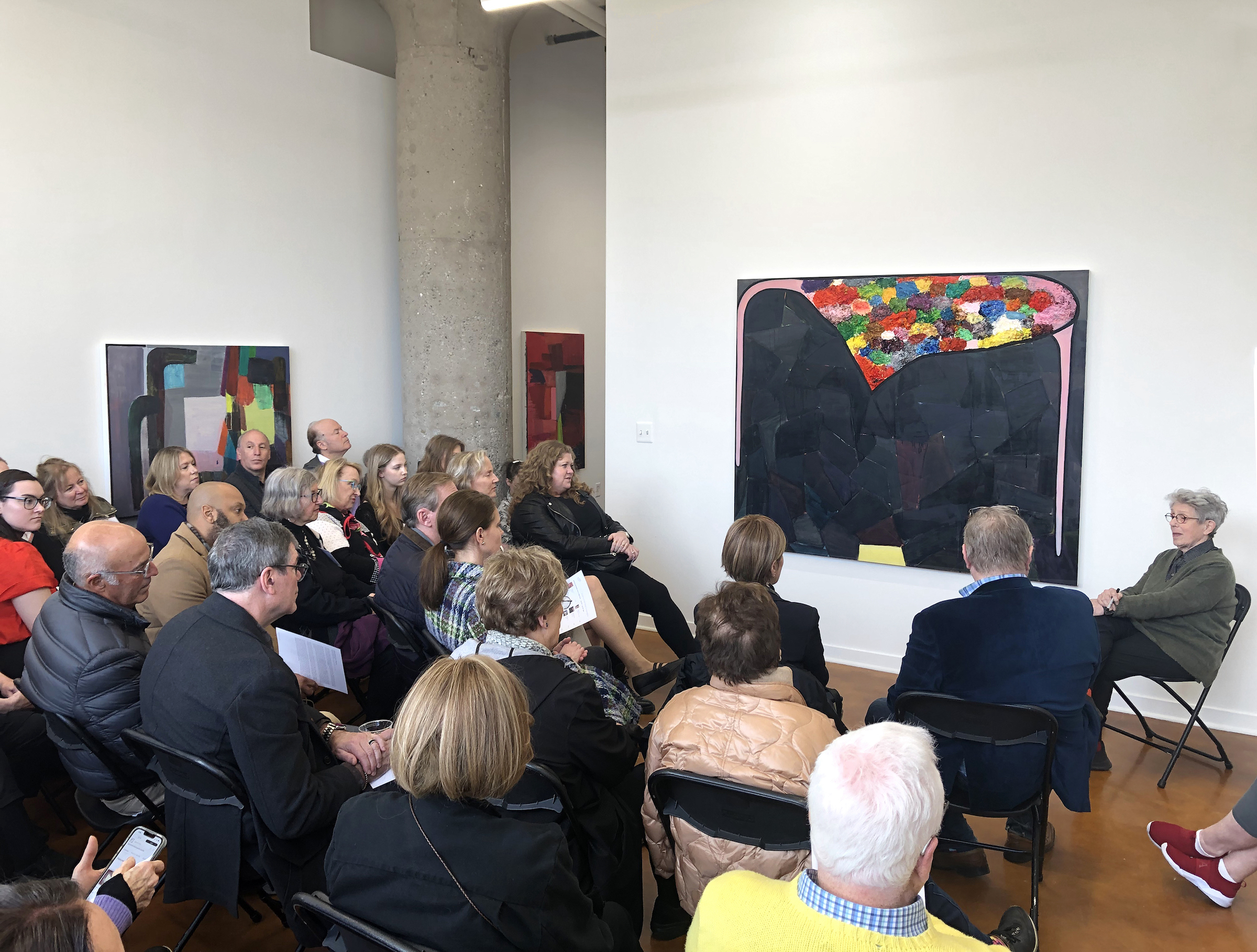
After Cubism: Modern Art in Paris, 1918 – 1948, at the Detroit Institute of Arts
Cubism wasn’t born of a manifesto (Pablo Picasso and Georges Braque tended to leave the blah-blah to others), but Cubism’s outsized influence inspired the spilling of much ink, as artists and critics sought to explain it, support it, modify it or, inevitably and however prematurely, proclaim its demise. In the week of the armistice that ended World War One, artists Amédée Ozenfant and Charles-Édouard Jeanneret (aka, Le Corbusier) penned Aprés le Cubisme, announcing the supplanting of the old style with what they dubbed Purism, an attempt at bringing order to the fractured post-war world, and to the jumble of the art world in particular — a world whose undisputed capital was Paris.
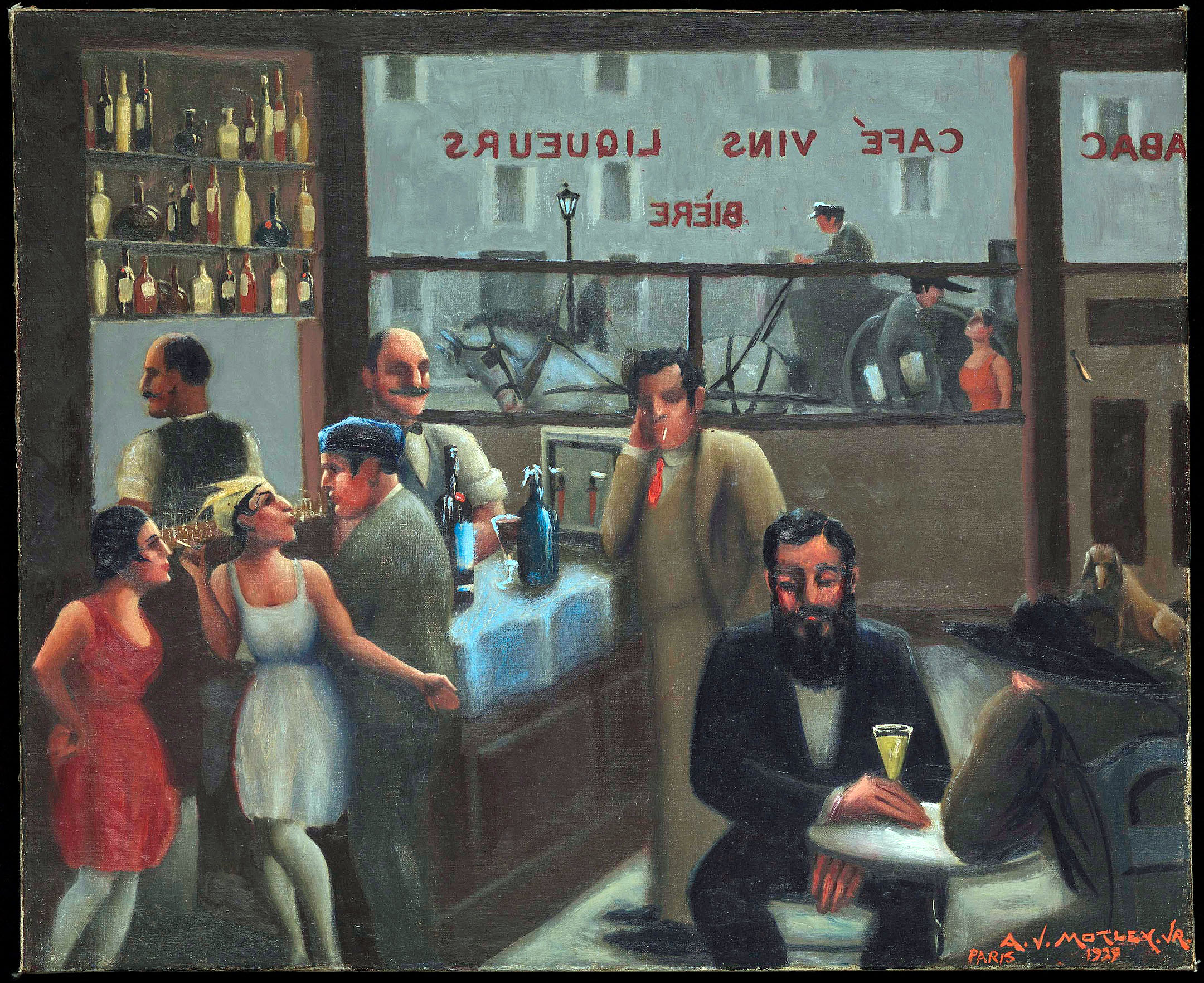
Café, Paris, 1929 Archibald John Motley, Jr., American, 1891 – 1981 Oil on canvas
After Cubism: Modern Art in Paris 1918-1948, the Detroit Institute of Arts’ current exhibit of graphic works from its collection, borrows it’s name from the Purist manifesto but sets its scene with the sole painting in the show, a recent-ish acquisition by Archibald Motley from 1929, Café, Paris, which depicts an archetypical scene of a Montmartre watering hole populated by various bohemian types. A Black American painter, Motley was one ingredient in the multicultural stew of artists that populated the City of Light between the wars. He’s joined in this exhibit by, among others, Mexico’s Diego Rivera, seen here breaking away from his own version of Cubism with still lifes that suggest the more naturalistic style he’d eventually bring to the DIA’s Detroit Industry murals; Lithuanian-born Jacques Lipchitz, one of a few artists here who kept some version of Cubism alive despite reports of its passing; and the Jewish Russian Marc Chagall, whose etching L’Apparition, a scene of a winged muse descending upon a self-portrait of the painter at his easel, is a secular Annunciation. Also here is Tsugouharu Foujita, whose delicate line drawing Head of a Girl is both modern and reflective of the graphic traditions of his native Japan. The drawing pairs nicely with the small watercolor portrait of A Young Girlby Marie Laurencin, the only painter among the women artists in the show; the others are all photographers: Berenice Abbott, Gertrude Fehr, Dora Maar, and the German-American Ilsa Bing, “queen of the Leica,” who contributes several intriguing compositions. The genderfluid Claude Cahun is represented by a riveting self-portrait as well.
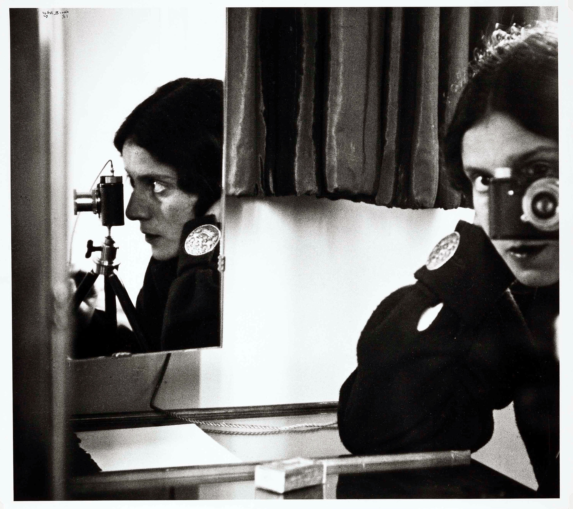
Self Portrait with Leica, 1931, printed 1992 Ilse Bing, American, 1899 – 1998 Gelatin silver print
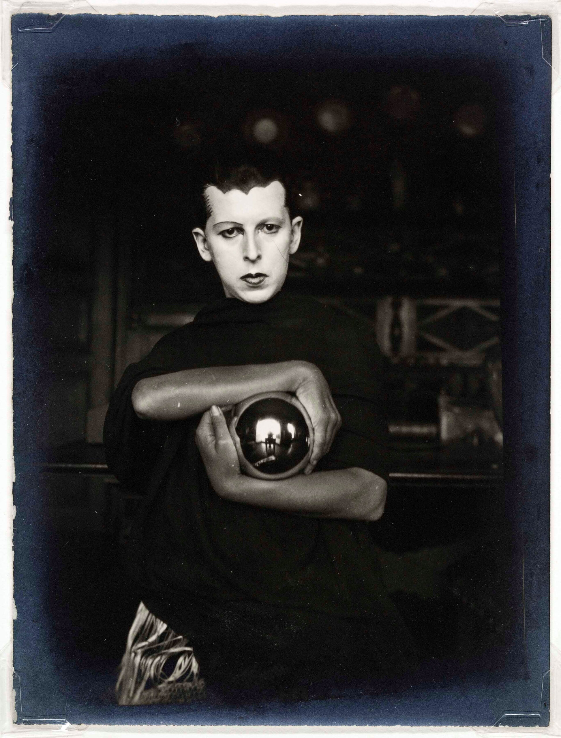
Self-Portrait, ca. 1927 Claude Cahun, French, 1894-1954 Gelatin silver print
Dominating one wall of the exhibition’s first room is a color mock-up for a mural by Raoul Dufy, a project called The Spirit of Electricity, created for display at the 1937 World’s Fair (and now in the Museum of the City of Paris). Gifted to the DIA in 1999, the large color sketch has some resonance with the Rivera Industry murals; turbines, trains, and other modern marvels are depicted, though Dufy is apparently less interested in the technology of electricity, which he associates with the power of Zeus and other mythological figures, and more fascinated by the “Great Men” of science and history, who throng the bottom of the image. The panels are brightly colored and loosely painted. Compare this with the more muscular, more populist, and tech-savvy vision of Rivera — which may be just to say that artists’ approaches to modernity in these years were varied and often contrasting.
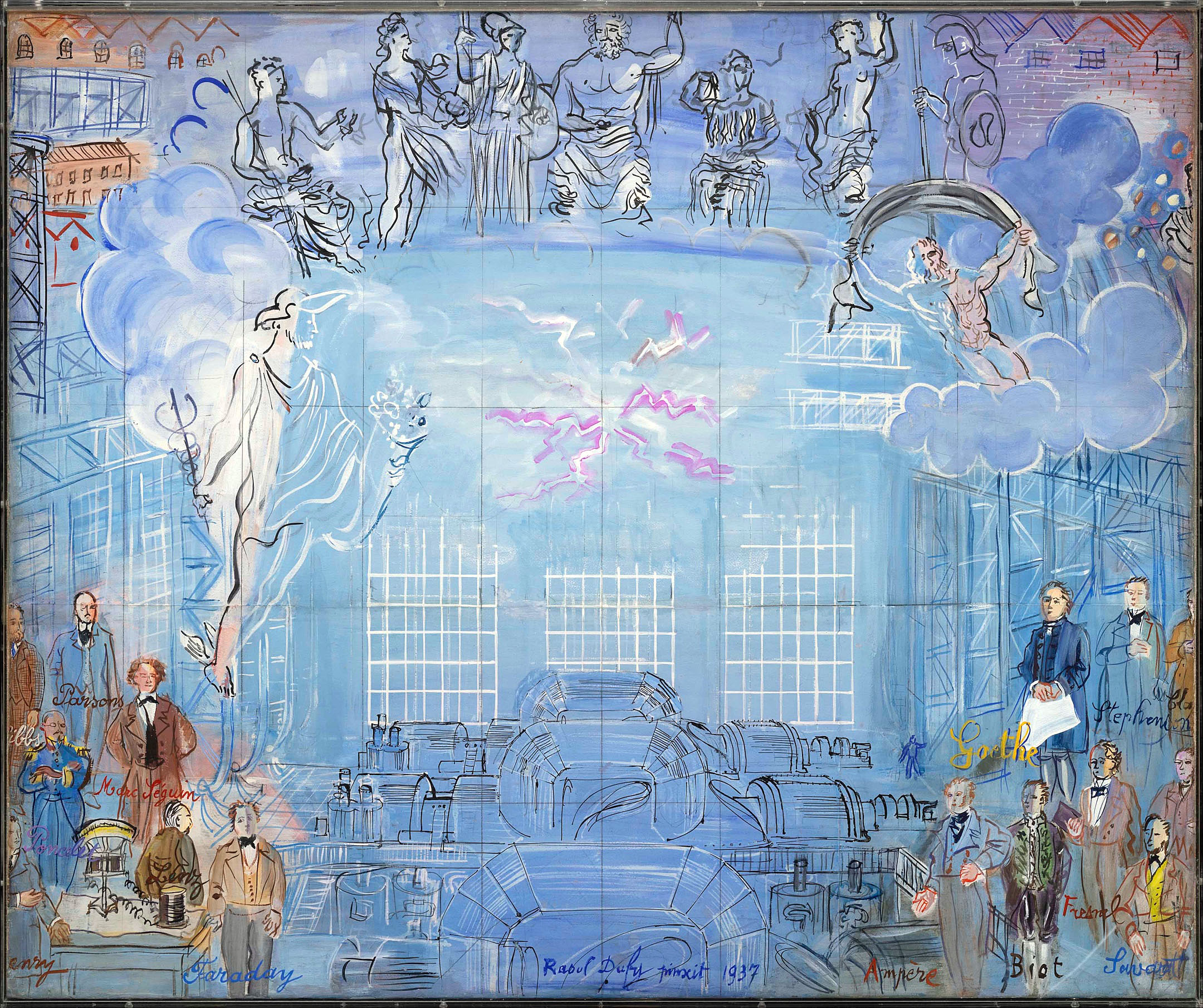
The Spirit of Electricity, 1936/1937 Raoul Dufy, French, 1877-1953 Watercolor, gouache on paper mounted on canvas
Inevitably, perhaps, Picasso becomes at least one of the exhibit’s through lines, his position as the guy to beat implied by the title, his status as a successful giant of the art scene suggested in a photo by Man Ray in which he regards the viewer coolly from behind a respectable suit and cardigan. His decidedly non-cubist pencil drawing from 1920 of a nude bather sitting on a beach, the horizon balanced on her head, is one of the first works in the show; his late-1945 print Head of a Young Boy is one of the show’s final images. Picasso was one of the first to explore what lay beyond Cubism, and he’s shown here returning to classical sources for inspiration, as in his suite of illustrations for Le Chef-d’œuvre inconnu— The Unknown Masterpiece, a short story by Balzac about an obsessed artist whose ten-year attempt to paint a portrait of his beloved results only in an undecipherable mess. Picasso’s most direct illustration of the story, showing the placid model knitting on the left, the artist absorbed in his work on the right, and the canvas in between choked by a tangle of arcs and lines, could pass for a wry New Yorker cartoon on the state of modern art. (Picasso related so strongly to the story that he moved his studio to the same Paris neighborhood in which Balzac’s fictional painter worked.) Picasso’s line work throughout the illustrations is in fact clear and simple, evoking classical sculpture, except when he strategically applies intense hatching to emphasize a particular section of the image.
The complete set of Balzac illustrations is displayed in one of the gallery’s two octagonal side rooms. The other contains another set of illustrations, these by Louis Marcoussis, one of Cubism’s hold-outs, for a text by Gérard de Nerval, the Romantic writer whose dreamy work presaged the concerns of Surrealism. The Surrealists of course took the opposite tack from the return-to-order crowd, deciding after WW1 that irrationality and madness were more relevant to the current age than reason. The movement is represented here by the experimental photographs of Man Ray and others, as well as copies of the lavishly produced journals Minotaure and Verve; the final edition of the latter, the “war issue,” features a defiant Gallic rooster by Joan Miró, the last image to appear in the journal before it closed due to the encroachment of the Nazis.
Elsewhere in the exhibit is Picasso’s The Dream and Lie of Franco, a savage lampooning of the Spanish dictator whom Picasso depicts as some kind of anthropomorphic tumor, running roughshod through a series of grotesque misadventures. It’s one of his best-known graphic works, but when you’re mounting a concise survey of thirty of the most storied years in art history, it’s not a bad idea to “play the hits” here and there. Matisse, for example, is well represented by his popular pochoir portfolio called Jazz, derived from the colorful paper cut-outs he created late in his life. Bedridden by illness while his country was being overrun by fascists, Matisse summoned happier memories of the circus and a trip to Tahiti to use as subject matter, but it was his publisher that gave the collection its musical title, to suggest the spirit of improvisation behind the work. The images are likely familiar to many art fans thanks to decades of posters and other inexpensive reproductions, but they definitely merit seeing in their original vibrant colors, and their lyrical compositions deserve a closer look.
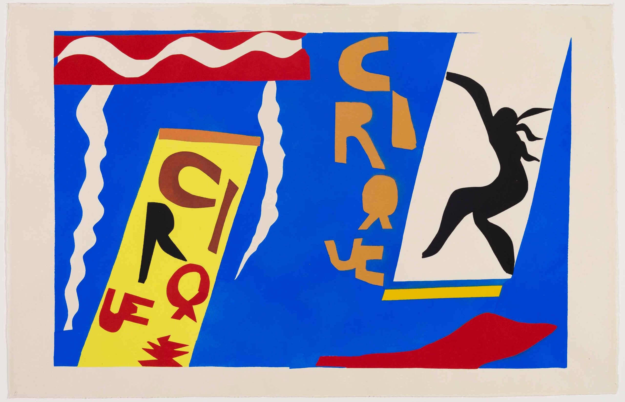
Le cirque, 1943 Henri Matisse, French, 1869-1954 Tériade, Greek, 1897 – 1983 Edmond Vairel, French Pochoir printed in color ink on wove paper
Other “greatest hits” on display here that will delight devotees of the between-the-wars art scene include Cartier-Bresson’s clever photo Behind the Gare Saint-Lazare, of a man leaping gingerly over a reflective layer of water on the pavement and Brassaï’s portrait of Bijou, a fading, bejeweled Belle Epoch matron ensconced in some bar in Montmartre who seems to be incapable of finding a path into the future.
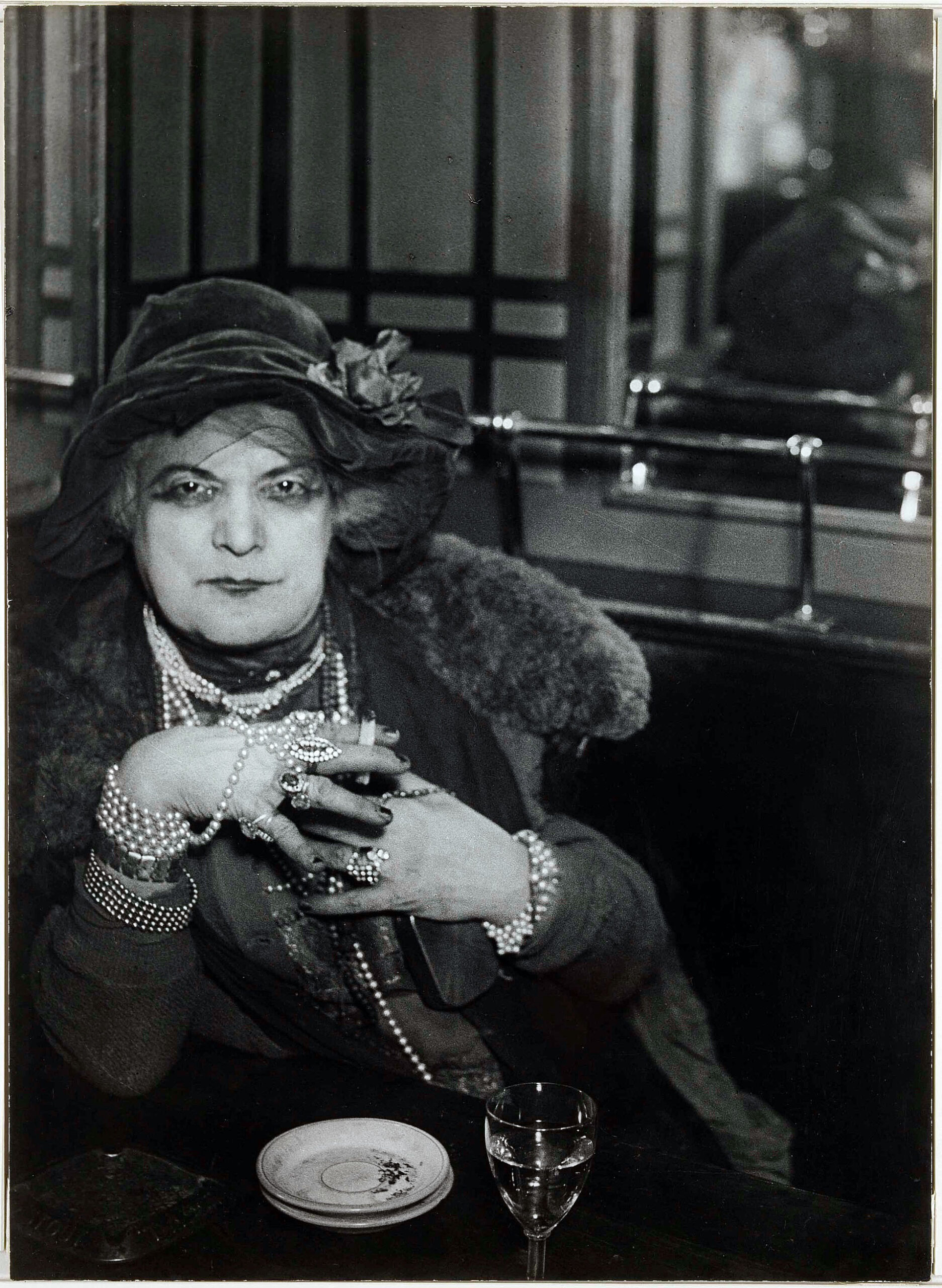
“Bijou” of Montmartre, ca. 1932 Brassaï, French, 1899-1984 Gelatin silver print
The path forward for many of the artists in this exhibit included nerve-wracking waits for exit visas, cross-Atlantic escapes, struggles alongside Resistance forces, and interment in concentration camps (or, as with Le Corbusier, collaboration with fascists). While it’s not quite the final image in the exhibit (that’s Bing’s photo of the Eiffel Tower, still standing through everything), maybe Picasso’s doe-eyed child in Head of a Boy, printed only a few months after the end of the war, is a good note to go out on — a fresh-faced hope for a new start after the horrors of the Second World War, from an artist whose post-war work would be so preoccupied with the image of the dove.
After Cubism: Modern Art in Paris, 1918 – 1948, at the Detroit Institute of Arts, 2023
Error, group does not exist! Check your syntax! (ID: ”2”)