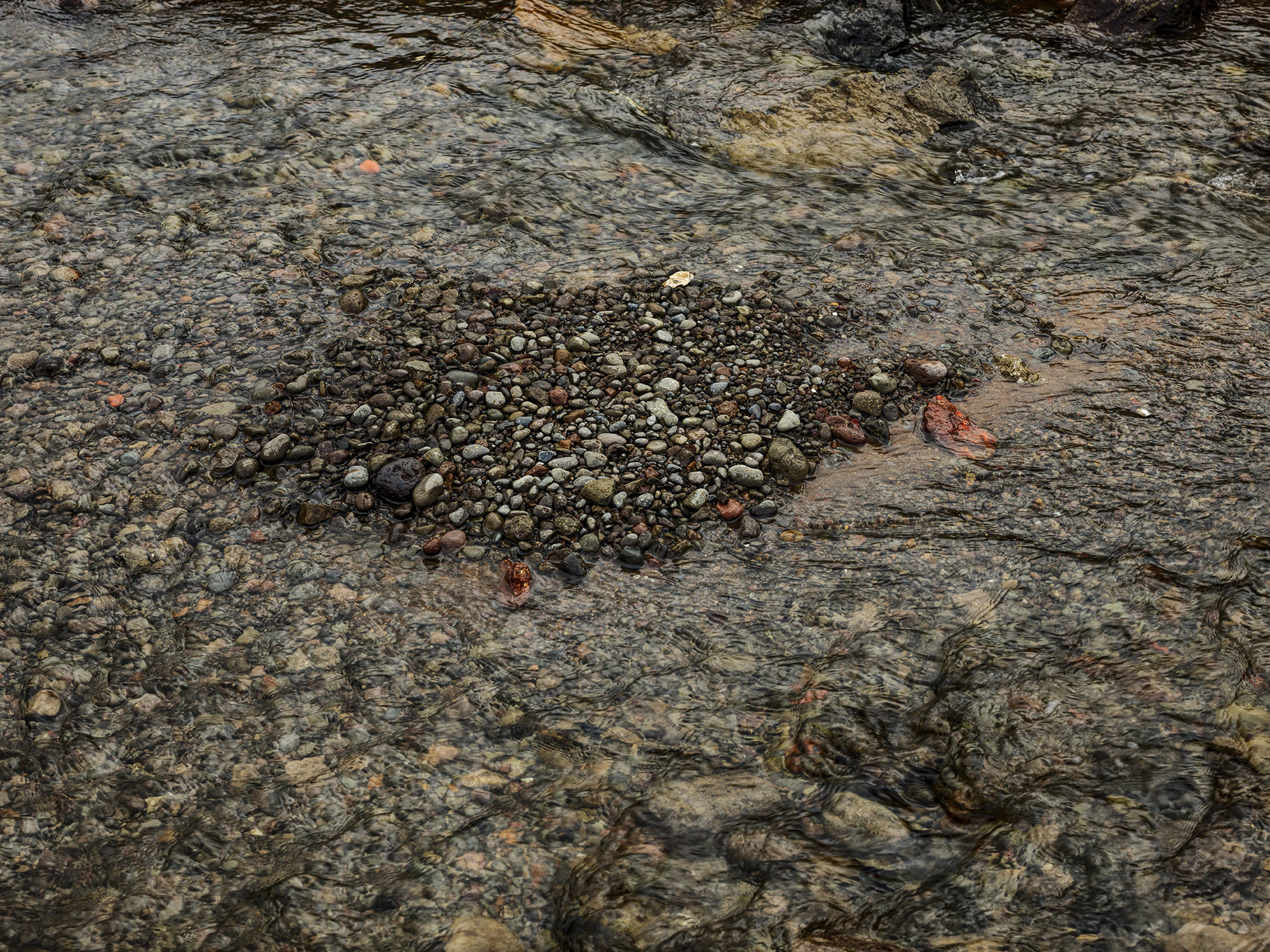
Carla Andersen, West Fjords 5, Iceland, Archival pigment print, 30 x 40″ 2016
There is a striking contrast between the work of Carla Anderson, photographer, and Elizabeth Youngblood, abstract artist using various mediums, now on exhibition as Chosen Silences, opened in midtown Detroit, at Galerie Camille, April 7 – 27, 2017.
These two artists share an attraction to abstraction and contemplation but deliver their ideas using different media. This certainly must have contributed to the idea of an exhibition together as the work is not presented in different spaces, but is intentionally integrated, with the purpose of bringing the viewer along as they peruse the gallery space. It’s a good idea.
Gallery director Melannie Chard says, “Chosen Silences blends the work of Anderson and Youngblood to create an environment of quietude and contemplation of form, texture, tension and light. While each artist works in a different medium, both have chosen to communicate in that space of quiet. In that space of what would seem silent, but isn’t.”
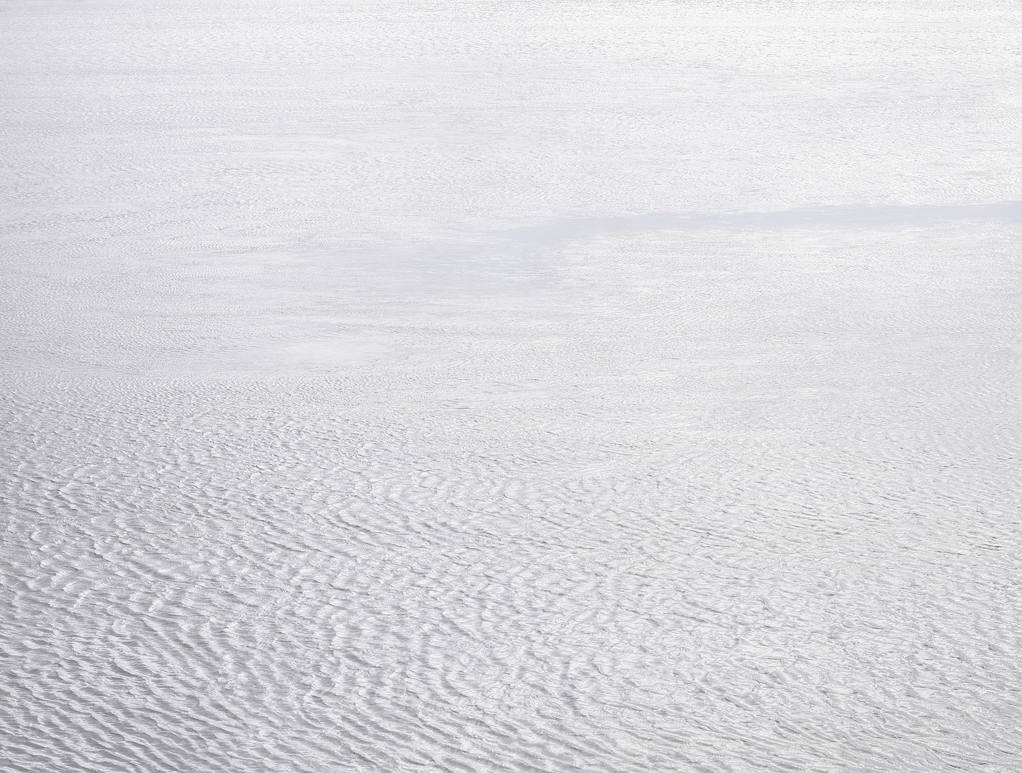
Carla Andersen, West Fjords 4, Iceland, , Archival pigment print 44 x 52” 2016
Anderson’s photography reminds me, at times, of how I feel when I am looking at a color field painting. These large, 30 x 40” images (sometimes digital, sometimes film) are about the space in nature, captured beautifully using large format cameras, and presented in a way that does not go unnoticed. And I must mention scale, because these photographs would not have the same impact if they were printed in, say, 8 x 10”. The large-scale print brings the viewer intimately closer to the subject, as in West Fjords 5, photographed in Iceland, in a way that draws you into a universe of these small stones or in the reveal of an oncoming night sky in Emmett County.

Carla Andersen, Emmet County, Michigan, Archival pigment print, 30 x 40″ 2016
There is a large context for Andersen’s work, who was awarded her BFA from CCS, 1976 and her MFA from Cranbrook in 1978. Her influences could have been a combination of Carl Toth and George Ortman, both teachers at the studio-based Cranbrook Academy of Art during the 1970s. Probably more important would be her exposure to the work of Edward Weston who did abstracts of the desert, as in Oceano 1936, Eliot Porter, as in Pool in the Brook, 1953, or more recently, Joel Meyerowitz as in his large color image, Dawn Hardline, 1980. This work, sometimes called non-objective, relies less on representational objects and more on color, light, texture and form that conveys a feeling or an impression. I have always been drawn to the work of Man Ray’s series called Symmetrical Patterns from Natural Forms first exhibited in Germany in 1914, where he experimented with objects, light and form. The American, a Russian immigrant from Philadelphia would become close friends of Marcel Duchamp and engage in avant-garde photography throughout the 20th century. That’s not to say Andersen’s work is avant-garde at this point in time, because of the groundwork laid down for nearly a hundred years of photography.
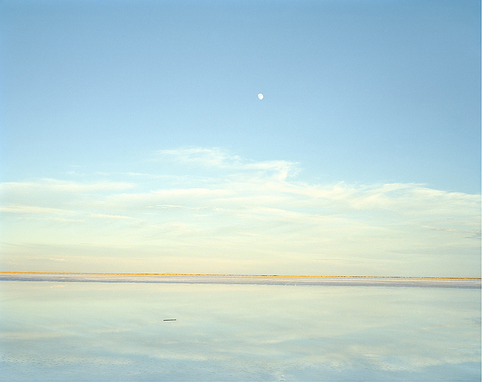
Carla Andersen, Great Salt Lake, UT 35, Archival pigment print 30 x 40” 2016
The symmetry of Great Salt Lake stops the viewer in their tracks when they notice the reflection of the sky in the lake, and the two objects juxtaposed: the moon and a small log in the lake. The illusion makes one feel as though they are out in the lake viewing the sliver of landscape (when actually they could possibly be on a shore), and upon close observation, there is a one percent downward tilt to the right to the horizon. It is the combination of these subtleties that make this image so powerful. It’s worth mentioning that Larry Melkus at Fine Arts Printing executed the printing and mounting of these prints. He says, “Carla and I came up with a double archival cold mounting process. The print is flush mounted onto a 3mm white archival plastic sheet. This is then float mounted onto a larger sheet of white aluminum composite material. The effect is that the print is displayed on its own “pedestal” within the frame. In addition, John Rowland painted his frames to match the white of the print surround, resulting in a subtle display of visual strength surrounding, framing and showcasing the photographic work.”
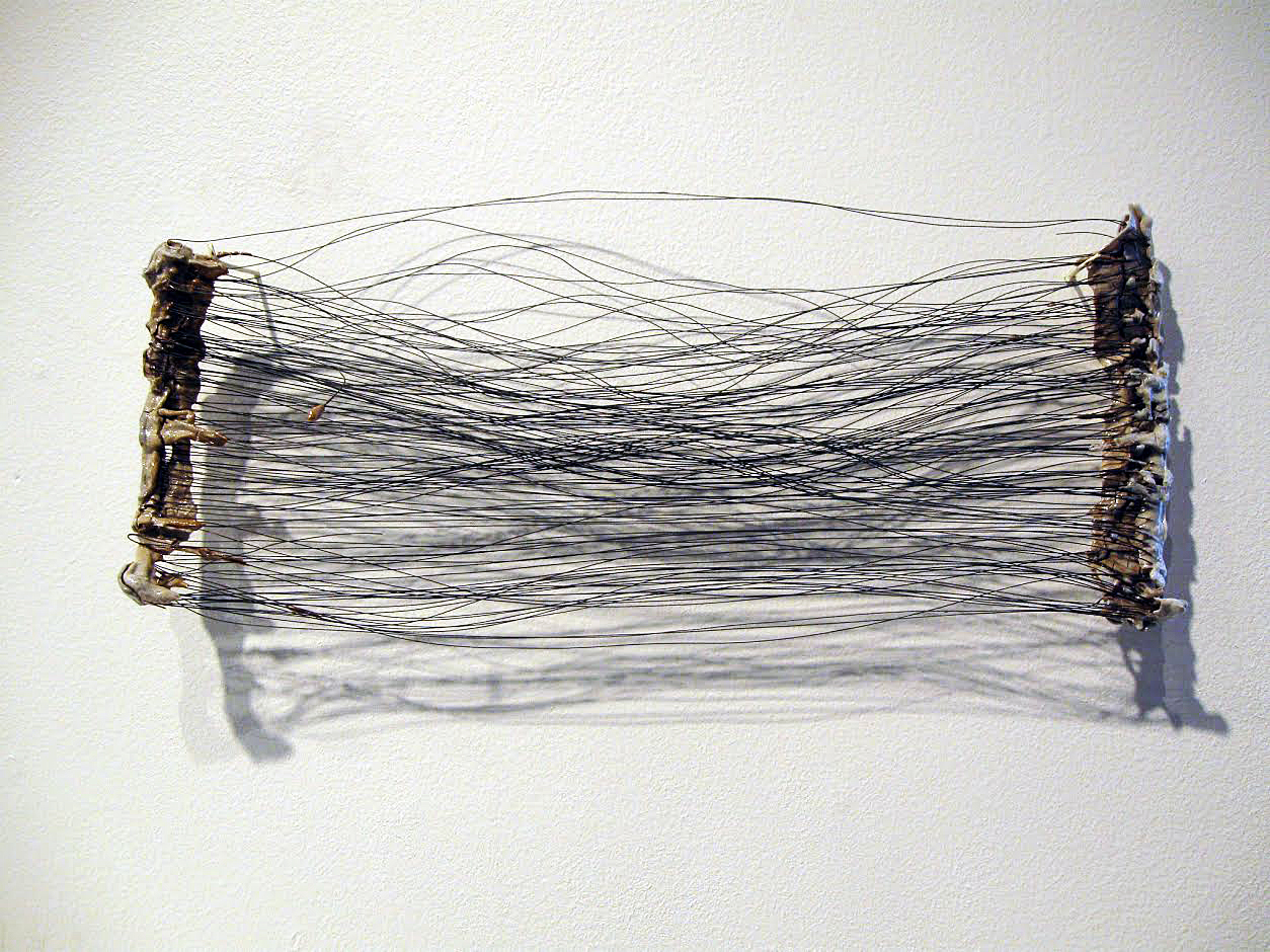
Elizabeth Youngblood, #6 Flat Horizontal Wire and porcelain, 14″ 2013
Elizabeth Youngblood’s work is multi dimensional, a mixture of three-dimensional objects made from ceramic and wire, and a collection of black and white drawings on paper. The contrast between the porcelain bars and the strands of thin black wire, as in #6 Flat Horizontal, provide an interesting play between material and as a relief, the shadows from the light adds to the dimension. Youngblood was awarded a BFA from the University of Michigan and an MFA from Cranbrook Academy of Art, where she studied design with the McCoys, who I have turned to several times for design work. No doubt they had an influence on her work, probably more about the process of developing conceptual ideas. It’s possible this eventually led her away from working as a graphic designer, more towards to becoming a fine artist.
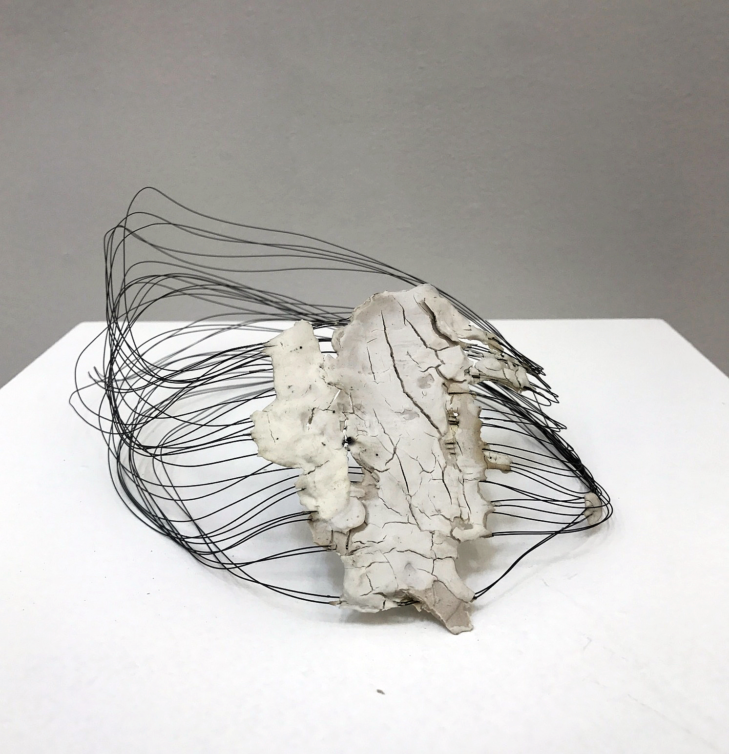
Elizabeth Youngblood, Untitled Really, Wire and Porcelain, 2014
Clara DeGalan wrote about Youngblood’s work in fall of 2016 at 9338 Campau for the Detroit Art Review, saying “Youngblood respects making, and, though she is acutely aware of the cultural associations that come with each material she ropes into her vision, her devotion to process and skill-building manage, miraculously, to shed the oppressive political discourse that has hung around craft for decades and present it, unilaterally, as a vast conduit for exploration of an artist’s conceptual vision.”
It’s always a challenge to decide how large to make a three dimensional piece of work. If I were to dare to offer a constructive idea for her work, it would be to pay more attention to scale, pretty much across the board.
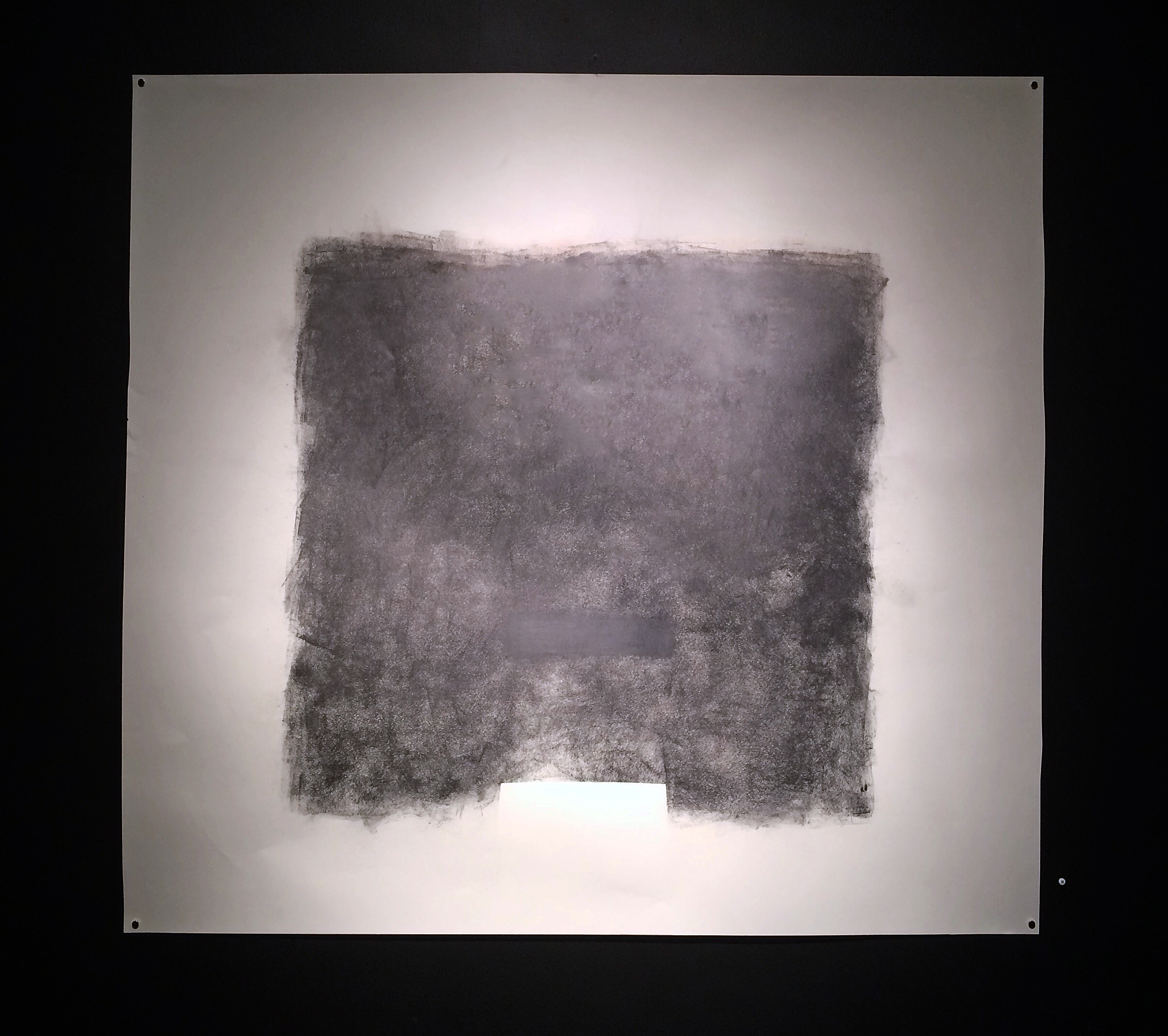
Elizabeth Youngblood, Large No. 3, Graphite on Paper, 42 x 45”, 2011
In contrast to the more didactic and delicate wire pieces, and in a minimalist fashion, Youngblood makes the drawing, Large No. 3, where she applies more graphite than is necessary to make a point about the material and the pressure applied. In this drawing, she illustrates ‘no fear’ in executing a powerfully bold and massive block composition, challenging her viewer to ponder her intent.
Chosen Silence, Galerie Camille April 7 – 27, 2017
