Cressandra Thibodeaux, Fever Visions I ,2023, Infrared photograph
If anything, the photos included in the press kit for the Detroit Institute of Arts’ latest exhibition, Contemporary Anishinaabe Art: A Continuation, don’t do the show justice. To be sure, the kit does include some of the most striking artworks in the show: Cressandra Thibodeaux’s photographic image Fever Visions I, for instance, a color field-like composition of five turquoise discs on a red background, superimposed onto cylindrical hay bales lined up in an actual field. As the title suggests, the piece was inspired by hallucinations experienced by the artist during an illness. Also visionary is Jonathan Thunder’s painting called Basil’s Dream, in which rival spiritual beings — a Thunderbird and a lynx-like Mishibizhiw — shoot some pool while a DJ spins tunes and Ojibwe storyteller Basil Johnston records the scene on a typewriter. Painted all in shades of magenta, the image’s dreamworld atmosphere and cast of enigmatic characters (as well as its “widescreen” format) feel almost Lynchian, though the scene is more good-natured than creepy.

Thunder, Basil’s Dream, 2024 – Acrylic on canvas

Gordon M., 1868: Remember Our Relatives 2022 Annigoni paper, cedar smoke
Also in the press kit: Washita 1868: Remember Our Relatives (2002) by Gordon M. Combs, a sepia-tone tableau of rearing horses, teeth bared and eyes flashing, that seem seared into the paper (it was created using cedar smoke). This harrowing image of terror and pain commemorates the massacre of the Native Americans and the subsequent slaughter of the horses and mules of Washita, Oklahoma by George Custer’s 7th Cavalry. The creatures evoke the horse bellowing at the center of another visual chronicle of military cruelty, Picasso’s Guernica.

Morriseaux Punk, Norval Morriseaux, Punk Rockers, Nancy and Andy 1989 Acrylic on canvas
And naturally, the press materials for the exhibition include a work that’s become something of a signature image for the show (it’s on a lot of the gift shop merch): the irresistible Punk Rockers Nancy and Andy, a vivid acrylic painting from 1989 of a big-haired, leather jacketed couple in profile against a bright red background by the late Norval Morrisseau. A member of the Bingwi Neyaashi Anishinaabek First Nation (the DIA cites the tribal nationalities of the artists on the wall labels), Morrisseau was Canada’s best known contemporary Indigenous artist, in part because his biography is marked by the sort of pitfalls, comebacks, and eccentricities that the popular press enjoys latching onto when reporting on artists. However, it’s Morrisseau’s bold, compelling, often narrative paintings — influenced by ancient petroglyphs, 20th century modernism, Anishinaabe, Christian and Eastern spiritual traditions, and more — that justify his status as the “grandfather” of contemporary Anishinaabe art.

George Morrison, Totemic Column, 1995 (fabricated 2024-25), stained redwood, granite base; Jim Denomie, Untitled (Totem Painting), 2016, Oil on canvas, wood
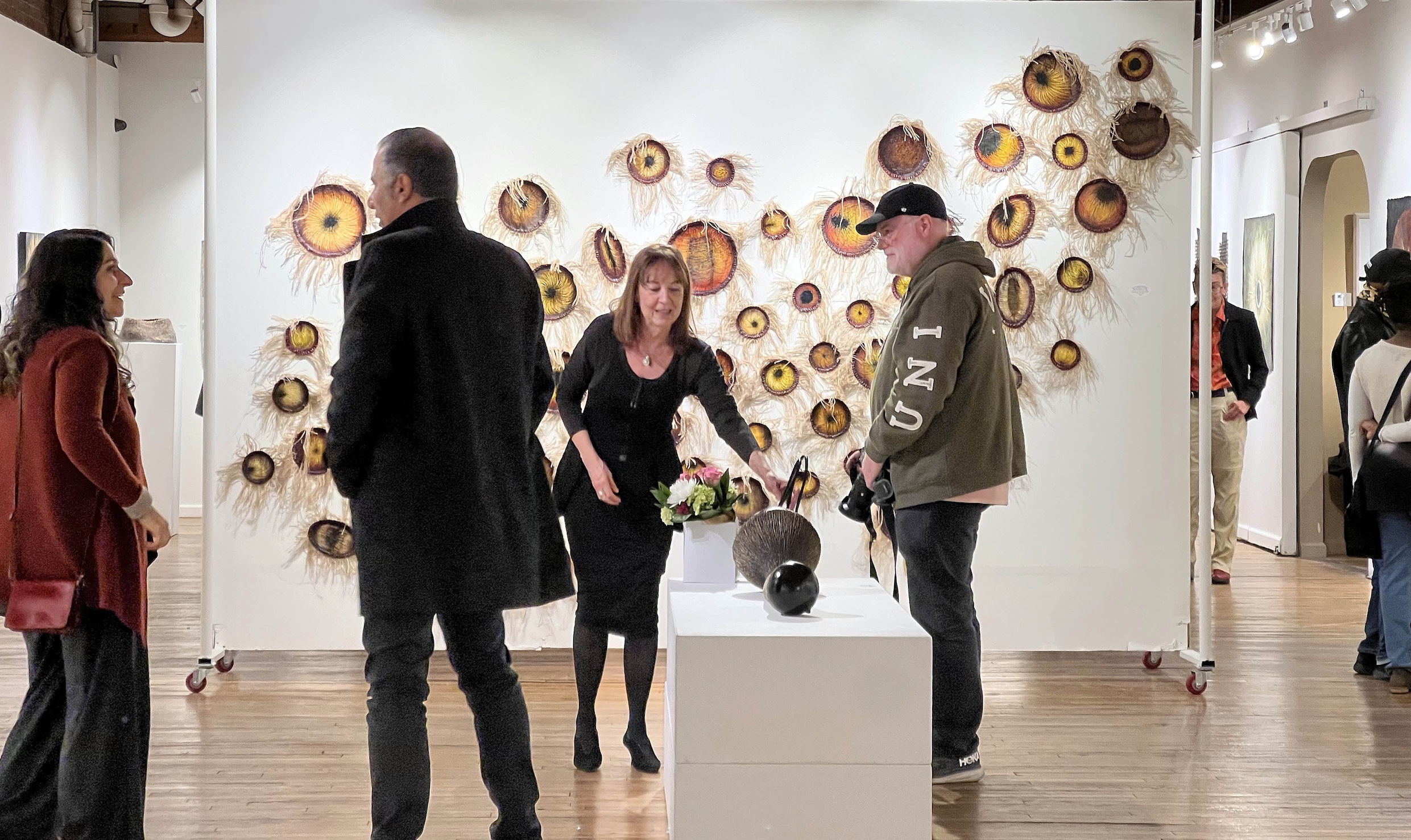
To be fair to the DIA’s publicity department, no handful of images could entirely do right by such a large, rich, and wide-ranging exhibition, which is fine — it just means there are wonderful surprises awaiting visitors throughout Contemporary Anishinaabe Art: A Continuation. The spirit of the show is encapsulated outside the entrance by two contemporary takes on the totem pole. George Morrison’s beautiful Totemic Column is constructed like a puzzle from wavy, interconnected pieces of redwood; the effect feels a bit like looking down into a flowing river. Jim Denomie’s Untitled (Totem Painting), a tribute to his mentor Morrison, is both more traditional than Column — it features the animal heads one might expect to see on a totem pole — and very modern, as the faces of the creatures are painted onto the column in an expressionistic, cartoon-like style (and anyone who knows my love of comics will know that’s high praise coming from me). Harking back to tradition, forging varied paths forward, integrating old and new influences, commenting on past and current events, honoring predecessors: these threads run throughout the exhibition.

Jim Denomie, Untitled (Totem Painting) 2016 Oil on canvas, wood

Jim Denomie, Untruthful 2014 Oil on canvas
As someone unfamiliar with his work previously, Denomie is a happy revelation for me. A large painting by the late Ojibwe artist greets visitors just inside the show. Depicting four figures on horseback, some with mask-like animal heads, it might be mistaken for some variation on the Four Horsemen of the Apocalypse. In fact, Four Days and Four Nites, Ceremony (2019-20) refers to the journey to the afterlife made by the souls of the dead in Ojibwe tradition. Denomie’s vivid colors and expressive brushwork give this spirit world a heightened, electric feeling. Denomie often brings a sharp, dark sense of humor to his examinations of historical injustices. His other painting here, Untruthful (2014), depicts the Lone Ranger and Tonto astride their steeds (the pair appear in a number of Denomie’s artworks). “You lied to me!” says Tonto in a cartoon word balloon. “Get used to it,” replies the ranger. Denomie said he used color and humor to draw a viewer in, then he was “able to zap ‘em” with the truth.

Heron Hill, Joe Kennedy & Daniel Collazos Baakaani-inaaddizi: Their Actions Are Different 2025
One room here is devoted to some amazing fashion designs. Victorian gothic meets East Coast and Great Lakes Native American influences in Ojibwe designer Delina White’s Woodland Elegance: Four Piece Evening Apparel Ensemble, a silky purple dress and black shawl, with gold embroidery, over a black lacy underskirt. Joey Kennedy and Daniel Collazos of Heron Hill Designs offer a melding of Indigenous and queer styles, including an enviable pair of embroidered Doc Marten boots and matching hat. And Jillian Waterman contributes the astonishing In Case of Emergency Bury Me and Watch Me Grow (2024), an ensemble complete with vest, purse, and gas mask, all beaded with red, white, and yellow corn seeds. Also check out Adam Avery/Naawikwegiizhig’s beautifully beaded hats in the next room, Blooming Hat (2020) and Flowering Moon (2024).

Jillian Waterman, In Case of Emergency Bury Me and Watch Me Grow, 2024
Much of the work on display here, in fact, is three-dimensional — furniture, sculpture, jewelry, and other handiwork, from two sturdy birchbark canoes built by Chippewa craftsman Ronald J. Paquin, to a delicate beaded veil with the phrase I Get Mad Because I Love You repeated across it in white and translucent beads, created by Chippewa artist Maggie Thompson as a commentary on psychological abuse. Dennis Esquivel contributes a beautiful cabinet of maple and cherry wood entitled Out of the Woodlands (2019); its legs are streamlined versions of Ottawa war clubs. A dress-shaped object hanging on a wall — Dress for Nookomis, (2023) — made of fabric and painted blood red with thick black and white outlines, is more than just a piece of Pop art; it’s a liminal thing that “exists between worlds — part textile, part memory, part protest,” as artist Nonamey describes it. The red dress is the symbol of the Missing and Murdered Indigenous Women and Relatives movement, which raises awareness about violence committed against Native American women.

Maggie Thompson I Get Mad Because I Love You 2021-22 Beads, filaments, jingles

Dennis Esquivel, Out of the Woodlandds: Standing Cabinet 2019

Nonamey, Dress for Nookomis 2023 Acrylic on reclaimed fabric
I’m getting close to my word count here, and I see I’ve done not much better than the press kit at encapsulating the full breadth of this show. I haven’t mentioned the display discussing African American/Ojibwe sculptor Mary Edmonia Lewis’ friendship with Henry Wadsworth Longfellow, author of the fictional Song of Hiawatha. I haven’t discussed Rabbett before Horses Strickland’s sprawling battle scene Right of Consciousness, or Summer Yahbay’s beaded bandolier bag Nmamiikwendis: I Am Proud of Myself (2024), a traditionally male garment cast in shades of pink that makes a good case for the true strength of that color. There are a number of photo portraits of folks from tribal elders to Iggy Pop. (Why Iggy? Because photographer David Dominic, Jr. of the Little Traverse Bay Bands of Odawa Indians respects the rock star for building a diverse community through his music.) And then there’s the short film that closes the show, Happy Thanksgiving (2023), a comedic crime flick about an Anishinaabe youth who comes up with a creative way to get payback after being asked one too many times to celebrate the subjugation of his people. Suffice to say, Contemporary Anishinaabe Art: A Continuation rewards repeat visits. Museums often tend to seal Native Americans in amber, reducing their culture to a collection of artifacts in a vitrine, but this show leaves no doubt about the multiplicity of artistic voices and practices that live and thrive within the contemporary Anishinaabe community.
Detroit Institute of Arts’, Contemporary Anishinaabe Art: A Continuation
[adrotate group=”2″]