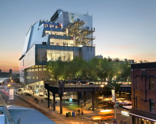
From its first space in Greenwich Village in 1931, to another home at Madison and 75th Street in 1966, to its new home at 99 Gansevoort Street, the Whitney Museum has been deeply rooted in celebrating American art.
Sculptor and patron Gertrude Vanderbilt Whitney was the driving force behind its development as she recognized the difficulty American artists were having exhibiting their work. Trying to keep up with its growth, it had established branches in various parts of Manhattan, and Stamford, Connecticut.
The new building at 99 Gansevoort Street is designed by the architect Renzo Piano, includes approximately 50,000 square feet of indoor galleries and 13,000 square feet of outdoor exhibition just east of the Hudson River. At the northern edge of the Meatpacking District, and the foot of Chelsea where the new High Line begins, is New York City’s newest and most unique public park.
As an artist and writer whose family is from NYC, the location choice for the new museum seems perfect, and at first glance, the interior space has an abundance of glass and terraced exterior space. One of the most impressive observations upon my first visit was the gallery interior wall. The fifth floor, for example, has 18,000 square ft. of open space where the 12” thick walls look and feel stationary, but, in fact, are movable. When you look up, you see a very thick steel grid that explains how these museum walls can be moved and repositioned based on curatorial design.
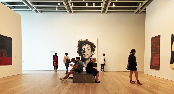
The first exhibition at the new Whitney Museum is America Is Hard to See, which provides a vehicle for its collection of American art that has been described as one of the arguments for moving into a new space. The collection includes over 21,000 works of art by more than 3000 artists who worked in the 20th and 21st centuries. The argument is that the Madison space never allowed for the proper leverage of the collection. This first exhibition, illustrates its capacity. Here in this installation image, Phil, 108 X 84, by the artist Chuck Close, one gets a feel for the gallery space. From his initial series in 1969, this acrylic and graphite on canvas presents a frontal portrait against a neutral ground. Close took an 8 x 10-inch photograph of his friend Phillip Glass, overlaid it with a penciled grid, and then painted a vastly enlarged blowup of each square onto the canvas using airbrushes to create a photographic image. In all the galleries, the flooring is reclaimed wide-plank pine from locations near the city and virtually column free.
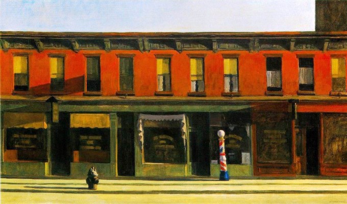
The theatrical painting Early Sunday Morning, one of Edward Hooper’s most iconic paintings, takes its place in the exhibition as an example of social isolationism in this painting of Seventh Avenue, a north-south street, where light from the east cast it long shadows. Although Hopper is known as an archetypal twentieth-century American realist, his paintings are fundamentally representational. This painting demonstrates his emphasis on simplified forms, painterly surfaces, study of light and a thoroughly contemplated composition.
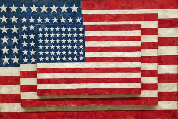
Three Flags is a signature image of Johns’, who got lumped into the Pop Art category by default when he decided to use everyday images in his work. Painting targets, maps, letters and numbers, Johns led some artists away from the abstract expressionism of the time. The familiarity and simplicity of his subject matter attracted audiences, often grounded in the imagery that was part of the everyday world at a time when the art world was searching for new ideas. In a statement, he says, “My work is largely concerned with relations between seeing, and knowing, seeing and believing, seeing and saying.” In Three Flags, he shifts the emphasis from emblematic meaning to a change of scale, discrete marks and surfaced texture.
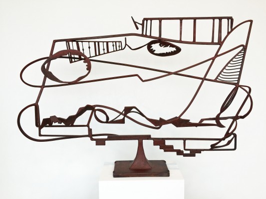
David Smith made what he called “drawings in space” using welded steel, as in Hudson River Landscape in 1951. Sometimes known as an abstract expressionist sculptor, similar to Pollock, Smith’s life was cut short when his pickup truck spun off the road in a crash near Bennington, Vermont at the age of 59. Best known for the Cubis, a series of stainless steel hand-brushed geometric shapes, his works have been included in exhibitions at the MOMA, Solomon R. Guggenheim Museum, Whitney Museum of American Art represented by M. Knoedler & Co. and Gagosian galleries.Smith continued to paint and draw throughout his life, pieces that included landscape and figurative work. Most of Smith’s work is an object lesson in what scale means with respect to the viewer. His work was that of a welder, not a forger, and is often referred to when expressing the concept of Constructivism.
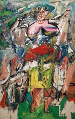
For this viewer and many others I assume, the painting Woman and Bicycle is the 1950’s hallmark of Willem de Kooning’s work. Acknowledged as one of the most influential Abstract Expressionists, he says in his statement, “I’m not interested in ‘abstracting’ or taking things out or reducing painting to design, form, line, and color. I paint this way because I can keep putting more things in it–drama, anger, pain, love, a figure, a horse, my ideas about space. Through your eyes, it again becomes an emotion or idea.” The most distinguishing attribute in Woman and Bicycle are the two smiles where banality meets beautiful.
In addition to the new museum and its exhibition, the web site for the Whitney Museum is excellent, one of the best I have experienced. Extremely comprehensive and user-friendly, there are many short videos that explain everything. http://whitney.org
As for what will become of the space on Madison, The Metropolitan Museum of Art plans to present exhibitions and educational programming at the Whitney’s uptown building for a period of eight years, with the possibility of extending the agreement for a longer term.
The Whitney Museum of American Art
America is Hard to See May 1 – September 27, 2015
Upcoming: Frank Stella, A Retrospective October 30 – February 7, 2016
