Critical art reviews of Detroit galleries and museums weekly

Author: Clara DeGalan

Writer

Ragnar Kjartansson, Steve Shaw, Chloe Brown @ MOCAD

MOCAD installation shot

Ragnar Kjartansson – Installation 2016, All Images Courtesy of the Museum of Contemporary Art Detroit

The Museum of Contemporary Art Detroit –  Winter Exhibition: Ragnar Kjartansson, Steve Shaw, Chloe Brown

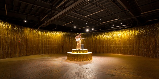
The Museum of Contemporary Art Detroit’s cavernous galleries often echo with sound, from the frequent band shows in the café space (which is my current favorite place to drink coffee and catch up with my emails) and from the steady influx of multi-media works that always lend a distilling element to MOCAD’s exhibitions. Sound really is the cornerstone of MOCAD’s winter exhibition, most notably produced by a solitary, guitar-strumming lady seated upon a revolving dais in a large, empty gallery curtained off by gold tinsel streamers. This is “Woman in E,” a performance piece created by Ragnar Kjartansson.

Parting the gold curtains to enter the space, one is confronted with eerie, resonant chords and dim, sparse space that evoke the strange interstice after a party has ended, a telling shadow of the real action, which took place sometime before. Potent symbols of Motown, glitter rock and funk are all here, with the solemn, oracle-like figure strumming in E Minor (chosen for its melancholy, reflective effect) on an electric guitar as the focal point.

chloebrown_dancin

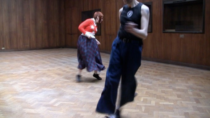
Film still from Dancing in the Boardroom (Turnin’ My Heartbeat Up), 2013. Chloë Brown.

The theme of after-party fallout and cultural epoch is approached as well in the film and drawing of Chloe Brown, who’s body of work exploring the youth culture and economic gloom surrounding the closing of a Spode ceramics factory in Stoke-on Trent, England pinpoints the essential relationship between music, movement and identity in the face of great loss. Brown’s film, “Dancing in the Boardroom (Turnin’ my Heartbeat Up)” depicts a young couple dancing to Northern Soul music in a spacious, dim room with beautiful parquet floors that once bore the weight of executives, secretaries and free enterprise. Shots of the abandoned Spode factory’s lush interiors and tremulous lighting stand in stark contrast to the couple’s unabashed joy in moving to this Motown-inspired music.

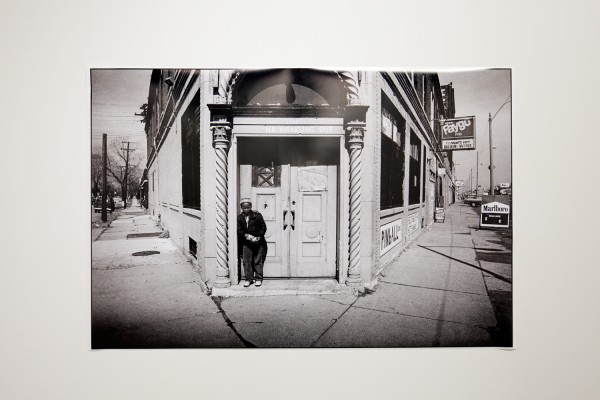
A dose of life on the street is supplied by photographer Steve Shaw. Shaw’s documentary-style images of Detroiters making their way with dance, dress, and grit in a constantly shifting urban landscape supply the unstudied immediacy that is stylized out of the other artist’s work.

Steve Shaw

Steve Shaw, Black & White Photograph, Gratiot & Shene 1983, Courtesy of the artist.

In a show anchored in performance, Shaw’s photographs depict people drawing from the same cultural well and making many of the same movements as the performers in Chloe Brown and Ragnar Kjartansson’s works, only in real time, with skin in the game.

The Winter Show is on display at Museum of Contemporary Art Detroit from January 15 through April 24, 2016.  http://www.mocadetroit.org 


Rick Vian @ Robert Kidd Gallery

Where Light enters the Mind

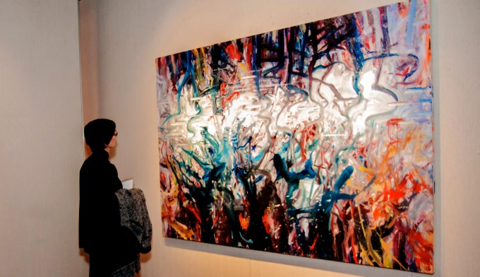
RickVian install 1_2

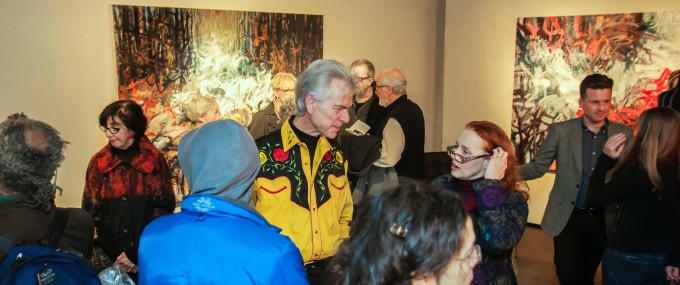
Rick Vian, Installation / Opening image, Courtesy of the Robert Kidd Gallery

As a young, aspiring painter, before I had any idea that Rick Vian was a local artist, I greedily snipped out every advertisement from Art in America his work was featured in and collaged them into my journal, alongside the work of other painters who inspired me. I loved the way his work rode a Rothko-esque razor’s edge between abstraction and representation (channeling Rothko as well in subjective spiritual punch) and how smartly it appropriated recognizable phenomena that were already abstract, such as reflections and strange effects of atmosphere and light, into works that were as much about form and surface as they were about content and illusion. Seeing Vian’s recent work this week, therefore, felt doubly special- being surrounded by masterful, imposingly scaled paintings that come from a body of work I’ve followed closely for years.

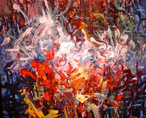
R.Vian install 2

Installation Image, Courtesy of the Robert Kidd Gallery

The title of Rick Vian’s retrospective, currently on view at Robert Kidd Gallery in Birmingham- Using the Whole Chicken– belies the perceptive, multi-layered formal gravitas that unfolds as one moves from piece to piece. Consisting of paintings spanning 1972 to 2015, Using the Whole Chicken, takes as its prima materia two iconic spiritual forms from two vastly different faiths- the Western Baroque genre of trompe lois church ceiling paintings (Vian mentions two ceilings in Roman churches in his artist statement, painted by Giovanni Battista Gauli and Andrea Pozzo) and the Eastern mandala (or mandorla, which, as Vian points out, appears in early esoteric Christian and Islamic art as well). Both forms seek to foster a transcendent spiritual experience, delivered visually- Both consist, very basically, of a round, bright center surrounded by darkness. Vian takes this visual coda of contemplation and transcendence outward, into nature, and inward, into the visual cortex of the human brain- an interesting conceptual mirror for the outer journey of Western painting, with its focus on beauty, perspective, and high illusion, versus the inner path of Eastern aesthetics with its deceptively simple abstractions and vague, groundless atmospherics that channel a more subjective, synesthetic experience of the world.

Sky in the Water

Rick Vian, Sky in the Water, Detail, 60 X 84, 2015


Vian’s great gift as a painter is his apparently effortless ability to conjure images that are at once fully nonobjective and grounded in depth- windows onto the world in the Italian Renaissance tradition. The paintings in Using the Whole Chicken appear before the viewer’s eyes as formal abstractions, while creeping up behind the eyes as atmospheric landscapes. Their surfaces are formal, their deeper implications illusionistic. The more time one spends with a Rick Vian painting, the more subtle, ungrounding, and revelatory this interplay becomes.

It’s appropriate that Vian has chosen to frame the work in Using the Whole Chicken in terms of iconic spiritual image systems- he’s picked the beauty, turgid hues, and attention to surfaces from Western painting and the subjective, unfixed viewpoint and groundless atmospherics from Eastern painting, roping in references to the inner processes of the brain into the mix. The honeycomb-like grids that appear here and there in the work represent the process by which light enters the visual cortex of the human brain and is broken up into colors, shapes and space- another symbolic connection to the traditions of church ceiling painting and the mandorla, which Vian describes as “looking towards a place of light from a place of darkness.”

Using the Whole Chicken exhibition is on display at Robert Kidd Gallery in Birmingham, MI from 11/19/2015 – 12/19/2015. www.robertkiddgallery.com


Brenda Goodman @ Center for Creative Studies Gallery

Square Peg, Round Hole, Hungry Ghost
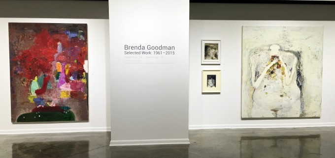
B. Goodman Installation 11,2015

Brenda Goodman, Installation image, Courtesy of Ron Scott


One is reminded of the pre-eminence of painting as the pinnacle of fine art media- and its uncanny self-sufficiency- up to the late Twentieth Century when viewing Brenda Goodman’s decade-spanning retrospective at Center Galleries at College for Creative Studies. Coming face to face with the broad span of figures, forms, and grounds that float heavily through Goodman’s oeuvre unlocks a deep, visceral response. This is painting that tells me that I know nothing about painting. This is painting as it once was and is no longer. This is painting from the days when painting was a truly heroic undertaking- when works of profound genius that seamlessly roped form, material, surface, context, and narrative into an exploration that balanced on a knife’s edge between pure form and deep, expressive language seemed to roll right out of the minds of Goodman and her contemporaries, such as Philip Guston, Elizabeth Murray, Nancy Mitchnick, and Ellen Phelan.
the race

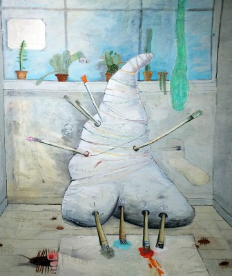
Brenda Goodman, The Race, 1973 – Oil on Canvas Courtesy of Clara DeGalan

The above-mentioned self-sufficiency that comes across in Goodman’s work is the result of visual engagement with the viewer’s experience, employing only one material to express a language that is both purely formal and not- that both dwells in and transcends the methods of its making- that feels (these works make one refer to a visual response as a feeling) like a foreign language heard in a dream that gradually becomes discernible as one listens to it.

Likewise, as one goes from work to work in Brenda Goodman: Selected Work 1961-2015, the development of her encyclopedia of symbols distills in different forms and contexts, its trajectory remaining intact despite the constant inversion of figure/ground and objective/nonobjective (these, I might add, are only two of the largest and most evident inversions- Goodman parses the notion of inversion, turning, twisting, and recasting through surface, picture plane, narrative, space, and form up to the horizon of the viewer’s vision and then, presumably, beyond it) that Goodman ropes into her exploration down the decades. It is this roster of forms and characters- Goodman has referred to them as “personal symbols”- that hauntingly parallel language in the aggressively visual, formal context of her work.
untitled 1979

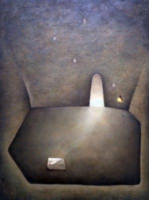
Brenda Goodman, Untitled, 1979, Oil, Sand, on Canvas

The figure makes its presence felt in various ways through the years spanned in Selected Work. Its earliest manifestations, in works such as The Race (1973) depict grotesque-yet-loveable mutations of human bodies into simplified intestinal forms with prehensile limbs and hungry mouths, clumsily filling minimal atmospheric spaces as they stretch and strain to work, express, and consume. These minimal spaces empty out intriguingly in a couple of works from the late 70’s though the forms of the figures remain, now sunk into ground space and half-camouflaged with light, as in Untitled (1979). Another untitled piece, one of the most striking in the show, is a smallish work on paper from 1981 depicting a rotund draped form that bears all the awkward heft of Goodman’s early organ-figure paintings, and yet floats across a deep black ground cut horizontally near the bottom of the picture plane to reveal a thin strip of earth-toned underpainting that reads like a tightrope. There are shades of Philip Guston’s Klansman romps here, but recast in an altogether more sombre, personal context.
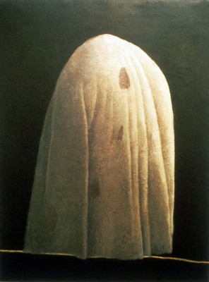
Utitled 1981 BG

Brenda Goodman, Untitled, 1981 Oil on Paper

The figure fleshes out more representationally, in the same vague, thinly painted studio-type space, in a series of unforgiving self-portraits that progress through the 1990’s (an era marked by extreme hostility toward painting and explorations of the figure in particular that sparked an epoch of figurative painters such as Jenny Saville, Elizabeth Peyton, John Currin, and Lisa Yuscavage) to 2008. These portraits, which Goodman executed while struggling with her weight, depict a large, fleshy female figure ephemerally lodged among barely tipped-in canvas stretchers and vast pale space. The figure is heavy and fat, the flesh built up in crazy swaths and scorings of sick flesh tones, and yet floats- her feet are almost never visible, and her connection to the studio-like space is uncertain.
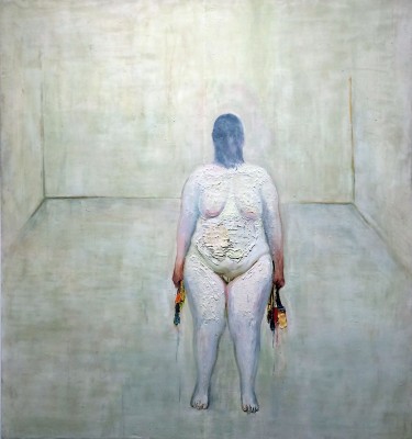
self portrait 4

Brenda Goodman, Self Portrait #4, 2004, Oil on Wood


The organ-figure appears again around this time, undulating through dark voids and squirming beneath flat, saturated bands of color in a run of untitled works on paper that evolve through almost totally nonobjective color field studies shot through with drawing/painting marks, and coalesce again in Goodman’s most recent work on display, such as the taut, formally enclosed Euff (2015). Here, a pale, root-like figure waves two tapering limbs around a deep black ground, which it shares with pale, sharp slashes that read like unlit matches, creeping into the picture plane from the lower right. The figure’s limbs divide the picture plane into three petal shaped forms- looked at this way, the figure becomes the ground, and yet the sense of movement that radiates from it quickly re-establishes it as a figure. Is the form painted, or is the painting happening around the form? It’s a mark of Goodman’s genius that the two are constant, silently changing places. Her best work keeps the forms and the action vague enough that the interstice between figure and ground remains enticingly impossible to focus upon. It seems like such a practice, where the meat is in the surfaces, would preclude any meaningful figurative, symbolic, or contextual content. That’s another facet of Goodman’s genius. Her paintings are purely formal but not, intensely personal yet open, deeply symbolic and embedded in an experiential, bodily context, and yet ungrounded, floating, vulnerable to various points of entry and engagement. It is this quality that leaves the contemporary viewer in awe- the ability of Goodman’s work to function seamlessly on visual, emotive, and conceptual levels, with paint and surface as the only tools.
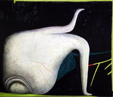
Euff BG 2015

Brenda Goodman, Euff, 2015 Oil on Wood


Brenda Goodman: Selected Work, 1961 – 2015   November 14 – December 19, 2015

http://www.collegeforcreativestudies.edu/community-outreach-and-engagement/center-galleries

“Brenda Goodman: A Life on Paper”  Paul Kotula Projects, http://www.paulkotula.com
Performance @ Popp’s Packing: Jessica Frelinghuysen

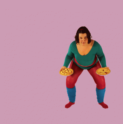
pie-in-the-sky

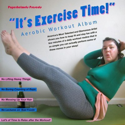
Though I flatter myself that I am a somewhat avid runner and yogi, I was not prepared for the hardcore booty-shaking that artist Jessica Frelinghuysen led her audience through at the opening of her new show, “It’s Exercise Time!” last Friday at Popp’s Packing art space in Hamtramck. I guess at such events my body is in rest-and-present-yourself-well mode, most of my energy going into chit-chatting and craning my neck to get a glimpse of the work on display around the clusters of opening attendees. One doesn’t stand by and observe at Frelinghuysens performances, however. Indeed, the very designation of “audience” collapses before Frelinghuysens’ boundless energy, quick wit, and all around fantastically grounded presence. It’s also a safe bet that you’ll find yourself diving into some activity that you wouldn’t hitherto have dreamt of doing in a gallery setting- which is exactly the point.

The walls around the gallery were posted with Trail Fit-esque exercise instruction graphics explaining how to properly do lifting reps with large bags of rice and knee-lift-and-punch sets while singing along to “Eye of the Tiger” (which happened to be playing over the sound system while I read that particular instruction- the invitation became irresistible.) Interspersed between instruction graphics were surprisingly lovely photographic portraits of Frelinghuysen going through her workout paces at many unconventional sites around Hamtramck- tossing sides of meat in Bozek’s meat locker and lifting a huge bag of onions outside Al Haramain Market. She told me a funny story about that moment- as she struggled to lift the unwieldy sack, a man in very conservative Yemeni dress pulled up and parked right in front of where she was lifting. He watched, without budging from his car, and when she finally got the fifty-pound bag lifted over her head, he burst into a sudden round of applause. It seems Frelinghuysens’ energy is just as infectious outside the gallery space.

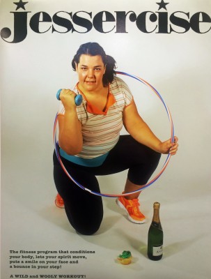
Jessercise Poster, Jessica Freylinghuysen 2015 Photo by CLara DeGalan

“It’s Exercise Time” has transformed Popp’s art space into one easily mistaken for a small, mom-and-pop gym, except for the bottles of champagne that are there for both lifting and drinking purposes. This effect was pushed still further at the opening, as folks gathered around Frelinghuysen while she mounted the carpeted platform, dressed in full rainbow-hued workout regalia. She proceeded to lead us in a lengthy, fast-paced, serious cardio workout that had me out of breath inside of three minutes- Frelinghuysen broke a sweat, loosened up and launched into the next round of time-steps and air punches. Here the long tradition of displays of endurance in performance art was channeled with a lightness and hilarity that suited the bright palette and self-deprecating humor of Frelinghuysens’ exhibition. One by one, audience members were drawn into participation, as enchanted by the artists’ unaffected, funny, down-to-earth performance style as that man outside al Haramain Market. The total (and somewhat surprising) absence of irony in Frelinghuysens’ manner helps, as well. In a setting where people tend to be very concerned about how they appear, the extent to which we all followed her example, cutting loose and just having fun with our bodies, was a revelation.

All of the best performance artists I’ve seen in action assume characters that are somewhat amplified versions of themselves. Frelinghusen is a natural at this. While her performances certainly bear a trace of the theatrical- she assumes a particular garb and enters her performance space, be it the gallery or city street, with a point to make- she inhabits them in such a way that she never stops feeling present, accessible, to her audience. Significantly, she refers to the clothes she designs and wears for her performances as “uniforms” rather than costumes. This points to the importance of the uniform as an entry point, cultural signifier, and problem-solving accessory. Frelinghuysens’ many bodies of work all have a problem to be solved as their starting point. Her ongoing “Paper Helmets” series aims at solving problems of personal communication; her “Coffee Cart” performance at Cranbrook aimed to remedy the absence of available coffee for Cranbrook students and staff. “It’s Exercise Time!” makes up one part of her exploration of a somewhat more complex problem- the vast divide between “art” space, and the rest of the world.

It's Exercise Time album cover Photo by Jessica Freylinghuysen

Her impetus to dovetail gym culture with gallery culture, she told me, lay in her long-standing, serious commitment to both worlds, and how odd it seemed that her social life in the gym was so completely different than her social life on the art scene, when the two disciplines (of the body, on the one hand, and the studio on the other) bore such a close resemblance to one another. She pointed out that endurance, commitment, and serious play are all common factors between the two worlds. That resemblance extends to the aesthetic, as well- she noted how the white, clean walls of the gallery closely resemble those of the gym. Transplanting the gym to the gallery, with a veneer of humor over seriously exploratory intent, proved delightfully disruptive to the usual flow of an art opening. Frelinghuysen manages such actions with a light, humorous touch which leave people in the art world and outside of it feeling tickled and intrigued, rather than confused and defensive. She noted, “If it’s disrupting everyday life a little bit, then I’m interested in it.” Disruption is the calling card of so many performance artists- not so many manage to channel it into actions for positive engagement and change that flow identically inside and outside traditional art-viewing spaces. Frelinghuysen has already moved past those boundaries- and is playfully beckoning us to follow.

Saturday, October 24, at 2 pm at Popp’s Packing


Page 6 of 6

Powered by WordPress & Theme by Anders Norén