Critical art reviews of Detroit galleries and museums weekly

Author: Clara DeGalan Page 1 of 6

Writer

Olga de Amaral @ Cranbrook

Olga de Amaral: To Weave a Rock at the Cranbrook Art Museum 

Bogotá-born and based fiber artist Olga de Amaral is now receiving her first U.S. retrospective at the Cranbrook Art Museum in a joint curatorial venture with the Museum of Fine Arts in Houston, the institutional hotbed of Latin American scholarship, primarily driven by well-researched exhibitions. This current show, which traveled here from Texas, is a rare treat since Latin American programming does not feature centrally in the Michigan cultural agenda.

By way of introducing the non-utilitarian textile practice of this Colombian artist to an audience mostly unfamiliar with her rich practice from the last five decades, the Cranbrook Art Museum commissioned a short video displayed in the entrance space, directed by Andrew Miller. Filmed in close-up in what appears as a single take, the artist directly speaks to the viewer about the essential role that color, texture, and structure, alongside the simplicity of a geometry of squares, circles, and triangles, play in her woven, braided, and knotted fabric “constructions” in space.


Such concerns are perfectly in keeping with the principles of an abstract artist whose series of works are distinguished by permutations in technique accompanied by a plethora of intricate color, texture, material, and shape variations developed throughout her career. In the 1960s, the planar tapestry-style weavings, often featuring a fringe above or below, allowed the viewer to look through the existing wool threads onto the support, the white wall.

Installation shot, Olga de Amaral: To Weave a Rock, Cranbrook Art Museum, Photo credit for all images except noted: PD Rearick

Amaral first encountered a loom at Cranbrook, even taking one back to Bogotá. Most countries where abstraction was central between the 1940s and late 1970s were immersed in lengthy periods of dictatorships during those decades. Whether despite or because of the political situation, Amaral’s frequent years abroad, always returning to Bogotá, heralded an international career. After initial training in architectural drafting at the Colegio Mayor de Cundinamarca in Bogotá before coming to the U.S. to briefly study English at Columbia University in New York, she transferred to Cranbrook in 1954. During her two years in Michigan, she accomplished the most conspicuous of her transformations as a non-degree seeking student trained by the Finnish-American textile designer Marianne Strengell. Back in the 1940s, artists such as Strengell and Anni Albers at Black Mountain College began to pave the way for a more experimental approach to weaving, opening it up to integrating concerns from the “other” arts of painting and sculpture.

Amaral’s iconic Carretón negre (Black Clover), 1973, reminding us of the sculptural work of Eva Hesse, is displayed prominently as a signature work to be seen immediately upon entry to the exhibition. As it sits on a low white pedestal, supported by a hook, the bulbous knot exudes a tremendous sense of weight. This sculpture is indicative of how in the wake of process-oriented soft sculpture many artists chose to make visible the fact that material behavior in space controls shape. It was appealing that this occurs beyond the immediate control of the artist as a force of nature.

A pictorial play with light and air as forces of transparency in the first tapestries gave way in the 1970s to a radical pursuit of free-standing and free-hanging objects suspended from the ceiling.

Installation shot, Olga de Amaral: To Weave a Rock, Cranbrook Art Museum

The weavings gain an unprecedented degree of volume in space driven by a sculptural monumentality that explores weight, mass, and gravity as form-giving forces. As a direct response to the developments of Minimalism and Postminimalism when artists became attentive to the architectural context, the behavior of the art material, and the bodily experience of the viewer in space as a mobile entity, fiber art as an independent art form was born in the late 1960s and early 1970s, and Amaral emerges on the forefront of it with the Muro tejidos (Woven Grid Walls.)

Made from wool strings and horsehair braided together, Muro tejido, 1972 (the second work from the left in installation shot 2), rejects the rigidity of the right angle that dominated the loom-based tapestries from the mid-1960s. As weighty and sagging dividers of space, these “physical structures” from the 1970s break with the order of the grid, often omitting the horizontal line of the weft in large sections in an emphasis on materiality as a force of expression. This is accompanied by hand-tying and wrapping increasingly tactile materials of coarse horsehair, broad straps of linen, and even bands of plastic directly into the constructions. Secondary to concerns with shape and volume, color in this period is somewhat subdued to greys and browns and bound to a traditional waving process of dying the thread before the weave. Increasingly, throughout the 1990s and 2000s, the color becomes a vital force when fabric works are made entirely off the loom.

Installation shot, Olga de Amaral: To Weave a Rock, Cranbrook Art Museum

This stellar show of about fifty works shines a light on those terrific leaps into space and color by Amaral, so that viewers can study the formal changes in a mostly chronologically organized lineup from 1965 to 2017. The five curatorial themes of “Rebel Warp,” “Radical Materialism,” “Alchemy,” “Space Odyssey,” and “The Line” cut through an artistic oeuvre characterized by series that often carry associative references to the landscape of Antioquia dominated by the Andes Mountains and prehistoric Colombia.

Of special note in this regard is a series of luminous golden plaques begun in 1996, the Estelas; the title is the artist’s creative composite of the Spanish words for star and fabric. Tightly grouped together in a black niche, about a dozen items hang from the ceiling on transparent nylon wires. The crusted surfaces shimmer brilliantly in the light, strongly enhanced by their contrast to the surrounding black wall paint.

Installation shot, Estela Grouping, 2007, linen, gesso, and gold leaf, Olga de Amaral: To Weave a Rock, Cranbrook Art Museum, Photo credit: Nadja Rottner

Ancient cultic monuments, stone tablets, or gravestones come to mind that brings ideas of ritual, commemoration, memory, and the passing of time on a cosmological scale to the fore. All the while, the double-side sculptures items float precariously in space with changing impressions of light and color lending a quality of impermanence and fragility to the Estelas that seems contradictory. Color is no longer the result of a fabric dye but added onto a linen ground with a tool, stabilized by gesso in the manner of a painter. Words such as off-stretcher painting, free-hanging sculpture, or off-loom weavings characterize her objects as Amaral continues to abandon the fundamental concept of weaving—the opposition between the warp and the weft—entirely in the most recent decades of her practice.

One such example hangs to the left of the Estelas. Suspended from the ceiling and about two feet away from the wall, a black and dark green curtain-like item leaves a strong but unstable and fluctuating cast shadow with a wave pattern behind it.

Olga de Amaral, Entorno Quieto 5 (Quiet Environment 5), 1993, Wool and horsehair, 86 ½ x 86 ½, Courtesy: Case de Amaral.

In Etorno Quieto 5 (Quiet Environment 5), 1993, we encounter an alternative conception of surface and support from the Estelas. Two superimposed planes of differently colored fabric celebrate the freedom of the vertical line from its horizontal imprisonment, creating a wave like vibration of shape reminiscent of the illusionism of optical art when an artwork sets in place shape and color oscillations subject to the viewer’s eye-brain response. Then there is the fact that the fabric threads literally move in infinite ways by circulations of air.

Extending this push toward opticality into a room-spanning environment, the viewer encounters the impressive installation of the Brumas (Mists), 2013, made from acrylic, gesso, and cotton on wood, toward the end of the gallery. Hung off four black rectangular panels (each about 75 x 35 inches in size), myriads of colored threads hang loose. Cut at different lengths, the impression of triangular shapes is only upended when the moving viewer comes in closely.

Installation shot, Olga de Amaral: To Weave a Rock, Cranbrook Art Museum

This work, among others from the last three decades of her practice, is directly inspired by two forms of geometric abstraction, known as Optical (or Op art), a style of abstract art based on patterns and optical illusions, and Kinetic art (objects that have moving parts). Both became popular in Venezuela in the 1950s and 1960s represented by artists such as Carlos Cruz-Diez and Jesús Soto. Their works included small and large-scale abstract sculptures in bright colors and industrial materials that promote the experience of color by the viewer, through his or her own subjectivity, in an individual, emotional and virtual way, changing the way we perceive space, light, and movement.

Behind the Brumas in the last room on the left, three recent tall knots from 2016-2017 are suspended from the ceiling, all the while touching a floor pedestal. Nudo 19, 27, 25 are colored in non-naturalistic turquoise, yellow, and magenta (made from linen, gesso, acrylic.) They stand in front of two vibrant tapestries titled Lienzo en dos colores (Canvas in Two Colors), featuring a blue and green color combination and one in red and magenta that matches the knots. These works recall an artist’s statement from the video, namely that mixing colors in fabric art is like painting, except that paint is replaced by died threads that are interwoven, be it on a machine or by hand.

The show brings out beautifully how the work as a whole oscillates semantically, formally, and procedurally around artistic and intellectual concepts of opposition such as opticality versus gravity, the industrial and the indigenous, the hand and the machine. Air, movement, gravity, and water evoke ideas of natural change and impermanence. They stand in a productive dialogue with concepts such as universality, the cosmological, and the monumental. It is those tensions, among others, that animate the work from within.

Olga de Amaral: To Weave a Rock at the Cranbrook Art Museum through March 20, 2022

Adeshola Makinde: Relevant @ Playground Detroit

The insertion of a work of art into the public sphere through mass media means is a dictum of Chicago-based Nigerian American visual artist Adeshola Makinde, who began his career as a self-taught practitioner three years. Having established the framework of a photomontage artist, “collage commissions” such as “the beauty is…FEEL STRONGER TOGETHER!,” 2020, executed for Nike, or “A year on from George Floyd: how laws allow police to use fatal force,” an illustration for a news report by the Guardian, recombine text and images from various print and media outlets into an art of political messaging that lacks ambiguity.

Designing work for reproducibility in the urban sphere, Makinde garnered public attention in Detroit in 2019 with a text-only black and white highway advertisement on W. Warren Avenue and Wesson Street. The rented billboard featured a found political slogan from the Civil Rights era, “We demand an end to police brutality now!,” writ large in white capital letters on a solid black backdrop, situated opposite a Coca-Cola bottling warehouse on the other side of the street.

Adeshola Makinde, “WE DEMAND AN END TO POLICE BRUTALITY NOW!,” 2019 22” x 11” feet, W. Warren Ave & Wesson St, Detroit, Michigan

As is well known, during the mid-to-late 1960s conceptual artists began to respond critically to how institutions shape our daily lives by incorporating language into art. Makinde’s practice extends some of conceptual art’s presuppositions, namely that art as text can be distributed anywhere: in fashion magazines, on walls, like advertising, in bus stops, or in social media contexts, in attempts to reach a wider non-art and art audience alike. A turn to language in visual art challenged the very nature of art, altered its appearance, often accompanied by a strategic insertion of text into commercial circuits of distribution. As part of a nationwide campaign with 29 billboards in 22 cities, “We demand an end to police brutality!” was accompanied by additional political slogans such as “We protest school segregation,” “Black power,” and “Free all political prisoners.” In this series, Makinde shifts a personal expression of street protest into a commercial context to broadcast messages of discontent even louder. To bring found Civil Rights era slogans into the context of art also pays attention to the work we do with words when we protest.

This becomes particularly evident in his recent solo show at Playground Detroit which shifts the premise of the billboard project into the space of an art gallery by working with text silkscreened onto canvas. Aptly titled RELEVANT by local curator Juana Williams, the exhibition makes a strong case for the continued relevance of a fight for social justice. As racial oppression has deep roots in U.S. history, the struggle for civil rights and racial equality began decades before the 1960s and it continues to this day. The timely exhibition incorporates the sentences from the billboard campaign into a plethora of twenty-eight political slogans, all of which stem from the Civil Rights era transcribed by Makinde off banners and hand-held placard signs seen in historical photographs of street demonstrations from the 1960s.

Installation shot, Adeshola Makinde, RELEVANT, Playground Detroit, Photography credit@samanthaslist

Upon entry into the long rectangular exhibition space on Gratiot Avenue near Eastern Market, on the left wall one can read “Support those who serve the people” and “We demand equal rights now!”. Text in white, sans serif capital lettering, is printed onto identically sized 16 x 20-inch black canvases. As an expression of protest and discontent, often without the backing of powerful institutions, letting your voice be heard is most effective in simple, concise, bold, and repeatable words. Makinde’s design choice echoes that typefaces in protest signs are often without a serif at the end of a stroke, set in capital letters, and feature a mono weight letter style without thick and thin line transitions as they ought to compete for attention in a crowded street or media space. The canvas fabric is neatly pulled around the edges of the stretcher so that the pictorial work takes on an object dimension. The wall on the opposite side of the room features the phrases “All power to the people,” “We shall overcome,” and “Equal opportunity and human dignity.”

Installation shot, RELEVANT, Playground Detroit, Photo credit @samanthaslist

Merriam Webster dictionary defines “people” as “human beings making up a group or assembly linked by a common interest” and “the mass of a community as distinguished from a special class.” While a linguistic message such as “All Power to the people” does not diminish in emotional force or urgency of appeal over time, “the people” as the entity that is addressed is a fluid category up for change. In addition, by using instructional verbs that issue a command (“support,” “honor,” or “free all”) and by employing the personal pronoun “we,” Civil Rights era messaging was both direct and inclusive.

Makinde’s citations are exact quotations without alterations to the language. However, the 1960s aesthetic of placards tended to be in black on white, often collapsing two messages onto a single hand-made sign. We might read the artist’s choice of white on black, instead of black on white, as an allegory on his own experience of being Nigerian in a mostly white suburban Chicago neighborhood where discourse, education, and history were written by white people. He refers to his practice as “a journey into Black consciousness” which is the result of a missed encounter: “My upbringing is precisely why I approach art the way I do. I was raised in the Chicagoland suburbs and in my younger years attended predominantly white schools. This is something that shapes my work today, due to the fact that it was such a stark difference from the life I led at home with my immigrant parents from Nigeria. By going to schools with this sort of racial makeup, I didn’t learn a great deal of Black history, if at all.”

One of the canvases in the exhibition, “HONOR KING: END RACISM!,” is accompanied by a T-Shirt and yard sign limited-edition with the same slogan.

Adeshola Makinde, “HONOR KING: END RACISM!,” Limited Edition yard sign, 2020

We can wear the shirt in our daily lives and plant the sign in our front yard. This allows us to participate directly in the performance of dissent, and it cleverly appropriates techniques from political campaigning for the purpose of protest art.

The exhibition has additional reach beyond the gallery space in a poster campaign. The slogan “Free all political prisoners,” alongside the announcement for the exhibition, is pasted onto twenty abandoned street facades in Detroit.

Adeshola Makinde, “FREE ALL POLITICAL PRISONERS,” 2021, 24 x 36 inches, Wheatpaste posters, various locations, Detroit. Photo credit Adeshola Makinde

Most of the locations are placed along the historic Grand River Avenue which radiates out from downtown into the suburbs. As one of the city’s main traffic arteries, it is a busy thoroughfare that connects the inner city to outer residential areas, reaching as far as Lake Michigan. Abandoned spaces and derelict facades along the Grand River corridor stand in stark contrast to the urban revivalism of Detroit midtown or downtown where abandoned storefronts with decaying commercial lettering are mostly an image of the past. The RELEVANT posters blend the political with the commercial, the artistic with the political, and the contemporary with the historical.

RELEVANT pays homage to how Detroit was a city where black people embraced black power activism much earlier than in most other cities, and it isolates those slogans that have the most timeless ramifications for a cultural movement that has its historical roots in African American activism but is by no means limited to it. Famously in Detroit slogans such as “We demand equal rights now,” “Vote for freedom,” and “We demand an end to bias,” were visible during the Walk to Freedom in Detroit on June 23, 1963, after which Martin Luther King Jr. delivered an impassioned precursor speech to “I Have a Dream,” advocating against civil rights inequalities, police brutality, housing segregation, unfair wages, and gender imbalances. Makinde’s sorting out of popular slogans with dated historical references (such as “Stop Jim Crow” or “Join the N.A.A.C.”) makes a strong argument for the continued relevance of a fight for social justice today.

Lastly, looking into the history of individual slogans, the Civil Rights era emerges as a movement with a plurality of voices. “All Power to the people” is a popular anti-establishment slogan employed since the 1960s in a variety of contexts by pro-democracy movements, youth anti-war protests, or other social movements. Initially used by young people to protest oppression by older people, the so-called establishment, it was appropriated by the Black Panthers to protest the rich ruling class domination of society by white people. The famous slogan “Black Power” is directly attributed to the Panthers whose radical ideology of self-determinism is not synonymous with King’s more inclusive dictum of “All the power to the people.”

Adeshola Makinde, “BLACK POWER,” Silkscreen on canvas, 16 x 20 inches, 2020

Over the past year, the language of protest has been in high demand and Makinde’s prescient show offers much food for thought. Who are the people, then and today? Who is fighting the good fight today? Are you part of the people? RELEVANT also offers up valuable insights into the history and the aesthetic of protest. Commentators have likened the recent political strife to that of the 1960s and expressed disbelief that the country has arrived at such a divided and volatile state. It is time for disbelief to make way for analysis. RELEVANT reminds us of the complexities of the historical moment generally referred to as the Civil Rights era and it shows the need to better understand the performative dynamics of protest and the rules of the language of dissent that fuel it.

Adeshola Makinde, Relevant, Playground Detroit, July 30-August 28, 2021

Marie Herwald Hermann @ Reyes/Finn Gallery

Quite like the majority of us, ceramicist Marie Herwald Hermann has been confined to work from home since March last year, and she found inspiration in this unfamiliar circumstance. As the country begins to mend  And the Walls Became the World All Around Us reminds us of the power of art to not only create beauty, but to build community through a greater understanding of humanity.

Taking over the entire single-room space at Reyes / Finn, a fairly new, professional contemporary art gallery in Corktown led by Terese Reyes and Bridget Finn, the markedly colorful installation crafted from clay, wood, silicone, and pigment, comprises over twenty works either in the form of a single object or a combination of several into an arrangement. Having worked with Simone de Sousa Gallery in 2015 and Reyes Projects in 2017 and 2018, among other venues, Copenhagen-born Hermann is no stranger to Detroit as she moved here after graduating from the Royal College of Art in London with an M.A. in Fine Arts in 2009, only to settle into an academic teaching position in ceramics at The School of the Art Institute of Chicago in 2018.

Installation detail of Marie Herwald Hermann, And the Walls Became the World All Around Us, 2021. Photo by Clare Gatto. Courtesy of the artist and Reyes | Finn, Detroit.

The title of Hermann’s vibrant and vivid show, And the Walls Became the World All Around Us, alludes to a 1963 American children’s picture book classic Where the Wild Things Are by Maurice Sendak that functions as a meditation on how dreams and the imagination are tied to experiences of confinement, restriction, and trauma. The main character Max, a young boy who is sent crying to his bedroom by his mother after playing recklessly in the house while wearing a wolf suit, envisions a magical journey to an island where he reigns over and dances with terrifying in appearance but playful and sensitive half-reptilian, half-mammilian wild things before returning home. Philosophers in the empiricist tradition believe that we can only imagine things using the materials that we have previously perceived. Since many features of the wild things’ world resemble Max’s actual world, including Max himself, this book, not unlike this exhibition, provides an opportunity to think about whether this empiricist claim is true.

Exceedingly well executed and in pursuit of an overall aesthetic of cohesion, And the Walls Became the World All Around Us features in the very center of the space a long, green display table that cuts diagonally across the rectangular room. The display is reminiscent of the painted still lives of early modern Italian artist Giorgio Morandi known to depict apparently simple domestic objects such as vases, bottles, and bowls with great tonal subtleties, an art historical point of reference acknowledged by the artist.

Installation detail of Marie Herwald Hermann, And the Walls Became the World All Around Us, 2021. Photo by Clare Gatto. Courtesy of the artist and Reyes | Finn, Detroit.

While the green table perfectly matches the color of the tall, vertical wall right behind it, the entire arrangement stands out in shape, color, and process from the surrounding objects, albeit ever so subtly. The table and twenty-three ceramic vases and bowls set atop are, interestingly enough, not listed in the work inventory for the exhibition—a fact this author will return to presently.

Hermann’s installations in general, and this one in particular, deliver a delightful impression of unity between sculptural objects, surrounding walls, and the floor that many visual artists in the twentieth century have been after, including the passion of Minimalist and Postminimalist sculptors in the 1960s for placing objects directly on the floor. In a free-standing tub-shape of sorts, Untitled (Blue and Yellow), floor, wall, and object enter into a pleasing aesthetic unity with sutle variations in hue, texture, and material make-up.

Marie Herwald Hermann, Untitled (Blue and Yellow), 2021 Stoneware and maple wood, 9.5 x 40.5 x 11.5 in. Photo by Clare Gatto. Courtesy of the artist and Reyes | Finn, Detroit.

As the human eye moves through the space from one field of vision to another, changing permutational differences in shape, color, and texture create a dynamic experience while preserving cohesion. As such Hermann operates with the logic of a visual artist who conceives of ceramic objects as entities that cannot be unbound from the coordinates of space-time perception. The many references that occur in her work to the history and practice of visual artists build a fruitful bridge between ceramics, sculpture, and painting. Color conceived of as a field, and this is something abstract painters explore, promotes sculptural integration between wall and objects. An exploration of the impact of color on human perception introduces a new avenue of pursuit for the artist.

Marie Herwald Hermann, and the silence returned, 2021 Porcelain and stoneware, 15.5 x 16.5 x 7.5 in Photo by Clare Gatto. Courtesy of the artist and Reyes | Finn, Detroit.

In the bright yellow and pink arrangement and the silence returned, it becomes especially apparent that color holds power over feelings. The base color yellow has a strong orange tint that heightens its chromatic intensity. While the wall and shelf are painted in the same color, the cup and bulb-like object with its pointy tip appear in a somewhat lighter tone. Both hues enter into a pleasing resonance of barely perceptible difference with the light pink of the long rod and roundish saucer-like plate. Fashioning her signature wall shelves, and not just the objects supported by it, out of clay and in matching colors speaks to an artistic desire for integration as an aesthetic concern often accompanied by an intellectual desire for a more wholistic approach to life in general. In an unpublished artist talk in 2020, she states that objects “on their own they are un-significant,” only in a group will the object achieve “significance.”

Returning to the green table arrangement, Hermann acts yet again more directly like a painter when color pigments are brushed onto the vessels and protected by a transparent seal that acts like a varnish. By extension, the surrounding works appear in different colors and feature different shapes in porcelain and stoneware, two harder variants of clay fired at high temperatures. We cannot talk about ceramic objects without talking about texture and tactility. Despite the artist’s programmatic refusal to leave expressive finger marks on her ceramic objects, process is paramount to her work.

Throwing clay onto a wheel, the artist confesses to this author, is a purely automatic routine at this stage of her career, just like riding a bicycle, and there is an innate beauty to it. The “thinking body,” Hermann notes, can do “things” during the process of throwing. What we commonly but somewhat misleadingly might refer to as muscle memory (muscles cannot have memory only the brain does), scientists have termed a form of procedural memory that allows us to do certain tasks without thinking about them. In this sense, the ceramic vessels on the green table function as props for human experience. They stand for the thoughts and feelings that occurred during the physical task of throwing. A byproduct of the working process, rather than an end product, they are not for sale.

Memories play an important role in the work of Hermann in general. There is much that researchers do not understand about human memory and how it operates. Some suggest that instead of different, distinct types of memory, it operates in successive stages anchored in sensory memory, short-term and long-term memory occur. Sensory memories committed to explicit or episodic long-term storage in the form of autobiographical events repeatedly surface in her installations. The vibrant wall colors in And the Walls Became the World All Around Us are inspired by childhood memories of visiting the classical art collection of the Thorvaldson Museum in Copenhagen with her architect-parents. The clash between three-dimensional Greek and Roman marble sculptures offset against bright yellow, blue, or red backdrops gives way here to an aesthetic of integration and fluidity instead of contrast.

In addition to yellow and green, blue is the third dominant color in this installation.

Installation detail of Marie Herwald Hermann, And the Walls Became the World All Around Us, 2021. Photo by Clare Gatto. Courtesy of the artist and Reyes | Finn, Detroit.

Interestingly, as memory studies emphasizes, yellow and blue are colors in our semantic memory that represent nature in language. We note that the “sun is yellow” or that the “sky is blue,” even though, in scientific terms, this is not accurate. The sky only appears to be blue as light and air contain the full spectrum of color and the sun is not a yellow planet nor is the light that it emits yellow.

Many types of shapes occur in the show: circles, rings, elongated ovals, needles, cups without handles, bowls etc. Some of the objects cary strong associations with kitchen utensils or plumbing fixtures such as towel rings evoking ideas of cleanliness, beautification, and the labor of washing, while others remain entirely abstract. At any rate, tentative links with elements of the domestic realm attributed to women emerge. This holds especially true for Double.

Marie Herwald Hermann, Double, 2021 Oakwood and silicone, 47 x 9 x 1 in. Photo by Clare Gatto. Courtesy of the artist and Reyes | Finn, Detroit.

Fashioned in oakwood, the irregular oval frame is reminiscent of a mirror in form and name. Double reminds us that a mirror image is a reflected duplication by means of light that only appears to be identical. Setting malleable materials such as latex, resin, or now silicone, alongside hard and durable stoneware and porcelain, allows for time and process to enter the work as silicone changes when it ages. That silicone is a material employed in kitchens and bathrooms, as well as in breast implants, as the artist reminded this author, expands on the larger theme of the work as a poetic meditation on everyday life.

“I like titles with hints at something romantic and beautiful, but also titles that withdraw in the end, and have a tone of sadness and melancholia,” Hermann revealed in a public interview with Glenn Adamson at Simone de Sousa Gallery in 2015. Reading the exhibition title And the Walls Became the World All Around Us in conjunction with the work titles reads like a nature poem: “whispers in passing, us, double, in passing me, in passing, you, three clouds, green as the woods I miss, and we watched, and the silence returned.” Like in a poem, meaning emerges by allusive references that are more or less present one moment, only to evaporate in the next.

To make ceramic sculpture speak to us in the manner of poetry, and with the intense visual satisfaction of radiant colors, interesting shapes and vivid textures, certainly feels like a tremendous artistic accomplishment. Anchored in the personal but speaking to the universal, Hermann’s walls advocate an integration of nature and culture, of work life and domestic life, of the visual and the textual, the sculptural and the pictorial.

Marie Herwald Hermann’s exhibition: And the Walls Became the World All Around Us at the Reyes/Finn Gallery through June 26, 2021.


Roger Martin @ Image Works

A humbly titled show, Cass Corridor, at Image Works Gallery, one of Dearborn’s most interesting new exhibition venues, provides a rare look at ordinary daily life in the Cass Corridor in the 1970s. Michigan photographer Roger Martin’s first series as an emerging artist reveals the many shades of life in this diverse neighborhood. In search for chance encounters and unnoticed moments, a young, long haired Martin walked the streets of the Cass Corridor routinely, often several days a week, between 1969 and 1972. An impressive archive of about 10.000 street and interior shots accumulated over time, none of them dated or labelled.

Installation Image, Roger Martin, Cass Corridor, Image Works, 3.2021 – All images courtesy of Images Works, and the artist.

Bordering the campus of Wayne State University, where Martin was working on his B.A. in Photography at the time, was a depressed inner-city neighborhood bisected by Cass Avenue, now subsumed under Midtown and associated with Detroit’s most recent revival. The Cass Corridor, referred to by some historians astringently as a “planned slum,” held a mixed population of African Americans and Chinese, many of whom spilled over from the demolished Black Bottom and old Chinatown neighborhoods Downtown. Also, home to a considerable White community in low-income public housing, it was plagued by alcoholism, prostitution, and other ailments. Largely operating outside of the values of a postwar middle-class society, underground culture and lifestyle movements such as a thriving LGBTQ and experimental arts community emerged facilitated by a low rent environment, a rich bar culture, and proximity to cultural and educational institutions. The neighborhood made national news due to its burgeoning crime and drug culture dominated by heroin, cocaine, and crack. While housing was predominantly segregated by ethnicity, the streets provided a more open place for encounters, at least by degree.

Twenty carefully selected Archival Pigment prints in sizes of 12” x 6” and 7.5” x 9.5” have been newly scanned from negatives, digitally remastered, and printed by Chris Bennett, the owner and chief curator of Image Works Gallery. Bennett, a photographer and digital print professional who moved here from the West Coast in 2017, provides national programming dedicated primarily to photography in its many historical and contemporary facets. The vast majority of the photographs, selected by Bennett in close collaboration with Martin, had not seen the light of day before.

The photographs in the show are newly titled, mostly in a descriptive fashion, and hung to further enhance the visual drama that occurs inside the frame: a choreography of changing angles, bodily positions, single or multiple figure groupings, and alternating backgrounds provide the chosen sequence with a pleasantly strong sense of visual rhythm. Consequently, the images can be viewed in any order. But one image does stand out. Hung right below the exhibition title, Peterboro and Cass showcases Chinatown’s urban façade shot from street level with an obliquely receding pavement line that bifurcates the urban space into two unequal halves.

Roger Martin, Cass and Peterboro, Archival Pigment Print, n.d.

Moving off the street toward the sidewalk, an African American woman dressed in black with a black hat and a black bag stands out markedly against two white parked cars in the foreground. The commercial signage further enhances the strength of this photographic play with visual contrast. Chung’s Cantonese Cuisine and Bow Wah Chop Suey in white on black clash with a black on white Pepsi logo above a Grocerland Market sign. One might be tempted to read into this the idea of a possible cultural confrontation(s). To take a case in point, the Chinese community was only afforded an opportunity to buy properties after a 1960s urban renewal effort moved their Downtown location around Third and Bagley Street up north toward Peterboro and Cass.

Shot in black and white with a 35 mm Leica, Martin’s handheld style seeks sharp focus and stability inside the frame quickly and intuitively. Perfect geometry, metered lighting, or perfect focus give way to an exciting spontaneity of alignment and a focus on people in acts of simply being and doing.

Roger Martin, Professor Pinkus, Archival Pigment Print, n.d.

In Professor Pinkus, we confront a bearded old man with an oversized grey coat, a black woolen hat, and a long white cane with a silver tip, resembling a cane for a blind person, inside a coin laundry. He looks straight but furtively at the camera. Martin shoots from varying distances and angles at which the camera faces the subject, but always at eye level. As the photographer relays the story of Mr. Pinkus, and most images come with a story, he encountered this former Literature Professor several times over the years as he was frequently heard citing Shakespeare in public after succumbing to alcoholism.

The most successful of Martin’s images closely engage with the private aspects of public street life on sideways, in front of facades and door entries, and on porches. These liminal locations hold a special place of interest for the photographer as sites of transition between private and public.

Roger Martin, The Haircut, Archival Pigment Print, n.d.

In The Haircut, five individuals in close physical proximity engage in activities ranging from a buzz cut to drinking and rolling cigarettes after a return from the drugstore. A candid approach to street photography operates as a clandestine practice, but Martin approaches his subjects casually, asking for permission to capture transitory moments in their everyday lives. The choice to react to the presence of the camera is entirely up to the individuals. This opens up an unpredictable range of human gestures and expressions that lends complex visual and emotional interest to many of these images. In Back Pocket, three man are stacked in space, receding gradually into the middle ground from the left foreground. This leads the eye to a man with his head and back turned away from us as he is attempting to drink from a white plastic cup and a bottle tucked into his right trouser pocket.

Roger Martin, Back Pocket, Archival Pigment Print, n.d.

We cannot determine to what extent, if at all, these men are connected. And yet their presence in the same photographic frame implies that there was activity before the photographer took his shot.

These are not just simple documentary images that provide information and aesthetic reward through compositional intricacies, but they are open to a variety of complex meaning and emotions. Not unlike in the work of French photographer Henri Cartier-Bresson, whom Martin recounts as a strong inspiration for this series, each image elicits a sense of curiosity or questioning as to the nature of the human interaction: between present and past, between protagonists, between photographer and photographed. This is the particular nature of the photographic event astutely highlighted by Martin’s photographic style. Bresson photographed daily life on the streets of Paris trying to capture what he famously called the decisive moment, a poignant or poetic moment that can pass quickly and enhances the meaning of the photograph. More specifically, the decisive moment in Martin’s images seems to call for the presence of at least two protagonists. The Two demonstrates just that.

Roger Martin, The Two, Archival Pigment Print, n.d.

Two individuals with similar clothing, hair styles, and bodily demeanor, but of considerably different age, stand quietly to be photographed. Set against a tri-part, high contrast white and black backdrop, we are left wondering as to their gender identity. Cass Avenue was once home to the cities’ largest concentration of gay and transgender bars.

In Cass Corridor, Martin does not set out to document the pressures of society, industry, and poverty on race, ethnicity, sex, gender, and class. And yet these images function as fault lines of social identity formation amidst social inequalities without turning the precarities of these lives into spectacles for the public eye. Dearborn-born Martin, who completed his M.A. in Photography at Wayne State in the mid-1970s, has since tried his professional hand at a variety of genres other than street photography, and we can look forward to seeing additional work in the future as he exhibits more locally.

Roger Martin, Cass Corridor,  Image Works,  Exhibition through April 30, 2021


Lauren Semivan @ David Klein Gallery

Lauren Semivan’s Photography : Door into the Dark at David Klein Gallery, Detroit, MI

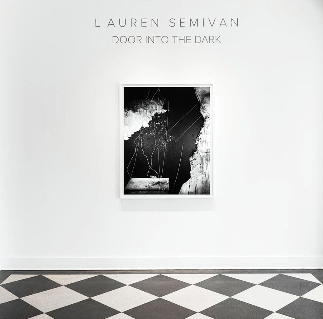
Lauren Semivan, Installation image, all images courtesy of David Klein Gallery 2018

Lauren Semivan is known in Detroit, New York, Paris and beyond for her atmospheric, lyrical, semi-abstract photographs that comprise hand-drawn backgrounds, iconic objects, and, occasionally, her own body. In my past writing about her work, I’ve landed repeatedly on poetic metaphors for context. Semivan’s works have always felt, to me, like poems- narrative, balanced from top to bottom, musical in rhythm, expanding quietly into the psyche. Her new work, currently on view at David Klein Gallery in Detroit, feels similar, and deeply different. What was once an open-ended narrative has become a closed loop, meter circling in on itself, flowering in dark and solitude, like prima materia in an alchemist’s vitrine.

It makes sense that the title of her show at David Klein is “Door into the Dark.” The title is meant to define photography, as Semivan explores it. She describes the medium as “…both a tool for escape, and an instrument for self-knowledge.” The vanishing of grounding, recognizable objects and spaces in her work bears out this description.

Lauren Semivan, Velvet, Edition 2 of 5, Archival Inkjet print, 2015

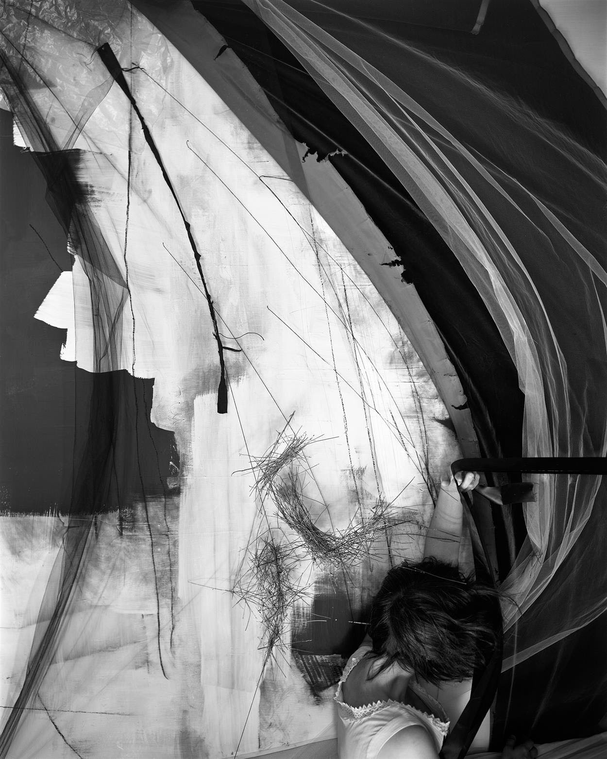
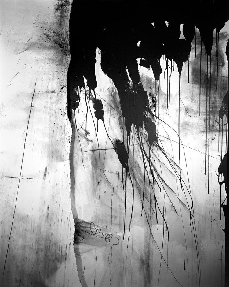
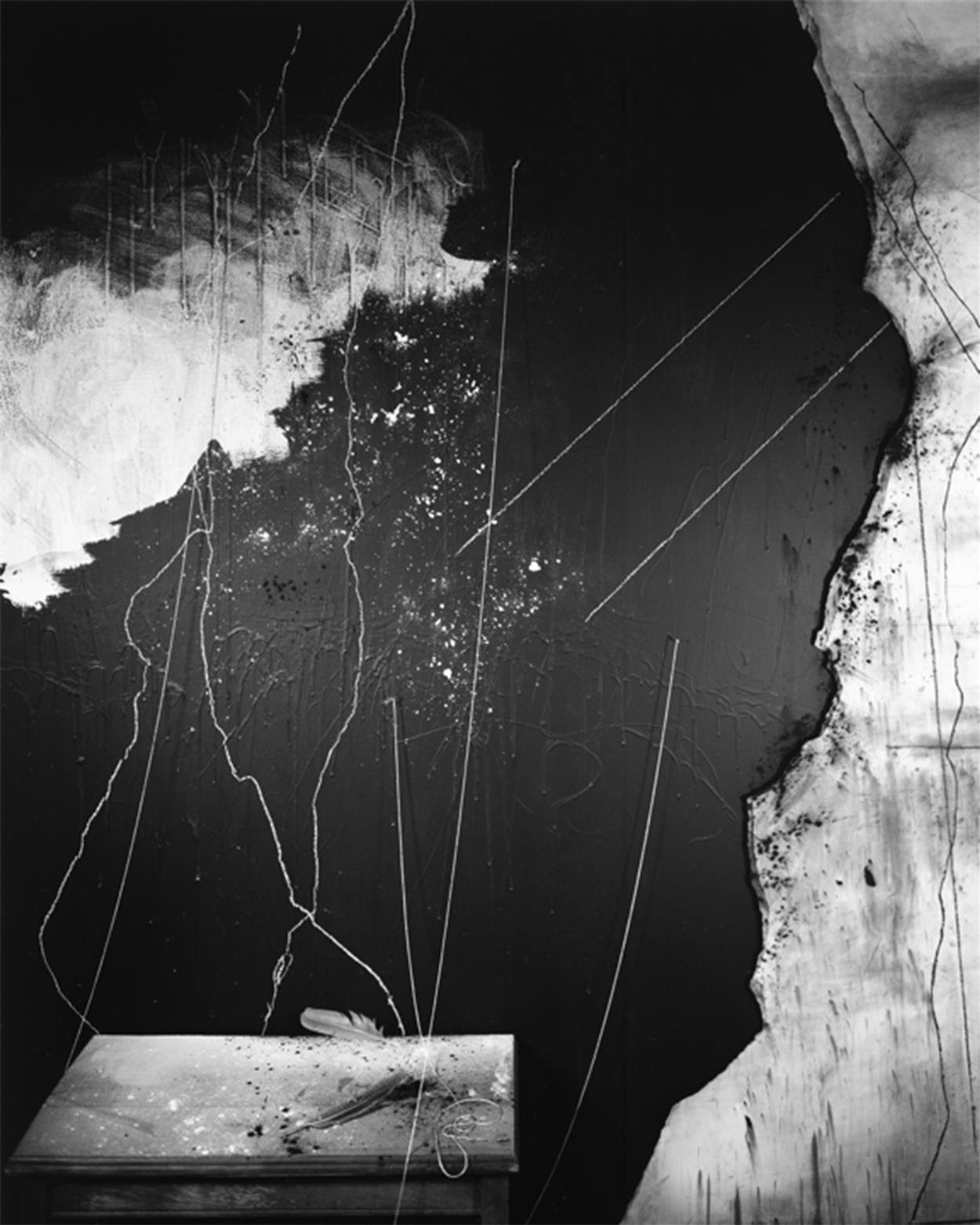
Semivan’s photographs are delicate webs of diamond-hard form. The curves, swoops and taut wedges of space that her carefully constructed environments conjure have always gestured at a vision beyond language. There has previously been a roster of familiar objects placed within her compositions, however, that give things a narrative, documentary feel- feathers, tables, a metronome anxiously dangling from a string. While some objects inhabit Semivan’s new work, more and more of her compositions are given over to amorphous, mute twists of fabric and slashes of paint. It’s as if she’s making the passage from logos to eros- from evoking words and stories to bringing images to light that one can’t navigate with language, that come from a place of pure feeling. This is a brave transition- it’s up in the air whether her pictures can hold the eye unmoored of the evocative objects she’s relied on, hitherto, to ground us in her rippling, canny vision.

Lauren Semivan, Glacier 2, Archival Inkjet print, 2017

Semivan’s own body flickers in and out of the works in “Door into the Dark,” as it has periodically for the last several years. Her face is never fully seen beyond a glimpse of profile. Her costumes, like her environments, are amorphous and billowy, and offer no grounding in specific time or place- the woman who wanders through Semivan’s photographs could be living next door, or long dead. Her wind-swept clothes and hair rhyme visually with their backgrounds, making the figure both an unsettling presence and just another formal element. Her presence is disconcerting in the same way figures in the images of the Twentieth Century photographer Frederick Sommer are- seeming to merge with their environments, more like ghosts or sentient features of their landscapes than individuals. Like Semivan, as well, Sommer experimented with indistinct, unsettling vignettes of beautifully placed, disparate objects and tense, shallow spaces that are grasped with emotional instinct, rather than verbal.

Lauren Semivan, Flur, Chalk, Feathers, Edition of 5, Archival Inkjet print, 2017

“Door into the Dark” is a truly stunning show that draws the viewer deeper into a quiet, interior place where words and story slowly drift away. The technical mastery of Semivan’s photographs, with their deep, velvety blacks, uncannily focused surface details, and atmospheric directional forces, is well worth lingering over.

“Lauren Semivan: Door into the Dark” is on view at David Klein Gallery in Detroit from February third through March tenth, 2018.

Page 1 of 6

Powered by WordPress & Theme by Anders Norén