Detroit Art Review

Critical art reviews of Detroit galleries and museums weekly

Beyond Photography @ Public Pool

Photo Pool Takes Over Hamtramck

Noah Elliott Morrison's photo instrallation

Noah Elliott Morrison’s photo illustration. All Photographs courtesy of Sarah Rose Sharp.

The stated objective of Photo Pool: Photography Based Art Beyond Photographs at Public Pool is clear from the title—Curator Noah Elliott Morrison has assembled a collection of artists attempting to use photography as a jumping-off point for artistic exploration that goes beyond the conventional boundaries of the medium. In this respect, the show is very successful, with five artists (including Morrison) that take their photographic inspiration in wildly divergent directions.

House photos B.Christopher

Brandon Christopher – A Flock of Re-Imagined House Portraits

The immediate impulse is to place these presentations into a kind of hierarchy of relative closeness to conventional photography, but the impossibility of doing so reveals the success of Photo Pool in collecting artists that both embrace the photographic medium and consciously dismantle it. Brandon Christopher, for example, begins with relatively straightforward portraits of abandoned Detroit homes, but violates the purity of these as photographs by pairing them with colored-over versions of the same images, effectively rendering the homes as though drawn by an imaginative child.

Ash Arder - Net Worth 1

Ash Arder – Net Worth 1

Ash Arder uses photography as a logical means for documentation, in her explorations of found objects in and out of context. In “Net Worth 1,” a photograph features a rusty basketball hoop on the street, displayed in juxtaposition with a white-washed version of a similar hoop, its makeshift net hand woven from stinging nettle fibers. Nearby, a second piece of the installation titled “Strange Fruit” is comprised of a set of three (faux) red apples suspended within another matrix of nettle fibers; close viewing reveals a barcode sticker with the unmistakable Air Jordan logo visible through the loose knit of nettles. As with Christopher’s work, the photographic elements ground the subject in physical reality, even as Arder begins to weave these elements of the material and cultural world together to paint a sinister tale.


Trisha Holt, on floor

Trisha Holt – Work reaches onto floor

One might argue that Trisha Holt’s piece, which sits a floor level, is the most directly photographic. It appears to be a largely unaltered image of a large body of water in two segments—the serene surface stretching back to fill the plane of an image leaning against the wall, a small wave cresting to break within the piece lying flat on the floor. But Holt’s use of these two vectors plays a neat trick of incorporating this incongruous image seamlessly into the gallery space, having cleverly fitted her floor piece into the trap door that enables basement access from the gallery. Holt’s work often negotiates new dimensionality in photography, playing off the odd tricks of perspective that occur when photographs with their own depth are reincorporated into new images (much like the dislocating effect of posing for a picture next to a cardboard cutout of a celebrity). Her piece manages to create a sense that the wave might break across the gallery floor at any moment.


Ben Saginaw's pairings

Ben Saginaw – Couter Intuitive Pairings

Challenging as they are understated, an installation of pieces by Ben Saginaw fall perhaps the farthest outside conventional photography—a great achievement in a show filled with mixed media. Two pillow forms cast from dense plaster are on display above two small photographs that feature indeterminate scenes in progress; in one, a small girl appears to be shooting a handgun. The pillows, which are ostensibly soft and harmless, are in fact heavy. The girl, Saginaw states, is shooting cans with her family on a summer evening in Detroit. So close to the anniversary of the death of Tamir Rice, a young boy shot by police for playing with a toy gun in the open-carry state of Ohio, the image cannot help but remind us the high stakes surrounding what we think we see, when we see things.

Suspended before the gallery’s back wall is Morrison’s own work, which layers semi-translucent photographic images taken in Hamtramck into a dense patchwork of visual information, lit up by a hovering flock of flashlights. Morrison’s intention was to create a metaphor for the densely layered qualities of life in Hamtramck—the installation is best viewed from behind, as the flashlight beams enhance details from each layer that remain distinct in the visual chaos.

From lake views, to the comforts of home, to life on the streets, Photo Pool: Photography Based Art Beyond Photographs lives up to its title in a focused and satisfying way that leaves this reviewer itching to revisit the medium.

Photo Pool: Photography Based Art Beyond Photographs: http://apublicpool.com


50 years @ the Detroit Institute of Arts

Collecting Prints, Drawings, and Photographs

Frankenthaler

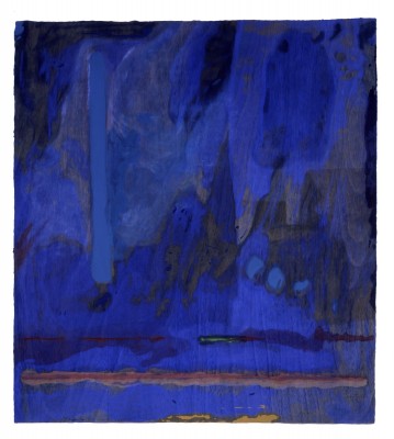
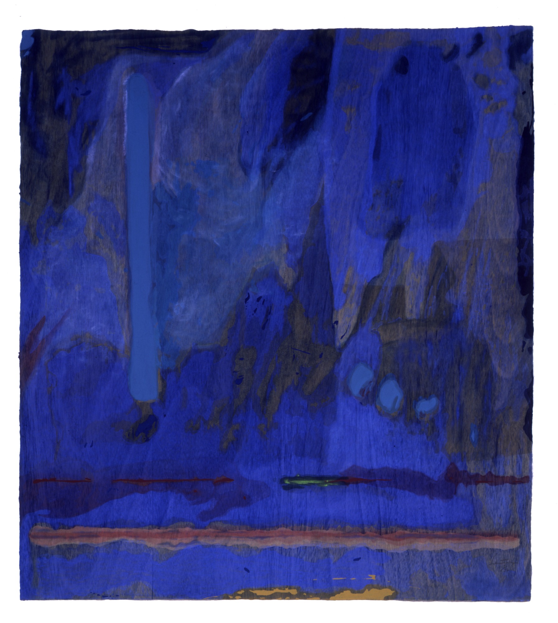
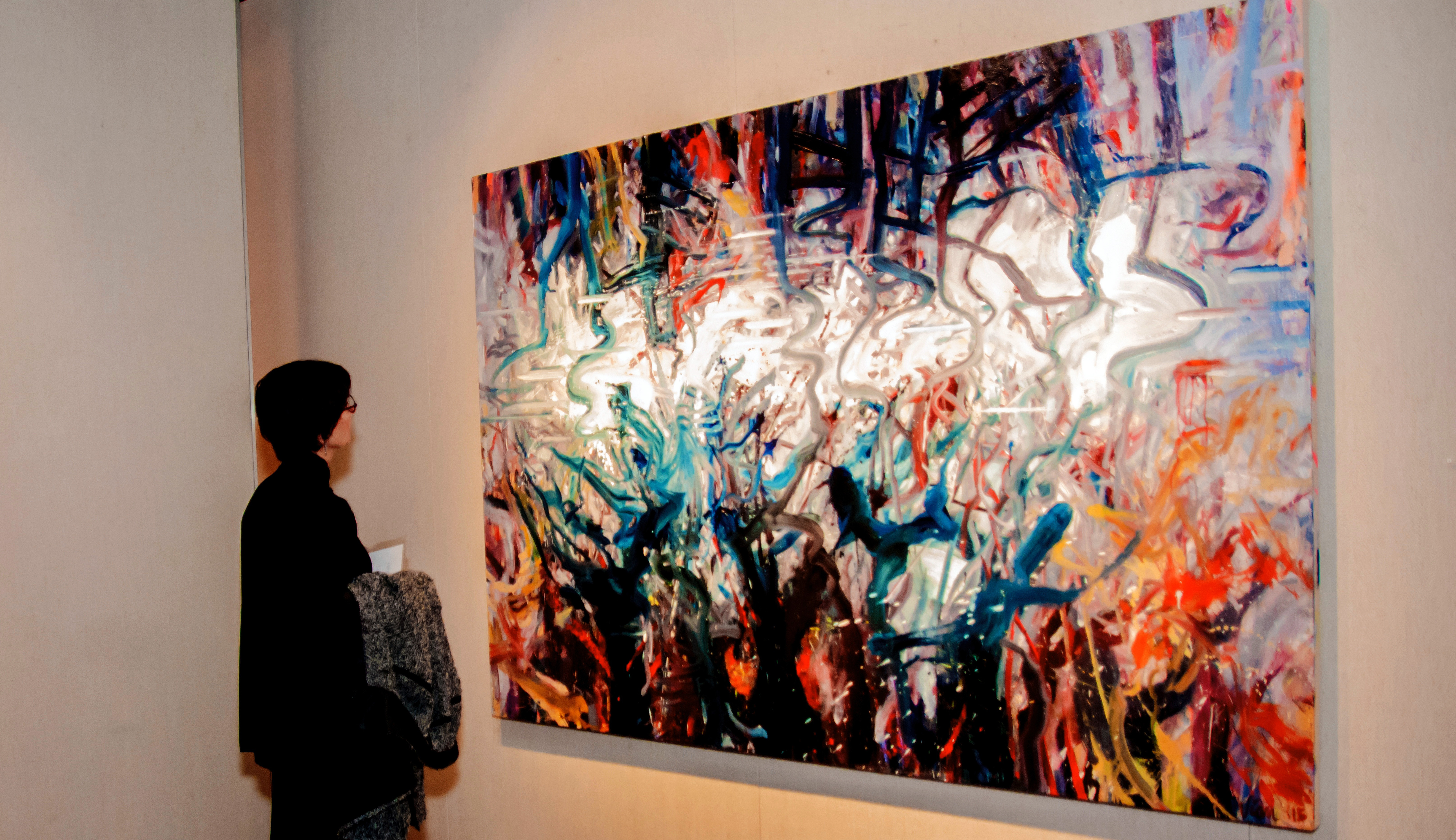
Helen Frankenthaler, American, 1928 – 2011 Tales of Genji III 1998 Woodcut and stenciling printed in color on handmade tan paper Image and sheet: 47 x 42 in.

At the center of the City of Detroit’s heart is the Detroit Institute of Arts (DIA). For many reasons, including its world famous collection, exhibitions, events, film theater, classes and workshops, the DIA serves as an aesthetic anchor to the entire metro Detroit area.

The December 15, 2015 opening celebrates the DIA’s 50th anniversary of one of its long-standing auxiliary support groups, Friends of Prints, Drawings, and Photographs (FPDP) with an exhibition curated by Nancy Sojka, head of Prints, Drawings and Photographs. The exhibit, 50 Years of Collecting Prints, Drawings and Photographs, marks her retirement from the DIA where she has worked since 1988. During her tenure she has organized more than 40 exhibitions from the DIA’s collection, including Ordinary People by Extraordinary Artists: Works on Paper by Degas, Renoir, and Friends (2014–15), Picasso and Matisse: The DIA’s Prints and Drawings (2012-13), Government Support of the Arts: WPA Prints from the 1930s (2009–10), The Big Three in Printmaking: Dürer, Rembrandt and Picasso (2006); Martin Lewis: Drawings and Related Prints (2000); Prints by Terry Winters: A Retrospective from the Collection of Robert and Susan Sosnick (1998–99), and Prints and Drawings in the Age of Rubens (1994).

“Over the years Nancy has organized dozens of exhibitions drawn from the museum’s rich collections of prints and drawings,” said Salvador Salort-Pons, DIA Director. “While we will miss Nancy’s ingenuity and expertise, we wish her the best in her retirement.”

Among the featured works are Berenice Abbott’s New York at Night, Robert Frank’s Belle Isle Detroit, Erich Heckel’s Die Brucke poster, Edvard Munch’s Lovers, Charles Burchfield’s In the Parlor, Helen Frankenthaler’s Tales of Genji III, James McNeill Whistler’s Yellow House, Lannion, Martin Lewis’ Which Way?, along with selections from Robert Rauschenberg’s Bellini Series.

“During her tenure at the Detroit Institute of Arts, Nancy Sojka has provided passionate scholarship, connoisseurship, and exposure of the graphic arts to an expanding citizenry from the Michigan counties of Wayne, Oakland and Macomb and museum attendees from far beyond Metropolitan Detroit.” says Norm Stewart, Director of Stewart & Stewart.  “The exhibitions she has presented in the Schwartz Graphic Art Galleries represent a curator with exceptional knowledge of graphic arts history, a keen awareness of contemporary graphics, and an understanding of the developing technologies that will shape what is to come.”

The exhibition provides a small glimpse of the complete collection showing 125 art objects, (from a collection housing approximately 35,000 objects, that breaks down to 10,000 photographs, 10,000 drawings, and 15,000 prints) which includes a good number of local artists.

Commenting, “The exhibit, What’s New – Recent Acquisitions in 2004 was evidence of the adventurous way in which Nancy grew the collection of art on paper at the museum. Nancy was very supportive of the artist’s in Detroit who worked on paper and I am deeply appreciative for her support over these many years.” by Doug Semivan, Art Chairman of Madonna University.


Whistler in his Studio

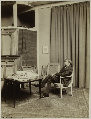
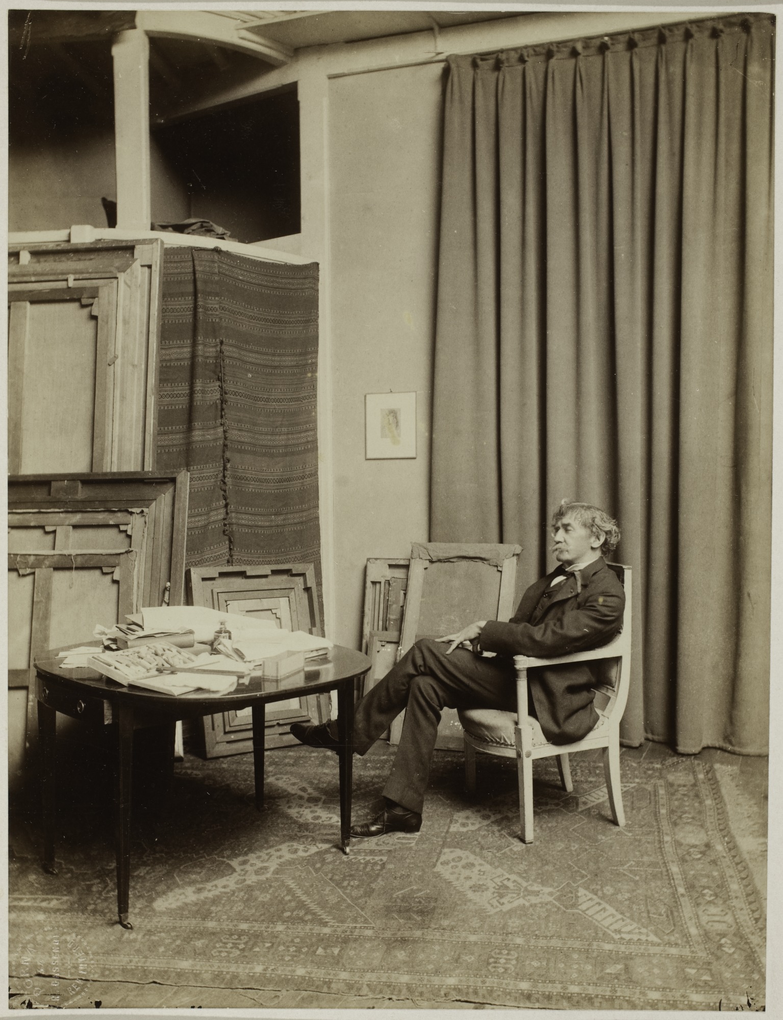
Paul François Arnold Cardon, French, 1859 – 1941 Whistler in His Paris Studio at 106 Rue Notre Dame des Champs 1892 Albumen print mounted to board. Sheet and image: 17 x 14 in.

French photographer, Paul Francois Arnold Cardon, or Dornac, specialized in personalities, and took this 17 X 14 photo in 1892 using the albumen print process mounted on board. The photo captures a rare moment of James A. M. Whistler, the American-born, British-based artist in his studio whose Yellow House, Lannion is also part of the exhibition. This image is a moment in time just as the art of photography starts to develop throughout Europe. The photograph was a gift of Leonard and Jean Walle.

Kertesz - carrefour

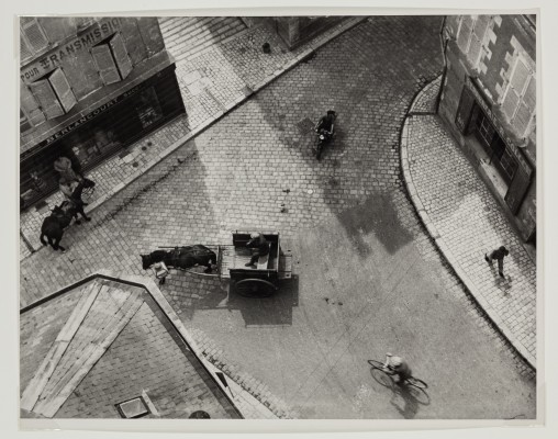
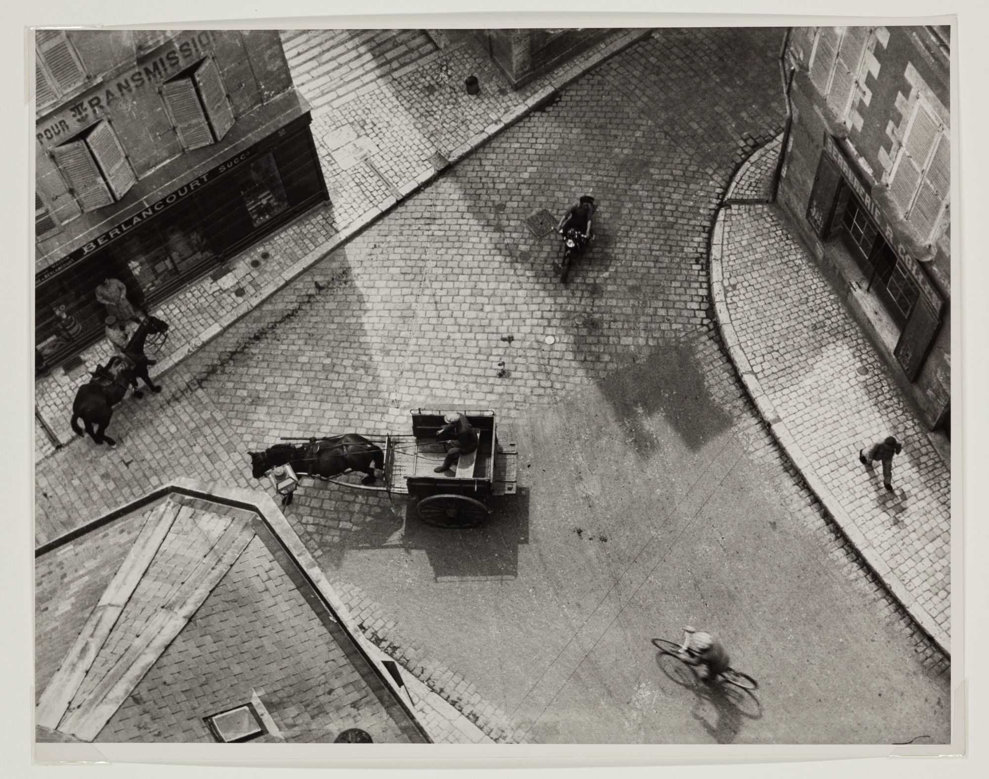
André Kertész, American, 1894-1985 Carrefour Blois 1930 (printed 1970/1985) Gelatin silver print Image: 10 11/16 x 13 11/16 in. (27.4 x 35.8 cm)

The Hungarian photographer André Kertész spent many years in Paris and is known for his aerial black & white compositions that often capture the effects of low light casting long shadows on his subjects. After his education in 1912 at the Academy of Commerce in Budapest, he eventually found his way to Paris, where he spent the majority of his life producing portraits, streetscapes and distortions. When I visited the Getty Museum in 1996, the museum had recently purchased all of his remaining work and had just mounted a retrospective. Kertész brought a unique vision to the art of photography and influenced generations of photographers that followed.

Seydou Keita

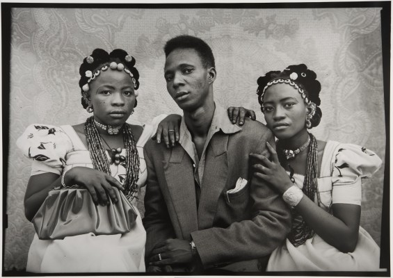
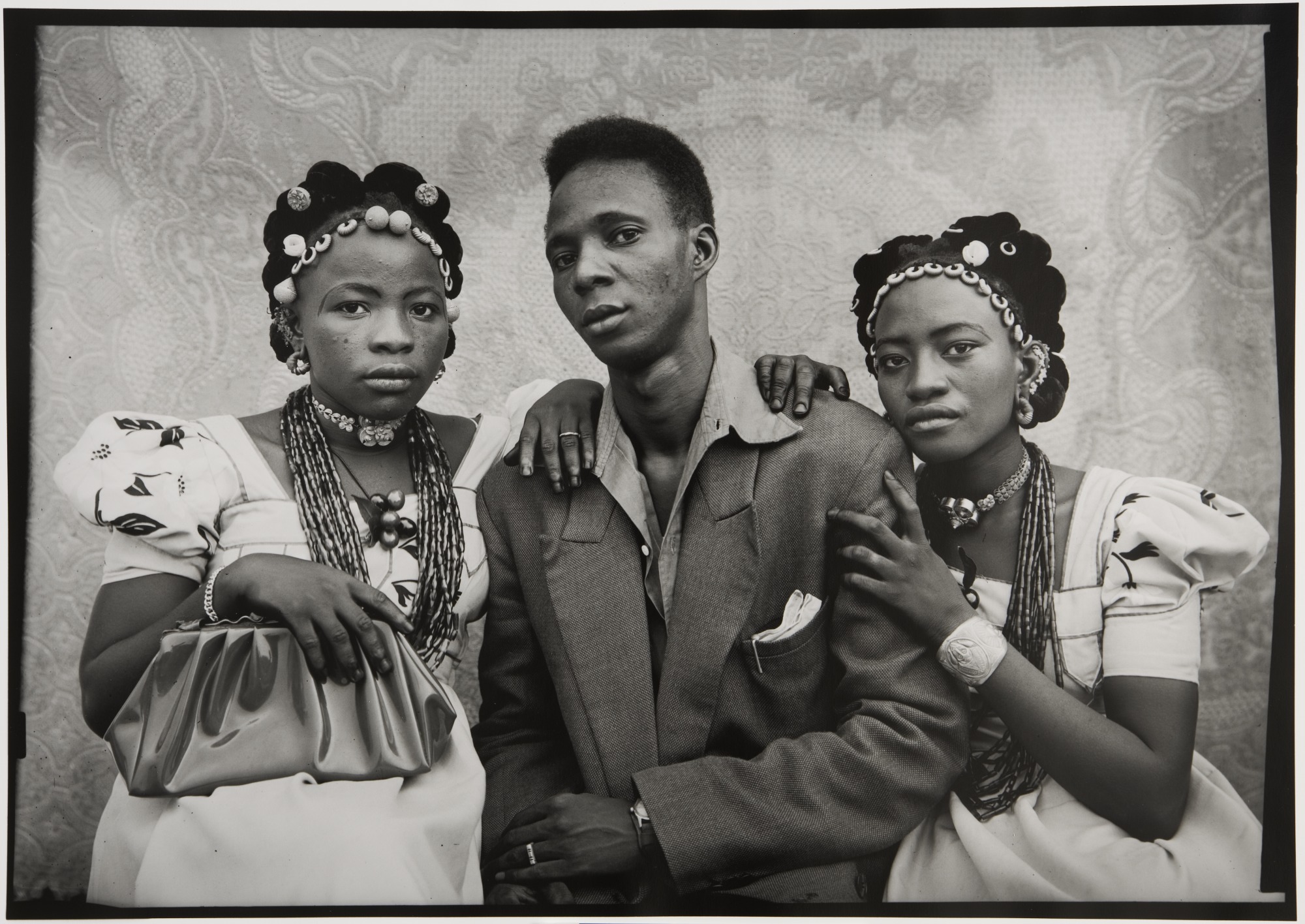
Seydou Keita, African, 1923 – 2001 Untitled #42A51 1956/1957 Gelatin silver print Image: 15 11/16 x 22 1/8 in. (39.8 x 56.2 cm) Sheet: 24 x 20 in. (61 x 51 cm)

The untitled 24 X 20 photo print by Seydou Keita typifies the work by this photographer from Bamako, Mali who spent much of his life photographing the people of this once-French colon. The self-taught photographer was introduced to his Kodak Brownie Flash camera in 1935 by his uncle and went on to pursue a career as a professional photographer. His strict sense of formality is combined with his ability to develop a level of intimacy with his subjects and capture a moment that withstood time. This photo was a museum purchase, with funds from William and Ellen Kahn.

saar_allison-snake_man

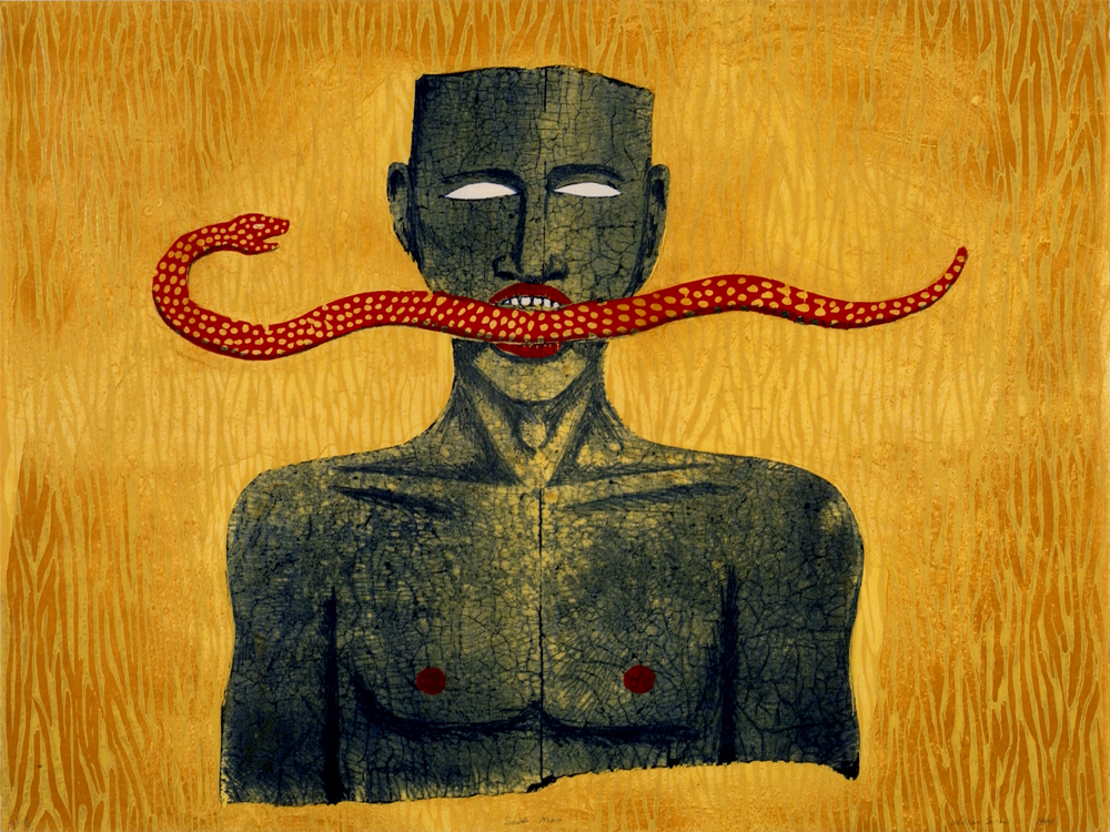
Alison Saar, American, born 1956 Snakeman 1994 Woodcut and lithograph printed in color on oriental paper Image and sheet: 27 7/8 x 37 1/8 in. (70.8 x 94.3 cm)

A younger artist from the west coast, Alison Saar, has created a color woodcut and lithograph, Snakeman, 1994, (a gift from Marc Schwartz). She is a well known African-American artist whose work explores themes of African culture and spirituality. A recipient of a Guggenheim Foundation fellowship and a fellowship for the National Endowment for the Arts, Saar’s work has often included a variety of materials (bronze, lead, tar and wood) with which she creates a highly personalized amount of cultural context in her painting, sculpture and print formats.

Walker Evans

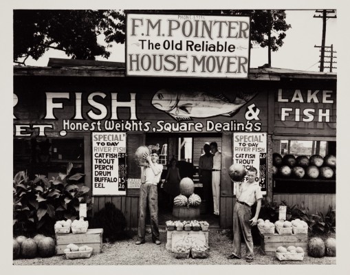
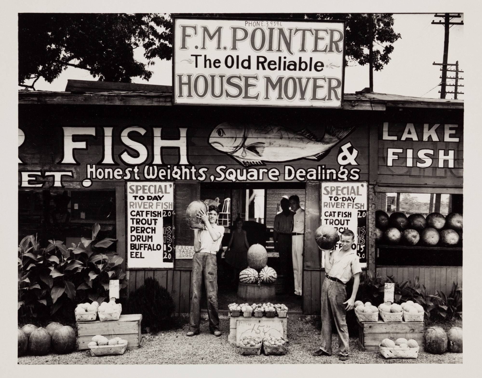
Walker Evans, American, 1903-1975 Roadside Stand Vicinity Birmingham, Alabama 1936 (printed later) Gelatin silver print Image: 7 1/2 x 9 1/2 in. (19.05 x 24.13 cm.)

It could be said easily that Walker Evans is one of the most influential artists in the twentieth century and the progenitor of documentary-style photography in the United States. Although I had read about his work during my college years, it was the retrospective of his work at the Metropolitan Museum of Art in New York City in 2000 that left an indelible impression. Born in St. Louis, Missouri in 1903, Evans spent a year at Williams College where he indulged himself in literature and where he first envisioned himself as a writer. Fortunately for the art world, Evans gradually redirected himself toward photography. His lifetime of photography took him through the Depression years during which he worked alongside Dorothea Lange, Arthur Rosthstein, and Russell Lee as part of the government New Deal agency. He had been assigned to capture the essence of American life. His black & white images were of people found along the roadside, cafes, home interiors, and small town main streets. The photograph, Roadside Stand, from 1936 is a gift from Beverly Franzblau Baker, in memory of Morris D. Baker.

2004_65-d1_o2

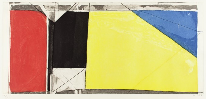
Richard Diebenkorn, American, 1922-1993 Folsom Street Variation III 1986 Soapground, aquatint, flatbite, and drypoint printed in color on off-white wove paper Plate: 12 x 25 7/8 in. (30.5 x 65.7 cm) Sheet: 26 5/8 x 40 1/8 in. (67.6 x 101.9 cm)

This aquatint and dry-point print from the work of Richard Diebenkorn, Folsom Street Variation III, 1986, gives us information about a West Coast abstract expressionistic painter who also engaged in printmaking. Best know for his abstract landscape series, Ocean Park, Diebenkorn’s work seems rooted in the outside world. His works on paper also included drawings using gouache and crayon, but it is his large body of painting that retains a quiet and distinctive intensity while presenting the viewer with an informal use of space, as oppose to, say, Piet Mondrian. The print is a gift from Dr. and Mrs. Robert J. Miller and Dr. and Mrs. Robert Moss.

The 125 pieces selected by Nancy Sojka and her staff for the exhibition 50 Years of Collecting Prints, Drawings, and Photographs serves as a nice send-off for Sojka and her years of work at the Detroit Institute of Arts. In this exhibition, she pays some attention to the Detroit artists in the collection, including Stanley Rosenthal, Janet Hamrick, Bill Rauhauser, Norman Stewart, Dave Jordano, Doug Semivan, Susan Campbell and others. As the public focuses on exhibitions of painting, sculpture, film and installation, let us not forget about the drawings, various print forms and photographs that rest in this grand collection at the Detroit Institute of Arts.

Detroit Institute of Arts – Hours and Admission

9 a.m.–4 p.m. Tuesdays–Thursdays, 9 a.m.–10 p.m. Fridays, 10 a.m.–5 p.m. Saturdays and Sundays. General admission (excludes ticketed exhibitions) is free for Wayne, Oakland and Macomb county residents and DIA members. For all others, $12.50 for adults, $8 for seniors ages 62+, $6 for ages 6–17. For membership information, call 313-833-7971.


Rick Vian @ Robert Kidd Gallery

Where Light enters the Mind

RickVian install 1_2

Rick Vian, Installation / Opening image, Courtesy of the Robert Kidd Gallery

As a young, aspiring painter, before I had any idea that Rick Vian was a local artist, I greedily snipped out every advertisement from Art in America his work was featured in and collaged them into my journal, alongside the work of other painters who inspired me. I loved the way his work rode a Rothko-esque razor’s edge between abstraction and representation (channeling Rothko as well in subjective spiritual punch) and how smartly it appropriated recognizable phenomena that were already abstract, such as reflections and strange effects of atmosphere and light, into works that were as much about form and surface as they were about content and illusion. Seeing Vian’s recent work this week, therefore, felt doubly special- being surrounded by masterful, imposingly scaled paintings that come from a body of work I’ve followed closely for years.

R.Vian install 2

Installation Image, Courtesy of the Robert Kidd Gallery

The title of Rick Vian’s retrospective, currently on view at Robert Kidd Gallery in Birmingham- Using the Whole Chicken– belies the perceptive, multi-layered formal gravitas that unfolds as one moves from piece to piece. Consisting of paintings spanning 1972 to 2015, Using the Whole Chicken, takes as its prima materia two iconic spiritual forms from two vastly different faiths- the Western Baroque genre of trompe lois church ceiling paintings (Vian mentions two ceilings in Roman churches in his artist statement, painted by Giovanni Battista Gauli and Andrea Pozzo) and the Eastern mandala (or mandorla, which, as Vian points out, appears in early esoteric Christian and Islamic art as well). Both forms seek to foster a transcendent spiritual experience, delivered visually- Both consist, very basically, of a round, bright center surrounded by darkness. Vian takes this visual coda of contemplation and transcendence outward, into nature, and inward, into the visual cortex of the human brain- an interesting conceptual mirror for the outer journey of Western painting, with its focus on beauty, perspective, and high illusion, versus the inner path of Eastern aesthetics with its deceptively simple abstractions and vague, groundless atmospherics that channel a more subjective, synesthetic experience of the world.

Sky in the Water

Rick Vian, Sky in the Water, Detail, 60 X 84, 2015


Vian’s great gift as a painter is his apparently effortless ability to conjure images that are at once fully nonobjective and grounded in depth- windows onto the world in the Italian Renaissance tradition. The paintings in Using the Whole Chicken appear before the viewer’s eyes as formal abstractions, while creeping up behind the eyes as atmospheric landscapes. Their surfaces are formal, their deeper implications illusionistic. The more time one spends with a Rick Vian painting, the more subtle, ungrounding, and revelatory this interplay becomes.

It’s appropriate that Vian has chosen to frame the work in Using the Whole Chicken in terms of iconic spiritual image systems- he’s picked the beauty, turgid hues, and attention to surfaces from Western painting and the subjective, unfixed viewpoint and groundless atmospherics from Eastern painting, roping in references to the inner processes of the brain into the mix. The honeycomb-like grids that appear here and there in the work represent the process by which light enters the visual cortex of the human brain and is broken up into colors, shapes and space- another symbolic connection to the traditions of church ceiling painting and the mandorla, which Vian describes as “looking towards a place of light from a place of darkness.”

Using the Whole Chicken exhibition is on display at Robert Kidd Gallery in Birmingham, MI from 11/19/2015 – 12/19/2015. www.robertkiddgallery.com


Economy of Form @ David Klein Gallery

Taking a hard look at the “hard edge”

Install 3 DK EOF

M. Kim, M. Sengbush, Installation Image Courtesy of David Klein Gallery

Viewing just the south-facing wall of the main gallery at David Klein Gallery’s new downtown Detroit location, you might never imagine that there are three different artists included in the current show, Economy of Form: Matthew Hawtin, Mary Kim, and Mark Sengbusch, which held its opening reception on November 14th, and will run through December 24th. Closest to the door is Pitch, a six-sided monochrome piece in matte black by Hawtin—a dimensional canvas that resembles an iconic jewel shape tipped on its side. This flows in seamless conversation with Kim’s Two circles, which conveys two roughly circular forms made out of rigid lengths of wood, likewise bending outside the 2D plane, and swathed in bright acrylic shades of chartreuse and red. The wall terminates in Sengbusch’s Gibson 6, which distills his signature set of symbols, laboriously scrimshawed into acrylic-painted wood, into six scaled-up details in shades of matte black and grey.

M.Hawtin EOF8

Matthew Hawtin, Pitch (2015), Acrylic on canvas


Spare arrangements, vibrant monotones, and careful use of geometry is present in all three bodies of work, and the exhibition title refers to a characteristic of the term “hard edge,” first applied to Four Abstract Classicists, which opened at the San Francisco Museum of Art in 1959. The artists featured in the 1959 show were John McLaughlin, Lorser Feitelson, Frederick Hammersley, and Karl Benjamin, and give clues to some of the formal inspiration for the artists on display at David Klein—as indeed they have spawned entire generations of work springing from these starting points, including that of Ellsworth Kelly, Robert Indiana, Paul Feely, and numerous others. Perhaps rising less automatically to mind and representing a more unique expression of these artists individual visions are some wellsprings of inspiration that fall outside the contemporary arts canon; Kim’s second Master’s degree in architecture transformed her previously more traditionally 2D approach to painting into the 3-dimensional constructions that just from the walls at hard angles; Hawtin’s almost two-decade long experiments with the “torqued canvas” that removes the physical structures of the painting stretcher and frame; Sengbusch’s obsession with seminal science fiction writer and visionary futurist William Gibson.

M.Sengbush EOF5

Mark Sengbusch, Gibson 6 (2015), Scrimshawed acrylic on panel

In some ways, the three artists in this group show work together so perfectly because they have each chosen to zoom into the fine details of one traditional element of painting—Kim’s works are entirely stretcher and or/frame, Hawtin’s are obsessed with the canvas surface (sometimes actually fiberglass, affording a preternaturally smooth finish), and Sengbusch has generated an elaborate vocabulary of original signifiers. This last elevates Sengbusch’s work to a unique level, translating his source material into a visible and new language that goes beyond art history, and breaks into future territory. But while writers like Gibson are necessarily preoccupied with the meaning of words, Sengbusch is concerned with the form, the literal design of language—a rich subject for investigation. To create language without meaning is a truly difficult task, when you consider the awesome power of the human mind to translate symbols as diverse as a musical note, hànzì or kan’ji (Chinese and Japanese characters, respectively), or the letters you are currently reading into meaningful sounds, and Sengbusch’s finished canvases of course lend themselves to interpretation, when viewed by anyone trained to seek meaning from signifiers.

M.Kim EOFI

Mary Kim – Four Squares (DK Red, Green, Yellow, Blue, Red) (2015), Painted wood

Altogether, a very strong show at David Klein Gallery, with allusions to the rich lineage of minimalist and hard edge traditions, and a few new twists thrown in to keep the conversation moving!

Install 4 EOR

M. Sengbush, M. Hawtin Installation Image Courtesy of David Klein Gallery


Economy of Form: Matthew Hawtin, Mary Kim, and Mark Sengbusch remains on display from November 14 – December 24, 2015 at David Klein Gallery1520 Washington Boulevard, Detroit

www.dkgallery.com

Brenda Goodman @ Center for Creative Studies Gallery

Square Peg, Round Hole, Hungry Ghost

B. Goodman Installation 11,2015

Brenda Goodman, Installation image, Courtesy of Ron Scott


One is reminded of the pre-eminence of painting as the pinnacle of fine art media- and its uncanny self-sufficiency- up to the late Twentieth Century when viewing Brenda Goodman’s decade-spanning retrospective at Center Galleries at College for Creative Studies. Coming face to face with the broad span of figures, forms, and grounds that float heavily through Goodman’s oeuvre unlocks a deep, visceral response. This is painting that tells me that I know nothing about painting. This is painting as it once was and is no longer. This is painting from the days when painting was a truly heroic undertaking- when works of profound genius that seamlessly roped form, material, surface, context, and narrative into an exploration that balanced on a knife’s edge between pure form and deep, expressive language seemed to roll right out of the minds of Goodman and her contemporaries, such as Philip Guston, Elizabeth Murray, Nancy Mitchnick, and Ellen Phelan.

the race

Brenda Goodman, The Race, 1973 – Oil on Canvas Courtesy of Clara DeGalan

The above-mentioned self-sufficiency that comes across in Goodman’s work is the result of visual engagement with the viewer’s experience, employing only one material to express a language that is both purely formal and not- that both dwells in and transcends the methods of its making- that feels (these works make one refer to a visual response as a feeling) like a foreign language heard in a dream that gradually becomes discernible as one listens to it.

Likewise, as one goes from work to work in Brenda Goodman: Selected Work 1961-2015, the development of her encyclopedia of symbols distills in different forms and contexts, its trajectory remaining intact despite the constant inversion of figure/ground and objective/nonobjective (these, I might add, are only two of the largest and most evident inversions- Goodman parses the notion of inversion, turning, twisting, and recasting through surface, picture plane, narrative, space, and form up to the horizon of the viewer’s vision and then, presumably, beyond it) that Goodman ropes into her exploration down the decades. It is this roster of forms and characters- Goodman has referred to them as “personal symbols”- that hauntingly parallel language in the aggressively visual, formal context of her work.

untitled 1979

Brenda Goodman, Untitled, 1979, Oil, Sand, on Canvas

The figure makes its presence felt in various ways through the years spanned in Selected Work. Its earliest manifestations, in works such as The Race (1973) depict grotesque-yet-loveable mutations of human bodies into simplified intestinal forms with prehensile limbs and hungry mouths, clumsily filling minimal atmospheric spaces as they stretch and strain to work, express, and consume. These minimal spaces empty out intriguingly in a couple of works from the late 70’s though the forms of the figures remain, now sunk into ground space and half-camouflaged with light, as in Untitled (1979). Another untitled piece, one of the most striking in the show, is a smallish work on paper from 1981 depicting a rotund draped form that bears all the awkward heft of Goodman’s early organ-figure paintings, and yet floats across a deep black ground cut horizontally near the bottom of the picture plane to reveal a thin strip of earth-toned underpainting that reads like a tightrope. There are shades of Philip Guston’s Klansman romps here, but recast in an altogether more sombre, personal context.

Utitled 1981 BG

Brenda Goodman, Untitled, 1981 Oil on Paper

The figure fleshes out more representationally, in the same vague, thinly painted studio-type space, in a series of unforgiving self-portraits that progress through the 1990’s (an era marked by extreme hostility toward painting and explorations of the figure in particular that sparked an epoch of figurative painters such as Jenny Saville, Elizabeth Peyton, John Currin, and Lisa Yuscavage) to 2008. These portraits, which Goodman executed while struggling with her weight, depict a large, fleshy female figure ephemerally lodged among barely tipped-in canvas stretchers and vast pale space. The figure is heavy and fat, the flesh built up in crazy swaths and scorings of sick flesh tones, and yet floats- her feet are almost never visible, and her connection to the studio-like space is uncertain.

self portrait 4

Brenda Goodman, Self Portrait #4, 2004, Oil on Wood


The organ-figure appears again around this time, undulating through dark voids and squirming beneath flat, saturated bands of color in a run of untitled works on paper that evolve through almost totally nonobjective color field studies shot through with drawing/painting marks, and coalesce again in Goodman’s most recent work on display, such as the taut, formally enclosed Euff (2015). Here, a pale, root-like figure waves two tapering limbs around a deep black ground, which it shares with pale, sharp slashes that read like unlit matches, creeping into the picture plane from the lower right. The figure’s limbs divide the picture plane into three petal shaped forms- looked at this way, the figure becomes the ground, and yet the sense of movement that radiates from it quickly re-establishes it as a figure. Is the form painted, or is the painting happening around the form? It’s a mark of Goodman’s genius that the two are constant, silently changing places. Her best work keeps the forms and the action vague enough that the interstice between figure and ground remains enticingly impossible to focus upon. It seems like such a practice, where the meat is in the surfaces, would preclude any meaningful figurative, symbolic, or contextual content. That’s another facet of Goodman’s genius. Her paintings are purely formal but not, intensely personal yet open, deeply symbolic and embedded in an experiential, bodily context, and yet ungrounded, floating, vulnerable to various points of entry and engagement. It is this quality that leaves the contemporary viewer in awe- the ability of Goodman’s work to function seamlessly on visual, emotive, and conceptual levels, with paint and surface as the only tools.

Euff BG 2015

Brenda Goodman, Euff, 2015 Oil on Wood


Brenda Goodman: Selected Work, 1961 – 2015   November 14 – December 19, 2015

http://www.collegeforcreativestudies.edu/community-outreach-and-engagement/center-galleries

“Brenda Goodman: A Life on Paper”  Paul Kotula Projects, http://www.paulkotula.com

Page 73 of 78

Powered by WordPress & Theme by Anders Norén