Lois Teicher, Quiet Performance: The Stillness of Shape at the Galerie Camille
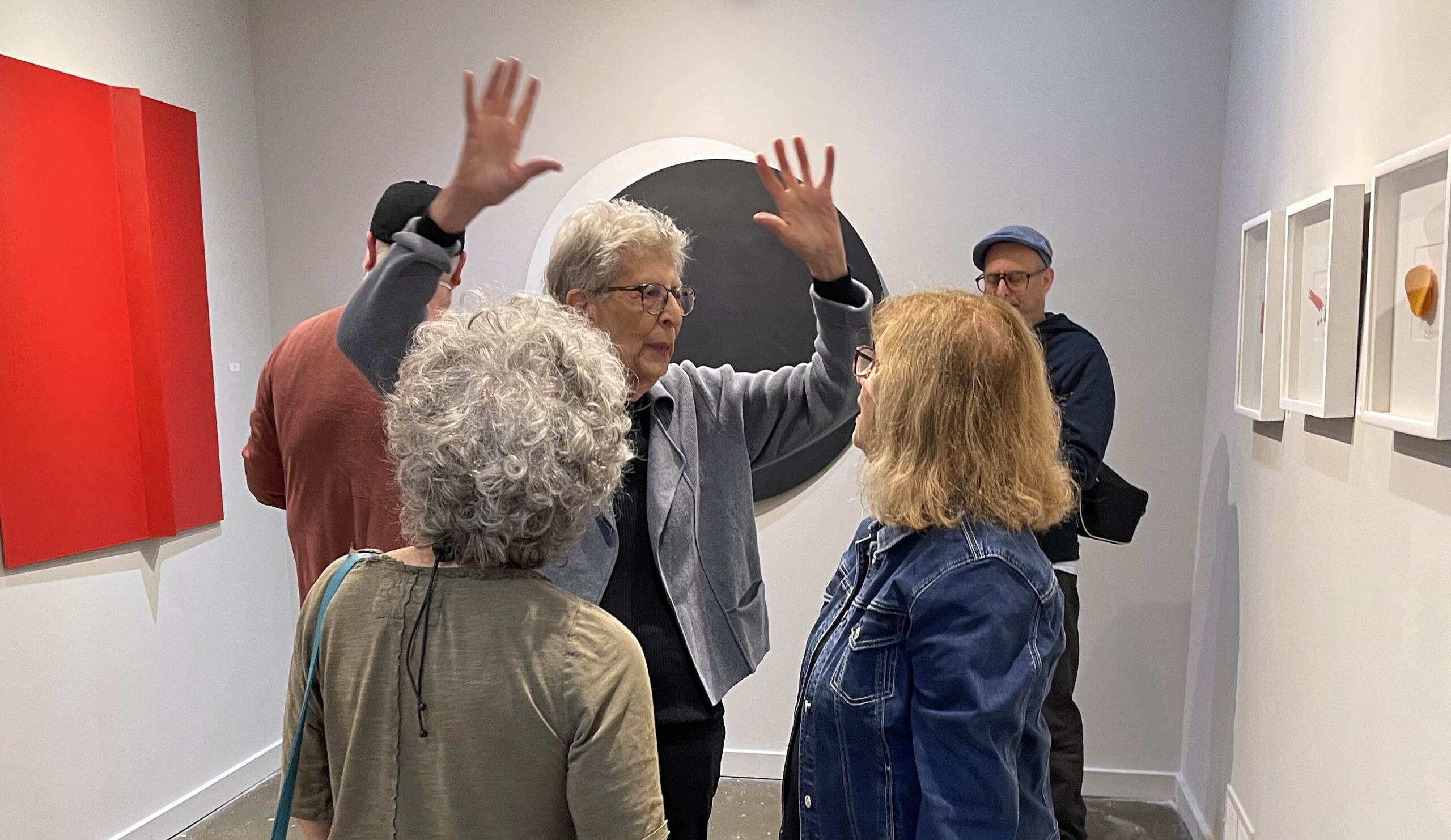
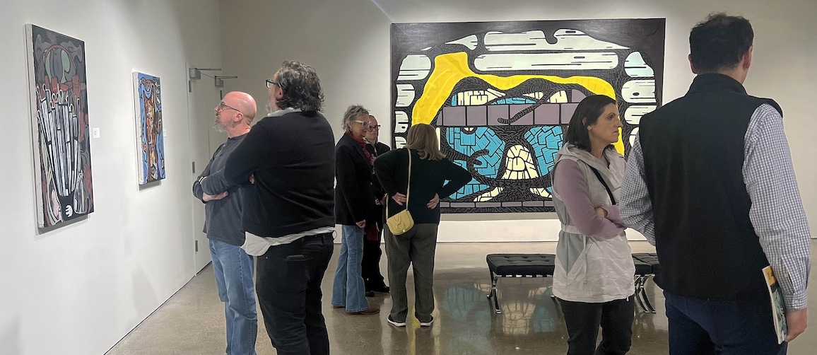
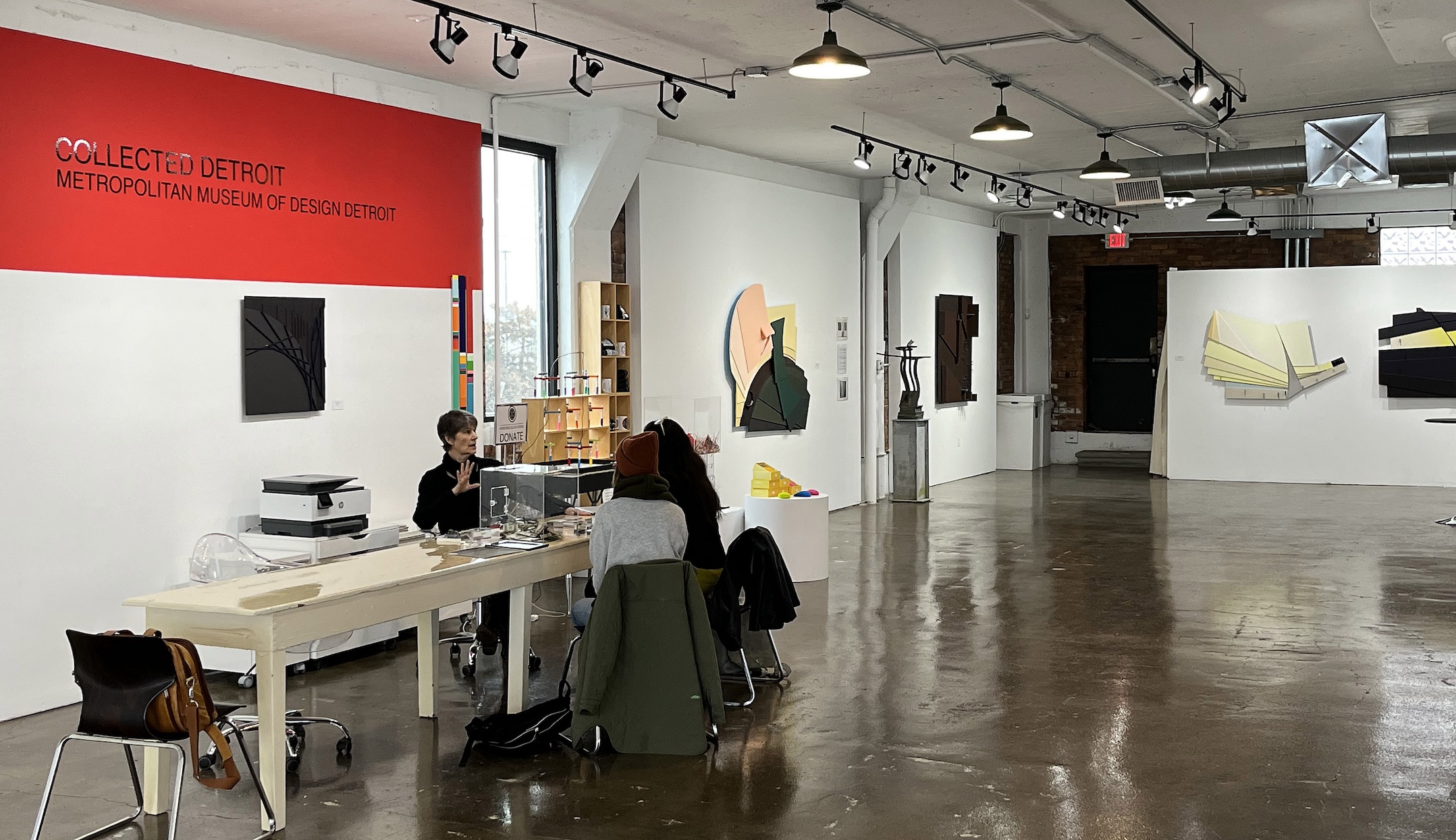
An installation shot of Lois Teicher – Quiet Performance: The Stillness of Shape, at Galerie Camille in Midtown Detroit, up through October 19. In the picture, Teicher is the one gesturing with her hands. (Photos courtesy of Galerie Camille, except where noted.)
Sculptor Lois Teicher has mastered the art of weightlessness, which is all the more challenging when working in steel and aluminum. Whether diminutive or huge, her curved, geometric forms in strong primary colors pose as delicately as dancers, high-wire acts often seeming to balance on one toe. In her new show at Detroit’s Galerie Camille, Quiet Performance: The Stillness of Shape, the eighty something artist who’s still working at full clip gives us a range of her small works, a couple of which echo her massive public sculptures in Detroit and elsewhere.
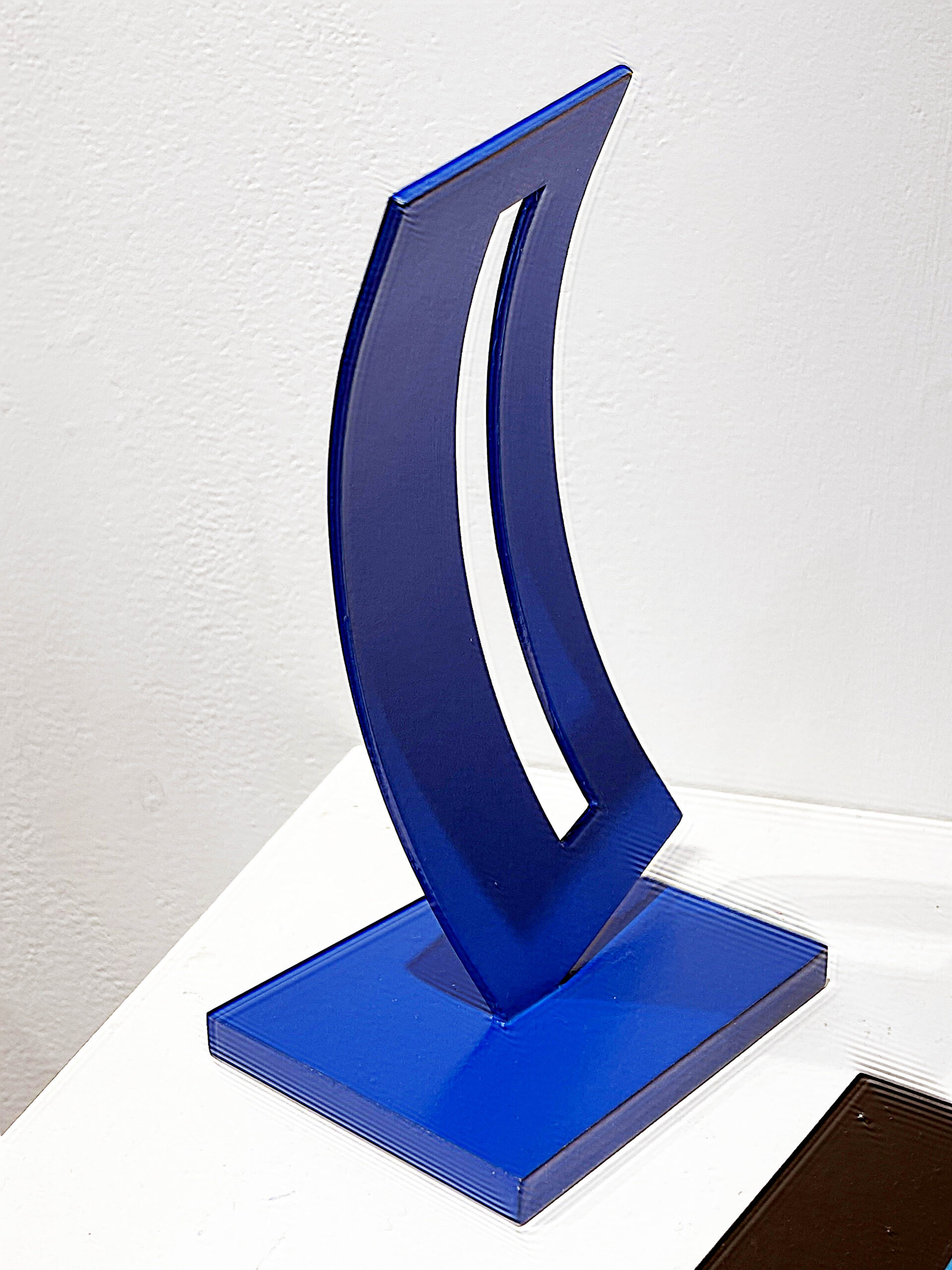
Lois Teicher, Curved Form with Rectangle and Space – ed 21, Aluminum.
The best example of that echo is Curved Form with Rectangle and Space – ed 21. The descriptive title pretty much sums it up — this is a narrow, concave rectangle, maybe 8 inches tall, balanced on one corner and leaning slightly to the left, with a tall, symmetrical hole cut slightly off center within the dark-blue metal. People who know Detroit well will experience a jolt of recognition, for this is the exact form – almost a tiny maquette – of Teicher’s 14-foot-high, white sculpture of the same name that’s the commanding centerpiece of the Hudson’s Art Park between the Scarab Club and John R Street, right behind the Detroit Institute of Arts. In his highly useful guide to the city’s public sculpture, Art in Detroit Public Places, critic Dennis Nawrocki notes that the opening cut in the work allows the viewer to see through, “subtly playing with negative and positive space.”
There’s something immensely satisfying and graceful about both pieces, small and large. In the case of the latter, which went up in 2000, the sculpture brings a stamp-sized pocket park alive that years ago had been nothing but a drab patch of grass. Students of Detroit urbanism won’t be surprised to learn that the park was the brainchild of urban planner Sue Mosey at the University Cultural Center Association (now Midtown Detroit Inc.), who in her 30-year career brought countless overlooked bits of Midtown back to vibrant life. In this case, Teicher’s sculpture delivers a striking grace note on a stretch of road that was in desperate need of it.
Galerie Camille director Marta Carvajal, who curated the show, praises Teicher’s gift for simplicity and “the unstable balance – she finds balance using the least amount of surface. Her mind,” Carvajal adds, “works on a different level than ours, with very sophisticated laws of physics.”
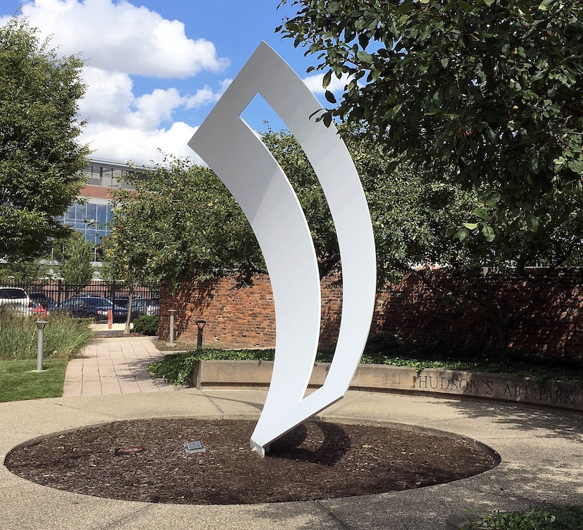
Lois Teicher, Curved Form with Rectangle and Space, Powder-coated stainless steel, 14 x 7 feet, 2000. (Photo: Detroit Art Review)
Teicher, who lives in Dearborn, graduated from Detroit’s Center for Creative Studies (now the College for Creative Studies) when she was 61, after raising her three children, and then went on to get her MFA at Eastern Michigan University. She currently maintains a studio in Eastern Market. Working with fabricators and engineers, Teicher has immersed herself in industrial processes that would scare off many, developing, as Maryann Wilkinson, former executive director of the Scarab Club wrote in Essay’d, “a unique style for large-scale sculpture that emphasizes tension and a suggestion of movement that serves to deny her work’s complexity and weight.”
That tension is equally present in the mostly diminutive work on display in Quiet Performance, like the 10-inch-high Dynamic, which stars a bowed crimson circle a bit like the rising sun on the Japanese flag, pleasingly perched at the far left edge of a convex white platform. It’s a graceful, beguiling orb – and one that’s echoed in Cosmos, one of a number of pencil-and-oil compositions framed on the wall, though it must be noted that in the case of Cosmos, the painted “sun” is rising out of a nebulous, sooty cloud.
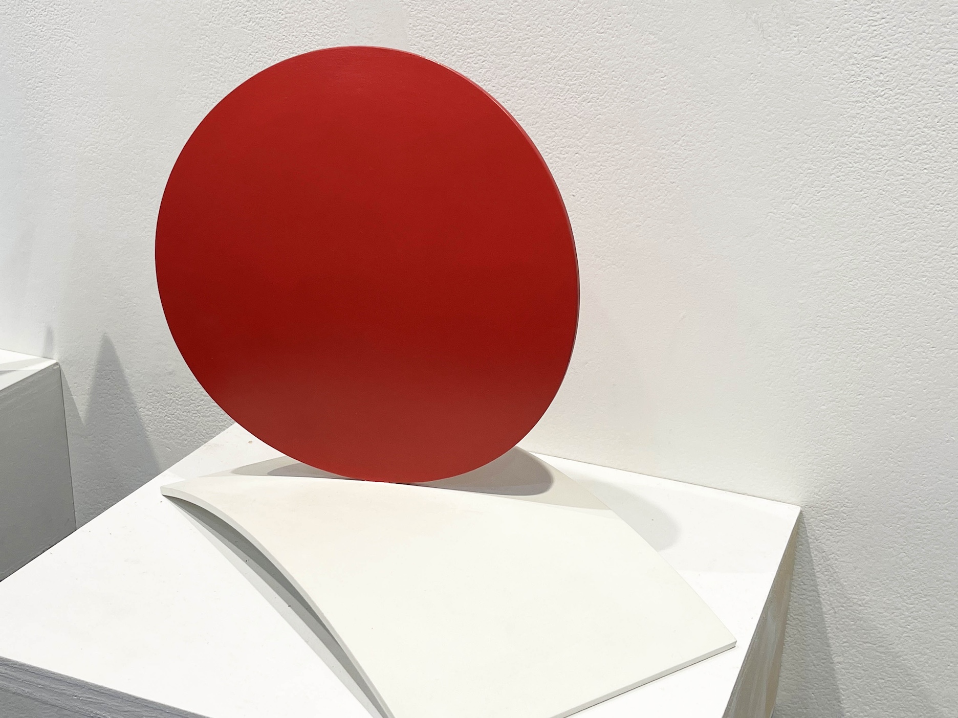
Lois Teicher, Dynamic, Welded aluminum, 10.5 x 12 x 7 inches.
It’s hard to escape the conclusion that the artist just likes playing with elemental geometry, as with the mid-sized, dark-blue sculpture, Linked. Here Teicher gives us two flat circular discs intersecting at right angles, almost as if a circular buzz saw had made it halfway through a flat circle before stopping. Again, the composition is perfectly balanced on the two rims, yet also suggests imminent collapse, however unlikely.
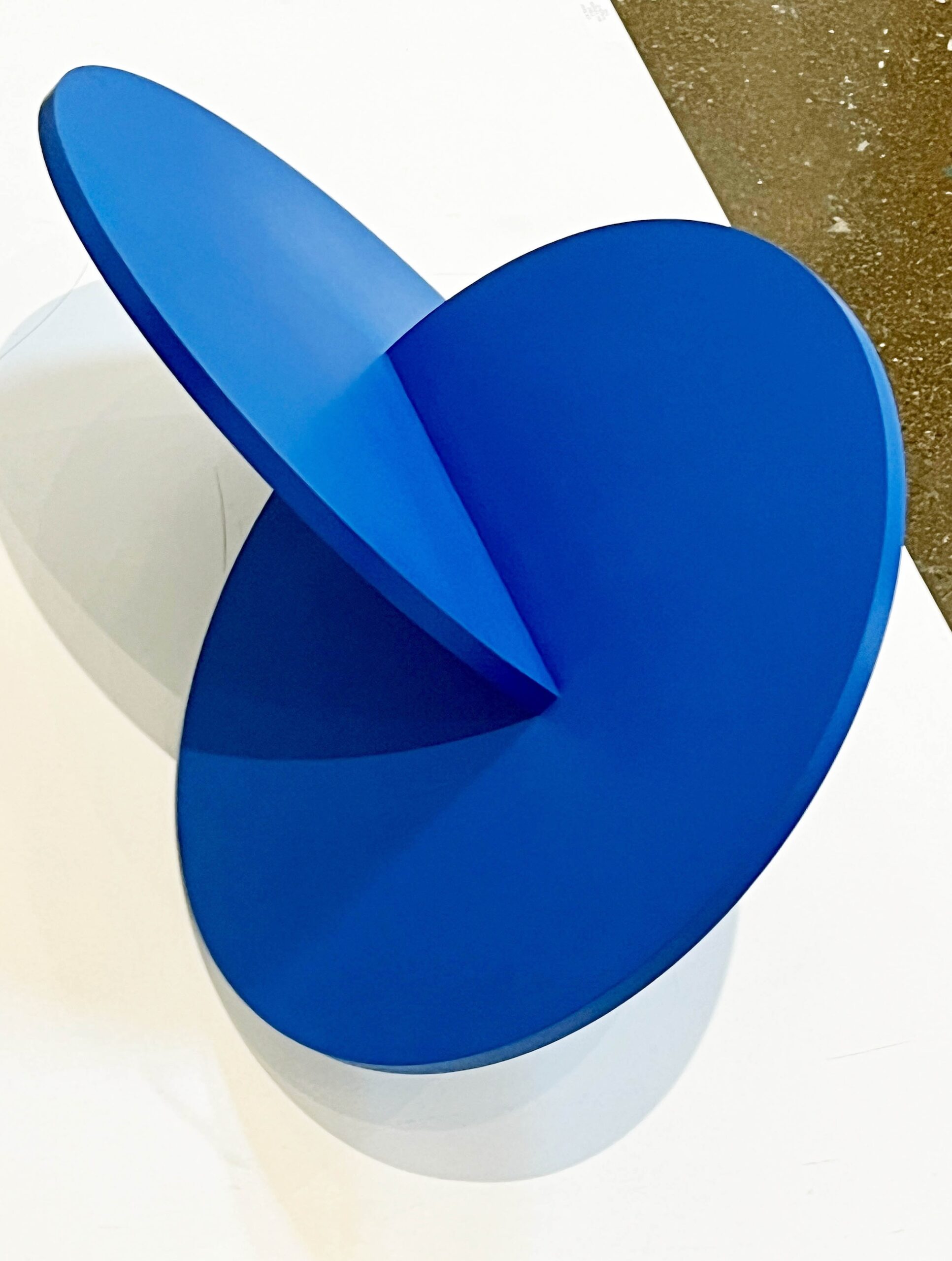
Lois Teicher, Linked, Aluminum & enamel, 13.5 x 26 x 19 inches.
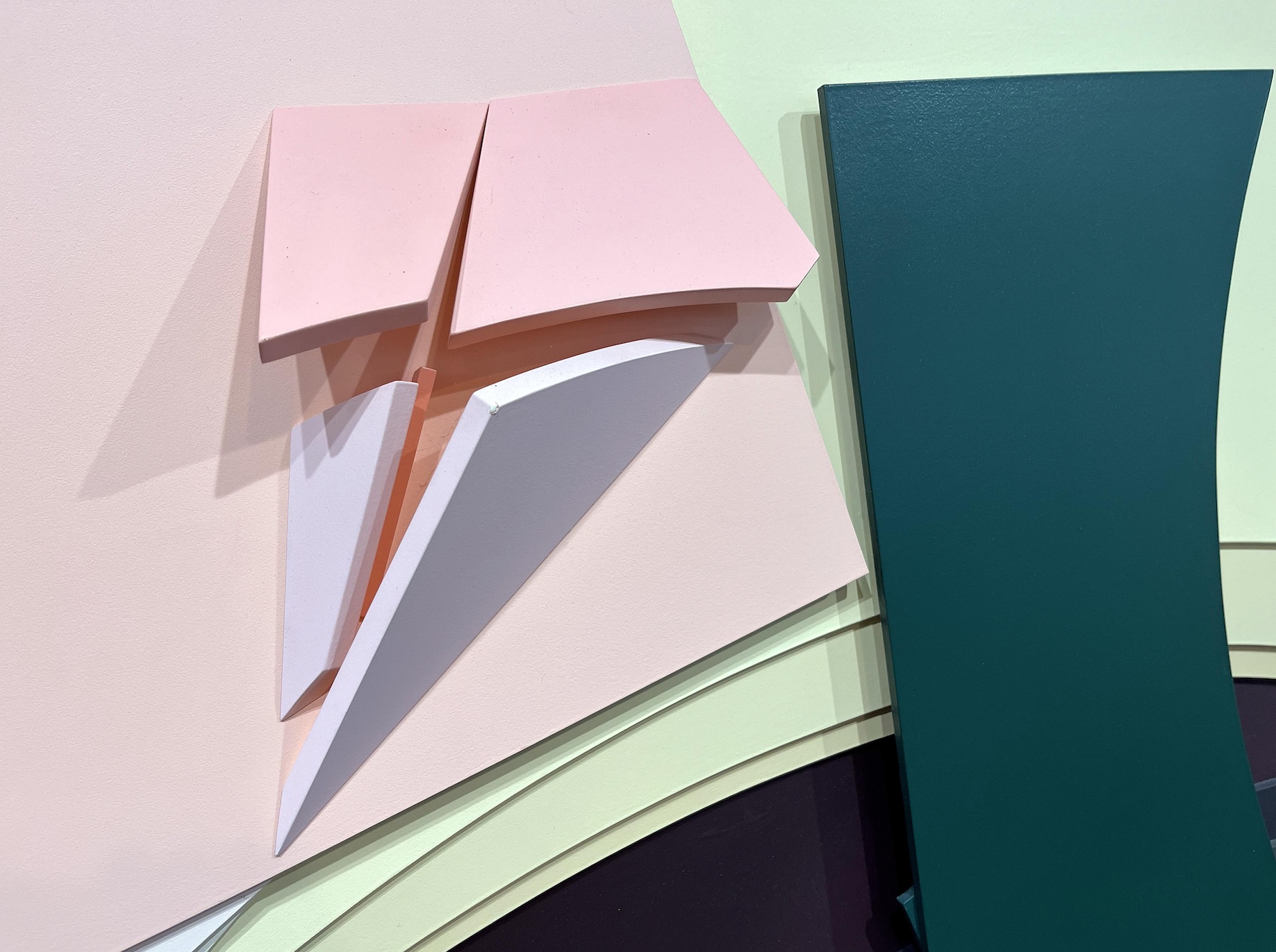
An undeniable touch of whimsy also permeates another of Teicher’s ink and oil compositions on the wall, Envelope Series 3 – a loosely rendered picture of two overlapping envelopes, each unsealed with the flap sticking straight up. There’s something about the concept’s lack of consequence – Really, a painting of envelopes? – that makes the conceit amusing. But there’s real visual interest here, too, in the way Teicher has turned the simplest of images into an affecting color study. An open business envelope seen from the back, of course, divides into five isosceles triangles — three very broad, and two quite narrow. In this work, the bottom of the top envelope is colored with deep crimson that edges over the lines, while its partly covered cousin is smoky black on the outside and a strong yellow within. The work is simultaneously oddball and charming.
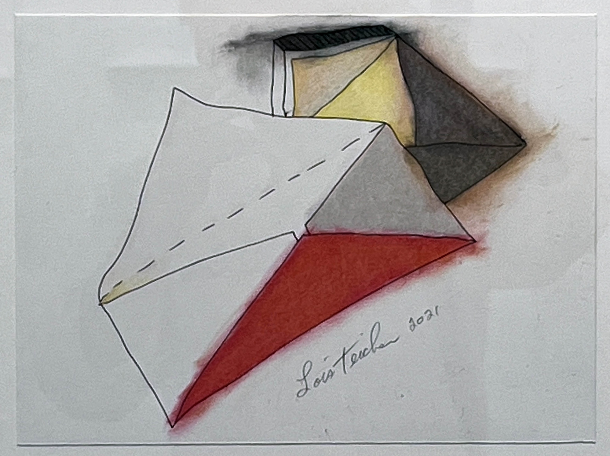
Lois Teicher, Envelope Series 3, Ink, oil sticks, Bristol board, 14 x 16 inches.
Playfulness or capriciousness also seems to have been the leitmotif behind Teicher’s first big public commission in 1996, which is worth mentioning in any essay about the artist. Paper Airplane Series with Deep Groove was constructed for Flint’s Bishop International Airport. Three separate sheets of steel have been folded into the classic shape of childhood paper airplanes. The largest sits on the floor in the airport’s main terminal and is painted white with blue lines to perfectly mimic the sheet of school paper commonly employed for the purpose. There are even holes for the standard three-ring binder. It doesn’t get any better than this.
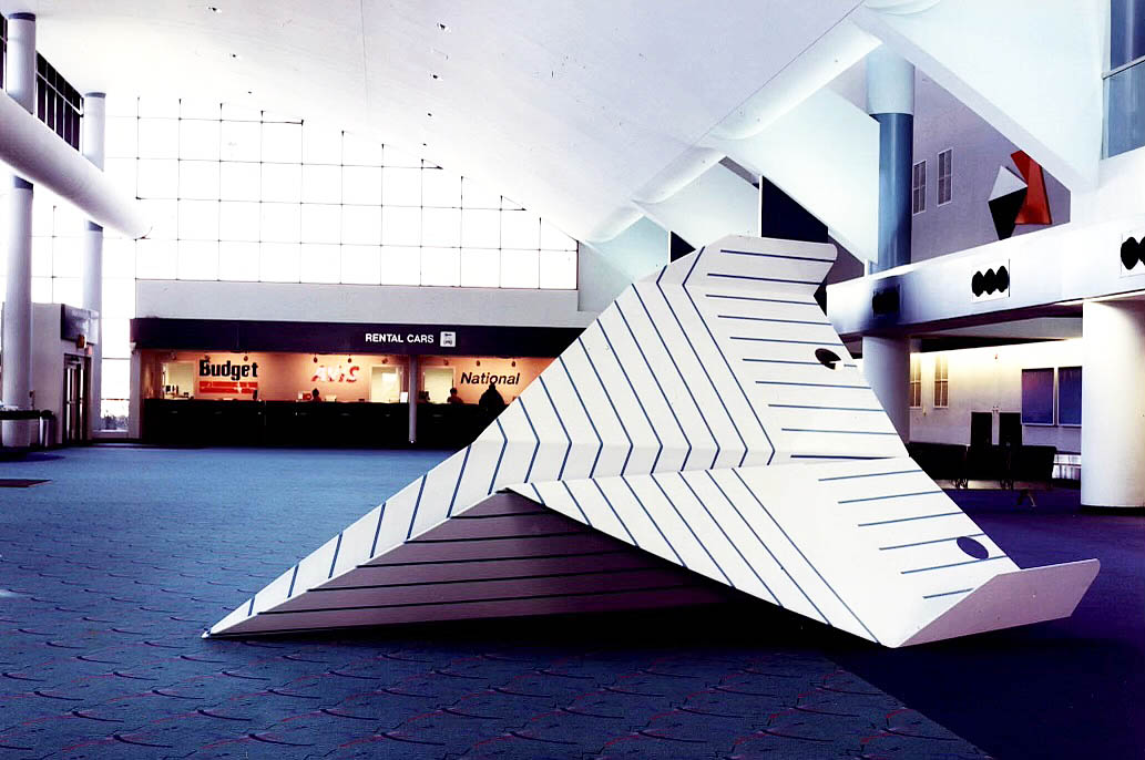
Lois Teicher, Paper Airplane Series with Deep Grove, Bishop International Airport, 1996.
Lois Teicher’s Quiet Performance: The Stillness of Shape is up at Galerie Camille in Midtown Detroit through October 19. The gallery will host an artist’s talk on October 18 from 5 to 8 p.m.