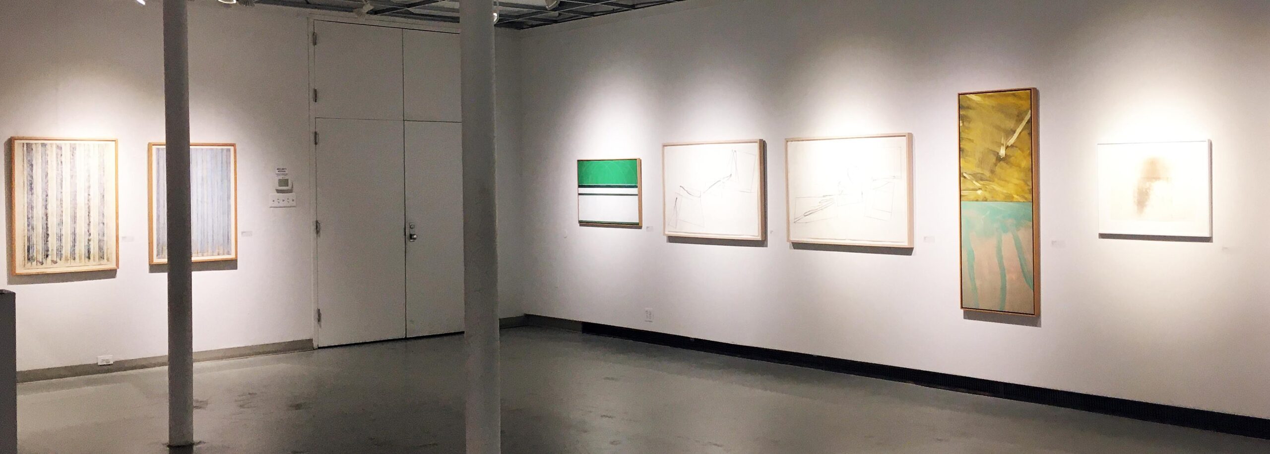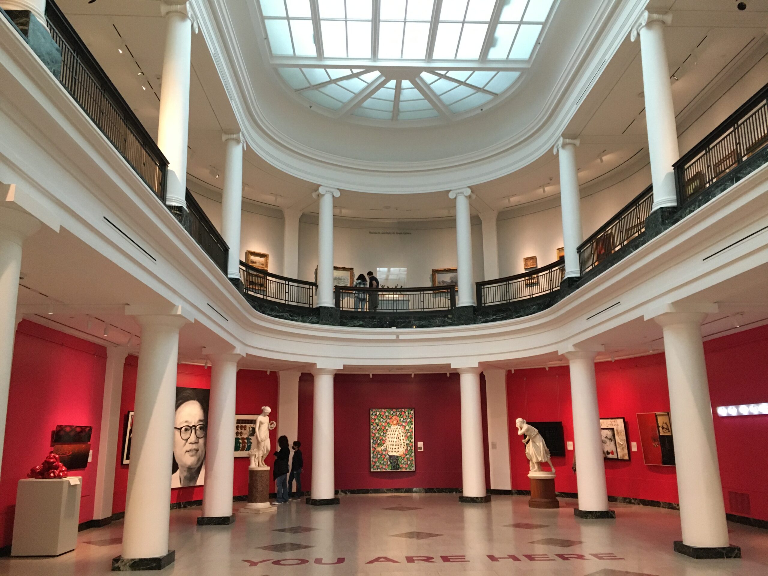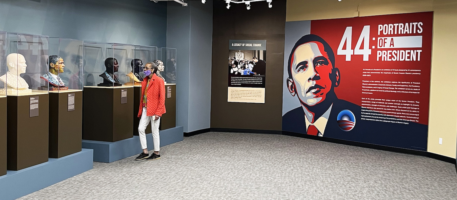
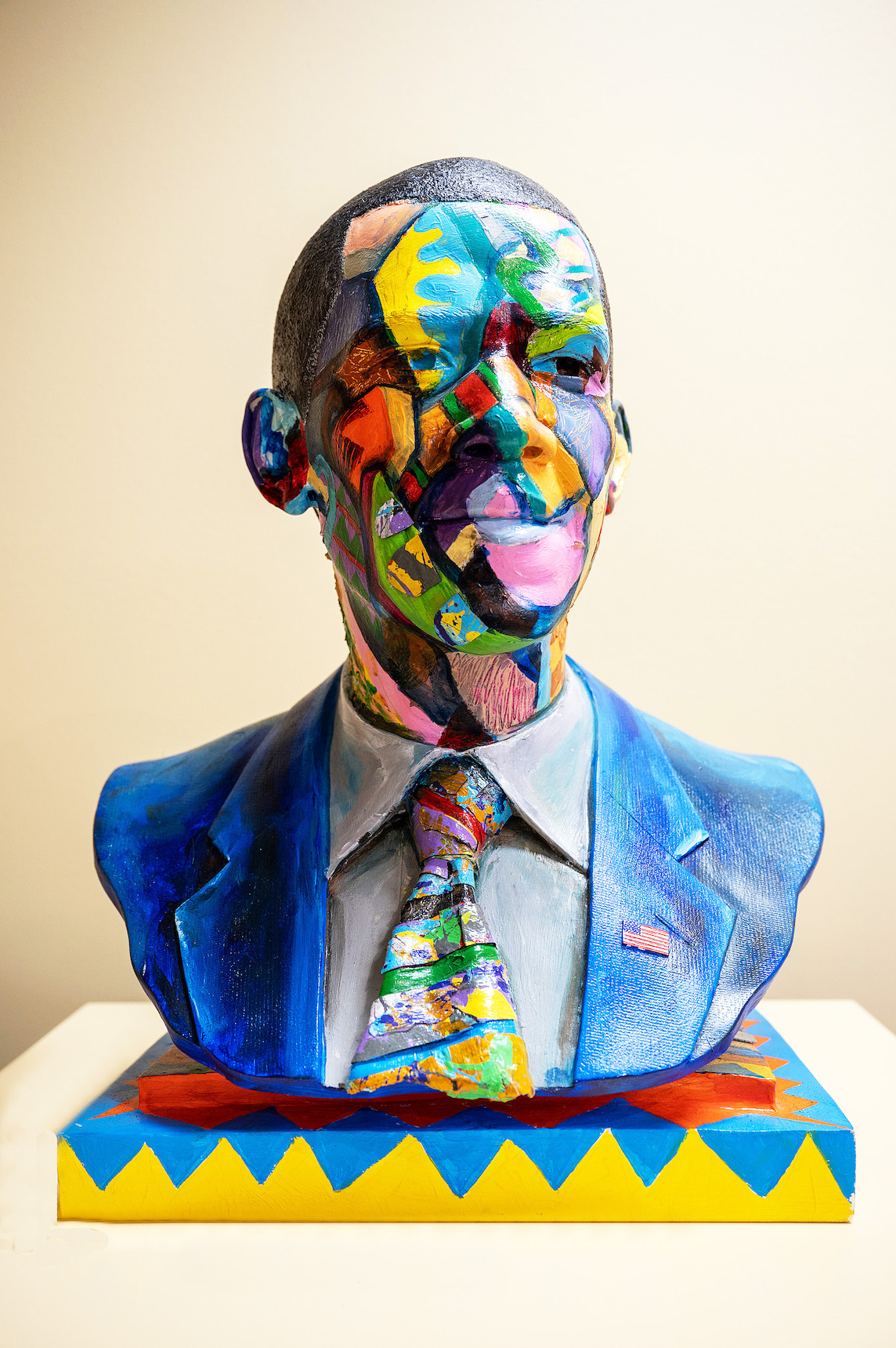
An installation view of 44 – Portraits of a President at the Charles H. Wright Museum of African American History.
In a moment that feels fraught with political peril, the Charles H. Wright has resurrected its show of creatively painted busts of President Barack Obama, first mounted in 2012 and at the time titled Visions of Our 44thPresident.
The current show is called 44 – Portraits of a President and includes a few new Detroit artists not in the original. The exhibition, staged in two galleries on the museum’s lower floor, will be up through Dec. 31, 2022.
All of which raises the question: why resurrect an exhibition after 10 years?
The reason, said Patrina Chatman, the Wright’s director of collections and exhibitions, has everything to do with efforts by some in this country to rewrite the nation’s racial history, downplaying aspects like slavery they find uncomfortable or distasteful.
This deeply offends the historian in Chatman. “You don’t just change the historical record because you don’t want to tell the stories” she said, arguing that those engaging in this sort of revisionism don’t want people to know how dreadful things really were at one time.
“We’re a history museum,” Chatman added. “We have to make sure these stories are told, and told in different ways.”
The premise for “44,” both 2012 and 2022, is simple: Take replicas of the same bust of President Obama, created for the original exhibition by Santa Fe artist Matthew Gonzales, and encourage artists to have at them. The result is a kaleidoscopic parade of Obama likenesses, dressed up in all the colors of the rainbow, and ranging from literal representations to the very abstract.
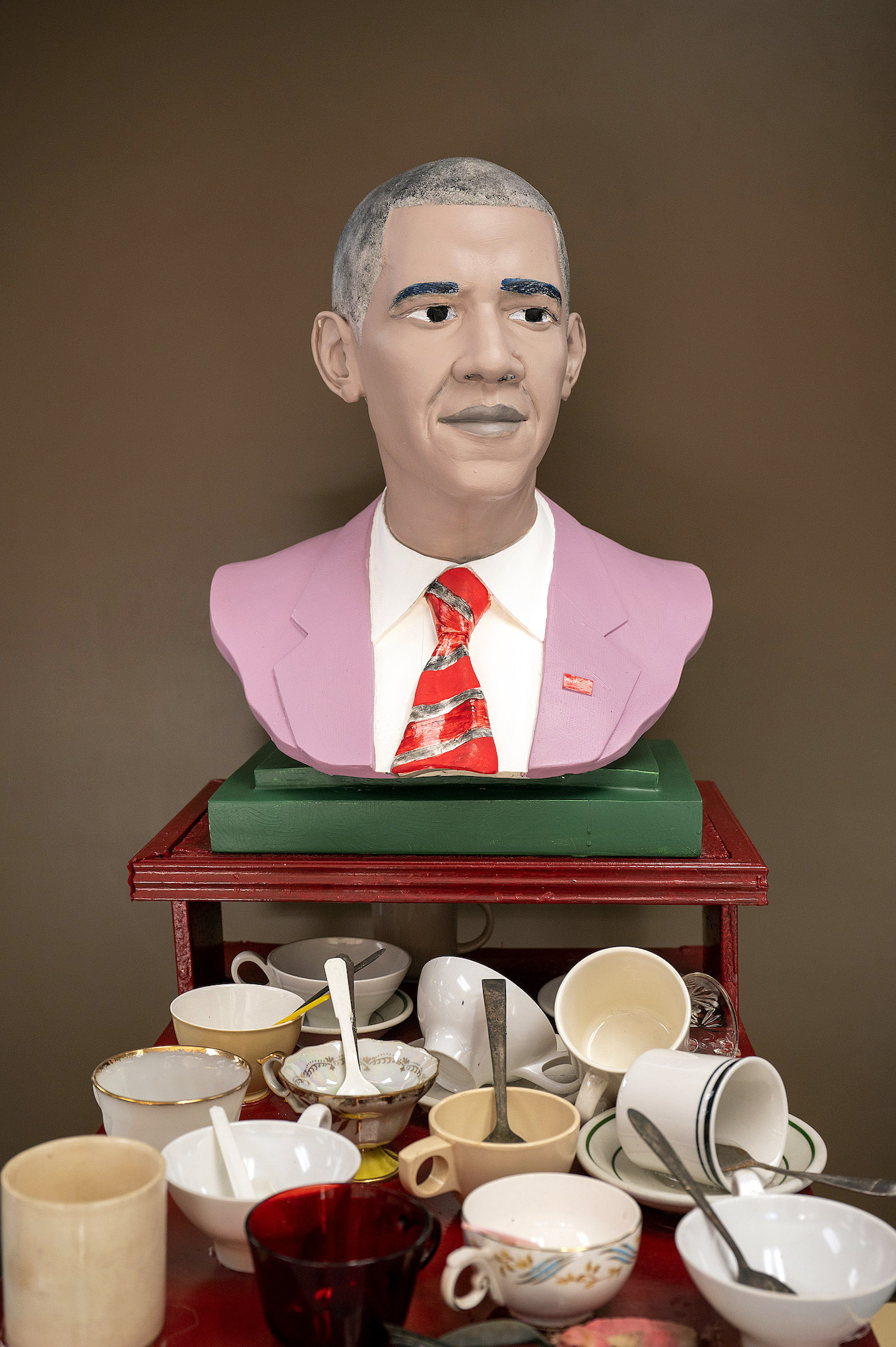
All Parties by Detroit artist Tyree Guyton.
One of the most interesting is Detroit artist Tyree Guyton’s high-concept contribution, “All Parties.” The Heidelberg Project founder has given us a blandly painted president with light-coffee skin, gray hair, and a pink suit jacket with an orange, striped tie. In front of him is a table stacked with old-fashioned teacups and spoons, an allusion to the Tea Party that rose up in 2009 to bedevil President Obama and his Affordable Care Act as it made its tortuous way through Congress.
In his artist’s statement, Guyton defined Americans — in particular, apparently, Tea Party conservatives — as a “people in a flummoxed situation of refusing to change with the times.”
Appropriating Obama’s image for artistic purposes, of course, was well established even before the 2012 Wright exhibition. The most-famous example is surely Shepard Fairey’s “Hope” poster, based on an Associated Press photo and one of the most-totemic images from 2008. On the other side of the aisle, artist Jon McNaughton produced a series of highly critical paintings of the president that variously portray him fiddling while Washington burns, or stepping all over the U.S. Constitution. (Fox News’ Sean Hannity reportedly owns one of McNaughton’s canvases.)
Perhaps “44’s” most-daring treatment comes from Tatyana Fazlalizadeh, a Brooklyn artist with an African-American mother and an Iranian father (hence the unusual last name). With “Is He Black Enough?” she tackles the question by painting the top half of the president’s face a deep, rich ebony, while the bottom half looks a lot like a white guy with a good tan.
In so doing, Fazlalizadeh touches on the twin complaints that pursued our first African-American president: For many white people, he was unquestionably “too Black,” at the same time that some members of the African-American community charged he wasn’t Black enough. In her artist’s statement, Fazlalizadeh suggested the question highlights “the potency of the color black.”
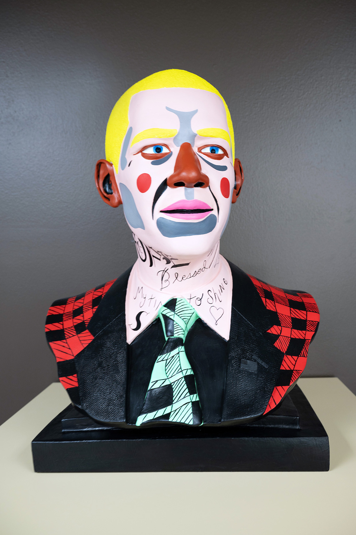
My Time to Shine by Nina Chanel Abney.
Also going out on a limb symbolically is New Yorker Nina Chanel Abney with her bust. Somewhat shockingly, “My Time to Shine” represents the 44th president as a clown with yellow hair, circular red cheeks, and a garish outfit. Her aim, Abney said on the accompanying label, was to underline how “the ruler of any country must put on many faces to appeal to the masses,” very much as a clown does in a circus.
It’s a plight that seems to stir some sympathy in the artist. Acknowledging the intense, often hostile, scrutiny any president faces – and Obama was certainly no exception (nor Trump) — Abney said she wanted to explore “the idea of concealment for self-preservation,” an intriguing insight into the psychological drawbacks of presidential power.
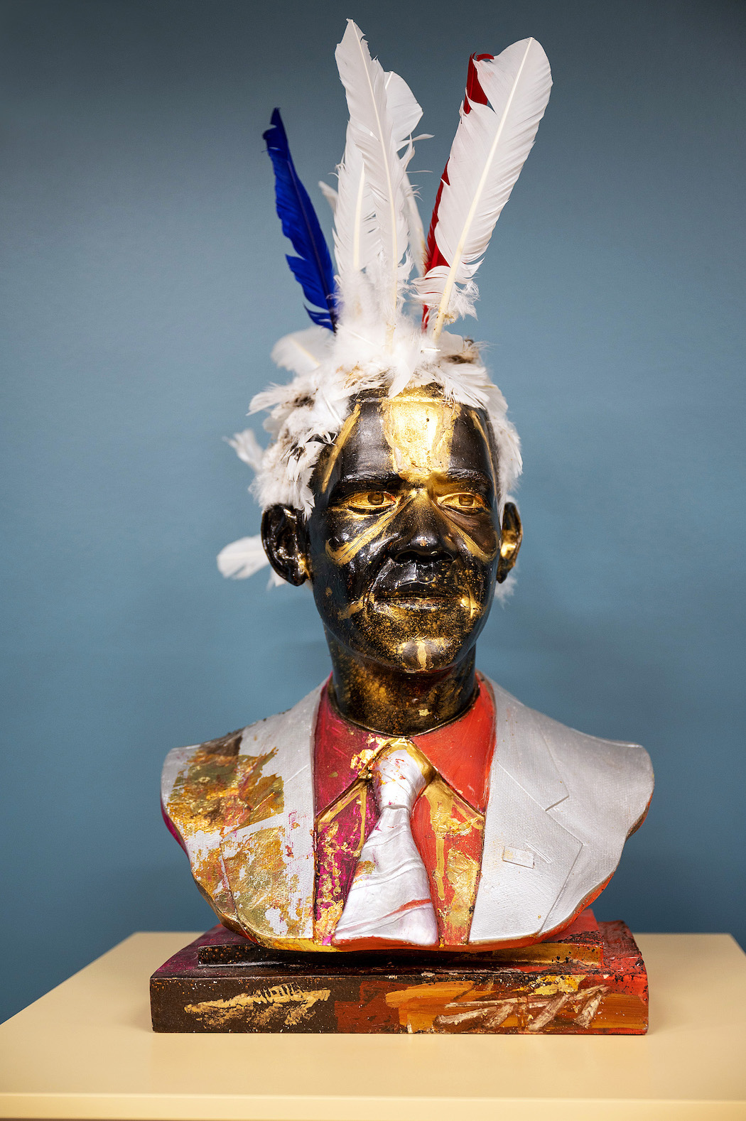
Tarred and Feathered by Angelbert Metoyer.
Another bust sure to raise eyebrows is New Orleans artist Angelbert Metoyer’s “Tarred and Feathered,” in which we find the former president, his black face streaked with bright gold, wearing a crown of feathers like a Native American tribal leader. Metoyer suggests opponents, with their fierce disdain, in effect tarred and feathered Obama. But the symbolism is two-sided. “In the Afro-Caribbean cultures of the South,” the artist noted, a crown of feathers signals power and prestige. “With this bust,” she said, wrapping things up nicely, “the punishment became instead an adornment – he is beautified by it.”
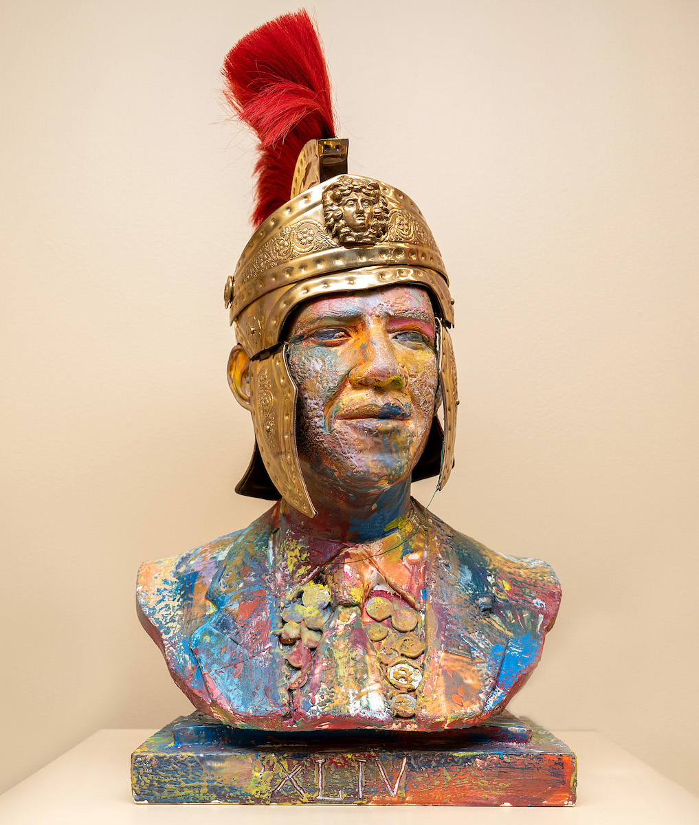
Preston Sampson’s Tales Retold.
Finally, the somewhat downbeat “Tales Retold” by Baltimore artist Preston Sampson acknowledges Obama’s huge accomplishment as the first Black president, but steps back to ask whether his administration really changed the trajectory Sampson argues the country’s been on for at least a century.
In “Tales,” Obama is decked out in a Roman centurion’s helmet, complete with red plume. While many Americans are proud that we elected Obama, the artist suggests we still resemble the Roman Empire more than we might like to think, and that the president, for all his virtues, did little to alter that.
Which leads to a heavy question: “Will we follow the same course of ruin?” as Sampson asked in his artist’s statement. “That tale is yet to be told.”
Mr. President Hear Our Cry by Kevin Cole.
44 – Portraits of a President will be up at the Charles H. Wright Museum of African American History through Dec. 31,2022.