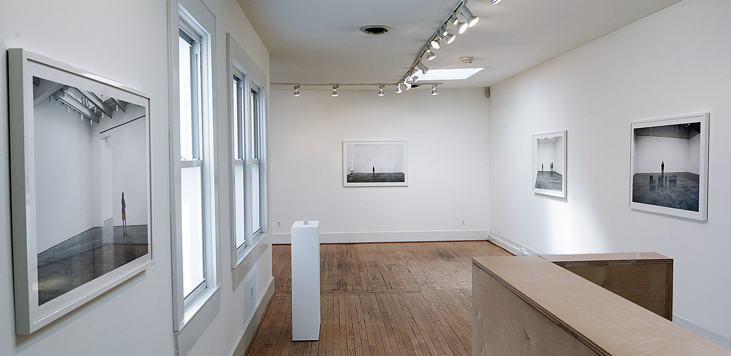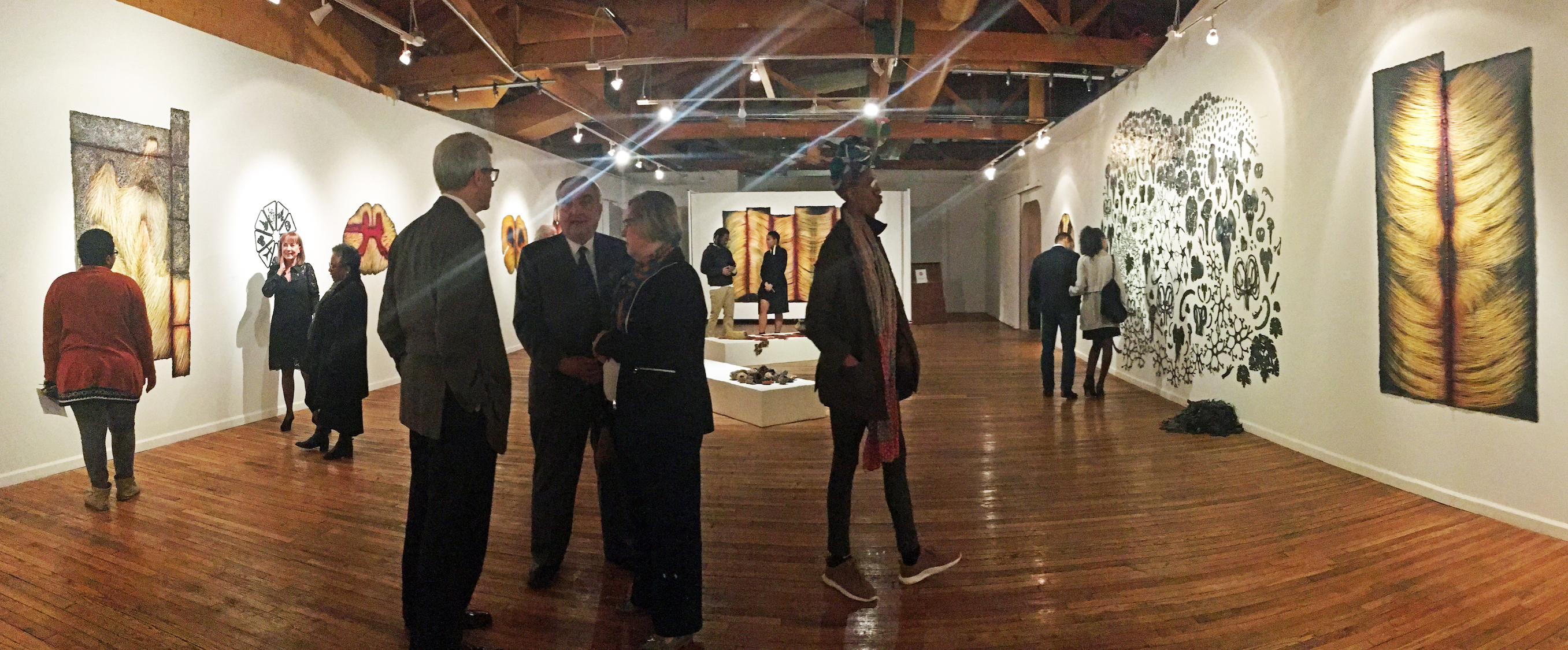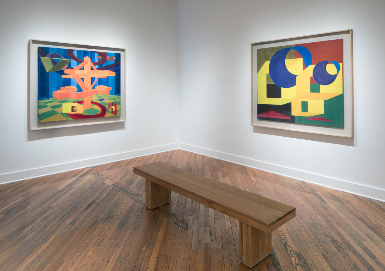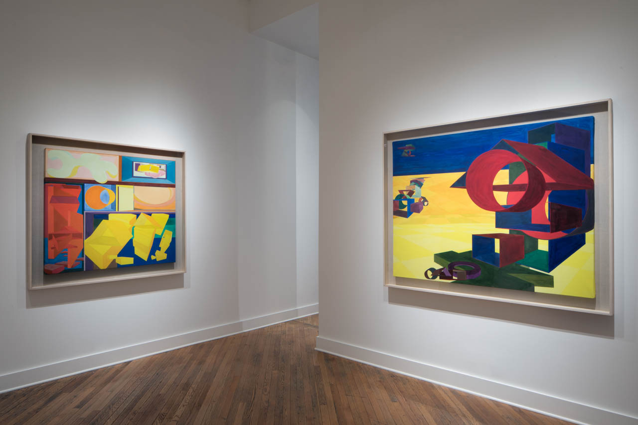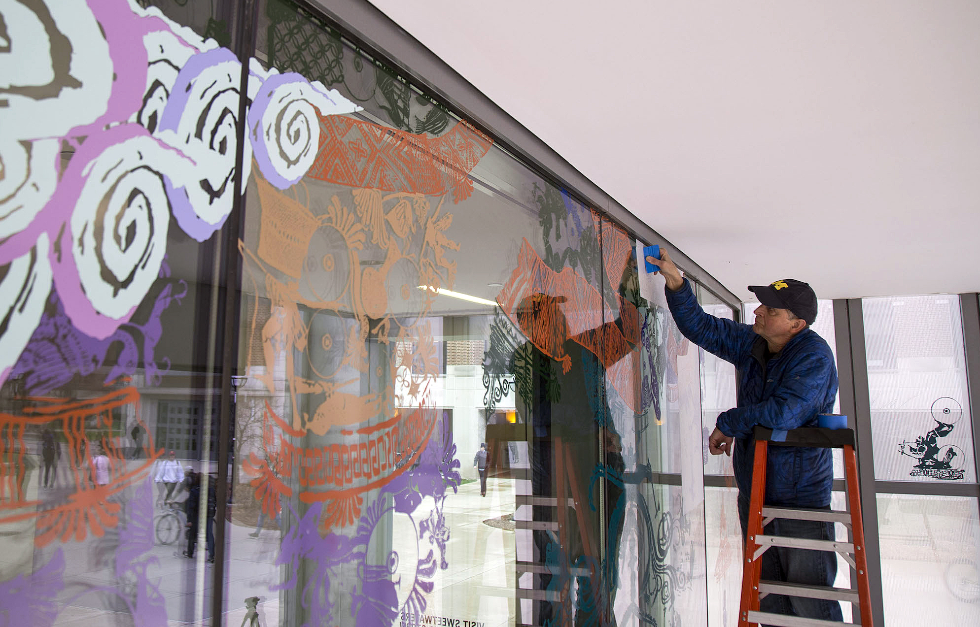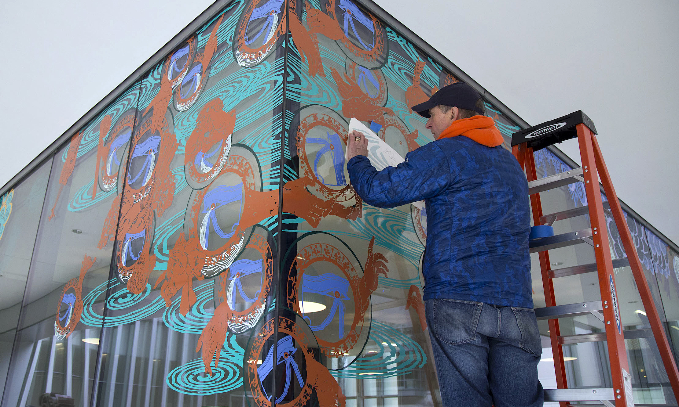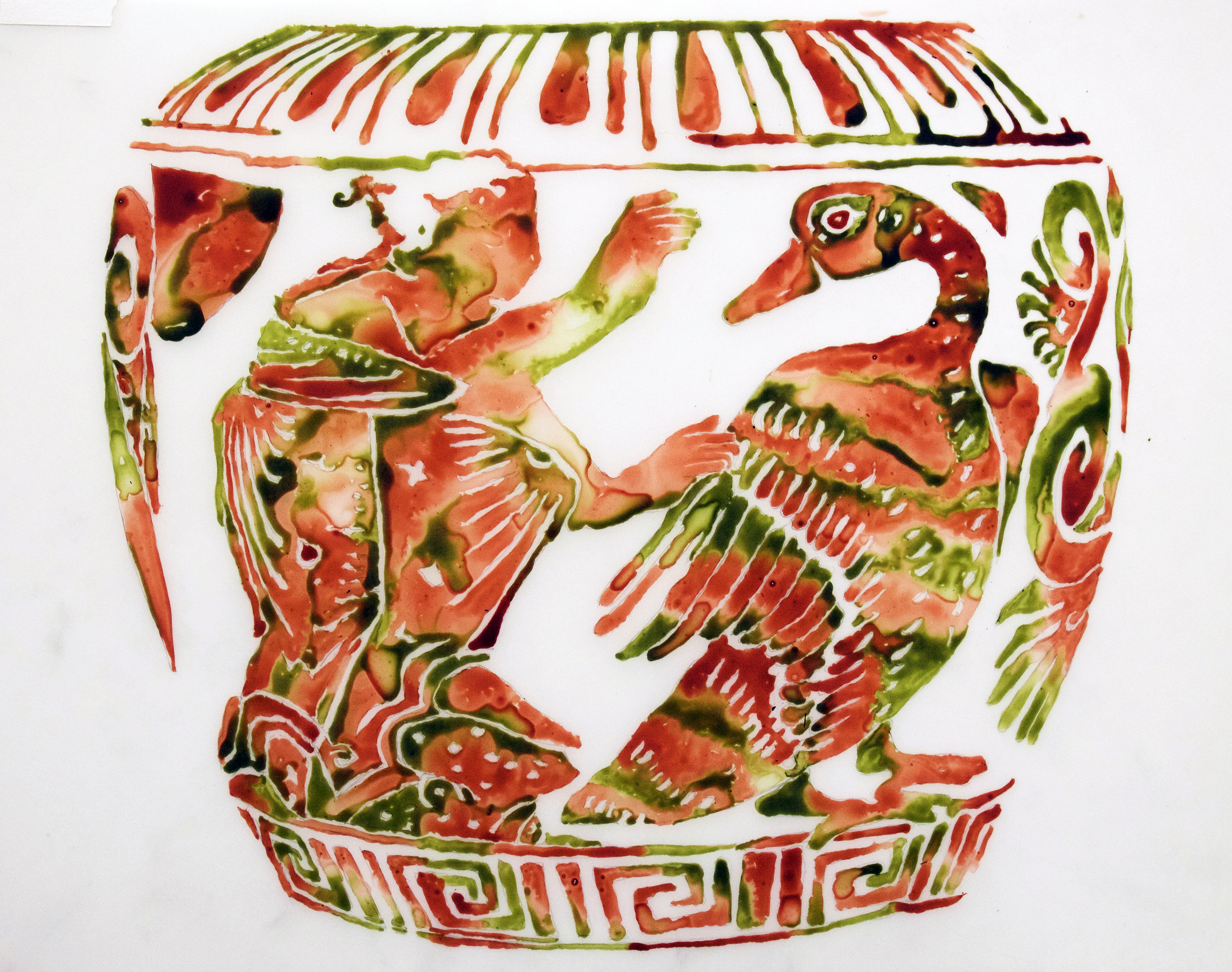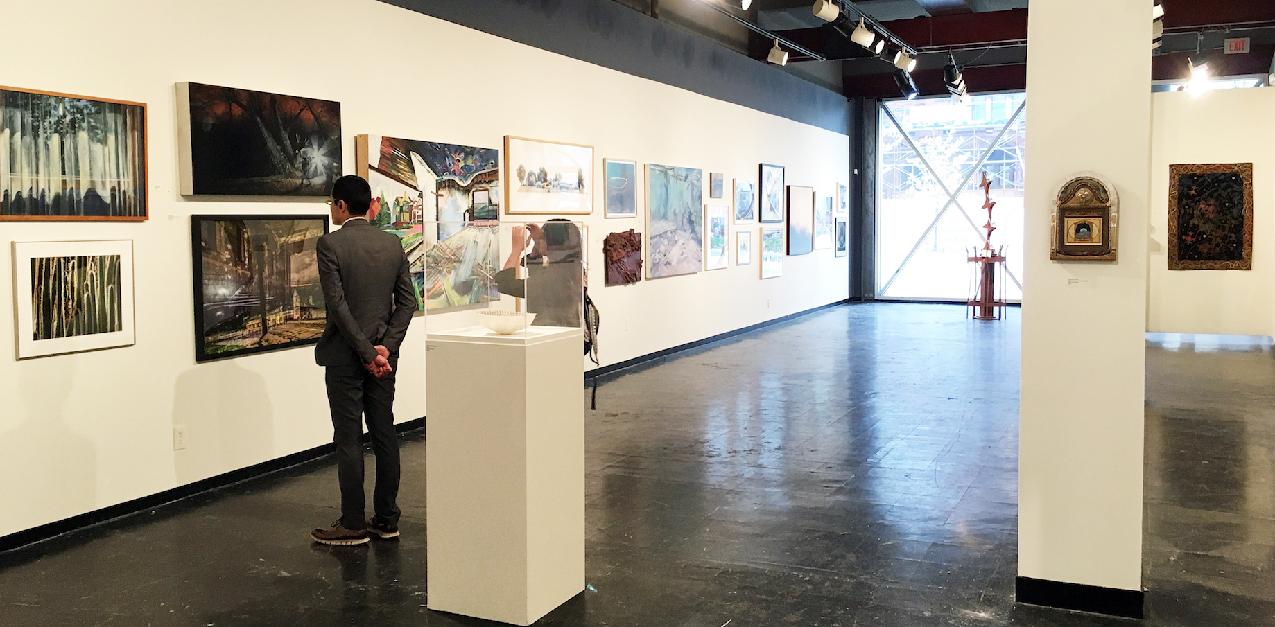
Installation View of Detroit Artist Market’s “Terrain” exhibition, Photos courtesy of The Detroit Artists Market, Matt Fry, DAR
Steadfast in its mission as a non-profit gallery devoted to contemporary art and community, the Detroit Artists Market once again opened its doors to the whole art community in its Biennial All Media Exhibition juried by Detroit’s visionary landscape painter Jim Nawara. In his call for entries Nawara made it clear that the definition of landscape was pretty much wide open:
The works for this exhibition may present engaging, evocative images and ideas that employ illusion, allusion, and/or representation of observed, interpreted, or imaginary landscapes.
Beyond that, his nuanced description of the possible parameters of landscape is a tutorial itself:
Natural and unnatural phenomena in urban, suburban or rural landscape subjects, concepts about geology, memory and landscape, history embedded in landscape, archaeology, space archaeology, aerial views, maps and cartography, seascapes, layered space, camouflage in landscape, still life in landscape, figure in landscape, skyscapes, nocturnes, weather effects, atmospherics, optical phenomena in landscape (opposition effect, sun pillars, fogbows, glories, etc.), or microcosmic and macrocosmic landscapes may be of interest.
Nawara’s description of what he calls “Terrain,” increases our post-digital visual vocabulary for all things called “landscape” and certainly our appreciation of what he has included in the exhibition.
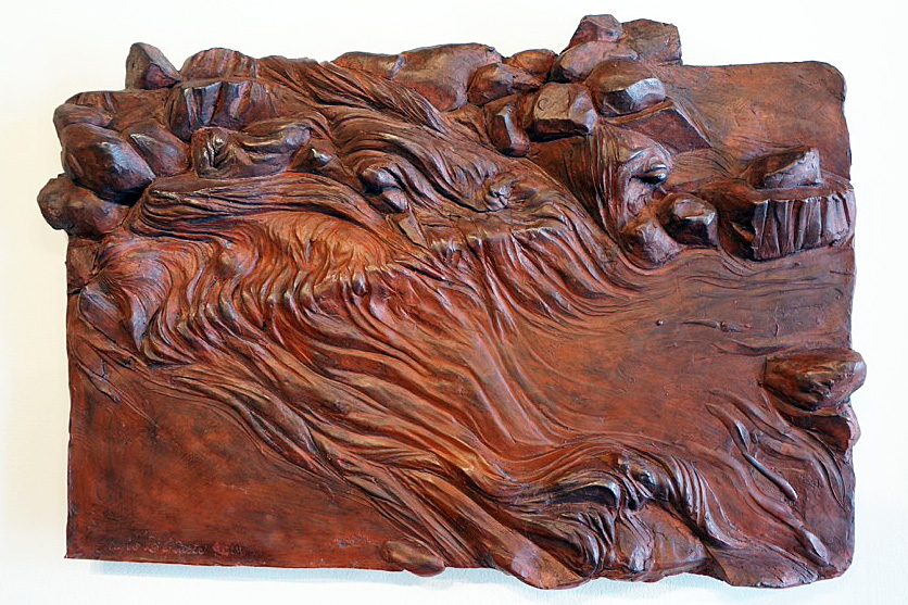
Sergio DeGiusti, “Time and the River,” (2014) Hydrostone, 21”X31”
Master Detroit sculptor Sergio DeGiusti’s hydrostone relief “Time and the River” is perhaps the exhibition’s quintessential representation of the earth’s terrain and sets the stage for much of the imagery of the exhibition. Sculpted and tinted in waves of iron oxide red, the hydrostone relief evokes the metaphor of primal forces shaping the earth’s molten magma interior into phantoms arising over millions of years, to structure the interior of the planet as we know it now. The blood red waves accumulate to congeal into enormous crystalline mountains of iron evolving into animated figures that shape the history of the planet. The figurative shapes that arise suggest the powerful, destructive forces of nature, even human nature, that are seen in early twentieth century neoclassical sculpture.
There are forty artists represented in “Terrain” fulfilling virtually every feature of Nawara’s description of landscape and every media but they all somehow suggest the classic dynamics of DiGiusti’s “Time and the River,” in which the powerful, yet graceful forces, of nature shape our planet. Ryan Herberholz’s “Reservoir,” is built around the image of a hallucinogenic derelict house, an all too familiar image to Detroiters, caving in upon itself and sliding into a sinkhole, which is kind of a metaphysical reservoir or sewer. Pastel colored oil floor boards and ceilings seem to melt and flow into the dark hole at the center of the image. Meanwhile out of the windows we can see utopian fields of green and a pastel landscape of tidy, cobbled together, rescued houses.
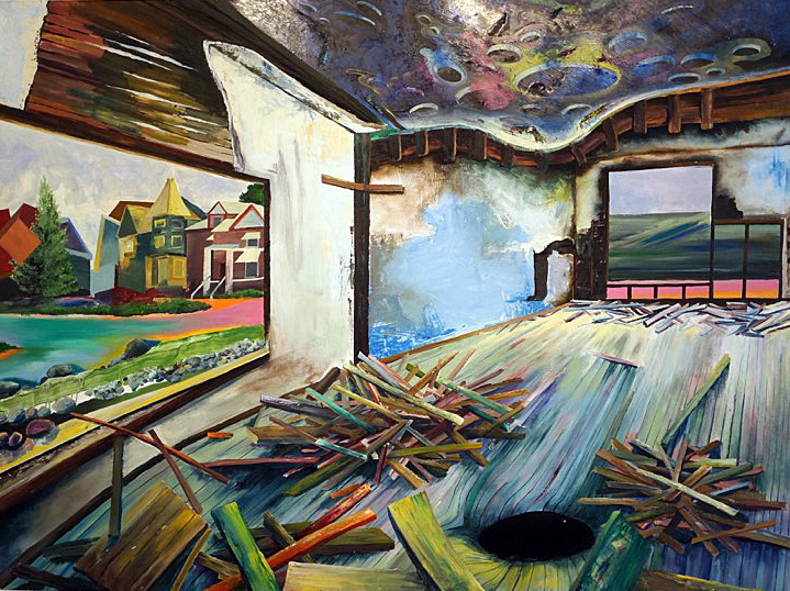
Ryan Herberholz, “Reservoir,” (2017), Oil on Panel, 48”X64”
Deborah Kingery’s large format, black and white photo, “Target,” captures the foreboding towers of the Enrico Fermi 2 nuclear power plant near Monroe, Michigan. Fermi 1, once a major threat to SE Michigan, due to a nuclear meltdown, has been decommissioned. Kingery’s infrared film print (film stock of the psychedelic 60’s because of its surrealistic effects on light and vegetation), beneath a huge ominous sky of vaporous clouds produced by the twin nuclear stacks, with the deer target in the foreground, pictures Fermi 2, the replacement for Fermi 1.
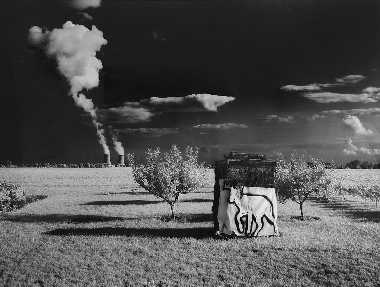
Deborah Kingery, “Target,” Infrared Silver Photograph, 33”X43”
One of the fine ironies of the exhibition is two works of art that document human interaction and collectively create a wonderful human landscape. Donita Simpson’s very humanizing photo of the artist Jo Powers pictures her in studio amidst art making materials, photos and sketches, including a study for a “steam shovel,” a tiny, toy model of one, and one of her enigmatic self-portraits and other accoutrements of an artist studio. Powers stares, meditatively, from the landscape of her studio, into the distance. The atmospheric, completed painting itself hangs above Simpson’s photo. It is of a fully-clothed woman in an excavated hole standing up to her knees in water, the steam shovel poised on an earth mound behind her. As always with Powers’ evocative images, interpretation is open but there is always both a solitary search and an enigmatic mission suggested. Powers’ modest, tonalist paintings, rich in painterly chops, always stay within themselves, and because of that are deeply satisfying.
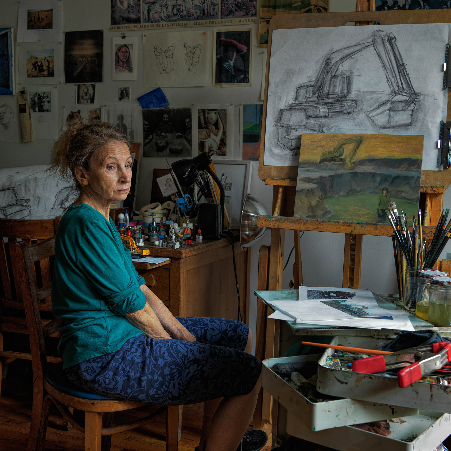
Donita Simpson, “Portrait of Jo Powers,” (2016), 30”X30”
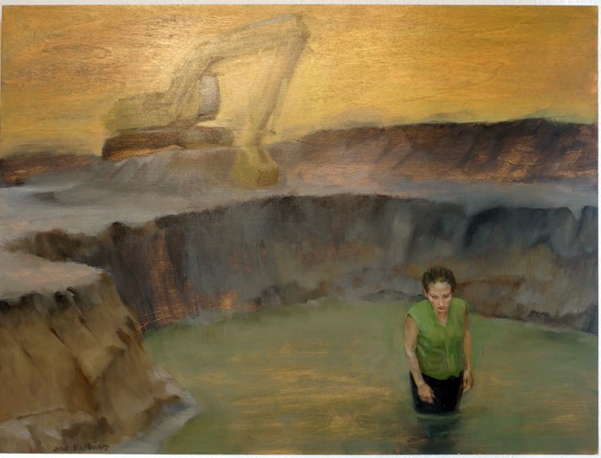
Jo Powers, “Site,” (2015), 12”X16”
There are not many group-exhibitions that, at least for this writer, gain much traction because of the, often-random application of art to a specific theme. Nawara however, has attracted, probably because of his own fine artistic history, a group of Detroit’s best artists who have addressed the mission with sincerity.
In other words, there’s many fine works in “Terrain” that make a dynamic contribution to developing the concept of terrain and only a few that seem a stretch. Jill Nienhuis insightful painting, “Boulevard Bob,” tracks the flora and fauna of typical alley terrain culture with the juxtaposition of a nomadic black dog, probably named Boulevard Bob, on the prowl for dinner and a stellar rendering of sunset lit mullein plant in the foreground. That there can be a beautiful sunset in an alley, with overgrown plants and trees and a derelict car, is fundamental to urban dwellers, especially Detroit, but that there is a specific alley culture that is recognized and celebrated, and punctuated by the noble mullein, is sensational!
This years’ Detroit Artist Market Biennial has many treasures and fulfills Nawara’s diversely imaginative definition of Terrain. Mel Rosas’ retablo influenced painting of an iconic street scene in Mexico is quietly suggestive of the elemental simplicity of that picturesque culture and climate. Sue Carmen-Vian’s articulate graphite drawing, “Pancake Race,” seems a comic commentary on the stereotypical role of women in the Human Race. Bill Schwab’s photograph “Roosevelt at Buchanan, Detroit/ Projection Djupavik, Iceland,” is layered projection of a dystopic factory with crumbling concrete walls, derelict clapboard house and building and haphazard electrical wiring punctuating the apocalyptic vision. One of the only ruin-porn-noir images that engages the surfaces of the derelict with technical invention and cinemagraphic sensibility. “Terrain” is rich in Detroit artists with many gems to be discovered.
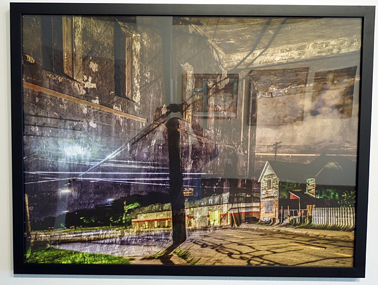
Bill Schwab, “Roosevelt and Buchanan, Detroit/Projection Djupavik, Iceland” (2017), Photograph, 32”X42”
Biennial All Media Exhibition: Terrain, April 27-May 26, 2018, Detroit Artist Market
Address – 4719 Woodward Avenue, Detroit, MI 48201
Contact – Web: info@detroitartistsmarket.org – Phone: (313) 832-8540
Hours – Tuesday – Saturday, 11:00 A.M. – 6:00 P.M.