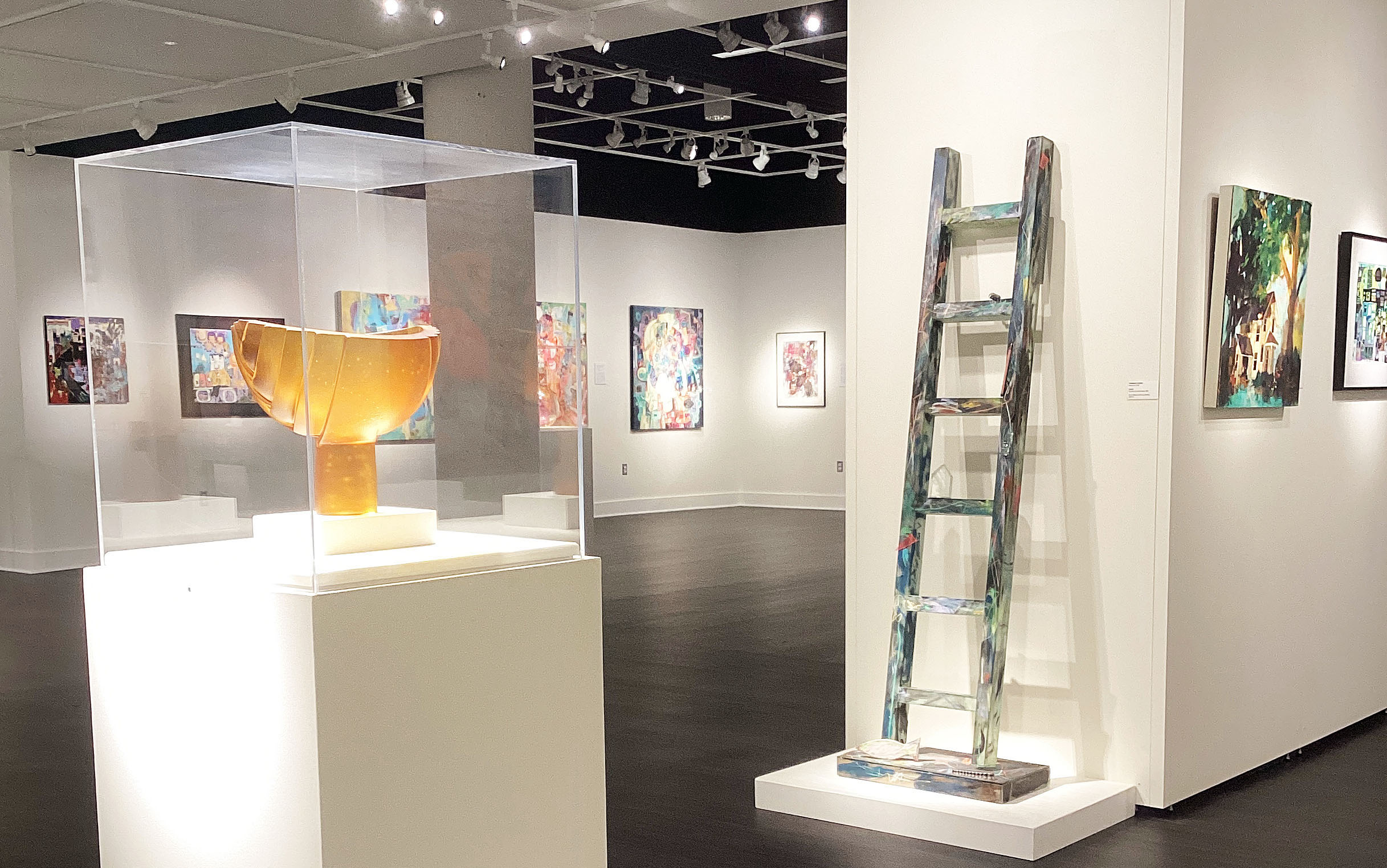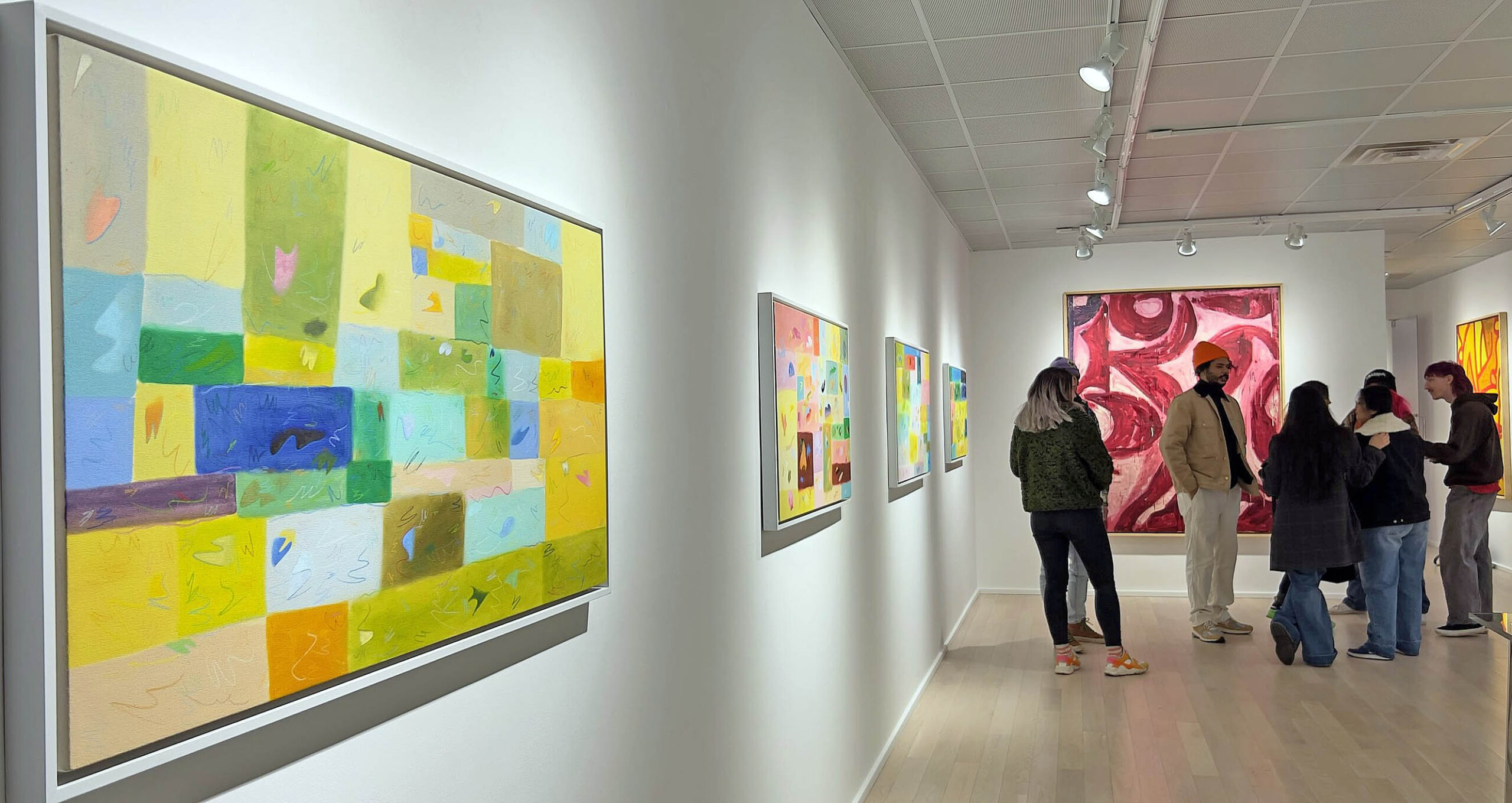
An installation image: Matthew Hawtin, Sylvain Malfroy-Camine and Benjamin Pritchard at the David Klein Gallery in Birmingham. Image courtesy of Sylvain Malfroy-Camine.
You’d be hard-pressed to find three abstract painters with styles more radically divergent, but such is the charm of New Work: Matthew Hawtin, Sylvain Malfroy-Camine and Benjamin Pritchard, up through April 29 at Birmingham’s David Klein Gallery. It’s a refreshing exhibition – you may well find moving from one artist to the other an unexpectedly bracing experience.
Despite differences, there is an underlying construct. “The overarching theme is abstraction and the brushstroke,” said owner and gallerist David Klein, who adds that he’s really been trying to build the gallery’s abstract-painting program. “You go from Matthew Hawtin, who completely hides the brushstroke, to Ben Pritchard who’s all brushstroke and gestural energy.” His judgment? “Ben is the grand gesture; Matthew is no gesture.”
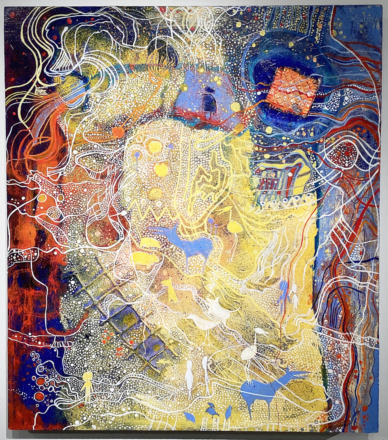
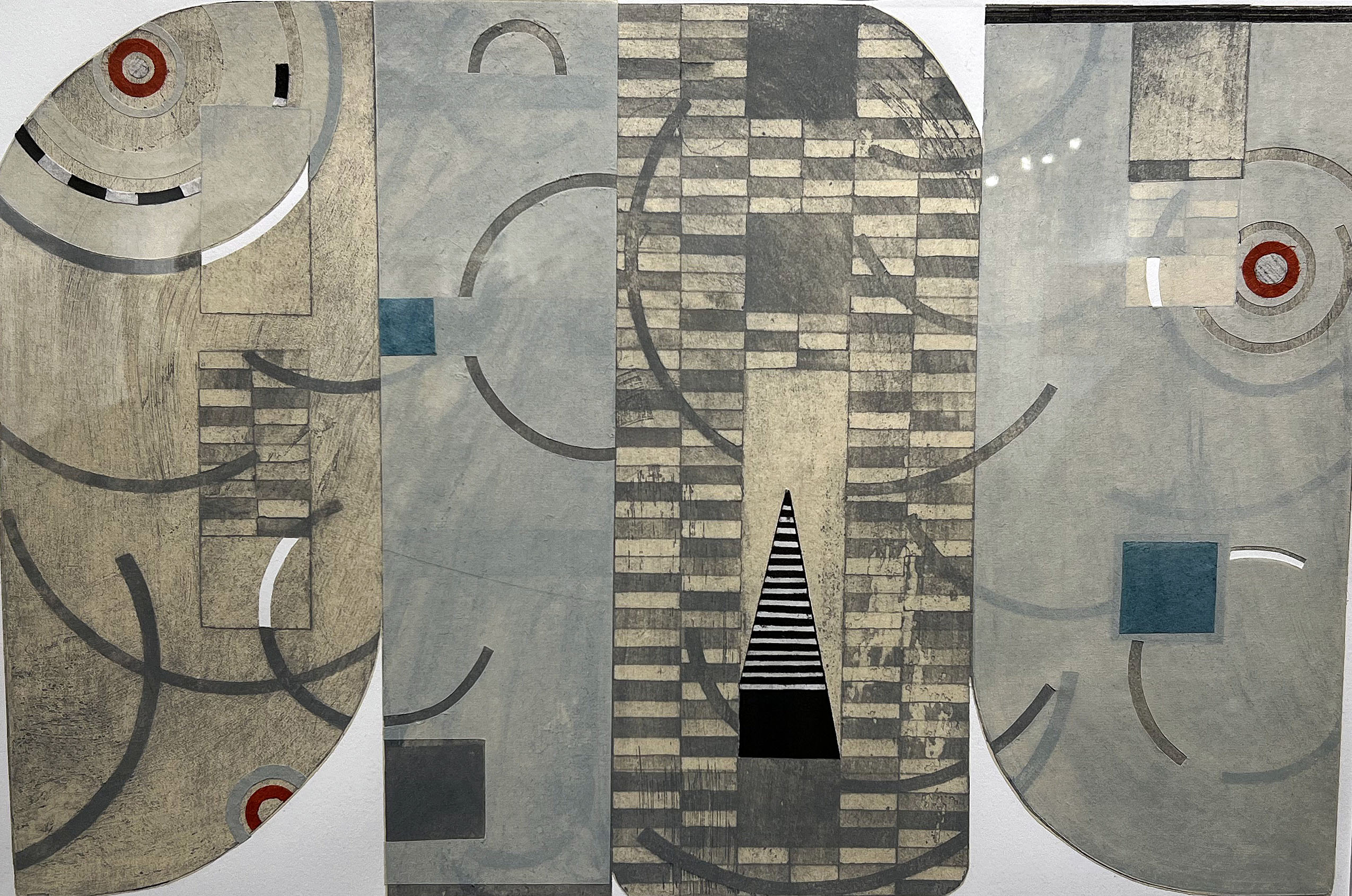
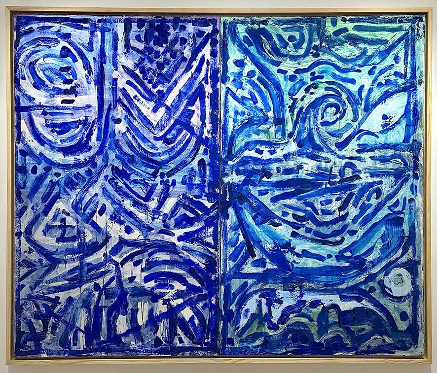
Employing that same scale, Klein locates Malfroy-Camine, who came to Michigan for Cranbrook and stayed after getting his 2021 MFA, somewhere in-between the other two artists in terms of the prominence that the brushstrokes enjoy. Unlike Hawtin’s solid-color exercises, canvases like Malfroy-Camine’s Construct/Construct read as textured works, dotted as they are by scatterings of small shapes applied with colored pencil on top of the dried oil.
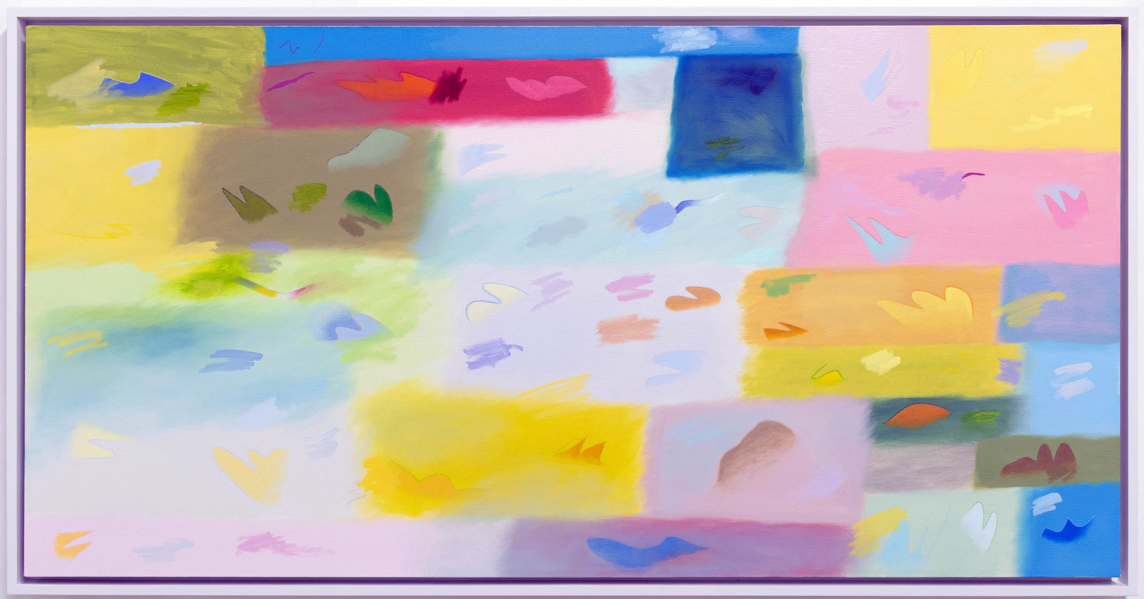
Sylvain Malfroy-Camine, Construct/Construct, 2023, Oil and colored pencil on canvas, 28.5 x 48.75 inches. Images courtesy of the David Klein Gallery and DAR.
There’s an airiness to these quilt-like canvases that’s simultaneously child-like and sophisticated. Indeed, they don’t hang on the walls so much as hover, and radiate a deeply original vibe with their patch-work backgrounds and oddball annotations. “Sylvain’s got a unique expression that’s kind of the backbone of his work,” Klein said, who added that the young artist has come “a long, long ways” in a short space of time, carving out a unique visual personality. “Sylvain expresses himself,” Klein said, “in a way I haven’t seen before.”
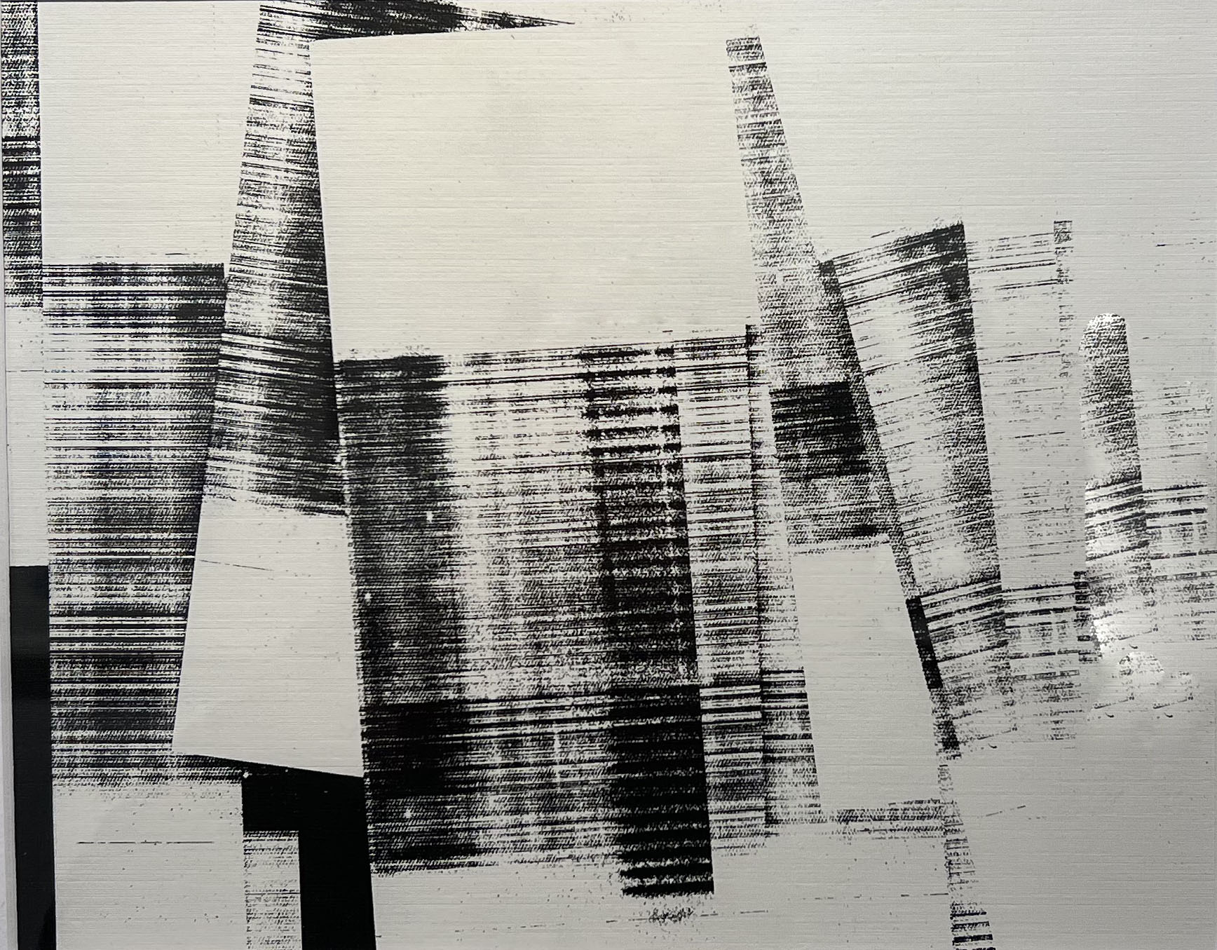
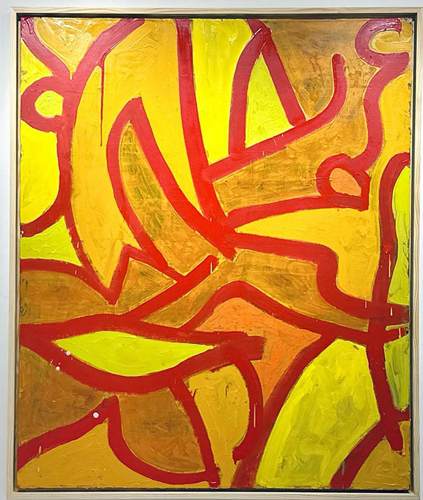
Malfroy-Camine’s compositions in this show lean heavily on pastels and “thin” colors, and as a consequence, really pop when set next to one of Pritchard’s deeply saturated paintings, whose sinuous lines and landscapes feel almost sculptural. Based in Brooklyn, Pritchard maintains studios both there and, since he often returns to Michigan, in a shed on his parents’ Oakland County property. A Detroit boy through and through, Pritchard nonetheless graduated – rather exotically — from the Royal Academy of Arts in London.
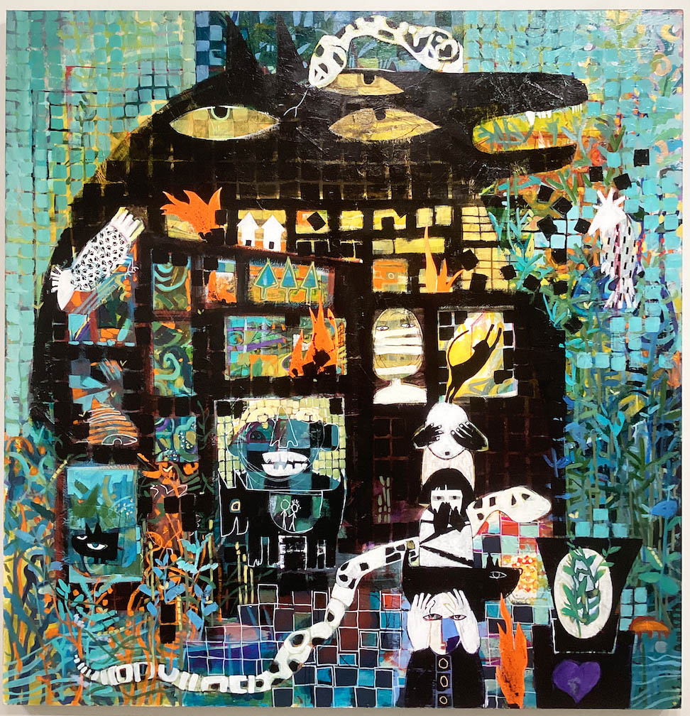
Benjamin Pritchard, Roz Painting, 2023, Oil on linen, 60 x 72 inches.
The pieces he has in New Works represent a sort of departure for Pritchard. For most of his career, Klein says, the artist worked at a very small scale – nothing like what’s hung on the gallery walls today. As it happens, Klein was able to get him some larger canvases, “and Ben just went to town and created a powerful body of work,” the gallerist said. “Being able to paint on that scale really brought him to another level.”
Size-wise, Roz Painting, which calls to mind two muscular ceramic tiles standing next to one another, is 60” by 72,” large enough to fill up an entire wall. Constructed of compressed twists and turns, Roz draws a contrast with Pritchard’s other works on display, like “Magnanimous Duality,” which feel considerably more organic in spirit. Maybe it’s the curves, maybe it’s the colors, but running through and uniting all the artist’s work is a strong, sensuous current.
Benjamin Pritchard, Floating Solution (After a Late DeKooning), 2023, Oil on linen, 60 x 50 inches.
As it happens, the word “sensuous” can be applied easily to Hawtin’s work as well, albeit in a completely different universe. Born in the U.K. and raised in Canada, Hawtin now lives in the Detroit area but is still, if you will, bi-national, maintaining a studio across the waters in Windsor. The power of these smaller canvases on display lies in their saturated, strikingly flat surface treatment — as well as the knife-edge geometry that cleaves and defines them. They’re both eye-catching and a little confrontational. Their remarkable precision, Klein suggests, calls to mind both Elsworth Kelly and Robert Mangold, two 20th-century painters whose work, while very different one from the other, practically defined “hard edge.”
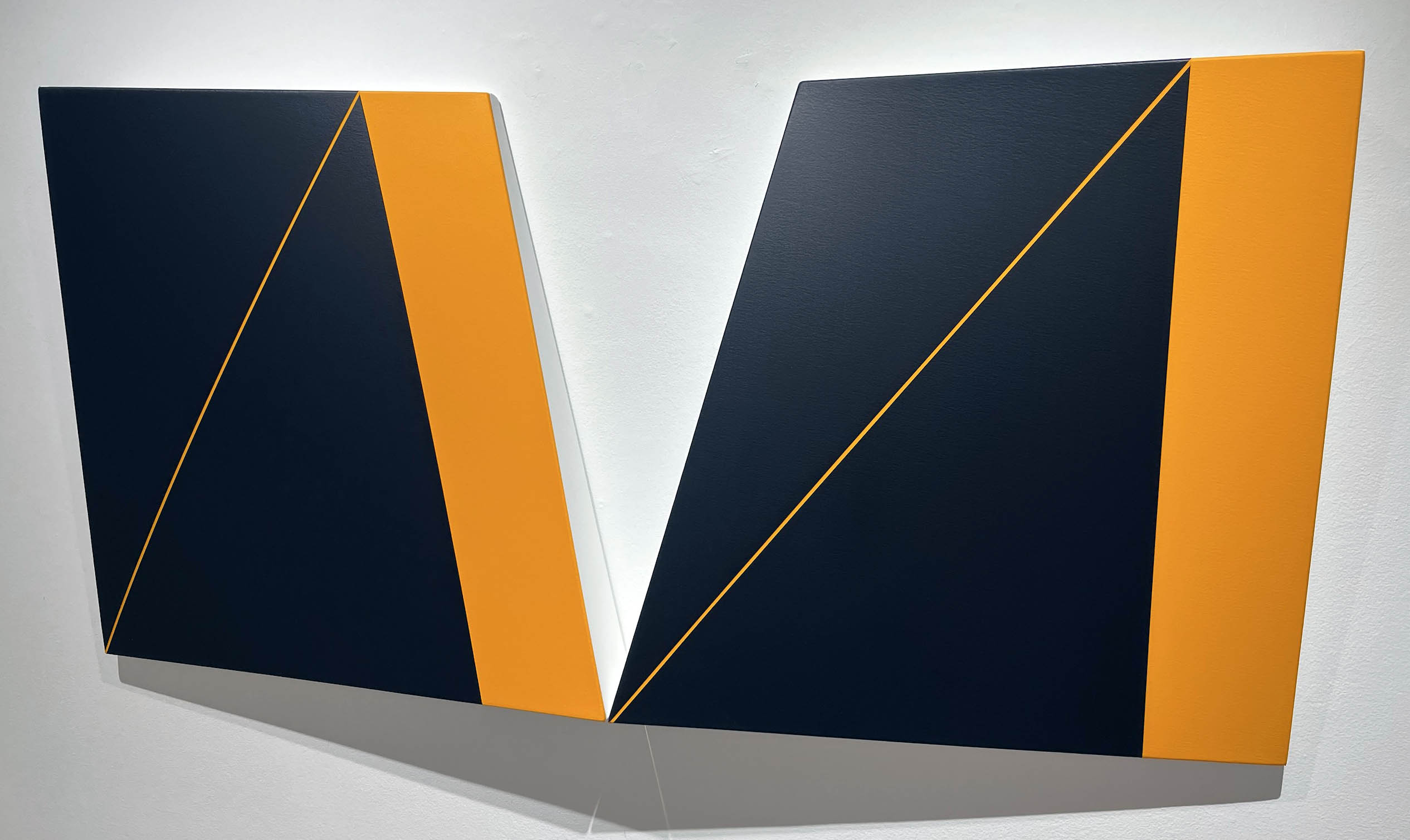
Matthew Hawtin, Binary, 2023, Acrylic on canvas, 24 x 44 x 4 inches.
But the surprises here go beyond sharp lines. “Matthew’s color choices,” said Klein, “can be kind of radical, like the orange and black together in Binary. I look at that and think ‘Halloween,’ but he pulls it off really elegantly – particularly with the addition of a line to break up the monochrome color pattern.”
Disorientation plays a minor-key role here. Many of these acrylic compositions toy with triangles and trapezoids, breaking canvases – not one of which is a rectangle — into colored blocks that almost generate an unexpected but convincing illusion of three dimensions. Adding to that tantalizing confusion are Hawtin’s trademark “torqued” canvases, whose surfaces tilt and cant at slight angles to the wall instead of being completely parallel. The works in effect “lean” toward the viewer, but so subtly that you wonder momentarily – as with the apparent 3-D – whether you’re imagining things. You’re not. Examine the edges and you’ll understand the construction involved.
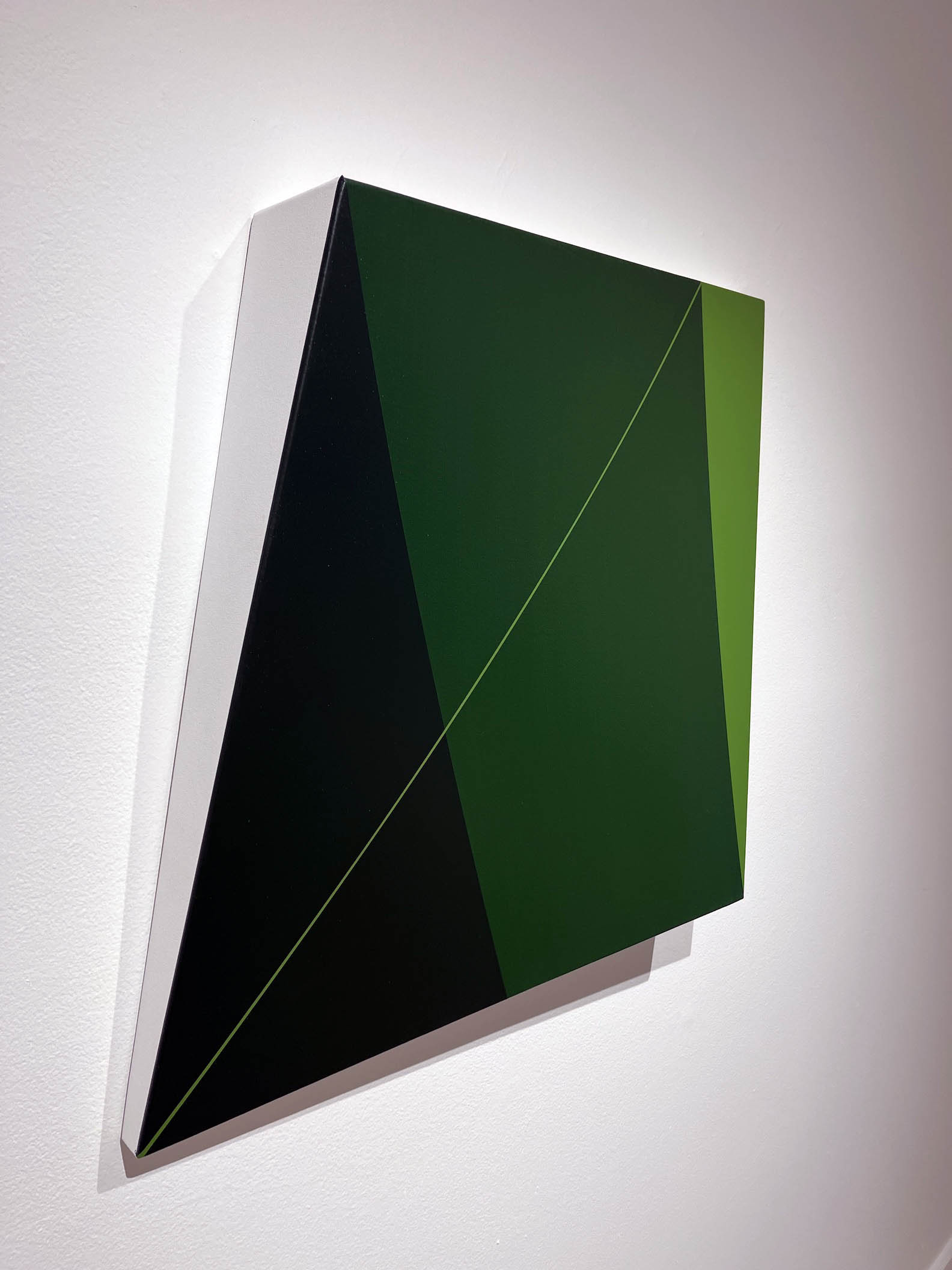
Matthew Hawtin, Cool Green, 2022, Acrylic on canvas, 24 x 30 x 4 inches
New Work: Matthew Hawtin, Sylvain Malfroy-Camine, and Benjamin Pritchard will be up through April 29 at the David Klein Gallery in Birmingham.