Critical art reviews of Detroit galleries and museums weekly

Author: Dennis Nawrocki Page 2 of 4

Writer

Photography @ Scarab Club

50th Annual Photography Exhibition at the Scarab Club

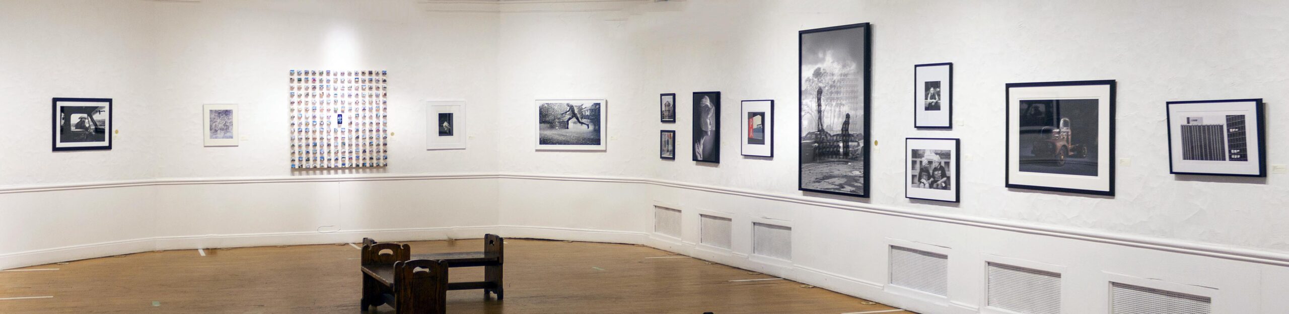
Installation view, 50th Annual Scarab Club Photography Exhibition, Installation photo by Christopher Gene, all other photos courtesy of Scarab Club

A striking and expansive display of photographic sensibilities, currently on view in the 50th Annual Scarab Club Photography Exhibition, continues a long-standing tradition of welcoming and introducing current photographic practice. Juried by Ralph Jones, Detroit photographer, documentarian, educator, mentor, and exhibiting artist, this “unthemed” show (as per the Club’s Call for Entry application) is visually vibrant and emotionally rich. The spacious installation of the submissions of 38 artists enhances a diverse array of figurative and abstract images, formats both commandingly large and gem-like in scale, and bold, colorful pictures in tandem with austerely black and white compositions.

Technically, Matthew Raupp’s Detroit Photo Series (2020) might be termed a relief, projecting as it does some three inches plus from the wall. His compendium of 192 colorful, miniature views of buildings (2 x 2” each) represent sharply focused, frontal images of structures drawn from the precincts of Detroit. Each is individually mounted on a 2 “ wood cube imbuing them with the weight and heft of a three-dimensional structure. Fronts of houses, storefronts, banks, churches, and fire stations in various states of repair–intact, rehabbed, repurposed, or derelict– attest to the adaptability and resiliency of The D. Additionally, an iPhone mounted dead center zooms through the entire ensemble of facades, offering an alternative, fast-paced scan (so 21st century) through Raupp’s personal land bank.

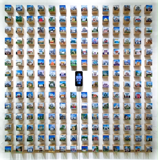
Matthew Raupp, Detroit Photo Series, 48 x 48 x 3,” Wood blocks, photographic prints, iPhone


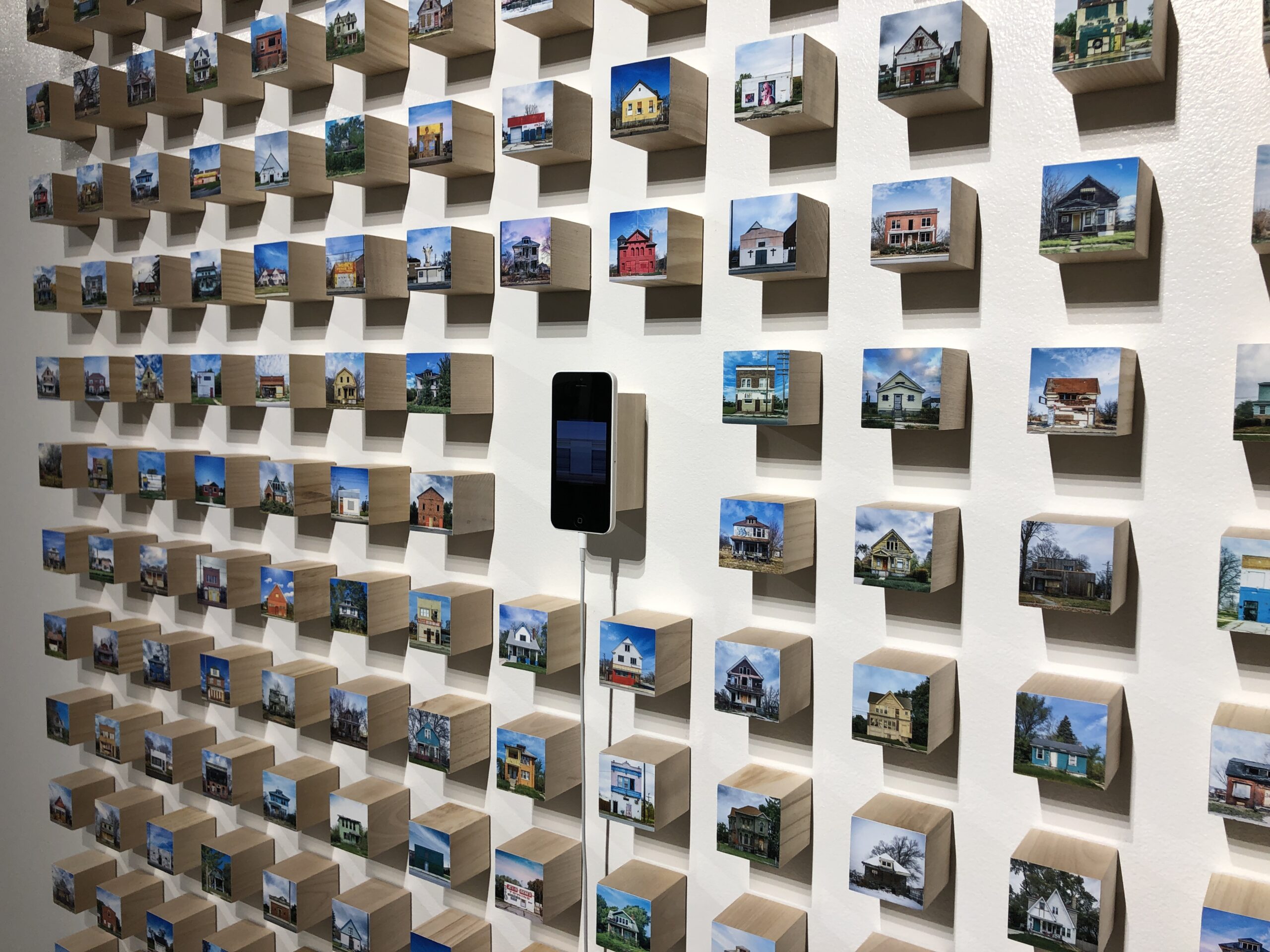
Detail, Matthew Raupp, Detroit Photo Series

Two vertical compositions, rather like exclamation points, punctuate one wall, making the most of the slender height of the format. In Kate Gowman’s five feet tall Scrapyard Fire (2012), no flames are in sight. Instead, a hazy atmosphere pervades the scene. The smoggy smoke of the fire, some distance away, merges with the gray, shapeshifting clouds and gracefully listing tree trunks, while two men quietly inhabit the crisply detailed foreground, one perched atop a wrecked car and the other standing nearby, while gazing toward the unseen fire. Aesthetically, the subtle tonalist merging of gray hues belies the alarming import of Gowman’s title. In contrast, Vincent Cervantez’s poignant The Unveiling (2021), a three feet tall still life of a white bridal(?) veil sprawled on a bed of brown, parched leaves, evokes loss, accidental or deliberate, perhaps a dream forsook, or even a violent encounter. Discarded objects and litter–masks, plastic bags and containers, whippets, and etc.–pervade the culture. Here, rather affectingly, an eddy of wind lifts the veil and threatens to whisk it out of sight.

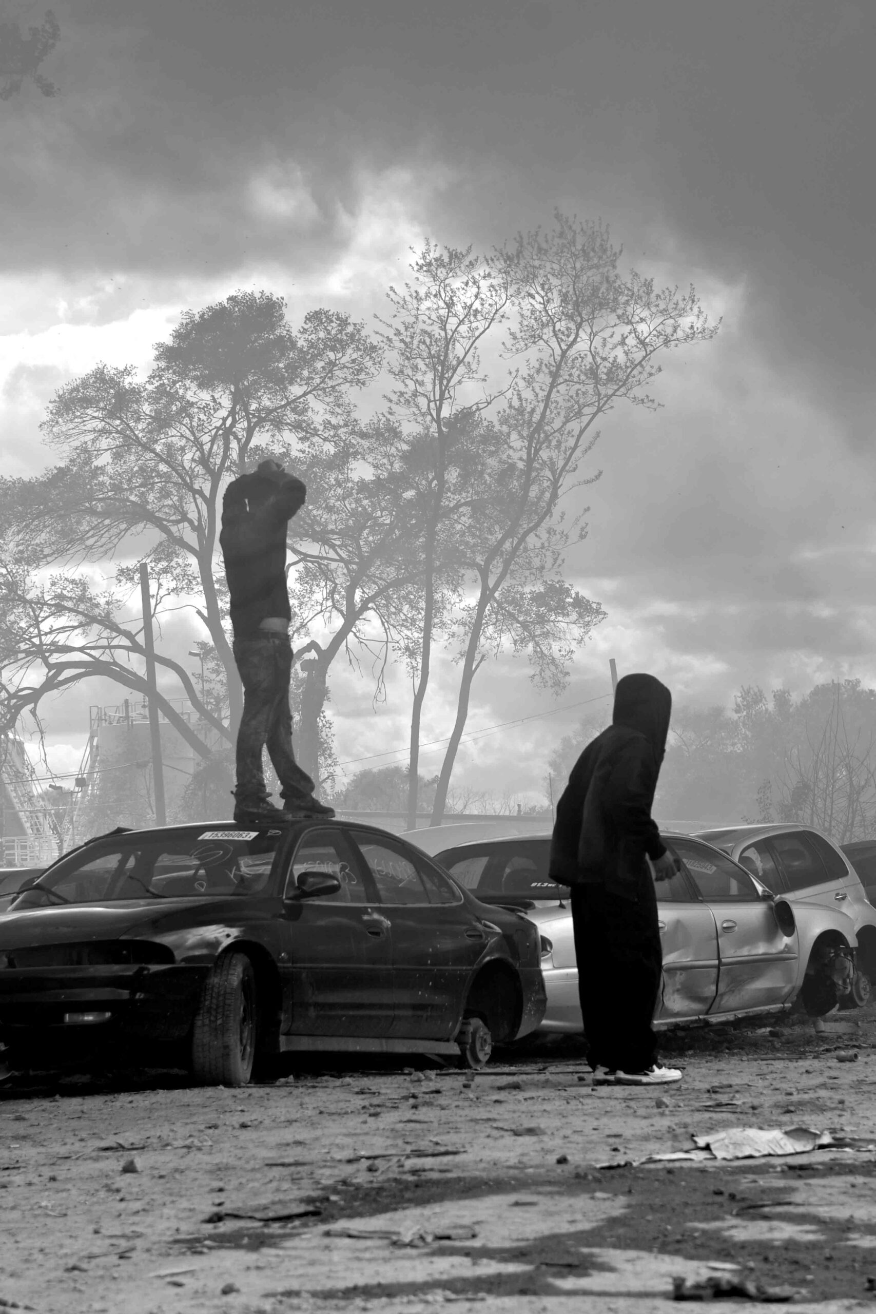
Kate Gowman, Scrapyard Fire, 60 x 36,” Fine art print on Hahnemuhle paper

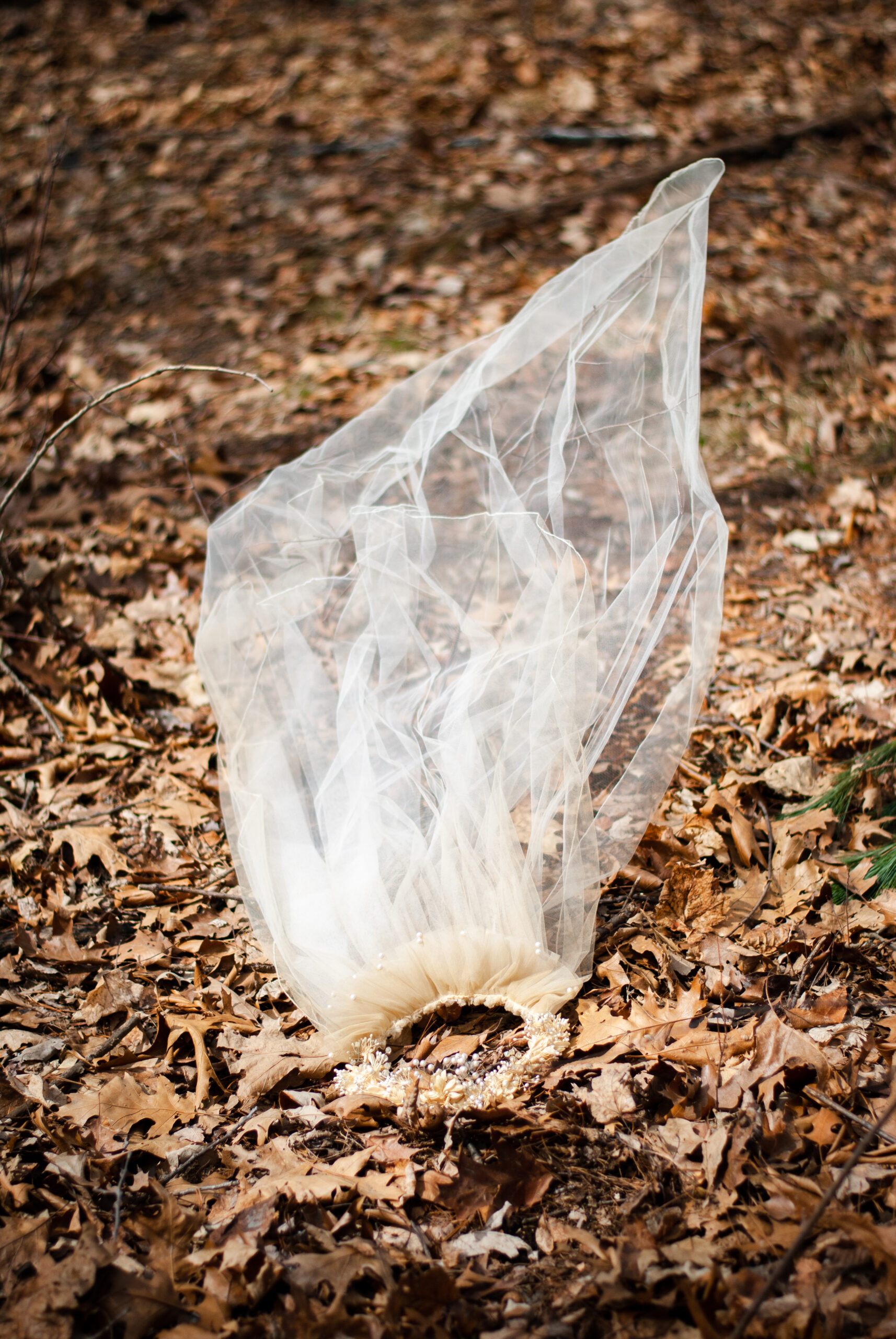
Vincent Cervantez, The Unveiling, 36 x 24,” Digital print

Affirmation rules as well in the Scarab Club’s 50th anniversary show. Tom Stoye’s Leap of Farith (2016) presents a silhouetted figure, legs spread wide (the print is 32” broad), head skimming the top of the frame, bounding through a spray of water. Its lithe, explosive energy swiftly transports the viewer aloft and across the expanse of paper. The small, square, quiescent People in a Pandemic (2020), by Anne Knight Weber, however, features four clustered, stationary figures (one adult and three children) on a vast beach as avatars of the endemic isolation of a pandemic. Sans a frame, water, wet sand, reflections, and azure sky shimmer and float free of the gallery wall heightening the glassy stasis of the scene.

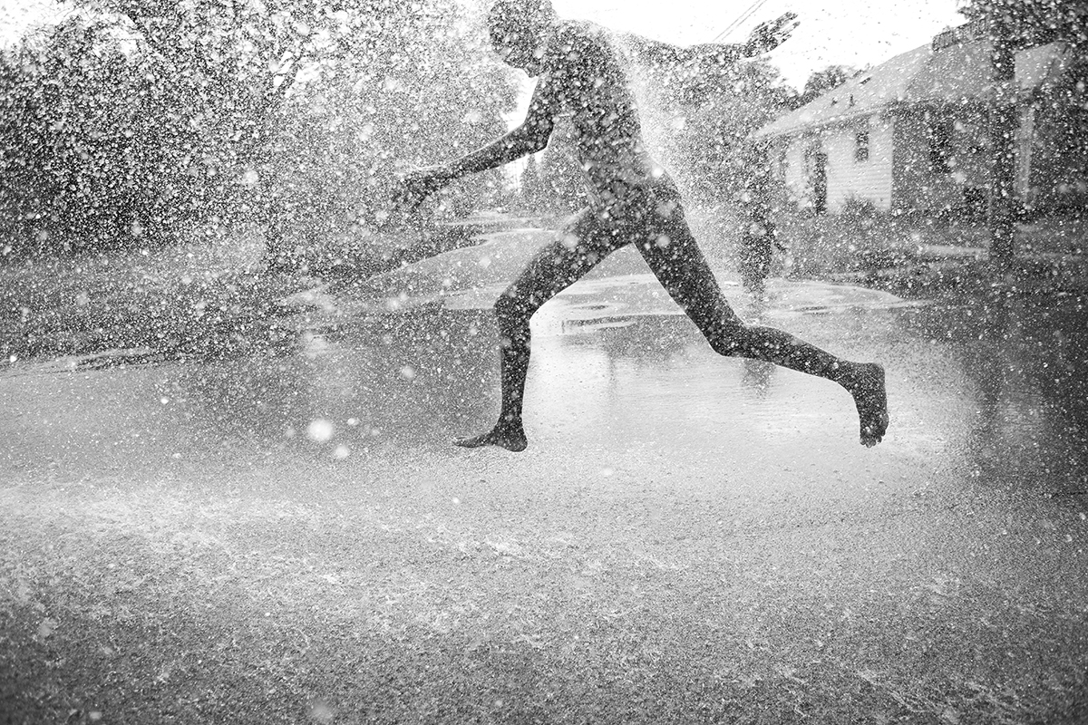
Tom Stoye, Leap of Faith, 21 x 32,” Photographic print

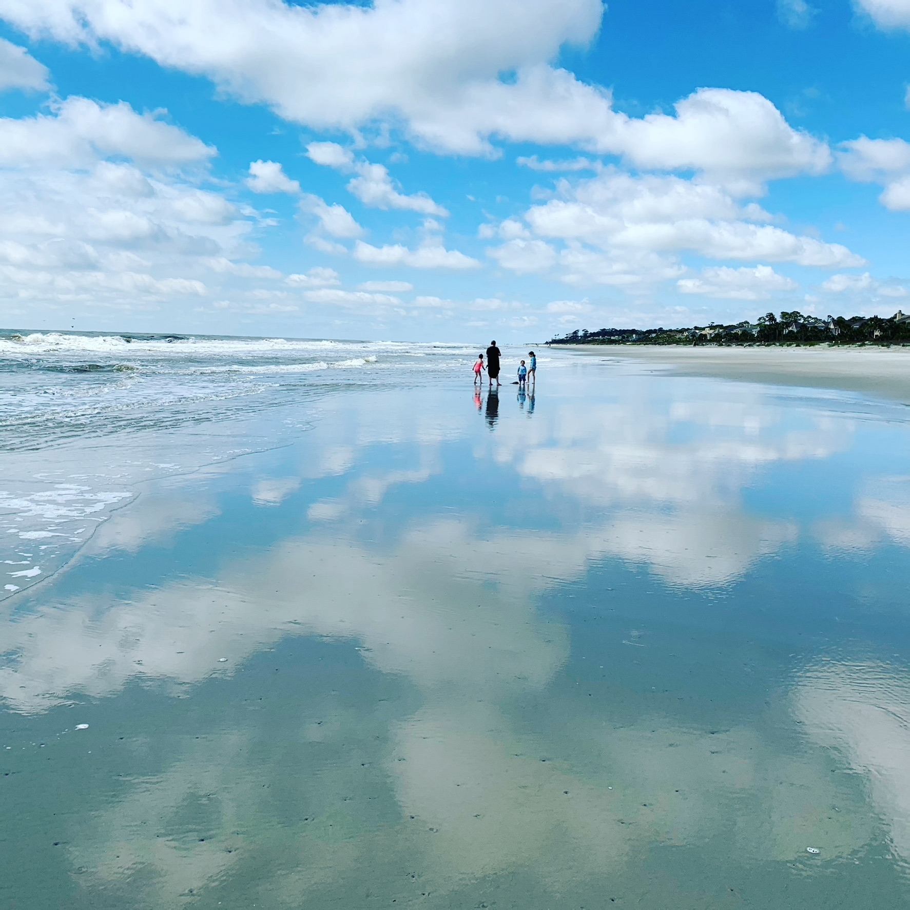
Anne Knight Weber, People in a Pandemic, 11 x 11,” Photograph, acrylic glass

Other photographers focus upon the uneasy balance and oft tense interaction between figuration and abstraction. An emphatic zig zaging line rivets the view of Jerry Basierbe’s Steel Breakwater #3–Point Betsie, MI (2019), while in Hats(2016) by David Clements a swirling orange oval governs the foreground. In the former, the dark, zig zagging line of the breakwater thrusts the viewer into the silky, placid waters of Lake Michigan, a coastal locale frequented by the artist. It’s a harsh, slicing armature that connotes something of the blunt force of industrialization. In the latter, Clements presents a vignette drawn from his ongoing series documenting African American church services. Here, the elliptical orange confection up front instantly captures the viewer’s eye before noting another woman, also attired in a matching, eye-catching hat and coat, seated in the next pew forward.

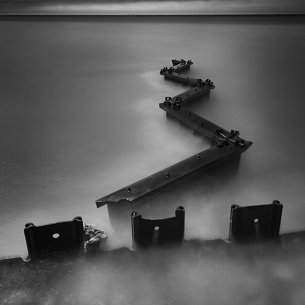
Jerry Basierbe, Steel Breakwater #3–Point Betsie, MI, 18 x 18,” Digital photographic print

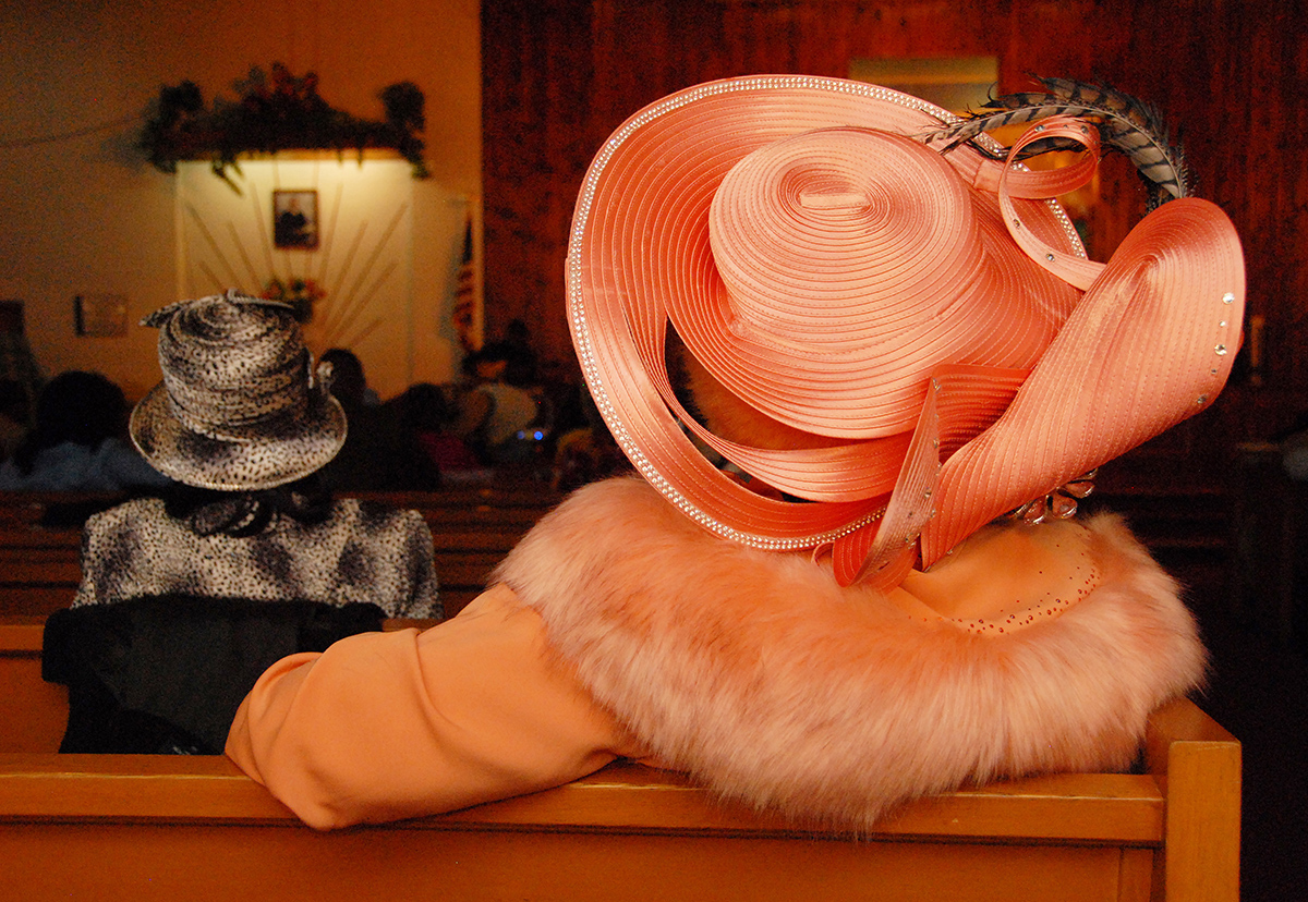
David Clements, Hats, 14 x 16,” Photograph

One of the smallest works in the exhibition also touches on fashion. Teresa Petersen’s Fashion for Women and Children (2018), a mere 3 x 3,” presents a fenced off storefront featuring pink and blue pastel raiment for women and children. Like Raupp, Basierbe, Clements, and others, she too scours particular locales for definitive subjects. Alas, here the fashions on parade are imprisoned behind a metal grate, teasingly short-circuiting a window shopper’s desires.

Teresa Petersen, Fashion for Women and Children, 3 x 3,” Photograph

Small, medium, or large, splendidly hued or chastely black and white, figurative or abstract, these singular examples may indeed spur a desire to encounter more of the photographs on display. And that is exactly what this golden anniversary exhibition at the Scarab Club proffers: all 38 selections remain on view through June 26, 2021.

The Scarab Club is located at 217 Farnsworth St. across the street from the Detroit Institute of Arts.

Car Design in the Motor City @ DIA

Detroit Style: Car Design in the Motor City, 1950 – 2020 at the Detroit Institute of Arts

Installation: counterclockwise, Firebird III, General Motors, 1958; 300C, Chrysler Corporation, 1957; Le Sabre, General Motors, 1951

As a visitor arriving at the Farnsworth Street entrance of the Detroit Institute of Arts to take in “Detroit Style: Car Design in the Motor City, 1950 – 2020,” you’ve just begun your journey. After entering the Farnsworth doors of the South Wing of the building, one begins a colorful and eye-catching hike across the width of the museum. The tour passes through the hallowed halls and treasure laden galleries of the Institute until reaching the North Wing and the now deinstalled modern/contemporary galleries and the exhibition entrance. There, a wide doorway (definitely not a columned portal) leads into the first show-stopping gallery of “Detroit Style.” Unlike any other gallery in the DIA, arrayed before you is a breathtaking trio of sleek, shiny automobiles seemingly floating on an expansive white vinyl plinth: a silvery gray Firebird III (General Motors, 1958), a pristine white 300C (Chrysler Corporation, 1957), and a lush misty blue Le Sabre (General Motors,1951). Their elegantly understated hues allow the clean lines, crisp edges and creases, wings, fins, and upswept taillights to protrude and project into space. After all, as a curator once wittily claimed, “Automobiles are hollow, rolling sculptures.”

This, the first and largest gallery, focuses on the 1950s in an exhibition that unfolds chronologically decade by decade. Organized and overseen by DIA curator Benjamin Colman, twelve cars in all are displayed, four from each of the Big Three manufacturers. (And, tactfully, a different car graces three distinct covers of the indispensable catalog–in red, silver, or blue, your choice.) Each of the sequential galleries showcases one or more concept and/or production vehicles. In addition to automobiles, the show offers design drawings, archival photos, paintings, a sculpture, and short videos in which designers discuss their works. (Access the videos at end of this text.)

In the opening gallery, for instance, devoted to the 1950s and presenting the cars described above, a drawing by Art Miller, Rendering of Automobile Interior (1952), features a cutaway view of a gleaming red and black interior and the startling sight beyond the opposite window of a tiny, low flying jet zooming by in the distance, an apt reflection of the influence of aircraft forms on auto design then as well as of the au courant lingo of the 50s: “The Forward Look.”

Installation: foreground, Corvette Stingray Racer, General Motors, 1959; background, Edward Ruscha, Standard Station, Amarillo, Texas, oil on canvas, 1963

In one of the subsequent galleries addressing the 1960s, a Corvette Stingray Racer (General Motors,1959) is backgrounded by Edward Ruscha’s Standard Station, Amarillo, Texas (1963). Sharp, crisp lines exaggerating length and emphasizing edges and creases earmark both objects. The iconic red, white, and blue gas station, defined by thrusting diagonals that recede into infinity, is silhouetted against a dark sky with criss crossing searchlights that highlight both the glowing filling station and silvery Stingray in the foreground.

Installation: left, Mustang, Ford Motor Company, 1967; right, Plymouth Barracuda, Chrysler Corporation, 1970; middle, John Chamberlain, Coo Wha Zee, painted steel, 1962

Moving further along into the 60s, two so-called pony cars, the Mustang ((Ford, 1967) and Plymouth Barracuda (Chrysler, 1970), enter the scene. Viewed head on, as here, these sporty, youthful, and spirited vehicles present contrasting hues, one gutsy black, the other flaming red, each with a broad, mouthy grille suggestive of a tense, one-on-one confrontation. Nestled between them is John Chamberlain’s brawny black and white sculpture, Coo Wah Zee (1963). Fabricated from discarded car parts bent and contorted into a tall, rough-edged abstraction, it is, as the title intimates, one “crazy” sculpture. Two drawings, the rakishly tilted 71 Barracuda Front End Facelift Concept (1968) by Donald Hood and Howard Payne’s smoldering Ford Mustang(1965)–a ripe orange body profiled on red paper–attest to the visceral appeal of these feisty, automative rivals.

Donald Hood, ’71 Barracuda Front End Facelift Concept, mixed media on vellum, 1968


Howard Payne, Ford Mustang, Prismacolor and gouache on red charcoal paper, 1965

Just beyond midpoint in the exhibition, rather like a palate refresher, the 4-door, aerodynamic Probe IV (Ford, 1983) comes into view. Its soft, pristine white hue, integrated forms, rounded corners, quiet, whispering demeanor, and four wheel covers minimizing the presence of tires and implicit speed, denote what one commentator described as a “wind cheating supercar.”  Accompanying its calm presence are a number of fluid, ovoid renderings by Howard “Buck” Mook, Maurice Chandler, Taru Lahti, and Ken Okuyama (c. 1982 -1991).

GT, Ford Motor Company, 2017


Kristin Baker, The Unfair Advantage, acrylic on PVC on board, 2003

The final gallery, sparely installed, is home to just two works: an electric blue, sinuous, teardrop shaped GT (Ford, 2017) and Kristin Baker’s large scale, mixed media composition The Unfair Advantage (2003). The swept-back lines of the low-slung GT, a reinterpretation of a racing car legend of 1966, telegraph power, speed, machismo. Baker, alternatively, presents a cautionary work, an updated Futurist scene (landscape, raceway?) that evokes jagged, colorful forms whizzing by AND, as a counterpoint, the blurred, roiling smoke and fire indicative of a catastrophic crash. Nothing like ending the show with a bang!

Videos, accessible here,  provide perspective on how Detroit’s iconic vehicles are created with this interview series featuring car designers Ralph Gilles, Emeline King, Craig Metros, and Ed Welburn.  The four designers share their insights on favorite cars, the use of materials, and the collaboration between designers and engineers.

“Detroit Style: Car Design in the Motor City, 1950 – 2020” is on display at the DIA through June 27, 2021. Keep in mind that to view the exhibition you will need to reserve in advance a specific day and time for your visit.

James Chatelain: Home is in My Head @ paulkotulaprojects

Installation Image, James Chatelain: Home is in My Head at paulkotulaprojects

“Home is in My Head” is the intriguing, tantalizing title of Jim Chatelain’s display of recent paintings at paulkotulaprojects. Delving into Chatelain’s concept of home is well-nigh irresistible given his usual reluctance to discuss the meaning and sources of his art. Linked to Detroit’s Cass Corridor artists of the 70s and 80s, Chatelain has worked in both abstract and figurative modes throughout his career.

For starters, he plucked the title of his latest display from the 1971 Jackie Lomax album and song whose lyrics describe a loner who discovers, after searching far and wide, that he only feels “at home” when living in his head. Hence, the dozen plus canvases in the show, dating from 2018 – 2020 (with one 2016 exception), focus on the “head” (for the most part) represented frontally or in profile, in bold, eccentric color ways and dark, emphatic contours.

Jim Chatelain, “Untitled,” acrylic and collage on paperboard, 20 x 15” 2019

Moreover, Chatelain’s visages, ranging from life-size to monumental, may be figurative or semi-abstract, as in Untitled from 2019 and Starfish, 2020. In the former, the actual-size head, wrapped in a vine of yellow leaves, is bound with both a crown of thorns and metallic chains. Large teardrops of blood, a recurring motif of the artist, surround the head silhouetted by a greenish aura, while an imprisoning grid offers a partial view of roiling forms within. This unsettling view inward is countered by the liberating, spiraling whiplash of Starfish, whirling out of watery depths (like a waterspout, dancer on toe, or—to stretch a point—the birth of Venus?) while enclosing within its black, red, and yellow contours a chockablock mash-up of fragmented forms.

Jim Chatelain, “Starfish,” acrylic on linen, 35 x 25” 2020

Trunk (2018), another small scale, life-size image, similarly bares Chatelain’s predilection to peel away an exterior surface to expose what is concealed. Here, the “trunk” (of a tree) is also, and primarily, the torso of a human body from armpit to groin, beneath which, after cutting away the bark, a phantasmagoria of staring eyes and layered lengths of wood in yellows and reds is exposed.  Flanked as well by grasping, finger-like nerve endings (or lightning, electrified tendrils?), both body and nature reveal more than meets the eye.

Jim Chatelain, “Trunk,” acrylic on canvas, 26 x 18” 2018

Layers of imagery also dominate the lurking, looming, twice life-size specter of 2018’s Untitled. The large, bristling head, with curling, upturned braids, appears to be wearing a balaclava, but one with a peak reminiscent of a loose-fitting stocking cap. Apparently attired in a black turtleneck, fingers extending downward and upward near the mouth or chin evoke a worrisome gesture. On the picture plane, a delicate white form, perhaps referencing a hat or boat, floats lightly and elegantly in front of the frightening, masked presence behind. The eerie Prussian blue, grass green, sky blue, and luminous white hues reinforce the impact of a stunning, double-take image composed of disparate elements.

Jim Chatelain, “Untitled,” acrylic on linen, 34 x 26” 2018

Four monumental images of 2020 (each 53 x 40 in.) dominate the show and confirm the ongoing importance of Chatelain’s “home in my head” variances. (Additional examples reside in the artist’s studio.) Two currently on view illustrate again the artist’s dichotomous figurative/abstract models that heighten the pictorial dynamic of the exhibition. And since both are untitled, Chatelain leaves us somewhat on our own to ferret out their mysteries. In Untitled, the sharply incised profile of a little over four foot tall head with wide open, saw-toothed maw ingesting tiny circular morsels startles. The spine-like tree trunk on the right curls around and into the brain that, subdivided into numerous chambers, is replete with multifarious shapes surging through the cavity, including several droplets of blood. Sentient life, in an ominous, darkling universe, seems rife with blood, sweat, and tears.

Jim Chatelain, “Untitled,” acrylic on canvas, 53 x 40” 2020

Untitled, however, is vessel shaped rather than head-like, with vaguely hieroglyphic or alphabetic shapes inscribed on black tablets/slabs crowned with several eye-like roundels. The flattened shapes and bold black, white, and red color scheme are regally enhanced by a wavy fringe of filaments (a cape, robe, or drapery?) that vivifies the perimeter of the composition. Of particular note, a surreal, floating hand stabilizes the composition and adds a human touch, perhaps suggestive of a stabilizing hand or the positioning of hands in a traditional half-length portrait.

Jim Chatelain, “Untitled,” acrylic on canvas, 53 x 40” 2020 (All images courtesy of paulkotulprojects)

All told, Chatelain has presented a discombobulating compound of heads (primarily) whose chameleon-like extremes present an ambitious, many-faceted hunt for Home. His dozen plus “homes” or dwellings encompass and express contradictory states of mind, moods, personas, temperaments, identities, attitudes, fears, and emotions, basically what we sum up as the human condition. Uncozy and unruly as his findings may be, all are ultimately revelatory re the universal quest to “know thyself.”

Jim Chatelain: Home is in My Mind is on view at paulkotulaprojects through April 4, 2020

Richard Prince: Portraits @ MOCAD

“Richard Prince: Portraits,” Installation image, 2019 – Image Courtesy of MOCAD

Richard Prince, who invented “rephotography” back in 1977, is still at it in 2019, apparently undeterred by any number of litigious skirmishes and accelerating technology. The 91 works on view in Portraits, his plainly titled exhibition at the Museum of Contemporary Art Detroit, have been appropriated from Instagram (IG), the mega-expanding social-media platform, founded in 2010, that now counts some 600 million plus users. That number alone offers the omnivorous Prince a mind boggling trove from which to lift, enlarge, and revamp the posts of swanning millennials and Generation Z’s from which he draws his subjects.

As curated by director Elysia Borowy-Reeder and installed in the largest of MOCAD’s galleries, the hang is an unexpectedly old fashioned one: Salon style, cheek by jowl in multiple tiers, canvases ganged nearly edge to edge, blanketing every square inch of wall space available. Moreover, the format from image to image is identical, the portrait looms at the top followed by multiple lines of text: up first is often a description drafted by the Instagrammer, then the greedily coveted tally of “likes,” #hashtags, comments from sundry “followers,” and a concluding cryptic blurb by Prince or one of his handles (@joankatzz, for example). The whopping impact of 90-plus ink jetted canvases of widely different sizes is pretty overwhelming, the antithesis of a standard line-up of worthies stationed at eye level.

“Richard Prince: Portraits,” Installation image, 2019 – Image Courtesy of MOCAD

Prince rather vividly narrates in a wall text and poster how the immersion in IG posts is like scurrying down a rabbit hole for hours on end following a gazillion leads, threads, and hashtags in pursuit of portrait material. In an excerpt from his journal Birdtalk, he lays out the raison d’etre of his motives and practice: “I can start out with someone I know and then check out who they follow or who’s following them, and the rabbit hole takes on an outer body experience where you suddenly look at the clock and it’s three in the morning. I end up on people’s grids that are so far removed from where I began it feels psychedelic.”

“Richard Prince: Portraits,” Installation image, 2019 – Image Courtesy of MOCAD

Embarking on a similar process, museum visitors pan across the fatiguing (periodic pauses are recommended) array of images; espy known (Miley Cyrus, Brooke Shields) or unknown subjects; parse texts replete with non sequiturs, truncated spellings, made-up words, and innuendoes; identify recognizable operatives (Jerry Saltz, New York art critic, John Sinclair, Michigan activist); overlook absent punctuation, dismiss absurdities, treasure pearls of wisdom, decode overabundant emojis, and so on.

Richard Prince, “Untitled (@gab3),” Ink jet on canvas, c. 2015-19 Image Courtesy of DAR

AND marvel and revel in the visual audacity, weirdness, and sexiness of poses, gestures, facial expressions, props, costumes, and locales, from @psytranceclub’s transformation into an elegant, horned human and animal hybrid to embody her belief in the bond between species, to the surreality of the necklace of shoes that circles the torso of @violetchachki, or the rarified identity between owner and pet in @katevitamin, in which both mistress and hairless cat sport blond bobs. A visitor might also be moved by the sad young men backdropped by a Los Angeles sunset in @gab3; one wears a Hello Kitty sweatshirt, the other hangs a cross on a chain over a skull emblazoned top. Alternatively, an onlooker might be swept along by @barbaraperezw, a bronzed surfer with wind-blown hair blithely skateboarding to her destination. Hair, big or razor sharp, figures in @afropunk and @fatalbert69: perhaps she calls to mind Diana Ross or Angela Davis as commentator @joankatzz snidely trolls (while also name-checking John Sinclair); and he, via a mirror, simultaneously displays both a tousled hairstyle head on and a sharply etched zig-zag design on sides and back.

Richard Prince, “Untitled (@barbaraperezw),” Ink jet on canvas, c. 2015-19 Image Courtesy of DAR

Taxing as surveying these and other abutting panels is, MOCAD’s installation and Prince’s modus operandi further ramp up the impact of Portraits.  The austere white walls of the gallery, the bright, shadow free fluorescent lighting, and the absence of any ancillary furnishings—benches, pedestals, or caption labels—plus Prince’s smooth, toothless canvas in a brilliant white–manufacture a crisp, chilly white on white perimeter. The fusion of Prince’s art and the museum’s style of display heightens the focus on the IG subculture (per Prince’s nomenclature) and the performative, narcissistic display of its followers.

Richard Prince, “Untitled (@afropunk),” Ink jet on canvas, c. 2015-19 Image Courtesy of DAR

Portraits exists, simultaneously, as a group display of appropriated Instagram accounts (two thirds of and by women); and a showcase of Prince’s enlarged screenshots which he hijacked by appending strings of obscure, laconic comments; and as recollections of the portraits/self-portraits vaingloriously posted by the initial Instagrammers. That’s three shows in one generated by the umpteen intersecting and overlapping dynamics of these pieces, so it is no surprise that Prince refers to his portrait spawn as “friendly monsters.”

“Richard Prince: Portraits” remains on view at MOCAD through January 5, 2020


Inspired @ Pewabic Pottery

Inspired, Installation image, Pewabic Pottery, 2019 Photo: PD Rearick

Climbing the narrow, delayed-gratification-stairway to Pewabic Pottery’s second floor galleries, even for the umpteenth time, anticipation mounts until, at the top of the stairs, sightlines to left and right reveal the shiny artifacts of a new exhibition. The current show, confidently entitled “Inspired,” does indeed proffer an eclectic array of ceramic art created by four artists working in diverse, distinctive ways. The display, conceived and installed by Pewabic curator Darlene Carroll, features makers who lead ceramic programs that Pewabic’s co-founder, Mary Chase Stratton, played a role in establishing.

Inspired, Installation image, Pewabic Pottery, 2019 Photo: PD Rearick

First up, Susan Crowell’s Huckleberry (Vaccinium myrtillus), a single, gigantic, four lobed sculpture of a grain of huckleberry pollen (as seen under a microscope) measuring 12 ½ inches in diameter, is indeed “voluptuous,” as she declares. Its purply-blue glaze and plump, spherical forms embody the lush, caress-me allure and inkling of a tasty, delectable huckleberry. Other of Crowell’s jumbo flora include a lemon yellow cluster of Hazelnut Pollen (Corylus avellane), each pod about the size of a softball, and a nectar-from-the gods spill from wall to pedestal of fourteen, luscious pink Rose-Bay Willow Herb (Onagraceae) triangular pollen forms. Crowell has taught ceramics at the University of Michigan’s Penny W. Stamps School of Art & Design since 2005, and at the Residential College since 1972.

Susan Crowell, “Huckleberry (Vaccinium myrtillus),” Stoneware with vitreous engobes, stains, glazes, 12.5 x 12.5 x 12 in., 2019

No less alluring is Jessika Edgar’s I want to touch you to be happy inside. A two foot tall ice cream treat—chocolate topping layered over an exotic coppery colored flavor-of-the-week—slumps atop an animate, tri-legged stool, itself ensconced on a glitzy, solid gold pedestal. This popular icon, centralized, pedestaled, and overblown suggests desire incarnate, as does the title, albeit meltingly short-lived in the end. Another suggestive Edgarian title—Get it while you can—coupled with an organic, roly-poly torso festooned with acrylic pearls resting on a mid-century biomorphic end table with canted legs, its top covered with faux fur, embodies as well the contemporary appeal of faux, formless, and real.  Edgar is an assistant professor and coordinator of Ceramics at Wayne State University.

Jessika Edgar, “I want to touch you to be happy inside,” Ceramic, glaze, copper leaf, variegated metal leaf, osb board, 50 x 30.5 x 30.5 in., 2019

Ian McDonald, artist-in-residence and head of ceramics at Cranbrook Academy of Art, presents, among other examples of his ceramic practice, a trio of Shade Vessels, ranging in height from 12 to 16 inches. Severe and minimalist, with precise horizontal ribbing, two are glazed in hushed lavender hues, while the third sports a smoky greenish hue, soft palettes somewhat unexpected on such stark shafts. Hollow and formally composed of cylinder and bowl-like forms, they are however unitary, integral vessels, reminiscent perhaps of trees, umbrellas, or even observation towers that provide protection and shelter. Also on view is a suite of broad, darkly hued, table-hugging bowls (five to six inches in height and up to 17 inches in diameter) that McDonald dubs Low Works.

Ian McDonald, “Shade Vessels,” Stoneware with glaze, left to right: 16 x 10.5 x 10.5 in.; 12 x 7.25 x 7.25 in.; 15 x 11 x 11 in., 2017-18 Photo: PD Rearick


Assistant professor and head of Ceramics at College for Creative Studies, Ebitenyefa Baralaye weighs in as conceptualist and relief sculptor of this collegial foursome. Working in “raw,” unglazed terra cotta, Baralaye’s plaques of mazes, furrowed fields, and enigmatic phrases highlight transitional issues of “feeling, engagement, and displacement.” Real Feels reads a rectangle of raised text, 15 x 20 ½ inches in size. The vertically stretched out letters suggest an emotional tension or anxiety, a state corroborated by the inversion of the identical terms to “Feels Real” on a second plaque (not in the show). Another of Baralaye’s panels on exhibit (glazed white, as it happens) quietly and poignantly asks What Now. His words and low-key art serve as discreet prompts to action for both academe and audiences alike as a new semester and year loom ahead.

Ebitenyefa Baralaye, “Real Feels,” Terracotta, 15 x 20.5 in., 2019 (courtesy David Klein Gallery) Photo: PD Rearick


Inspired
remains on view at Pewabic Pottery through October 21.


Page 2 of 4

Powered by WordPress & Theme by Anders Norén