Critical art reviews of Detroit galleries and museums weekly

Author: Ron Scott Page 2 of 25

Anita Bates @ N’Namdi Center for Contemporary Arts

Dr. Anita Bates’s exhibition, A Long Time Coming, now on view at N’Namdi Center for Contemporary Arts revives a fresh experience to Abstract Expressionism.
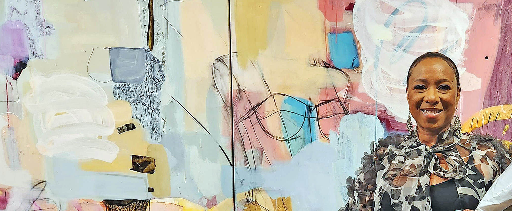
Installation, Anita Bates, N’Namdi Center for Contemporary Art 2023. All images courtesy of DAR.

Detroit artist Anita Bates opened her exhibition, A Long Time Coming, at N’Namdi Center for Contemporary Art on September 9, 2023, with recent abstraction expressionistic paintings rich in color, scale, line, texture, and composition. The paintings are like forest flowers, reminding this writer of music performed so exquisitely in the 1960s by the jazz musician Charles Lloyd. Gestural strokes, mark-making, and the impression of spontaneity characterize the work.  Her creative process over the past thirty years follows in the footsteps of Willem de Kooning (and others), but she focuses on the color field, devoid of any reference to the landscape or figure.

Abstract Expressionism emerged in the early 1940s, primarily in New York, where a small group of loosely affiliated artists created a diverse body of work that introduced new directions in painting—and shifted the art world’s focus forever. In distinction to the emotional energy and gestural surface marks of abstract expressionists such as Pollock and de Kooning, the Color Field painters initially appeared to be cool and austere, effacing the individual mark in favor of large, flat areas of color, which these artists considered to be the essential nature of visual abstraction, along with the actual shape of the canvas. However, Color Field painting has proven to be sensual and deeply expressive, albeit different from gestural abstract expressionism.

Bates says in her statement, “The colors found in the majority of the work in this exhibition are lighter than previous bodies of work; they are colors associated with my childhood but seen through the eyes of maturity.  I primarily work in the triadic combinations of green, orange, and purple or a palette of red together and always gravitate towards these hues while consistently pushing my knowledge of these harmonies via desaturation and contrast. For me, this element of art and design demonstrates my growth as an artist; The ability to make color transition with tints, tones and shades.”
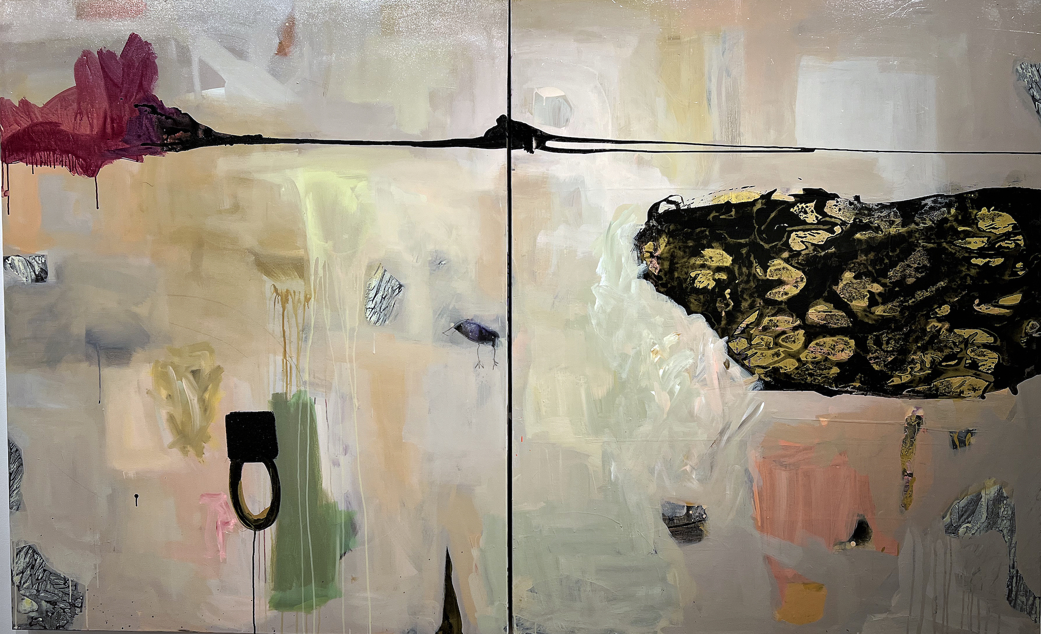
Anita Bates, The Power of Subtlety, Mixed Media on Canvas, 2023

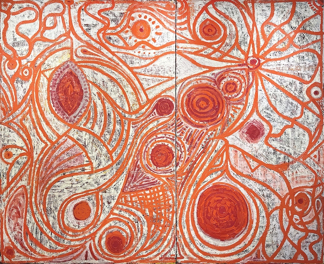
The two diptych canvases,  30 X 46” each, and entitled The Power of Subtlety, are connected with a black horizontal line in the top quarter, providing the geometric compositional structure for the overall painting. The background throughout is a sloshing around of pastel colors from her triad of green, orange, and purple, where transparent blends of white and tan merge. Possibly influenced by artist Lee Krasner, Bates plants herself in color field composition with oddly shaped abstract elements. The dominant feeling is esoteric, with a personalized set of small, mysterious objects that keep the viewer at bay.  The artist seems to be saying that the painting does not need to convey a meaning other than the way it makes the viewer feel.

For Abstract Expressionists, the authenticity or value of a work lies in its directness and immediacy of expression. A painting is meant to be a reveal of the artist’s identity. The gesture, the artist’s “signature,” is evidence of the actual process of the work’s creation.
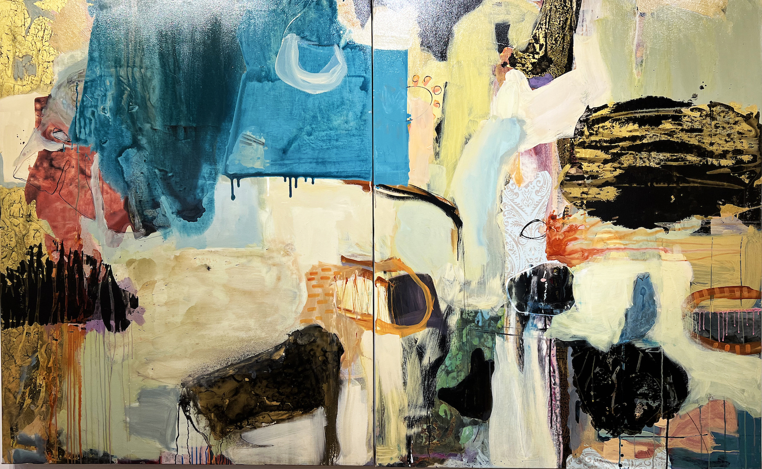
Anita Bates.The Zoo, 60X96″, Mixed Media on Canvas, 2023

The Zoo,  another 30 X46” diptych, is more lively, with a much larger color palette that includes details of black drawing and a more integrated overlapping of shapes.  Is it a Zoo?  If so, it is one not so much of animals but of contrasting shapes from the artist’s subconscious reflecting her sensibility. There is a lot more compositional traffic in The Zoo that speaks to the language of her attraction to the overlapping and action-packed gesture of Abstract Expressionism.
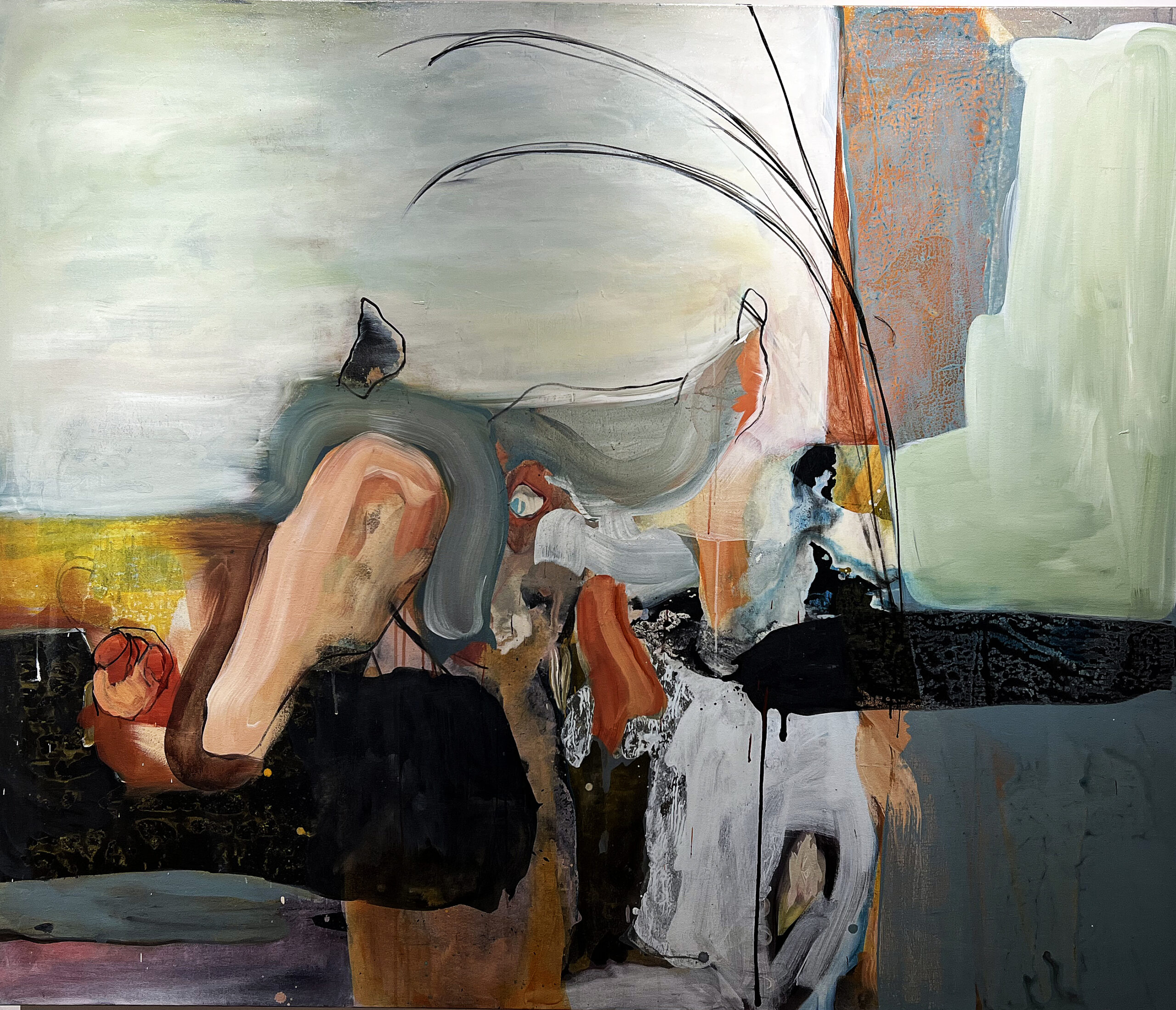
Anita Bates, Poivres Rouge, 60×72″, Mixed Media on canvas,

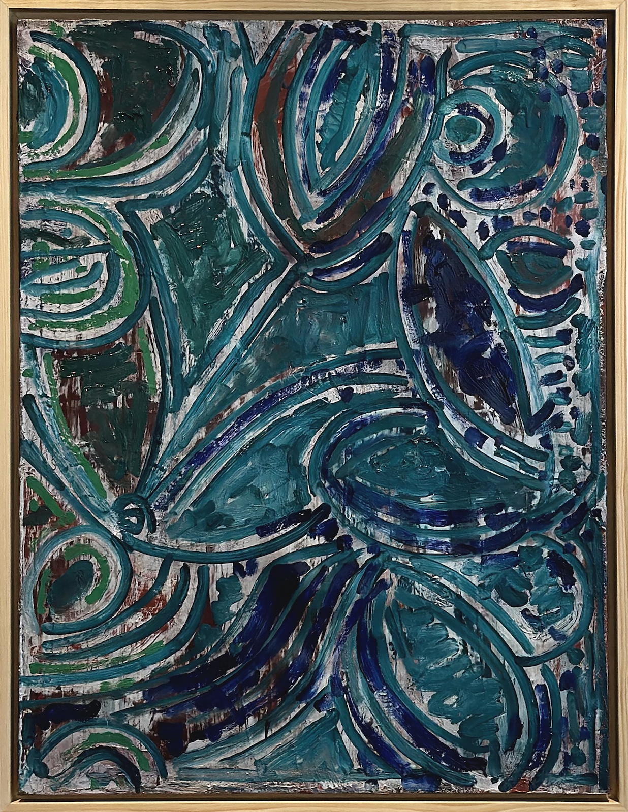
Poivres Rouge is a mixed-media painting on canvas that divides the space into quarters and places its weight in the center of this organic composition. The title refers to a French restaurant or, in the dictionary, defined as Pepper, perhaps based on the artist’s travels in France.

Early art critics, like Harold Rosenberg, had long been outspoken in their view of a painting as an arena which to come to terms with the act of creation. To Clement Greenberg, the physicality of the paintings’ clotted, dripping, and oil-caked surfaces was the key to understanding these works as documents of the artists’ existential struggle. Bates seems to occupy a middle ground since her paintings are non-referential yet emotive.
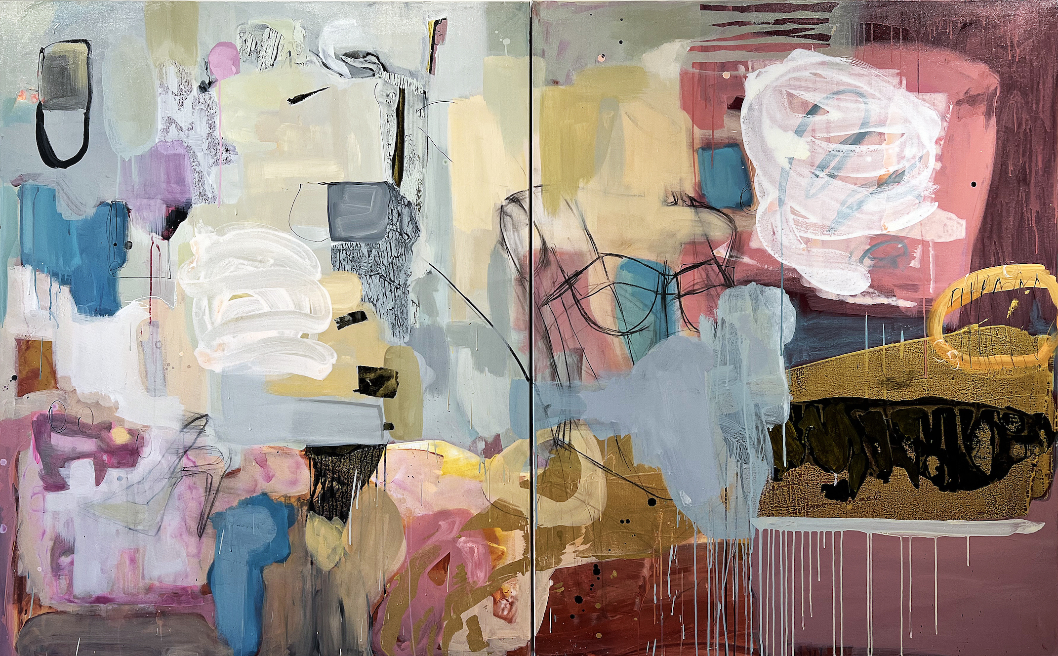
Anita Bates, Candy, 60×96″, Mixed Media, 2023

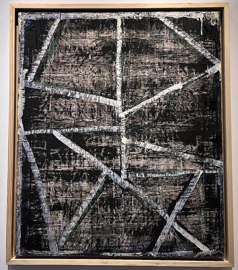
Staying with a familiar palette of color in Candy, Bates presents layers of oil paint working from dark to light with a multitude of overlapping shapes, lines, and drips as she balances the congestion of abstraction. Brush strokes move horizontally and vertically, and a balanced of black drawing helps hold the picture together.  There is a distinct push and pull of paint, solvents, and water, mixing to create diverse textures.

Like the Charles Lloyd album from 1966, Forest Flower, the uplifting abstractions in A Long Time Coming draw the viewer back… and then back again for more observation and discovery.

Dr. Anita Bates earned her Ph.D. in Education and an M.F.A. in painting from Wayne State University. She was a 2019 Kresge Arts Fellow, resides as a native of Highland Park, Michigan, and has widely exhibited throughout Metro Detroit and beyond. https://www.anitabatestheartist.com/


Lucy Slivinski @ N’Namdi Center for Contemporary Art

The Improvisation of Matter Into Magic
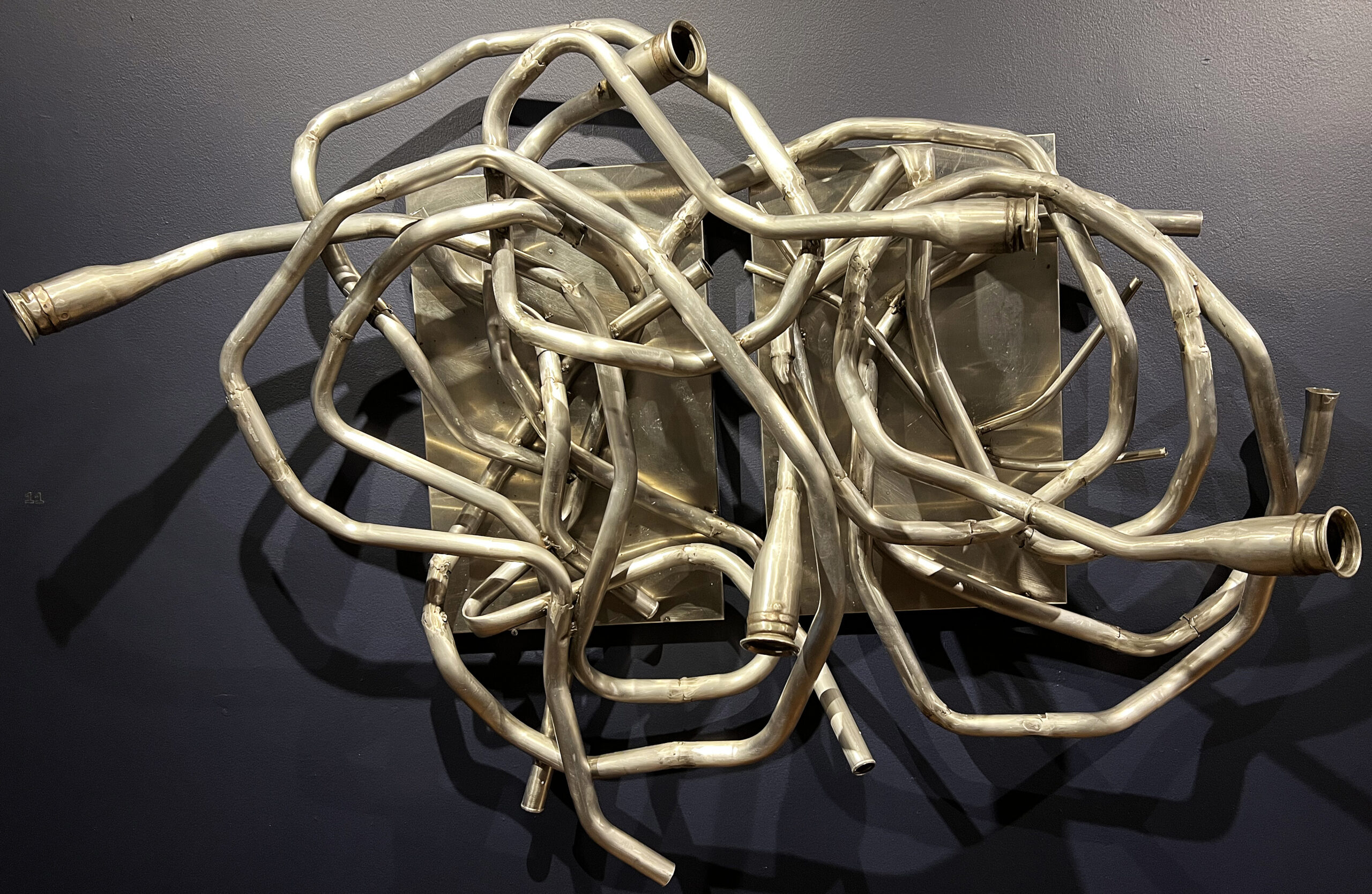
Installation Lucy Slivinski sculpture N’Namdi Center for Contemporary Art

Critically acclaimed artist Lucy Slivinski hails from Chicago, Illinois, bringing her wide collection of sculptures and installations. For over 40 years, as one of the few female artists working in metal, Slivinski has created abstract sculptures for interior and exterior residential and commercial spaces.  Most of her contemporary sculpture features found objects, scrap metal, and other locally sourced, recycled products that would otherwise end up in a landfill or smelting factory, continuing to harm the environment.  As an abstract artist, Slivinski’s unique style has been commissioned for many large outdoor public sculptures, live performances, and gallery installations.

Lucy Slivinski earned an M.F.A. from Cranbrook Academy of Art and a B.F.A. from Northern Illinois University.


Herbert Gentry @ N’Namdi Center for Contemporary Art
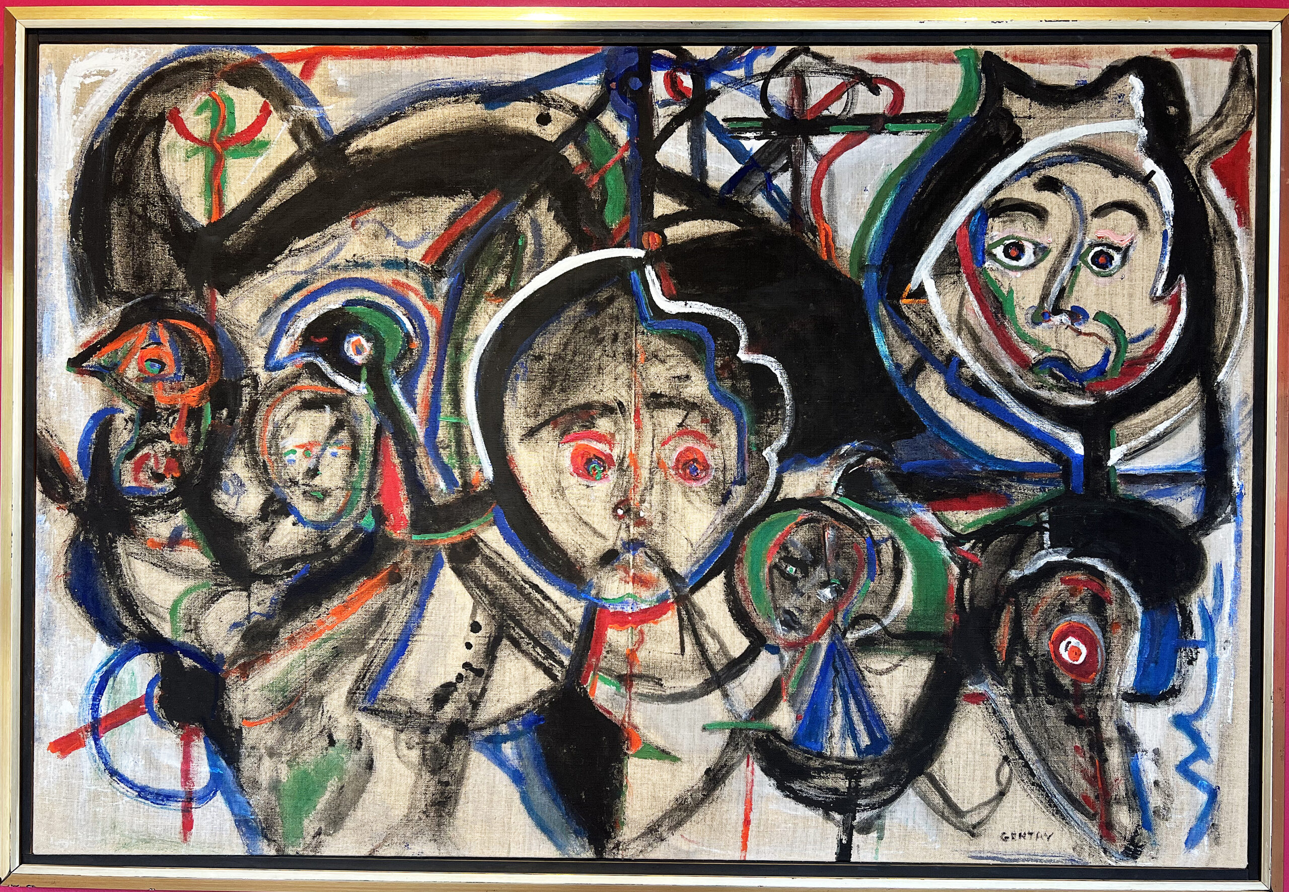
Installation Herbert Gentry N’Namdi Center for the Arts 2023

Herbert Gentry’s paintings juxtapose faces and masks, shifting orientations of figures and heads—human and animal—into profiles to the left, to the right, above, and below. The direction of the head, as face or profile, leading right or left, or facing front, is played against the relative scale of each head, its position on the canvas, and its relationship to the others.  The faces evoke subtle expressions and moods. Rather than using images to depict a concrete story, Gentry releases his experiences upon the canvas. Born in Pittsburgh, PA, Mr. Gentry was raised in Harlem during the highly creative Harlem Renaissance period. He served as a member of the Armed Forces in World War II, and his early commitment to art was confirmed upon his return to Paris in 1946, where he studied painting.

Three Gallery Exhibitions, September 9 – through November 30, 2023

Susan Yamasaki @ Center Gallery

A Collection of Birch Assemblages at the Center Gallery in Glen Arbor, Michigan.

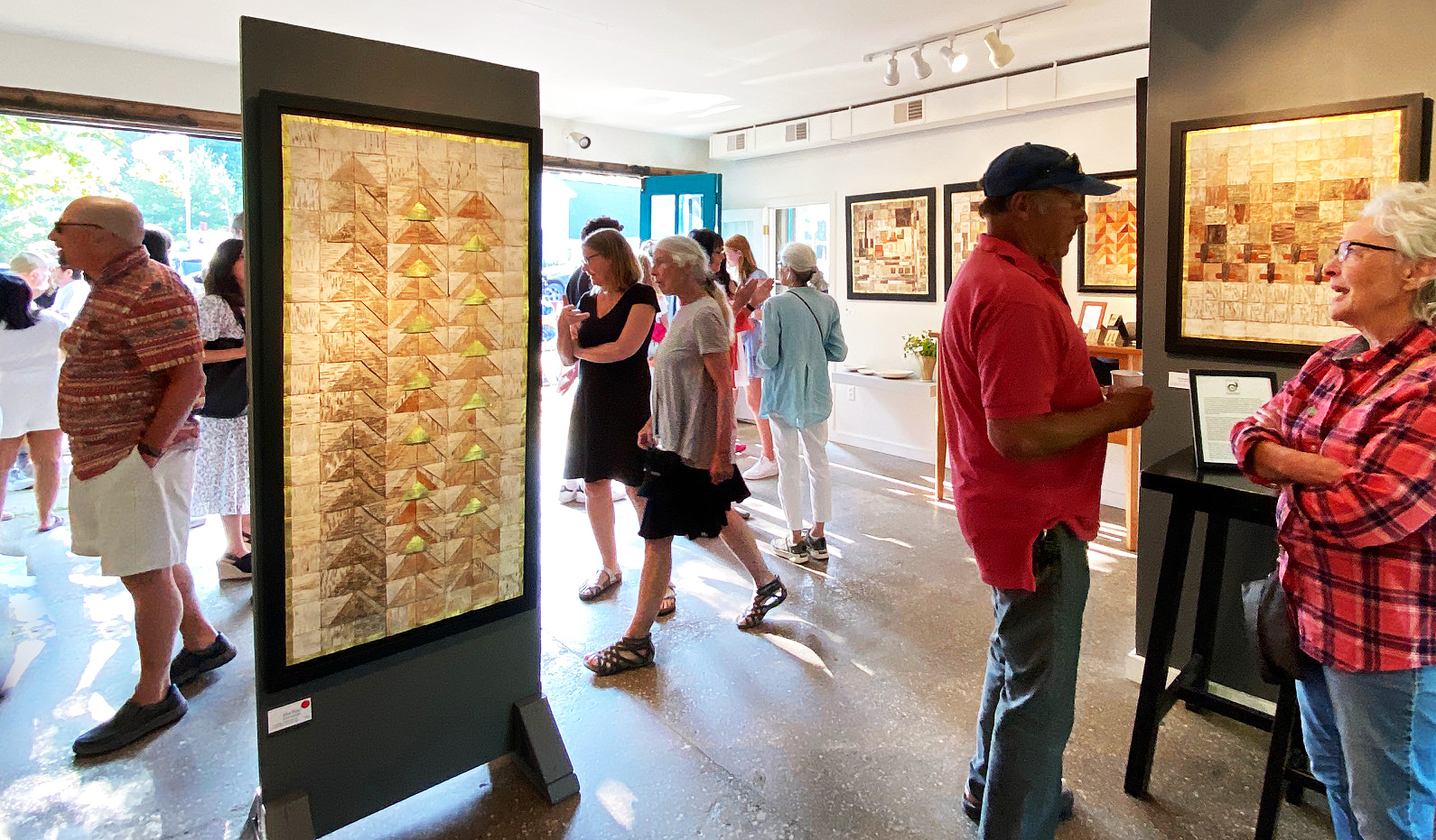
Installation image, work by Susan Yamasaki at Center Gallery, Glen Arbor, 2023  Image courtesy of Susan Tusa

It has been nineteen years since Susan and Taro move from Birmingham, Michigan, to the glacial moraine in Leelanau County, where their property rises upward to look out over Lake Michigan and the Sleeping Bear Dunes.  The forest comprises thick oaks, pines, black ash, beech/maple, and birch.  A devastating storm in 2015 snapped birch trees in half, and Susan foraged her land to discover this bark from birch trees with a wide diversity of color and texture.

The following birch assemblages are a sample of what is now on display at Center Gallery, opening August 4 -10th, 2023, in Glen Arbor, Michigan.

She says in her statement, “My heart would break as I would step over the wreckage of trees whose lives had ended.  But upon taking a closer look, I could see that the bark of the birch beautifully reveals the experience of the tree.  I chose to use the bark of the fallen birch to make my art.  The panels become sacred objects, honoring the link between earth and sky.  They pay homage to the struggle and adaptability of each tree.”

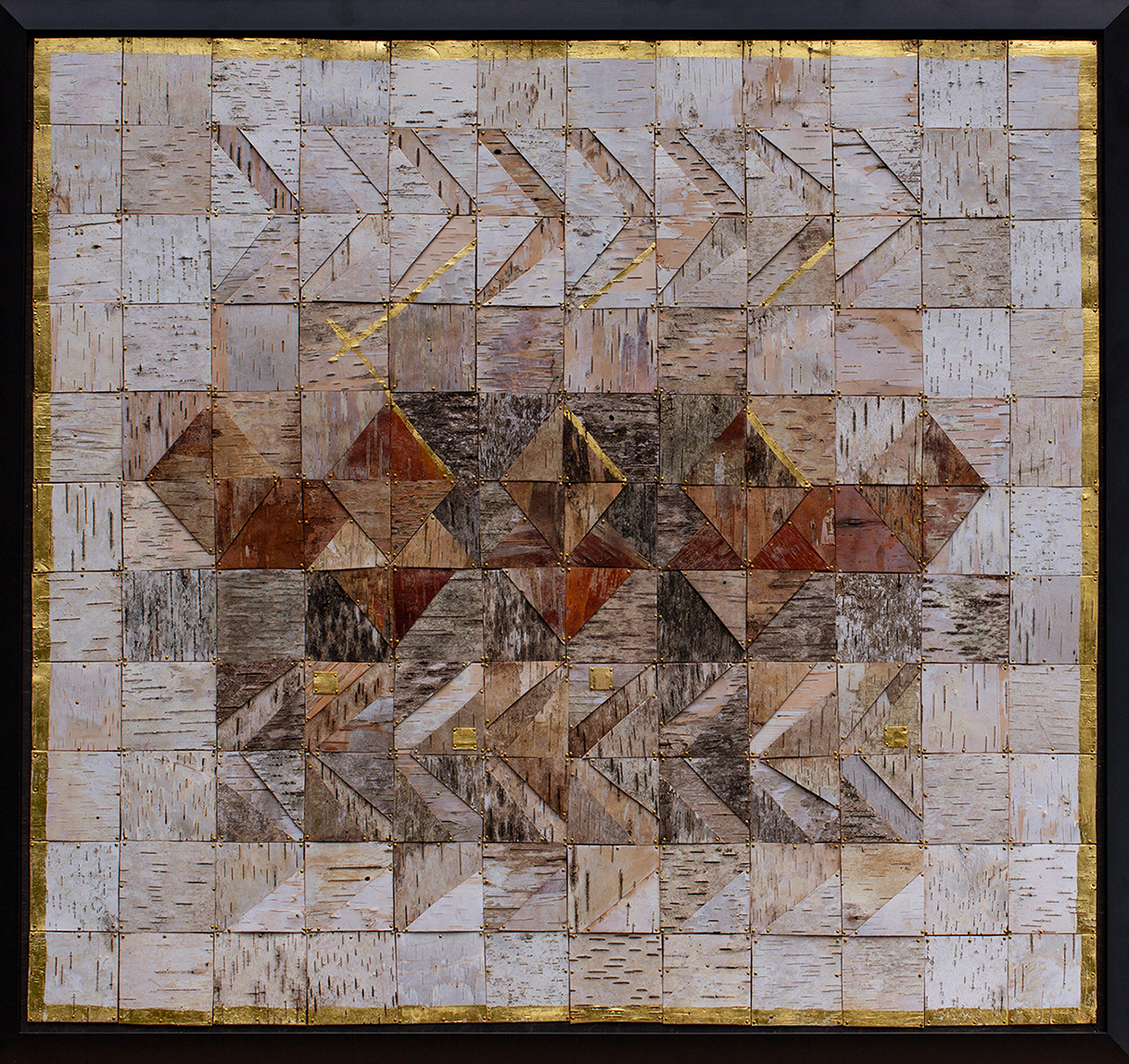
Susan Yamasaki, Shift, 26 x 31″, Assemblage, 2023  Image courtesy of Taro Yamasaki.

The assemblage is composed formally on a grid and is abstract.  Shift has chevrons on the top and bottom of the center staged rectangle, and the overall pieces are squares with bits and pieces of gold leaf as a border and a punctuated black frame.

Assemblage is the art of creating a three-dimensional sculptural composition from found objects.  One of the best-known assemblage artists of the 20th century was the Russian-born American sculptor Louise Nevelson. She transformed these found objects into large wall-mounted and free-standing reliefs, which often take the form of stacked boxes and compartments.  Once assembled, the sculpture was spray-painted with a single color – usually black, white, or gold – to unify the complex sculptural elements and bring symbolic meaning.

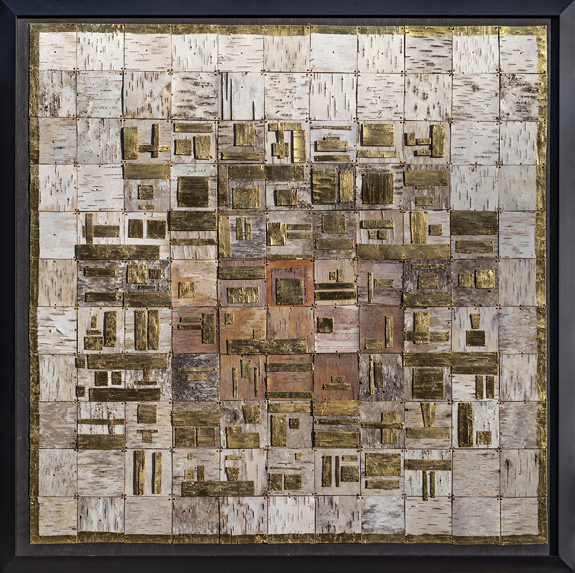
Susan Yamasaki, Hieroglyphs, 35 x 35″, Assemblage, 2021. Image courtesy of Taro Yamasaki.

It is easy to say squares and rectangles dominate the motifs in a background of white in Hieroglyphs, as the square abstraction surrounds a cluster of gold leaf objects.  Found in ancient Egyptian art, the stylized shapes represent a word, syllable, or sound, where gold is designed to elevate the symbol’s value.

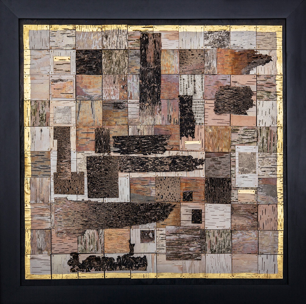
Susan Yamasaki, Burnt, 34 x 34″, Assemblage, 2020.    Image courtesy of Taro Yamasaki.

In the work, Burnt, although its background is a field of squares, an overlapping darkened color represents the birch that was touched by fire.  The effect contrasts the composition and moves the action of larger pieces of bark from left to right, repeating the small horizontal lines in many of the squares.

Susan Yamasaki, Underbark, 35 x 30″ Assemblage, 2023, Image courtesy of Taro Yamasaki.

The image Underbark, illustrates how the artist handles color (red and orange), which opens the door to expanding the option to future compositions.  It is noticeable that Susan Yamasaki has a comfort level using a grid-based composition of squares and working overtime on variations of well-established designs of gold leaf borders and black frames until she gets to a point where there are options that present themselves.

Until now, she has created a very personal oeuvre: abstract assemblages based on her relationship with material that is part of her natural environment, but raises the question, where will the work go from here?

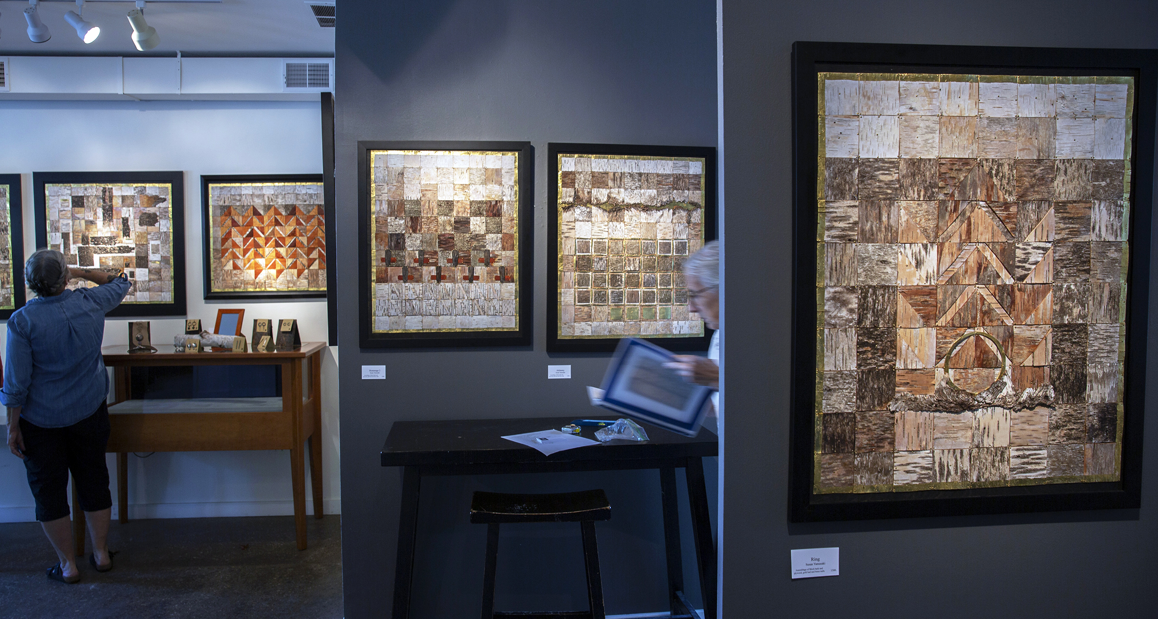
Susan Yamasaki, Installation, Assemblages, 2023.  Image courtesy to Taro Yamasaki.

Susan Yamasaki studied art at Michigan State University and then finished at Wayne State University, ultimately with a degree in Art History.  She earned a teaching certificate and taught science at Roeper School in Suburban Detroit.  After moving to northern Michigan, she taught at a public Montessori school in Traverse City.

Susan Yamasaki, Birch Assemblages, Center Gallery in Glen Arbor, Michigan, August 4 – 10, 2023.

Tom Parish @ Scarab Club

Untouched by Time – for the American painter Thomas Parish

Installation, the image of the artist, Tom Parish (June 11, 1933 – October 25, 2018), 2019, all images courtesy of DAR

He was born in Hibbing, Minnesota 1933, where blistering winters kept the young boy inside his home, coloring the pages from a Sears & Roebuck catalog. When he was four, his mother married Ken Parish, and the family moved to Chicago. He attended a public grade school where he was recognized for his art and later attended a military high school providing a small studio space. There he made paintings that were purchased by many of his teachers. During this period, he repeatedly visited the Chicago Art Institute and was excited by the work of Joseph Cornell, J.M.W. Turner, El Greco, Jean Baptiste Corot, and Edward Hopper. He often said, “My father wanted a better and more highly recognized school experience for his son.”

Upon graduation from high school, Parish’s mother helped him apply to William & Mary College, a prestigious liberal arts school in Williamsburg, Virginia. Still, it was a short time before his teachers, based on his artistic talent, recommended that he transfer to the Pennsylvania Academy of Fine Art with its famous museum. Well known for its academic approach to painting, the teachers taught the highly traditional skills of life drawing and painting. He recalled opening an exhibition that included Franklin Watkins, Morris Blackburn, Hobson Pittman, Robert Motherwell, and Willem de Kooning. In addition, the permanent collection housed in the oldest college museum in the country had many masterpieces by William Merritt Chase, Thomas Eakins, and Winslow Homer, and former Academy students Robert Henri and John Sloan.

It would shape Parish’s painting in a way that would soon be discovered.

Tom Parish, Pink Sky, 36 x 24″, Oil on canvas, 2000.

Parish’s graduate degree led him to two years of teaching in North Dakota and a community college teaching position at Forest Park that lasted three years. The offer of a teaching assistantship at the University of North Dakota led him to the art department there, headed by Bob Nelson, who had trained at the Chicago Art Institute and had figurative work at the Corcoran Gallery in Washington, D.C., and the Museum of Modern Art. He made several friends who taught nearby at Washington University in St. Louis, Missouri, with a distinguished faculty, such as Josef Albers and Max Beckman, and again, a rich collection at the museum.

Along the way, the literary influences that he sought out would shape his thinking about painting.  He would say, “An early influence was Cezanne’s Composition: Analysis of Form, by Erle Loran, which helped provide a framework for looking at composition, along with The Story of Art, by E.H. Gombrich, a widely regarded book of art criticism.”  It was his reading of Albert Pinkham Ryder, an American painter, whose descriptions of these moody seascapes, and Hart Crane’s The Bridge, a poem inspired by New York City’s Brooklyn Bridge, that pushed Parish towards landscape painting, albeit surreal and aerial images of objects and buildings.

All along the way, these constant visits to world-class museums and a new type of jazz music during the mid-1950s filtered into Parish’s view of the world. He eventually created a unique island called Zarna, a place from his childhood filled with imaginative landscapes.  These aerial images produced with minor marks of  paint often included train tracks, rooftops, and geometric objects, each with a light source casting shadows to the side.

There came a time in the mid-1960s when an Assistant Professor position at Wayne State University opened up. During a visit to Chicago, Robert Wilbert, the then Chair of Painting, was impressed with the work of Tom Parish. Mack Gilman of the Gilman Gallery said, “Parish is among the best of six living painters in the world.”  Wilbert had found what he was looking for and knew with Parish on board; he would have a good team. At that very moment, Parish was on his way to teach at L’Ecole des Arts in Winnipeg, Canada, when he got a call from Wilbert and was offered an Assistant Professor position on a tenure track to teach painting in Detroit. Located in midtown across from the Detroit Institute of Arts, with one of the most significant art collections in the United States, Parish had found a place to teach and paint near a world-class museum.

Parish had found gallery representation in Chicago with Mac Gilman in the 1960s, where he exhibited his Zarna-based surreal landscapes comprised of a compact field of stones, producing a color field. The work attracted the attention of the Martha Jackson Gallery in New York City, specializing in American painting. Parish participated in three exhibitions at the Martha Jackson Gallery in the early 1970s after David Andersen (Martha Jackson’s son) had seen his work in San Francisco. 1980 Parish resumed the relationship with the Gilman Gallery. This was to become the Gilman Gruen Gallery and eventually the Gruen Gallery. There would be ten years of exhibition in Chicago, and by this time, Parish had solidified his reputation for painting in the Chicago and Detroit art communities.

By then, Parish was searching for a direction to take the work until a visit to Europe and Venice in 1986 provided him with a replacement for the Zarna imagery. The canals, corners, terraces, and undulating water shimmering with elongated light satisfied his love for landscape painting. It was an ‘Old World’ atmosphere with the architectural form and mystical light that seemed to draw him into a significant compositional transition.

He needed to keep his teaching position and his studio in Detroit, so he and his wife, Shirley, began to plan extended trips to Venice, sometimes twice or three times a year, spanning the last thirty years. The time in Venice was spent on observation and capturing images photographically during a two-, sometimes three-week stay. The photos were both in spirit and part informational in creating what I have called magical realism, using a literary term. The early work would include a Vaporetto, water taxi, or gondola and be always set against a salty, worn section of architecture and elongated reflections flight on water. The underlying strength is always compositional. Parish returned to everything he had experienced in his reading to his observations of Cezanne, combined with a lucid imagination to form special longitudes of form and gentle reflections of light.

Tom Parish, Sogo Dream, 55 x 75″, 2016

Parish’s work, like Sogno Dream, 55 x 75-inch Oil on Canvas, combines his strengths: a composition that stretches out spatially and draws on elements in abstraction and his command of painting in the reflection-struck water in the turbulent canal. The viewer is drawn into the water’s texture above and below the water’s surface.  Venice, Italy’s famous artists Jacopo Bassano, Giovanni Bellini, Giorgio e, Titian, Palo Veronese, and Tintoretto have left their mark primarily by painting religious allegories. Parish focused on architecture and light.

Tom Parish, San Marco, 61 x 85″, 2014

Writers succumbed to the city’s unique charm, vitality, and decadence including Goethe, Herman Hesse, and John Ruskin. Thomas Mann (1875 – 1955), the Nobel Prize winner in literature, was fascinated by Venice and used it as a setting for one of his most famous novels. He writes the following in 1912 in “Death in Venice”: “Yes, this was Venice, this the fair frailty that fawned and that betrayed half fairy-tale, half star; the city in whose stagnating air the art of painting once put forth so lusty a growth, and where musicians were moved to accords so weirdly lulling and lascivious.”

It took an American painter, Thomas Parish, from Hibbing, Minnesota, home to the musician Bob Dylan, to find the landscape in Venice, part of the shallow Venetian lagoon and an enclosed bay between the mouths of the Po and the Piave Rivers. His Venetian landscapes expose the beauty of the architectural setting and swirls of reflective water that transcend a soft blend of magnitude and mystery.  The memorial exhibition, Untouched by Time, was curated by Dalia Reyes, Gallery Director at the Scarab Club, with assistance from Shirley Dombrowski Parish.

Untouched by Time, Tom Parish, Scarab Club, open until June 17 – 2023. 


Stan Natchez @ BBAC

Birmingham Bloomfield Art Center presents Stan Natchez, Brenda Kobs Russell, and Maria Balogna

Stan Natchez, BBAC, Install 3.2023

The BBAC opened its three galleries with new visual art exhibitions on March 10, 2023, presenting work by a Native American painter, Stan Natchez, a printmaker, Brenda Kobs Russell, and drawings by Maria Balogna.

Stan Natchez was born and raised in Los Angeles. Still, the indigenous artist now lives in New Mexico and brings his exhibit, Indian Without Reservation, to the BBAC with support from the National Endowment for the Arts and Arts Midwest. By taking the philosophies and techniques of both modern life and the traditional Native American heritage, Natchez achieves a complex harmony in his work by using a distinctive Neo-Pop style. He says in his statement, “I paint the life I live, and so every painting, in some way, is a self-portrait. My art is about the way I respond. And that is my experience…my experience is my art…and art is my life.”

Stan Natchez, Monopoly, 58 x 58″ Mixed Media

Natchez talks about his influences, Andy Warhol, Jasper Johns, and Roy Lichtenstein, combined with artifacts from the Native American culture. They would be found in Monopoly, where he uses the popular board game as a compositional structure to combine the various corporate logos with Native figures and designs. (I know this writer has worked hard at eliminating the word Indian from my vocabulary to represent Native Americans, yet I find it ironic to see this in the title of this exhibition.)

Stan Natchez employs art appropriation in most of his work throughout the exhibition, where he uses pre-existing objects or images as an artistic strategy, intentionally borrowing, copying, and image transfer is a practice that is traced back to Cubism, Dada, and, more recently, Pop Art.

Stan Natchez, Medicine Crow Living in Two Worlds, 48 x 36″ Mixed Media

Medicine Crow comes from a warrior of the Crow tribe. He was a “reservation chief,” concerned with helping the Crow tribe “learn to live in the ways of the white man” as soon and as efficiently as possible. The subject for this painting is taken from an original black-and-white photograph. The crow symbolism represents messages from dreams or the sub-conscience, and the object he holds is a group of feathers attached to a wooden handle and is used in a variety of ceremonies. Natchez brings the three primary colors across the face to draw attention to the reservation chief.

Stan Natchez, Traveling Through Time, 48 x 66″, Mixed Media

Natchez travels across time, mixing the images of Picasso, Matisse, Marilyn Monroe, Piet Mondrian, and a section of the painting Guernica juxtaposed with several Crow tribal leaders. He is mixing famous western images with Native American icons across time, creating a grid that compares and contrasts. By doing this, he places his people on par with world-recognizable images.

Stan Natchez, Guernica to Wounded Knee, 48 x 66″ Mixed Media

Part of this painting includes features of Guernica, the large 1937 oil painting by artist Pablo Picasso. Natchez spans time with imagery from events at Wounded Knee. It is one of his best-known works, regarded by many as the most moving and powerful anti-war painting in history. The painting here was made earlier in 2012 and then was sold and duplicated at a later date.

Stan Natchez earned his undergraduate degree from the University of Southern Colorado and his M.F.A. at Arizona State University. In addition to being a nationally known artist, Natchez has distinguished himself as a teacher, dancer, editorial advisor, and legal advocate for the Native American community.


Brenda Kobs Russell: Familiar Rhythms

Brenda Kobs Russell, Sequence, Etching Collage

Brenda Kobs Russell is a locally based artist whose work reflects an ongoing investigation connecting her inner life to natural phenomena. Given her time in school, you could look to the abstract influences of Pablo Picasso, Fernand Leger, or Paul Klee. During the 1920s, geometric abstraction manifested itself as the underlying principle of the Art Deco style, which propagated the broad use of geometric forms to influence abstraction. For example, Sequence is an etching with touches of white gouache, making it a monoprint that has been popular among printmakers recently.

She says, “As a whole, my work serves as a record, mapping an interior investigation of my surroundings and a practice of abstracting the familiar. I am interested in the congruities between organic cycles of transformation and artistic process, particularly how an image evolves through the erosion of an etching plate and is further translated by ink into paper.”

Russell is an art educator, having taught students across a wide range of ages and abilities in private schools, art centers, and as a lecturer on the faculties of Oakland University and Penny W. Stamps School of Art & Design, University of Michigan. She earned her B.F.A. at Michigan State University (1983) and her M.F.A. at Cranbrook Academy of Art (1985).


Maria Balogna: by His stripes

Maria Balogna, Darkness to Light III, Ink on Paper

“The Cost. The Wounds. The Enormity. Symbolic themes run throughout this collection of small drawings that outwardly express the salvific work of The Suffering Servant [ reference: Isaiah 53 ].” The abstract drawings of Maria Balogna contain undertones of Christianity without the weight of literary imagery.

The exhibitions will run through April 20, 2023.

The BBAC is open to the public. Masks are strongly recommended.

EXHIBITION GALLERY HOURS: Monday-Thursday 9 am-5 pm, Friday & Saturday, 9am-4 pm

Rocco Pisto @ Strand Gallery in Pontiac

Rocco Pisto, Installation image, Strand Gallery, 2023

The newly restored Flagstar Strand Theater in Pontiac opened its gallery to a retrospective exhibition of artwork by Rocco Pisto on January 20, 2023, spanning fifty years of painting that began in 1976. Watercolor is a medium that has been around for over several hundred years, yet often thought of as a secondary choice of paint to oil and acrylic. You might look at the early work of Albrecht Durer, Georgia O’Keeffe, Paul Klee, Winslow Homer, and John Singer Sargent to realize its place in history and its ability to withstand centuries. Where oil and acrylic paint are additive mediums, watercolor is subtractive, usually on paper, and translates its nature with its ability to have the strength and capacity of transparency. Watercolor is made of pigments suspended in a water-based solution, which refers to both the medium and the resulting artwork. Rocco Pisto’s 50 pieces range from 1976 to 2022 and reflect the artist’s unique techniques in controlling and experimenting with the watercolor medium.

Rocco Pisto, Telegraph Run, Watercolor, 34 x 42″, 1976

The early work Telegraph Run, done in 1976 during Pisto’s MFA work at Eastern Michigan University, illustrates a fluid construction that builds a composition using carefully placed primary colors and a delicate violet line structure that holds it all together. In his statement, Pisto says, “As a painter for over fifty years, I never tire of the experimental process of starting a piece and solving the design problems along the way to make it a finished work. Spontaneity, discovery, individuality, analysis, visual balance, contrast, and contradiction summarize my thought process.”

Rocco Pisto, Fire & Ice, Watercolor, 1976

Over time in Pisto’s work, we see various categories, including landscapes and figures, with all subjects that have evolved to the abstract expressionism in this field painting, Fire & Ice. The line that begins with the landscape and proceeds to abstraction is not straight. Pisto is back and forth throughout his career, keeping his thinking spontaneous and his trademark unique. He says, “The paintbrush becomes a performer, dancing across the paper, juicy and full of life. My work frees my imagination and provides many opportunities for magical accidents.”

Rocco Pisto, RenCen at Night, Watercolor, 53 x 42″, 2001

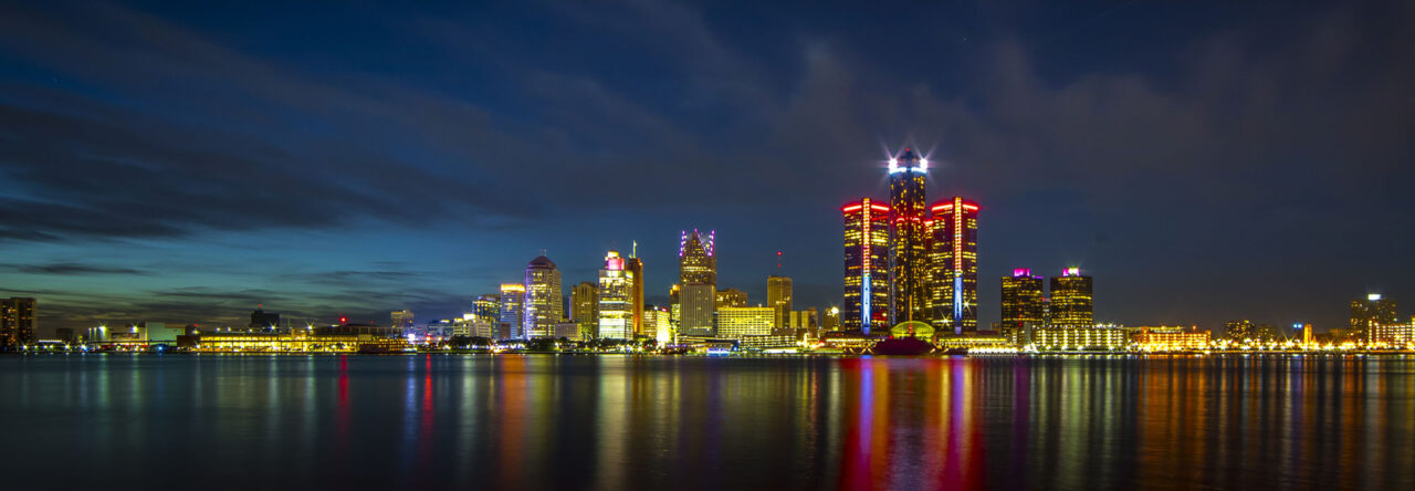
More recent is the large image of the Ren Cen at Night,  which relies heavily on the waterfront river reflection looking on from the Canadian side of the river. This watercolor has been used as a backdrop for a commercial poster for the 75th MWCS exhibition. Pisto says, “My painting technique abstractly by dripping, pouring, splashing, and brushing paint allows the work to evolve until it meets my criteria of what constitutes a successful piece of art.”

Rocco Pisto, Marsala Glow, 56 x 42″, Watercolor, 2021

The large watercolor in Marsala Glow is neither landscape, still life, figurative or pure abstraction. To this viewer, it is part aerial, part diagram, with a warm collection of color surrounding blue-green that suggests water, with a circular moat juxtaposed to an inner box. That leaves the interpretation up to the viewer to explain, whether broad or narrow. A viewer, as in all artwork, will bring their experience to the moment and draw a personal conclusion about the meaning of this work.

Rocco Pisto, The Fight for Ukraine, Watercolor, 43 x 55″, 2022

The painting, The Fight for Ukraine, is an example of creating art that draws attention to a current European event on everyone’s mind. What might be at first glance abstract, on a closer look, the viewer sees the bands of blue and yellow under siege with aerial bombardment resulting in the symbolism of the Russian armed invasion. The painting incorporates gouache, crayon, and India Ink, with watercolor to form a multimedia expression. Print sales from the original are currently being donated to first responders of the Ukrainian Army.

Rocco Pisto earned a Bachelor’s and Master’s degree in Fine Arts from Eastern Michigan University in 1974 and has been painting for over five decades. He is the recent President Emeritus of the Michigan Watercolor Society and holds a Signature Member and Great Lakes Fellow designation in that group. He also has membership in the National Watercolor Society, the International Society of Experimental Artists (ISEA), and the Brighton Art Guild. Rocco Pisto earned a Bachelor’s and Master of Fine Arts from Eastern Michigan University.

The solo 50-year retrospective at the Flagstar Strand Gallery in Pontiac will run through March 31, 2023.

Page 2 of 25

Powered by WordPress & Theme by Anders Norén