Critical art reviews of Detroit galleries and museums weekly

Author: Ron Scott Page 26 of 36

Carlos Diaz @ David Klein Gallery

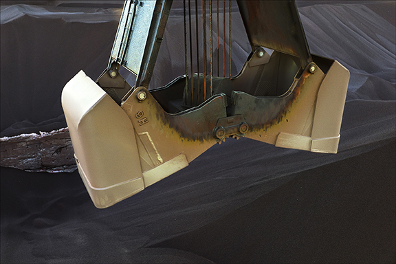
CARLOS DIAZ, ROUGE SERIES: CLAM SHELL BUCKET – 2012-14 C PRINT 21 X 30″

The David Klein Gallery in Detroit opened a retrospective exhibition of work by the photographer Carlos Diaz, May 13, 2017.   Spaces & Spectacle covers four themes of work dating back to the early 1980’s. Diaz, a Professor of Photography at Center for Creative Studies, has taught and influenced several generations of students in the art of photography over the course of 35 years.

It has been at least a couple of generations since photographers were loading 35mm film into their single lens reflex cameras on a daily basis, providing themselves with the means to record images. The commercial photographers were using mid-range Hasselblad, Cannon, and Nikon that recorded on 2.25 x 2.25 rolls of film, a format that provided the resolution for high-quality print work. All of this changed in the mid-1990’s when digital photography came of age, founded in part by the NASA space program. Diaz had been using film to capture his fine art images, sometimes referred to today as analog versus the digital world of solid-state CCD image sensor chips. In this exhibition, we see a variety of formats Diaz has used to capture and print his fine art photography.

Christine Schefman, Gallery Director says, “The photographs and collages reflect Diaz’s continued interest in the American Industrial Revolution, which gave birth to the working class, and the American amusement industry which was born out of the Revolution.”
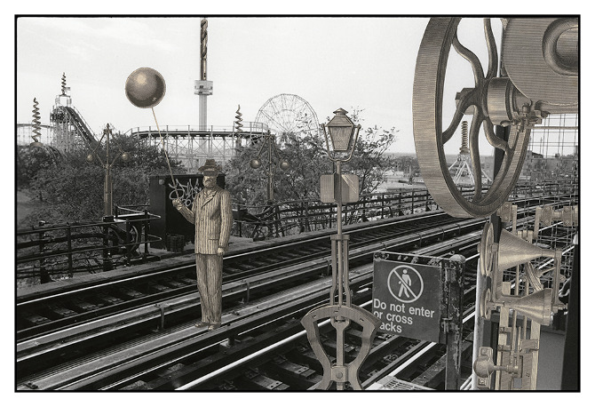
CARLOS DIAZ, INVENTED LANDSCAPES OF CONEY ISLAND – 2006 COLLAGE: GELATIN SILVER PRINT & VINTAGE STEEL PLATE WITH WOOD BLOCK ENGRAVINGS 11 X 14″

The collage series Invented Landscapes of Diaz’s work perhaps draws on experience doing mechanical drawing before he started his formal art studies. He went on to complete his BFA from Center for Creative Studies in Detroit and an MFA from the University of Michigan School of Art. The photographic collages are images of the industrial based Coney Island amusement park that became a backdrop for hand-cut images from old patent manuals, allowing Diaz to create what he has described in his statement, “The Invented Landscapes images and the Coney Island environment provides a space to merge both metaphorically and literally, the machines of the industrial revolution and the amusement park landscape. They are the fusion of the functional forms of labor and the fun of the fantasy of the carnival.” The change in tonality allows the viewer to see the added elements.
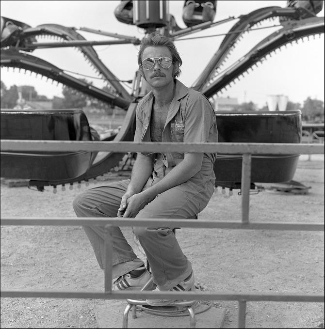
CARLOS DIAZ, WADE CARNIVAL SHOWS: OCTOPUS RIDE ATTENDANT – 1980-83 ARCHIVAL INKJET PRINT 36 X 36″

In these early 2 x 2 mid-range photographs, created in 1980 while Diaz was still in Ann Arbor, he selects and poses carnival ride attendants for a straight-forward full-bodied portrait. It is back then that it becomes evident that Carlos Diaz has a psychological preference for formal balance in many of his compositions. In the work, Octopus Ride Attendant, Diaz spends the time to center the figure and create an equal amount of space in all directions, either in the compositional set-up or in the printing (described as an archival inkjet print, meaning the negative was scanned and printed using an inkjet printer.) This element does not appear in the Invented Landscape work but dominates most of his other work. To illustrate, when you visit his web site, his image and the text are all centered on the page. I recommend visiting the web site where you can view his entire body of work. He says, “In one form or fashion, photography for me has always provided an opportunity to attempt to understand other people and their circumstances.”
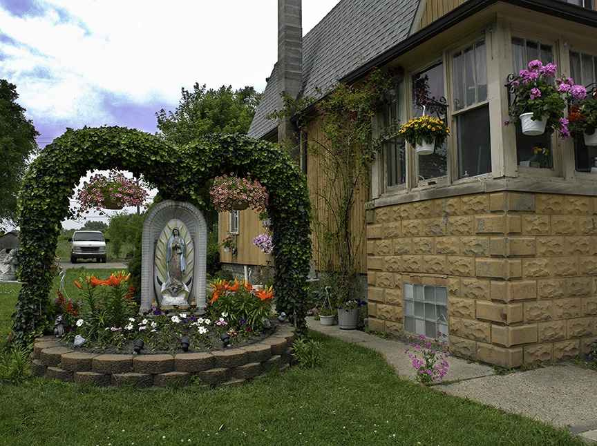
Mary’s Garden, Beyond Borders, 2010, C print. 23 x 30 inches

There is one photograph in the exhibition, Mary’s Garden that comes from his Beyond Borders series where he documents the front yards of many homes in Southwest Detroit. This photograph is another good example of creating this approach to a formal sense of balance and sensibility. The balance comes from this vertical chimney centered in the composition and an even amount of design weight to the large home on the right and the Madonna flower arrangement on the left, not to mention the nice halo of foliage around the parked truck, where a formality of color balance comes into play as well.
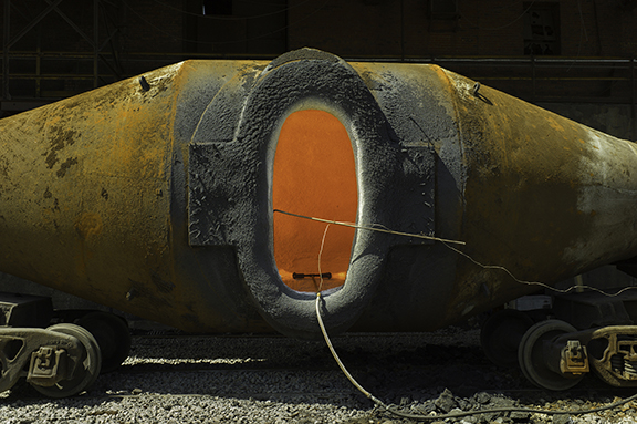
CARLOS DIAZ ROUGE SERIES: TORPEDO CAR – 2012-14 C PRINT 21 X 30″

These photographs from the Rouge Series look like full-frame color prints from 35mm film and printed as a C-Print. The term C-print stands for Chromogenic color prints. These are full-color photographic prints made using traditional chemicals and processes. It seems natural that Carlos Diaz would be interested in the Ford Rouge Complex, in that he grew up in Pontiac, Michigan and had a close relationship with the auto industry. Many of his family members work for the auto companies, and Diaz recalls his experience when he first saw the Diego Rivera murals at the Detroit Institute of Arts. He says, “When I saw the Diego Rivera Murals, my view of the automotive worker’s role and the understanding of the realities of automotive production shifted as I began to see modernists painters like Charles Sheeler, who depicted the Rouge and industry as a means that would save mankind.” Here, in the work Torpedo Car, Diaz centers his image, providing more evidence of this preference to address the concept of formality in composition.
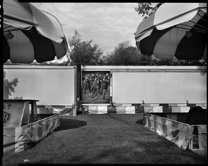
CARLOS DIAZ, CARNIVAL MIDWAY: HORSE RACE MURAL – 2008 ARCHIVAL INKJET PRINT 24 X 30″

Carlos Diaz remains interested in the life surrounding carnivals, not just the people, but also the structures, the culture and perhaps the nostalgia. In the 2008 print Horse Race Mural, part of the American Carnival Midway series, the work is formally composed and celebrates the photographic image center stage. We see how the umbrellas enter into the composition, almost identical on each side; More like Ansel Adams, than Henri Cartier-Bresson.

David Klein Gallery until June 10, 2017
Michael Scoggins @ Birmingham Bloomfield Art Center

The Robinson Gallery at the Birmingham Bloomfield Art Center (BBAC) is home to a new exhibition by New York artist Michael Scoggins, opening April 28, 2017.

If you’re expecting landscape, figurative, representational, or abstract artwork, this is not one of those. If I had to place it in context, it would more attuned to the Pop art movement, where Andy Warhol took the image of a Campbell’s soup can and increases its scale, often repeating the image multiple times. Here in the United States, Pop art started with the New York artists Andy Warhol, Roy Lichtenstein, James Rosenquist, and Claes Oldenburg, all of who drew on popular imagery that eventually became an international phenomenon. Pop artist’s celebrated commonplace objects and people of everyday life, in this way seeking to elevate popular culture to the level of fine art.

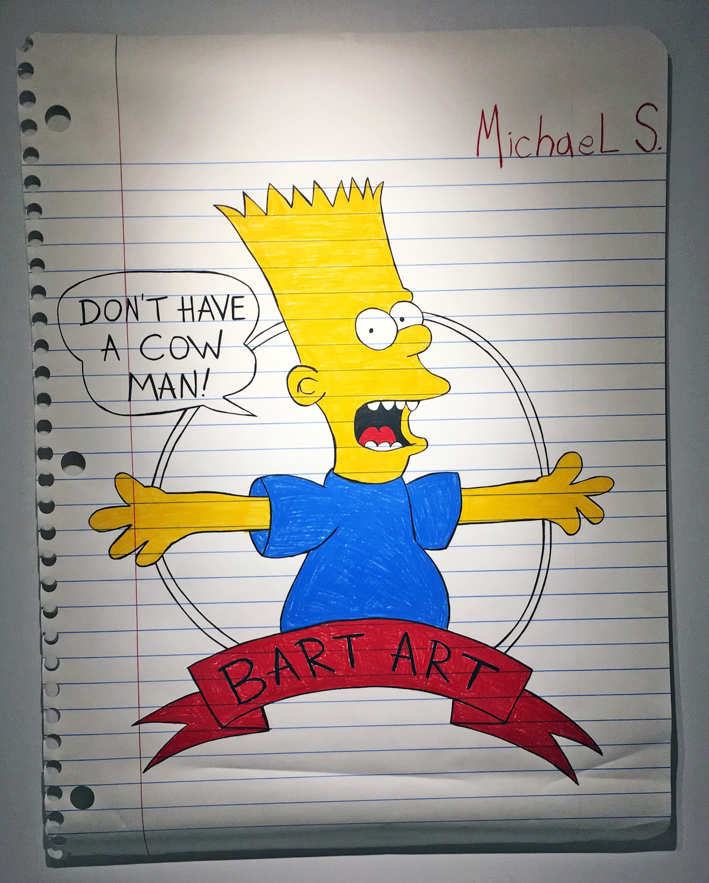
Michael Scoggins, Bart Art #1, Colored Pencil on Paper, 67 x 51″, 2014

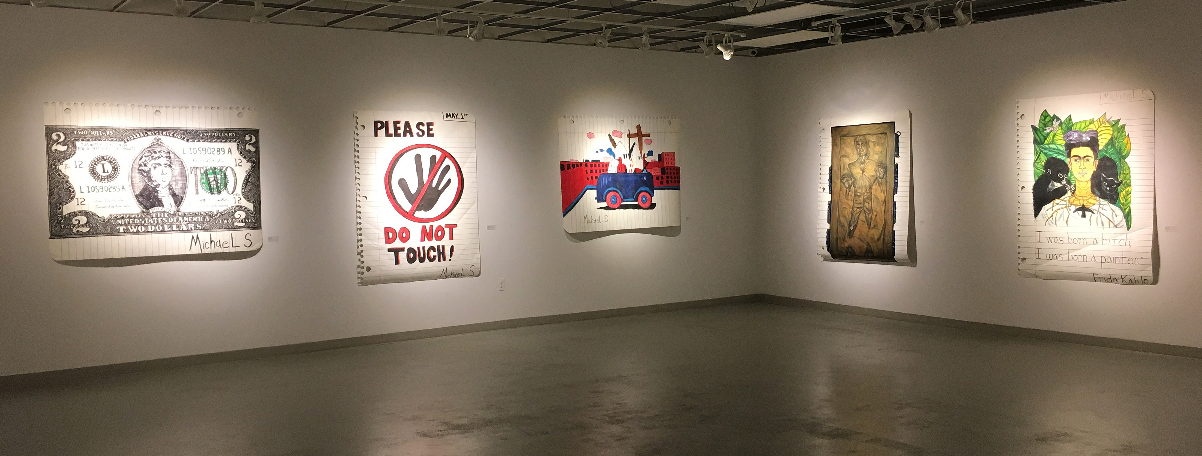
The work of Michael Scoggins takes on the politics of childlike imagery and dramatically changes its scale. If this work were executed on an average piece of notebook paper, 8 ½ x 11”, it would be appropriately displayed in an elementary school gymnasium exhibition. The key concept here is scale. These large 50 x 70” pieces of paper carefully simulate the torn out notebook sheet and illustrate the horizontal thin blue lines and the vertical red line on the left. In the imagery from The Simpsons, the character of Bart is reaching out, “Don’t have a Cow, Man.” Well, maybe he’s reaching out to his audience, a kind of confrontation about this iconic image hanging on a gallery wall while appealing to lovers of this character that was first developed by Matt Groening in 1989, and the Fox sitcom now in its 29th season.

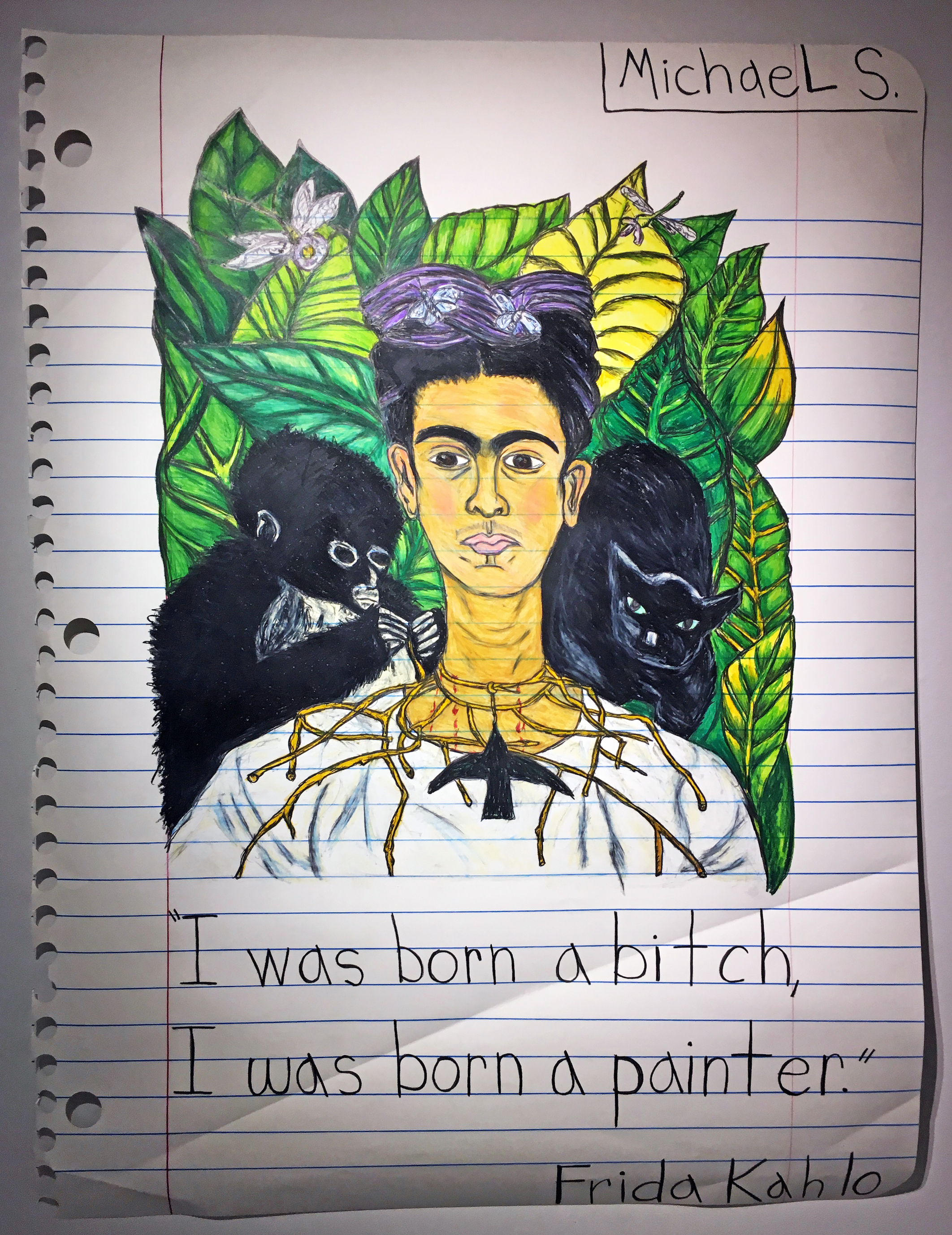
Michael Scoggins, I Was Born…(Frida), Graphite, Color Pencil, on Paper, 67 x 51″ 2016

The imagery displayed in Scoggins work is mixed. You have a child’s rendition of a Frida Kahlo work, as in I Was Born…(Frida) with commentary, to a copy of a two-dollar bill, or often an entire sheet of paper devoted to a page of childlike penmanship, repeating a controversial sentence the entire length of the page. There is the possibility that the work is autobiographical, and takes the viewer back to transformative years of Scoggin’s youth. Few of us would disclose our fourth-grade classroom illustrations and present them later in life, after an MFA in painting, as fine art.

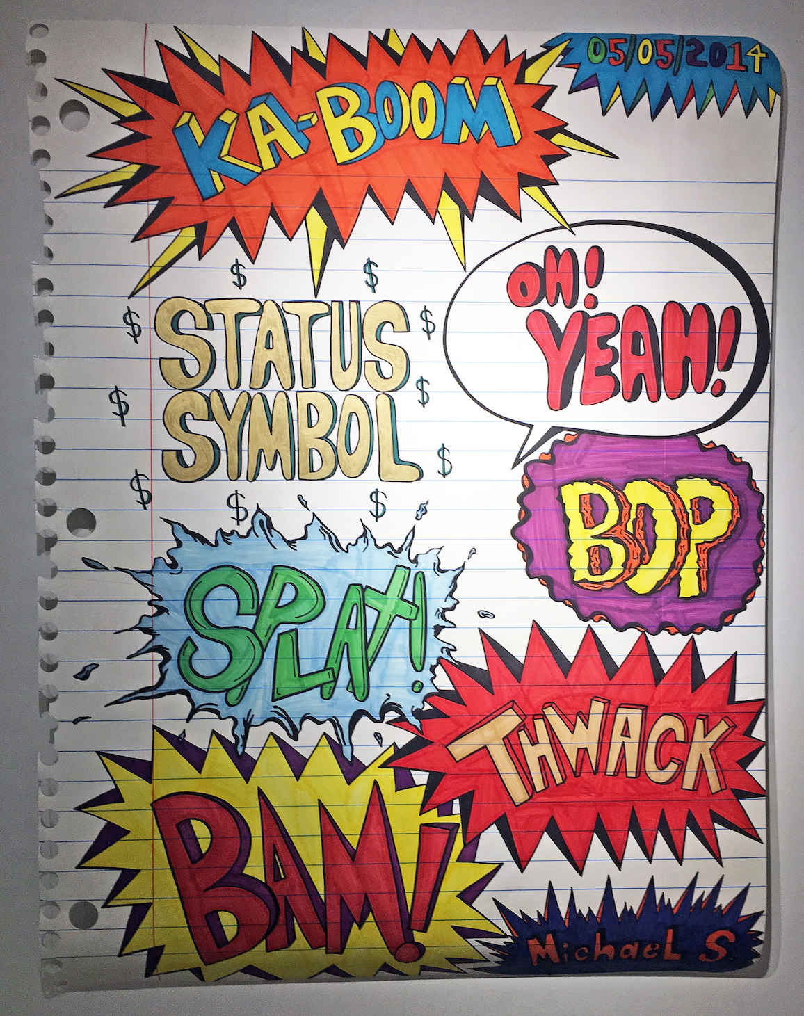
Michael Scoggins, Explosion Drawing #4, Marker, Color Pencil on Paper, 67 x 51″ 2014

In many, if not all, of the labels we have given to artistic movements since the beginning of time, is the reason why I go to the Pop Art movement to explain Michael Scoggins work. We have artists, today, that are producing minimal sculpture, impressionistic paintings, abstract expressionistic canvases, and photographic realism, all part of a continuation of movements that began in the past. This concept is an endeavor that transforms youthful memories onto large re-created sheets of notebook paper, to comment on narratives that are nostalgic images and make us take notice. Scoggins uses “Michael S. as a caricature of his younger self, in deliberately creating a signature, and uses nuances of crumpled, folded, sometimes torn or folded paper, to create the facsimile.

“The work I make is always political,” says Michael Scoggins, who satirizes art-world politics and provincialism in penetrating, disarming schoolboy-style doodles and writings. “I feel the ‘Michael S.’ character has definitely transformed over the years and has become more of an extension of my adult self,” Scoggins has said. “I want to present my work with sincerity, and it is truly a reflection of my inter-self.”

Michael Scoggins work is included in the permanent collections of the Museum of Modern Art (New York, NY); the Hammer Museum, (Los Angeles, CA); the Mattituck Museum (Mattituck, CT); the Gettysburg Museum (Gettysburg, PA); The Savannah College of Art and Design (Savannah, GA); along with several prestigious private collections. In addition, Scoggins is one of Wasserman Projects’ artists and his work was first shown in January 2016 at their gallery in Detroit, Michigan.

He lives and works in Brooklyn, New York

The BBAC mission is “to connect people of all ages and abilities with visual arts education, exhibition, and other creative experiences.” They accomplish this by offering classes, exhibits, workshops, camps, and events to the public since 1957.

Michael Scoggins     Birmingham Bloomfield Art Center      April 28 – June 9, 2017


Faina Lerman @ Cave, Russell Industrial Center

Family Album: Faina Markovna Lerman at Cave

Faina Markovna Lerman worked with photographs to make the twelve paintings that comprise “Family Album” currently exhibited at Cave in the Russell Industrial Center. The photographs are mostly stored in the family album from which she took the name and from which she worked. In her artist’s statement for the exhibit she says:

“These paintings are inspired by the desire to honor my family history and experiences  that are fading, gone, or were well before my time. They reference photos from the  1950’s (post WWll Latvia)-1980 (when my family immigrated to the United States)”.

To make paintings in honor of the family is to celebrate and remember its existence but Lerman uses photos which, typically, already serve as memories. Family photos are the evidence, the signs, that the family was, and provide a sense of continuity and context, even likeness for heirs to compare themselves, to find lineage. As artifacts, they carry with them their own cultural information: the serrated edges of the square format photos, the fading chemicals used to make them, and the eroding paper on which the images are printed, these things locate them in time. What Lerman is after is more complex than either the fact and corroboration of their existence.

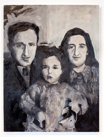
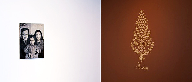
Faina Markovna Lerman, “Baba, Dzeda and Mom before Josef arrived (Riga 1955)”  Water-based oil on wood, 2017 All images courtesy of Corine Vermeulen


The first image that we encounter, and there is a definitive evolution of the twelve paintings, is “Baba, Dzeda and Mom before Joseph arrived (Riga 1955).” It is a black and white painting with pink tinges shadowing the figures. (I learned that Lerman painted over a painting of her grandfather with which she was completely dissatisfied: “There was red in it.”) We get a sense of her pursuit by the title. Baba and Dzeda are Russian names commonly used for Grandmother and Grandfather, and it is clear in this painting that Lerman was after likeness to the photo and mirroring the initial effect of the image at which she is gazing. She is interrogating the photo searching for connection. Whether intended or factual or not each figure has the same brush- stroked nose to accomplish the notion of family. Wonderfully the act painting contains a genetic component. Most interestingly Dzeda’s half of the portrait is shaded darker than Baba’s and her mother (Lerman’s mother), the baby between them, is half shaded and half in the light, representing a genetic sharing of her parents. Is this a conscious mirroring of the photograph or is it a factor of Lerman’s desire to find likeness in her family? While classically sober, in keeping with traditional family portraits, it is an energetically expressionistic rendering of her mother and grandparents. Each brush stroke is deft and fraught with meaning. The figures express an innocently touching but uncertain humanity.

Photographs might be considered a pure, distilled concentrate, a moment composed of many recognizable signifying features, a face, a nose, a certain dress, of a life. In her paintings Lerman is working at reconstituting a family “fading, gone, or were well before my time.” The painting becomes the echo within her of first family, of ontologically, her beginning. The painting is a reification of that history. It is not a slavish copying, but a deep mining of herself to affirm their lives.

Latvia, along with Lithuania and Estonia, borders the Eastern shore of the Baltic Sea. Riga, the capital of Latvia, where the photo was taken, was torn, like all Baltic Soviets, between Germany and Russia, between persecution of the Jews by both the invading Nazis and by Latvian nationalists themselves, and by the Russians. That said, Latvia was where Lerman was born and the site of her early childhood. “That culture, that landscape, the food, the smells, the music, that world is disappearing, that moment of the world is maybe gone and I want to preserve it somehow. I want my children to know it. When we would have dinner before they were gone I would sit there eating and cry, cry while I was eating, knowing how fragile the moment was and that it was disappearing.”

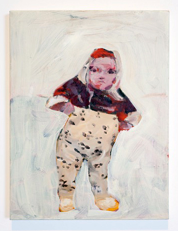
Faina Markovna Lerman “The Baby with a fever (Riga 1976)”, 1Water-based oil on canvas, 2017

There are two other paintings from Riga. One is “The Baby with Fever (Riga 1976)” based upon a photo of Lerman as an infant, straddled and supported by her parents. Her mother told her that because she was sick with fever she had bundled-her- up against the cold. Lerman painted-out, or intentionally left her parents out, and added color to the black and white image as if to create a reality for herself as a child that has faded or that she never had. It is a loose, gestural painting, with the sense of the infant almost rescued out of the painted-out background. There is also a look of decisive and emerging identity in the painting of the infant that Lerman has asserted.

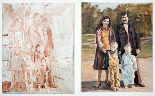
Faina Markovna Lerman, “Rainis Park (Last family photo taken before coming toAmerica,1980),”  Water-based oil on canvas, 2017

The other painting, “Rainis Park (Last family photo taken before coming to America,1980),” is a diptych. One panel is an almost transparent, study-like sketch of Lerman’s immediate family, her mother, father, sister and her. Riga’s Rainis Park is infamous in history as a site where in June 1941 the Nazis gathered and shot 300 Latvian Jews, and thousands of other Russian patriots and Jews were murdered in and around Riga. The transparent quality of the study, juxtaposed to the second painting that reveals a stylish and life-affirming family, throws a painful question into Lerman’s narrative tableau of what could have been.

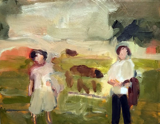
Faina Markovna Lerman, “Baba Sonya and Josef with horses (date and place unknown),”  Water-based oil on canvas, 2017

There is a strong sense of evolution in “Family Album.” The paintings become looser and gestural, almost abstract. She is comfortable with her gestures and the marks she makes on the canvas are convincing and beautifully lyrical. In discussing Lerman’s “Family Album” exhibition and particularly the wonderful little painting, “Baba Sonya and Josef with horses (date and place unknown), “ 2017, a prominent Detroit artist said “This is a very brave exhibition and she learned to paint marvelous paintings doing it.”

Faina Markovna Lerman is a multi-talented artist and cultural activist and “Family Album” isn’t simply an exhibition of her artistic talent as a painter but illustrates her broad view of personal identity and our collective history.

The exhibition is punctuated by a few simple family possessions– original stools, linens, baby blanket and Russian Nesting dolls (Matryoshka)– that were brought from Russia when her family migrated to Detroit in 1980. The Latvian symbol for growth, fertility and prosperity, which is on the cover of her family album is reproduced on the wall of the Cave Gallery.


Cave through 5/12 17

Russell Industrial Center 1600 Clay St.

Building Four-Third Floor

Detroit, Mi 48211


Anderson & Youngblood @ Galerie Camille

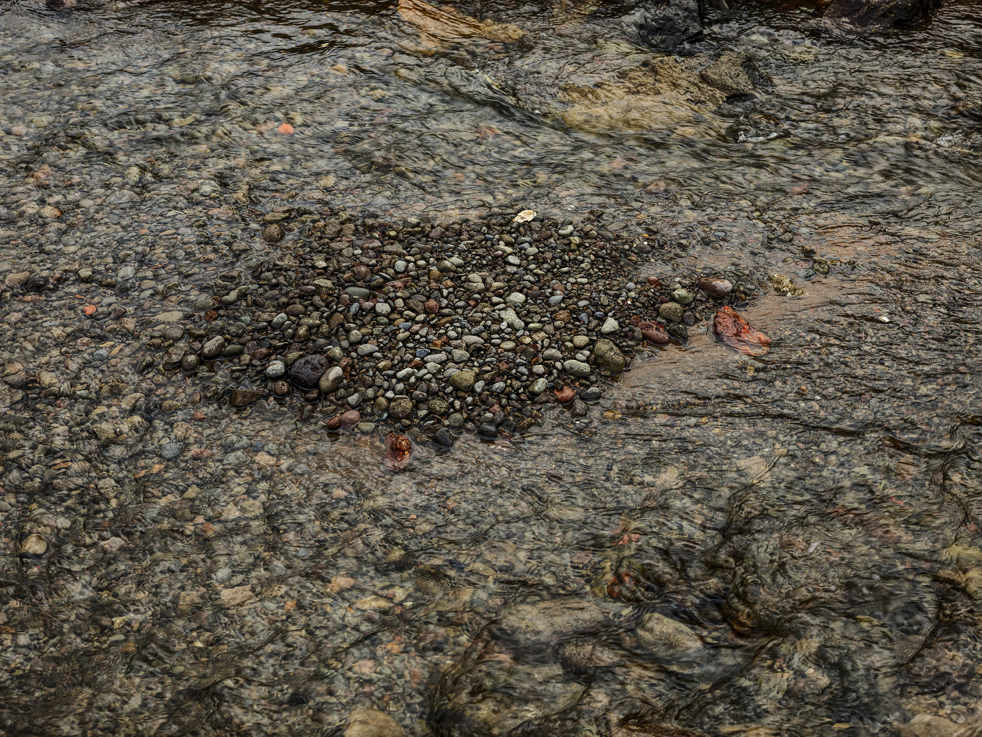
Carla Andersen, West Fjords 5, Iceland, Archival pigment print, 30 x 40″ 2016

There is a striking contrast between the work of Carla Anderson, photographer, and Elizabeth Youngblood, abstract artist using various mediums, now on exhibition as Chosen Silences, opened in midtown Detroit, at Galerie Camille, April 7 – 27, 2017.

These two artists share an attraction to abstraction and contemplation but deliver their ideas using different media. This certainly must have contributed to the idea of an exhibition together as the work is not presented in different spaces, but is intentionally integrated, with the purpose of bringing the viewer along as they peruse the gallery space. It’s a good idea.

Gallery director Melannie Chard says, “Chosen Silences blends the work of Anderson and Youngblood to create an environment of quietude and contemplation of form, texture, tension and light.  While each artist works in a different medium, both have chosen to communicate in that space of quiet. In that space of what would seem silent, but isn’t.”

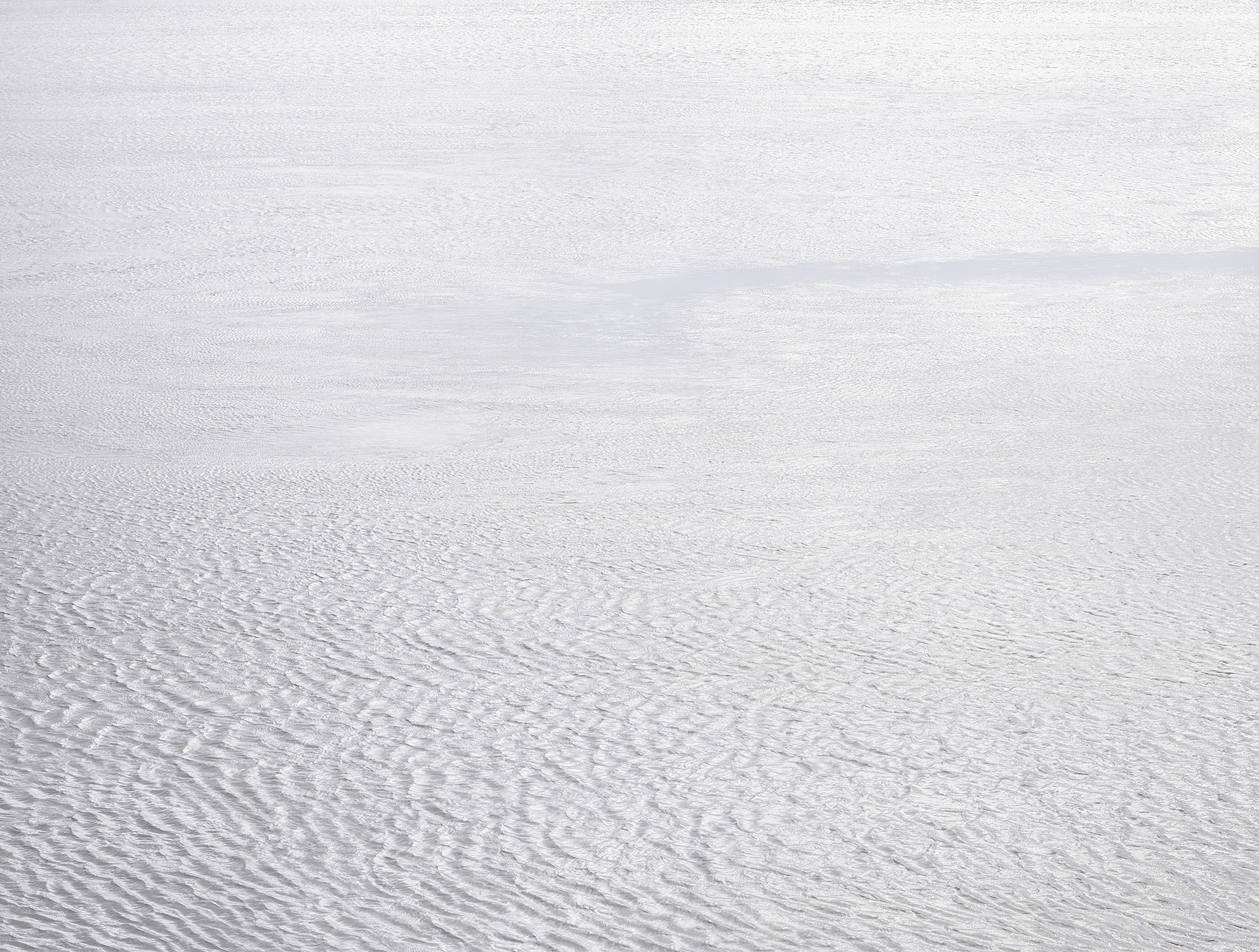
Carla Andersen, West Fjords 4, Iceland, , Archival pigment print 44 x 52” 2016

Anderson’s photography reminds me, at times, of how I feel when I am looking at a color field painting. These large, 30 x 40” images (sometimes digital, sometimes film) are about the space in nature, captured beautifully using large format cameras, and presented in a way that does not go unnoticed. And I must mention scale, because these photographs would not have the same impact if they were printed in, say, 8 x 10”. The large-scale print brings the viewer intimately closer to the subject, as in West Fjords 5, photographed in Iceland, in a way that draws you into a universe of these small stones or in the reveal of an oncoming night sky in Emmett County.

Carla Andersen, Emmet County, Michigan, Archival pigment print, 30 x 40″ 2016

There is a large context for Andersen’s work, who was awarded her BFA from CCS, 1976 and her MFA from Cranbrook in 1978. Her influences could have been a combination of Carl Toth and George Ortman, both teachers at the studio-based Cranbrook Academy of Art during the 1970s. Probably more important would be her exposure to the work of Edward Weston who did abstracts of the desert, as in Oceano 1936, Eliot Porter, as in Pool in the Brook, 1953, or more recently, Joel Meyerowitz as in his large color image, Dawn Hardline, 1980. This work, sometimes called non-objective, relies less on representational objects and more on color, light, texture and form that conveys a feeling or an impression. I have always been drawn to the work of Man Ray’s series called Symmetrical Patterns from Natural Forms first exhibited in Germany in 1914, where he experimented with objects, light and form. The American, a Russian immigrant from Philadelphia would become close friends of Marcel Duchamp and engage in avant-garde photography throughout the 20th century. That’s not to say Andersen’s work is avant-garde at this point in time, because of the groundwork laid down for nearly a hundred years of photography.

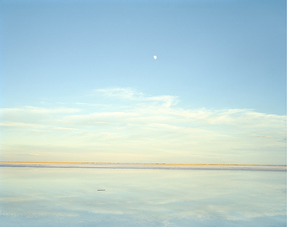
Carla Andersen, Great Salt Lake, UT 35, Archival pigment print 30 x 40” 2016

The symmetry of Great Salt Lake stops the viewer in their tracks when they notice the reflection of the sky in the lake, and the two objects juxtaposed: the moon and a small log in the lake. The illusion makes one feel as though they are out in the lake viewing the sliver of landscape (when actually they could possibly be on a shore), and upon close observation, there is a one percent downward tilt to the right to the horizon. It is the combination of these subtleties that make this image so powerful. It’s worth mentioning that Larry Melkus at Fine Arts Printing executed the printing and mounting of these prints. He says, “Carla and I came up with a double archival cold mounting process. The print is flush mounted onto a 3mm white archival plastic sheet. This is then float mounted onto a larger sheet of white aluminum composite material. The effect is that the print is displayed on its own “pedestal” within the frame. In addition, John Rowland painted his frames to match the white of the print surround, resulting in a subtle display of visual strength surrounding, framing and showcasing the photographic work.”

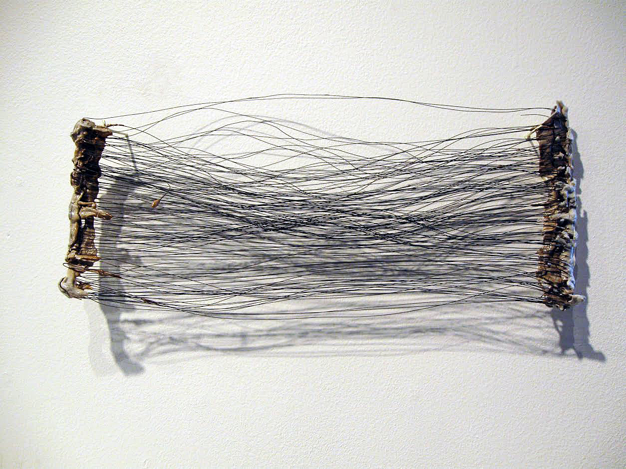
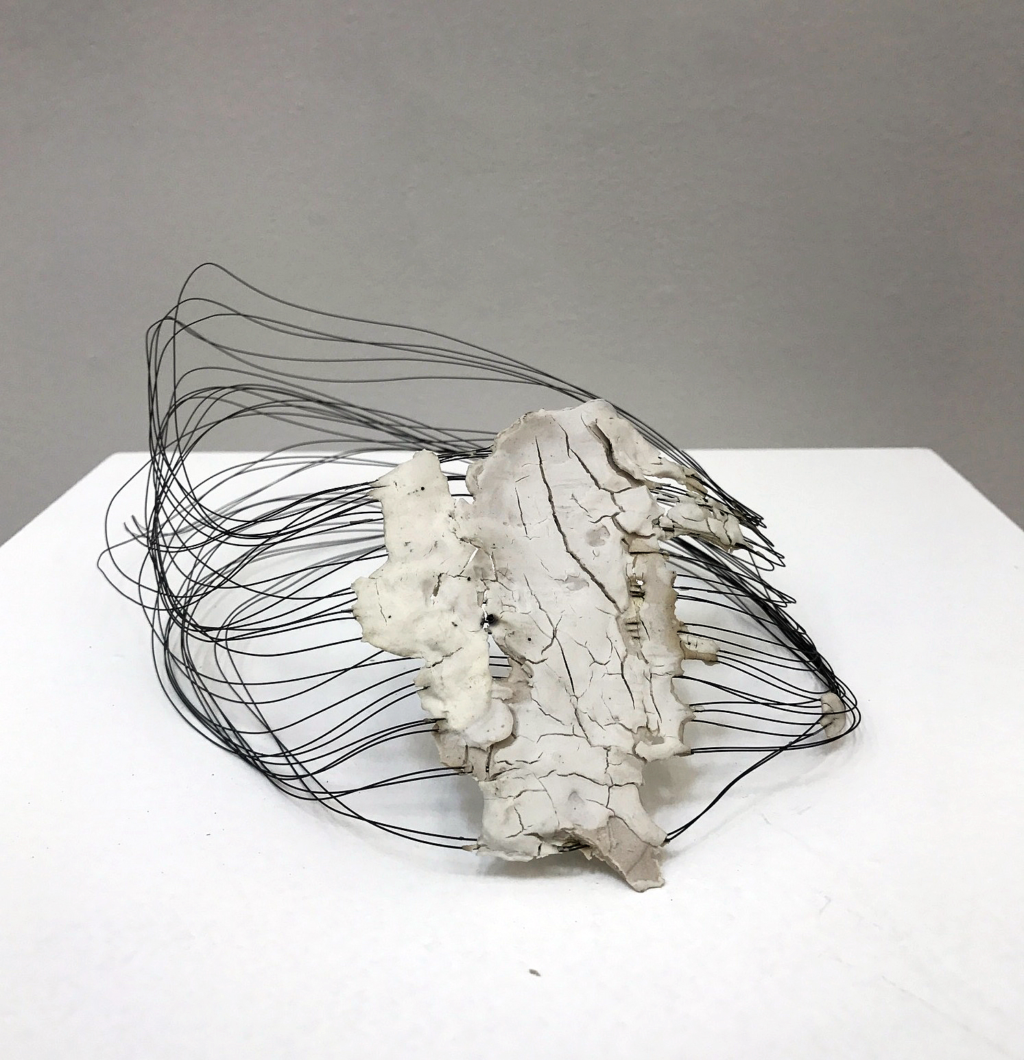
Elizabeth Youngblood, #6 Flat Horizontal Wire and porcelain, 14″ 2013

Elizabeth Youngblood’s work is multi dimensional, a mixture of three-dimensional objects made from ceramic and wire, and a collection of black and white drawings on paper. The contrast between the porcelain bars and the strands of thin black wire, as in #6 Flat Horizontal, provide an interesting play between material and as a relief, the shadows from the light adds to the dimension. Youngblood was awarded a BFA from the University of Michigan and an MFA from Cranbrook Academy of Art, where she studied design with the McCoys, who I have turned to several times for design work. No doubt they had an influence on her work, probably more about the process of developing conceptual ideas. It’s possible this eventually led her away from working as a graphic designer, more towards to becoming a fine artist.

Elizabeth Youngblood, Untitled Really, Wire and Porcelain, 2014

Clara DeGalan wrote about Youngblood’s work in fall of 2016 at 9338 Campau for the Detroit Art Review, saying “Youngblood respects making, and, though she is acutely aware of the cultural associations that come with each material she ropes into her vision, her devotion to process and skill-building manage, miraculously, to shed the oppressive political discourse that has hung around craft for decades and present it, unilaterally, as a vast conduit for exploration of an artist’s conceptual vision.”

It’s always a challenge to decide how large to make a three dimensional piece of work. If I were to dare to offer a constructive idea for her work, it would be to pay more attention to scale, pretty much across the board.

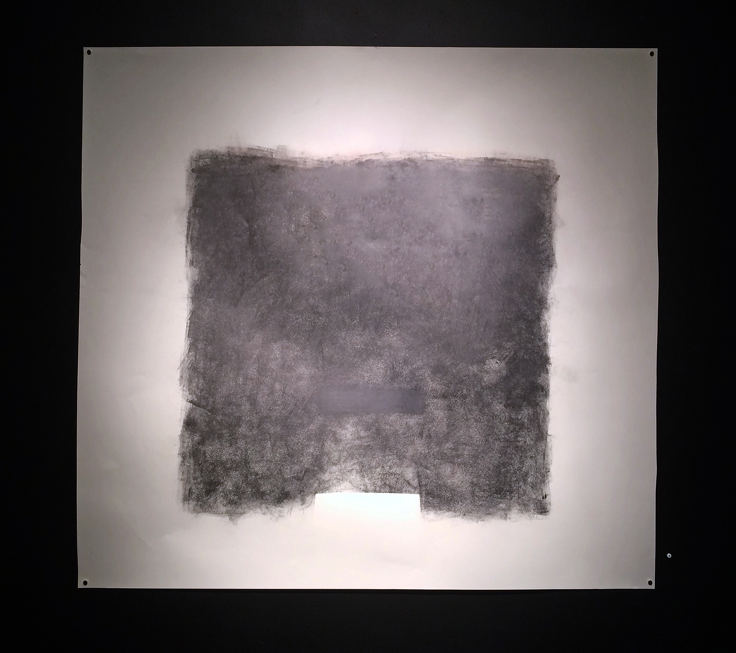
Elizabeth Youngblood, Large No. 3, Graphite on Paper, 42 x 45”, 2011

In contrast to the more didactic and delicate wire pieces, and in a minimalist fashion, Youngblood makes the drawing, Large No. 3, where she applies more graphite than is necessary to make a point about the material and the pressure applied. In this drawing, she illustrates ‘no fear’ in executing a powerfully bold and massive block composition, challenging her viewer to ponder her intent.

Chosen Silence, Galerie Camille     April 7 – 27, 2017


Abstraction @ David Klein Gallery

Group Exhibition: Gisela Colon, Jeff Colson, Brad Howe, Heather Gwen Martin, Hugo McCloud, Ruth Pastine, Matt Wedel, Patrick Wilson

Who introduced abstract painting to Western culture? Today, Kandinsky is given credit as the father of abstract painting as early as 1910, with first a watercolor, then on canvas, but he had a manifesto in which he wrote about abstraction in 1909. Personally, I think abstraction will be in our art vocabulary for years to come, synonymous with words like cubism, impressionism and realism. David Klein Gallery has an exhibition of eight artists from various parts of the country that opened March 18, 2017, representing both paintings and sculptures. On the Road: American Abstraction, surveys artists from other parts of the country, providing the Detroit audience with abstract sensibilities on both the east and west coast, as well as work from the Midwest.

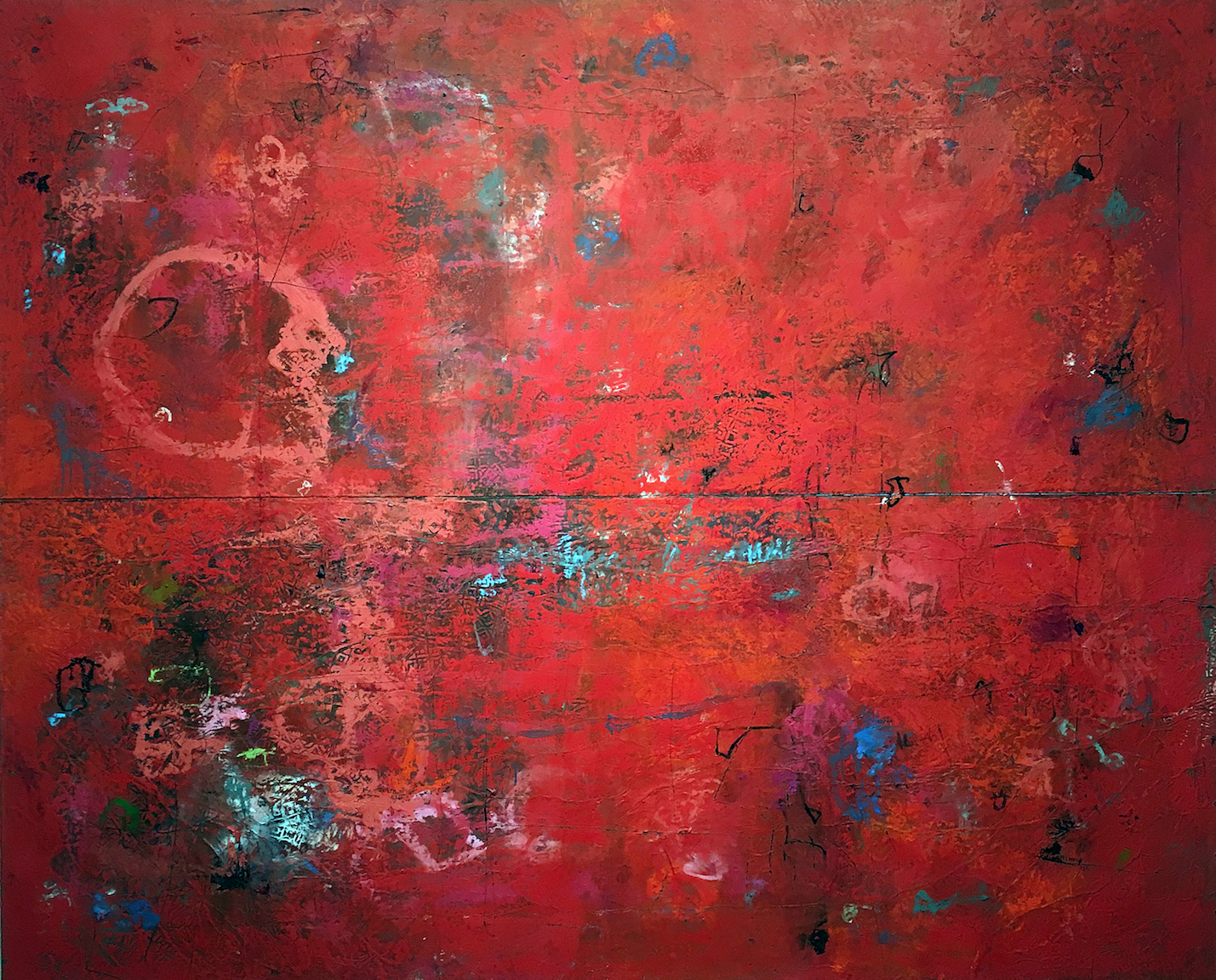
Hugo McCloud, Speechless Conversations, 2016, Aluminum Foil, Aluminum coating, Oil Paint, 79 x 98″

The work that grabbed most of my attention was the large red field abstraction by native Californian Hugo McCloud, who now lives and works in Brooklyn, New York. The horizontal diptych fuses unconventional materials, along with woodblock printing, where he creates a rich surface that reflects a type of urban decay. The rich surface contains a large variety of under painting both in terms of shape and color. Self-taught with a background in industrial design, he says in a statement to artnet, “All of my work is kind of process oriented. When I had a desire to go into the fine art realm,” he explained, “I didn’t really have an understanding of how to work on canvas or use brushes and traditional art making tools. That wasn’t really my foundation.” McCloud stretches his canvas out on the floor, sanding, marking, all driven intuitively by his desire to explore and uncover his personal aesthetic.

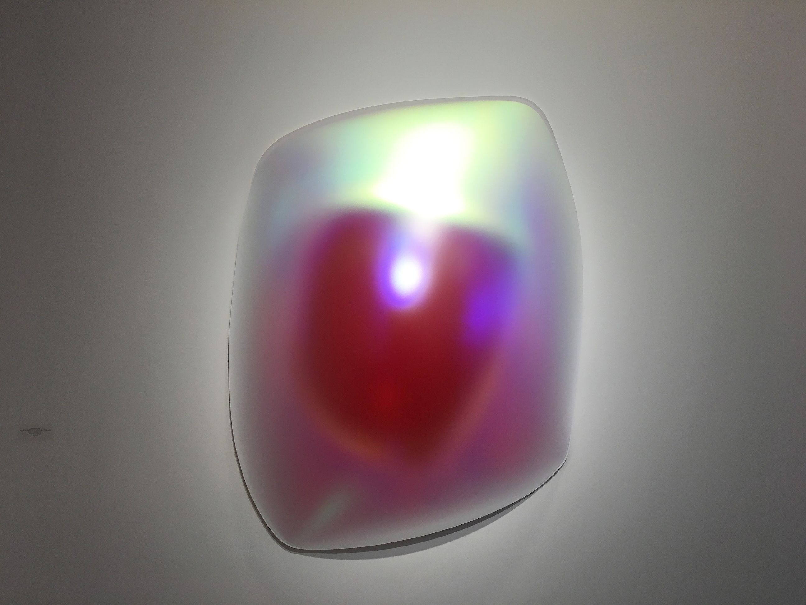
Gisela Colon, Skewed Square Glo-Pod, 2013, Blow-Molded Acrylic, 60 x 42 x 12″

On the other end of the abstract spectrum is the work of Gisela Colon, raised in Puerto Rico where she completed her undergraduate work at the University of Puerto Rico, and her JD from Southwestern University of Law, in Los Angles where she now resides. Her earlier work was acrylic over wood constructions, painted with an automotive lacquer, but here in this piece at the David Klein Gallery Irregular Rectangle Glo-Pod she has turned to the technique of blow-molding that uses sheets of colored acrylic. She calls that and subsequent pieces made without the use of paint ‘Glo-Pods’ due to what she deemed “a breakthrough in my use of materials that generated an internal self-generated glo without the use of paint.”Her work has been connected to the work of west coast artists interested in the properties of light and the nature of perception. To this writer, these sculptural objects have a focus that draws on the writings by Donald Judd and Robert Irwin from the 1960s. These ideas may have set up this minimalist approach to creating objects as sculptural reliefs using properties of light, technological elements and reductive forms that, in this case, attach themselves to the wall. The non-specific objects hover between painting a sculpture where light is emitted from within, creating a very contemporary piece of artwork designed to please.

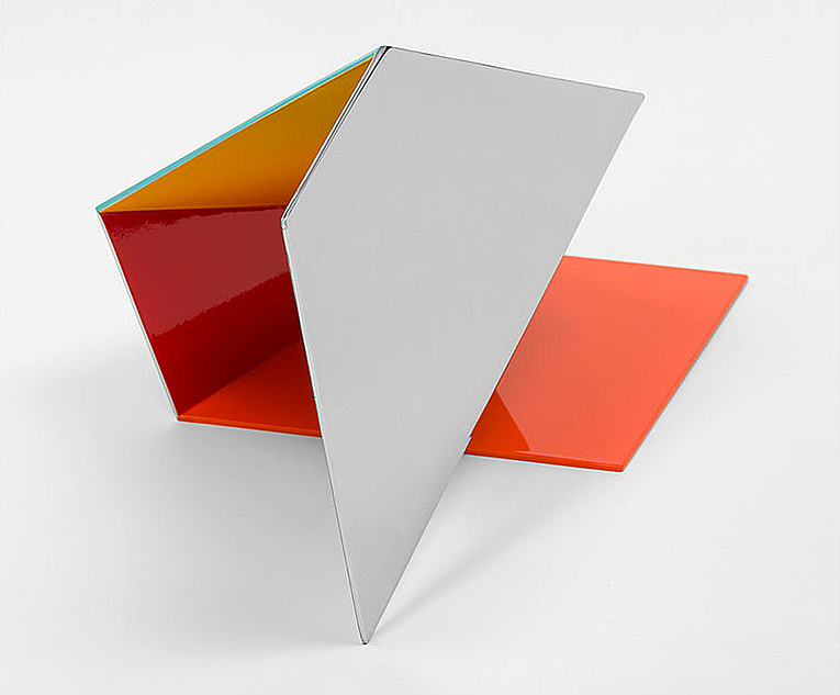
Brad Howe, Soft, 2016, Stainless Steel, Urethane, 12 x 24 x 9″

These abstract planes take me back to Tony Smith, allied with the minimalist school, where he worked with simple geometrical forms combined on a three-dimensional grid, creating drama through simplicity and scale. Created by artist Brad Howe, from Stanford University, these relatively small folds of stainless steel are impeccably constructed with effort and thought, providing simple form and color with attention drawn to their edges.

Howe says, “If we are to engage in the project of self-edification, the evolution of self, the enterprise is tied to our imagination. As Richard Rorty indicates, imagination is bound by our vocabulary, and it is in the growth of vocabulary we should focus. Vocabulary is tied to experience, and it is in energized moments of exposure to strangeness that our vocabulary expands. Encountering strangeness stretches and expands our self-image and seeds the rich potential for our collective conversations.”

Given the amount of concern that sculptors give to scale, these pieces feel like models waiting to be fabricated forty times larger than these tabletop sizes.

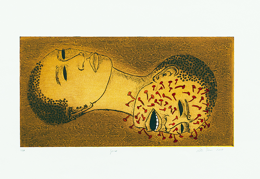
Alison Saar, Janus, 10/10, 2004, 10 x 19″

In its second gallery space, the David Klein Gallery provides an intimate collection of works on paper that includes lithographs, woodcuts and etchings. Of particular note is Alison Saar’s hand-tinted paper etching, Janus, that provides an image depicting the two worlds of the same woman, one existing in severe pain, the other in solitude. The expression may resonate with many people, women and men alike who find life to have its existence varied in a dichotomy of emotions. Saar says, “It was really poignant to me, this idea that a work of art could, somehow, turn a page, or shed a light, or lead back to a source. And that’s one of the things that’s exciting about being an artist; that your work threads people to other places, and not necessarily in straight lines.”

A native of Los Angles, Alison Saar’s work is primarily figurative, often female, in various emotional states or physical expressiveness. She seems to find symbolic richness in found objects, often with a narrative that offers a metaphoric view of life’s possibilities.

The David Klein Gallery has a long history of representing a collection of Detroit artists living and working in the Detroit Metro area. In contrast, On the Road: American Abstraction, Christine Schefman, Director of Contemporary Art, draws on artists who are represented by galleries from New York to Los Angeles, providing thought on some new experience and provoking exposure to the Detroit art community.

David Klein Gallery   March 19 – April 22, 2017


Page 26 of 36

Powered by WordPress & Theme by Anders Norén