Critical art reviews of Detroit galleries and museums weekly

Author: Sarah Rose Sharp Page 3 of 6

Writer

Shaina Kasztelan @ Hatch Gallery

Somewhere Over the Rainbow is a Double Rainbow: Way up high with Shaina Kasztelan

OTRDR11

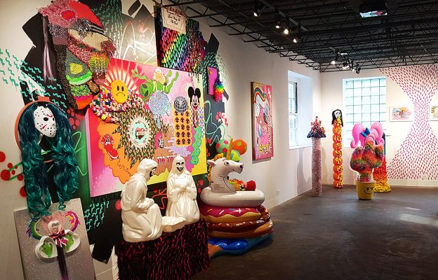
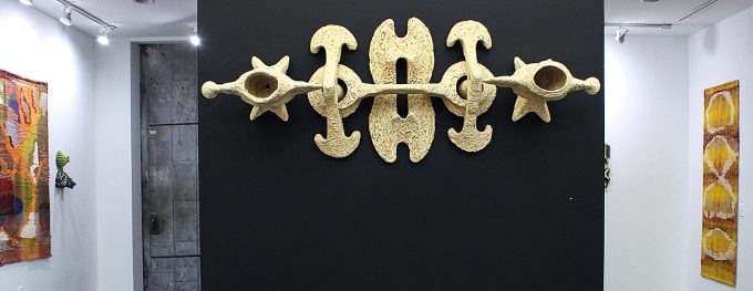
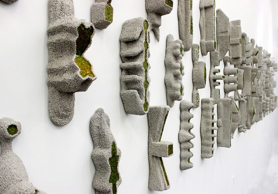
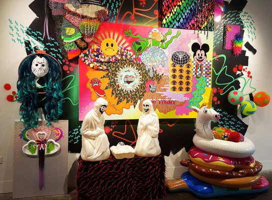
Shaina Kasztelan – Central installation, All Images Courtesy of Sarah Rose Sharp

One of the most challenging aspects of grappling with mental illness is not just the negotiation of an emotionally fraught psychic territory, but the social pressure to conceal whatever struggles may be happening internally. For women, especially young women, this struggle is a subset of the prevailing demand to present a shiny, positive face to the world. In Somewhere Over the Rainbow is a Double Rainbow, at HATCH Art in Hamtramck through May 28th, artist Shaina Kasztelan effectively reveals the turbulent and colorful interior life of a young Millennial woman. This, her first solo outing, is an installation-heavy environment that immediately draws the viewer into a kind of psychedelic and intensely female headspace, via a chaotic accumulation of material culture that targets her as a consumer.

OTRDR1

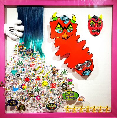
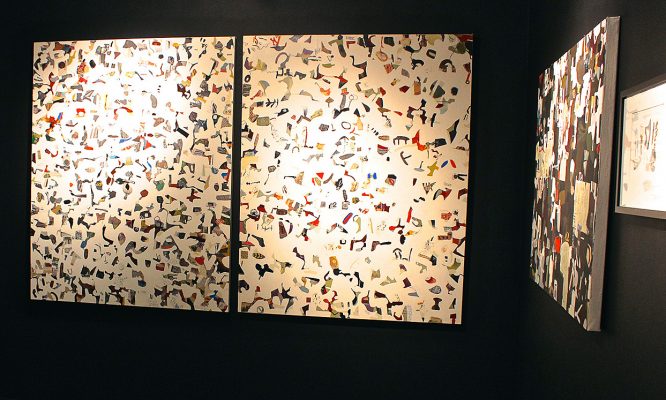
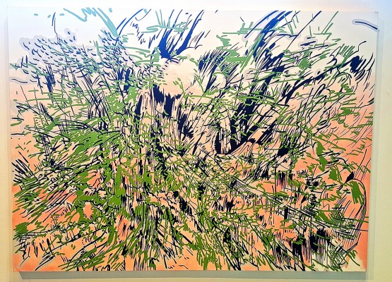
Shaina Kasztelan “The Devil’s Vibrating Smile,” (2016), 46″x46″


These materials include, but are not limited to: stickers, small toys, fake fur, plastics in innumerable iterations, decorative cake toppers, beads and cheap jewelry, a blow-mold nativity trio, fake fur, craft paper, artificial hair, and a series of pool floaties. Hearts! Rainbows! Unicorns! Kasztelan has plumbed the depths of the party-variety store in her search, and leaves no corner of her installation space unoccupied. One has a sense of stepping into a riot of Attention Deficit Disorder and teenage misanthropy, rife with cultural references that might be enigmatic to some, but readily identifiable to anyone within Kasztelan’s demographic. The nativity scene sports Insane Clown Posse face make-up; a cross-stitch bears an iconically self-pitying Nine Inch Nails lyrics; everywhere we encounter pop culture figures, from Mickey Mouse to the murderer from Scream, to the ubiquitous “Have A Nice Day” smiley face, in various interpretations. This is an interesting interplay between the objects Kasztelan has bought ready-made and incorporated into her texture- and color-rich compositions, and those that she assembles from scratch using craft materials; why bother to meticulously assemble a Mickey Mouse face from perler beads, when there are literally thousands of commercially made objects bearing the same visage?

OTRDR2

Shaina Kasztelan – Details from the central installation

This speaks to a kind of obsession, which is echoed in the endless repetition of shapes—often small toys that can be bought in bulk for a few pennies each. In “Baby Cactus is Happy,” a cactus shape covered in rainbow hair and wearing a pink inflatable wig bears dozens of tiny variety store plastic babies, the mere existence of which is slightly confounding. Indeed, when you start to zero in on any of Kasztelan’s works, the preponderance of oddly useless objects generated by our culture and marketed in the direction of young women begins to become unnerving. What message does it send, to be continually surrounded by things that are colorful, basic, and functionless. Kasztelan seems to have compensated for this material invasion of her head by creating an imaginary life for these objects, reimagining them into creatures, friends, and demons—golems of hyper-femininity—often by means of craft projects, another highly feminized activity set. As each creature takes shape, so it reflects some aspect of young womanhood, dark or light. “I Scream, You Scream, We All Throw Up,” is a tower of plastic spray foam, fused into a kind of totem pole with spray foam, and topped with a fright mask that is the most recognizable symbol from the “Scream” movie franchise. The mask is vomiting spray foam in lurid colors down the length of the totem pole, and this violent mixture of hoarding candy, binging, and purging, very successfully blurs the innocence of a child’s Halloween activity with the body image pressure applied to young girls as they emerge into puberty, and the resulting host of horrific eating disorders that are a scourge against this demographic.

OTRDR5

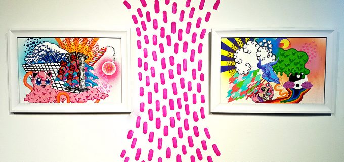
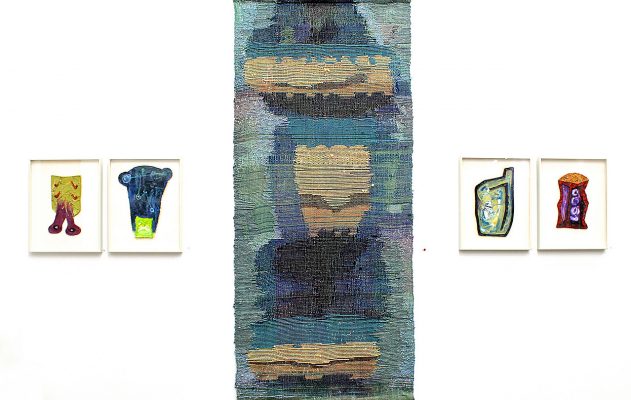
Shaina Kasztelan – Two works on paper 12 X 20″

Though presented in the trappings of frivolous girlhood, Kasztelan’s materials are a Trojan Horse for extremely intense concepts about sexuality, drug use, and mental wellness. Technically, each piece is incredibly rich in detail, seamlessly constructed (even in the event that drippy spray foam is being used as an adhesive, there is an intentionality and conscious hand at work) and remarkably successful at balancing literally hundreds of objects into well-balanced compositions. As a first solo outing, Kasztelan’s work already presents a strong self-awareness and adroit leveraging of a personal perspective that is often marginalized—that of the young woman, struggling to process a world full of expectations and distractions, and perhaps prone, in this struggle, to medicate some of the confusion into imaginary friendships. Somewhere Over the Rainbow is a Double Rainbow is a wild journey that brings home a surprisingly deep message.

“Pictures of You” @ David Klein Gallery

Five painters take on reality in Group Exhibition

Jamie:trevor installPY4

Trevor Young, “Beach Town” 2013, Jamie Adams, “Bride Falls, Pink Pants, Soggy Socks” 2016


“Realism gets a bad rap,” says Christine Schefman, Director of Contemporary Art for David Klein Gallery, and helmswoman of the new downtown Detroit location. The latest show to open at David Klein is Pictures of You, which features five painters, each of whom employs realism in some capacity in his renderings—and each of whom makes a pretty good case for its enduring relevance in a time where painting is no longer the leading technology for capturing reality.

StephenPY2

Stephen Magsig, “National Theater” – 2014

The show is divided between a focus on human versus architectural subjects—and within each subject type, further divided between attempts at photo-realism versus the taking of impressionistic liberties. Within the architectural realm, artist Stephen Magsig holds down the stricter side of realism, with austere landscapes that seem, for all their industrial details, to be fundamentally about capturing light where it strikes and fades from surfaces. The works on display are larger than his exceedingly charming ongoing series, “Postcards from Detroit,” which capture this same basic subject matter at a handheld scale. While the postcard series is a bit looser, Magsig’s larger works are precise and focused—perfectly capturing, but perhaps more potentially outstanding when viewed outside the context of, the city from which he draws so much inspiration.

TrevorPY5

Trevor Young, “Ellipse” 20 X 16, 2016

Occupying the more impressionistic end of the architectural spectrum is Trevor Young, whose works on display include fuzzy nightscapes that evoke the dark, patchwork quilt-like city lighting grid from a bird’s-eye perspective, and nighttime tableaus of empty gas stations, their diffuse fluorescent lighting creating washes of quiet menace. These images, though outwardly stolid, nonetheless contain a kind of radiant energy; one can practically hear the buzz of lighting, the sharp intake of breath before some kind of hell breaks loose.


bob PY3

Robert Schefman, “Wonderland” 84 X 72 – 2016

Fighting on the side of humanity, Robert Schefman’s works seem to hew more closely to photo-realism, with a painter’s natural fetishism around capturing light sources and shadow, and perhaps a more personal kind of fetishism at play in a set of works dealing with characters and scenarios lifted from the “Clue” board game. Mrs. Green, kissed by afternoon light, gazes pensively out a window; Mr. Green is crumpled mostly out of the frame at her feet, amid a tangle of rope (he appears in a separate canvas). The eye-grabbing large-scale work that hangs at main gallery center depicts two young women in the process of sorting through boxes of records at what seems to be a twilight listening party in a driveway. Though his narratives are somewhat dreamy or disturbing, the details are sharp; by contrast, the large-scale oils on linen by Jamie Adams  seem torn from vivid fantasy. Evoking classic mythical painting, but with updated clothing, and luridly modern colors, Adams’ subjects stand apart from a readily identifiable location in reality. They seem like Greek gods, engaged in floating orgies, adrift in carnal encounters, highly figurative, but like nothing of this world.


AndyPY1

Andrew Krieger, “Campground Daredevil” – 2015

Bridging all of these works are the poignant and beautiful contributions by Detroit painter Andrew Krieger . Though clearly figurative, Krieger’s works evoke a kind of non-idealized nostalgia—more Richard Linklater than Norman Rockwell. The movement and depth created in his images—which feel unmistakably specific, seemingly torn from the raw source of memory—is enhanced by his architectural canvases. Unable to be confined to a flat picture plane, Krieger’s images literally buck, curve, and protrude into three-dimensional space. Subjects are often floating—boys jumping their bikes, a girl tumbling midair on a trampoline, a child tossed by his father poised at the apex of a cannonball into a swimming pool—their shadows casting into backgrounds that contain a wealth of funny and specific details (one bike jump is being executed, we realize, off a piece of plywood being supported from underneath by another child). Krieger is masterful with his perspectives and angles, and renders his memories in palettes that move them backwards in time. Tones are generally muted, only to be punctuated by bright blues—the sparkle on electric blue swimming pool, hot blue summer sky, vivid blue jeans on a neighborhood kid in the background.

If realism is the mode at hand, one has to wonder, what reality is being revealed? Though the show is titled Pictures of You, it seems clear that what emerges, more than an objective version of reality, is a detailed and highly subjective portrait of the mind of each of these painters. On display are the pictures indexed within the consciousness of their makers; in the end, it makes a picture of them. Which, if any, of these approaches speaks to you probably says a great deal about the snapshots you carry in your own mental wallet.

“ECHOES”: Three Artists Resonate @ Galerie Camille

“ECHOES” at Galerie Camille is a three-person show featuring the work of Robert Mirek, John McLaughlin, and Paula Schubatis . The show demonstrates points of resonance that carom throughout the individual bodies of work, as well as creating a kind of visual conversation between the three artists, who would seem to have little in common, at first glance.

Mirek and McLaughlin are both established artists with long histories in the Detroit Metro scene. Schubatis is an emerging artist and recent graduate from University of Michigan Stamps School of Art and Design, and has been tearing up the Detroit scene lately, with a turn as a Red Bull House of Art resident, and a number of group and solo shows in the area.

EC1

Installation Image, Robert Mirek, Mitosis – All Images Courtesy of Sarah Rose Sharp

Upon entering Gallerie Camille, the viewer is greeted by “Mitosis”—a large-scale wall-hanging sculpture by Mirek, composed of hundreds upon hundreds of tiny wood scraps. These are the remainders from his labor-intensive series of graphic shape sets, which he designs by computer and then cuts from plywood; two series face off against each other on the walls leading into “Mitosis”: the Strand series on the right, and the newer Thread series on the left. Mirek’s works have a feeling of alien archeology, and the interspersing of his work with that of Schubatis is nearly seamless. The two artists inadvertently echo each others’ palettes, and her abstract and lovely wall-hangings and humorous rock-based sculptures look right at home alongside his meticulous vocabulary of symbols and oil paintings that veritably leap off the page in their desire to achieve the greater dimensionality accomplished by his sculptural forms. “Mitosis,” with its many constituent parts, is the perfect centerpiece for the show, which features work that seeks to impose order upon a chaos of objects, symbols, and materials.

EC3

John McLaughlin, Ground Floor (diptych) Painting / Collage

This is evident in McLaughlin’s work, which sits mostly apart from the others, in the deep-set black box gallery. Collage typically implies the layering of images—by contrast, McLaughlin’s mixed media drawings on paper are a colorful motif of stand-alone squiggles, each cut from media materials, which occasionally abut each other, but do not overlap. The effect is something like pouring a colorful jigsaw puzzle out onto a white table; there is a sense of some potential connection or relationship between these shapes, but it is not figurative and not explicit. The whitespace becomes equally as important as the particulates, and the eye caroms around the visual static, looking for imagery—a kind of highly mediated form of cloud-watching. Though his work stands physically and materially apart from Mirek and Schubatis, McLaughlin’s works collectively reinforce the effect created by ECHOES, with swarms of shapes hanging together that effectively echo Mirek’s symbol-clusters in the main gallery.

EC6

Schubatis, Wall Hanging, flanked by Mirek’s Paintings

Schubatis has drawn her components into an even tighter matrix—that of the woven body. Her weavings have been, at times, highly experimental in her incorporation of odd materials, such as caution tape and other plastic waste, but even in these more conventional wall-hangings, her impeccable sense of balance and bold color choices make for dynamic and achingly lovely compositions. In the center gallery, which is almost entirely work by Schubatis, these are interspersed with sculptural oddities—improvisations on rock forms, embellished with melted candlewax, paint, and bedazzling gemstones. The combination of bold materials, mineral shapes, and paradoxically minimalist finish create a kind of paleo-futuristic effect; these works would be fitting interior decorations for the Starship Enterprise.

EC7

Robert Mirek, Stand Series, detail view

Or perhaps, again, that influence is seeping through from Mirek’s work, which inescapably suggests alien art: mysterious shapes that beg for translation. The Strand series finishes his plywood forms in an exterior of gray pumice punctuated by sharp chartreuse pebbles of window glass. There is an undersea feel to these, like the superstructure of a reef, the rough irregularity of which has given rise to vibrant life. The Thread series reveals more of the underlying woodwork, and give the sense of architectural models for fabulously modern space-buildings and complexes, with the threads tracing out colorful infrastructure—water lines, green spaces, or transit systems (hovercrafts, one imagines). In the small transitional space between main gallery and the back room dominated by Schubatis, her work and Mirek’s mix almost indiscriminately. Here, a wall hanging is flanked by two of Mirek’s standalone wall sculptures, which tonally mimic each other so perfectly that the truth of that happy accident seems stranger than fiction. There, another woven piece by Schubatis provides a calm striation of undulant yellow-on-gold-on-brown forms, which make a harmonious landscape for several pieces from Mirek’s Scorch, series, which seem almost carved out of bone, with the darker backdrop material revealed, upon closer inspection, to be hundreds of tiny drawn and glued elements—replicating just like cells, alluded to in the title of Mirek’s sprawling centerpiece.

Altogether, much to be considered and enjoyed within ECHOES, proving that sometimes the best part of work is the visual echoes that emerge when visions bounce off each other.

Matthew Bandsuch @ Popps Packing

“THE WAY IS NOT THE WAY” – Meandering through process with Matthew Bandsuch 

MB1

Matthew Bandsuch during his artist talk, alongside Pile, the largest work in the show, which took him months to execute

Artist Matthew Bandsuch has a successful career as an illustrator, providing satirical and figurative visual components to national publications including The Washington Post, The New York Times, and The LA Times, and local ones such as Hour Detroit Magazine. The Detroit native and CCS graduate relocated to Chicago in 2001, and in addition to his illustration work, has nurtured a painting practice that has yielded inclusion in shows around Detroit and Chicago. “THE WAY NOT THE WAY” is a solo show of recent work exhibited at Popps Packing from March 26 through April 16, and demonstrated Bandsuch’s range as an artist and obsession with process.

MB7

Matthew Brandsuch, It is so. (left) and Brunt, oils on linen

The large-scale painted drawings (Bandsuch prefers to consider them “drawings” although they are made with paint on canvas) are filled with layer atop layer of visual noise, and would be arresting on their own, but are especially surprising in contrast to Bandsuch’s very legible work as an illustrator. When you consider that the definition of illustration is to illuminate or clarify a subject through visual example, Bandsuch’s paintings reveal a shadow side to his strengths as an illustrator—that of an abstractionist. During an artist talk for the show’s closing on April 16th, Bandsuch outlined the process that inspired the body of work on display, beginning with a single sculptural work—a smooth-planed and geometric “model of a rock” made from anthrachite coal, that he replicated in folding-paper form. Looking at the cut marks left behind in the process of creating the paper cutout, Bandsuch found the shapes that became the basis of abstract quasi-naturescapes that are the foundational imagery of the paintings on display. This source image allowed for Minimalist and reductive elements, as well as subject matter as close to meaninglessness as possible—a concept that again demonstrates an alter-ego alive within an illustrator soul. Bandsuch is not concerned with conveying meaning through these works, nor is he interested in the surface texture or color theory of painting (all of his colors were straight from the tube, or perhaps slightly mediated with white)—“THE WAY NOT THE WAY” is a deep meditation on process, resulting in imagery that illustrates a genealogy of mark and line, where each subsequent iteration between media or added layer inherits something from its predecessor, both replicating and altering it.

MB4

Matthew Brandsuch, Overcast, Ink, acrylic, oil on linen

In this way, each painting is like a network of memory  —wherein the original experience is altered each time it is recalled, adding or deleting pieces and reunifying them into the perceived memory. Several of Bandsuch’s pencil-on-paper drawings—“unintentional landscapes,” as he calls them—are on display, alongside the largest work in the show, a staggering wall-sized canvas in graphic black and white, with bold splashes of yellow. These and other drawings are translated to digital images, and sometimes painstakingly layered in Photoshop, before being projected directly onto canvas for transcription to the finished pieces. “As I’m going through, things are working or things are not working,” said Bandsuch, during his talk, pointing out the inevitable emergence of quasi-figurative elements; here a snippet of what looks like traditional Japanese wave painting, here a cartoony little face, here a cloud. As Bandsuch creates the paintings, he makes decisions to play up the chance elements, resulting in finished canvases that cannot be directly traced back to any single image, but represent the full inheritance and mutation of their genealogy. In the same way it might be considered that our bodies are really just vessels for genetic strains that connect us to the whole of human history, Bandsuch’s canvases might be considered vehicles for ideas that are riding through various physical manifestations throughout the whole of art history.

MB3

Matthew Brandsuch, Undergrowth, Oil on linen

The intensive work of meticulously shepherding these forms speaks to Bandsuch’s dedication and his obsession with the underlying processes of making. His artist talk makes it evident that this is a labor of love, which takes on new depth and literally increasing dimension at every turn. To borrow a phrase, it might be said of “THE WAY NOT THE WAY” that it is a true demonstration of journey as destination.

Marie Woo @ the Birmingham Bloomfield Art Center

The Clay Menagerie: The Life and Work of Marie Woo

Marie W intallation view

There are funny shapes and objects all over Clay Odyssey: A Retrospective, a survey of work at the Birmingham Bloomfield Art Center by ceramicist Marie Woo, spanning a 60-year career that has always aspired to push ceramics past function and into experimental realms. There is not a symmetrical form among the 50+ works on display. There are stacks of thin, rigid forms, peaked like high hats from drum kits, rendered in matte clay and punctuated with little nubbins. There are collections of forms that look like hot stones under dilapidated and rusting wire enclosures—like the contents of a charcoal pit, or the steam-producing unit in a sauna. A delicate branch suspends a collection of azure clay beads on lengths of wire in a static, freeform arrangement that resembles a frozen rainstorm. Inside a rectangle of glass sits a loose pyramid of lumpen white balls. Irregular wall pieces suggest nests containing clutches of dinosaur eggs. The majority of pieces are finished in chalky, matte glazes that give the room a sense of antiquity. Everywhere are shapes of prehistory, primordial roots.

Bowl with lid

There is great intentionality in the way that Woo has slashed and broken her forms – even those resembling traditional vessels have scarred-over cuts along their exterior surfaces, strategic tears and gouges, or oddly pinched handles on the lids of pots. Based on Woo’s background, studying under famed ceramic artist Maja Grotell, founder of the ceramics program Cranbrook Academy of Arts—as well as her subsequent involvement in the experimental ceramics collective, the Clay Ten, and her fervid dedication to researching and preserving the traditions of Chinese folk pottery, that Woo understands how to make a flawless form. The question then becomes, why does she so categorically refuse to do so?

Brown Plate

Perfectionism can be a real mind trap. Training on the pottery wheel demands precision, symmetry, replicability of form. And yet, in a world where perfect bowls, mugs, and plates can be created by machine and readily purchased at the local Crate & Barrel, that there is little practical need for a ceramic artist to focus on making functional or “perfect” forms. Rather, Woo seems to be obsessed with the hand of the artist as a reflection of her own capacity for human error and variance—there are literal castings of (presumably) her own hands in several wall pieces. As is aptly demonstrated by the recent group show at Pewabic curated by Cranbrook’s Head of Ceramics, Anders Ruhwald, This is the Living Vessel: person. This is what matters. This is our universe , there is an opportunity to treat ceramic vessels as an expression of the individuality of their maker—of all people, as living vessels. This seems to be at play in Woo’s oeuvre.

beads on string

Additionally, there is an examination of the clay body that demonstrates a deep meditation on the nature of her material at its baseline. In an essay written by Dennis Nawrocki for Essay’d, Woo teases out some ideas in her most recent work, which deals with unfired clay exposed to natural elements over time, leading to the inevitable decompensation of unfixed forms. This body of work is represented in hanging triptychs of pictures that document the journey from structured clay body to regressive, melting lumps. It sees natural, in a world driven by capitalism and consumption, so replete with objects, that an artist as enamored with process and creation as Woo would find a way to focus on the making, leaving the results to unmake (or simply alter) themselves over time. Central to the exhibition is a piece that corrals dozens of fired vessels into a tube of chicken wire, which collectives forms a kind of urn holding a stand of dry grasses. The clean, formal construction of the object’s base indicates precision in its making, but it looks like nothing so much as a mass grave for discarded objects, marked with dried-out flora. Perhaps this stands as a monument to the death of ideas that need to be permanently fixed in objects—as is the case for many who reach their octogenarian years, there is a lessening interest in the material world, and more of a focus on the life of the soul, the spark within the vessel.     http://bbartcenter.org

Two hands

Page 3 of 6

Powered by WordPress & Theme by Anders Norén