Critical art reviews of Detroit galleries and museums weekly

Category: Drawing Page 2 of 15

Jim Chatelain @ Oakland University Art Gallery


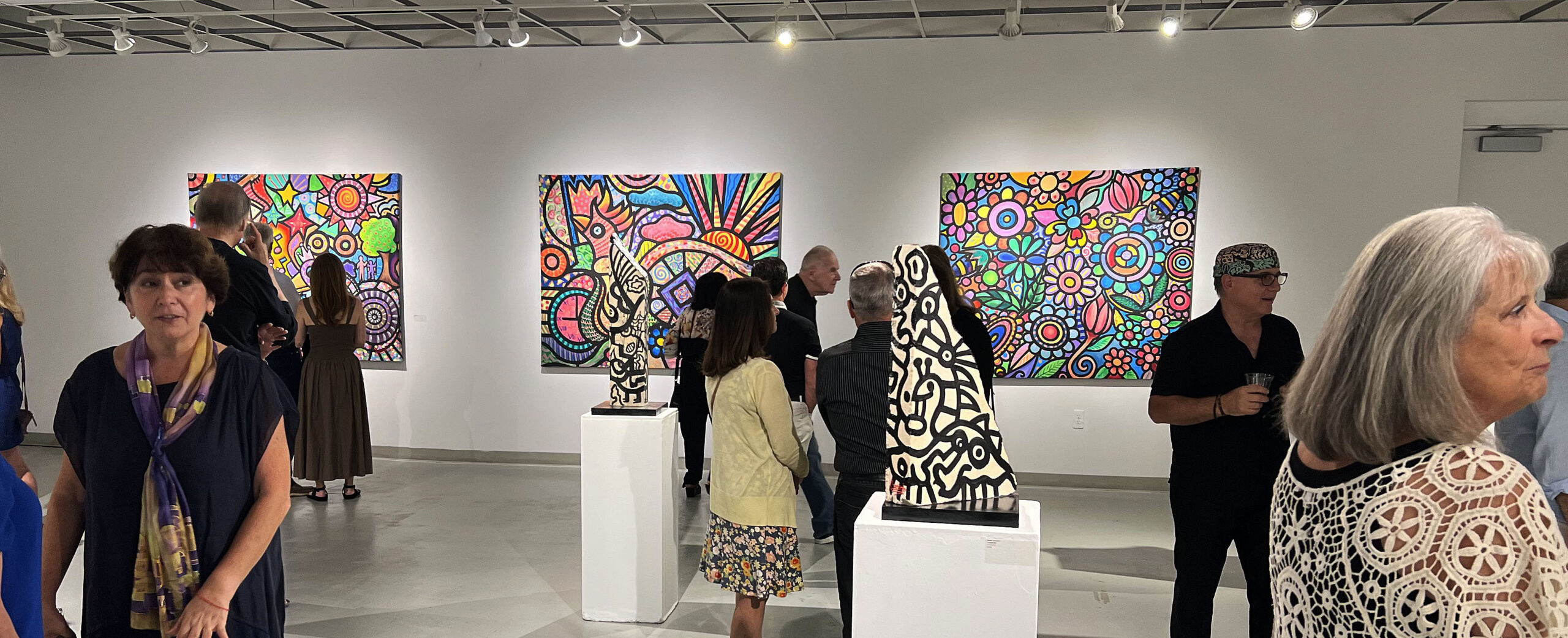
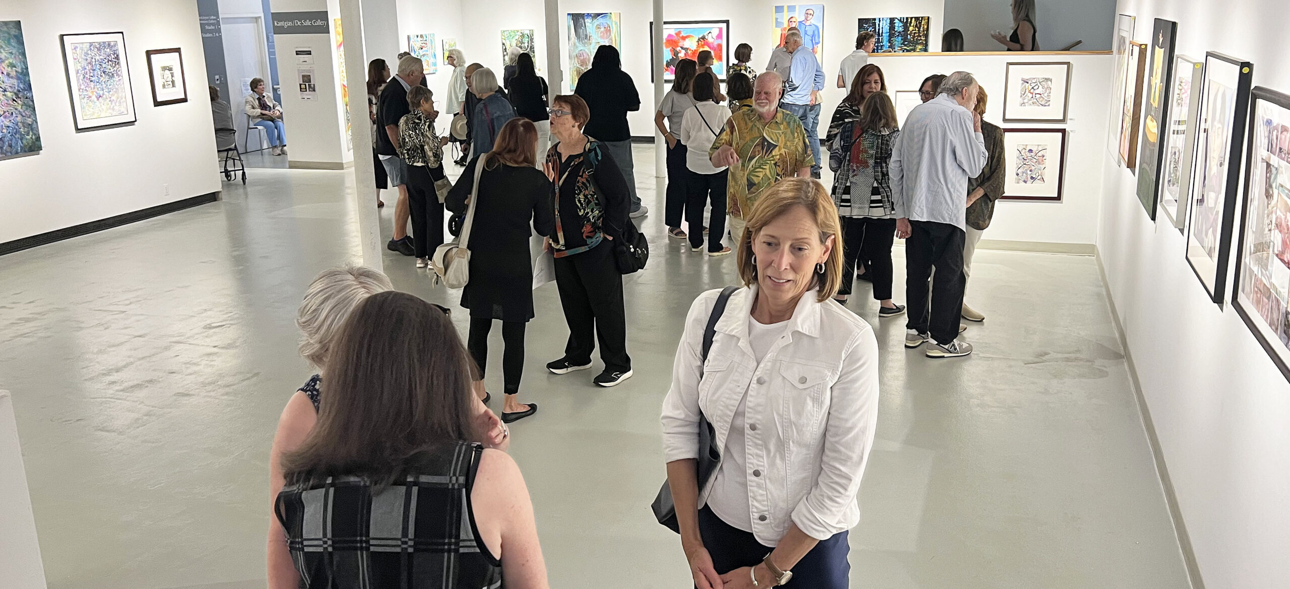
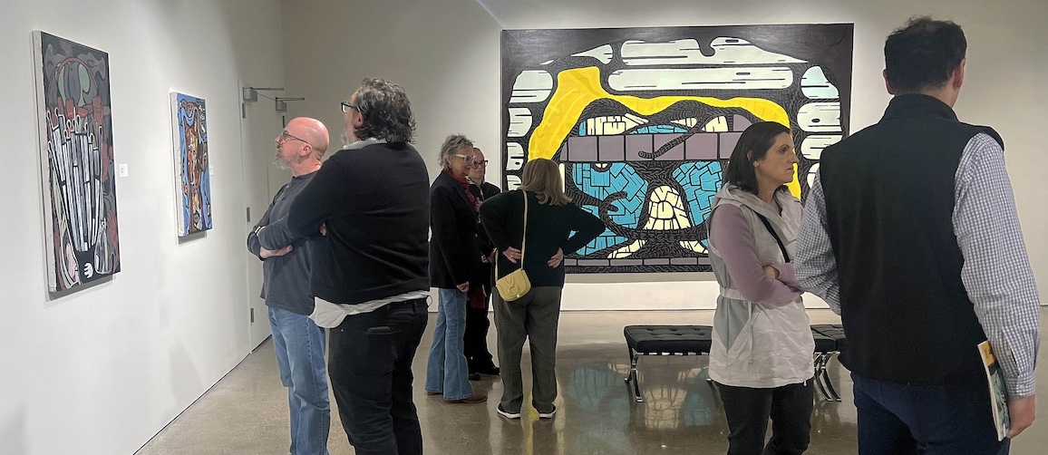
An installation view of Jim Chatelain: Correcting Past Mistakes,  will be up at the Oakland University Art Gallery through November 24, 2024 (Photos courtesy of OUAG, except where noted.)

Continuing its tradition of outstanding exhibitions, the Oakland University Art Gallery presents Jim Chatelain: Correcting Past Mistakes, up through November 24. The 40 works on display, created between 2001 and 2024, represent an eruption of color and tangled abstraction, in some cases intriguingly intestinal in appearance. Altogether, the show opens a fascinating window on the non-figurative work of the celebrated Cass Corridor artist, now in his mid-70s, who’s still producing at an impressive clip.

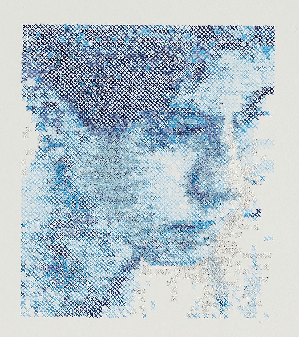
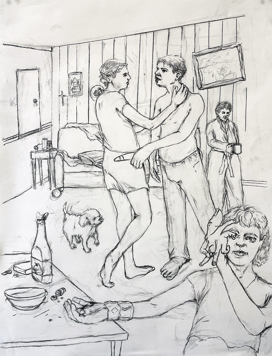
Many people may be familiar with Chatelain’s earliest paintings that caused a sensation in the much-talked-about 1978 “Bad” Painting show at Manhattan’s New Museum — crudely outlined urban figures of the sort you might have seen on Cass Avenue in those years, rendered with seemingly slapdash brushstrokes and an air of menace. Subsequent figurative work involved a weirdly magnificent series of facial portraits, full of distorted and bulbous features, that – never mind their odd appearance – manage to be both poignant and disturbing in equal measure.

In a biographical essay for the Paul Kotula Projects gallery in Ferndale, Robert Storr – who long headed the Museum of Modern Art’s department of painting and sculpture – urged art enthusiasts to “take a walk on the wild side with [Chatelain] as your guide. You’ll meet a cast of hard-bitten urban types, [with] extraordinary toughness whose heavily lined faces bear the unmistakable trace of what it takes to just keep going in the late modern purgatory that is big city life in our time. Chatelain knows these people inside and out; he’s their recording angel.”

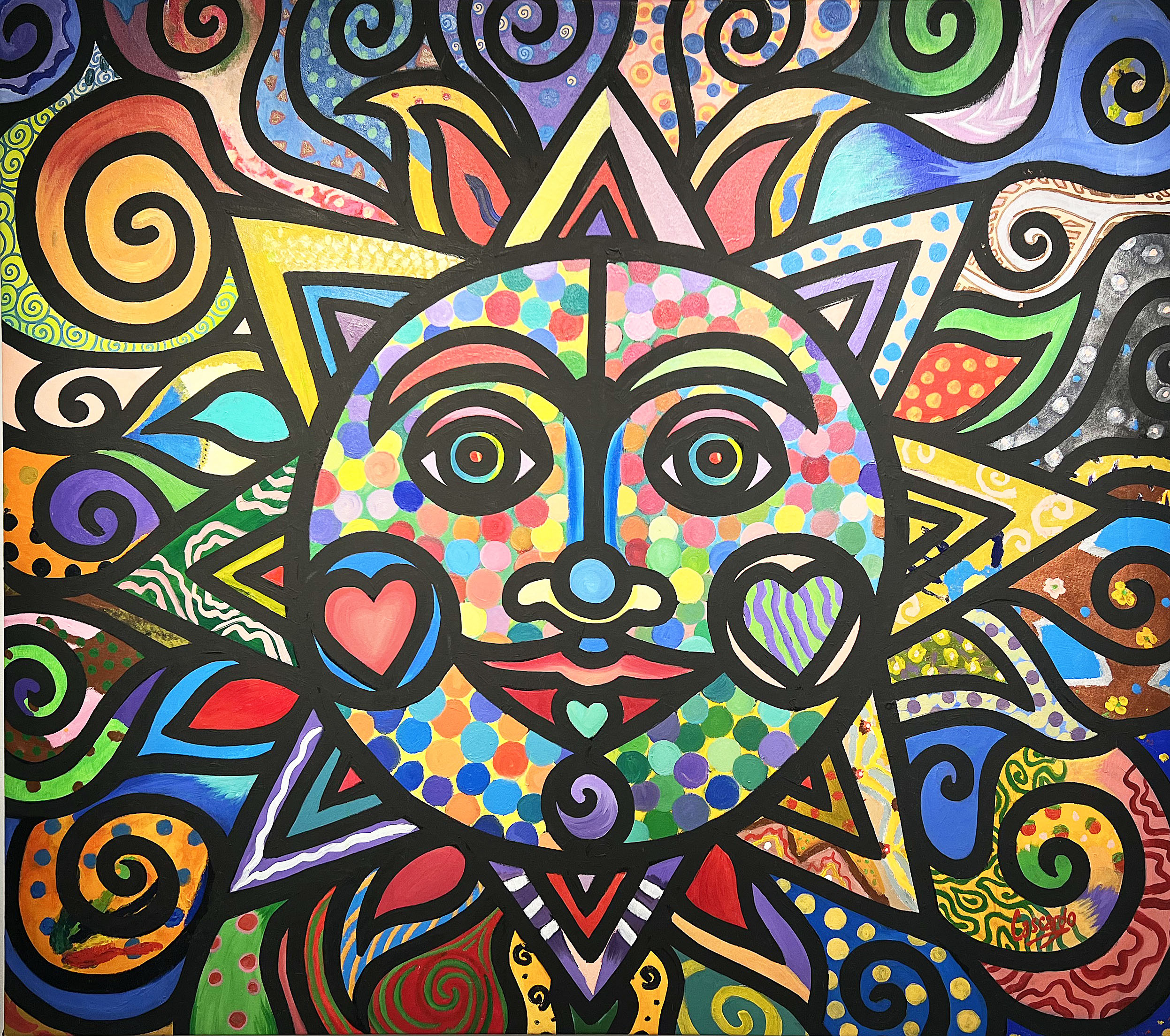
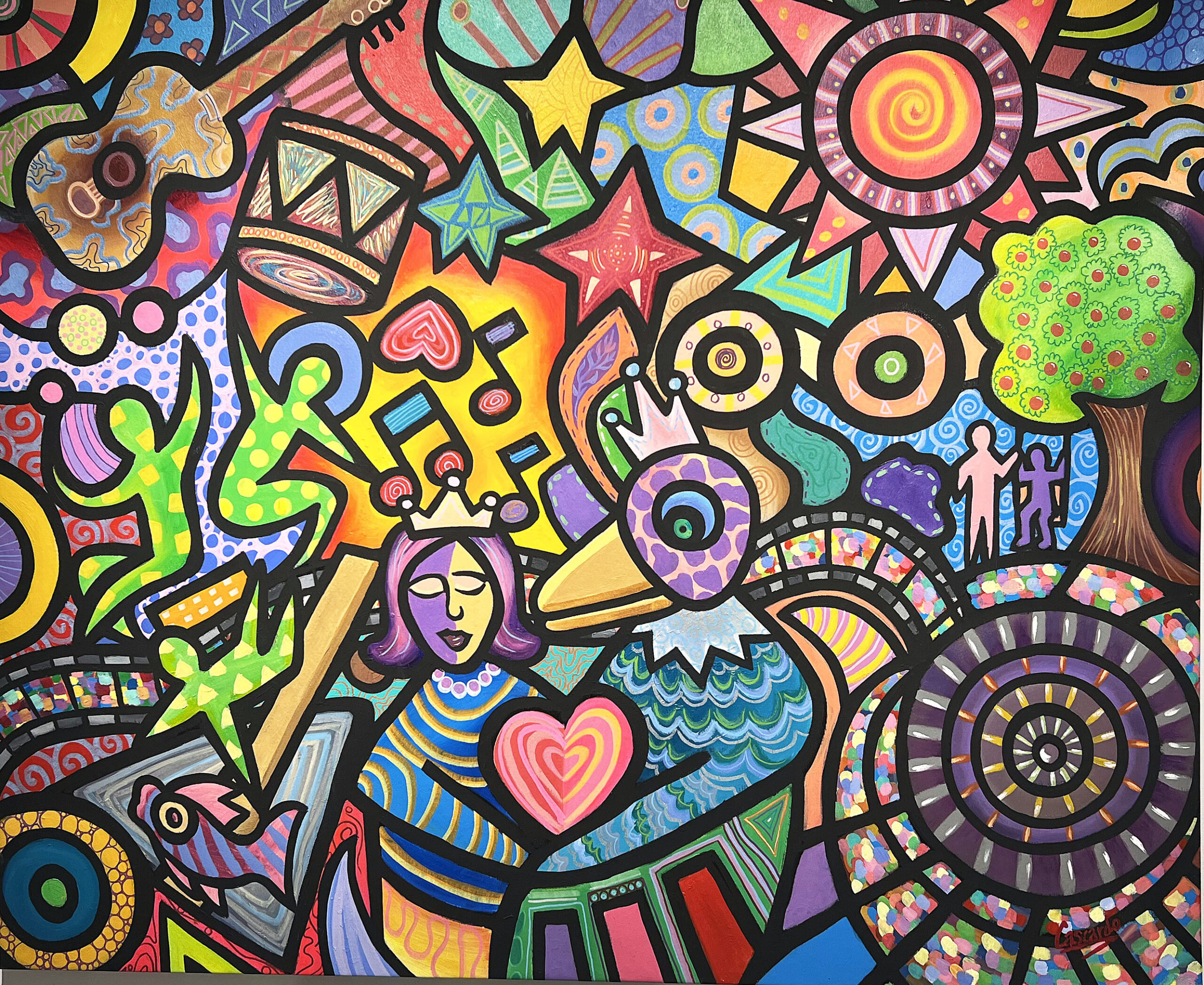
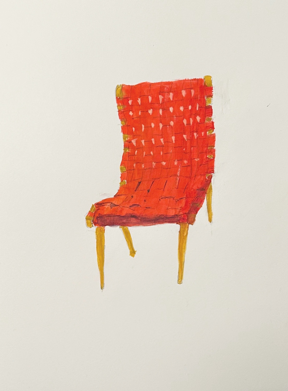
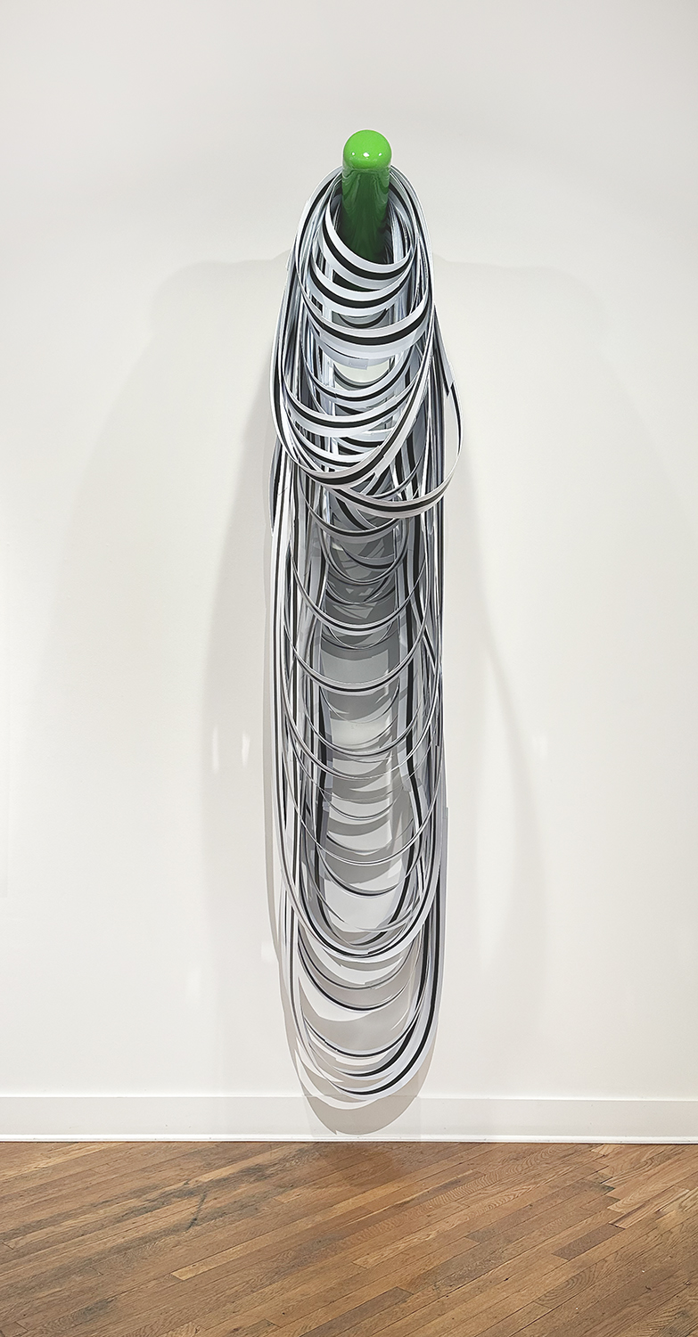
Jim Chatelain, Untitled, Acrylic paint, paint pen 0n linen paper, 24 x 20 inches, 2023.

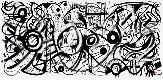
Compared with those gritty predecessors, one of the delights of Correcting Past Mistakes is just how beautiful these twisted abstracts, often suggesting collapse and calamity, really are. Curator Ryan Standfest, an artist who teaches at Oakland and has long been a Chatelain admirer, describes the works as “frenzied and active” with an “aura of tumult.” Yet these are meticulously crafted works, never mind their vaguely cartoon-like appearance. “The paintings are vibrant, with colors that pop,” Standfest says. “One color doesn’t cancel out the other – they support each other quite well.” This echoes the artist’s own appraisal. In an interview with Standfest in the show’s handsome catalog, Chatelain describes his choice in colors as “really pop-y. My palette is really like that. It’s the blue of the Superman costume and the red of the cape.”

Chatelain, who maintains a studio in Ferndale as well as one in Delhi, New York, about 120 miles from Manhattan, hails from Findlay, Ohio. In 1967, he transferred from Findlay College to  Wayne State University, sight unseen, graduating with a BFA in 1971. While at Wayne, he studied painting with John Egner, a professor who was a co-founder of the legendary Willis Gallery and a key mentor to much of the early Cass Corridor talent. Their collective work finally got the official stamp of approval in 1980 when the Detroit Institute of Arts pulled together the seminal show Kick Out the Jams: Detroit’s Cass Corridor 1963-1977.

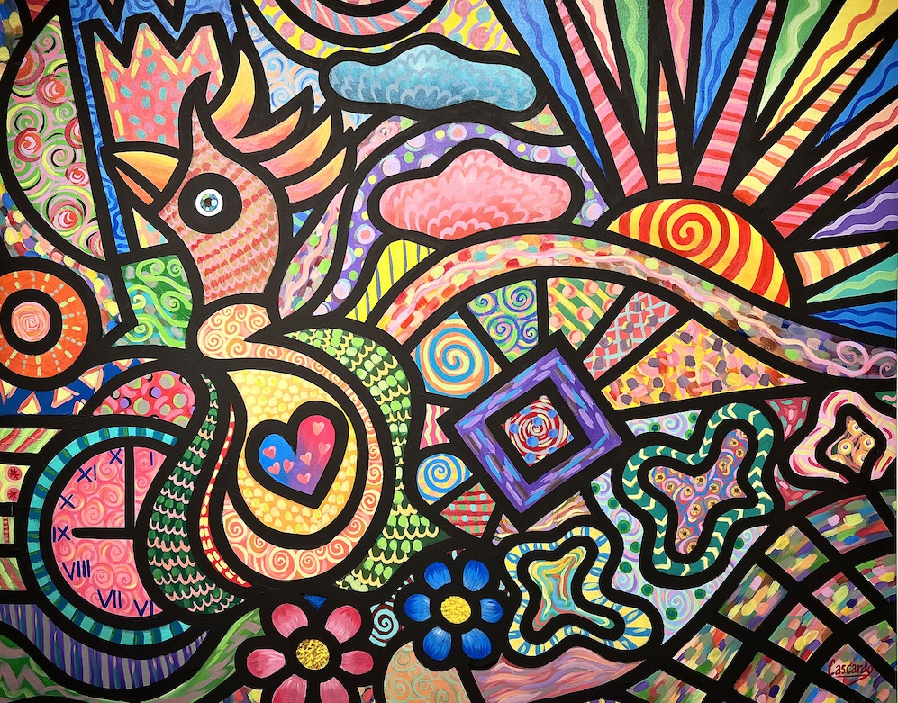
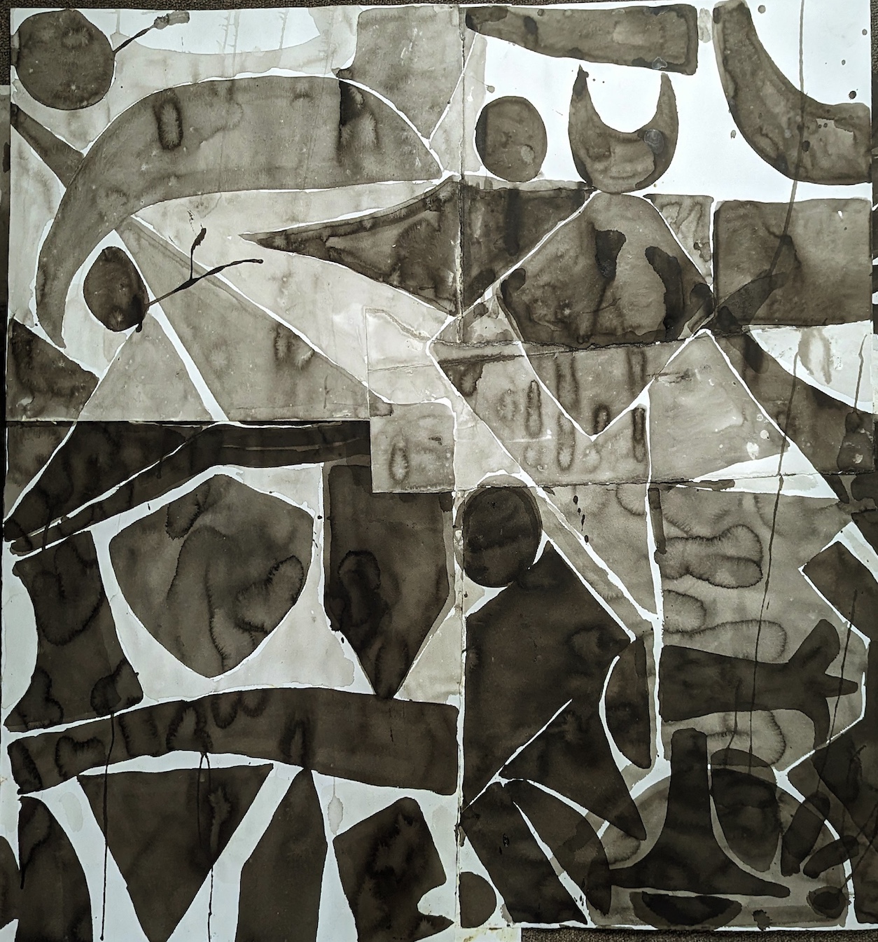
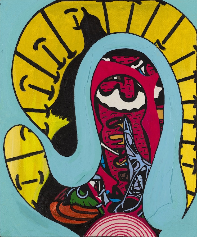
Jim Chatelain, Basket, Acrylic paint pen with vinyl paint on paper and mat board, 21 ½ x 17 inches, 2024.

The recent abstracts on display at OUAG are remarkably immersive and seductive. Go ahead — just try to resist their labyrinthine magnetism. In her catalog essay, critic Lynn Crawford describes the works as “unfamiliar, uncanny, yet bursting with life.” And indeed, it’s hard not to get sucked into their twisted contours, where something – digestion, perhaps? – is clearly going on. For her part, Crawford refers to “blended strands of lifeforms” that “radiate an energy and are possibly equipped to take on initiatives themselves.”

Yet there’s also a series of constructions that employ Phillips-head screws as their chief element and mostly rely on a muted palette that stands in sharp contrast to the boldly colored works that constitute the majority of the show. One can’t help but be struck by the exertion that went into these pieces, and they manifest an air of struggle and threat that sets them apart, echoing some of the ominousness in Chatelain’s early figurative work.

Even the title of one, Head on a Plate, implies danger. Standfest laughs when asked about these works. “There are an insane number of screws on them,” he says. “Talk about violence! Just imagine Jim screwing each one of those in, over and over.” He adds, “I’ve never asked him if he had a strategy, whether he marked off where they would go or just made it up as he went along.”

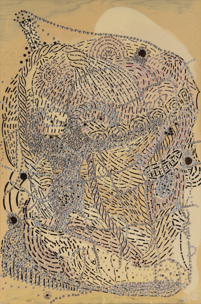
Jim Chatelain, Head on a Plate, Enamel paint, screws on plywood, 48 x 32 inches, 2001.


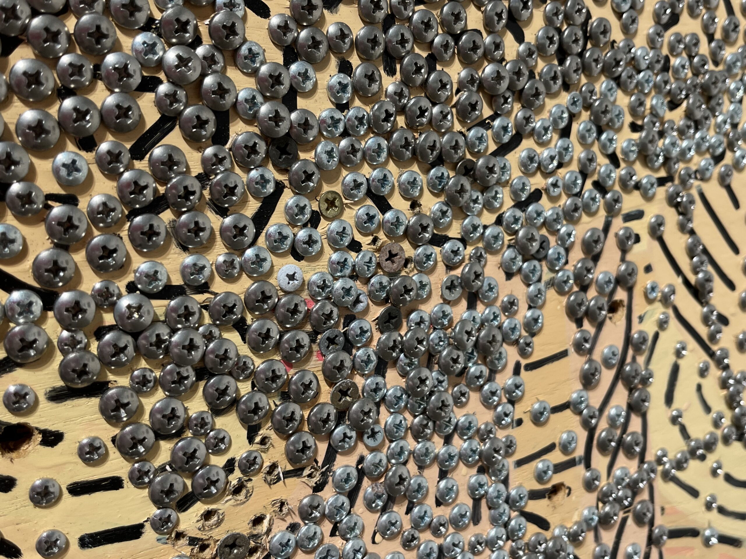
Jim Chatelain, Head on a Plate (detail), Enamel paint, screws on plywood, 48 x 32 inches, 2001. (Photo: Detroit Art Review)

Yet the title above also points to another key element of Chatelain’s oeuvre, a dark humor that ripples through many works. Standfest argues there’s “something of a violent physical comedy to Jim’s work that links to the [earlier] figures in some ways. He describes the figurative work as ‘situations,’ and there’s a tension in that.” Chatelain himself acknowledges a certain puckishness to much of what he’s produced. “In those early 70s figure paintings, there’s humor in those. They’re cartoonish in some ways,” he says. “It’s a little harder to do with the abstract work, but I think it can be done, [though] I can’t say that’s the case with all of it or most of it.” Chatelain sums it all up in a refreshing artistic philosophy: “It’s a failed painting that doesn’t have a little humor coming out of it.”

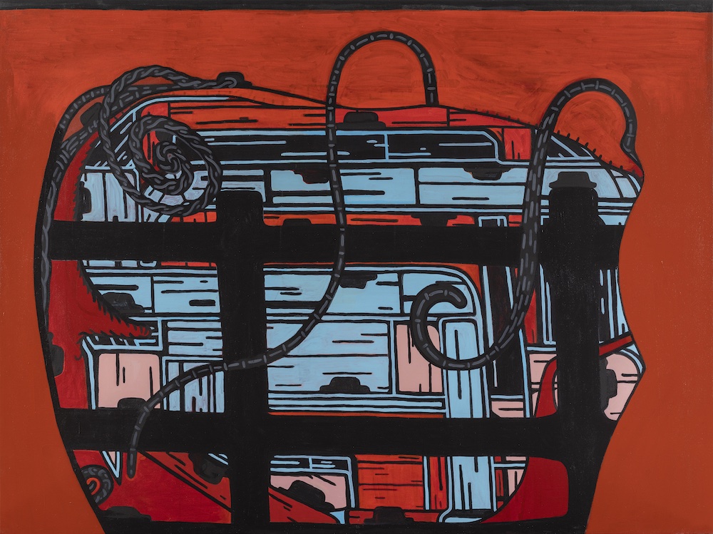
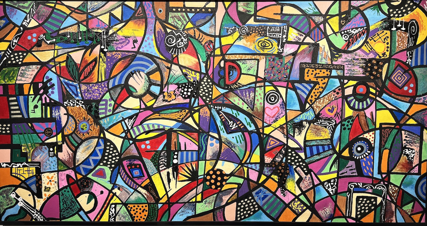
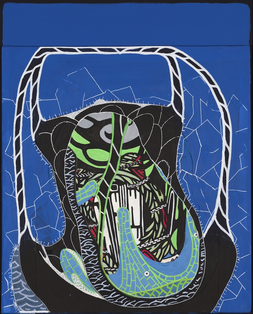
Jim Chatelain, The Caged Flea, Acrylic on canvas, 72 x 96 inches, 2015.

The gallery will host three talks open to the public before the show closes. On September 26, curator Ryan Standfest will lead a walkthrough of the show. On October 30, Dan Nadel, who’s curating an alternate history of American art in the 1960s for New York’s Whitney Museum, will speak. On November 6, Standfest will interview Chatelain. All gallery talks take place at noon.

Jim Chatelain: Correcting Past Mistakes will be up at the Oakland University Art Gallery in Rochester through November 24, 2024.

[adrotate group=”2″]

Daniel Cascardo & New Exhibitions @ BBAC

Daniel Cascardo, Installation image

The Birmingham Bloomfield Art Center gets a jump on the new fall season with three exhibitions opening in the last days of August that include Daniel Cascardo:  Vision of Reality, An Artist’s Perspective in the Robinson Gallery, the Birmingham Society of Women Painters in the Kantgias-DeSalle Gallery, and work by Hannah Miller. The exhibitions opened on August 23 and extend through September 19, 2024.  “It’s really a very inclusive show,” said Annie Van Gelderen, president and chief executive of the art center, noting the range of emerging and veteran artists in the exhibit.

Daniel Cascardo, Luminosity

In the work of Mr. Cascardo, the painting Luminosity reflects the most traditional abstraction with a large and diverse collection of colorful shapes and patterns that rely on his black line borders to hold the composition together.   There is a calculation of placing swaths of color in positions across the rectangle from left to right and from top to bottom. If you wonder why this abstraction feels right, it is because of this calculated balance of line, color, and shapes that make their way equally into all parts of the composition.

He says, “The versatility of acrylic paint allows me to work quickly, capturing the energy of the moment through a freestyle technique. My inspiration comes from my imagination, spirituality, life experiences, creativity, music, and the arts. Through my work, I strive to communicate joy, happiness, and beauty, inspiring others to explore their creativity and engage in the artistic process.”

Daniel Cascardo, Rooster’s Melody

In the artwork, Rooster’s Melody, a similar technique of colorful patterns is encapsulated by a black border outline. Still, it supports a rooster motif near the center of the composition and is less abstract in its intent.

Daniel Cascardo, O Soi Mio

In the work Ol So Mio, the composition is more formal and illustrative in its intent. Balanced in shape and design, the composition is easier to understand, and the color is now heavier and darker in the lower half of the canvas, providing a top and bottom.

Daniel Cascardo, Harmonic Encounter

By using a variety of standard and recognizable shapes, figures, animals, instruments, and a landscape, Harmonic Encounter is a universe unto itself, even more illustrative in the artist’s attempt to create an overall happy place for us. Cascardo says, “My childhood experiences and cultural influences have significantly shaped my artistic vision, particularly my deep connection to my Italian American heritage. The food, travel, people, architecture, and fashion that have shaped my life inspire my artwork, allowing me to create unique and powerful imagery. Through my art, I hope to evoke emotions, inspire creativity, and engage in the world’s beauty.”

Dainiel Cascardo, Virtuoso

Daniel Cascardo attended College for Creative Studies, Detroit, MI, Art Direction/Design, 1985

Henry Ford College, Dearborn, MI, Fine Art, 1983

Goldman Sachs 10k Business Alumni, 2018

Birmingham Society of Women Painters

Birmingham Society of Women Painters, Installation image

The Birmingham Society of Women Painters, founded in 1944, comprises residents from the surrounding metro Detroit area. With more than 50 members, they exhibit a diverse approach to painting, including watercolor, oil, acrylic, and mixed mediums. This exhibition, Brushstrokes, is in the Kantgias-DeSalle Gallery through October 8, 2024, and the juror is Meigan Jackson, a contemporary fine artist whose work is both a painter and paper artist, between the visual real and its abstracted essence.

Hannah Miller, Oddly Silent

Hannah Miller: Parallel Seekers   Here, in her Hopper-esk painting, the artist reflects a socially conscious creator and innovator who uses art and design to make the world a more inclusive, kind, and welcoming place.

www.bbacartcenter.org

In the fourth gallery are works by BBAC students of Tim Widener.

Hours: Mon-Sat, 10a-4p

248.644.0866

Exhibitions supported by Bank of Ann Arbor / Birmingham

[adrotate group=”2″]

Eric Mesko @ Hatch Gallery

Eric Mesko, Self Portraits, 1990, 10” x 15”, acrylic on cardboard.

Disorientation, exhilaration, and amusement are feelings gallery visitors will experience upon walking into Hatch Gallery right now, where work by Detroit artist Eric Mesko is on display. “Eric Mesko Ain’t Dead Yet” is a retrospective of sorts, though not a complete one. Christopher Schneider and Sean Bieri, who curated the exhibition, have selected a generous slice of Mesko’s 50-year output from a rich trove of art and artifacts in the artist’s Ferndale house and studio. Most of the work is from the 1990s and gives a taste, at least, of the preoccupations and style of expression of this artist and activist, whose work was described by Rebecca Mazzei of the Detroit Metro Times in 2005 as “extreme expressionism.”

Eric Mesko, Oil Wars, 1990, 24” x 36” acrylic and oil stick on board.

Mesko’s childhood in the 1940s, as the son of a lieutenant colonel in the Marines, gave him a unique position from which to view the place of America on the world stage, for good or ill. His frequent moves from military base to base, both in the U.S. and worldwide, gave him a global perspective on both his own American identity and world cultures. Though an inveterate natural draftsman from an early age, Mesko didn’t take an art class until his last year in high school. He enlisted in the Marines after graduation and served three years, until 1967, and only began to study art seriously in the late 1980s when he earned both a B.F.A and an M.F.A. from Wayne State University.

Eric Mesko, installation, Exhibition poster (2024), small Uvalde Kid, (n.d.) wood, found objects.

In a 2002 essay on Mesko, Dick Goody, Director of the Oakland University Art Gallery, described his work as “more steeped in the traditions of cartoon comics than twentieth-century art,” a statement that is both accurate and incomplete. While many of the works on paper undeniably reference the visual tropes of comic books, Mesko’s sculptures equally suggest his deep familiarity with Chicago Imagists like H.C. Westermann and with post-World War II folk art traditions such as hand-painted signs and improvised cultural artifacts. He also claims familiarity with, and appreciation for, American regionalists like Thomas Hart Benton, and even names Jackson Pollock and El Lissitzky as influences. In the end it is impossible, and possibly pointless, to describe Mesko as either an insider or an outsider. His work, while encompassing all these influences, has coalesced into its own unique perspective; he is both insider and outsider,  a sophisticated thinker making work within a primitivist visual idiom.

Eric Mesko, Batter, (n,d) wood assemblage, found objects,


Eric Mesko, Uvalde Kid, 1998, 30” x 42” x 17” wood, found objects.

Many of the recurring images in the exhibition circle around the identity and meaning of American masculinity. G.I.’s., baseball players and cowboys figure prominently In Mesko’s personal iconography as symbols of American values past and present.  The Uvalde Kid, named after one of many childhood homes of the artist, is one of the larger assemblages in the exhibition. Astride his horse and brandishing a pistol, he is a reminder that frontier violence is an enduring feature of the American psyche, recently made immediate by the mass shootings in Uvalde, Texas. The G.I.’s in Mesko’s pictures, too, practice sanctioned violence in furtherance of national goals. Yet they seem helpless, cogs in an oil-fueled war machine.  His large acrylic and oil stick painting on panel Oil Wars (1990) and the small wooden tank that sits in front of it, are two of several artworks that reference the wars in Iraq and the U.S.’s historically vexed relationship to the oil economy.

Eric Mesko, Oil Warrior, 1991, 11” x 14,” Ink and watercolor on paper

Lest all of this should appear too grim, let it be noted that many of Mesko’s images and artifacts are comic. In Self Portrait as Lord Greystoke, the artist pictures himself as Tarzan, bemused atop a herd of hippos. In another large painting, Mesko portrays the sculptor Tony Smith in a battle for art supremacy, King Kong vs. Godzilla style. Mesko’s pictures can be light-hearted, even silly, although they often make an ironic point, as in his American Voter drawing.

Eric Mesko, Self-Portrait as Lord Greystoke, 1984., 11” x 14,” ink and watercolor on paper.

The world’s oceans and the fish that swim in them are also favorite images in “Ain’t Dead Yet.” The sculpture Moby Dick  (1990, now in the Wayne State University art collection)  is a virtuosic evocation, in found materials, of Captain Ahab’s mythic nemesis. The series Jonah and The Whale, ten paintings on vintage New York Times papers, tell what would have been a really big fish story if only there had been newspapers in Biblical times. The altered book Fish or Cut Bait recounts another, more intimate tale of idyllic fishing trips. A large assemblage, Great Fish of Ferndale, anchors the center of the gallery.

Eric Mesko, Jonah and the Whale (series), 1989, acrylic on New York Times

Mesko describes and critiques contemporary mass culture in America as more conformist, more materialistic and more predatory than the local, particularized regional artifacts and architecture of his American childhood in the 1940’s. “I grew up,” he says, “in the last era where idealism still meant something …The innocence of all that is lost but it wasn’t a fake innocence because in the late forties there was still a lot of idealism in the country and somehow that was important to me from an early age.”

Eric Mesko, American Voter, 1992, 9” x 12,” Ink on paper

After the initial shock and awe of encountering Mesko’s extraordinary vision, we begin to understand his unsentimental assessment of America and Americans. He may be a disillusioned patriot, but he retains enough optimism to keep working into his eighties. As he has put it, “We have to face our future head-on and accept our tasks with determination.“ Or, in the parlance of the show’s title, “We ain’t dead yet.”


Hatch Gallery

Hamtramck, MI

https://www.hatchart.org/   

July 13 to August 4, 2024

[adrotate group=”2″]

Look At Me! Look At Me Now! Magical World of Dr. Seuss @ Art Leaders Gallery

An installation view of Look At Me! Look A Me Now! Exhibition at West Bloomfield’s Art Leaders Gallery, up through March 30.

In a treat for anyone who loves cartoons, The Imaginative, Profound & Magical World of Dr. Seuss: The Rare Editions Exhibition will be up at Art Leaders Gallery in West Bloomfield through March 30, 2024. On Saturday, March 23, the gallery will host a special open house for the Seuss exhibit from 3 to 6 p.m.

This show of prints and sculptures, which you’ll find at the center of the Art Leaders space, is surprisingly magnetic. On display are a number of treasures that will appeal to fans, including several “before and after” pairings, where the original rough draft – with multiple, seemingly messy lines working out each visual element – is framed in a diptych with the polished, final version. It makes for fun viewing and gives a little glimpse into the process that produces what looks like simple art.

Consider the two versions of Look at Me Now, starring Seuss’ best-known creation, the Cat in the Hat, who’s juggling all manner of breakable items while balancing on a ball. It’s classic Seussian absurdity, and an almost universally recognizable childhood image.

Dr. Seuss, Look At Me Now!, Look At Me Now!,  Diptych, 26.5 by 17.5 inches. (Photos courtesy of Art Leaders Gallery.)

Dr. Seuss published his first children’s book, “And to Think I Saw That on Mulberry Street,” in 1937. But it was “The Cat in the Hat” exactly 20 years later that really catapulted the artist into the pop-cult stratosphere. It was fame that never flagged. His death in 1991 at 87 prompted all sorts of elegiac summaries: In its front-page obituary, the New York Times called Seuss “the modern Mother Goose,” while Time Magazine declared he was “one of the last doctors to make house calls – some 200 million of them in 20 languages.”

(“The Cat in the Hat,” by the way, was significant not just for its unhinged hero — who generated childish excitement and anxiety in equal measure — but also because it employed a limited vocabulary of about 220 “beginner’s words” recommended by reading specialists. Seuss then wrote it all up in a cadence — “anapestic tetrameter,” if you must — that was particularly easy for young readers to master and learn. From there on in, his books aimed to make learning how to read fun – quite a shift from the old “Dick and Jane” primers of the time.)

One of the charms of Seuss’ work, of course, has always been its complete lack of pretension and his willingness to make fun of himself. Four months after the launch of “Cat in the Hat,” the Saturday Evening Post helped the artist do just that when it ran what would become the most-iconic Seuss self-portrait, The Cat Behind the Hat – featuring the good doctor as his famous feline, looking dyspeptic, complete with stovepipe hat – in its July 6, 1957 issue.

Dr. Seuss, The Cat Behind the Hat, 20 by 10 inches.

Theodor Seuss Geisel – aka Dr. Seuss – initially got his start in advertising. Two years out of Dartmouth College in 1927, the young Geisel, from Springfield, Massachusetts, got a job drawing ads for “The Flit” — a household insecticide spray Standard Oil of New Jersey produced which promised to kill almost anything that crept, fluttered or crawled. Charmingly, the style of one ad from the early forties is unmistakably Seuss-ian, with an impish bug in a red-striped shirt who’s just flown right through a woman’s fancy hat, sparking predictable outrage.

Once Seuss was working full-time on children’s literature – his output was staggering – he took to working on his own personal art at night and on weekends, much of which is in the Art Leaders exhibition. Some, like the luridly colored Worm Glowing Bright in the Forest in the Night, approach abstract expressionism, albeit with the puckish intrusion of a befuddled yellow worm. Others, like Life’s a Great Balancing Act, play with patterns in a way that’s slightly reminiscent of Escher, but always, again, with a dash of oddball humor.

Dr. Seuss, Life’s a Great Balancing Act, 30.75 by 22 inches.

A man of his times, Seuss has, perhaps inevitably, come under fire for depictions of minorities that now seem tone-deaf and condescending. The Amazing World of Dr. Seuss Museum in Springfield, Massachusetts, announced in 2017 that it would replace a mural that included such images. And in 2021, the Seuss estate said it would voluntarily stop selling six titles, including Mulberry Street, thought to contain egregious examples of racial and ethnic stereotypes.

Happily, the art in this spirited exhibition avoids those sorts of dated allusions. Most just underlines Dr. Seuss’ gift for enchanting idiocy, and his ability to spin magical, gossamer worlds out of thin air. His approach is almost unfailingly gentle, indulgent, and tolerant of the frailties of this brittle world. In Seuss-land, all human rancor can be boiled down to the contentious standoff between two neighbors featured in My Petunia Can Lick Your Geranium, competing over who had the better garden.

Dr. Seuss, My Petunia Can Lick Your Geranium, 27 by 34 inches.

 The publisher of The Art of Dr. Seuss, Robert M. Chase, notes that almost everyone has a “significant Dr. Seuss memory” and that any number of creative artists and writers acknowledge the master’s influence on their work. “Indeed,” writes Chase on the website of the same name, “what Walt Disney was to entertainment, Theodor Seuss Geisel was to art and literature.”

Dr. Seuss, Cat from the Wrong Side of the Tracks, 22 by 44 inches.

The Imaginative, Profound & Magical World of Dr. Seuss: Look At Me! Look At Me Now! The Rare Editions Exhibition will be at West Bloomfield’s Art Leaders Gallery through March 30, 2024.

[adrotate group=”2″]


Drawing: Detroit @ David Klein Gallery

Tylonn J. Sawyer, Black Man on a Horse: Bayard, 2024, charcoal, pastel and glitter on paper,72” x 88.5” All Photos courtesy of David Klein Gallery

The  21 artists whose work is on view at David Klein Gallery right now can tell you—and show you–that drawing has its own special kind of magic.  “Nothing up my sleeve here,” these creatives seem to say as they produce, with a flourish, images conjured from imagination and a few rudimentary materials. As individual as a fingerprint, each artist’s contribution defines, and sometimes expands, our understanding of what a drawing can be and do.

Tylonn J. Sawyer’s life-size equestrian figure  Black Man on a Horse: Bayard, anchors the exhibition and is very much front and center.  The image depicts civil rights hero Bayard Rustin astride a barely controlled horse that may leap off the wall at any moment. The charcoal on paper drawing invites comparison to Kehinde Wiley’s Officer of the Hussars (2007) at the Detroit Institute of Art but switches out that painting’s pretty fussiness for austere formal and emotional rigor on themes of Black history and identity. The addition of a field of black glitter at the lower portion of the composition adds a mythic edge.

Cydney Camp, Friendly Place, 2024, graphite on paper, 36” x 36

Many of the portrait drawings in the exhibition are life-size or larger. Kim McCarty’s faces of young women, Charles Edward Williams’s handsome swimmers, Cydney Camp’s Friendly Place and Whitfield Lovell’s Spell #16 demand our attention with their scale and skill.  Panning out from the close-up view, Robert Schefman and Joel Daniel Phillips include drawings of single figures that place their subjects within a specific time and place for added context.

Marianna Olague, Head Over Heels, 2024, graphite, gouache and colored pencil on paper, 30” x 22”

Several of the large figurative portraits depend upon unorthodox points of view to capture our interest.  Conrad Egyir’s recessive figures turn away even as he uses the tools of their creation, arranged on shallow ledges below the images, to draw us in. Kelly Reemtsen, as usual, focuses on the implied social status of her fashionable ladies and the subtle menace of their sharp tools.  Marianna Olague literally turns self-portraiture on its head with a drawing of sneaker-clad feet seen from below, as if she is taking a selfie while lying on her back.

Cayce Zavaglia, Raphaella Blue Cross-Stitch, 2021, ink and hand embroidery on Arches paper, 15” x 11”.

A number of the most impressive still-life drawings depend upon their large scale for impact. Jessica Rohrer’s breathtakingly intricate Red Coleus invites close looking; it irresistibly draws the viewer into a close inspection of the minute red and purple leaves within the magnified whole.  Armin Mersmann’s imposing—and decomposing—giant pear is another spectacular example of how scale can be employed to capture our attention.

Mary-Ann Monforton, Red Chair, 2023, watercolor and pencil on paper, 11” x 8.5”

But large formats don’t entirely dominate. Shea Burke’s sweetly intimate watercolors and Cayce Zavaglia’s embroidery on paper, Raphaella Blue Cross-Stitch, ably make the point that a drawing needn’t be large to be impactful.  Maryann Monforton’s quirky colored pencil drawings invite us into her cozy, art-filled home, where her friendly, funny chairs and snack-laden plates offer hospitality on paper. Willie Wayne Smith’s improvised interior, Boomerang, suggests a situational mystery and raises more questions than it answers. Jack Craig’s finely detailed pencil drawings appear at first to be abstractions, but upon close inspection turn out to accurately reflect his three-dimensional freeform bronze constructions.

Willie Wayne Smith, Boomerang, 2019, charcoal on paper, 24” x 18”

Though the exhibition belongs (mostly) to the figurative realists, a few very welcome abstract drawings make the curatorial cut.  Neha Vedpathak’s light and air-filled Untitled Drawings #1, #2 and #3, with their delicate but insistent marks in metallic dust, charcoal powder, graphite and acrylic, seem to levitate just in front of the paper.  In contrast, Susan Goethel Campbell’s dark, pierced and stained Night Garden builds upon the themes of her recent solo show at the gallery with moody intensity.  Benjamin Pritchard’s paper and ink collage, Night Shapes, is a special visual treat. The dreamlike architecture of geometric shapes and symbols is both weighty and weightless, simple yet enigmatic. Are there more of these beauties lurking somewhere in his studio?  I hope so.

Benjamin Pritchard, Night Shapes, 2021, ink and collage on Arches paper, 42” x 39”

Perhaps the most physically imposing—and formally complex—piece in “Drawing: Detroit, A Line Goes for a Walk” is Emmy Bright’s Big Drawing which combines printmaking, sculpture, conceptual art and assemblage. It is all—and none—of the above. Bright, an artist in residence in print media at Cranbrook Academy of Art, repeats a single line printed on paper many times, then attaches the papers end-to-end to form a bale (A bunch? A bundle?) that hangs on a metal peg on the gallery wall.

The art and craft of drawing represents a core competency for most artists and certainly of the artists in this exhibition. “Drawing: Detroit” offers gallery visitors an eclectic mix of works on paper that combine impressive technical mastery with considerable conceptual interest.  These artworks on paper, made by some of the city’s most accomplished practitioners, will be on view until March 15, 2024.

Emmy Bright, Big Drawing, 2023, polystyrene grommets, acrylic, steel peg, variable dimensions.

Exhibition: Drawing: Detroit, at the  David Klein Gallery  On view through March 15, 2024.

[adrotate group=[“2”]

Page 2 of 15

Powered by WordPress & Theme by Anders Norén