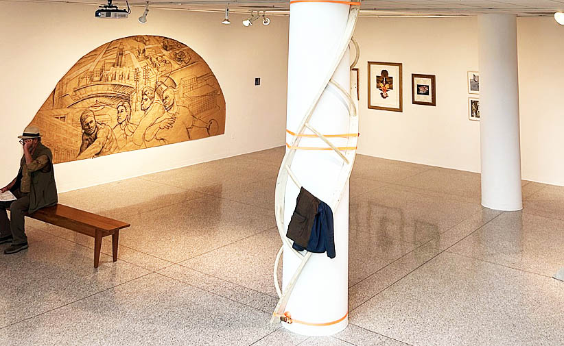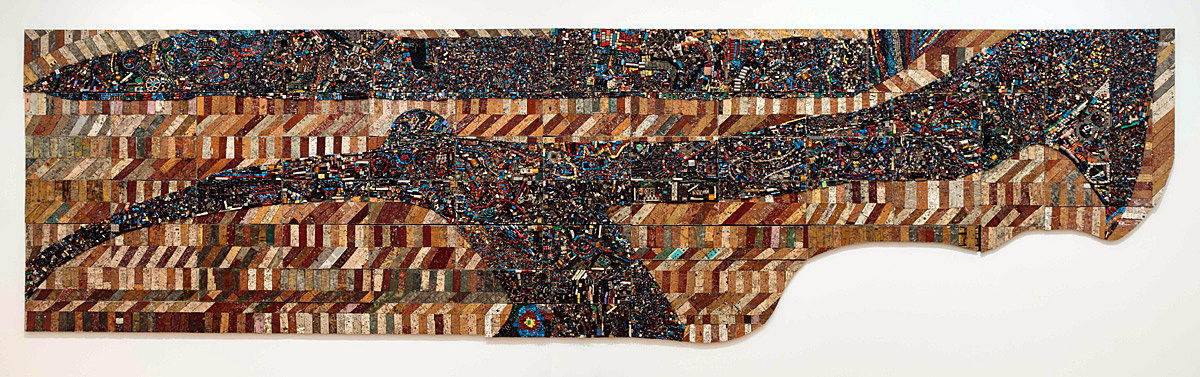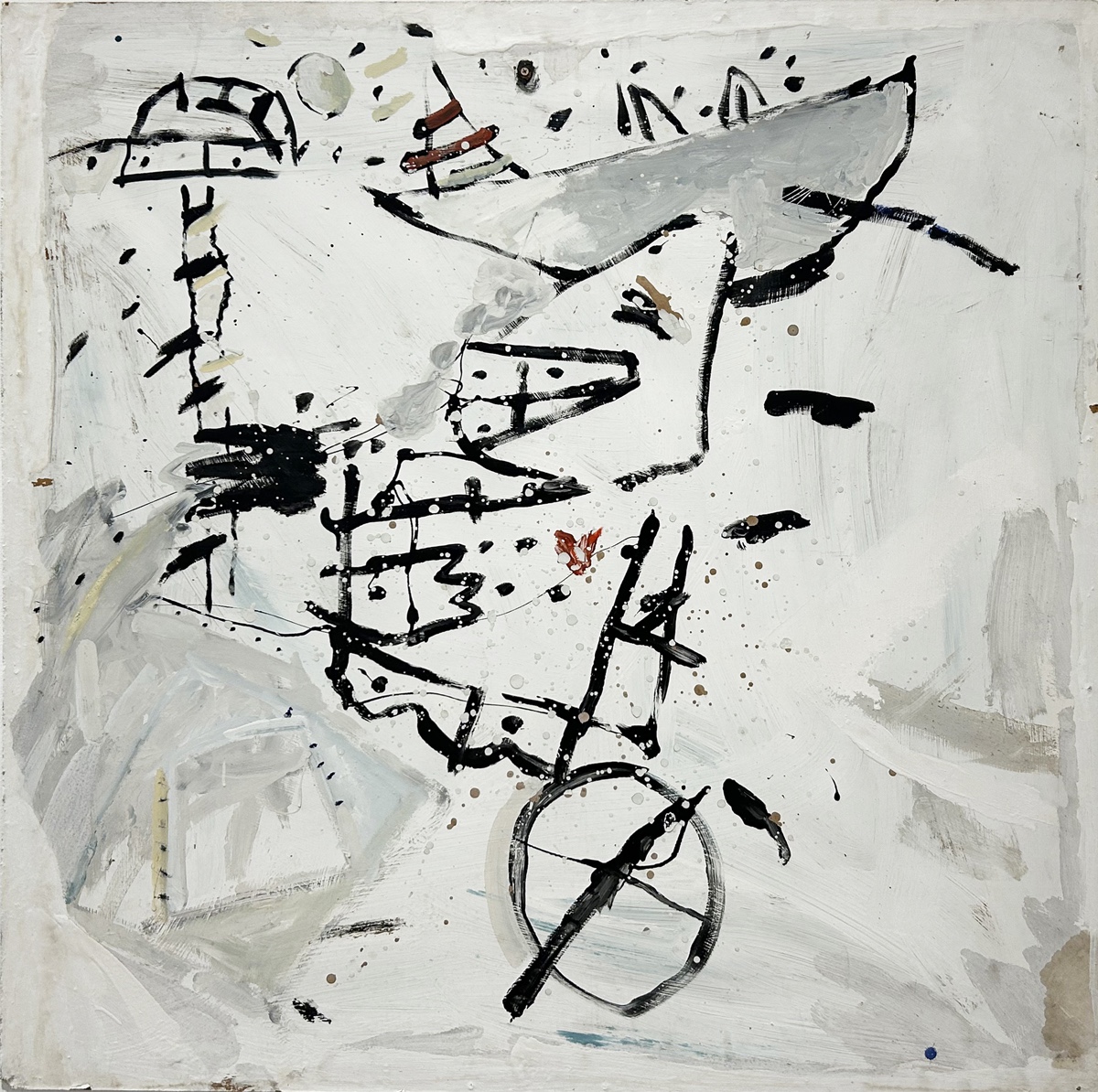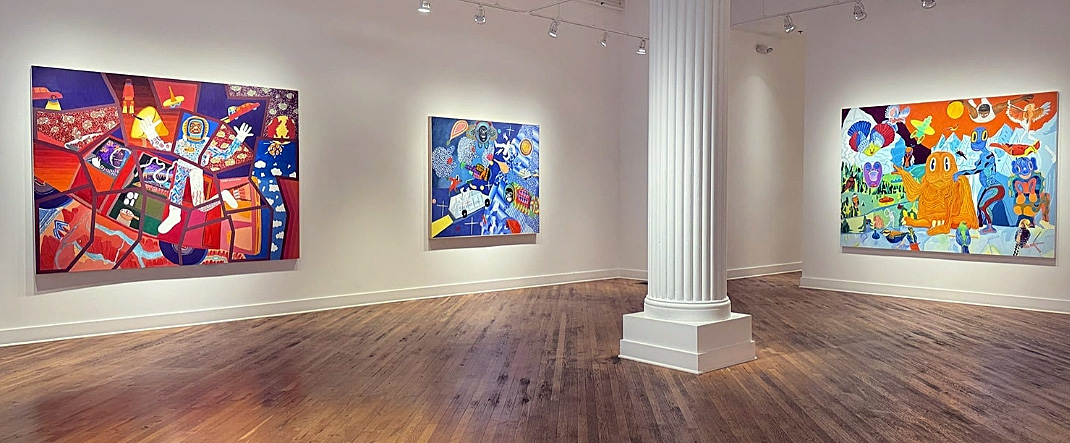
Peter Williams, Installation, David Klein Gallery Detroit, Nov. 2-December 21, photo courtesy of David Klein Gallery
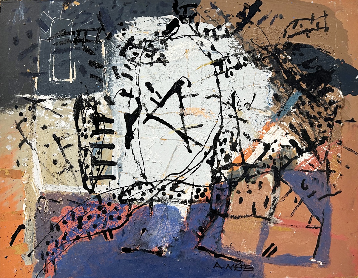
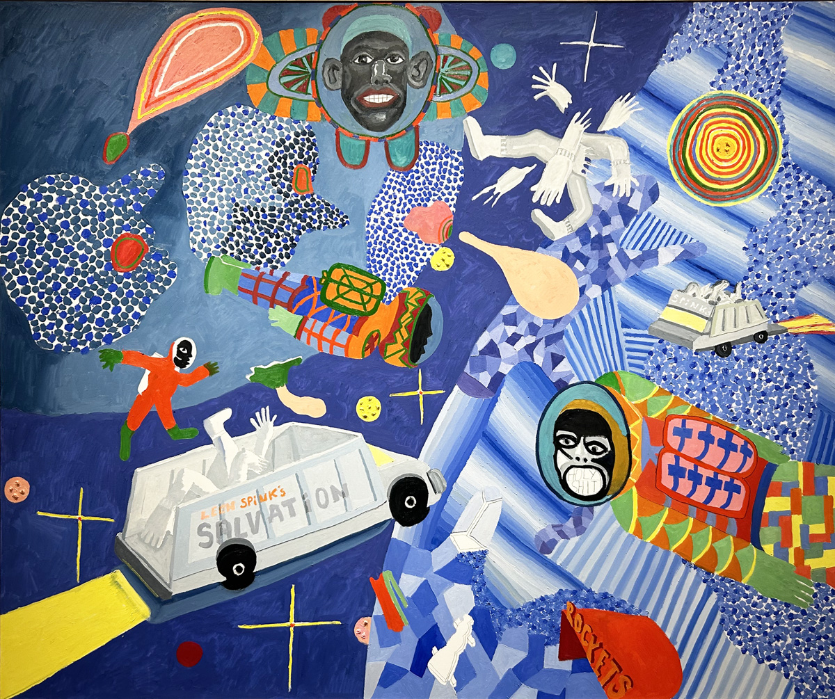
As I entered the David Klein Gallery in Detroit this December, the intense face of an African American man confronted me from the middle distance of an enormous painting. Cathedral, by Peter Williams, from the artist’s series “Bent Word,” is now on view along with a dozen of his late masterpieces until December 21. Executed near the time of his death in 2021, the composition is crowded with lively figures, exuberant patterns, and minivans traveling inexplicably through outer space. The enigmatic central figure (possibly Williams himself?) dressed in astronaut’s gear (or are they pajamas?) floats, weightless, in a topsy-turvy environment. Silent behind his helmet, is he waving hello? Or goodbye? Or both? The brilliant white areas of primed canvas recurring throughout the composition create the impression that the painting is starting to shatter into brilliantly colored pieces.
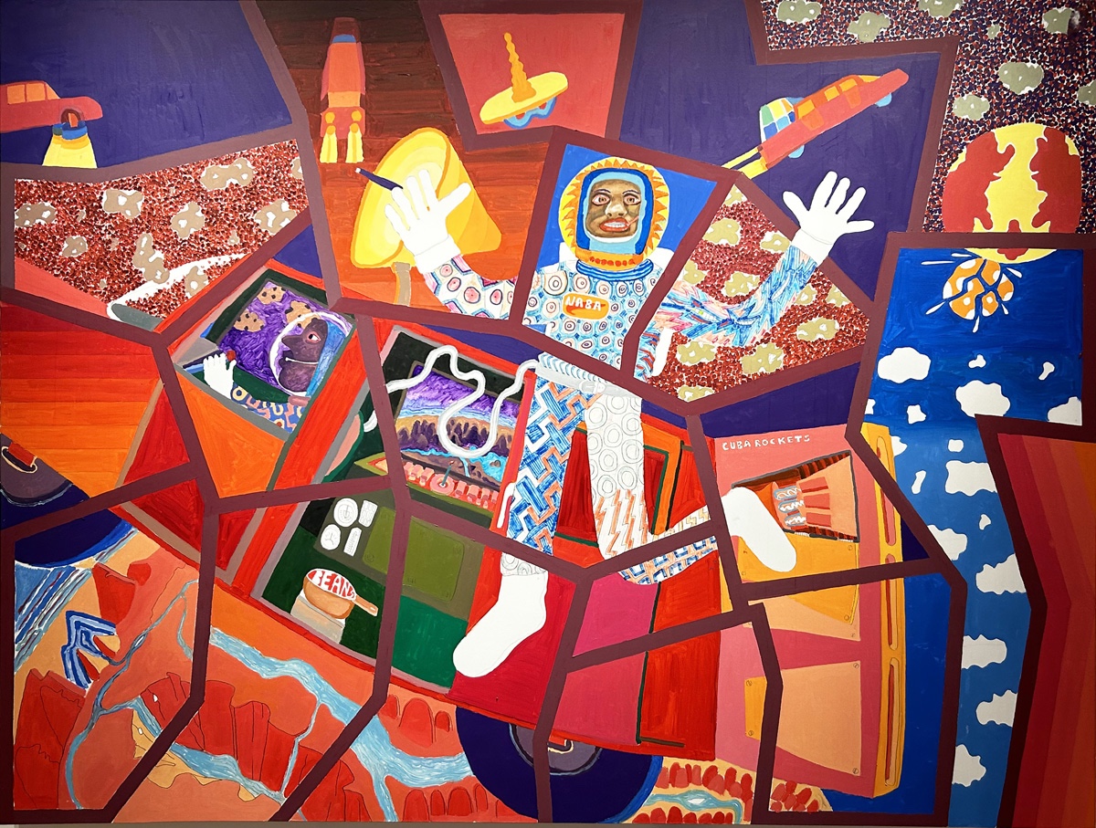
Peter Williams, Cathedral, 2019, oil and graphite on canvas, 72” x 96” All photos by K.A. Letts unless otherwise noted.
Williams’s artworks throughout the exhibition are full of references to pop culture yet grounded in the artist’s deep understanding of Western art history. He created his own unique style by mixing pop culture imagery, geometric abstraction, pointillism, and pattern painting with his studies of Goya, Kandinsky, and Klee. Robert Colescott’s paintings, with figures from art history like St. Sebastian and Picasso’s demoiselles bumping up against pinup girls and Aunt Jemima, also come to mind. In a 2020 interview with the Artists’ Legacy Foundation, Williams explained, “Most people don’t have any kind of dialogue with the work of 500 years ago or even 100 years ago. I’m trying to talk in the language that’s available to most people. We live in a comic universe right now.”
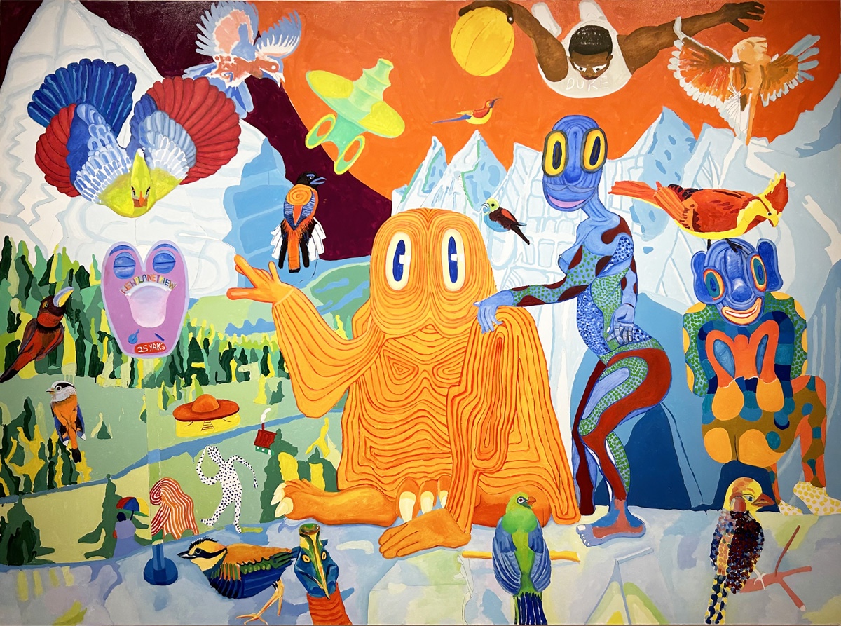
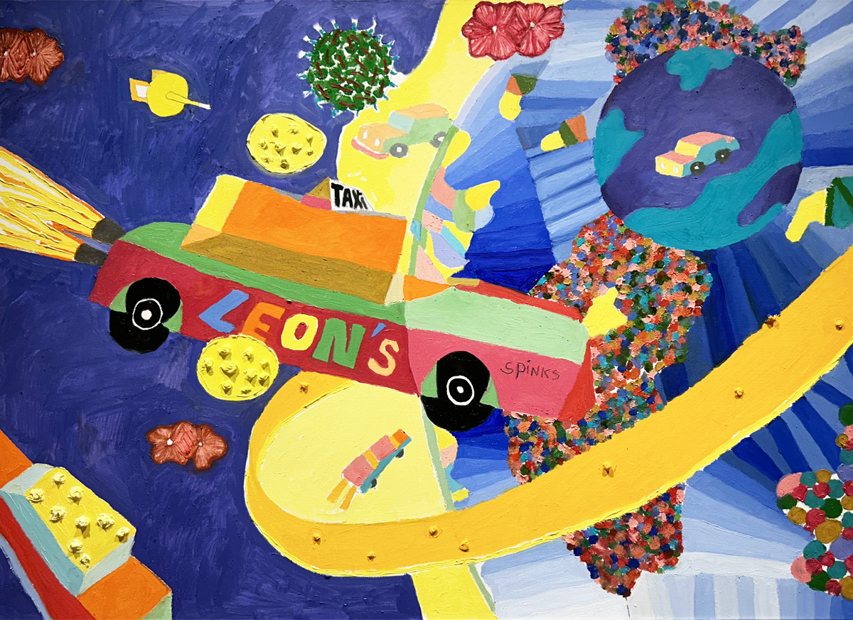
Peter Williams, 2. As the Birds Fly, Another Planet, 2019, oil and graphite on canvas, 72” x 96”
Afrofuturist narratives make up an important part of Williams’s cosmology, particularly in the later paintings. The “Bent Word” series tells stories of imaginary African American colonists (and a character called “the N Word”) who depart earth, escaping environmental catastrophe. In his 2019 painting As the Birds Fly, Another Planet, Williams imagines a new world, strange yet attractively pastoral, where earth’s birds join aliens in paradisical leisure. A lone Black basketball player at the upper edge of the painting seems headed for the planet’s surface.
Peter Williams, Leon Spinks’ Salvation, 2020-2021, oil on canvas, 60” x 72”
Mortality was clearly on Williams’s mind when he painted Leon Spinks’ Salvation in 2020-2021. The world -famous boxer died in February 2021 after a long illness, only a few months before Williams was to follow him. The central, haloed figure in celestial blue seems headed upward, with crosses that might be stars anchoring the astral space. Two white vans (ambulances?) with discarded body parts float, left and right, over the blue planet below. An appalled astronaut mouthing the words “holy shit” expresses, perhaps, the stunned reaction we all share when contemplating mortality. The colorful but thinly painted imagery suggests, once again, the conditional quality of fugitive human existence. A smaller canvas on a similar theme, Leon Spinks’s Taxi, is devoid of figures, focusing instead on cosmic cars leaving earth’s gravity.
Peter Williams, Leon Spinks’s Taxi, 2021, oil on canvas, 31” x 40
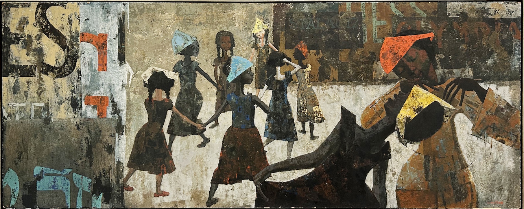
NYACK, painted in 2013, makes a helpful comparison to the later work. The comic figures are arranged in a kind of rightward-facing parade, earthbound. The organizing compositional elements are vertical. But a brown figure moves right to left below, missing limbs but still swimming resolutely through the water.
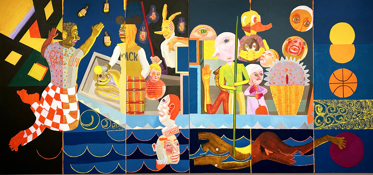
Peter Williams, NYACK, 2013, oil on canvas, 60” x 132” (diptych)
Williams died in Wilmington, Delaware on August 19, 2021. He had recently retired as a senior professor in the Fine Arts Department at the University of Delaware. But before that, he had been an associate professor for 17 years at Detroit’s Wayne State University. Detroit-based Rotland Press published a monograph in 2016 entitled “The N-Word: Paintings by Peter Williams,” which included an interview between Williams and Detroit poet and playwright Bill Harris. A major exhibition of Williams’s work, “Black Exodus,” opened at the Museum of Contemporary Art Detroit in January of 2021, only a few months before his death, and featured a few of the paintings now on display at David Klein Gallery.
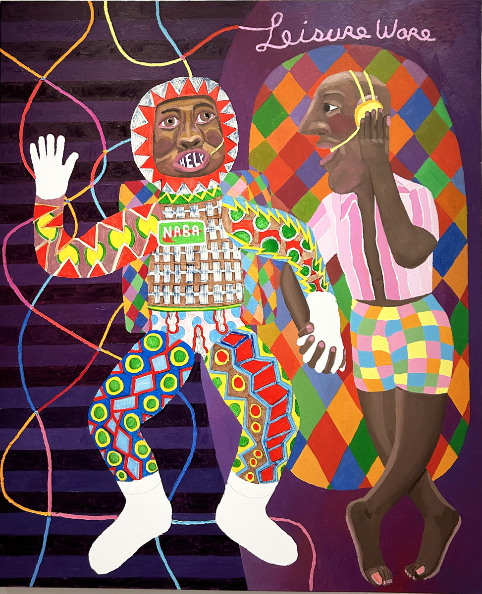
Peter Williams, Peter and Mike, 2019, oil and graphite on canvas, 60” x 48”
Born in Suffern, N.Y. in 1952, Williams grew up in Nyack, N.Y., where he had his first solo exhibition at the age of 17. He earned a B.F.A. from Minneapolis College of Art and Design in 1975, followed by an M.F.A. from Maryland Institute (College of Fine Art) in 1987. A life-altering car accident while Williams was in New Mexico as a young man resulted in lifelong disability. He lost his right leg and required crutches for the rest of his life.
Peter Williams’s paintings are housed in the permanent collections of the Smithsonian American Art Museum, Washington, D.C.; Walker Art Center, Minneapolis; and Whitney Museum of American Art, New York, among many others. In 2020, he received the Artists’ Legacy Foundation Award, followed a few months later with a Guggenheim Fellowship.
Williams’s paintings defy categorization as they settle into their place in contemporary art history. They are funny, wild, sometimes terrifying, but always deeply human, combining abstraction, figuration, storytelling and racial advocacy in a persuasive worldview that takes into account not only the world as it is, but our future as it could become.
Peter Williams @ David Klein Gallery, November 2-December 21, 2024
[adrotate group=”2″]