Ruth E. Carter Costume Design at the Charles H. Wright Museum of African American History, Detroit, Michigan.
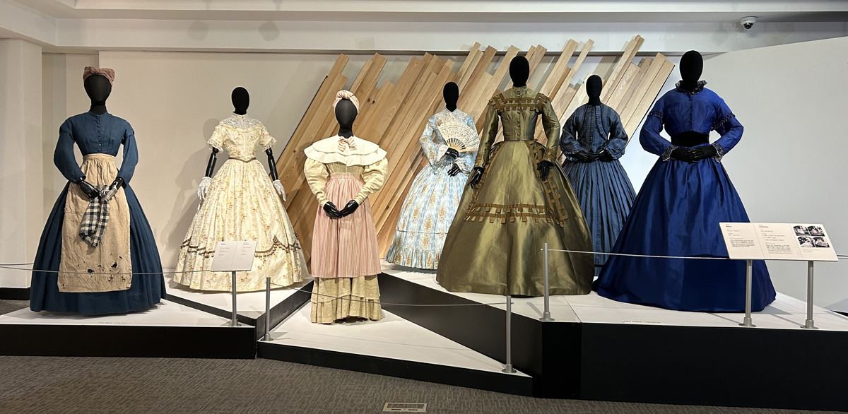
“Roots” (2016) Miniseries directed by Bruce Beresford, Thomas Carter, Phillip Noyce, and Mario Van Peebles, installation with costumes by Ruth E. Carter for Nancy (Anna Paquin) and Charlotte (Joy Jacobson). All Photos: K.A. Letts
When we go to the movies, we are often only dimly conscious that each film is a complex work of collaboration, with thousands of anonymous artists and craftsmen working together to realize the vision of a singular director at the top of the credits. But Ruth E. Carter, the creative mind and eye behind the costumes in over 70 films by a who’s who of talented filmmakers, stands out as a uniquely talented contributor to this most collaborative art form. The current retrospective of her work, with costumes and props from her 40-year career, “Ruth E. Carter: Afrofuturism in Costume Design,” is now on view at the Charles H. Wright Museum of African American History until March 31, 2024. It’s well worth a visit and the (rather steep) price of admission to appreciate, in person, these exquisitely realized artifacts of Carter’s long career.
Carter has been the go-to designer for a distinguished collection of directors—Spike Lee, Steven Spielberg, Ava DuVernay and Ryan Coogler, among others—who depend upon her meticulous research and masterful craftsmanship to give visual heft and historical authenticity to the stories they tell. The exhibition takes us on a tour of the artist’s work from her comic designs for the 1988 send-up of blaxploitation films “I’m Gonna Get You Sucka” to the historical authenticity of the 2016 re-make of “Roots” to her most recent Afrofuturist costume inventions for “Black Panther” (2018) and “Wakanda Forever” (2022.) A two-time Oscar winner, Carter doesn’t merely dress her actors—she illuminates the characters and the story through her attention to detail and careful research, a process she describes as “reading about a time period, speaking to historians, studying the way the mind thought and body moved, and learning about innovative or ancient design techniques that can enhance the costume.”
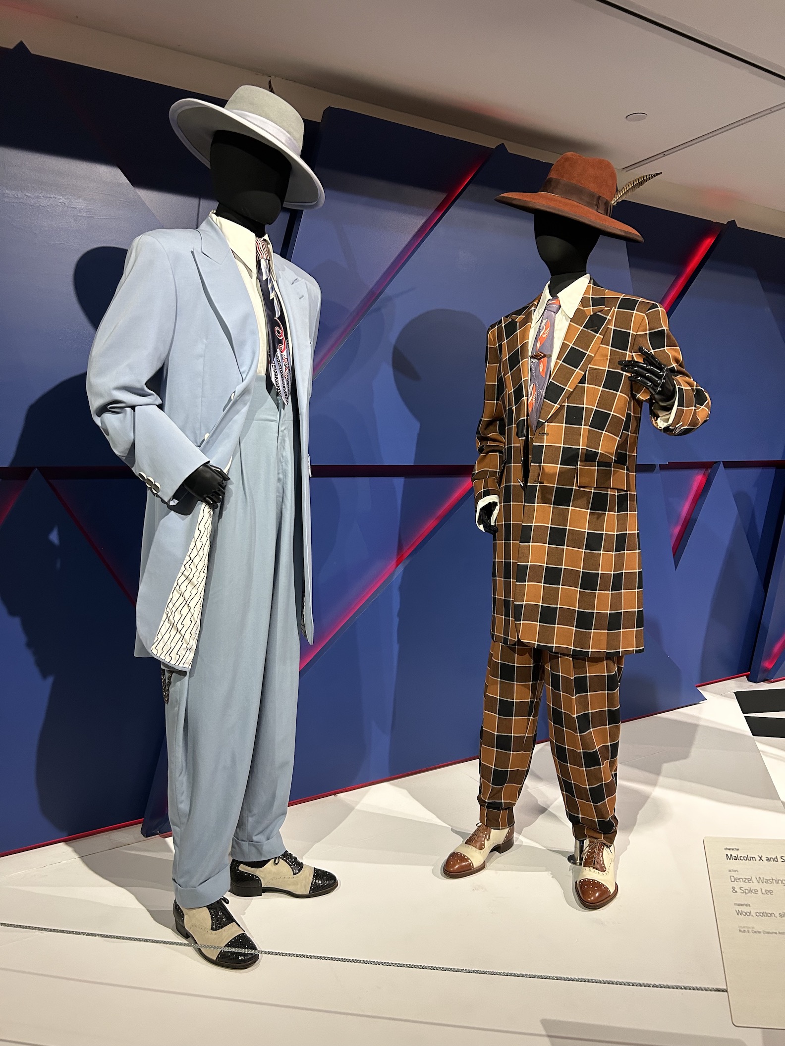
“Malcolm X,” (1992) Directed by Spike Lee, installation with zoot suits for Malcolm X (Denzel Washington) and Shorty ((Spike Lee) designed by Ruth E. Carter.
The costumes in this exhibition often tell stories based on important events in Black American history such as “Malcolm X,” “Selma,” and “Amistad.” But her work on more fictional plots like “Coming 2 America,” “Dolemite is my Name” and even the Black Panther movies, deliver an equal sense of authenticity thanks to her extensive research into American fashion history and ethnographic studies from African sources.
Particularly impressive are some of the modern costumes designed by Carter for “Malcolm X.” The 2 zoot suits on display, with their exaggerated silhouettes and outrageous color palettes, though extreme even on their own terms, are remarkably well-realized and convincing. The trajectory of Malcolm X’s life can be traced through Carter’s costumes, from his early origins as a young hipster through his subsequent ideological embrace of the National of Islam and culminating in his post-hajj conversion to Sunni Islam and civil rights activism.
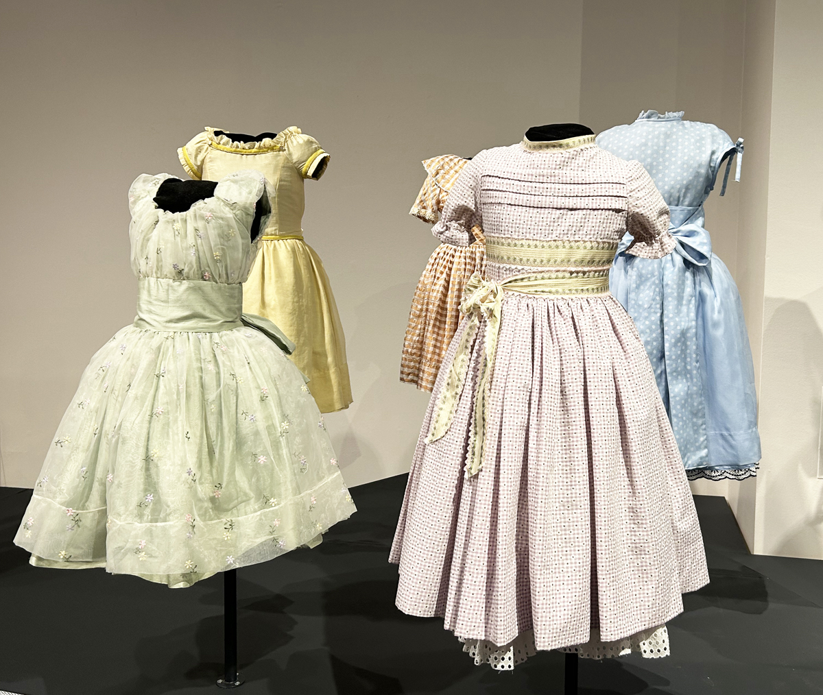
“Selma” (2014) Directed by Ava DuVernay, installation with Sunday dresses designed by Ruth E. Carter for the young girls: Addie Mae Collins (Mikeria Howard,) Denise McNair (Trinity Simone,) Carol Rosamond Robertson ( Ebony Billups,) Cynthia Dionne Wesley (Nadej K. Bailey,) and Sarah Collins Rudolph (Jordan Rice.)
Another particularly poignant collection of delicate Sunday School dresses for the little girls in “Selma” shows Carter at her most subtly expressive. Each dress is finely detailed, from the voile and taffeta fabrics to the eyelet under-petticoats to the ribbon sashes. The violent fate of the five is subtly foreshadowed and rendered more horrific by the butterfly-like fragility and beauty of these pastel confections.
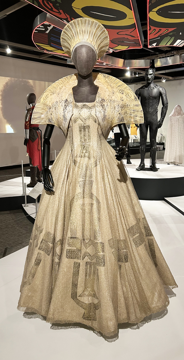
“Black Panther: Wakanda Forever” (2020) Directed by Ryan Coogler. Queen Ramonda (Angela Bassett) Carter’s design for the queen’s crown was based on the traditional South African woman’s marriage hat. Fabric designs were developed in cooperation with Austrian designer Julie Koerner.
Carter’s most recent costumes for “Black Panther” (2018) and “Black Panther: Wakanda Forever” (2022) are the headliners in this exhibition, and deservedly so. Her already prominent reputation as a costume designer has been raised exponentially by the two high profile and highly profitable films. (“Black Panther” grossed over $1.3 billion worldwide and broke numerous box office records, becoming the highest-grossing film directed by a Black filmmaker and the second highest grossing film of 2018.)
The Marvel Studio-derived adventures of king T’Challa and his royal clan, set in the mythical African nation of Wakanda, nevertheless take on a convincing reality based on Carter’s imaginative world-building. The films are a recent iteration of the cultural esthetic known as Afrofuturism, a term first coined by cultural critic Mark Dery in 1993. What began as a more-or-less literary trend centered on science fiction has since made inroads into other genres such as fantasy and magic realism. Historians point to Ralph Ellison’s 1952 science fiction novel “Invisible Man” as a precursor, and Octavia Butler’s novels are often associated with the genre. Carter defines the movement for herself as “using technology and intertwining it with imagination, self-expression, and an entrepreneurial spirit, promoting a philosophy for Black Americans, Africans, and Indigenous people to believe and create without the limiting construct of slavery and colonialism.” She has ably combined her characteristic attention to historical and ethnic costume history with an inventive admixture of computer-generated and 3d-printed detail that makes the complex story believable on a visceral level.
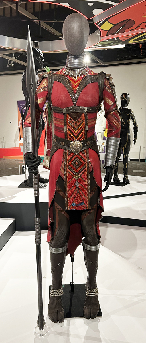
“Black Panther” (2018) Directed by Ryan Coogler. Ayo Dora Milaje (Florence Kasumba) Carter’s costume designs for the Wakandan warrior clan, the Dora Milaje, were based on traditional dress of the Ndebele women of South Africa.
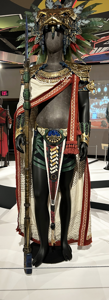
“Black Panther: Wakanda Forever” (2020) Directed by Ryan Coogler. Namor, King of Talokan (Tenoch Huerta.) Carter’s designs for the inhabitants of the underwater kingdom were based upon Mexican and Mayan influences.
Carter has earned wide attention for her Black Panther costumes referencing Afrofuturism, but she is far from the only creative to contribute to the ongoing cultural conversation in the visual arts, music, and literature. In 2021, the Metropolitan Museum of Art in New York City opened “Before Yesterday We Could Fly: An Afrofuturist Period Room.” The exhibition, organized in a “period room” installation format, envisioned the past, present, and future home of someone who lived in Seneca Village, a largely African-American settlement destroyed in the mid-1800’s to make room for Central Park. In 2022, the Hayward Gallery in London curated an exhibition of 11 contemporary artists from the African diaspora who draw on science fiction and myth to speculate on the world’s future.
Visual artists working in the fine arts on a smaller scale, like Nick Cave, Rashad Newsome, Kara Walker, Wangechi Mutu, Yinka Shonibare and Ellen Gallagher, can be counted among those influenced by the Afrofuturist esthetic. But Carter, as a high-profile creative in a mass-market art form that reaches millions, may be one of the most prominent visualizers of the genre working now. “Ruth E. Carter: Afrofuturism in Costume Design” provides an excellent opportunity for anyone who wants to feel the texture and sense the power of Afrofuturism to head down to the Wright Museum for a visit this fall and winter.
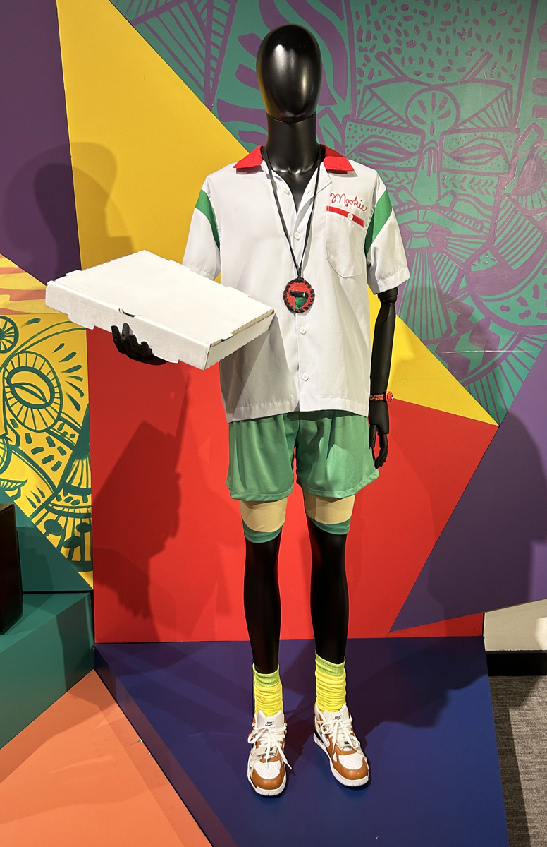
“Do the Right Thing” (1989) Directed by Spike Lee. Mookie (Spike Lee) Carter’s designs for the film are neon-bright and based on the red, yellow and green of the pan-African flag. Photo: K.A. Letts
Ruth E. Carter: Aftrofuturism in Costume Design October 10 – March 31, 2024 https://www.thewright.org/exhibitions#current
[adrotate group=”2″]