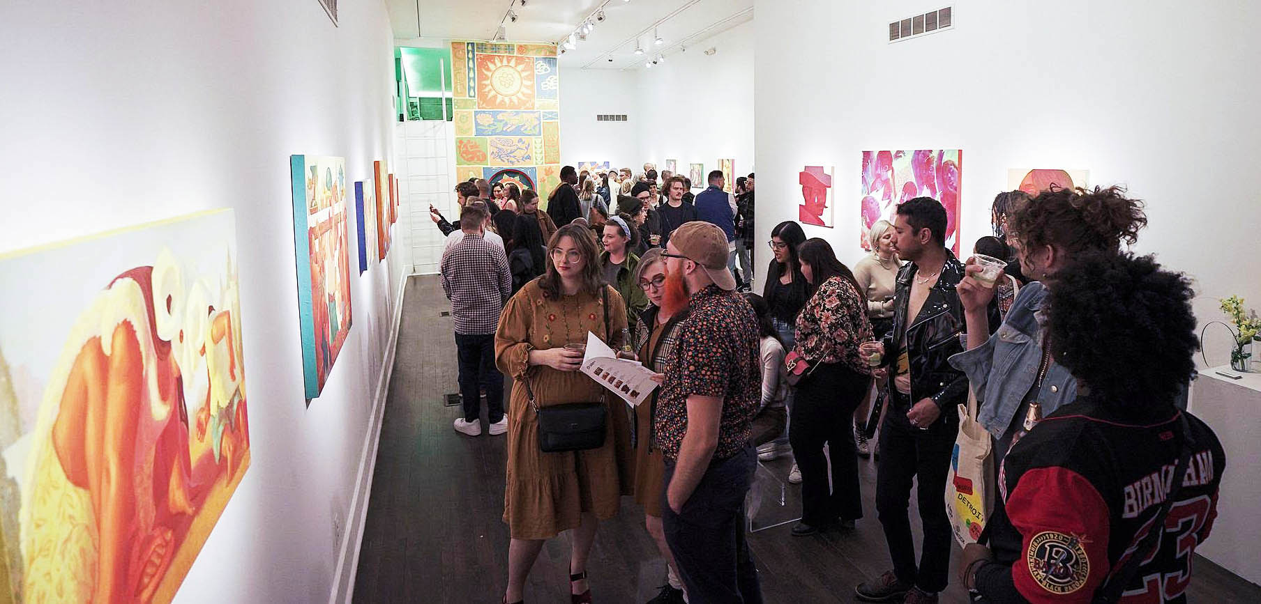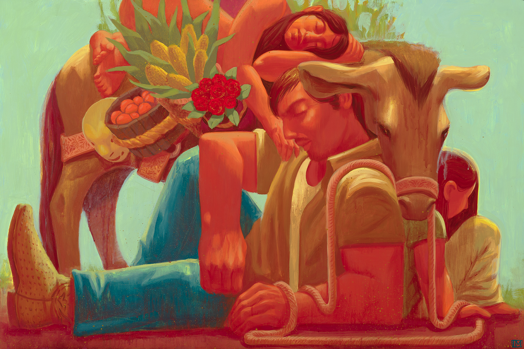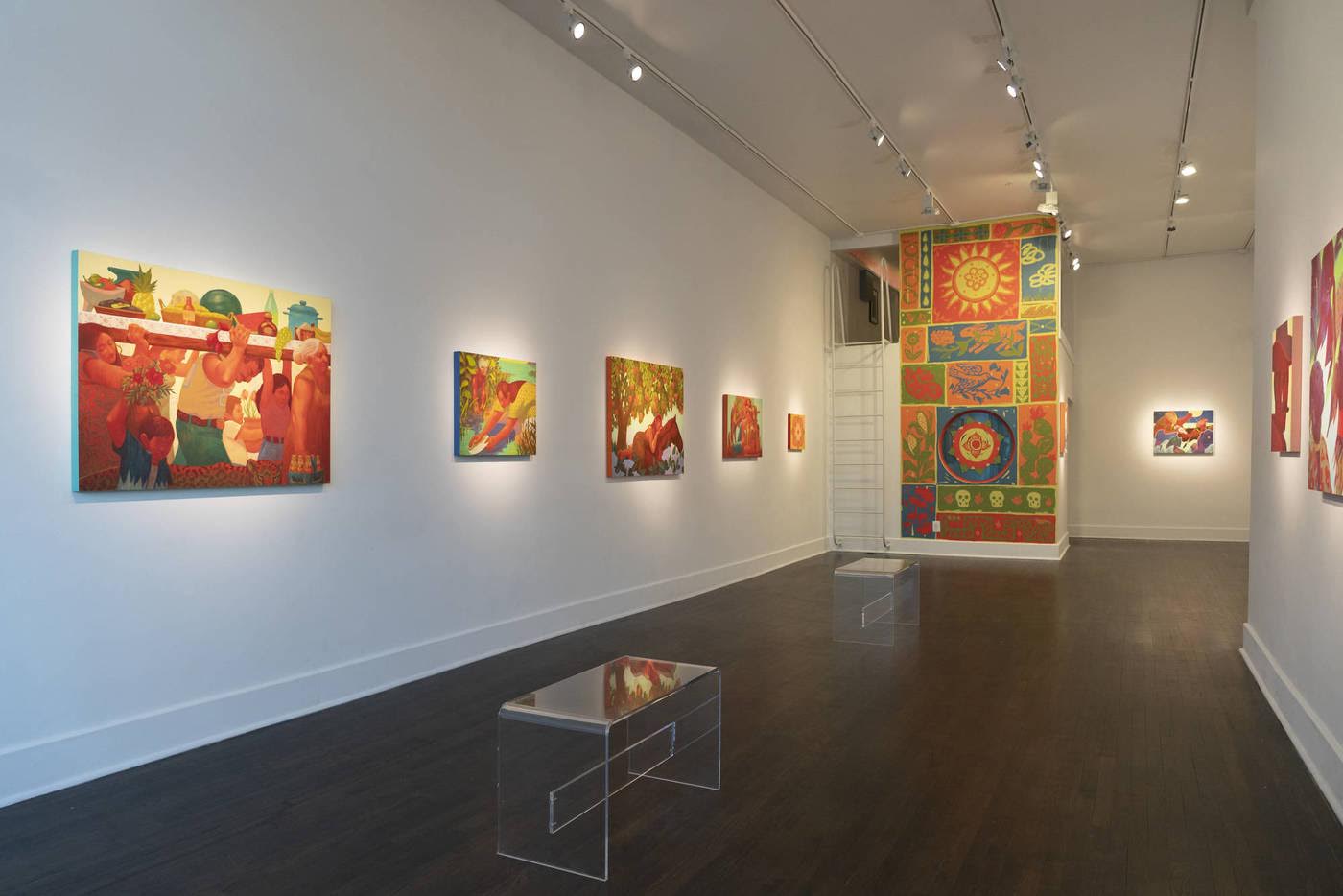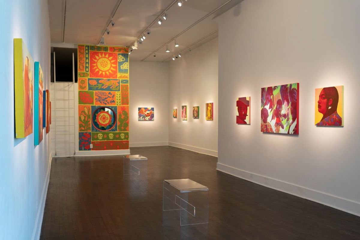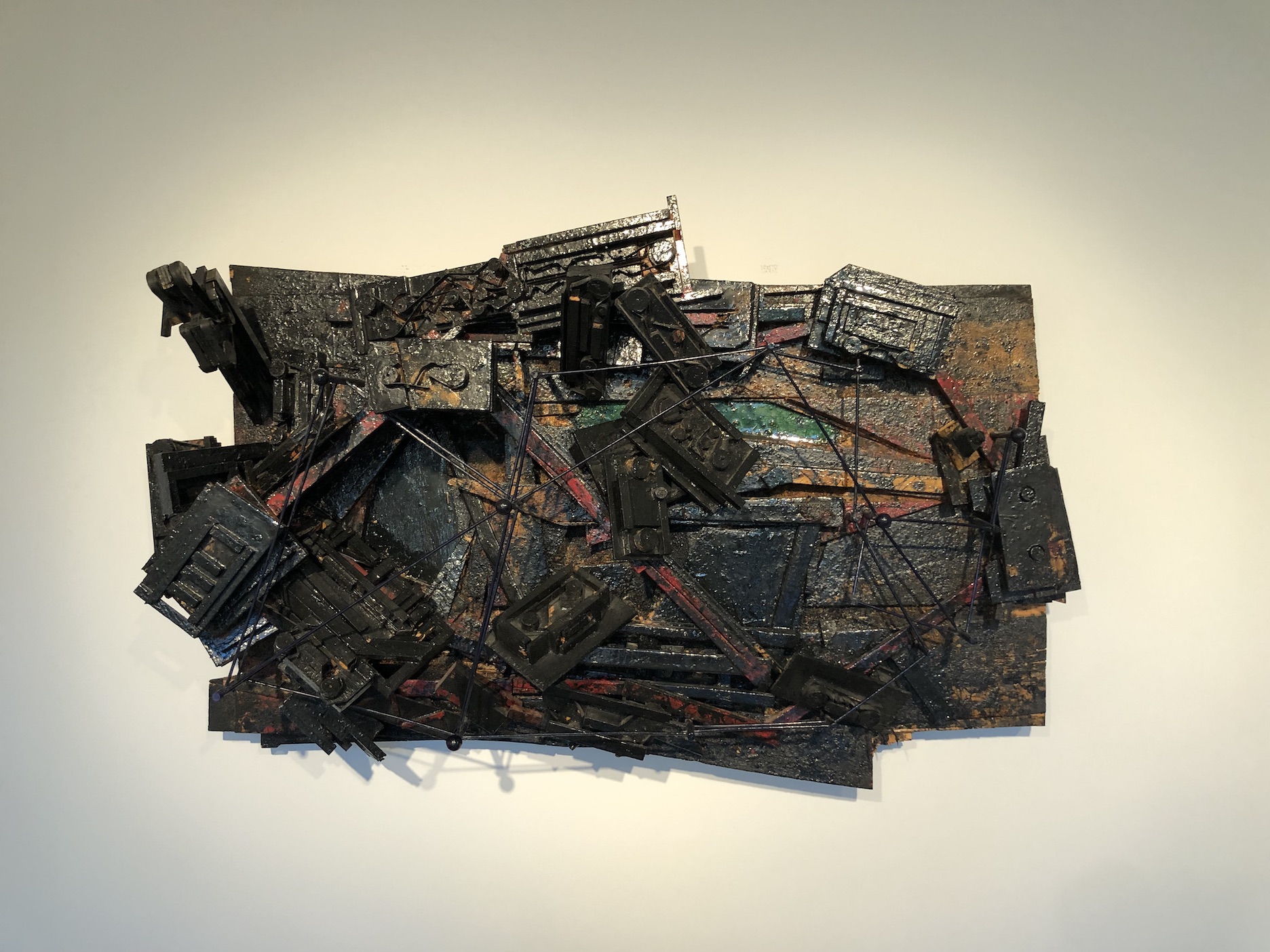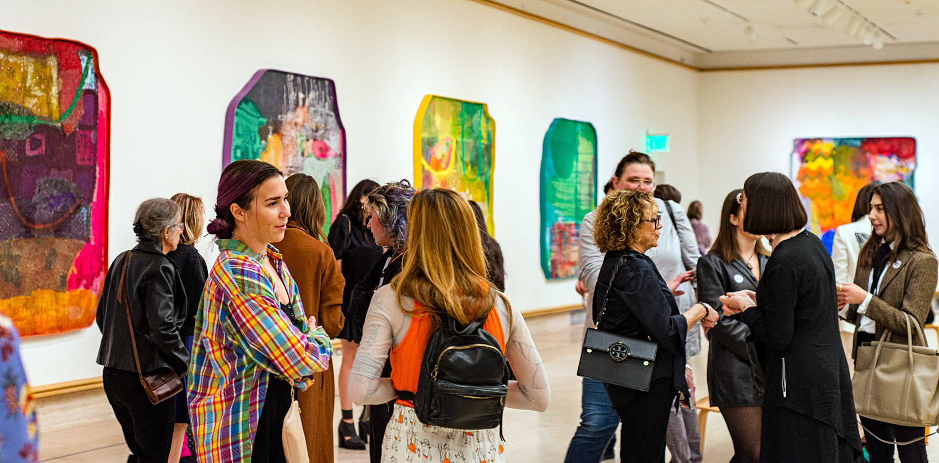
Installation Cranbrook Art Museum, James Benjamin Franklin, Full Circle, 2022
In the color-saturated, exuberant and irregularly shaped paintings of James Benjamin Franklin’s solo show Full Circle, humble and often degraded fiber elements of domestic detritus are transformed by all means necessary into improbably beautiful contrivances for seeing and being. With this exhibition of 11 recent artworks, on view until March 19, 2023 at the Cranbrook Art Museum, he has returned—full circle–to the campus where he earned an MFA in 2017 for his first solo museum show. A West Coast native now living and working in Detroit, Franklin has absorbed the influence of the city’s surfaces and structures and has now transformed those raw materials into a lush visual feast.
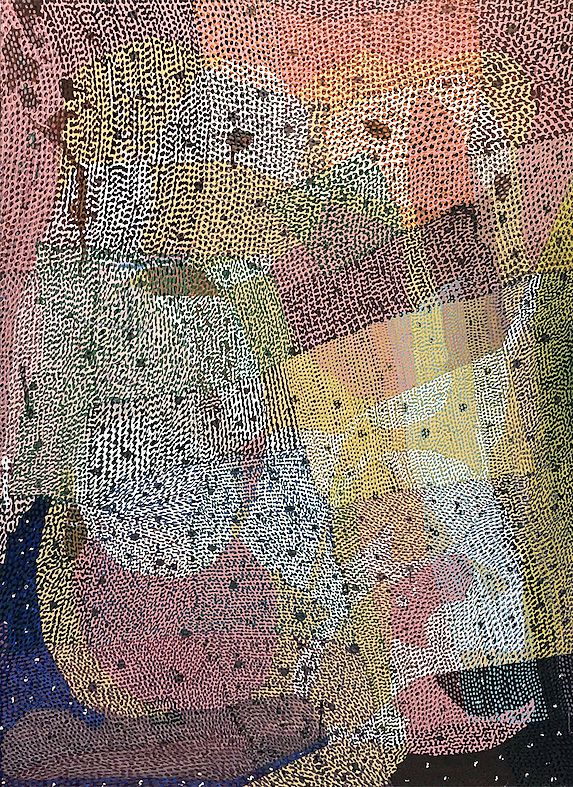
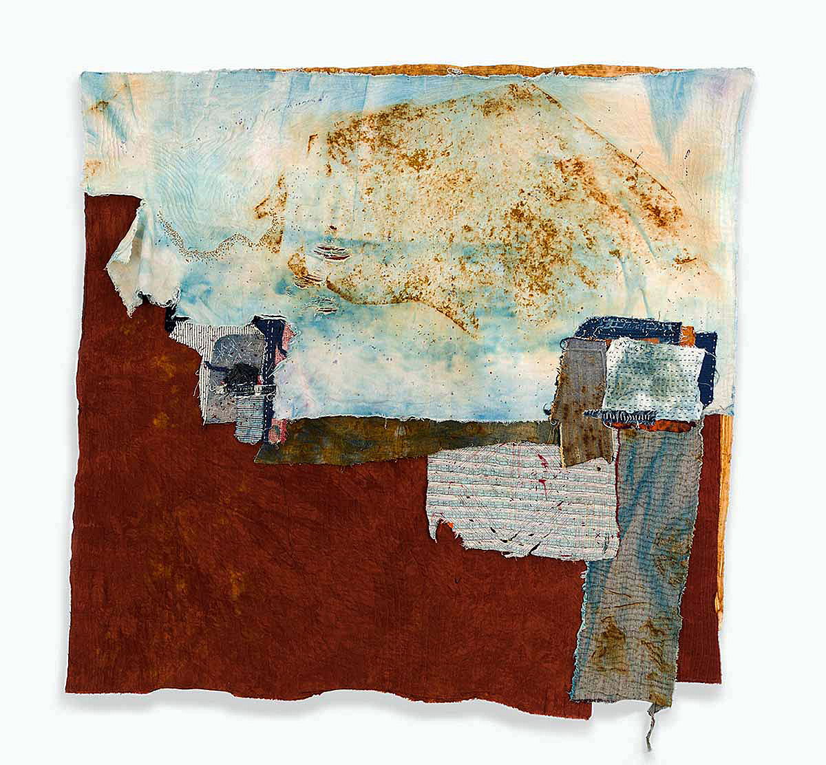
Aim, 2022, acrylic, fabric, plaster, sand, epoxy on extruded polystyrene, 82.5” x 79” x 3.25 photo: K.A. Letts
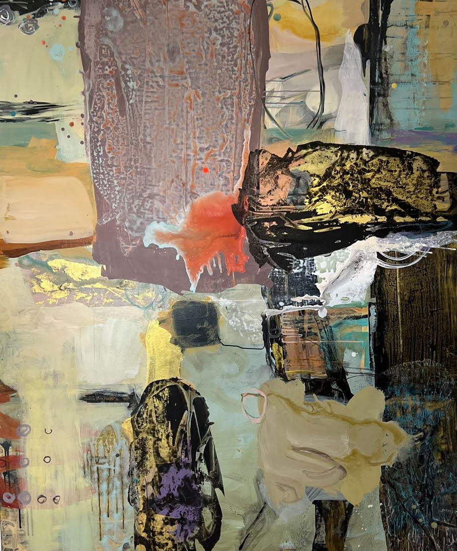
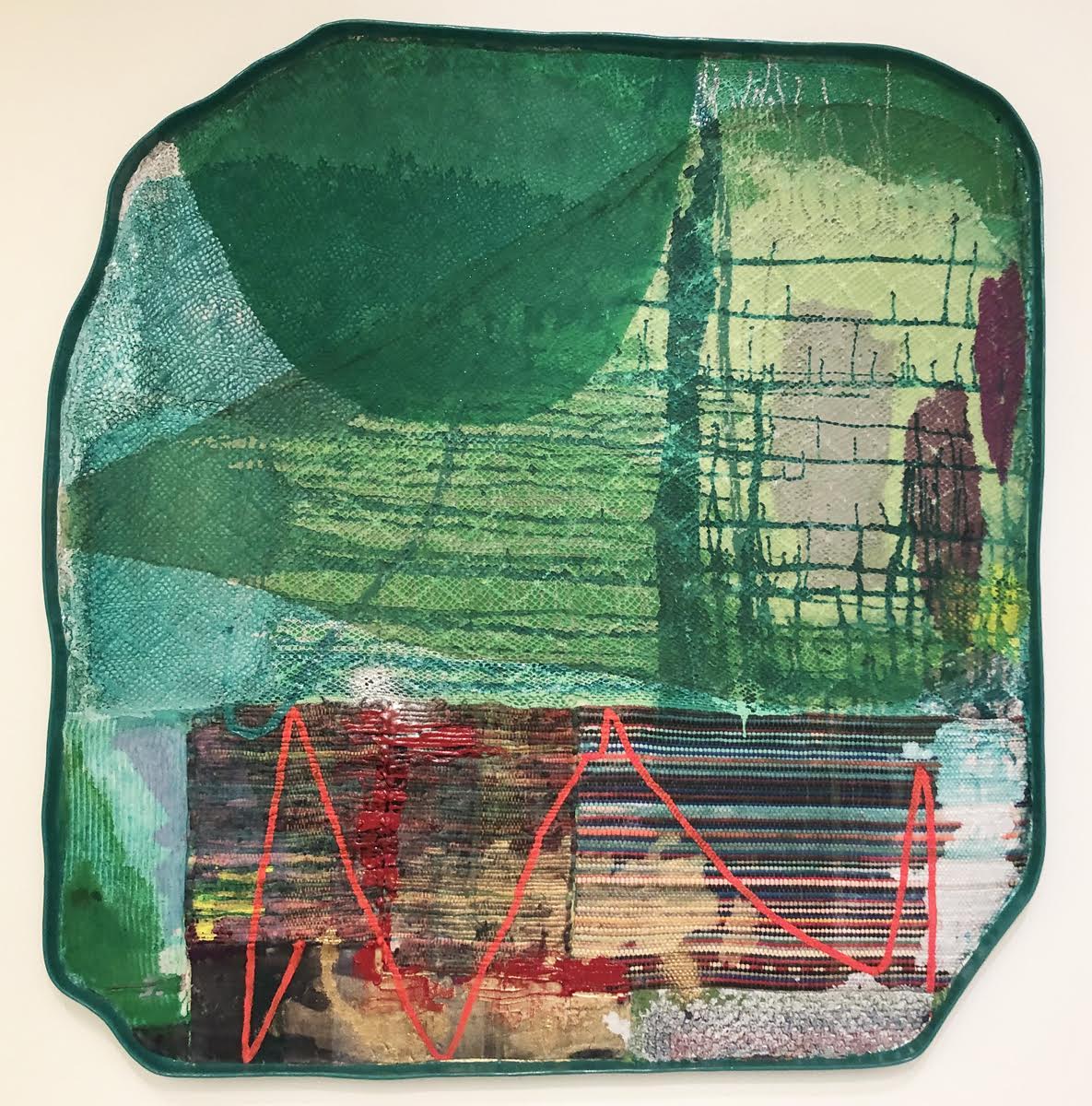
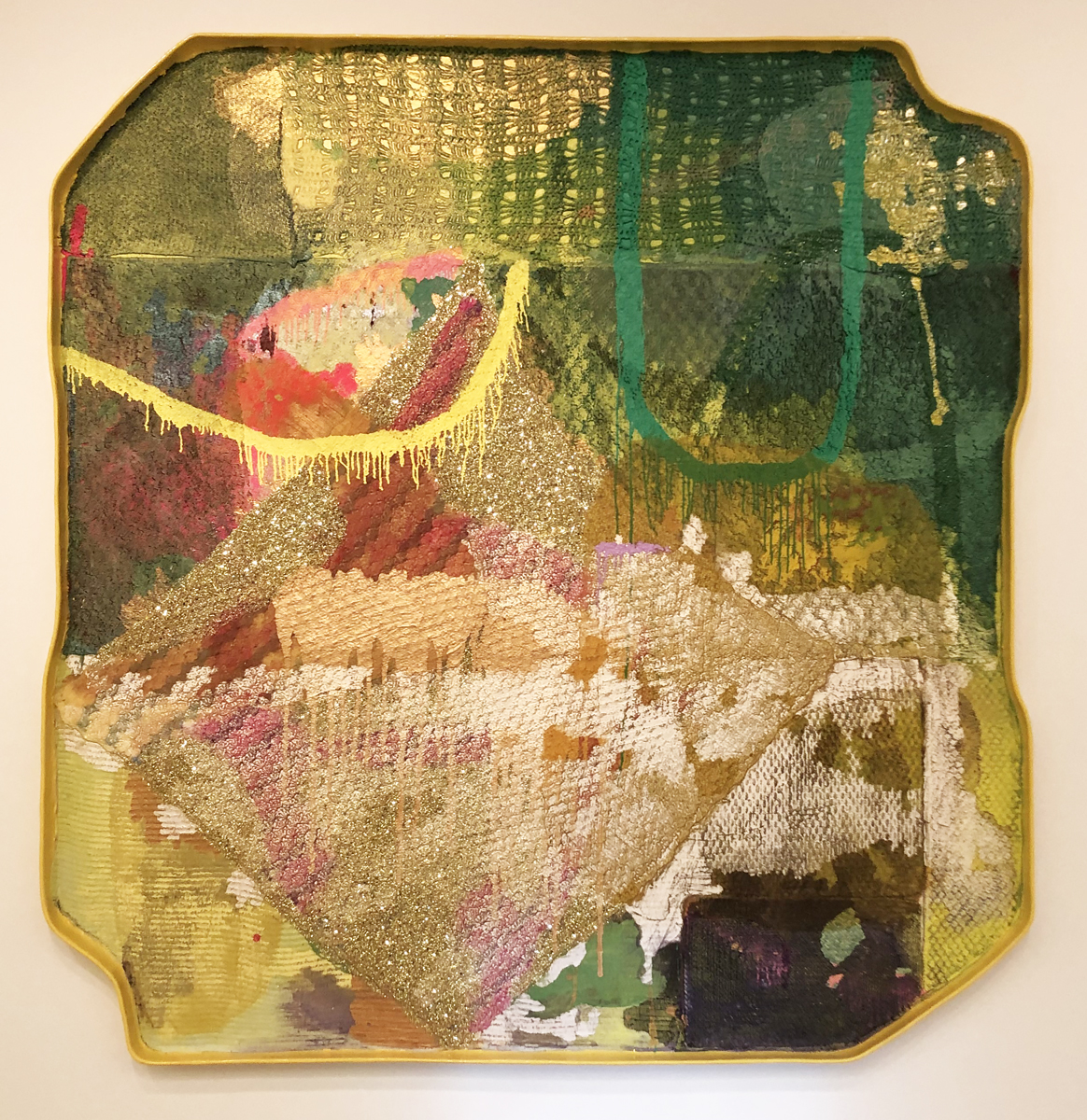
The paradox at the center of Franklin’s art practice is that he achieves these sumptuous effects while using the humblest of lowbrow materials. The artist creates his own eccentrically configured grounds from extruded epoxy and foam core, a process that takes several days and yields a flat shallow receptacle with raised edges. It’s a fictive playground of sorts for his highly idiosyncratic painted inventions. Into this sandbox-sized tray go thrift store fabrics, IKEA finds, blankets, bits of carpet, rugs and bathmats that form the underlying physical basis for the paintings. He also seems to have a particular affinity for crocheted afghans, lace doilies and other hand-crafted bric-a-brac. Next comes the audacious improvisational application of paint and glitter and sand and plaster in color combinations that vary considerably from artwork to artwork.
The resulting paintings balance esthetic refinement with the effect of a precocious child’s craft project. It’s evident that this is fully intended. “I needed to achieve the playfulness which was sitting at the back of my head,” Franklin said in a recent interview with Bomb magazine. “I want to get lost and get a sense of either joy or mystery in the work and all the materials that are used and just kind of all the things that are unexpected and surprising.” Franklin credits the gritty urban environment of Detroit and a certain local DIY mentality for inspiration and he specifically cites the influence of the Dabls Mbad African Bead Museum.
We have the sense that as the artist continues to explore his improvised methods, he has become more confident in the capacity of his materials to convey the intended effect. The paintings have become diaphanous and translucent, and the constituent parts are allowed to retain their identity while contributing to Franklin’s overall project.
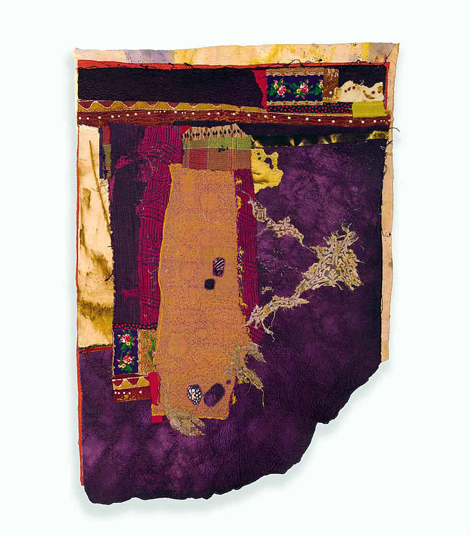
Rise, 2022, acrylic, fabric, plaster, sand, glitter, and epoxy on extruded polystyrene, 5” x 79” x 3.25” photo: K.A. Letts
This is an artist who is willing to take risks, to experiment, and to trust his process and his vision. His painting, Rise, is emblematic of this self confidence. Franklin depends on the physical roughness of the dimensional lacy fabrics to provide the formal substructure for a particularly offbeat composition. Dominated by the diamond shape in the lower, slightly left-of-center quadrant of the painting, Franklin softens its intrusive presence with varied shades of acid yellows and muddy pinks, plus a judicious sprinkling of metallic glitter. He has changed the orientation of the tray throughout the creative process, sometimes using gravity to move the paint and in other instances allowing the colors to puddle. Swooping yellow and green linear curves at the top quarter of the composition allow the irregular movement of the exterior shape to make inroads. The spidery lace patterning at the top of the painting comes to the perceptual foreground while other elements are submerged by inchoate blobs of pigment. There is nothing programmatic; this process feels entirely intuitive.
Every visitor will have their own favorites among the paintings in this exhibition. I was particularly charmed by his painting Be, where Franklin has allowed the native colors of the yellow and orange 1970s zigzag afghan at the top of the picture to participate in the interplay of the constituent elements, while sunny lines created by dry brushing carry an implied landscape across the imaginary horizon. Thickly applied blue glitter makes a starry lake at the bottom of painting. The whole thing seems both incredible and inevitable.
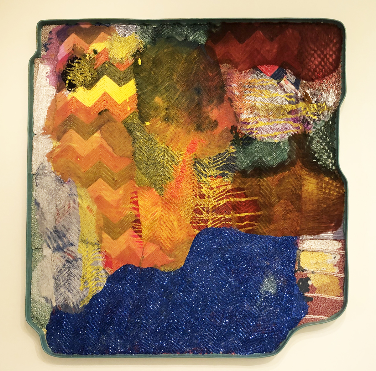
Be, 2022, acrylic, fabric, sand, glitter, epoxy on extruded polystyrene, 82.25” x 80” x 3.25” photo: K.A. Letts
Of course, this level of risk-taking can go wrong, and in Accord, Franklin’s experimentation with framed voids in the interior of the painting seem, to me at least, to be unsuccessful, as they stop the flow of the composition at awkward points. But Franklin’s chance-y explorations more often meet with consistent, lightning-in-a-bottle success.
Every painting in Full Circle has its own idiosyncrasies and difficult-to-quantify virtues, as well as its own internal color-logic. They share procedural and material elements, but through careful examination, we discover that each artwork represents a singular dialog between the artist’s imagination and his medium. There is a courting of potential surprise–and even disaster–in each one, yet time after time Franklin successfully produces exhilarating paintings that surprise and delight.
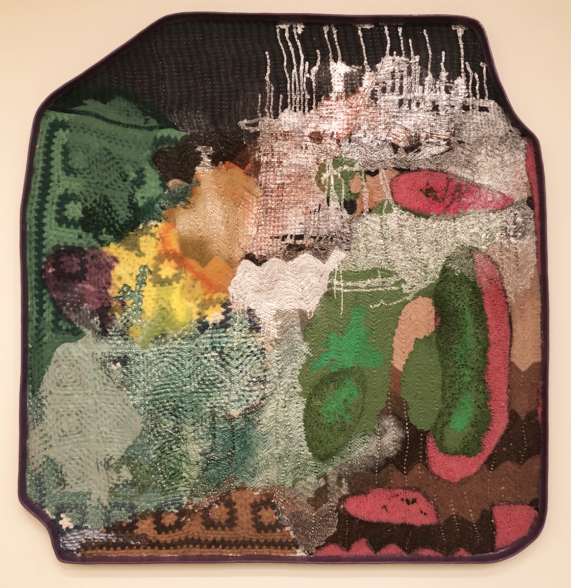
Retain, 2022, acrylic fabric, plaster, sand and epoxy on extruded polystyrene photo: K.A. Letts
Full Circle: James Benjamin Franklin @ Cranbrook Art Museum, through March 19, 2023
[adrotate group=”2″]