Critical art reviews of Detroit galleries and museums weekly

Category: Drawing Page 13 of 15

Sandwich Project @ Art Gallery of Windsor

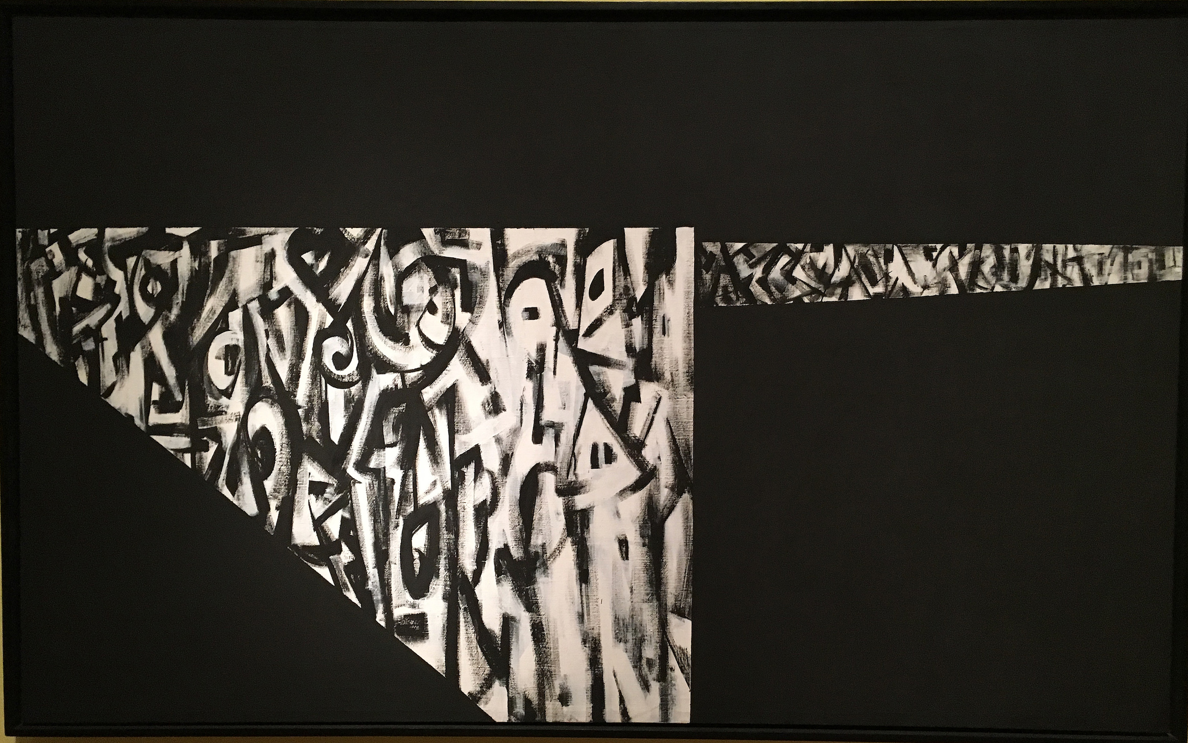
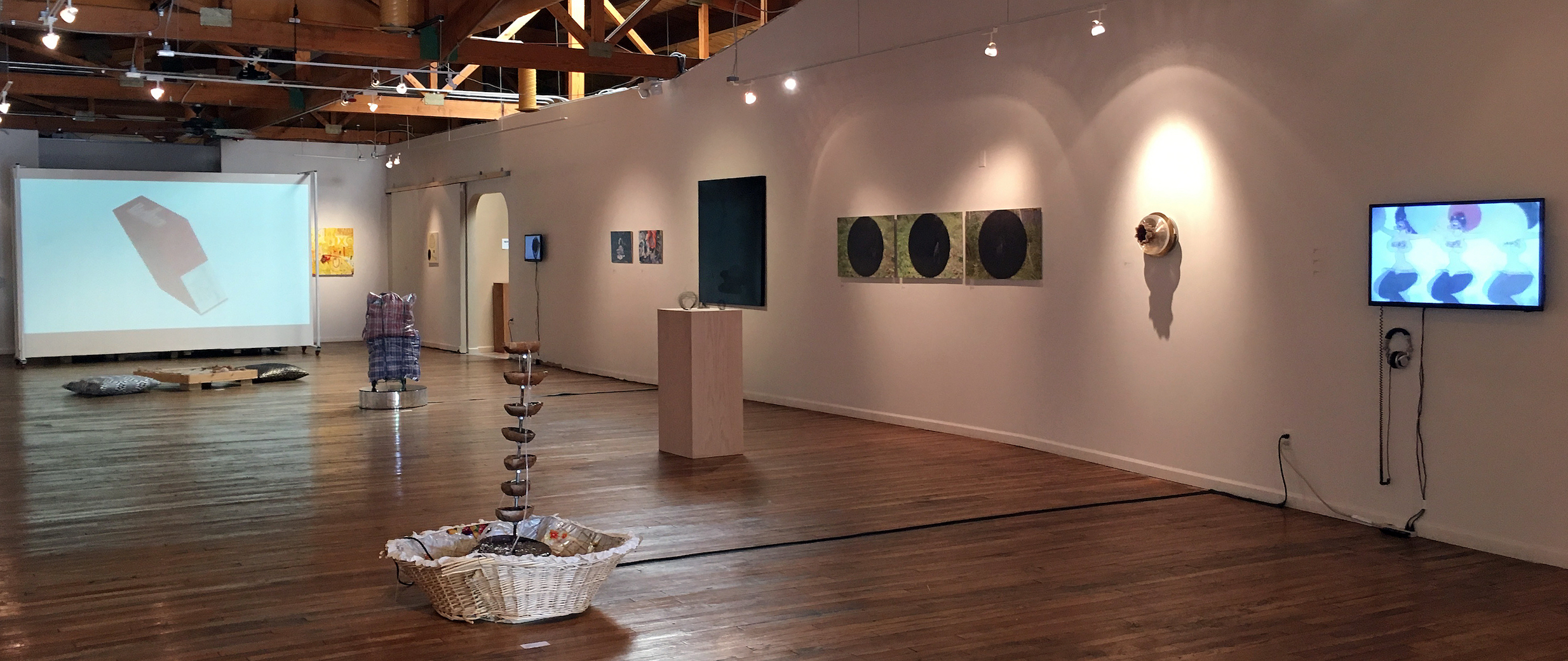
Installation Image, Sandwich Project, image courtesy Cynthia Greig 2017

“The Sandwich Project” at the Art Gallery of Windsor centers around famed American artist Martha Rosler’s 1974 video, “Semiotics of the Kitchen,” a visionary send-up of the entrapment of women in the machinery of the kitchen. It features a very young Rosler parodying more famed cooking show host Julia Childs.

After more than forty years, and our global digital brain transplant, the six-minute B&W video remains mesmerizing both intellectually and as a performance. With deadpan facial and bodily gestures, Rosler punctuates an alphabet of the accouterments of cooking — Apron, Bowl, Chopper, Dish, Egg Beater — objects that traditionally have signified women’s domestic identity, but become as sinister as the crippling machinery of the factory.

As Charlie Chaplin’s Little Tramp had been pushed over-the-edge by the machine of the factory in his 1936 film Modern Times, thus defining the generation of pre-union, factory workers, Rosler’s Julia Childs dramatizes the enslavement of women in the signifying machinery of the kitchen.

Rosler’s video, however, is only a set-up for the rest of the engaging Sandwich Project, which was the brainchild of Windsor’s renowned Iain Baxter&, an early conceptual artist, painter and photographer, and was curated by Art Gallery of Windsor’s Jaclyn Meloche, also an artist, performance artist and writer. Baxter& conceived the Sandwich project as a play on “all things Sandwich,” to quote Katherine Mastin, AGW’s Director,

Sandwich, one of the earliest neighborhoods in Windsor, namesake of England’s once important port, was the origin of the name for the portable lunch, which (after the Fourth Earl of Sandwich) like this exhibition, composes layers of ingredients (often between two slices of bread). The word dredges up all kinds of history both in England and in Windsor, in the underbelly of which lies the War of 1812, a conflict that to some locals seems as though it was between Detroit and Windsor. In fact, Sandwich, Ontario was the site of important 1812 battles.

Iain Baxter&, “Iain Baxter as an open-faced sandwich” 1978

Iain Baxter&, born in England, his own art fraught with visual hi-jinks, was obviously quite cognizant of this back story in conceiving the project, which is ripe with delicious visual puns and ironies.

Likewise it’s the relationship of food to social and political history, popular culture and feminism, that Meloche ran with to create six independent exhibitions, each of which is self-contained, with moments of delightful humor and brilliant art, while at the same time executing an engaging critical perspective on food and culture. A video entitled “Food as Metaphor,” moderated by Meloche, which includes statements and discussion by the artists, punctuates the exhibitions.

Baxter&’s own contribution, entitled “Baxter&Food,” is a collection of more or less still-life photos of nourishment.  “Iain Baxter as an open face sandwich,” c.1978, is typical of his dadaistic play with art history in which he humorously features himself as both the maker and material of art. Equally the dada irony looms huge in “Still Life with Winter Vista,” 1996, which features a glass patio table laden with a cornucopia of tropical fruit and vegetables, with a classic Lake St. Clair winter landscape in the background. Baxter&’s energetic art prompts thinking about big issues like ecology, food and identity, rather than simply art stuff, yet at the same time his work has a subtle aesthetic valence that is hard to categorize. His “The Primaries,” composed of bottles of ketchup, mustard and blue Gatorade that he classifies as “found objects,” is not only a great commentary on our food culture and its ironic spectacality, but a rather wonderful conceptual sculpture.

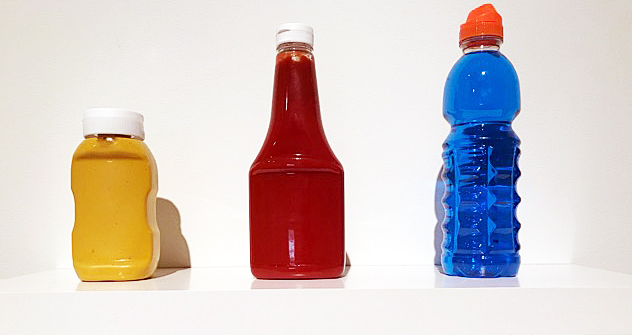
Iain Baxter&, “The Primaries,” Found Objects, 2017

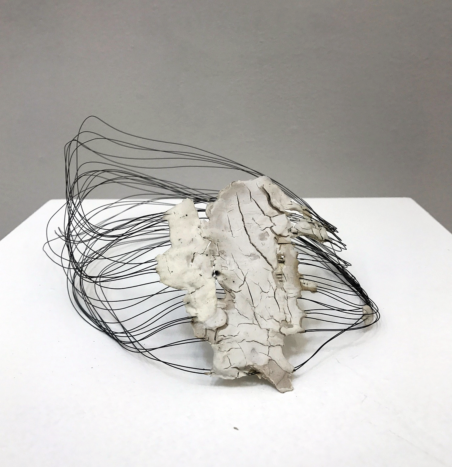
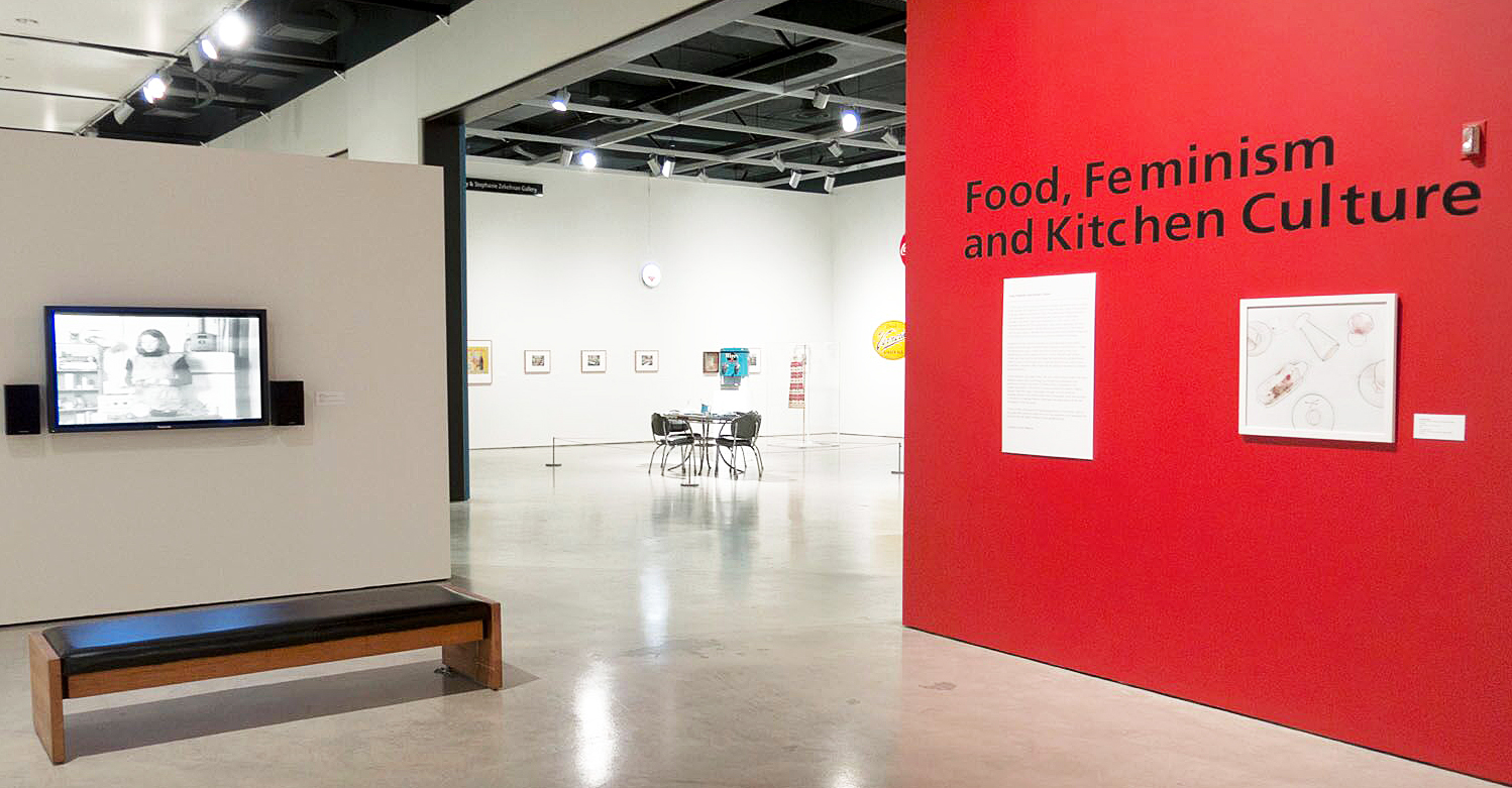
Of the six exhibits in The Sandwich Project, the one most provocative to the central issue of our food culture is “Food, Feminism and Kitchen Culture.” Introduced by Rosler’s video, the exhibition sets up a discourse on the landscape of the kitchen as an imprisoning construction of which women are the principle inhabitants.

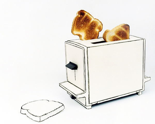
Cynthia Greig, “Representation no. 29 (toaster), chromogenic print, 20 x 24”

If Rosler’s video sees the objects of the kitchen as an almost violent lexicon of possibilities for the construction of women’s identity —Apron/Women, Bowl/Women, Chopper/Women, Dish/Women — Cynthia Greig’s (Detroit’s best kept secret) manipulated photographs become escapes from the reality of the haptic world into a realm of diagrammatic ghosts, from realism to shadows of the real. In reducing photographs of common objects of the kitchen — toaster, milk cartons, coffee cups, French fry carton — to elemental outlines, they become ideas that hold us captive. These graceful, elegant shapes become enigmatic containers that define and thus limit ­— limitations to being, to exuberance, and diagrams that ultimately beckon language to elucidate and emancipate them.

Each of Greig’s diagrammatic images includes a referent to reality. A diagrammed toaster has images of freshly “toasted” bread popping out of it. The outlined milk carton has “spilled milk” next to it. A French fry carton has French “fried potatoes” sticking out of it. Each photograph posits the philosophical dilemma of what contains and what is contained. Pushed to their logical end, these images become a sort of dictatorial grammar of the kitchen.

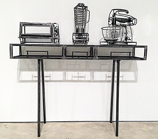
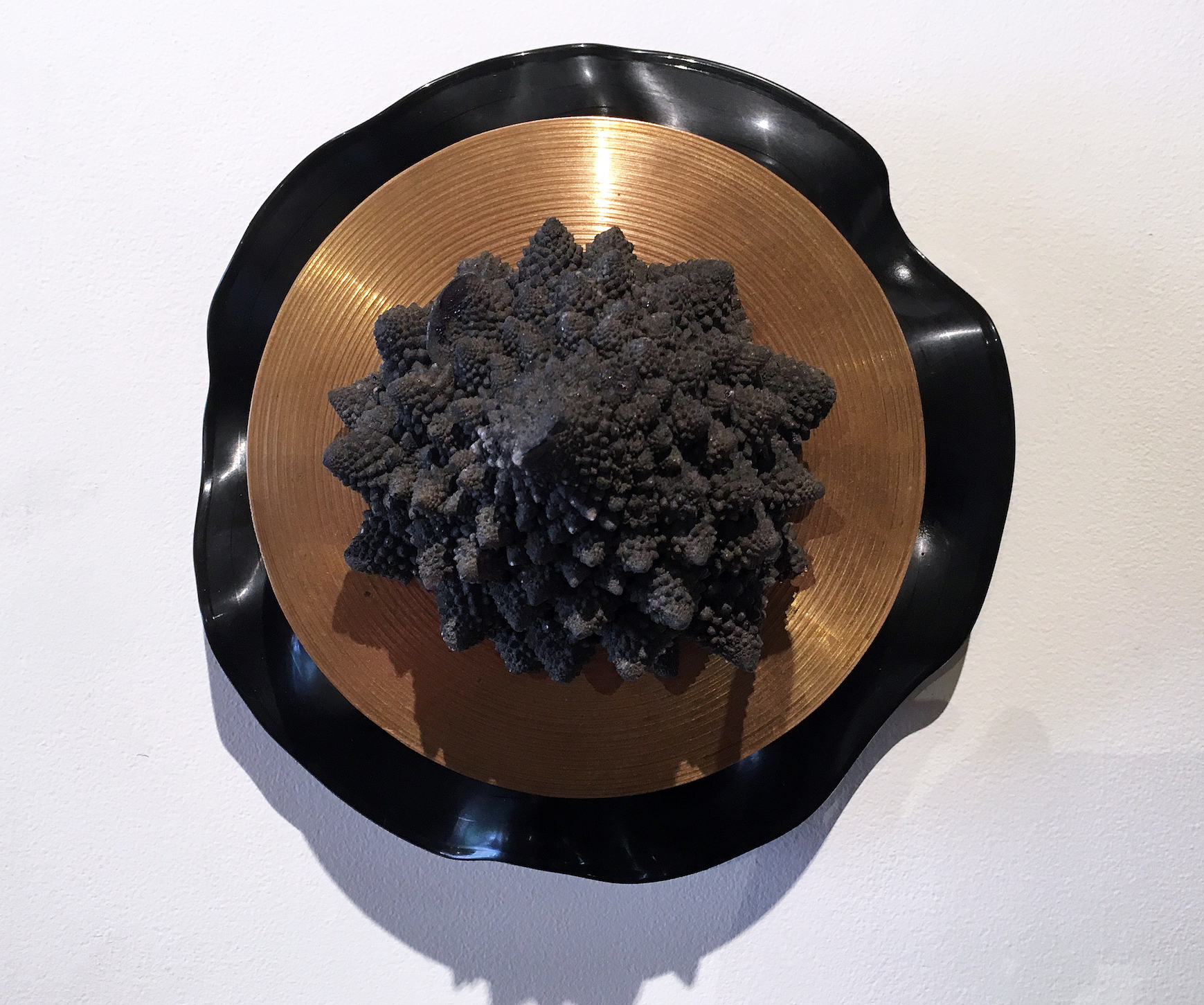
Anna Frlan, “Kitchen as Factory [Mixing machine, blending machine,toasting machine]”, Steel, 2017

Complementing Greig’s skeletal works are Anna Frlan’s welded steel replicas of kitchen appliances. Actually, as if taking a hint from Greig’s diagrammatic images, Frlan’s are even more cage-like machines — a toaster oven, a blender, a mixer, a stove, a dishwasher. These drawings made of steel, at the same time as they resemble medieval torture devices, might suggest Piranesi’s images of Roman prisons. They are stunning, sinister signifiers of the role of kitchens in defining identity.

Each of the artists in this section of The Sandwich Project makes a stunning contribution to the discourse on Food, Feminism and Kitchen Culture. Marilyn Minter’s painting from her “Food Porn” series and Carly Erber’s crocheted “Salisbury Steak” make wonderfully opposite statements about women and representation of food. Christiane Pflug’s painting “Kitchen Door with Ursula,” 1966, and Annie Pootoogook’s “Tea Drinkers,” 2001, both reflect subtle personal takes on the complex psychology of kitchen life.

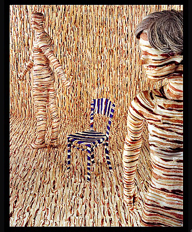
Sandy Skoglund, “Body Limits,” 1992

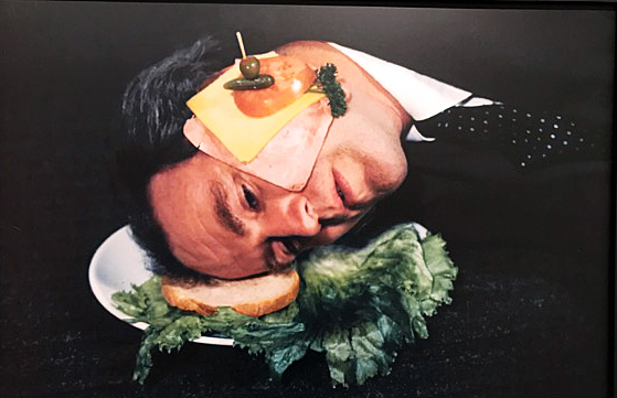
A related, borrowed exhibition, originating at the Akron Art Museum and curated by Theresa Bembnister, “Snack” is a tour de force of a generous selection of diverse representations of food, featuring Pop artists Andy Warhol, James Rosenquist, Claes Oldenburg and other contemporary artists’ takes on the western recreational activity of food and eating. Sandy Skoglund’s “Body Limits” documents a surreal tableau she created parodying a fashion shoot of two figures dressed in bacon.  French photographer Robert Doisneau’s “L’Innocent,” 1949, captures a typical Parisian gentleman’s existential encounter with his dinner in the window of a restaurant.

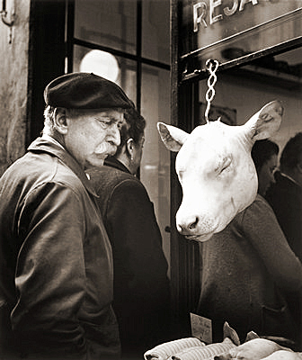
Robert Doisneau, “L’Innocent,” B& W Photograph, 1949

The Sandwich Project is no less than a blockbuster of an exhibition, a realization that surpasses expectation.  The fourth part, “Lunch,” collects a wonderful assortment of artifacts and images of the great pastime of noonday culture, including a wall full of school kids’ lunch boxes that in themselves are a history of midcentury pop culture, and a selection of early twentieth-century images from The Henry Ford Museum archives of Detroit cafeterias, diners, and hot dog stands.

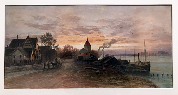
Frederick Arthur Verner, “Untitled (River Scene, Sunset”), 1891, watercolour over graphite on paper

Two other exhibitions that bookend The Sandwich Project are AGW’s collection of nineteenth-century watercolors of the Sandwich area by artist Frederick Arthur Verner, and “Food and Film,” which features four short films on the production and distribution of food as a go-between in signifying Canadian identity. One of Verner’s watercolors features the Detroit River-front with typically English village-like architecture of early Windsor (Sandwich) in the foreground, replete with fishing boats, and a nascent Detroit industrial landscape on the far shore. During the nineteenth century, the Detroit River was famous for its astonishing fishing, supplying First Nation people and eventually Windsorites and Detroiters with bounteous whitefish and walleye. Verner’s watercolor thus becomes an ironic commentary on the devolution of food production in the area.

The Sandwich Project is a perfect summertime day trip or even two-day trip, and yields an abundance of food-for-thought about the business, culture, and representation of our relationship with food.  For lunch, Sir Cedric’s Fish and Chips is right around the corner from the Art Gallery of Windsor, reminding us of the Canadian predilection for things British. If, however your tastes are more inclined to American fare, there’s Lafayette Coney Island just across the border.

The Sandwich Project Continues through October 1, 2017

 Art Gallery of Windsor,  401 Riverside Drive West, Windsor, Ontario N9A7J1     519-977-0013

Detroit Institute of Arts & Charles Wright Museum Collaborate on 1967 Rebellion Exhibitions


From Left to Right – Patrina Chatman, Curator of collections and exhibitions, Charles Wright Museum of African American History, Valerie J. Mercer, Curator of African American art and head of the General Motors Center for African American Art, Detroit Institute of Arts, Kathy Locker, Program director/Detroit, John S. and James L. Knight Foundation, Juanita Moore, President and CEO, Charles Wright Museum of African American History and Salvador Salort-Pons, Director Detroit Institute of Arts.

Art of the Rebellion and Say It Loud are coordinating exhibitions to commemorate 50 years since July 23, 1967, when African Americans took to the streets of Detroit to express their anger and frustration with the injustice of law enforcement. To many people, and supported by the then media establishment, the events on 12 Street and Clairmount were conventionally referred to as the Detroit Riots, both in Detroit, Southeastern Michigan and around the country. Over the course of five days, more than 2000 buildings were destroyed, 7,200 people were arrested, 43 people killed and over 1,100 injured.

Jim Hubbard, Woman Sitting on Ledge, 13 x 19 B&W 35mm 1967

At the DIA, African American Art Curator Valerie Mercer explains that a number of the 34 works on display emerged from black art collectives that in some cases aimed to instruct a community whose self-identity was in rapid flux. “Harlem’s Weusi collective felt we African-Americans needed to learn more about African culture,” Mercer said, “which is hard for us, since it’s typically not taught in schools.”

Salvador Salort-Pons, DIA director said, “The commemoration of the 1967 Detroit rebellion provides an opportunity to call attention to the talented and often overlooked artists who were reacting to the struggle for social, political and racial justice during the 1960s and 70s. The DIA’s collaboration with the Wright Museum lays a foundation from which we are building a strategic and lasting working relationship that will help bring our community closer together.”

Wadsworth Jarrell, Three Queens, Acrylic on Canvas, 1971

At the Detroit Institute of Arts, Art of Rebellion features 34 paintings, sculptures and photographs mostly by African American artists working both collectively and independently in the 1960s and 70s. Artists in the collectives: Spiral, Kamoinge Workshop, Harlem’s Weusi, AfriCobra, and Black Arts Movement, created art for African American audiences that asserted black identity and racial justice with the Detroit rebellion of 1967 as background. The exhibition also includes works by artists who were not part of a collective and artists working in later decades who were inspired by art from the Civil Rights Movement.

Wadsworth Jarrell, Revolutionary, Acrylic on Canvas 1972

The work of Wadsworth Jarrell is prominent in the DIA exhibition in that it captures a color depiction of African American figures using a kind of alphabet soup to communicate a variety of literary messages. Wadsworth Jarrell is an African-American painter, sculptor, and printmaker who was born in Georgia then moved to Chicago, Illinois, where he attended the Art Institute of Chicago. He is a founding member of AfriCOBRA, a collective of African American artists formed in Chicago in 1968 as a response to the Civil Rights Movement. Its members inspired black pride by exploring and defining a black visual aesthetic that would reflect the style, colors, cool attitude and rhythm associated with their culture. AfriCOBRA artists focused on the social and political issues that affected their communities and were committed to making art that was understandable, relevant and accessible.

Allie McGee, Apartheid, Mixed Media on Masonite, 1984

Detroit artist Allie McGee, whose work is represented by the N’Namdi Center for Contemporary Art, is featured with a large abstraction, Apartheid. The work highlights his use of angular shapes and splatters of paint to evoke tension. McGee often used sticks in place of brushes to obtain the effect he wanted. The title refers to the oppressive political system that existed in South Africa. The Civil Rights and Black Power movements inspired many African American artists to address the fight for civil rights faced right here in Detroit.

Norman Lewis, Untitled (Alabama), Oil on Canvas 1967

The outline of a hooded Klansman near the center of this painting converges with sharp angles suggests tension. The title Alabama was code for the complicity of that state’s government in the oppression of African Americans throughout the community. Strong composition and the black and white motif further supports the overall symbol in this oil-on-canvas work.

Elizabeth Catlett, Homage to Black Women Poets, Mahogany, 1984

Elizabeth Catlett’s wooden sculpture Homage to Black Woman Poets is carved from one piece of Mahogany and pays tribute to black women poets, such as Gwendolyn Brooks, Jikki Giovanni, Sonia Sanchez and Maya Angelou. Catlett is widely recognized as a contemporary sculptor known for her focus on women subjects.

Titus Kaphar, For Tryvon, Amadou, Sean, and Mike, Calk on Asphalt, 2014

The Chalk on Asphalt drawing by Titus Kaphar in 2014 brings the recent events across the country into the narrative that exists today. The images depict three black boys, perhaps those who were lost to injustice and informs the audience that the events surrounding a young black man like Trayvon Martin live on inside each and every one of our consciences.

The Charles Wright Museum partnered with the Detroit Institute of Arts to create parallel exhibitions — the DIA’s Art of Rebellion: Black Art of the Civil Rights Movement opened on the same day as Say It Loud. Both are part of a community-wide reflection of the 1967 Detroit Rebellion. More than 100 local institutions will participate in this commemoration, led by the Detroit Historical Museum. The Charles Wright Museum began its remembrance of this complicated and painful historical experience with the unveiling of Detroit artist Charles McGee’s landmark outdoor sculpture United We Stand at the Museum in July 2016. The Detroit Art Review covered that event, and I spoke with McGee, a fellow artist with whomI exhibited more than once. He said, “It’s about togetherness…living together in peace.”

“Artists have a way of bringing moral clarity and promoting empathy,” said Juanita Moore, president and CEO of The Wright Museum. “They can often articulate the emotional truth of a situation in a way that breaks through our mental barriers and opens us to new perspectives in a way that other forms of communication cannot. This new exhibit will both show how some of the most significant African American visual artists have interpreted and resisted social inequities over time, and broaden the historical narrative and dialogue around the 1967 Rebellion.”

Gordon Parks, Police State, B&W, 35mm, 13 x 19″ 1997

Born in Fort Scott Kansas, at the age of 25, Gordon Parks was struck by photographs of migrant workers in a magazine. He bought his first camera for $7.50 at a Seattle pawnshop and taught himself how to take photos. He started in the fashion industry, but Parks went on to become the first African-American photographer for Life and Vogue magazines. Parks once said, “People in millenniums ahead will know what we were like in the 1930s and the important major things that shaped our history at that time. This is as important for historic reasons as any other.” In this photo Police State, the image is more about capturing a moment that delivers a blunt and literal statement to his audience.

Roko, The King of Montgomery, Oil on Canvas, 28 x 38″ 1988

This mixed media painting by the artist Roko comes from a mug shot of Martin Luther King, one of many, taken by police departments during the Civil Rights period. Known nationally for his dramatic portraits, Roko relies on deep colors and black line to capture the downtrodden state of his subjects. As part of this exhibition, it is well known that Dr. Martin Luther King led Marches in Detroit, such as the Walk to Freedom March down Woodward Ave, in 1963, the precursor to his “I Have a Dream” speech at the Washington Monument just two weeks later. It drew crowds of an estimated 125,000 or more making it “the largest civil rights demonstration in the nation’s history” at that time.

Senghor Reid, Broadcast News, Mixed Media 1971

Detroiter Senghor Reid develops paintings that explore the connections between culture, art and social sciences as in his work “Broadcast News,” with its black-stenciled letters on bright yellow background or “The ’67 Riot Did Not Take Place.” Since he was born in 1976, maybe for him, these events did not take place. He earned a Bachelor of Fine Arts from the University of Michigan, Ann Arbor, and a Master in Art Education from Wayne State University. A recipient of the prestigious ArtServe Michigan Governor’s Award for an Emerging Artist in 2001, Reed was a Kresge Artist Fellow Recipient in 2009.

Postscript

On Monday morning, July 24, 1967, I remember being notified to leave work and go home until further notice. Some people had heard about an overnight disturbance in Detroit, but it wasn’t until I got home that I saw the news stories on our black and white TV. ABC news anchor Bill Bonds was reporting live on a civil disturbance near Clairmount and 12th Street that had broken out when police raided an unlicensed after-hours bar on the city’s west side. When I was allowed to return to work the following Friday I was surrounded by jokes from  fellow white suburbanites.  I remember being ashamed and disgusted by these pathetic displays. I had no true sense of what was going on then, but now I realized that although there was blatant racism on both sides of my extended families, my parents had met as professional dancers and worked with artists of all persuasions. These people were made up of all races and sexual orientation. Many lived in my home from time to time during my formative years of high school.

At the time, I didn’t understand the true depth of what happened that summer, but it came to form the foundation of my values as a grown man: All people were created equal, and to quote Martin Luther King, “Injustice anywhere is a threat to justice everywhere.”

Art of Rebellion has been generously supported by the Community Foundation for Southeast Michigan and the Whitney Fund.

Say It Loud is the recipient of a prestigious Knight Arts Challenge Detroit grant from the John S. and James L. Knight Foundation.

Detroit Institute of Arts

Charles Wright Museum    

Group Exhibition @ N’Namdi Center for Contemporary Art

Jennifer Junkermeier Curates and Michaela Mosher Designs an Exhibition: Round in Circles.

Installation Image, Round in Circles, N’Namdi Center for Contemporary Art, All Image Courtesy of the Detroit Art Review

For a gallery owner to ask someone to curate an exhibition is both exciting and a little risky.  But George N’Namdi has been in this business for more than thirty-five years, and he knows exactly what he’s doing. By inviting a guest curator Jennifer Junkermeier, he is injecting new energy into his space, one that capitalizes on Detroit-based artists (33) and may very well bring new audiences into the gallery. Simone DeSousa has done something similar in her gallery, recruiting Nancy Mitchnik to curate some 70’s aging Cass Corridor artists (she is one herself) into her gallery, and both go outside the regular season because summer is the right time to do it.  This is N’Namdi’s third annual summer show of Detroit artists with an invited curator. In 2016 it was Essay’d VI by Steve Panton, and 2015 was Mundo ‘Mericas curated by Vito Valdez.

Opening June 16, 2017, Round in Circles, is a collection of Detroit-based visual artists that provide nearly every medium, including painting, drawing, sculpture, video, projection, and literary work on the wall. If you need to tie that together with an idea, why not use the circle as a place to start, if not literally in the work, then probably in the mind of the artist, or a metaphor that applies to almost anything, dating back about 3000 years. She says in her statement, “Yes, going round in circles is dizzying, at once nauseating and exciting, impoverished and plentiful, the form that implies nothing also embraces the possibilities of being everything.”

It’s a pleasure for a writer to pick out some favorites, and say a little something because it is almost impossible to write a review when there is such a variety of work as there is in this exhibition.

Graem White, You Are Here: Center of the Universe, Mixed Media, 11.5 x 14″

Graem Whyte is an artist that works with a wide variety of three-dimensional material, sometimes on the floor, sometimes on the wall.  Born and raised in metro Detroit, Whyte is based in Hamtramck, MI where he and his wife Faina Lerman oversee the community-based activity at Popps Packing. Whyte’s work always feels very unconventional, driven more by the idea than the material, illustrated in his one-person exhibition at Oakland University in 2012. In his work, You Are Here, it seems to play on the border, a manipulated LP record, a gold plate, and a burst of Mixed Media, suggesting that music can be concrete. Graem Whyte is an adjunct art instructor at the Center for Creative Studies.

Shanna Merola, Untitled 2, from series “We All Live Downwind”, Archival inkjet pigment print, 14 x 20″

The photograph by Shanna Merola, from the series, We All Live Downwind, seems driven by her interest in documentary photography, and a deep concern for social justice. This writer is not trying to figure out the context of these orange gloves holding a ceramic dish, rather – enjoying the surrounding and colorful pieces of torn paper. Merloa was born in Bridgeport, Connecticut, 1980, earned her BFA at Virginia Commonwealth University, and an MFA Cranbrook Academy of Art.  She lives and works in Hamtramck, Michigan.

Todd Stovall, Untitled, Acrylic, Wood, 2 x 2′ 2017

Detroit artist Todd Stovall keeps the minimalist shaped canvas work alive in his work, Untitled, although this piece is entirely made of wood.  The context for this kind of approach might be artists like Charles Hinman, Ellsworth Kelly, and Frank Stella.  Stovall is not trying to do much with color, rather the simple power of shape, although the red wall is there to support his effort. 

Clara DeGalan, A Veiled Asking, Oil on canvas, 2016

This oil painting, A Veiled Asking, by Clara DeGalan reflects a deep and progressive direction from her earlier work in graduate school, an MFA from Wayne State University in 2015, and a two-person exhibition in 2016 at the Birmingham Bloomfield Art Center. It’s this idea of transparency and the illusion of dimension that creates a mystery that leaves us wanting, combined with an offset but a sturdy sense of composition. All of this held together by a circle and a piece of blue tape. Lovely. 

Round in Circles is a group exhibition that explores formal and metaphorical implications of the circular.” Says Junkermeier.  The exhibition could send a signal to other galleries, to experiment (certainly some do) during your summer months, and realizing there is limited space for thirty-three artists, at least I can mention their names as part of this exhibition.

Contributing Artistis: ‘jide Aje, Danielle Aubert, Corrie Baldauf, Davin Brainard, Tyanna J. Buie, Alexander Buzzalini, Shane Darwent, Clara DeGalan, Simone DeSousa, Erin Imena Falker, Jessica Frelinghuysen, Ani Garabedian, Richard Haley, Asia Hamilton, Megan Heeres, Eli Kabir, Osman Khan, Austin Kinstler, Nicola Kuperus, Timothy van Laar, Anthony Marcellini, Adam Lee Miller, Shanna Merola, Eleanor Oakes, Ato Ribeiro, Robert Platt, Marianetta Porter, Dylan Spaysky, Todd Stovall, Gregory Tom, Graem Whyte, Elizabeth Youngblood, and Alivia Zivich

N’Namdi Center for Contemporary Art

Round in Circles through August 26, 2017

Michael Scoggins @ Birmingham Bloomfield Art Center

The Robinson Gallery at the Birmingham Bloomfield Art Center (BBAC) is home to a new exhibition by New York artist Michael Scoggins, opening April 28, 2017.

If you’re expecting landscape, figurative, representational, or abstract artwork, this is not one of those. If I had to place it in context, it would more attuned to the Pop art movement, where Andy Warhol took the image of a Campbell’s soup can and increases its scale, often repeating the image multiple times. Here in the United States, Pop art started with the New York artists Andy Warhol, Roy Lichtenstein, James Rosenquist, and Claes Oldenburg, all of who drew on popular imagery that eventually became an international phenomenon. Pop artist’s celebrated commonplace objects and people of everyday life, in this way seeking to elevate popular culture to the level of fine art.

Michael Scoggins, Bart Art #1, Colored Pencil on Paper, 67 x 51″, 2014

The work of Michael Scoggins takes on the politics of childlike imagery and dramatically changes its scale. If this work were executed on an average piece of notebook paper, 8 ½ x 11”, it would be appropriately displayed in an elementary school gymnasium exhibition. The key concept here is scale. These large 50 x 70” pieces of paper carefully simulate the torn out notebook sheet and illustrate the horizontal thin blue lines and the vertical red line on the left. In the imagery from The Simpsons, the character of Bart is reaching out, “Don’t have a Cow, Man.” Well, maybe he’s reaching out to his audience, a kind of confrontation about this iconic image hanging on a gallery wall while appealing to lovers of this character that was first developed by Matt Groening in 1989, and the Fox sitcom now in its 29th season.

Michael Scoggins, I Was Born…(Frida), Graphite, Color Pencil, on Paper, 67 x 51″ 2016

The imagery displayed in Scoggins work is mixed. You have a child’s rendition of a Frida Kahlo work, as in I Was Born…(Frida) with commentary, to a copy of a two-dollar bill, or often an entire sheet of paper devoted to a page of childlike penmanship, repeating a controversial sentence the entire length of the page. There is the possibility that the work is autobiographical, and takes the viewer back to transformative years of Scoggin’s youth. Few of us would disclose our fourth-grade classroom illustrations and present them later in life, after an MFA in painting, as fine art.

Michael Scoggins, Explosion Drawing #4, Marker, Color Pencil on Paper, 67 x 51″ 2014

In many, if not all, of the labels we have given to artistic movements since the beginning of time, is the reason why I go to the Pop Art movement to explain Michael Scoggins work. We have artists, today, that are producing minimal sculpture, impressionistic paintings, abstract expressionistic canvases, and photographic realism, all part of a continuation of movements that began in the past. This concept is an endeavor that transforms youthful memories onto large re-created sheets of notebook paper, to comment on narratives that are nostalgic images and make us take notice. Scoggins uses “Michael S. as a caricature of his younger self, in deliberately creating a signature, and uses nuances of crumpled, folded, sometimes torn or folded paper, to create the facsimile.

“The work I make is always political,” says Michael Scoggins, who satirizes art-world politics and provincialism in penetrating, disarming schoolboy-style doodles and writings. “I feel the ‘Michael S.’ character has definitely transformed over the years and has become more of an extension of my adult self,” Scoggins has said. “I want to present my work with sincerity, and it is truly a reflection of my inter-self.”

Michael Scoggins work is included in the permanent collections of the Museum of Modern Art (New York, NY); the Hammer Museum, (Los Angeles, CA); the Mattituck Museum (Mattituck, CT); the Gettysburg Museum (Gettysburg, PA); The Savannah College of Art and Design (Savannah, GA); along with several prestigious private collections. In addition, Scoggins is one of Wasserman Projects’ artists and his work was first shown in January 2016 at their gallery in Detroit, Michigan.

He lives and works in Brooklyn, New York

The BBAC mission is “to connect people of all ages and abilities with visual arts education, exhibition, and other creative experiences.” They accomplish this by offering classes, exhibits, workshops, camps, and events to the public since 1957.

Michael Scoggins     Birmingham Bloomfield Art Center      April 28 – June 9, 2017


Anderson & Youngblood @ Galerie Camille

Carla Andersen, West Fjords 5, Iceland, Archival pigment print, 30 x 40″ 2016

There is a striking contrast between the work of Carla Anderson, photographer, and Elizabeth Youngblood, abstract artist using various mediums, now on exhibition as Chosen Silences, opened in midtown Detroit, at Galerie Camille, April 7 – 27, 2017.

These two artists share an attraction to abstraction and contemplation but deliver their ideas using different media. This certainly must have contributed to the idea of an exhibition together as the work is not presented in different spaces, but is intentionally integrated, with the purpose of bringing the viewer along as they peruse the gallery space. It’s a good idea.

Gallery director Melannie Chard says, “Chosen Silences blends the work of Anderson and Youngblood to create an environment of quietude and contemplation of form, texture, tension and light.  While each artist works in a different medium, both have chosen to communicate in that space of quiet. In that space of what would seem silent, but isn’t.”

Carla Andersen, West Fjords 4, Iceland, , Archival pigment print 44 x 52” 2016

Anderson’s photography reminds me, at times, of how I feel when I am looking at a color field painting. These large, 30 x 40” images (sometimes digital, sometimes film) are about the space in nature, captured beautifully using large format cameras, and presented in a way that does not go unnoticed. And I must mention scale, because these photographs would not have the same impact if they were printed in, say, 8 x 10”. The large-scale print brings the viewer intimately closer to the subject, as in West Fjords 5, photographed in Iceland, in a way that draws you into a universe of these small stones or in the reveal of an oncoming night sky in Emmett County.

Carla Andersen, Emmet County, Michigan, Archival pigment print, 30 x 40″ 2016

There is a large context for Andersen’s work, who was awarded her BFA from CCS, 1976 and her MFA from Cranbrook in 1978. Her influences could have been a combination of Carl Toth and George Ortman, both teachers at the studio-based Cranbrook Academy of Art during the 1970s. Probably more important would be her exposure to the work of Edward Weston who did abstracts of the desert, as in Oceano 1936, Eliot Porter, as in Pool in the Brook, 1953, or more recently, Joel Meyerowitz as in his large color image, Dawn Hardline, 1980. This work, sometimes called non-objective, relies less on representational objects and more on color, light, texture and form that conveys a feeling or an impression. I have always been drawn to the work of Man Ray’s series called Symmetrical Patterns from Natural Forms first exhibited in Germany in 1914, where he experimented with objects, light and form. The American, a Russian immigrant from Philadelphia would become close friends of Marcel Duchamp and engage in avant-garde photography throughout the 20th century. That’s not to say Andersen’s work is avant-garde at this point in time, because of the groundwork laid down for nearly a hundred years of photography.

Carla Andersen, Great Salt Lake, UT 35, Archival pigment print 30 x 40” 2016

The symmetry of Great Salt Lake stops the viewer in their tracks when they notice the reflection of the sky in the lake, and the two objects juxtaposed: the moon and a small log in the lake. The illusion makes one feel as though they are out in the lake viewing the sliver of landscape (when actually they could possibly be on a shore), and upon close observation, there is a one percent downward tilt to the right to the horizon. It is the combination of these subtleties that make this image so powerful. It’s worth mentioning that Larry Melkus at Fine Arts Printing executed the printing and mounting of these prints. He says, “Carla and I came up with a double archival cold mounting process. The print is flush mounted onto a 3mm white archival plastic sheet. This is then float mounted onto a larger sheet of white aluminum composite material. The effect is that the print is displayed on its own “pedestal” within the frame. In addition, John Rowland painted his frames to match the white of the print surround, resulting in a subtle display of visual strength surrounding, framing and showcasing the photographic work.”

Elizabeth Youngblood, #6 Flat Horizontal Wire and porcelain, 14″ 2013

Elizabeth Youngblood’s work is multi dimensional, a mixture of three-dimensional objects made from ceramic and wire, and a collection of black and white drawings on paper. The contrast between the porcelain bars and the strands of thin black wire, as in #6 Flat Horizontal, provide an interesting play between material and as a relief, the shadows from the light adds to the dimension. Youngblood was awarded a BFA from the University of Michigan and an MFA from Cranbrook Academy of Art, where she studied design with the McCoys, who I have turned to several times for design work. No doubt they had an influence on her work, probably more about the process of developing conceptual ideas. It’s possible this eventually led her away from working as a graphic designer, more towards to becoming a fine artist.

Elizabeth Youngblood, Untitled Really, Wire and Porcelain, 2014

Clara DeGalan wrote about Youngblood’s work in fall of 2016 at 9338 Campau for the Detroit Art Review, saying “Youngblood respects making, and, though she is acutely aware of the cultural associations that come with each material she ropes into her vision, her devotion to process and skill-building manage, miraculously, to shed the oppressive political discourse that has hung around craft for decades and present it, unilaterally, as a vast conduit for exploration of an artist’s conceptual vision.”

It’s always a challenge to decide how large to make a three dimensional piece of work. If I were to dare to offer a constructive idea for her work, it would be to pay more attention to scale, pretty much across the board.

Elizabeth Youngblood, Large No. 3, Graphite on Paper, 42 x 45”, 2011

In contrast to the more didactic and delicate wire pieces, and in a minimalist fashion, Youngblood makes the drawing, Large No. 3, where she applies more graphite than is necessary to make a point about the material and the pressure applied. In this drawing, she illustrates ‘no fear’ in executing a powerfully bold and massive block composition, challenging her viewer to ponder her intent.

Chosen Silence, Galerie Camille     April 7 – 27, 2017


Page 13 of 15

Powered by WordPress & Theme by Anders Norén