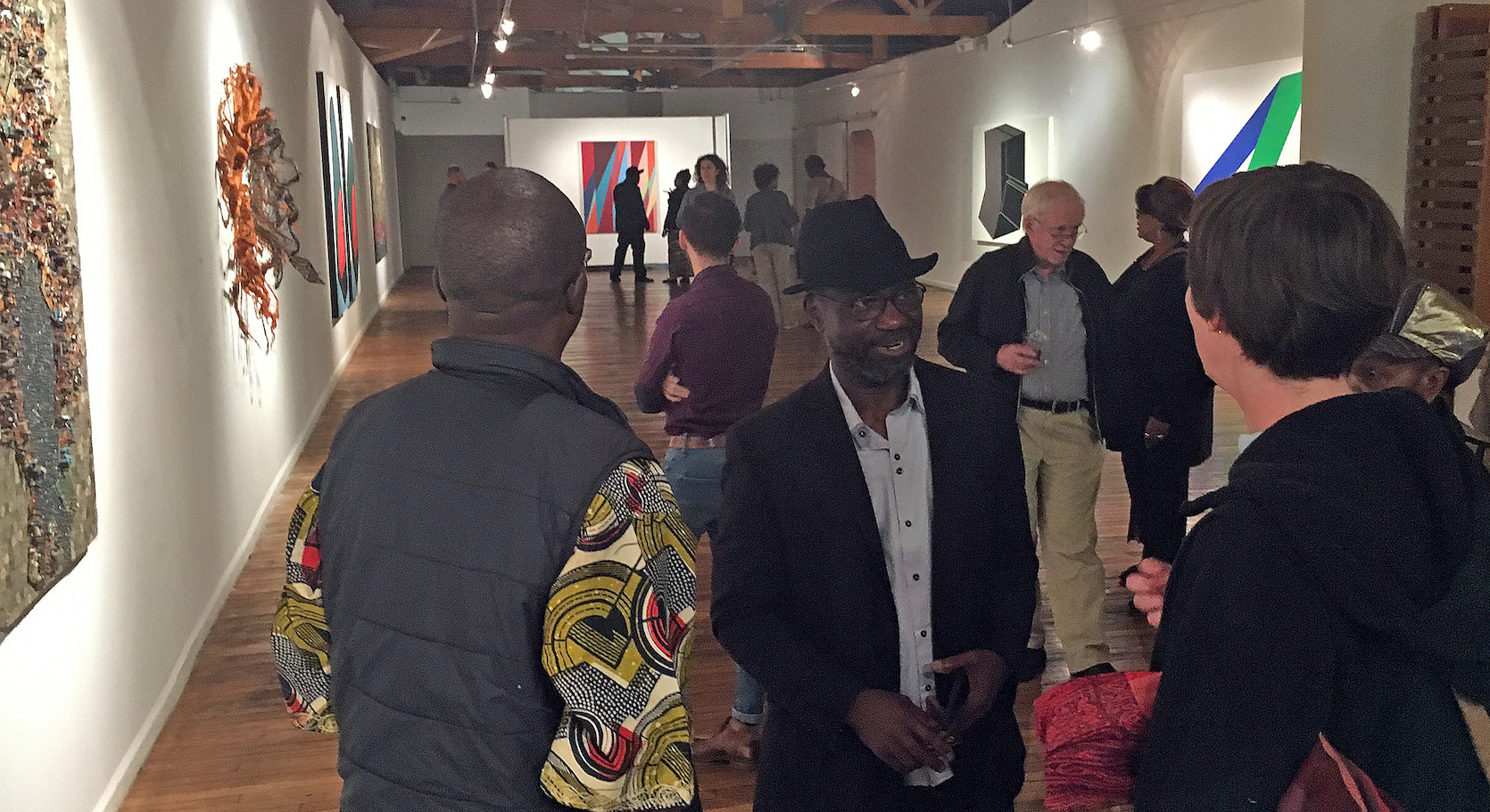
Detroit Art Review: Monet at Detroit Institute of Art
The Early Work of Claude Monet While living in the Paris suburb Argenteuil
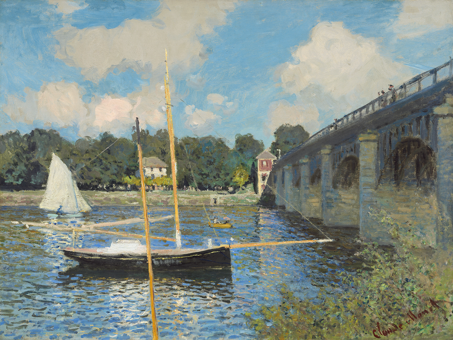
Claude Monet (French, 1840 – 1926 ), The Bridge at Argenteuil, 1874, oil on canvas, Collection of Mr. and Mrs. Paul Mellon
The Detroit Institute of Arts opened a new exhibition, Monet: Framing Life, on September 22, 2017, with the work of impressionist Claude Monet(1840-1926), an early key figure in the Impressionist movement that transformed French painting in the second half of the nineteenth century.
This exhibition depicts Monet’s leisure activity in and around Paris from 1871-78. While at the Paris studio studying with Charles Gleyre, Monet met several other artists, including Alfred Sisley, Frederic Bazille, and Pierre-Auguste Renoir. Monet found his subjects in his immediate surroundings of Argenteuil, just fifteen minutes from Paris by train.
His asymmetrical arrangement of forms emphasized the two-dimensional surfaces by eliminating linear perspective and abandoning three-dimensional modeling. Much of this work was started plein air, where Monet would set up his easel and work directly in a natural outdoor setting, then return to the studio for completion. His vibrant brightness of color in preparing his canvas with light-colored primers, instead of dark ground under-painting, broke with traditional landscape painting.
Raised in Normandy, Monet spent his youth in LeHavre and had been exposed to the work of Eugene Boudin, known for his paintings in the open areas along the Channel coast. Boudin befriended the young Monet, then only 18, and persuaded him to give up his teenage caricature drawings and to become a landscape painter, helping to instill in him a love of bright hues and the play of light on water later evident in Monet’s work.
Monet’s paintings of poplar trees and stacks of wheat, mustard colored water off cliffs off the coast of Normandy, of women strolling with children suggest that life is inherently serene, a series of warm sunny afternoons where parasols protect a woman’s delicate skin from overexposure to the sun. His quests to capture nature also prompted him to break down space and eventually merge color and subject into an atmosphere. The end result is a feeling we absorb, much more mysterious than an intellectual or logical observation.
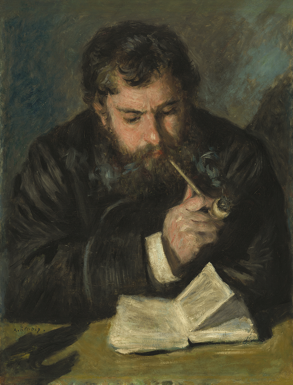
Auguste Renoir, Claude Monet, French, 1841 – 1919, 1872, oil on canvas, Collection of Mr. and Mrs. Paul Mellon
The art scene in Paris was alive and well during these years for a group of artists who wanted to change the traditional approach to painting. Pierre-Auguste Renoir had become a close friend to Monet and here in this portrait, he captures him wearing a blue jacket and smoking a pipe. Renoir had a brilliant eye for both intimate human features and the day’s fashions. His images of common families and well-dressed Parisian pleasure seekers created a bridge from Impressionism’s more experimental aims to a modern depiction of the French middle-class.
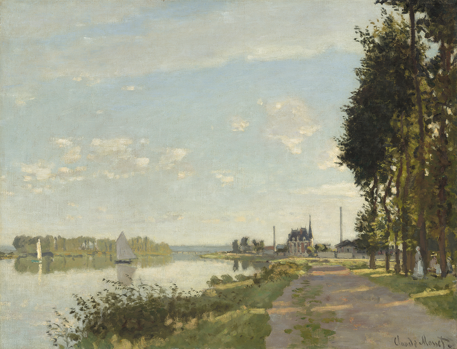
Claude Monet (French, 1840 – 1926 ), Argenteuil, c. 1872, oil on canvas, Ailsa Mellon Bruce Collection 1970.17.42
The promenade along the River Seine was a popular subject for Claude Monet. The compositional structure in Argenteuil around 1872 would shape landscape painters for years to come. He divides the canvas by threes on both the lateral and longitudinal axis while capturing low light casting shadows across this old dirt river road. The stillness here is captivating, without a person in sight or smoke bellowing from the distant factories stacks. Monet’s work lays down a foundation for artists like Childe Hassam, the American Impressionist, in his watercolor, The Beach at Dunkirk or his oil on canvas, Winter Midnight, where he has absorbed the plein air approach of Monet and the ability to offer up tranquility to people from all walks of life.
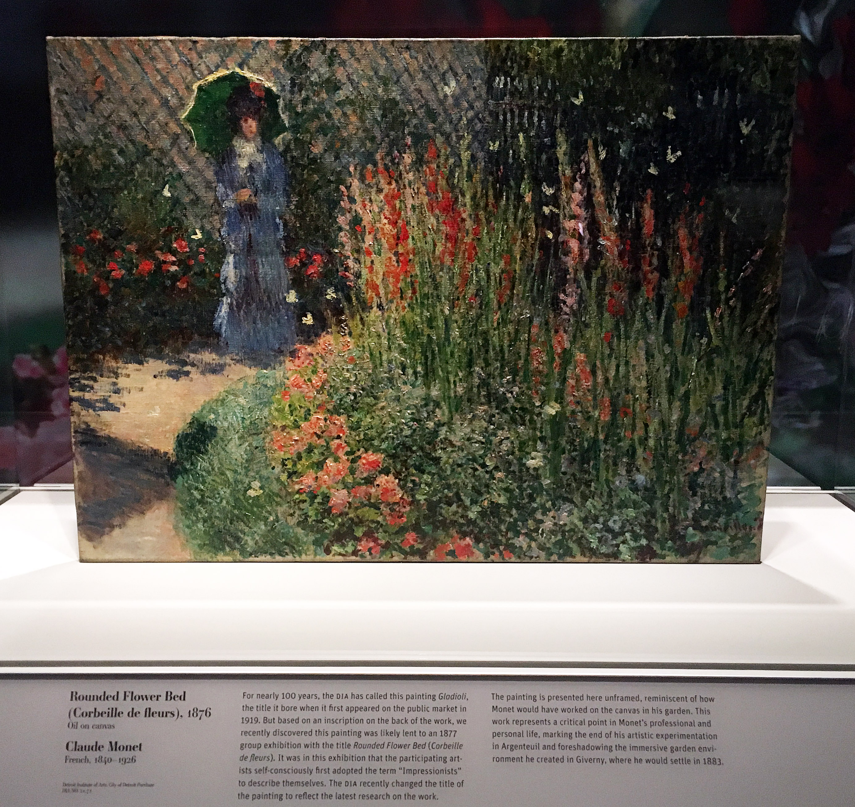
Claude Monet, Rounded Flower Bed, Corbeille de Fleurs, Oil on Canvas, 1872 Courtesy of the DIA
The painting at the center of the exhibition is the work of art formerly referred to as Gladioli and now renamed Rounded Flower Bed (Corbeille de fleurs). The renaming is the result of new research recently done for this exhibition. For nearly one hundred years, the DIA has called this painting Gladioli, the title given when it first appeared on the public market in 1919. After closer inspection, the painting was lent to an 1877 group exhibition with the title, Corbeille de fleurs or Rounded Flower Bed. It was at this exhibition that the participating artists first adopted the term Impressionists to describe themselves. In the DIA exhibition, the painting sits under glass without its frame and provides the viewer with a detailed explanation of the markings on the back of the painting. The painting is reminiscent of how Monet would have worked on canvas in his garden, and foreshadows the immersive garden environment he later created at Giverny.
The Monet exhibition, which concentrates on the late 1870’s, is where Impressionism arrives and gradually begins to mature.
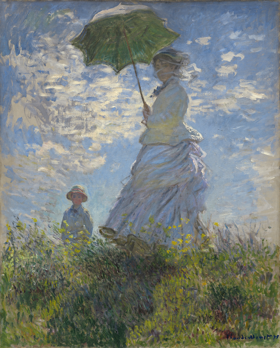
Claude Monet (French, 1840 – 1926 ), Woman with a Parasol – Madame Monet and Her Son, 1875, oil on canvas, Collection of Mr. and Mrs. Paul Mellon
It is inherent in the paintings of the early 1870s, as in Woman with a Parasol, the imposing canvas of Camille and Jean Monet, the artist’s wife and young son, where the artist starts to abstract the clouds simply using marks of paint and the white dress becomes blue. Monet’s compositions were based on zones of light and shade. Two years later, in the open fields near Argenteuil, the figures are seen from a distance, and everything disintegrates into a blur of minced color.
The work of Claude Monet is so instilled into our lexicon of artwork, we tend to forget how new the work was to the art world. Cezanne has been quoted as saying, “Monet is only an eye, but good God, what an eye.” The art of impressionism conjures up a world of magical charm filled with light and color. More than anyone else, Claude Monet recognized that his garden, rather than his words, presented the path to understanding his art.
Monet: Framing Life is on exhibition at the Detroit Institute of Arts, through March 4, 2018. Wayne, Oakland and Macomb counties: $10 for adults, $5 for ages 6-17, $8 per person for groups of 15 or more.
This exhibition has been organized by the Detroit Institute of Arts and made possible by the Bonnie Ann Larson Modern European Master Series. Generous corporate support has been provided by Park West Foundation, JPMorgan Chase, Altair, English Gardens, and Grand Hotel—Mackinac Island. Major support has been provided by Lois and Avern Cohn. Additional funding is contributed by Dr. Mark and Amy Haimann, Dr. Theodore and Diana Golden, anonymous donors, Eleanore and Dick Gabrys, and Andrew L. and Gayle Shaw Camden.