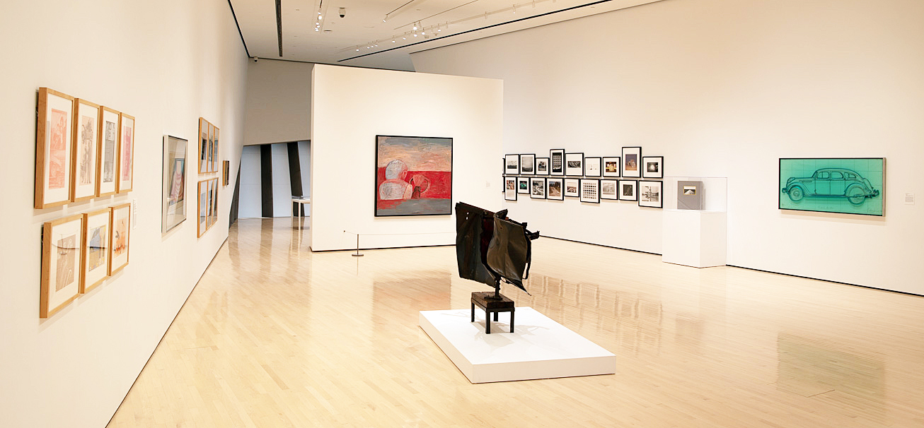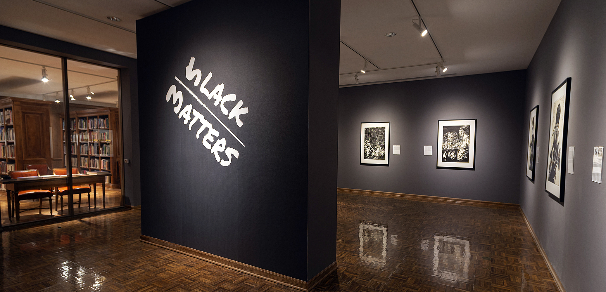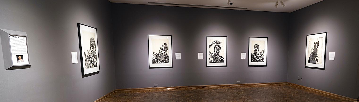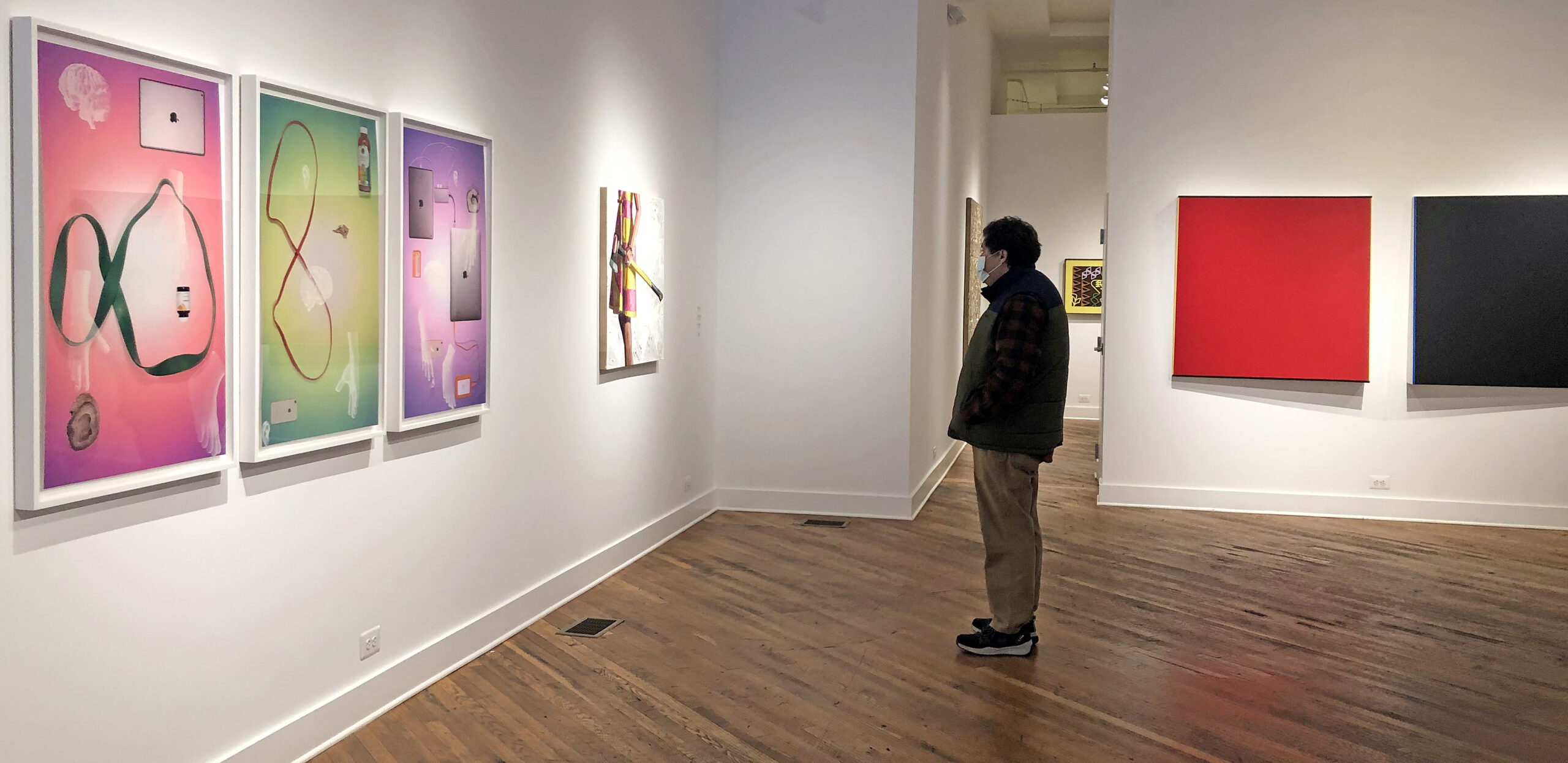
Installation image, New Work, New Year, 2021
If it has been hard to survive 2020, that has been especially true for the art community. Artists have had to be concerned with their health, livelihood and families, endure a deadly virus and experience a tumultuous political environment that heightened the anxiety in everyone’s lives. Art exhibitions struggled to even exist in 2020, while some opted to be exclusively virtual. The David Klein galleries have consistently staged openings, albeit with masks, social distancing and staggered appointments.
The David Klein Gallery’s Director of Contemporary Art, Christine Schefman, has started off the new year by looking back at 2020 with an exhibition statement about this new show. She says, “2020 was a year of uncertainty, but one thing we know that remained constant was artists making art. Maybe there was a pause at the beginning, but ultimately artists found the inspiration to keep moving forward. Whether they continued to explore an ongoing body of work or create something entirely new, their practice endured.”
In this exhibition of fifteen artists, the first two artists I will mention are Robert Schefman and Kelly Reemtsen, both clearly figurative painters with a depth of experience yet whose work is completely juxtaposed.
Schefman talks about choosing an illusionist narrative while avoiding the term photorealism, and he has worked hard at finding a story that uses the human form as his subject. Over the years, his technique has been impeccable. He has made a point to find a theme, a secret or a mystery that dominates these large oil paintings, and he obviously devotes time to the color pallet and composition. Reemtsen on the other hand, who has spent time on the west coast and is drawn to Wayne Thiebaud’s work, creates tension between a headless female figure in a pop art patterned dress grasping tradesmen tools; be it a saw, a shovel or an ax. Schefman’s oil paint is carefully and smoothly applied with photo accuracy. In contrast, Reemtsen’s oil paint is very thick and applied loosely at times with a palette knife to the background, while the dresses are always A-line designs cinched at the waist. Her work shouts out contemporary like Balthus, while Schefman’s work is soft and traditionally romantic like Vermeer. It is noted here that the figure has become popular as of late, but it is always a challenge to follow in the steps of DaVinci, Botticelli, Michelangelo, Rembrandt, Caravaggio, Ingres, Manet, Klimt, Sargent and Picasso, to name just a few.
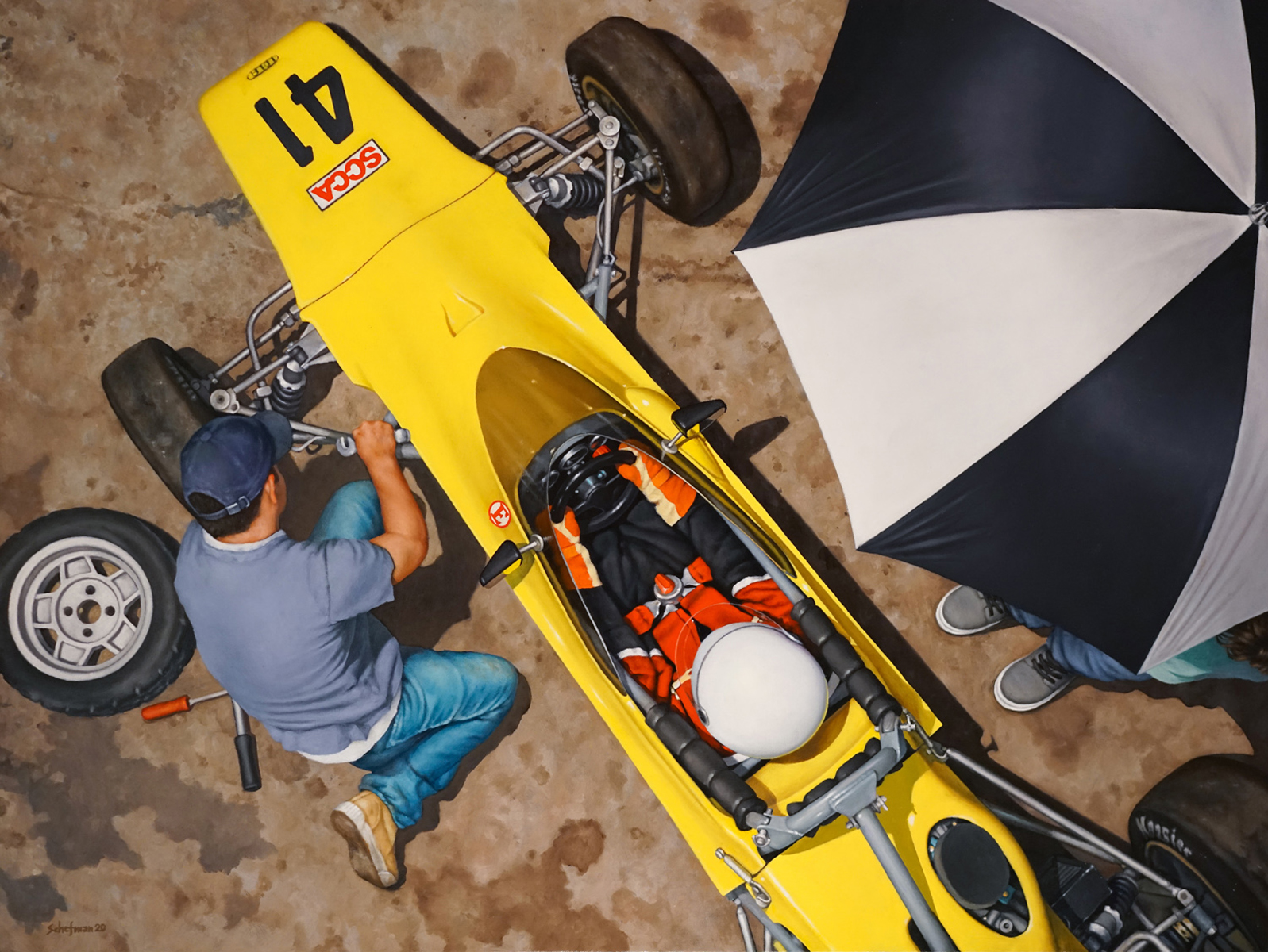
Robert Schefman, Lola, Oil on Canvas, 50 x 40″, 2020
Robert Schefman’s last solo exhibition at the David Klein Gallery in November 2019 focused on a series of works exploring hidden secrets sent to him via social media with no names attached. He leaves that process during 2020 with Lola, an aerial view of a Formula 4 race car as a crew member changes a tire while a figure holds the umbrella protecting the driver from heat or approaching rainfall. It fits nicely into his illusionistic narrative. The strength here is the point of view, the use of color and the construction of a compelling composition. Although it gleams with the craft of realism and the precise replication of photo imagery, it is likely the nostalgia of this moment in time draws the artist back to an earlier period in his life.
Robert Schefman earned a B.F.A. from Michigan State University and an M.F.A. from the University of Iowa.
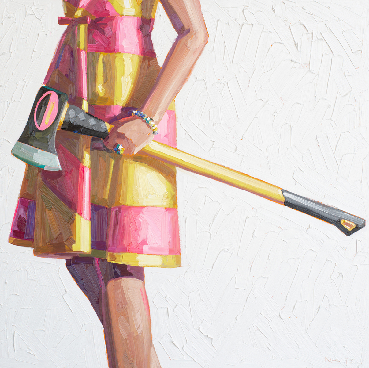
Kelly Reemtsen, Bits and Pieces, Oil on Panel, 36 x 36″, 2020
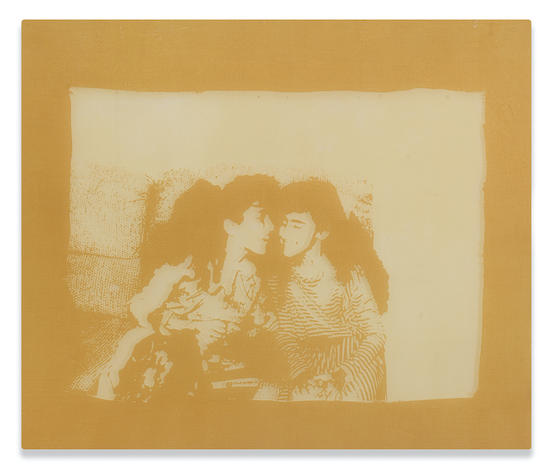
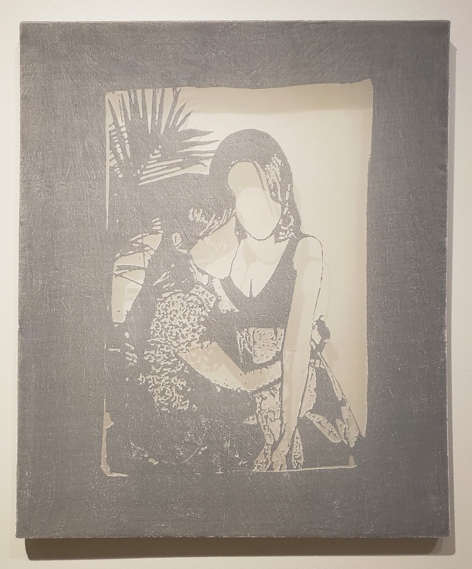
Kelly Reemtsen gives us her now-familiar depiction of a young woman in retro skirts carrying an ax, with her trademark being pictorially cropped at the head. Although there have been large paintings in the past that include the female’s head, the work here, Bits and Pieces, is repeated both in composition and the thick, painterly impasto of oil paint. Set against a white background, the viewer is forced into the tension between the dress pattern and the manly grasp of the color-coordinated ax. Perhaps an early interest in fashion found its way into her mindset, and the niche was oddly a new “post-feminist” expression. The other element that keeps repeating itself is the reoccurring geometric patterns, both on the dresses and in the backgrounds.
Kelly Reemtsen earned her undergraduate degree from Central Michigan University and pursues her graduate degree at California State University at Long Beach.
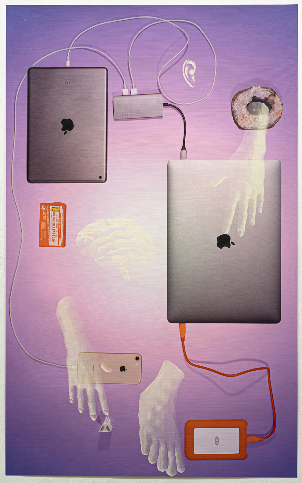
Cooper Holoweski, Late Stage, New Age Process, Mixed Media, 40 x 24″, 2020
In this exhibition, Cooper Holoweski’s Mixed Media pieces were new, fresh and fascinating. Based on a composition of photo illusions of objects, human parts and abstract forms, the work has an underlying grid that supports the vertical work on paper. Although the work was a new experience, the name was familiar. I had written about his video work at the Center Gallery, College of Creative Studies, in 2017. What still fits from the review is his mention of tension, contradiction and counterbalance, elements present in this new mixed media collage imagery. These mixed media prints are highly technical in their creation, something described as New Age Process. Made on Homasote, a cellulose-based fiber wallboard, several gesso coats are applied, and Holoweski uses a laser engraver to obtain a variety of effects creating his archival inkjet print.
Cooper Holoweski earned a B.F.A from the University of Michigan and an M.F.A. from the Rhode Island School of Design.
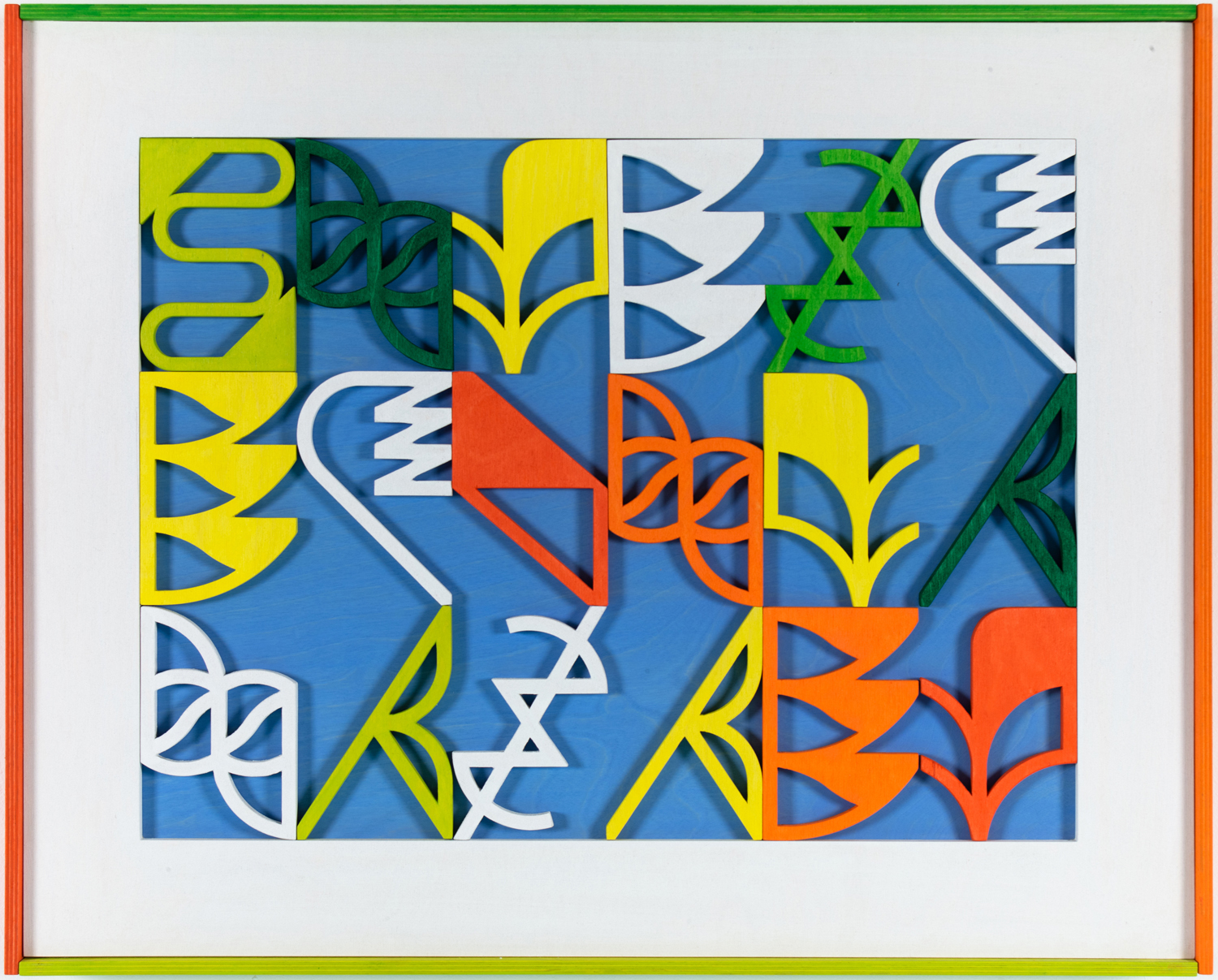
Mark Sengbusch, Singin in the Rain, Acylic on Plywood, 25 x 31″, 2020
Mark Sengbusch’s work is an assemblage of pieces of colorfully painted shapes made from wood that are arranged on a grid with a solid colored background. From his biography, it appears as though the types of forms he uses have been influenced by the architecture he experienced in his travels to Europe and the Middle East. The feeling one gets relies on the pattern created by these new and unusual shapes in this work, Singin in the Rain, which is a combination of secondary color and repetition. These design elements’ craftsmanship extends to the surrounding border and frame, making it an integrated part of the work. He refers to asemic approaches to writing with no semantic content but rather symbolism that is open to subjective interpretations.
Mark Sengbusch earned his B.F.A. from the College for Creative Studies and his M.F.A. from Cranbrook Academy of Art.
Ricky Weaver, My First Mind Tells Me, Archival pigment print, 30 x 45″, 2020
Ricky Weaver’s work employs magical realism to investigate the moment. She uses images of herself to capture a metaphysical sense of reality in her work. In the work My First Mind Tells Me, she recreates a moment with multiples of the same person while shifting to composition and color aesthetics. The attraction here is bringing the viewer into her world and keeping them questioning where the reality lies. The theme that resonates throughout her work is the black female and her relationship with faith. Much of her work is black & white images, but My First Mind Tells Me is rendered in full color. Repeatedly, she investigates the possibilities of these moments and forces the viewer to imagine a variety of alternatives. It is refreshing to experience an artist so grounded in her beliefs that it transfers to her work.
Ricky Weaver earned her B.F.A. in Photography from Eastern Michigan University and an M.F.A. in photography from Cranbrook Academy of Art.
Scott Hocking is well known for installations both in the gallery and on sites throughout the Detroit Metro region and beyond. In answering what an artist did in 2020, he responds with a digital film, Kayaking Through the Quarantimes. He mentions in his statement, “Over the years, the experience of kayaking has developed into a full-blown obsession, a much-needed connection to nature and quietude, an art project in itself.”
The exhibition includes the work of: Ebitenyefa Baralaye, Susan Campbell, Matthew Hawtin, Scott Hocking, Cooper Holoweski, Kim McCarthy, Mario Moore, Marianna Olague, Jason Patterson, Kelly Reemtsen, Lauren Semivan, Mark Sengbusch, Robert Schefman, Rosalind Tallmadge and Ricky Weaver.
Hourly time slots are available with a maximum of 20 visitors per hour. Plan your visit to the gallery at www.exploretock.com/davidkleingallerydetroit For further information, please contact: Christine Schefman Director of Contemporary Art: christine@dkgallery.com