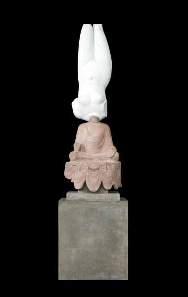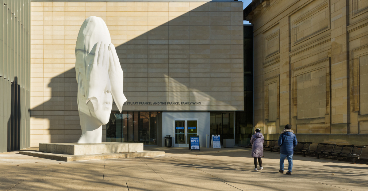
Jaume Plensa, 2018, polyester resin and marble dust, 24.5’ h x 9’ x 10’. Gift of J.Ira and Nicki Harris. Photo: Patrick Young, Image Works
We knew this would happen.
After a certain amount of hand-wringing and wheel-spinning at the beginning of the pandemic, museums and galleries have begun to come up with increasingly creative ways to engage the public’s interest in art, both in person and digitally.
The University of Michigan Museum of Art (UMMA) has just installed a major new sculpture by Spanish artist Jaume Plensa on the museum grounds, where it can be seen all day and all night. (Plensa may be best known to the region’s art-loving public as the creator of the Crown Fountain, the interactive video sculpture in Chicago’s Millennium Park.)
Behind the Walls was on view for the Frieze Sculpture Festival in May 2019 at Rockefeller Center in New York City, but since its purchase and recent installation in November 2020, will be permanently on display outside UMMA. The pure whiteness of the young girl’s head, with her disembodied hands shielding her face, references classical marble sculpture, but its colossal size and slightly distorted perspective bring it into the twenty-first century.
Curriculum/Collection @ UMMA
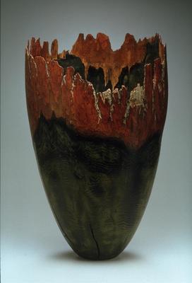
Hemlock Canyons, Mike Irolla, 2001, hemlock, 25” x 16” x 16” photo: UMMA
Wormwood Vase, David Nish, 1997, wormy ash, 4 1/2” x 4” x 4” photo: UMMA
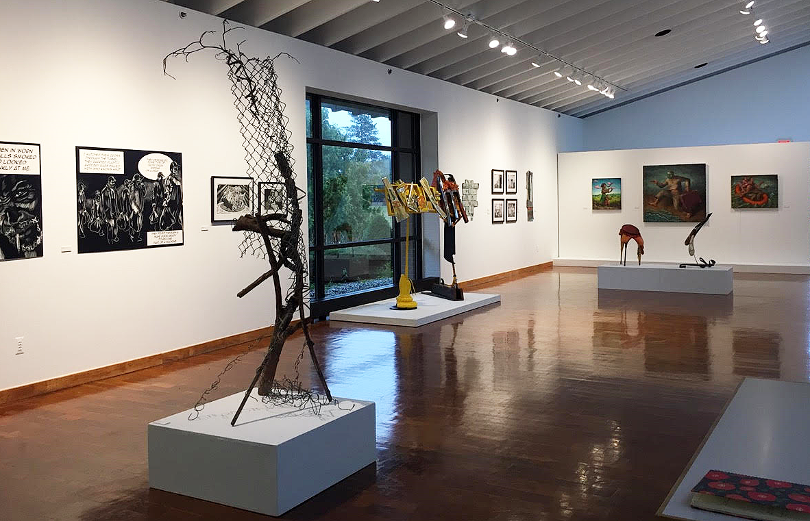
And if you are lucky enough to have a university i.d. (UMMA is currently closed to the general public during the pandemic) and can get inside the museum, an inventive new and ongoing program called Curriculum/Collection has recently launched. The project integrates art objects from the museum’s collection into the study of university subjects as diverse as philosophy, design and architecture, and as seemingly improbable as health care, data science and social work. For this project, which will run from October 2020 through June 2021, Andrew W. Mellon Curator David Choberka has enlisted 7 classes from throughout the university to integrate artworks into their course of study to–as he says–“explore the infinite value of art in shaping our understanding of …well, everything.” In addition to the art objects on display in the A. Alfred Taubman Gallery I, the Curriculum/Collection has a robust and constantly changing online presence, with plentiful video and textual content to amplify and clarify the explorations of the subject matter through art. Online material will be updated and expanded throughout the year as the classes progress.
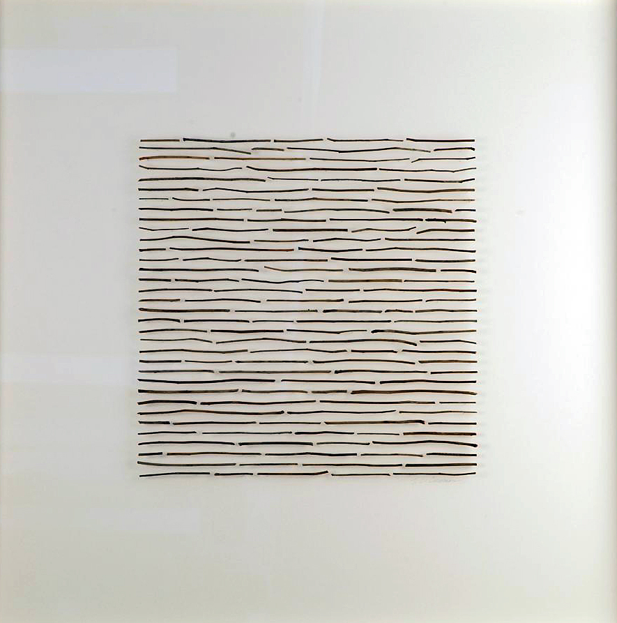
Field Notes II, Larry Cressman, 2009, raspberry twigs, polymer, pins, 32 5/8 x 32 ½ “ photo: UMMA
Some areas of study are more obviously related to the visual arts than others. For her undergraduate art and design class, Florilegium: Creating a Plant Compendium, Penny Stamps School of Art and Design lecturer Cathy Barry has chosen a variety of works by artists who engage in the forms, life processes and cultural meaning of plants. Three of the pieces Barry has selected show how artists can enlist natural systems in creating artworks that meaningfully connect human and natural forces. For his elegant turned-wood vase Hemlock Canyons, Michigan artist Mike Irolla leaves residual bark on the surface to suggest natural rock formations referenced in the title, and employs fire as the finishing element, adding texture and color the surface. Nearby, Wormwood Vase by David Nish, can be described as a work of art collaboratively created by an insect and a human. In contrast, a delicate assemblage by Larry Cressman implies the careful labor of a natural historian, collecting and cataloging slender twigs in a serene post-minimalist composition that hums with nature’s quiet buzz. There is clearly a lot of material for the students to work with here, in addition to their field work and their own studio practice. The final product of all this thought and reflection will be a book-form summation of their studies based on the florilegium, a compendium of plant illustrations popular among the British landed gentry in the 18th century.
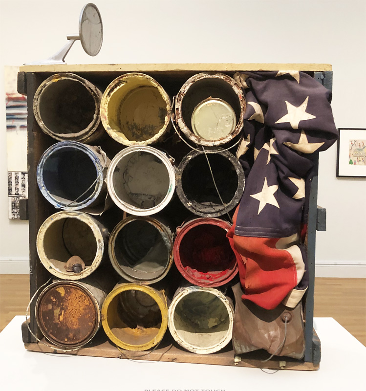
Untitled (Paint Cans), Tyree Guyton, 1989, paint cans, wooden crate, American flag, rearview mirror, ceramic figure. Photo: K.A. Letts
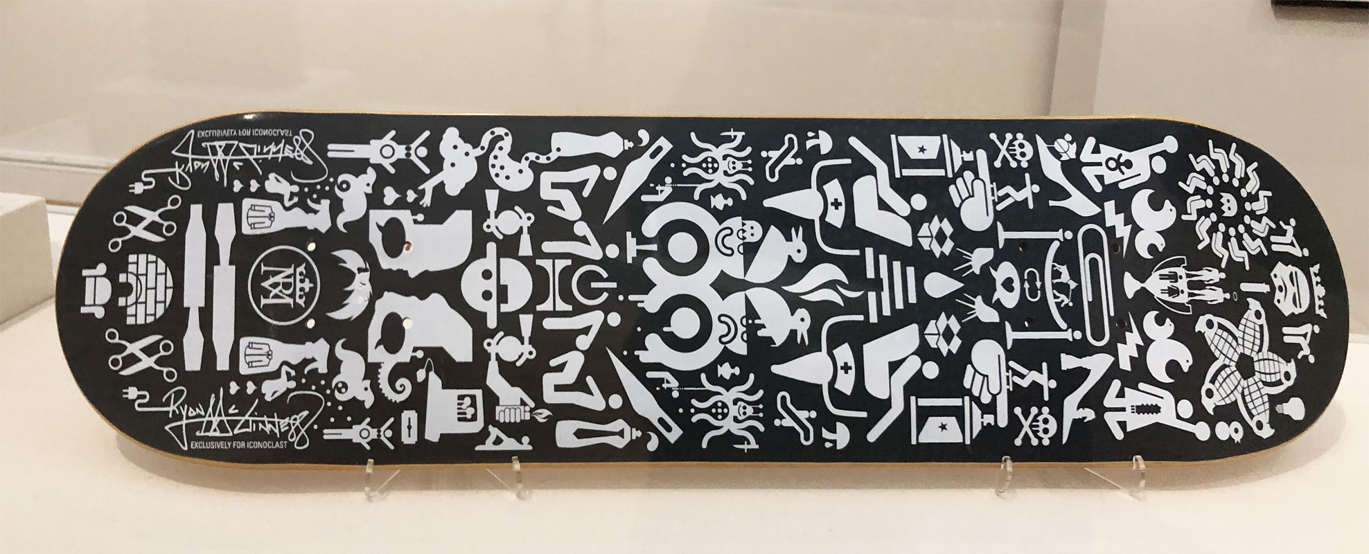
Hopeless Gifts to Material Culture, Ryan McGinness, ca. 2000-2008, silkscreen on skateboard. Photo: K.A. Letts
Another particularly interesting collection of objects and images by artists with ties to southeast Michigan will support Introduction to Community Organization, Management and Policy/Evaluation Practice. Course leader Larry M. Gant, who holds professorships in both the School of Social Work and at the Penny Stamps School of Art and Design, premises the idea for this course on his view that conventional social work focuses too narrowly on quantifiable socio-economic assets and deficits, while neglecting intangible social capital, such as community based art. Selected artworks include an assemblage by Tyree Guyton, whose Heidelberg Project has famously waxed and waned in Detroit for over 30 years. In a nearby case, a hipster skateboard by Ryan McGinness features cryptic hieroglyphics of urban signage and graffiti. A mask-like assemblage entitled Michigan Worker, by George Garcia, succinctly expresses both drudgery and endurance, and is typical of Detroit artists that use the found detritus of the city as raw material for their art practice. These artworks make the case for a more nuanced appreciation of visual culture within the context of urban communities, and it will be interesting to watch this class progress and what conclusions can be teased from the materials provided.
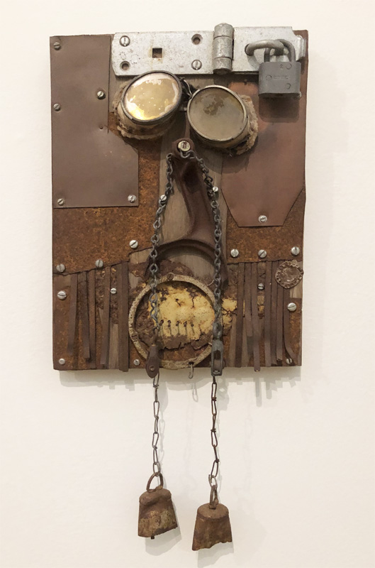
Michigan Worker, George Vargas, 1985,welding goggles, metal, hanging belts, rusty bottle cap, pulleys, chains, padlock mounted on plywood, 20 7/8” x 10 3/8” x 2 9/16” Photo K.A. Letts.
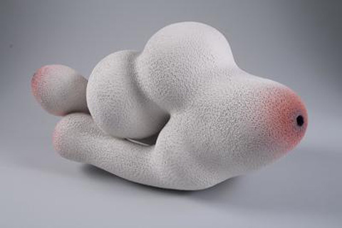
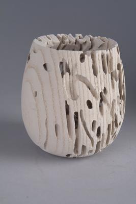
Nociceptor-Heart Sutra, Susan Crowell, 2009, white stoneware, industrial ceramic pigment, 9” x 18” x 9” Photo: UMMA. Class: Perspectives on Health and Health Care.
The direction that the other five classes will take in their exploration of their selected artworks remains to be discovered, as Curriculum/Collection is in its early stages. The museum will provide supporting information on the progress of each class on the museum website, updated throughout the academic year. I, for one, am interested in finding out how art and philosophy, architecture and neural networks, data science, political protest and health science will cross-pollinate and enrich each other. An occasional virtual visit to Curriculum/Collection to see how the U of M students are doing might be just the thing to get us through this dark pandemic winter.
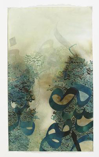
Winter in Ann Arbor, Khaled al-Saa’i, 2002, natural ink, tempera and gouache on paper, 14 1/16” x 8 5/16” Photo: UMMA. Class: Data Science and Predictive Analytics
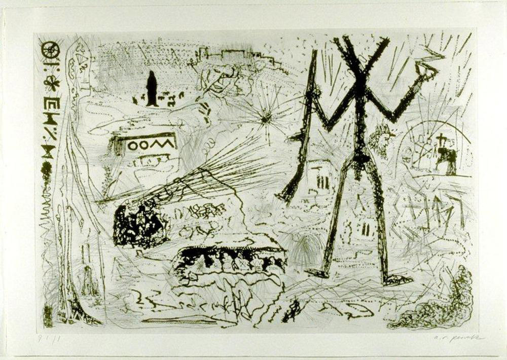
A Taste of the Desert, A.R. Penck, 1983, drypoint on Arches vellum paper, 29” 5/8” x 41 7/8” Photo: UMMA. Class: Art and Resistance: Global Response to Oppression.