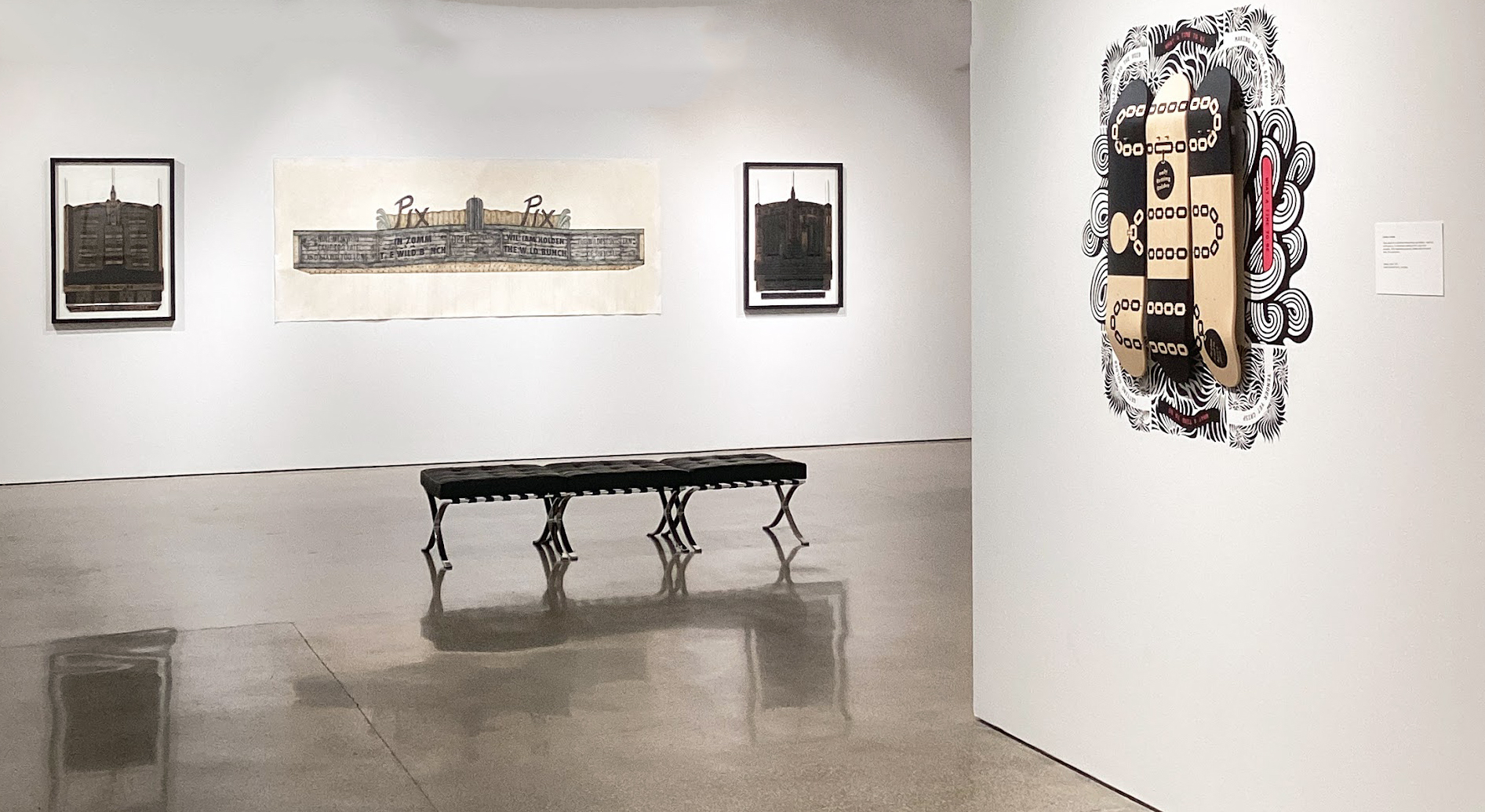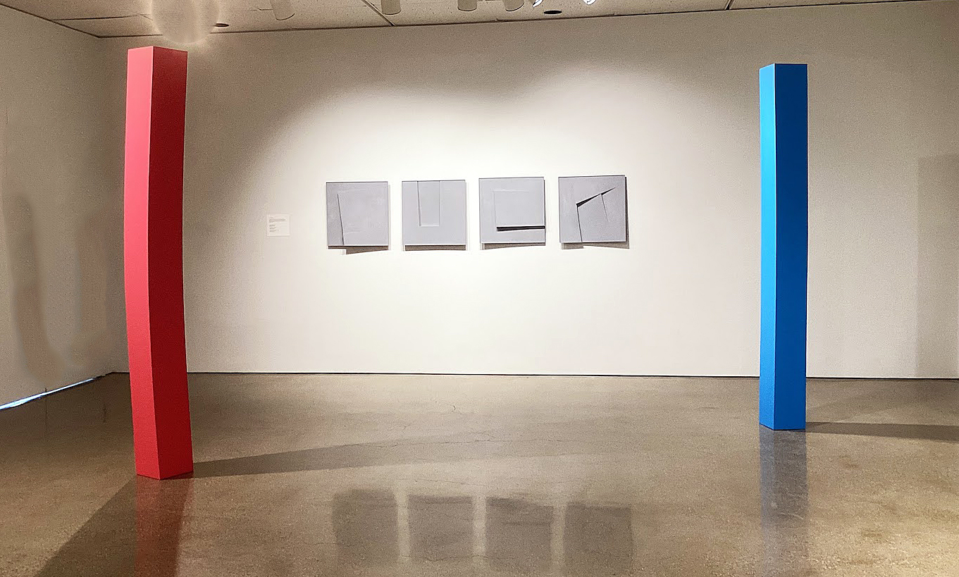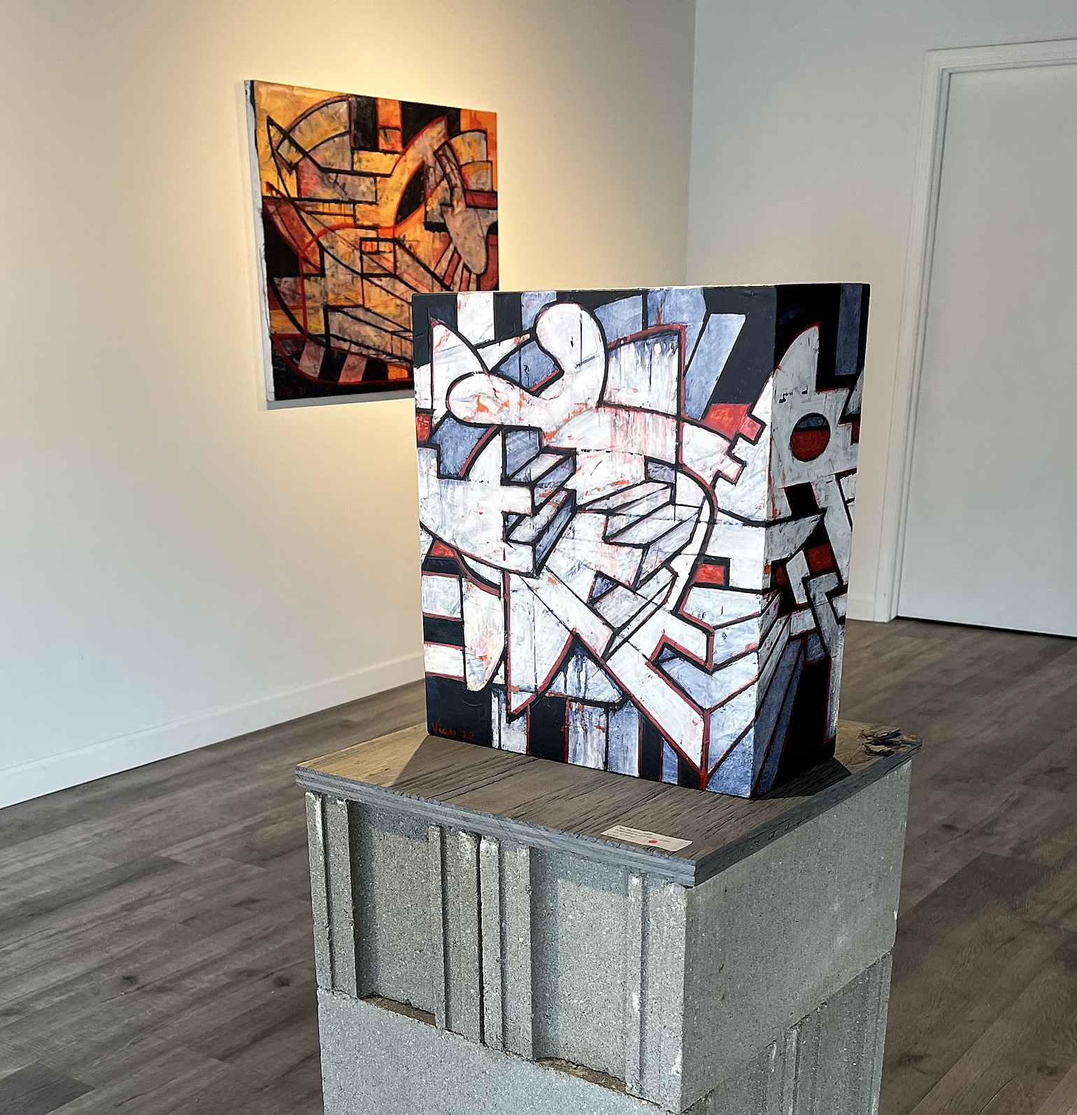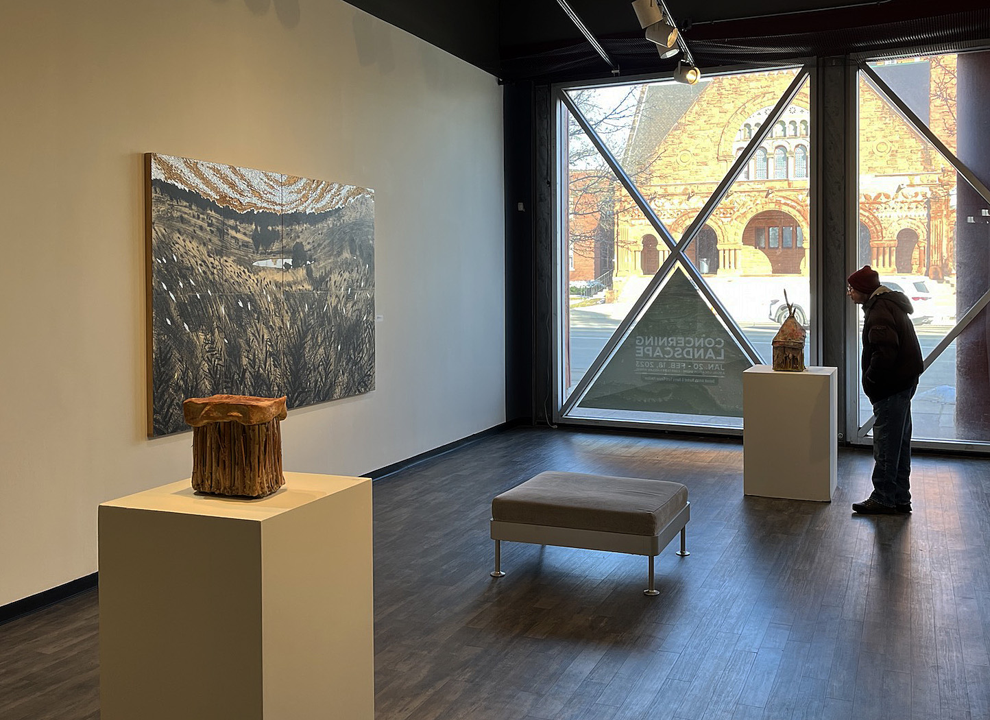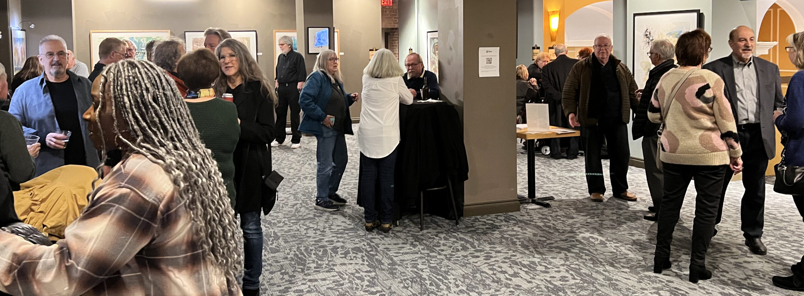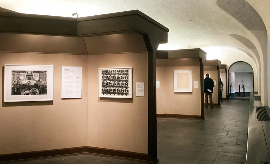
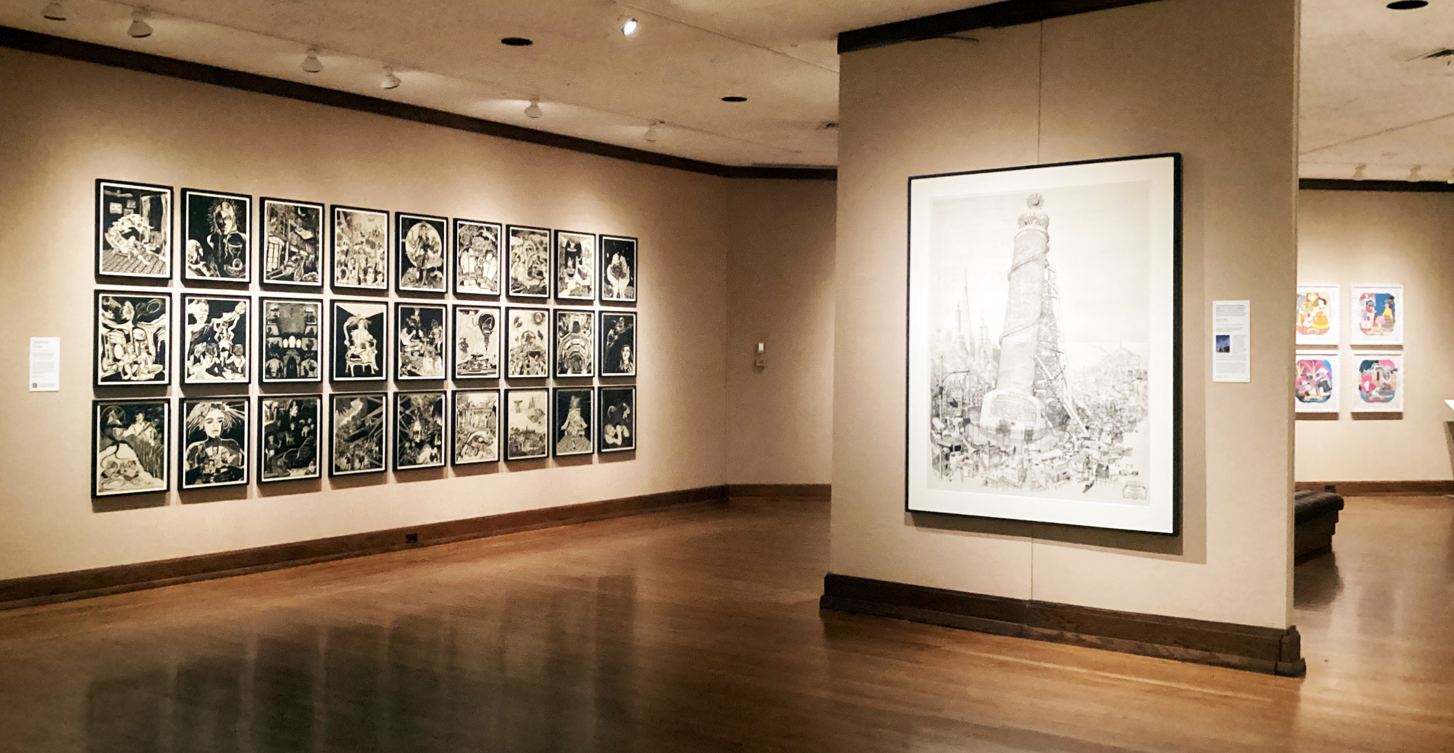
Exhibition view of Printmaking in the Twenty-First Century. All Images: Ashley CookPrintmaking in the Twenty-First Century at the Detroit Institute of Arts
Printmaking in the Twenty-First Century @ Detroit Institute of Arts
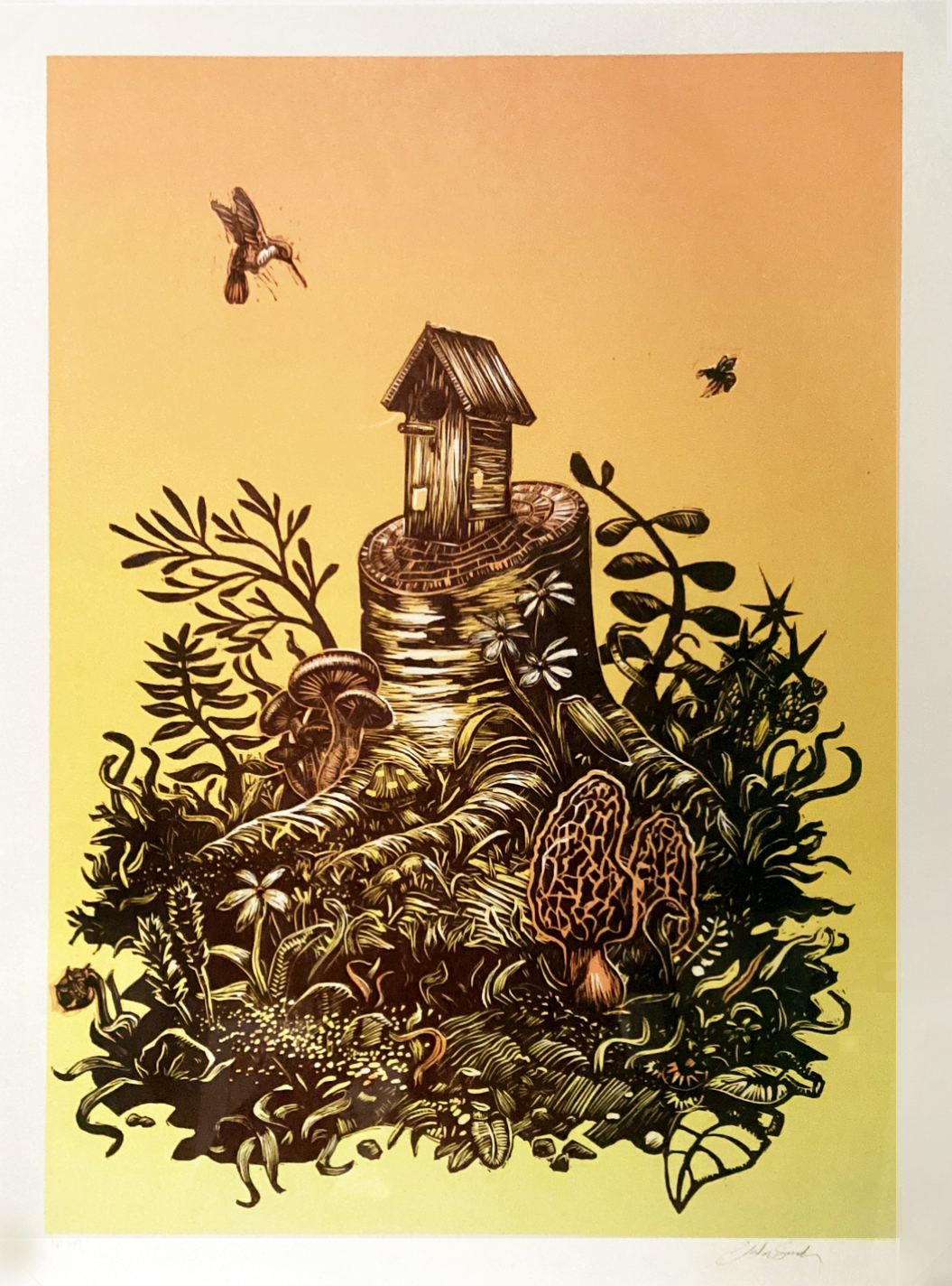
On view at the Detroit Institute of Arts is an exhibition that focuses on printmaking with over 60 works by local, national and international artists. Clare Rogan, who is the Curator of Prints & Drawings at the DIA, unpacks the magic of printmaking through placards that explain some of the most widely used processes and their history dating back to 700 AD in China. Since the first moment that ink was applied to a carved plate and pressed onto paper, it became evident that this new technology would change the trajectory of creative expression forever. Printmaking, unlike drawing or painting, allowed for the production of multiples, which gave artists a chance to produce more and reach a broader audience while still remaining true to their vision. Printmaking in the Twenty-First Century presents a plethora of practices including woodcuts, aquatints, linocuts, screenprints, lithographs, intaglios, relief collagraphs, letterpresses, monoprints, etchings, drypoints, spitbites, photo etchings and engravings. While the featured artists draw inspiration from a lineage over 1300 years old, the works in this exhibition span from the year 2000 until now.
The Schwarz Galleries of Print and Drawing is where you can find this show. Depending on which door you enter, you will receive the body of work differently, however all guests will walk away having witnessed the breadth of concerns these printmakers have addressed. Experimentation is particularly evident in works like Shadows II by William Kentridge, Arise by Fred Wilson, Aerial #3 by Susan Goethel Campbell and Untitled by Tara Donovan. Each of these pieces participate in conversations of abstraction through investigations of material and process. Visually, experimentation by printmakers seems to have furthered aesthetic potential and often achieved deeply mystical outcomes. Many times the printmaker’s multi-step process of creating is mysterious; the informative literature throughout the show satisfies the curiosity a fascinated viewer may have.
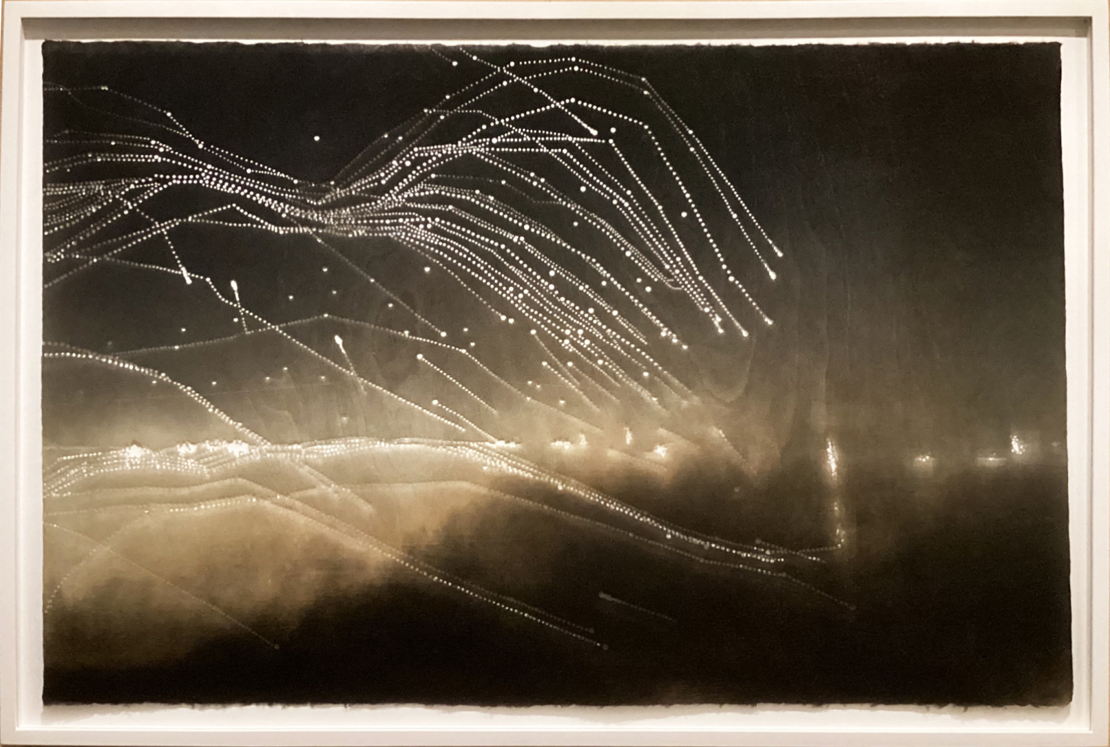
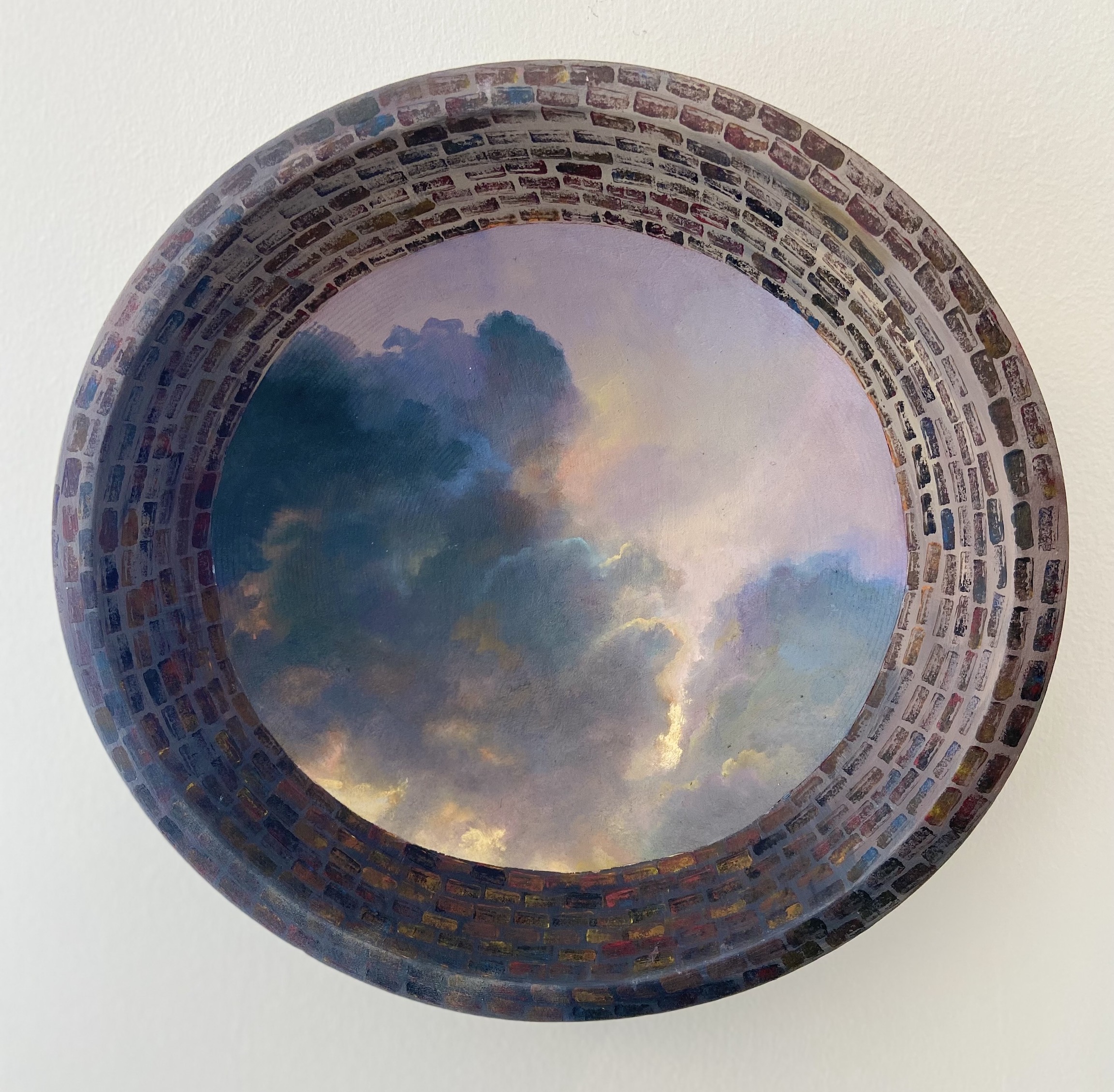
Susan Goethel Campbell, Aerial #3, Monoprint printed in brown and black ink with hand punching on kozo paper, 2010
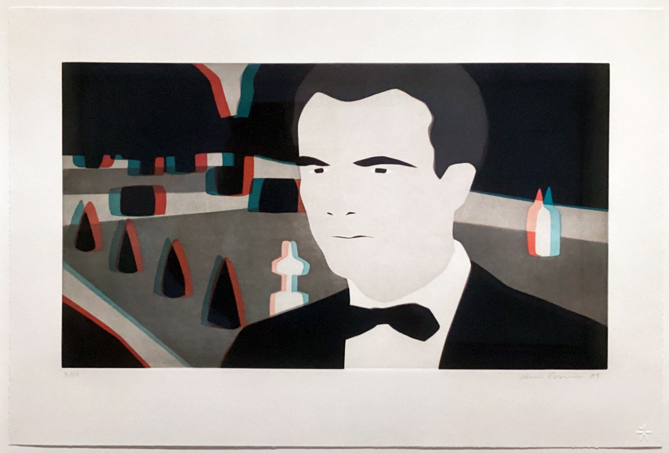
Kota Ezawa, X3D, Color aquatint on paper, edition 3/35, 2009.
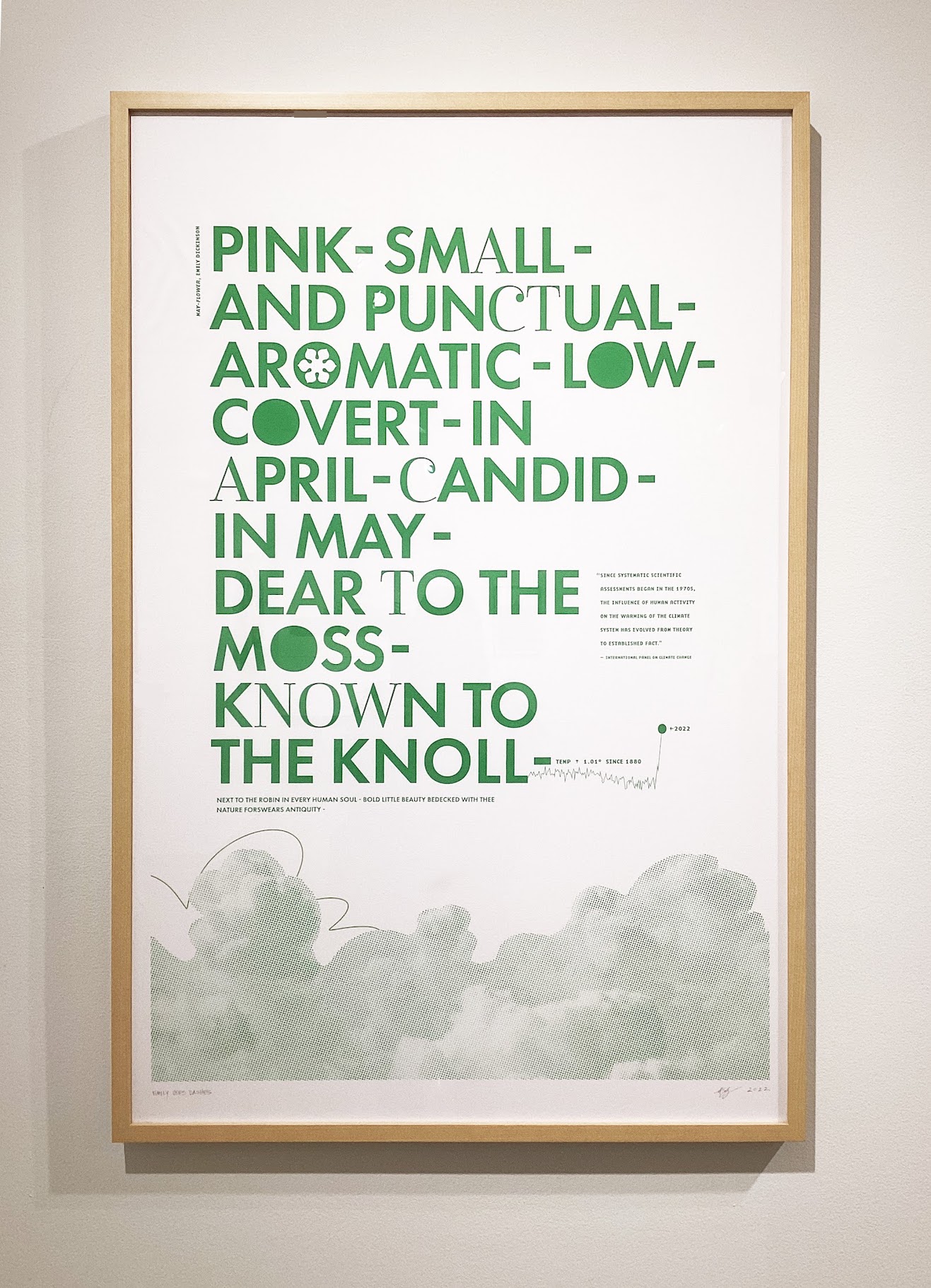
For those who prefer representation, this show also has what you’re looking for. While experimentation is still evident in pieces like Watermark by Nicole Eisenmen and X3D by Kota Ezawa, there is as much concern for producing a legible illustration as there is for exploring the different ways to do so. There are also impressively complex representations of birds in Dying Words by Walton Ford and bugs in The Bestiary of Museum Visitors Notable Bird Beaks of American Museum History Exhibition Paradise and Perdition Thorny Territory by Mark Dion. These two, however, utilize more traditional methods of printmaking to explore the possibilities of realism, which highlights yet another of printmaking’s many facets.
Further into the exhibition is On Press Project: Prints for Non-profits, organized by Detroit-based printshop Signal Return who invited local artists to produce posters for non-profits in the Detroit area. There are 24 linocut and letterpress posters that were made between 2018 and 2022 that bring awareness to organizations, including Detroit Hives, Black Family Development, Keep Growing Detroit, Freedom House, The Children’s Center, and Greening of Detroit. Amongst them are posters for Detroit Will Breathe, an activist group that represents and supports Detroit’s participation in the global Black Lives Matter movement. These simple yet powerful protest posters silently shout DEMOCRACY FOR ALL! and remind us of the essential role that printmaking has held in the realm of activism throughout time. Signal Return spent much of 2020 producing protest posters for Black Lives Matter activists free of charge, which have fueled the demonstrations in the streets. This gesture is not new; researching images of human rights marches throughout history, we see that mass-produced messages designed by artists and produced by printmakers have been critical.
Clinton Snider, Greening of Detroit, Linocut, 202
This exhibition does not shy away from themes of colonization and the oppression of marginalized groups. It confidently moves on to explore more ways in which printmaking can be a functional approach to critiquing such realities while honoring and supporting those who are challenged with underrepresentation. Curated into the show is a series of printed medical-grade masks by world-renowned political artist Ai Weiwei. They were created in 2020 and sold to raise money for Covid-19 relief programs like Human Rights Watch, Refugees International, and Doctors without Borders. Sultana’s Dream is a large-scale imaginative series that depicts the array of achievements by women who live in a world free from the laws and wars of men. The purpose of these images is to illustrate a short novel by Bengali writer and women’s rights activist Rokeya Sakhamat Houssain.
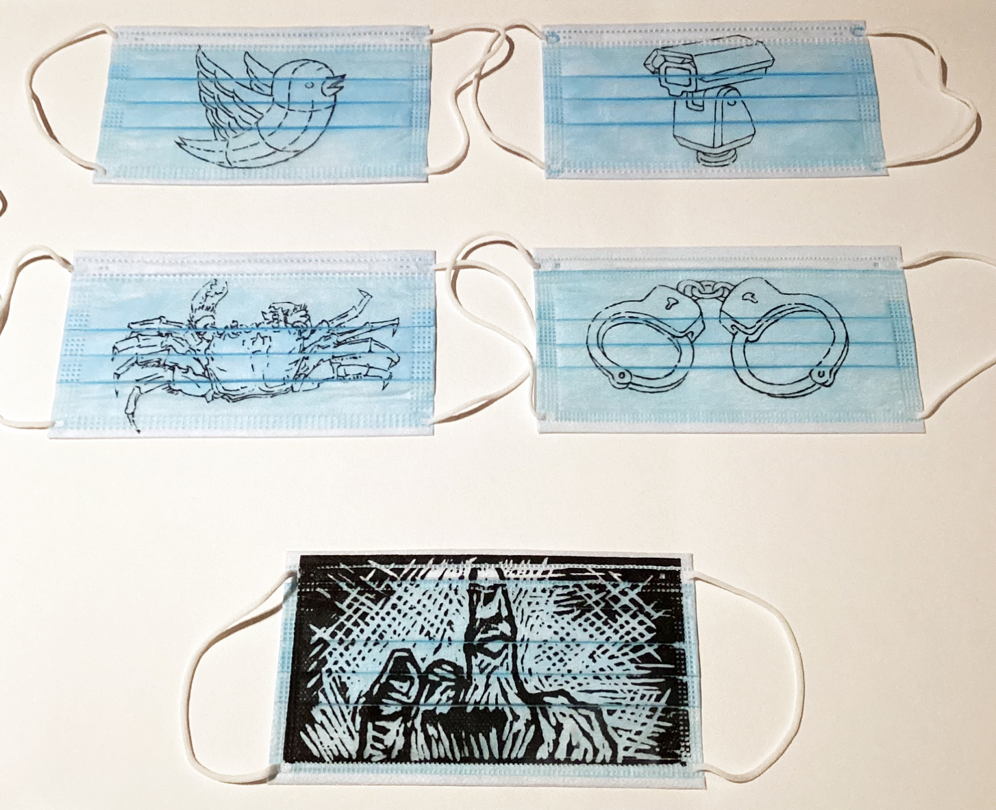
Ai Weiwei, Ai Weiwei MASK, Screenprints on polypropylene masks, unlimited edition, 2020.
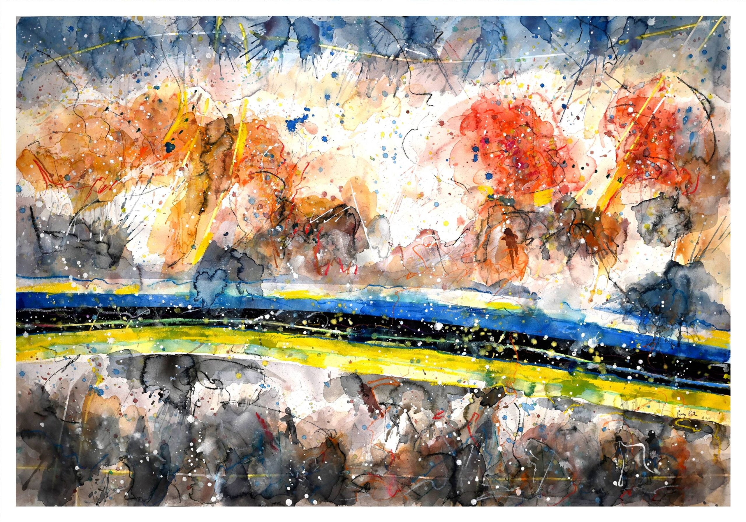
Additionally, the beautiful life-size works of artist Dyani White Hawk represent the dentalium dresses worn by indigenous women of North America. Roger Shimomura addresses anti-Asian racism through his depiction of childhood memories as a boy living in Japanese internment camps during WWII. Robert Pruitt illustrates the complexities of Black identities through an image of a female basketball player with the Black Panther Party slogan “Black is Beautiful” on her jersey. Hernan Bas presents the male characters of Hardy Boys mystery novels with fairy wings to challenge gender norms and the disparagement of homosexuality. It would be safe to assume that nearly half of the works on display in this exhibition were done as a product of material experimentation with something to learn, while the other half were done as a product of support with something to say. The common thread is that they all require a curious urge to explore and an open mind to appreciate.
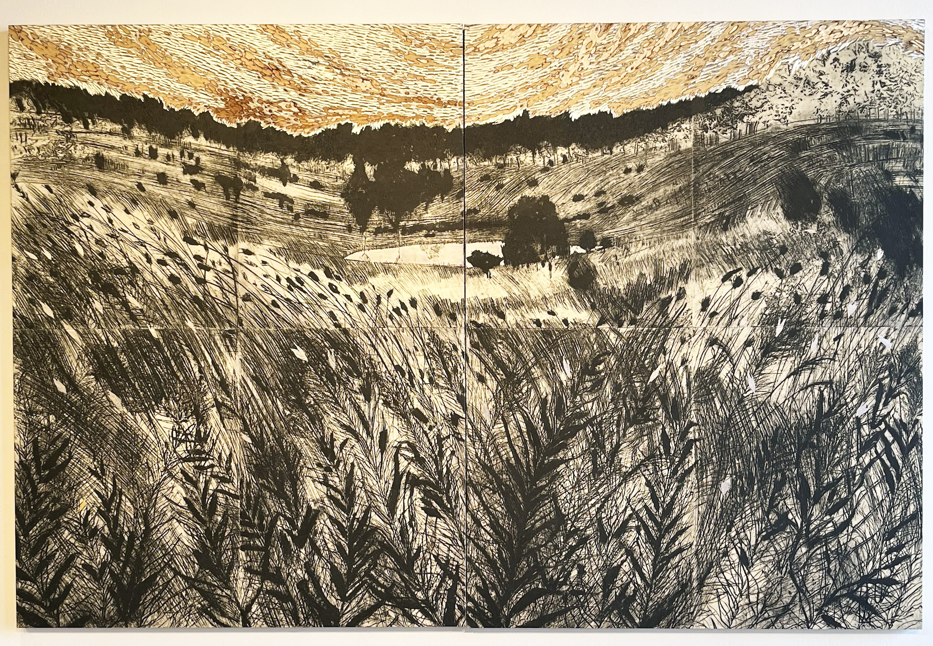
Exhibition view of Printmaking in the Twenty-First Century
Printmaking in the Twenty-First Century is on view at the Detroit Institute of Arts until April 9, 2023, accessible with the museum general admission pass.