Detroit Institute of Arts presents Russ Marshall: Detroit Photographs, 1958-2008 Image courtesy of DIA
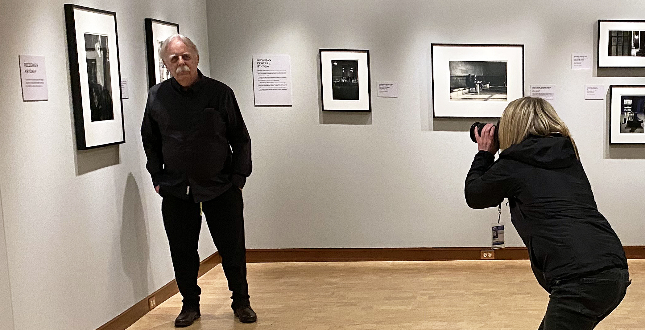
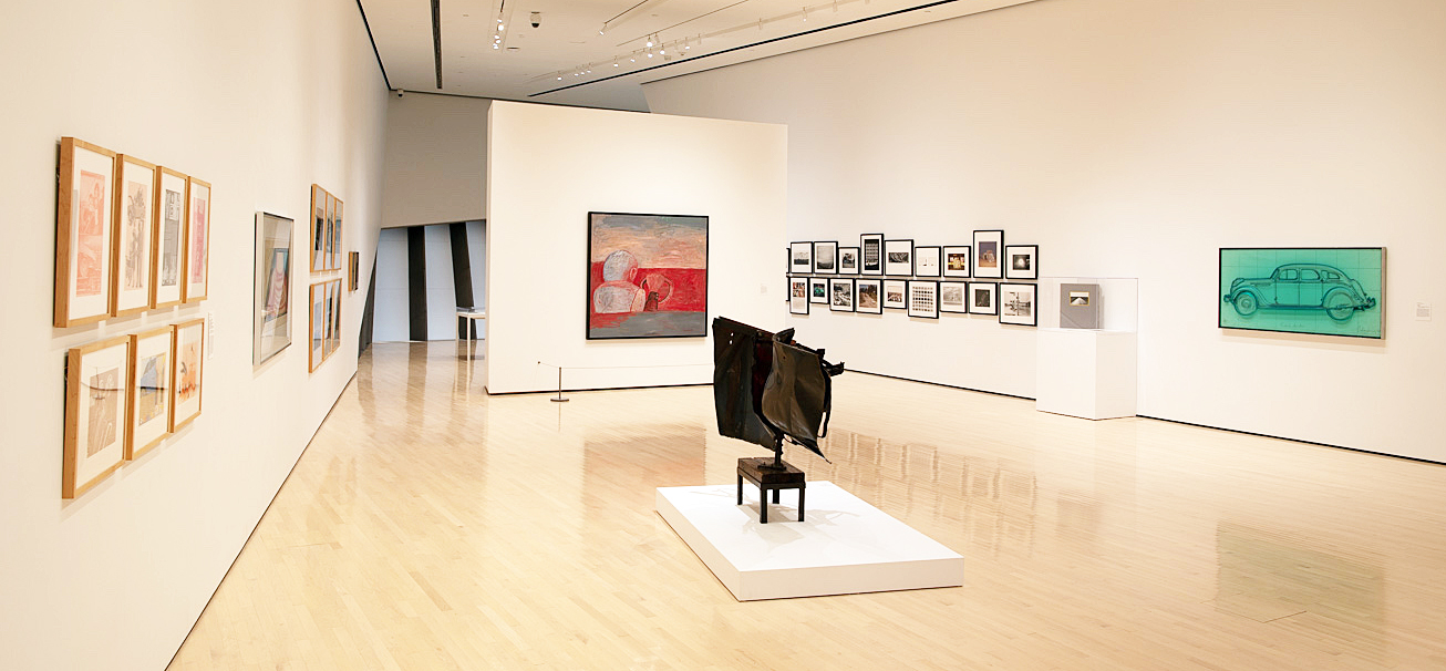
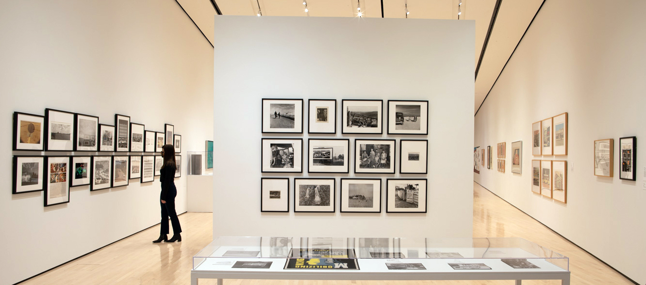
Russ Marshall, Installation image courtesy of the DIA
The Detroit Institute of Arts is currently exhibiting over 90 black & white photographs by the Detroit photographer Russ Marshall in their first-floor de Salle gallery. Russ Marshall: Detroit Photographs, 1958–2008 opened November 15, 2020, and will run through June 27, 2021. Department Head in the Prints, Drawings, and Photographs department and the James Pearson Duffy Curator of Photography, Nancy Barr has been working at the DIA for the best part of twenty-five years and is responsible for the very tasteful curation of this rich and comprehensive exhibition. Although the work broadly covers six decades of freelance work capturing the local labor movement in and around Detroit, for this review, I will focus on the imagery that speaks to Marshall’s artistic work both from his interests in the cultural events of Detroit and his travels to Europe during the years 1987-1990.
To understand his beginnings, Russ Marshall was born in 1940 in the coal-mining town of South Fork, Pennsylvania, to a coal miner and industrial factory worker family. His parents relocated to Detroit in 1943, and he grew up in a federal housing project surrounded by the neighborhood activities comprised of thousands who worked in the automotive factories. His father worked in the Chrysler DeSoto plant assembly line where steel from Great Lakes Steel company provided the iron ore that transformed the raw material into steel for car parts. In his teens, Marshall was the owner of a Scout 120 box camera and began capturing the people around him and the places where he lived.
Marshall says in his statement, “Our family photo album was probably my first significant exposure to photography and on some level, at an early age, it was impressed upon me that it was important to keep the memories of these miners, steelworkers, and farmers alive.”
He goes on in the Huffington Post to describe his childhood, “Growing up in a federal housing project in a working-class neighborhood in Detroit provided a unique perspective to a young boy in the 1940s and ’50s. With activities of the big three auto companies always in the news, which could affect most of my relatives and neighbors, including my father who worked on the Chrysler DeSoto plant assembly line, I was conscious of where I was in this life — where I fit in.”
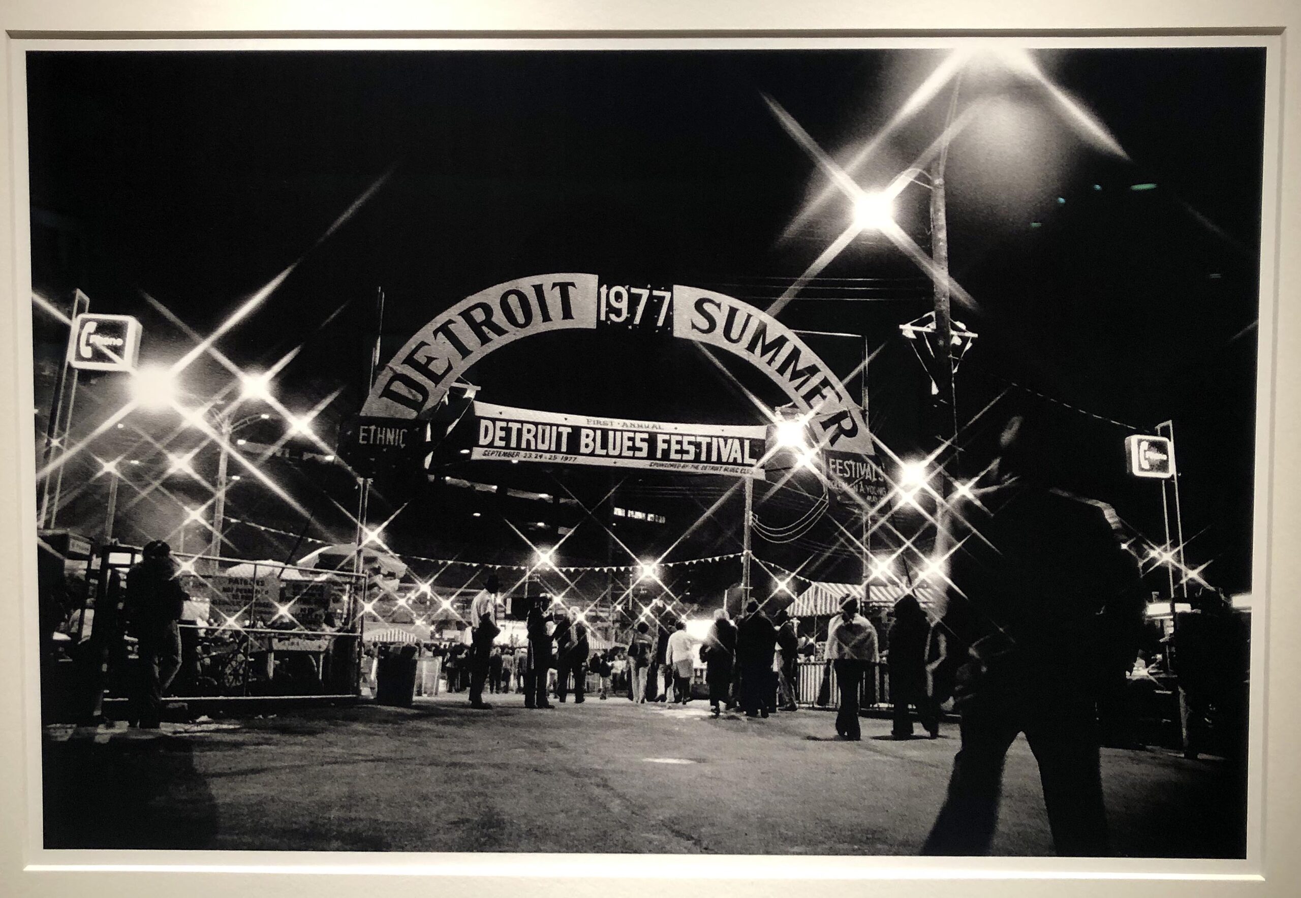
Russ Marshall, First Annual Detroit Blues Festival, 1977, Dye-based inkjet print, 2019
It was September 22-25, 1977 that Marshall must have discovered the new filters that could be used on a 35mm single reflex lens that applied a star-burst effect filter to light sources as seen in the entrance shot of the first Detroit Blues Festival. During these predigital years, the filters absorb part of the light available, often necessitating a more prolonged exposure. This image provides a high contrast moment in time, probably 35 mm negative, dominated by the then-latest star filter’s effects. In 1977 it was a time for trying the filter and its impact, but eventually, photographers grew tired of the special effect. From the citation, the negative was recently printed by creating a Dye-based Inject print in 2019. My guess is that Marshall may have scanned the 35mm negative and brought the image into a digital environment to print.
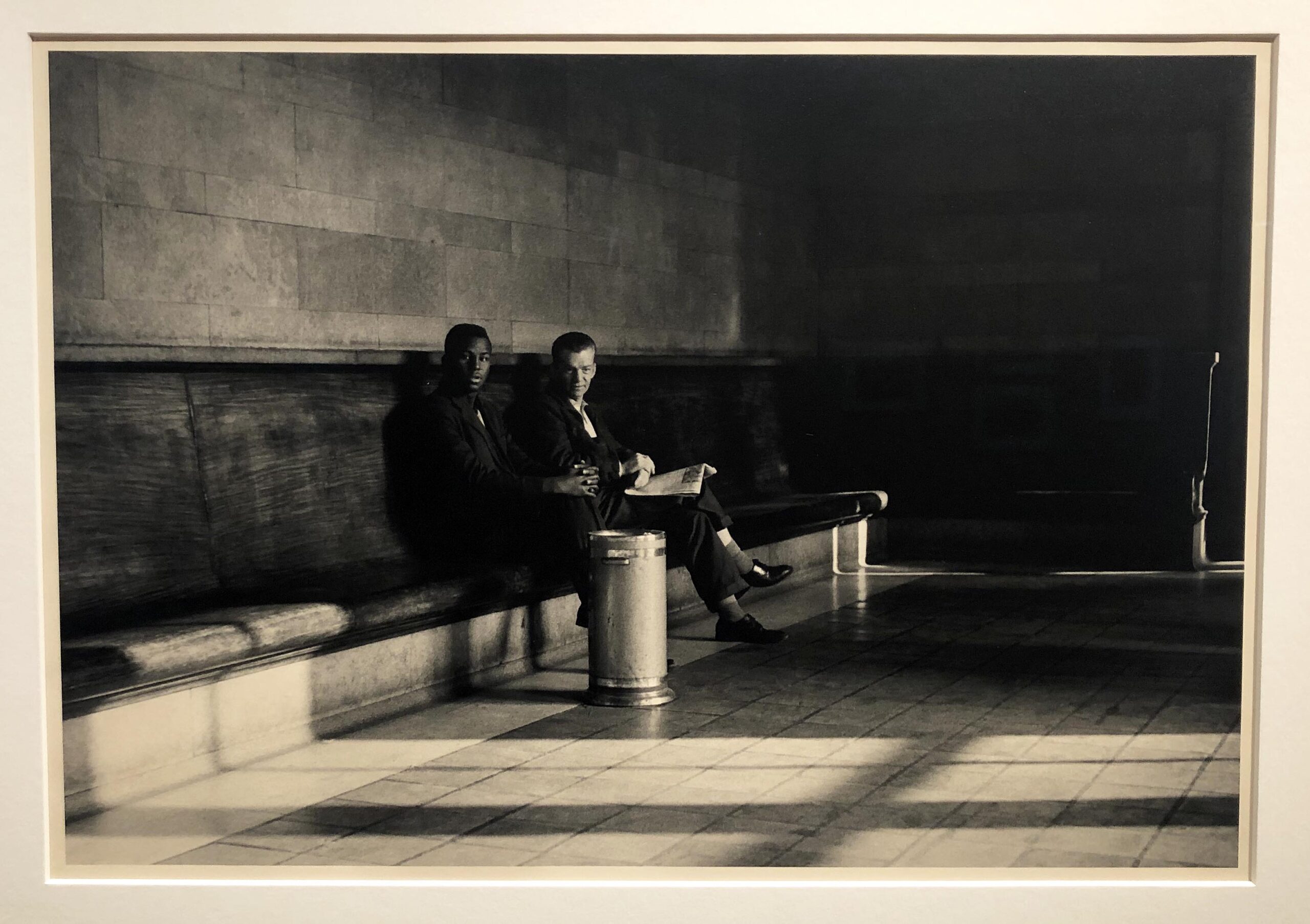
Russ Marshall, Men’s Lounge, 1959, Gelatin Silver print, 2005
Some will notice the Men’s lounge at the Michigan Central Train depot as a moment in time where the two men are gazing directly into the camera. The low light source is probably natural light from large windows off-frame to the right. The citation tells us it is 1959, at a time just as the civil rights movement was just gaining momentum. The attraction here is on two fronts; the composition, off-center to the left, and dramatic light provide the symbolic idea of two young men, one white, one black, sitting next to each other with ease. For this writer, this may be the strongest work in the exhibition.
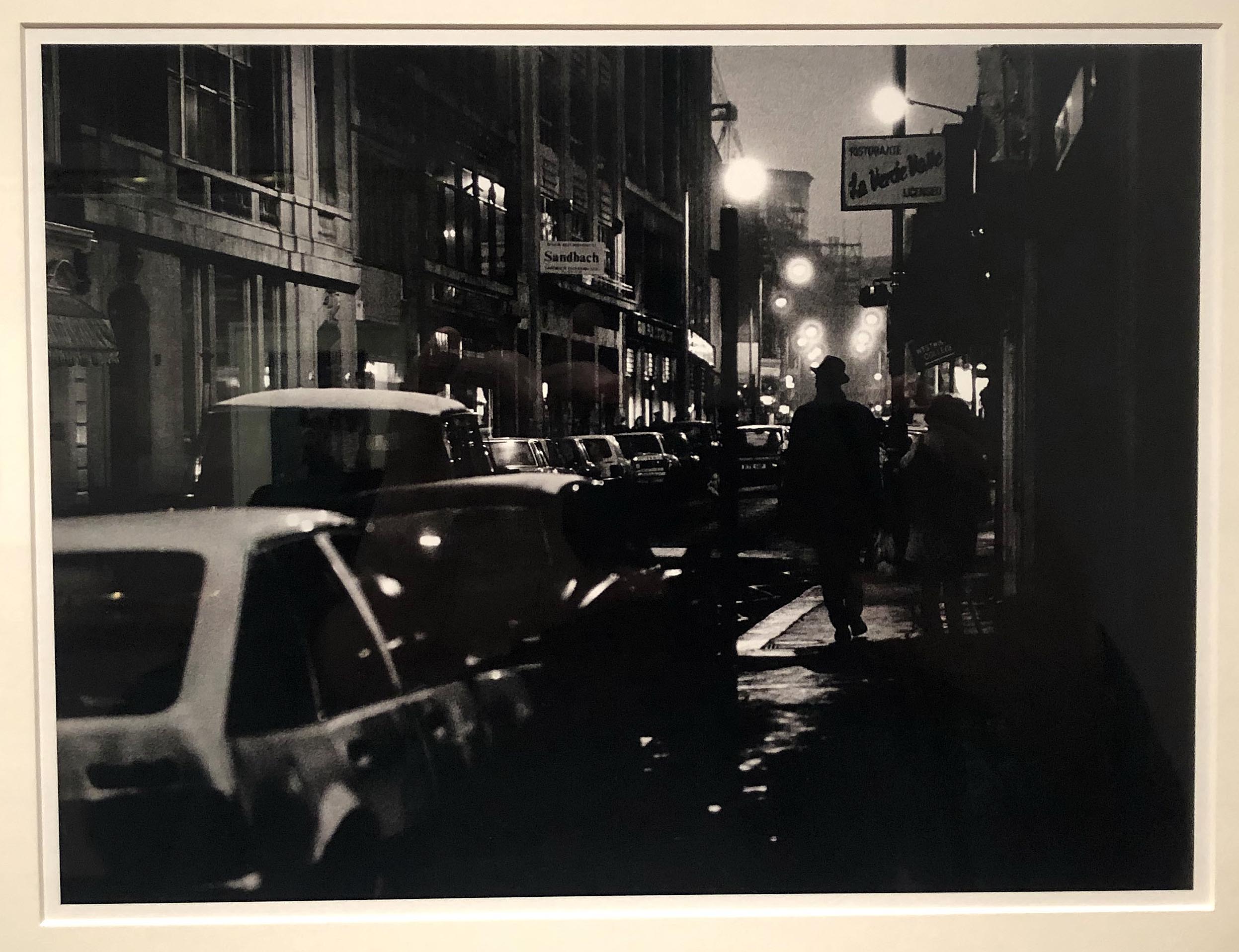
Russ Marshall, Soho District, London
In addition to Marshall’s journalistic work, the exhibition includes images featuring Marshall’s photographs taken of public life in England and eastern Europe as the Cold War was on the decline from 1987-1990. The photo taken in the Soho district of London, captures a figure entirely in silhouette right of center, which depicts this London street’s mood, tightly packed with cars. The street lights (possibly filtered) takes the viewer back in space along the street’s edge. A picture like this could quickly be taken on a tripod, where the exposure and focus would require a still camera or braced himself for a slower shutter speed. From Marshall’s images in Detroit factories and city streets, he usually includes a figure, whether it was hippies on Belle Isle or city workers in a protest line.
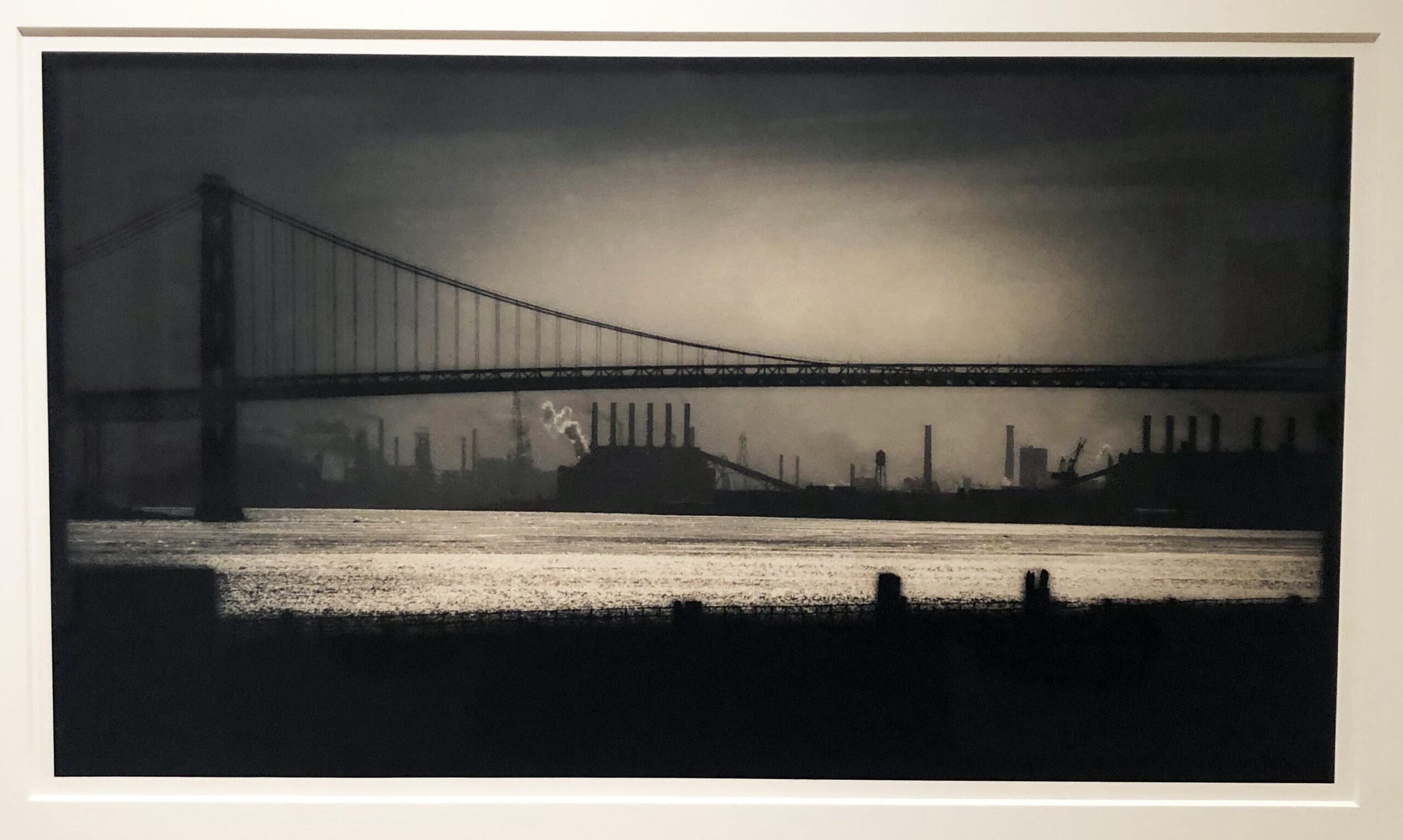
Russ Marshall, Ambasador Bridge & Zug Island
Many of Marshall’s industrial images are products of controlled light and soft focus. Telephoto lenses can make objects in the distance appear larger, and the time of day and printing filters can create a mood. The Ambassador Bridge and Zug Island image uses these tools and the design element of repetition to capture what he sees as a marker in time. Often a photographer will set up his camera on a tripod and experiment with various exposures where one will work with the effect he is after. In this image, the little smoke that billows from behind the six stacks of dark vertical chimneys catches light from the source near the horizon and creates a focal point just left of center. The sky could be easily manipulated in the darkroom using a dodging tool that helps the late evening sky become diffused and darkened at its edges.
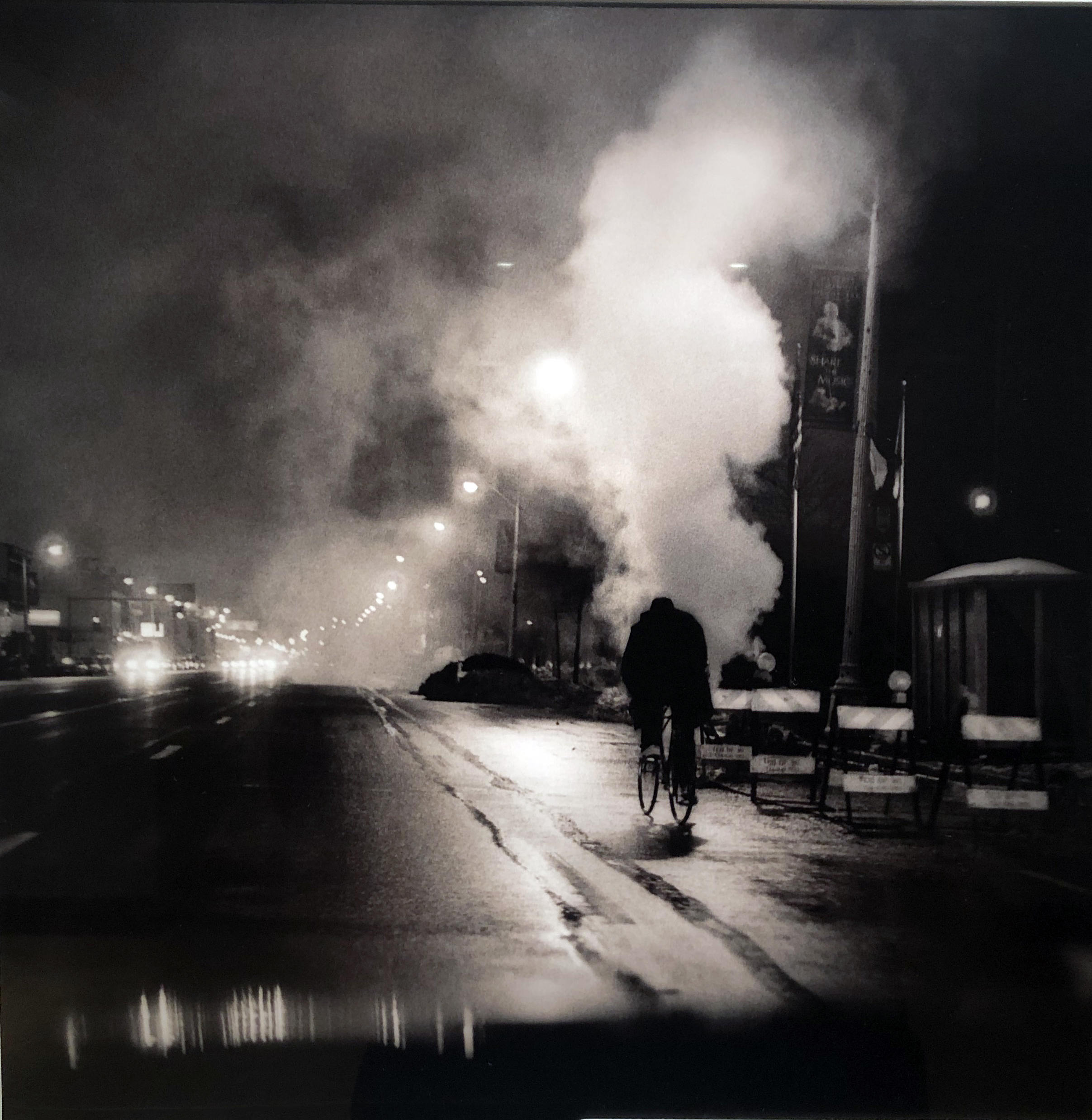
Russ Marshall, Woodward City Man, 2000, Gelatin Silver print, 2005
Similar to London’s image, Marshall grabs a moment of a man on a bicycle in silhouette with the focus on the mood and light, but it is essential to include a figure. Why? Because it humanizes the setting and provides the viewer with a sense of scale. I asked Marshall about the square formatted images that could suggest using a 2.25-inch format to present square-framed compositions, but he said the square was created in the darkroom from a 35 mm negative.
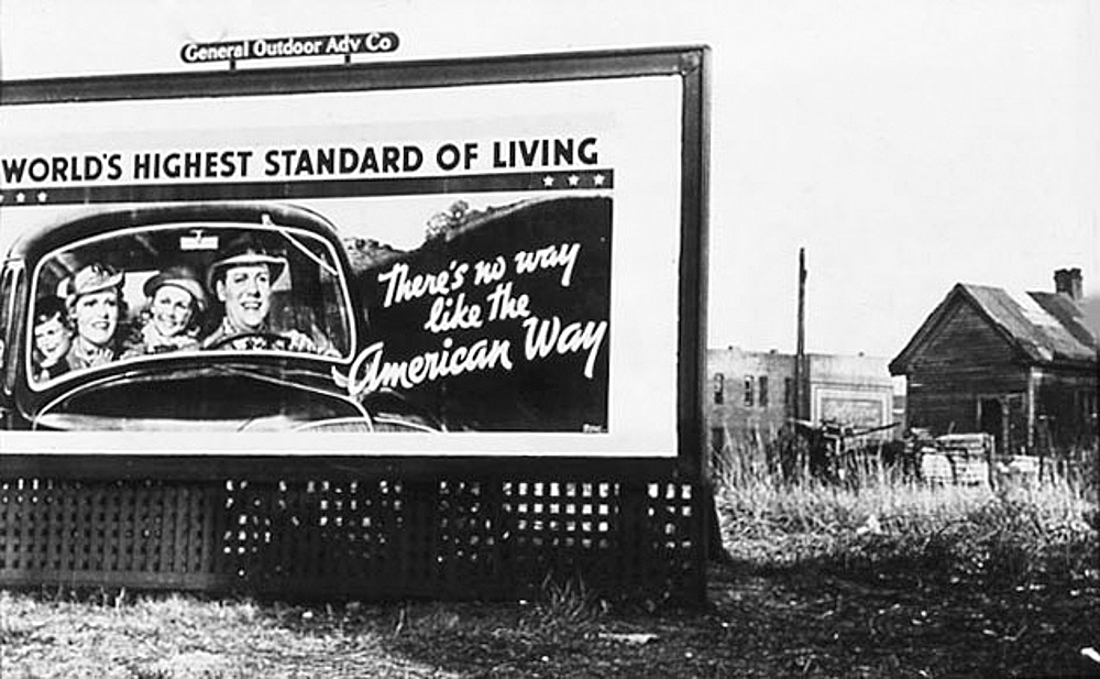
It would be easy to say that these images fall under the influence of Robert Frank, who spent time in Detroit documenting the auto industry and the people of Detroit. It would be impossible for someone so dedicated to photography as Russ Marshall to not be drawn to the work of Robert Frank. Photographers who have seen Frank’s book, The Americans, and are familiar with his images, still feel the overpowering influence of his work today.
The exhibition at the Detroit Institute of Arts is organized by themes: Everyday Detroit, Public Life, Workers, Sounds of Detroit, and A Lens Towards Europe, including some rare images of an intact Berlin Wall. Although most of Russ Marshall’s work was journalistic by the nature of the subject, his eye for artistic compositions that transcend time makes the work a perfect exhibition for the DIA.
Detroit Institute of Arts, Museum Hours: Wed – Fri 9am – 4pm, Sat – Sun 10am – 5-pm
Closed Mon & Tues The museum will be closed New Year’s Day.