Detroit Art Review

Critical art reviews of Detroit galleries and museums weekly

John Corbin @ Susanne Hilberry Gallery

 John Corbin’s exhibition: Level and Plumb

“In the last several years the Monarch’s (butterflies) population has decreased for some known (logging in Mexico) and some unknown reasons. It might be that the Monarch has been rendered obsolete. I haven’t found the app that replaced it yet.”  – John Corbin, Some Thoughts about My Work and Becoming Obsolete

John Corbin’s solo exhibition Level and Plumb, which opened at Susanne Hilberry Gallery on June 10, is a deconstructed, re-assembled encyclopedia of romantic obsolescence. The visually discordant pairings of Corbin’s sculptures, composed of found clocks and carpenter’s levels, and his collages of dissected atlas maps, instantly provoke curiosity and invite closer analysis. These parallel bodies of work gradually break down into a bizarre, insightful history of the chronology of both time and space. The objects Corbin uses to explore this history- clocks, carpenter’s levels, printed maps, and globe-trotting migrant birds and butterflies- eulogize the laborious, beautiful process of gaining understanding of the workings of the universe through trial and error, meticulous inch-by-inch progress, and miraculous leaps of logic.

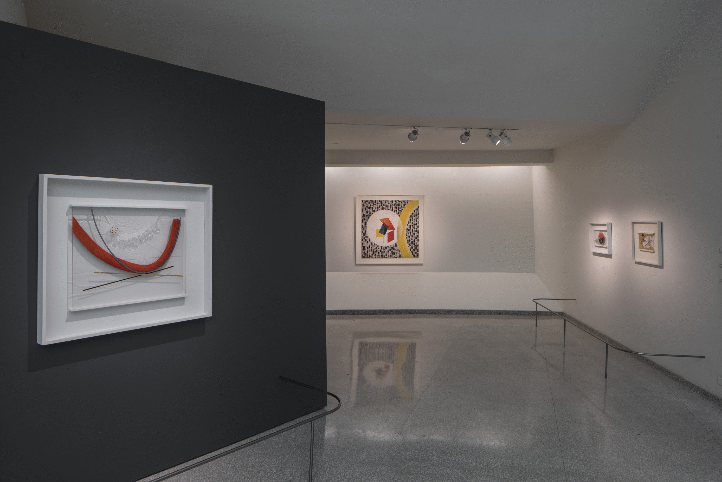
Corbin installation shot

John Corbin, Installation shot – All images courtesy of Angela Pham and Susanne Hilberry

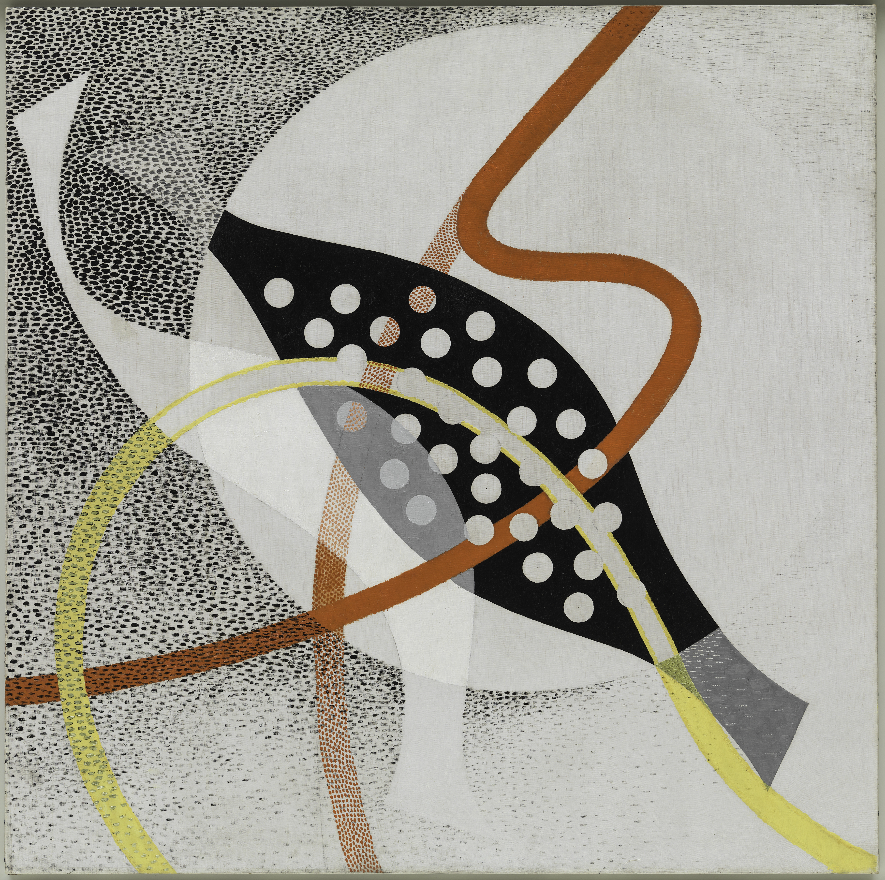
Corbin’s deconstructed map collages, both intimately and massively scaled, are beautiful objects in and of themselves- the honeycomb-like patterns and delicate tonal grades that deconstruct atlas maps into swirling, undulating atmospheric studies traversed by iconic migratory creatures- cranes, monarch butterflies- speak both to the original function of these objects- to cast sublime amounts of space into understandable terms for people- and to their total functional obsolescence now- an abundant natural resource for repurposing into studio practice.

Image 2 Two if by Sea 2012-16 Acrylic Map collage 68in x 88in

John Corbin, Two if by Sea, 2012-16 Acrylic Map collage – 68in x 88in

The same feeling comes through in Corbin’s sculpture- the assemblages of levels and clocks begin to communicate their quaint insistence on the perfect right angle, the perfect orb, hard-wired to the wall, veiled in white. They’re no longer tactile tools, but studies in contemplation of the universal truths that they are indexical to.

 3 Spirit Level III 2016 Levels and Hourglasses 11.5in x 20in x 1 and one quarter inch

John Corbin, 3 Spirit Level III 2016 Levels and Hourglasses 11.5in x 20in x 1 and one quarter inch

One word that comes repeatedly to mind while exploring Corbin’s show is ephemera. The masses of printed information and measuring, calibrating objects that, not so long ago, were as essential to us as our thumbs. As one delves deeper into Level and Plumb, the realization gradually dawns that the source materials that make up all of the works in the show bear an uncannily simultaneous familiarity and distance. Where have these tactile measuring tools- clocks, levels, puzzles, maps- disappeared to? When did they leave us? Why are they simply no longer a part of our lives? Seen in this light, Corbin’s sculptures and collages begin to read like effigies, and in his statement for Level and Plumb he places the blame for the vanishing of these miraculous objects squarely upon Apple Inc. The huge scale of this leap- timepieces, maps, measuring tools, means of communication, means of documentation, all pouring into one handheld electronic device, bears the same sublime quality as a bound atlas that lays the whole world out before your eyes. It captures the frisson that accompanied one’s first realization that a clock that measured the hours in a day was also documenting the movements of the sun and stars. The compression and deconstruction Corbin subjects his source materials to echoes, as well, the bizarre compression of millennia of human development into ever smaller and more disposable projections of our most inspired leaps of understanding. There’s a tragedy whispering alongside the uncanniness of Corbin’s work- is it not a little sad that these tools, once so essential to our navigation of our world, now take up residence in the stillness of gallery space, as functionally ambiguous to culture as any other work of fine art?

Image 4

John Corbin, Installation image

Are the gallery and the museum now the storehouses for the dictation from the stars that once sparked our highest aspirations that we’re not sure what to do with anymore? What is the relationship of those aspirations to the objects we hold in our hands today? Though conspicuously absent visually, the iPhone is a constant, silent presence in Level and Plumb, appearing in ironic relief in your own hands every few seconds to check the time or take a picture, insisting on its appropriation of the delicate structures of time and space that Corbin’s materials used to hold the keys to. Level and Plumb is an important, and timely show, in the way it quietly and beautifully reveals the evolution (or possibly devolution) of human mastery of the discernable world to us. The ephemeral tools we used to rely on to gauge the world around us may seem unwieldy and quaint now, but Corbin’s reworking of them remind us that they were beautiful. They sang of the universe. And, even removed from practical use and deconstructed, they still carry insights that make the most user-friendly smartphone suddenly feel blunter than a flint hand-axe.

Level and Plumb is on display at Susanne Hilberry Gallery June 10 through August 6, 2016.


Ceramics and Watercolor @ Flint Institute of Arts

Flint Institute of Arts Exhibition: Function, Form, Fantasy: Ceramics from the Robert and Deanna Harris Burger Collection

Ceramic work is one of the most ancient arts in the world, but in the United States and many parts of the world, has evolved over the last hundred years from what was once traditional functional craftwork to a high form of creative art that competes with painting and sculpture. This current diversity of ceramics has evolved dramatically as illustrated by the Burger Collection, now on display at Flint Institute of the Arts. Function, Form, Fantasy is currently on exhibit in three jointing galleries. The Function section has ceramic work that is traditional as it relates to its use: bowls, vases, plates, etc., Form moves away from being utilitarian, and experiments with shape, clay properties, and glaze, where as Fantasy uses a new freedom to create a narrative that could be comic, industrial, surreal, futuristic; You name it.

Function

Pippin Drysdale

Pippin Drysdale, b. 1943, Horizon Traces, 2010, Stoneware

Horizon Traces, was created by Pippin Drysdale, a ceramicist from Australia that creates the perfect shaped vessel while revealing fine lines of multiple colors. She says in her statement she is inspired by the desert sands.

Form

Adrian Arleo

Adrian Arleo, b. 1960, Dreaming of Rama Teapot, 2001, Stoneware

The titled Rama, refers to an Indian king of lore, where the American artist Adrian Arleo, creates two human forms contrasting in size and glaze selection. Rama, the blue-tinted man, represents the perfect form of man, full of virtue, justice, and peace. The highly created textures assist in creating dimension and contrast to the forms.

Fantasy

Andy Nasisse

Andy Nasisse, b. 1946, Untitled, 2006, Stoneware

The American, Andy Naisise, creates Untitled, 2006 where he incorporates male and female, good and evil as opposites in this figurative piece of stoneware. In his statement, he says, “I think of figures as “part of a family of images that find their way through my hands and into the outer world.”

This exhibition offers the audience a view of recent ceramic work, beginning in the 1060’s to present day. Dr. Robert Burger and his wife have been collecting works of art since the 1970’s and have donated nearly 250 works of art to the FIA. Mrs. Burger has ties to Flint, having enjoyed ceramic classes at Flint Institute of Arts in her youth. You will find large and small works, simple and complex, by well-known artists that are elegant while thought-provoking works of clay that go a long way to blur the line between craft and fine art.

Moving Toward the Light

New Cycle

Joseph Raffael, American, b. 1933 New Cycle, 2009–10 Watercolor on paper 73 1/2 x 89 x inches Courtesy of Nancy Hoffman Gallery, New York, NY

On exhibition in the Graphics Gallery during these summer months, the artist Joseph Raffael has an exhibition of unusually large watercolor paintings, courtesy of the Nancy Hoffman Gallery, NYC, NY. This collection of eleven large watercolor paintings celebrates flora and fauna where Raffael captures a deep view of floral life, both in and out of focus. Growing up in Brooklyn, Raffael helped his mother with the fruits, vegetables, and flowers in her garden, where he came to regard the changing of seasons as a form of magic. He says “Seeing blossoms come alive is the same as watching a painting come forth out of the white space of a page or a canvas. The garden is another example of how one begins with nothing but seeds and the brown-colored space of the earth from which, little by little, the garden emerges.”

Orchids Dream

Joseph Raffael, American, b. 1933 Orchids Dream, 2013 Watercolor on paper 55 x 78 x inches Courtesy of Nancy Hoffman Gallery, New York, NY

The scale and intensity of these paintings provide the viewer with a combination of the representational subject matter set in a personal world of abstraction. His backgrounds and borders bring compositional strength to the composition and heighten the vision of watercolor. These large-scale works depict flowers, water, and fish swimming in in ornamental ponds. The artists say, “I don’t paint flowers; I paint energy.”

Those traveling north from Detroit this summer will find pleasure in stopping by for both exhibitions at Flint Institute of Arts, just a few blocks off I-475.

The Flint Institute of Arts is located in the Cultural Center Park just two blocks off I-475 between UM-Flint and Mott Community College. Hours are Mon-Wed & Fri, 12p-5p; Thu, 12p-9p; Sat, 10a-5p and Sun, 1p-5p. Admission to the exhibition is free to members and children under 12; Adults $7.00; Senior Citizens and Students $5.00. Saturdays are free thanks to First Merit Bank. For more information call (810) 234-1695 or visit www.flintarts.org.

Nancy Mitchnick: “Uncalibrated” @ MOCAD

Install NM MOCAD 2016

Nancy Mitchnick, Installation at MOCAD, 2016 – Courtesy of MOCAD

Nancy Mitchnick has had a spate of exhibitions this past year. She had a great show at Hamtramck’s Public Pool, showed a few earlier works in a cool three-man exhibit at the iconic Detroit gallery, Alley Culture, and really opened some eyes with new paintings at Wasserman Project. The exhibitions signify a return to and embrace of her hometown after she escaped from the Cass Corridor art community in 1973, and lived and worked as a painting professor and artist for years in New York (Bard College), California (CalArts), and Massachusetts (Harvard). She was also honored as a Kresge Fellow in 2015, and most recently was selected by the prestigious American Academy of Arts and Letters as a recipient of the organization’s 2016 art awards. Quite a homecoming!

The most recent iteration of her work is in the big room of the Museum of Contemporary Art Detroit (MOCAD). The huge gallery of MOCAD seems like it was made for Mitchnick and she comfortably fills the space with what at first seems a most curious selection of paintings—ranging from two portraits of a friend and three portraits from her “Wonder Women” series, to a work in progress recovered from what she herself calls a “bad” painting (about which she recently lectured at MOCAD), a couple of expressionistic still lifes, two landscapes and nine houses from her old neighborhood, and two new “narrative paintings.” In a sense the show constitutes a mini-retrospective of the range of Mitchnick’s work over the past thirty years—portraiture, still life, landscape—and two new, auspicious paintings that signify a leap into her future. But much more poignantly, “Uncalibrated” (the title of the exhibition) seems to explore Mitchnick’s quest over the years to mine the vast rhizoid root system of painting, to find out what being an artist is and what it can do, and what it will come to be. (In mock despair she exclaimed, “Sometime my studio looks like a group show.”) “Uncalibrated” is fundamentally a self-portrait, or perhaps a memoir, of Mitchnick as painter.

Virginia Woolf 48 X 48

Nancy Mitchnick, Oil Painting 48 x 48, “Virginia Woolf”, 1990-91        All following Images Courtesy of Glen Mannisto


At the entrance of MOCAD are three early portraits, from the Wonder Women series, of Virginia Woolf, George Eliot, and Frida Kahlo. Painted in grisaille-like, gray shades that produce a classical sculptural effect, the heads of these three great, prototypical, feminist artists have a heroic scale and echo both Renaissance sculpture and certainly Enlightenment ideals. That they are outside of the main gallery, at the entrance, provides a hint of what part these heroic women might play in Mitchnick’s life as a painter. All three were experimental, independent, rational and investigative, secular beings and certainly, like Mitchnick, lived large lives. They also suggest a classical meta-literacy—to challenge the status quo, to invent, hybridize, psychoanalyze, to utilize—that is certainly part of Mitchnick’s own strategy as an artist. In her conversation with Jens Hoffmann,
 MOCAD’S Susanne Feld Hilberry Senior Curator at Large, she admits to being a voracious reader, which somehow parallels and infiltrates her work as an artist.

rough eye

Nancy Mitchnick, Eye Detail, Oil Painting, 1992 -” Davy Butler First Hit”

eye 1 with red in corner

Nancy Mitchnick, Detail of Eye Painting, 36 x 36 “Davy Butler  Finished” – 1992


Her two portraits of a friend and patron, “Davy Butler: First Hit,” and “Davy Butler: Finished,” are elegant illustrations of Mitchnick’s carpentry skills in building these paintings, readily apparent throughout all of her work since. (“My father was a cabinet maker, but sometimes had to frame houses to make money.”) In “First Hit,” eyebrows and eyes are a dozen or so quick brush strokes—they are elegant and deft, making a sketchy, speculative architecture. “First Hit” is more mysteriously suggestive than descriptive, framing the first marks of the physiognomy of identity. Then in “Davy Butler: Finished,” the painting confidently assembles itself around the subject’s eyes. The head is smaller, more contained, and from each part of the facial landscape—the nose, the lips and mouth, and the eyebrows are precise—a commanding, almost Roman presence emerges. While making portraits to earn money, Mitchnick disavows a preoccupation with likeness, with making a painting that looks like the subject: “”Making likeness is not good painting, I’m making great paintings.” Her process, she says, is “all trial and error,” sometimes “losing whole beautiful passages to erasure, to get it right, to make a good painting.” In an offhanded aside she adds, “you writers just keep a record in your computers of every version of what you do. I lost a beautiful turtle here,” she muses pointing to a spot on the recent painting “Night Heron.” However not surprisingly, “Davy Butler: Finished” (the portrait of the friend who attended her recent MOCAD conversation with Hoffman), is not only an extraordinarily articulate painting, but an ennobling likeness as well.

IMG_2277

Nancy Mitchnick, Two Portraits, “Davy Butler First Hit” , “Davy Butler Finished “, 1992, both 36 x 36


The heroic scale that she is given to (“I didn’t realize at first that I was a heroic scale painter”), necessitates a physicality and energy apparent in most of these recent works (as well as in her person). Fortunately disregarding all of the foreboding claptrap about “Ruin Porn,” Mitchnick took scores of photos of her old neighborhood near and around Hamtramck and began working from them during her first return to Detroit after losing her Harvard position to a “Conceptual artist.” (“I wanted to do something with Detroit.”)

First House

Nancy Mitchnick, “First House”, 34 x 45 Oil Painting, 2006

The centerpieces then of “Uncalibrated” are the nine flat, elevation portraits of Detroit houses in various states of devolution. Depicting mostly the homes of working class people and perhaps middle-class families who ran small businesses or auto industry management, these are not memorials nor documentation of the state of derelict Detroit, but exquisite paintings that celebrate a presence of people who built and inhabited this place. Even the smallest painting, “First House,” exudes a very particular ethos and an aesthetic filled with a humanizing spirit.

Torn Orange 59 X 99

Nancy Mitchnick, “Torn Orange”, Oil Painting, 59 x 99, 2009

In reminiscing about her Cass Corridor days, Mitchnick talked about wanting to be an abstract painter but was never able to escape narratives but perhaps, ironically, that has finally (almost) been achieved in two of the most monumental paintings in the exhibit. “Torn Orange” is the painting of a surgically exposed side of a store. Composed of modulated tones of orange colliding with a diagonal green and yellow slash, it features the typical markings of a classic abstract expressionist work, but Mitchnick keeps the context of the building by depicting the surrounding light and air of the city. “Big Burn” is a triumphant exploration of the remains of a home that, in its abandoned state, is slowly rotting and returning to the earth. Exposed rafters, plaster lath and crumbling foundation are astonishingly caressed into a derelict geometry that made Mitchnick blurt, “I felt like I was composing a symphony!” It is triumphant painting that in itself is a marvelous history lesson.

FullSizeRender

Nancy Mitchnick,” Big Burn”, Oil Painting, 129 x 59, 2006-20016

Each of the house paintings has a complexly charged presence. “Buffalo Street” is of the house in which Mitchnick grew up, and while it was in its last stages of devolution, Mitchnick’s painting still captures what seems a classical bearing, with its gabled roof and three-windowed dormer still erect and proud, and still evincing the colors that it once wore. It is difficult to imagine Mitchnick’s mindset when revisiting and painting this moment of her life and prompts the question of whether this is an elegy for the Buffalo Street house or an objective portrait.


Buffalo Street 99 X 88

Nancy Mitchnick, “Buffalo Street”, Oil Painting, 99 x 88, 2008-09

One of the most interesting aspects of Mitchnick’s work is the lesson that she teaches with each composition, which is that it takes a long look to realize a painting. Her latest pieces, “Night Heron” and “White Front,” seem almost recklessly whimsical compared to the disciplined, graphic painting of the abandoned houses. Populated with strange bits of ocean coral, odd mythic creatures (snakes, birds, turtles), and a Persian Princess, they are a gargantuan leap into another mind space. However, after one spends time with them, they gain traction, and their amazing palette of colors (throughout “Uncalibrated” her palette is symphonic) begins to tantalize, and an almost fairytale narrative gathers. It might be the story of a new Hamtramck or not, but it certainly signifies another trajectory for Nancy Mitchnick’s painting to mine.

Night Heron 77 X 111

Nancy Mitchnick,”Night Heron”, Oil Painting 77 x 111 – 2016


“Uncalibrated” will be at MOCAD until Sunday, July 31, 2016.


Shaina Kasztelan @ Hatch Gallery

Somewhere Over the Rainbow is a Double Rainbow: Way up high with Shaina Kasztelan

OTRDR11

Shaina Kasztelan – Central installation, All Images Courtesy of Sarah Rose Sharp

One of the most challenging aspects of grappling with mental illness is not just the negotiation of an emotionally fraught psychic territory, but the social pressure to conceal whatever struggles may be happening internally. For women, especially young women, this struggle is a subset of the prevailing demand to present a shiny, positive face to the world. In Somewhere Over the Rainbow is a Double Rainbow, at HATCH Art in Hamtramck through May 28th, artist Shaina Kasztelan effectively reveals the turbulent and colorful interior life of a young Millennial woman. This, her first solo outing, is an installation-heavy environment that immediately draws the viewer into a kind of psychedelic and intensely female headspace, via a chaotic accumulation of material culture that targets her as a consumer.

OTRDR1

Shaina Kasztelan “The Devil’s Vibrating Smile,” (2016), 46″x46″


These materials include, but are not limited to: stickers, small toys, fake fur, plastics in innumerable iterations, decorative cake toppers, beads and cheap jewelry, a blow-mold nativity trio, fake fur, craft paper, artificial hair, and a series of pool floaties. Hearts! Rainbows! Unicorns! Kasztelan has plumbed the depths of the party-variety store in her search, and leaves no corner of her installation space unoccupied. One has a sense of stepping into a riot of Attention Deficit Disorder and teenage misanthropy, rife with cultural references that might be enigmatic to some, but readily identifiable to anyone within Kasztelan’s demographic. The nativity scene sports Insane Clown Posse face make-up; a cross-stitch bears an iconically self-pitying Nine Inch Nails lyrics; everywhere we encounter pop culture figures, from Mickey Mouse to the murderer from Scream, to the ubiquitous “Have A Nice Day” smiley face, in various interpretations. This is an interesting interplay between the objects Kasztelan has bought ready-made and incorporated into her texture- and color-rich compositions, and those that she assembles from scratch using craft materials; why bother to meticulously assemble a Mickey Mouse face from perler beads, when there are literally thousands of commercially made objects bearing the same visage?

OTRDR2

Shaina Kasztelan – Details from the central installation

This speaks to a kind of obsession, which is echoed in the endless repetition of shapes—often small toys that can be bought in bulk for a few pennies each. In “Baby Cactus is Happy,” a cactus shape covered in rainbow hair and wearing a pink inflatable wig bears dozens of tiny variety store plastic babies, the mere existence of which is slightly confounding. Indeed, when you start to zero in on any of Kasztelan’s works, the preponderance of oddly useless objects generated by our culture and marketed in the direction of young women begins to become unnerving. What message does it send, to be continually surrounded by things that are colorful, basic, and functionless. Kasztelan seems to have compensated for this material invasion of her head by creating an imaginary life for these objects, reimagining them into creatures, friends, and demons—golems of hyper-femininity—often by means of craft projects, another highly feminized activity set. As each creature takes shape, so it reflects some aspect of young womanhood, dark or light. “I Scream, You Scream, We All Throw Up,” is a tower of plastic spray foam, fused into a kind of totem pole with spray foam, and topped with a fright mask that is the most recognizable symbol from the “Scream” movie franchise. The mask is vomiting spray foam in lurid colors down the length of the totem pole, and this violent mixture of hoarding candy, binging, and purging, very successfully blurs the innocence of a child’s Halloween activity with the body image pressure applied to young girls as they emerge into puberty, and the resulting host of horrific eating disorders that are a scourge against this demographic.

OTRDR5

Shaina Kasztelan – Two works on paper 12 X 20″

Though presented in the trappings of frivolous girlhood, Kasztelan’s materials are a Trojan Horse for extremely intense concepts about sexuality, drug use, and mental wellness. Technically, each piece is incredibly rich in detail, seamlessly constructed (even in the event that drippy spray foam is being used as an adhesive, there is an intentionality and conscious hand at work) and remarkably successful at balancing literally hundreds of objects into well-balanced compositions. As a first solo outing, Kasztelan’s work already presents a strong self-awareness and adroit leveraging of a personal perspective that is often marginalized—that of the young woman, struggling to process a world full of expectations and distractions, and perhaps prone, in this struggle, to medicate some of the confusion into imaginary friendships. Somewhere Over the Rainbow is a Double Rainbow is a wild journey that brings home a surprisingly deep message.

Lois Teicher @ Robert Kidd Gallery

Cosmic Journey 3 & 1_web

Lois Teicher, Cosmic Journey #3 (Red) welded aluminum with acrylic 35 x 23-1/2 x 6-3/4 inches Cosmic Journey #1 (Black) welded aluminum with enamel 37 x 23 x 9 inches

The Robert Kidd Gallery, in Birmingham, Michigan opened an exhibition of sculpture by the artist Lois Teicher on May 21, 2016. These hand-welded shapes of metal with spray painted surfaces rely heavily on her use of space and form. Working in a minimalist tradition, Teicher brings a high level of technical accomplishment to these abstract works. These sometimes folded pieces of colorful metal are hard-fought ideas that use pure geometric forms that give the viewer a certain type of comfort that is easy on the eyes. It brings to mind a piece of Teicher’s work outside in a lush organic and natural setting where there is an extreme contrast presented.


Fragment_web

Lois Teicher, Fragment – welded aluminum with enamel 43 x 43 x 22 inches

The conceptual idea presented in Teicher’s work reminds this writer of work by Robert Mangold and Ellsworth Kelly. Searching for the roots of the minimalist tradition in a broad sense, these geometric abstractions are easily associated with the Bauhaus School in the work of Yves Klein, Piet Mondrian, and Joseph Albers. Some might suggests the movement was a reaction to abstract expressionism, but I would argue it is more of an inner-sensibility that drives this work; that there is an internal intellectual idea that says these forms are part of what creates the space/time continuum in the universe.


CurvedFormTriSpaceIII_Red_web

Lois Teicher, Curved Form with Triangle and Space III – welded aluminum with acrylic and enamel 36 x 23 x 18 inches

It’s taken this writer a trip to Donald Judd’s Marfa, Texas, and Dia: Beacon up the Hudson River from New York City, to contemplate and digest minimalist concepts. The recent passing of artist Ellsworth Kelly in December 2015 bring to mind a kindred spirit with Ms. Teicher, who completed her graduate work in 1981. She says in her statement, “My studio work is generally constructed of hand-welded metal that I personally fabricate. The process of expressing ideas mostly germinates from a solitary inner experience the flows outward and takes the form of visual expression.”


Eclipse Series VI_side_web

Lois Teicher, Eclipse Series VI – welded aluminum with acrylic 52 x 52 x 14 inches


The work on the floor and the wall sings a similar minimalist note, but Ms. Teicher takes her own step when she makes the form fold. What needs to be said is the role scale plays in this work. Some of the work in this exhibition seems like scale models for larger work that would be placed in public spaces. Given the space afforded by galleries, it’s these models that often stand alone as works of art in search of a public space. There is a natural balance in Teicher’s pieces with a Zen-like simplicity that informs each piece of work with a high caliber of visual experience.

Continuum, May 21 – June 18, 2016  Robert Kidd Gallery, Birmingham, MI


Page 69 of 79

Powered by WordPress & Theme by Anders Norén