Detroit Art Review

Critical art reviews of Detroit galleries and museums weekly

Shannon Goff @ Susanne Hilberry

20151022_163213

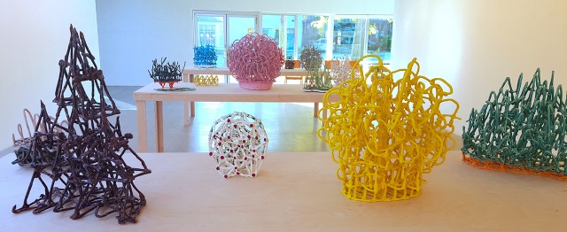
Shannon Goff – Installation of hand-built Ceramic, 2015 All Images Courtesy of Sarah Rose Sharp

At first glance, there is little common ground between the two sides of Susanne Hilberry Gallery; unusual, because both sides are part of a solo show, Miles to Empty, by Detroit native Shannon Goff. Goff has two distinct bodies of work in the show: a playful collection of pastel-shaded ceramic pieces, and an exacting full-scale replica of Lincoln Continental rendered in crisp while cardboard.

“I first started working with cardboard in grad school, as an intermediary material when my ceramic work grew more ambitious in scale,” Goff says, “I needed a material to help me figure out how to scale up while defying gravity.” Indeed, the sheer scale of the cardboard construction (also called “Miles to Empty”) draws the viewer in immediately, but the attention paid to detail really underscores the meticulousness of the hand-building work involved in Goff’s process. This, of course, mirrors the labor-intensive process of assembling actual automobiles—a process that is collectively well understood in the birthplace of the automobile assembly line, but largely invisible to most end users of cars, on the whole.


20151022_163020

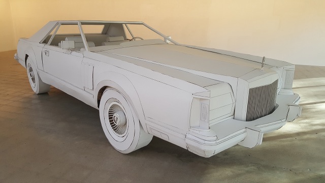
Shannon Goff – Miles to Empty, Cardboard, 2015

Once an understanding has been achieved of the importance of hand-building within Goff’s practice, a connection to the ceramic and unfired clay works that populate the other side of the gallery becomes obvious. Long white tables house collections of sculptures that can be seen as three-dimensional iterations of drawings. In fact, with its bright colors, blobs of metallic glaze embellishments, and loosely figurative subjects, the whole of this gallery could be taken as a kind of fine art fridge, covered in a child’s drawings.

This is not to say that Goff’s sculptural work lacks sophistication. What seems gestural and spontaneous is, of course, a deeply challenging question of physics, when it comes from ushering clay in its unfired state through a molding and firing process that leaves it standing strong. “My three-dimensional ceramic drawings saddle somewhere between engineering and experiment. I’ll pose a question to myself, for example, what if I change the line weight? Or what if I play with the density? How many times can I fire a piece before a potential collapse or catastrophe occurs.? If and when such an event occurs, can I salvage it or part of it? One of ceramics main opponents is gravity…I suppose it’s a main opponent of humans as well”

Some of Goff’s works betray the fight against gravity, like “Ka Lae” (2014), in which a top-heavy section of jagged blue peaks has sent the orange superstructure beneath canting off at a now-frozen angle. This reflects Goff’s ambition, with this piece, to see how little material could support a “forest of density.” For the most part, they support surprisingly complex and dense configurations with seeming effortlessness. Although Goff says, of her work in cardboard, “It [is] far easier to engage a large amount of space without all of the problems and limitations of ceramic,” scale with ceramics seems to be a constraint that she has overcome. The crowning achievement of the clay-based works, standing in a gallery on its own, is “Doyenne”—an unfired clay piece that stands 82” high, and was constructed on-site, due to its size and complexity. This piece, which initially began as an attempt to channel and create the aura of Goff’s grandfather, took on a different life and identity as it progressed. “I wanted this piece to be rooted in place, so I decided to abstractly start from a map of downtown Detroit and see what happened,” says Goff. “I even aligned it directionally the best I could. On the third day it grew tall enough to reveal a skirted figure. I knew then that this piece was not my grandfather but the true doyenne of the Detroit art scene. On the 4th day, it looked back and I listened.”

20151022_163158

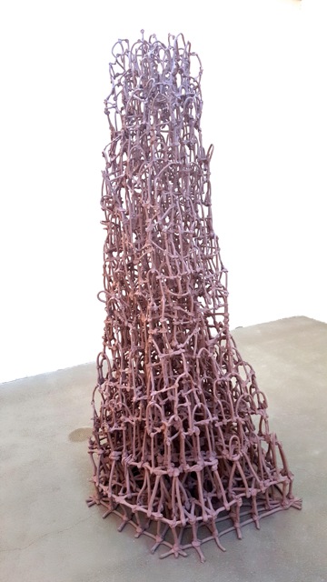
Shannon Goff, Doyenne — Hand-Built Ceramic, 2015


Goff refers, of course, to Susanne Hilberry—the gallery’s founder, and a tireless champion of the Detroit art scene, who sadly passed away amidst preparations to mount Goff’s show, after a long illness. Her passing leaves a hole that cannot be filled, but Goff’s timely monument to her influence seems a fitting send off. From the ghosts of cars past, to the doyenne whose memory lives on in the place she built, Miles to Empty captures a vital mixture of remembrance and hopeful energy. “I guess in many ways it’s about birth and life and death,” Goff says. “And memory. And loss.”


The 56th International Venice Biennale through Detroit Eyes

Venice overview image

Venice overview Image, Courtesy of the Venice Biennale

There is a mystique about the Venice Biennale, partly because of its age, (it was established in 1895) and partly because of its location in the Giardini area of Venice, Italy. By 1910 it exhibited artists like Renoir, Klimt, Courbet and Picasso. Over the years it has diversified beyond art to include film, architecture, dance and music. For the purpose of this piece, I will comment on the art exhibition at the Arsenale, but there are exhibits at Giardini and throughout Venice.

The 56th International Venice Biennale celebrates its 120th birthday with 136 artists from 53 countries around the world. The curator of this year’s Biennale, All the World’s Futures, is Okwui Enwezor, a Nigerian curator, art critic and writer specializing in history. He lives in New York and Munich and, in 2006, received the Frank Jewett Mather Award for art criticism from the College Art Association.

To write a review of the 56th Biennale as a whole would be lengthy, exhaustive and near impossible, so I will confine my remarks to work at the Arsenale that exhibited over a hundred works of art in a decommissioned warehouse once used by the Navy (to build ships, I assume). The Arsenale would easily be four or five football fields long and 200 feet wide. From that experience, I have selected ten artists to mention, based on my interest and curiosity. From the opening section that was dominated by Bruce Nauman’s neon pieces, rather simple works that simulate a restaurant sign in the window, to the entire section three devoted to Katharina Grosse’s Color Riot, which was an enormous room filled with spray painted dirt and cloth. There are many pieces like Color Riot, conceptual and installation works, that I do not have either the context or familiarity with to comment on.

Color Riot 2

Katharina Grosse, Untitled Trumpet, 2015 – Germany


Chris Marker Passengers, France 2011

Chris Marker, Passengers, 2011 – France


One of the most breath-taking moments in the Biennale was the work of the late French artist, Chris Marker (1921 – 2012) and his photographic installation, Passengers, 2011. The 134 color photograph images around the perimeter of the room are of anonymous people from the Paris Metro and include small, ever-changing LCD images from above. In Passengers, Marker tracks his Parisians and captures them in an unguarded way, often looking for imagery that reminds him of images found in art history.

Chris Ofili, UK, 2015 Bending Over for Justice & Peace

Chris Ofili, Bending Over for Justice and Peace, 2015 – Great Britain

Having seen the solo exhibition Night and Day at the New Museum in NYC, November 2014, it was not surprising to see Chris Ofili’s work at the Biennale representing Great Britain. The vibrant and technically complex work enlists sexual, cultural, historical and religious references. His subject matter challenges and reinterprets racial stereotypes. Represented by the David Zimmer Gallery in New York City, his work often exposes the darker undercurrents of society. His M.F.A. was completed in 1993 at the Royal College of Art, and he won the prestigious Turner Prize in 1998. Bending Over for Justice and Peace, Ofili presents a staggeringly mysterious painting with flowing patterns around two inverted figures. The London-born, Trinidad-based artist presents four paintings in this year’s Biennale.

Daniel Boyd Austalia

Daniel Boyd, Untitled Diptych, 2014 – Australia

A young indigenous Australian artist, Daniel Boyd provides a fresh abstract interpretation of line and space to this year’s Biennale. Counter to his earlier figurative work in which he explored the relationship between the aboriginal people and the British Empire, he has moved to abstraction with the same methods except filters out color and focuses on interconnected space. The lively compositions are comprised of a dotted, intense surface that engages the viewer in the overall matrix.

Terry Adkins USA

Terry Adkin, Matinée, 2007-2013 – Bronze, steel, hangers, burnt cork – USA


The late artist, Terry Adkins (1953 – 2014) was a professor at the University of Pennsylvania and was born in Washington, D.C. A musician and multi-media artist, his work explores historical figures and acts from Beethoven to Hendrix. His work Matinee at the Biennale approaches the art-making process from the viewpoint of the composer over a lifetime that was shortened in 2014 when he died of heart failure. His work has been arranged as sculpture, video and photography where he modifies musical instruments that are repurposed as objects.

Kay Hassan, South Africa, Untitled 2015 Paper construction

Kay Hassan, Untitled, 2011, Paper – South Africa

Born in Johannesburg, South Africa in 1956, Kay Hassan is best known for his pieces of printed billboard posters but also works with painting installation and video. His themes have always revolved around migration, dispossession and urban life. Growing up as a child in Soweto, he witnessed the constant flight of South Africans as apartheid policies forcibly took peoples’ land. The mural-sized work depicts townspeople on the run. His techniques of deconstructing and constructing are realized fully on close inspection when it is clear that the work was made up entirely of disregarded paper.

Meric Algun Ringborg Turkey, Souvenirs for the Landlock 2015 Installation

Meric Ringborg, Souvenirs for the Landlocked, Installation, 2015 – Turkey

Meric Ringborg was born in Istanbul, Turkey in 1983 and now lives in Stockholm. Her ready-made installation, Souvenirs for the Landlocked, is a large room reconstructed in Section 6 with objects that have a particular meaning for her. The installation is typical of her earlier work in that it takes a group of sculptural works and places them in a domestic-like room space environment. In her narrative she writes about her grandfather’s maritime travels, from which he would bring objects from all parts of the world. Each object in the installation carries with it a special meaning that reveals a type of interconnectivity. Ringborg did her graduate work at Royal Institute of Art, Stockholm, and she says in her statement, “Souvenirs are representative of what ‘has been seen’ and thus echo a highly subjective sight, much like photographs; albeit contrary to an image they are sculptural representations of experiences, markers of the transference from event to memory.

Lorna Simpson, US Three Figures, 2014 screenprint on Clayboard

Lorna Simpson, Three Figures, Ink & Screen-print on Claybord, 2014 – USA

The artist Lorna Simpson is represented at the Biennale with figure paintings and her photo-silkscreen, Three Figures. Her early work was as a street photographer where she reflected her feeling about race, society and multiculterism. She came of age during the early 1980’s after a generation of black power and the civil rights movement. Eventually she began to question the truth these supposedly objective photographs revealed and shifted to conceptual photography, which focuses on the idea, rather than the end product. She completed her M.F.A. in 1985 at the University of California and now lives and works in Brooklyn, New York.

Gedi Sibony US Trident, 2015

Gedi Sibony, U.S. Trident, – USA

Born in New York in 1973, Sibony received his M.F.A. from Columbia University in 2000. His paintings draw on minimalism in a kind of pared down aesthetic. In the painting Trident, he uses a self-contained object, here a riveted piece of a ship or plane part. He has used cardboard, wood, and plastic sheeting, in a kind of simple style focusing on color and composition. Sibony has the ability to elevate this ready-made work to a kind of poetic beauty. He says in his statement, “I want to convey a kind of discovery by moving through things the way allegory incorporates various energies in a harmonious environment. This might be understood as an alignment of symbolic thinking and material tactility.”

Rudra

Emily Young, Fufluns, Rouge de Vitrolles Marble, Great Britain – 2015

Additionally, I would like to mention an artist whose work was not on exhibit at the Biennale. Instead, sculptor Emily Young’s Call & Response was on display at the cloister of Madonna dell’Orto church in Venice. Using rock from quarries near her studio in the Etruscan hills, Young’s work fuses the age-old principles of stone carving with a progressive, widely informed approach to form and composition. The contemporary and ancient are united in these sculptures, creating a rare and poetic presence.

So how does an artist, say, from Detroit, get their work accepted into the 56th International Venice Biennale? Well, I am not sure I have the answer to that question because what you come to realize is that the answer lies between the published lines. There are eligibility requirements: You must be a U.S. citizen and come from a non-profit museum, school, gallery or visual art organization. An advisory committee convened by the National endowment for the Arts and composed of curators, museum directors and other curatorial experts reviews proposals. You don’t send off your images in an application. And it is written that you don’t submit a proposal without first discussing your project with the Cultural Programs Division of the U.S. State Department. Translation: You have be connected. To be selected as the curator of the Venice Biennale, you probably have to walk on water.

The 56th International Venice Biennale, All the World’s Futures,was curated by Okwui Enwezor, organized by la Biennale di Venezia and chaired by Paolo Baratta. The exhibition opened at the Giardini della Biennale and at the Arsenale to the public on Saturday, May 9th, and will close November 22nd, 2015. The awards ceremony and the inauguration took place on Saturday May 9th, 2015.


Talking “Storm Trees” with Nancy Mitchnick @ Public Pool Artspace

The Storm Tree Cycle

Nancy Mitchnick, The Storm Tree Cycle – Three of four “Storm Trees” on display at Public Pool – All Images Courtesy of Sarah Rose Sharp

Nancy Mitchnick is a Detroit legacy that spans generations. After witnessing and creating work within the Cass Corridor scene, she moved on to find success in New York City, before eventually falling into a series of teaching positions, including working at CalArts in Valencia, California—“the conceptual art school when painting was supposed to be dead”—and a long-term stint at Harvard University. At long last, she has returned to her native homeland of Detroit, and her efforts to make new work and show selections from her existing works have been recently propelled by being named as a 2015 Kresge Visual Arts Fellow.

MrWoodman

Nancy Mitchnick, Mr. Woodman – Two views of Mr. Woodman: “Mr. Woodman Walking” and “Mr. Woodman Thinking”

Over the last month, Mitchnick has held court in Hamtramck’s Public Pool community art space, presiding over a solo show titled Storm Trees and Mr. Woodman. The “Woodman” drawings are a series of mixed media pieces on paper starring a figure inspired decades ago by a literal piece of wood that Mitchnick couldn’t bear to sacrifice to her woodstove—but it is the wall of “Storm Trees” that really captured my attention—at once wildly gestural and absolutely formal. Mitchnick took some time out during a work day at her newly enhanced studio space in the Russell Industrial, to talk to me about the creation of these particular works.

Nancy Mitchnick:     This is about the tree paintings, yeah?

Sarah Rose Sharp:         Yes. When did you do those?

NM:                                 I did them in 2008, the year before I left Harvard. And no one wanted to show them. People wanted to buy them for a little amount of money—two people who collected my work and bought big paintings—and I said, I can’t do it. I just can’t.

SRS:                             I’m intrigued by them, especially since, as you said, you sort of paint buildings and stuff. I think those building paintings almost look like quilts.

NM:                             I do love the gird. I’m a grid girl.

SRS:                             Is that how you lay out your paintings?

NM:                             Well, not exactly, but often the work is an implied grid. I don’t plan it, I find it. When I was a kid, I never could tell you why I painted anything, and I liked that it was mysterious—the whole process is like a revelation to me, so I never feel like talking about it. It’s like talking about sex. How are you going to explain how it feels? You know, it’s private and between two people—usually. [LAUGHS]

SRS:                             [LAUGHS]

NM:                             So I I feel something deeply, and it feels right, and then I make a painting, and I can explain about the formal part. But with the trees that are the gallery [Public Pool]—I was working at a barn, and I passed them every day, and it really is a perfect subject for me, because it’s lyrical but also gridded out, because of the branches. It’s these verticals, with branches that are lyrical behind. It was so beautiful to paint them. I guess I’m a sensualist, and I want an experience that’s joyful when I’m painting.

I turned the work into different kinds of adventures. Like, I’d be teaching at Harvard, in claustrophobic Cambridge, and then I’d go to this big old messy farm that’s been in business for centuries. So I got to have this fun in this beautiful place, and do my work—and it cost, I don’t know, thousands of dollars to ship a whole studio, for three or four months. It was an expensive proposition, but I’ve done it.

And maybe it’s because I’m ADHD, plus slightly dyslexic, but smart somehow—I can sort of jump from subject to subject a little bit, in the paintings, as well as in conversation.

SRS:                             In a single painting, or from painting to painting?

NM:                             No, from painting to painting. And then things happen that you really don’t plan. I’ve read history and science, you know, it happens to everybody. Everybody’s got stories about how they went out to do one thing and another thing happened. I’ve always felt sort of nuts, but it seems like it’s a very common occurrence. So I go up to Peru, New York, just to work in the landscape, and also to work in this big barn—but the landscape was way too green, and I didn’t really find anything—I was looking in the wrong places. And I passed those trees every day on my way to the barn, and I never thought to paint them. And I started the house paintings that summer, which really, I’m still trying to figure out what to do about Detroit, how to paint about Detroit. And those houses were kind of an aside.

studio

Nancy Mitchnick, studio – Some of Micthnick’s new work in progress, just after moving into her newly appointed studio space

So there I was, trying to figure something out, and my friend was coming through, and he said, “God, isn’t that a natural subject for you to paint?” And I just looked at the spot, and I realized it was just perfect. I had big stretchers set up for another project entirely, and I got very, very excited because I’d had such a strong feeling about them. I just knew that they were immediate, that they were abstract, that I loved the underpainting, and that I couldn’t fuss with this. I just knew not to make them pictoral, and anyway, how could you? I was far away from it, and they were so gestural.

Close Call

Nancy Mitchnick, Close Call, – One of Mitchnick’s “house paintings,” also on display at Public Pool

So I just set them up, and it really was terrific fun. I had an 8-foot palette; I must have put down three pounds of white paint. The palette was very limited—terra verte, ochre, raw umber, olive green deep, white, I probably used some gray, with a little bit of cadmium green now and then. It was a simple, simple set of colors, and it must have taken an hour and a half to mix a palette. My arm would get tired, because I was using lead white, which is heavier. And then I’d take a little break, then I’d set it up—and then I would just make those paintings in a day. I never had so much fun, actually.

I felt, you know, when I was a kid, I just wanted to be an abstract painter. I always wanted to be a different kind of painter. Who knows? Maybe it will work out in the end—because I’ve tried to change, and you are who you are. And you really mess up if you try to work against what comes naturally.

SRS:                             Well, right. It’s like pretending to be someone you aren’t to date someone. All you do is commit yourself to never be appreciated for who you are.

NM:                             Exactly, and then you’re miserable. So that was such a natural subject for me, and so joyful, because it was abstract, but it really was observing something from life. I painted the whole under-painting, and then for the big tall trees, I just loaded the brush, and just started at the bottom, and just pulled it all the way up, 7½ feet, and that was it. And I didn’t know if they were good or bad, I just knew I loved making them, and they felt right. I liked them a lot.

“Storm Trees and Mr. Woodman” showed at Public Pool, September 12th-October 17th.

30 Americans @ the Detroit Institute of Arts

30A-artists-group

Photo Credit: Kwaku Alston

The new director of the Detroit Institute of Arts (DIA), Salvador Salort-Pons, took the podium and introduced the new 30 Americans exhibition with relaxed confidence. The selection and planning for this exhibition had begun more than a year ago when he was head of the European Department at the DIA since 2008. With a Ph.D. in art history and a MBA with a focus on finance and strategy, he comes to the museum directorship with an additional strength: sound business sense. His time at the podium was brief, but I sensed a transitional moment for the museum and the larger Detroit community.

30 Americans is an important exhibition, extremely well curated, designed, and at the right place and time for the City of Detroit. It reminded me of how I felt at the opening of the Shirin Neshat exhibition, March 2013, when the DIA hosted her mid-career retrospective and simultaneously reached out to the community, educating people on Islamic art. 30 Americans is similar in how it will educate the Detroit community by showcasing some of the most talented African-American artists in the United States today. In the 2010 census, 82% of people living in Detroit responded as African American.

30 Americans powerfully demonstrates contemporary African American artists’ interests in the complexities of identity and developing a range of artistic approaches to portray or reference its distinctions and similarities,” said Valerie J. Mercer, DIA curator.

The exhibition comes from the well-known Rubell Family Museum in Miami, Florida. It is one of the world’s largest, privately-owned Contemporary Art collections, and the first time this work will be on display at the DIA. Each year, Rubell creates thematic exhibitions drawn from its collection, “We only show art we own. That is a founding principle of the Rubell Family Collection, a principle that gives us tremendous freedom and enormous constraints. When we set out to conceptualize a new exhibition, we know we will only get the depth and quality we seek if we already have a strong foundation of works by a core group of artists.”

image-357Wiley-Kehinde_Equestrian_Portrait

Kehinde Wiley, Equestrian Portrait of the Count Duke Olivares – 2005, oil on canvas. Courtesy of Rubell Family Collection, Miami


The most well-known artist in the exhibition is Kehinde Wiley, whose work dominates the show with three large paintings. The painting, Equestrian Portrait of the Count Duke Olivares, depicts a young black male figure in hip-hop clothing, set against a rich floral background. Based on the Spanish artist Diego Velazquez’s painting from 1634, Wiley engages in a type of surreal photorealism on a grand scale of 366 by 366 inches. He braids his foreground and background together, creating a picture plane tension. As a boy growing up in Los Angeles, he spent his time looking at historical paintings at the Library in San Marino, CA. He earned his undergraduate degree from San Francisco Art Institute and his M.F.A. from Yale in 2001.

image-359Wiley-K_Sleep

Kehinde Wiley, Sleep, 2008, oil on canvas. Courtesy of Rubell Family Collection, Miami

As you enter the second room, you are met with Sleep, a 132 X 300-inch monster-sized figure painting, part of his series of reclining erotic figures. Here again, his use of British Arts & Crafts designs in the background also enters the foreground in what has become a consistent element in his work. At times, it reminds me of paintings of Christ after he was taken down from the cross. Wiley’s signature portraits of street people designed around specific historical paintings seem to draw attention to the absence of African American people from Western cultural narratives. Like this work or not, he is a major force in contemporary art in American painting today.

image-355Thomas-Mickalene-Baby_I_AM_Ready_Now-2007

Mickalene Thomas, Baby I Am Ready Now – 2007, acrylic, rhinestone and enamel on wooden panel. Courtesy of Rubell Family Collection, Miami

The irrepressible Mickalene Thomas is comparable to Wiley in her weight and influence on the American art scene. The New York-based artist is known for her elaborate and complex work that often has a sexual overtone. She may be presenting what she thinks it means to be a black woman regarding a kind of cultural stereotype. The paintings are often composed using patterns, enamels, acrylic, and rhinestones and usually present a provocation. Her painting, along with the title, seems to bait the viewer. These round corners were a favorite of hers back in the mid 2000’s, but the new work has moved forward with a kind of spin on Picasso’s figurative Cubism. Check out: She Ain’t a Child Anymore #2, 2015.

image-339Basquiat-JM_OneMillionYen

Jean-Michel Basquiat, One Million Yen – 1982, oil on canvas with wood and jute. Courtesy of Rubell Family Collection, Miami

More familiar to audiences is Jean-Michel Basquiat. The late American artist achieved notoriety during the 1980s when he was part of the Andy Warhol and Keith Haring scene in New York City. Born in Brooklyn, Basquiat was half Puerto Rican and half Haitian and has been described as a precocious and gifted child. Kellie Jones, who wrote Lost in Translation: Jean-Michel in the (Re) Mix says, “Basquiat’s cannon revolves around single heroic figures: athletes, prophets, warriors, cops musicians, kings, and the artist himself. In these images the head is often a central focus, topped by crowns, hats and halos. In this way the intellect is emphasized, lifted up to notice, privilege over the body and physicality of these figures (i.e. black men) commonly represented in the world.”

The Rubell piece, One Million Yen, from 1982 creates one of his “dichotomies” utilizing social commentary that attacks a power structure, while at the same time imparting a strong Neo-expressionist composition using mixed media material.

Duck, Duck, Noose

Gary Simmons – Duck, Duck, Noose, Installation, 1992 Image Courtesy of DIA

The exhibition is peppered with work by a variety of African-American artists that speaks directly to racial violence in the United States. When you enter the room housing the Duck, Duck, Noose piece by Gary Simmons, 1992, you are confronted by emotional experience where nine stools are arranged in a circle with KKK hoods on the seat with a noose hanging down in the center. The life-sized installation capitalizes on the audience’s familiarity with these symbols, reminding us of our historical past where injustices were committed against black men and women in the late 19th and mid 20th centuries. The title is a play on the English nursery game, Duck, Duck, Goose. The installation brings into focus the injustices that are continually committed against all peoples and through a juxtaposition of history where art imitates life. Gary Simmons’ work is currently representing the United States at the 2015 Venice Biennale.

30 Americans exhibits 55 paintings by artists such as Barkley Hendricks, Kerry James Marshall, Carrie Mae Weems, Lorna Simpson and the late Robert Colescott. Their influence on a younger generation can be seen in the works of artists such as Nick Cave and Kara Walker. Overall, the exhibition reflects a variety of approaches to creating artwork around identity, gender, race, sexuality and a confrontation to the traditional American genres.

Bravo to the DIA for bringing this exhibition to Detroit…now what’s next? A big contemporary exhibition? As soon as there is a curator.

The Detroit Institute of Arts  5200 Woodward Ave. Detroit, Michigan  48202    313.833.7900

For information about admission pricing, and hours: http://goo.gl/OJU15N


Performance @ Popp’s Packing: Jessica Frelinghuysen

pie-in-the-sky

Though I flatter myself that I am a somewhat avid runner and yogi, I was not prepared for the hardcore booty-shaking that artist Jessica Frelinghuysen led her audience through at the opening of her new show, “It’s Exercise Time!” last Friday at Popp’s Packing art space in Hamtramck. I guess at such events my body is in rest-and-present-yourself-well mode, most of my energy going into chit-chatting and craning my neck to get a glimpse of the work on display around the clusters of opening attendees. One doesn’t stand by and observe at Frelinghuysens performances, however. Indeed, the very designation of “audience” collapses before Frelinghuysens’ boundless energy, quick wit, and all around fantastically grounded presence. It’s also a safe bet that you’ll find yourself diving into some activity that you wouldn’t hitherto have dreamt of doing in a gallery setting- which is exactly the point.

The walls around the gallery were posted with Trail Fit-esque exercise instruction graphics explaining how to properly do lifting reps with large bags of rice and knee-lift-and-punch sets while singing along to “Eye of the Tiger” (which happened to be playing over the sound system while I read that particular instruction- the invitation became irresistible.) Interspersed between instruction graphics were surprisingly lovely photographic portraits of Frelinghuysen going through her workout paces at many unconventional sites around Hamtramck- tossing sides of meat in Bozek’s meat locker and lifting a huge bag of onions outside Al Haramain Market. She told me a funny story about that moment- as she struggled to lift the unwieldy sack, a man in very conservative Yemeni dress pulled up and parked right in front of where she was lifting. He watched, without budging from his car, and when she finally got the fifty-pound bag lifted over her head, he burst into a sudden round of applause. It seems Frelinghuysens’ energy is just as infectious outside the gallery space.

Jessercise Poster, Jessica Freylinghuysen 2015 Photo by CLara DeGalan

“It’s Exercise Time” has transformed Popp’s art space into one easily mistaken for a small, mom-and-pop gym, except for the bottles of champagne that are there for both lifting and drinking purposes. This effect was pushed still further at the opening, as folks gathered around Frelinghuysen while she mounted the carpeted platform, dressed in full rainbow-hued workout regalia. She proceeded to lead us in a lengthy, fast-paced, serious cardio workout that had me out of breath inside of three minutes- Frelinghuysen broke a sweat, loosened up and launched into the next round of time-steps and air punches. Here the long tradition of displays of endurance in performance art was channeled with a lightness and hilarity that suited the bright palette and self-deprecating humor of Frelinghuysens’ exhibition. One by one, audience members were drawn into participation, as enchanted by the artists’ unaffected, funny, down-to-earth performance style as that man outside al Haramain Market. The total (and somewhat surprising) absence of irony in Frelinghuysens’ manner helps, as well. In a setting where people tend to be very concerned about how they appear, the extent to which we all followed her example, cutting loose and just having fun with our bodies, was a revelation.

All of the best performance artists I’ve seen in action assume characters that are somewhat amplified versions of themselves. Frelinghusen is a natural at this. While her performances certainly bear a trace of the theatrical- she assumes a particular garb and enters her performance space, be it the gallery or city street, with a point to make- she inhabits them in such a way that she never stops feeling present, accessible, to her audience. Significantly, she refers to the clothes she designs and wears for her performances as “uniforms” rather than costumes. This points to the importance of the uniform as an entry point, cultural signifier, and problem-solving accessory. Frelinghuysens’ many bodies of work all have a problem to be solved as their starting point. Her ongoing “Paper Helmets” series aims at solving problems of personal communication; her “Coffee Cart” performance at Cranbrook aimed to remedy the absence of available coffee for Cranbrook students and staff. “It’s Exercise Time!” makes up one part of her exploration of a somewhat more complex problem- the vast divide between “art” space, and the rest of the world.

It's Exercise Time album cover Photo by Jessica Freylinghuysen

Her impetus to dovetail gym culture with gallery culture, she told me, lay in her long-standing, serious commitment to both worlds, and how odd it seemed that her social life in the gym was so completely different than her social life on the art scene, when the two disciplines (of the body, on the one hand, and the studio on the other) bore such a close resemblance to one another. She pointed out that endurance, commitment, and serious play are all common factors between the two worlds. That resemblance extends to the aesthetic, as well- she noted how the white, clean walls of the gallery closely resemble those of the gym. Transplanting the gym to the gallery, with a veneer of humor over seriously exploratory intent, proved delightfully disruptive to the usual flow of an art opening. Frelinghuysen manages such actions with a light, humorous touch which leave people in the art world and outside of it feeling tickled and intrigued, rather than confused and defensive. She noted, “If it’s disrupting everyday life a little bit, then I’m interested in it.” Disruption is the calling card of so many performance artists- not so many manage to channel it into actions for positive engagement and change that flow identically inside and outside traditional art-viewing spaces. Frelinghuysen has already moved past those boundaries- and is playfully beckoning us to follow.

Saturday, October 24, at 2 pm at Popp’s Packing


Page 74 of 78

Powered by WordPress & Theme by Anders Norén