Critical art reviews of Detroit galleries and museums weekly

Month: November 2017

Keith Haring @ Cranbrook Art Museum

Dark Haring Rises: 30 Years After its Installation, Keith Haring’s “The Detroit Notes” reappears at Cranbrook Art Museum
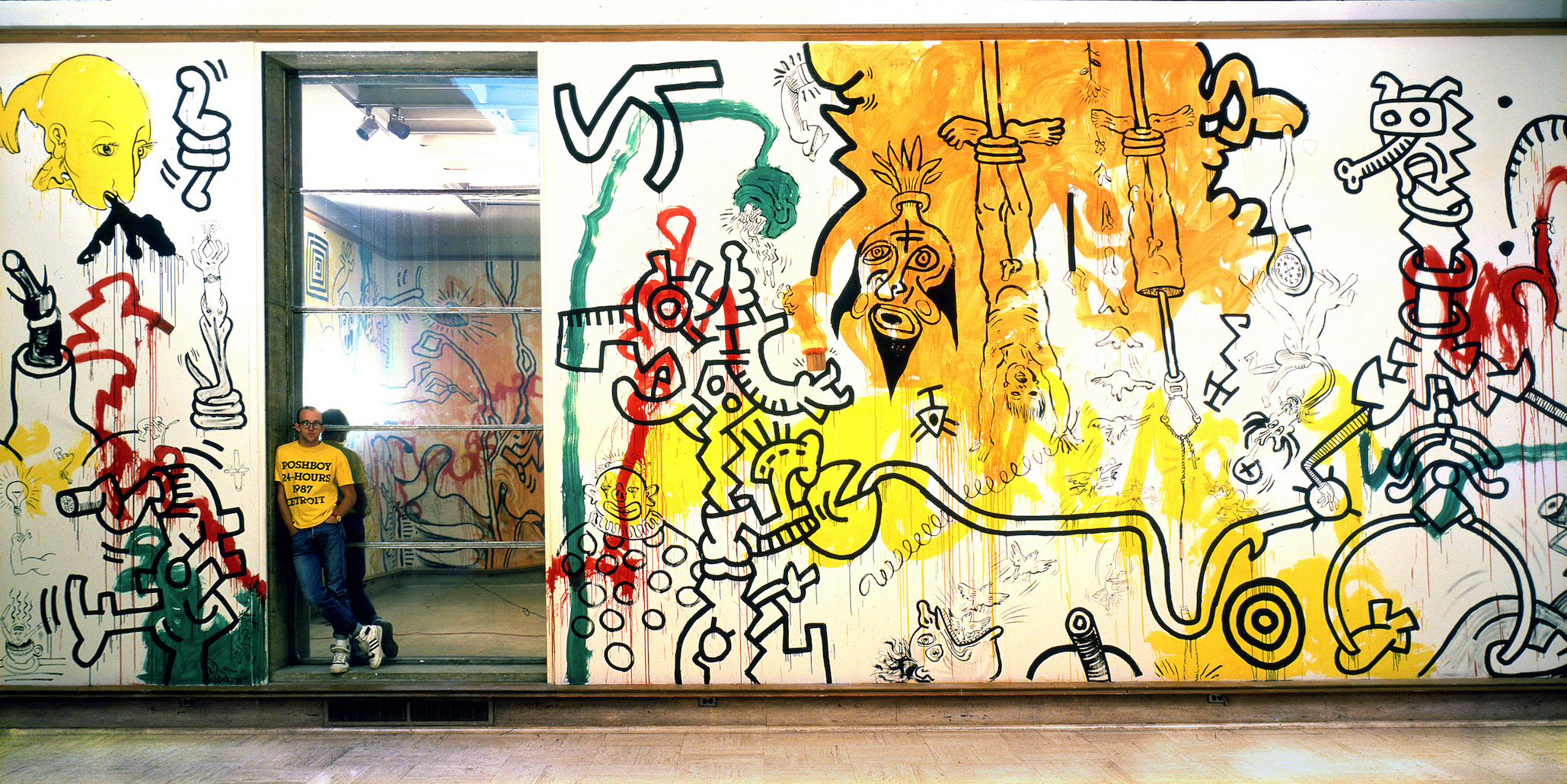
Keith Haring at Cranbrook Art Museum, 1987 Photograph by Tseng Kwong Chi, 1987 © Muna Tseng Dance Projects, New York Art work: © Keith Haring Foundation, New York.

Keith Haring is internationally known for his ebullient and evocative figure drawings, rising to art world fame in the mid-1980s on a wave of graffiti-influenced NYC street culture. Like many of his contemporaries, Haring was part of an early wave bringing art to market as a prestige commodity, and like many of his fellows, he died at a lamentably young age due to complications connected with AIDS—in Haring’s case, at the age of 31, in 1990.
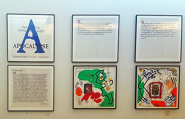
Keith Haring, Apocalypse (1988), by Keith Haring and William S. Burroughs (installation view)

As part of its Fall program, the Cranbrook Art Museum presents a small suite of works by Haring that bookend his career, Keith Haring: The End of the Line. The centerpiece of the exhibition is a reconstruction of a temporary mural, “The Detroit Notes,” installed at Cranbrook in 1987, bracketed on either side by a gallery of very early and very late work by the artist.
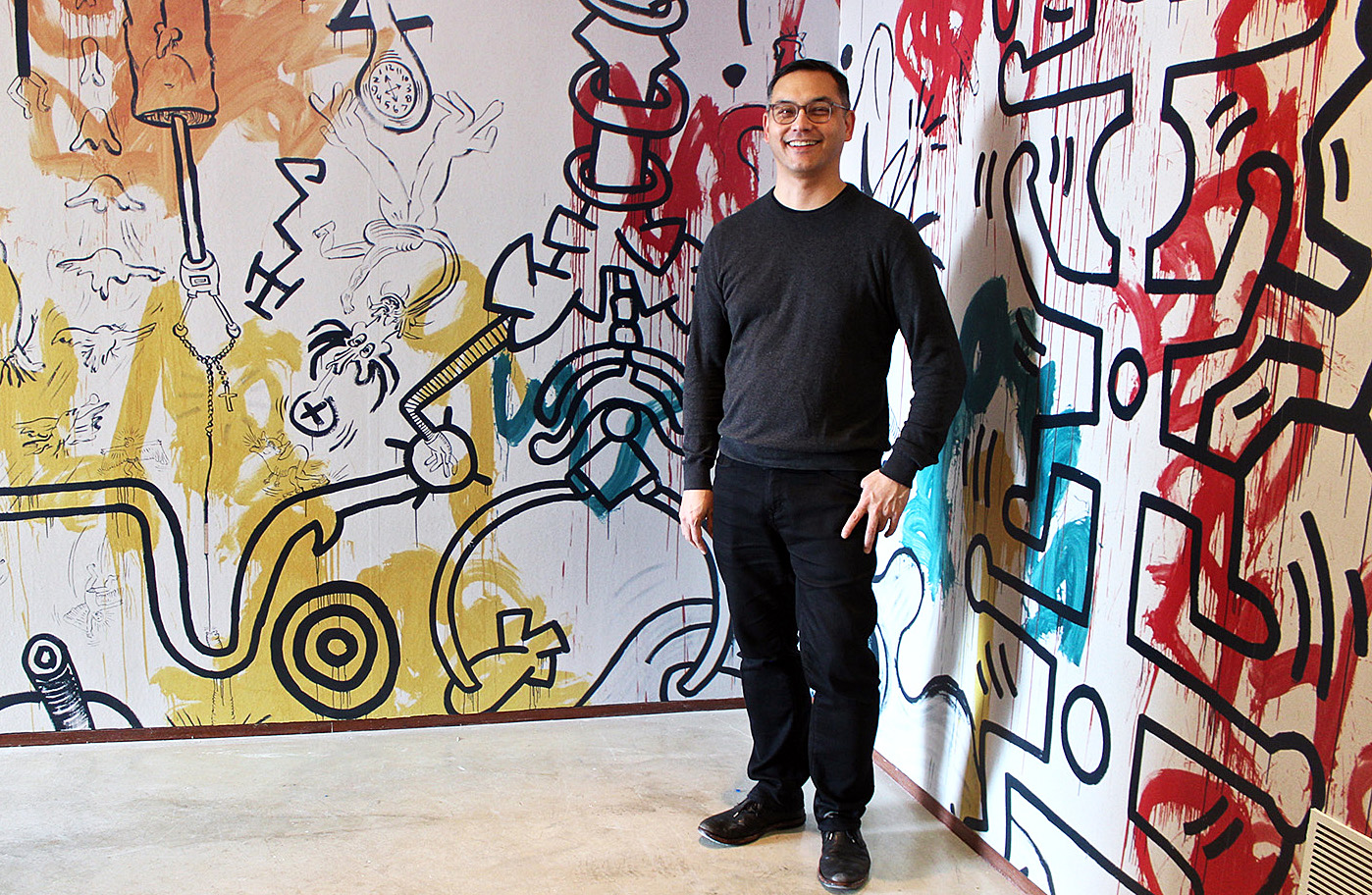
Cranbrook Art Museum Director Andrew Blauvelt poses in the reconstruction of “The Detroit Notes” 1987 mural by Keith Haring

“There was the sort of public persona of Haring, and the kind of drawing that he would put out in public, versus the kind of things that he would do post his AIDS diagnosis,” said Andrew Blauvelt, Director of the Cranbrook Art Museum, by way of introducing a wall of documental photographs taken by Haring’s friend, artist Tseng Kwong Chi, who also died of AIDS in the 1990s. These photographs capture Haring at work adorning New York City subway station advertisements with his signature iconography, and are mounted opposite a rare example of one of the actual billboards. In the piece, Haring’s work is juxtaposed with and ad for Perdue Franks asking, “Should you buy a hot dog from this man?” and demonstrates the artist already in command of the cartoonish and highly abstracted figures that would populate and morph throughout the course of his career.

Also on display is Haring’s thesis project from SVA, a video titled “Painting Myself into a Corner,” wherein the young artist does literally that. “He did a lot of work that was floor-based, [Jackson] Pollack-esque,” said Blauvelt, “and then picked up the kind of iconography that he was known for. That video showed him working in a performative way, and we wanted to pull that out, because he always thought of his practice as performative.“

This aspect of Haring’s work stands in conversation with another of the shows in the Fall program, Maya Stovall’s Liquor Store Theatre Performance Films, which combine cultural anthropology, dance, and performative public spectacle into improvisational encounters between Stovall (and other dancers) and random Detroiters on their way in and out of liquor stores.
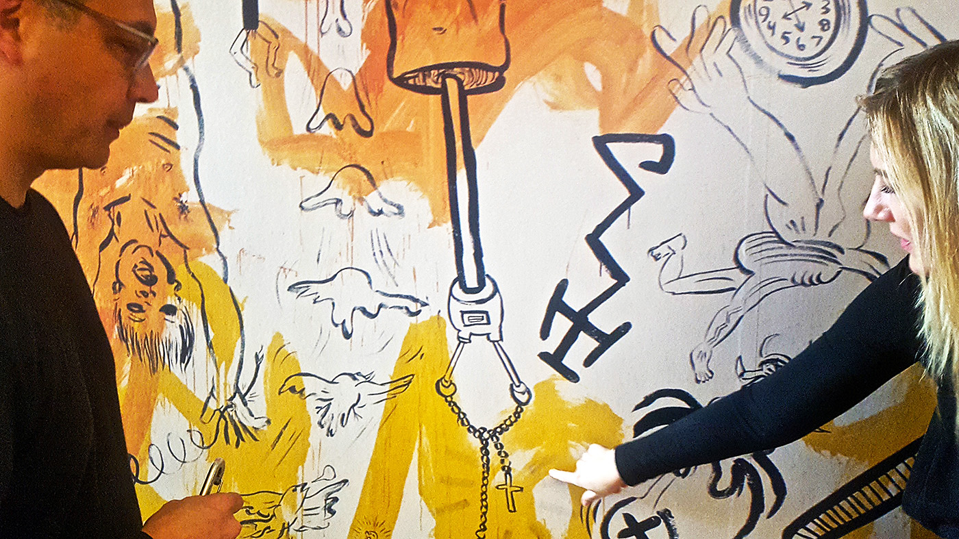
Blauvelt and Senior Curator Laura Mott point out details in the Keith Haring mural

“A lot of these historical art figures, like [Jean-Michel] Basquiat and Haring, didn’t quite fit into easy categories, and the same is true of Maya Stovall,” said Blauvelt. In her first solo museum show, Stovall presents a set of existing works, including those that were a part of this year’s Whitney Biennial, as well as a new piece in the series commissioned by Cranbrook. Just like Stovall’s newest video work, Haring’s mural was a commission for the museum, and the exhibition happens to coincide with the 30-year anniversary of the mural’s presentation, which was also accompanied by a lecture.

“I started drawing in the subway in New York City in 1980,” said Haring, during the lecture, which took place on September 25, 1987. “…The situation sort of presented itself almost by accident. …For the first time, it seemed like I had made something that made sense to be in public because it had a kind of communicative power.”

Indeed, while Haring’s style is instantly recognizable, it is perhaps the somewhat blank nature of his figures that make them so accessible and universal. But the Cranbrook murals reveal a new phase in Haring’s works, what Blauvelt characterizes as “dark Haring,” and speculates foreshadows the public revelation of his AIDS diagnosis.

“He’s officially diagnosed in ’88 or ’89 with AIDS,” said Blauvelt. “But I think he understood that he was going to succumb to it, because most of his friend by that time were diagnosed.” Though Haring’s themes were often political and social, the work at the end of his life and career took a turn toward the deeply personal, and the scale reconstruction of “The Detroit Notes”—including a video of Haring executing the project—captures some of this new style.
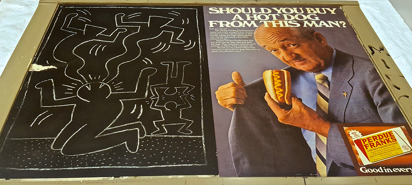
The original subway advertisement billboard ‘vandalized’ by Haring during his run of subway art in the early 1980s.

Haring worked for two solid days on the mural—which was always understood to be a temporary installation—first laying down washes of orange, yellow, red and green, then circling back to doodle in black paint over the backgrounds. Though definitely expressing a Surrealist bent—dismembered robot-aliens and frightening, mythical demon-beasts—the work is nonetheless some of Haring’s most figurative, giving faces, albeit grotesque and monstrous, in place of the usually blank bobble-heads for which is he is best known. Bodies are rendered with genitalia, and in various states of dismemberment, televisions blare telescoping stacks of figures, a rosary hangs from a disjointed robot spine. The imagery is immersive and disturbing, and the reconstructed hallway closes in on the viewer as did, perhaps, Haring’s unshakable sense that the demons that were claiming so many of his art world brethren were closing in on him, as well.

Those looking for respite are unlikely to find it at the end of the mural hall, where the final gallery presents two late-life collaborations between Haring and notorious beat poet William S. Burroughs—Apocalypse (1988) and The Valley (1989). One is a series of illustrations made by Haring in response to an existing text by Burroughs; the second presents large-scale prints combining Haring’s images with a new work by Burroughs, developed in conversation with Haring after hearing of the artist’s interest in his writing. It is a fine meeting of two souls on the brink of darkness—Burroughs, who had written himself up from darkness (that included “accidentally” shooting his second wife, Joan Vollmer) to flourish as a gentleman junkie, and Keith Haring, who had gone from rising star into meteoric fall, finding himself at last in a corner he couldn’t paint his way out of.
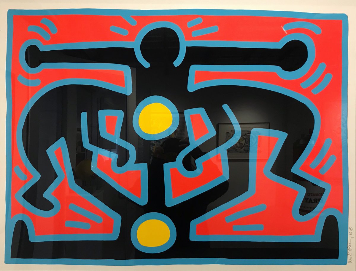
Keith Haring: The End of the Line runs through March 11, 2018 in the Wainger Gallery of the Cranbrook Art Museum.
Monet: Framing Life @ Detroit Institute of Arts

Detroit Art Review: Monet at Detroit Institute of Art

The Early Work of Claude Monet While living in the Paris suburb Argenteuil

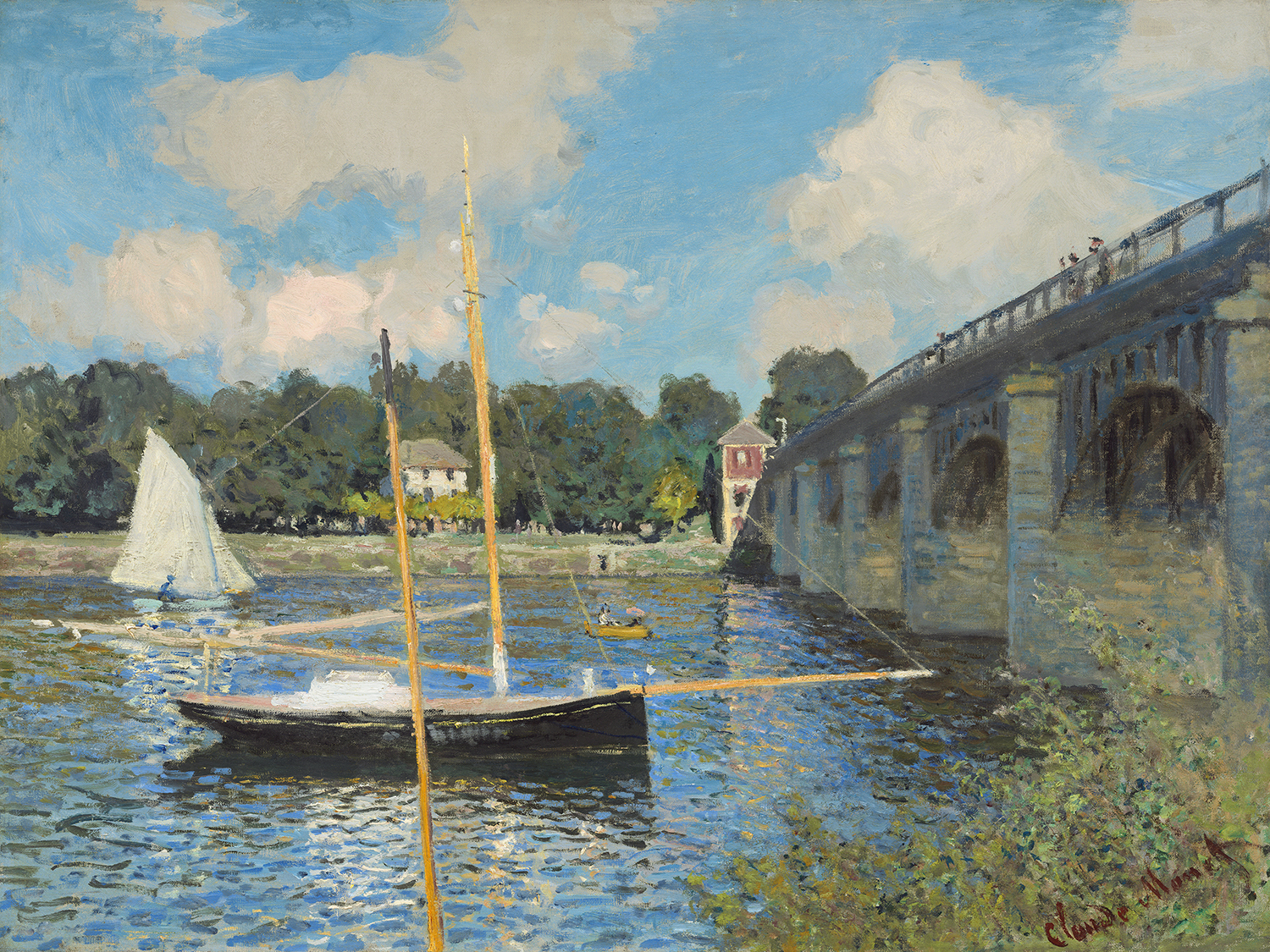
Claude Monet (French, 1840 – 1926 ), The Bridge at Argenteuil, 1874, oil on canvas, Collection of Mr. and Mrs. Paul Mellon

The Detroit Institute of Arts opened a new exhibition, Monet: Framing Life, on September 22, 2017, with the work of impressionist Claude Monet(1840-1926), an early key figure in the Impressionist movement that transformed French painting in the second half of the nineteenth century.

This exhibition depicts Monet’s leisure activity in and around Paris from 1871-78. While at the Paris studio studying with Charles Gleyre, Monet met several other artists, including Alfred Sisley, Frederic Bazille, and Pierre-Auguste Renoir. Monet found his subjects in his immediate surroundings of Argenteuil, just fifteen minutes from Paris by train.

His asymmetrical arrangement of forms emphasized the two-dimensional surfaces by eliminating linear perspective and abandoning three-dimensional modeling. Much of this work was started plein air, where Monet would set up his easel and work directly in a natural outdoor setting, then return to the studio for completion. His vibrant brightness of color in preparing his canvas with light-colored primers, instead of dark ground under-painting, broke with traditional landscape painting.

Raised in Normandy, Monet spent his youth in LeHavre and had been exposed to the work of Eugene Boudin, known for his paintings in the open areas along the Channel coast. Boudin befriended the young Monet, then only 18, and persuaded him to give up his teenage caricature drawings and to become a landscape painter, helping to instill in him a love of bright hues and the play of light on water later evident in Monet’s work.

Monet’s paintings of poplar trees and stacks of wheat, mustard colored water off cliffs off the coast of Normandy, of women strolling with children suggest that life is inherently serene, a series of warm sunny afternoons where parasols protect a woman’s delicate skin from overexposure to the sun. His quests to capture nature also prompted him to break down space and eventually merge color and subject into an atmosphere. The end result is a feeling we absorb, much more mysterious than an intellectual or logical observation.

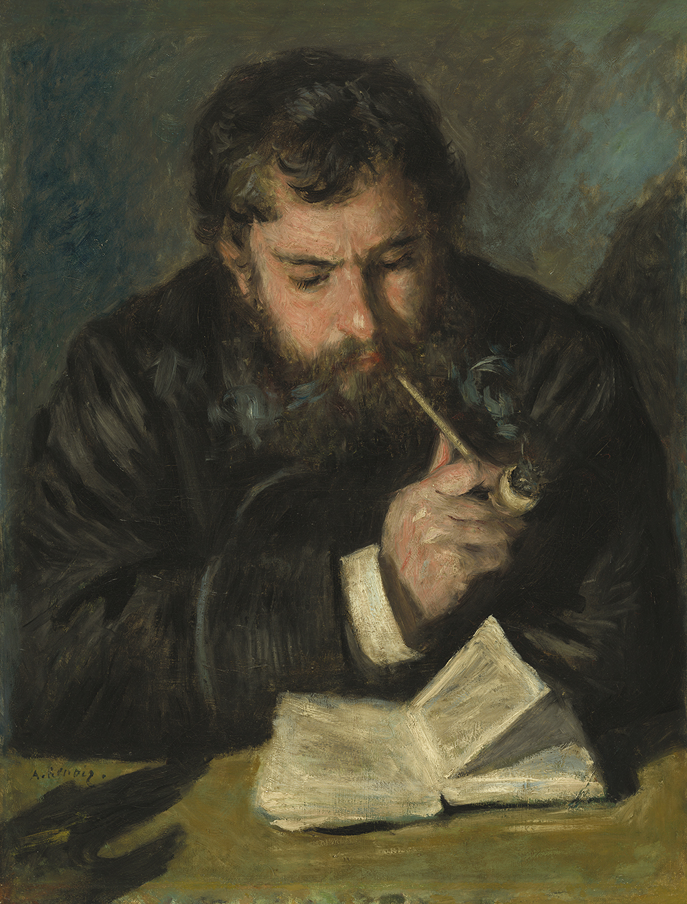
Auguste Renoir, Claude Monet, French, 1841 – 1919, 1872, oil on canvas, Collection of Mr. and Mrs. Paul Mellon

The art scene in Paris was alive and well during these years for a group of artists who wanted to change the traditional approach to painting. Pierre-Auguste Renoir had become a close friend to Monet and here in this portrait, he captures him wearing a blue jacket and smoking a pipe. Renoir had a brilliant eye for both intimate human features and the day’s fashions. His images of common families and well-dressed Parisian pleasure seekers created a bridge from Impressionism’s more experimental aims to a modern depiction of the French middle-class.

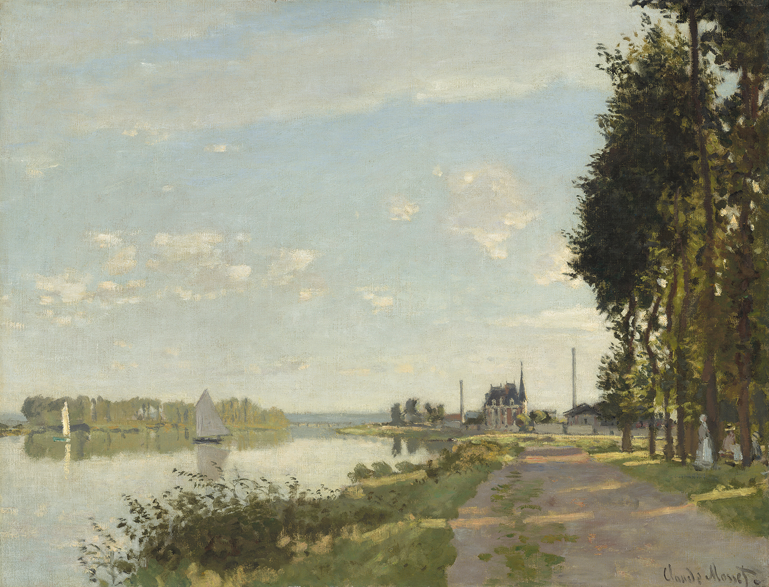
Claude Monet (French, 1840 – 1926 ), Argenteuil, c. 1872, oil on canvas, Ailsa Mellon Bruce Collection 1970.17.42

The promenade along the River Seine was a popular subject for Claude Monet. The compositional structure in Argenteuil around 1872 would shape landscape painters for years to come. He divides the canvas by threes on both the lateral and longitudinal axis while capturing low light casting shadows across this old dirt river road. The stillness here is captivating, without a person in sight or smoke bellowing from the distant factories stacks. Monet’s work lays down a foundation for artists like Childe Hassam, the American Impressionist, in his watercolor, The Beach at Dunkirk or his oil on canvas, Winter Midnight, where he has absorbed the plein air approach of Monet and the ability to offer up tranquility to people from all walks of life.

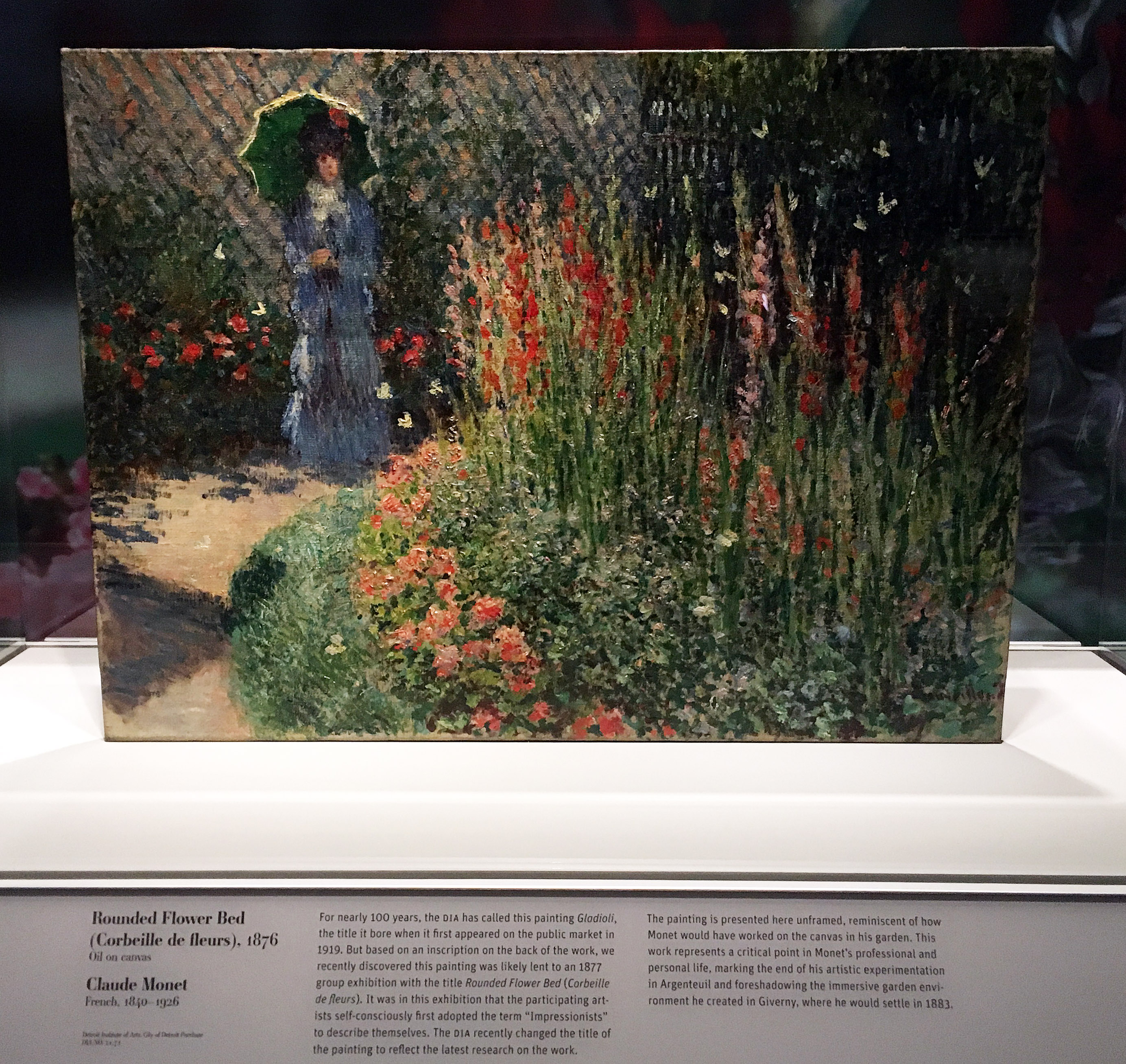
Claude Monet, Rounded Flower Bed, Corbeille de Fleurs, Oil on Canvas, 1872 Courtesy of the DIA

The painting at the center of the exhibition is the work of art formerly referred to as Gladioli and now renamed Rounded Flower Bed (Corbeille de fleurs). The renaming is the result of new research recently done for this exhibition. For nearly one hundred years, the DIA has called this painting Gladioli, the title given when it first appeared on the public market in 1919. After closer inspection, the painting was lent to an 1877 group exhibition with the title, Corbeille de fleurs or Rounded Flower Bed. It was at this exhibition that the participating artists first adopted the term Impressionists to describe themselves. In the DIA exhibition, the painting sits under glass without its frame and provides the viewer with a detailed explanation of the markings on the back of the painting. The painting is reminiscent of how Monet would have worked on canvas in his garden, and foreshadows the immersive garden environment he later created at Giverny.

The Monet exhibition, which concentrates on the late 1870’s, is where Impressionism arrives and gradually begins to mature.

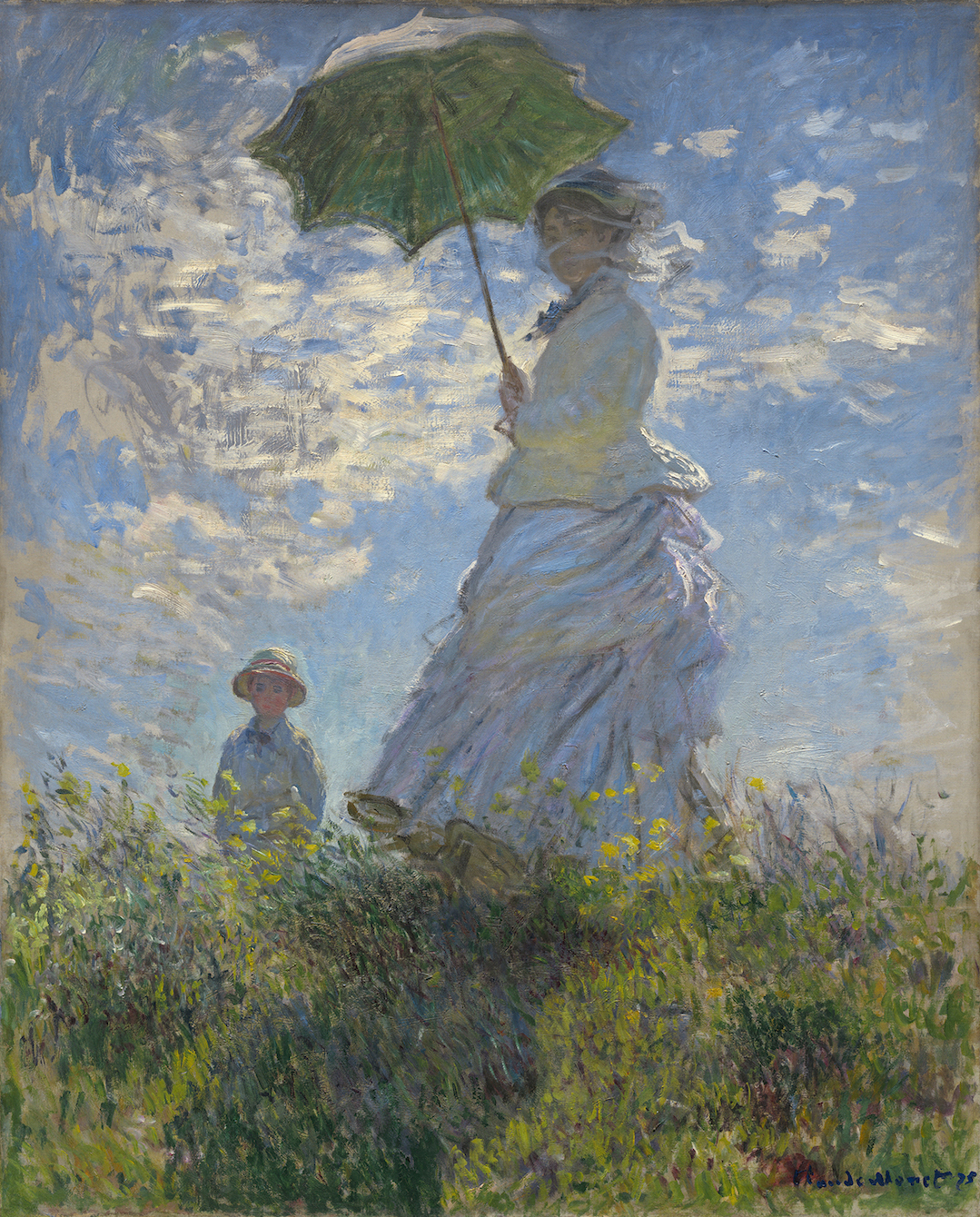
Claude Monet (French, 1840 – 1926 ), Woman with a Parasol – Madame Monet and Her Son, 1875, oil on canvas, Collection of Mr. and Mrs. Paul Mellon

It is inherent in the paintings of the early 1870s, as in Woman with a Parasol, the imposing canvas of Camille and Jean Monet, the artist’s wife and young son, where the artist starts to abstract the clouds simply using marks of paint and the white dress becomes blue. Monet’s compositions were based on zones of light and shade. Two years later, in the open fields near Argenteuil, the figures are seen from a distance, and everything disintegrates into a blur of minced color.

The work of Claude Monet is so instilled into our lexicon of artwork, we tend to forget how new the work was to the art world. Cezanne has been quoted as saying, “Monet is only an eye, but good God, what an eye.” The art of impressionism conjures up a world of magical charm filled with light and color. More than anyone else, Claude Monet recognized that his garden, rather than his words, presented the path to understanding his art.

Monet: Framing Life is on exhibition at the Detroit Institute of Arts, through March 4, 2018. Wayne, Oakland and Macomb counties: $10 for adults, $5 for ages 6-17, $8 per person for groups of 15 or more.

This exhibition has been organized by the Detroit Institute of Arts and made possible by the Bonnie Ann Larson Modern European Master Series. Generous corporate support has been provided by Park West Foundation, JPMorgan Chase, Altair, English Gardens, and Grand Hotel—Mackinac Island. Major support has been provided by Lois and Avern Cohn. Additional funding is contributed by Dr. Mark and Amy Haimann, Dr. Theodore and Diana Golden, anonymous donors, Eleanore and Dick Gabrys, and Andrew L. and Gayle Shaw Camden.


Abstract Minded: Works by Six Contemporary African Artists

Curated by Osi Audu at the N’Namdi Center for Contemporary Art

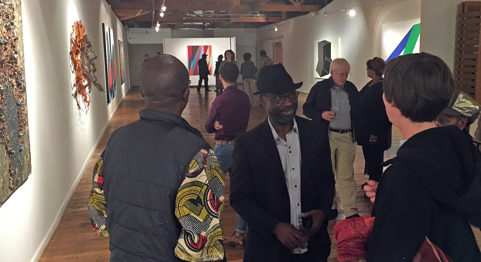
Installation Image, all images courtesy of the N’Namdi Gallery

Curated by Nigerian born artist Osi Audu, “Abstract Minded: Works by Six Contemporary African Artists,” at the N’Namdi Center, is an exhibition that surveys a confounding issue in the history of modern art, which is the lineage of the use abstraction in contemporary African art. For most people, their first association with African Art is ethnographic and stereotypical otherness, but also the exotic richness, of “primitive African iconography.” Thanks to the Detroit Institute of Art’s great African collection, many of us have grown up with that legacy. But now it is truly refreshing to get a glimpse of internationally known contemporary African artists in N’Namdi’s iconic space.

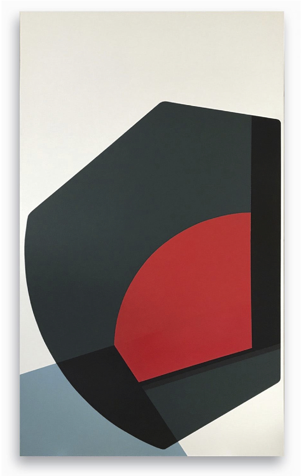
Serge Alain Nitegeka, “Found Mass 1,” Paint of wood, 74 7/8”x43 3/8”, 2017


Each of the five artists represented in Audu’s selection employs abstraction in a unique and revelational way, showing the effect of over thirty years of economic globalization in general and on art practices in particular. Serge Alain Nitegeka is a Burundi-born artist living and making art in Johannesburg, South Africa. While there are only two of his paintings in the exhibition, Nitegeka’s work participates in a dialogue with the dynamics of geometric abstract shapes and, in his drama of the manipulation of tilted planes, of geometric, colored shapes engaged in a Constructivist tradition. We can go back to the beginning of the century to the Russian Supremacists and El Lissitsky to find the origins of this work. Much of Nitegeka’s inspiration, the gallery guide explains, comes from a fascination with the built infrastructure of Johannesburg itself, the highways and buildings and basic structure of its urban landscape, in other words, contemporary Africa. He has achieved an international reputation for his large-scale installations.

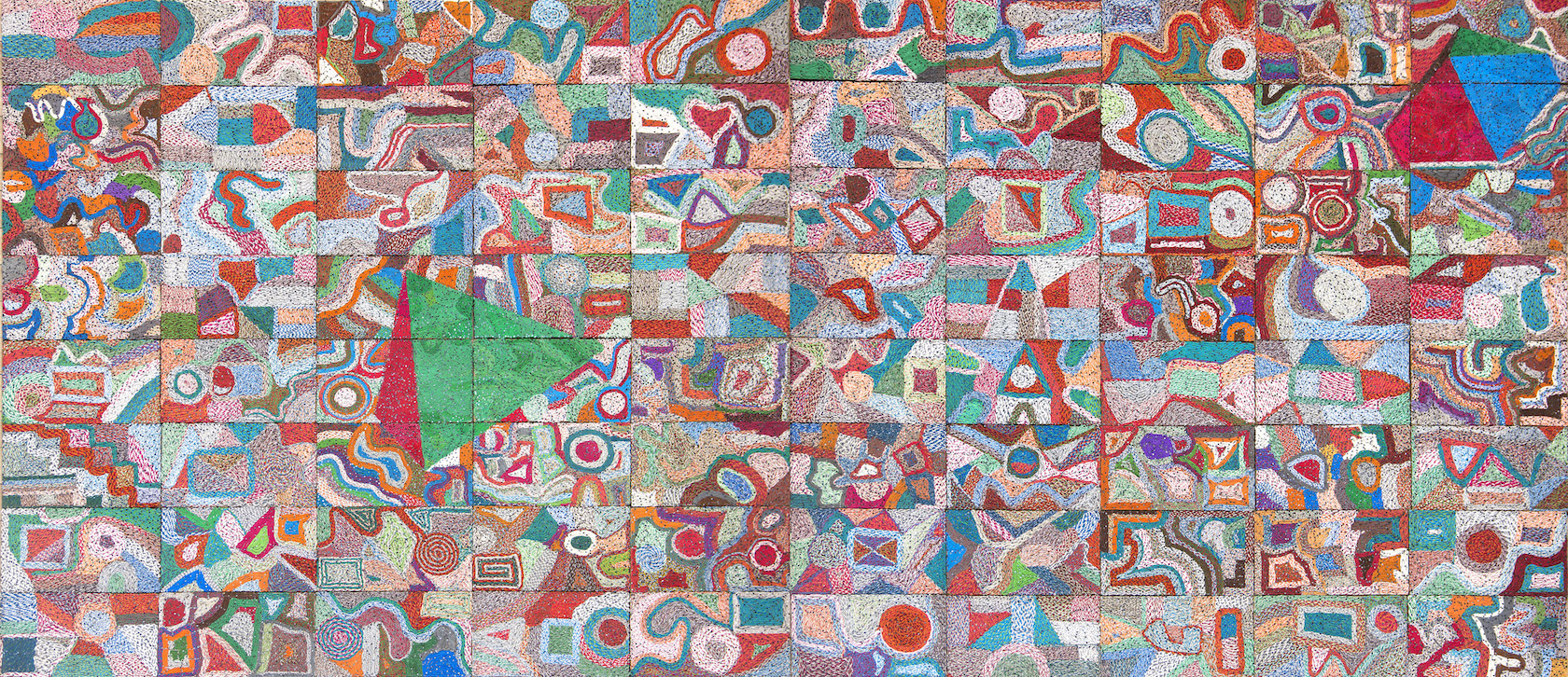
Elias Sime, “Tightrope Contrast,” Reclaimed electronic wires on panel, 73”x95,” 2017

Equally renowned is the work of Ethiopian artist Elias Sime, whose work echoes the bricolage strategies of many Detroit artists. In pieces composed of reclaimed electronic components — hundreds of cell phones, computer mother-boards, miles of color-coded wires — Simes constructs, with obsessive mastery, complex images of delicate line and color that are metaphorical in thinking about the interconnectivity and dependency of all of our lives on a global scale. They are also quite simply sublime in effect. From his “Tightrope” series, “Tightrope Contrast” is magical. Each of the eighty 8”x12” panels of which it is composed can be read as independent, abstract cartoon landscapes or topographical maps, suggesting an epic tapestry of tangled narratives.

From the same series, “Tightrope: Mobile2,” fiendishly composed of thousands of discarded cell phones, is a giddying delight when one thinks about the millions of voices and words that occurred with these phones and that the sculptural relief represents. It is a triumph in recycling, as well a majestic work of art!

For one gnarly reason, Osi Audu, the curator of the “Abstract Minded,” and Elias Sime have the most amount of work in the exhibition and that reason is the cost of insuring the works of art. Quite simply it is outrageously expensive to bring in and insure many high-profile artists’ works. Nevertheless, and thankfully, Audu and Sime are well represented with four works each.

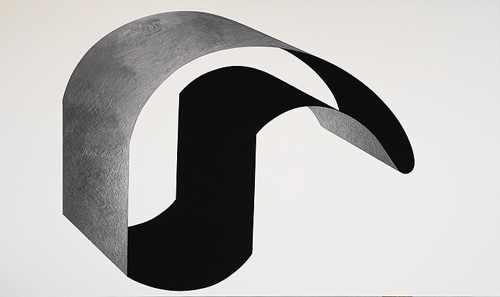
Osi Audu, Self-Portrait, Yoruba Head, Graphite & Pastel, on paper, mounted on canvas, 2017

Sime and Nitegeka have focused on the material culture of contemporary Africa — buildings and highways, the technology of cell phones and circuit boards — translating these modern materials into geometric forms in the universal language of abstraction. Osi Audu, on the other hand, in a complex negotiation of the ethnographic history of the Yoruba philosophy, has turned the history of African cosmology back on itself to create conceptual self-portraits. Proceeding from the Yoruba belief in the architecture of the head as a model of the inner and outer head, of the spiritual and physical, Audu has explored African identity through its art. Employing the Ogoni, Benin, and Etsako peoples’ tribal masks, he has used that process of mind, the analytical process of seeing a form called abstraction, to invent alluring new shapes that he calls, without irony, “self-portraits.” In a sense, the process seems to negate the ethnographic reality of African culture on behalf of the currency of the global language of abstraction. However, the forms that have emerged become, in and of themselves, identities. The “Self-Portraits” become logos of the real. Audu’s strategy only succeeds because of their fundamental success as images; as enigmatic shapes, they carry a mysterious presence that is equal to that of the tribal masks themselves. “Self-Portrait: Benin Head,” composed of reflective graphite and light-absorbing black pastel, while carving a unique geometric shape, with a sense of inside and outside, of African spiritual interiority and physical exteriority, diagrams a presence that is complex and elegantly composed.

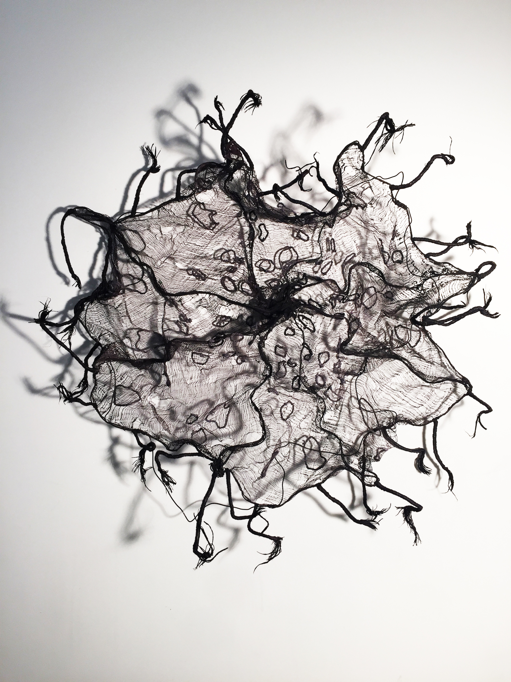
Nnenna Okore, “Threads of Time,” Cheesecloth, dye, wire, acrylic, 54”x54”x8”, 2017 of Time” Cheesecloth, dye, wire and acrylic 54″ x 54″ x 8″ 2017

Nigerian artist Nnenna Okore’s remarkable mixed media wall sculptures are composed of found and repurposed materials — threads, buttons, wire — and achieve their presence by mirroring the vital growing processes and unique forms of nature. The delicate webbing in “Threads of Time” inscribes, in the processes of tribal arts, her working hands in the abstract expressionistic process of the image. The braiding, matting, twisting, and weaving — akin to abstract painting’s vigorous expressionistic gestures — all echo tribal hair-style techniques and textile fabrication but simultaneously locate the object in both a cosmopolitan and a tribal landscape.

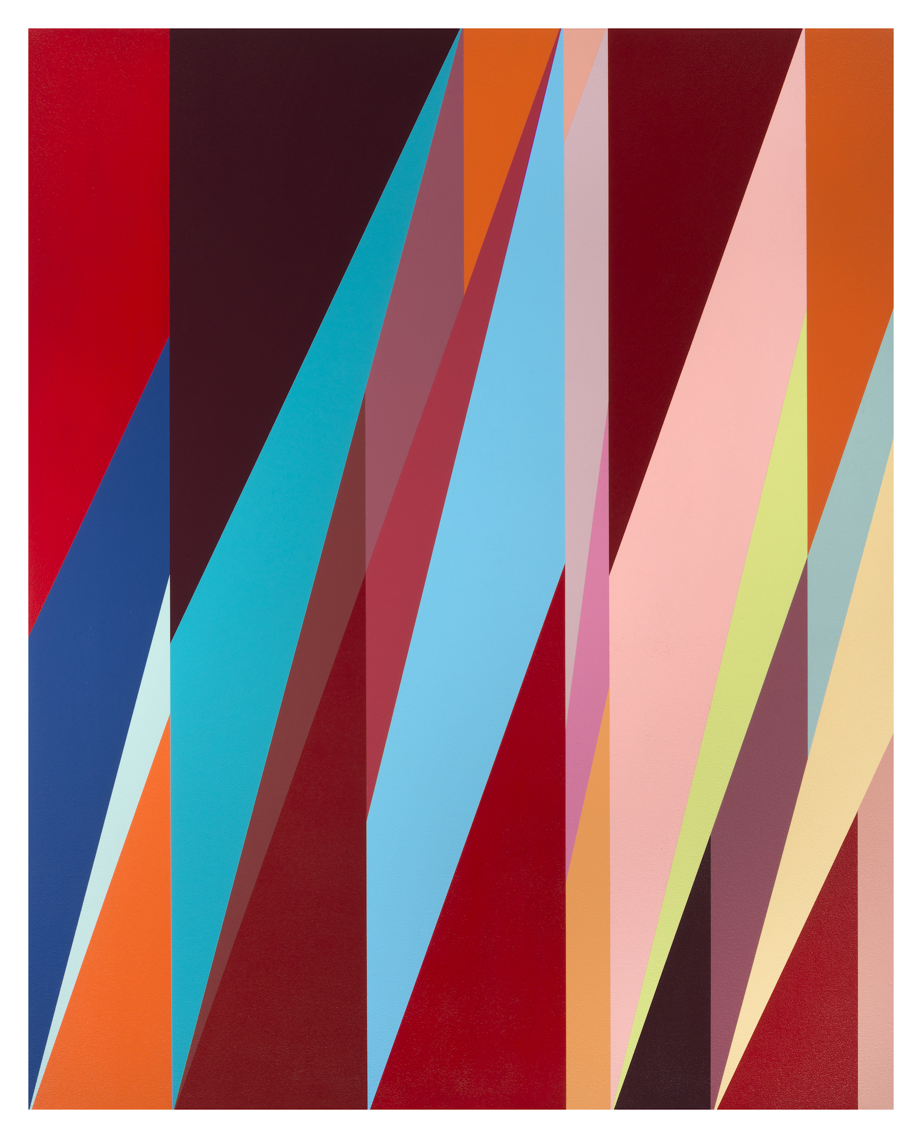
Odili Donald Odita, “Metropolitan,” Acrylic on canvas, 68”x 48,” 2017

Like Nitegeka’s Constructivist-inspired paintings, we would like to see more than one work by Nigerian-born Odili Donald Odita, but one senses in his painting “Metropolitan” the celebratory vision of interlocking splinters of light and color that are metaphors for the human imagination. And like Nitegeka, he has painted huge architectural installations that, while referencing artists such as Color Field painter Kenneth Noland, are original and awe-inspiring.

Osi Audu’s “Abstract Minded” exhibition places the idea of abstraction not in the tradition of Western art history, but rather in the history of ideas and philosophy. The process of abstraction that he characterizes in contemporary African art is a mode of thought that is fundamental to a worldview, rather than an art history term, and in a very real sense posits Detroit as a site of this dialogue.

Abstract Minded: Works by Six Contemporary African Artists

Curated by Osi Audu at the N’Namdi Center for Contemporary Art

N’Namdi Center for Contemporary Art    Through January 8, 2018


Jim Nawara @ WSU Art Department Gallery

PHENOMENA IN LANDSCAPE: Paintings, Prints, Drawings, & Photographs 1969-2017

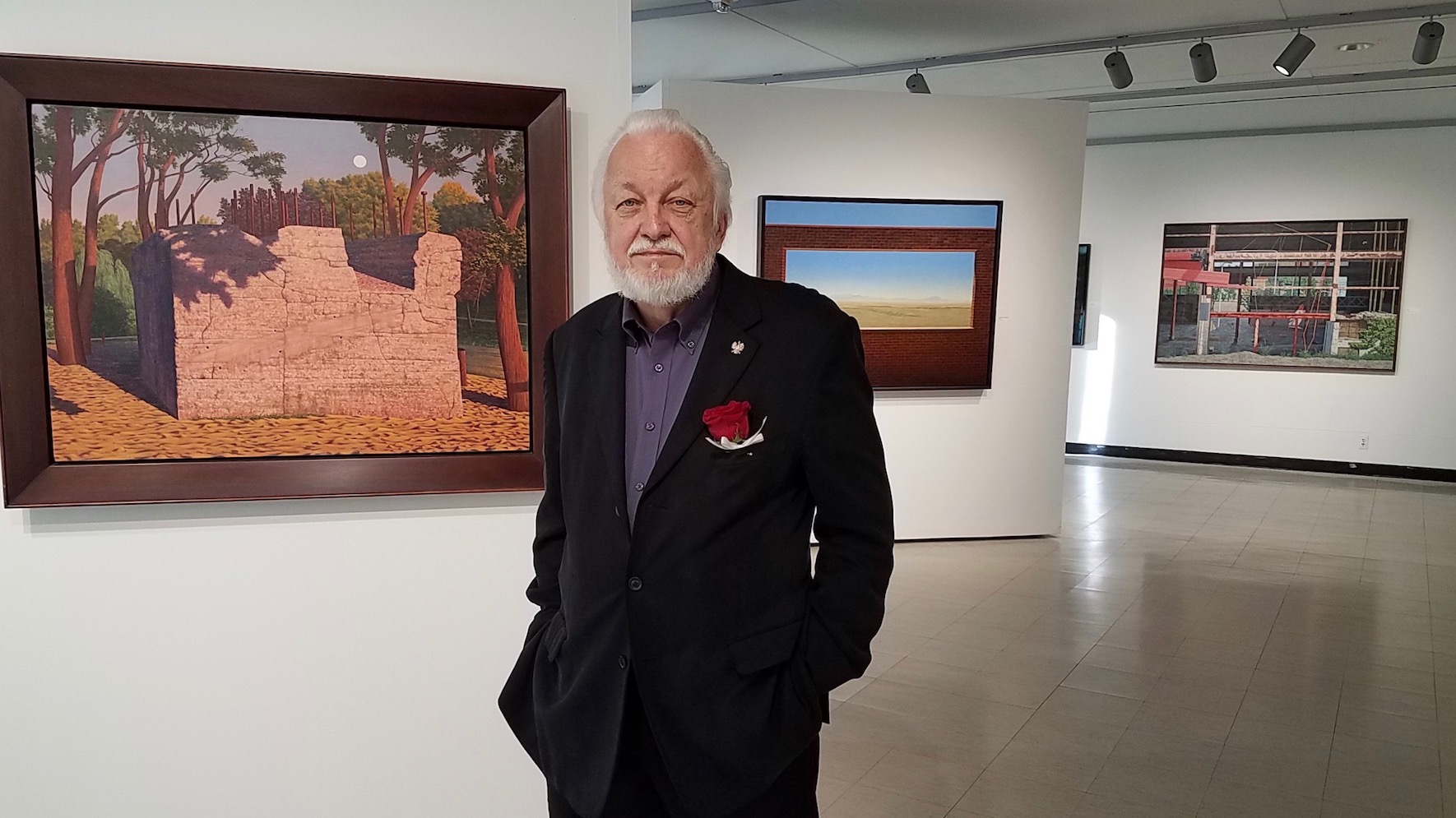
James Nawara, Professor Emeritus of Painting and Drawing at Wayne State University, PHENOMENA IN LANDSCAPE, Retrospective Exhibition, 2017 Image Courtesy of Lucille Nawara

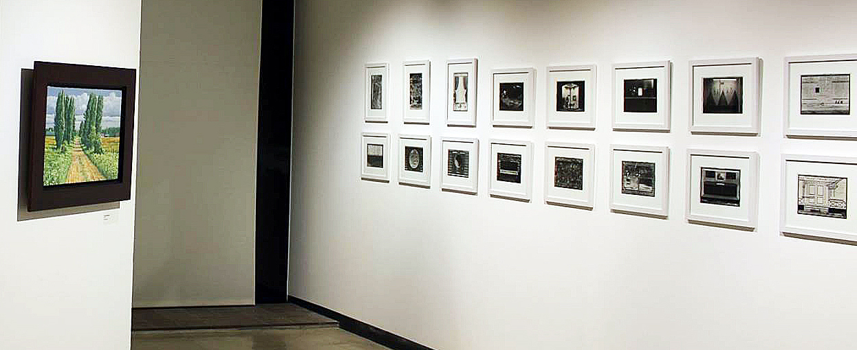
The exhibition by Jim Nawara, now Professor Emeritus of Painting and Drawing at Wayne State University, spans forty-eight years and includes more than one hundred paintings, prints, drawings, and photographs. The exhibition begins with Nawara’s imaginary landscapes seen from an aerial viewpoint that were made in the seventies and eighties. Next, an engaging series of thirty-two black and white photographs (1969-1989) presents sometimes quirky subjects selected mostly from Detroit area urban landscapes. Some these compositions were influential sources for subsequent oil paintings and large watercolor paintings that Nawara has produced from 1990 up to the present. No longer seen from an aerial viewpoint, these representational landscapes are based upon observation and interpretation of actual sites that are carefully selected.

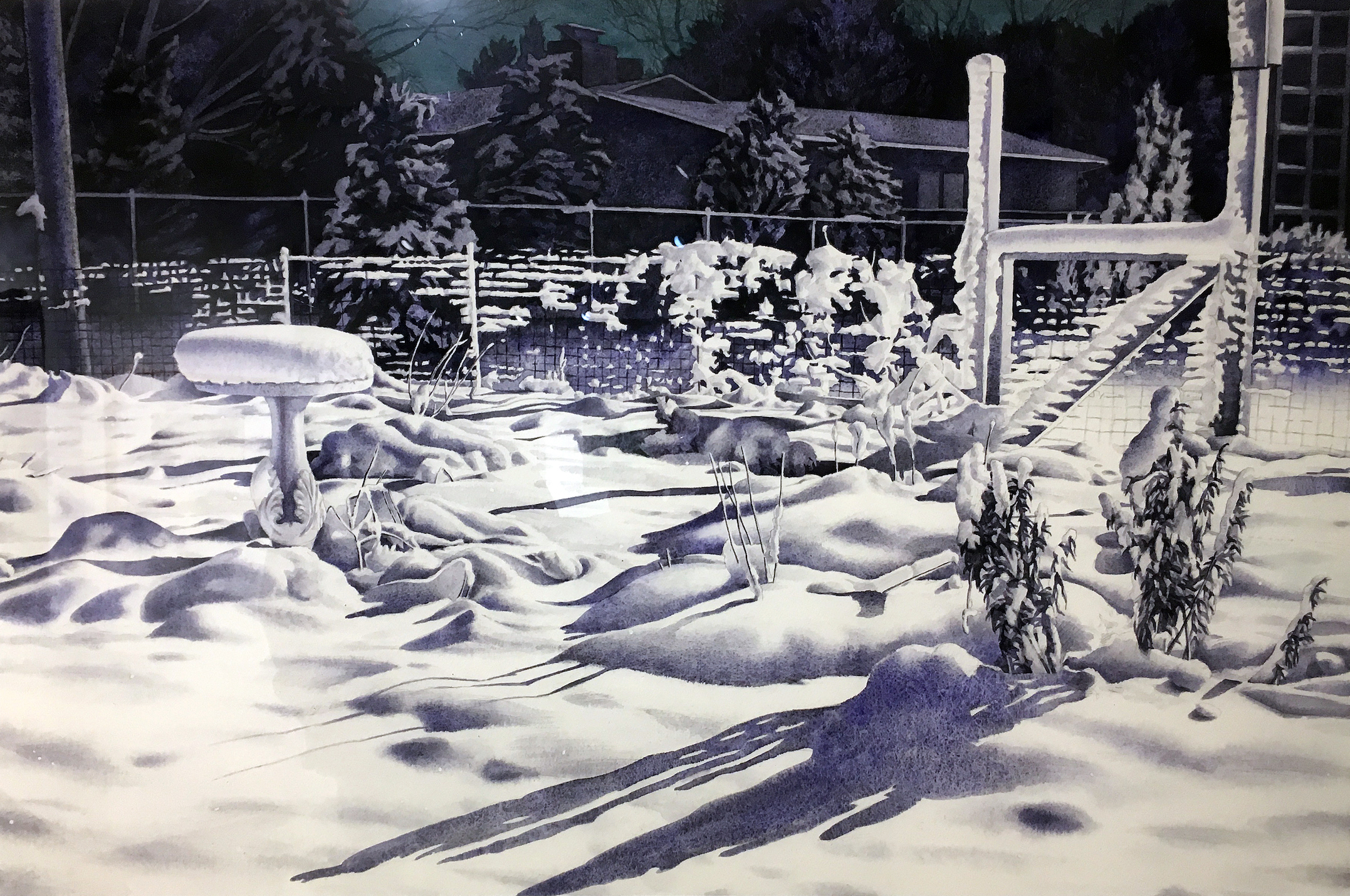
Nawara has stated that he often prefers depopulated, nondescript, or non-picturesque sources, “The subject does not need to be obviously beautiful, grand, or pristine. I once found the foundation of an abandoned house more intriguing than an idyllic nearby waterfall. A large globe light set in a library lawn below a harvest moon, the geometric pattern of a partially demolished Detroit factory, and the stark, nighttime shadows on snow covering a backyard garden all became painting subjects.”

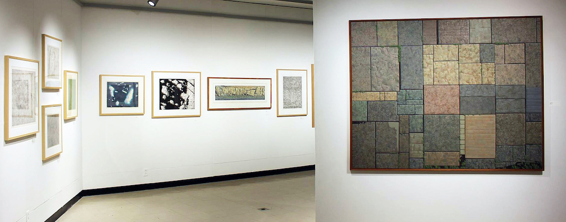
James Nawara, Installation image, Early work, Image Courtesy of DAR 2017

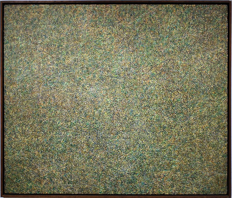
In the earlier imaginary landscape subjects, the terrain was seen from a low-altitude aerial viewpoint. Although invented, these compositions evolved from actual landscapes viewed from commercial flights, light aircraft, a helicopter and once a hot air balloon flight, as well as the artist’s interests in geology, optical phenomena, and prehistory. At a distance, the work might suggest abstract color field painting, exemplified by abstract color field painters like Jules Olitski in the 1980’s. Upon closer observation, the details reveal a plausible landscape that provides illusions of crop growth, archeological sites, subtle patterns, rock formations, long cast shadows, with both actual and illusionistic textures. These works have a feel for abstraction, something that would be carried through in Jim Nawara’s later work.

James Nawara, Trace, acrylic on linen, 1973

As an undergraduate at the School of the Art Institute of Chicago, Nawara studied under the mentor and famous photographer, Kenneth Josephson and also worked as a commercial photographer in Chicago. He went on to graduate school in painting at the University of Illinois, and studied photography there under another well-known photographer, Art Sinsabaugh.

James Nawara, Thirty- Two early Black & White 8 x 10″ Photographic Images

After completing his graduate degree in Illinois, Jim Nawara moved to Detroit to take a position as a drawing instructor at Wayne State University. His thirty-two photographs in this exhibition, most of which were taken in Detroit, have seldom been exhibited. He chose the rigor of always composing and printing the images full frame, un-cropped. The dates of these images overlap Nawara’s shift from aerial view subjects to landscapes based on ground-level views of actual sites. He was intrigued by the idea that an artist might be able to make art out of a “mundane” subject.

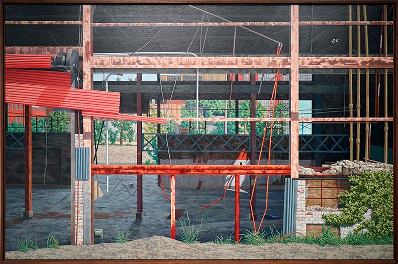
James Nawara, RESTEEL, oil on Linen, 1991

In the large industrial urban landscape, RESTEEL multiple layers of broken walls and windows of an abandoned factory draw the viewer into the painting. The foreground, mid-ground, and background all have their characteristics concerning light, shape, and color. It is an example of magical realism that presents an abstraction that is grounded in realism. In the foreground, the lower right brick structure plays off the left sheets of corrugated red metal, while the interior plays with a sliver of light. The imagery is divided into thirds both vertically and horizontally. It is a grid that provides us with a solitude that brings us back to multiple viewing. Each section of this oil painting is meticulously rendered, another reason viewers are compelled to take a long, hard look and become enveloped by this vestige of Detroit’s industry.

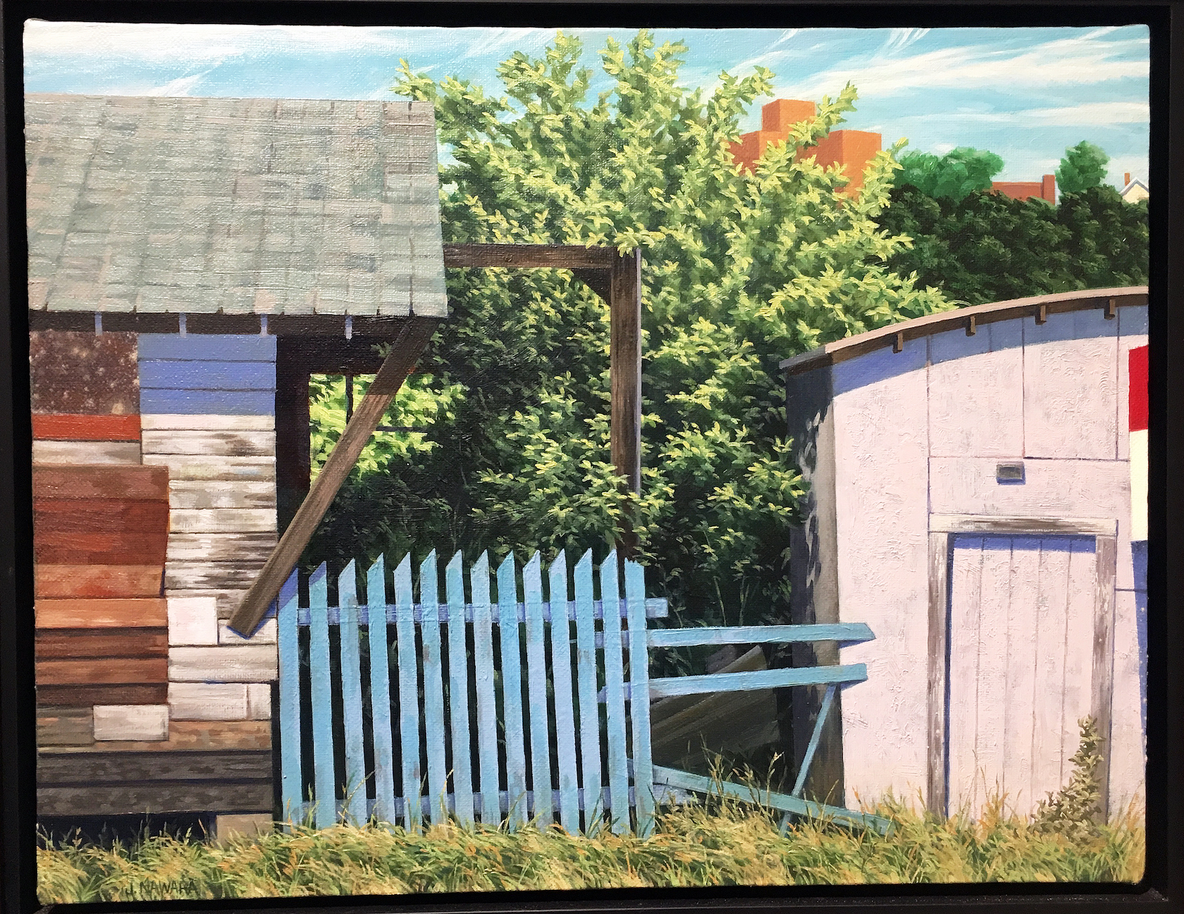
James Nawara, Blue Fence, oil on linen, 1999

In the small oil painting, Blue Fence, from 1999 is another example of Nawara’s strong composition, illusionistic space, and placement of color. He painted the blue fence, as well as a wedge of a red, white and blue sign on the far right in crisp detail. The fence, sign, shed walls, roof, and tree are carefully layered, like flats on a stage. It is evident that placement of these compositional elements is like an abstract collage.

James Nawara, Night Garden, Watercolor, 2007

Nawara’s Night Garden demonstrates a high level of technical facility with the watercolor medium. He poetically creates the stillness of fallen snow in his wife’s vegetable garden, illuminated by a strong floodlight on the back of their studio.

Working from a photograph, Nawara translated the textured snow with granulated watercolor washes, particularly as seen in the snowdrifts and snow-covered birdbath. This was an ephemeral subject, as all the snow melted by dawn. The entire painting was done with just three granulating watercolors, Holbein Ultramarine Blue Deep, Daniel Smith Lunar Black, and Holbein Prussian Green.

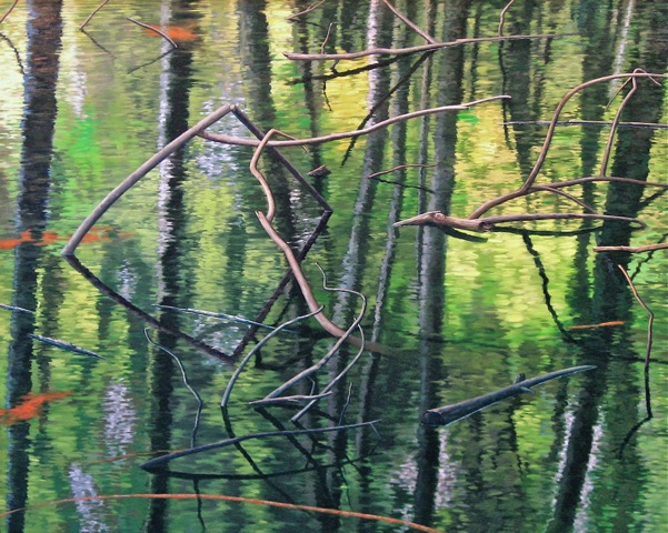
James Nawara, RHOMBUS, 40 x 50, oil on linen, 2008

Nawara’s 2008 40” x 50” oil painting RHOMBUS was used on the announcement for this exhibition. A rhombus is a geometric term for a parallelogram, like the shape of a diamond on playing cards. The rhombus in this painting is formed by a broken branch and its reflection in a flooded young woodland. Nawara was intrigued by the shimmering soft focus of the water surface, and the reflections of trees appear softly blurred by breezes, while the actual branches were rendered in sharp focus. Magic realism is in full play with this abstract composition, far from anything a traditional landscape painter would contemplate. Jim Nawara was pleased when a former student described his exhibition as “dreamlike”.

I had an opportunity to ask the artist a few questions:

Ron Scott: The title of your exhibition is PHENOMENA IN LANDSCAPE. What are some examples and what do you mean by Phenomenon?

Jim Nawara: Anything that may be of visual interest that is happening or that has happened in the landscape; also the evidence, or traces of natural and human activity in the landscape.

RS:  When did the move from aerial imagery to horizon-based landscape take place and why?

JN: Actually, I made my first real drawings when I was about six years old and these were graphite pencil aerial view landscapes! This was after my first airline flight from Chicago to Minneapolis. My dad worked for Northwest Airlines, and he took my brother and me on a round trip to give my mom a one-day break. I was blown away by the views out the window and made drawings of what I saw as soon as I got home. Many years later I started drawing and painting aerial views again as a graduate student at the University of Illinois. Then after about twenty years, I moved away from aerial view landscapes in the late eighties. I felt that I had plowed the aerial view field thoroughly, and I wanted to move to other aspects of landscape.

RS: How much of the work is plein-air and how important is that process to the work?

JN: I have started a few paintings outdoors; but being a slow painter, I have never completed one outside. I found it stimulating, and I just kept seeing more and more information that I wanted to put into the painting! I use quick graphite sketches and photographs to define the compositions. I worked outside for two consecutive days on RESTEEL, the six-foot painting in this exhibition. Each day within two hours of my arrival the wind increased moderately, and the six-foot canvas turned into an uncontrollable sail pulling itself and me down the street!

RS: What role has photography played in your artwork? How is it used?

JN: My photography experience in and out of school has given me a good understanding of the differences between human vision and the way a camera records an image. This is crucial in understanding how to use a source photograph effectively for another medium.

RS: How would you describe the difference in oil on canvas work, and the works on paper? Is it more than scale? Is there something inherent in the media?

JN: Yes, oil and watercolor are just inherently different mediums with their characteristics and qualities. I enjoy both and often alternate between the two. The major difference is the fact that transparent watercolor dries rapidly and allows you to move forward quickly in a painting. However, you are very limited in removing color that has dried into the paper. Therefore, I have to plan out each watercolor several steps ahead. Oil paint allows you to move forward and back more easily, but each has its particular, wonderful charms.

RS: Which (living or dead) artist’s work are you most attracted to, and why?

JN: There are many wonderful artists who made excellent work. The first three that I immediately think of are Edwin Dickinson, Georgio Morandi, and (always) Johannes Vermeer. Check them out in books or online, but better yet, try to see some actual work in museums.

RS: What attracted you to these abandoned Midwest locations?

JN: I never select a site to paint because it is abandoned, though some are.   I primarily consider my paintings abstract organizations of shape, color, light, and space. The paintings are always interpretations filtered through time, memory and imagination, as well as the physical process of painting. I often choose urban landscapes, but when I select a natural subject, I am interested in the effects of human activity great and small on the landscape. These events may be grand, unimportant, profound, or peculiar. I want to engage the viewer and to express something that is ineffable. My watercolor painting Lock shows a mosquito-ridden abandoned canal lock in Ohio that provided enough visual interest for me to make a painting.

The work in this exhibition spans Jim Nawara’s forty-six-year career as a professor of drawing and painting at Wayne State University. Artists and colleagues that know Jim kid him about his “brief” resume, a reflection of his record as an active exhibitor participating in solo and small group shows as well as more than 250 international, national and regional group exhibitions, not to mention the public and private collections that house his work. In 2007 Nawara had an exhibition at the Muskegon Museum of art, Overviews & Afterlands, that exhibited 22 works of art where the curator remarks say, “His landscapes are without figures, yet notated with marks of human activity and man-made forms. They are based on observation but driven by invention. They reflect the passage of time: changing light and shadow, remnants of man-made forms, the layering of a medium during the creative process.”

Jim Nawara earned a B.F.A from the School of the Art Institute of Chicago and an M.F.A from the University of Illinois, Champaign

The exhibition continues through Friday, December 8th, 2017

Wayne State University Art Department Gallery

Hours: Tuesday – Thursday 10 AM – 6 PM, Friday 10AM- 7PM

Art Department Gallery, 150 Art Building,  5400 Reuther Mall,  Detroit, Michigan 48202

Frederic Edwin Church @ Detroit Institute of Arts

Church: A Painter’s Pilgrimage

Church: A Painter’s Pilgrimage, currently on view at the Detroit Institute of Arts, presents a dazzling selection of works made by one of America’s most well-known and successful Nineteenth Century painters. Frederic Edwin Church is best known for highly rendered visions of manifest destiny- expansive, breathtaking views of the American west and South America. Church traded mainly in paintings of virgin land- land untampered with by humans (the people who had made their homes in such landscapes for millennia are mostly absent from Church’s paintings, save as the odd bit of picturesque window dressing). Land that was considered the God-given right of Church’s audience, described by the DIA as “white, Protestant, American.” One thing that A Painter’s Pilgrimage makes clear- through an excellent guide of subtly pointed remarks provided by the DIA- is how much the romance of that Nineteenth Century American, white, Protestant narrative is still with us, buried deep in our cultural bedrock.

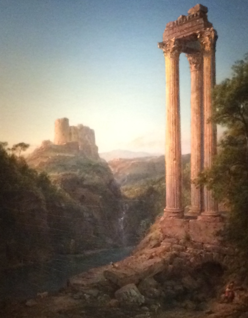
A Painter’s Pilgrimage showcases an unconventional body of work for Church- paintings made during a journey the artist took around the Middle East and the Mediterranean in the region then known as the Levant. Church rarely dealt with human history directly in his iconic American landscapes- in A Painter’s Pilgrimage, stately ruins and picturesque cityscapes layer over one another like condensed timelines of Western civilization’s cradles.

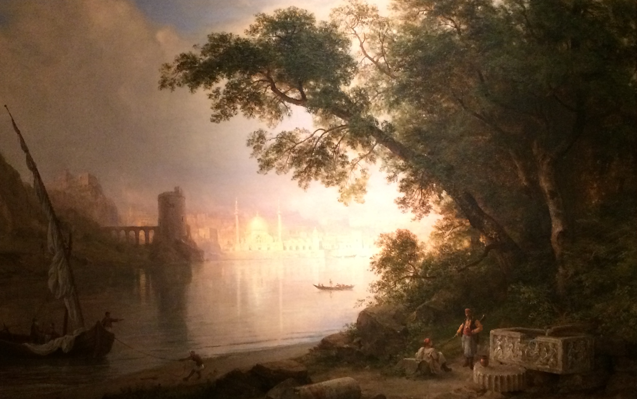
Frederic Church, Nature and Civilization, Sunrise in Syria, Oil on Canvas, 1874

Wandering the dimly lit galleries (necessary to protect the paintings) it’s difficult not to be swept away in the grandeur of Church’s vision- every single work is simply dazzling. Church was, first and foremost, a great painter. A devout Christian, he invested all his works with spiritually symbolic shifts in light, focus, and atmospheric cataclysm. His wildly billowing clouds, lurid red skies, and sublime scale speak to the greatness of his God’s creation. The visual rearrangement and condensing of human monuments that he engaged in while painting Middle Eastern landscapes speaks to the desires of the artist and his audience, who clearly felt a sense of ownership of this ancient landscape and how it ought to appear. The dreamy genre painting Al Ayn (The Fountain) combines various types of architecture from different places and eras to describe the arch of civilization’s rise and fall.

Frederic Church, The Fountain, Oil on Canvas, 1882

It also features human figures placed in the foreground, an unusual move for Church, but one that completes his romantic vision of the East. Al Ayn could be an illustration of the history of Orientalism- problematic as the image is, it’s so beautiful that one can’t help but be drawn in by it. This frisson persists throughout the show- how does one look at paintings that are so vested in the West’s destructive view of landscape and people, that are themselves posters for Colonialism, racism, manifest destiny, etc…. and yet are so intoxicatingly lovely?

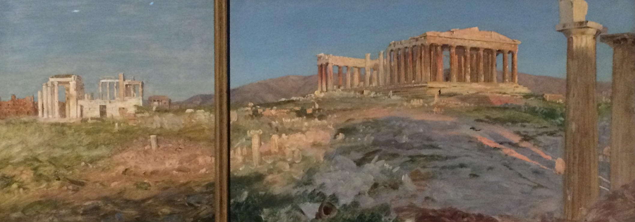
Frederic Church, Erechtheum and The Parthenon Study, Oil on Paper, 1869-70

Jerusalem from the Mount of Olives is the stunner in a galaxy of stunners. Just beginning to get over Church’s grand but achingly overdone visions of Classical architecture (his Parthenon is so painstakingly rendered and devoid of the freshness of his smaller, on-site studies, which are sprinkled throughout the galleries like shimmering dewdrops, that it quickly gets exhausting to look at) an encounter with Jerusalem renews the eyes and stops the breath. It’s clear that this was probably the most significant site in the Middle East for Church- the epicenter of the Holy Land.

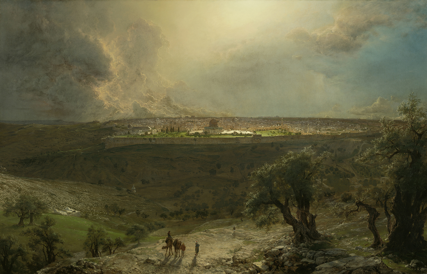
Frederic Church, Jerusalem from the Mount of Olives, Oil on Canvas, 1870

The painting is just what its title says- a view of the ancient walled city from atop the Mount of Olives, where twisted, gnarled trees reach toward the sky, symbolizing the suffering of Christ. The sublime distances roped into the view. The layers of light. The sunlit olive branches pulsating over the deep-shadowed valley. The pure, blinding light at the focal point- the Dome of the Rock at the city’s apex. Here, Church breaks atmospheric perspective- everything is far too sharply in focus for the distance, which increases the otherworldly feel of the view. The odd little comb of perfectly angled shadows of the row of columns to the right of the Dome. The dazzling tips of roiling storm clouds massing along the horizon- the vast, perfect lapis blue of the sky beyond. This is a genre painting that transcends genre- an enormous confection of kitsch that transcends its kitschiness. This is the paradox of Frederic Edwin Church- a painter with truly sublime vision and (for contemporary viewers) deeply problematic politics. That vision makes the seduction of those politics hard to resist. These paintings present a crystalline vision of my childhood daydreams of a vast, mythic, mysterious East. This strange familiarity suggests that Church’s vision- the vision of manifest destiny- is still with us. A Painter’s Pilgrimage is canny to that vision, and provides a great contextual, historical lesson in its making.

Frederic Edwin Church: A Painter’s Pilgrimage is on View at the Detroit Institute of Arts from October 22, 2017 through January 15, 2018


Powered by WordPress & Theme by Anders Norén