Critical art reviews of Detroit galleries and museums weekly

Author: Clara DeGalan Page 2 of 6

Writer

Matisse Drawings @ UofM Museum of Art

Matisse Drawings: Curated by Ellsworth Kelly from The Pierre and Tana Matisse Foundation Collection
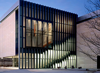
UofM Museum of Art, Exterior, 2017 Images Courtesy of Levi Stroud

Matisse Drawings, a traveling exhibition currently gracing the University of Michigan Museum of Art’s cathedral-like A. Alfred Taubman Gallery, presents a spiritual meeting of two Twentieth Century titans- Henri Matisse, one of Modern Europe’s most beloved painters, and Ellsworth Kelly, king of the hard-edged color field painting that branched from Abstract Expressionism in mid-century America. The exhibition, lovingly curated and meticulously arranged by Kelly, encompasses an unbroken row of neutrally framed drawings that snakes around the walls of the Taubman Gallery. Nestled in a smaller gallery next to Taubman is a collection of Kelly’s own lithographs, made during a stay in France, inspired both by Matisse and the landscape that inspired the Fauvist master.
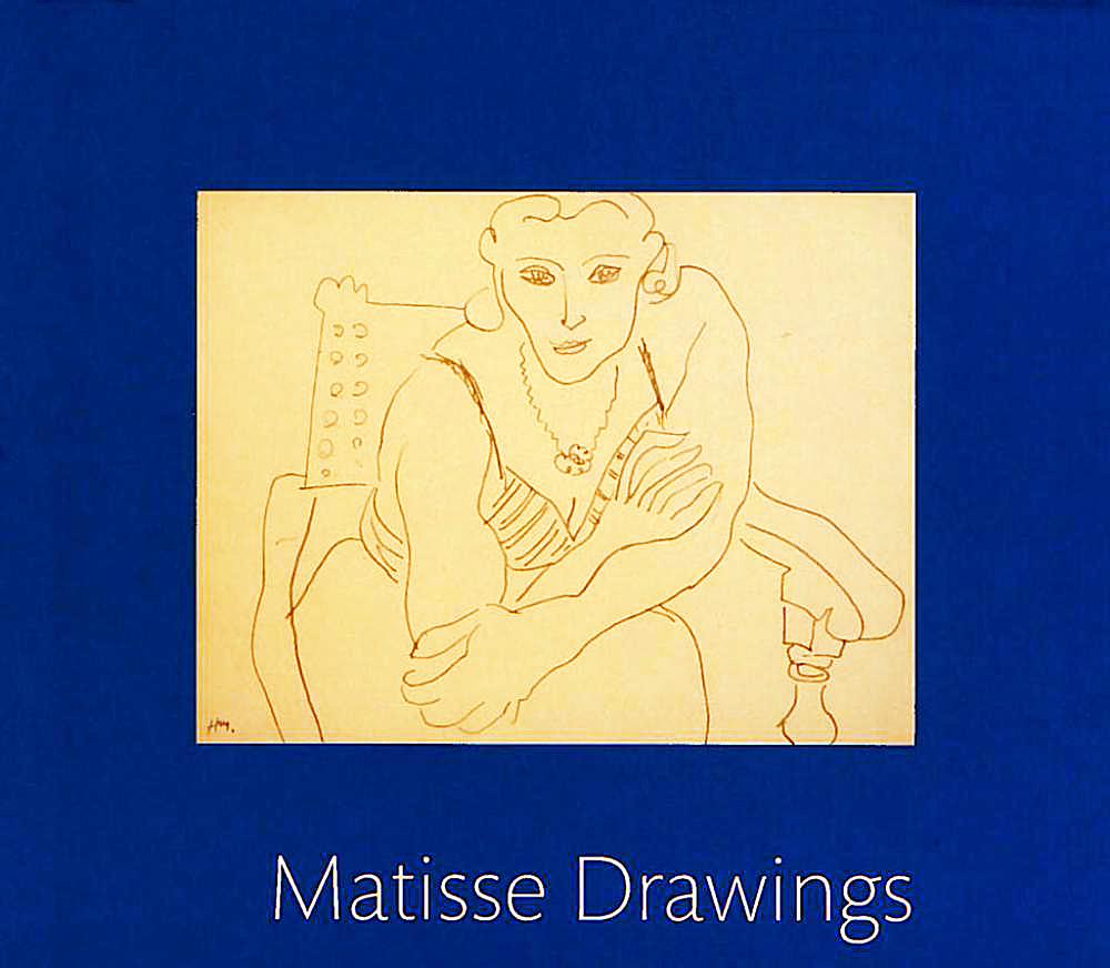
Henri Matisse, Catalog of Drawings from exhibition 2017

Coming into the presence of a Matisse painting is invariably moving, profound, and difficult to describe. He was a master of emotive, ecstatic visual expression. As formal, flattened, and abstracted as his work can be, there is always, uncannily, a sense of natural light, and plenty of breathing space. Though formidable, Matisse’s works never feel closed off- they invite the viewer in to dance with them. Ellsworth Kelly himself points to this phenomenon in an interview enclosed in UMMA’s gorgeous exhibition pamphlet- “Matisse evoked space. For instance, when he would do leaves or fruit or still lifes, he would leave openings. Like this would be a leaf (gestures in a vaguely C shape in the air). But my drawings are about shapes: the forms are closed.”
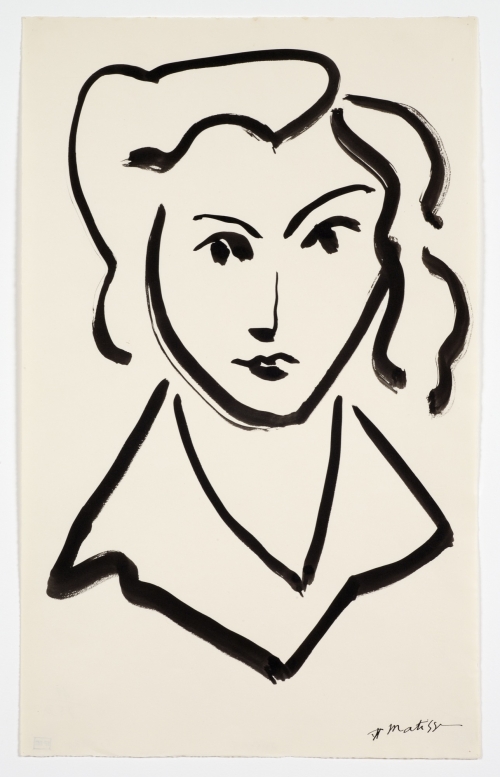
 

Henri Matisse, Drawing, Head of Woman, 1945

Matisse was a magician of open form. The feeling of completeness, along with the lack of fussy detail, gets more astonishing with each passing drawing. The graceful bend of a plant stem, the nuanced tilt of a woman’s head, the fleeting glance of the artist himself peering around his drawing board in a self-portrait, are conveyed with a mind-bending economy of marks. Matisse’s marks contain multitudes. The shift from point to edge of drawing tool in one sweeping contour imply light, shadow, movement and space with such apparent effortlessness that one is first skeptical, then seduced, then transcended in following it along the curve of a cheek or the plume on a hat. This strikes the deepest in Matisse’s studies of shoulders and arms- as simply as they’re drawn, they distill the formal heart of the Odalisque in bent, foreshortened elbows as hands reach up to tousle hair, the sensuous weight of a torso rests on crossed forearms. There’s a purity to these drawings that somehow transcends Orientalism in way’s Matisse’s predecessors and contemporaries did not- they’re about life, movement and muscle, the glorious freedom of the sensuous body.
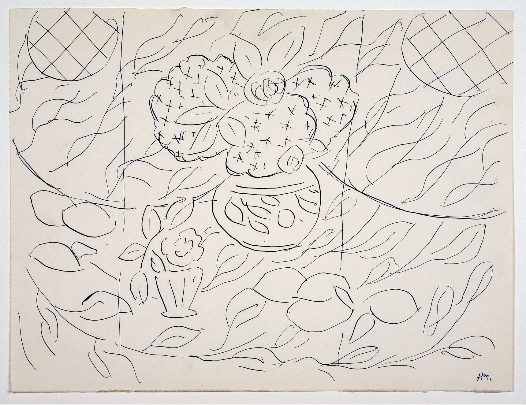
Henri Matisse, Drawing, Sketch for Lemons & Mimosas, 1944

Ellsworth Kelly, as curator, positioned his own works adjacent to Matisse’s, not mingling with them- a nice gesture of deference to a master, as well as a sly, unique lens for perspective. According to the exhibition’s press release, the viewer is meant to see Kelly’s lithographs first, and then approach Matisse as if through Kelly’s eyes. I went in the opposite way, washing up to Kelly’s lithographs dazzled by Matisse. The two artists complement each other like a tall glass of water after a shot of bourbon. As Kelly points out in the above-mentioned interview, his forms are closed- sparing in detail like Matisse, but quieter, humbler, more about shape than movement. They are, in their way, as beautiful as Matisse’s drawings- scaled and composed masterfully, describing plants found in the French countryside with a graceful observance not readily apparent in his more famous paintings. The major difference is that Kelly’s minimalism seems wrought from disciplined restraint, while Matisse’s economy of line erupts, magically, from abandon and delight.
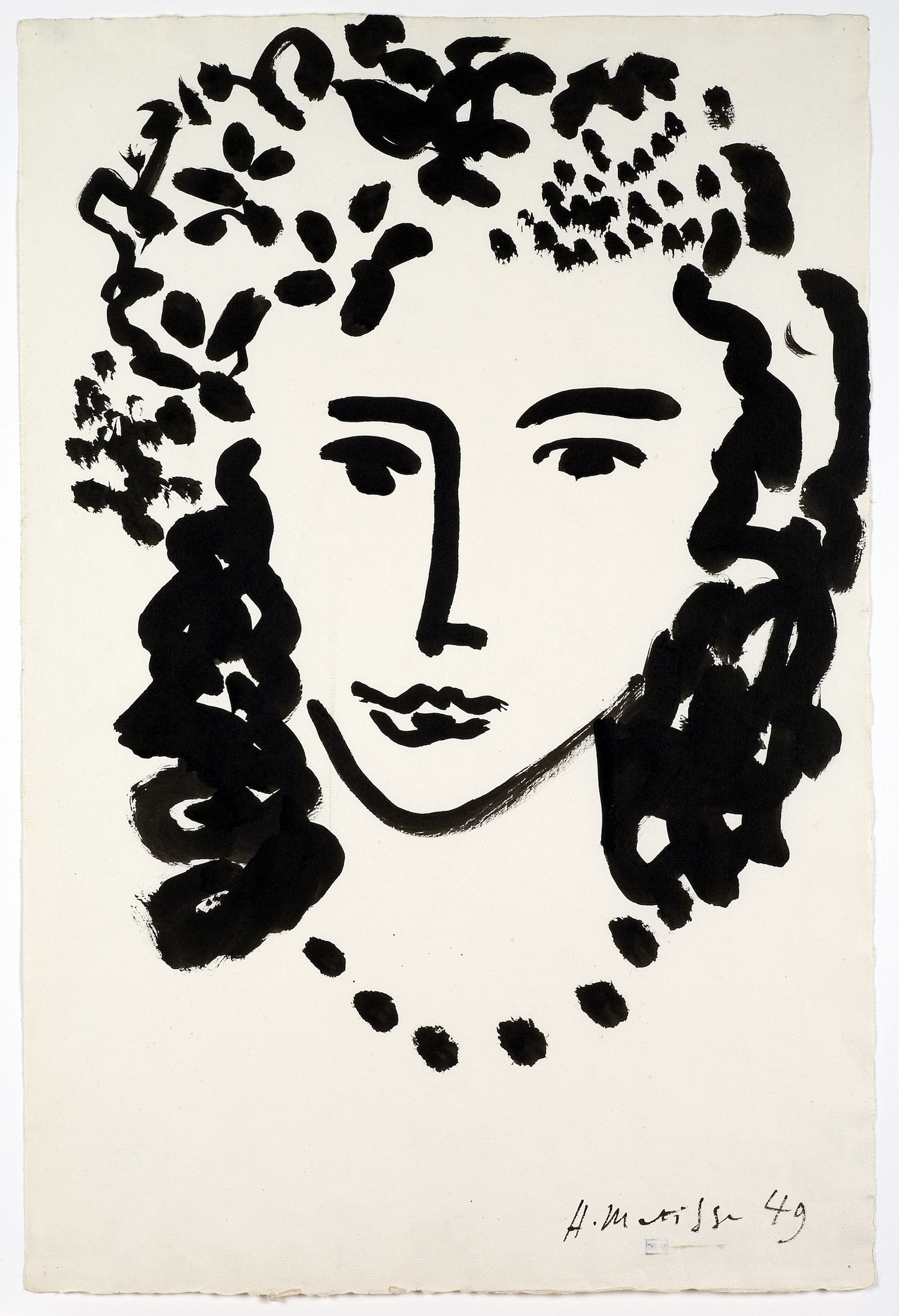
Henri Matisse, Drawing, Large Head, 1949

Matisse Drawings- Curated by Ellsworth Kelly is on view at the University of Michigan Museum of Art November 18, 2017, through February 18, 2018.
UofM Museum of Art

Frederic Edwin Church @ Detroit Institute of Arts

Church: A Painter’s Pilgrimage

Church: A Painter’s Pilgrimage, currently on view at the Detroit Institute of Arts, presents a dazzling selection of works made by one of America’s most well-known and successful Nineteenth Century painters. Frederic Edwin Church is best known for highly rendered visions of manifest destiny- expansive, breathtaking views of the American west and South America. Church traded mainly in paintings of virgin land- land untampered with by humans (the people who had made their homes in such landscapes for millennia are mostly absent from Church’s paintings, save as the odd bit of picturesque window dressing). Land that was considered the God-given right of Church’s audience, described by the DIA as “white, Protestant, American.” One thing that A Painter’s Pilgrimage makes clear- through an excellent guide of subtly pointed remarks provided by the DIA- is how much the romance of that Nineteenth Century American, white, Protestant narrative is still with us, buried deep in our cultural bedrock.

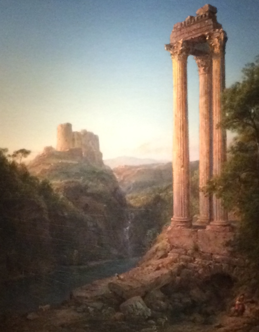
A Painter’s Pilgrimage showcases an unconventional body of work for Church- paintings made during a journey the artist took around the Middle East and the Mediterranean in the region then known as the Levant. Church rarely dealt with human history directly in his iconic American landscapes- in A Painter’s Pilgrimage, stately ruins and picturesque cityscapes layer over one another like condensed timelines of Western civilization’s cradles.

Frederic Church, Nature and Civilization, Sunrise in Syria, Oil on Canvas, 1874

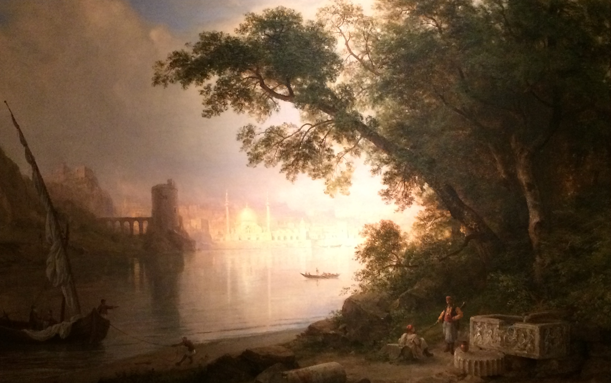
Wandering the dimly lit galleries (necessary to protect the paintings) it’s difficult not to be swept away in the grandeur of Church’s vision- every single work is simply dazzling. Church was, first and foremost, a great painter. A devout Christian, he invested all his works with spiritually symbolic shifts in light, focus, and atmospheric cataclysm. His wildly billowing clouds, lurid red skies, and sublime scale speak to the greatness of his God’s creation. The visual rearrangement and condensing of human monuments that he engaged in while painting Middle Eastern landscapes speaks to the desires of the artist and his audience, who clearly felt a sense of ownership of this ancient landscape and how it ought to appear. The dreamy genre painting Al Ayn (The Fountain) combines various types of architecture from different places and eras to describe the arch of civilization’s rise and fall.

Frederic Church, The Fountain, Oil on Canvas, 1882

It also features human figures placed in the foreground, an unusual move for Church, but one that completes his romantic vision of the East. Al Ayn could be an illustration of the history of Orientalism- problematic as the image is, it’s so beautiful that one can’t help but be drawn in by it. This frisson persists throughout the show- how does one look at paintings that are so vested in the West’s destructive view of landscape and people, that are themselves posters for Colonialism, racism, manifest destiny, etc…. and yet are so intoxicatingly lovely?

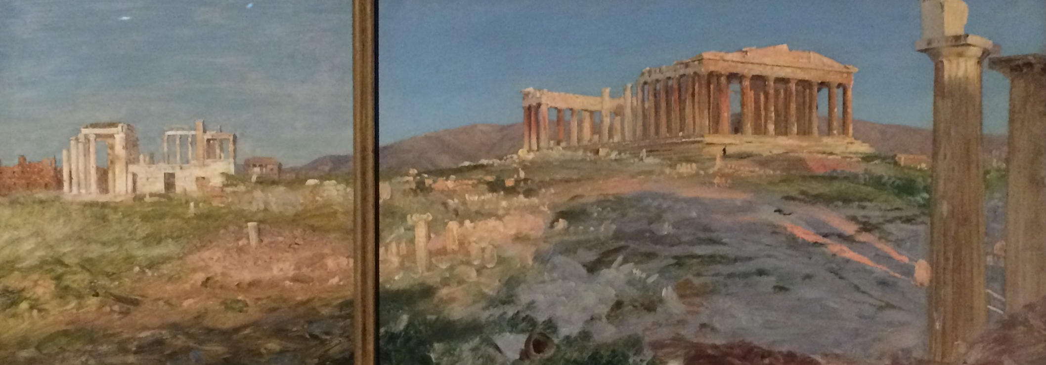
Frederic Church, Erechtheum and The Parthenon Study, Oil on Paper, 1869-70

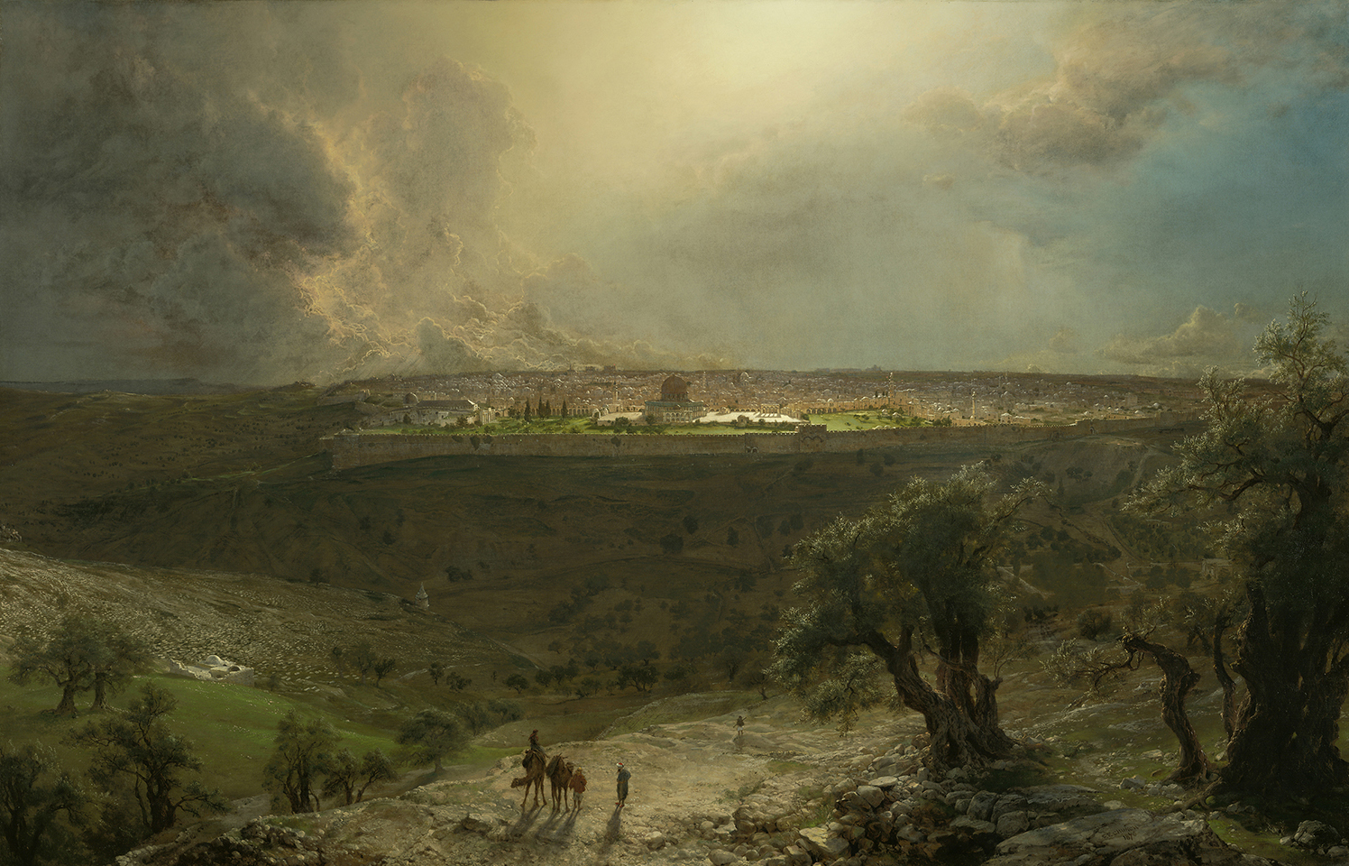
Jerusalem from the Mount of Olives is the stunner in a galaxy of stunners. Just beginning to get over Church’s grand but achingly overdone visions of Classical architecture (his Parthenon is so painstakingly rendered and devoid of the freshness of his smaller, on-site studies, which are sprinkled throughout the galleries like shimmering dewdrops, that it quickly gets exhausting to look at) an encounter with Jerusalem renews the eyes and stops the breath. It’s clear that this was probably the most significant site in the Middle East for Church- the epicenter of the Holy Land.

Frederic Church, Jerusalem from the Mount of Olives, Oil on Canvas, 1870

The painting is just what its title says- a view of the ancient walled city from atop the Mount of Olives, where twisted, gnarled trees reach toward the sky, symbolizing the suffering of Christ. The sublime distances roped into the view. The layers of light. The sunlit olive branches pulsating over the deep-shadowed valley. The pure, blinding light at the focal point- the Dome of the Rock at the city’s apex. Here, Church breaks atmospheric perspective- everything is far too sharply in focus for the distance, which increases the otherworldly feel of the view. The odd little comb of perfectly angled shadows of the row of columns to the right of the Dome. The dazzling tips of roiling storm clouds massing along the horizon- the vast, perfect lapis blue of the sky beyond. This is a genre painting that transcends genre- an enormous confection of kitsch that transcends its kitschiness. This is the paradox of Frederic Edwin Church- a painter with truly sublime vision and (for contemporary viewers) deeply problematic politics. That vision makes the seduction of those politics hard to resist. These paintings present a crystalline vision of my childhood daydreams of a vast, mythic, mysterious East. This strange familiarity suggests that Church’s vision- the vision of manifest destiny- is still with us. A Painter’s Pilgrimage is canny to that vision, and provides a great contextual, historical lesson in its making.

Frederic Edwin Church: A Painter’s Pilgrimage is on View at the Detroit Institute of Arts from October 22, 2017 through January 15, 2018


Susan Aaron-Taylor @ NCRC Gallery, Ann Arbor

Strata is Susan Aaron-Taylor’s work at the University of Michigan NCRC Connection Gallery

Susan Aaron-Taylor’s dynamic, charged sculptures, on view currently at NCRC Connection Gallery at the University of Michigan, confront the viewer like visitors from another world. Beginning with an image drawn from a dream or an astral journey (Aaron-Taylor is a student of Jungian psychology and shamanic practice) she curates a collection of challenging, specific materials into forms that utterly transcend craft. Aaron-Taylor’s sculptures are charged with an eerie liveliness- sharp, appraising eyes, extended claws, bared teeth, sensuous, bejeweled fur- and seem to exist in their own open-ended narratives, in which time assumes a dream-like quality, collapsed and overlapping. Susan Aaron-Taylor: Strata is a retrospective, encompassing different bodies of work that explore, from different perspectives, a channeling of massive power.

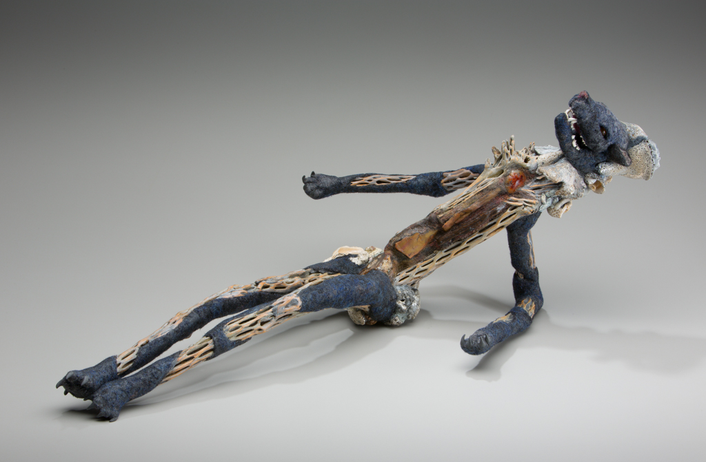
The studio where Aaron-Taylor nurses her visions into corporeal forms is a bright, warm space, part alchemical laboratory, part cabinet of natural curiosities. Leading me around her studio, Aaron-Taylor opens drawers, draws back curtains, pulls out boxes, revealing piles of glittering stones, cords of elegantly twisted wood, curls of birchbark, mounds of multicolored felt. Beginning with an armature of found wood, each form is carefully and lovingly built, of bones, shells, quills, beads, crystals, cacti, and a hand-stitched felt “pelt” into an incredibly powerful assemblage that seamlessly evokes a recognizable animal- cats, polar bears, water rats. These creatures feel both archetypal and individual. Each projects a state of emotional extremity that could vary from viewer to viewer- the half-reclined posture and exposed bones of “Guide,” for example, presents a puzzling paradox between title and content- power invested with touching vulnerability.

Susan Aaron-Taylor, Guide, Cholla Cactus, Shells, Handmade felt, Petrified Wood, Animal Skull, Banded Iron, 12 x 29 x 14″ All Images courtesy of Tim Thayer

Each clearly has a story to tell. Though they come from a very personal place, Aaron-Taylor is reluctant to reveal her own associations with her sculptures- she finds it more interesting to learn what they evoke for viewers. It is a tenet of Jungian psychoanalysis that each symbol that appears in a dream has a meaning unique to the dreamer.

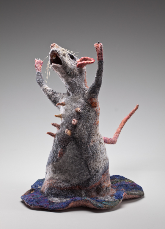
The vivid blue dressing that surrounds “Water Rat” could be a ruffled skirt or a watery environment. The rat is depicted with her forelegs raised toward the sky in a gesture that could be read as despair or exaltation. The rat is clearly a mother- her body is studded with erect nipples tipped with shimmering beads. It’s an unusual combination of signs- lowly rodent and fertility goddess.

Susan Aaron-Taylor, Water Rat, 16 x 11 x 18″, Handmade Felt, Stones, and Stitching

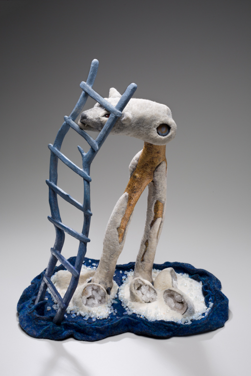
The ladder that “Polar Bear” climbs straddles multiple worlds- it could represent a conduit to the shamanic upper world, or index a cage through which the defiant, porcupine quilled face of the creature snarls, depending upon the angle by which one views it. Either way, the being’s survival is uncertain. It’s elongated legs balance precariously on diminutive masses of ice that threaten to float apart in warming seas.

Susan Aaron-Taylor, Polar Bear, 19 x 17 x 13″, Wood, Handmade Felt, Geodes, Porcupine Quills, Cabochons, and Beads

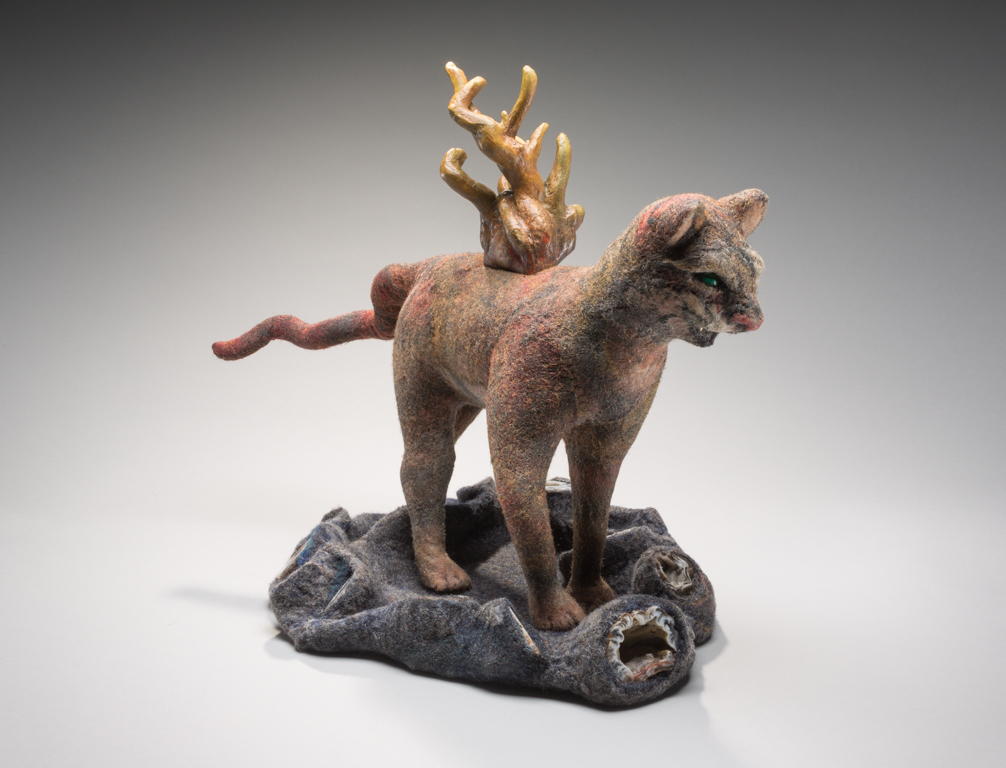
“Tiger Teapot” adds yet another intriguing layer of imagery, being both a functioning teapot (it technically contains an inner chamber, lid and spout, though Aaron-Taylor points out that her teapots “can only really be used for a return to those childhood tea parties where what was being served was imagination and wonder.”) and a sly, enigmatically smiling creature mid-prowl.

Susan Aaron-Taylor, Tiger Teapot, 12 x 19 x 10″, Handmade Felt, Wood, Geodes, Cabochons, and Porcupine Quills

The tea service format ropes the ritual act, the gathering around vessels invested with fragrant brew, into the dream-symbol narrative Aaron-Taylor presents in tantalizingly vague, multifaceted flashes of insight. Expertly weaving the half-remembered visuals of dreams with iconic objects that resonate with ritual, Aaron-Taylor sets the stage for viewers to have their own experience of journey and revelation. With her incredible command of materials and craft and the profound, yet somehow light-hearted feel of her sculptures, she makes for a good guide.

Susan Aaron-Taylor: Strata is on view at Connections Gallery, North Campus, University of Michigan, from September 5 through December 12, 2017


To the End of the Earth @ Detroit Artists Market

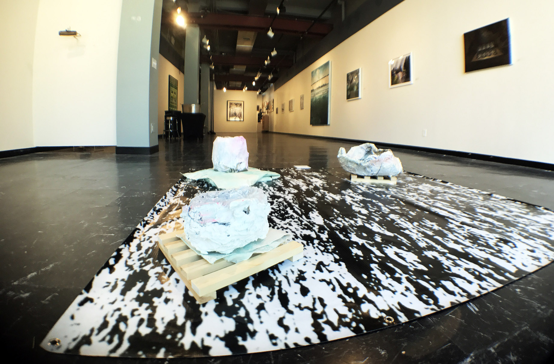
“To the End of the Earth,” the new group exhibition at Detroit Artists Market, is grandly ambitious in its mission. As DAM’s press release states, it seeks to “… Bring together artists who seek to improve our bleak ecological reality through artwork that opposes political policy, presents objective data analysis, and conveys compelling emotional narratives.” This is an important show- it marks the importance of the humanities in general, and visual art in particular, in unpacking the increasingly urgent ecological crisis that is looming more heavily, day by day, on our planet and our lives.

Installation Image, Courtesy of Detroit Artist Market 2017 All images Courtesy of Detroit Artist Market

Curator Adrian Hatfield (himself no slouch as a painter of spiritual/earthly slippage- do check out his work) has assembled a group of artists who work predominantly in loving craft and visual narrative- there’s a refreshing lack of conceptual chillness to this show. The work largely avoids didactic environmentalist rhetoric, instead presenting us with feverish beauty and unsettling juxtapositions that ground examination of terrifying imbalance in the bones.

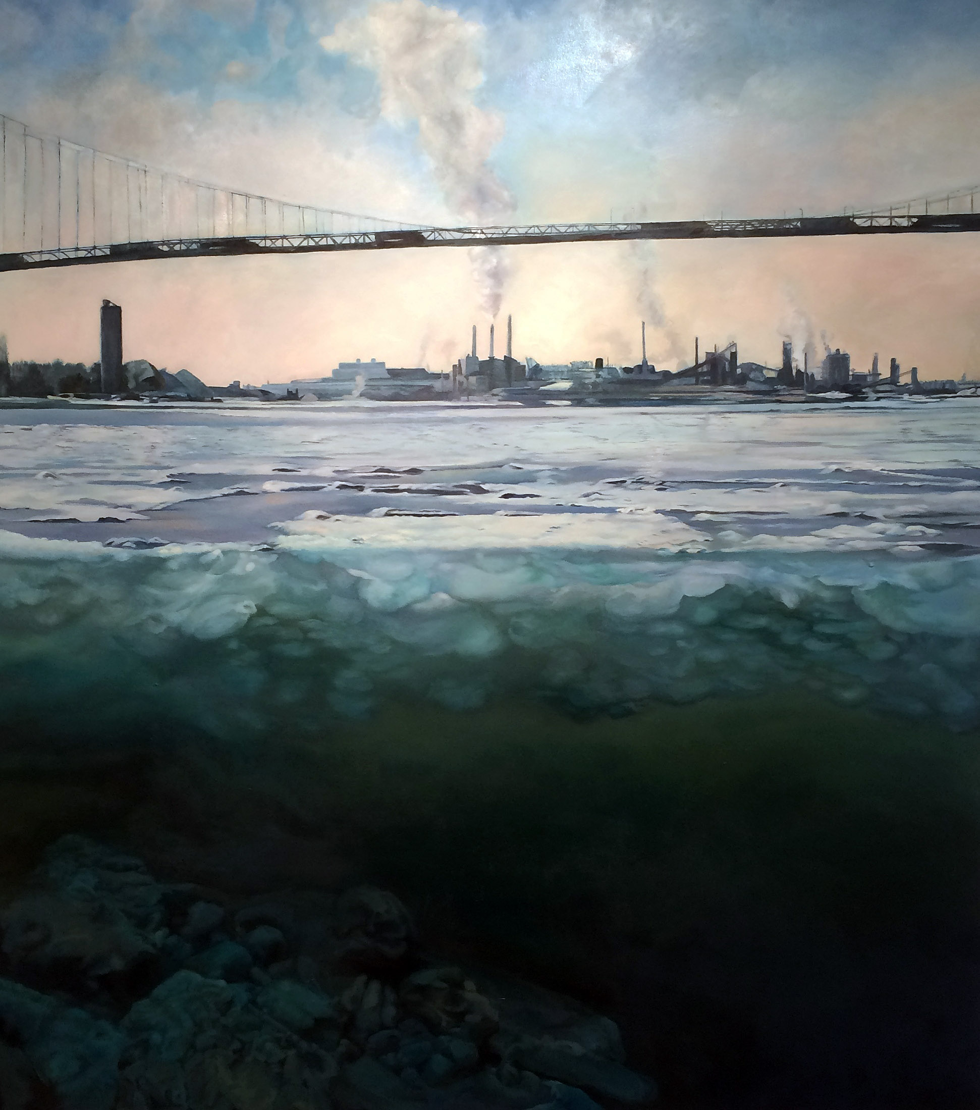
Dominique de Gery, Zug Winter, Oil on Canvas, 2017

Two standouts are Dominique deGery’s Zug Winter and Millie Tibbs’ Mountains + Valleys- Yosemite 4. deGery’s painting gifts uncommonly grand scale and highly developed technique to a familiar Detroit River view- her bisected horizon/underwater landscapes always make me think of Rothkos. She somehow manages to balance closely observed realism with visionary abstraction- a Hudson River School student granted multi-planar sight. deGery’s landscapes convey more about our delicate, wayward relationship with the land and water we live amongst than most artist statements or grim statistics could.

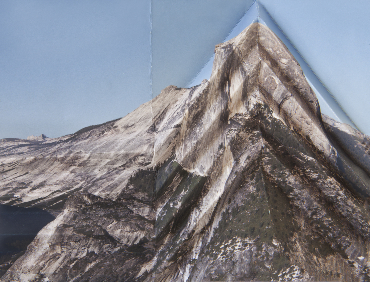
Millee Tibbs, Three Mountains & Valleys, Yosemite 4, Archival Print, 2013

It’s difficult to do interesting things with landscape photography these days. Millee Tibbs’ work is a notable exception. Her practice quietly probes unprecedented pockets in photographic imagery, spanning the figure, national monuments and many subtleties in between, unearthing the unsettlingly familiar and ungroundingly uncanny in every subject she engages. Mountains + Valleys- Yosemite 4 presents an iconic view of Half Dome, a famous, imposing feature of the Yosemite National Park skyline. This monument is one of the gods of nature photography, steadily indexed since the dawn of the medium. Tibbs’ layered meditation on the sublime, yet somewhat clichéd monument stakes its territory by manipulating the print itself, folding it into steep 45 degree angles reminiscent of paper airplanes. The delicate stratification of crease marks that remain once the print is again pressed flat enclose the phallic Half Dome in a yonic, halo-like embrace. On closer examination the jagged creases, like the mountain itself, turn out to be an illusion of captured light- Tibbs’ final image is a print of the folded print. This uncanny doubling casts everything about the image into doubt, except it’s frankly sexual examination of our relationship with iconic landscapes.

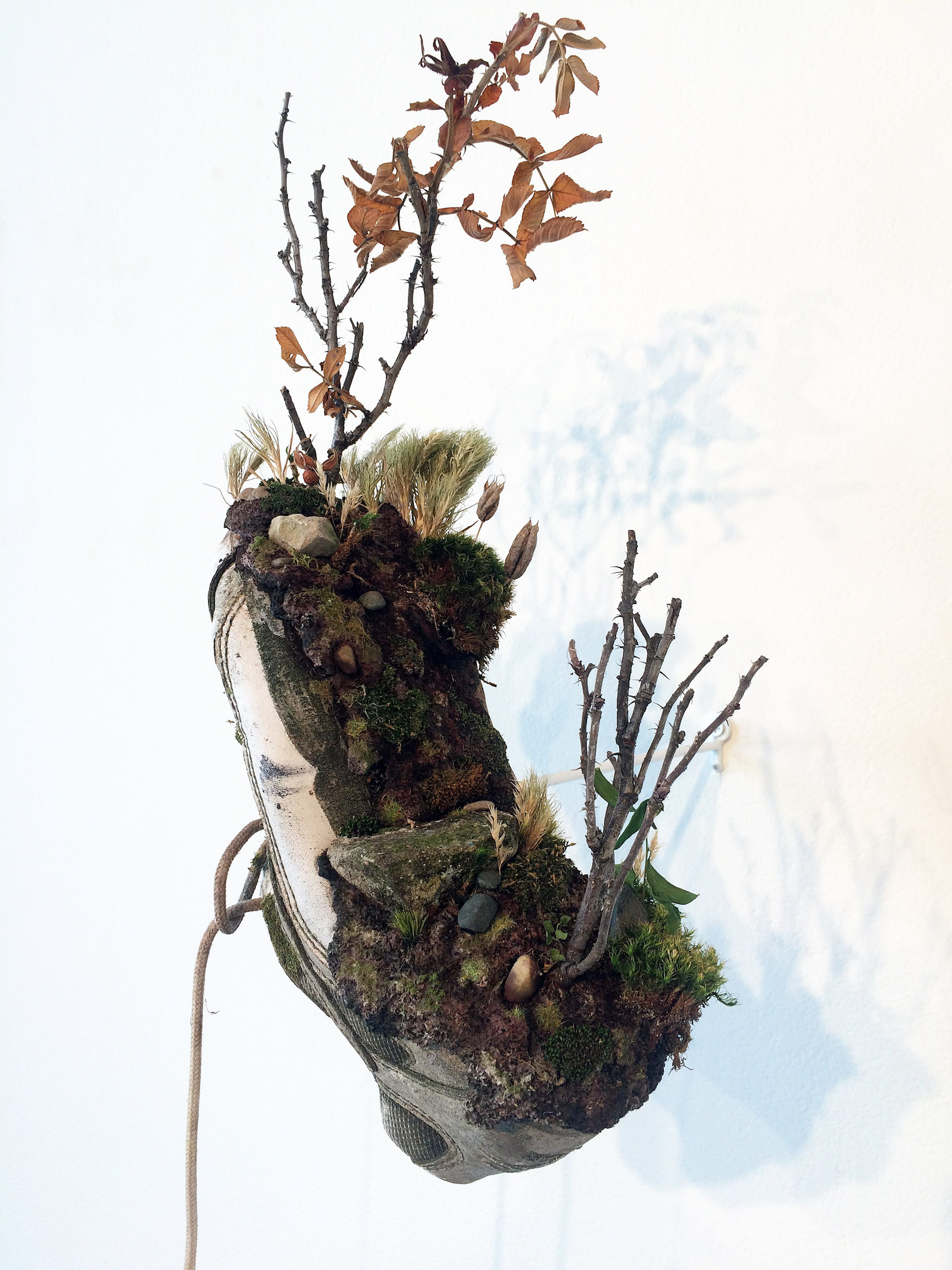
Clinton Snider, Senic Overlook, Mixed Media, 2016

More slow-burning revelation arrives through Clinton Snyder’s dirty/dainty mixed media sculptures, depicting meticulous miniature landscapes built atop found detritus of urban living. Scenic Overlook evokes the deceptive green crust floating uneasily atop a landfill, which is perfectly iconized by a worn-out old shoe.

While the truth of climate change and environmental degradation seems indisputable, one truth of our current relationship with these phenomena is that the message is not getting through. Statistics, studies, and choirs of frantic talking heads make facts readily available, along with steps that can be taken to slow the trajectory of climate change. The presence of all these facts in popular culture seems, on the ground, to change very little about the way we conduct our lives- at least in the Western First World. There is a need for new dialogs to open, in languages parallel to the logistical and statistic. Artists are uniquely suited to engage with this oncoming massive shift in our ability to bind and distill different forms of knowledge. For a scorchingly beautiful argument on this subject, see The Dark Mountain Project Manifesto.   “To the Ends of the Earth” presents some of the best artists working in visual narrative in Detroit right now, and lives up to its vision in providing a (much needed) new conversation on climate change.

“To the End of the Earth” is on display at Detroit Artists Market from September 8 through October 14.


Love Songs: Sam Friedman @ Library Street Collective


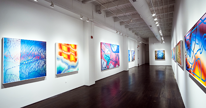
Sam Friedman, Installation image, All images courtesy of Library Street Collective

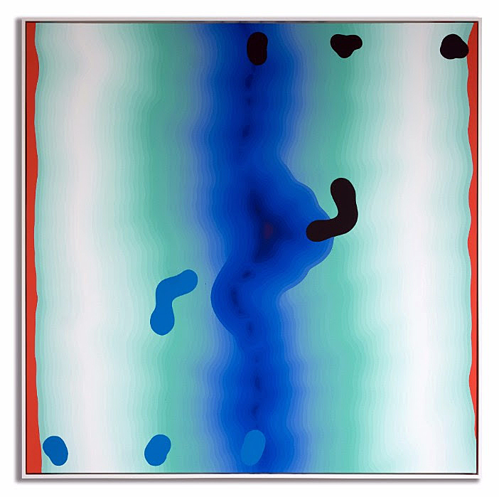
Sam Friedman’s artist statement for Love Songs, a solo exhibition of paintings and works on paper that opened at Library Street Collective on February 11, mentions the Japanese aesthetic philosophy of Wabi Sabi as an influence in his work. This world view exults the “transience of imperfection; a beauty that is imperfect, impermanent and incomplete.” It’s hard to discern much imperfection or incompletion in Friedman’s imposing acrylic paintings, with their crisp, technically rigorous paint handling. Every mark bears an identical edge that somehow holds its own amid countless other razor sharp edges. Despite this uniformity, areas of Friedman’s paintings break down into surprising illusions of space, dazzlingly beautiful gradations, and vibrating forms that actually seem to move before the eye, and stay burned upon it. You see Friedman’s snaking forms gestures across white walls for several moments after you’ve turned your gaze away from the work.

Sam Friedman, Untitled, 2016 (48 x 48 inches; Acrylic on canvas, white floater frame)

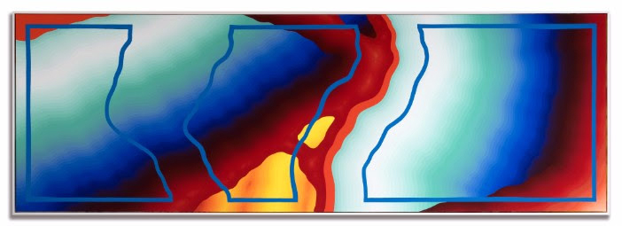
Friedman wrings a surprising range of surface effects from a severe economy of techniques. Every one of his identically edged marks is, apparently, applied the same way- in one single, virtuosic stroke that embodies hand skill and discipline. While each painting contains a huge number of nearly identical marks, no mark is valued over any other. This doesn’t flatten the composition, or render it uninteresting. Friedman’s democratic approach to mark-making lets your eye take in both the whole of the work, and miraculous openings into smaller, more intimate moments. It’s an unusual painter who creates such an impression of deep space, foreground and background, with such a uniform, crystallographic approach to the picture plane.

Sam Friedment, Untitled, 2016 (30 x 90 inches; Acrylic on canvas, white floater frame)

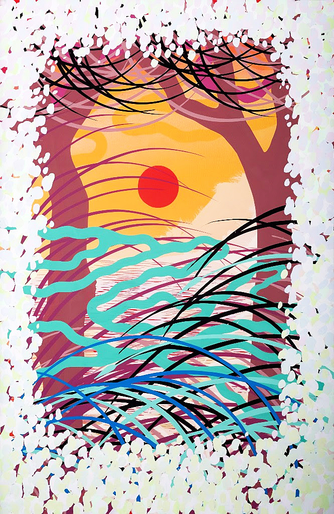
Passing from the gauntlet shaped front space of Library Street Collective, where Friedman’s large paintings are displayed, into the more spacious back room of the gallery which houses a collection of smaller works on paper feels like leaving a dazzling, noisy city for a vast, light filled meadow. These works feel both more personal and riskier. This might be due to Friedman’s use of a larger range of media (acrylic, spray paint, silkscreen ink). His subject is a factor, as well- the sun setting over a body of water, revisited again and again, the horizon line splitting each piece into perfect halves that meet precisely at eye level. These works present an eternal template on which Friedman proceeds to meditate on the spatial layers he applied with such closed-loop certainty in his large acrylic paintings. The more organic forms- tall grass, flower petals, atmospheric effects- combined with the unavoidably vernacular icon of sunset over water presented on poster-scaled formats, while not mind-blowing in quite the same way as the paintings, feel vastly more personal. Friedman’s mastery of abstraction comes full circle in these works. The same blunt formal power and ease with materials shows up in them, with an added dose of freedom. The smaller formats and organic, representational subject matter seem to allow Friedman to play a bit more with imagery and surface effects- there’s a feeling that the stakes are lower here, or the imagery more deeply felt.

Sam Friedman, Untitled, Untitled, 2016, 54.5 x 37.75 inches; Acrylic and vinyl paints, silkscreen ink, and acrylic spray paint on primed Stonehenge paper

One wonderful thing Friedman’s paintings and works on paper have in common is the above-mentioned whiff of the vernacular. The large, abstract paintings have the dizzy free-fall atmospherics and sophisticated, ambiguous movements of album covers and Trapper-Keeper designs from the Seventies and Eighties, revisited with the same depth and grandeur one felt, mesmerized by them, as a young kid. Friedman’s works make it as if these foundational images grew up with us. The works on paper similarly shadow mass-produced movie or art posters. They communicate in the same language, with the same saturated, iconic forms that, in Friedman’s hands, take on a breath-taking, mature refinement.

Sam Friedman: Love Songs is on view at Library Street Collective  through April 8, 2017.

Page 2 of 6

Powered by WordPress & Theme by Anders Norén