Critical art reviews of Detroit galleries and museums weekly

Author: Clara DeGalan Page 5 of 6

Writer

Patrick Hill @ Susanne Hilberry Gallery

Mocking up Where Nature and Structure Meet

Installation Shot Patrick Hill Drawings and Maquettes

Patrick Hill Drawings and Maquettes, Installation Image – Courtesy of Susanne Hilberry Gallery. All other images courtesy of Clara DeGalan

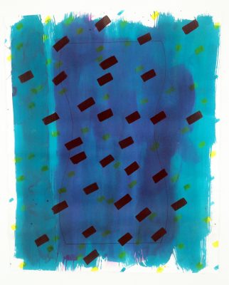
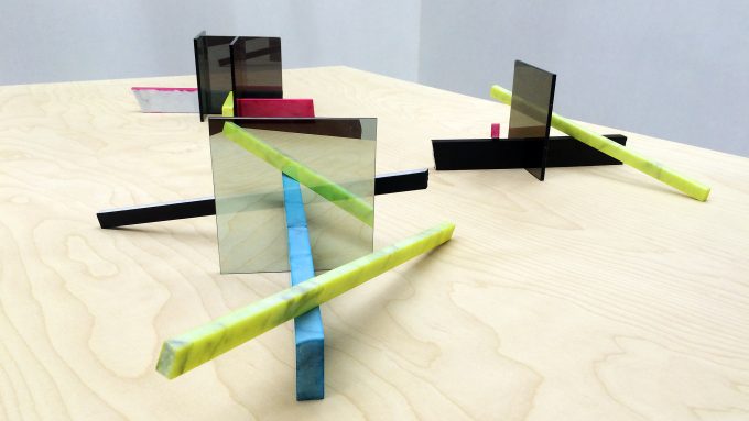
Patrick Hill’s maquettes, on display at Susanne Hilberry Gallery along with a large number of 2D works in a solo exhibition titled, appropriately, “Drawings and Maquettes 2014-2016,” are constructed in such a way that you can feel their potential to tower benevolently above you. You seem to be looking across the galleries from atop a high mountain at a curious experiment in integrated living down below. Hill’s 2D works evoke a similar experience of upended scale. Viewing images of them, it’s difficult to discern which are human-scaled and which small and intimate, inviting the viewer to huddle in close. Patrick Hill’s visual language is as rock-solid as the formal principles of sculpture, on which he bases both his 2D and 3D works. His solo exhibition transforms Susanne Hilberry’s galleries into a vast, charming landscape that evokes the West Coast, and Los Angeles in particular, in a tickling synesthesia of palette, forms, structures, visual and cultural references, and scale.

Image 1 Outdoor Studies 1 through 3 2012 2 Way Mirror Carrera Marble Dye Ink

Patrick Hill, Outdoor Studies 1 through 3 2012 2 Way Mirror Carrera Marble Dye Ink

Hill balances the solid, earthbound heft of his sculptural forms with light materials, colors, and narratives. His titles play with words and ideas, swinging between references to mysticism, nature, and pop culture (three exemplary titles are Threshold [New Thought II], Outdoor Study, and Kelly Bundy). A pair of ink and tea wash studies on paper are subtitled Moons and Boobs- channeling spiritual and formal rhymes between words in a way that keeps the conversation around this interesting work funny and light.

Image 2 Kelly Bundy 4 2011 Paper Dye and Ink 60 and three eights by fifty inches

Patrick Hill, Kelly Bundy 4 2011 Paper Dye and Ink 60 X 50

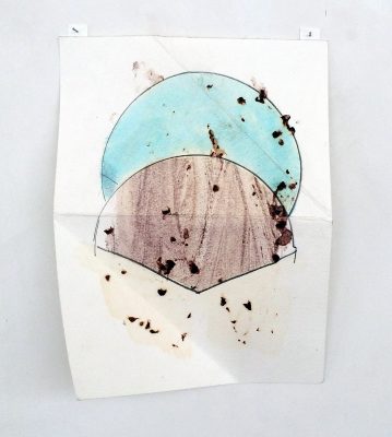
True to the three dimensional formal principles they borrow, Hill’s multimedia drawings contain layers of real and simulated texture. Their slapdash, playful surfaces are only part of the story- a closer look at works such as Fan Death (Double) reveals the artists fertile engagement with natural forms that collide in beautiful, meditative ways with empirical, human-made structures. The folds that lift the heavy paper off of the wall begin to reference the first steps of an origami structure, which is overlaid with a Frank Stella-esque drawn architectural/fan form, over which Hill has collaged blackberries. The above-mentioned synesthesia that makes Hill’s work more and more intriguing is in full force here. It’s present, too, in Palm (black and pink) which makes a spray paint stencil of an actual palm frond, evoking the surface quality of rapidly executed street art and, with the leaf’s delicate, vibrating edges, the iconic West Coast sound of wind moving through palm trees.

Fan Death (Double) 2013 Paper Blackberries Dye Grahite 12 by 9 inches

Patrick Hill, Fan Death (Double) 2013 Paper Blackberries Dye Graphite 12 X 9″


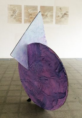
Hill is constantly flipping heavy and light throughout the works in “Drawings and Maquettes.” This visual/conceptual romp is especially enjoyable in his sculptures, which point toward human scale while seldom exceeding a foot or two in height.

 Large Geosurgery 2013 Cardboard Dye Ink Tape Glue 52 and a half by 35 X 33"

Patrick Hill, Large Geosurgery, 2013 Cardboard Dye Ink Tape Glue 52 X 35 X 33″


In this respect, they’re successful as maquettes- and it matters that it’s the maquettes that are being shown, in all their rough-edged, paint-spattered humility. Despite their sculptural construction and prep-drawing feel, the maquettes capture the spirit of Hill’s work better than the hinted- at final pieces ever could. They are heavy and light, silly and serious, funny and touching, all at once. It’s a fine balance, and one Hill manages with a deceptively care-free abandon.

“Patrick Hill- Drawings and Maquettes” is on display at Susanne Hilberry Gallery through June 4, 2016.


http://www.susannehilberrygallery.com/


Kimia F. Kline @ the Elaine L. Jacobs Gallery

“As Above, So Below” –  Kimia Ferdowsi Kline and the wise conduct of life

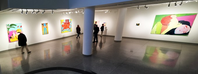
Installation shot

Installation Image, Courtesy of the Detroit Art Review

The culmination of Kimia Ferdowsi Kline’s residency at Wayne State University, funded through the Basil Alkazzi Detroit Residency and the New York Foundation for the Arts, is a jewel-like array of visual storytelling that is currently on display at Elaine L. Jacob Gallery at Wayne State University. The impressive body of work revolves around a famous book of fables, Kalila and Dimna, in which a succession of interrelated stories featuring animal protagonists unfold, like Russian dolls, one emerging from the next. This foundational group of stories, originating in India and evolving through Persia, became the inspiration for the fables of Aesop and the Brothers Grimm, among others. Kline’s appreciation for the ancestry of a work of art is apparent, not only in her choice of subject matter, but in the conscious homage she pays to such painters as Henri Matisse, David Hockney, and Richard Diebenkorn in her lush, engaging work.

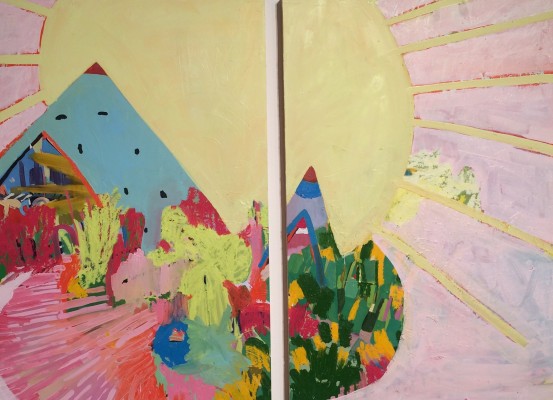
Image1Sunland 2015 Diptych of two panels

Kimia F. Kline, Sunland 2015 Diptych of two panels – All Images Courtesy of Clara DeGalan

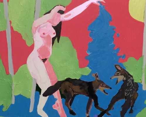
The fables become a narrative clothesline on which Kline strings visual flights of fancy rendered in a vibrant California palette (Kline earned her MFA at the San Francisco Art Institute and speaks eloquently of her love for the California painters and their granddaddy, Matisse.) The paintings themselves strike an exuberant balance between Modern Western painting (Matisse’s abstract, sublimely lit grids, Diebenkorn’s broad fields of pulsating color that congeal into horizon-less landscapes) and the illustrative tradition of illuminated Persian miniature paintings (the collapsed, vertical placement of figures and movement that propel a story from one frame of action to the next, and that influenced artists of Matisse’s generation to free themselves from the shackles of Western linear perspective). Kline is just coming into the full flower of her abilities, and slings the paint with a joyful abandon that projects a moment to moment experience of absorbing, and distilling, her subject and her influences. Her smaller paintings are bombs of formal beauty and technical virtuosity- the off-hand yet incredibly nuanced treatment of the female figure in “Woman Bathing Two Jackals” kept beckoning from the corner of my eye as I perused her larger pieces, drawing me back again and again to wonder at the light-hearted, yet incredibly serious montage of symbols dancing around the picture plane.

Image 2 Woman Bathing Two Jackals 2015 Oil on Panel

Kimia F. Kline, Woman Bathing Two Jackals, 2015 – Oil on Panel

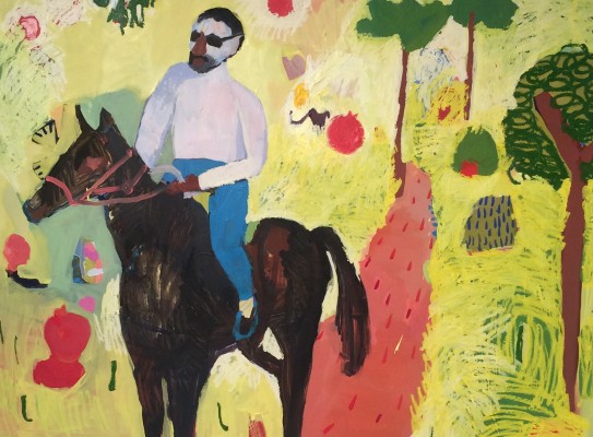
“Pomegranate Warrior” gave me the same experience, with a cinematic twist, following the rider out of the picture plane and into unknown regions. Kline’s best work in “As Above, So Below” does exactly that- engages the eye with the unbridled joy of her palette and dynamic composition, then subtly embeds itself in the subconscious for later unpacking.

Image 3 Pomogranate Warrior 2016 Oil on Panel

Kimia F. Kline, Pomogranate Warrior, 2016, Oil on Panel

The title of Kline’s show, “As Above, So Below,” derives from Hermetic teachings about the nature of the universe. According to this philosophy, the individual is a microcosm of the universe, and the raw material of everyday existence bears within it the traces of the divine matter from whence it came. This divinity is parsed as it makes its descent through the ages, picking up influences from history and experience. Kline’s work is a perfect visual distillation of that idea- she continually weaves fresh content from the materials and narratives of her ancestors, cultural and artistic. Her work is a refreshing reminder of all that we still have to sift through and re-arrange from the wisdom of those who came before us- and the myriad paths such a practice can help us to experience.

Image 4 As Above So Below 2016 Oil on Canvas

Kimia F. Kline, As Above So Below, 2016 – Oil on Canvas

“As Above, So Below” is on view at Elaine L. Jacob Gallery at Wayne State University, Detroit, MI, through June 24, 2016


“Doubly So” @ CCS Center Galleries

Duplicity from Without and Within: Molly Soda, Sheida Soleimani, Sofia Szamosi, and Dessislava Terzieva
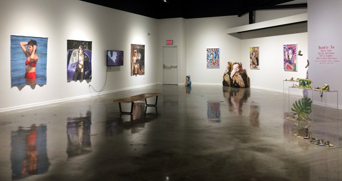
Image 1 Installation Shot Doubly So

Installation Image – “Doubly So” All Images Courtesy of Clara DeGalan

“Doubly So,” an exhibition conceived and curated by Samantha ‘Banks’ Schefman of Playground Detroit, that opened last Friday at Center Galleries at Detroit’s College for Creative Studies, features four up and coming artists exploring identity within social media from a (surprisingly illusive) outside perspective. The four engage with what builds an identity in the age of social media which, essentially, comprises being constantly seen, and our conflicted desires both for privacy (another increasingly illusive phenomenon) and for maximum exposure. That frisson between a desire for and retreat from exposure is grappled with most tellingly in the work of two of the artists, Molly Soda, and Sofia Szamosi. Both primarily feature their own faces and bodies in their work in “Doubly So,” and the impression is that they are objectifying themselves in an aim to draw discourse of the exhibitionism of the female body in popular culture back into the hands of women.
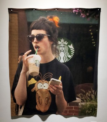
Image 2 Molly Soda Mary Kate 2015 Printed Fleece Blanket 60 in x 50 in

Molly Soda – Mary Kate 2015 – Printed Fleece Blanket 60 in x 50″

This practice has been pretty widespread in women’s art since the 1970’s (Szamosi’s archive of selfies strongly reference Hannah Wilke’s photographic self-portraits in content and form, and her film “Tarred and Feathered” channels the visceral imagery of the Abjectionist movement.)
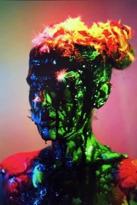
Image 3 Sofia Szamosi Tarred and Feathered 2015 Digital Print with frame 31 in x 22 in

Sofia Szamosi – Tarred and Feathered – 2015 Digital Print with frame 31 in x 22″

In “Doubly So,” Szamosi’s identity unpacking feels a bit outdated at first look- the knee-jerk response is that this argument has already been made, again and again, and is past its vital currency. However, it still possesses the power to unsettle. Moving along Szamosi’s selfie chronology, taken in photo booths between 2005 and 2015, I couldn’t tell whether I was tired of seeing her body or jealous of its beauty. This uncertain response that wells up in me pretty much every time I am confronted with such work is a clue that our relationship with depictions of the female body, even by other females, is far from liberated or resolved.
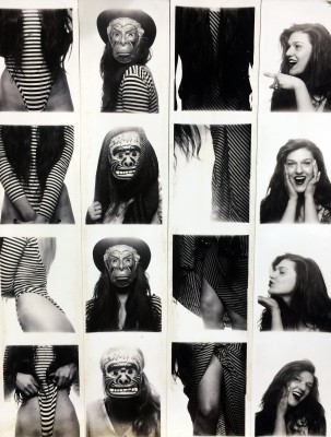
Image 4 Sofia Szamosi 10 Years of Photobooth Self Portraits detail 2005 to 2015 194 original photo booth strips 8 in x 23 ft

Sofia Szamosi – 10 Years of Photobooth Self Portraits detail 2005 to 2015 194 original photo booth strips 8 in x 23 ft

Molly Soda has gained critical acclaim for her work in and about social media, and she plays with its tropes really cleverly. Her website (mollysoda.biz) is hilarious- for a moment you truly fear you’ve stumbled onto a bit of porn-saturated malware that is going to eat your computer alive, tiny gyrating women and pixilated graphics abounding. Her work in “Doubly So” follows Szamosi’s in winking exhibitionism that seeks to subvert assumptions about the exposure of women in social media. Soda poses as various celebrities caught in paparazzi shots as they fill parking meters, climb out of cars, pause for an ill-fated moment of unselfconsciousness while wading in the ocean.
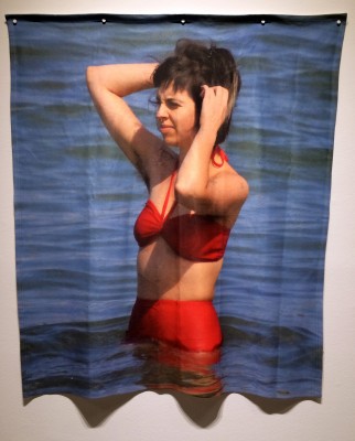
Image 5 Molly Soda Selena 2016 Printed Fleece Blanket 60 in x 50 in

Molly Soda – Selena 2016 – Printed Fleece Blanket 60 in x 50″

There is an interesting commentary here on the scorn heaped upon these women for daring to appear in public in an un-camera-ready state. The large-scale portraits are printed on fleece blankets in a nod to commemorative kitsch- and perhaps a suggestion that we draw comfort from the exposed humanity of these pop culture goddesses. But should we? Are these images not as objectifying and offensive as the idealized, photo shopped guises we are used to seeing celebrities in? Soda’s work in “Doubly So” left me with a grim suspicion that autonomy of image in social media still alludes women, and it’s a problem we are going to have to spend a few more decades thinking our way around.

Soleimani and Terzieva, by contrast, do not place their likenesses into their work in “Doubly So,” which creates a wholly different dialog with identity’s plight in social media. So much of our engagement with the online world revolves around the persona we create for ourselves there, it’s easy to forget what that world is doing outside of our identity-building enterprise, and how the signals we receive (and do not receive) from it are informing or misleading us. Terzieva’s sprawling installation of twining USB cords, false flowers, and technological baubles in various states of decay comments on the mounds of obsolescence we leave in our wake in our hunger for ever swifter, sexier, newer conduits. Her sculptures of moss-coated smartphones embedded in piles of organic material are beautiful, and could have stood on their own without the prefabricated environment installed around them, which becomes a bit distracting. Terzieva’s best sculptures have old-school magnifying glasses affixed to them, through which one sees these objects blown up into delicate terrarium-like landscapes, in which the cell phone becomes strangely monolithic, or dissolves altogether into glittering shells and pebbles.
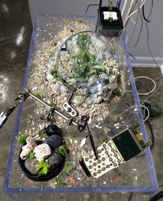
Image 6 Dessi Terzieva Nostalgia Feels Like Deja Vu 2016 Acrylic Concrete Seaweed Wax Cell Phone Battery iPhone 8 x 7 x 3 in

Dessi Terzieva – Nostalgia Feels Like Deja Vu – 2016 Acrylic Concrete Seaweed Wax Cell Phone Battery iPhone 8 x 7 x 3″

Soleimani’s work, bright and bubbly though its surfaces are, instantly grounds this digital universe in the grimmest of real calamities. Her series of archival pigment prints, and their accompanying soft sculptures, present portraits of Iranian women who have been publicly executed for what the governing regime in Iran defines as crimes, such as defending themselves from rape. Voices of dissent under a totalitarian government are rapidly squelched- the freedom with which we share our political beliefs on Facebook, and other social media is as much taken for granted in the United States as is the objectification of women’s bodies for worship, derision, or personal affirmation. Soleimani’s work achieves ever refining tension between sensual beauty and hard-hitting political content- her elaborate collages juxtapose brilliant colors and moist glittering surfaces with dismembered body parts and visual fever dream montages of oppression, control, rebellion, and terror. Her work in “Doubly So” tones things down a bit formally, maintaining the bright palette but letting the subjects of her portraits engage the viewer more quietly and directly, with stunned but defiant gazes and wringing, desperate hands.
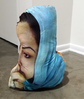
Image 7 Sheida Soleimani Delara 2015 Soft Sculpture

Sheida Soleimani – Delara 2015 Soft Sculpture
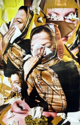
 

Image 8 Sheida Soleimani Sakineh 2015 Archival pigment print with frame 41 in x 28 in

Sheida Soleimani Sakineh 2015 Archival pigment print with frame 41 in x 28 in

Soleimani’s soft sculpture portraits of these doomed women call to mind a passage from Lewis H. Lapham’s preamble essay to the Spring 2016 issue of Lapham’s Quarterly, the theme of which is “Disaster.” “…( a joint venture of money and machine), the danse macabre surrounding us onscreen reduces human beings to things- broken toys, smashed dollhouse furniture… Too far removed or arriving too late on the scene, the camera doesn’t grasp the human response in the eye of the storm.” The doll-like construction of Soleimani’s sculptures evokes the loss in translation of the real horror of these women’s lives and deaths, glimpsed briefly via digital stream. As the press release for “Doubly So” is careful to note, “Though it has been an ongoing political struggle for American women to fight for gender justice and equality, it pales in comparison to the totalitarian government of Iran that will sentence one to death for speaking up against them on such social media streams as Facebook.” “Doubly So” attempts to find common ground between the struggle for autonomous identity faced by American women and the daily life-and-death struggle Iranian women must undergo, yet, as the press release cannot help but state, the former struggle simply pales when juxtaposed with the latter.

“Doubly So” is on display at Center Galleries at The College for Creative Studies March 19 through April 23, 2016
 

“Transitions” @ the Galerie Camille

The Art of Shifting Stillness: Brian Day and William Harris

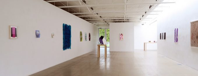
Galerie Camille Install-1 (1)

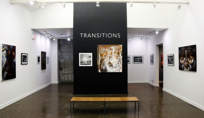
“Transitions” at Galerie Camille, Installation View, Courtesy of Galerie Camille All other images Courtesy of Clara DeGalan

Galerie Camille’s current show features the work of two artists at two very different points in their careers- Brian Day, an established Detroit area photographer, and William Harris, a painter and former student at College for Creative Studies. At first glance, the two couldn’t be more different, stylistically, technically, or conceptually. That is part of the point, says Melannie Chard, director of Galerie Camille, a recent addition to Midtown’s mushrooming gallery district. “It is actually my intention to continue to exhibit established artists with newer artists, and you will see this theme in upcoming shows as well… I like that it provides an opportunity to introduce collectors to new work, and the artists seem to enjoy the collaboration which ultimately strengthens the artistic community.” Chard’s conviction that there is room for everybody in Detroit’s exhibition roster, and her commitment to showcasing new and potentially risky work, is welcome news that immediately sets Galerie Camille apart in a scene that can feel insular and difficult to gain exposure in.

The work of Day and Harris shown side by side is proof that Chard’s formula is potent. In nearly every respect, Harris is the Appletini to Day’s Grey Goose, neat- both get you there, via different styles, materials, and combinations. Both, however, derive from the same culture, and are hunting down the same distillation- the human figure as it inhabits, symbolizes, and claims its stake in iconic architectural structure.

1 William Harris Onementum Oil on Linen 40 x 30

William Harris, Onementum – Oil on Linen 40 x 30

SONY DSC

Brian Day, In The Air Tonight, Photograph on Paper, 11.5 X 17.5


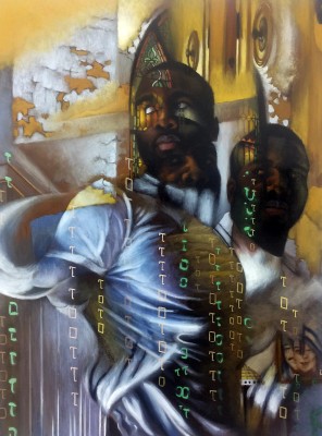
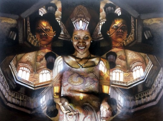
Harris is a hitherto self-taught painter whose style is in a state of fraught transition, as it becomes overlaid with academic techniques and compositional tropes. His work, at this point, maintains an ardent, romantic floridity and an endearing improvisational use of materials that speaks both to his naiveté and his sincerity. His subject matter involves various experiments in dissolving figural repetitions into cavernous architectural spaces, drawing imagery from Surrealism, documentary images of derelict architectural spaces, and what I can only define as a romantic music video aesthetic.

3 William Harris Empirical Light Oil on Linen 48 x 36

William Harris, Empirical Light – Oil on Linen 48 x 36


His technique and subject matter are still finding their way- his rendering of hands is particularly problematic, especially juxtaposed with his incredible facility with faces, and eyes in particular- his figures manage to be both iconic of the structures they are overlaid onto, and autonomous characters in their own right, who engage the viewer, from one piece to the next, with an unsettlingly steady, appraising return gaze. Harris’ technical foibles would be less distracting if they were more intentional and canny- which might, ironically, throw off the crystalline sincerity of his work.

Day, by stark contrast, is a mature artist in full command of his powers. His photographs are fluent masterworks, each finding a balance between content and form that evokes the early Constructivist photography of Alexander Rodchenko.

4 Brian Day Feel No Pain Photograph on Paper 7.5 x 11.5

Brian Day, Feel No Pain – Photograph on Paper 7.5 x 11.5

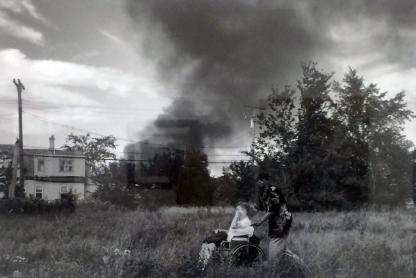
Like Rodchenko, Day grounds his work in a deceptively straightforward, documentary style that speaks simultaneously in a more subversive formal language, conjuring gorgeous abstractions in light and shadow even while capturing candid moments of human passage through urban space. Day’s documents of action, while political in their content (his body of work “Planet Detroit” depicts the ravages of house fires in run-down neighborhoods, seen up close as fire fighters battle with them, or at a distance, as grim vertical plumes of smoke rise against a scene of daily urban transit) dwell in the formal beauty of these arrangements of light and shadow as well, with a lightness of touch that offsets the potential for objectification that lurks in his subject matter- Day is able to see both horror and beauty from ground level.

The two artists share an interest in the vital role human action plays in the life of architecture, and, in turn, how the narrative of that architecture informs the culture that inhabits it- the embattled maintenance and slow decay of the structures that define our landscape becomes part of our viscera, as well as the scenery of our daily movements. It will be interesting to see where Harris takes his exploration of the figure’s physical and metaphorical weaving into structures. The formal lushness of Day’s work supplements, rather than distracts from, the problematic grittiness of his subject matter. Finding visual rhymes and formal touchstones between the two artist’s pieces is one of the great pleasures of “Transitions.” Both are asserting themselves as vital voices in this epochal moment that work made in and about Detroit is experiencing.

“Transitions” is on view at Galerie Camille from March 11 through April 1, 2016.       http://www.galeriecamille.com/

Piles of Distinction @ David Klein Gallery

David-Klein-Gallery- Playground Detroit

Mitch Cope, Kari Cholnoky, Lisa Waud, and Patrick Ethen in a group exhibition

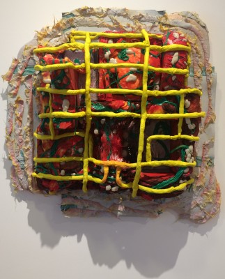
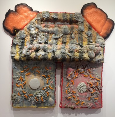
There’s a mixture of playfulness and deadly seriousness, grounded in filth and pointing to transcendence, in the current exhibitions at David Klein Gallery’s new Detroit space. Brooklyn-based Kari Cholnoky’s meaty paintings and sculptures, gathered under the brilliant title “Semi Lucid Steaks,” seek to invade the viewer’s physical and psychic space, propelled by bonkers materials like spray foam, pantyhose, synthetic hair, and Cheetos (all of which are listed with deadpan sincerity in the descriptions that accompany each work) and a mind-bending palette of fluorescent hues that could have come straight from my Trapper Keeper circa 1992.

Cholnoky_Specimen

Kari Cholnoky, Specimen 2015, Faux Fur, Insulation Board, Urethane Foam, Epoxy Putty, Synthetic Hair, Acrylic, Collage, Spaghetti 28 x 30 x 10 Inches – All Images courtesy of Clara DeGalan

Cholnoky’s palette isn’t the only oddly scholastic reference I picked up in her work. The template of art class projects- laminated odes to creative expression made with macaroni, textural, day-glo hued paint, and other materials culled from donations by suburban hoarders and civic-minded businesses- is distilled into moments of subtle, sophisticated formalism in Cholnoky’s sheer devotion to these humble, hideous materials, and her loving care in curating their mind-boggling combinations- some works seem to simmer with a low inner fire, others to ooze and swim with primordial energy.

Cholnoky_Slideshow

Kari Cholnoky, Sideshow 2015, Faux Fur, Acrylic, Collage, Urethane Foam, Epoxy Putty 52 x 60 x 6 Inches.

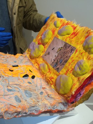
Moving from one piece to the next is an increasingly heady experience that ropes synesthesia in with wild visual confusion- you begin to almost smell the work. Cholnoky’s present exploration seems most fully realized in her handmade book, part of an ongoing series, which turns everything that defines “book” on its head. It is a cumbersome, overwhelming object that looks as if it would be sticky to touch, which doesn’t lessen one’s urge to touch it (a latex-gloved gallery attendant will turn its leaves for you, worse luck.)

Cholnoky_Book

Kari Cholnoky, Real Book 2015, (detail) Mixed Media, 15 x 14 x 9 Inches

The formal puzzle of Cholnoky’s materials jumps out from page after page. Grasping their meaning, and their point of entry into the psyche, might be as difficult- and seductive- as grasping the book itself.

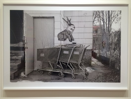
“Totems,” Mitch Cope’s body of photographs, sculptures and documentary film, dovetails neatly with “Semi Lucid Steaks” in its focus on curated combinations of low materials- garbage, in this case- that seek to question our relationship with them. Cope’s exhibit is accompanied by a gorgeous piece of writing titled “Zen and the Art of Garbage Hunting and the Protectors of Refuse.” It describes the garbage hunter’s process of identifying “Piles of Distinction,” or garbage heaps that have drawn the protection of a totem, seen here as hilarious spirit-animal beings preserved on film via a “highly sensitive and specialized machine.”

Cope_Garbage_Totem

Mitch Cope, Garbage Totem Scrap-a-House, 2014, C-Print, 30 x 46 Inches

Once identified, these piles of distinction are transformed by yet another machine (the documentary film is taken from the machine’s point of view, so only its powerful front incisors are seen- it stacks old tires and charred furniture into imposing piles to an oddly perfect Bach soundtrack) into vertical plinths of stacked garbage assembled in honor of their original owner, “recently deceased friend and neighbor,” in hopes of attracting permanent protection to the vicinity, as well as honoring the inherent power individuals leave behind with their earthly belongings. The piece is funny, sentimental, and serious all at once, maintaining a light touch with its potentially problematic content- garbage-strewn, run down neighborhoods, excesses of objects that have outlived their owners and practical usefulness, death itself.

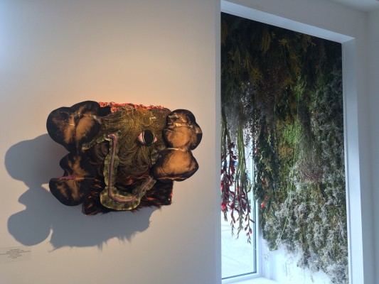
Accompanying “Totems” and “Semi Lucid Steaks” are a playful, sensual floral installation by Lisa Waud, the magical mind behind Hamtramck’s Flower House project, and a light installation by Patrick Ethan, who is also currently exhibiting at Playground Detroit.

Chonoky_Waud_Installation shot

Cholnoky/Waud Installation Image

Pile of Distinction Group Exhibition,  on display at David Klein Gallery’s Detroit space from February 6 through March 12, 2016.

www.dkgallery.com

Page 5 of 6

Powered by WordPress & Theme by Anders Norén