Critical art reviews of Detroit galleries and museums weekly

Author: Jonathan Rinck Page 1 of 11

Writer

Doug Cannell @ Stamelos Gallery Center

Doug Cannell: presents Learning Curves at the Stamelos Gallery Center, UofM Dearborn
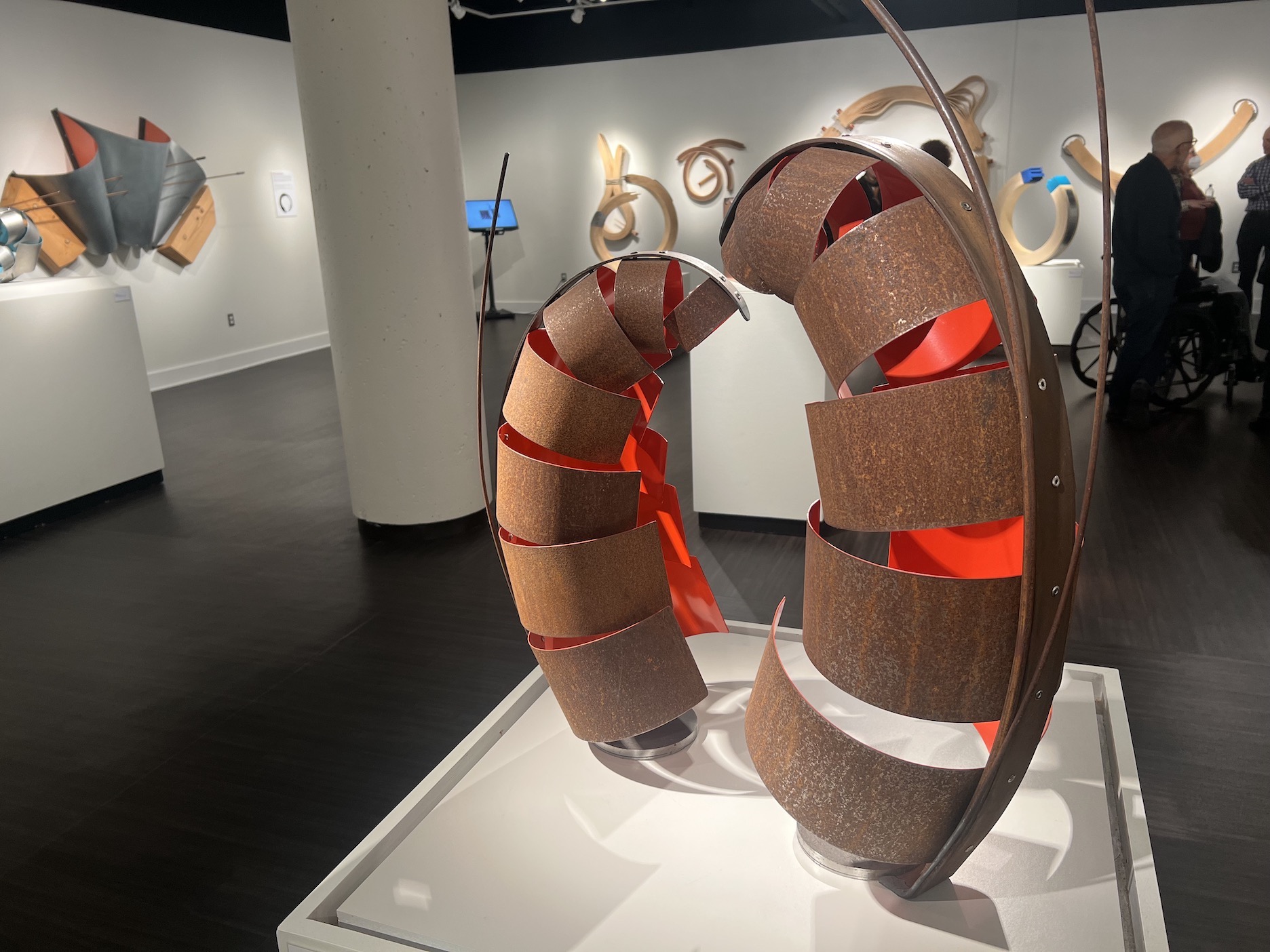
Doug Cannell: Learning Curves, installation view.

The inspirations behind Doug Cannell’s sculptures are many and varied. They range from jazz music, the movement of water, urban decay, font design, calligraphy, and more. He’s also deeply inspired by the textures of Detroit’s places and spaces, where he was born and raised, and much of his work blurs the boundaries between the organic and the industrial.  “I buy my art supplies at scrapyards,” Doug Cannell writes, and “hardware stores and lumberyards.” Through December 10, the Stamelos Gallery Center (of the University of Michigan, Dearborn) presents Doug Cannell: Learning Curves, the artist’s most comprehensive exhibition to date.

Cannell mostly works with lumber and metal, exploring all the possibilities of the media, but always adhering to a truthful honesty to the material, never making metal or wood look like something it isn’t. Many of these works also draw on Cannell’s years of experience as a graphic designer, particularly the works which evoke different letters, alphabets, and typefaces. With some exceptions (like his series The Language of Bodies), the overwhelming majority of his works are abstract. All his work adheres to careful attention to craftmanship and design.

Learning Curves features multiple series of works created over the span of ten years, but gives prominence to two new bodies of work. The Enso and Beyond is sourced in the meditative Zen practice of creating an enso, a circle made with one continuous stroke of a calligraphy brush. Cannell transposes the enso into three dimensions, playing with its minimalist form in a series of circular wooden sculptures. Some of these are almost literal 3D interpretations of an enso, while others are more indirect, suggestive of calligraphic linework in a more general sense.  Speaking of these works, Cannell says, “I liked the idea that it’s not so much about the finished product, but it’s about the experience of making the artwork. It’s a meditative moment.”
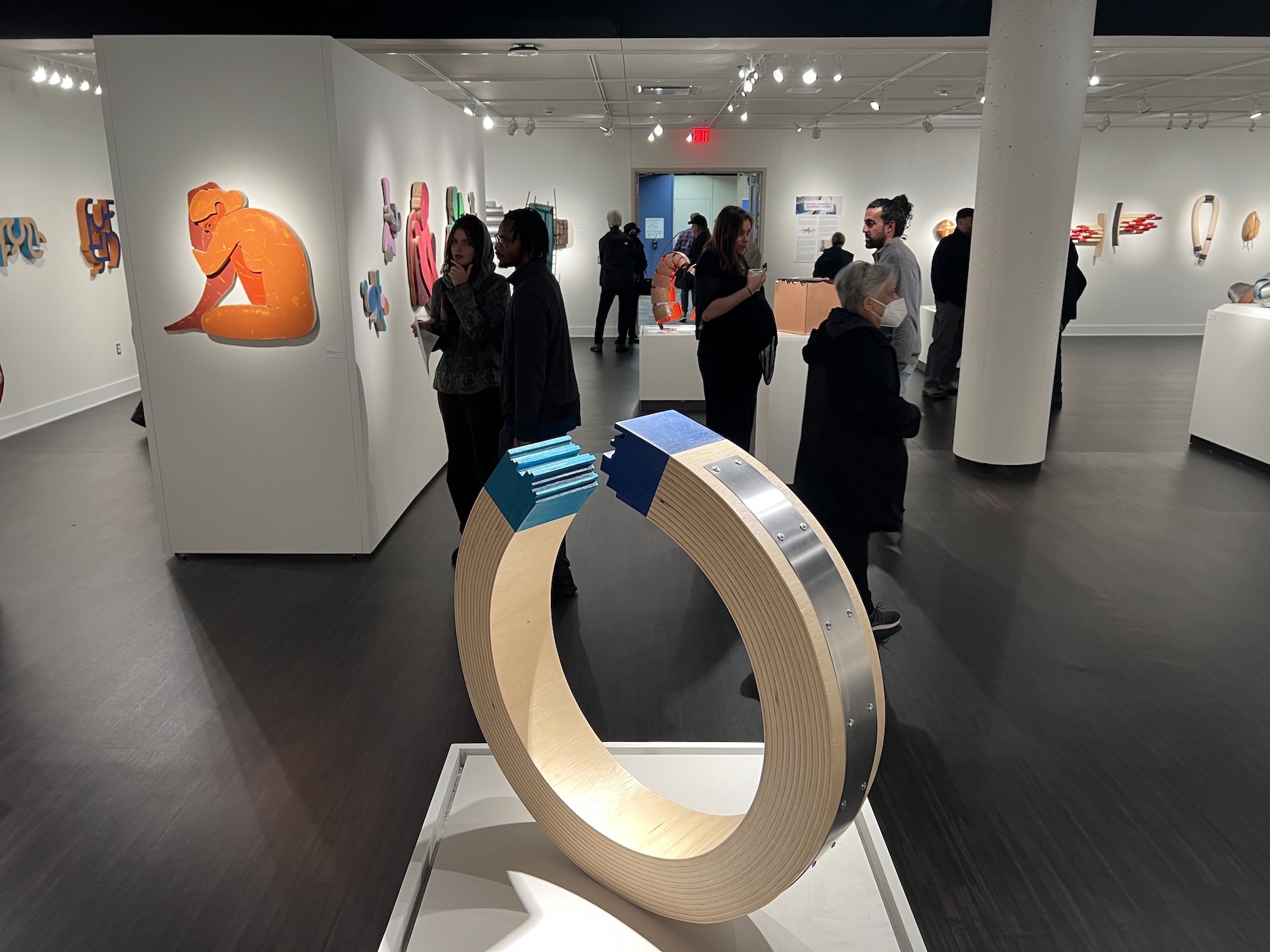
Doug Cannell: Learning Curves, installation view.

The other new body of work on view is sourced in Cannell’s experience as a graphic designer, a field which gave him an immense appreciation for the capacity of various fonts and typefaces to enhance the meanings of words and to imbue words with nuance. In the series Letterforms, Cannell takes letters from various alphabets of the world, deconstructs them, and merges them together into sculptures that celebrate the language or the font on which they’re based. The forms are abstracted, but still recognizable, so viewers might recognize letters from the Thai alphabet, or Korean, Arabic, or Hebrew. It’s a series in wood which draws attention to the pure form of words without regard for their literal sounds or meanings.

Filling about half of the gallery space, these two recent bodies of work are displayed alongside selections of earlier works. One series is an expressive body of works which explores emotion and body language. The defensive postures the life-sized wooden figures assume are often suggestive of struggle. In using representational/figurative imagery, the series is an outlier in Cannell’s larger body of work, the rest of which is almost entirely abstract.

More typical (if its ok to say that about a body of work as relentlessly varied as this), are the abstract wooden sculptures of the series A Tree is a Wild Thing.  Each of the emphatically organic forms in this series was created using rectangular boards of industrial lumber, which Cannell then worked until the wood attained a beauty more suggestive of its original source in nature.

But Cannell’s work also explores the beauty and formal qualities of industrial materials, and the series Art and Invention is an exploration of the visual possibilities of steel and its decay. Often making use of repurposed, rusted steel, some of these wall-mounted sculptures seem like more polished and refined versions of the doggedly rugged industrial sculptures of Constructivist Vladimir Tatlin.
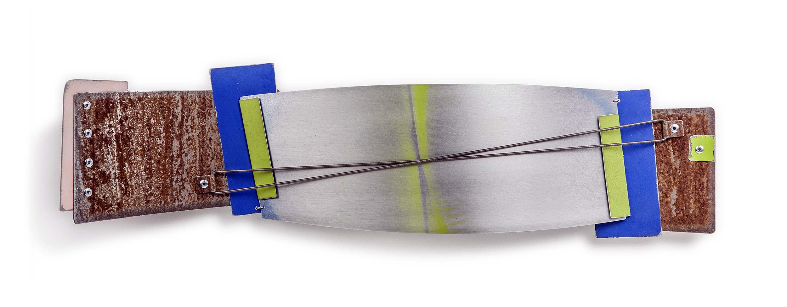
Arc Mentha, 2017 (28”x 8” x 4”), steel, aluminum, paint.
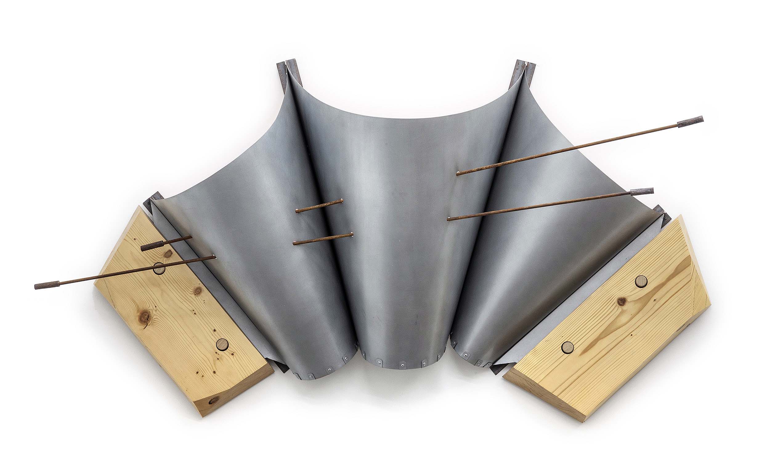
Thrump, 2016, (48’’x94’’x34’’), steel and wood

There seems to be a whimsicality and a playful quality to much of this work. It blurs boundaries between the organic and industrial…between craft and fine art. Regarding the inevitable categorization of his work into “series,” Cannell confesses that his goal is never to set out to create a series, and that a work in one set might just as easily fall into another. His work defiantly refuses simplistic categorization and easy labels, much like the places, spaces, and textures of Detroit itself.
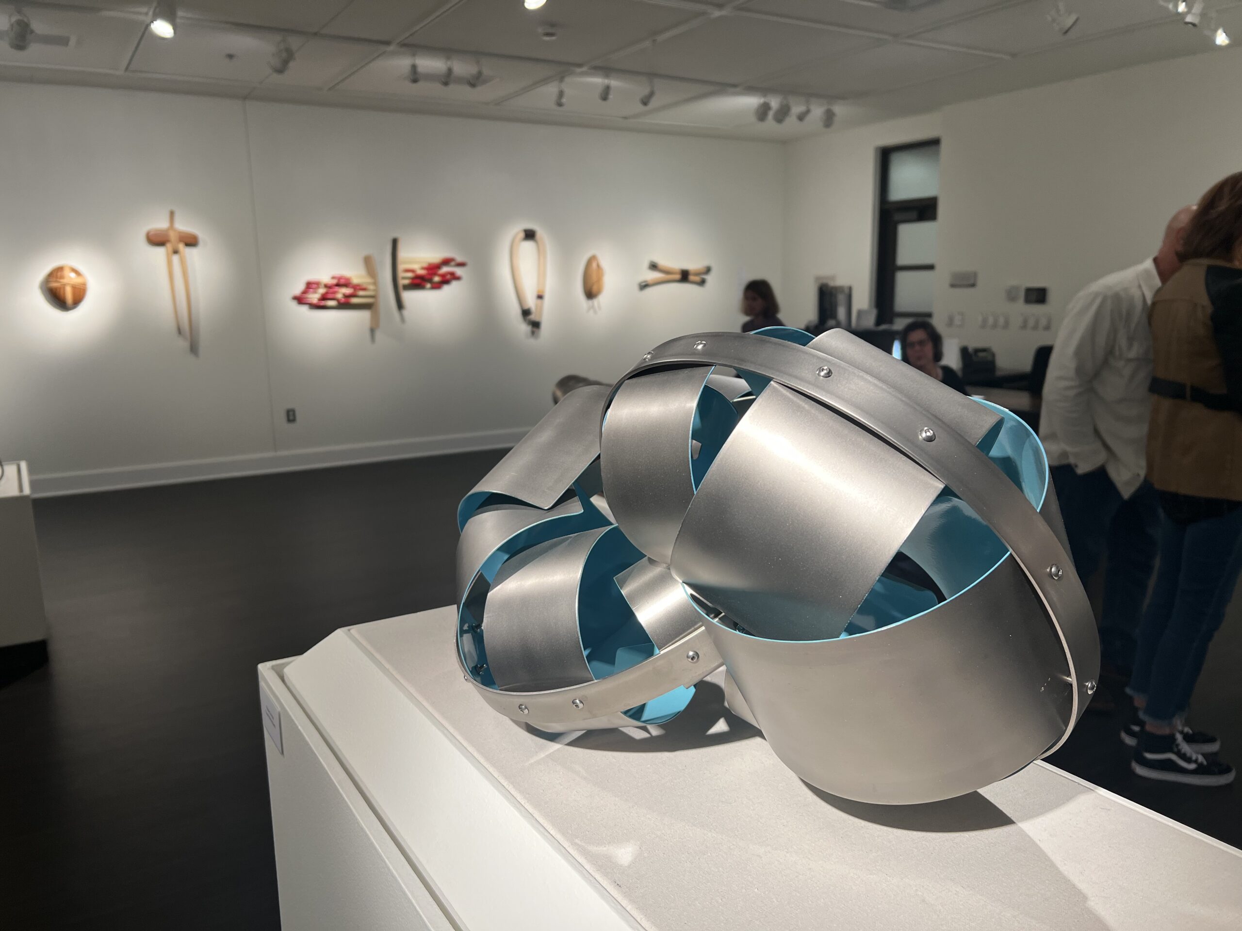
Doug Cannell: Learning Curves, installation view.

Doug Cannell @ Stamelos Gallery Center, UofM Dearborn,  through December 10, 2023.
Shouldn’t You Be Working? @ MSU Broad Museum

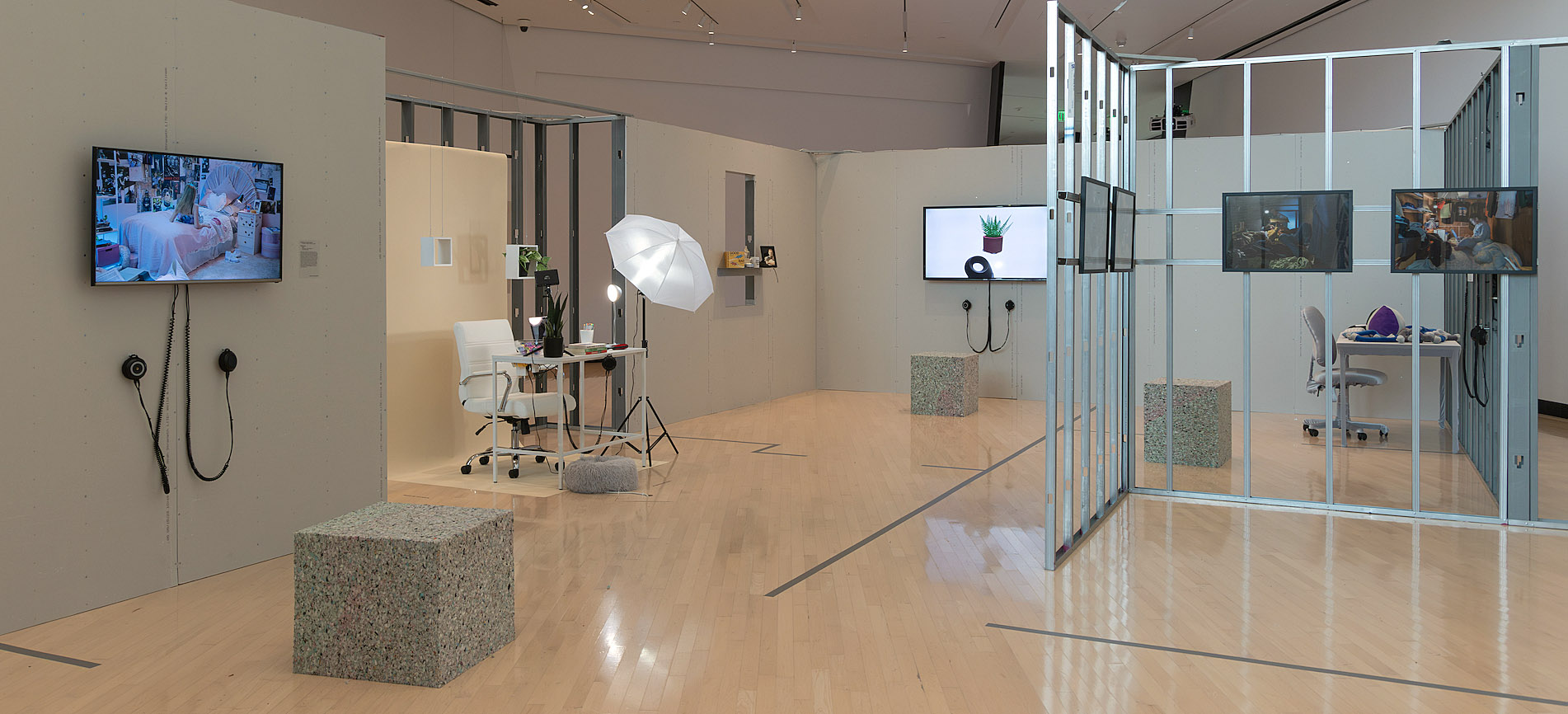
Shouldn’t You Be Working? 100 Years of Working from Home installation view at the Eli and Edythe Broad Art Museum at Michigan State University, 2023. Photo: Vincent Morse/MSU Broad Art Museum.

In 1896, Michigan State University opened the doors to its School of Home Economics, one of the first in the nation. The school even contained a fully functional practice home where the students cooked, cleaned, and hosted events. The home was demolished in 2008, and the Broad Art Museum was erected in its place. Taking its former school of home economics as its reference point, through December 27, the Broad presents Shouldn’t You Be Working? 100 Years of Working From Home. Curated by Teresa Fankhänel, the exhibit features photography, digital media, and installation, and it explores the intersection of work and home life, focusing on how technology and artificial intelligence are shaping the future of both.

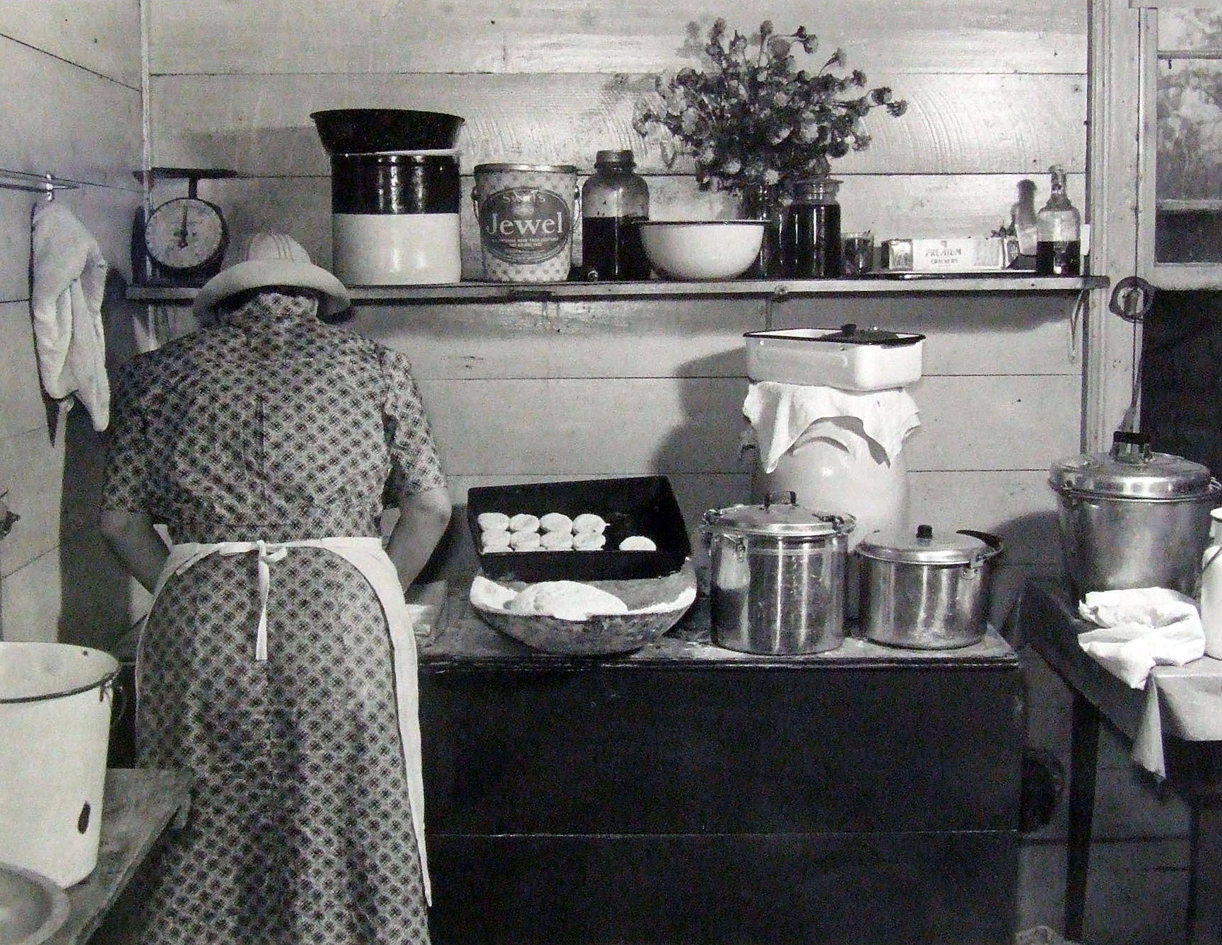
This exhibition pairs ten contemporary artists and architects with a selection of photography and ephemera, including archival photographs from the university’s former School of Home Economics. These are paired alongside iconic photographs of workers in their homes, taken by the likes of Walker Evans and Marion Post Wolcott, who, on behalf of the Farm Security Administration, famously documented the lives of the rural workers and sharecroppers who struggled to maintain their livelihoods during the Great Depression.

Records of the MSU School of Home Economics. Courtesy Michigan State University Archives & Historical Collections.

Marion Post Wolcott, A member of the Fred Wilkins family making biscuits for dinner on cornhusking day, Tallyho, near Stem, N.C., 1939. Eli and Edythe Broad Art Museum, Michigan State University, purchase, funded by the Emma Grace Holmes Endowment, 2006.33.1

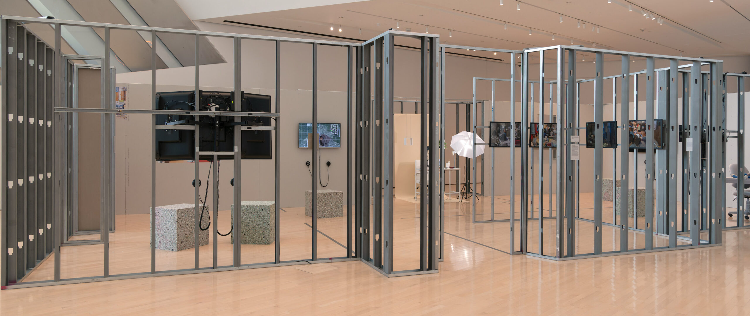
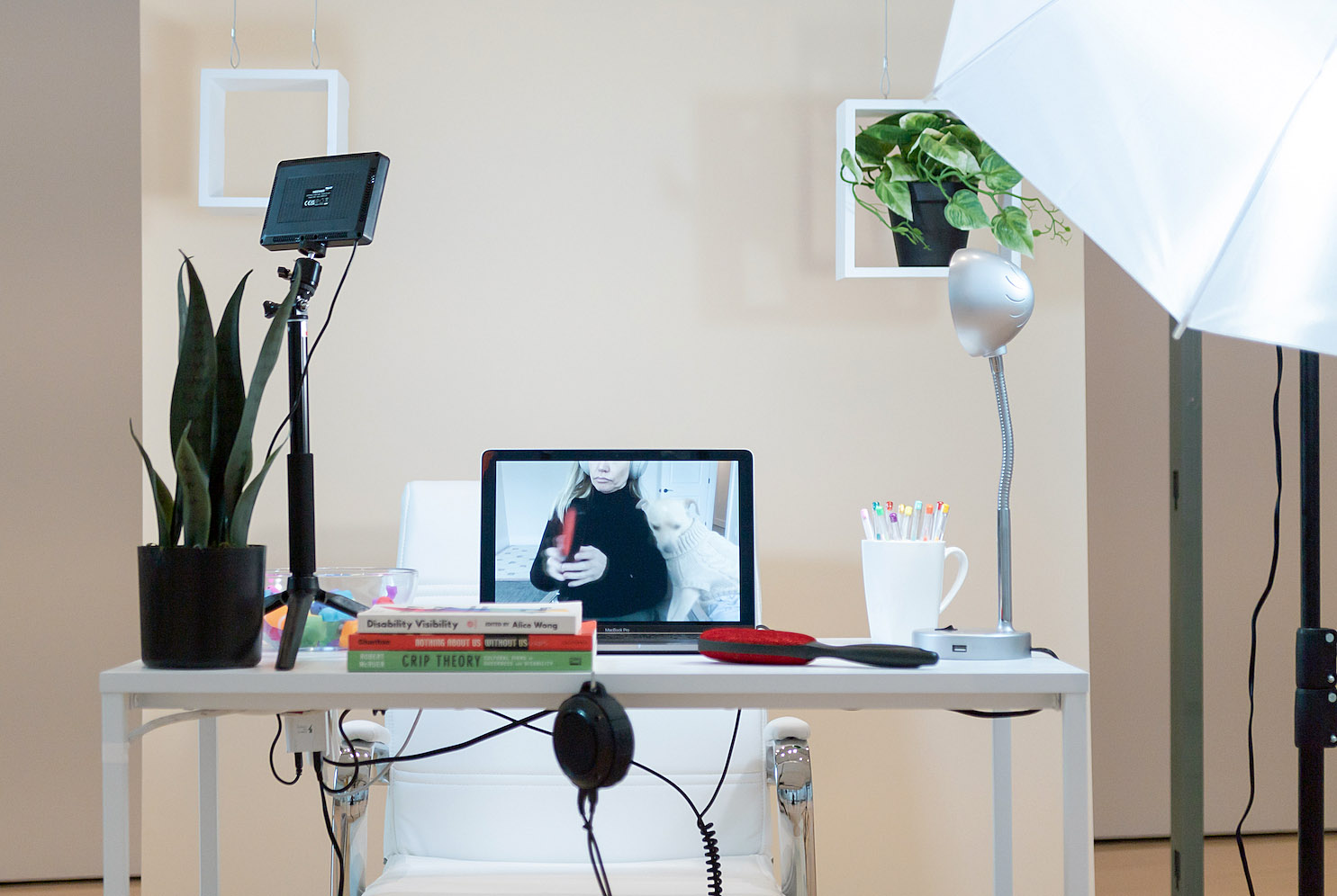
The visual epicenter of the exhibition space is a partial recreation (at a 1 to 1 ratio) of the Paolucci Building, the former home economics practice house that once occupied this site. This interactive structure serves to frame a selection of photography, digital art, and an installation, which explore contemporary intersections of work and home life. Inside, there’s a mock-up of a home office replete with all the trappings of a television studio; a sight which will resonate with any of us who have been on a Zoom call. It also recalls the home studios of the social media “influencers” who ironically manage to create lucrative public careers from the privacy of their homes.  This office installation, Cream Screen, by Marisa Olson, also serves to confront and dismantle the assumption that the technology to work or study remotely is accessible to everyone.

Shouldn’t You Be Working? 100 Years of Working from Home installation view at the Eli and Edythe Broad Art Museum at Michigan State University, 2023. Photo: Vincent Morse/MSU Broad Art Museum.

Shouldn’t You Be Working? 100 Years of Working from Home installation view at the Eli and Edythe Broad Art Museum at Michigan State University, 2023. Photo: Vincent Morse/MSU Broad Art Museum.

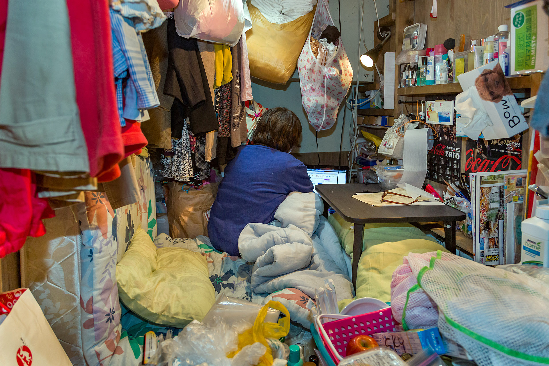
Also inside this recreation of the Paolucci Building is a selection of photography by Korean artist Won Kim. His series Living Small shows the cramped living quarters of Tokyo’s pod hotels. Unlike the city’s chic capsule hotels (more refined, but still not for the claustrophobic), these pods are little more than plywood boxes; there’s not even a door or windows. These spaces offer very low-income housing for individuals in between jobs, and are the ultimate expression of minimalist living. These images call to mind the famous photograph Five Cents a Spot taken by Jacob Riis, which shows the crammed tenement housing of some of New York City’s poorest residents.   

Won Kim, Enclosed: Living Small, 2014. Photo print © Won Kim

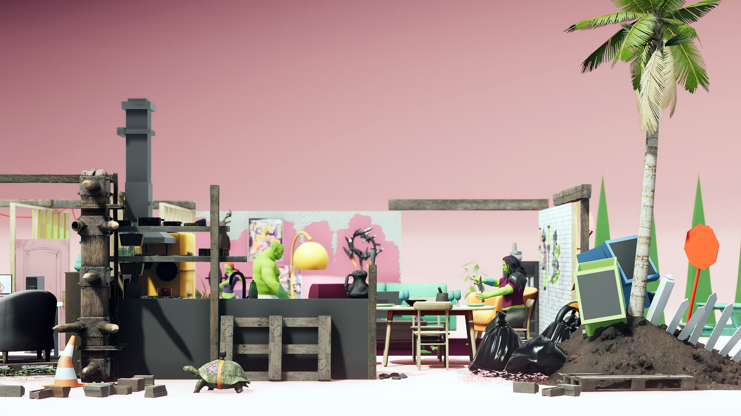
Several monitors screen short video works that specifically address how technology shapes our work/home balance. Theo Triantafyllidis’ Ork Haus applies a sort of dark, absurdist humor in his digital portrayal of a dysfunctional family of orks (yes, orks) at home during lockdown. All are hopelessly addicted to their screens (VR headsets, TVs, and phones). The papa ork dabbles in cryptocurrency, and his little orkling learns to code; meanwhile, the family is oblivious to real-world catastrophes that surround them, such as the out-of-control fire in their kitchen.

Theo Triantafyllidis, Ork House, 2022. Live simulation video © Theo Triantafyllidis

Merger, a video by Keiichi Matsuda, presents us with a dystopian future in which artificial intelligence has taken over all corporations. The film’s unnamed protagonist has resigned to this digital takeover, acknowledging her status as a human is obsolete, and ultimately makes the decision to transition into a digital entity.

Keiichi Matsuda, Merger, 2018. Video © Keiichi Matsuda

For better or for worse, the boundaries between work and home are shifting. And COVID certainly accelerated the process, turning our homes into workspaces, at least for those of us who were fortunate to have the means to work remotely. This exhibition doesn’t necessarily criticize the advent of new technologies in the home, though it does invite us to pause for a moment and consider what this brave new world will look like.

Shouldn’t You Be Working? is on view at the MSU Broad Art Museum through December 17, 2023.

Blind Spot: Stephanie Syjuco @ MSU Broad

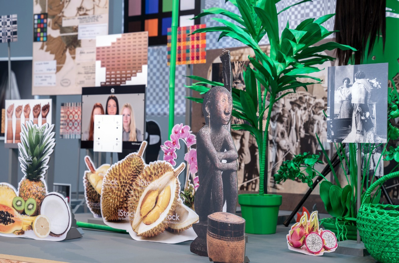
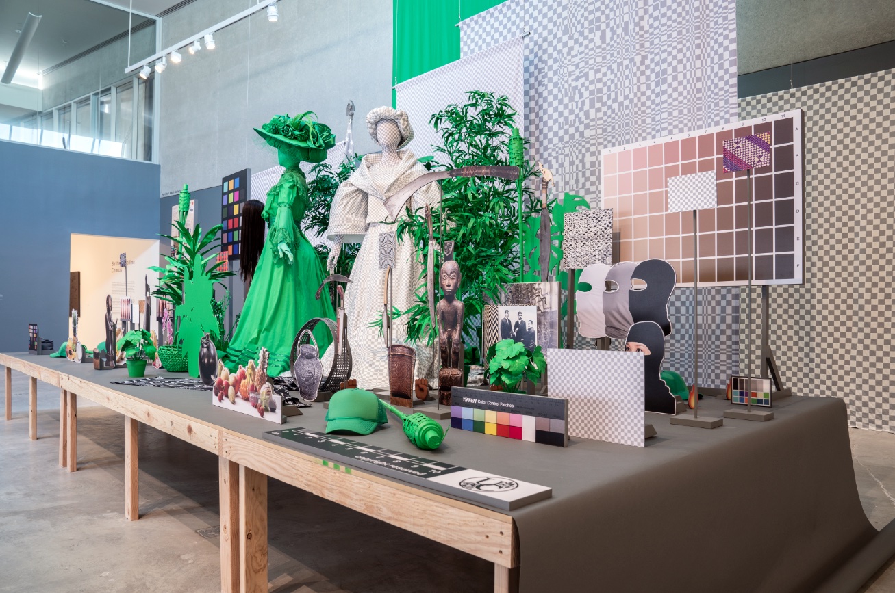
Dodge and Burn (Visible Storage) Stephanie Syjuco, Dodge and Burn (Visible Storage), 2019. Wooden platform, digital photos and printed vinyl on lasercut wood, chroma key fabric, printed backdrops, seamless paper, artificial plants, mixed media. Overall 20 x 17 x 8 feet. Photo: Dusty Kessler. Courtesy of the artist, Catharine Clark Gallery, San Francisco, and RYAN LEE Gallery, New York.

While I chatted with Rachel Winter (assistant curator at the MSU Broad Art Museum) about the artistic practice of Stephanie Syjuco, Winter described her as a “force of nature,” and given her many accomplishments, it’s easy to see why. Syjuco’s work has been displayed at the MoMA, the Whitney, and the Smithsonian Museum of American Art, and her awards include a Guggenheim Fellowship and a Smithsonian Artist Research Fellowship. Recently, she was featured on the PBS series Art21.  Born in the Philippines, Syjuco has spent most of her life in the United States, and currently teaches at the University of California, Berkeley. Using America’s colonization of the Philippines as a frequent reference point, her archival and research-based artistic practice addresses the ways photographs and objects can be used to construct skewed narratives.

Through July 23, the Broad presents the exhibition Blind Spot: Stephanie Syjuco, a collection of Syjuco’s work which traverses across photography, sculpture, craft-based media, and installation. This is a diverse body of work with a focused intent, addressing the ways individuals from the Philippines were represented in America during the years of American occupation (1898-1946). America’s history in the region is not given much attention in our history books, and is a “blind spot” for many of us. But these works also speak to colonialism and representation in a broader, more generalized sense.

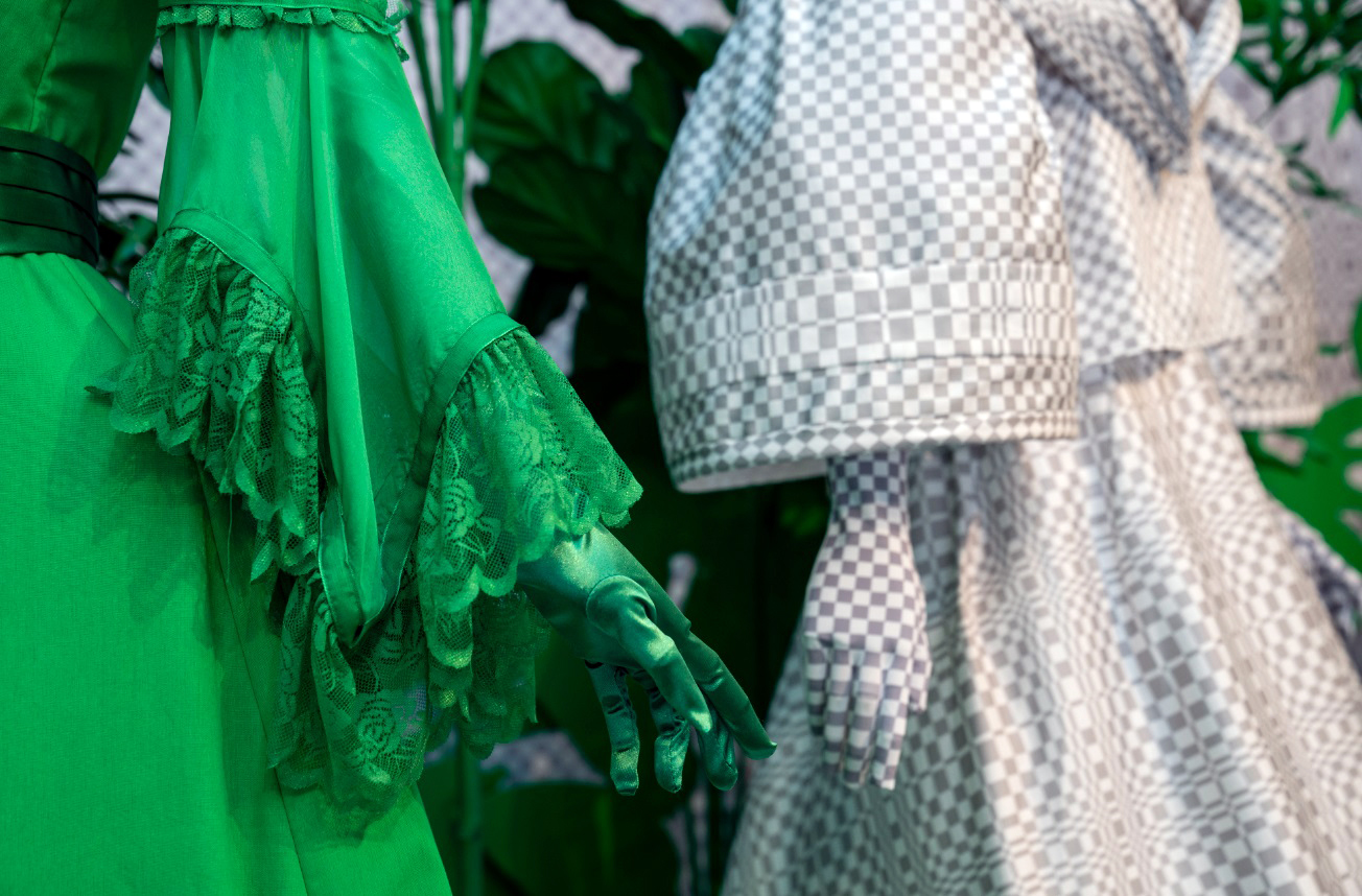
Syjuco frequently uses chromakey green in her works, a reference to the green-screen used in digital video post-production. And the grey and white checkered pattern she often uses is a reference to the transparency background in Photoshop which fills the negative space in an image after something has been deleted. These allow for both superimposition and erasure, and their prevalence in her work speaks to the omnipresence (particularly in the internet age) of manipulated images and narratives.

Dodge and Burn (Visible Storage) Stephanie Syjuco, Dodge and Burn (Visible Storage), 2019. Wooden platform, digital photos and printed vinyl on lasercut wood, chroma key fabric, printed backdrops, seamless paper, artificial plants, mixed media. Overall 20 x 17 x 8 feet. Photo: Dusty Kessler. Courtesy of the artist, Catharine Clark Gallery, San Francisco, and RYAN LEE Gallery, New York.

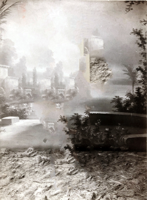
The exhibition’s namesake, Blind Spot, is an evocative digital reconstruction of photographs taken during the 1904 St. Louis World’s Fair. In addition to showcasing new technologies and scientific innovations, the fair also Included what was described at the time as a “human zoo,” featuring more than 1,100 individuals who were trafficked from the Philippines and who, for the duration of the fair, inhabited a Disneyland-style mockup of a village.  It was conceived as an educational display, but the exhibit also served to propagate notions about racial inferiority. Photographs of these individuals, taken as they posed in front of backdrops and dioramas suggestive of the South Pacific, helped disseminate these problematic ideas. Blind Spot is a digital intervention for which Syjuco manipulated these images in Photoshop, removing the people and leaving in their trace ghostlike, blurry apparitions. In the 40 images that comprise Blind Spot, all we see are the backgrounds that these individuals were posed in front of, and in removing the people from the photos, Syjuco symbolically liberates them from the ethnographic gaze. Begun in 2019 during a Smithsonian research fellowship, Syjuco completed the project specifically for this exhibition, and afterward it will enter the Broad’s permanent collection.

Blind Spot Stephanie Syjuco, Blind Spot, 2023. Pigmented inkjet prints mounted on aluminum. Eli and Edythe Broad Art Museum, Michigan State University, purchase, funded by the Nellie M. Loomis Endowment in memory of Martha Jane Loomis, 2022.33

Although the installation Dodge and Burn (Visible Storage) is sculptural, like Blind Spot it also directly addresses photography and representation. The title references the photographic darkroom technique of lightening or darkening certain parts of the image, though Dodge and Burn can certainly be read in more literal ways. The ensemble presents a large stage crammed with images and objects associated with the Philippines. Many of these are cut-outs of stock images (watermarks clearly visible) that are displayed as prop-like objects. The centerpiece of the ensemble are sculptural representations of two women from the late 19th Century, one in traditional Filipinx dress, and one dressed in more Western fashion. It’s an intentionally busy sculptural collage which the artist likens to having too many tabs open on a computer. While the work reminds us of America’s colonial history, contemporary references in the ensemble (emojis, photographic color calibration charts, and MAGA hats) encourage us to think about the extent to which America is still a colonial power (Puerto Rico and Guam remain U.S. territories, after all, an enduring legacy of the 1898 Treaty of Paris). Subtitled “Visible Storage,” the work serves as a critique of how objects in museums have often been used to construct problematic narratives.

Dodge and Burn (Visible Storage) Stephanie Syjuco, Dodge and Burn (Visible Storage), 2019. Wooden platform, digital photos and printed vinyl on lasercut wood, chroma key fabric, printed backdrops, seamless paper, artificial plants, mixed media. Overall 20 x 17 x 8 feet. Photo: Dusty Kessler. Courtesy of the artist, Catharine Clark Gallery, San Francisco, and RYAN LEE Gallery, New York.

While several bodies of work in this exhibit specifically address Filipinx representation, Syjuco’s work also addresses representation and constructed narratives in more generalized ways. One work in the show features 20 digitally printed flags suspended from the ceiling; their presence evokes the United Nations, and initially they seem to be an expression of unity. But these flags come from fictional rogue/enemy states portrayed in American and European movies; none of these states existed in reality. Most of these are from films produced during the cold war, and are stylized to evoke certain parts of the world; together they speak to a generalized fear of a foreign enemy.

Syjuco’s work is heavily based on archival research, and it raises questions about how archival holdings are acquired, interpreted, and displayed. In support of this exhibit, the accompanying booklet includes brief essays by the directors and registrars of Michigan State University’s varied collections across the arts and sciences (such as the herbarium and the university archives).  They discuss their holdings while acknowledging the “blind spots” that exist within these collections, underscoring the cross disciplinary relevance of Syjuco’s artistic practice.

The show takes full advantage of the Broad’s Zaha Hadid designed exhibition space. It’s both conceptually powerful and visually rich. And while the colonization of the Philippines occurred on the other side of the world, Syjuco, particularly with her Blind Spot project, reminds us of some of the ways that the enduring impact of America’s colonial legacy comes close to home.

 Eli and Edythe Broad Art Museum

Blind Spot: Stephanie Syjuco is on view at the Eli and Edythe Broad Art Museum through July 23, 2023

Breaking the Mold @ Flint Institute of Arts

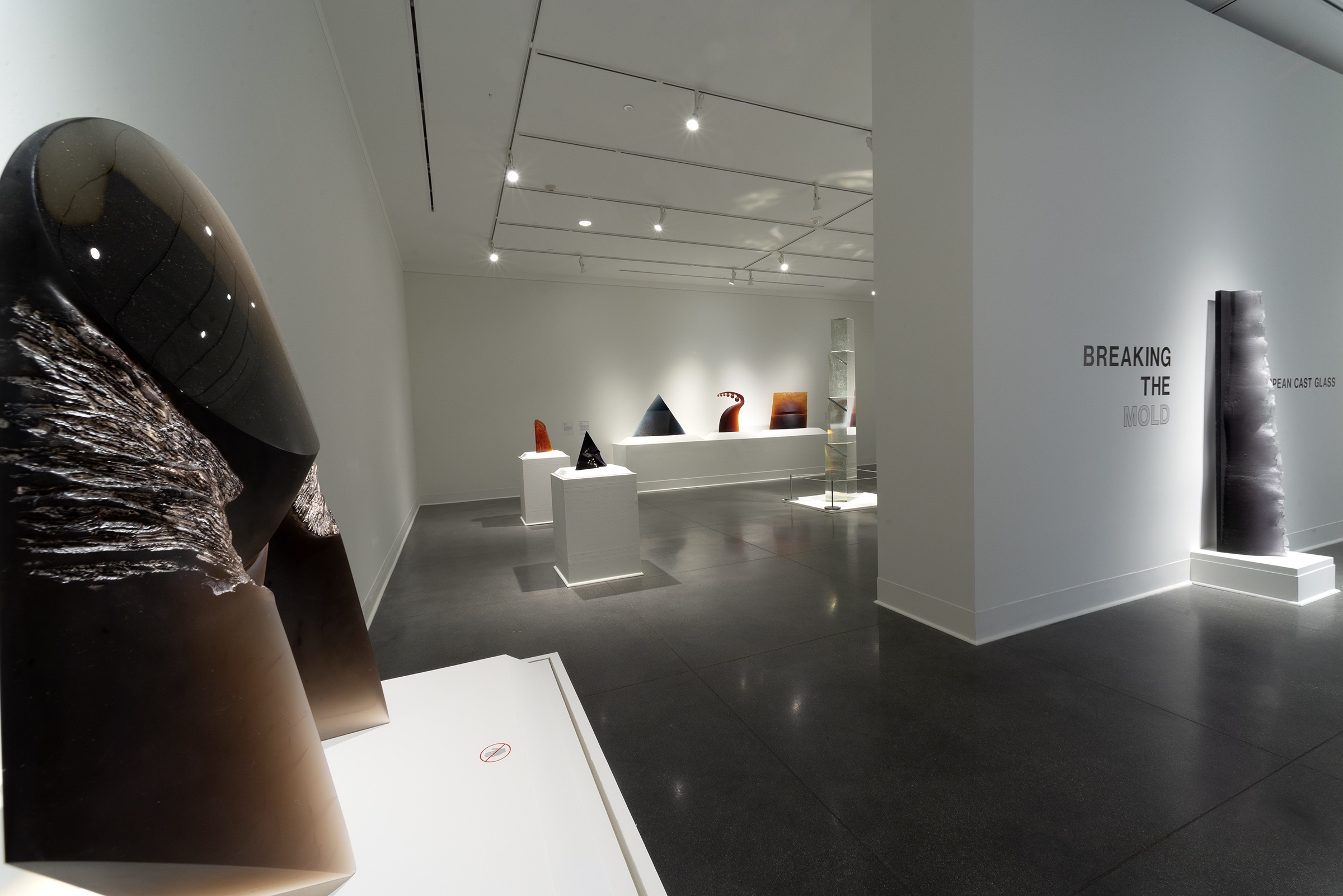
Breaking the Mold, installation, and all images are courtesy of the Flint Institute of Arts.

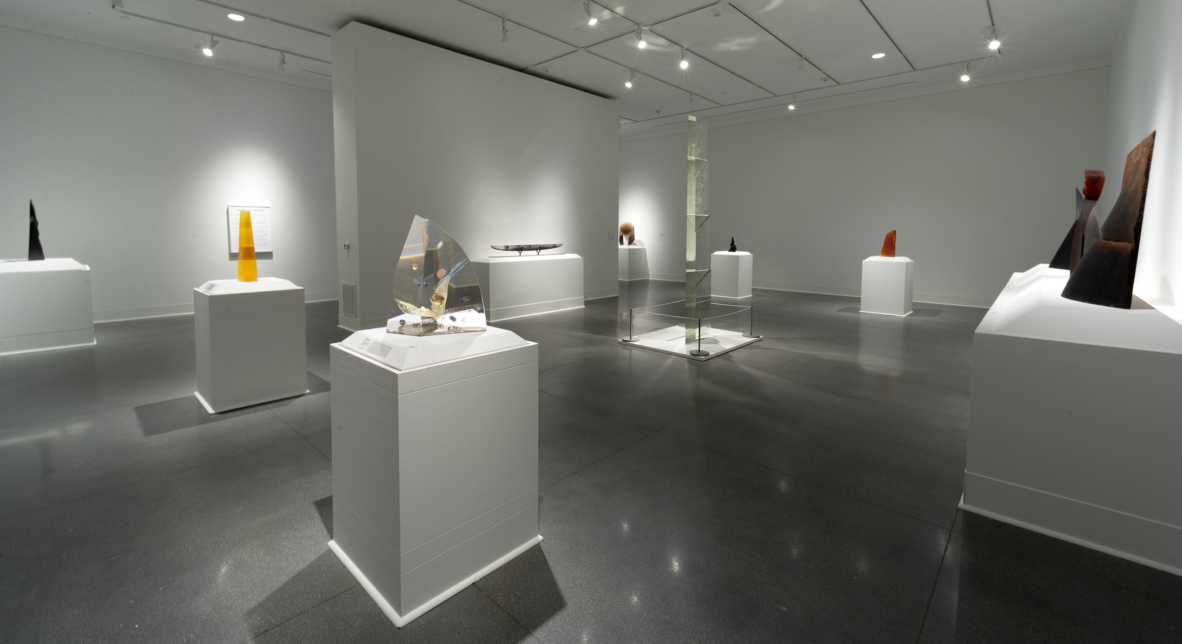
Whenever I visit the Flint Institute of Arts, I always leave feeling that the FIA is a seriously under-hyped museum, not just because of the strength of its collection but also because its galleries are just downright cool spaces, each varied and perfectly suited for the time period and style of the artwork they contain.  A major expansion in 2018 added to these galleries a chic and suitably contemporary space to showcase the museum’s collection of modern and contemporary glass. Until April 2, many of these glass works join forces in the Harris-Burger Gallery (also a relatively new addition) with works pulled from storage to offer a visual survey, European Cast Glass, offering viewers an intimate single-room micro-exhibit that hints at the diversity and the surprisingly subversive beauty of the medium.

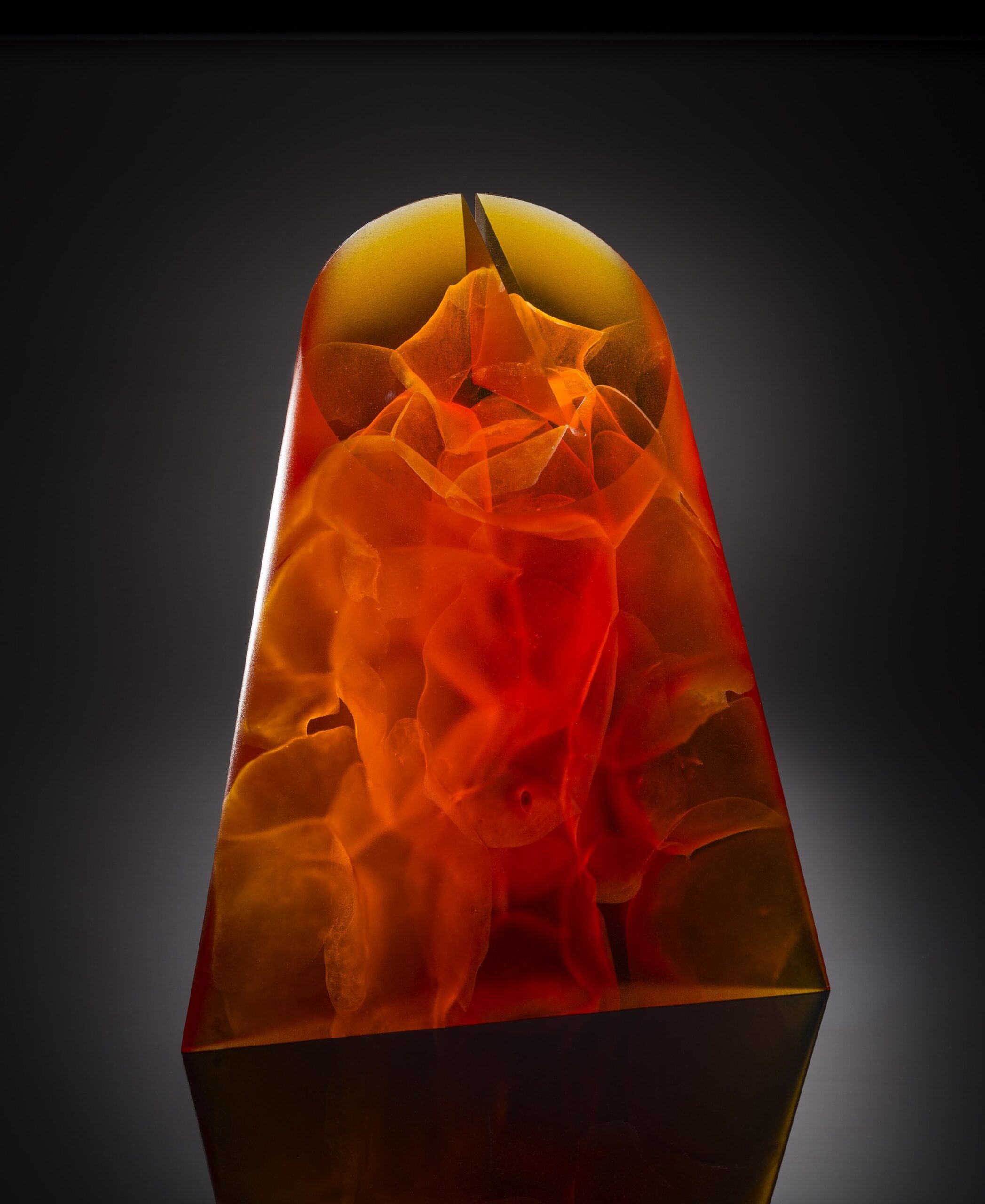
It’s a show entirely of European cast glass, offering a truncated survey of the medium while suggesting its enduring relevance. The method of using a mold to cast glass dates back to the 15th century BC, long predating the development of blown glass, a first-century innovation. The 20th century brought about a Renaissance of glassmaking in Europe, fueled by artists who began their careers in manufacturing but broke away from commercial glassmaking and focused instead on glassmaking as fine art.

Petr Hora, Czech, born 1949, Hadros, 2006. Cast and acid-polished glass 18 3/4 × 15 1/2 × 4 3/4 in. (47.6 × 39.4 × 12.1 cm). Courtesy of the Isabel Foundation. L2017.59. Photo Credit: Douglas Schaible Photography.


Vladimira Klumpar Czech, born 1954. After Rain, 2007, Cast glass. 33 3/4 × 23 1/2 × 8 3/4 in. (85.7 × 59.7 × 22.2 cm). Courtesy of the Isabel Foundation. L2017.67. Photo Credit: Douglas Schaible Photography.

Most of these works are abstract or non-representational, but not all. North Sea Waves by Slovakian artist Zora Palová is a vertically oriented column of gently undulating waves of glass. Unlike many of the works in the exhibit, which have clean, crisp lines, North Sea Waves has a very textural, rough surface, revealing the hand of the artist. In her choice of dark violet and white, Palová wanted to mimic the color of crashing waves of the North Sea, and in this work, she presents us with a seascape playfully flipped on its axis (having lived for a while in St. Andrews, Scotland, I can vouch with Palová that the North Sea can certainly get dark, and moody).

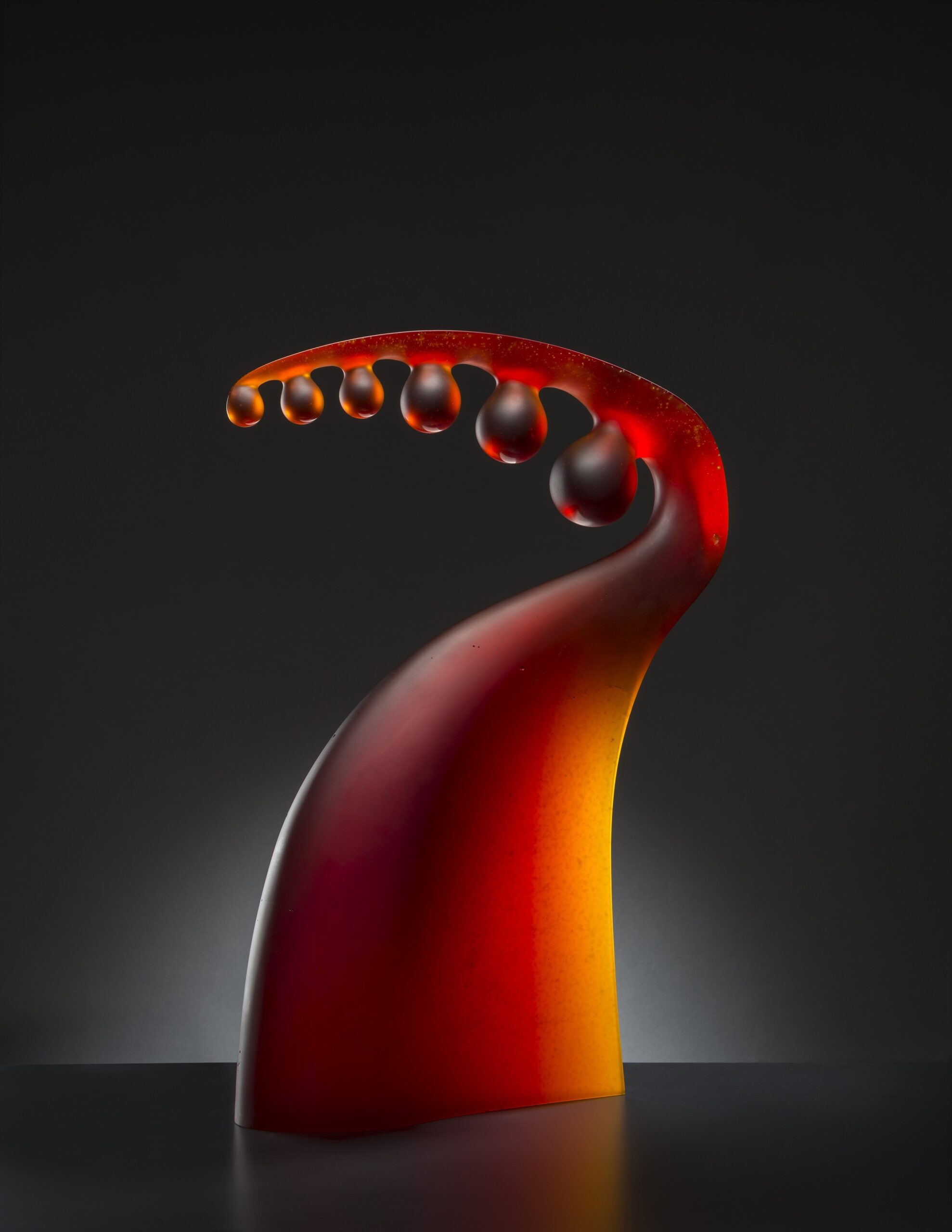
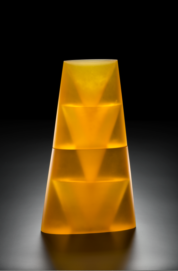
Many of these artists were simply exploring the capabilities of color, shape, light, and form, and their works seem largely the result of play and experimentation. The organic appearance of Vladimira Klumpar’s After Rain is delightful, vaguely organic in form, reminiscent of some kind of otherworldly plant gently bending from the weight of droplets of liquid glass. And the vertically ascending triangles of Vladimir Bachorik’s Escalation, to me anyway, read almost as an inverted stack of highly abstract nesting dolls.    Depending on the thickness or thinness of the glass, the color of these abstract works can alternate between rich and opaque or thin and translucent.

But some of the works in this exhibit are charged with surprising social and political relevance.  Stanislav Libenský and his wife Jaroslava Brychtová are both represented in this exhibit with several works. Heavily influenced by Cubism and Constructivism, their work stood as a subtle foil to the government-sanctioned Soviet-realist style so prevalent in Eastern Europe, something they had in common with other Czech artists. Together they innovated methods for casting monumental cast glass, and became renowned artists and teachers with an international following. Many of the artists in this show followed in their footsteps, and Sarah Kohn– the exhibition’s curator– likens this show to a sort of visual “family tree,” allowing us to see how these artists influenced each other.

Vladimir Bachorik Czech, born 1963, Escallation, 2005 Cast glass. 23 1/2 × 13 1/2 × 4 in. (59.7 × 34.3 × 10.2 cm). Courtesy of the Isabel Foundation. L2017.13. Photo Credit: Douglas Schaible Photography.


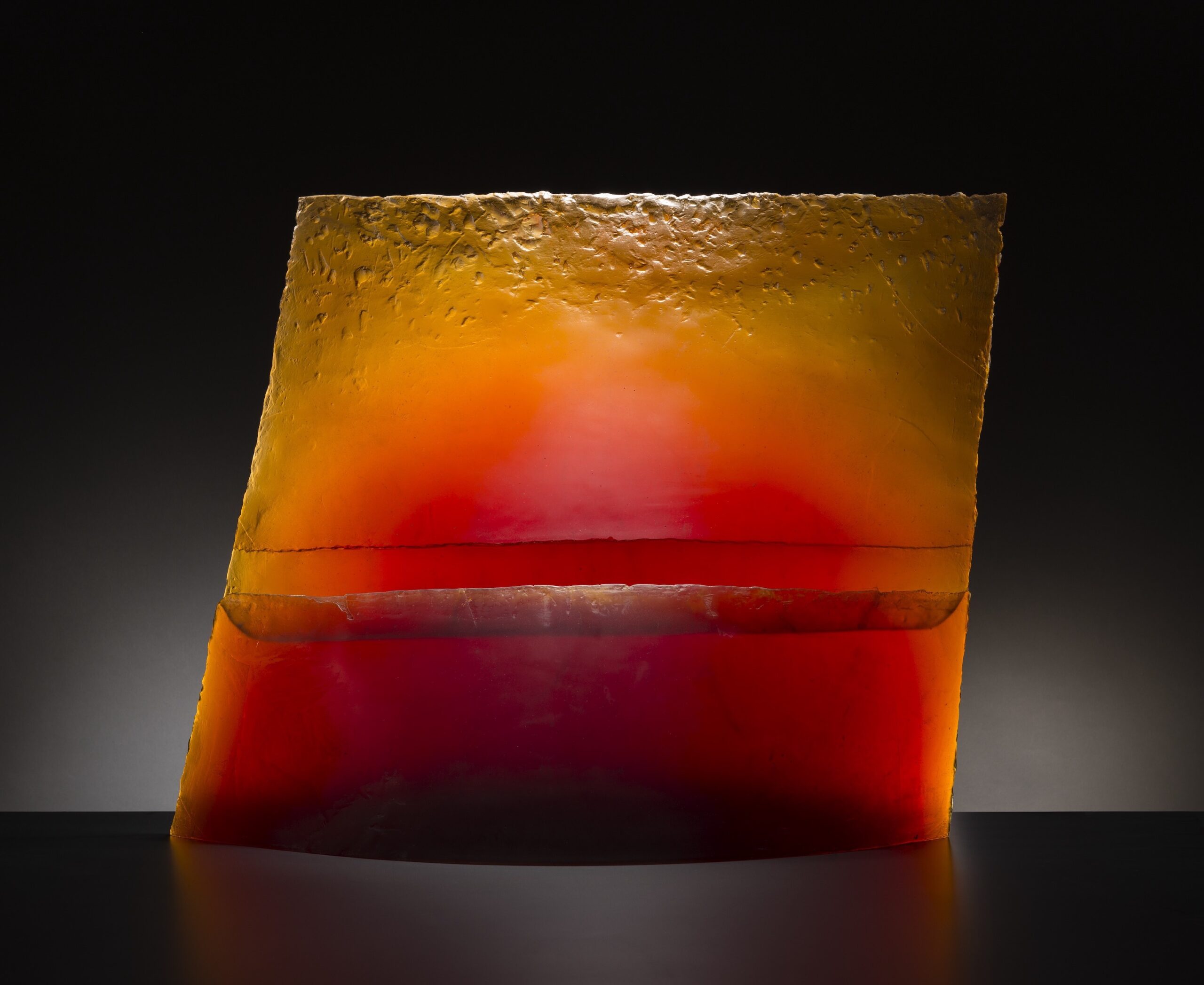
Stanislav Libenský Czech, 1921 – 2002 Horizon, 1992-2005 Cast glass, 33 × 43 × 11 1/2 in., 500 lb. (83.8 × 109.2 × 29.2 cm, 226.8 kg). Courtesy of the Isabel Foundation. L2017.74. Photo Credit: Douglas Schaible Photography.

Stanislav Libenský’s 3V Column, the exhibition’s literal centerpiece, was a direct response to Czechoslovakia’s Velvet Revolution, which Libenský witnessed firsthand from his studio window. The half-million protesters who in 1989 gathered in Wencelas Square and collectively brought an end to Communist one-party rule flashed their fingers in a Churchillian V Shape: a shape directly referenced by the horizontally oriented V-shaped cuts incised in three different places in the column. The column was previously displayed in the FIA’s glass gallery on a podium against a wall, but here it’s in the center of the gallery space, allowing viewers to appreciate it in 360 degrees, and view up close the thousands of minuscule air bubbles arrested within its form.

Breaking the Mold allows the FIA to flaunt highlights from its robust collection of glass art, including works previously in storage. It also re-presents the way some of these works are displayed, yielding a different viewer experience.  Even if the historical context or subject of a work of glass art is not readily apparent, glass still possesses an undeniable beauty that prevents it from being prohibitively esoteric; it’s art that anyone can enjoy. This is a small exhibit, so come for what it is, and while you’re there, explore the rest of the much underhyped spaces the FIA has to offer.

Breaking the Mold, installation image courtesy of the Flint Institute of Arts.

I want to thank the curator of this exhibition, Sarah Kohn, who was very generous with her time in discussing this exhibition with me, and fielding my many questions.

Breaking the Mold: European Cast Glass -October 29, 2022 – April 2, 2023, at the Flint Institute of Art.

Cezanne @ Art Institute of Chicago

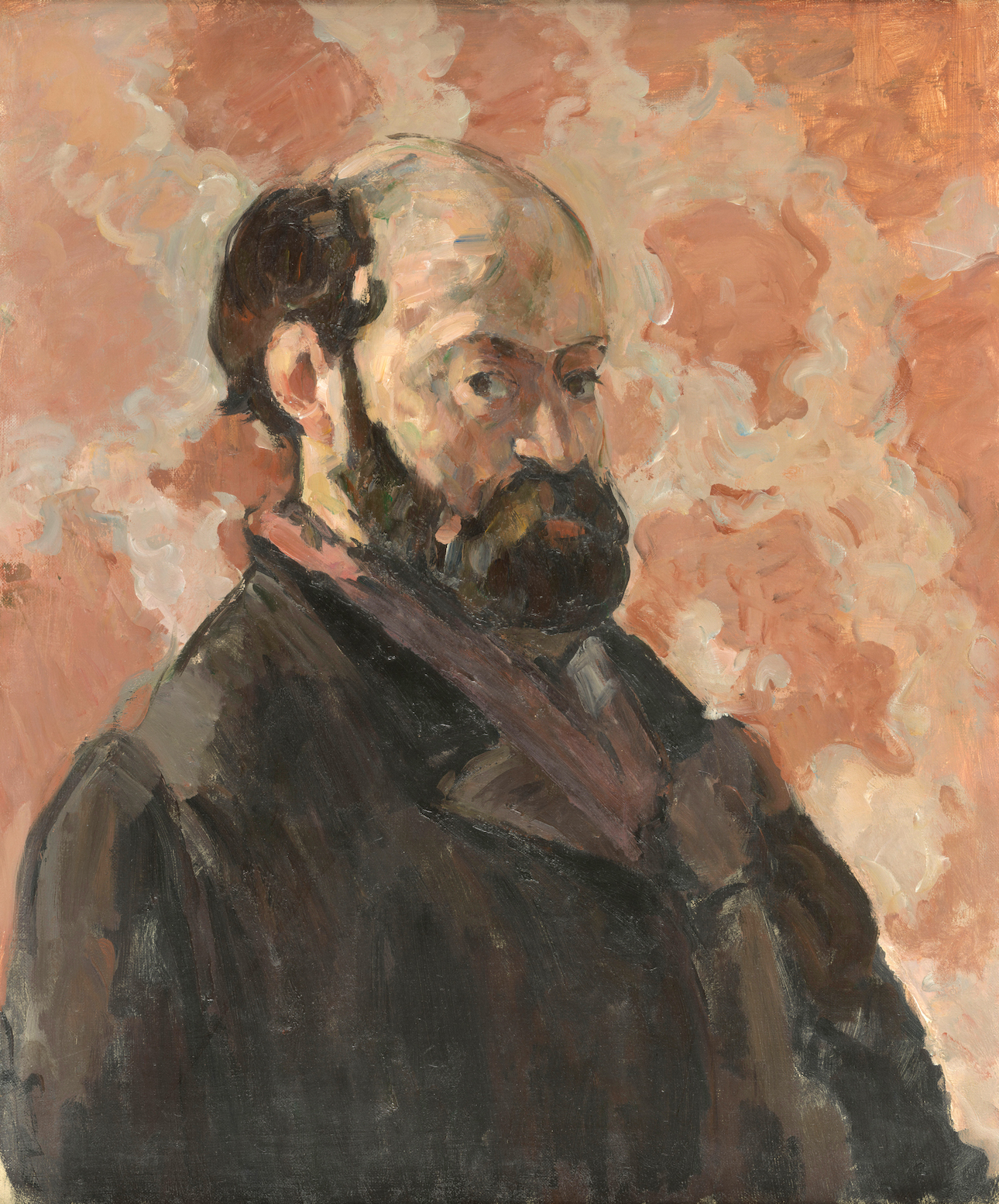
Right now in Chicago, there is probably more Cezzane under one roof than anywhere else in the world. The Art Institute of Chicago goes big with its special exhibitions, and its current offering of works by Cezanne is a beast of a show, comprising 80 paintings, 20 watercolors, two sketchbooks, and a smattering of pencil sketches, and together they demonstrate the artist’s stylistic and thematic breadth. This is Cezanne’s first American retrospective in 25 years, and it brings together works from collections in North and South America, Australia, Europe, and Asia. The show emphasizes Cezanne’s multigenerational appeal; lauded after his death as the “father of modern art,” his paintings (including many on display) were owned by well-known 19th and 20th-century artists, and his enduring reach extends to the present day.

CÈzanne Paul (1839-1906). Paris, musÈe d’Orsay.

Although Cezanne was never formally accepted into art school, he was firmly rooted in art historical tradition, and he studied the masters of the past. When he moved to Paris in 1861, he frequented the Louvre, which he once described as “an open book I am continually studying.” There, he studied and copied Renaissance and Baroque paintings and sculptures. Several early graphite drawings on view demonstrate his ability to draw the figure in a classical, academic style. These tightly rendered drawings are contrasted in the same room with other early experimental works from the 1860s in which Cezanne applies the paint thickly, using only a palette knife to scribble in his subject. These early works are suggestive of a versatile style and artistic swagger.

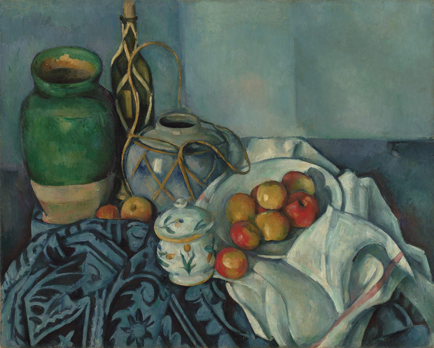
Cezanne’s vision brought new life to the centuries-old genres of still life painting and landscape painting, and in his hands the two could become strikingly similar, as a room of his increasingly busy still life paintings demonstrates. There’s nothing “still” about his still-lifes. Thoroughly unburdened by any adherence to linear perspective, these counterintuitive canvasses seem to heave and buckle. Add into the mix a tactfully arranged patterned tablecloth replete with ridges, furrows, and crevices, and the result is tabletop topography.

Still Life with Apples; Paul Cézanne (French, 1839 – 1906); 1893–1894; Oil on canvas; 65.4 × 81.6 cm 25 3/4 × 32 1/8 in.

Paul Cezanne. The Basket of Apples, about 1893. The Art Institute of Chicago, Helen Birch Bartlett Memorial Collection.

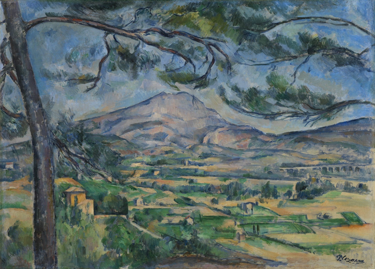
Although he studied in the great museums of Paris, Cezanne self-styled himself as a provincial artist. He was born and raised in Aix-en-Provence, and he frequently left Paris to paint the region, geographically defined by the imposing limestone Mont Sainte-Victoire– the location of a second-century Roman military victory and source of local pride. Some of Cezanne’s most recognizable paintings are the serialized studies he affectionately painted of the angular mountain, mostly executed during the last fifteen years of his life. This exhibit presents over a dozen studies and paintings of the mountain, and they represent some of Cezanne’s most daring works.  The individual brushstrokes of his paintings become an increasingly noticeable presence, and the clarity of the landscape dissolves into a mosaic of scrubbed-in patches of color. One of his aims was to “make the air palpable,” and in these paintings, he certainly succeeded. There isn’t any negative space in the most abstract of these paintings; the air itself is rendered with thick chunks of color. These paintings speak to Cezanne’s artistic philosophy, which held that a painting was complete not when it was finished in the conventional sense, but rather when it successfully achieved his personal artistic intent.

Paul Cezanne. Montagne Sainte-Victoire with Large Pine, about 1887. The Courtauld Gallery, London. © Courtauld Gallery / Bridgeman Images

But even while Cezanne pushed the boundaries of abstraction, leading the charge toward modern art, this show makes it clear that he retained a deep affection for the art of the past. He produced many paintings crowded with frolicking or fighting nudes that acted as contemporary responses to the fleshy Baroque-era Gardens of Love and Bacchanals by the likes of Titian and Reubens. Cezanne’s Battle of Love, in which pairs of abstract nude figures naughtily tussle in a pastoral setting, directly echoes Titian’s 16th century Bacchanal of the Andrians.

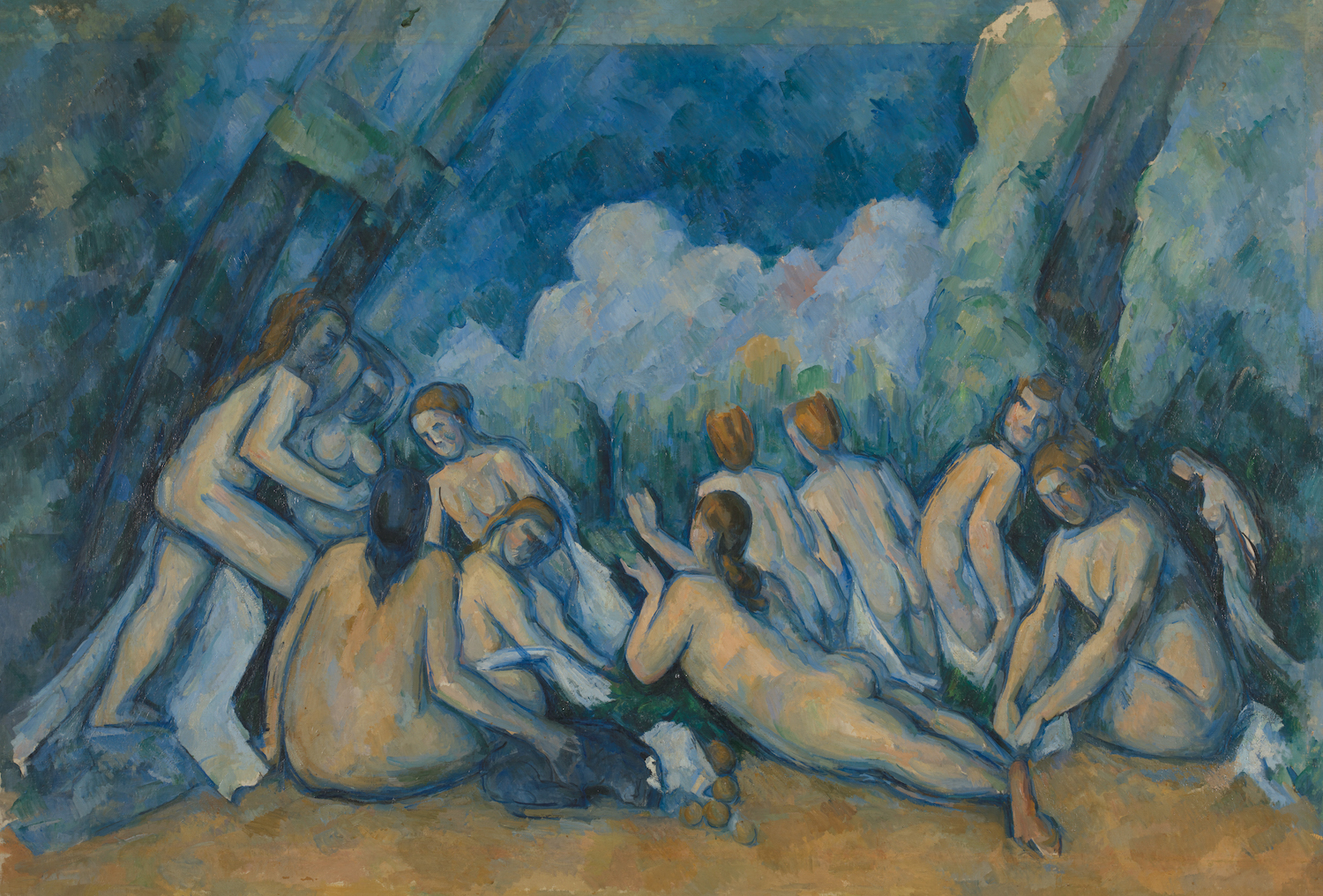
The exhibition concludes with the largest and most realized of Cezanne’s Bather paintings, a subject he returned to throughout his life (other similar, smaller versions appear elsewhere in the show). It’s an idealized scene; the models were entirely products of his imagination, and Cezanne rendered the landscape to compliment and answer the composition and movement of the models. Stylistically, these abstracted figures are emphatically modern, and it’s easy to see why they appealed to artists like Henry Moore, Pablo Picasso, and Henri Matisse, all of whom once owned some of the paintings presently on these walls.

Paul Cezanne. Bathers (Les Grandes Baigneuses), about 1894–1905. The National Gallery, London, purchased with a special grant and the aid of the Max Rayne Foundation, 1964.

Cezanne is sometimes described in print as a “painter’s painter.” Perhaps this is unfair since it suggests that the average person just won’t understand his work. But this exhibition gives non-experts plenty of reasons to like his art, whether for his relentlessly imaginative re-working of classical artistic tropes, or perhaps the sheer complexity of his still-life paintings. This exhibition demonstrates his artistic reach, and specialists and non-specialists alike will find the exhibit rewarding. The abundance of works on view amply demonstrates Cezanne’s indebtedness to the past, even as he challenged artistic conventions and boldly anticipated the art of the future.

Cezanne is on view at the Art Institute of Chicago through September 5, 2022. 

Page 1 of 11

Powered by WordPress & Theme by Anders Norén