Critical art reviews of Detroit galleries and museums weekly

Author: K.A. Letts Page 6 of 9

Writer

By Her Hand: Artemisia Gentileschi @ DIA

By Her Hand: Artemisia Gentileschi and Women Artists in Italy, 1500-1800 at the Detroit Institute of the Arts

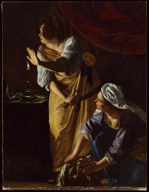
Judith and Her Maidservant with the Head of Holofernes by Artemisia Gentileschi, 1523-1525, oil on canvas, photo DIA

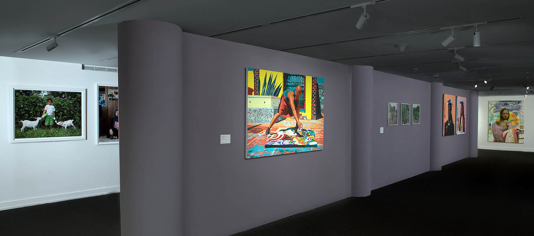
If you are suffering from the cold gray February doldrums and you’re looking for a short vacation from wintry isolation, the Detroit Institute of Art has a solution for you. “By Her Hand: Artemisia Gentileschi and Women Artists in Italy, 1500-1800” offers a tightly focused survey of masterpieces by women artists, some famous and others less so, in a warm and inviting setting. The exhibition spotlights compelling stories and transcendent artworks of the anomalous female Italian art stars who managed to make remarkable art—and conduct successful careers–in an age when few women had access to the knowledge and tools to make art at all.

In a series of adjoining galleries, visitors are expertly guided by the organizers from the Detroit Institute of Art and the Wadsworth Athenaeum Museum of Art on a three century-long tour of women artists who were significant and highly successful in their time. Some of the most famous surviving examples of their work are on view, as well as some fascinating additions.   The exhibition tells each artist’s surprisingly varied life story:  how each managed to conduct a successful arts career in a cultural environment that did not welcome women.

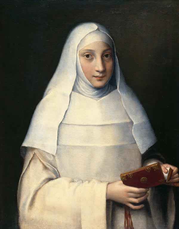
The Artist’s Sister in the Garb of a Nun by Sofonisba Anguissola, 1551, Oil on canvas, photo DIA.

Sofonisba Anguissola, a singular international talent

The exhibition starts off with a bang. Sofonisba Anguissola’s striking portrait of her sister Elena dressed as a nun hangs in solitary splendor on its own wall at the exhibition’s entrance.  Painted when Anguissola was only 16, this emotionally resonant white on white likeness foreshadows her future prominence as an internationally known portrait painter.

Unlike most of the artists in “By Her Hand,” Anguissola was not the daughter of a professional artist.   Her noble Cremonese father, Amilcore Anguissola, was an enlightened proponent of education for women. He arranged for all six of his daughters, of which Sofonisba was the eldest, to receive instruction in Latin, music and painting. Already a local art celebrity at a young age, she was known for painting a large number of self-portraits which served as calling cards advertising her skills. She was sufficiently celebrated in her twenties to be invited to join the Spanish court of Philip II in Madrid, where she later painted the portrait of Infante Don Fernando in 1573 which is now on view in the gallery. Unfortunately, not many of her paintings survive; most of the artworks from her Spanish residency were lost in a 17th century fire.

Fede Galizia, Orsola Maddelena Caccia, Diana Scultori, Lavinia Fontana enter the family business.

Each of the four artists who share the gallery adjoining the entrance found her own path to success in the cultural environment of her day. As was usual at the time, Fede Galizia, Orsola Maddelena Caccia, Lavinia Fontana and Diana Scultori all gained access to the art world through connection with their artist fathers, but from there their stories widely diverge.

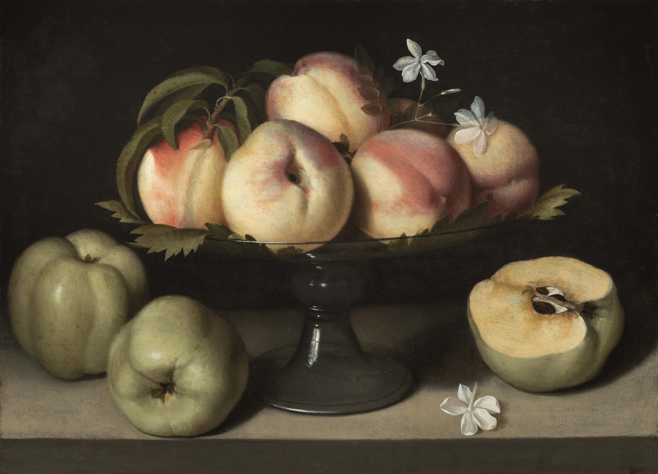
Glass Tazza with Peaches, Jasmine Flowers and Apples by Fede Galizia, 1607, oil on panel, photo DIA

Fede Galizia (1578- c.1630), the daughter of a well-known painter of miniatures, chose to concentrate on portraits and religious scenes, but was particularly admired as a pioneer in the new genre of still life.  The very beautiful, modestly sized Glass Tazza with Peaches, Jasmine Flowers and Apples featured in this exhibit is typical of her work. In it, a centrally positioned bowl of vibrantly colored fruit almost invites the viewer to reach out for a delicious taste.

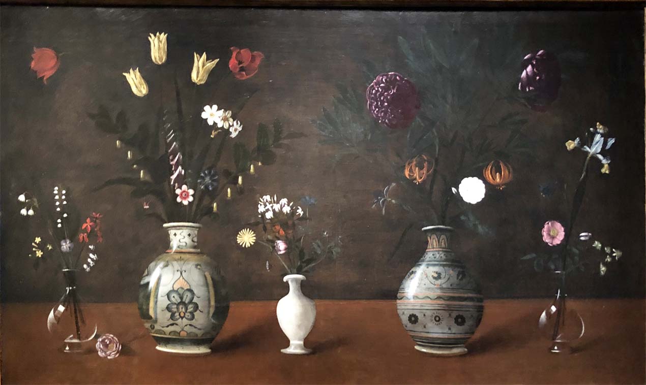
Vases of Flowers on a Table by Orsola Maddelena Caccia, 1615-25, oil on canvas, photo K.A. Letts

Perhaps the most interesting life story of the four is that of Orsola Maddalena Caccia (1596–1676).  Her father Guglielmo Caccia, a Mannerist painter, founded the Ursuline Convent at Moncalvo to shelter his six daughters from the political turbulence of the region. Caccia later became abbess there and encouraged the nuns to make art as a means to support the convent. She herself painted religious scenes as well as spiritually symbolic still life compositions. (Coincidentally three of Caccia’s paintings, which are vanishingly rare outside the region of their production, were recently donated to the Metropolitan Museum of Art in New York, where they now are on display in the newly reinstalled European painting galleries.)

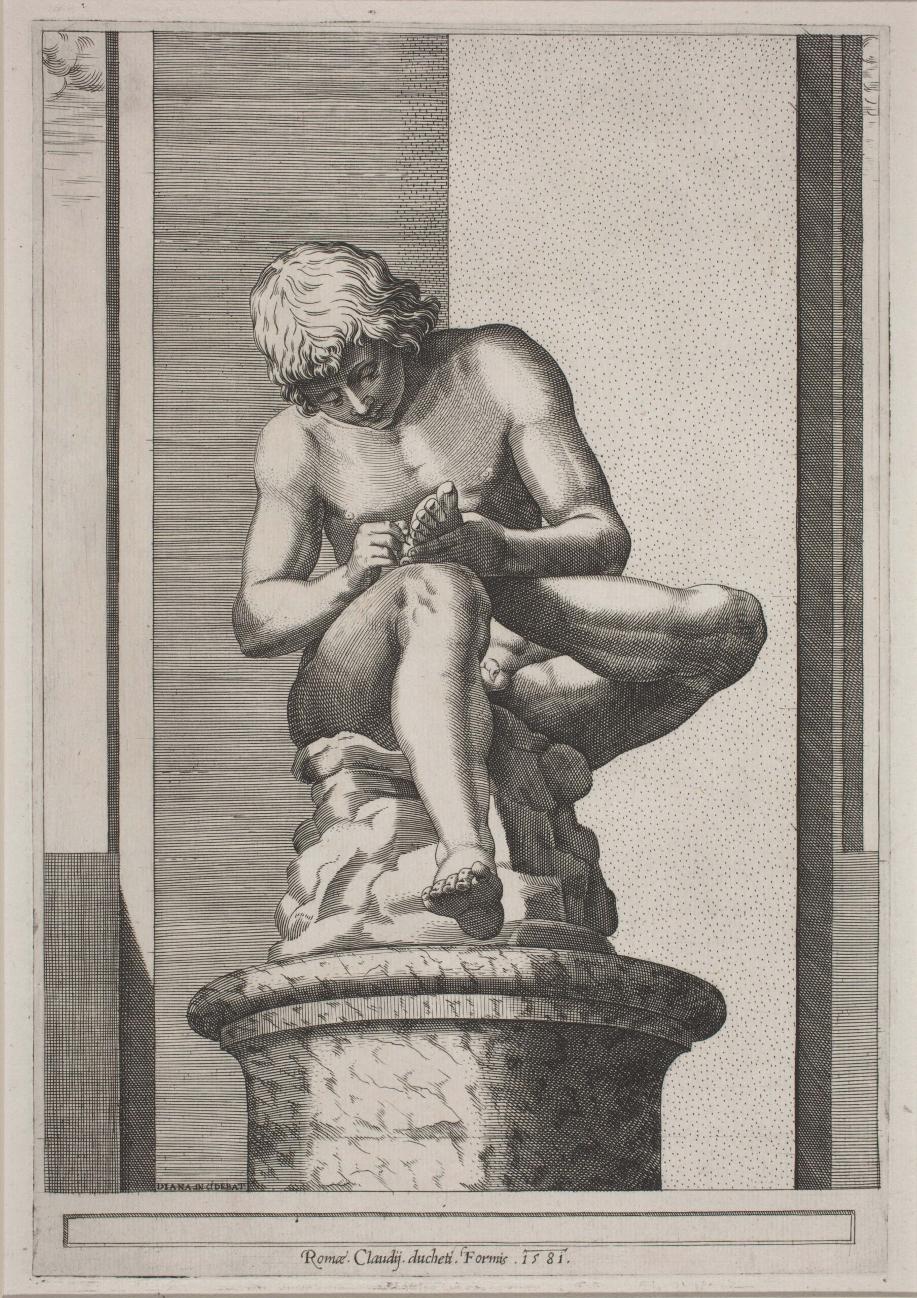
Spinario, State 1, by Diana Scultori 1581, engraving on laid paper, photo DIA

The engraver Diana Scultori (1547–1612), learned her craft from her father and used her expertise to promote the fortunes of her architect husband, Francesco da Volterra, during their long and productive professional lives in Rome. Lacking a strong foundation in drawing, and like many other engravers, Scultori often used other artists’ work as the basis for her prints. Most of the drawings for her engravings came from her husband, her father, or an artist with whom she was acquainted. She was well known during her life as a savvy businesswoman who promoted the interests of her family through the acquisition of the Papal Privilege, a kind of license that allowed her to make and market her own work.

Of the four painters in this gallery, Lavinia Fontana, (1552-1614) was probably the most famous during her lifetime. She had the good luck to be born in Bologna, where attitudes toward women in the professions, including art, were unusually enlightened. She was trained by her father Prospero Fontana and had a highly successful career as a portraitist, as well as a painter of mythological and religious subjects. Her meticulously observed and psychologically penetrating Portrait of Ginevra Aldrovandi Hercolani shows why the artist was greatly admired by her contemporaries.

Giovanna Garzoni and Elisabetta Sirani

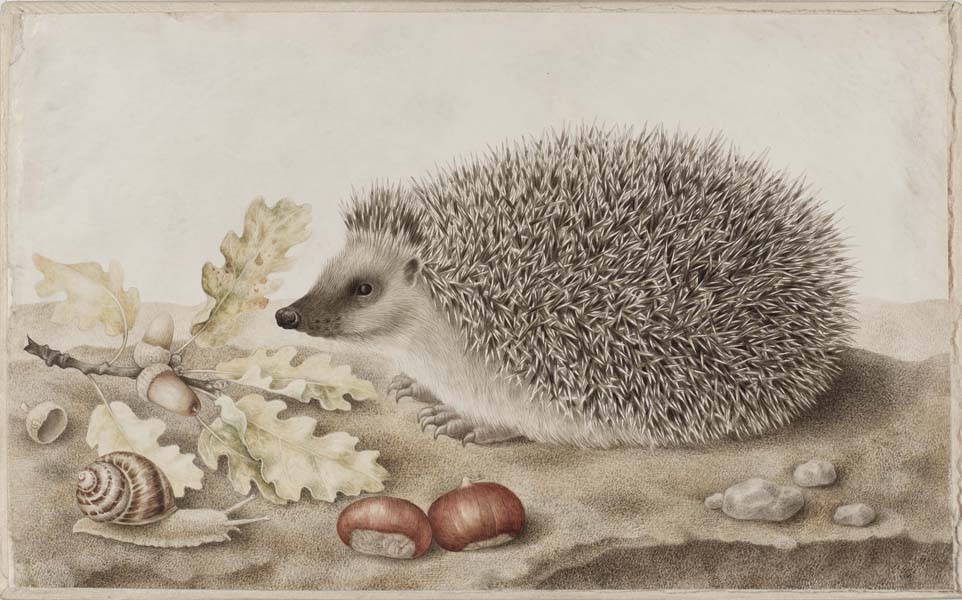
A Hedgehog in a Landscape by Giovanna Garzoni, 1643-1651, bodycolor on vellum, photo DIA

The sensitively rendered still life paintings of Giovanna Garzoni (1600-1670), are a highlight of this exhibition; they reward the viewer’s attention with a palpable sense of connection to the artist and her world. Garzoni, who never married, was essentially an itinerant painter who created work for wealthy patrons in Venice, Naples, Florence and Rome. The accuracy and intimacy of Garzoni’s gaze is particularly evident in her wonderfully realized Hedgehog in a Landscape. Each quill of the little creature is lovingly depicted; his soft undercoat is in delightful contrast to his pointy claws and twitchy nose and the chestnuts in the foreground look good enough to eat.

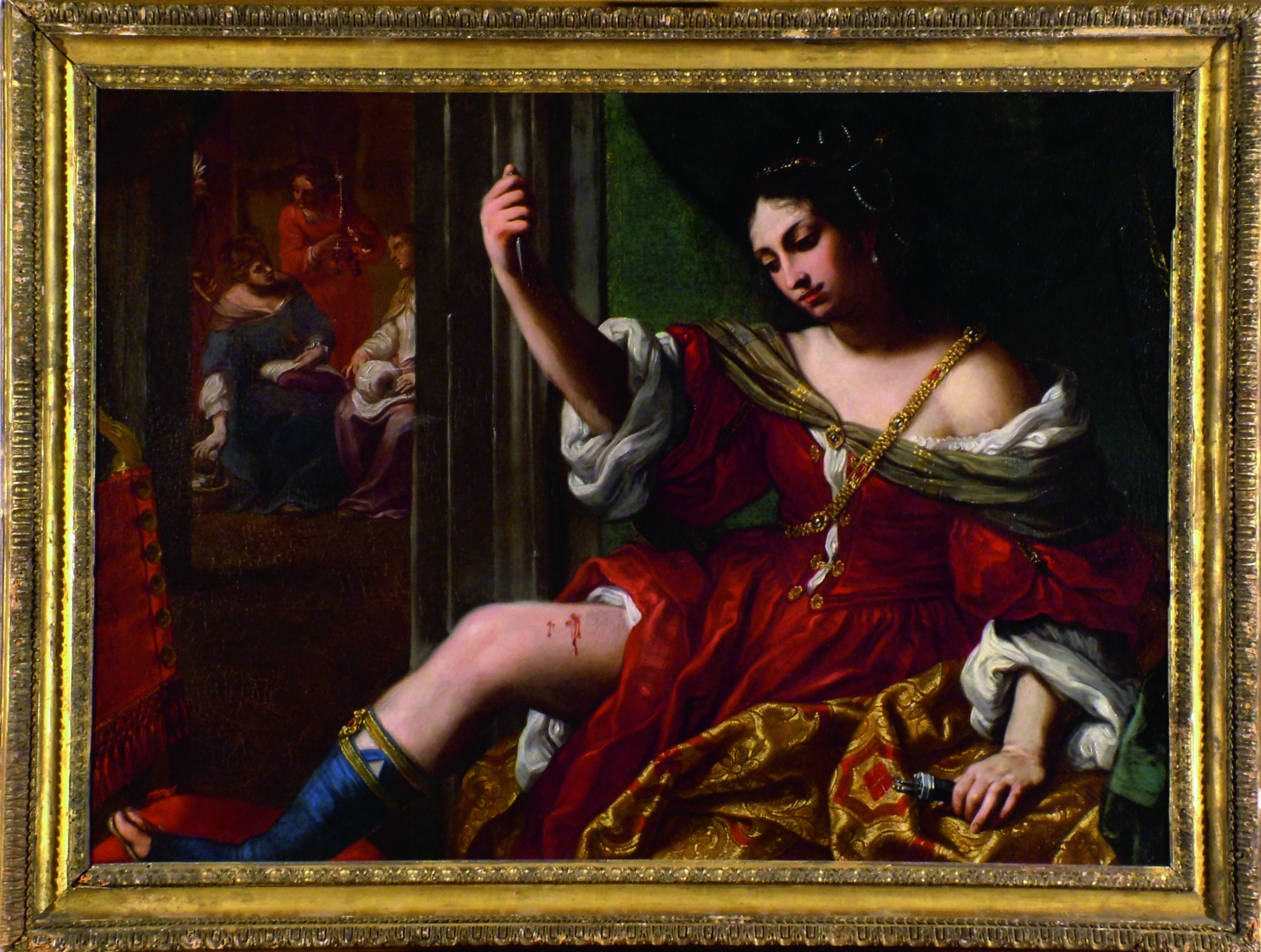
Portia Wounding Her Thigh by Elisabetta Sirani,1664, Oil on canvas. Photo DIA

On the opposite wall of the gallery from Garzoni’s artworks, we find the prolific Bolognese painter Elisabetta Sirani (1638-1665). Throughout her short but intense career, Sirani painted a wide range of subjects, from portraits to allegories to religious themes.  Not only was she the source of a remarkably abundant body of work, Sirani founded a painting school for aspiring woman artists. Her painting in this exhibition, Portia Wounding Her Thigh, is remarkable for a number of reasons.  In addition to the rarity of the theme, the veiled eroticism of the subject’s exposed thigh and her dreamy facial expression make this composition startlingly complex on a psychological level. To a modern eye, Sirani’s choice of self-cutting as a mark of female agency may seem fraught, but there is no denying that this is a major painting by a woman artist from the Baroque period.

Artemisia Gentileschi

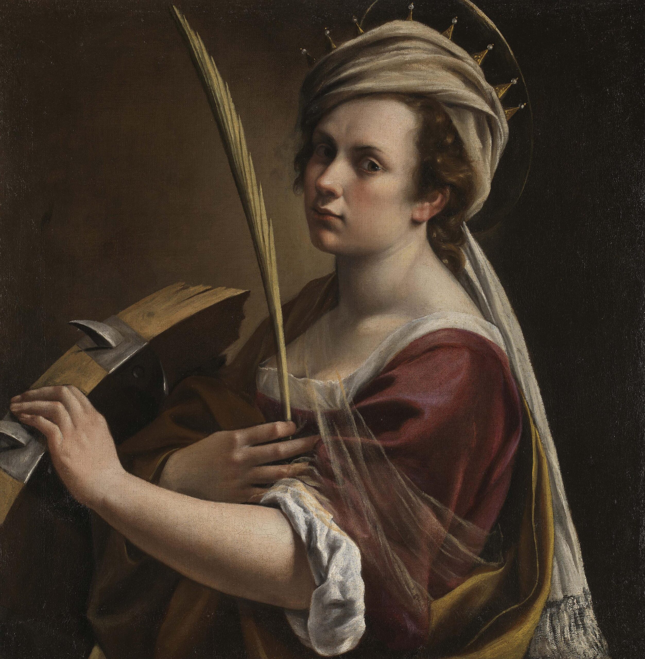
Self-Portrait as Saint Catherine of Alexandria by Artemisia Gentileschi, 1615–1617, Oil on canvas, photo DIA

The central placement of Artemisia Gentileschi’s famous painting Judith and Her Maidservant with the Head of Holofernes, one of the gems in the DIA’s permanent collection, leaves no doubt that she is the star of this show. The subject of the virtuous Judith triumphing over the villainous Holofernes was a favorite of Renaissance and Baroque painters, but Gentileschi (1593-1652/53) tells the story here with remarkable energy and immediacy. The cinematic play of light and shadow across the face and arm of Judith and the powerful dynamism of the two women united in murderous sisterhood makes this painting unique.

In acknowledgment of Gentileschi’s well-deserved status as the quintessential female painter of the Baroque era, the museum has produced an informative and insightful video that puts her in art historical context and provides welcome detail for understanding of Gentileschi’s life and times.

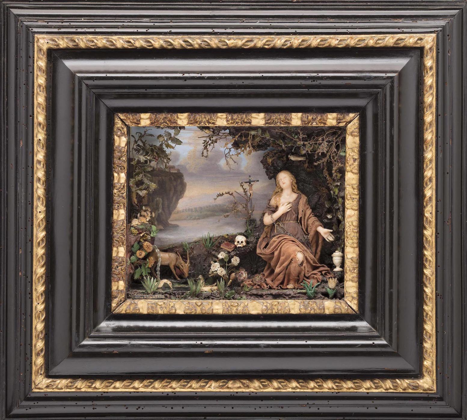
Penitent Magdalene by Caterina de Julianis, 1717, Polychrome wax, painted paper, glass, tempera on paper, and other materials.

The final gallery in the exhibition, which features work by women artists from the eighteenth century, suffers from a puzzling sense of decline in the energy and scale in the work. Or possibly the bravura visual fireworks of the paintings by Elisabetta Sirani, Giovanna Garzoni and Artemisia Gentileschi in the previous gallery are simply a hard act to follow. Of some interest is the lone 3-dimensional piece in the show, Penitent Magdalene by Caterina de Julianis (1670-1743). The diorama, which is part of the DIA’s permanent collection, contains a small female wax figurine in a wooded environment, surrounded by animals and symbolic elements. The exhibition ends as it began, with a single painting, a  restrained self-portrait of the Florentine artist Anna Bacherini Piattoli (1720-1788), currently on loan from the Uffizi.

The virtuosic and often transcendent work that comprises “By Her Hand: Artemisia Gentileschi and Women Artists in Italy, 1500-1800” will be on view at the DIA until May 29, 2022. This expertly curated and enlightening exhibition tells the story of women artists who were eminent and highly successful in their time but were often rendered posthumously obscure through misattribution of their work to more famous male artists and other forms of art historical neglect. Shows like this are an important corrective to previous critical malpractice.

While the exhibition’s press release lists the Detroit Institute of Art and the Wadsworth Atheneum as the organizers of “By Her Hand,” it would be a shame not to acknowledge the contributions of the co-curators of this expertly researched and beautifully installed show by name: Eve Straussman-Pflanzer, former Head of European Art Department & Elizabeth and Allan Sheldon Curator of European Paintings at the DIA (and now Curator of Italian and Spanish Paintings at the National Gallery of Art, Washington D.C.)  and Doctor Oliver Tostmann, Susan Morse Hilles Curator of European Art at the Wadsworth Atheneum.


Zenax @ Library Street Collective

Untitled (high blood pressure, depression, antipsychotic, depression, anxiety) by Beverly Fishman, 2021, urethane on wood panel, 48” x 113” photo: K.A. Letts

Zenax, an exhibit featuring thought-provoking work by two creative voices in dialog, is on view at the Library Street Collective until January 6. Detroit artist Beverly Fishman and California painter Gary Lang have combined the words Zen and Xanax in the exhibit’s title, creating a neologism that deftly names each artist’s thematic intent. The work of both bears a passing resemblance to the self-referential minimalist paintings and constructions of Frank Stella and Kenneth Noland, but Fishman and Lang appropriate and subvert the memes and tropes of 1960’s and 70’s minimalism to achieve their very different–and quite specific–goals.

Beverly Fishman

Fishman’s wall constructions speak the language of manufactured consumer products, of blister packs and digital devices. But most especially they speak the language of pharmaceuticals. As part of her ongoing studio practice, she explores the implications, both good and not-so-good, of pharmacological self-modification in emotion and behavior.

Fishman has researched, online, the seductive shapes, colors, and surface sheen of pills and drug packaging to develop her idiosyncratic visual vocabulary. Using these found shapes as source material, she begins her creative process with collages in a variety of materials and in colors that range from the fleshy pink tints of makeup to paint sample colors from the hardware store. Specialists then fabricate the slightly convex trapezoids, rounded polygons and bisected sections of circles. They are finished with smooth, featureless surfaces in consumerist colors, which are assembled into the final artworks. Fishman links the slickly constructed components based on her intuitive sense of how the shapes and colors interact. Her compositional intention is tore-configure and re-arrange them “until they finally surprise me.”

Untitled (depression, depression, adhd) by Beverly Fishman, 2021, urethane on wood panel, 42´x 43” photo: K.A. Letts

Fishman’s 5-piece wall construction, Untitled (high blood pressure, depression, antipsychotic, depression, anxiety), is the largest of the four pieces she has contributed to Zenax, and showcases her creative strategy. The color palette is an aggressively pleasant combination of pastel and neon hues that are at once both attractive and slightly ominous. The consumer-friendly colors—pinks, aquas and burgundies—are bordered by neon reds, greens and oranges that both unify the composition and militantly guard the boundaries of the constituent shapes.

Perhaps more than most artists, Fishman uses the titles of her wall constructions to guide the viewer toward her underlying theme. She both praises and condemns modern medicine for giving us the dubious capacity to deliver social control on a molecular level–scientific advances with unexpected side effects. Her somber observation:  pharmacology has advanced to the point that drugs can control not only how we behave, but what we are allowed to feel.


Gary Lang

After the chilly perfection of Fishman’s shaped artworks, the three paintings by Gary Lang in Zenax seem almost lyrical. While subtle, the sweep of his brush and its interaction with the surface of the painting is palpable and ever-present. Lang works within the same visual language of geometry and optics as Fishman, but his aim is transcendence. His meditative use of repetition and a highly organized, yet intuitive compositional methodology results in paintings that seem to vibrate with silent energy.

Maverick 2 by Gary Lang, 2021, acrylic on canvas, 53” x 53” photo: K.A. Letts

Lang skillfully wields the optical properties of his colors to manipulate the perception of the space within his paintings. Maverick 2, shows this strategy at work. A black square-framed in white marks the outer boundary of the painting. A thinner black and white frame repeats the outer boundary and seems to invite entrance. Two flat bands of green and orange mark the surface of the inner picture plane, with a gray shadow seeming to raise them slightly off the surface. Lang leads the eye into the fictive space behind the surface with carefully calibrated, concentric veils of translucent yellow-green. Yet another double band of flat color delivers us–finally–to the glowing inner core of the painting.

His painting ROR bears a passing resemblance to the Ojo de Dios, a native American votive object, and provides another clue to the meditative aims of the artist. The repeated black diamonds alternating with flat primary bands and the graded yellow-green layers fading into white light once again beckon the viewer toward a higher state of being.

ROR by Gary Lang, 2021, acrylic on canvas, 91” x 103” photo: K.A. Letts

While the alternating and telescoping colors within the paintings appear calculated, for Lang they are intuitive. In a 2015 interview with Eric Fischl, he describes his method: “I juggle colors and spatial ratios compulsively prior to painting in order to get a mutable footprint, and adjust and articulate my notations spontaneously once [I am] painting.” The result is a body of work that invites comparison to sacred objects and altered states.

The artworks in Zenax share a common formal vocabulary that allows an interesting dialog between two artists who wield similar means toward contrasting ends. Fishman flatly rejects the purely formal; her work is specifically referential and represents a kind of socially engaged abstraction. Lang’s aims are specific as well but refer to the life of the spirit. Consciousness is the subject at hand for both artists though: its nature, its susceptibility to alteration by means pharmacological or spiritual. It’s a conversation worth having.

Zenax @ Library Street Collective install image courtesy LSC.

Zenax @ Library Street Collective through January 6, 2022


Shirley Woodson @ DAM

Shirley Woodson Celebrates Her Retrospective Exhibition at the Detroit Artist Market

Why Do I Delight, by Shirley Woodson, 2021, neon signage, photo courtesy of Detroit Artist Market

Shirley Woodson: Why Do I Delight, a solo show and retrospective exhibit honoring the work and life of 2021 Kresge Eminent Artist Shirley Woodson, opened on September 24 and will be on display at Detroit Artists Market until October 23. The thirteenth Detroit recipient of this honor by the Kresge Foundation, Woodson is an accomplished artist, a veteran educator, an avid collector; she has also been a mentor to countless young Detroit artists throughout her 60-year career. In addition to this exhibit and as part of a celebration of her many contributions to the cultural life of the city, she is the subject of a recently released monograph produced by the Kresge Foundation, entitled “A Palette for the People.”  She is also the recipient of a no-strings-attached $50,000 prize.

Why Do I Delight, Kresge Eminent Artist exhibit installation, 2021, at Detroit Artists Market, photo courtesy of Charlene Uresy

Woodson is a lifelong Detroiter.  Her family moved to the city in 1938 from Pulaski, Tennessee, searching for opportunities denied them in the Jim Crow South.   They prospered here and set down deep roots. Woodson says, “In those days, everyone wanted the same thing, I think, opportunity, opportunity.  We found it in Detroit and never looked back.”

In childhood, Woodson found her twin loves, art and education, and has devoted her life both to making art and to sharing it with young artists as an arts educator. Woodson graduated with an M.F.A. in painting from Wayne State University in 1958, followed in 1965 with an M.A. in education, which enabled her to pursue a career teaching art in the Detroit Public Schools, Highland Park Community College, and Eastern Michigan University. She later returned to the Detroit Public Schools as an administrator to supervise the art education program.  Peter Crow, who worked as an art teacher under Woodson’s leadership, describes her influence:

“If you want to say something about Shirley’s impact on art teaching in Detroit schools it would be that it was Shirley who set the high standard for art teaching in the city. She insisted on hiring qualified teachers and, if possible, teachers who were also artists. This was, I think, her philosophy. But it wasn’t necessarily new. She felt that she was carrying on a tradition of high standards in Detroit for the teaching of art, one that she knew as a student and when she was teaching.”

Speaking from the perspective of a former student, multi-disciplinary artist Elizabeth Youngblood remembers her first impression of Shirley Woodson in the classroom, “I remember her looking too close to our age, too young to be the teacher.  I also remember how much fun she brought.  Shirley believed in me making art before I did.”  Youngblood describes Woodson’s influence on many young Black artists as pivotal: “If she didn’t make a piece of art at all and only worked as an arts administrator who’s done everything for so long to make sure other people could make art, and kids could have some real-life idea that there are such people, artists, out there, that would be enough to celebrate Shirley Woodson.“

But of course, Shirley Woodson could and did–and does–make art. Even as she taught and mentored young artists, co-founded and led organizations like the National Conference of Artists, organized shows, ran galleries, and collected art, Woodson has maintained an active and productive studio practice. The current retrospective at Detroit Artists Market serves up a range of work the artist has created throughout her career, as well as some new artworks in a surprising variety of media.

Shirley Woodson, Beach Scene, 1966, collage, gouache, graphic on board, photo by K.A. Letts

An early work, Beach Scene, sets the table for themes and subjects Woodson has returned to over the course of her career.  Painted in 1966, the painting features shrouded female figures that face the viewer in the foreground, setting up a distant spatial relationship with the silhouetted presences on the faraway beach with a roiling sky overhead.  Compared to her later work, the palette is fairly monochrome, though specks of gold leaf give a welcome sparkle to the hazy surface. Adjacent to this rather subdued and small-scale piece, Dreams #3, from 1995, functions as a declaration of the artist’s intent to follow her own inclinations as a colorist and as a painter of signs and symbols.

Shirley Woodson, Dream #3, 1995, acrylic on canvas, photo by K.A. Letts

The curator of Why Do I Delight, Leslie Graves, has included a sizeable collection of oil pastels from the 1990’s in the exhibit, which seem to show the artist moving toward complete abstraction.  The perfunctorily rendered trees in these compositions barely nod at representation, focusing instead on flat circular planes and their relationship with each other. Woodson employs the premise of the tree forms to explore the interaction of the colors within the ovoid shapes.

Shirley Woodson, Green Vase Nocturnal for Toni Morrison, 2021, acrylic on canvas, photo by K.A. Letts

Three large paintings from 2021 show that Woodson is still actively exploring the parameters of her mature style, which is characterized by lush color, gestural brushwork and a flattened picture plane. Elements of the background and the foreground meet and mingle in a visual conversation. It’s only fair that Fauves like Henri Matisse and Raul Dufy come to mind when looking at these paintings, since they were among the first European avant-garde artists to make a study of African and Oceanic art.  Woodson returns the favor here, employing the visual syntax of European painters to suit her own–African American–purposes. Green Vase Nocturne for Toni Morrison is typical of this most recent work, a lyrical composition that suggests a twilight fish pool, the outline of a vase super-imposed and refracting wavey images, all surrounded by shadowy figures.

In a somewhat startling departure from her previous work, Woodson displays some new text-based artworks in Why Do I Delight, and in particular, has included a couple of neon pieces that bear witness to her lively interest in contemporary trends and her ongoing appetite for exploration. The wistful line “Why do I delight?” appears in glowing yellow,  taken from a poem that the artist wrote for her late husband Edsel Reid, while nearby, the words Being Pedestr-ian, in basic white, adorn the gallery wall and resonate with her wry humor, precisely describing what she is not.

Receiving the Kresge Eminent Artist award certainly marks a well-deserved honor in Shirley Woodson’s life, but based upon the work in her current solo show at Detroit Artists Market it is abundantly clear that her creative career is far from over. As she herself eloquently puts it: “The artist is always confronted with the next step.  You learn to see every step of the process as a question: What can I share with people? What do I still have to say?”

She adds, “I’m listening and waiting.”

Shirley Woodson, Blue Vase for Sarah Vaughn

Shirley Woodson Celebrates Her Retrospective Exhibition at the Detroit Artist Market through October 23, 2021

Best Times @ David Klein Gallery

Best Times Installation at David Klein Gallery, photo: K.A. Letts

“They were the best of times, they were the worst of times…”     

As Charles Dickens begins his 1859 novel, A Tale of Two Cities, he describes a historical period of political and social turbulence that is, in some ways, similar to our own.  To those disposed to pessimism, 2021 might seem like a time to despair, but the artists now showing work in Best Times at David Klein Gallery beg to differ. They celebrate beauty–in the natural world, in art, in everyday objects–while remaining clear-eyed observers of contemporary life and its discontents. Color is the star of the show here; its emotional impact ranges from the giddy pastel polygons of Sylvain Malfroy-Camine to the contemplative gray formalism of Matthew Hawtin, with quite a lot in between.

Late Stage, New Age (red exercise band infinity, sage, Kombucha, green aura) by Cooper Holoweski, 2020, mixed media, 40 x 24.75 inches, photo courtesy of David Klein Gallery

Cooper Holoweski sets the tone for the exhibit with conceptually and procedurally complex works on paper from his Late Stage, New Age series of works on paper.  He seems both enamored by and critical of the technological ecosystem’s marvels. Each piece is a demonstration of complex digital processes such as inkjet printing and laser cutting in dialog with the images of technology that their use makes possible. The cheerful consumerist palette of these mixed media artworks sets up an uneasy resonance with ghostly, truncated human anatomy. Juxtaposed with mundane food and household products, digital devices intrude–a new, added component to daily life that alters the human experience of the self and the environment.

Untitled (January 15) by Lauren Semivan, 2021, archival pigment print, 50 x 40 inches, photo courtesy of David Klein Gallery

Similarly-sized archival pigment prints by Lauren Semivan make an interesting point of comparison to Holoweski’s work. Her lyrical photo collages are composed of humble detritus–fairly anonymous, slightly used paper napkins, net tulle fabric, and the like. Those diaphanous and often translucent elements are bisected with thin lines of color, transforming the shallow fictive space into elegant compositions that fool the eye. The artist describes color in her work as an “emotional descriptor.”  Up close, the marks and scratches on the surface suggest imagined topographies and the physical records of human presence. Step back though, and the picture begins to pulse with the luminosity of a cloudy sky.

Lost City #2 by Susan Goethel Campbell, 2020, two-layered perforated woodblock print on Goyu paper, edition of 5, 23.5 x 31 inches, photo courtesy of David Klein Gallery

Susan Goethel Campbell’s color-saturated and heavily pierced works on paper describe tropical landscapes seen from above.  From a distance their source in aerial photography is evident, but as we draw nearer, the subtle striations of the wood block printing plates she uses to apply color and the tiny pin pricks that admit hues from the layer beneath begin to make the landscape dissolve into a dreamy abstract matrix of lines and shapes. Goethel Campbell’s choice of colors–acid-y greens, deep blues and aquatic turquoise–are evocative of equatorial environments but avoid the picture postcard aesthetic of tourist destinations.  The artist’s title for the series, Lost Cities, obliquely hints at the ephemeral nature of island ecosystems.

Sedition by Matthew Hawtin, 2020, collage on paper, 22 x 22 inches, photo courtesy of David Klein Gallery

In the middle gallery, Matthew Hawtin’s small, austere collages remain in the world of the handmade, but just barely.  His specialty is the subtle variation of textures and lines within a minimalist esthetic. These intimate artworks force us into closer examination, where we begin to discern the tiny differences in each severely cut rectilinear line and shape. There is something restful about contemplating the warm grays juxtaposed with clear bright reds and yellows.

A Specificity by Ben Pritchard, 2021, oil on panel, 8 x 10 inches, photo courtesy of David Klein Gallery

For gallery visitors who hunger for something a little more visceral than Hawtin’s cerebral formalism, a collection of heavily textured, richly colored abstractions by Ben Pritchard occupies the opposite wall and might be just the thing. These lush, impasto-ed paintings in robust blues, greens, oranges and browns bring to mind the idiosyncratic paintings of the early modernist Arthur Dove. Pritchard is a painter of signs and symbols–cryptic shapes that might be stylized animals or kites or moons, but remain just outside the realm of the known. They are objects of meditation, nonspecifically directing the range of our thoughts and emotions.

Yellow Rose Moon by Mitch Cope, 2021, oil on Masonite panel, 73 x 73 inches, photo courtesy of David Klein Gallery

From the two loosely painted floral tondos on view, Mitch Cope, who is best known for large-scale installations exploring the Detroit landscape and the objects within it, is taking a little vacation from all that. He seems to be having a great time. The frowsy, slightly retro painted blossoms on Masonite retain a kind of subtle urban surface that suggests found objects and undercuts the prettiness of the subject matter.

Rome by Sylvain Malfroy-Camine, 2021, oil and acrylic on canvas, 25 x 30.75 inches, photo courtesy of David Klein Gallery

Sylvain Malfroy-Camine’s many-sided paintings perhaps best describe the euphoric mood that pervades Best Times. Fenced within their polygonal pens, multi-colored ovals and swatches have escaped the earth’s gravity and float or explode inside the pictorial space. In addition to his studio practice, Malfroy-Camine is a musician, and the discrete spots of color in each artwork suggest musical notes in a jubilant symphony.

The artists in Best Times aren’t starry-eyed optimists. There are ample references to contemporary unease, from Cooper Holoweski’s cheerily ominous digital devices to Susan Goethal Campbell’s lush depictions of fugitive coastlines. But hope is a choice, and for right now, the joyful ambience of this summer collection seems right.

Best of Times, Group Exhibition, through August 28th, 2021 at the David Klein Gallery

With Eyes Wide Opened @ Cranbrook Museum of Art

Cranbrook Museum of Art, With Eyes Opened, Sculpture Court and Mixing Chamber, installation, photo: PD Rearick

With Eyes Opened: Cranbrook Academy of Art since 1932 has just opened at the Cranbrook Museum of Art in Bloomfield Hills, to great acclaim and national attention. Covered by the New York Times Magazine with a spiffy video tour and ample media attention both local and national, it’s a hydra-headed beast of a show with many sponsors but no single curator. Objects and images from every period of the Academy’s history compete for space and attention, with no fewer than ten dueling accounts threaded throughout the museum’s seven galleries.

The organizers seem to have had difficulty settling on a single narrative for this exhaustive survey of the Academy’s history–and no wonder. The tapestries, sculptures, paintings, prints, photographs, product prototypes and mass-produced products tell a kaleidoscopic story of the many creative minds whose vision and creativity have emanated from the school over time.

The history of this premier American art institution is told through objects in only piecemeal fashion in the physical exhibit; the accompanying printed volume, a 624-page doorstop of a book, contains a more complete narrative of the school’s history, along with one-page profiles of many (though not all) of the artists and designers represented in the show.

Untitled (Aluchair) by Christopher Schanck (MFA, 3D Design 2011), 2019, aluminum foil, resin Collection Cranbrook Art Museum

At the entrance to the main gallery, visitors can watch American Look. Commissioned in 1958 by Chevrolet, this cold war artifact celebrates many of the post-World War II designed amenities that were newly available to middle class consumers of a certain limited demographic.  Throughout the celebratory video, the “American-ness” of the consumer lifestyle is promoted relentlessly. Even though the uncritical materialism may seem cringe-worthy to a modern viewer, the optimism and can-do mentality expressed in the video amply show why the period beginning in 1950 is often called the American Century. The film provides a good starting point for With Eyes Opened, which takes us on a visual tour not only of the mid-century American esthetic, but also, by implication, through a consideration of how those perceptions and values have grown and changed over time to include contemporary preoccupations with equity, diversity and sustainability.

Model 1601 Stacking Chair by Don Albinson (Cranbrook Academy of Art Sculpture, 1940-1941), 1965, aluminum, nylon, molded plastic. Photo PD Rearick

The video serves as an introduction to one of the more successful elements of the exhibit, which celebrates the modern chair. Designers like Charles and Ray Kaiser Eames and Don Albinson  were uniquely successful at conceptualizing and producing practical, relatively inexpensive and attractive mass production chairs, many instantly recognizable today as fixtures of modern life in home and office.  The chair as a concept unifies this display;  in addition to the mass produced chairs there are a number of hand-crafted, one-of-a-kind examples such as Chris Schank’s Alufoil  Chair and Terence Main’s  Queen Anne, Queen Anne doubled chair. Here, as throughout the exhibit, the organizers have decided to mix the mass-produced and the hand-crafted, without comparing or contrasting the purposes and philosophies involved.

Cranbrook Museum of Art, Sculpture Court, installation. Photo: DAR

The physical and esthetic center of the exhibition, which brings the concept of design and art to a satisfying apotheosis of the handmade and the mass-produced, comes in the Mixing Chamber. There,  the room-sized mural of black and white figures by Cleon Peterson suggests the sensibility of a 21st century Egon Schiele. Tortured, semi-nude bodies surround the wittily conceived bench by Vivian Beer, whose automotive-painted red drape on the slipper shape is at once modern and baroque.

Untitled (Asthma, High Blood Pressure) by Beverly Fishman (Artist-in-Residence, Dept. of Painting 1992-2019) 2018, urethane paint on wood. Photo: PD Rearick

In the adjacent North Gallery, 34 paintings, works on paper and photographs hang floor to ceiling, with abstraction as the ostensible unifying theme. The hanging of contemporary art salon style is a fraught strategy that calls for sensitively selected and carefully coordinated curation and enough space around each piece to allow the work to breathe.  Here the disparate artworks compete visually, like guests at a crowded cocktail party shouting to be heard.  Beverly Fishman’s brightly colored, sharp-edged geometric polygons (almost) hold their own, and McArthur Binion manages to succeed simply by installing a painting, DNA: Study (Lake St. Clair), too large to share the space with other artwork. As worthy as each piece in the gallery may be, a little editing would have been welcome.

Untitled by Rebecca Ripple (Artist-in-Residence, Dept. of Sculpture, 2017-present) 2016, plastic, aluminum brass, photocopy, pencil, hair, champagne foil. Photo: K.A. Letts

In the Sculpture Court, through the Mixing Chamber ‘s other doorway, Nick Cave’s exuberant  SoundSuit (2012) holds the floor, with a recessive companion, Flamer, by Mark Newport, hanging on the adjacent wall.  Duane Hanson’s provocatively banal figure lounges nearby, unimpressed. Other strong work in the sculpture court includes several fiber pieces which seem to have wandered in, perhaps to provide space between the large and diverse 3-dimensional works–not a bad idea as it turns out. The white-on-white tapestry Montana 30, by Colombian artist Olga de Amaral, made up of small squares of white painted canvas relieved with touches of red, is especially welcome here. Sculptures by artists of the past such as Marshall Fredericks and Carl Milles share the space, more or less peacefully, with artworks by younger artists like Tyanna Buie and Kate Clark. Toward the back of the gallery, James Surl’s spiky mobile floats in its own private galaxy, next to a terrific assemblage by Rebecca Ripple that radiates an ad hoc starburst of Miro-esque energy.

Auburndale Site, Detroit MI (#4) by Object Orange, 2006, archival color photograph, 1/25 Cranbrook Museum of Art. Photo: K.A. Letts

In a small side gallery near the elevators, three photographs by the art collective Object Orange deliver a moment of surreal surprise. From 2005-2007, these (anonymous) Cranbrook graduates undertook a conceptual project called Detroit, Demolition, Disneyland which involved painting–in “Tiggerific” Orange– derelict structures in the city as a form of both public performance and protest. The photographs, brilliant orange structures against bleak gray backgrounds, are arresting, unexpected and a bit melancholy.

Cranbrook Museum of Art, With Eyes Opened, Object Islands, installation, Photo: PD Rearick

The Wainger Gallery, last stop on the main floor galleries, features a clever installation of “object islands,” table height circular plinths that subtly guide the viewer through a broad array of fairly small- scale ceramics, metal objects and product design prototypes. Many of the objects in this gallery are one-of-a-kind art objects in a variety of media, often in unusual combinations, such as Iris Eichenberg’s untitled brooch made of porcelain, silver and linen.

With Eyes Opened takes on a lighter tone in the museum’s lower level gallery with The Menagerie, a whimsical collection of figures and objects inspired by the natural world, from Marshall Frederick’s chunky Two Bears to Stephen Malinowski’s photograph Cafeteria, a surreal bison-in-a-dining room.  The playful theme of The Menagerie is echoed nearby with a small collection of toy and playground designs that, while welcome, seem like an afterthought.

In the adjacent hall gallery, prints and posters highlight Cranbrook’s influential graphic design program. Installed next to printed media that feature collage, photomontage and progressive typography, several unique works hint at the endless formal potential of paper as a medium.  Elizabeth Youngblood’s elegant, silvery process drawing is tucked into a corner near Laurence Barker’s more exuberant hand-made paper piece.  Layers from the Disemboweled Series by Winifred Lutz takes the medium into the realm of expressionism.

Yet Untitled by Elizabeth Youngblood (MFA Design, 1975) 2018, paint, mylar. Photo: Glenn Mannisto

And last–but not least–some of Cranbrook Academy’s most recent graduates inhabit the lower level deSalle Gallery with distinction. Many of these young artists currently live and work in Detroit and continue the Academy’s tradition of excellence in both craft and conception. The growing diversity of the school is on display here, pointing to a more inclusive future, now enabled by the recent $30 million gift from Dan and Jennifer Gilbert to support student diversity.  Ricky Weaver’s gray and white photo-apparitions emanate spirituality, across from Ebitenyefa Baralaye’s Portrait II, a comic-sinister stoneware head.  Around the corner, Marianna Olague’s painting El Pleno Dia seems to emit its own light.  The emerging artists in this gallery demonstrate the continuing influence of the Academy’s alumni on the Detroit art scene and beyond.

With Eyes Opened is multi-faceted, rich and a little chaotic, more of a class reunion than a retrospective.  What comes through loud and clear in this exhaustive–and sometimes exhausting–survey, though, is the Academy’s continued vitality and its ongoing relevance to any discussion of the 21st century designed environment. And really, that’s enough.

Cranbrook Museum of Art, With Eyes Opened, deSalle Gallery, installation, Photo: P.D. Rearick.

Eyes Wide Open at Cranbrook Museum of Art through September 19, 2021

Page 6 of 9

Powered by WordPress & Theme by Anders Norén