“McMillan’s Chernobyl: An Intimation of the Way the World Would End,” at the Oakland University Art Gallery
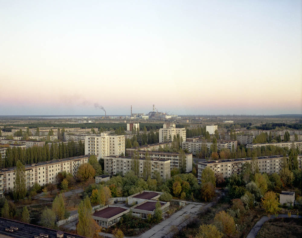
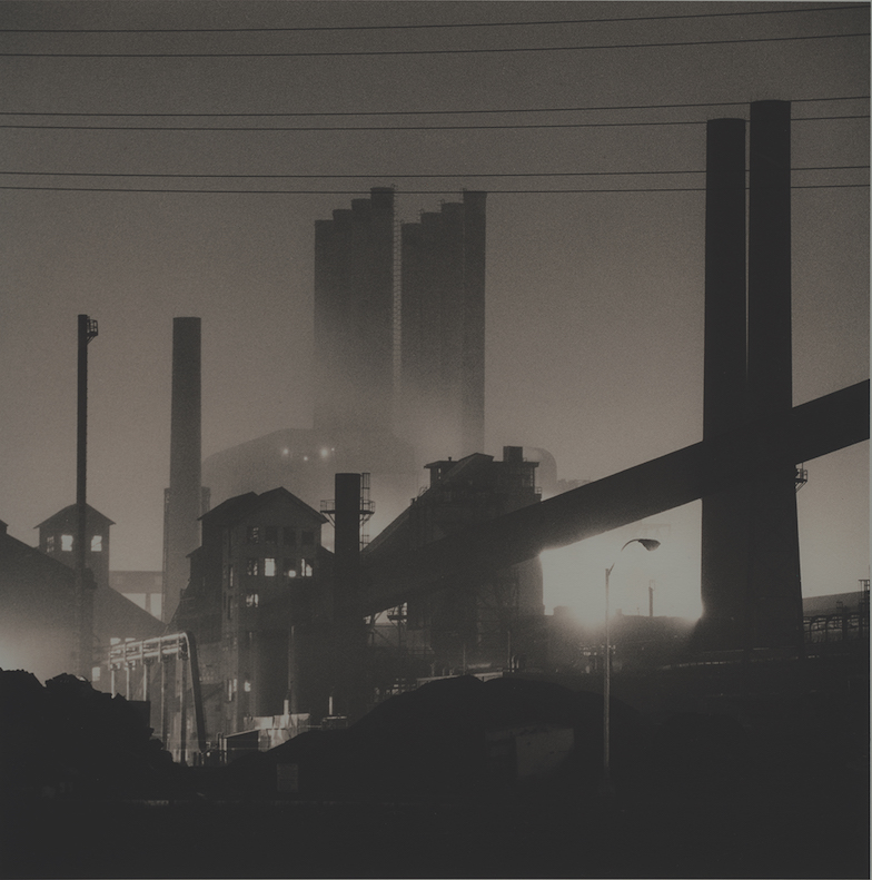
David McMillian, Pripyat Rooftop, Inkjet Print, 23 x 30″, 1994
If you are a Detroiter, it is impossible not to find an uncanny similarity between the (de)evolution of the Ukraine city of Chernobyl after the nuclear disaster there in 1986, as photographed by Scottish born, Canadian photographer David McMillan, and the photos of demolished-by-neglect Detroit over the roughly same years. Both cities became subjects for photographers, both became, are, victims of romanticizing modern urban ruins. One was an economic disaster and the other a technological accident. Both have tour agencies that offer tours of the spectacle of the, seeming oxymoronic, modern industrial city ruins. Both have artists whose photos and sculptural works have been celebrated as significant contributions to contemporary culture and art. But most significantly, both have had profoundly detrimental effects on the people who lived there, and somehow it seems like the least significant.
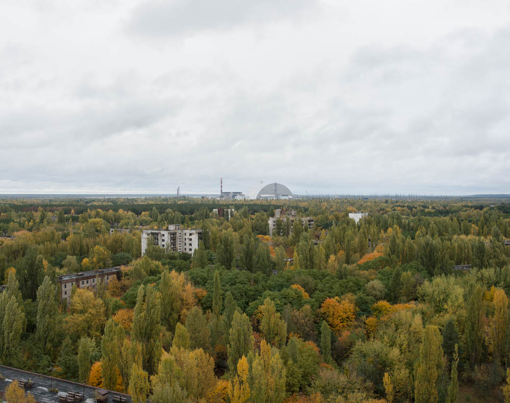
David McMillan, Pripyat Rooftop, Inkjet Print, 23 x 30″ 2017.”
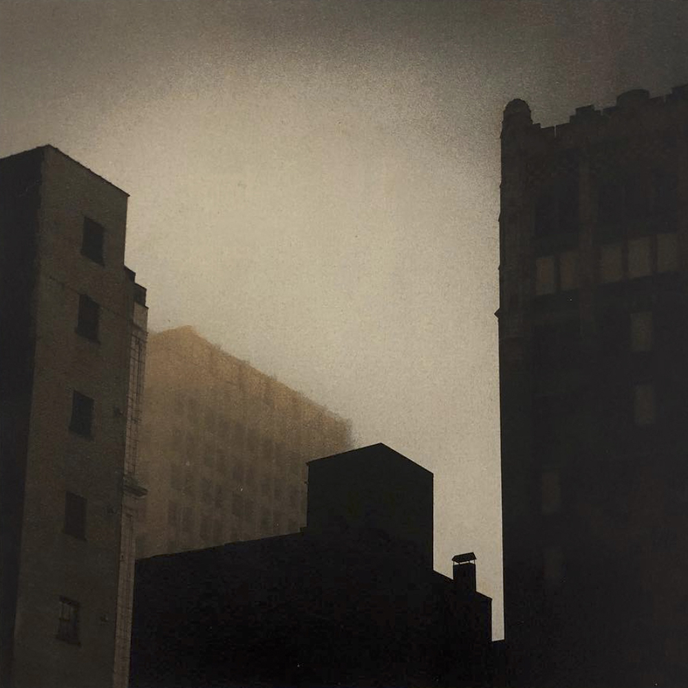
“McMillan’s Chernobyl: An Intimation of the Way the World Would End,” currently at Oakland University Art Gallery, is the result of McMillan’s twenty-two sojourns to Chernobyl since 1994 to photograph the heart wrenching changes over two decades in the radioactive urban landscape. It amounts to lifetime commitment. His photographs range from capturing the rapidity of nature’s (time is nature) eroding effects on the built landscape, the infrastructure that structures everyday life and the forgotten, forlorn artifacts of everyday life itself. From his first picture of the Chernobyl nuclear reactor from a rooftop in the nearby city of Prypiat one can sense absence and desolation. A complete city with proud looking apartment buildings and roads and landscaping but not a person or automobile evident, not a clothesline with a drying towel visible. A forced abandonment. Another photo taken from the same rooftop twenty-three years later palpably reveals the built world, having lain fallow for over thirty years, being swallowed and digested by nature.
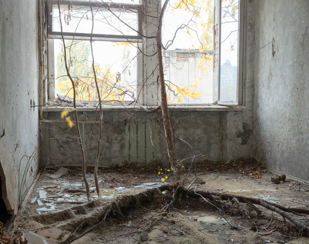
David McMillan, Hotel Room, Inkjet Print, 23 x 30, 1996.
McMillan’s are not romantic landscapes photos that aestheticize the ruins but revelational: he photographs the same site periodically to show change. At least eight sites in the exhibition were photographed periodically to show the invasive dynamics of nature. Aside from the photo of Chernobyl from the rooftop, dramatic changes can be seen in a number of intimate spaces. In 1996 he photographed a hotel room with an elm sapling growing in the middle of the room surrounded by small plants including a couple of ferns. Eight years later he photographed it again, revealing multiple saplings thriving in the small room. Photographed again nine year later, the sapling has become a full-fledged tree with large roots reaching out across the room. Meanwhile the atmosphere (fluctuating hot and freezing, humid and dry air) has stripped the walls of paint and plaster, leaving the room an inhospitable ruin.
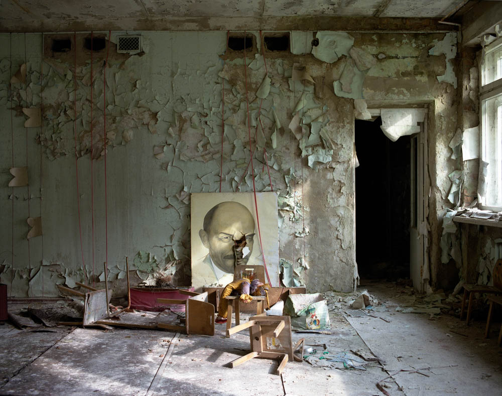
David McMillan, Portrait of Lenin, Inkjet Print, 25 x32, 1997.
McMillan isn’t without appreciation for the beauty of the derelict ruin and the well composed image. “Portrait of Lenin” is a beautifully decomposing school room with gorgeous scabs of paint peeling off the wall, children’s chairs upended and strewn around the room, one chair supporting a broken, abandoned doll, all watched over by a portrait of Soviet Russia’s famed leader Vladimir Lenin that sits on the floor, leaning against the wall. A subtle slant of light illuminates the room and particularly Lenin’s eye and a dark doorway in the back corner of the room balances the image.
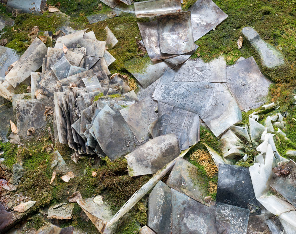
David McMillan, Photo Studio, Inkjet Print 30 x 38″, 2016.
There are a number of interior photographs, especially in the kindergarten rooms, that in their fragmented, disintegrating state, appear as constructed collages and, pardon the painting model, even abstract paintings. In a recent visit, he photographed a “Photo Studio, 2016” with a ream of moss covered photo paper, strewn and evolving toward becoming dirt. “Floor with Slippers, 2006,” while beautiful with its toxic looking pigments and randomly dispersed shoes, has the terrifying intimation of the wearers of those various shoes having been vaporized. While they might suggest a romantic indulgence with ruins, McMillan is much more interested in exploring the processes and results of decay, its inevitability everywhere.
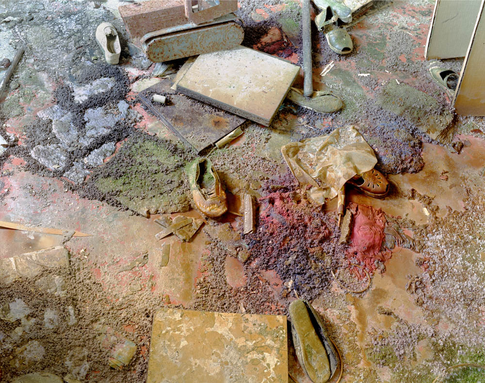
David McMillian, Floor with Slipper, Inkjet Print, 38 x 48″ 2006.
Yet we must abide by McMillan’s visual essay here and realize that there is a persistent optimism throughout. Everywhere we look there is a process of rebirth. McMillan focuses his camera on the ironic dispersal of berries, all kinds of fruits of bushes, as a counterpoint to decay. Rose hips (the fruit of rose bushes), blackberries, rowanberries, Mountain Ash berries, Wolfeberries, all photographed as if in competition with the chaos and the democracy of entropy.
Ironies and wry surprises abound everywhere you go in in McMillan’s Chernobyl. Photographed in 2006, “Trees and Fence” sees a galvanized fence enmeshed in a thicket of tree branches and shrubs making the fence a visual redundancy. “Blue Slide, 2009” reveals a children’s playground slide in the middle of an overgrown area, its graceful arc mimicking the desperate new growth of neighboring trees preventing any kind of play.
McMillan’s quiet, somber meditation on the phenomenon of nuclear disaster in Chernobyl is then always close to emotional grief as well as a bemused recognition of the dynamic resolution that is nature. It seems that in the course of twenty-two visits he himself evolved toward this passive acceptance and understanding of decay and rebirth. The baroque image “Geometry Classroom, 2015” with its wire models of geometric forms and it images of famed mathematicians, such as Sophie Germain and Johannes Kepler, framed by a lyrical geometric bookcase, is the arch commentary on human endeavor. Amidst the best laid plans of geometricians, the corrosive power of time has turned the geometry classroom into a geometric molecular nightmare.
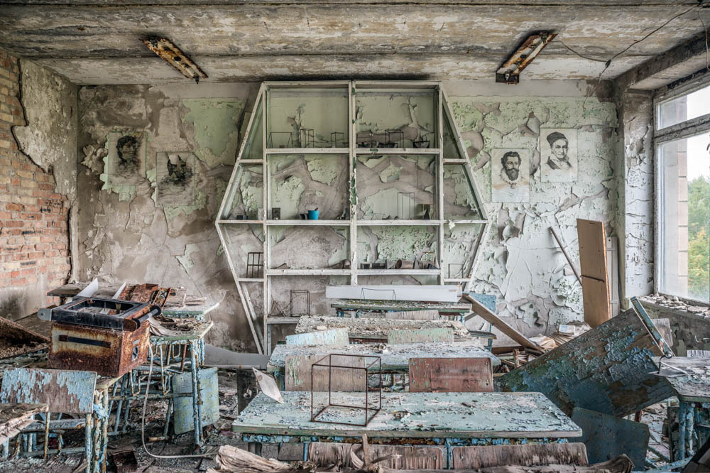
David McMillan, Geometry Classroom, Inkjet Print, 28 x 42″ 2015.
Curated by Oakland University professor of art history, Claude Baillargeon, in conjunction with the publication of McMillan’s monographGrowth and Decay: Prypiat and the Chernobyl Exclusion Zone (Steidl, 2018).
“McMillan’s Chernobyl” will run through March 31, 2019 at Oakland University Art Gallery