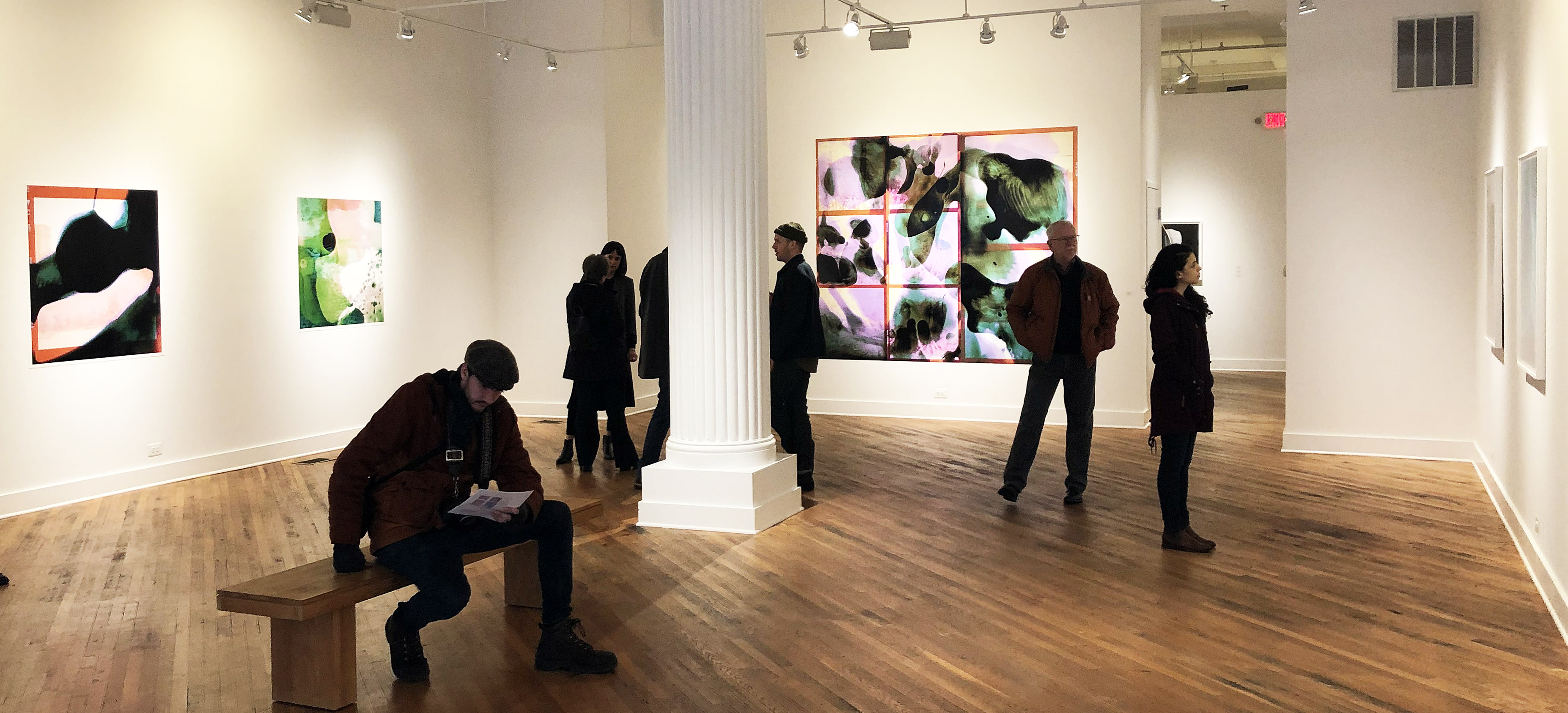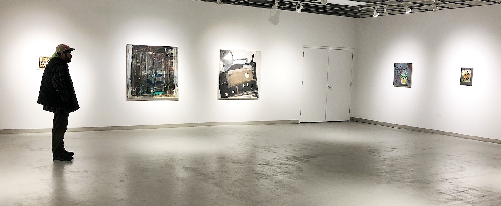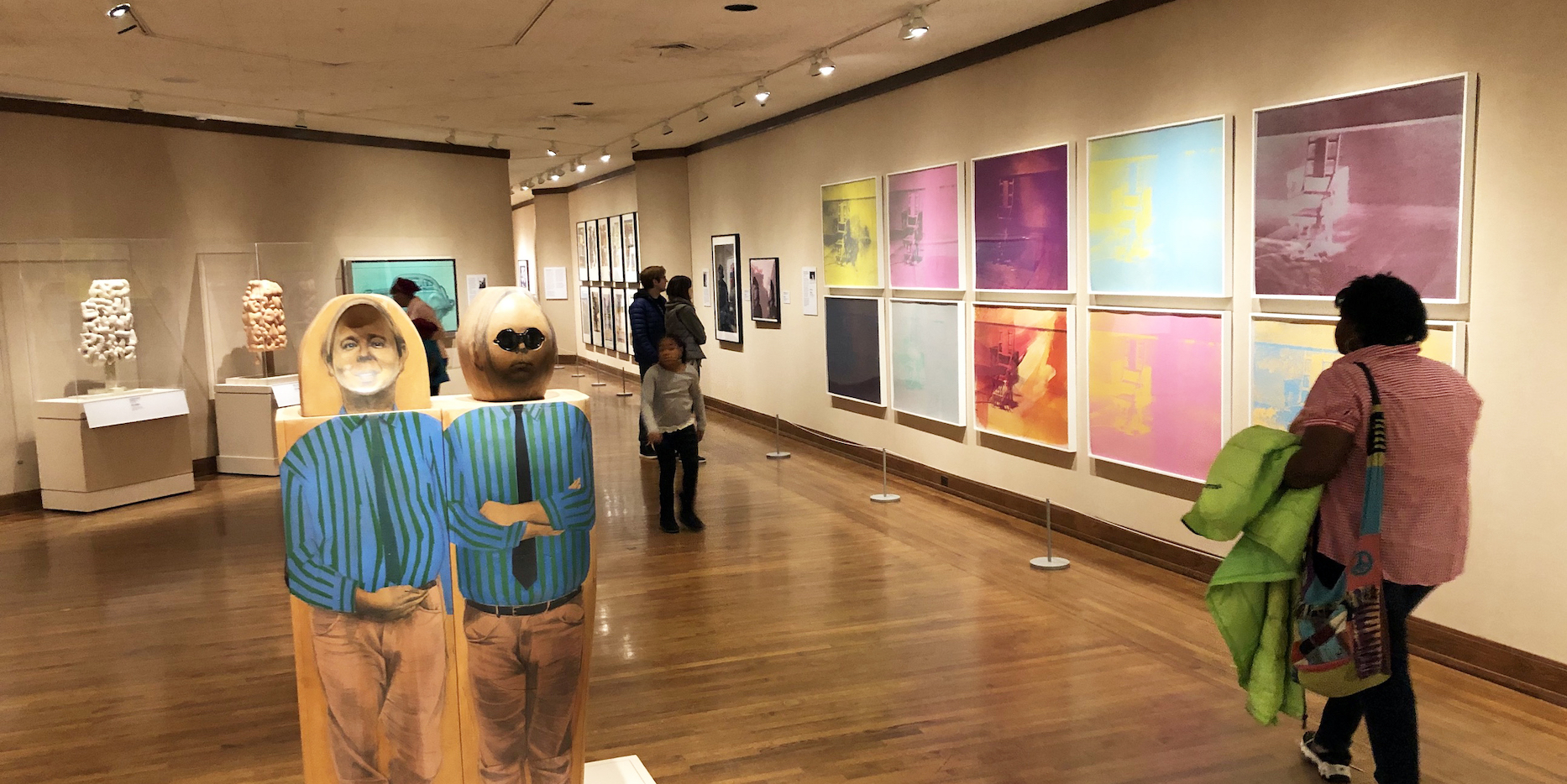
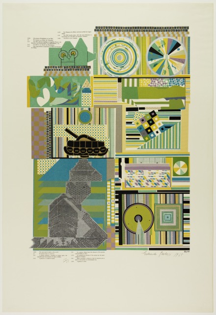
From Camelot to Kent State: Pop Art, 1960-1975, Detroit Institute of Art, Installation Image, Courtesy of DAR
Pop Art emerged in the mid to late 1950s and at its most potent was a high art version of what was being done in the low art pages of MAD magazine, being sold on newsstands at the same time. Its works were a challenge to and a satirical critique of cultural hierarchies, using the popular visual vocabulary of advertising, cinema, comic books and the superabundance of mass-produced banality. It was a reflexive attitude employing bland surfaces to disrupt culture with ironic precision. It was a movement that embraced emergent means of mechanical reproduction to comment on the Capitalist dream machine powered by the post-World War II assembly line.
But as the exhibition “From Camelot to Kent State: Pop Art, 1960-1975” at the Detroit Institute of Arts explores, a larger political project emerged from those artists associated with Pop Art to dismantle the machinery of Modernity as war and social injustice chipped away at the later half of the 20th century.
Works by a remarkable roster of artists including Jim Dine, Audrey Flack, Robert Indiana, Jasper Johns, Roy Lichtenstein, Marisol, Larry Rivers, Robert Rauschenberg, James Rosenquist, Ed Ruscha, May Stevens and Wayne Thiebaud fill out the exhibition, but there are a core group of works by Corita Kent, Claes Oldenburg, Eduardo Paolozzi, Richard Hamilton and Andy Warhol that serve as conceptual highlights to the Postmodern thrust of the Pop Art agenda.
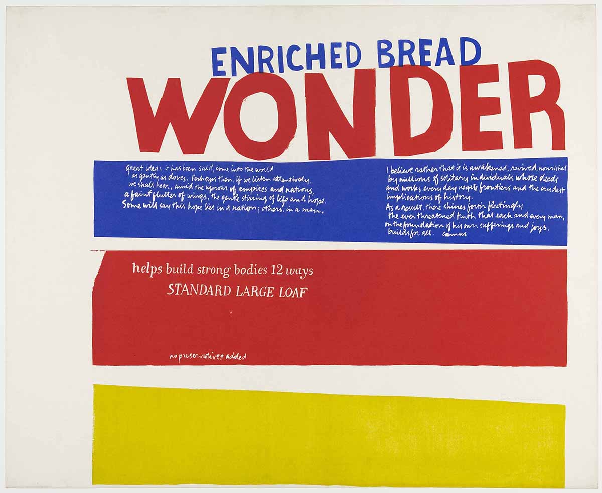
Corita Kent, “Enriched Bread” (1965), screen print printed in color on wove paper, 29 ¾ x 36 3/8 inches, All images and artwork courtesy of the Detroit Institute of Arts
The Heart
Enriched Bread (1965) by Corita Kent (1918-1986) is a screen print composed with three horizontal bands of the trinity of primary colors (plus white) so often employed in the rigorous Modernist projects of the Bauhaus and De Stijl. But as it happens, these are also the colors that designer Drew Miller chose in 1921 to adorn the packaging for that all-American lunch staple Wonder Bread. As the story goes, when the vice president of the Taggart Baking Company found himself in a state of “wonder” at the sight of hundreds of red, yellow and blue balloons being released at the International Balloon Race at the Indianapolis Motor Speedway, an idea for sliced bread packaging was born.
“WONDER” appears in large bold red letters below “ENRICHED BREAD” in blue. Further below, in white script on a strip of blue, is the following:
“Great ideas, it has been said, come into the world as gently as doves. Perhaps then, if we listen attentively, we shall hear, amid the uproar of empires and nations, a faint flutter of wings, the gentle stirring of life and hope. Some will say this hope lies in a nation; others in a man. I believe rather that it is awakened, received, nourished by millions of solitary individuals whose deeds and works everyday negate frontiers and the crudest implications of history. As a result, there shines forth fleetingly the ever threatened truth that each and every man, on the foundation of his own sufferings and joys, builds for all.”
This text was the closing to Albert Camus’ lecture Create Dangerously, delivered December 14, 1957 at the University of Uppsala in Sweden, four days after accepting the Nobel Prize in Literature. Camus, the most optimistic of Existentialist thinkers, was pointing the way toward a more constructive future a mere three years prior to his death at the age of 46 in an automobile accident.
Below this, on a strip of red, is “helps build strong bodies 12 ways” and “STANDARD LARGE LOAF” and “no preservatives added”.
At the bottom of the composition is an empty band of pure yellow.
The text in Enriched Bread is not professionally set: letters appear hand-cut, handwritten and hand-painted. Nor are the stacked bands of primary colors presented with Modernism’s clean straight edges. The handmade character of the printed image, bold when viewed at a distance, envelops the viewer in an intimate and heartfelt space upon closer reading.
Wonder Bread had the distinction of being part of a government-sponsored initiative during World War II rationing. Known as the “Quiet Miracle,” loaves were enriched with vitamins that had long gone missing due to the industrialization of bread production. There is a little miracle achieved with this print, which feels like a beating heart in the middle of the exhibition. Corita Kent was an American Roman Catholic religious sister who returned to secular life in 1968. She referenced Wonder Bread packaging in a number of works as a means to add enrichment to the image itself, reclaiming the mass marketed industrialized products of Modernity as a vehicle for intimate and meaningful conversation. What she accomplished with the transformation of her source material through critical recontextualizing, is a transformation of essence that calls to mind the Transubstantiation of the Eucharistic elements. This is not a cynical undermining of production line goods, but a kind of hopeful artistic alchemy that reasserts the humane by way of wonder.
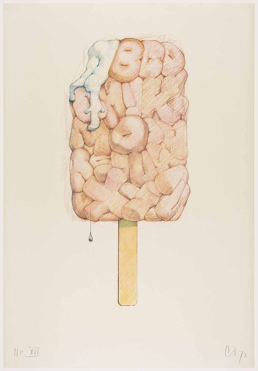
Claes Oldenburg, “Alphabet in the Form of a Good Humor Bar” (1970), offset photo-lithograph printed in color ink, 29 x 20 inches.
The Store
There are three iterations of a Good Humor brand ice cream bar on display in the exhibition, by Claes Oldenburg: Alphabet in the Form of a Good Humor Bar (1970) is an offset photo-lithograph from a colored pencil drawing, Alphabet/Good Humor—Cloth Study (1972-1973), a small standing cloth and wood sculpture, and Alphabet/Good Humor (1975), a cast resin and polyurethane enamel sculpture on a bronze base. All three pieces present the ubiquitous ice cream bar, a bite taken out of its upper left corner, as a neat slab of puffy and stubby letters, the alphabet from A to Z, pressed together. On both the lithograph and the enameled sculpture, there is a single drip at the base. In the print, the bite manifests as a letter “A” oozing a thick white cream that cascades over the letter “G.” It should be noted that the letter “O” is situated in the middle of the bar, and appears as a donut with a pinched center made all the more suggestive by the Caucasian flesh coloring chosen by Oldenburg. This implied eroticism mingling with the absurd is present throughout much of Oldenburg’s work as he takes the desire for commodified objects to a new level, locating their latent seductiveness. This began with his artist studio/storefront The Store, which he opened in the Lower East Side of Manhattan in 1961, and stocked with painted plaster replicas of candy bars, pastries and undergarments among other things. The sloppy application of enamel on each object satirized the heavy-handed masculine impulses of action painting as a mere advertisement of heavy breathing in the American consumerist landscape.
The Good Humor Bar was for Oldenberg, another in a collection of objects that symbolized commodity fetishism. There is a concern for economics running throughout his work. He has made use of the Good Humor Bar in many other works, dating as far back to 1963 with Soft Fur Good Humors, adorned with fake tiger and leopard skin. Then there is the 1965 Proposed Colossal Monument for Park Avenue, New York: Good Humor Bar, in which the enormous, slumped ice cream on a stick blocks traffic in the wealthiest of boulevards. In the 1971 print System of Iconography—Plug, Mouse, Good Humor, Lipstick, Switches, the ice cream bar sits alongside other iterations of the reimagined cultural commodity including his Geometric Mouse, a Constructivist variant on Mickey.
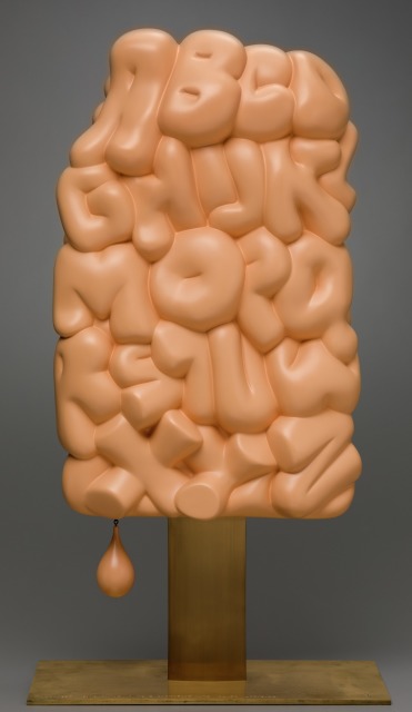
Claes Oldenburg, “Alphabet/Good Humor” (1975), cast resin plated with polyurethane enamel; bronze and wood,, 36 x 19 1/8 x 10 inches.
Alphabet/Good Humor is a uniquely absurd American object. It is both erotic and un-erotic, as its softness and fleshiness remains only a hardened illusion. There is the suggestion of this matrix for the English language eating itself or being eaten as letters pile up, crowding one another out in a suffocating orgy. It sells itself as something other than what it is. It is frozen in a state of forever melting away.
The Machine
Scottish artist Eduardo Paolozzi (1924-2005) was co-founder of the British proto-Pop project The Independent Group (1952-55), along with artist Richard Hamilton. He considered himself an “engineering artist,” approaching the act of image-making as industrial production. As early as 1954, the thematic thrust of Paolozzi’s prints involved the merging of machine and body, charting an assembly line wired with the human nervous system. In 1962 Paolozzi embraced the hitherto commercial process of screen printing to produce increasingly complex print imagery reflecting his concerns for humanity in the age of mechanical reproduction.
Included in the exhibition is Paolozzi’s ambitious portfolio of 12 screen prints from 1964, As Is When, which when first exhibited in 1965 was lauded by critics as “the first masterpiece in the medium.” Despite this acclaim, there were curators and print specialists who thought Paolozzi’s new print work was insufficiently handmade, as he had made use of appropriated imagery that was photographically reproduced. Unlike photography, which has long embraced a necessary technical progression, printmaking and printmakers have wrestled with issues of purity (hand-printing vs. machine printing), even though its very foundation was built upon notions of mass production and dissemination. Although Paolozzi’s embrace of commercial reproduction techniques placed him at odds with the fine art print establishment, As Is When did much to dismantle the hierarchy between “fine” and “applied” arts.
But the process by which As Is When was manufactured is necessarily a reflection of Paolozzi’s greater project. Repetition, seriality, mass production—terms that can describe printing but could also describe the media atmosphere from which the artist deconstructed and reconstructed imagery. In these prints we are presented with a dizzying mosaic of shifting information in the form of abstract patterns and the occasional incursion of representational elements. Each image contains fragments of text that develop a complex relationship between language and image. They are impossibly dense, but insistently engaging.
Drawn from the life and writings of Ludwig Wittgenstein (1889-1951), As Is When is an attempt by Paolozzi to represent the Austrian philosopher’s fragmentary construction of the experience of reality as a schism between language and the visible world. The complexity of Wittgenstein’s system of thinking, referenced from his text Tractatus Logico-Philosophicus (1921), posits the facts of Modernity as being what that are at any given moment. Stable meaning is illusory, merely a fragile geometry. As soon as Paolozzi’s images construct themselves, they break down. They are both stable and unstable
Eduardo Paolozzi, From the “As Is When” portfolio: “Experience” (1965), screen print printed in color ink on wove paper , 38 x 26 inches.
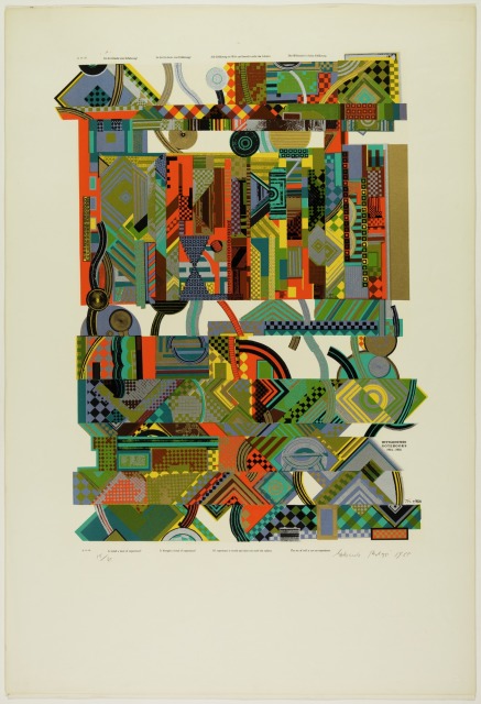
Eduardo Paolozzi, From the “As Is When” portfolio: “Reality” (1965), screen print printed in color ink on wove paper , 38 x 26 inches.
Appropriated from printed advertisements, technical manuals and newspapers, each of the twelve 38 x 26 inch prints presents a series of complex and abstract mappings in which the boldly colored and contrasted patterns keep the viewer in a state of perpetual collating, reorganizing that which appears to be already organized. As with Wittgenstein, Paolozzi begins with a logical structure only to lead his viewer to ever more perplexing states of irresolution. We are left with pure experience as Paolozzi reshuffles his text and image deck, disrupting the progression of narrative by jumbling meaning and creating new juxtapositions. This interest in appropriating material and then remixing and reengineering it is akin to the “cut-up technique” a collage approach to literary construction whereby a written text is cut up at random and rearranged to create a new text.
The new media landscape that Paolozzi was responding to, in which meaning was increasingly susceptible to dissolution, was chipping away at society’s ability to feel. Paolozzi’s close friend, the British novelist J.G. Ballard (1930-2009), described this in the preface to the 1974 French edition of his 1973 novel Crash, which concerns the sexual fetishization of automobile accidents as a metaphor for technological alienation and the death of feeling:
“The marriage of reason and nightmare which has dominated the 20th century has given birth to an ever more ambiguous world. Across the communications landscape move the spectres of sinister technologies and the dreams that money can buy. Thermo-nuclear weapons systems and soft-drink commercials coexist in an overlit realm ruled by advertising and pseudo-events, science and pornography. Over our lives preside the great tin leitmotifs of the 20thcentury—sex and paranoia. Despite McLuhan’s delight in high-speed information mosaics we are still reminded of Freud’s profound pessimism in Civilisation and Its Discontents. Voyeurism, self-disgust, the infantile basis of our dreams and longings—these diseases of the psyche have now culminated in the most terrifying casualty of the century: the death of affect.”
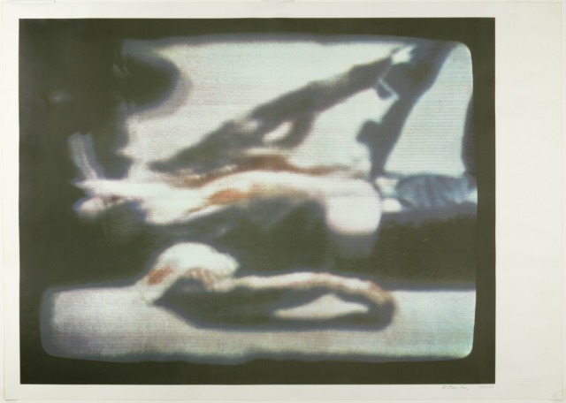
Richard Hamilton, “Kent State, 1970” (1970), screen print printed in color on wove paper , 53 x 67 1/2 inches, courtesy of the Detroit Institute of Arts
Kent State, 1970(1970), a screen print by British artist Richard Hamilton included in the exhibition, hints at this inability to feel: the print was produced using a photograph of a television news broadcast on the killing of four unarmed students demonstrating the Vietnam War on the campus of Kent State University, Ohio on May 4, 1970. Then President Nixon had suggested that the murdered students were to blame for their own deaths and various national polls indicated that the public supported this view. Hamilton, in strong opposition to the Vietnam War, produced his 13-color print in an edition of 5,000 so that “art could help to keep the shame in our minds; the wide distribution of a large edition print might be the strongest indictment I could make.”
The Factory
If Paolozzi commented on the machine, Andy Warhol wanted to become the machine.
Whereas Oldenburg had a Store that humanized the trivial object, Warhol had a Factory that magnified its triviality. The cultural numbness alluded to in Hamilton’s blurred television image of a murdered student at Kent State, finds it’s fullest expression in the works produced by Warhol known as the Disaster series, in which death is the great American commodity.
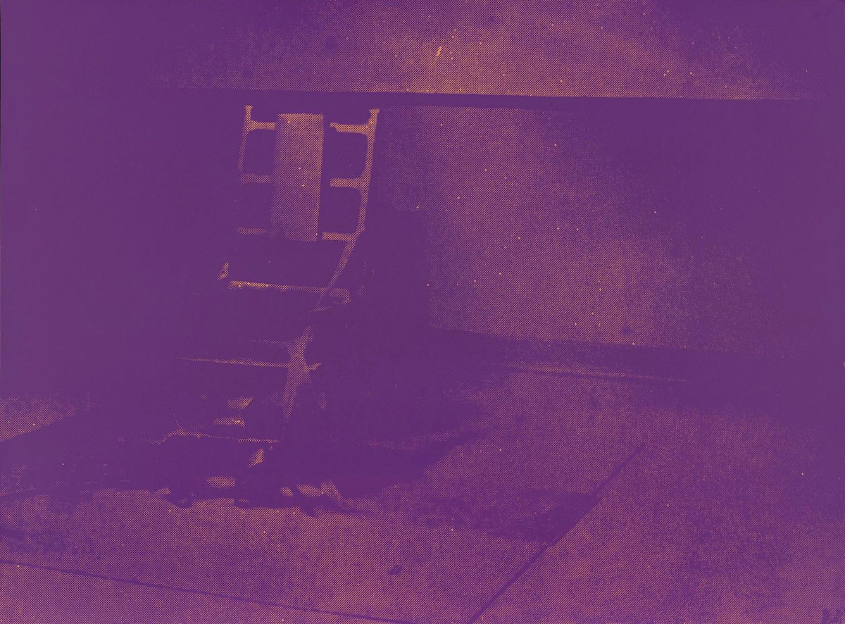
Andy Warhol, from the series “Electric Chairs” (1971), portfolio of ten screen prints , 35 x 47 ½ inches, lent by Marc Schwartz & Emily Camiener
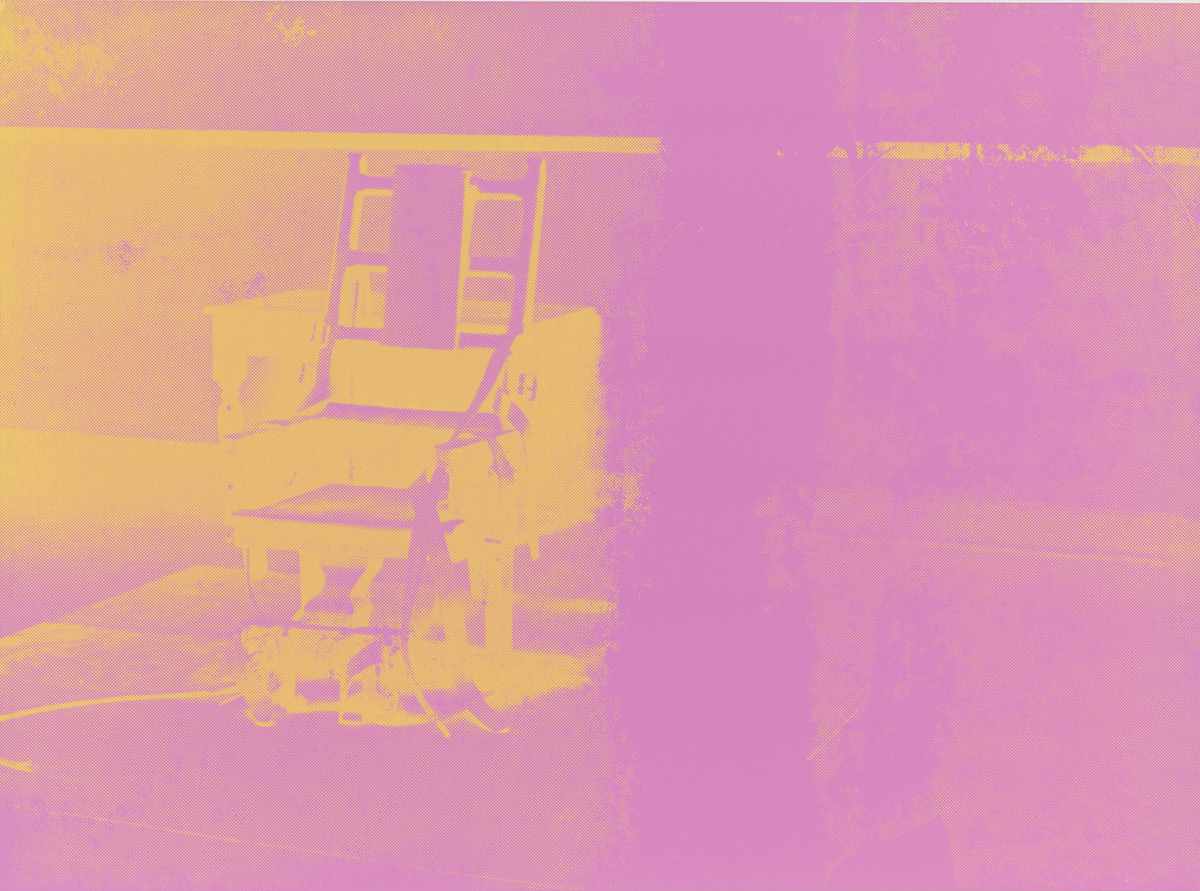
Andy Warhol, from the series “Electric Chairs” (1971), portfolio of ten screen prints , 35 x 47 ½ inches, lent by Marc Schwartz & Emily Camiener
Appropriating a press-release photograph of an electric chair used in the electrocution of convicted Cold War spies Ethel and Julius Rosenberg in 1953, at the Sing-Sing Penitentiary in New York State, Andy Warhol produced a number of paintings and prints of the chair from 1963-1967. A later variant in the form of ten screen prints each measuring 35 x 47 ½ inches and titled Electric Chairs (1971), is the non plus ultra of Pop Art’s darker vision in the exhibition.
Much like Paolozzi, in the 1960’s Andy Warhol repurposed the commercial method of screen printing, allowing for image repetition and the means to manipulate the “decay” of the picture. In addition to his iconic celebrity works, from 1962 to 1967 Warhol focused on reproducing images of suicides, car crashes, accidental deaths, race riots and the aforementioned electric chair. Taken from black and white photographs appearing in newspapers and tabloids of the day, the image quality was intentionally degraded, pointing toward Roland Barthes’ sentiment that the photographic image inherently speaks to the catastrophe of death. In these Disasterworks, as they’ve come to be known, Warhol is ultimately a black humorist. Beginning with his painting 129 Die In Jet (Plane Crash) from 1962 (his first “death” work), there was an ironic fatality present in all of Warhol’s output from this period. An inevitability of decay and death possesses subsequent works as well as a fundamental absurdity in repetition, scale, and use of color, all exhibited in the most deadpan manner. Warhol achieved a glib portrayal of the American zeitgeist in the 1960’s with this series. In Foot and Tire (1963-1964), depicting an absurdly outsized truck tire with a human foot beneath it, Orange Car Crash Fourteen Times (1963), Five Deaths Seventeen Times in Black and White (1963), and his numerous Electric Chair works, he revealed our cultural morbidity against the backdrop of an unstable era. His repeated reproduction of the already cheap newspaper printing quality is intentionally haphazard.
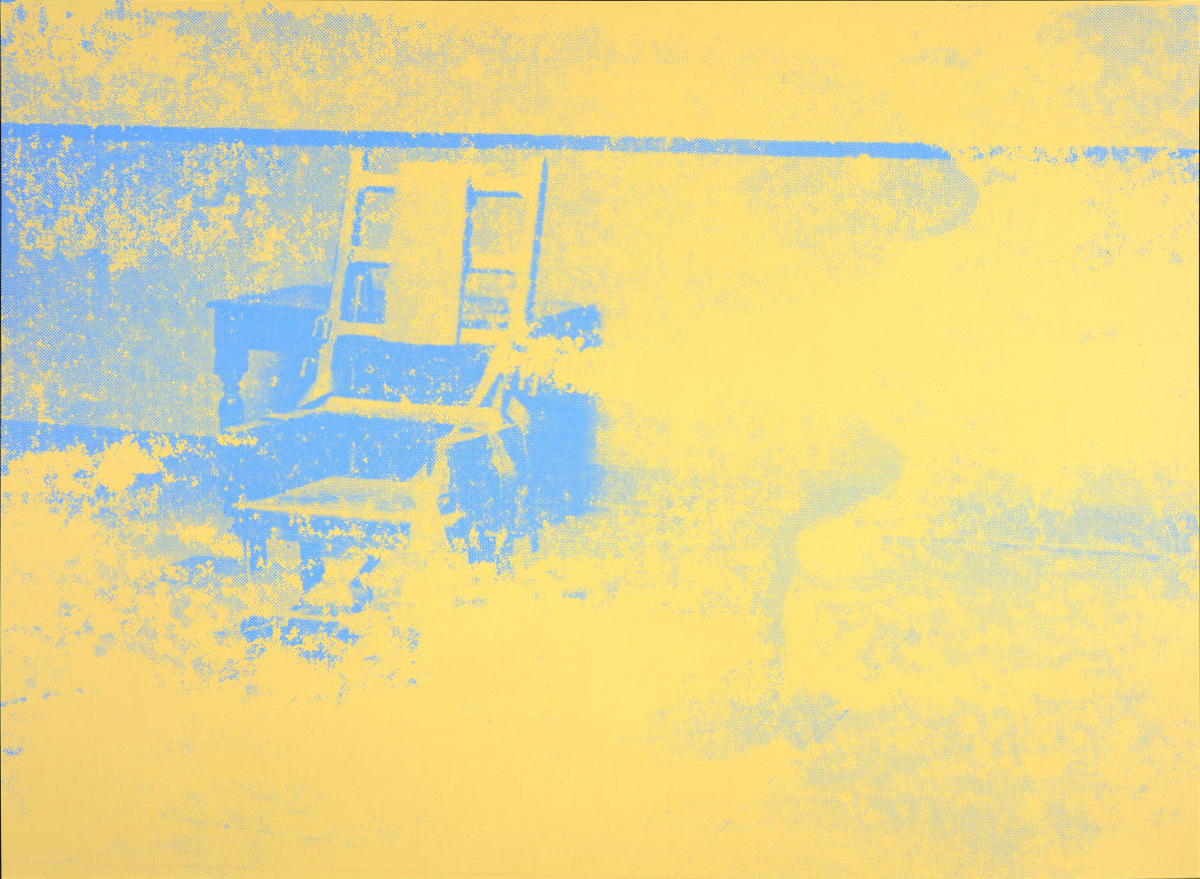
Andy Warhol, from the series “Electric Chairs” (1971), portfolio of ten screen prints , 35 x 47 ½ inches, lent by Marc Schwartz & Emily Camiener
When the image of the electric chair is enlarged and degraded, repeated ten times, each iteration given a palette of garish and vibrating color, there is an absurd banality on display in this work that strikes the distanced pose of the black humorist. Nothing is being clearly satirized. Instead the simple vulgarity of our cultural penchant for “death gawking” is put on display, to be neatly hung on a fashionable gallery wall, or perhaps in a living room not far from the television set.
Warhol’s Electric Chairs are intended to silence the room, to suck the air from it. We sit, we stare, we grow numb. And yet not far off in the exhibition space nourishment is close at hand in the form of Corita Kent’s Enriched Bread. Now would be a good time to revisit that work.
From Camelot to Kent State: Pop Art 1960-1975, on view at The Detroit Institute of Arts through August 25, 2019