Critical art reviews of Detroit galleries and museums weekly

Category: Paintings Page 28 of 49

Mirror, Mirror @ College for Creative Studies Center Galleries

The Dresner Foundation Soul Studio artists occupy the College for Creative Studies Center Galleries in the Manoogian Visual Resource Center until March 30.

Installation View, Mirror, Mirror

The works fill the space but are not cramped. Sufficient wall space between the pieces allows individual focus. However, upon entering the gallery one is struck by how the pieces speak to each other across the large room. The artists of Soul Studio collaborate, consciously and/or unconsciously, and their works seem to be enriched for it.

A primary example of this collaboration, “Celebration of Chaos” is credited to all the Soul Studio Artists. It is one of 3 pieces which hang from the ceiling trusses, casting shadows of additional dimensions to the subject piece. On the wall, the “Celebration of Chaos” shadow looks like a crown of thorns – perhaps representing the sometimes buffeting trials of life? On the floor, the shadow is interspersed with bright highlights – are they lumens of joy and hope in the middle of chaos?

Soul Studio Artists, Celebration of Chaos, yarn, wire, bamboo

These are expressive works, make no mistake. They hang together as a cohesive unit, yet each piece calls for attention and inspection on its own terms. The eponymous “Mirror, Mirror” by Aislinn Wendrow, is an actual antique dresser-case mirror with carefully crafted, curved wood sides. It has all been painted over in bold strokes, obliterating the reflective and frame surfaces with colors juxtaposed and contrasted. It is as though the time for reflection has gone – this is the time for expression. “I recognize myself. Take me for who I am!”

Aislinn Wendrow, Mirror, Mirror, acrylic on mirror

Pretense is shunned here, as evidenced even in the titles. The first piece in the show is: “Untitled (9 Squares with Spaghetti) by Jonathan Barrett, with painted yarn arranged in knots like spaghetti, or “This is Sew Abstract” also by Wendrow, which features handstitched details. The work is sometimes playful, sometimes mischievous, such as the handmade book “Prankbook” by Andy Feinberg. They are large format canvases, hanging pieces, or entire series. The viewer should expect edgy and challenging work that is ultimately a delight to see.

The show is held together by the vision of Anthony Marcellini. He is the director of Soul Studio in West Bloomfield, a project of the Dresner Foundation through the Friendship Circle, providing studio space and artistic direction to artists with special needs. Creative opportunities are offered in a wide variety of media, from fine art to design of all types, both 2D and 3D: http://www.friendshipcircle.org/soul/

Rosen & Binion @ Cranbrook Art Museum

Annabeth Rosen: Fired, Broken, Gathered, Heaped and McArthur Binion: Binion/Saarinen, opens at the Cranbrook Art Museum

Annabeth Rosen: Fired, Broken, Gathered, Heaped (installation view), 2017. Photo by Gary Zvonkovic. Courtesy the artist and the Contemporary Arts Museum Houston.

McArthur Binion, Binion/Saarinen: I, 2018, oil paint stick and paper on board, Courtesy Modern Ancient Brown

Two Cranbrook MFA graduates, Annabeth Rosen (81) and McArthur Binion (73), have returned to the Cranbrook campus at the Cranbrook Art Museum (CAM) as seasoned artists with exhibitions that provide a platform to exemplify their accomplishments. The exhibition opened November 17th, 2018 and runs to March 10, 2019, easily utilizing the spacious galleries, especially the Annabeth Rosen exhibit, which is nothing less than mammoth in its scope.

I’ve written about McArthur Binion before and seen his work representing the United States at the Venice Biennale in 2017, so when this exhibition first came to my attention, I assumed Binion would be my focus.  But the exhibition of his work here at CAM is modest in comparison to the work of Rosen in both the Main and the Larson galleries.  Her work is the artist’s first major museum survey that archives more than twenty years of work. A critically acclaimed pioneer in the field of ceramics, Rosen brings a deep knowledge of the material’s history and processes to the realm of contemporary art.

Annabeth Rosen: Fired, Broken, Gathered, Heaped (installation view), 2018. Photo by Detroit Art Review.

Rosen’s work is curated by Contemporary Arts Museum of Houston’s senior curator, Valerie Oliver, and surveys two decades of her ceramic additive work that has a derivative aspect found in abstract expressionistic art. Her studies at Cranbrook under Artist in Resident Jun Kaneko encouraged her to experiment with non-functional forms and separate her work from the traditional role of ceramics as functional craft. Much of Rosen’s work is assembled with already-fired broken parts which have been reassembled, re-glazed, and ultimately re-fired, adding wet clay to the process.

Rosen says, “I work with a hammer and chisel, and I think of the fired pieces as being as fluid and malleable as wet clay.”

Annabeth Rosen, Fired and glazed ceramic, Bundle, and rubber ties.

The ceramic work is divided up into categories: Mash Ups, Bundles, Mounds and Drawings.  Some of the Mounds are bound together by wire, and others are smaller shapes (Bundles) that have been bound using rubber that might be made from a bicycle inner tube. Rosen began vertically stacking these bundles of ceramic and mounting them on a steel frame set on four wheels.  Rosen has developed an acute interest in non-functional ceramic forms as abstract expressionistic sculpture along with painterly compositions of paint on paper.

Annabeth Rosen, Paint on paper, 2014

It would be impossible to ignore the works on paper as a major force that directly relates to the ceramic work.  These compositions that are constructed with a gestural stroke are both studies and stand-alone work that underpins a philosophical and conceptual driven force behind her sense of creation.  The process in the drawing and ceramic work reveals her hand is symbiotic, where one influences the other.  Rosen seems to muster strength in her drawings as inspiration and influence for the ceramic sculpture work that follows. All the drawings, which could easily be considered paintings, are created without the consideration of color and this seems to this viewer to place the emphasis on the compositional creation of line, movement, shape and space. All the work, ceramic and on paper, is a bi-product of her internal meditations and illustrates a unique utilization and application of materials, techniques and concepts.

Annabeth Rosen, Installation view, Fired and glazed ceramic, and steel baling wire.

Annabeth Rosen studied at Alfred University (BFA) and the Cranbrook Academy of Art (MFA), and has gone on to teach at the Rhode Island School of Design, the University of the Arts in Philadelphia and the Art Institute of Chicago. Since 1997 she holds the Robert Arneson Endowed Chair at the University of California, Davis.


McArthur Binion, Binion/Saarinen: I, 2 – 2018, oil paint stick and paper on board, Courtesy Modern Ancient Brown

In Cranbrook Art Museum’s North Gallery, the Chicago-based artist McArthur Binion says that he had a note pinned to his wall for decades that read “Binion/Saarinen”,obviously something that came from his graduate studies at Cranbrook Academy of Art during the early 1970s. This idea is obviously generated from literally living on the campus and being surrounded by the Finnish architecture of Eliel Saarinen who immigrated to America in 1923 after the completion of the Chicago Tribune building in 1922 and who went on to be a visiting professor at the University of Michigan before developing the entire Cranbrook campus for George Booth. Perhaps it was the grids inherent in these architectural structures that made a deep impression on Binion, a Mississippi-born African American who developed his own visual language-based graphic elements, particularly circles and grids.

He says, “My work begins at the crossroads—at the intersection of bebop improvisation and Abstract Expressionism”, and at times he has described his work as rural Modernist.Binion uses oil stick, crayon and, more recently, laser-printed images to create his lushly textured and colored geometrically patterned works. The work in the Cranbrook exhibition is produced on board with small photo printed images as a background field for this tightly knit grid produced with hard pressed oil paint stick. These carefully measured grids and hand-done hatchings cover tiny images that usually have some personal meaning to the artist. In the past, the work often incorporated biographical documents, such as copies of his birth certificate or pages from his address book.

McArthur Binion, Binion/Saarinen: 2018, oil paint stick and paper on board, Courtesy Modern Ancient Brown

These new paintings use autobiographical photo imagery of both Saarinen and himself in their early thirties as a background for his delicate squared-off grid that could be easily described as minimalist abstraction from a distance.  Upon close examination, this personal element attempts to bond the two together, at least from Binion’s perspective.  In addition, the gallery space includes painting, drawings and furniture by Eliel Saarinen.

McArthur Binion’s paintings are largely symbolic and achieve an expressive resonance that defies the reductive materialism of minimalism. They are formed out of an unlikely confluence of influences, including such Modernist masters as  Piet Mondrian, and Wifredo Lam, as well as his own southern African-American heritage, reflected in his mother’s quilts and West African textiles. Persistence and discipline fortifies Binion’s practice and his succinct, richly personal compositions.

His work is included in the permanent collections of the Metropolitan Museum of Art, New York, and the Smithsonian National Museum of African American History and Culture, Washington, D.C.

Binion/Saarinen: A McArthur Binion Project is organized by Cranbrook Art Museum and curated by Laura Mott, Senior Curator of Contemporary Art and Design.

Annabeth Rosen: Fired, Broken, Gathered, Heaped and McArthur Binion: Binion/Saarinen, at the Cranbrook Art Museum runs through March 10, 2019.


Ruben and Isabel Toledo: “Labor of Love” @ the Detroit Institute of Arts

Ruben Toledo, “Broomstick Librarian Shirtwaist Dresses,” 2008, Designed by Isabel Toledo, Painted by Ruben Toledo, image by DIA – William Palmer.

We normally think of industry as the machinery of the production for making a particular thing, like the steel industry, or, especially in Detroit, the auto industry, but entering the current exhibition, “A Labor of Love,” at the Detroit Institute of Arts, we are greeted by a magnificent image of twisted swirls of colors and pleats of seven dresses. This very energetic image was composed and painted by Ruben Toledo of his wife, Isabel Toledo’s dress designs for Anne Klein, one of the leaders in the Fashion Industry. It’s not a huge leap of the imagination to go from car design, with its annual turnover and retooling for the latest, sexiest, avatars of human desire, to the fashion industry and its latest adjustments of hem and neckline and introduction of the latest color to elaborate on the human body. That’s just what this famous New York husband and wife team of artist and designer did in “Labor of Love,” their investigative interventions in the encyclopedic collection of the Detroit Institute of Arts.

Ruben and Isabel Toledo, “The Choreography of Labor,” 2018 Remaining images by DIA Eric Wheeler

Situated in the DIA’s Special Exhibitions galleries, the main thrust of their installation is an exploration of Diego Rivera’s “Detroit Industry Murals,” the heart and soul of the museum and, art lovers might say, Detroit itself. In her exploration of the collection, Isabel Toledo saw the connection in Rivera’s fresco murals between the fashion and auto industry immediately and brought them together in a large collage (Image #2) that depicts a flowing dance of her dress designs across silkscreened representation of Rivera’s painting of the factory with workers depicted engaged in car production. The darkened gallery, filled with sculpted manikins wearing formal gowns of various cultural origin, suggests a grand promenade celebrating immigration and integration of world cultures to Detroit.

Installation image of Special Exhibitions Gallery with Isabel Toledo’s first sewing machine in foreground.

There is a haunting tableau composed of Isabel Toledo’s first sewing machine wrapped in black taffeta, with ghostly gowns floating in the air above, with a quote on the wall from Isabel that offers the idea of the fashion industry and (by proximity) the auto industry, as a metaphor for the generational influence of migration and change, of death and rebirth: “The combination of ideas, time and imagination can all be triggered by fashion and how people dress, undress, expose, or cover their bodies, fashion offers the perpetual next—the never ending now, the reinvention of inventions.” It is a twist on Darwinian Evolution that goes back to LeCorbusier’s use of it to explain the evolution of design. (Incidentally Isabel’s sewing machine, in looking like a little animal, echoes Rivera’s drawing of an V-8 engine block that looks like a dog).

Diego Rivera drawing from DIA Collection

Throughout the exhibition the female body is explored as the medium of exchange for cultural expression and happily this exhibition gives us the opportunity of seeing four of Rivera’s breathtaking Detroit Industry preparatory cartoons, two of which are female figures representing the seed and fruit of the female body. Because of their fragile paper the cartoons are not displayed often.

Much of the “Labor of Love” exhibition becomes a treasure hunt. Spread throughout the museum are nine Isabel Toledo’s playful, sexy, even downright erotic designs for female adornment which are in response to particular themes and moments of the history of art arranged in the chronological galleries. It is intriguing to ferret out the connections to the specific art or gallery theme. A map is provided but, even for a seasoned museum visitor, it’s a joy to walk through the museum, with chance encounters of things that catch your eye, trying to find Isabel’s interventions. It is a clever way to break the museum’s “ideology” and cast a completely different agenda on its organization, and get the public into the galleries.

Isabel Toledo, “Synthetic Cloud,” 2018, Nylon

There are many intriguingly inventive responses and fashion interventions by the Toledos including Isabel Toledo’s design for Michele Obama’s inauguration outfit found in the American Colonial house and interesting twists on the shenanigans of the surrealists, and to Alison Saar’s “Blood/Sweat/Tears” sculpture, but the most engaging is “Synthetic Cloud.” Installed in the “minimalist” gallery and inspired, it appears mostly by Robert Irwin’s diaphanous acrylic disc, “Untitled, “ but as well by the hard-edged paintings and sculpture of Donald Judd, Sol Lewitt, Eva Hesse and Ellsworth Kelly.  Above Irwin’s chimerical disc, the most mysterious piece of art in the museum, hang eleven multicolored, nylon, tulle tutus that float like a formation of clouds high above our heads. Layer upon layer of pastel underskirts support the dancing figures that also support the rigid wire bodices of the imaginary ballerinas. Somehow echoing Irwin’s ineffable image of light and shadow, Toledo’s fantastic ballerina clouds are worth the trek.

Panoramic installation view of gallery

Isabel and Ruben Toledo: Labor of Love, Detroit Institute of Arts    –  Through July 7, 2019


W.C. Bevan @ Greenroom Gallery

W.C. Bevan, “Contrast” partial installation view, All images – Ryan Standfest

Entering into the space of the new Greenroom Gallery for its second exhibition, “Contrast”, a collection of 24 black and white painted, printed and drawn works by W.C. Bevan, muralist, graffiti artist, printmaker and painter, one comes upon a seamless environment in which wall surface and the individual works presented on it, augment one another to resemble a brightly-lit cave covered with symbols and representations both prehistoric and futurist, of our time and outside of our time, vague and precise. There is a timeless music issuing forth from this chamber.

BLACK & WHITE

W.C. Bevan states that black and white is his “preferred mode of transport.” It’s usage suggest basic black ink on white paper, the foundation of a D.I.Y. print aesthetic cultivated in an underground Punk culture of fast and cheap photocopied zines, handbills and posters. But economic necessity also gives way to meaningful form, as high contrast lends itself to the graphically impactful, the immediate read from whatever distance. Color can carry with it nuance, emotional shading, a reading that depends upon one’s preconceived connection to a color. Whereas the simple combination of black plus white has no hidden agenda up its sleeve.

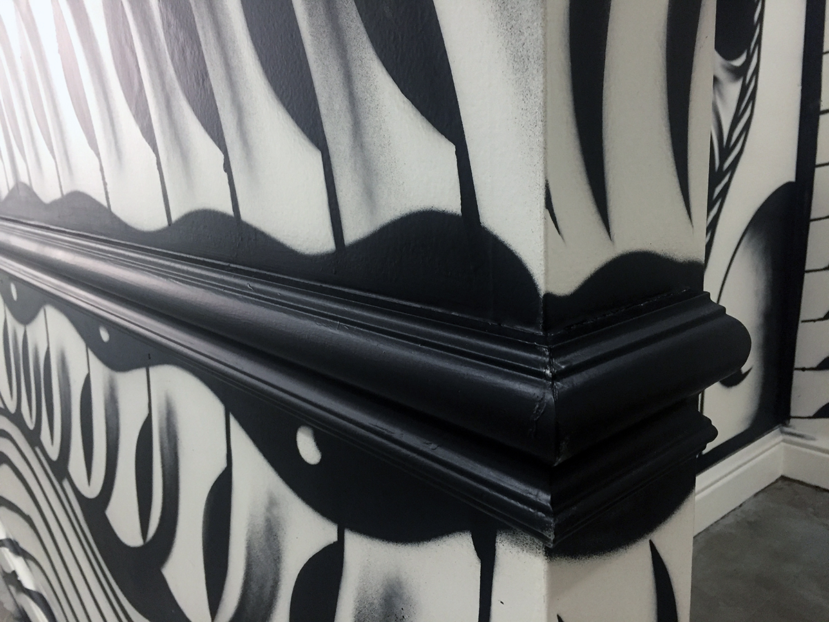
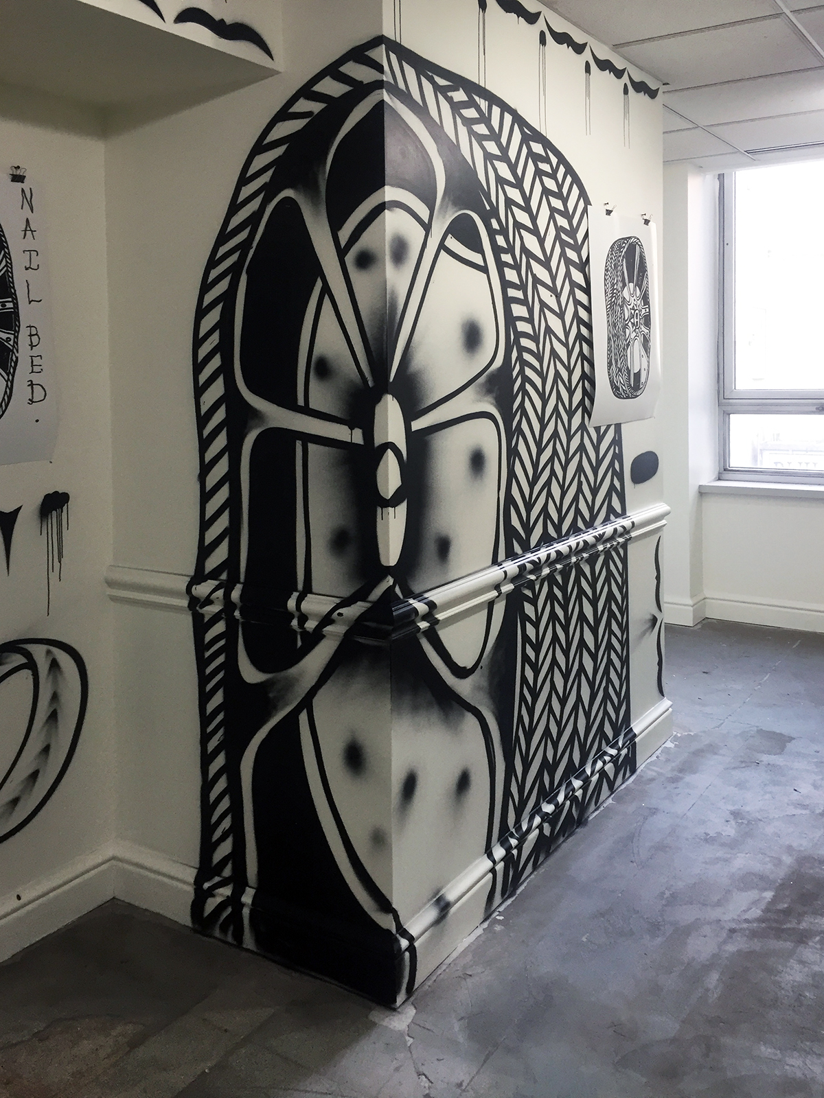
However, there is the presence of grey. When Bevan utilizes a can of black spray paint to adorn the walls of his exhibition space, he makes skilled use of the resulting overspray as a gradient, softening the image. He likens this to the mis-registration of a printed image, in which a layer of color slips outside of its intended target, accidentally lending further dimension. Indeed, there are also an abundant number of drips allowed to remain, unedited, that keep the space active, reminding the viewer of the performance required to manufacture marks.

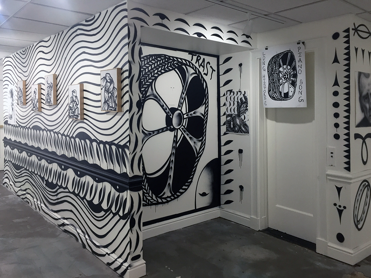
Bevan’s methodology is a balancing act between exerting control and embracing chance. Upon an initial encounter with a space, a wall, a surface, a scenario must be devised in reaction to circumstance. Visual anchors are established using large scale icons. Connective threads between these anchors take the form of repeated visual motifs, adornments that form a flowing space to be read. Entering the Greenroom Gallery space, flashes of prehistoric cave art abound. As with the Paeolithic paintings found in the Chauvet-Pont-d’Arc cave, Bevan’s spray-painted marks respond to the various openings, contours and edges of the wall’s surface, making use of spatial shifts as an opportunity to animate his shapes and lines.

W.C. Bevan, “Contrast” installation detail, acrylic spray paint on wall, 2018

These adornments comprise a lexicon, assembled from typographic symbols. Bevan’s walls have a strong hieroglyphic character, suggesting black and white pictographic texts. It is no surprise then, that his practice of black and white mural painting began with the 2015 project “True Meridian,” which adorns a large wall on the former Eastern Market location of the letterpress shop Salt & Cedar, on the East Fisher Service Drive. Proprietor Megan O’Connell and Bevan had envisioned the mural as a black and white “cathedral of type” in response to the idea of letterpress. The resulting image retained its ecclesiastical architectonics, but letterforms gave way to a dizzying pattern of abbreviated characters.

W.C. Bevan, “Contrast” installation detail, acrylic spray paint on wall, 2018

Growing up in Cleveland, surrounded by examples of opulent turn of the 20thcentury architecture, much of Bevan’s wall-marking practice has been defined by a relationship with architectural ornamentation; the decorative repetitions that activate the façade of a building through the rhythmic accretion of detail. This visual language is on view in “Contrast.”  The Classical ornamental device known as “egg and dart,” which consists of an egg-shaped object alternating with another element shaped like an arrow or a dart, is echoed in the spray-painted embellishments on Bevan’s walls.

W.C. Bevan, “Contrast” installation detail, acrylic spray paint on wall with “Untitled” drawings and “Tire Poem” print, 2018

TIRES

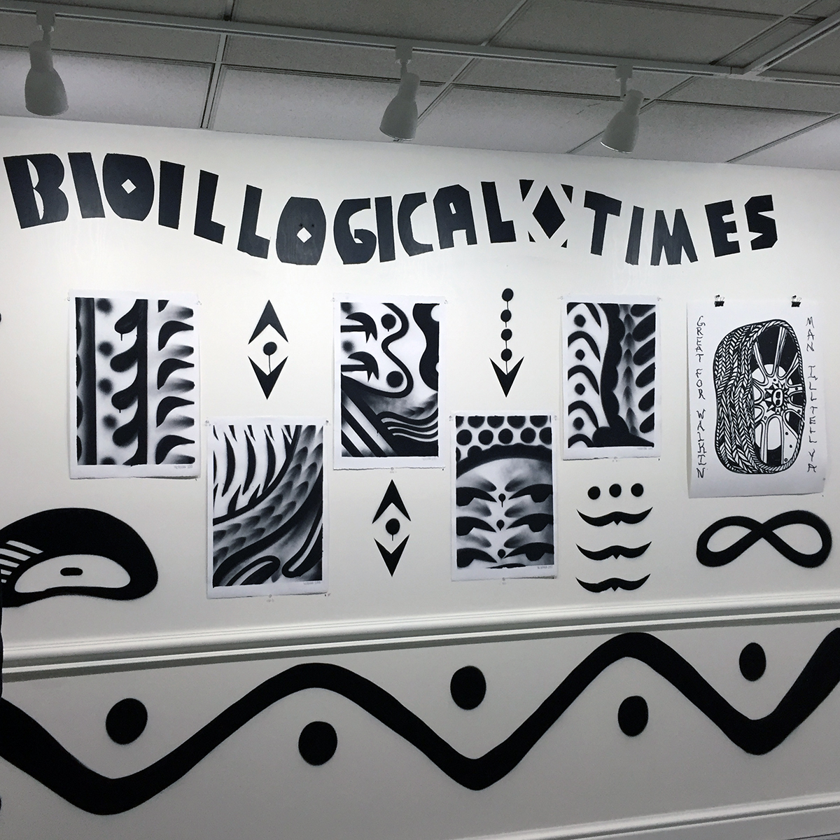
The “contrast” of the title is not just black and white, but also the organic and the inorganic. One prominent text adorning a wall states “BIOILLOGICAL TIMES” (a kind of subtitle to the show) as a reminder of the uneasy relationship between the natural and the industrial.

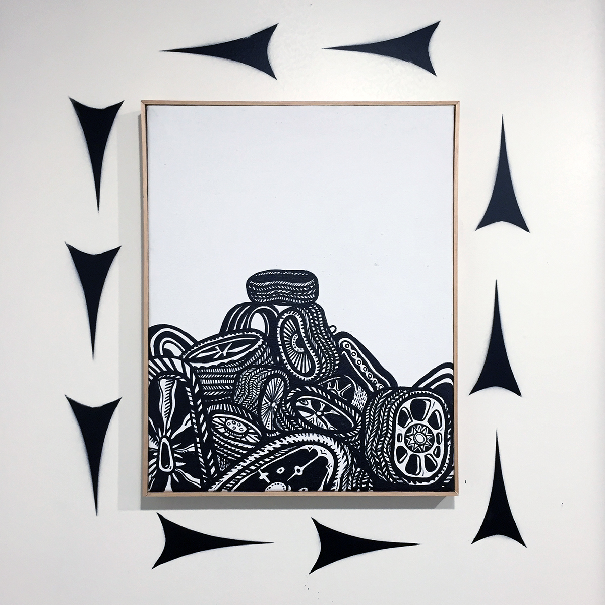
The recurring motif of the exhibition is the automobile tire. It appears in a series of oversized visual anchors, in a smaller series of screen prints with poems scrawled in black oilstick, as piles in smaller acrylic paintings on canvas, and deconstructed as tread marks that reframe and elaborate a new, more playful architecture within the exhibition space.

W.C. Bevan, “Tires”, acrylic on canvas, 22 x 17.5 inches, 2018

In the series of small acrylic paintings depicting tire piles, the subject becomes a surrogate for bodies—slumped, disposed of. Bevan speaks of the tire as a thing that has gone places, that has been worn down while carrying us places, therefore having a history itself. The very idea of the tread has multiple meanings: to walk along, to press down onto the ground, to crush or flatten. In “Contrast,” tires themselves have been crushed and flattened, having carried themselves too far. The piles he depicts morph into less recognizable heaps and mounds, as they go treadless. Throughout the exhibition space, there is an unraveling of the tire, a peeling away of the tread—unspooled to become architectural pattern.

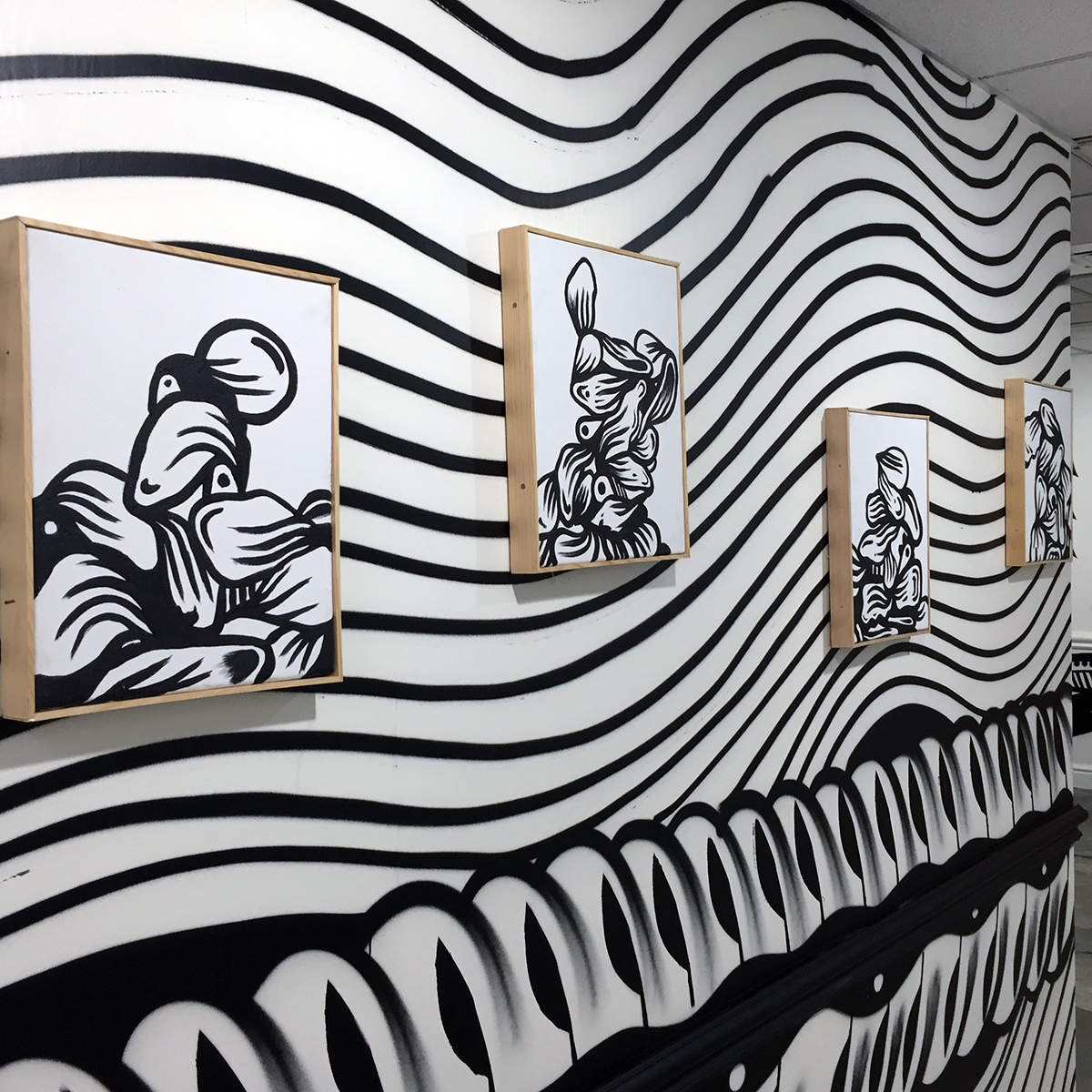
W.C. Bevan, “Wall Peeps”, acrylic on canvas, each 15.5 x 12.5 inches, 2018

Ultimately, the tire is not the subject. In fact, the tires are not just tires. For Bevan, the urban experience of the discarded tire, tossed into a field, piled, stacked, becomes an absurd totem. A deflated tragicomic sign of what has passed. Bevan’s tires are droopy, flaccid, out of shape. Having spent some time painting commercial signs populated by “hamburgers, liquor bottles and tires” for quick cash, Bevan has spoken of a fondness for hand-painted tire shop signage around the city of Detroit, that often represents the tire and or wheel as something misshapen. Unmoored by the refined craft of a trained artist, there is an clumsy earnestness to most of these signs with their straightforward deformation of what Bevan calls “the thing that keeps America moving.”

STREET

On screen printed works each titled “Tire Poem,” Bevan scrawls variant texts with a black oil stick, at the sides of each repeated, centrally printed tire image. The texts have a touch of the street to them, rough fragments drifting into the image nudging them toward something resembling a hand-painted sign:

LONG HISTORIC PIANO SONG

PIRATES MADE OF YOGA

GREAT FOR WALKIN’ MAN I’LL TELL YA

SUDAFED NAIL BED

MMAMA ALWAYS SAID LIFEE ISS GOOD THHEN YOUREEBORN A RAT

YOU’RE A PONYTAIL WOW

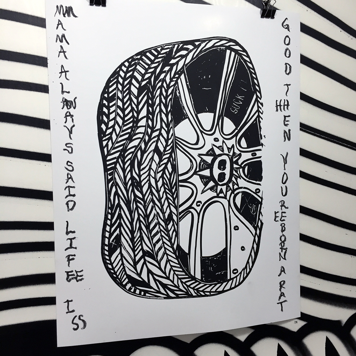
W.C. Bevan, “Tire Poem”, screen print with oil stick, 28 x 22 inches, 2018

The majority of the work in “Contrast” makes use of vernacular visual street language.  In conversation, Bevan points out a series of paintings depicting tires by the artist Art Green, who was a member of the Chicago-based Hairy Who—a group of artists producing work in the late 1960s to early 1970s that was a potent mélange of high and low tendencies culled from comic books, Art Brut, commercial advertising and popular illustration, resulting in fragmented and highly fluid, often sexually-charged work that was a deliriously absurd response to the times it was made in. Similarly, Bevan’s work constructs a “Rustbelt Absurd” with its own pictorial elasticity, erasing notions of high and low with a language both refined and unrefined, and a practice that bridges the street and the studio with mural painting and graffiti, printmaking and painting.

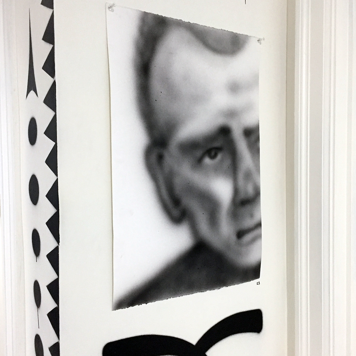
W.C. Bevan, “Hamtramck Memory Drawing”, acrylic on paper, 22.5 x 15 inches, 2018

There is a portrait, seemingly out of place in the exhibition, titled “Hamtramck Memory Drawing,” of a man, possibly of Eastern European extraction, partially cropped. Possibly working class. Possibly from the Poletown neighborhood Bevan has lived in since March of 2018. The drawing, executed with sprayed acrylic on paper, is a soft grey. It feels distant and contrasts with much of the hard-edged graphic work in the exhibition. In its quietness, it asserts itself as a reminder of the human dimension of Bevan’s work, the psychological lifeblood of a black and white Rustbelt vision, placing the everyday of the studio into the street, and vice versa, while summoning the abundant wall-painted symbols as dispatches from a landscape tread upon.

“Contrast: Black and White works by W.C. Bevan”
November 30, 2018-February 1, 2019
Greenroom Gallery Detroit
located within Emerson’s Haberdashery, 1234 Washington Blvd., Detroit, MI 48226
Gallery Hours: Tuesday-Saturday, 10-6pm
Closing reception on Feb. 1, 2019, 6-9pm


Charles White @ MoMA, NYC

Charles White: A Retrospective at the Museum of Modern Art, New York City, NY

Charles White (American, 1918–1979). General Moses (Harriet Tubman). 1965. Ink on paper, 47 × 68″ (119.4 × 172.7 cm). Private collection. © The Charles White Archives. Photo courtesy of Swann Auction Galleries

If there’s a fearsome female gaze that can make Manet’s icy Olympia seem coy and puerile by comparison, it’s that of the determined Harriet Tubman, rendered in ink by Charles White during the height of the Civil Rights movement.  Famous for liberating hundreds of slaves during the Civil War, here she becomes a contemporary symbol for racial equality, and could, with little imagination, plausibly be seen among those marching on the front lines across Pettus Bridge in Selma, Alabama.  She’s emblematic of White’s work, which unfailingly depicted black America with strength, regality, and dignity.

Born in 1918 on Chicago’s South Side, African-American artist Charles White began his career inauspiciously as a sign painter; he would later become one of the most accomplished draftsmen of his generation.  His style had extraordinary reach, ranging from the gently abstracted figures that peopled his WPA mural paintings of the late 1930s to his tight and refined graphite and ink drawings of the 1960s.  Charles White: A Retrospectiveis a muscular show that snugly fills half of the MoMA’s third floor with over 100 drawings, paintings, and other ephemera.  White’s first major show in 30 years, this traveling exhibition champions the enduring appeal of figurative drawing, and his socially-conscious subject matter keeps his work uncannily relevant.

Arranged chronologically, the retrospective begins with his early paintings, produced when White was a freshly minted graduate from the School of the Art Institute of Chicago in 1938. His early mural Five Great American Negros is an early tour de forcethat established several of the tropes that defined much of White’s subsequent career. Painted when he was just 21 for a fundraiser for Chicago’s South Side Community Art Center, the painting celebrates Booker T. Washington, Frederick Douglass, George Washington Carver, Marian Anderson, and Sojourner Truth.   The mural’s heaving landscape and figural distortions rhyme with the regionalist paintings of Thomas Hart Benton, but, as ever, White’s work also spoke to contemporary social injustices.  He painted the mural in 1939, the same year that gospel singer Marian Anderson was refused permission by the Daughters of the American Revolution to perform at Constitution Hall because of her race, and her inclusion in the work freights the painting with timely relevance and political weight.

Charles White (American, 1918-1979). Five Great American Negroes. 1939. Oil on canvas, 60 x 155″ (152.4 x 393.7 cm). From the Collection of the Howard University Gallery of Art, Washington D.C.© The Charles White Archives/ Photo: Gregory R. Staley

Charles White believed that artists had a moral obligation to contribute to social discourse, and to this end his work aggressively addressed racial injustice and economic disparity in America.  In the 1940s and 50s White produced soulful and moving works like There were no Crops This Year, a Steinbeckian depiction of a visibly distraught husband and wife; an empty sack which the woman holds is the only prop in the drawing, but it’s enough to tell their story.  And his poignant and incriminating proto-cubist Headlinesdepicts a visibly distraught woman flanked by a veritable blizzard of news headlines that reveal instances of racial inequality in America.  His use of collage and text mirrors the synthetic cubist experiments of Picasso and Braque, but here White masterfully harnesses the vocabulary of cubism and channels it toward social protest.

Charles White (American, 1918-1979). Headlines. 1944. Ink, gouache, and newspaper on board, 20 x 16″ (50.8 x 40.6 cm). Collection of William M. and Elisabeth M. Landes. © The Charles White Archives/ Photo: Gregory R. Staley

But while his works frequently addressed racial and economic inequality, White managed to avoid producing an oeuvre drearily burdened by politics.  His brightly painted Gospel Singers radiates joy, and the strong, pitchfork-wielding woman in Our Land (White’s witty response to Grant Wood’s American Gothic) radiates confidence, determination, and, above all, dignity.  

Music also played a significant role in his output, and he produced affectionate drawings of gospel singers Mahalia Jackson, Paul Robertson, and Bessie Smith.  White created cover designs for a series of jazz albums by Vanguard Records, and in 1965 his illustration for Gould: Spirituals for Orchestra received a Grammy nomination for best album cover.  But the musical collaboration this show especially highlights is that of Charles White and Harry Bellefonte, whose recorded voice croons uninterruptedly throughout the exhibition space.  Bellefonte commissioned works by White, often including them on his television show, and White responded with several portraits of the singer, head thrown back, utterly abandoned in music.  Fittingly, because of the close relationship White had with so many musicians, the MoMA has thoughtfully assembled a Spotify playlist of music inspired by the show—there’s everything from old spirituals to gospel music and James Brown.

In the 60s and 70s, White’s work continued to address social justice and civil rights, but his style became increasingly crisp, a marked departure from his previous abstracted depictions of the figure.  It’s a stylistic shift made apparent in his 12-part series J’Accuse (“I accuse”), a series of confrontationally large ink drawings collectively named after Emile Zola’s open letter to the French government in which Zola famously defended Richard Dreyfus, a Jew wrongfully convicted of murder.  The series’ title equated American racial inequality with European Antisemitism, but the drawings themselves refrain from directly referencing any instances of injustice.  Rather, White gives viewers affectionate and sensitively rendered portraits of black Americans, often set against a stark white background, and allows for their innate dignity to speak for itself.

Charles White (American, 1918-1979). J’Accuse #7. 1966. Charcoal on paper, 39 1/4 × 51 1/2″ (99.7 × 130.8 cm). Private collection. © The Charles White Archives/ Photo courtesy of Michael Rosenfeld Gallery LLC, New York, NY

The final room in the retrospective includes several works from his acclaimed Wanted Posterseries, a cycle of 21 monochromatic oil-wash and lithograph works which emerged from White’s frustration at the slow pace of the implementation of civil rights in America.  Appropriating the imagery of old wanted posters for runaway slaves, all the works in this series mimic the texture of crumpled newsprint in arresting tompe l’oeil.  Barely-discernable stenciled-in words help the viewer navigate the meaning behind these ambiguous works; in one especially poignant image, a mother stands behind her son, both their faces registering utter sorrow; above her head hovers the form of an eagle and the word “sold.”

One of the final images viewers encounter is White’s iconic Black Pope. Closely resembling the Wanted Posterseries in its color and texture, the painting depicts a man wearing clothing reminiscent of priestly vestments, flashing what could be interpreted both as the peace symbol, or the sign Christ makes in icons while bestowing a blessing.  Barely discernable, “Chicago” is stenciled atop the image, and the figure wears a sandwich board which proclaims with calculated ambiguity: “NOW”– an all-encompassing call to action.

Installation view of the exhibition Charles White: A Retrospective.October 7, 2018–January 13, 2019. The Museum of Modern Art, New York. Digital Image © 2018 The Museum of Modern Art, New York. Photo by Robert Gerhardt.

Charles White: A Retrospective is a massive show made even more impressive when we consider that the overwhelming majority of these works are fastidiously rendered figurative drawings—there are no easy shortcuts to quickly fill wall space.  Furthermore, while his drawings are impressively large, they always reward close inspection with their varied stippled and hatched-in textures.  Today, his work hangs in many of America’s great museums—the Metropolitan, the Chicago Art Institute, and the Smithsonian, to name a few. But his legacy isn’t just the art he created, but the many students who emerged under his shadow, such as Kerry James Martial, who stated that Charles White believed that one’s work “should be in the service of helping dignify people.”  His work did exactly that, and this retrospective triumphantly speaks to White’s unflagging and determined mission to portray black America with the dignity it deserved.

Charles White: A Retrospective, through January 13, 2019 at the Museum of Modern Art, NYC, NY.

Page 28 of 49

Powered by WordPress & Theme by Anders Norén