Critical art reviews of Detroit galleries and museums weekly

Category: Paintings Page 9 of 49

Concerning Landscape @ Detroit Artists Market

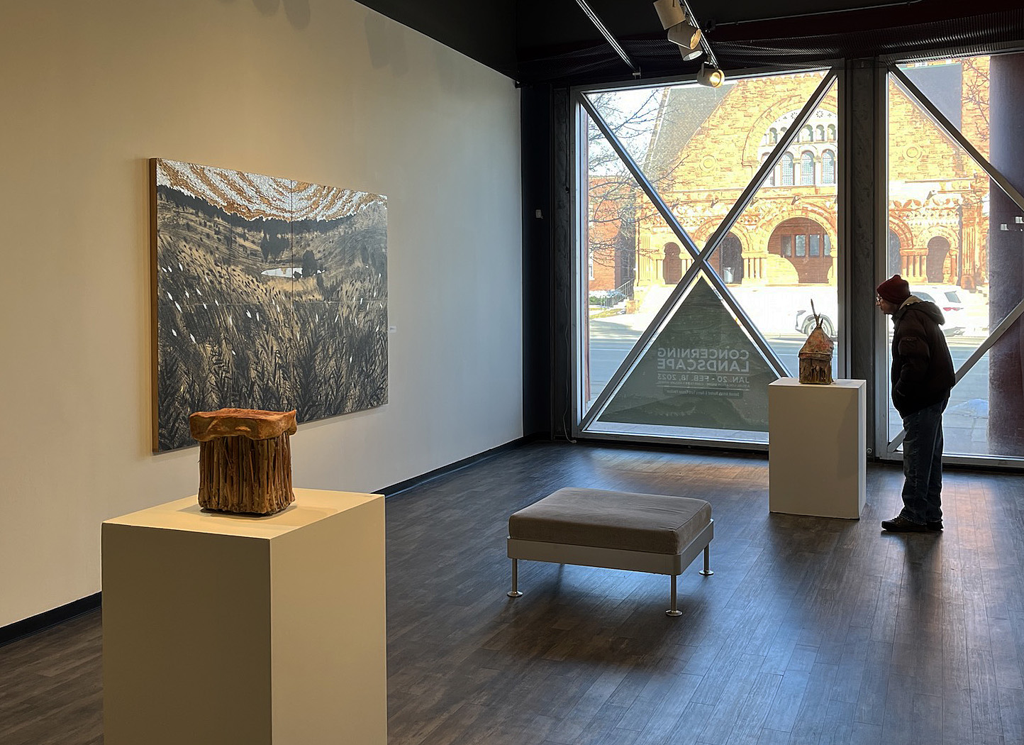
An installation shot of Concerning Landscape at Detroit Artists Market, up through Feb. 18. Image courtesy of Michael Hodges.

Over the centuries, the venerable landscape painting has evolved far from the Dutch masters who first perfected the genre — a fact underlined by the heterogeneous work in Concerning Landscape, up through Feb. 18 at both the Detroit Artists Market and the new Brigitte Harris Cancer Pavilion at the Henry Ford Cancer Institute in Detroit.

Curator Megan Winkel has adopted a refreshingly ecumenical point of view in pulling this together. Works range from Ann Smith’s intriguingly peculiar sculptures with their bunched reeds and dangling root systems to Carla Anderson’s photographic prints of geologic forms, including lyrically striated rocks in a spring in Yellowstone County, Wyoming.

A fan of the grand view? Not to worry. Concerning Landscape also embraces figurative vistas, like Helen Gotlib’s meticulous intaglio print, West Lake Preserve II, or Bill Schahfer’s lush photo study, Lagoon Life.

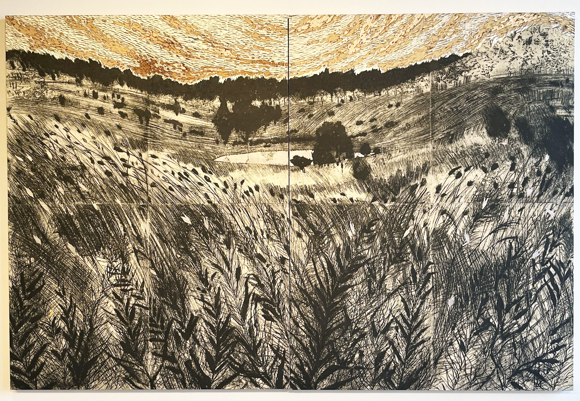
Helen Gotlib, West Lake Preserve II, Intaglio print, carved birch panel, palladium leaf; 2021.  All Images courtesy of DAM

 “West Lake Preserve” places the viewer right in the tall weeds, looking up a small valley to a pond and woods, a highly satisfying view. The large print’s divided into eight separate panels, and with the exception of a little dull orange at the top, it’s mostly a duotone essay in sepia and black. The photographic print, Lagoon Life, by contrast, stars a white ibis posing beneath a jungle crush of palm trees that all loom, menacingly, over the elegant bird’s head.

Winkel comes at all this curation from an interesting vantage point. She’s the manager and curator for the Healing Arts Program at Henry Ford Health Systems in Detroit, tasked with buying art for the sprawling medical empire. “Curatorial projects for me are mostly big buildings now,” she said, “and thinking about all the ways people can experience art when they’re not seeking it out.” The landscape, she adds, has understandably long found a home in medical centers given its generally soothing visions of a natural world far beyond the reach of the artificial light of the hospital ward.

Landscape as an art subject, of course, has a long, respectable history. Both the ancient Greeks and Romans enjoyed the genre, and the walls in upper-class homes were sometimes painted with pastoral views. But the status of the landscape plummeted in the Middle Ages, when religion elbowed every other art subject aside. Indeed, the natural world was reduced to a mere afterthought, and one with generally lousy perspective, to boot.

Things began to turn around in the Renaissance, particularly during Holland’s “Golden Age” in the late 16th and 17thcenturies, when an exquisite sensitivity to landscape and weather welled up in many studios, yielding in the best cases – van Ruisdael comes to mind — breathtakingly believable clouds and storm-tossed skies. Indeed, an online essay by the National Gallery of Art notes that “with their emphasis on atmosphere, Dutch landscapes might better be called ‘sky-scapes.’” (The Detroit Institute of Arts, by the way, has an outstanding collection of Golden Age Dutch paintings, well worth seeking out on your next visit.)

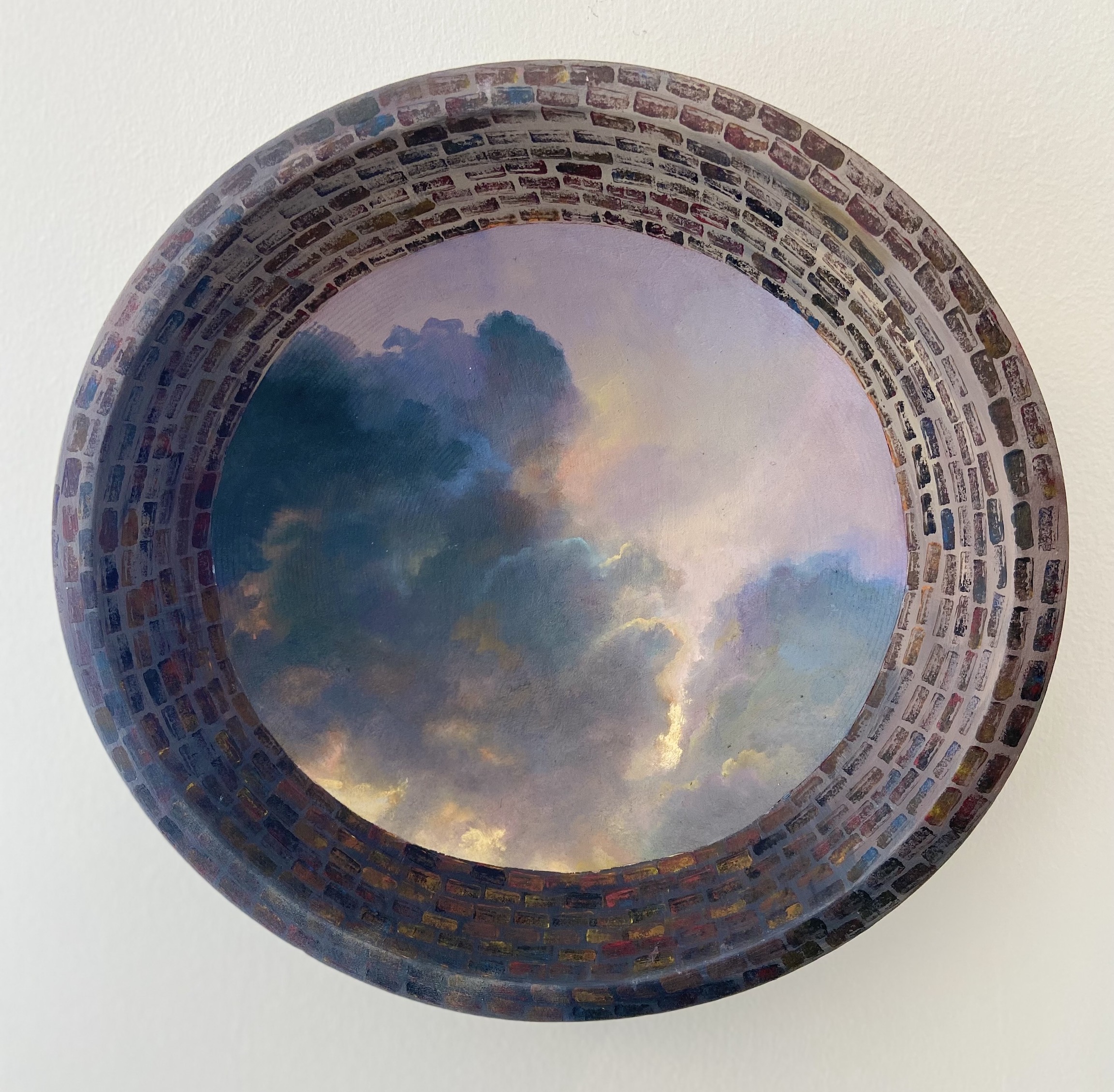
Catherine Peet, Looking Up from the Deep, Mixed media, 10” diameter.

The one piece in Concerning Landscape that gives van Ruisdael a run for his money is the vertiginous, gorgeous, Looking Up from the Deep by Catherine Peet, which you’ll find at the Henry Ford Cancer Pavilion gallery. This delicate sunrise or sunset-tinged cloudscape feels like it should be peering down at you from the dome of some state capitol, an impression strengthened by its circular frame.

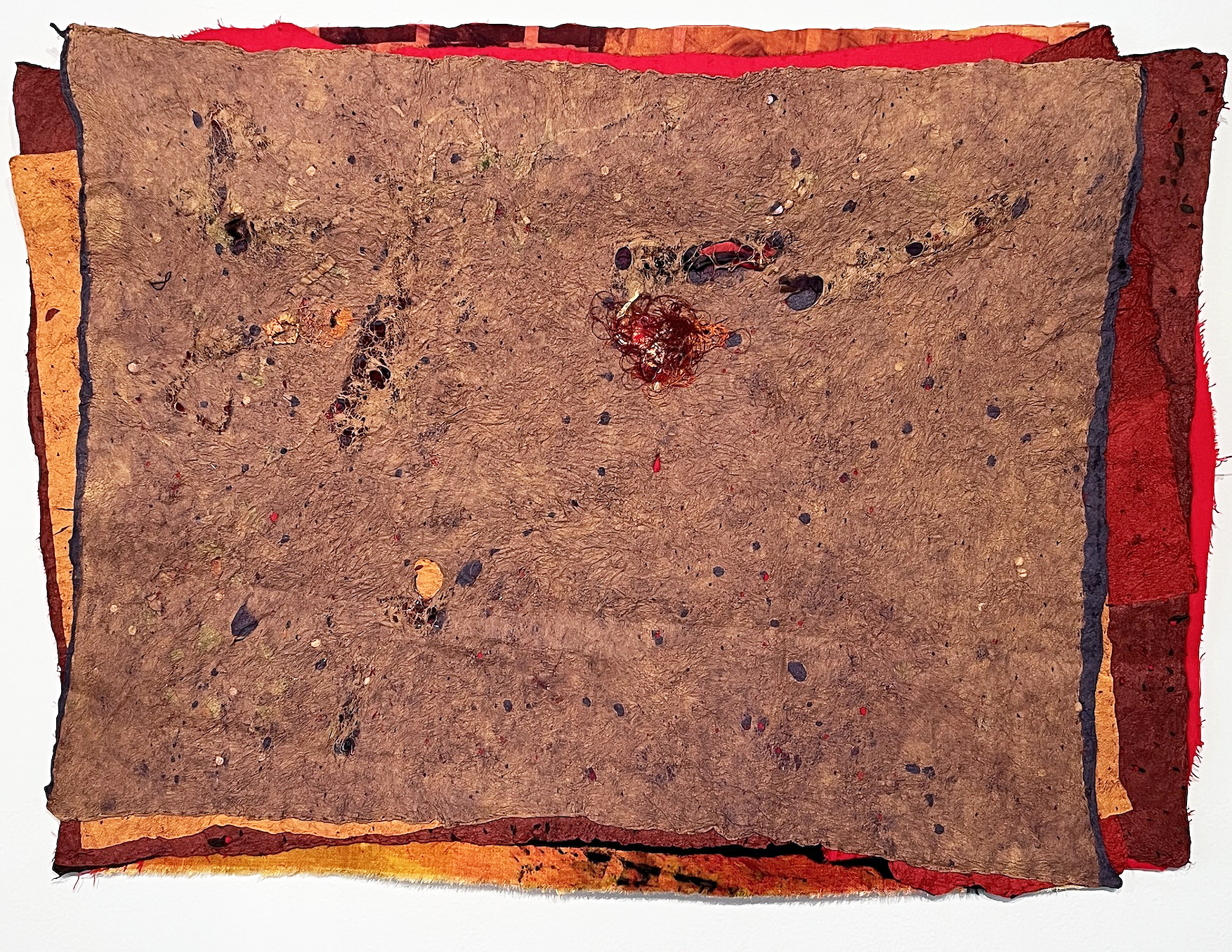
Sharing some of the same warm tones but at the far abstract end of the spectrum is Carole Harris’ mixed-media Desert Flower. The 2015 Kresge Artist Fellow has constructed an overlapping stack of hand-made fiber sheets that read like thick, highly textured paper, in colors ranging from cocoa to an alarming red peeking out beneath all the others.

The simplicity of this particular conceit is striking, as is Harris’ ability to make real drama out of colors that only emerge as narrow strips visible beneath the warm brown sheet on top. That Desert Flower pushes the boundary of “landscape” goes without question – so, too, the fact that it kind of knocks the wind out of you.

Carole Harris, Desert Flower, Fiber, 2023

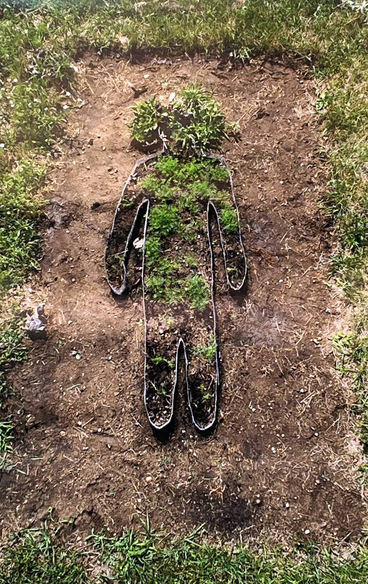
Russian transplant Olya Salimova, currently on a one-year BOLT Residency with the Chicago Artists Coalition, gives us something entirely different with her Body into Dill, one of the most original and daffy conceptions in the entire show. The centerpiece of this photograph is a rectangular garden space – disturbingly, about the size of a grave – that’s dug into the patchy lawn of some unpretentious backyard. Metal garden edging sunk in the turned-up dirt sketches a simple human shape, rather like police outlines of dead bodies on the sidewalk. Within that human-like enclosure, someone – Salimova? — has planted dill weed.

Its obvious imperfections are part of what makes this image so compelling. The yard clearly needs work, and the plantings in the “body” are scattered, newly dug and unsubstantial — apart from some vigorous leaf action filling up the head.

Olya Salimova, Body into Dill, Photography, 2021.

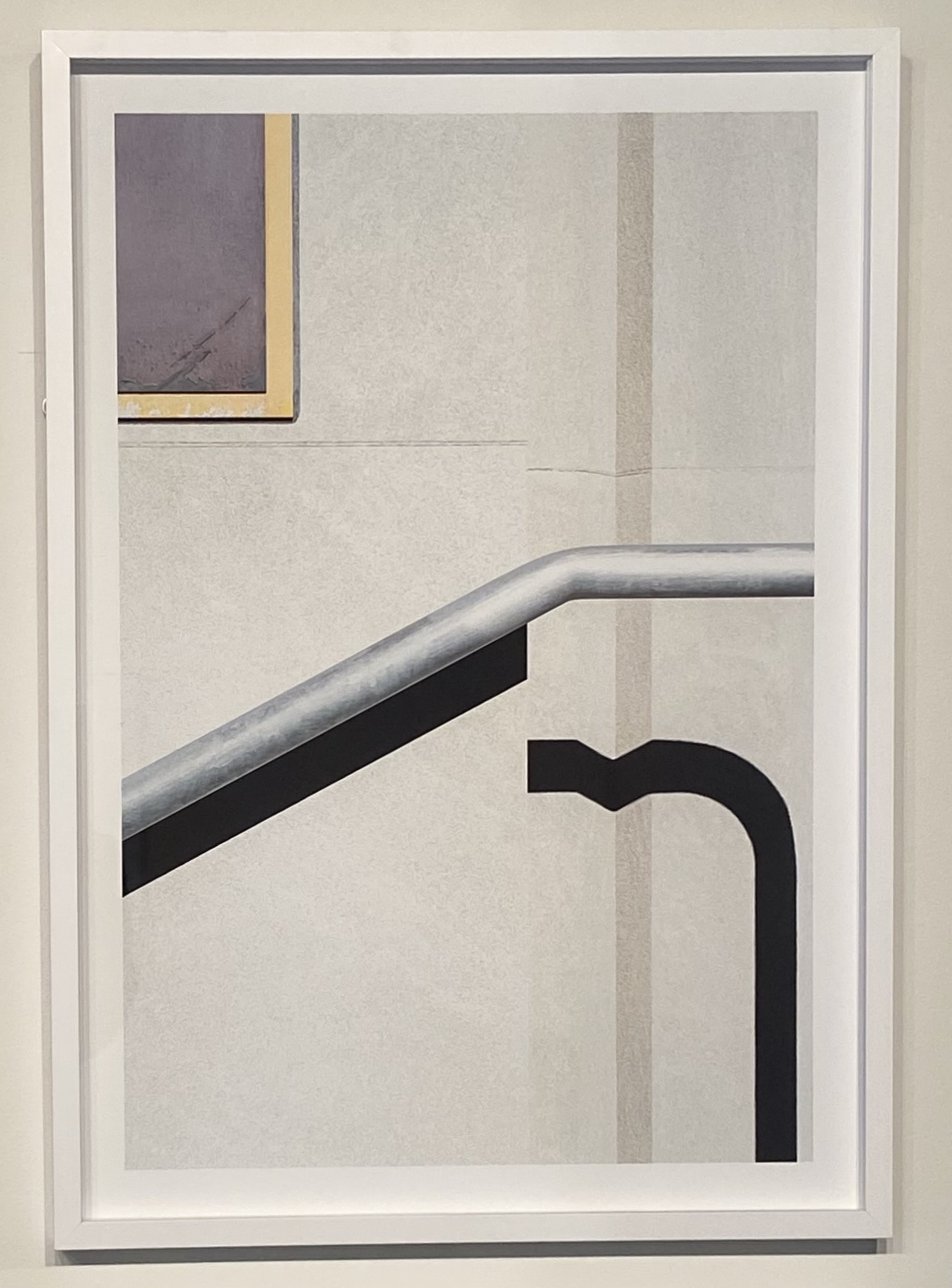
For those who enjoy a little disorientation in their photography – And when well done, who doesn’t? – Jon Setter’s collection of a half-dozen large prints, all up-close shots of building details, is a delight to behold. Each reads as an abstract design in 1920s Russian Constructivist mode. But in one case you’re looking at parallel diagonals on the late, lamented Main Art Theatre in Royal Oak, and in another, the Detroit Free Press building downtown on West Lafayette.  As a group, these deliberately confusing framings are both mischievous and fun to examine.

Jon Setter, Purple and Gold with Shadow (Detroit Free Press), Archival pigment print, 2021.

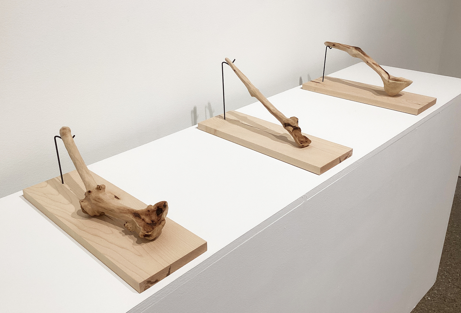
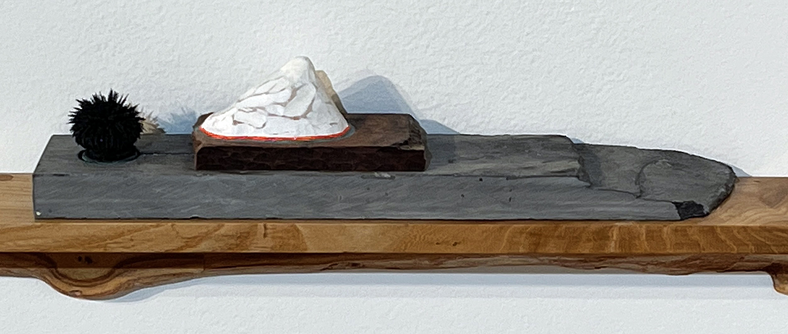
 Finally, Scenic Overlook 2 by Sharon Que, an Ann Arbor sculptor who also does high-end violin restoration, might remind you of a minimalist diorama minus the glass case. On a simple wooden shelf, Que’s sacked two smaller pieces of wood topped by a chalky white boulder or peak – part of the fun is the uncertainty — next to which sits a big, black, bushy… something.

Let’s stipulate that the white form is, indeed, a mountaintop. Call the spiky black, roundish thing next to it a plant, and you’ve got a surprisingly convincing perspective study of a bush and a white peak far, far in the distance – never mind its actual proximity in the assemblage.

Is it weird? Is it oddly compelling? Yes and yes.

Sharon Que, Scenic Overlook 2, Wood, magnetite, paint; 2016.

Concerning Landscape at Detroit Artists Market, up through Feb. 18.

Rocco Pisto @ Strand Gallery in Pontiac

Rocco Pisto, Installation image, Strand Gallery, 2023

The newly restored Flagstar Strand Theater in Pontiac opened its gallery to a retrospective exhibition of artwork by Rocco Pisto on January 20, 2023, spanning fifty years of painting that began in 1976. Watercolor is a medium that has been around for over several hundred years, yet often thought of as a secondary choice of paint to oil and acrylic. You might look at the early work of Albrecht Durer, Georgia O’Keeffe, Paul Klee, Winslow Homer, and John Singer Sargent to realize its place in history and its ability to withstand centuries. Where oil and acrylic paint are additive mediums, watercolor is subtractive, usually on paper, and translates its nature with its ability to have the strength and capacity of transparency. Watercolor is made of pigments suspended in a water-based solution, which refers to both the medium and the resulting artwork. Rocco Pisto’s 50 pieces range from 1976 to 2022 and reflect the artist’s unique techniques in controlling and experimenting with the watercolor medium.

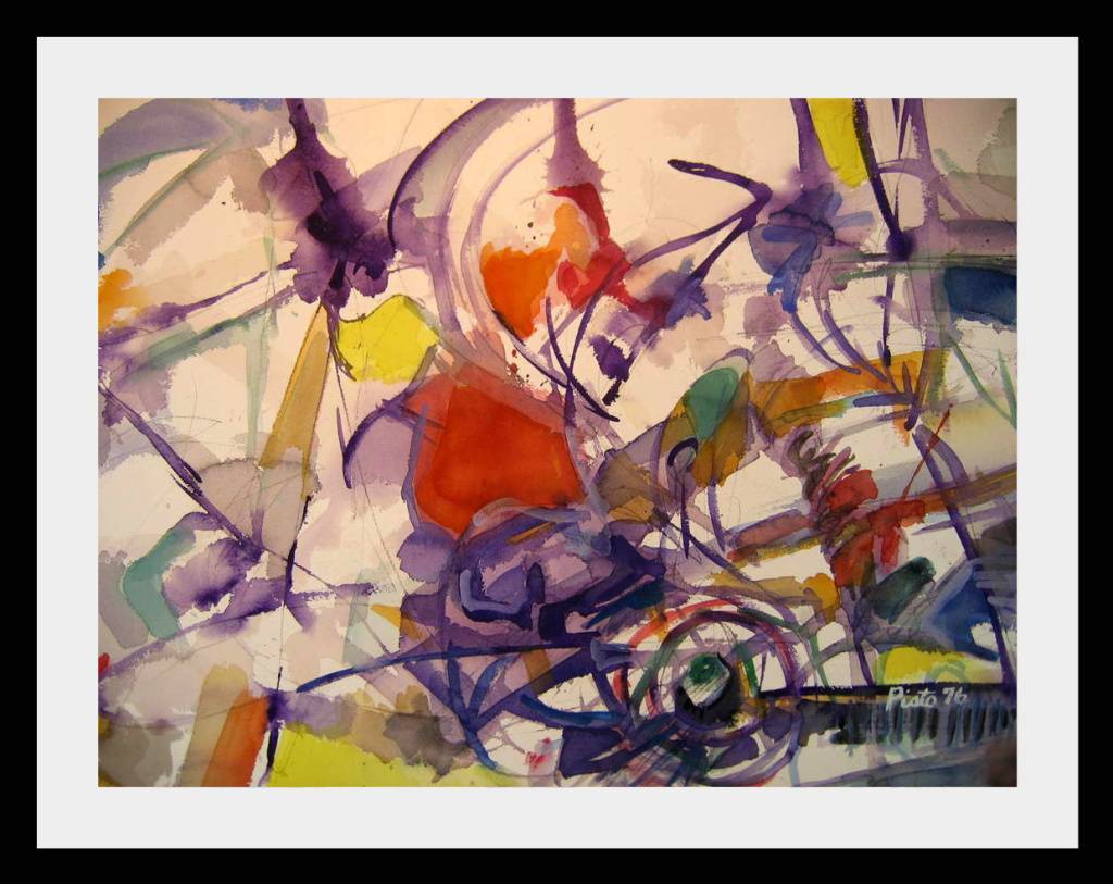
Rocco Pisto, Telegraph Run, Watercolor, 34 x 42″, 1976

The early work Telegraph Run, done in 1976 during Pisto’s MFA work at Eastern Michigan University, illustrates a fluid construction that builds a composition using carefully placed primary colors and a delicate violet line structure that holds it all together. In his statement, Pisto says, “As a painter for over fifty years, I never tire of the experimental process of starting a piece and solving the design problems along the way to make it a finished work. Spontaneity, discovery, individuality, analysis, visual balance, contrast, and contradiction summarize my thought process.”

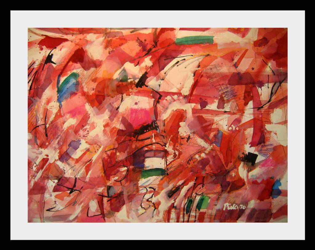
Rocco Pisto, Fire & Ice, Watercolor, 1976

Over time in Pisto’s work, we see various categories, including landscapes and figures, with all subjects that have evolved to the abstract expressionism in this field painting, Fire & Ice. The line that begins with the landscape and proceeds to abstraction is not straight. Pisto is back and forth throughout his career, keeping his thinking spontaneous and his trademark unique. He says, “The paintbrush becomes a performer, dancing across the paper, juicy and full of life. My work frees my imagination and provides many opportunities for magical accidents.”

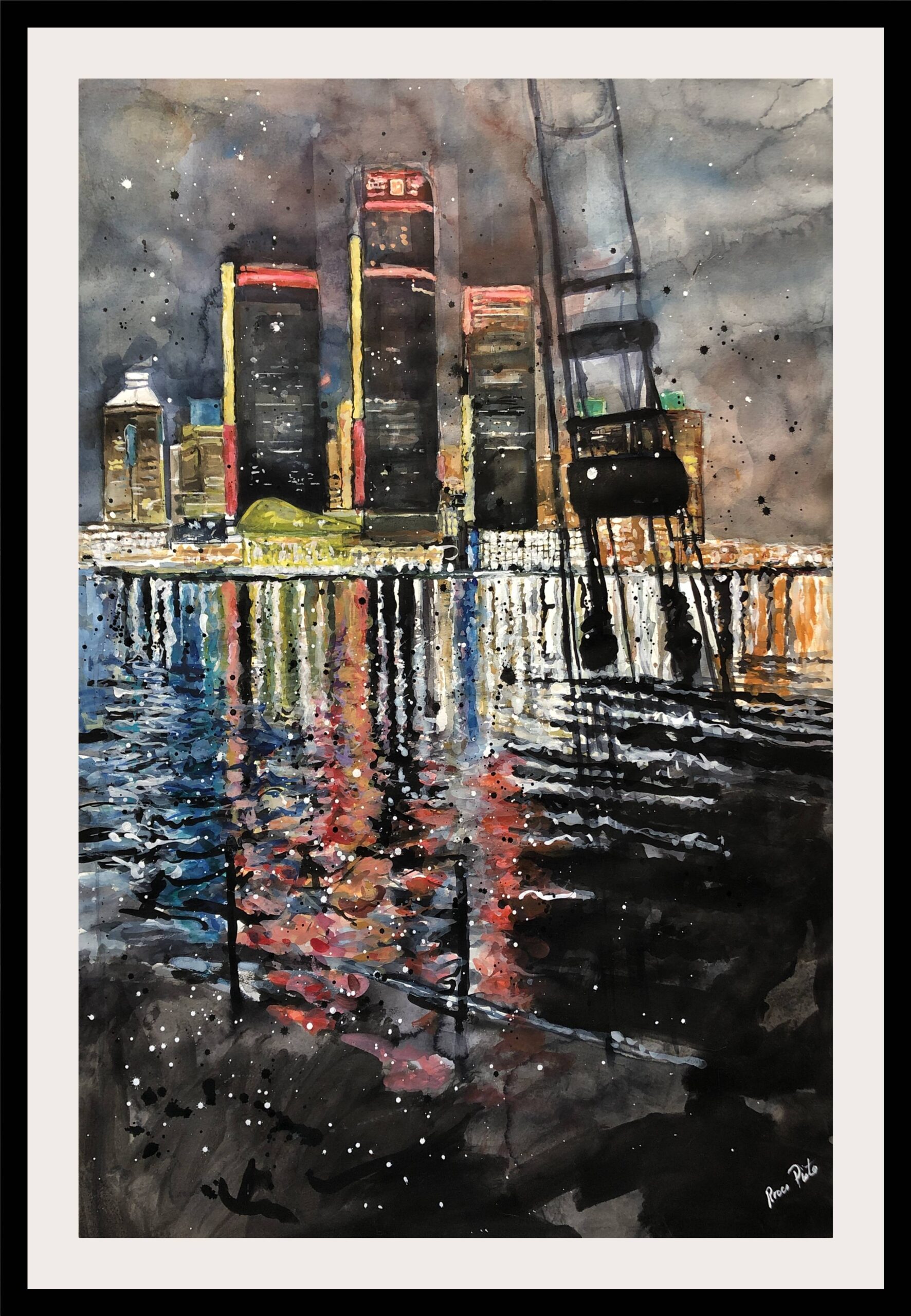
Rocco Pisto, RenCen at Night, Watercolor, 53 x 42″, 2001

More recent is the large image of the Ren Cen at Night,  which relies heavily on the waterfront river reflection looking on from the Canadian side of the river. This watercolor has been used as a backdrop for a commercial poster for the 75th MWCS exhibition. Pisto says, “My painting technique abstractly by dripping, pouring, splashing, and brushing paint allows the work to evolve until it meets my criteria of what constitutes a successful piece of art.”

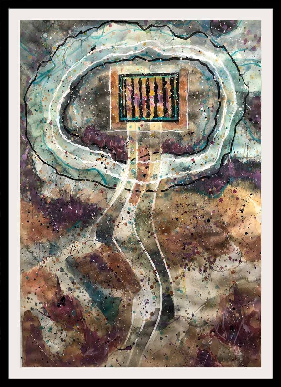
Rocco Pisto, Marsala Glow, 56 x 42″, Watercolor, 2021

The large watercolor in Marsala Glow is neither landscape, still life, figurative or pure abstraction. To this viewer, it is part aerial, part diagram, with a warm collection of color surrounding blue-green that suggests water, with a circular moat juxtaposed to an inner box. That leaves the interpretation up to the viewer to explain, whether broad or narrow. A viewer, as in all artwork, will bring their experience to the moment and draw a personal conclusion about the meaning of this work.

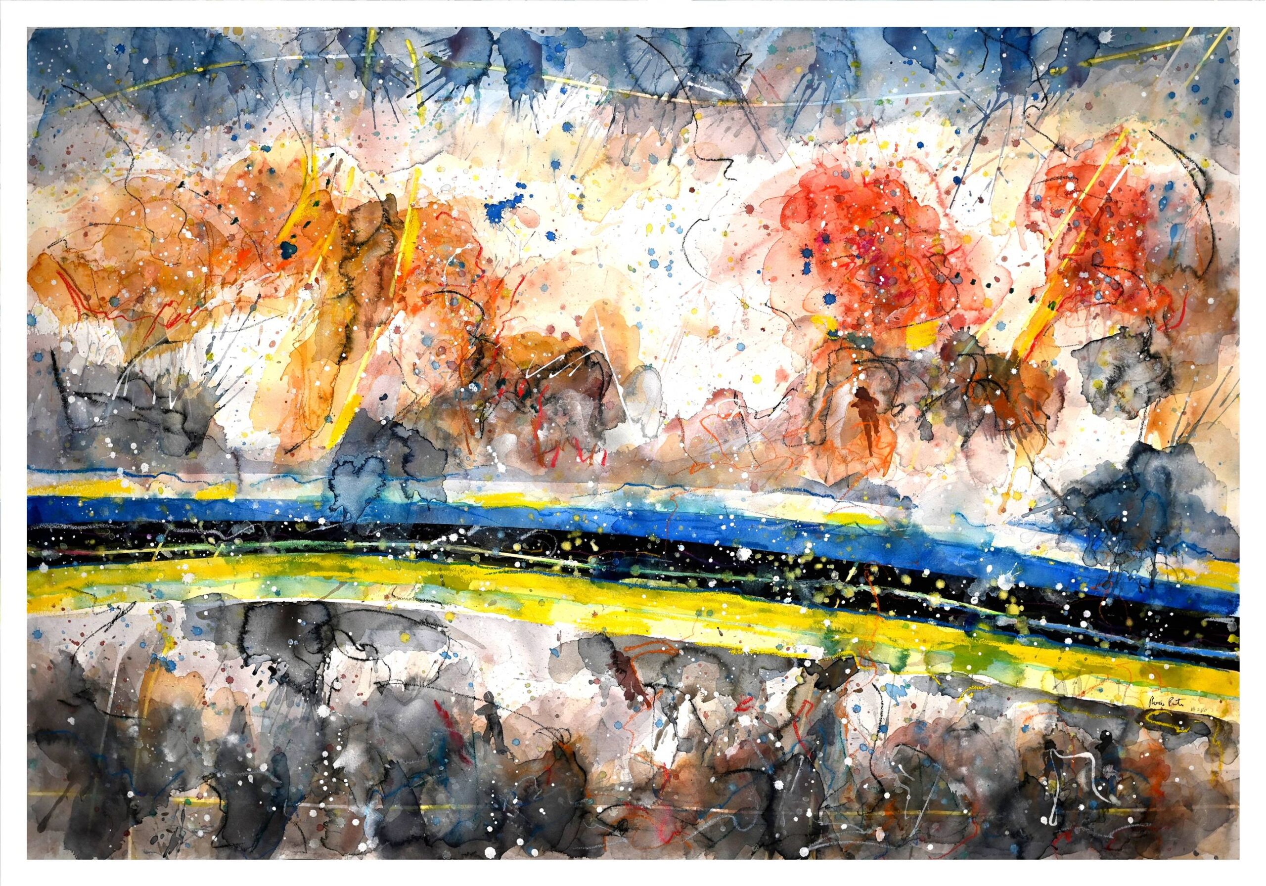
Rocco Pisto, The Fight for Ukraine, Watercolor, 43 x 55″, 2022

The painting, The Fight for Ukraine, is an example of creating art that draws attention to a current European event on everyone’s mind. What might be at first glance abstract, on a closer look, the viewer sees the bands of blue and yellow under siege with aerial bombardment resulting in the symbolism of the Russian armed invasion. The painting incorporates gouache, crayon, and India Ink, with watercolor to form a multimedia expression. Print sales from the original are currently being donated to first responders of the Ukrainian Army.

Rocco Pisto earned a Bachelor’s and Master’s degree in Fine Arts from Eastern Michigan University in 1974 and has been painting for over five decades. He is the recent President Emeritus of the Michigan Watercolor Society and holds a Signature Member and Great Lakes Fellow designation in that group. He also has membership in the National Watercolor Society, the International Society of Experimental Artists (ISEA), and the Brighton Art Guild. Rocco Pisto earned a Bachelor’s and Master of Fine Arts from Eastern Michigan University.

The solo 50-year retrospective at the Flagstar Strand Gallery in Pontiac will run through March 31, 2023.

Enchanted: A History of Fantasy Illustration @ Flint Institute of Arts

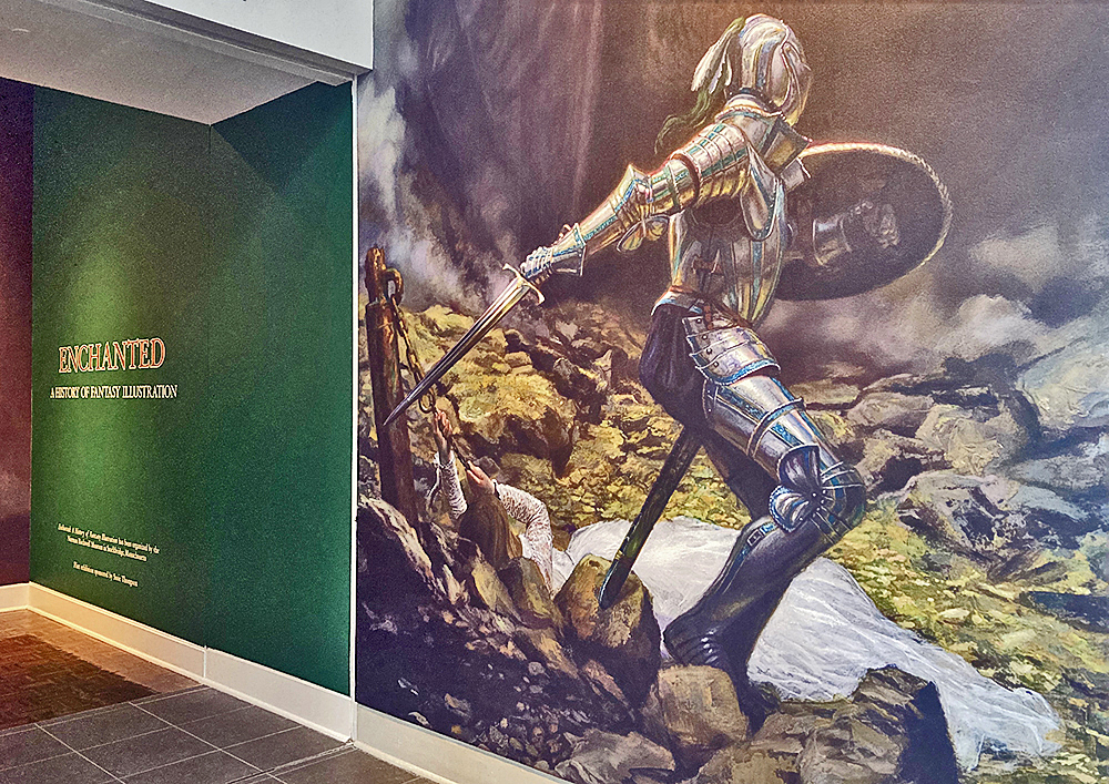
View of exhibition entrance with a large-scale digital print of St. George and the Dragon by Donato Giancola, oil on panel, 2010. All photos: Ashley Cook

The role that enchantment has played in the history of storytelling dates as far back as 2100 BC with The Epic of Gilgamesh, which is considered the point of emergence of the hero’s journey and various fantasy archetypes that we know so well today. The dragons, great floods, serpents and treks through the underworld are just some of the elements that have reliably appeared in scenes of imaginative tales told through time, so much so that the world-building efforts of fantasy writers have constructed an actual parallel universe complete with its own rules, landscapes, species and lessons. Since this first rendition of the dragon, writers and illustrators have contributed to further developing this place that conveniently mirrors our own to serve as a tool for catharsis, entertainment and morality. Enchantment: A History of Fantasy Illustration is the first ever full-scale exhibition to take a serious look at the expanse of this genre and its influence on the history of art, religion, popular culture, and subcultures, with a timeline of works spanning from as early as 1589 to as current as 2021.

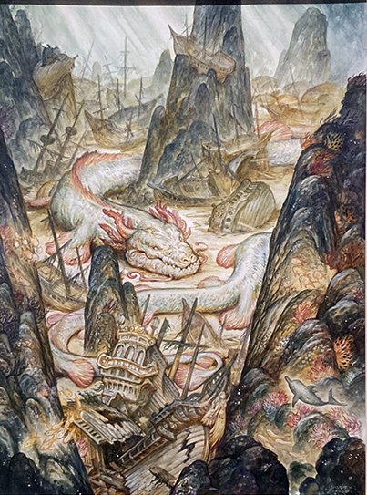
Justin Gerard, Lair of the Sea Serpent, watercolor on paper, 2019.

 Two large galleries of the Flint Institute of Arts have been reserved for over 150 original works; the collection was curated by Jesse Kowalski of the Norman Rockwell Museum in Massachusetts, where Enchantment was first shown. It is not surprising to learn that Kowalski has worked on a number of exhibitions that highlight illustration and fantastical subject matter. A text for this exhibition asserts that “the many facets of fantasy illustration have often been misunderstood or overlooked” and this observation seems to be one of the driving forces behind these curatorial efforts.

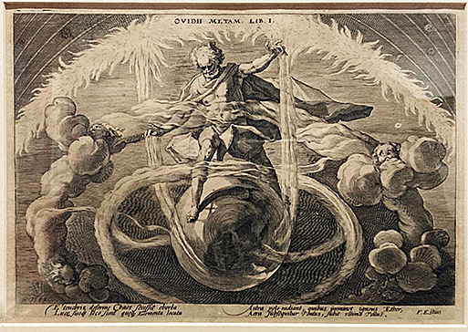
Hendrick Goltzius, Creation of the Four Elements, illustration, 1589.

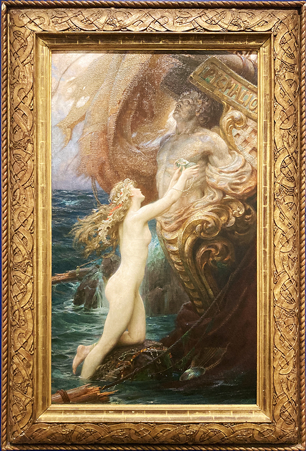
 Guests who are familiar with the Henry and Hodges galleries of the museum may notice the walls were freshly painted to set the tone for the rich colors and dreamy compositions of the show. Appropriate to the setting, the styles in which most of these pieces were done employ classical techniques like oil painting, etching, watercolor, and pencil drawings, with the occasional works rendered digitally by the 21st-century artists of the group. One may even occasionally forget that they are looking at scenes from a world of mythical landscapes and not from our own classical kingdoms of the past, as there is so frequently a thematic and aesthetic overlap between the two. Artworks like A Deep Sea Idyll by Herbert James Draper, Garden of Hope by James Gurney, or Allegory by Omar Ryyan place terrestrial beings and elements into impossible realities with a conviction akin to the old masters, and this blurring of the boundaries between imagination and reality is what makes fantasy so powerful.

Herbert James Draper, A Deep Sea Idyll, oil on canvas, 1902.

 The show has the potential to please visitors of many ages and backgrounds. For those whose palates are less versed in the world of fantasy, the exhibition space becomes a place for learning, with many sources of in-depth information and insight to contextualize the surrounding works. Along with exhibition texts focused on some essential aspects of fantasy including storytelling, adventure and the play between good and evil, there are also information plaques about each individual artwork which note the background of the artist and their role in the lineage of fantasy illustration. Taking in this information may be as enjoyable as basking in the quality of the material application or the beautifully carved frames surrounding the art, but for the visitors who are fantasy connoisseurs, it could be particularly special to read that some of the artworks before them were made for productions as big as The Lord of the Rings or Game of Thrones. In fact, almost all of the artworks included in the exhibition have played an important role in the history of fantasy illustration throughout time.

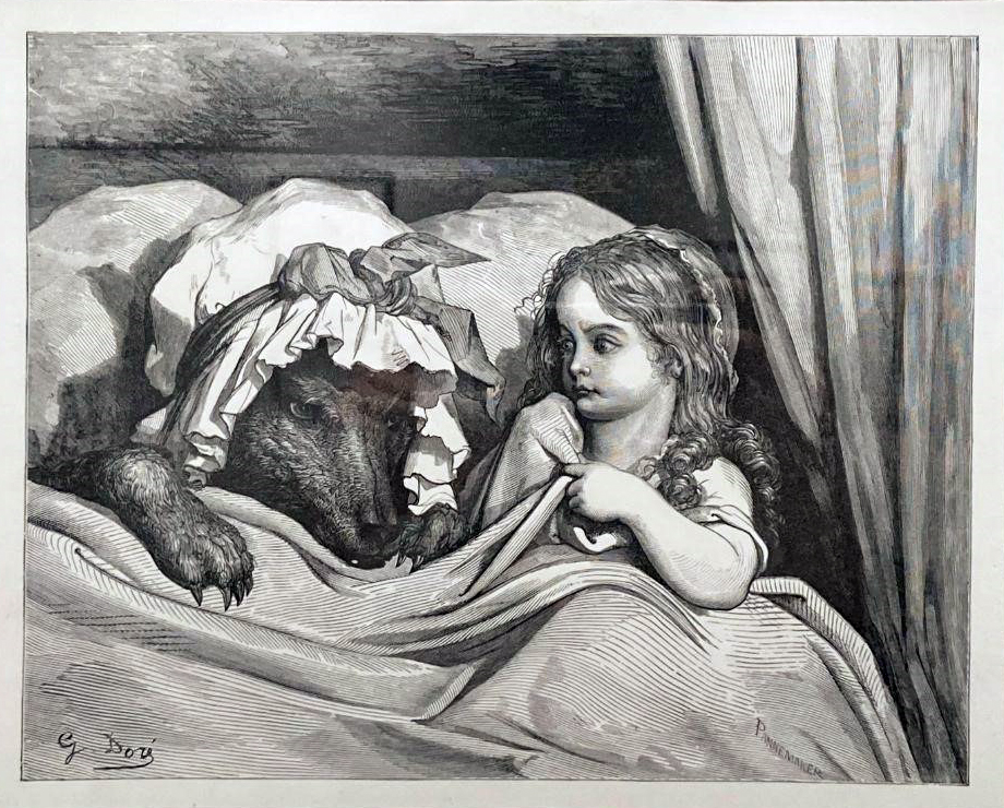
Gustave Doré, Little Red Riding Hood, antique woodcut on thick wove paper, 1880.

 What is interesting about this show is the breadth of work it covers, successfully linking old masters like Gustav Doré, Hendrick Goltzius, Arthur Rackham and Howard Pyle with emerging artists like Victo Ngai and Wayne Barlow. Despite all of the artworks being displayed in a traditional museum style, framed and hung on a wall, many of them were actually originally produced for films and books. There are comic book illustrators like Hal Foster with a drawing from the Prince Valiant series and Dan Dos Santos with the illustration of Red Rose made for Fables. Then we have pulp fiction illustrator Mark Zugs with The Princess of Mars, which was produced for the cover of Mars Trilogy, a compendium which contains original novels originally released in 1917-1919 by Edgar Rice Burroughs.  Henry Clarence Pitz’s Dark Water then brings us back to the early 20th-century ink on paper renderings, predated by the oil painting The Other Side by Dean Cornwell, yet throughout this extensive lineage, a strange consistency has been handed down from generation to generation that allows for almost anyone who has been read a fairy tale to feel at least somewhat at home.

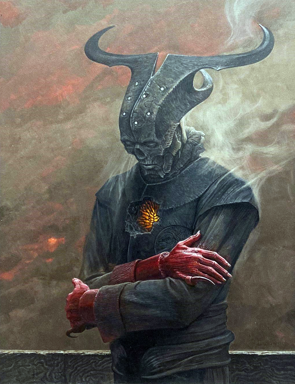
Wayne Barlow, Demon Minor, acrylic on illustration board, 2018.

Enchanted: A History of Fantasy Illustration opened September 24, 2022 and is on view until January 8, 2023. Please visit https://flintarts.org/ for more information.

Zaha Hadid @ Broad Museum

Zaha Hadid Design: Untold at Michigan State University’s Broad Museum

An installation view of Zaha Hadid Design: Untold at Michigan State University’s Broad Museum through Feb. 12.

When the Eli and Edythe Broad Art Museum, designed by the late Iraqi-British architect Zaha Hadid, opened at Michigan State University 10 years ago, the structure was heralded as one of the most commanding pieces of modern architecture on any Midwestern academic campus. As Artforum noted at the time, the 46,000-square-foot structure is “not so much a building as an event.”

That pretty much nails it. Comprised of juxtaposed blocks of parallel steel folds and pleats, and emerging from the ground at skew angles, students immediately nicknamed the $45 million project the “spaceship.” The Broad (pronounced “Brode”) is an aggressive, entertaining structure dropped between MSU’s academic-revival class buildings and the Grand River Avenue commercial strip, a building that makes little visible effort to harmonize with its surroundings — even as it feels somehow perfect in its location. Indeed, the Broad resembles nothing so much as an alien vessel that plowed into the earth at high speed during an emergency landing.

The Eli and Edythe Broad Art Museum at Michigan State University, designed by Zaha Hadid. (Photo courtesy Michigan State University Communications.)

If the work of Hadid, a Pritker Prize-winner who practiced for decades in London until her death in 2016, challenges both geometry and convention, much the same can be said for the Broad’s exhibition up through Feb. 12, Zaha Hadid Design: Untold. This career retrospective, curated by the Broad’s former director, Dr. Mónica Ramirez-Montagut, and Woody Yao of Zaha Hadid Design, spans 40 years of creative work, and sprawls over three floors. Rather than concentrating on her buildings, Untold spotlights Hadid’s non-architectural work, including tables, chairs, colorful rugs, chandeliers, a tea service, a chess set, and a car prototype that looks a bit like a sharp-nosed egg with wheels. She even brought her skills to bear on sneakers and outré fashion.

Zaha Hadid, Installation view of carpets and table in Zaha Hadid Design: Untold, at the Eli and Edythe Broad Art Museum at Michigan State University, 2022. (Photo: Dustin Forest)

For their part, Hadid’s buildings have a habit of upending our expectations for what a structure ought to look like. In addition to the Broad, one of her best examples is the large, crystalline egg she balanced on top of a traditional, 19th-century building for the Port Authority of Antwerp, Belgium. Or you could point to her elegantly curvilinear Aquatics Center built for the 2012 London Olympics.

In like manner, the artifacts in this show challenge age-old assumptions for what shape ordinary objects should assume. “There are 360 degrees,” Hadid famously said. “Why stick to one?” Following this dictum, tables, chairs and shelving units in Untold shake off any pretense of rectilinearity or standard form, morphing into instruments at once sinuous, expressionist and functional. As Broad Interim Director Steven L. Bridges put it, these works “ask us to think and see things differently at every turn.”

Zaha Hadid, Installation view of furniture and shelving units in Zaha Hadid Design: Untold, at the Eli and Edythe Broad Art Museum at Michigan State University, 2022. (Photo: Dustin Forest)

Born in Baghdad in 1950, Hadid graduated with a mathematics degree from the American University in Beirut, Lebanon, before moving to London in 1972 to attend the Architectural Association of London School of Architecture where she won the Diploma Prize on graduating in 1977. Two years later she founded Zaha Hadid Architects in the British capital, though she wouldn’t complete her first building, the swooping Vitra Fire Station in Weil Am Rhein, Germany, until 1993.

Most of Hadid’s designs were built abroad, perhaps unsurprising for a European architect. She did, however, design a condo tower that’s nothing but curves adjacent to New York’s High Line, as well as the Lois and Richard Rosenthal Center for Contemporary Art in Cincinnati – a handsome exercise in Brutalist block geometry that was the first major American art museum designed by a woman. As much an educator as a pioneering designer, Hadid taught at London’s Architectural Association, and held guest professorships at the University of Applied Arts in Vienna, as well as Columbia, Harvard and Yale.

Zaha Hadid, Installation view of vase, table and carpets in Zaha Hadid Design: Untold, at the Eli and Edythe Broad Art Museum at Michigan State University, 2022. (Photo: Dustin Forest)

Hadid’s work is often called “transformational,” and the pieces in this exhibition underline how radical her vision could be. Indeed, The Guardian dubbed her “the queen of the curve” for her boundary-pushing architecture. Starting her career in the 1970s, Hadid was very much the exception in a profession dominated by men who didn’t necessarily take kindly to a brilliant Iraqi woman. Small wonder, then, that one of the adjectives most commonly used to describe her is “fearless.”

That gutsiness, tempered by extraordinary vision, can be found all over the Broad Museum, both in Untold and the structure of the interior spaces themselves. Cutaways allow for dramatic vistas from the third floor down to the second, and the walls, depending on where you are in the building, tilt from 15 to 40 degrees off the perpendicular. Much like Frank Lloyd Wright’s Guggenheim Museum in Manhattan, Hadid’s Broad Museum is as much an experiential thrill as an envelope to house artifacts. In this respect, going to Untold is something of a twofer – both an intriguing exhibition and a passage through mind-bending architecture.

Zaha Hadid, Installation view of Zaha Hadid Design: Untold, at the Eli and Edythe Broad Art Museum at Michigan State University, 2022. (Photo: Dustin Forest)

Zaha Hadid Design: Untold will be at Michigan State’s Eli and Edythe Broad Art Museum through Feb. 12.

Full Circle: James Benjamin Franklin @ Cranbrook Art Museum

Installation Cranbrook Art Museum, James Benjamin Franklin, Full Circle, 2022

In the color-saturated, exuberant and irregularly shaped paintings of James Benjamin Franklin’s solo show Full Circle, humble and often degraded fiber elements of domestic detritus are transformed by all means necessary into improbably beautiful contrivances for seeing and being. With this exhibition of 11 recent artworks, on view until March 19, 2023 at the Cranbrook Art Museum,  he has returned—full circle–to the campus where he earned an MFA in 2017 for his first solo museum show. A West Coast native now living and working in Detroit, Franklin has absorbed the influence of the city’s surfaces and structures and has now transformed those raw materials into a lush visual feast.

Aim, 2022, acrylic, fabric, plaster, sand, epoxy on extruded polystyrene, 82.5” x 79” x 3.25 photo: K.A. Letts

The paradox at the center of Franklin’s art practice is that he achieves these sumptuous effects while using the humblest of lowbrow materials. The artist creates his own eccentrically configured grounds from extruded epoxy and foam core, a process that takes several days and yields a flat shallow receptacle with raised edges. It’s a fictive playground of sorts for his highly idiosyncratic painted inventions. Into this sandbox-sized tray go thrift store fabrics, IKEA finds, blankets, bits of carpet, rugs and bathmats that form the underlying physical basis for the paintings. He also seems to have a particular affinity for crocheted afghans, lace doilies and other hand-crafted bric-a-brac. Next comes the audacious improvisational application of paint and glitter and sand and plaster in color combinations that vary considerably from artwork to artwork.

The resulting paintings balance esthetic refinement with the effect of a precocious child’s craft project. It’s evident that this is fully intended. “I needed to achieve the playfulness which was sitting at the back of my head,” Franklin said in a recent interview with Bomb magazine. “I want to get lost and get a sense of either joy or mystery in the work and all the materials that are used and just kind of all the things that are unexpected and surprising.”  Franklin credits the gritty urban environment of Detroit and a certain local DIY mentality for inspiration and he specifically cites the influence of the Dabls Mbad African Bead Museum.

We have the sense that as the artist continues to explore his improvised methods, he has become more confident in the capacity of his materials to convey the intended effect.  The paintings have become diaphanous and translucent, and the constituent parts are allowed to retain their identity while contributing to Franklin’s overall project.

Rise, 2022, acrylic, fabric, plaster, sand, glitter, and epoxy on extruded polystyrene, 5” x 79” x 3.25” photo: K.A. Letts

This is an artist who is willing to take risks, to experiment, and to trust his process and his vision. His painting, Rise, is emblematic of this self confidence.  Franklin depends on the physical roughness of the dimensional lacy fabrics to provide the formal substructure for a particularly offbeat composition. Dominated by the diamond shape in the lower, slightly left-of-center quadrant of the painting, Franklin softens its intrusive presence with varied shades of acid yellows and muddy pinks, plus a judicious sprinkling of metallic glitter. He has changed the orientation of the tray throughout the creative process, sometimes using gravity to move the paint and in other instances allowing the colors to puddle. Swooping yellow and green linear curves at the top quarter of the composition allow the irregular movement of the exterior shape to make inroads.  The spidery lace patterning at the top of the painting comes to the perceptual foreground while other elements are submerged by inchoate blobs of pigment. There is nothing programmatic; this process feels entirely intuitive.

Every visitor will have their own favorites among the paintings in this exhibition.  I was particularly charmed by his painting Be, where Franklin has allowed the native colors of the yellow and orange 1970s zigzag afghan at the top of the picture to participate in the interplay of the constituent elements, while sunny lines created by dry brushing carry an implied landscape across the imaginary horizon. Thickly applied blue glitter makes a starry lake at the bottom of painting. The whole thing seems both incredible and inevitable.

Be, 2022, acrylic, fabric, sand, glitter, epoxy on extruded polystyrene, 82.25” x 80” x 3.25” photo: K.A. Letts

Of course, this level of risk-taking can go wrong, and in Accord, Franklin’s experimentation with framed voids in the interior of the painting seem, to me at least, to be unsuccessful, as they stop the flow of the composition at awkward points. But Franklin’s chance-y explorations more often meet with consistent, lightning-in-a-bottle success.

Every painting in Full Circle has its own idiosyncrasies and difficult-to-quantify virtues, as well as its own internal color-logic. They share procedural and material elements, but through careful examination, we discover that each artwork represents a singular dialog between the artist’s imagination and his medium. There is a courting of potential surprise–and even disaster–in each one, yet time after time Franklin successfully produces exhilarating paintings that surprise and delight.

Retain, 2022, acrylic fabric, plaster, sand and epoxy on extruded polystyrene photo: K.A. Letts

Full Circle: James Benjamin Franklin @ Cranbrook Art Museum, through March 19, 2023

Page 9 of 49

Powered by WordPress & Theme by Anders Norén