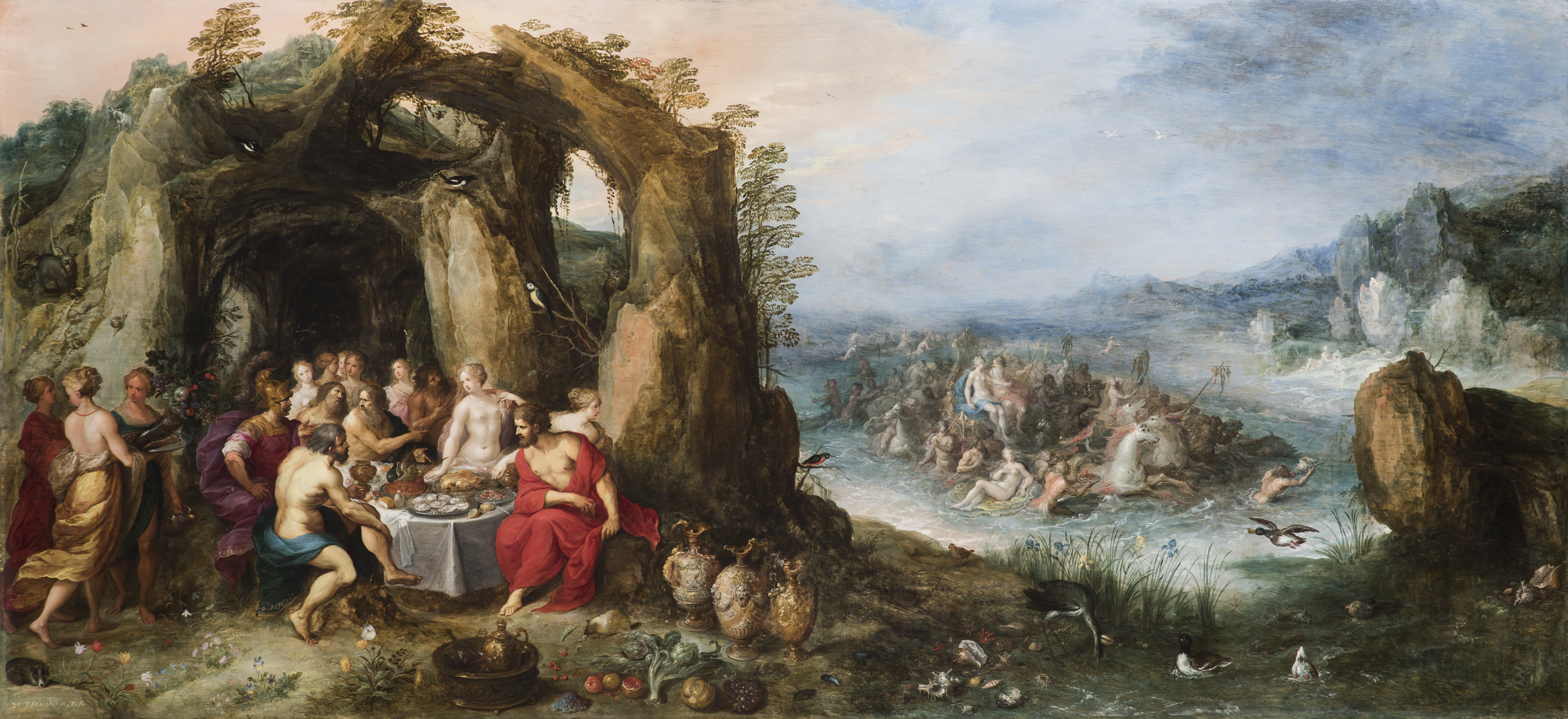
Frans Francken, Feast of the Gods, Oil on Panel – A landscape with Theseus and Achelous, with the Triumph of Poseidon and Amphitrite beyond Frans Francken the Younger / Antwerp, 1581 – Antwerp, 1642 Joos de Momper the Younger / Antwerp, 1564 – Antwerp, 1635 Signed lower left :Dᴼ FFRANCK. IN.E.F. Oil on panel, 72 x 157 cm. (28 ½ x 61 ¾ in.)
The Wasserman Projects opened a new exhibition, Old Masters / New World from the Colnaghi Gallery of London, for a limited time, September 7-11, 2016. The work includes major painting and sculpture by such artists as Frans Francken, Gaetano Gandolfi, Jusepe de Ribera, and Pedro Duque y Cornejo.
Gary Wasserman, Founder of Wasserman Projects says, “We share Colnaghi’s vision to connect the historic with the contemporary, and to show art in a diversity of contexts and through a wide range of collaborations. To be able to show these tremendous Old Master works in the contemporary, industrial-style setting of our exhibition space is an exciting proposition that highlights the connection between the past and present and offers a new way of experiencing both the art and the space.”
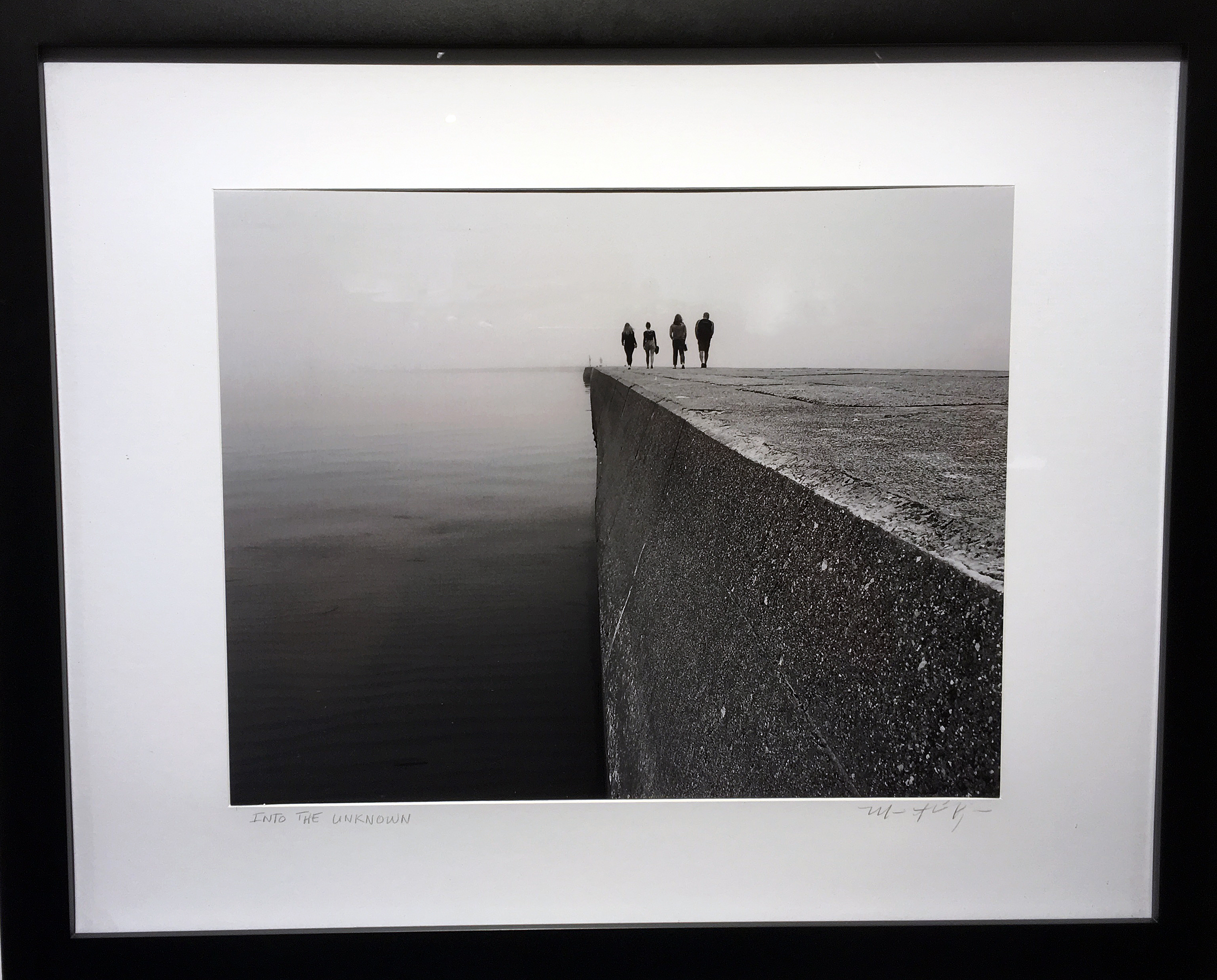
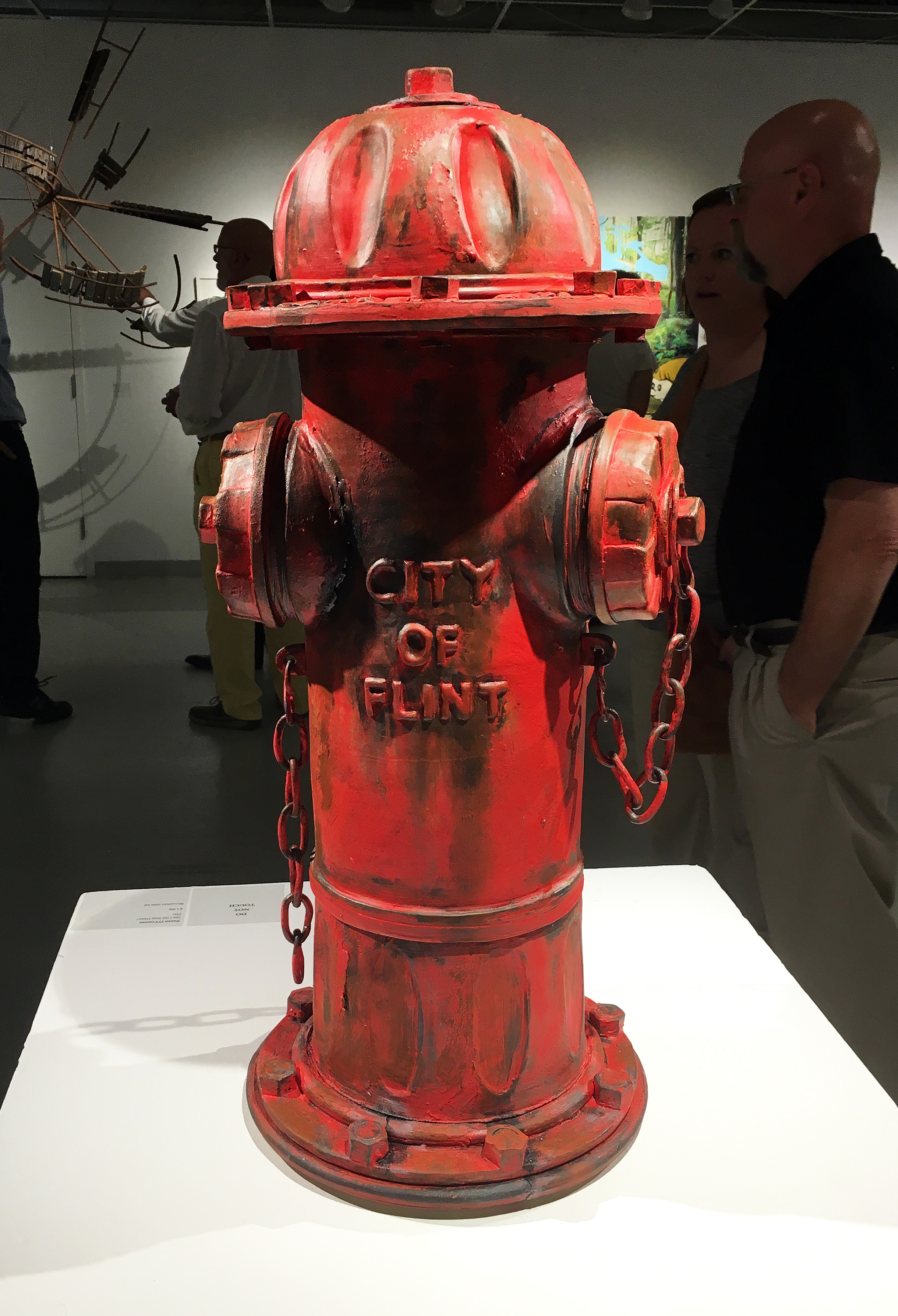
If you look at the trajectory of Wasserman Projects, set in a former firehouse in Detroit’s historic Eastern Market, the work on exhibition there has been contemporary and at times conceptual. The gallery works with artists from across disciplines and around the world, presenting exhibitions and performances that spark a discourse on art, but also cultural, social, or political issues, which are particularly active and timely in Detroit.
In attendance for this opening was Jorge Coll, CEO of Colnaghi, “We are thrilled to build on our long and storied history in America by holding our first exhibition in Detroit, and to be doing so in partnership within many of the greatest American museums and collections, including ones in this city. It is in this spirit of engaging new and existing communities of arts enthusiasts and collectors that we are holding Old Masters / New World in Detroit. We see our vision to present Old Master works across a wide range of locales as parallel to the missions of museums and universities to educate on the arts.”
Fray Juan Bautista Maíno “The Holy Family with the Infant Saint John the Baptist” Pastrana, 1581 – Madrid, 1649, Oil on Canvas 110.5cm x 92.5cm
The painting, The Holy Family, reminds this writer of how popular it was in the 14th through 16th centuries to paint the Madonna and Child. Here, the artist Stozzi, includes Joseph, the husband of Mary, and the young child Jesus, reminding us of the age difference, and provides the audience with a direct and comforting look from the mother. When I first read and studied the work of Giovanni Bellini, it was amazing how many paintings he made of Madonna & Child. People of wealth during these times, would commission a painting for their home, and because Catholicism was the dominate religion, there was nothing more pure and sacred than this image. One gets the impression there was tremendous status in having such a painting in their home. So the answer to the question is that it was very lucrative for artists to make so many of these paintings. The only question raised here is who is the child at the bottom of the painting who draws the attention of both Jesus and Joseph with the halo? The answer is his cousin, John the Baptist.
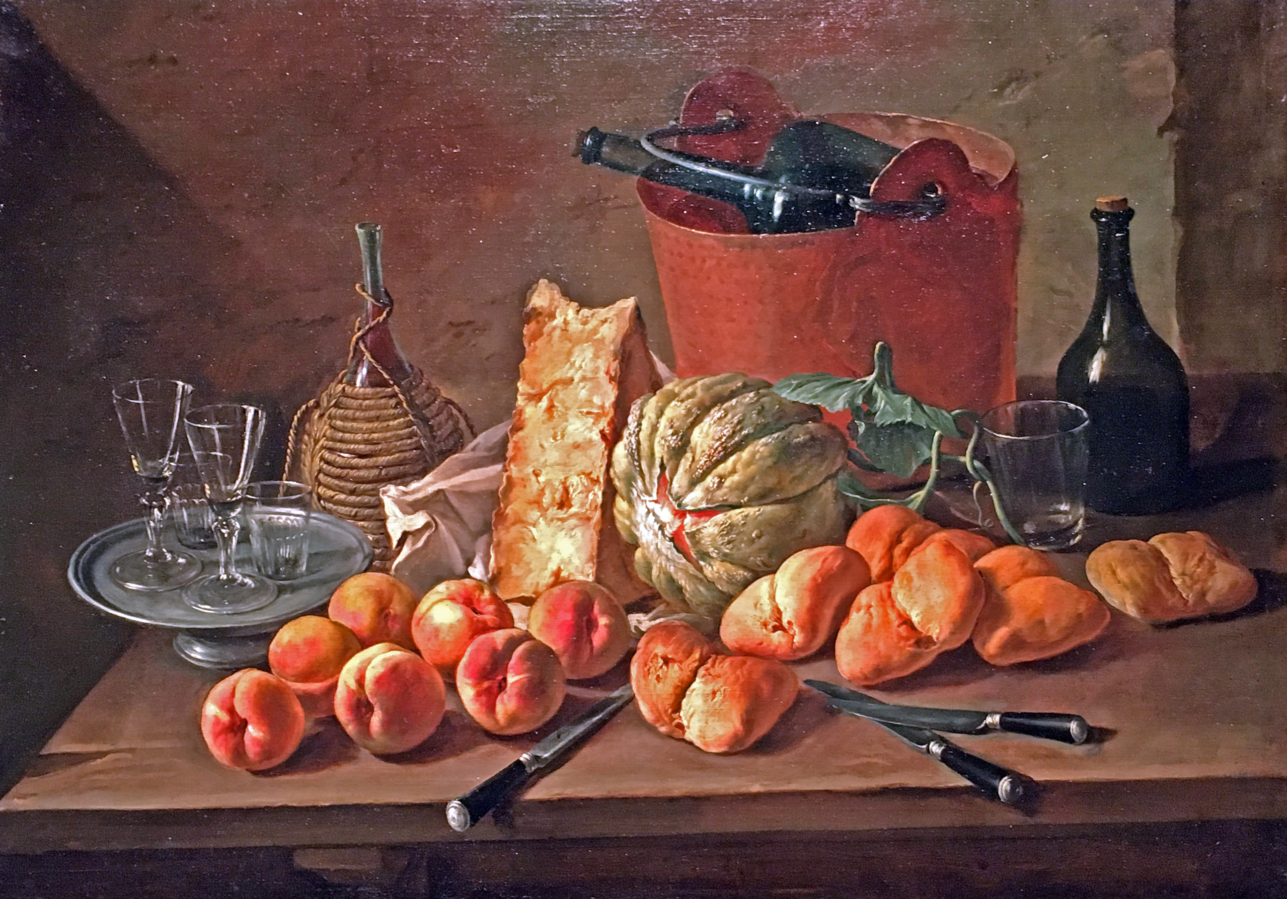
Giacomo Ceruti, Kitchen Still Life, 84 X 118 cm, Milan, 1698 – 1767
Still life paintings were popular during this time period. In Kitchen Still Life, the painter Giacomo Deriti produces a classic realistic composition that easily sets the stage for painters to come a century later. These near photo realistic images (before the invention of photography) are composed and lit, which provides the artist with an unlimited amount of time to compose, draw, under-paint, and add reflective details. Elements of illusion are magnified by having the knives come off the front edge of the table, while at the same time create a balance of shape and form with the light source coming from the upper left.
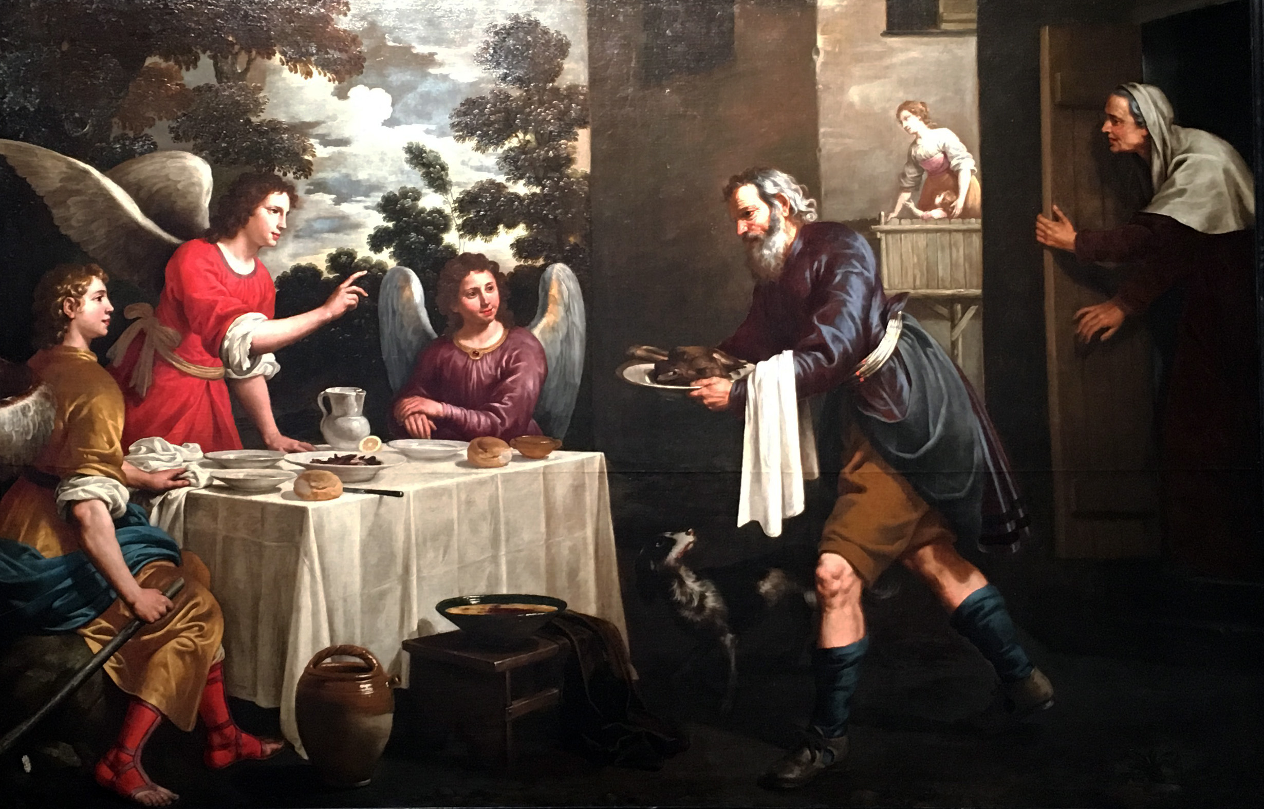
Juan van der Hamen y Leon, Abraham and the Three Angles, 279 X 181cm, Madrid 1596-1631
The Spanish painter, Juan van der Hamen, was born in Madrid in 1596 and was recognized for his allegories and landscapes during the Baroque period. A prolific artist, van der Hamen painted all his works during the first decade of the reign of Philip IV. As a religious painter Hamen worked for several religious institutions in and around Madrid and Toledo, like the Monastery of the Descalzas Reales, in Madrid, for which he painted altars. The best surviving examples of his religious work are in the cloister of the Royal Convent of La Encarnación in Madrid, painted in 1625 in a naturalistic tenebristic style. The painting Abraham and the Three Angels is known for the stylistic characteristics and the iconographic interest of the scene, by which the artist interpreted the Biblical theme of the apparition of the three angels in the house of Abraham to announce that Sara would conceive a son.
So why is it important for young people today to experience this work, both in galleries and museums? Let me start by saying that many things that are part of human history continue to enrich our lives: Mathematics, Philosophy, Literature, Music and certainly Art. Do we not still listen to Bach and derive meaning that connects us to all music, and can we not still relate to the allegory in Dante’s Divine Comedy? For Wasserman Projects to bring this experience to Detroit creates the opportunity to expose Italian and Spanish Renaissance Painting to an audience that may not have thought of the connection that all art shares.
Wasserman Projects demonstrates that it is guided by a spirit of collaboration, recognizing that art is best realized and most meaningful when it engages the broad range of people such as the dynamic and diverse population of Detroit.
Wasserman Projects, September 2016