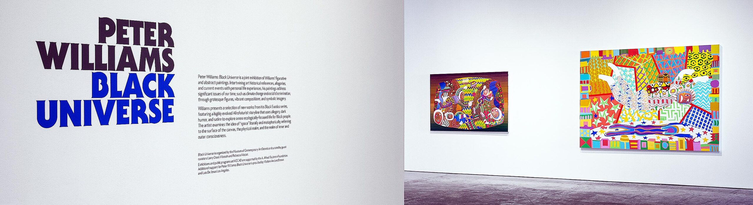
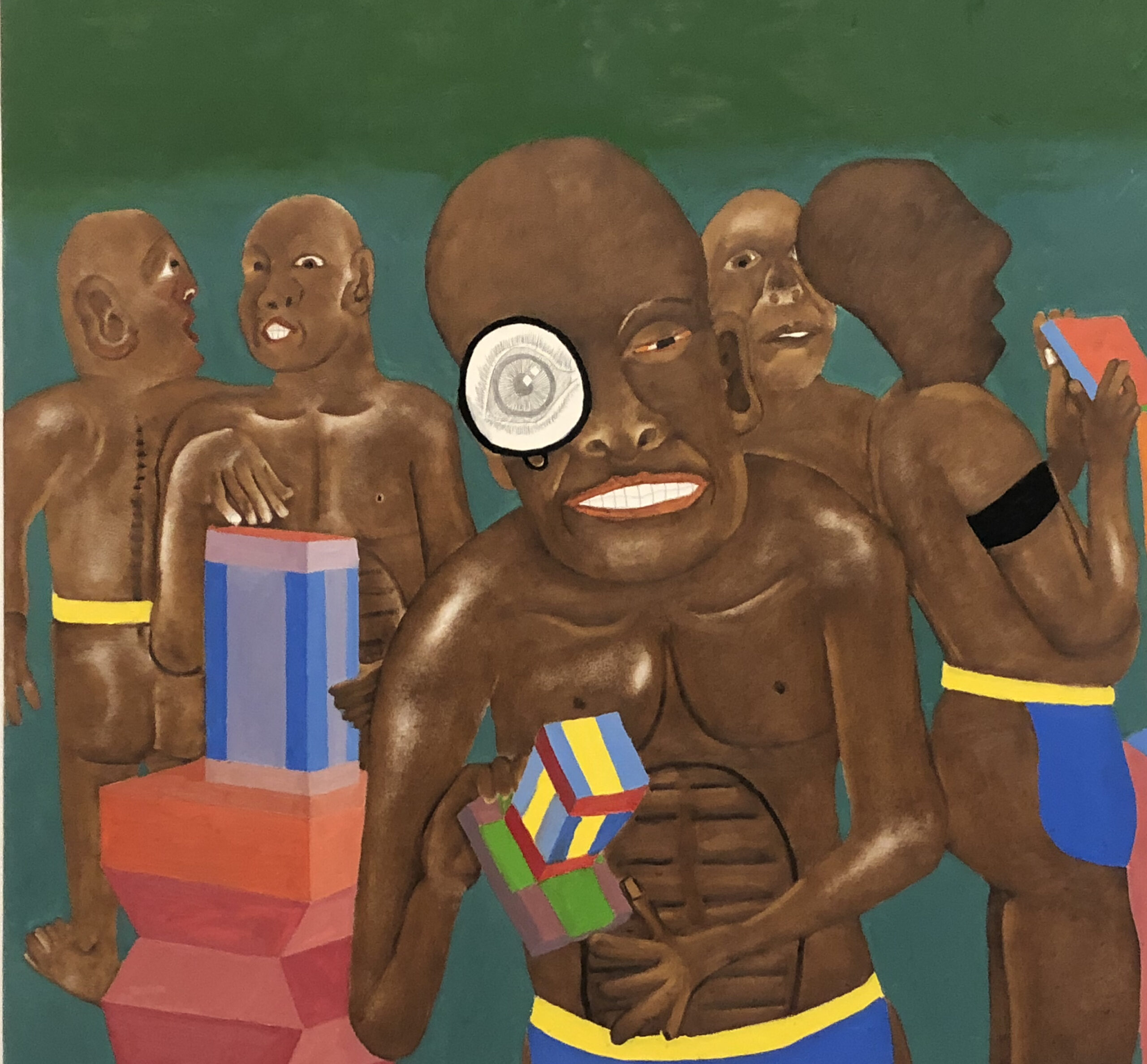
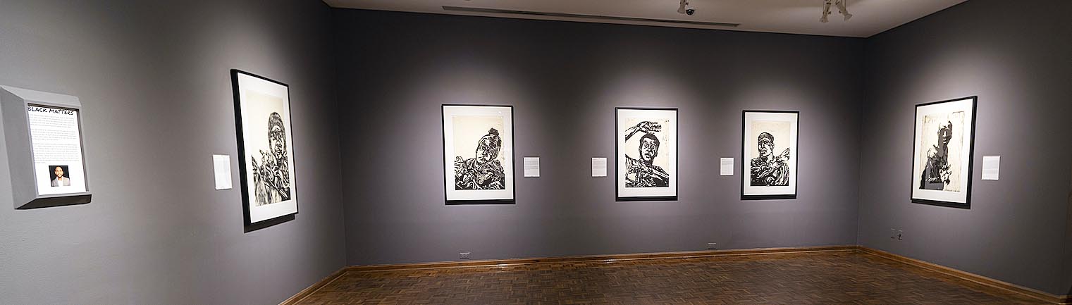
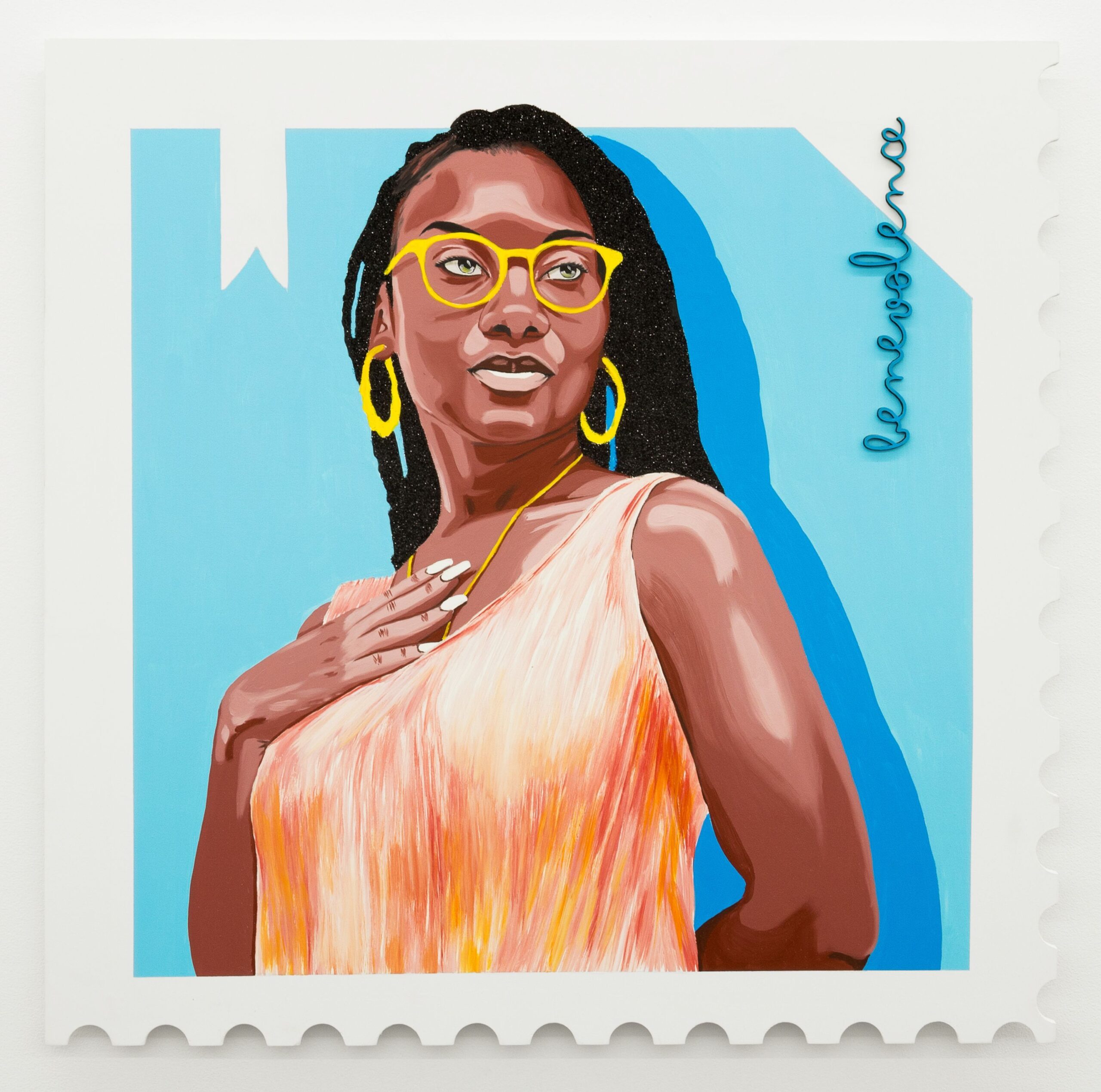
Mario Moore Curates a Group exhibition at the David Klein Gallery
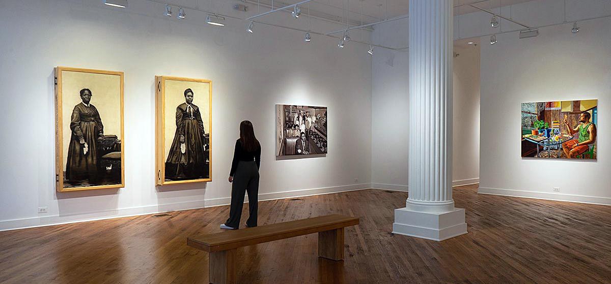
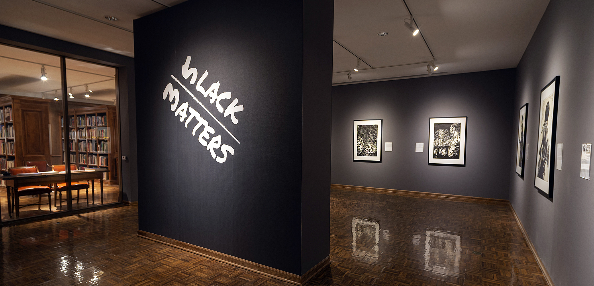
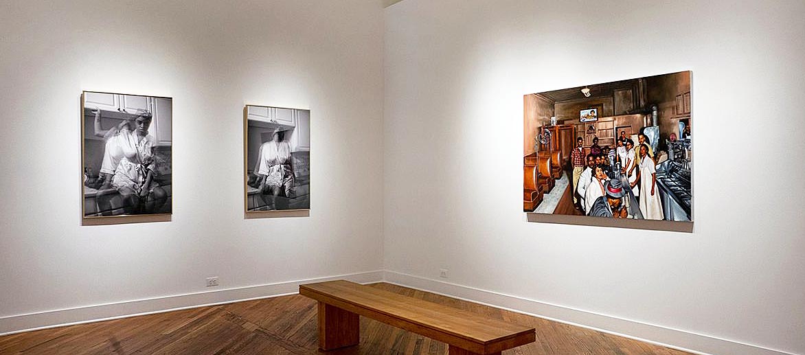
Familiar Installation, Jason Patterson (L) , Mario Moore (C), Senghor Reid (R) All images courtesy of David Klein Gallery except noted.
The historical moment in which we find ourselves, a moment when a pandemic and racial unrest crash into the political upheaval of a presidential campaign, seems to demand that artists respond somehow with starkly political work that addresses our collective pain. And many artists have responded with polemic art, to great effect.
But there is a more intimate, personal and equally valid response to make at this juncture in our history. That is the road that Detroit artist and curator Mario Moore has chosen to follow. For this group exhibition Familiar, at David Klein Gallery until October 24th, Moore has chosen five other like-minded artists to join him in meditations on memory, work, and family–most particularly mothers–in Black American history. These artists have taken the cultural moment into account, but they produce art that acknowledges the zeitgeist while operating on a deeper, more enduring level.
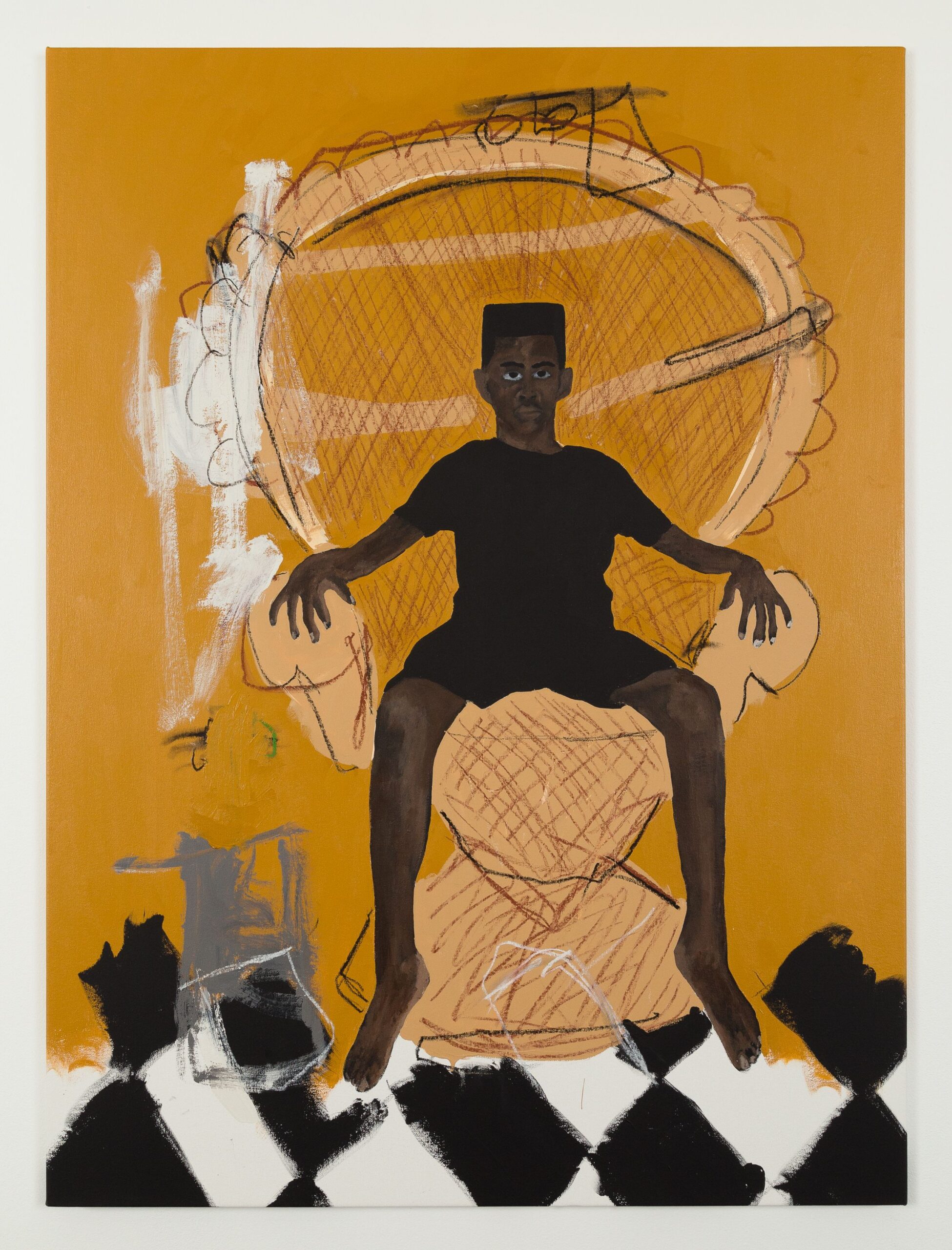
Mario Moore has become a visual historian of Black experience through his intimate portraits of the people that inhabit his world. His recent project, The Work of Several Lifetimes, emphasizes the importance of essential workers, often unseen and under-appreciated. In his paintings, he brings the figures that inhabit the background into the foreground, and in so doing makes an argument for the dignity of labor in all its forms.
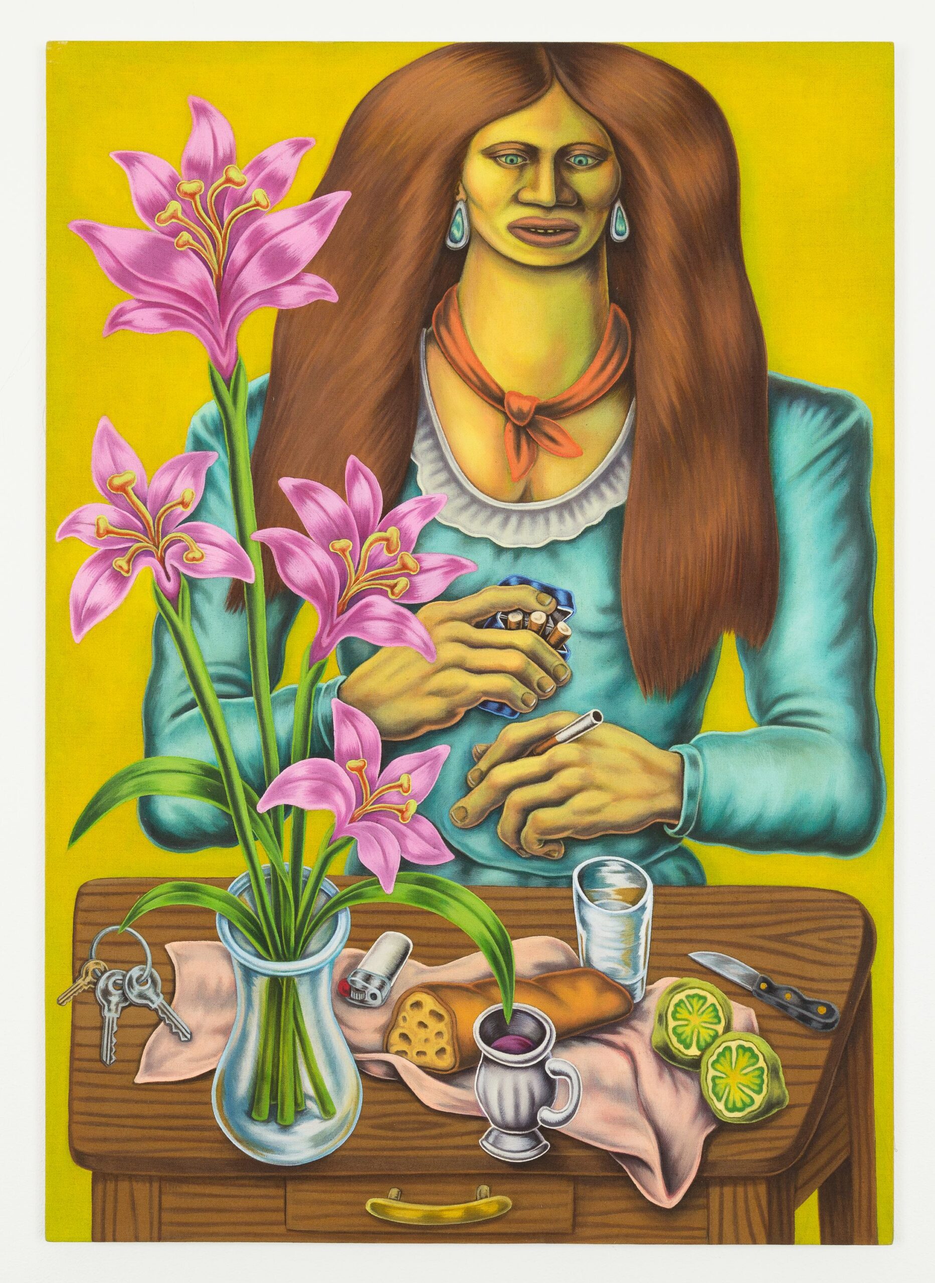
Mario Moore, I Continue to Dream, 2020, oil on linen,44” x 62”
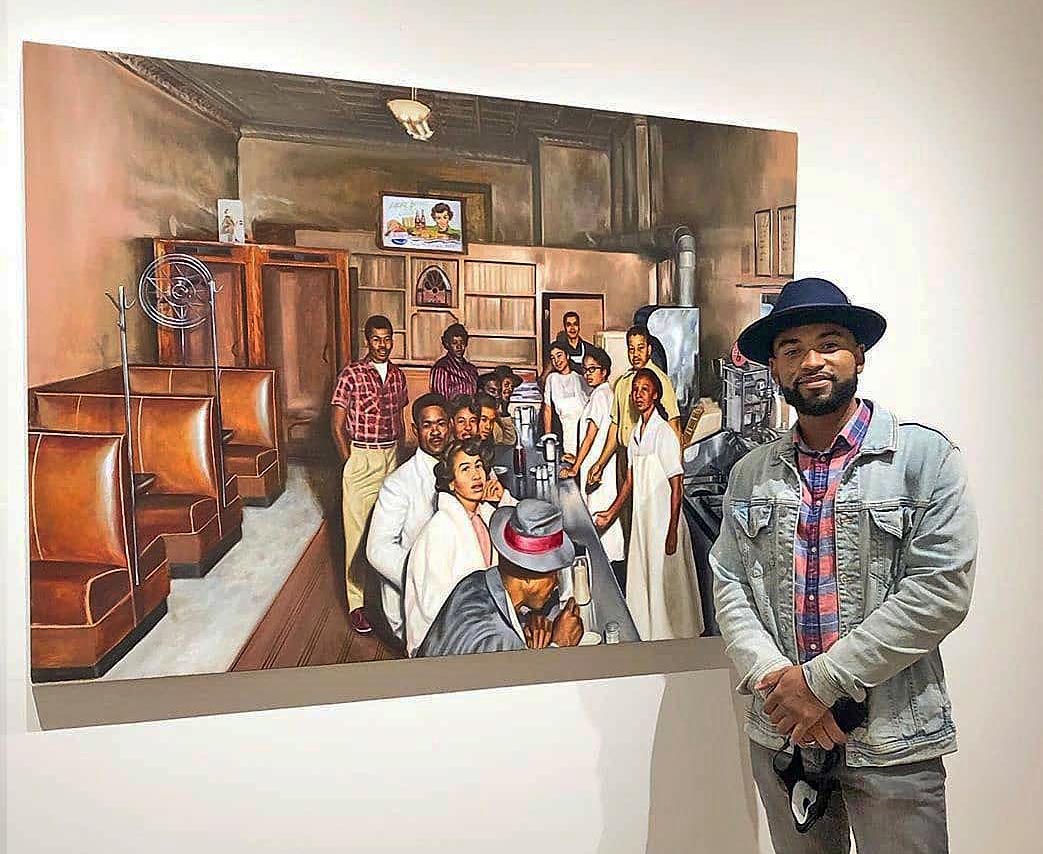
The three paintings Moore has chosen for exploration in Familiar are based on a photograph he recently discovered, of a Detroit diner once owned by his family. Moore was unfamiliar with this part of his family history and he set about learning more. Initially, he made a faithful black and white painting of the restaurant and its occupants, which included his grandmother and great grandparents. The two subsequent paintings are colored–literally–by the artist’s conversations with his grandmother, who described the place and people in more detail, thus combining archival images with familial oral history to recapture a past he never knew.
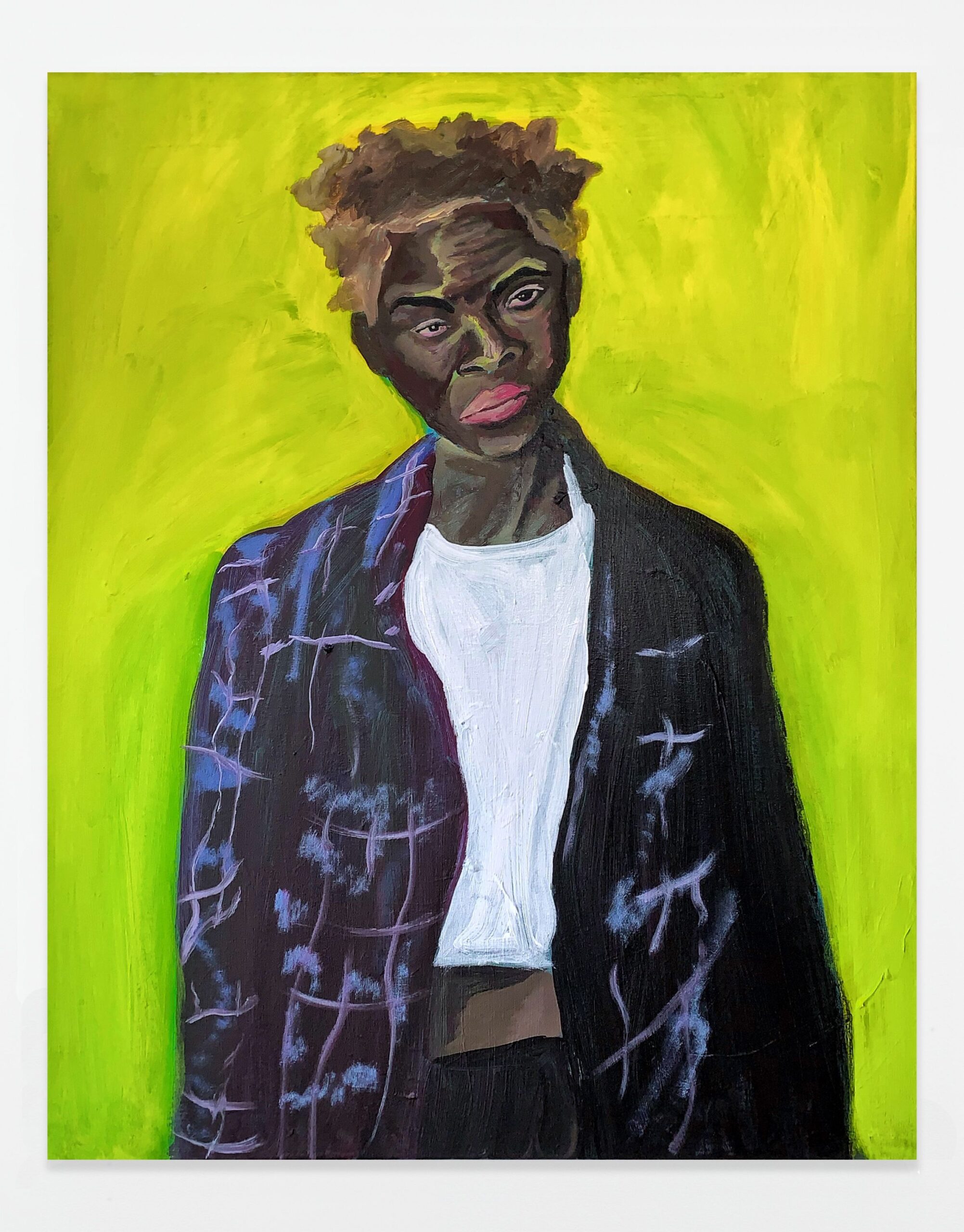
In contrast to Moore’s intimate storytelling, Illinois-born artist Jason Patterson’s images are arms-length and archetypal. He can convincingly claim to be an archivist and cultural historian of Black experience in addition to his considerable skills as a draftsman and craftsman. For the diptych The Negro Mothers on display, part of his series New Americans: Our Mutual Improvement & Social Elevation, he has drawn from vintage photographs of Reconstruction era Black women in the Randolph Linsly Simpson Collection in Yale’s Beinecke Library. The resulting monumental pastels of upwardly mobile African American matriarchs of the 19th century stand their ground on varnished, sepia-toned raw canvas. Patterson has surrounded and embedded these towering images in elaborate, coffin-like pine boxes that foreshadow the frustration of Black aspirations during Jim Crow. To further press his point, Patterson has carved quotes from the Langston Hughes poem, The Negro Mother, into the pine boxes.
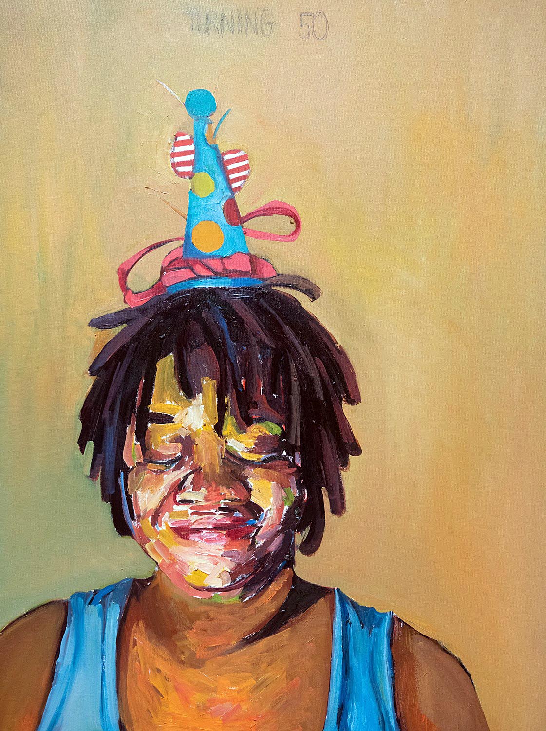
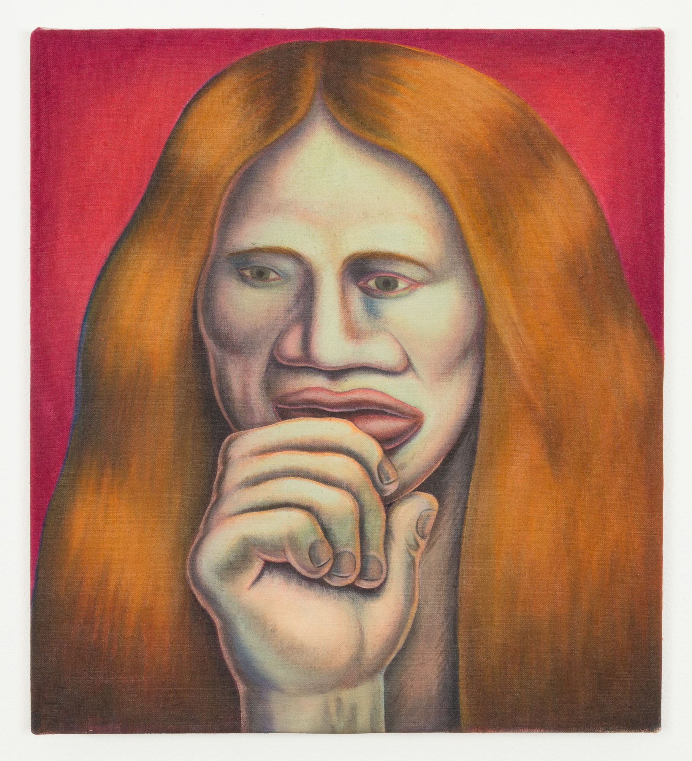
Beverly McIver, Turning 50, 2013, oil on canvas, 40” x 30”
Beverly McIver comes at her examination of family through intimacy. Her medium-sized square compositions are dominated by the larger-than-life heads of her subjects, in this instance her father, her sister and herself. The backgrounds are hazy, featureless fields of color, her lively brushwork is confined to the interiors of the painted faces. Compositional simplicity powers these modestly sized but impactful paintings. The portrait of her sister, Renee, is particularly interesting, her smiling face in the upper third of the picture offset by the flat whiteness of the cat in the foreground. McIver’s self-portrait is equally satisfying; she gazes ruefully out of the picture plane, a party hat perched on her head as she contemplates turning 50. The elegant simplicity of McIver’s paintings is a pointed reminder that sometimes less really is more.
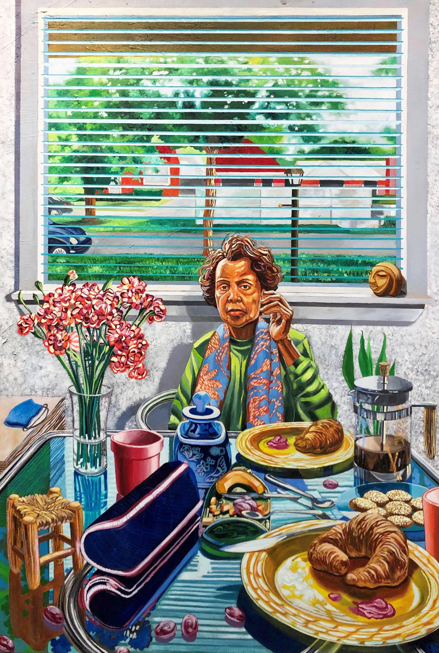
Senghor Reid, In Which We Serve, 2020, oil on canvas, 58” x 39 ½ “
Detroit artist Senghor Reid’s harshly daylit, everyday rooms can be interpreted as metaphors for his interior life. Each element in these crowded interiors–a book, food, a potted plant–is apparently mundane but exists simultaneously on a parallel symbolic plane. Of particular interest among the three paintings Reid has contributed to the show is In Which We Serve which brings up, once again, the importance of the black mother in the life of the family and in the context of the larger community. Shirley Woodson Reid, a prominent Detroit arts educator and Senghor Reid’s mother, is the authoritative primary figure. Her stern features occupy the center of the painting, both literally and figuratively, while arrayed before her are carefully selected objects that seem to suggest devotional offerings. Her importance, both to the artist and to the community, is acknowledged even within this modest domestic setting.
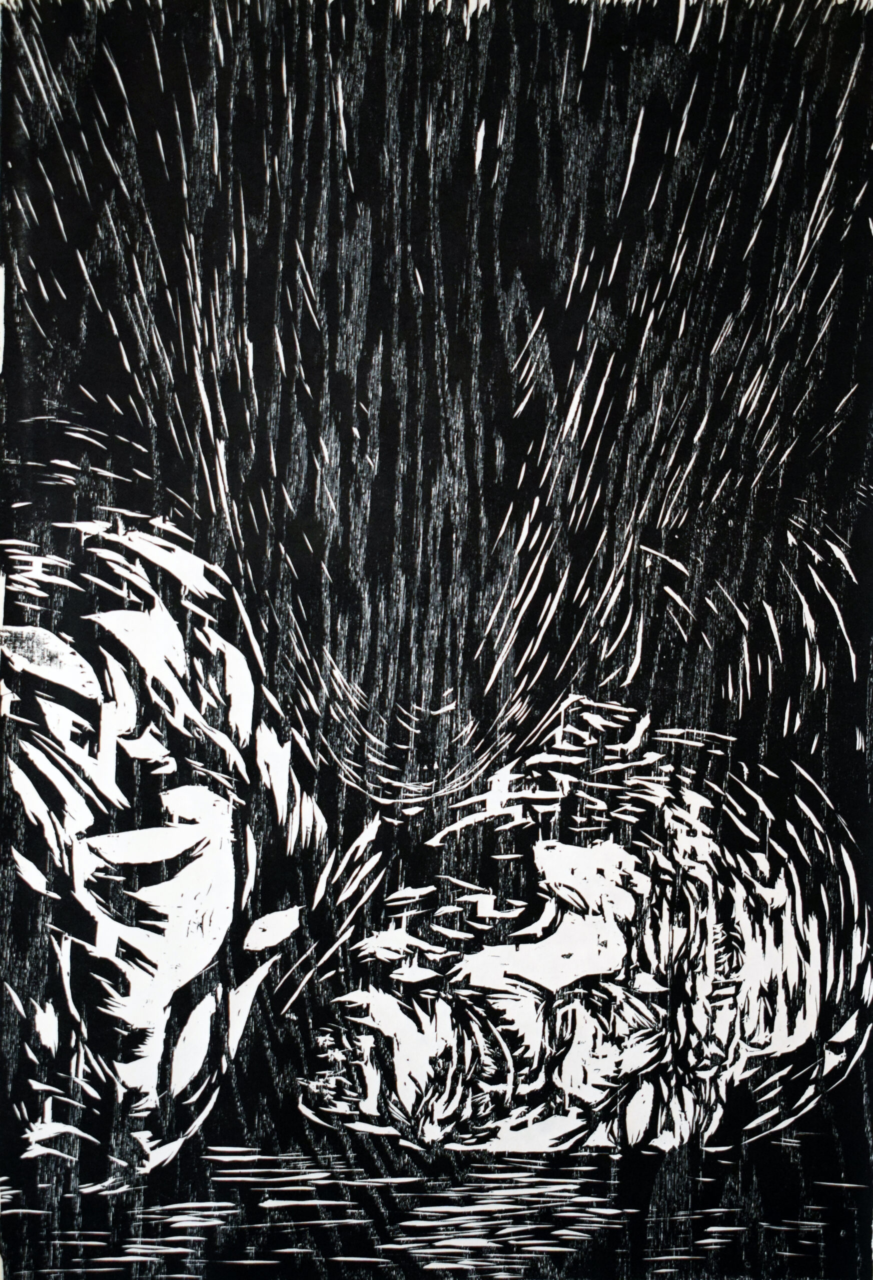
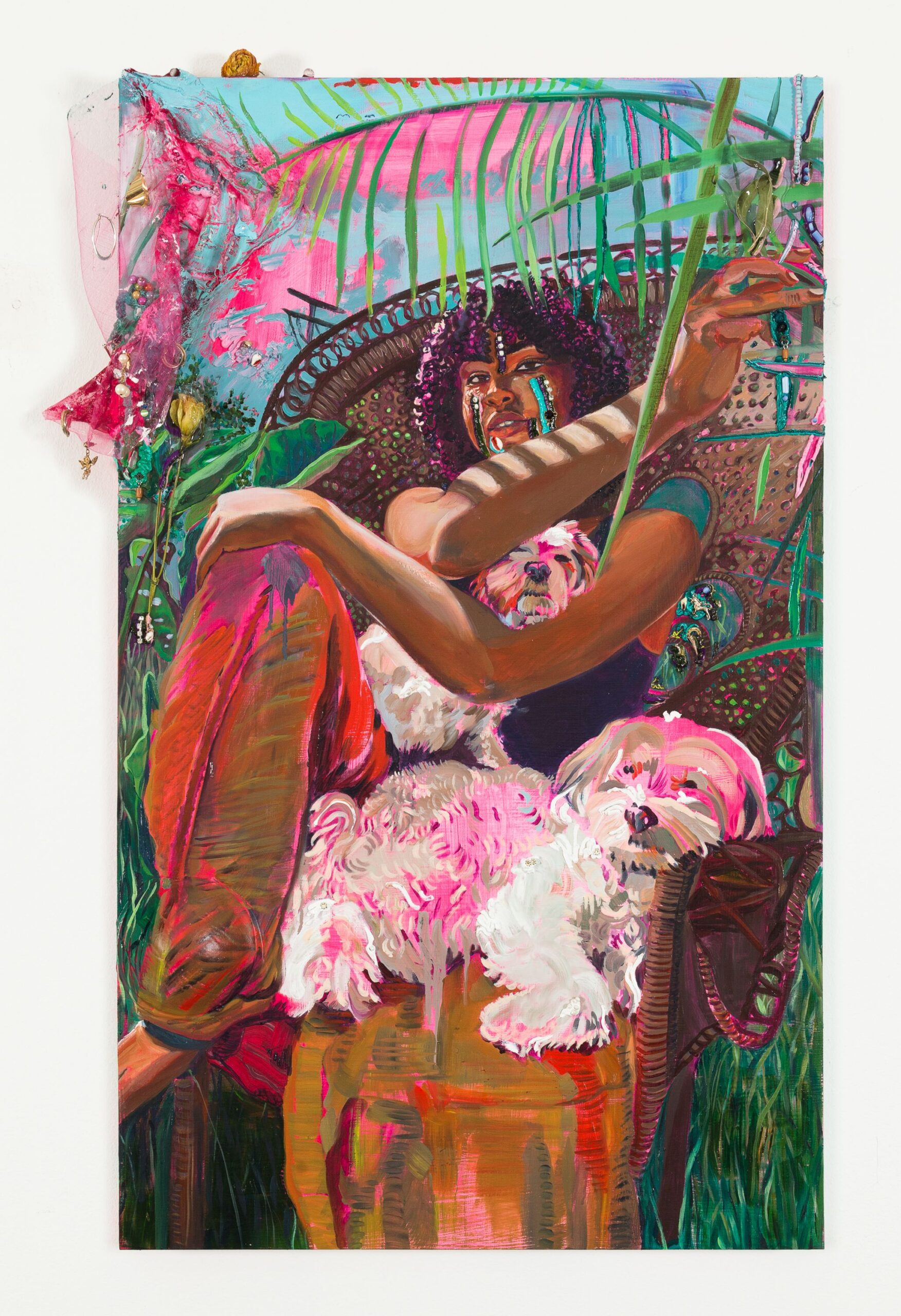
Photographer Ricky Weaver examines her ambivalence toward female identity from within. Her two self-portraits, Breathing 1 and 2, show the artist in conflict with the camera’s lens, the unwilling protagonist in her own story. Trapped by the camera’s eye, Weaver is locked in a futile struggle to escape her environment, her blurred image simultaneously there and not-there. She makes herself both subject and object, the viewer and the observed. The theme of the cornered subject is repeated in Untitled (Sunday Morning) which features the artist’s daughter backed up against the fence in an otherwise idyllic environment.
Chris Watts’s single translucent abstraction, Invisible Mirror II, features cloudy veils of pigment on silk; it’s an outlier among the more figurative works in Familiar. Its intrinsic merits aside, this seems an odd inclusion in an otherwise tightly organized collection of narrative work.
The temptation for artists to descend into the topical is powerful at this moment in history, when so much seems to be in contention. But the artists in Familiar seem well aware that there is a larger story to tell, and one that will continue regardless of current events. They know that their job is not just to advocate, but also to observe, report–to think–in broader and more abiding terms about the struggles that concern us all.
Familiar Installation, Ricky Weaver (L), Mario Moore (R)
Familiar, curated by Mario Moore, includes work by Moore, Beverly McIver, Jason Patterson, Senghor Reid, Chris Watts and Ricky Weaver.
David Klein Gallery is located at 1520 Washington Blvd, Detroit. Gallery Hours, Wednesday through Saturday 12 p.m.-5:30.