Detroit Art Review

Critical art reviews of Detroit galleries and museums weekly

Kehinde Wiley @ Toledo Museum of Art

Kehinde Wiley (American, born 1977), Morpheus. Oil on canvas, 2008. 108 x 180 in. (274.3 x 457.2 cm). Courtesy of Roberts & Tilton, Culver City, California; Sean Kelly, New York; Galerie Daniel Templon, Paris; and Stephen Friedman Gallery, London © Kehinde Wiley

Aside from having seen his work in print, I first saw the original work of Kehinde Wiley at the 30 Americans exhibition at the Detroit Institute of Arts in 2015. There I experienced his figure painting Sleep, an 11 X 25-foot oil painting from 2008, with a European Arts & Crafts-designed background. It was breath-taking, even overwhelming. As part of the Rubell Collection, this erotic figure called out as I described in that review, “like a painting of Christ after he was taken down from the cross.”

From the few works I saw back then, I was unable to ascertain the larger and broader work of Wiley, that is until his current exhibition at the Toledo Museum of Art, which just opened a large retrospective of Kehinde Wiley, A New Republic, on February 10, 2017. The exhibition presents sixty paintings, sculptures and stained glass works curated by Eugenie Tsai, the Curator of Contemporary Art at the Brooklyn Museum, and is a traveling exhibition.

When I first saw the work in Detroit, I asked myself: Is this about the scale of portraiture with decorative backgrounds? But one needs to see the scope of this exhibition to realize this is not about scale, as there are many small and intimate paintings that dispel that first impression. Wiley had taken his early study of art and acquired experience from undergraduate school at the San Francisco Arts Institute and combined it with an MFA from Yale to begin a crusade.

Kehinde Wiley, Conspicuous Fraud, Oil on canvas, 60 X 72″ 2001

Entering the exhibition, it was the painting in the first room, Conspicuous Fraud, Series #1, from 2001, Wiley’s last year at Yale, that I went back to after seeing the entire exhibition. The work seems like a major departure, a step forward that puts him on a trajectory that he develops and elaborates on over the next fifteen years. The painting is larger. We see an African American male in a suit with meandering black clouds. He notably breaks with the picture plane, clouds in both background and foreground. The larger than life figure in this painting disturbs the tropes of portraiture painting and intentionally elevates the subject’s status, juxtaposed to all preexisting social stereotypes. The road ahead is established and paved here in 2001. The idea of portraying young black men in power positions, be they political, social, or religious, will become Wiley’s focus, beginning in the United States on the streets of Harlem, but eventually expanding to include Senegal, Dakar, Rio de Janeiro and Mumbai, ultimately to become what Wiley would describe as the World Stage.

With his accomplished technical set of tools in hand, at Yale the issues that honed his perspective would be discussions surrounding identity, sexuality, gender and symbols of political power. The exhibition A New Republic focuses on African American males, Old Master portraiture and backgrounds, and then moves on to African American women, stained glass and sculpture.

Kehinde Wiley, The Two Sisters. Oil on linen, 2012. 96 x 72 in. (243.8 x 182.9 cm). Collection of Pamela K. and William A. Royall, Jr. Courtesy of Sean Kelly, New York. © Kehinde Wiley. (Photo: Jason Wyche, courtesy of Sean Kelly, New York)

“The magnitude of this exhibition will impress even those familiar with Wiley’s work,” said Brian P. Kennedy, TMA director, president and CEO. “He has taken the grandeur of portrait painting and translated it with his portrayals of contemporary African American men and women. Wiley bridges the gap between traditional portraiture and our daily lives, and in doing so, he raises questions about identity and how we perceive ourselves and others.”

Growing up in South Center Los Angeles in the late 1980s, Wiley began studying art early on, spending time in museums and seeing how the figure was presented over the last three hundred years. Africans were depicted as slaves, then servants, and ultimately as drug dealers, gang members and inciters of violence.

Wiley says, “Painting is about the world we live in. Black people live in the world. This is my way of saying yes to us.”

What seems to develop gradually is a complex multi-layered approach to his feelings about the lack of African Americans depicted in a positive way. He uses scale, Old Master settings, elaborate background patterns, and changes to the picture plane, all part of his tool bag to express the beauty and grandeur of normal people, something that has become his passion. He expands exponentially to include women, sculpture, stained glass and smaller paintings framed as if they were part of a cathedral altarpiece. All of this is an effort to attack the lack of existing works that depict African American subjects in a positive way. He has taken on the mission—I began by referring to it as a crusade—as one man, one artist, to fill the void in the complete history of Western Art.

Kehinde Wiley, After Memling’s Portrait of Man with a Coin of the Emperor Nero. Oil on wood panel in artist designed hand fabricated frame with 22k gold leaf gilding, 2013. With doors open: 24 1/2 x 29 x 5 in. (62.2 x 73.7 x 12.7 cm)


Wiley comments, “What I wanted to do was create a body of work in which empathy and the language of religious and the rapturous all collide in the same place.”  What does the coin he holds say? “In God We Trust?” On closer observation, it replicates the Roman coin used in Hans Memling’s Man with a Roman Coin, 1471, oil on a panel.

Wiley says, “There is something to be said about the power of smallness. As an artist who is in love with the material practice of painting, I can’t help but be amazed every time I look at Hans Memling’s small panel portrait…the simplicity of the small mark made well.”

Kehinde Wiley, Anthony of Padua. Oil on canvas, 2013. 72 x 60 in. (182.9 x 152.4 cm). Seattle Art Museum; gift of the Contemporary Collectors Forum

An aspect of Wiley’s portraiture painting is the issue of his breaking the picture plane, using the background and then bringing it forward over the subject. This goes back to paintings by the Old Masters, where there was a sense that it was necessary to preserve the integrity of the picture plane, to provide a flatness under and above the illusion of three-dimensional space, a technique discussed by Clement Greenburg in his essay “Modernist Painting” in which he talks about this concept being used in modern art as well. Wiley knows this all too well and intentionally works against this concept to say to his viewer, this is not photorealism, in case you were wondering. The element is playful, colorful, spatial and defiant.

Kehinde Wiley seems inspired by historical paintings of aristocrats and royalty where he uses his models—many cast in the streets of Harlem—and has them do dress-up for his photo sessions. My guess would be that he begins with high-resolution images captured in the studio with the precise control of light. The images are then projected onto a large linen canvas where the drawing begins, including the intricate backgrounds, using skilled assistants to save time. He probably works with oil paint primarily on the figure(s), while the antique and wallpaper-like backgrounds are painted using others.

Looking back through art history at paintings by Titian, Gainsborough and Ingres, Wiley projects heroism onto his black men and women as subjects who are missing from the history of Western art. He has developed his own distinct vocabulary from these Old Masters settings juxtaposed with these young, quintessential models. A New Republic, as a state in which supreme power is held by people through their elected representatives, is code for new representatives missing from our past.

Wiley delivers these skillful masterpieces to provoke a conversation about gender, race, politics and religion.

Toledo Museum of Art   Kehinde Wiley, A New Republic, February 10 – May 14, 2017


Cope & Reichert @ David Klein Gallery

Gina Reichert & Mitch Cope, Illuminated Totem – TV Tray 2017, Wood stool, kitchen spice drawer with spices, glass fridge shelf, acrylic display box, milk cartons, crystal bowl, cathode ray tube. 40 x 18 x 16 inches All images courtesy of the David Klein Gallery

We see these documentaries on PBS about people who collect ordinary items over a long period of time, and sometimes a lifetime. They hoard collections in bedrooms, living rooms, bathrooms and the garage. The documentary will usually focus on the psychological anxiety disorder Compulsive Hoarding, a subset of Obsessive Compulsive Disorder (OCD) where people equate certain mundane objects and material to their own personal identity. In extreme cases, entire houses belonging to such people become fire and health hazards.

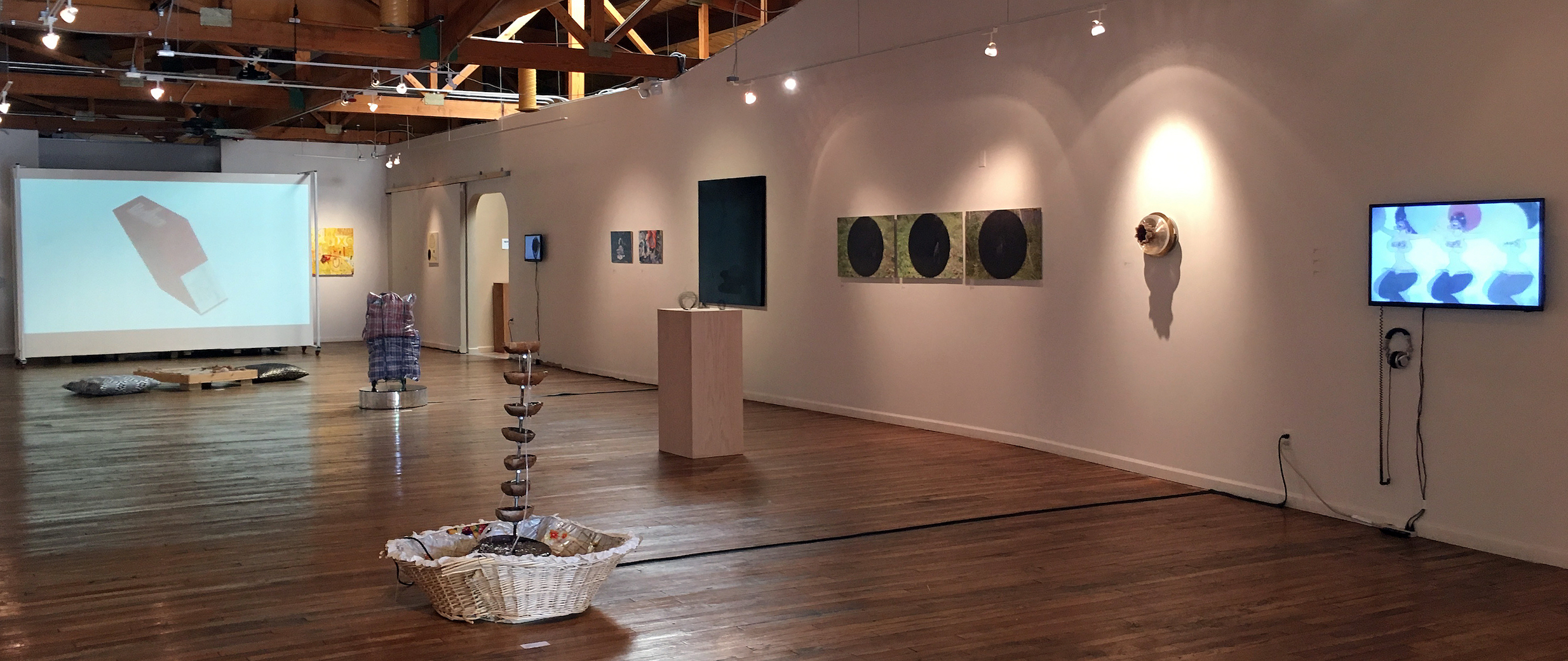
Such is the subject of the new exhibition at the David Klein Gallery: Organizational Strategies for the After Life, by architect Gina Reichert and painter Mitch Cope. The exhibition is a combination of sculptures made from found objects, paintings from found fabric patterns, plaster castings and jars of assorted small objects, all of which were meticulously obtained from a deserted neighbor’s house in Detroit.

Gina Reichert & Mitch Cope Stella’s Infinite Clothes Rack, #1 – 15. All paintings based on the fabrics of the ( never worn) clothes.

Gina Reichert & Mitch Cope Stella’s Infinite Clothes Rack, #1 – 15. All paintings based on the fabrics of the ( never worn) clothes.


The exhibition represents the culmination of six years of working together as a husband and wife team to distill and categorized the home of a person with Compulsive Hoarding Syndrome. In a statement they say,

“At the risk of being overly nostalgic for a past time, we pressed on in our search to reveal what we now believe is less a picture of the past, and more of the afterlife. Too often we romanticized past generations, especially here in Detroit, as being better or greater, cleaner or safer, than it is now, but we have become quite easily convinced through our research, that although the physical aspect of the houses were in a better shape than now, (they were brand new then) the last hundred years of life on Klinger Street were not necessarily a better time.”

Over time, both the painter and the architect, became increasingly interested in the house next door, abandoned by its owner, forcing them into a process of finding and categorizing thousands of materials produced over multiple generations that went back a century. Part of this exhibition is a video presentation of the documentation process, using four video screens with audio support. The video helps the viewer understand the magnitude of their work and the transformation of materials into objects of art.

Is there a context for their repurposing of an enormous amount of material for an art exhibition? Certainly, there is a history of found art objects. The amassment and display of found objects for their aesthetic qualities dates back to at least the 16th century, when the collections of individual enthusiasts were displayed in private “cabinets of curiosities,” or what the Germans called “Wunderkammer.” But it wasn’t until the 1900s that artists began to incorporate found objects into sculptural works as an artistic gesture in 1917, where Marcel Duchamp created his “readymade” The Fountain, consisting of a porcelain urinal signed R. Mutt.


Gina Reichert & Mitch Cope, Gathering of the Scattered – Vision 2017, Electronic tubes, bell jar, tape. 11 x 5 1/2 x 5 1/2 inches

But where this current exhibition breaks from found art objects repurposed as art is this idea presented by Cope and Reichert where they write,

“ What if the things we use and collect in our lives carry more than the representation of what they mean to the individual who owns them, but also carry a small part of their spirit?” They go on to say, “Or if the spirit of things attaches part of it to its user?” They raise many interesting questions about the spiritual relationship between the owner and the object, all of which is explained in their writing that is available as part of the exhibition.

Gina Reichert & Mitch Cope, lluminated Totem – Root Cellar 2017, Marble book ends, preserves in glass jars, acrylic display box, glass furniture feet, enameled steel tub, assorted glass servingware. 32 x 15 x 15 inches


Putting this aside, many of the paintings and sculptures are quite beautiful and stand on their own, without the complex environmental project that surrounds and embodies their creations.

Gina Reichert holds a Master of Architecture degree from Cranbrook Academy of Art and a Bachelor of Architecture from Tulane University. Mitch Cope, a native Detroiter, has lectured widely throughout the US and Europe. Cope holds a BFA from College for Creative Studies, Detroit and an MFA from Washington State University.

Banksy on Vinyl: The Record Covers

Banksy, Dirty Funker, Let’s Get Dirty, 12” Single 2006, Record album. 12 x 12 inches

The British artist Banksy – graffiti master, painter, activist, filmmaker and all-purpose provocateur – is also a prolific designer of album covers. Since 1998 Banksy has designed the cover art for almost 40 albums. Many of the albums were produced by small independent record labels for obscure British bands and were usually not commercially successful. As a result, Banksy album covers were not widely distributed and only a small number have survived. A collection of fifteen record covers and the actual albums, all framed and behind glass, comprise the exhibition Banksy on Vinyl in the second room at the David Klein Gallery.

Banksy, Various Artists, We Love You So Love Us, 12” album 2000, Record album. 12 x 12 inches

David Klein Gallery

Will Ryman @ Center Galleries, College for Creative Studies

Looming like a sci-fi phantom, a gossamer, spaceship-like car floats in the mercurial light of Center Galleries. It is an actual sized sculpture of the 1958 Cadillac Eldorado Biarritz– framed with resin and then shrouded in white, embossed Bounty paper towel–and is the fabrication of New York artist Will Ryman. The thing astonishes with its implausibility. We in Detroit wait every year for the latest and greatest version of automobiles but this particular moment, 1958, called for something different.

Will Ryman, 1958 Cadillac Eldorado Biarritz, Wood, Resin, Paper towel, 2017

Post World War II life is often referred to as the moment when America was great, as in “Make America Great Again.” The United States had emerged from WW ll as a savior of the Western World and the soldiers returned to an explosive economy that inspired and encouraged a new and better life. The soldiers got the GI Bill which was money for fighting the war. The brilliant technologies developed to build planes, ships, tanks, and guns were ready to be employed to build a new American infrastructure. After a few post war years of stagnant auto sales, Harley Earl, head of General Motor’s “Styling Department,” employing a strategy called Planned Obsolescence, found a way of making a new car, an alluring “object of desire,” every year and one for every purse. It was a very big deal! From Chevy, Pontiac, Buick, Oldsmobile to Cadillac every American wage earner could have a car that represented their class and level of economic status. The cars slowly evolved with modest cosmetic changes every year—a curve of a fender here, a piece of chrome there, a new palette of tantalizing colors, sumptuous upholstery or push button radios with front and rear speakers. Each new year model made last year’s version less attractive, less sexy. The American economy was the wonder of the world.

Will Ryman, Installation image, all images courtesy of Robert Hensleigh

The 1958 Cadillac Eldorado Biarritz, a hybrid of the P-38 fighter plane, a horse drawn carriage of the Victorian aristocracy and avatar of female goddess, was at the top of the heap. Its name says it: three names all denoting power and wealth– Cadillac for the historical founder of Detroit; Eldorado, Spanish for gold and the lost city of gold in Spanish mythology; Biarritz the French resort on Basque coast made famous by actress Bridget Bardot and the hangout of the very rich.

Will Ryman (b.1969), playwright, sculptor, painter, and, conceptual artist, has most recently composed what seems like a trilogy of poignant installation/sculptures that turn on American politics and history, culture and identity. Each uses apt materials to perform dramatic vignettes focusing attention on the collision of American ideals. Ryman’s “America,” (2013) is an actual-sized model of Abraham Lincoln’s boyhood home and is now housed in the New Orleans Museum of Art’s permanent collection. The cabin is made of real logs but coated with a rich gold resin patina and has an interior brimming with tesserae of bits that compose the history of American labor and production. The interior walls are a mosaic of everything from cottons balls and slavery shackles to pills, bullets, iPhones and arrowheads.

Will Ryman, The Situation Room, 2012 – 2015

More contemporary and polemic is Ryman’s “The Situation Room,” (2012-14) a life-size sculpted tableau of the famous and bizarre photo of President Obama and his closest circle, including Hillary Clinton, watching a live-feed from Pakistan of the assassination of Osama bin Laden by Navy Seals. Appropriately composed of crushed coal, turning the tableau into a shadow in the American memory bank, it serves as frightening meditation on the all too intimate scale of war and global politics. Perhaps because he was a playwright, Ryman’s sense of history and drama are dead-on as he seems to choose subjects and materials that point poignantly at the vital issues of our culture. Few artists of our time have been able to deal so directly with our political landscape.

Will Ryman, Detail, 1958 Cadillac Eldorado Biarritz, 2017

“Cadillac” (2014) is a haunting installation that, as you spend time with it, accumulates gravity and puts American history in strange relief. Beyond its initial novelty, a mashup of art history with its winged tailfins, sculpted with Art Nouveau’s whiplash fender lines and wraparound windshield, bounteous breast shaped bumper guards and covered in Bounty paper toweling, it possesses an uncanny, funereal presence. Like the painted white ghost bikes along the side of the road that memorialize children being killed by cars, “Cadillac” summons bigger thoughts about life and mortality and our collision with the industrial landscape. Bounty toweling, with its art deco (the symbol of cosmetic superficiality) embossed pattern and tag of “Bounty” on every sheet, creates an ironic commentary on the excesses of corporate America that was called attention to by President Eisenhower in his Farewell Address (1961). He warned of the threat of the Military Industrial complex that had taken over American culture and industry and that has become a part of everyday life.

The 1958 Cadillac Eldorado Biarritz broke every rule and standard of “Good Design” (a phrase that also meant good economics) set by most thoughtful modernists. While car design became a form of pop culture and post war novelty and spectacle, American design had become ostentatious, superficial, a symbol of conspicuous consumption and in the long run bad economically. In 2017 it is a ghostly reminder and presence incarnating all of the worst impulses of American culture and economics and not simply a kitschy tableau. Ryman’s chimera of our past absorbs (“Bounty is the thicker, quicker picker-upper”) and exudes our strange history. Ryman recently said that, instead of editorializing on his art, he has learned to let his materials speak for themselves and his “Cadillac” Eldorado Biarritz is stunningly articulate.

As part of the current Center Galleries exhibition Alumni & Faculty Hall is exhibiting Jeff Cancelosi: Picturing Us, featuring engaging, large format color photos of some familiar faces of artists and prime suspects of the landscape of Detroit art.

Jeff Cancelosi, “Artist Bailey Scieszka” Photograph, 2016

CCS Center Galleries –     Will Ryman: Cadillac  –   January 28-March 4, 2017

Kline & Giffin @ Galerie Camille

Kline & Giffin, Jive Nights, Mixed Media, 36 x 45, 2016

Two artists, Bowen Kline and Bruce Giffin, collaborated on several pieces of artwork for Jive Detroit, a two-person exhibition opening at Galerie Camille, January 20, 2017. In the 1920’s the word Jive referred to Jazz or Swing music, and was used later as jargon to describe a kind of teasing or putting someone on. In Jive Detroit, Kline and Giffin are working together on several photo collage/paintings. What is compelling about this collaborative work is the obvious coming together of a photographic image combined with painting to form a kind of expressionistic realism of mostly urban settings in and around Detroit.

Gallery Director Melannie Chard says, “Jive Detroit is a collaboration between photographer, Bruce Giffin, and painter, Bowen Kline. With access to 30 years of Bruce’s photographs, Bowen has constructed mixed media paintings that forge impressions of a city in constant change and the many faces of its residents.”

Bowen Kline, Bruce Giffin, Neighborhood, Mixed Media, collage on board, 34 x 38″, 2016

This approach differs entirely from what Photoshop can do in a digital environment, where it is used to combine a variety of images into one photographic image. There is no trickery attempted here. I am not sure what comes first in this collaboration, the photo images or the idea for a painting, but it doesn’t matter. It is an example of the synergy that can come from collaboration. In the work Neighborhood, it is the combination of “capturing a moment” between the two figures and the depth of field in the urban housing environment, laced with graffiti, that draws the viewer in.

Bowen Kline, Portrait of Bruce Giffin, Oil & Acrylic on board, 2016

Bruce Giffin, Portrait of Bowen Kline, Photograph on Paper, 2016


I guess that the idea of collaboration with Bruce Griffin was Kline’s idea as this is not the first time he has sought collaboration. In 2013 he exhibited with Tony Roko. Both artists worked on primarily figurative paintings at the Janis Charach Gallery located in the Jewish Community Center in the Detroit Metro area. He relies heavily on black line and contrast, using a combination of oil and acrylic paint. Painting from a studio barn in Romeo, Kline’s work is dominated by expressive portraits and subdued figure paintings.

Bruce Giffin has been shooting images in the City of Detroit for 30 years and was the recipient of a Kresge Fellowship in 2011 for visual art, largely based on “The Face of Detroit,” featuring evocative, hyper-close portraits of Detroiters. He must have walked the backstreets and alleys of Detroit for years to capture many of his personal images of ordinary Detroiters and desolate buildings. I first wrote about his image, Black Board Jungle, which does a good job of reflecting his interest in capturing abstraction in an exhibition at the Detroit Artist Market. That image is also in this exhibition. He has worked as a staff photographer along the way, shooting covers for the Metro Times, and for a long list of publishers, where Giffin has provided product and people images. In addition, he has a collection of infrared images, like Winter Coaster, that is included in this exhibition.

I hope this exhibition is not jiving us, and instead highlights and reinforces artistic collaboration, something we frequently experience in the fields of music, film, and dance. In the end, this show illustrates a young painter collaborating with a seasoned photographer to create something new. One plus one equals more than two in this situation, but to be constructive, and in the long haul, Bowen Kline will have to stand on his individual work, something that Bruce Giffin has already accomplished.

Galerie Camille  – January 20 – February 4, 2017


NAIAS 2017 @ Cobo Hall, Detroit

2017 Charity Preview

2017 North American International Auto Show (NAIAS) Charity Preview Event

What is now known as the North American International Auto Show (NAIAS) began as an event in 1899. The first official Detroit Auto Show was held in 1907 at Beller’s Beer Garden in Riverview Park, where a total of 33 new motor vehicles were shown by 17 vendors, and spectator admission was 50 cents.

So, you wonder, why are you reading about a car exhibition in the Detroit Art Review? We’ll answer that question with a question: How many people who are responsible for the creation of an automobile attended art school? Plenty, as it turns out.

Every week, we at the Detroit Art Review explore the work of artists in galleries and museums in the Detroit Metro Area, but we’ve never tipped our hats to the men and women who contribute to the aesthetics of an automobile. Because we are doing our work here in Detroit, the home of the automobile and most of the automotive industry, it seems fitting to mention an annual event that contributes $500 million to our local economy. More than 800,000 attendees last year and press from all around the world gathered to see the new cars produced that provide a basic staple of American culture: Individualized Transportation. NAIAS has displayed the wares of the automotive industry, a million square feet of it, at Cobo Hall since 1967.

Not to take away from the prestige of the event over all, but the design work that goes into an automobile is recognized by EyesOn Design Awards, which are the sine qua non design awards in the industry, sponsored by the Henry Ford Health System, Department of Ophthalmology. As proof of design excellence, consider a production car that rises to the top in terms of aesthetic appeal: the 2017 Lincoln Continental.

Lincoln_Approach_Detection_2017_Continental

Ford Motor Company, Lincoln Continental, 2017

The understatement of line, shape and proportion provides the viewer with a feeling of strength and security. It is not a pointed, aggressive look, but a mature profile in its approach to visual stability. The lines curve down and inward, an aesthetic seen sometimes in European sports cars. The repetition of roundness is soothing. Stylish elements abound, like the way the E-latch door handles provide a graceful inset in the side door, and five LED lamps create a slender design to what used to be a larger headlamp. The front grill is refined, delicate and proportionate to the front profile, unlike the majority of cars these days that feature a sweeping, forward design with pointed grills, like the V-Motion Nissan sports look, something you might see on a Star Trek movie set, or the Lexus grill that reaches down so low to the street it seems designed to collect debris.

Ford Motor Company, Lincoln Continental, 2017

Growing up and now working in Detroit, I was always acutely aware of the design and engineering sensibility in the metro area that dominated our psyche. For instance, the Sunday New York Times relegates automobile coverage to the business section, while there are two sections devoted entirely to the Arts. In Detroit, there has always been an Auto section in the Sunday Detroit newspapers and no Arts section. Yet the people of Detroit and the tri-county area supported a millage to keep the Detroit Institute of Arts (DIA) intact. They knew intrinsically that the fine arts were important to our quality of life, and voters made a substantial ten-year commitment to help support the DIA in a time when bankruptcy threatens our city. The Center for Creative Studies has developed an extraordinary Transportation Design program that works closely with the automotive industry to help prepare young designers to meet the technological needs of a changing work force. I know clay sculptors who form the full-scale prototypes at the General Motors Technology Center, and they often exhibit their hand thrown pottery at local art exhibitions.

So at the beginning of each year, the North American International Auto Show displays the new products of an American industry in which artistic design elements, both interior, and exterior, play a vital role. I, for one, am proud to be from Detroit and active in its art community, which includes all the men and women who work to design beautiful products. For those who attend the show or see the Lincoln Continental on the road, take a close look at the design elements and how they personify the rich aesthetics of a luxury car, and remember the Continental was made by artists and engineers here in Detroit.


Page 62 of 79

Powered by WordPress & Theme by Anders Norén