Detroit Art Review

Critical art reviews of Detroit galleries and museums weekly

Anderson & Youngblood @ Galerie Camille

Carla Andersen, West Fjords 5, Iceland, Archival pigment print, 30 x 40″ 2016

There is a striking contrast between the work of Carla Anderson, photographer, and Elizabeth Youngblood, abstract artist using various mediums, now on exhibition as Chosen Silences, opened in midtown Detroit, at Galerie Camille, April 7 – 27, 2017.

These two artists share an attraction to abstraction and contemplation but deliver their ideas using different media. This certainly must have contributed to the idea of an exhibition together as the work is not presented in different spaces, but is intentionally integrated, with the purpose of bringing the viewer along as they peruse the gallery space. It’s a good idea.

Gallery director Melannie Chard says, “Chosen Silences blends the work of Anderson and Youngblood to create an environment of quietude and contemplation of form, texture, tension and light.  While each artist works in a different medium, both have chosen to communicate in that space of quiet. In that space of what would seem silent, but isn’t.”

Carla Andersen, West Fjords 4, Iceland, , Archival pigment print 44 x 52” 2016

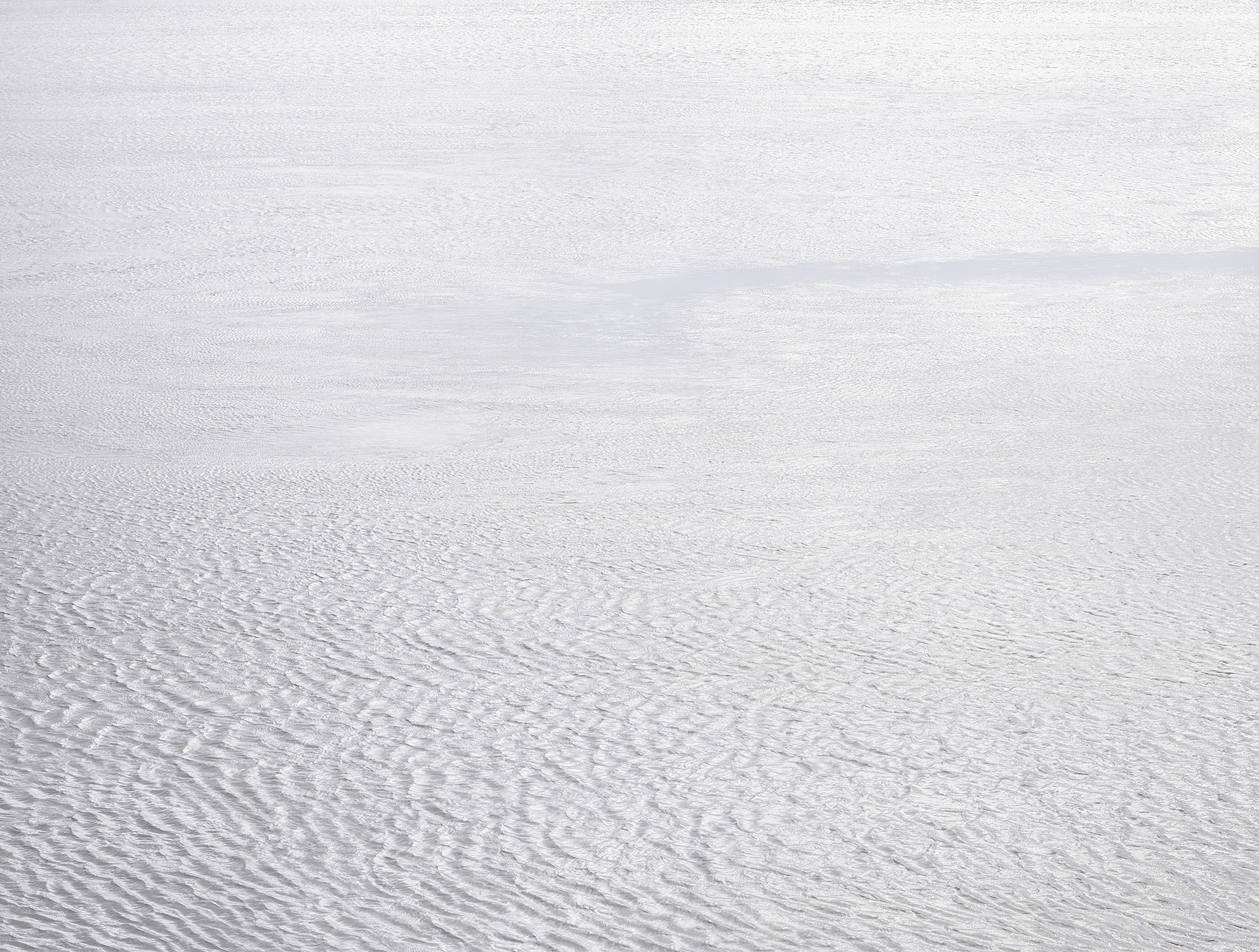
Anderson’s photography reminds me, at times, of how I feel when I am looking at a color field painting. These large, 30 x 40” images (sometimes digital, sometimes film) are about the space in nature, captured beautifully using large format cameras, and presented in a way that does not go unnoticed. And I must mention scale, because these photographs would not have the same impact if they were printed in, say, 8 x 10”. The large-scale print brings the viewer intimately closer to the subject, as in West Fjords 5, photographed in Iceland, in a way that draws you into a universe of these small stones or in the reveal of an oncoming night sky in Emmett County.

Carla Andersen, Emmet County, Michigan, Archival pigment print, 30 x 40″ 2016

There is a large context for Andersen’s work, who was awarded her BFA from CCS, 1976 and her MFA from Cranbrook in 1978. Her influences could have been a combination of Carl Toth and George Ortman, both teachers at the studio-based Cranbrook Academy of Art during the 1970s. Probably more important would be her exposure to the work of Edward Weston who did abstracts of the desert, as in Oceano 1936, Eliot Porter, as in Pool in the Brook, 1953, or more recently, Joel Meyerowitz as in his large color image, Dawn Hardline, 1980. This work, sometimes called non-objective, relies less on representational objects and more on color, light, texture and form that conveys a feeling or an impression. I have always been drawn to the work of Man Ray’s series called Symmetrical Patterns from Natural Forms first exhibited in Germany in 1914, where he experimented with objects, light and form. The American, a Russian immigrant from Philadelphia would become close friends of Marcel Duchamp and engage in avant-garde photography throughout the 20th century. That’s not to say Andersen’s work is avant-garde at this point in time, because of the groundwork laid down for nearly a hundred years of photography.

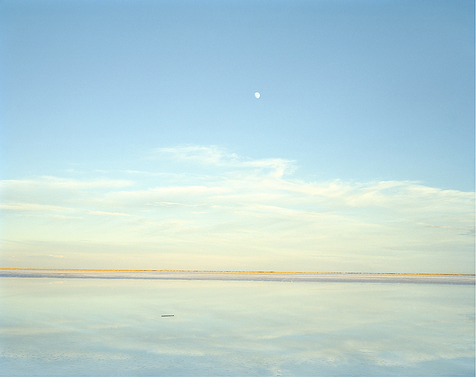
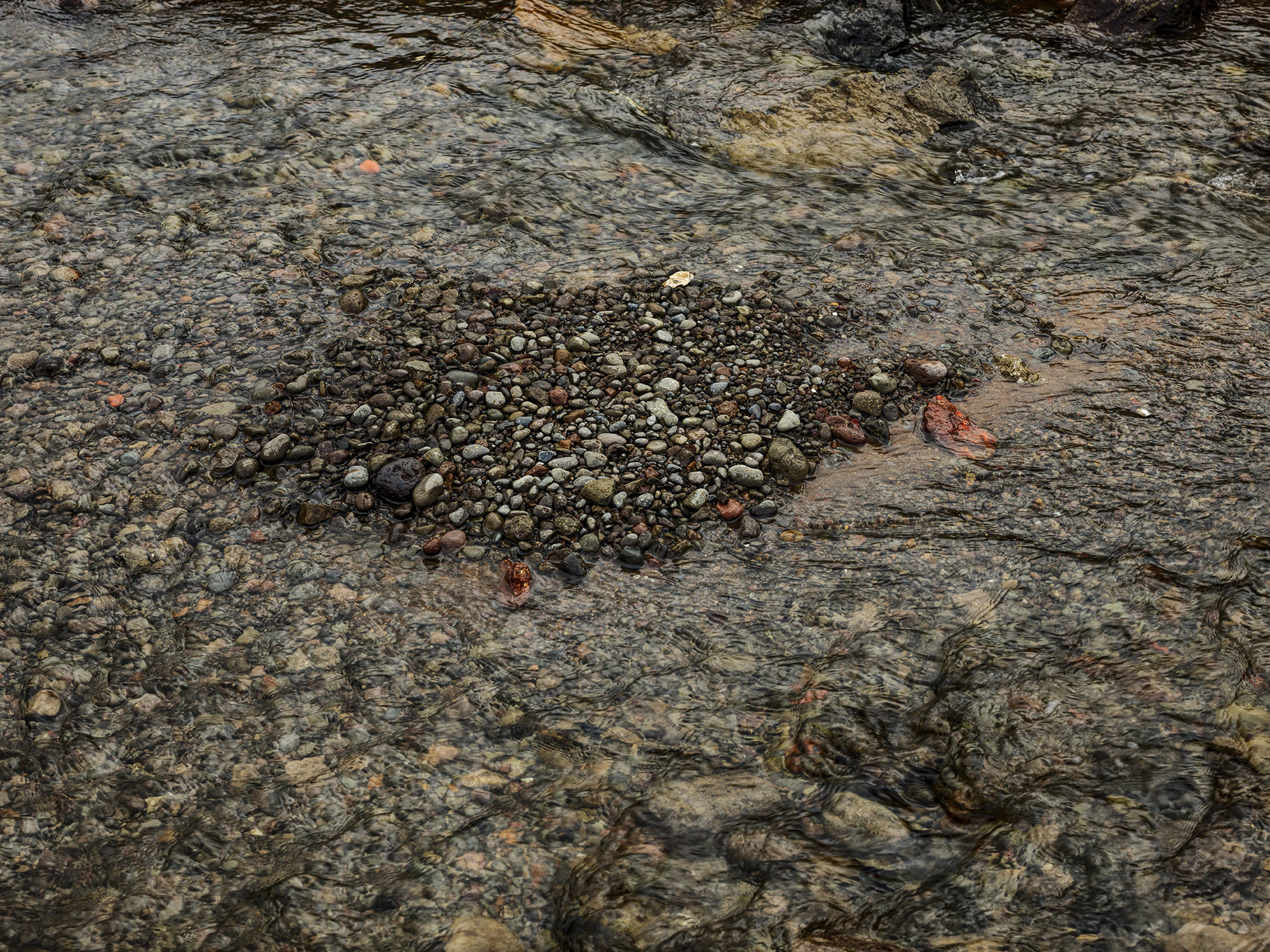
Carla Andersen, Great Salt Lake, UT 35, Archival pigment print 30 x 40” 2016

The symmetry of Great Salt Lake stops the viewer in their tracks when they notice the reflection of the sky in the lake, and the two objects juxtaposed: the moon and a small log in the lake. The illusion makes one feel as though they are out in the lake viewing the sliver of landscape (when actually they could possibly be on a shore), and upon close observation, there is a one percent downward tilt to the right to the horizon. It is the combination of these subtleties that make this image so powerful. It’s worth mentioning that Larry Melkus at Fine Arts Printing executed the printing and mounting of these prints. He says, “Carla and I came up with a double archival cold mounting process. The print is flush mounted onto a 3mm white archival plastic sheet. This is then float mounted onto a larger sheet of white aluminum composite material. The effect is that the print is displayed on its own “pedestal” within the frame. In addition, John Rowland painted his frames to match the white of the print surround, resulting in a subtle display of visual strength surrounding, framing and showcasing the photographic work.”

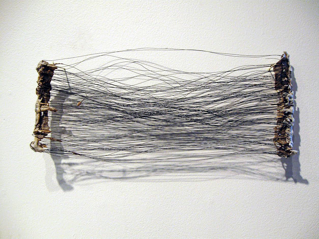
Elizabeth Youngblood, #6 Flat Horizontal Wire and porcelain, 14″ 2013

Elizabeth Youngblood’s work is multi dimensional, a mixture of three-dimensional objects made from ceramic and wire, and a collection of black and white drawings on paper. The contrast between the porcelain bars and the strands of thin black wire, as in #6 Flat Horizontal, provide an interesting play between material and as a relief, the shadows from the light adds to the dimension. Youngblood was awarded a BFA from the University of Michigan and an MFA from Cranbrook Academy of Art, where she studied design with the McCoys, who I have turned to several times for design work. No doubt they had an influence on her work, probably more about the process of developing conceptual ideas. It’s possible this eventually led her away from working as a graphic designer, more towards to becoming a fine artist.

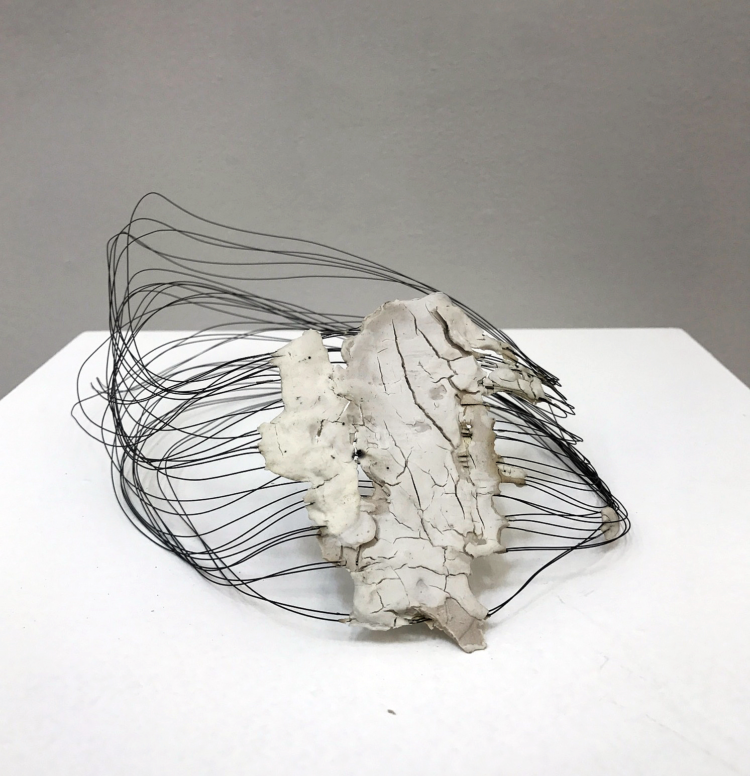
Elizabeth Youngblood, Untitled Really, Wire and Porcelain, 2014

Clara DeGalan wrote about Youngblood’s work in fall of 2016 at 9338 Campau for the Detroit Art Review, saying “Youngblood respects making, and, though she is acutely aware of the cultural associations that come with each material she ropes into her vision, her devotion to process and skill-building manage, miraculously, to shed the oppressive political discourse that has hung around craft for decades and present it, unilaterally, as a vast conduit for exploration of an artist’s conceptual vision.”

It’s always a challenge to decide how large to make a three dimensional piece of work. If I were to dare to offer a constructive idea for her work, it would be to pay more attention to scale, pretty much across the board.

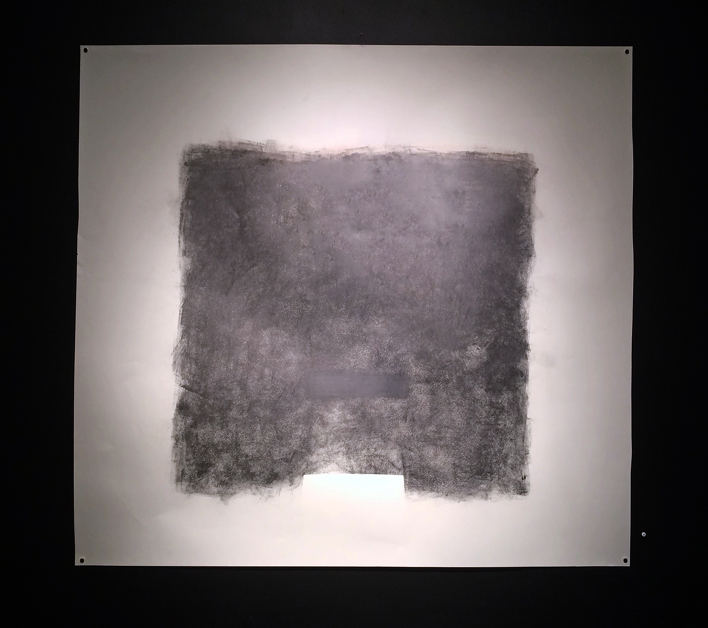
Elizabeth Youngblood, Large No. 3, Graphite on Paper, 42 x 45”, 2011

In contrast to the more didactic and delicate wire pieces, and in a minimalist fashion, Youngblood makes the drawing, Large No. 3, where she applies more graphite than is necessary to make a point about the material and the pressure applied. In this drawing, she illustrates ‘no fear’ in executing a powerfully bold and massive block composition, challenging her viewer to ponder her intent.

Chosen Silence, Galerie Camille     April 7 – 27, 2017


Abstraction @ David Klein Gallery

Group Exhibition: Gisela Colon, Jeff Colson, Brad Howe, Heather Gwen Martin, Hugo McCloud, Ruth Pastine, Matt Wedel, Patrick Wilson

Who introduced abstract painting to Western culture? Today, Kandinsky is given credit as the father of abstract painting as early as 1910, with first a watercolor, then on canvas, but he had a manifesto in which he wrote about abstraction in 1909. Personally, I think abstraction will be in our art vocabulary for years to come, synonymous with words like cubism, impressionism and realism. David Klein Gallery has an exhibition of eight artists from various parts of the country that opened March 18, 2017, representing both paintings and sculptures. On the Road: American Abstraction, surveys artists from other parts of the country, providing the Detroit audience with abstract sensibilities on both the east and west coast, as well as work from the Midwest.

Hugo McCloud, Speechless Conversations, 2016, Aluminum Foil, Aluminum coating, Oil Paint, 79 x 98″

The work that grabbed most of my attention was the large red field abstraction by native Californian Hugo McCloud, who now lives and works in Brooklyn, New York. The horizontal diptych fuses unconventional materials, along with woodblock printing, where he creates a rich surface that reflects a type of urban decay. The rich surface contains a large variety of under painting both in terms of shape and color. Self-taught with a background in industrial design, he says in a statement to artnet, “All of my work is kind of process oriented. When I had a desire to go into the fine art realm,” he explained, “I didn’t really have an understanding of how to work on canvas or use brushes and traditional art making tools. That wasn’t really my foundation.” McCloud stretches his canvas out on the floor, sanding, marking, all driven intuitively by his desire to explore and uncover his personal aesthetic.

Gisela Colon, Skewed Square Glo-Pod, 2013, Blow-Molded Acrylic, 60 x 42 x 12″

On the other end of the abstract spectrum is the work of Gisela Colon, raised in Puerto Rico where she completed her undergraduate work at the University of Puerto Rico, and her JD from Southwestern University of Law, in Los Angles where she now resides. Her earlier work was acrylic over wood constructions, painted with an automotive lacquer, but here in this piece at the David Klein Gallery Irregular Rectangle Glo-Pod she has turned to the technique of blow-molding that uses sheets of colored acrylic. She calls that and subsequent pieces made without the use of paint ‘Glo-Pods’ due to what she deemed “a breakthrough in my use of materials that generated an internal self-generated glo without the use of paint.”Her work has been connected to the work of west coast artists interested in the properties of light and the nature of perception. To this writer, these sculptural objects have a focus that draws on the writings by Donald Judd and Robert Irwin from the 1960s. These ideas may have set up this minimalist approach to creating objects as sculptural reliefs using properties of light, technological elements and reductive forms that, in this case, attach themselves to the wall. The non-specific objects hover between painting a sculpture where light is emitted from within, creating a very contemporary piece of artwork designed to please.

Brad Howe, Soft, 2016, Stainless Steel, Urethane, 12 x 24 x 9″

These abstract planes take me back to Tony Smith, allied with the minimalist school, where he worked with simple geometrical forms combined on a three-dimensional grid, creating drama through simplicity and scale. Created by artist Brad Howe, from Stanford University, these relatively small folds of stainless steel are impeccably constructed with effort and thought, providing simple form and color with attention drawn to their edges.

Howe says, “If we are to engage in the project of self-edification, the evolution of self, the enterprise is tied to our imagination. As Richard Rorty indicates, imagination is bound by our vocabulary, and it is in the growth of vocabulary we should focus. Vocabulary is tied to experience, and it is in energized moments of exposure to strangeness that our vocabulary expands. Encountering strangeness stretches and expands our self-image and seeds the rich potential for our collective conversations.”

Given the amount of concern that sculptors give to scale, these pieces feel like models waiting to be fabricated forty times larger than these tabletop sizes.

Alison Saar, Janus, 10/10, 2004, 10 x 19″

In its second gallery space, the David Klein Gallery provides an intimate collection of works on paper that includes lithographs, woodcuts and etchings. Of particular note is Alison Saar’s hand-tinted paper etching, Janus, that provides an image depicting the two worlds of the same woman, one existing in severe pain, the other in solitude. The expression may resonate with many people, women and men alike who find life to have its existence varied in a dichotomy of emotions. Saar says, “It was really poignant to me, this idea that a work of art could, somehow, turn a page, or shed a light, or lead back to a source. And that’s one of the things that’s exciting about being an artist; that your work threads people to other places, and not necessarily in straight lines.”

A native of Los Angles, Alison Saar’s work is primarily figurative, often female, in various emotional states or physical expressiveness. She seems to find symbolic richness in found objects, often with a narrative that offers a metaphoric view of life’s possibilities.

The David Klein Gallery has a long history of representing a collection of Detroit artists living and working in the Detroit Metro area. In contrast, On the Road: American Abstraction, Christine Schefman, Director of Contemporary Art, draws on artists who are represented by galleries from New York to Los Angeles, providing thought on some new experience and provoking exposure to the Detroit art community.

David Klein Gallery   March 19 – April 22, 2017


Stella’s Flatland @ UMMA

Today, Frank Stella’s paintings (better described as sculptures, really) burst from the wall, exploding forcefully into our space. But it was Stella’s flat and austere Black Paintings created while he was still a student at Princeton that originally thrust him into the national spotlight. Through April 23, a modest but important ensemble of three lithographs recently gifted to the University of Michigan Museum of Art (UMMA) reminds us that before his paintings brazenly shattered the fourth wall, Stella was first and foremost the master of emphatically two-dimensional canvasses thoroughly unburdened by any adherence to illusionistic space.

Frank Stella (American, born 1936), Lac Laronge IV, 1969, Acrylic on unprimed canvas. Toledo Museum of Art, Purchased with funds from the Libbey Endowment, Gift of Edward Drummond Libbey. ©Frank Stella. 1972.4

Stella’s meteoric rise began when, as a graduate fresh out of Princeton, his work was exhibited at the Museum of Modern Art’s Sixteen Americans exhibition in 1959. During the 1960s, Stella’s work adhered to the flat aesthetic of his Black Paintings, though he began experimenting with radically unconventional canvas shapes. Among these were his whimsical Notched-N paintings, canvasses which defied the centuries-old conception of painting as illusionistic and necessarily bound to the confines of a rectilinear surface. His stacked chevrons of muted color bands are never confined by any frame, blurring the boundary between painting and sculpture. In 1967, Stella began a famous collaboration with printmaker Kenneth Tyler, founder of the (then) Los Angeles based Gemini Studio, and Stella began to transpose his paintings into lithography.

Frank Stella, Empress of India II, from Notched-V series, 1968, lithograph on paper. Gift of Marsha L. Vinson and Marvin Rotman, 2014/2.19

It was one of many collaborations for Tyler, who also worked with 20th century art-world heavyweights such as Robert Motherwell, Josef Albers, Roy Lichtenstein, Jasper Johns, and David Hockney. With Stella, Tyler produced a series of lithographs based on Stella’s Notched- Ns. Look for Empress of India II; it’s a diminutive print based on the majestic, sprawling, 18-foot Empress of India in the permanent collection of the MoMA. The three lithographs on view in the UMMA’s Corridor Gallery were produced in the first year of their lifelong collaboration (they worked together until Kenneth Tyler closed his studio in 2000).

Frank Stella, Ifala I, from Notched-V series, 1968, lithograph on paper. Gift of Marsha L. Vinson and Marvin Rotman, 2014/2.20

Initially, it’s difficult to be impressed by them, perhaps simply because as 21st century viewers, we might reflexively associate their crisp, geometric lines with computer-generated art—merely the photoshoped creations of easy copy-and-paste. But if we lean in close, we’ll see the subtle imperfections that betray the human touch. (Significantly, even Stella’s large geometric abstractions of the same era reveal marks of the human touch; lost in translation when reproduced in textbooks, in person we can see the subtle pencil lines that demark the separation between color borders.) The lithographs are also tactile; the ink rising from the page gently but unmistakably pushes out into our space; one lithograph even shows gentle signs of distress; an effect which doesn’t translate in digital reproduction.

Frank Stella, Quathlamba II, from Notched-V series 1968, lithograph on paper. Gift of Marsha L. Vinson and Marvin Rotman, 2014/2.21

Long after he had moved beyond his minimalism, Stella maintained his partnership with Tyler. Among the more famous (and audacious) of their later collaborative works was Stella’s series of loosely illustrative prints based on Herman Melville’s Moby Dick. These intensely sculptural prints press out into viewer space, and– technically virtuosic– took years to produce.

Frank Stella (American, born 1936), La penna di hu, 1987-2009, Mixed media on etched magnesium, aluminum and fiberglass. Toledo Museum of Art. Museum purchase, by exchange. ©Frank Stella. 2014.104

Today, Stella’s works are, at least on first appearance, the complete antithesis of his minimalist abstractions of the 1960s. Take, for example, his playfully obnoxious La penna di hu (1987-2009), a recent work currently on view at the Toledo Art Museum. It’s sculptural in every sense, perhaps its only initial commonality with his paintings of the past being that it hangs on a wall. Yet, like Stella’s Notched-Ns, it nevertheless fights the notion that art should be illusory, and, in this respect, Stella’s oeuvre has remained strikingly consistent.

In comparison with his playfully sculptural three-dimensional collages, the works from Stella’s formative years as a minimalist artist perhaps seem weighted down by an austere solemnity, their meticulously calculated arrangements of shape and color eluding interpretation. But these serene, meditative works brazenly defied the notion of art as the conduit of illusion and narrative, and the three lithographs on view at the UMMA stand as historically important documentation of Stella’s celebrated early days as 1960s minimalist, emphatically the art world’s undisputed modernist master of Flatland.

Frank Stella, Lithographs, UMMA – April 23, 2017


Cody VanderKaay @ Oakland University Art Gallery

Cody VanderKaay, Installation image

Cody VanderKaay’s solo exhibition, Terrestrial Celestial, opened March 3, 2017, at the Oakland University Art Gallery, where Dick Goody, Art Chair, and curator at OUAG, turns inward to one of his associate professors to exhibit new work that takes the viewer in a variety of visual art directions. On the ground or in the sky, VanderKaay presents three-dimensional work that has delicacy as in the Orange Shed, versus blunt boldness, as in Six Views.

So where is this artist in his creative trajectory? I would say he is exploring an inner sensibility he has developed since his youthful years of art experience combined with his MFA at the University of Georgia, where he gives us his take on three-dimensional form.

Cody VanderKaay, Orange Shed, Latex on Basswood, 2016

The delicate relief, Orange Shed, using basswood and latex, reminds me of relief work from the 1950’s in the United States that was mostly decorative, with the exception of an artist such as David Smith. Smith combined found objects, worked in metal based on his experience working in a car body shop. The shared element with VanderKaay’s work is largely based on Constructivism, a modern art movement that flourished in Russia, then moved to Europe during the early parts of the 20th century. The central concept is placing the priority on the material employed, versus the subject matter or motif. The materials to express an idea dictate the form. The fundamental analysis of the material leads to the function. This idea shapes VanderKaay’s other work as well.

Cody VanderKaay, Six Views, Concrete 2017

Borrowing on ideas presented by Minimalist artists, be it Donald Judd or Robert Morris, the early 1980s brought a shift from Abstract Expressionism to a pared-down, three-dimensional object with little reference to real objects. The new vocabulary was simplified geometric forms created from humble industrial material. VanderKaay provides a repetition of nine “house-shaped” concrete objects in Six Views with an angled bottom that provides the observer with a parallel view.  It would seem variations on this theme could produce a body of work on its own, as the aesthetics are pleasing, even comforting to the eye, whether it appears in relief or as a taped drawing on the wall.

Cody VanderKaay, Bündner Schist, Crepe Tape on gallery wall, 2017

The large black-taped drawing on the gallery wall, Bündner Schist, reinforces elements in the overall exhibition, like a roadmap to his thinking.  He builds an amalgamation of trapezoids and variations that make his statement clear and concise, one that offsets the more three-dimensional work that dominates the overall exhibition. As part of the exhibition, we are confronted with the large assemblage of mixed media, Ball Drop, where the artist has presumably collected and large variety of materials and objects that met his fancy, not so different from when an artist collects things they like, placing them on a table (or wall) in the studio.  Not quite understanding how this fits into the overall exhibition, I asked VanderKaay to explain this in the last question presented in a short interview.

Cory VanderKaay, Ball Drop, 2017

Ron Scott: How and where did you first get interested in visual art?

Cody VanderKaay: I lived in both rural and suburban environments of the Midwestern, Southern, and Western United States. Periodic relocation and travel allowed me to experience a variety of living situations, routines, pastime activities and occupations that inevitably shaped my curiosity. As the son of a residential contractor, I was frequently exposed to architecture, trades labor, carpentry and the graphic art of drafting. As a young man, I trained myself in a number of related skills and techniques, when, eventually my proclivity for making art objects became my principal interest.

I studied sculpture at Northern Michigan University’s School of Art & Design and the University of Georgia Lamar Dodd School of Art, where I received my MFA. After graduating, I relocated to New Orleans to teach visual arts at Loyola University. Today, I am an Associate Professor of Art at Oakland University teaching sculpture, drawing, and fundamental art courses full-time.

RS: How has your worked evolved since college?

CV: The biggest and best change is an ability to identify when my intellect, technical ability and resources are in concert with one another, and encountering that moment again, in the finished artwork.

RS: How is it that you work in such a variety of material?

CV: I’m attracted to the range of qualities and technical constraints that raw materials and objects have; the combinations seem impossible to exhaust.

RS: What artists have most attracted your interest?

CV: Dil Hildebrand, Anne Truitt, Herman de Vries, Ilya Bolotowsky, Norman Dilworth, Tony Feher, and Richard Wentworth

RS: Your work seems to stand alone as single individual pieces. How does the large assemblage on plywood relate to the other work?

CV:The large plywood piece titled Ball Drop wasn’t conceived as an artwork per se, but rather as scaffolding or drawing of sorts. It’s evidence of the forms and subjects I was thinking through in the studio while making the other artworks in the exhibition. The title is a reference to the phrase ‘the penny has dropped’ and points to a realization or discovery that follows a long period of exploration and questioning. Many of the elements comprising the wall are residual, while a few are deeply personal. For example, the small oil painting of the Alps originally belonged to my Grandmother. The painting was given to her by her father when she left the Netherlands for the United States in the 1930’s. I coveted the painting as a child and acquired it after she passed. The wall doesn’t summarize the exhibition, but examining it closely will reveal more about the relationship between the other artworks on display.

RS: Anything else you would like to say?

CV: I find the challenges of working with self-imposed restrictions to be intellectually stimulating and personally significant. A large majority of my artwork is composed of irreducible elements and simplified forms, with surface qualities that raise questions about the substance and physicality of their forms. I often move between disciplines, on two or three projects at a time, and display finished work as a sequence or series of related artworks to bring formal and contextual concerns in closer harmony with one another. I use fabrication, mold making, casting, drawing and collage to produce my sculpture and two-dimensional artwork.

There are artists who focus on a subject for forty years, providing variations in size, color palette, composition and material. Cody VanderKaay is an artist who does not limit his expression to a genre. He is eclectic in his approach to creating his art and, most important, he is curious. Cody VanderKaay is giving an artist’s talk in the OUAG gallery on Thursday, April 6, at NOON.

Cody VanderKaay, Terrestrial Celestial, Open at OUAG – April 9, 2017


Love Songs: Sam Friedman @ Library Street Collective


Sam Friedman, Installation image, All images courtesy of Library Street Collective

Sam Friedman’s artist statement for Love Songs, a solo exhibition of paintings and works on paper that opened at Library Street Collective on February 11, mentions the Japanese aesthetic philosophy of Wabi Sabi as an influence in his work. This world view exults the “transience of imperfection; a beauty that is imperfect, impermanent and incomplete.” It’s hard to discern much imperfection or incompletion in Friedman’s imposing acrylic paintings, with their crisp, technically rigorous paint handling. Every mark bears an identical edge that somehow holds its own amid countless other razor sharp edges. Despite this uniformity, areas of Friedman’s paintings break down into surprising illusions of space, dazzlingly beautiful gradations, and vibrating forms that actually seem to move before the eye, and stay burned upon it. You see Friedman’s snaking forms gestures across white walls for several moments after you’ve turned your gaze away from the work.

Sam Friedman, Untitled, 2016 (48 x 48 inches; Acrylic on canvas, white floater frame)

Friedman wrings a surprising range of surface effects from a severe economy of techniques. Every one of his identically edged marks is, apparently, applied the same way- in one single, virtuosic stroke that embodies hand skill and discipline. While each painting contains a huge number of nearly identical marks, no mark is valued over any other. This doesn’t flatten the composition, or render it uninteresting. Friedman’s democratic approach to mark-making lets your eye take in both the whole of the work, and miraculous openings into smaller, more intimate moments. It’s an unusual painter who creates such an impression of deep space, foreground and background, with such a uniform, crystallographic approach to the picture plane.

Sam Friedment, Untitled, 2016 (30 x 90 inches; Acrylic on canvas, white floater frame)

Passing from the gauntlet shaped front space of Library Street Collective, where Friedman’s large paintings are displayed, into the more spacious back room of the gallery which houses a collection of smaller works on paper feels like leaving a dazzling, noisy city for a vast, light filled meadow. These works feel both more personal and riskier. This might be due to Friedman’s use of a larger range of media (acrylic, spray paint, silkscreen ink). His subject is a factor, as well- the sun setting over a body of water, revisited again and again, the horizon line splitting each piece into perfect halves that meet precisely at eye level. These works present an eternal template on which Friedman proceeds to meditate on the spatial layers he applied with such closed-loop certainty in his large acrylic paintings. The more organic forms- tall grass, flower petals, atmospheric effects- combined with the unavoidably vernacular icon of sunset over water presented on poster-scaled formats, while not mind-blowing in quite the same way as the paintings, feel vastly more personal. Friedman’s mastery of abstraction comes full circle in these works. The same blunt formal power and ease with materials shows up in them, with an added dose of freedom. The smaller formats and organic, representational subject matter seem to allow Friedman to play a bit more with imagery and surface effects- there’s a feeling that the stakes are lower here, or the imagery more deeply felt.

Sam Friedman, Untitled, Untitled, 2016, 54.5 x 37.75 inches; Acrylic and vinyl paints, silkscreen ink, and acrylic spray paint on primed Stonehenge paper

One wonderful thing Friedman’s paintings and works on paper have in common is the above-mentioned whiff of the vernacular. The large, abstract paintings have the dizzy free-fall atmospherics and sophisticated, ambiguous movements of album covers and Trapper-Keeper designs from the Seventies and Eighties, revisited with the same depth and grandeur one felt, mesmerized by them, as a young kid. Friedman’s works make it as if these foundational images grew up with us. The works on paper similarly shadow mass-produced movie or art posters. They communicate in the same language, with the same saturated, iconic forms that, in Friedman’s hands, take on a breath-taking, mature refinement.

Sam Friedman: Love Songs is on view at Library Street Collective  through April 8, 2017.

Page 66 of 84

Powered by WordPress & Theme by Anders Norén