Critical art reviews of Detroit galleries and museums weekly

Author: Ryan Standfest Page 1 of 2

Writer

SALON @ David Klein Gallery Detroit


“SALON” Gallery 1 Installation View. All photos are courtesy of David Klein Gallery.

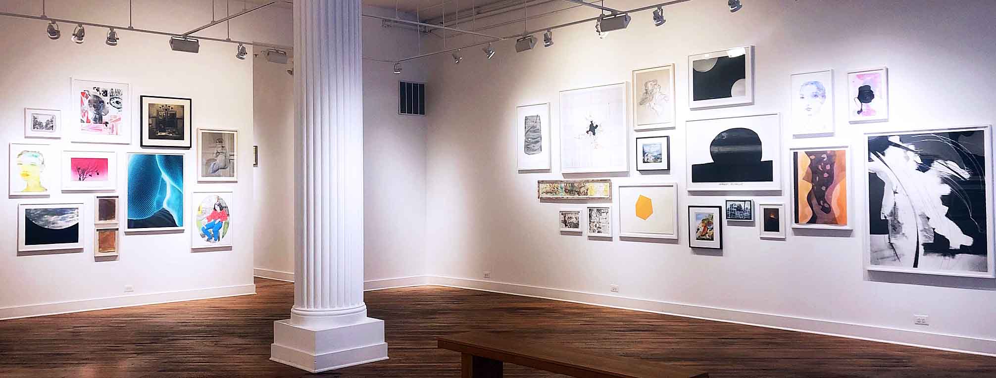
At the David Klein Gallery, Detroit, the exhibition “SALON” ambitiously presents 90 works by 39 artists across a range of media, with sundry formal intentions in diverse dimensions, all the while accomplishing the near impossible task of curating a ruminative viewing experience in which a spirited dialogue between each work translates into an expansive conversation with its audience. “SALON” summons and breathes new life into old models of art viewership and cultural discourse that once placed an emphasis on wide-eyed pluralistic wonder.
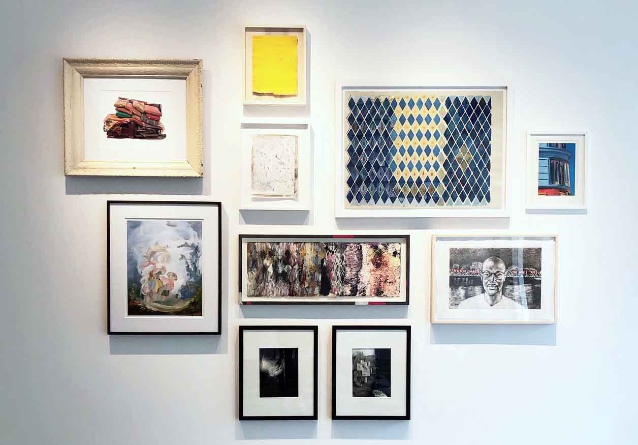
“SALON” Foyer Wall Installation. 

The term salon originates as a social event that flourished during the Enlightenment. A crucial practice in “the age of conversation,” the salon collected persons of intellectual and cultural significance within the home of a well-to-do host to allow for an absorbing, investigative conversation on a wide-ranging set of issues. These were intended to be regularly recurring conversations around art, literature and politics to satisfy a hunger for knowledge while refining the tastes of all participants, mingled with a dose of amusement as egos politely debated for intellectual superiority. The salon also came to be identified with a series of academic art exhibitions beginning in 1667, at the Académie des Beaux-Arts in Paris. Work chosen to be exhibited by a juried system, jostled for space in dense groupings that covered the wall from top to bottom. With the rise of public museums in the 18th century, a similar method of presentation was followed. Work that had once been displayed in private collections, often serving as the backdrop for salon conversations, and were ordered as closely grouped arrangements to juxtapose formal contrasts more immediately, was replicated in the new public displays.
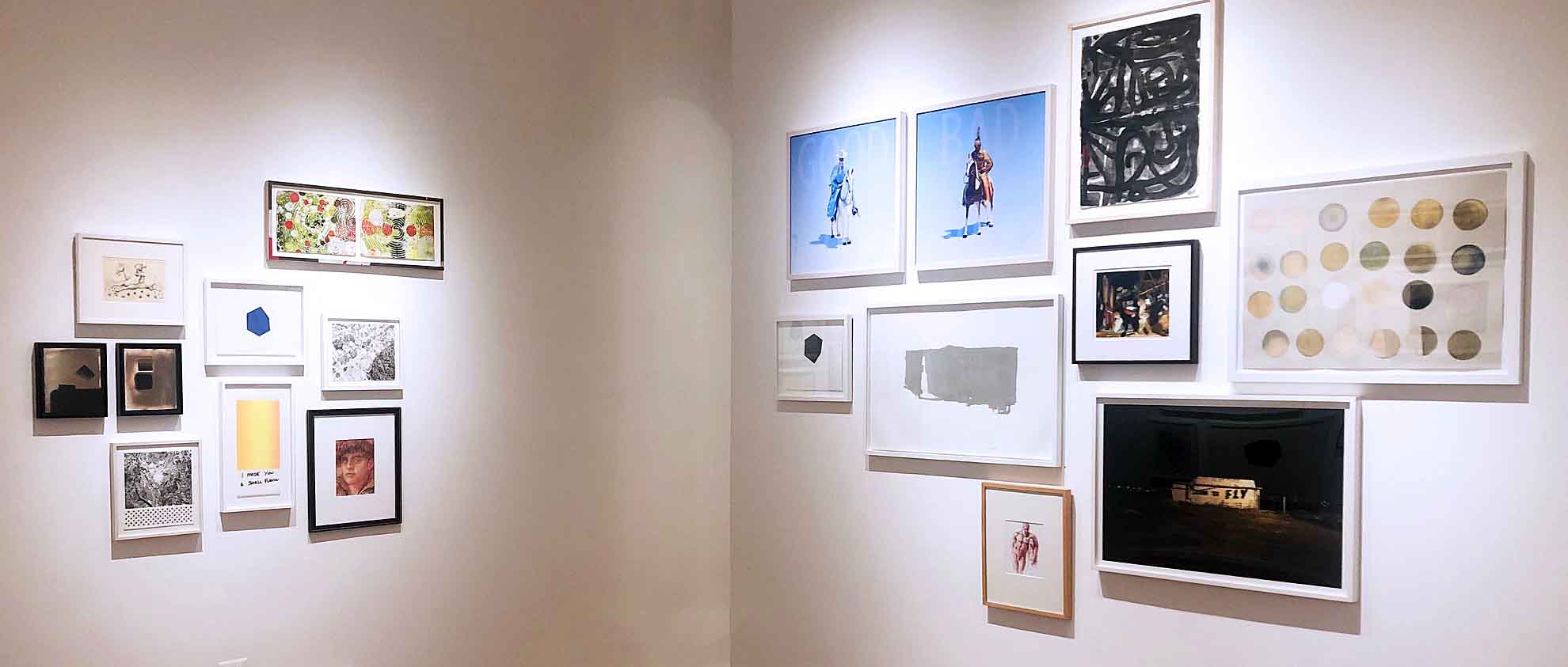
“SALON” Gallery 2 Installation View.

Crowded together to view a salon exhibition, the public was at times overwhelmed by the tightly clustered variety of works, but also in a state of awe and wonder, delving into vigorous conversation. With the advent of the “white cube” display methodology with neutral walls, controlled lighting and the spatial isolation of individual works of art inducing a hushed distance among viewing patrons, the salon approach was no longer the de facto system. The white cube environment, the earliest known iteration being an 1883 exhibition at London’s Fine Art Society by American artist James Abbott McNeill Whistler (1834-1903), was initially intended as an innovation to eradicate distraction, disconnecting art from the world and imposing more rigorous viewing criteria upon the viewer: there is only one way to see the artwork, and it is thus. Subsequently, what was innovative has now become conventional, with institutions and galleries continually questioning how to liberate the viewing of art from the impulse of Modernist constraint.
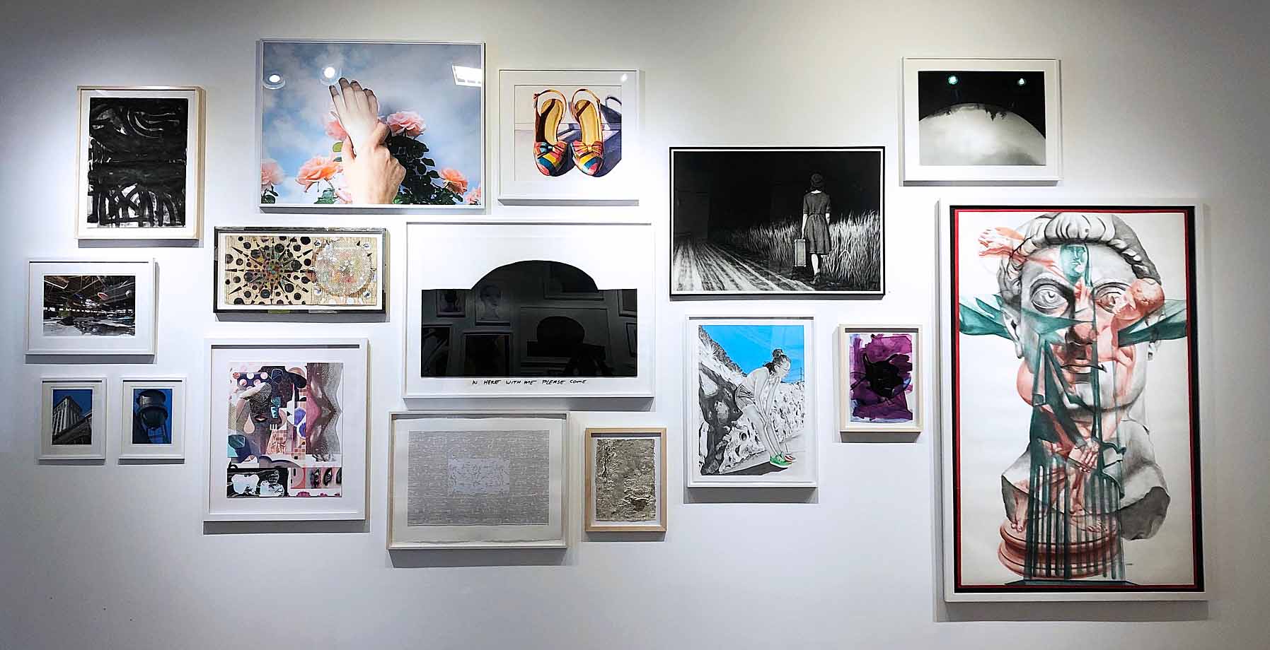
“SALON” Gallery 1 North Wall Installation.

At David Klein, the use of the salon as both conversational gathering point and display methodology, stimulates an adventurous public viewing space. Rather than filling every wall from top to bottom and side to side, the work in the exhibition is broken down into intriguing groupings displayed on eight separate walls in the two gallery spaces. It would be a fool’s errand to extract a work or two from each group and create a “best of” series of highlights as the basis for an exhibition review. There is no star amongst the roster of artists here, culled from the gallery’s extensive exhibiting family. This is a group effort; each work assists the other as contrasts are amplified to deepen the conversation. Such collective resonance is where the true joy of “SALON” resides as hierarchies are erased. The graphic sits beside the painted. The drawn beside the photographic. The representational beside the abstract. The minimal beside the dense. The humorous beside the solemn. And so on and so forth. Such juxtapositions are the stuff of wildly active viewing. The exhibition hums with a vitality.
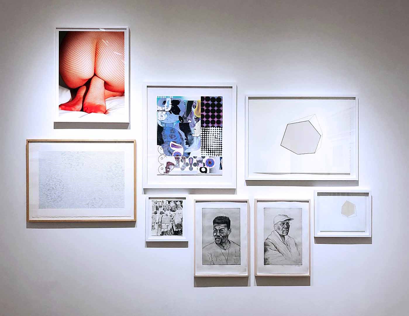
“SALON” Gallery 2 North Wall Installation

As a viewer moving from wall to wall, from conversation to conversation, one approaches the whole of each arrangement, marveling at the curatorial decisions resulting in unexpected formal juxtapositions. These configurations are the result of thoughtful installation on the macro level as well as care for content on the micro level. As one drills down into individual works, crowding in closer, examining each piece on its own terms, something occurs moving from one close inspection to another: the experience of the prior work lingers a bit more on the way to settling into the next. Like the exquisite sound design in a Robert Altman film, the voices overlap. On the north wall of gallery 2, the energetic collisions of Alisa Henriquez brush up against the hard-edged purity of Matthew Hawtin which finds a partnership with the carefully observed humanity of Mario Moore which is confronted by the mediated spectatorship of Jessica Rohrer which dissolves into the formal filigree of Janet Hamrick which simultaneously eases and bumps into the heightened temperature of Corine Vermeulen. There are many such moments throughout “SALON.”
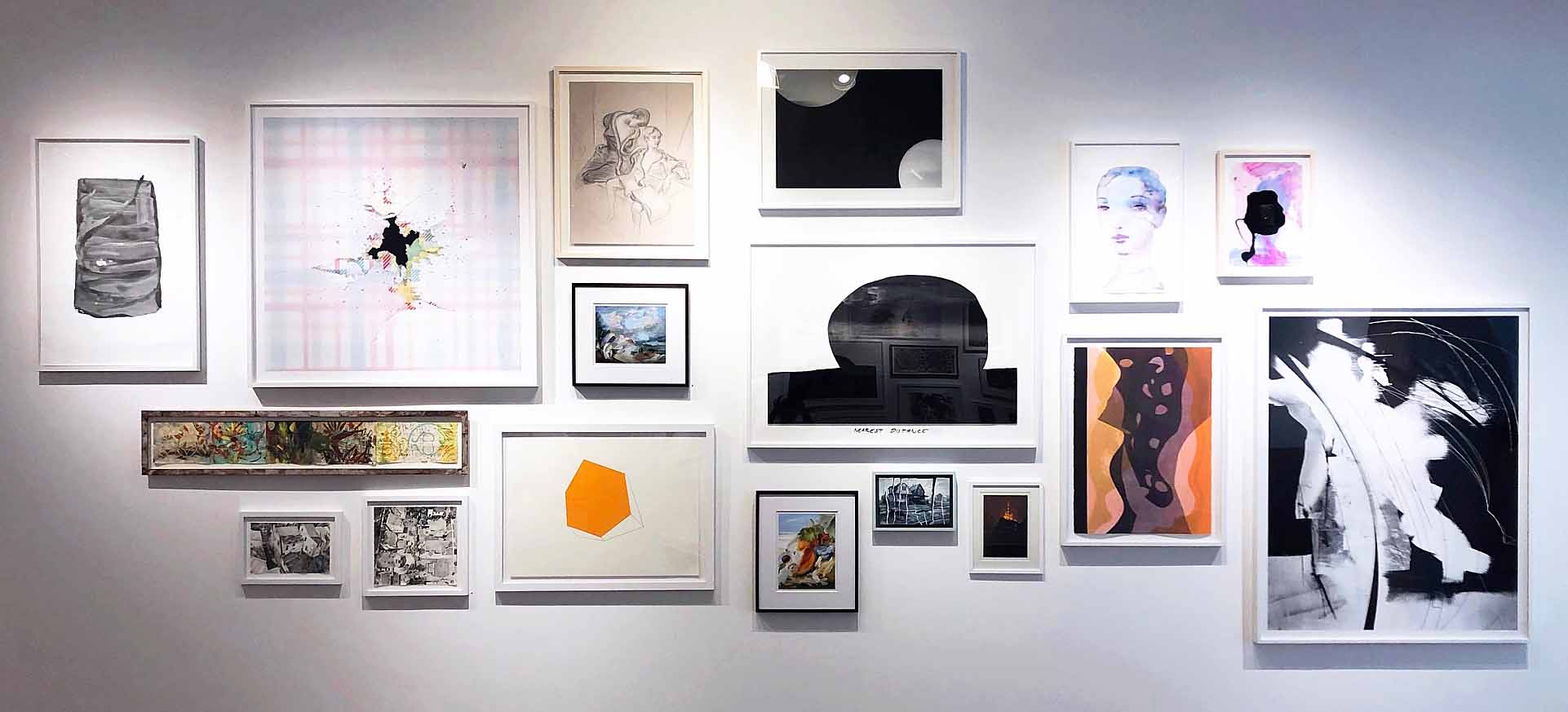
“SALON” Gallery 1 South Wall Installation.

Realistically, “SALON” is an exhibition about availability. The works chosen are bite-sized morsels representative of a larger body of work by each artist, serving as distilled entrées into their concerns. Framed for ease of hanging and transportability, the majority of works priced at a modest level for a larger audience, such market concerns go hand-in-hand with the formal accessibility of the exhibition. Free of viewing images in isolation in support of a single voice, the communion on display in “SALON” is a liberating and welcoming experience. Rather than being instructed where to place one’s focus, there is a choice of attention. In an era in which digital platforms tailor our viewing habits with surgical precision, employing harvested algorithms to produce ever narrower windows on the world, it is good to be reminded of the virtues of pluralistic viewing. “SALON” is a social event that invigorates the necessity of wide-ranging cultural conversations, reinforcing a community of expression.
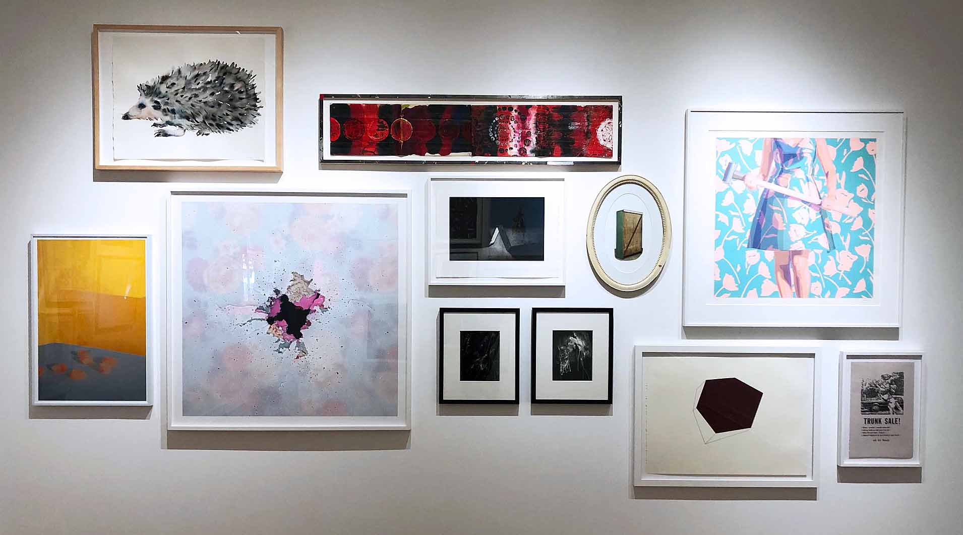
“SALON” Gallery 2 East Wall Installation.

“SALON” is Jamie Adams, Elise Ansel, Emmy Bright, Mitch Cope, Carlos Diaz, Joel Grothaus, Janet Hamrick, Matthew Hawtin, Alisa Henriquez, Patrick Hill, Scott Hocking, Cooper Holoweski, Trisha Holt, Cyrus Karimipour, Trevor King, Andrew Krieger, Stephen Magsig, Kim McCarty, Clara McClenon, Mario Moore, Carrie Moyer, Brittany Nelson, Marianna Olague, Judy Pfaff, Benjamin Pritchard, Kelly Reemtsen, Jessica Rohrer, Tylonn Sawyer, Robert Schefman, Julie Schenkelberg, Lauren Semivan, Clinton Snider, Rosalind Tallmadge, Corine Vermeulen, Liat Yossifor, and Elizabeth Youngblood.

“SALON” is on view at David Klein Gallery Detroit Until November 2.


Gyan Shrosbree and Jim Shrosbree @ Nx.ix Gallery

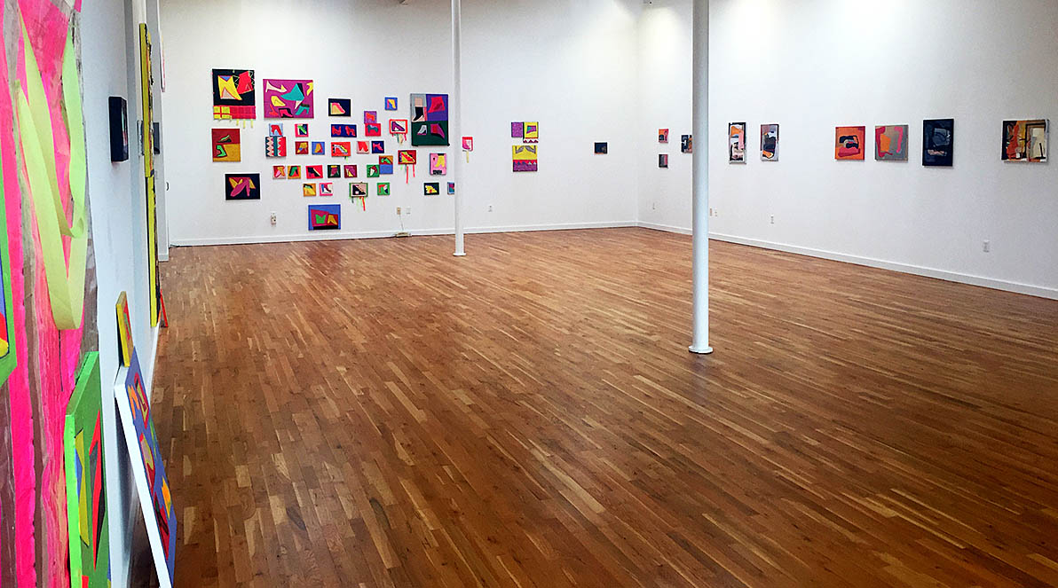
“Sense of Place” installation view; all images by Ryan Standfest

For the inaugural exhibition of the new Hamtramck gallery Nx.ix, gallerist Nicole McIntyre has curated a formally exuberant conversation between the work of Gyan Shrosbree and that of her father Jim Shrosbree. “Sense of Place” presents over 37 paintings in a large, bright, unobstructed space that is extended further as corners, baseboards, hallways, and those places generally left unconsidered in white cube installations, are teased out for a fuller sense of the place itself. Nestled above cabinets, hugging corners and leaning on the floor, groupings of the works into pockets great and small are an echo of what is unfolding within the pieces themselves.

Both bodies of work by Gyan and Jim Shrosbree are from 2019 and were created independently of one another. By bringing them together for this exhibition, Nicole McIntyre has initiated a dialogue in which abundant similarities and contrasts reside, so that the respective languages ultimately challenge each other’s construction. All of the works pursue their own memory by revisiting and revising the very spaces and forms they establish. Each artist in their own way challenges the infrastructure buried within the construction of their images—simultaneously excavating and burying, revealing and concealing. In many of the works, forms find themselves painted and repainted, pulled out, isolated, replaced and interrupted by textures, colors and structural devices intended to both complicate and simplify.

“Sense of Place” installation view: works by Gyan Shrosbree

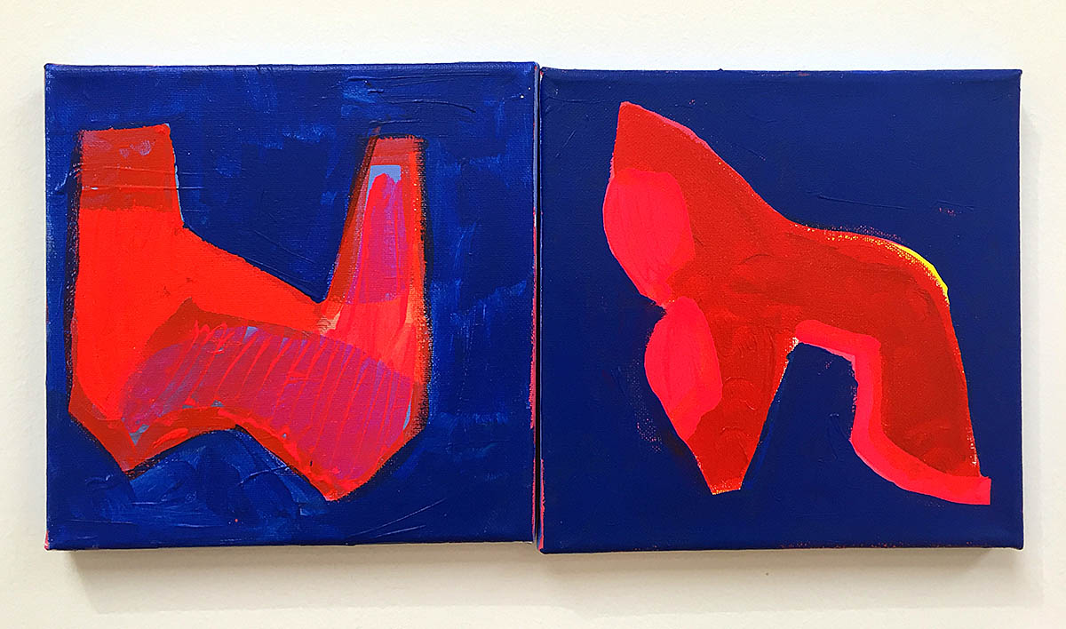
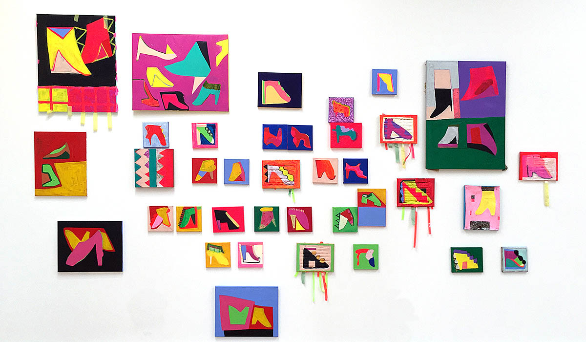
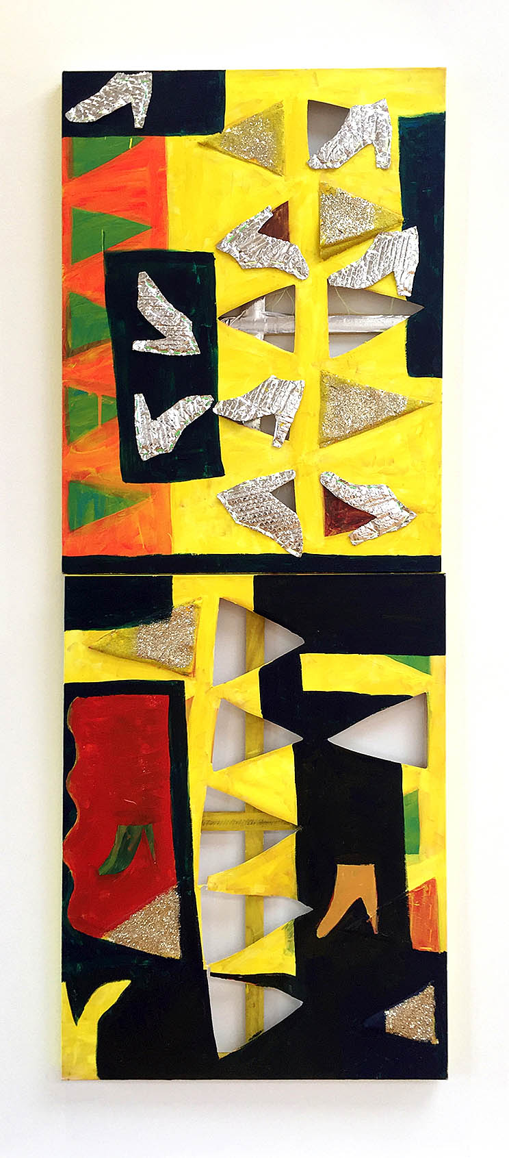
Gyan Shrosbree employs the recurring image of shoes throughout her work here. And yet they are also not shoes. The image of a shoe is present, but then exaggerated, caricatured, and abstracted into a reductive icon. The association of the shoe nevertheless lingers. That lingering connection with the body results in a proposition for the viewer: how would I need to physically adapt to this new shoe? We exist in a culture of feminine bodily deformation in which shoes bind, constrict and shape physical identity. To draw this conversation into the realm of formal abstraction is not without merit.

Gyan Shrosbree, detail of “I Will Never Share A Closet With You”, 2019, acrylic on canvas

In the paintings of Philip Guston, shoes are self-contained, heavy and inert things that get heaped and piled. They are abstractions of a shoe—the idea of a shoe arrived at via recollection rather than representation,  with emphasis placed on their thick leather soles often upturned and held in place with oversized tacks. Detroit artist Tyree Guyton makes use of the shoe in both painting and installation as the cast-off remnants of a population uprooted, moved, and unmoored, gesturing toward an itinerant homeless life on the street. His large scale paintings of shoes become totemic, celebratory, larger than life street signs reflecting a history of migratory traffic.

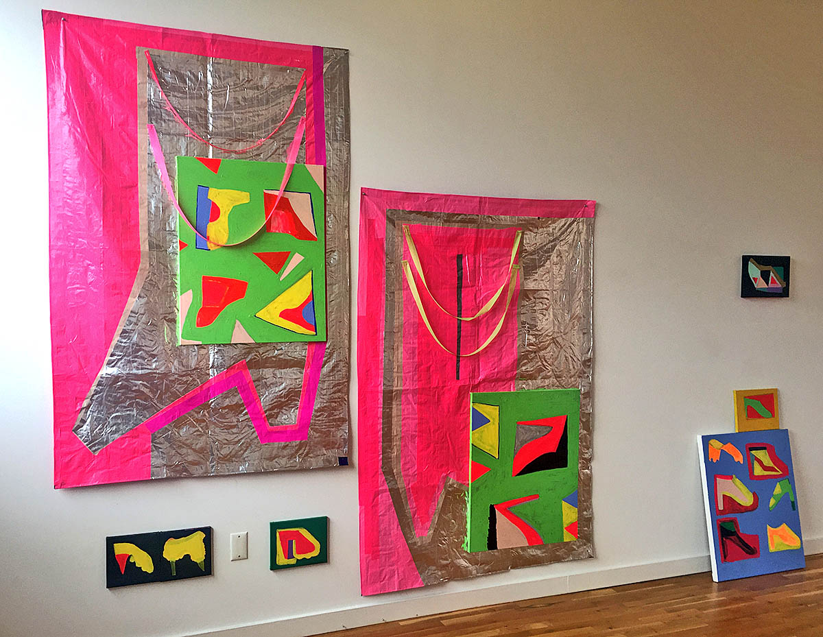
Gyan Shrosbree, “I Will Never Share A Closet With You”, 2019, acrylic, ribbons, glitter, push pins on canvas, various dimensions

From a distance, a grouping of Gyan Shrosbree’s canvases in “I Will Never Share A Closet With You”, suggests a wilder, more organic expression of Peter Halley’s day-glow abstractions from the 1980s. But a closer viewing reveals forms immersed in a folk art, painted sign sensibility. In her work, the shoe serves as a memory vessel, for the foot to return to again and again, always confining to a set shape, to a path taken daily. However, with each return Gyan Shrosbree makes to the body of the shoe, to render it from memory, the shape changes, softens, metamorphoses, allowing for an elastic formal existence. Humorous shapes emerge, and there is an echo of self-taught art, hand-painted signs and memory, in which images are arrived at through recollecting an image and repeating it with the alterations memory gives way to. The compositions suggest the structural rudiments of commercial advertising and merchandise catalogs—both online and printed, with overlapping and adjoining panels for each style. But in these paintings, the commodity grid is also just as fractured as the product. Gyan Shrosbree employs materials that have been associated with lowbrow craft production and the cultural assignation of feminine tastes. The liberal application of glitter, day-glo paint, streamers, and reflective tape signals the opposite of restraint and cranks up the heat in the images. There is a notion of embedded joy in these images. In a work such as “Silver Slippers”, the layering on of such material signals a destabilization of traditional “value”: high art strategies of abstraction are married to low-art techniques of throwing a shiny party. This keeps the work deceptively light, while beneath the skin, deeper structures are being carved up and dismantled.

Gyan Shrosbree, “Silver Slippers”, 2019, acrylic, tape, bubble wrap, and thread on canvas, 40” x 30” each

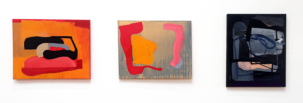
Jim Shrosbree, (left) “Once and Upon (rojo), 2019, oil on canvas, 16” x 20”; (center) “Talla-Hasee (rinse)”, 2019, oil and acrylic on canvas, 16” x 20”; (right) “Finding Out/Looking In”, 2019, oil on canvas, 20” x 16”

With a more subdued palette and a smaller scale, Jim Shrosbree’s paintings in the exhibition explore a process of editing and revising pathways. Moving from the concrete—from finite limitations of language to fragmentation—his spaces toggle between boundlessness and containment. There is a layered history on each canvas—a bit of string and tape buried beneath a skin of paint, a patch of collaged newspaper embedded in a window of pigment allowing us a glimpse of narrative transformed into visual texture. The paint handling moves from thin to thick, dripped to smeared to brushed. Shapes of color on the verge of amorphousness arrive near temporary definition, while pipeline frameworks settle in to add a note of stability.

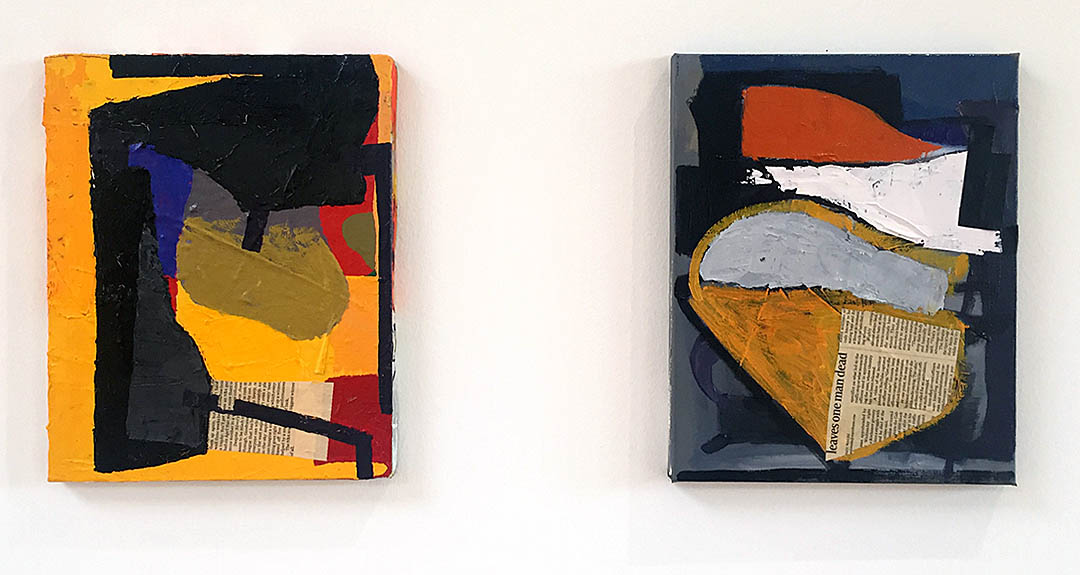
Jim Shrosbree, (left) “Biggest Winner of All”, 2019, oil and collage on canvas, 14” x 11”; (right) “Leaves One”, 2019, oil and collage on canvas, 14” x 11”

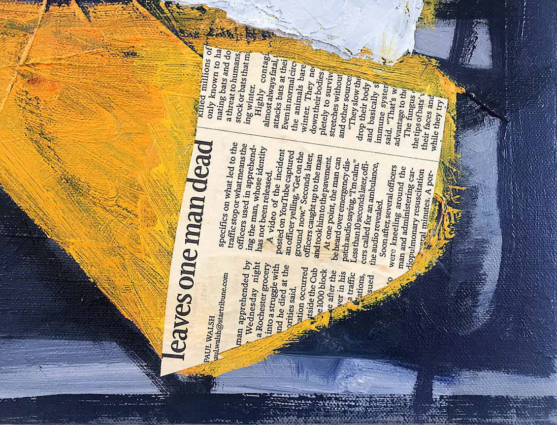
Many of Jim Shrosbree’s works here, use collage with newspaper fragments sourced from the Minnesota newspaper The Star Tribune. These shaped clippings—primarily serving a visual purpose with the rigors of functional, readable, black and white text contrasted against the liquidity of paint and color—have the added effect of locating the work as a place. Reading the text to gather every little piece of evidence, can tilt toward a structure. Akin to little scraps of memory, they summon the paintings of the German Dadaist Kurt Schwitters, who would embed used train tickets in his work. Similar to displaying the remnants of daily travel, the newspaper fragments in Jim Shrosbree’s paintings are a glimpse into daily dispatches from a specific time and place. In this sense, his work functions as both a recording and a clouding of that recording. That record is ultimately a memory of the procedures set upon by the painters hand—the accumulated marks and passages that both build upon and eradicate each step taken.

Jim Shrosbree, detail of “Leaves One”, 2019, oil and collage on canvas, 14” x 11”

Taking a stroll from the gallery in Hamtramck down Joseph Campau street, lined with storefronts both vacant and active, there is a resonance with what was experienced at Nx.ix. One passes windows covered over with yellowing newspapers. Another dirty window has stacks of dusty and sun-blanched shoeboxes leaning against it. Hand-painted sales signage in vibrant day-glow colors adorn shop windows. Facades show evidence of older shop names painted over while others are simply ghostly traces of what has slowly faded away.

In Gyan and Jim Shrosbree’s paintings, a sense of place is a sense of one’s place, as we attempt to locate ourselves by constructing a new place in the form of an image, out of and on top of the memory of where we have been. The act of building this new image reflects the ways in which the memories at the foundation of what we are building, complicate and simplify all at once. We abstract prior experiences as they evolve into newly shaped experiences and images. We rework the surfaces and apply a fresh coat of paint to old layers that will eventually resurface to share its history.

“Sense of Place” is on view at Nx.ix Gallery until October 14


Jim Shrosbree @ Paul Kotula Projects

The title of this new exhibition of work by artist Jim Shrosbree, “thinking/still,” is evocative of Irish playwright, poet and novelist Samuel Beckett who in his novel Molloy (1951), wrote “To restore silence is the role of objects.” Indeed, the objects of Jim Shrosbree are imbued with the capacity to distill and render the space they occupy with a thoughtful silence. “thinking/still” also suggests two different states of being, one seemingly active and one inactive, that are both the same. The oblique slanting punctuation mark separating the italicized action of “thinking” and the upright “still,” serves to both divide and join these two states. To be thinking is to be still. Stillness and thought are complimentary to one another, allowing for a new space to emerge.

The twenty six works in the exhibition, consisting of the sculptural, the drawn and the painted, form a thoughtful installation attentively harmonized to the intimate space of Paul Kotula Projects. The scale of Shrosbree’s objects recall the work of Swiss artist Paul Klee (1879-1940) in their seemingly modest presence—in a time when unabashed, leaden spectacle is the go to in art, Shrosbree accomplishes so much more by downshifting the scale of our immediate experience and necessitating a deeper dive into the details for a prolonged experience. The cumulative effect on the gallery environment is that of quieting down the space for subtle equations to unfold, establishing the necessary stillness to patiently enter into the smaller spaces contained within each object. It is an environment that reverberates with possibility where one is gently guided from one situation to another and then back, from slow to quiet to a state of revelation.

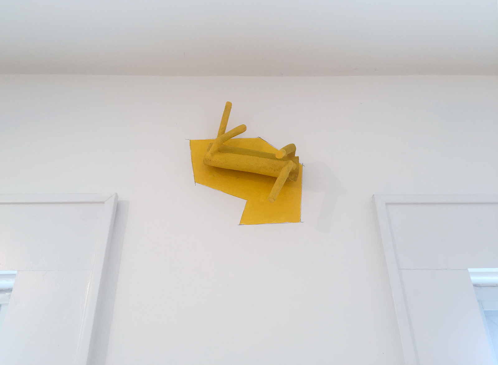
Jim Shrosbree, “CAD Y (fluer)”, 2016, ceramic, suede flocking, acrylic, graphite, 8 x 10 x 4 inches

CAD Y (fluer) (2016) is a work hiding in plain sight like some sulfur covered arthropod that has scuttled into position between two windows  just below the ceiling of the gallery. It is anchored into a geometric zone of yellow enameled onto the wall within drawn graphite edges. It is as if the form shed itself onto the wall to reinforce the necessity of its being there.

Many of the objects can be viewed as situational chamber pieces with a set of circumstances that chart a series of relationships. They are small, formal narratives or event mechanisms in which Shrosbree unfolds a circuit of experiences to set off a string of associations. At the root of his practice is the act of drawing as thinking, and this translates into the intuitive path making found in the objects.

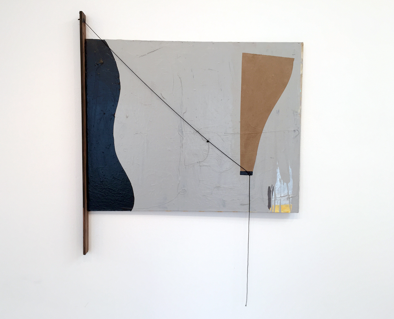
Jim Shrosbree,  “My Ship (paradise)”, 2019, acrylic, wood, string, collage, 41 x 38.5 inches

In My Ship (paradise) (2019), a painting is augmented with a string containing a little knot, held in place by a bit of tape and attached to a wooden stick. Things have been happening here as if an industrious child dreamer has constructed a rig with a secret intent. A string dangles humorously and the whole affair appears to be tentatively keeping itself together. Alternately absurd and poetic, the piece invites wonder with a minimum of means.

There is a hint of the absurd throughout Shrosbree’s work, with forms that are simultaneously graceful/clumsy, present/not present, full/empty. Akin to twittering organs rather than machines, the tentative nature of the forms and the situations they occupy, lend them a sense of ridiculousness and incongruity, and yet they also seem to transcend their nature the longer one spends with them. His titles indicate a humorous reconsideration of language through abbreviation, fragmentation, and an emphasis on spoken sounds. There is a play with words that echoes the formal play in the objects, as the texts are succinct yet also vague. With his use of color, Shrosbree tends to keep things simple on the surface of it all: yellow, red, blue, white, black, with forays into an orange or a green, however this serves as a means to softly beckon us into a deeper, more complex set of formal considerations.

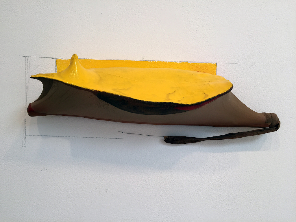
Jim shrosbree, “RO (coco)”, 2019, ceramic, nylon, enamel, wire, graphite, 7.25 x 19 x 5.75 inches

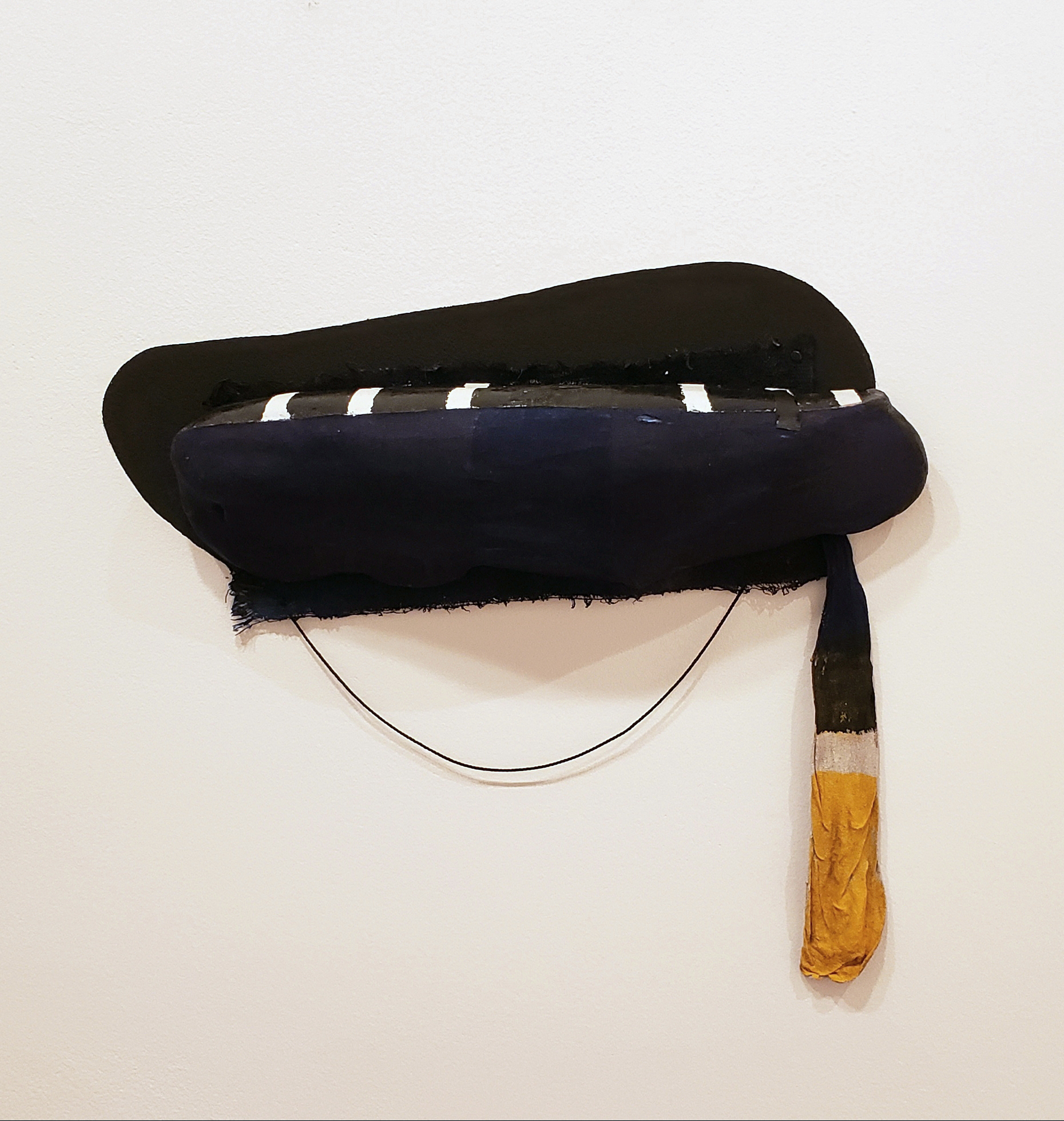
With  RO (coco)  (2019), Shrosbree breathes complex life into what at first read is a misshapen pouch or bag in an unlikely union with the wall behind it. A large expanse of white space surrounds the piece, beckoning the viewer to move in closer for a proper examination. The irony of the title lay in its reference to the elaborately ornamental, which in this case is comprised of the smallest shifts and gestures that guide our investigation of its construction. The piece appears beneath a yellow shell which in fact is not a shell. It’s skin appears soft, pliable, stretched, yet passages are hardened with enamel. A limp nylon tail trails beneath with a small wire emerging from it. Follow the wire and it disappears with an absurdist flourish into a tiny hole bored into the wall. Beneath this hole, another hole. Perhaps a first attempt at wire insertion. From this second hole, a graphite line is drawn horizontally to a vertical line that eventually forms a frame around the piece with a ground of yellow enamel applied within it to merge the form to the wall. Figure/ground as one. On even closer inspection, at the forensic level, little bits of pink eraser droppings dust the baseboard beneath the piece—evidence of Shrosbree’s process of working the graphite lines further.

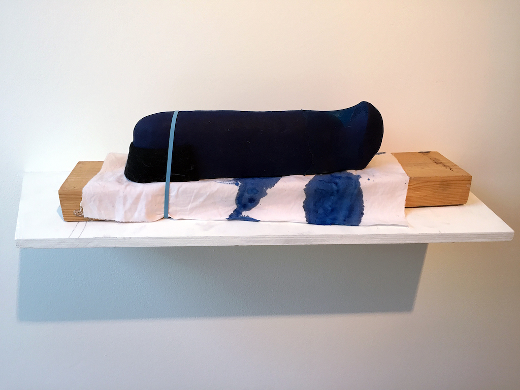
Jim Shrosbree, “UB (leng)”, 2017, ceramic, nylon, hair, wool, cloth, paint, ink, wood shelf, 6.5 x 23 x 7 inches (with shelf)

Likewise, a detailed examination of UB (leng) (2017), reveals a small mess of dog hairs gathered on a wool “muzzle” capping one end of a blue ceramic truncheon, resting on a rag stained with blue ink and lashed to a hunk of lumber. Unlike the work of artist Richard Tuttle, who employs a play between wall and form, drawing and the minimal manipulation of modest materials, Shrosbree’s work does not exist in a state of fragility. Despite its tentative nature, there is a kind of guileless presence that nevertheless insists on being there.

Jim Shrosbree “UB (VLoon)”, 2019, ceramic, fabric, string, cloth, tack, enamel, ink, acrylic, 14 x 16.5 x 3.5 inches

Jim Shrosbree, “Uno yuno”, 2019, ceramic, steel, paint, 49 x 15 x 16.5 inches


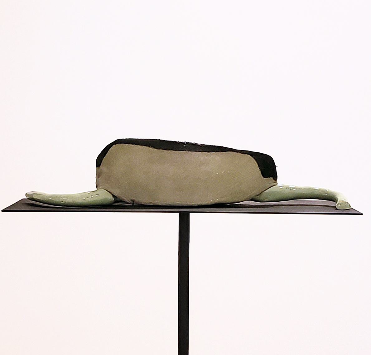
UB (VLoon) (2019) further elucidates Shrosbree’s interest in dichotomies: emptiness and fullness, the animate and the inanimate, the interior and the exterior. The flaccid and drooping painted nylon sack of the piece appears spent, yet it is attached to a form that appears ripe and full. Uno yuno (2019) is elegantly displayed on a steel plinth supported by a slender rod. Such refined stability is offset by the primary form: a seed-like entity suggesting an organic pouch plump with activity as sluggish tendrils emerge from either end. However on closer inspection, there is only the illusion of fullness within the cavity of the body. Its inflation has been implied.

Jim Shrosbree, “SAN (bdroop)”, 2019, ceramic, cloth, ink, acrylic, 15 x 12 x 4.25 inches

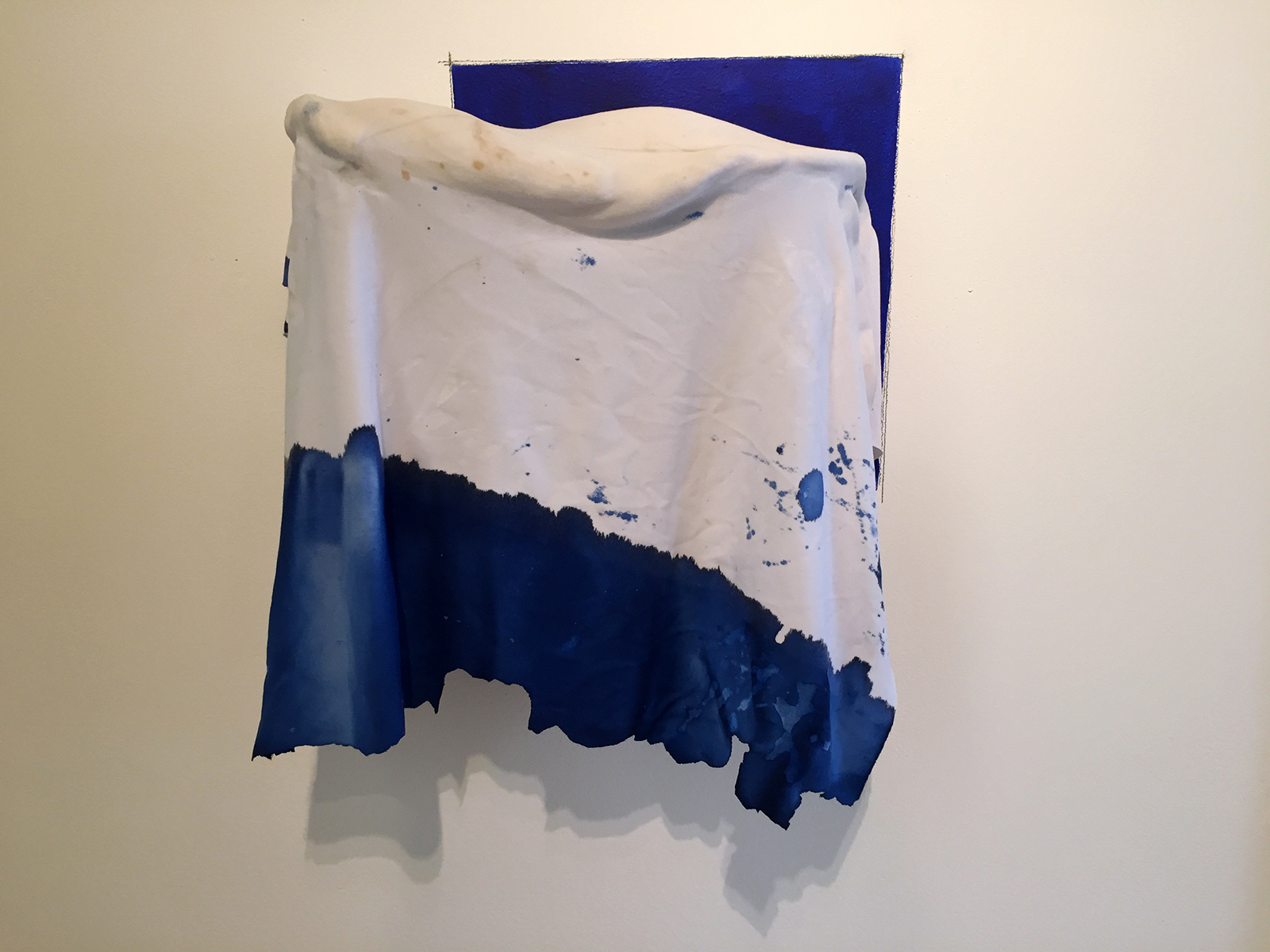
This embrace of illusion, of what is implied rather than shown, is central to the experience of Shrosbree’s work. In SAN (bdroop)(2019), a suspended ceramic cloth recalls the time-honored stage magic act of horizontally levitating a body beneath a sheet that conceals a platform or hidden wires. New Way (home) (2012) is a small painted relief with a wood flap seemingly supported by string, concealing the origin of a single humorous drip that emerges from under it.

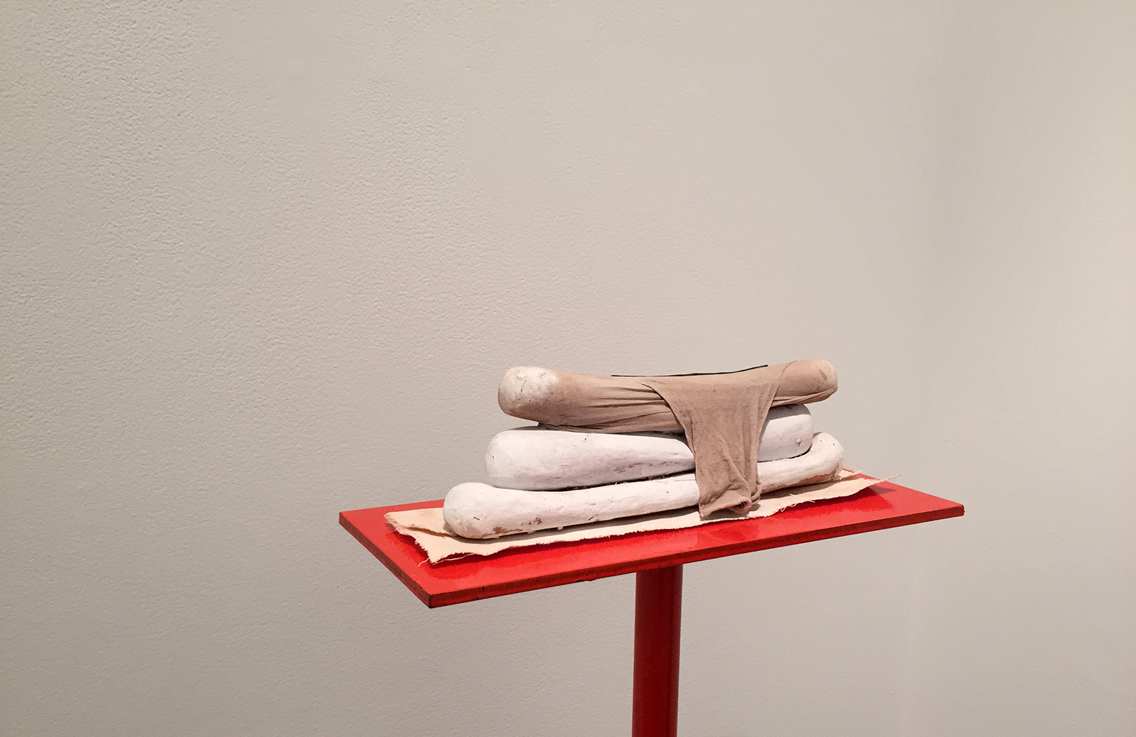
In what is arguably one of the more consistently unique rooms in Paul Kotula Projects, a small chamber at the left of the hallway one enters from, there is, nestled in a corner, a piece titled Tandroop (2019). It consists of three stacked ceramic forms, each resembling sausages or baguettes or extrusions—take your pick, but it may be best to simply ignore the impulse to impose such obvious comparisons—atop a rectangular patch of folded cloth, all of which is held aloft on a painted red plinth and support shaft. The top form has been stuffed into a nylon stocking, it’s open end drooping down like some distended, tired mouth. And then there is the absurd grace note: a length of black string resembling a shoelace, perhaps four inches long, has been carefully laid atop the nylon encased form. To examine all of this closely, the viewer must crowd closer into the corner of the small room, perhaps even positioning oneself atop the low platform beside it. The very act of adjusting one’s body in proximity to this piece, lends the work a vaguely carnal presence. It is passive and yet unavoidable all the same. Humorous and yet sad. A lonely figure in a small room conjuring a whisper to come closer.

Jim “Tandroop”, 2019, ceramic, nylon, cloth, gesso, enamel, steel, 46 x 15 x 7 inches

Within the tiny universe Shrosbree has constructed in the gallery, he allows us to gaze into little models of the shifting, liminal nature of consciousness. The French philosopher Georges Bataille (1897-1962) in positing his notion of form/formless, wrote in his essay “L’inform” (“Formless”, 1929): “A dictionary begins when it no longer gives the meaning of words, but their tasks. Thus formless is not only an adjective having a given meaning, but a term that serves to bring things down in the world, generally requiring that each thing have its form. What it designates has no rights in any sense and gets itself squashed everywhere, like a spider or an earthworm. In fact, for academic men to be happy, the universe would have to take shape. All of philosophy has no other goal: it is a matter of giving a frock coat to what is. A mathematical frock coat. On the other hand, affirming that the universe resembles nothing and is only formless amounts to saying that the universe is something like a spider or spit.”

Shrosbree allows for the formless to unfold as it will. Utilizing intuition as process, guided by a sharpened awareness, he places the viewer into a state of learning in which the formlessness of universal consciousness has within it connections, pathways, threads, associations. He constructs open, circumstantial spaces that provide meditative attunement; microcosmic narratives that gently unfold in multiple iterations depending upon how we, as investigators, follow the evidence and gather our experience together in pursuit of clarity. That he achieves this without a hint of overplaying his hand and allowing us the freedom to discover our own truths, is no small feat.

thinking/still is on view at Paul Kotula Projects through October 19, 2019

Stacey Steers “Night Hunter” @ K.OSS Contemporary Art Gallery

The actress Lillian Gish (1893-1993) was called the “First Lady of American Cinema,” as the earliest prominent female film star from 1912 to the 1920s. In screen performances that defined the role of women in silent cinema, Gish was the image of the archetypal suffering heroine that gained strength through trauma. It was the stuff of pure melodrama.

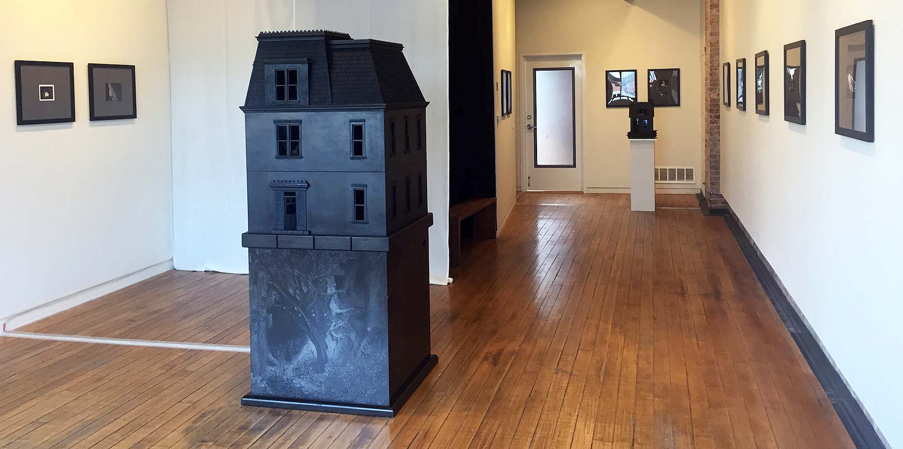
“Night Hunter”, Installation view at K.OSS Contemporary Art Gallery, All images: K.OSS Contemporary Art Gallery

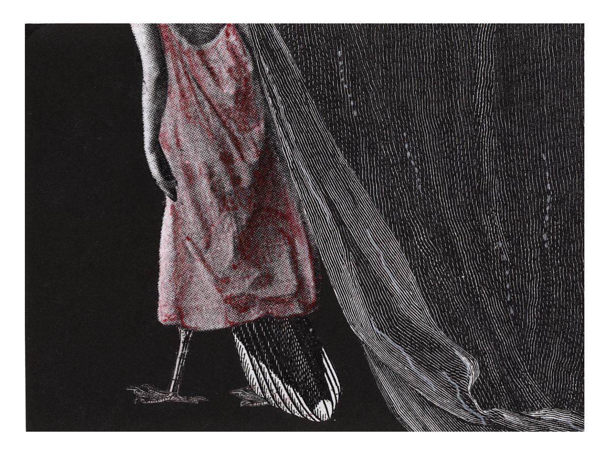
Artist and filmmaker Stacey Steers resurrects Gish in the animated short film Night Hunter (2011), which was created from 4,000 collages on paper and shot on 35mm film. It can currently be viewed as the centerpiece of the exhibition “Night Hunter” at the K.OSS Contemporary Art Gallery, alongside a selection of the collages used in its making and a reconfiguration of excerpted scenes within two sculptural installations. Steers work in “Night Hunter” evokes the literature of dark fairy tales, gothic horror and doomed Victorian romance as shot through with the intuitive approach to narrative construction found in Surrealist art and cinema. Rich in seemingly-incongruous symbolism, the film and its component parts untether and collect the raw material of the subconscious within a psychologically complex space that turns the psyche inside out. Although Steers evokes the imagery of the past, she also works to actively deconstruct and subvert the meaning of that imagery.

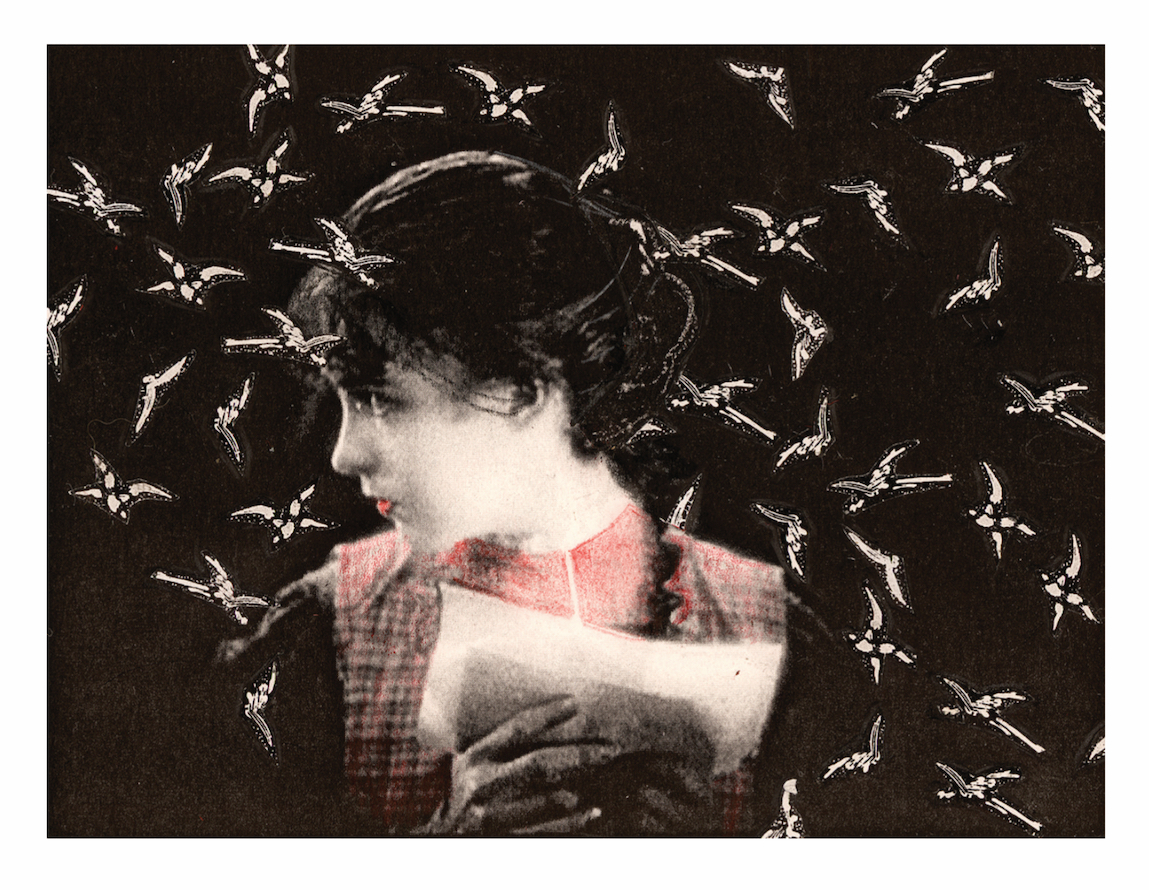
Stacey Steers: Single Collage, 22 x 18 x 1 inches, 2011

The exhibition “Night Hunter” calls forth many slivers of the ornately imagined past, beginning with The Night of the Hunter (1955), directed by Charles Laughton from a screenplay by James Agee. Set in West Virginia in the 1930s, that film stars Robert Mitchum as the misogynistic serial killer and self-appointed preacher Reverend Harry Powell, who attempts to hunt and kill a boy and a girl escaping his clutches along the Ohio River. He is a snake who enters the garden. There are numerous elements in the “Night Hunter” exhibition that converse with Laughton’s film, which is a highly stylized, expressionistic work photographed with the distortions and excessive play of shadows that haunt the dreams of children. The sets of the film appear as dimly lit dollhouses in the void, swallowed up by an ever present gloaming. Its action unfolds in an unreality— a studio lot rendition of night teeming with reminders of the natural, bestial world on the verge of devouring innocence. Lillian Gish even appears in The Night of the Hunter, as an older, wiser, gun-toting woman who keeps the Reverend at bay.

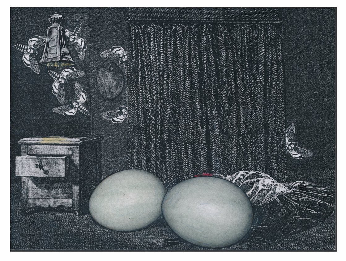
Stacey Steers: Single Collage, 22 x 18 x 1 inches, 2011

Steers’ film Night Hunter has as its setting, a house in the dark woods, where a youthful Lillian Gish, reanimated in footage excised from silent dramas such as Broken Blossoms (1919), True Heart Susie (1919) and Way Down East (1920), all directed by D.W. Griffith, and The Wind (1928) directed by Victor Sjösström. In this last film, the final silent performance of Gish, she plays a heroine who suffers at the hands of male brutality until she commits murder. Steer’s narrative thoroughly resonates with the history of Gish’s screen characters. In her Surrealist fairy tale, we are presented with the trappings of a haunted house rife with phantasmal stirrings. At the start, Gish, alone in the house, is sewing and cooking. Lace curtains part to reveal the starry night outside. Pots boil over. Death‘s-head hawkmoths are flitting about. The moodily detailed score by composer Larry Polansky establishes a space that is at once airy and yet also oppressive, with a mixture of sounds that conjure restless spirits within walls on the verge of talking. This is a scene of the domestic mundane laced with gothic horror. There is a raven clutching a writhing green earthworm within its beak. Oversized eggs bleed, the weeds penetrate up through the floorboards, a storm of moths flutter from the open drawer of a desk. Our heroine is writing a letter: “Strange things happening, mother.”

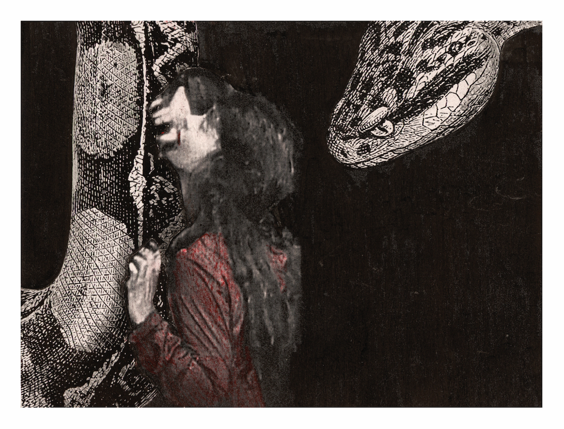
Stacey Steers: Single Collage, 22 x 18 x 1 inches, 2011

And soon, there is a snake: the intrusion of the phallic in the form of a venomous Copperhead. It is here that Steers relies upon the silent film archetype of the heroine in peril, as the snake threatens and the environment grows increasingly stifled. But there is a reversal, as one form of nature vies for dominance over another. In an echo of Camille Paglia’s feminist reading of Alfred Hitchcock’s film The Birds (1963), the force of feminine nature emerges as an act of reclamation in the face of the domestic as Lillian Gish flees the house to seek refuge within the dark of the surrounding forest. Night Hunter ends on a note of release.

The film harkens back to Surrealist works in its construction. The resuscitation of silent film footage incorporated into a new narrative recalls the film work of assemblage artist Joseph Cornell (1903-1972), whose experimental “found film” Rose Hobart (1936) was constructed from shuffled and reworked scenes from the 1931 “B” movie East of Borneo. Cornell would fixate upon repeated gestures and expressions of the actress Rose Hobart throughout the film in a manner that traps the actress under the male gaze. Alternately, Steers liberates the image of Gish as an active participant in her narrative.

Stacey Steers: Single Collage, 22 x 18 x 1 inches, 2011

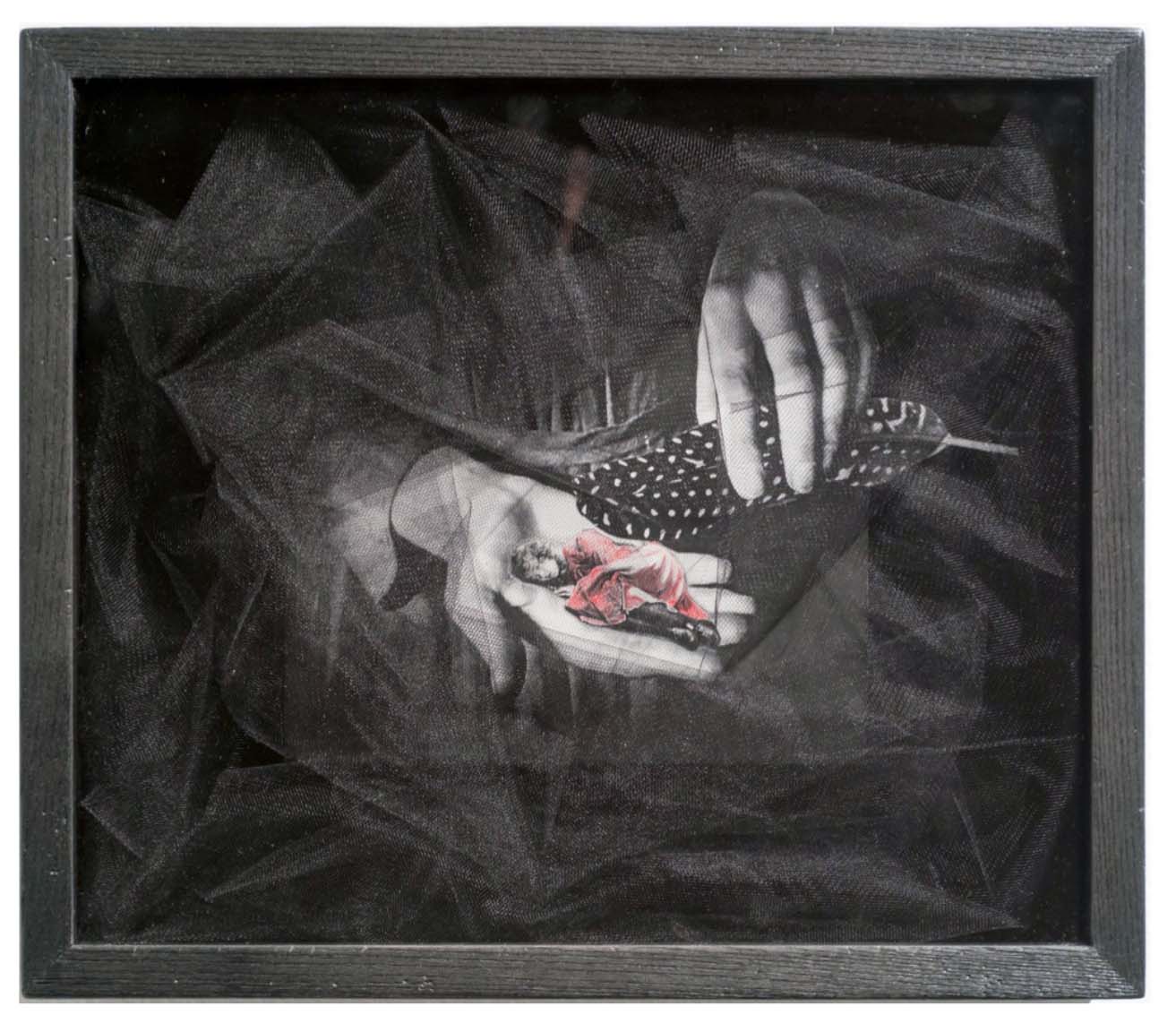
Steer’s Night Hunteralso gestures toward Max Ernst’s 1934 collage novel/comic book Une Semaine de Bonté  (A Week of Kindness), in which the Surrealist artist set about cutting up and reorganizing a plethora of print images culled from Victorian novels, encyclopedias and natural science journals. For Ernst and many other Surrealists, this intuitive act of arriving at new meanings through the intuitive suturing of inert images rescued from the cultural dustbin was an act of liberating that which had been previously repressed in source material. Steer’s work is similarly concerned with the use of collage and montage as an act of deconstruction and reconstitution. The exhibition itself is conceived to reflect this process as the viewing of the complete 16-minute film of Night Hunter is supplemented by twenty of the collages used in its production. But rather than ossifying the experience of the film, the collages enlarge upon the space of the narrative. The film itself is manufactured from material that is fragmented and then reassembled. To then take the film and break it down into moments framed  and placed behind glass, sometimes in shadow boxes with mixed media adornments, is to create auxiliary incidents that reshuffle the memory of what has just been seen.

When viewing these individual, static collage works, plucked from the moving continuum, one can appreciate the skill with which Steers approaches the visual texture of her film. When the celluloid images advance, there is that poetic, jostling motion of handmade animation, the meaningful delays and lapses that reinforce the simultaneous decay and reanimation of time. In a frozen state, each image yields the detail of their source material: the engraved, etched, and half-toned language of print alongside the grain of silent film stock with hand-colored additions.

Stacey Steers: Shadow Box, mixed media, 11 x 13 x 3 inches, 2011

The very notion of reshuffling time, abandoning the linearity of the narrative, allows for a different sort of immersion in the world Steers has created. Here too, one can glance back at a Surrealist predecessor: Luis Buñuel and Salvador Dalí’s silent film experiment in non-linear cinematic narration Un Chien Andalou(An Andalousian Dog(1927) with its shocking eyeball sliced open by a straight razor serving as a powerful symbol for the Surrealist intent in slicing open the image. But whereas Buñuel and Dalí leaned heavily on Freudian theory and the repeated victimization of their heroine in the film, Steers empowers her heroine. And that she does so after swallowing the same death’s-head hawkmoth glimpsed in Un Chien Andalou, should not be overlooked.

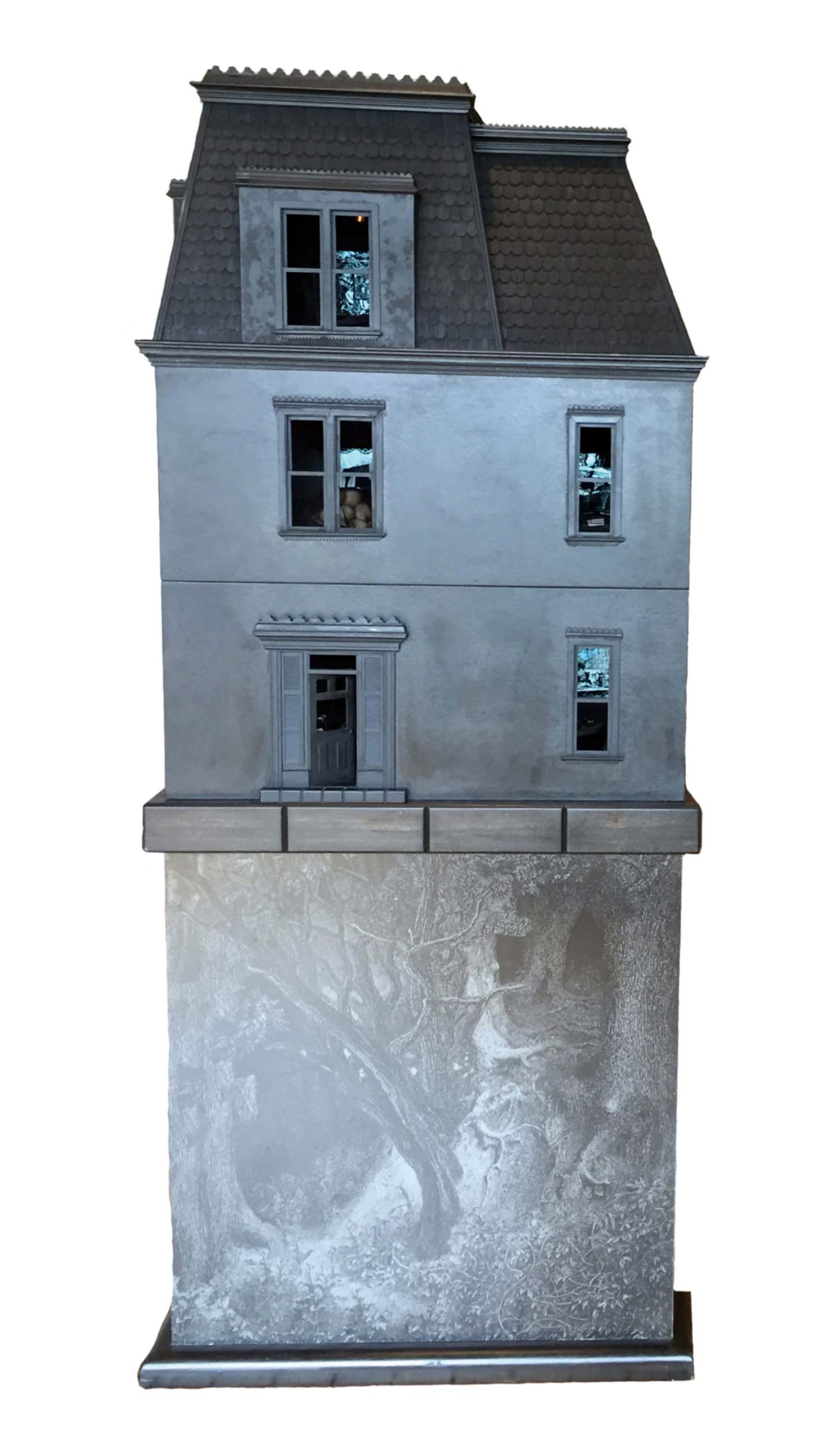
Stacey Steers: Night Hunter House, wood, Nixplay screens and mixed media, 60 x 36 x 36 inches, 2011

Included in the exhibition are two sculptures, Night Hunter House and Cottage that go further to represent the central film project in an alternative light. The house is a Victorian model measuring 60 x 36 x 36 inches, painted entirely in matte black, with windows that reward the viewer access to the interiors of ten rooms, each with a small video screen playing loops of selected scenes from the film, each with furnishings that echo the animated narrative. The dim lighting of the rooms and the scale of each video loop, fortifies the intimate domestic space viewed on the larger screen. It also reshuffles the narrative once again, as the observer glances from window to window catching a fragment here and there, the gaze drifting to the miniature objects found within. We make ourselves small and burrow back into this house, whose very architecture is the symbol for so many stories relating to the ghostly, the horrific and the romantic.

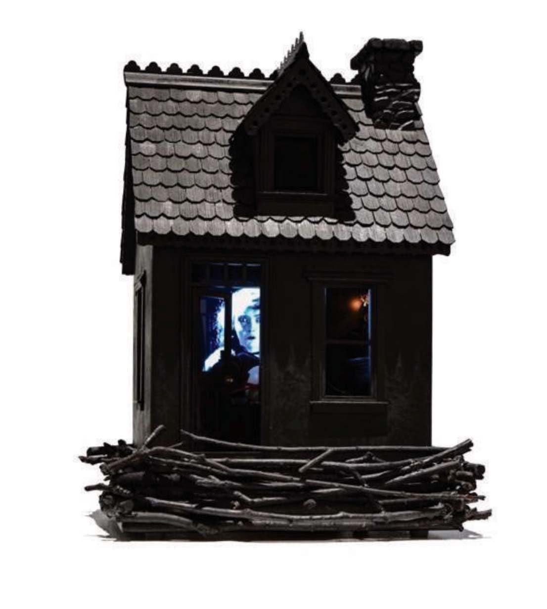
Stacey Steers: Cottage, wood, Nixplay screens and mixed media, 19 x 13 x 11 inches, 2011

With Cottage, a 19 x 13 x 11 inch construction similarly painted matte black and presenting a single screen video loop within, and with “House,” Steers revels in the relationship between narrative and architecture. In these miniature, darkened spaces, she has fashioned pitch black galleries within the larger white cube. They are temporal dream spaces for us to project ourselves into, collecting her flickering images to take back into the light of day as fragmented memories that will later rejoin into an altogether different narrative upon reflection.

The exhibition “Night Hunter” by Stacey Steers is on view at K.OSS Contemporary Art from May 24th through July 13th, 2019.


Compo/Site @ Scarab Club

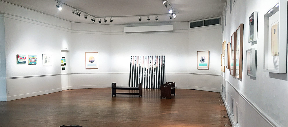
“Compo/Site”, Installation view at the Scarab Club, All images: Ryan Standfest

The current politically-charged discourse surrounding the construction of a wall at a secured southern border, is as much as anything a conceptual conversation giving material form to immaterial psychological barriers. The “Trump wall,” conceived as a talking point in the 2016 presidential campaign, is representative of something far more than the control of illegal immigration traffic. Its physical manifestation in the public imagination is a singular structure that forcefully cuts through the landscape, creating a geographic forcefield through which no body nor any view may pass. It is a potent symbol that negates the very notion of free passage.

Underlying the idea of it, is a sense of paranoia and xenophobia; the need to separate oneself from “the other.” It is also about turning inward, and embracing the notion that one’s sense of place is not a shared space, but an individually-owned and protected one. An isolationist perspective in which landscape itself must be divided, detached and organized into manageable zones to ease psychogenic stresses.

“Compo/Site” at The Scarab Club,  is an exhibition of forty works by six artists, all employing print media to investigate environmental psychology and the parameters of space and place. With a few exceptions, there is the noticeable absence of representations of the human body in most of the work on view, and yet there is a cultivated awareness throughout of human motivation behind structures that reshape physical landscapes into cognitive ones. Each of these artists question how we construct place and manufacture a phantom ownership over space—a personal space and a public space, a space for desire and a space for loss.

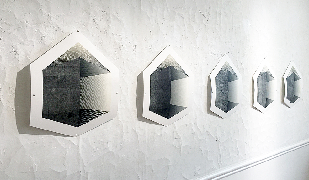
Zach Fitchner: “Housing Units”, Installation, monoprints on cut paper, 20 x 16 inches each, 2019

In Housing Units and Passenger Plane, Zach Fitchner assembles two installations within the gallery that proposes a set of containers, both private and public. Housing Units, a row of five monoprints each measuring 20 x 16 inches, employs a reconfigured matrix of wood relief and half tones, to minimally suggest a house on each shaped sheet of paper. The use of wood grain and screen pattern bridges the organic and the mechanical, but also summons two print processes to speak to concepts of pre-fabrication in housing. Fitchner smartly makes use of the monoprint process, whereby multiple iterations of an image can be achieved from a single changeable matrix, to underscore the development of postwar suburban communities in which a housing template was reproduced endlessly with minor variation in decorative choices. It is a visually stunning representation of the suburban phenomenon where the concept of community is performed as assimilation within a highly planned environment.

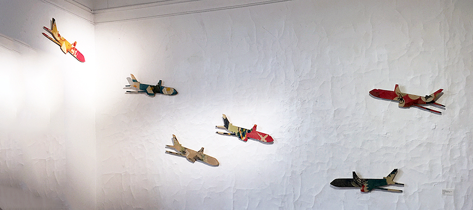
Zach Fitchner: “Passenger Plane”, installation, monotype, lithography and relief on panels with supergloss epoxy resin, 6 x 22 inches each, 2015-2016

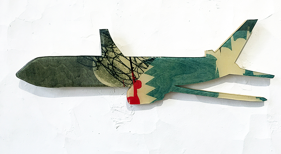
Zach Fitchner: “Passenger Plane”, detail, monotype, lithography and relief on panel with supergloss epoxy resin, 6 x 22 inches each, 2015-2016

 With Passenger Plane, Fitchner transforms the white of the gallery wall into an airspace with seven passenger jets taking off and landing. The jets are a mixture of monotype, lithography and relief prints, with a supergloss epoxy resin on cut plywood panels each measuring 6 x 22 inches. The programmatic routine of air flight is disrupted with the organic, printed fuselage skins—a patchwork camouflage that enlivens the representations of these flying containers as they glide over the irregular plaster surface of the Scarab Club’s gallery walls, which in this context resembles a sculpted airspace of stylized clouds. The sighting of Fitchner’s installations work quite well: suburbs and air traffic—a basic mechanics of procedural living speaking to one another. You can practically hear the distant jet engines overhead.

Arron Foster: “Lost in the Sand”, stone lithography, relief, digital inkjet, 22 x 17 inches, 2017

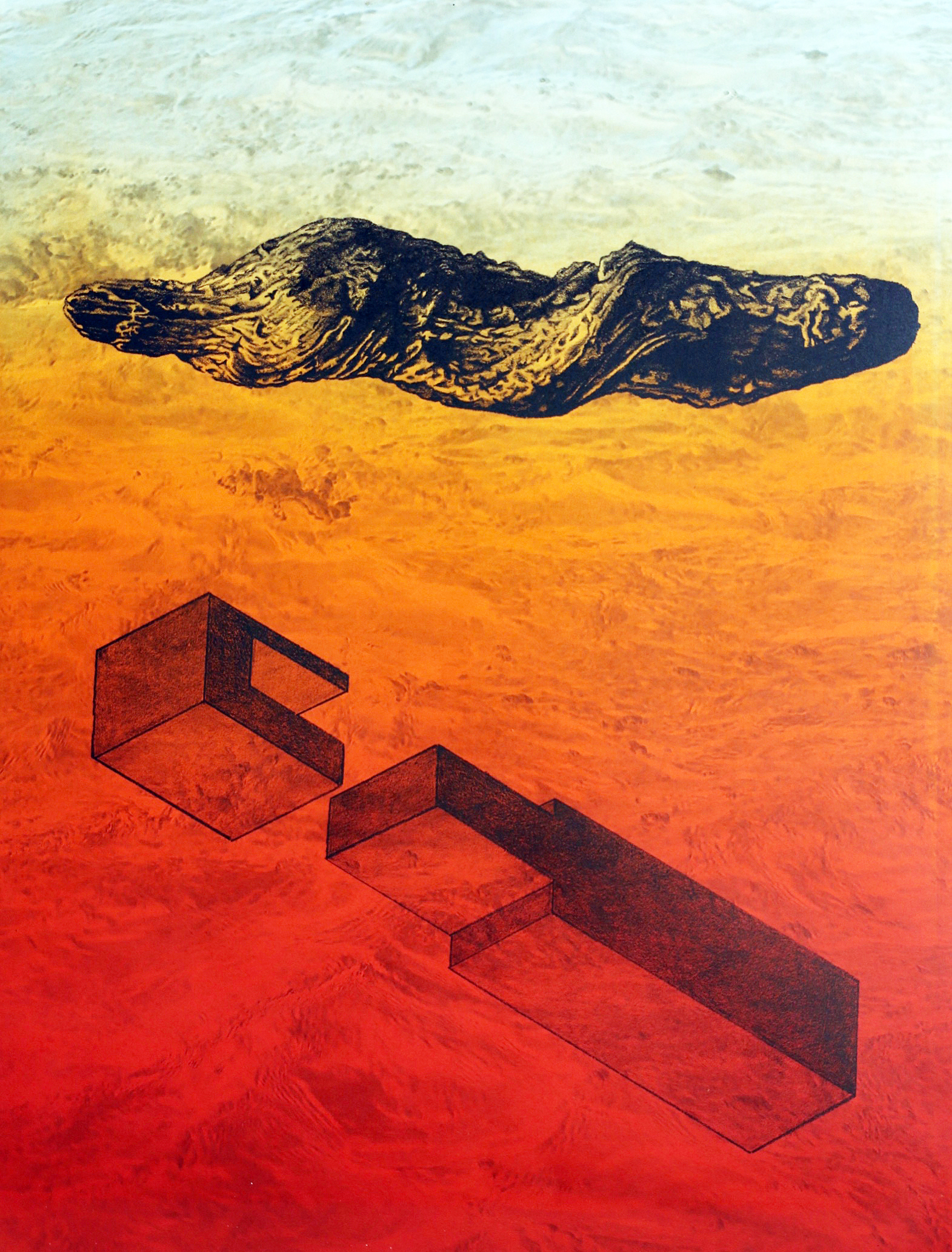
Arron Foster’s Lost in the Sandand Fossil Firealso address a relationship between the manufactured and the natural by way of setting drawn objects resembling smooth cast concrete forms alongside objects resembling a rough tree branch or section of bark. Lost in the Sand, a stone lithograph with relief and inkjet, floats this pairing of opposite sensations above a desert landscape with a transparent haze of color shifting from yellow to orange to red, from the top to the bottom of the piece. It conjures a strong sense of a place without specificity. Similarly, Fossil Fire, a stone lithograph with inkjet, depicts its pair of objects floating over a desert landscape which this time is turned on its side. The light however, remains a pale yellow. Both prints possess a timelessness—objects taken out of time, perhaps archeological remnants of environments lost whether through the collapse of an ecosystem or the fall of a civilization or both. Whether grown or constructed, each has been buried and dug back up. The precision with which each object is rendered with a lithographic crayon, has a studious clarity. The objects are able to crystallize specific, contrasting sensations in the mind. The landscape in each image, however, conjures a non-specific place, a dislocation from time, an environment of reverie where the objects may remain lost to us.

Matthew McLaughlin: “PS_Sample” (counterclockwise: 15, 13, 14, 10, 5, 2), monotype with charcoal drawing, 3 x 10 inches, 2018

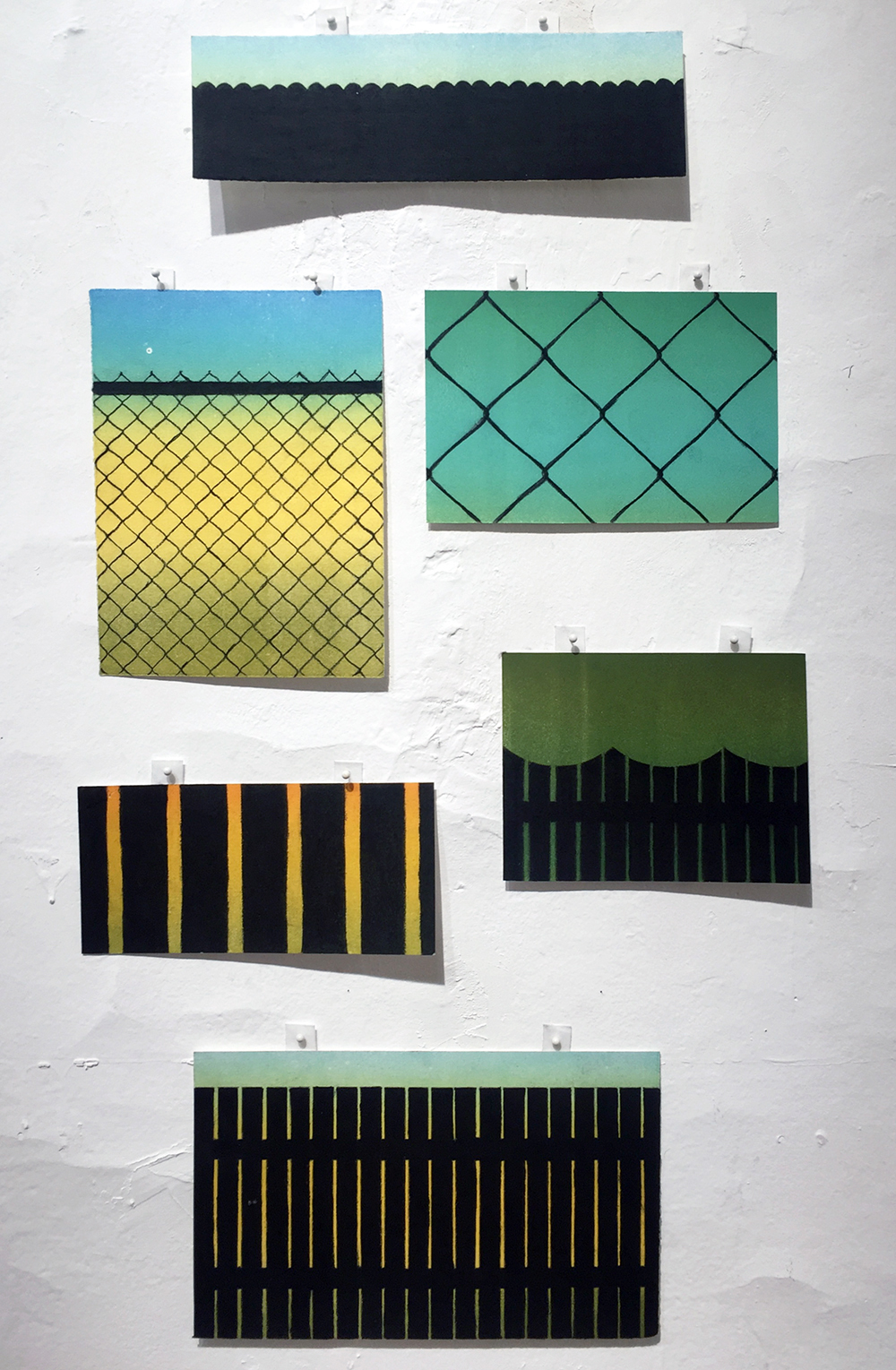
Matthew McLaughlin confronts the paradox of the planned community. In PS_Sample (numbered variously 2, 5, 10, 13, 14, 15), a series of six monotypes with charcoal drawing, and with an untitled installation comprised of printed and cut wood relief fragments assembled into an image, he delves into the poetics of fencing. Specifically, the image of the suburban backyard fence. The PS_Sample configuration presents six different samples or sections of a fence type. The PS in the title refers to “Personal Space,” and McLaughlin creates a space that is about imposition—the imposition of the fence on the landscape to disconnect the view from the viewer. The fence becomes a blockage, an interruption, another act of dislocation as the ambiguous, sublime color field of the monotyped background, with its alluring half-light, is divided and obscured by the dark silhouette of the fencing. This is the establishment of a personal space, but at the risk of distorting a view to the outside. Each is a window into a landscape that denies access to that landscape. Are those of us behind the fence imprisoned or protected or both? The space of the images is intentionally ambiguous.

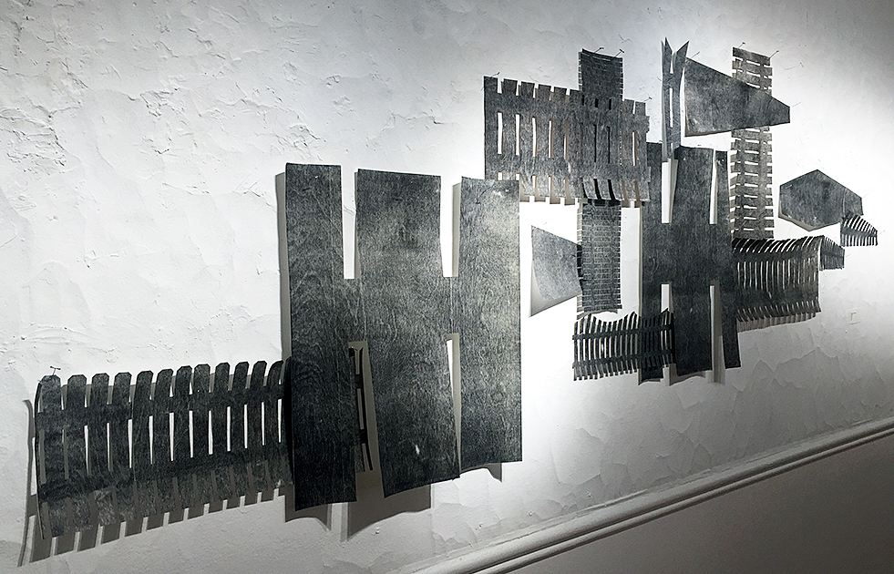
Matthew McLaughlin: “Untitled”, wall installation, monoprint on cut paper, variable dimensions, 2019

With his Untitled installation, we are given another fence—this time a series of deconstructed fences and barriers, reassembled via collage into a single ragtag barrier stretched across the gallery wall. The single unifying element beyond the overlap of its individual sections, is that of its printed woodgrain. But the reality of the cut paper fragments pinned together, with the shapes drooping and wavering here and there, is the impression of a hasty fortification. But against what? Who is keeping whom out, and for what purpose? What is personal space in the context of community? How do you integrate and separate yourself simultaneously?

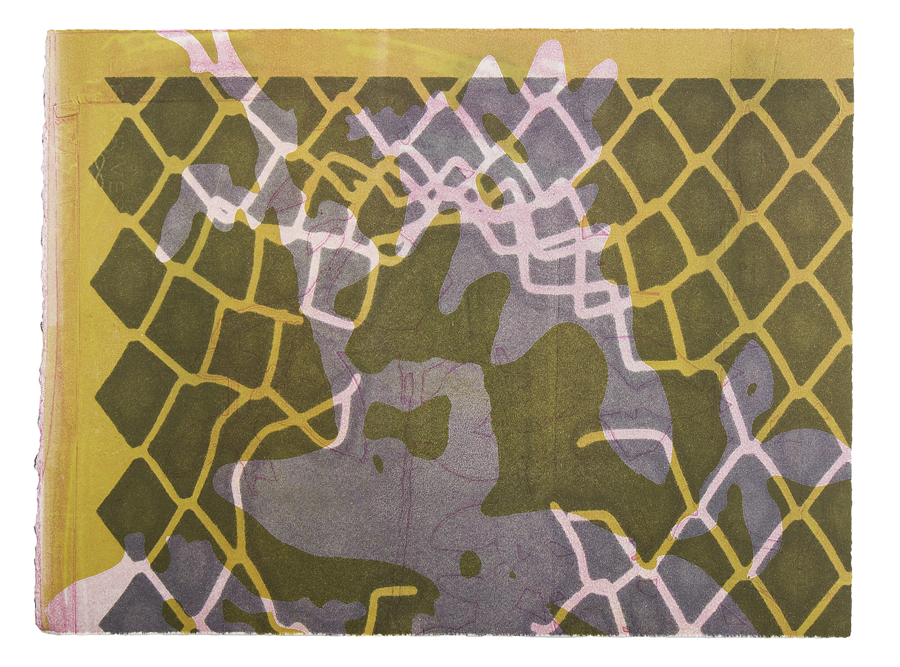
Taryn McMahon: “Massive Barrier”, monoprint, 14 x 18 inches, 2017

Taryn McMahon employs a layering of color and form in a series of monotypes in the exhibition, whereby the process of printmaking as an act of image projection addresses how we construct our relationship with the natural world. In Rising Water, Distant Garden, Massive Barrier and Wall, McMahon fragments and disrupts our depth of vision as a means to complicate how we are viewing her work. What can appear at first as deceptively simple visual texture and pattern existing on a shallow plane opens up and gives way to a slippage of foreground and background. Each image is a landscape. What we are experiencing is not clear at first and we must navigate our way into the space of the composition, finding our place as it were. The work demands that we enter it. The colors are not insistent, but are suggestive. These are highly atmospheric works that quietly intrude on consciousness. The layers vibrant between negative and positive space, light and shadow, heaviness and weightlessness. We are both inside and outside of these images. Their apparent flatness at first glance, gives way to an unfolding of space as more time is spent with each work. They are a fascinating conundrum: consisting of barriers that open up. This is perhaps a conceptual reversal of how we mediate the natural world: we tend toward flattening it, cutting it up, boxing it in, imposing our will upon it when we image it with our shallow depth of vision. And yet, we also see the natural world as boundless, infinite in its ability to surround us. The truth however is more complicated. As we are bound to our environment, the way in which we perceive it will determine its existence.


Nick Satinover : “ Northwoods Suite ( 4 ) ” and “Northwoods Suite ( 3 )”, both screen print and drawing on panel, 12 x 18 inches each, 2013

With Northwoods Suite (4) and (3), both screen print and drawing on panel, Nick Satinover is concerned with the poetics of place via half remembered maps and diagrams, the vernacular of hand-painted roadside signs and midcentury children’s educational books. There is something satisfying in the instructive playfulness of Satinover’s images. A warmth emanates from the work as he pairs abstraction with playfulness. The works are familiar without being specific. These are maps and diagrams, but only in the most suggestive sense. If maps and diagrams are about anchoring knowledge, Satinover does something wondrous by loosening their didactic boundaries so that we are given a poetic variation on mapping. The works summon the memory of early learning minus the demands of teaching. A child-like universality is on display: we are locating ourselves in someplace that could be anyplace. Place names and lines of demarcation soften and become gestural. Zones of information become pure passages of shape and color. He constructs a memory space. An evocation of discovering place for the first time.

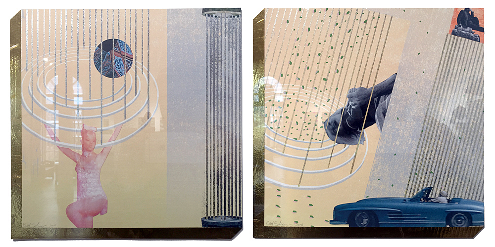
Brett Schieszer: “Head on Backwards, Feet at Funny Angles” and “Smile Before You Want To”, both reductive woodcut, screen print, lithography and digital collage with foil, 10 x 10 inches each, 2018

The work of Brett Schieszer seems to emerge from memory as well. The memory of expectation. In Head on Backwards, Feet at Funny Angles, Smile Before You Want To, and Really There is No Need, It’s Fine, each made with an amalgam of reductive woodcut, screen print, lithography, digital collage and foil, we are shown dynamic, bright, seemingly optimistic constructions, that conjure Russian Constructivist propaganda collages from the late 1920’s, such as those by artist Gustav Klutsis (1895-1938), as well as mid-century American advertising, both harnessing an optimism to promote a belief system and a lifestyle. For Schieszer, the past is a landscape, as the glossy surfaces, glowing colors, and radiant patterns of his images beckon entry into a dreamscape, a vacationland of the mind fueled by nostalgia. And yet, these are impossible places. Their unreality heightened by cutout photographic figuration placed against open expanses of color. Dreamland is nowhere. It is an imaginary space. Schieszer’s titles even have contradiction baked into them: a head is on backwards, feet are at funny angles. The natural act of smiling is something done before you want to. There is the false reassurance that everything is fine, and no other need should be considered. The images are each bordered on two edges by gold foil with a perspective that lends a false thickness to the composition. It is as if these are panels, tiles, or thick postcards projecting outward, persuading a visitation to this place where things seem to be alright.

Collectively, all of the work  in “Compo/Site” shuttles between abstraction and representation and suggest a split, a perceptual struggle between the concrete recognition of place and the effects of our fleeting personal impressions and projections upon it. That print is the primary vehicle for such an exploration is not without reason. As a process predicated on projection and memory—the transference of an image from one surface to another for the sake of creating an impression—there is much resonance between medium and subject here. Recording a mark on a surface, fixing it, is akin to the physical and mental marks we impose on the environments we inhabit or pass through. The history of mapping has been the history of print. To devise a system for spatial demarcation on a landscape in order to navigate it, possess it, name it, is also a form of psychological mapping. We construct the world as we wish it to be by projecting our identity upon it. In essence, we are constructing by compositing—merging the real and the unreal, the past and the present, the natural and the manufactured, the meaningful and the meaningless—resulting in a boundless psycho-geographic container whose definition is elastic and ultimately incapable of being colonized in any state of permanence.

Scarab Club exhibition “Compo / Site” through May 18th, 2019


Page 1 of 2

Powered by WordPress & Theme by Anders Norén