Owlkyd (AKA Darius Littlejohn) has a solo exhibition at Images Works in Dearborn, MI
Installation image courtesy of the gallery
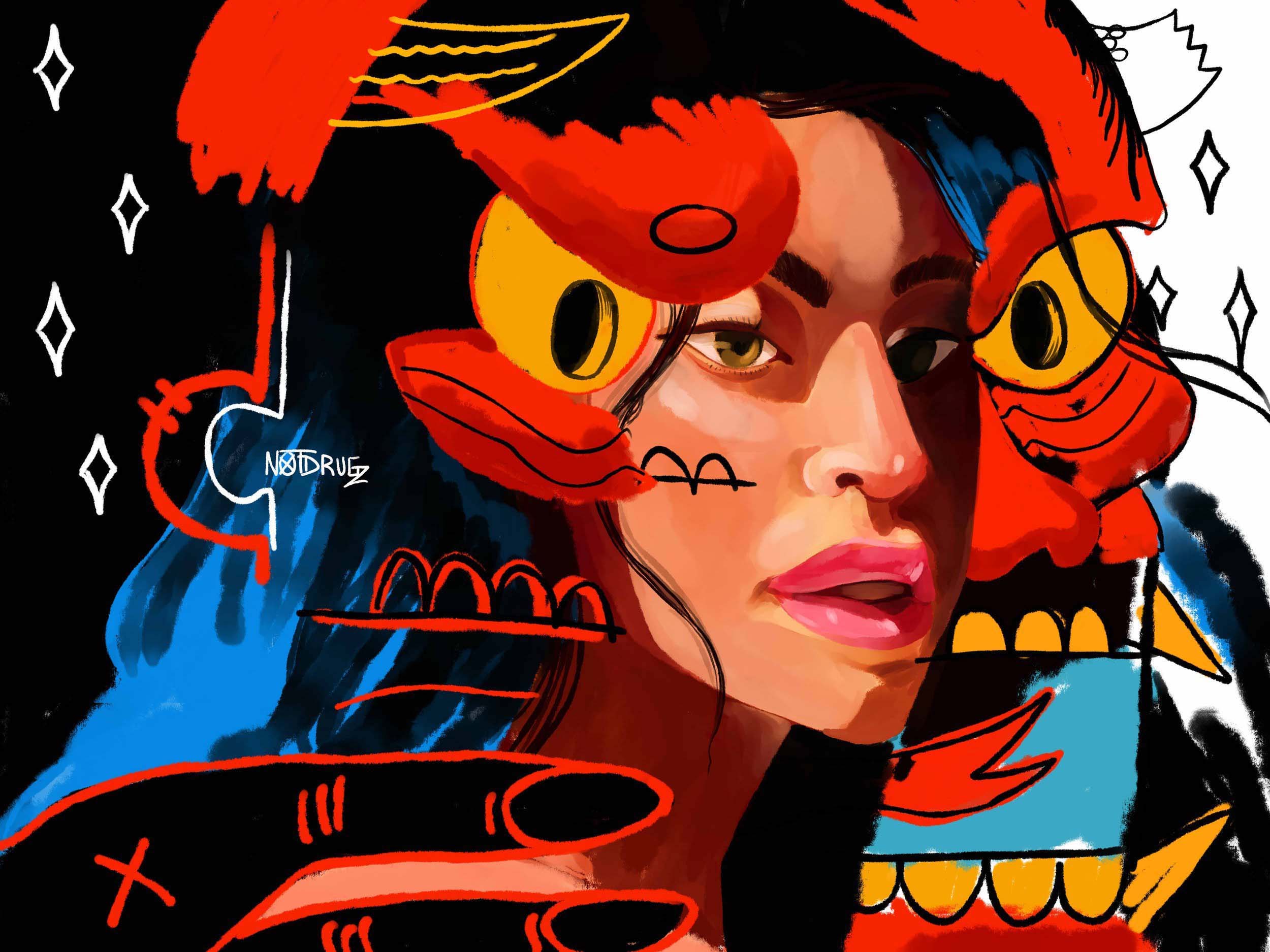
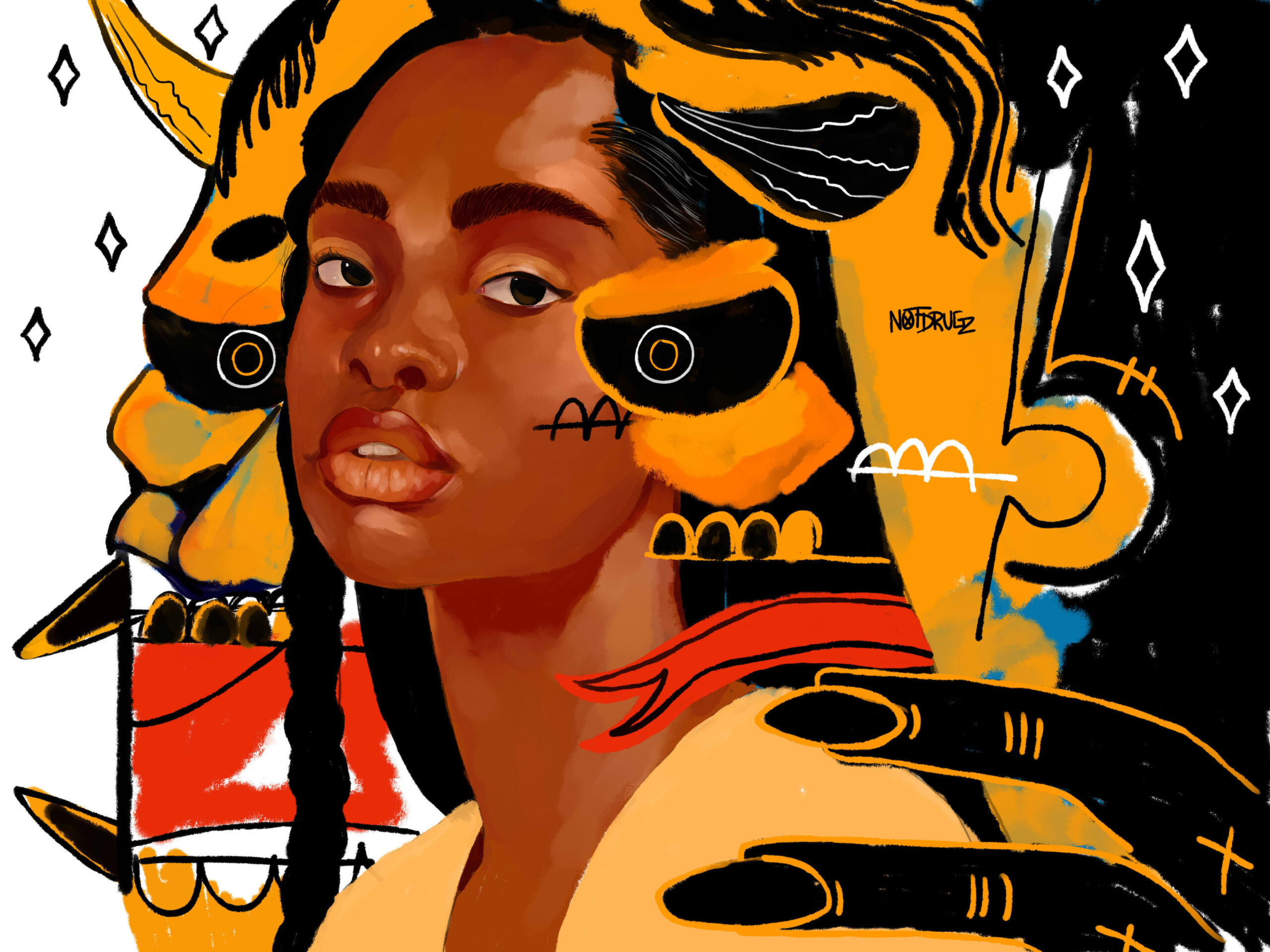
Image Works opened the Detroit-based artist Darius Littlejohn’s artwork on December 2nd with Expressionistic figures produced in a lushness of high contrast color using computer-based software and printed on paper using a large inkjet printer. Chris Bennett, owner and curator of Image Works says, “Deeply impacted by the Neo-Expressionist works of Jean-Michel Basquiat and the Surrealism of Pablo Picasso, Owlkyd melds his love of Realism with the abstract ideals pioneered by the two to find beauty in the clash of these disciplines.”
Owlkyd, What’s It To Me, 40 x 50”, Digital artwork on paper. 2022
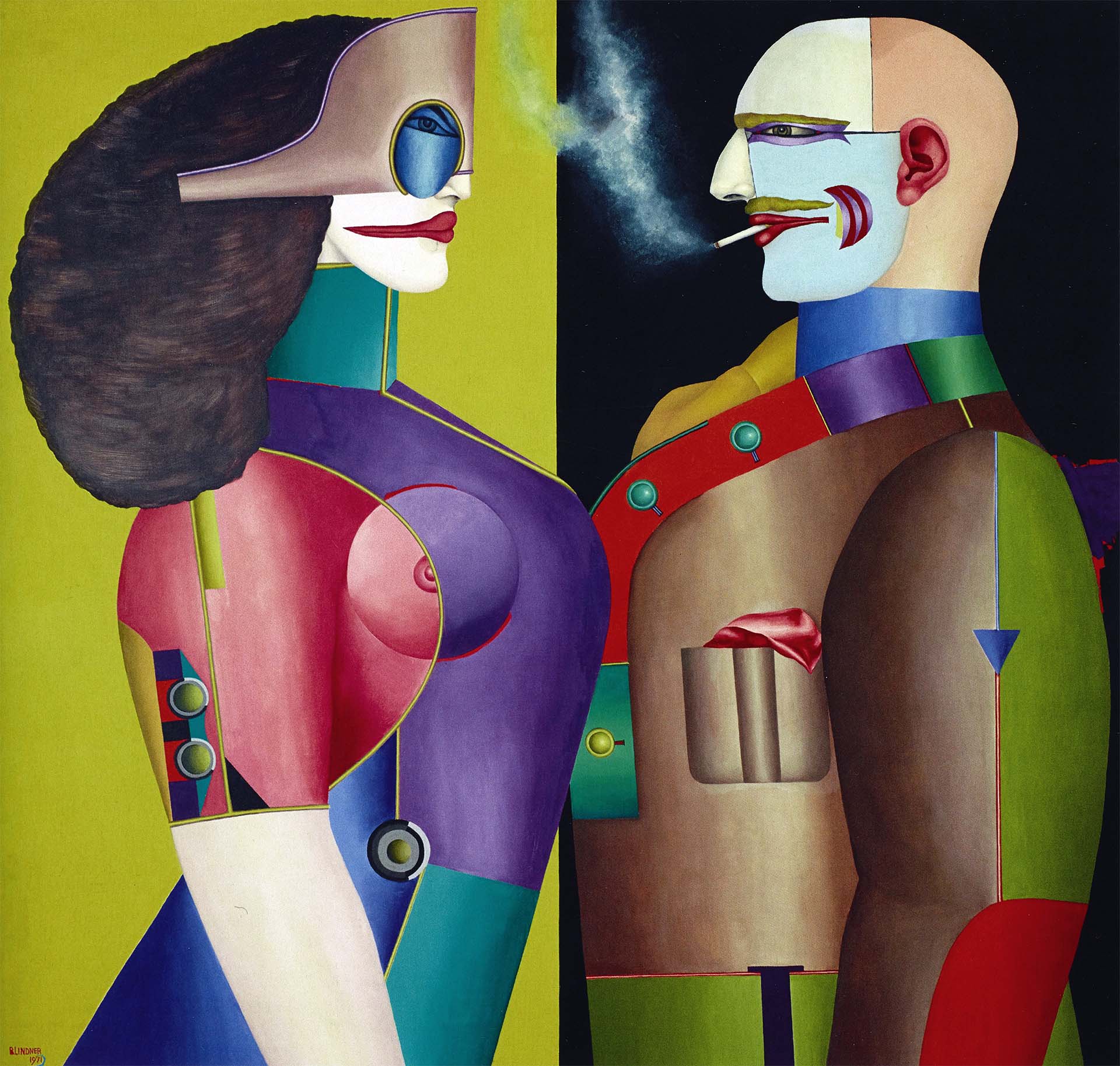
To place the artist Owlkyd in context, I recall following a similar artist in the mid-1970, Richard Lindner, the American/German artist born in Hamburg who moved to the United States in 1941 and taught at the Pratt Institute in Brooklyn, NY. Lindner’s works from this period are often characterized by a vague sense of nostalgia and sexual undertones. In Linder’s figurative work, he created powerful images that were both exotic and surreal in concept and bold in their use of high-contrast color. Lindner’s figures are reminiscent of those by Fernand Léger
Richard Lindner, The Grand Couple, oil on canvas, 60 x 72”, 1971
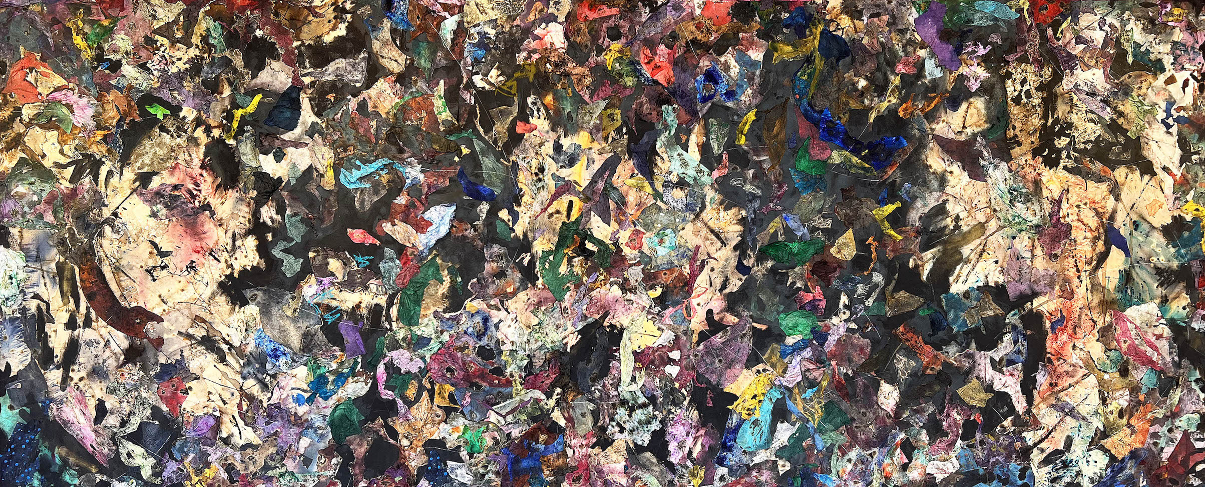
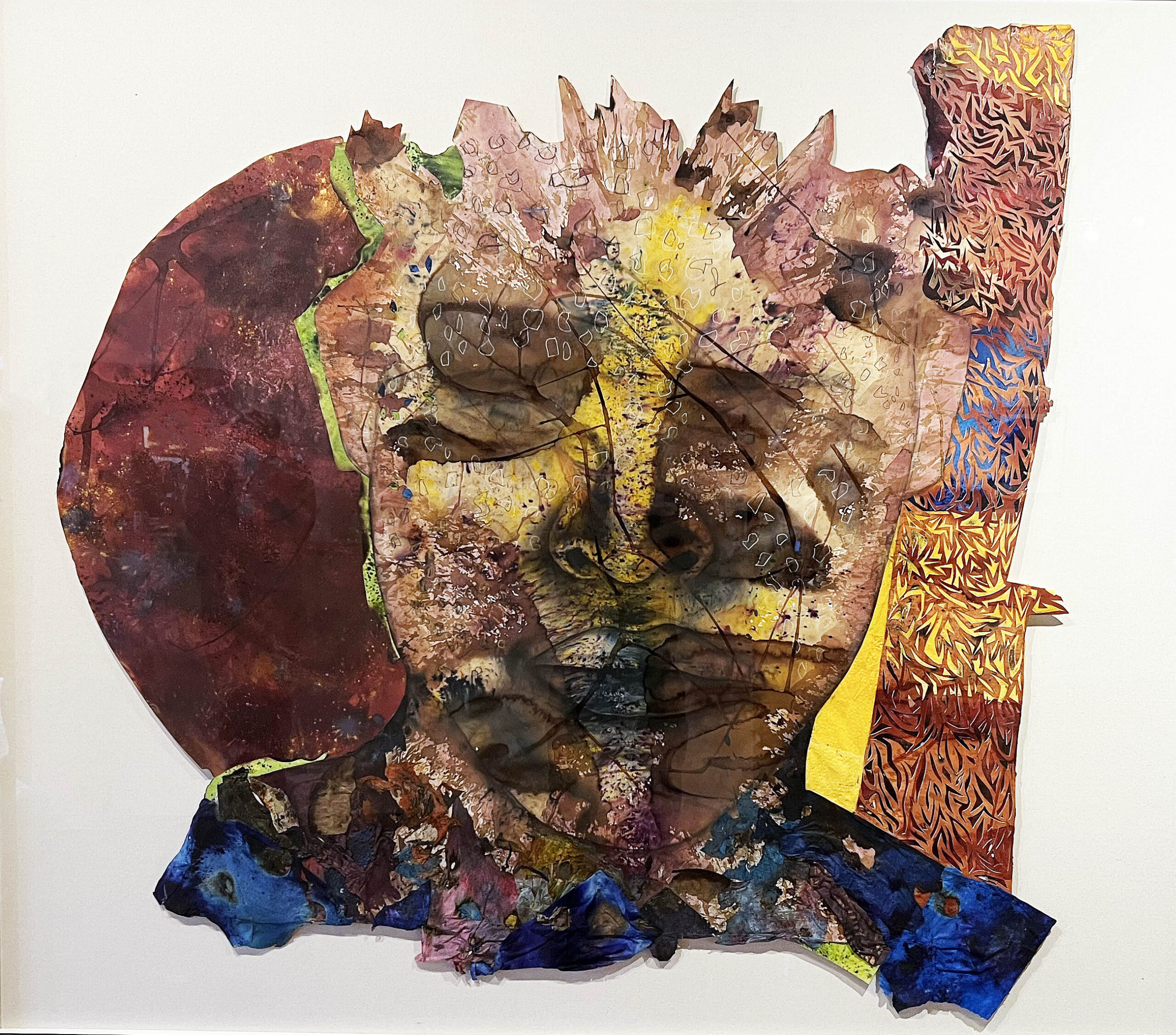
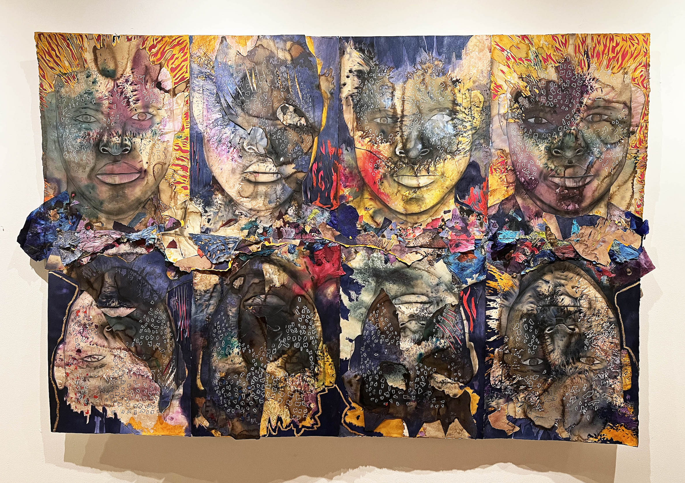
The works by Owlkyd are created in a digital environment using XP-Pen 15” drawing tablet, connected to his workstation using PaintTool Sai software, and printed out 40 x 50” using a large inkjet printer. These images are fluid Neo-Expressionistic portraits that use profiles of people with small design images spread out over the compositional spaces and set against various backgrounds.
Owlkyd, Regal, 40 x 50”, Digital artwork on paper. 2022
The work Regal has the figure set against a simplistic landscape with a figure that could be considered a self-portrait; again, dispersed throughout the composition are small design elements. At the same time, one arm is rendered in a realistic, painterly fashion, while the other has a flat white outline with three fingers. The childlike background contrasts with the uniformed figure, part realistic, part cartoonish. The expression of that contrast reaches out and grabs the viewer.
Owlkyd, Is My secret safe, 40 x 50”, Digital artwork on paper. 2022
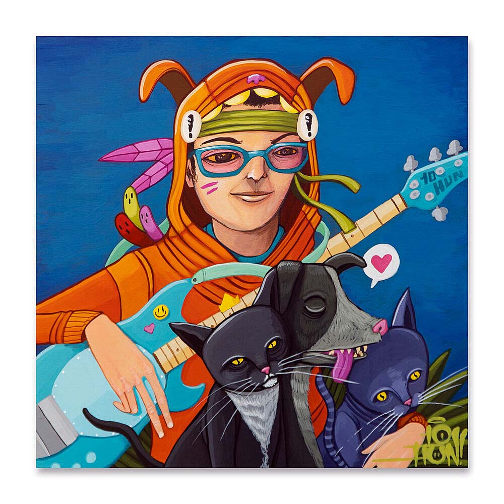
This three-quarter realistic female portrait, Is My Secret Safe, is heavily expressionistic in its surroundings, with small symbols contrasting against an abstract background. Separate from the first two portraits, the figure looks directly at the viewer with a listless expression that draws the viewer in. Owlkyd, in our conversations, mentions the artists who have been influenced well known most, like Picasso, Basquiat, and then Ten Hundred (Peter Robinson), a Michigan artist who specializes in bright, colorful, imaginative character work inspired by cartoons and anime, and graffiti, childlike imagination, comics, and world cultures.
Ten Hundred, (Ted Robinson), Bass Player, Digital Artwork example.
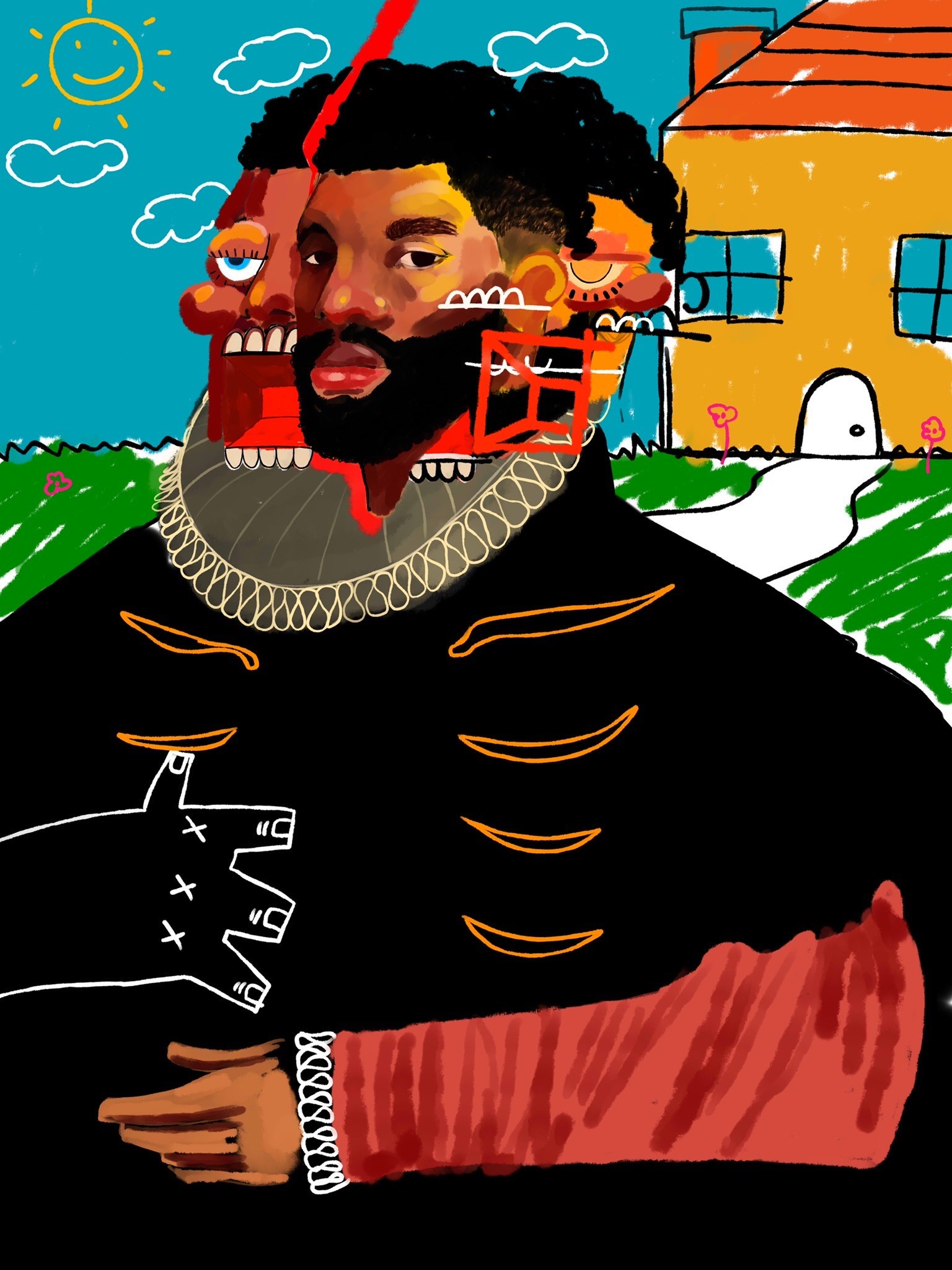
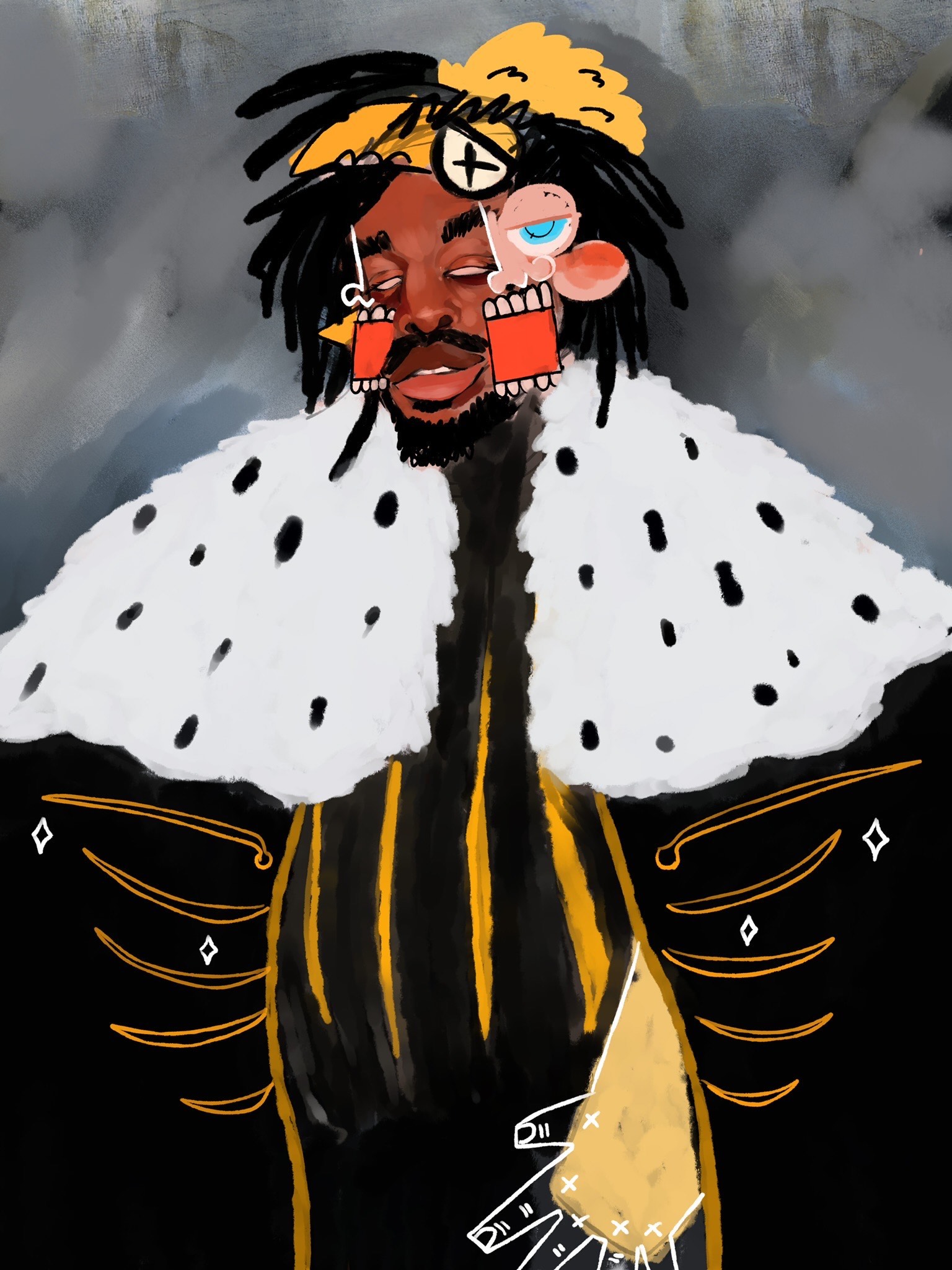
More evident in this figure, No More Opps, with cartoon images on and around the face, is again a self-portrait dressed in regal apparel.
Owlkyd, No More Opps, 40 x 50”, Digital artwork on paper. 2022
Owlkyd, (AKA Darius Littlejohn) supports his livelihood by working in the auto industry managing auto inventory systems for Chrysler. When asked about art school, he says, “Like many, I didn’t really have the means to pursue any formal training so I am wholly self-taught standing on my various influences.”
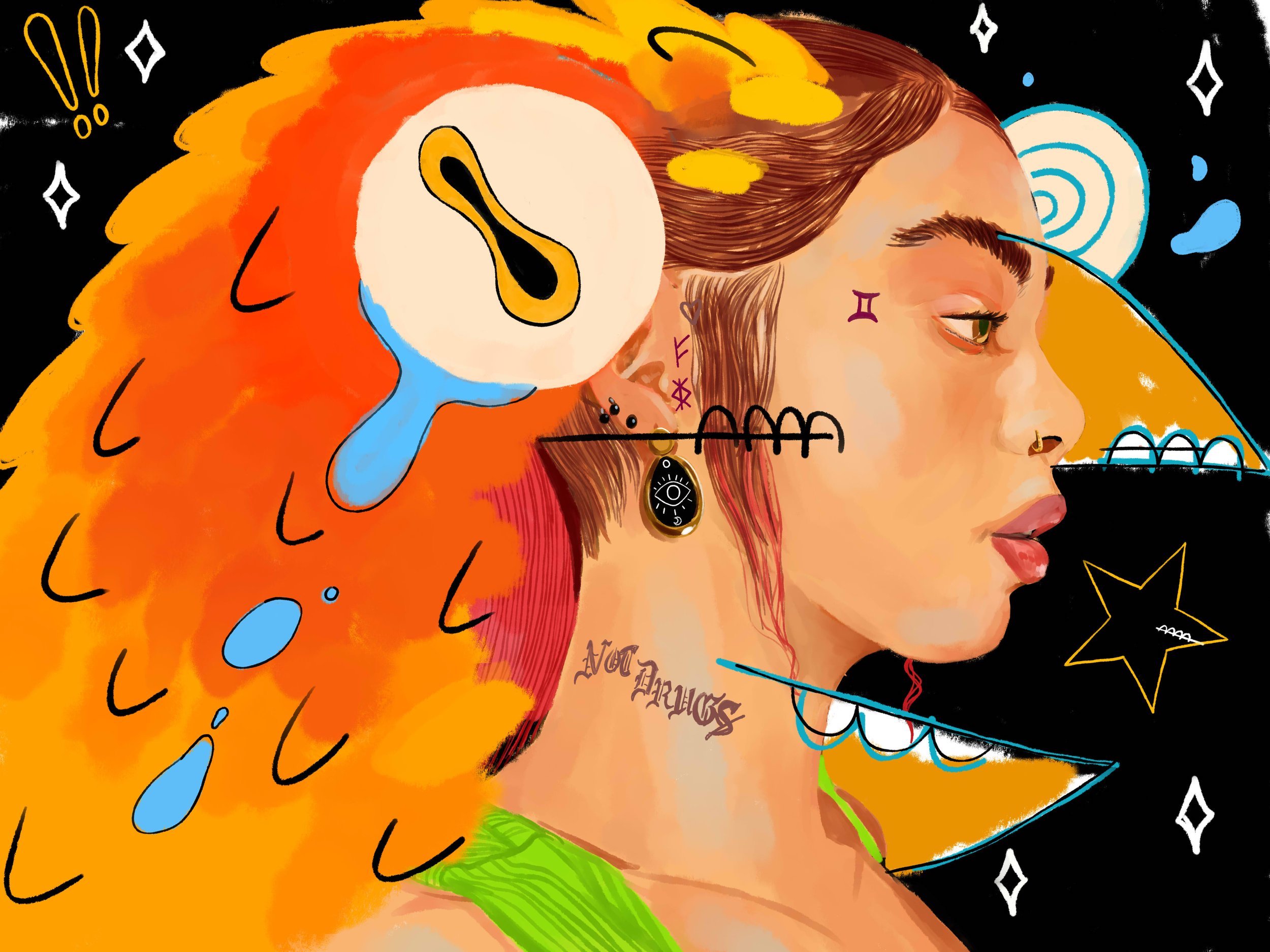
Owlkyd, Galactus, 40 x 50”, Digital artwork on paper. 2022
Throughout these portraits are words that express the message, “Not Drugs” and in this work Galactus, it is prominent. The message appears in the female portraits only and not in male portraits. It leads this writer to believe it is a statement that has particular meaning for females and reflects the artist’s need to send them a message.
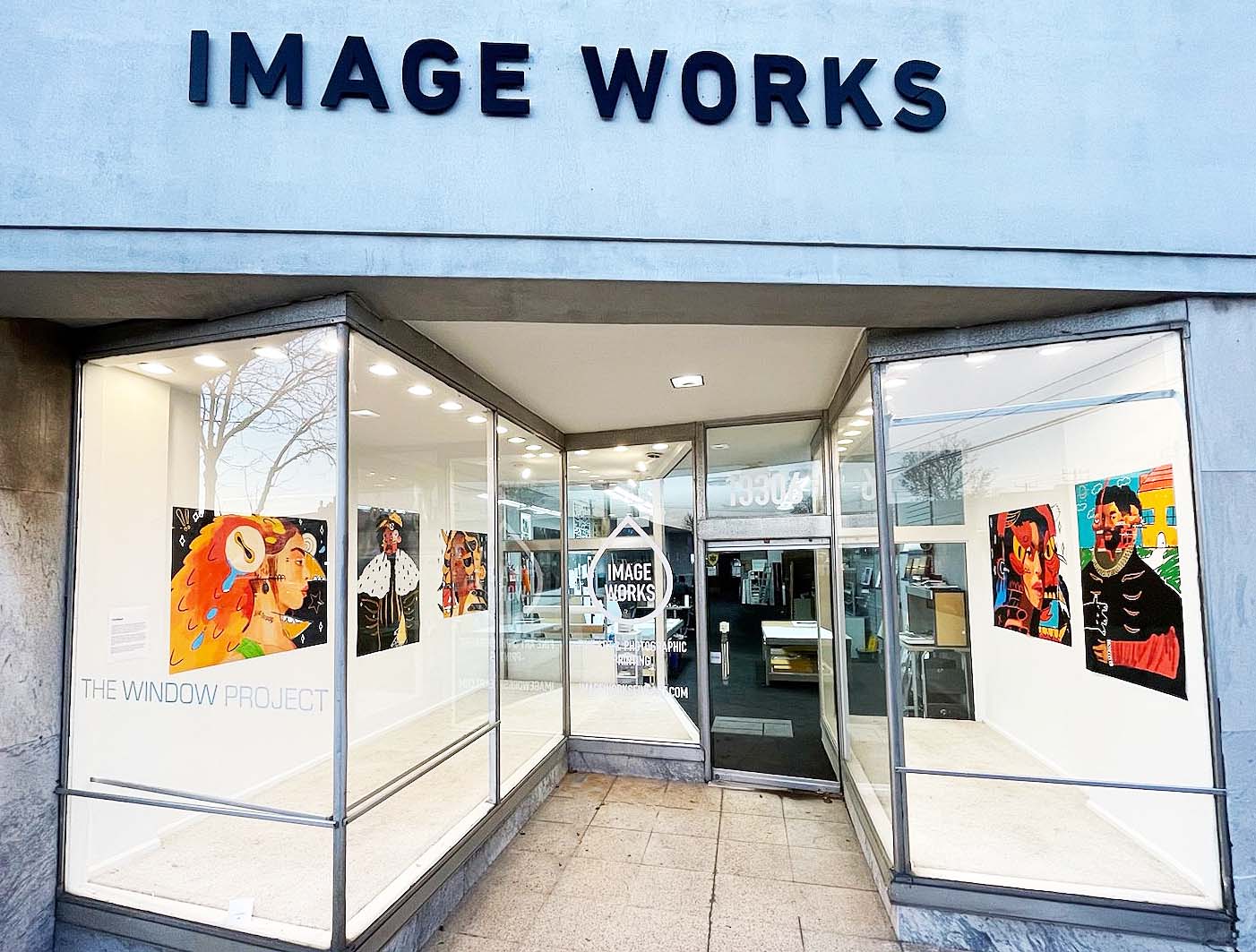
Image Works, located on the far east side of Dearborn, specializes in archival pigment printing, also known as giclée or inkjet printing, for reproducing photographic and fine art imagery. Housed in a storefront on Michigan Ave, it uses the all-glass entrance as its gallery.
The Window Project at Image Works is on display through January 28th, 2023 – Closing Reception: Saturday, January 28th, 1-4 pm
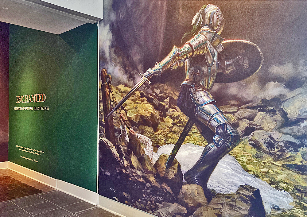
View of exhibition entrance with a large-scale digital print of St. George and the Dragon by Donato Giancola, oil on panel, 2010. All photos: Ashley Cook
The role that enchantment has played in the history of storytelling dates as far back as 2100 BC with The Epic of Gilgamesh, which is considered the point of emergence of the hero’s journey and various fantasy archetypes that we know so well today. The dragons, great floods, serpents and treks through the underworld are just some of the elements that have reliably appeared in scenes of imaginative tales told through time, so much so that the world-building efforts of fantasy writers have constructed an actual parallel universe complete with its own rules, landscapes, species and lessons. Since this first rendition of the dragon, writers and illustrators have contributed to further developing this place that conveniently mirrors our own to serve as a tool for catharsis, entertainment and morality. Enchantment: A History of Fantasy Illustration is the first ever full-scale exhibition to take a serious look at the expanse of this genre and its influence on the history of art, religion, popular culture, and subcultures, with a timeline of works spanning from as early as 1589 to as current as 2021.
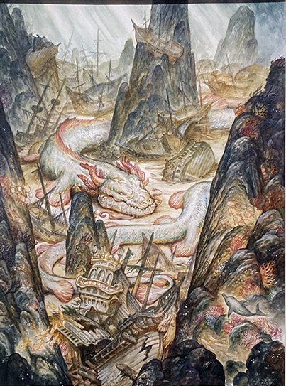
Justin Gerard, Lair of the Sea Serpent, watercolor on paper, 2019.
Two large galleries of the Flint Institute of Arts have been reserved for over 150 original works; the collection was curated by Jesse Kowalski of the Norman Rockwell Museum in Massachusetts, where Enchantment was first shown. It is not surprising to learn that Kowalski has worked on a number of exhibitions that highlight illustration and fantastical subject matter. A text for this exhibition asserts that “the many facets of fantasy illustration have often been misunderstood or overlooked” and this observation seems to be one of the driving forces behind these curatorial efforts.
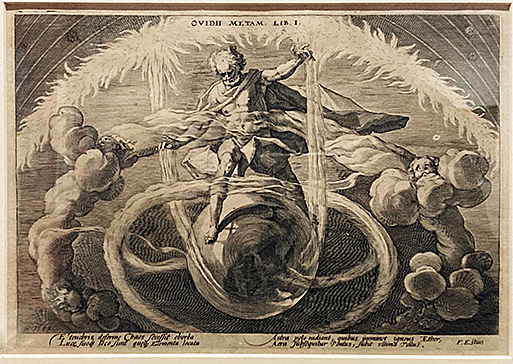
Hendrick Goltzius, Creation of the Four Elements, illustration, 1589.
Guests who are familiar with the Henry and Hodges galleries of the museum may notice the walls were freshly painted to set the tone for the rich colors and dreamy compositions of the show. Appropriate to the setting, the styles in which most of these pieces were done employ classical techniques like oil painting, etching, watercolor, and pencil drawings, with the occasional works rendered digitally by the 21st-century artists of the group. One may even occasionally forget that they are looking at scenes from a world of mythical landscapes and not from our own classical kingdoms of the past, as there is so frequently a thematic and aesthetic overlap between the two. Artworks like A Deep Sea Idyll by Herbert James Draper, Garden of Hope by James Gurney, or Allegory by Omar Ryyan place terrestrial beings and elements into impossible realities with a conviction akin to the old masters, and this blurring of the boundaries between imagination and reality is what makes fantasy so powerful.
Herbert James Draper, A Deep Sea Idyll, oil on canvas, 1902.
The show has the potential to please visitors of many ages and backgrounds. For those whose palates are less versed in the world of fantasy, the exhibition space becomes a place for learning, with many sources of in-depth information and insight to contextualize the surrounding works. Along with exhibition texts focused on some essential aspects of fantasy including storytelling, adventure and the play between good and evil, there are also information plaques about each individual artwork which note the background of the artist and their role in the lineage of fantasy illustration. Taking in this information may be as enjoyable as basking in the quality of the material application or the beautifully carved frames surrounding the art, but for the visitors who are fantasy connoisseurs, it could be particularly special to read that some of the artworks before them were made for productions as big as The Lord of the Rings or Game of Thrones. In fact, almost all of the artworks included in the exhibition have played an important role in the history of fantasy illustration throughout time.
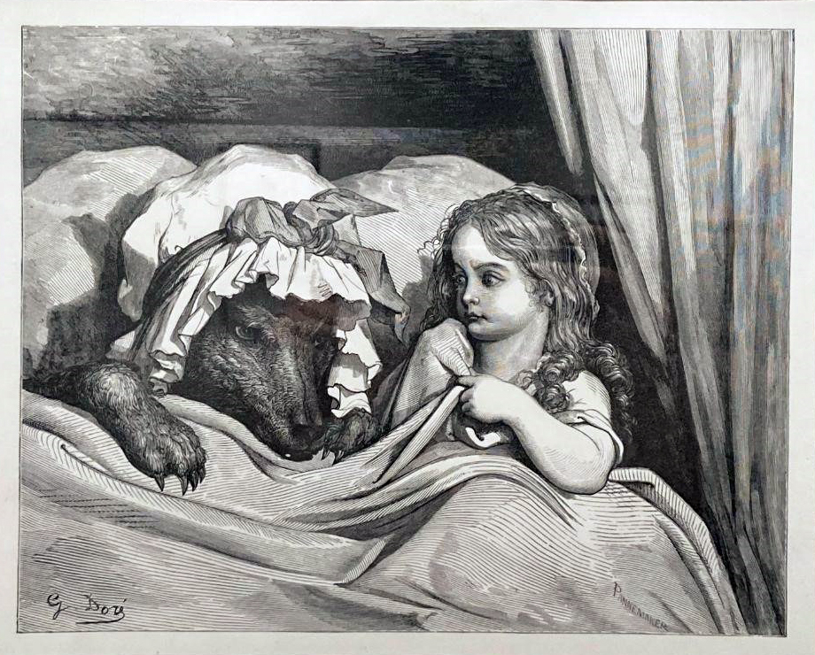
Gustave Doré, Little Red Riding Hood, antique woodcut on thick wove paper, 1880.
What is interesting about this show is the breadth of work it covers, successfully linking old masters like Gustav Doré, Hendrick Goltzius, Arthur Rackham and Howard Pyle with emerging artists like Victo Ngai and Wayne Barlow. Despite all of the artworks being displayed in a traditional museum style, framed and hung on a wall, many of them were actually originally produced for films and books. There are comic book illustrators like Hal Foster with a drawing from the Prince Valiant series and Dan Dos Santos with the illustration of Red Rose made for Fables. Then we have pulp fiction illustrator Mark Zugs with The Princess of Mars, which was produced for the cover of Mars Trilogy, a compendium which contains original novels originally released in 1917-1919 by Edgar Rice Burroughs. Henry Clarence Pitz’s Dark Water then brings us back to the early 20th-century ink on paper renderings, predated by the oil painting The Other Side by Dean Cornwell, yet throughout this extensive lineage, a strange consistency has been handed down from generation to generation that allows for almost anyone who has been read a fairy tale to feel at least somewhat at home.
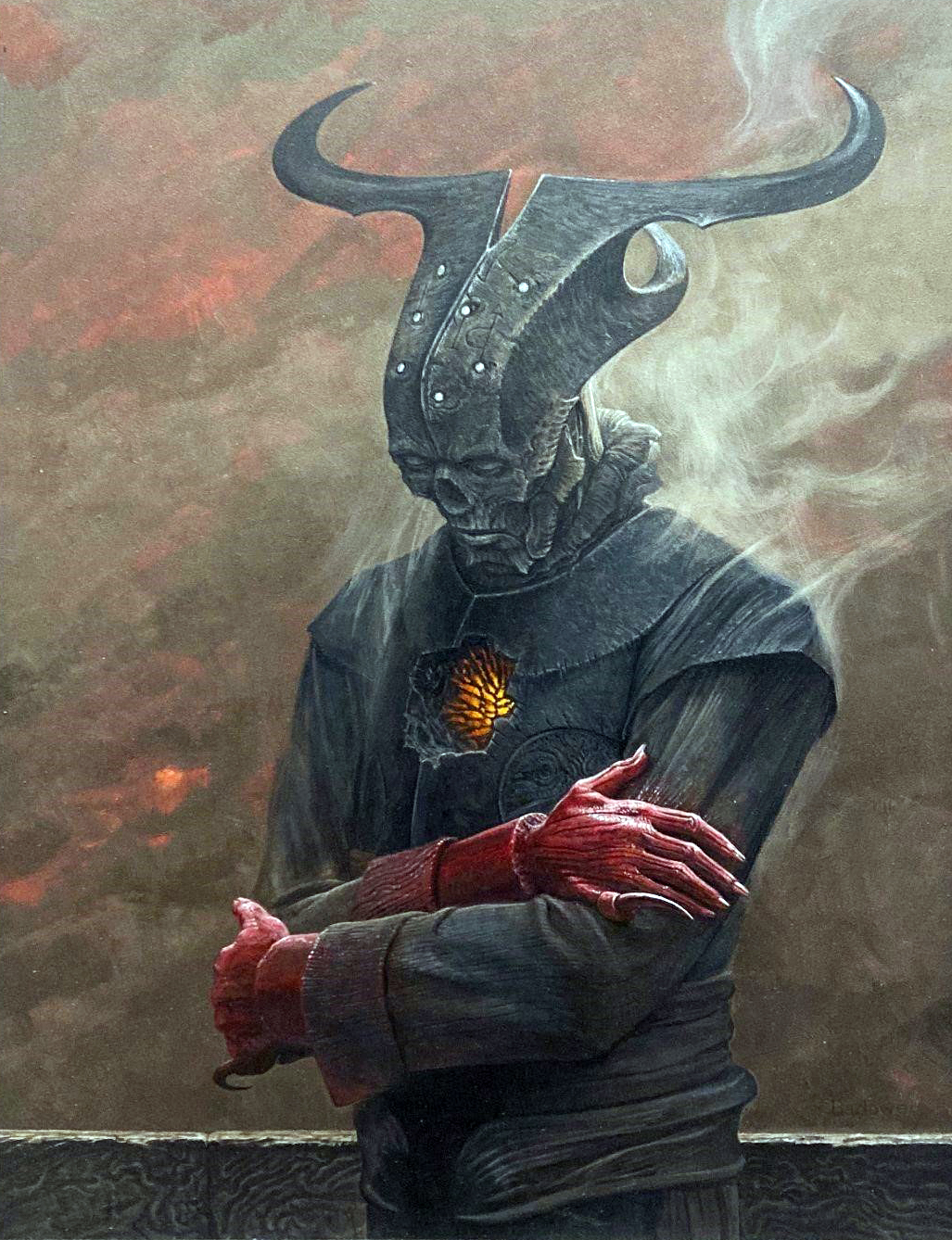
Wayne Barlow, Demon Minor, acrylic on illustration board, 2018.
Enchanted: A History of Fantasy Illustration opened September 24, 2022 and is on view until January 8, 2023. Please visit https://flintarts.org/ for more information.
Giving Tuesday is on November 29th, and the Detroit Art Review is excited to participate again this year. We hope you can join us! Giving Tuesday has dedicated a day of generosity and giving. It is one day to acknowledge the collective power of giving as simple acts of kindness.
On Tuesday, November 29, 2022, please support the Detroit Art Review its purpose, publishing critical art reviews of museum and gallery exhibitions. Make your own meaningful donation by way of a check to the Detroit Art Review Inc. and mail it to: Ron Teachworth, 1300 Lafayette, Apt. 313, Detroit, MI 48207. (old school for now) We are now a 501-C3 non-profit, EIN 81-1394001. Print this and send it with your check. We will provide a receipt.
Every donation helps the Detroit Art Review sustain our efforts to have a review site for the visual arts, spanning most of South Eastern Michigan. Thank you for your consideration and support on Giving Tuesday.
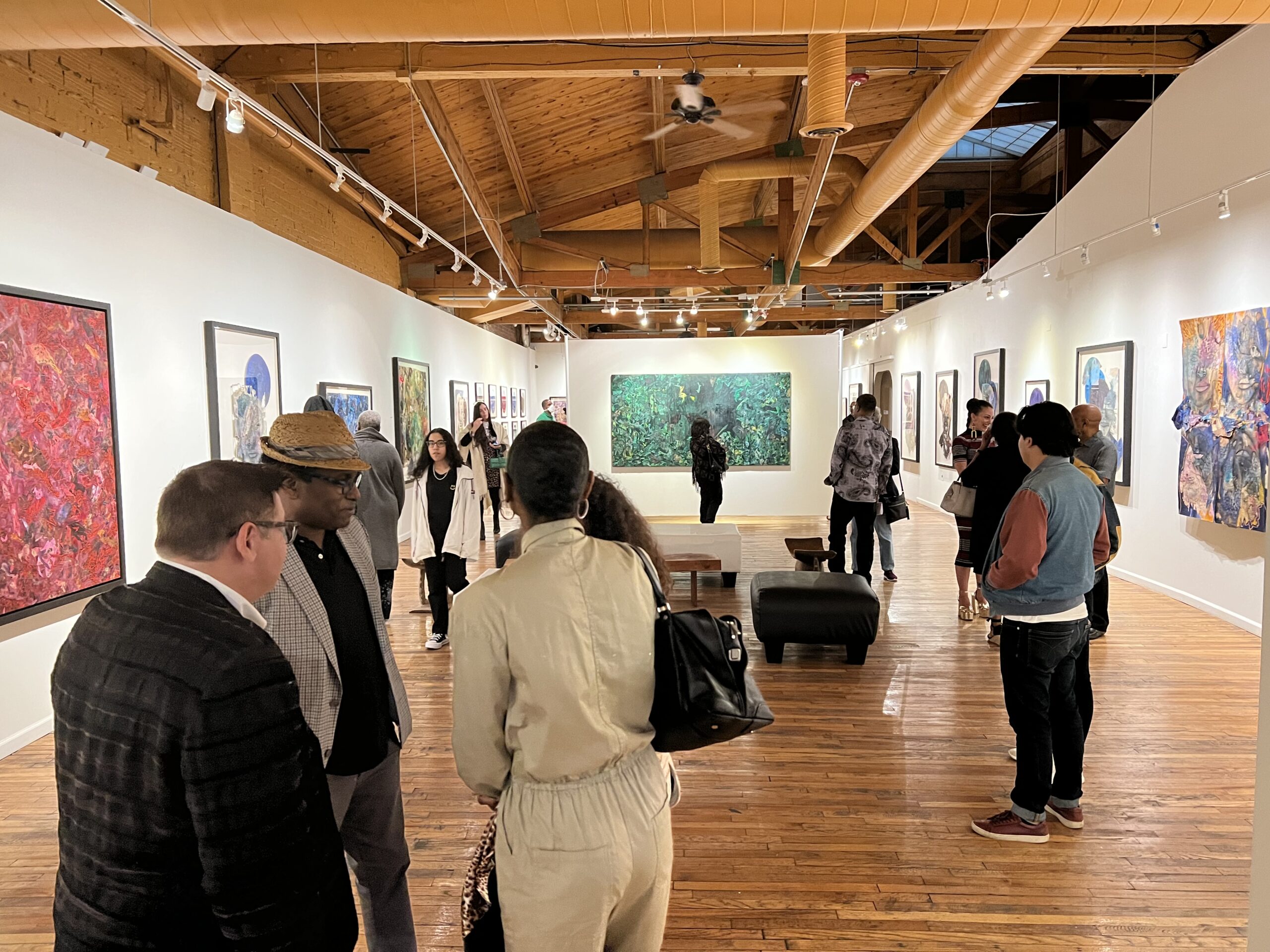
Stephen Abolite, Installation image, N’Namdi Center for the Arts, 2022
N’Namdi Center for the Arts opened a solo exhibition on September 22, 2022, by the multidisciplinary artist Stephen Arboite born in Haiti, grew up in New York City, and now resides in Miami. Curated by George N’Namdi, he says, “ The spiritual work is dominated by a greater sense of self. Arboite asks the viewer to immerse themselves in an examination of understanding of self through a psycho-spiritual lens, hopefully generating awareness of emotional and mental well-being, and a path to a potentially reconstructed journey.”
These multimedia collage self-portraits are obviously influenced by his Haitian heritage, which portrays the spiritual essence essentially manipulated by African spiritual practices. The mixture of human imagery with abstract elements engages the viewer with a combination of skill and ritual.
Stephan Aborite, Reflection Series #2, Acrylic, Coffee, Graphite, Collage Mixed Media on paper. 78″ x 31″ 2022
The artist refers to himself as multidisciplinary because some of the work is abstract fields of shape and color. As demonstrated in Reflection Series 2 there is a complex composition material set against a black background. He says in a statement, “Throughout that process, I found that the material itself, and how it dried, had a really intuitive quality,” says Arboite. “The same intuition that drew me to that led me to this current path. All these materials I use yield a certain weight, power, and energy. I think it is deeper than what is on the surface.”
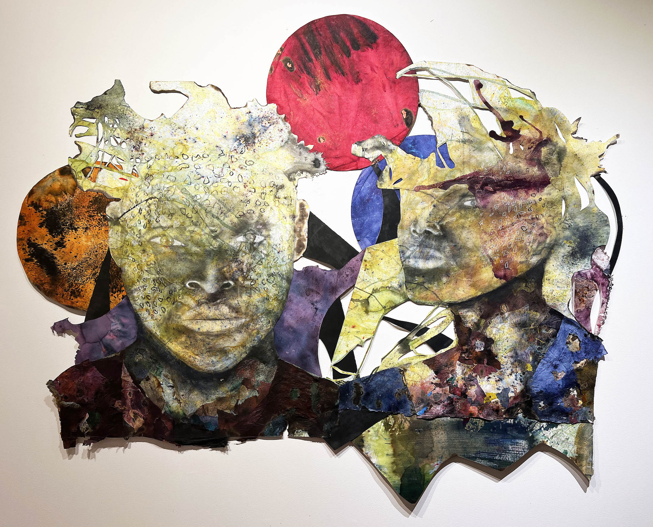
Stephen Arboite, Bwa Kayıma, Acrylic, Coffee, Collage Mix Media, 50″ x 96″ 2022
This image is a combination of large shapes and small motifs that contrast with large solid areas in the composition soon led the artist on a powerful journey to explore his Haitian heritage and various discourses on the Caribbean diaspora. Many, if not most, of these collages use an overlapping outline of the artist’s face to make the point that all of these are self-portraits. Using a staining technique that includes ground coffee, metallic powders, and organic pigment, Arboite portrays the spiritual essence of his subjects. Whereas the spirit is primarily manipulated in African spiritual practices, his artworks perform a ritual that allows the aura to be seen up front and center.
Stephan Abolite, Reflection Series #3, Acrylic, Charcoal, Collage Mixed Media, 60 x 72″, 2022
Stephan Aboite is a multidisciplinary artist of Haitian descent who was born and raised in New York City and now resides in Miami. Arboite’s work considers beauty outside of classical aesthetic paradigms, emphasizing spiritual transformation and the evolution of human consciousness. Arboite considers himself primarily a self-taught artist with a foundation in drawing and painting from the State University of New York, Purchase College. His works have been exhibited nationally at the Museum of Contemporary Art in North Miami, N’Namdi Contemporary in Detroit and Miami, Prizm Art Fair, and the Urban Institute for Contemporary Arts in Michigan, amongst others. Some notable collections include the Jorge M. Pérez Art Museum of Miami, the Eric and Donna Johnson Collection, and the Arthur Primas Collection of African American Art.
The exhibition Big Good Angel is on display at the N’NAMDI Contemporary now through January 16th, 2023.
The Detroit Institute of Arts presents Van Gogh in America
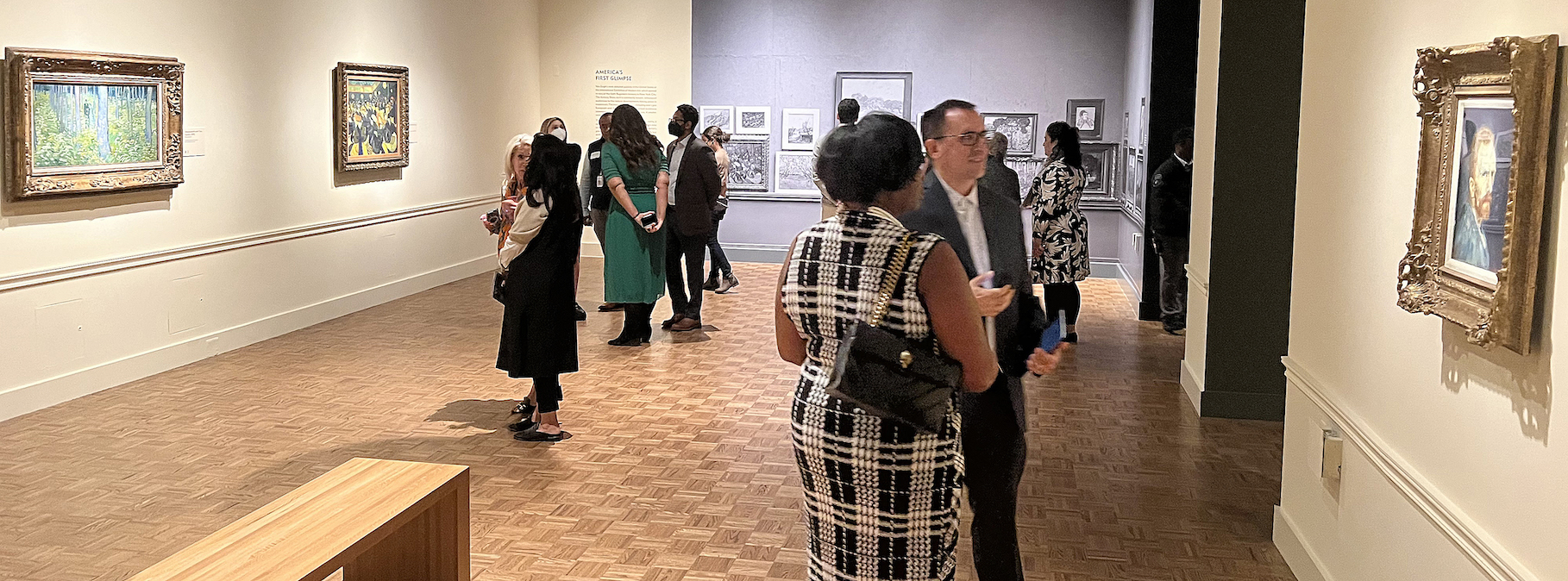
Installation image, Van Gogh in America, Detroit Institute of Arts, 2022
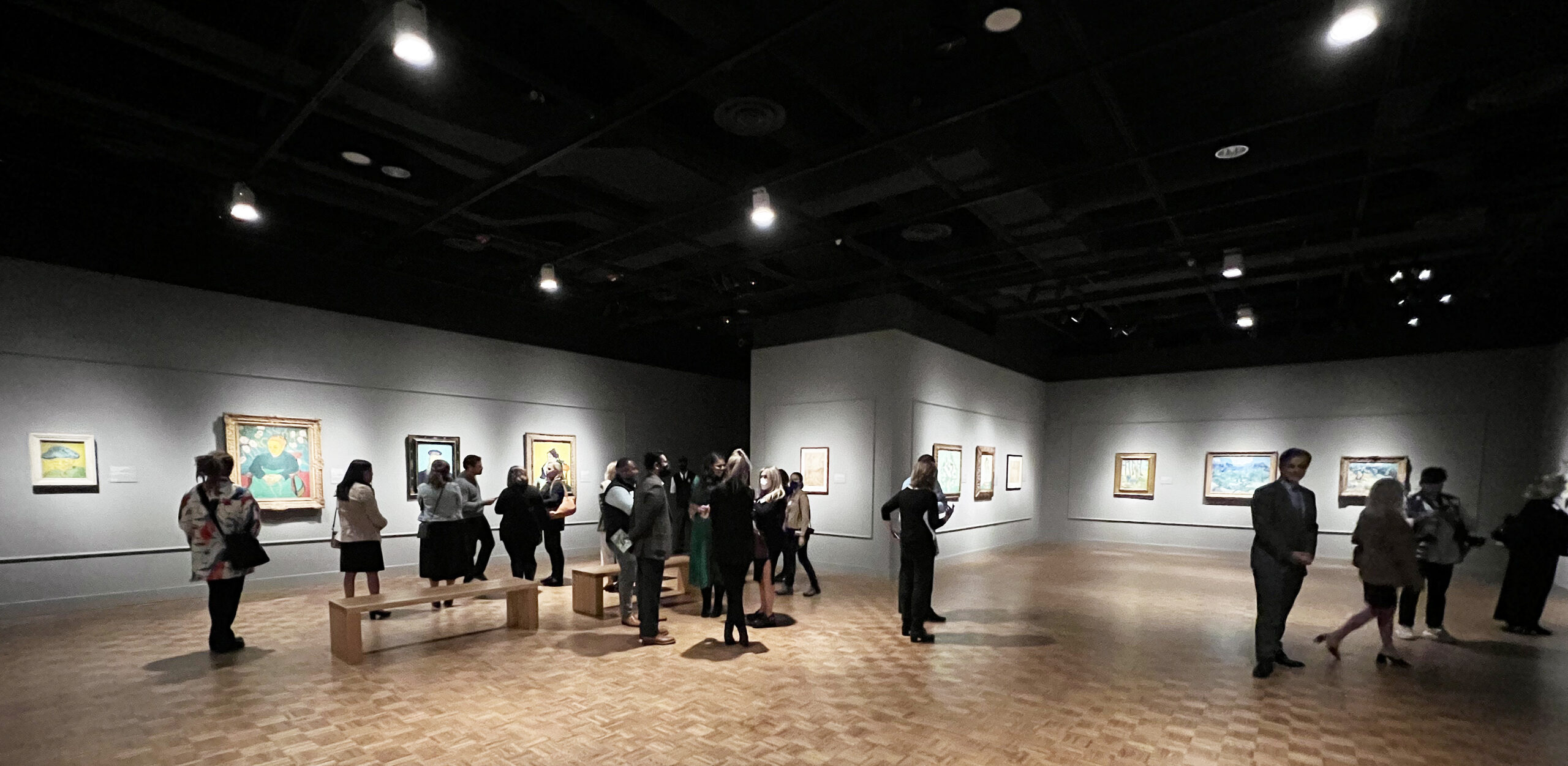
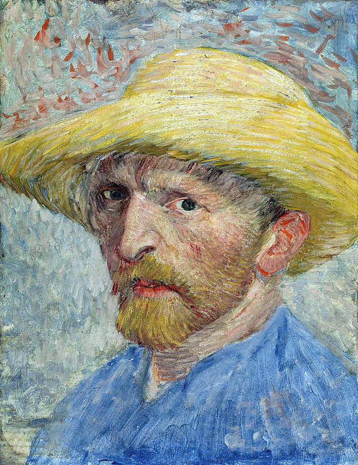
The Detroit Institute of Arts (DIA) presents a landmark exhibition, Van Gogh in America, that features 74 works of art that opened on October 2, 2022, and will run through January 22, 2023. The DIA celebrates being the first museum in the country to purchase a painting by Vincent van Gogh in 1921. The work, Self-Portrait (1887), was purchased at a New York auction by Ralph Booth, then the President of the City of Detroit Art Commission. There are nine galleries of artwork, and the exhibition includes a section of Van Gogh’s contemporaries, including Paul Cezanne, Paul Gauguin, Henri Matisse, Raoul Dufy, Georges Ribemont-Dessaignes, and Joseph Stella.
Self-Portrait, Oil on board mounted to wood, 13 x 10″ Detroit Institute of Arts, 1887
Van Gogh painted more than forty self-portraits and loved to scrutinize his features which, unlike those of the 17th century, might be considered disturbing or unattractive. That, in itself, could not be more introspective. Van Gogh could not find or pay for models, so he used his image reflected in a mirror to create an extensive collection of variations of himself: An indication of his introverted nature.
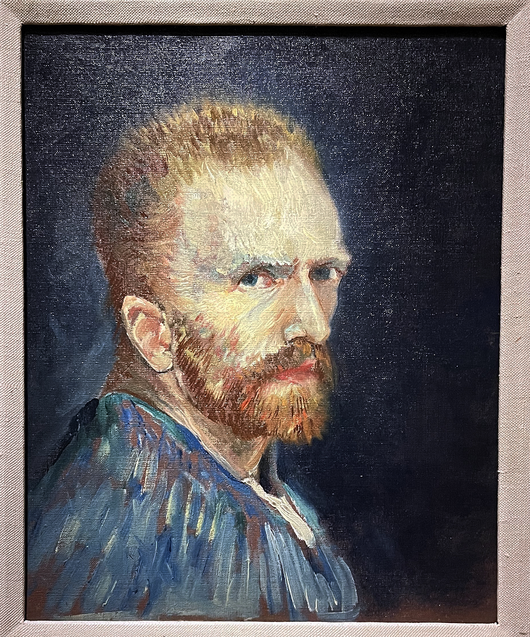
Self-Portrait, Oil on Canvas, 16 x 13″, Wadsworth Atheneum Museum, 1887
The director of the DIA, Salvador Salort-Pons, says, “One hundred years after the DIA made the bold decision to purchase a van Gogh painting, we are honored to present Van Gogh in America. This unique exhibition includes numerous works that are rarely on public view in the United States and tells the story – for the first time – of how Van Gogh took shape in the hearts and minds of Americans during the last century.”
The works of Van Gogh and his images are ubiquitous in the United States, the Western world, and beyond. There was the novel by Irving Stone, Lust for Life (1934), followed by Vincente Minnelli’s film adaptation, starring Kirk Douglas, which shaped the artist’s popularity. In the mid-1970s, Leonard Nimoy starred in a one-person play called Vincent that he’d adapted from the play Van Gogh by Phillip Stephens. That set the stage for the songs by Don McClean’s Vincent and Starry, Starry Night, and numerous films and theater presentations like Loving Vincent, the world’s first hand-painted, animated feature film, in 2017. Recently there has been the Immersive Van Gogh, a light show based on his imagery, and I would be remiss if I did not mention the book cover of Gardner’s Art Through the Ages was printed from the image of the painting Starry, Starry Night. And these mentions are only a few of the different ways Van Gogh’s work has been used artistically in our culture.
For readers of this review, an easy way to explore the life of Vincent van Gogh is this video produced by the Van Gogh Museum. It may set the stage.
Courtesy of the Van Gogh Museum – 4:50 Minutes
When Van Gogh lived and worked in Paris for two years, he made friends with many artists who were part of the new impressionism that differed from the highly respected artists of the Hague School, sometimes known as the Barbizon School, working exclusively in the tradition of realism.
One of his favorite painters was the French artist Jean-Francois Millet (1814-1875), who featured peasants and rural settings in the countryside. The common themes were waterways, seascapes with boats, windmills, and canals. Millet’s work may have lingered in his mind, but along came this small stroke of paint with variations of color that would come to dominate many of the spaces in his compositions. Clearly, Van Gogh wanted to use color for its expressive value rather than make faithful replicas of the images received by the eye in realism.
It took six years and a team of professionals to create this exhibition. Scheduled to open earlier in 2020, that opening was delayed by the COVID-19 pandemic. This exhibition is part of the Bonnie Ann Larson Modern European Artist Series. The curatorial effort was led by Dr. Jill Shaw, Head of the James Duffy Department of Modern and Contemporary Art, and Rebecca A. Boylan and Thomas W. Sidlik of European Art, 1850–1970 at the DIA. In her statement, Dr. Shaw says, “Van Gogh in America examines the landmark moments and trajectory of the artist becoming fully integrated within the American collective imagination, even though he never set foot in the United States.”
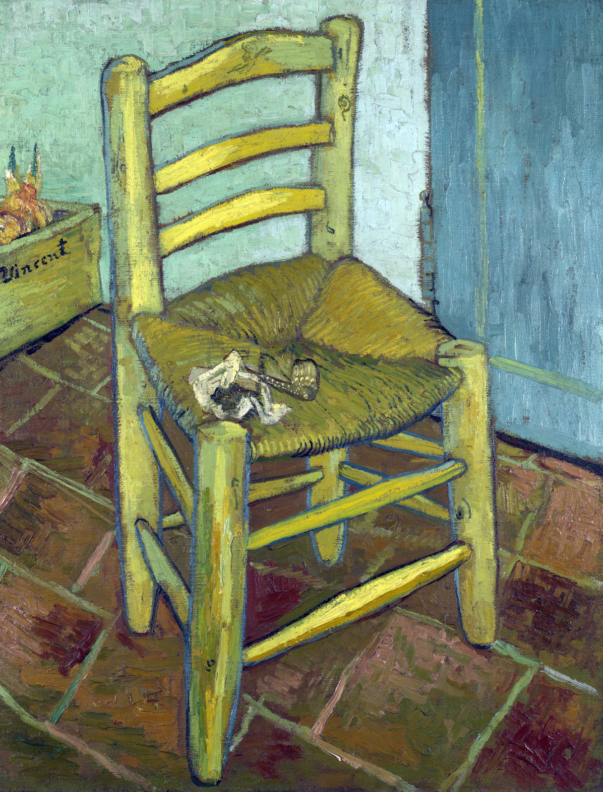
Van Gogh’s Chair, Oil on Canvas, 36 x 28″, The National Gallery London, 1888.
The DIA exhibition of these 74 works of art opens with The Chair as a welcoming image to the show’s first gallery. Painted in December of 1888, when the relationship between Gauguin and Van Gogh had become strained, Van Gogh paints two chairs, the second being Gauguin’s, as his dream of sharing a studio with his close friend was rapidly disintegrating. Van Gogh’s simple chair sits empty, absent of its owner, and is an infinitely lonely image. It is an extraordinary instance of propelling a most familiar object beyond the realm of still life so that it comes to represent the artist himself.
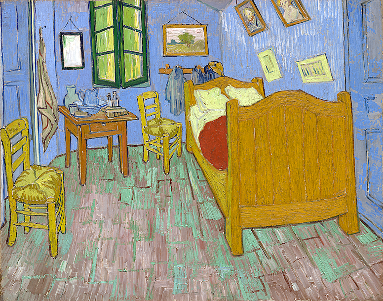
The Bedroom, Oil on Canvas, 29 x 36″, Art Institute of Chicago, 1889.
Van Gogh painted this interior three times while he stayed in the Yellow House in Arles, France, as he was particularly pleased with the bedroom where he had a bed, a small table, and two chairs. This moment marked the first time the artist had a home of his own.
He wrote to his brother, Theo, “It amused me enormously doing this bare interior. With a simplicity à la Seurat. In flat tints, but coarsely brushed in full impasto, the walls pale lilac, the floor in a broken and faded red, the chairs and the bed chrome yellow, the pillows and the sheet very pale lemon green, the bedspread blood-red, the dressing-table orange, the washbasin blue, the window green. I had wished to express utter repose with all these very different tones.”
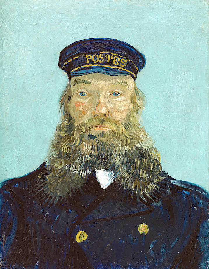
Portrait of Postman Roulin, 32 x 25”, Oil on Canvas, Detroit Institute of Arts, 1888.
Van Gogh painted Joseph Roulin and his family several times each, and the painting here is the second version painted in early August 1888. There were at least seven portraits of Roulin, as he befriended not only the man but his entire family. He found affordability in the work of the Roulin family, for which he made several images of each person. In exchange, Van Gogh gave the Roulins one painting for each family member. One cannot imagine how the strokes of color in his beard appealed to van Gogh and this relatively new application of oil paint. The painting was acquired in 1935 by Edsel and Eleanor Ford as a gift to the DIA.
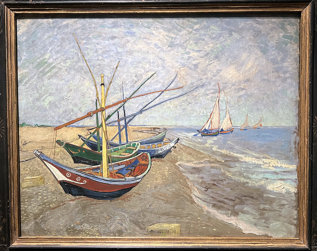
Fishing Boats on the Beach at les Saintes-Maries-de-la-Mer, Oil on Canvas, 25 x 32, Van Gogh Museum.
It was in February of 1888 that Van Gogh was living in Arles and would take excursions to Provence and the village of Les Saintes-Marie-de-la-Mer. Van Gogh would have liked to have made this painting on the beach, but the fishermen would put out to sea every morning, so he would make his drawings early and finish the painting in his apartment studio. In doing so, he could control his choice of color to his liking, using primary color juxtaposed with secondary color in the boat composition.
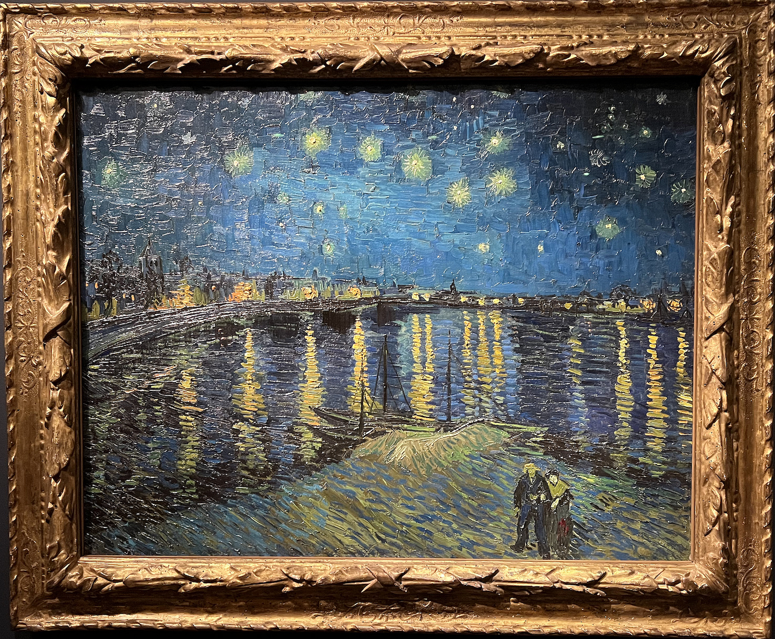
Starry Night (Starry Night Over the Rhone), Oil on Canvas, 28 x 36″, Musee d’ Orsay, 1888.
The DIA takes the visitor out of the exhibition with Starry Night Over the Rhone, which is just what this review will do. Just a two-minute walk from the Yellow House, painted in 1988, the subject is the night light and its effects on the river Rhone. The view from the east turn in the river towards the western shore of rocks is where Arles was built. After spending his days in the sunny fields of flowers and crops, the idea of painting at night must have intrigued Van Gogh. Here the gas lights from the town are complemented by the formation of the stars. Van Gogh writes to his brother Theo, “This morning I saw the countryside from my window a long time before sunrise with nothing but the morning star, which looked very big.” As it turns out, The Starry Night is one of the most recognizable paintings in western art.
On March 17, 1901, 71 of Van Gogh’s paintings were displayed at a show in Paris, and his fame grew enormously. Van Gogh’s sister-in-law, Johanna, had collected as many of Van Gogh’s paintings as she could but discovered that many had been destroyed or lost as Van Gogh’s mother had thrown away crates full of his art. His mother lived long enough to see her son hailed as an artistic genius.
Today, Vincent van Gogh is considered one of the greatest artists in human history.
I would like to distinguish between experiencing all the places one sees the remnants of Van Gogh’s artwork versus observing the original artwork up close in the DIA. That is one of the purposes of the museum. Educators and researchers refer to this experience as being in the presence of a “primary source.” Primary sources are what remains from the past. Aside from human memory and the unrecorded passing down of information from generation to generation, experiencing original paintings are the only way current generations can hope to understand what an authentic Van Gogh painting looks and, more importantly, feels like. In my later years, and over time, I have seen Vincent van Gogh paintings in various museums, but I never saw 74 artworks in one place. From so much that was written about him, Vincent van Gogh was a fragile and sensitive man burdened with poor health. As an artist, he became an instant soul mate to many. He was dependent and vulnerable but always willing to make himself available to his audience.
Take advantage of this opportunity to spend quality time at the Detroit Institute of Arts and join family and friends to view this extraordinary exhibition Van Gogh in America.
Installation image Van Gogh in America, Detroit Institute of Arts
Van Gogh in America celebrates the DIA’s status as the first public museum in the United States to purchase a painting by Vincent van Gogh, his Self-Portrait (1887). On the 100th anniversary of its acquisition, experience 74 authentic Van Gogh works from around the world and discover the fascinating story of America’s introduction to this iconic artist in an exhibition only at the DIA.
A full-length, illustrated catalog with essays by the exhibition curator and Van Gogh scholars will accompany the exhibition. The Detroit Institute of Arts is the exclusive venue for this exhibition.
Tickets are $7-$29 for adults; discounted prices are for residents in Wayne, Oakland, and Macomb counties. The DIA exhibition Van Gogh in America will run through January 22, 2022