Critical art reviews of Detroit galleries and museums weekly

Category: Assemblage / Collage

Group Exhibition @ N’Namdi Center for Contemporary Art

Jennifer Junkermeier Curates and Michaela Mosher Designs an Exhibition: Round in Circles.

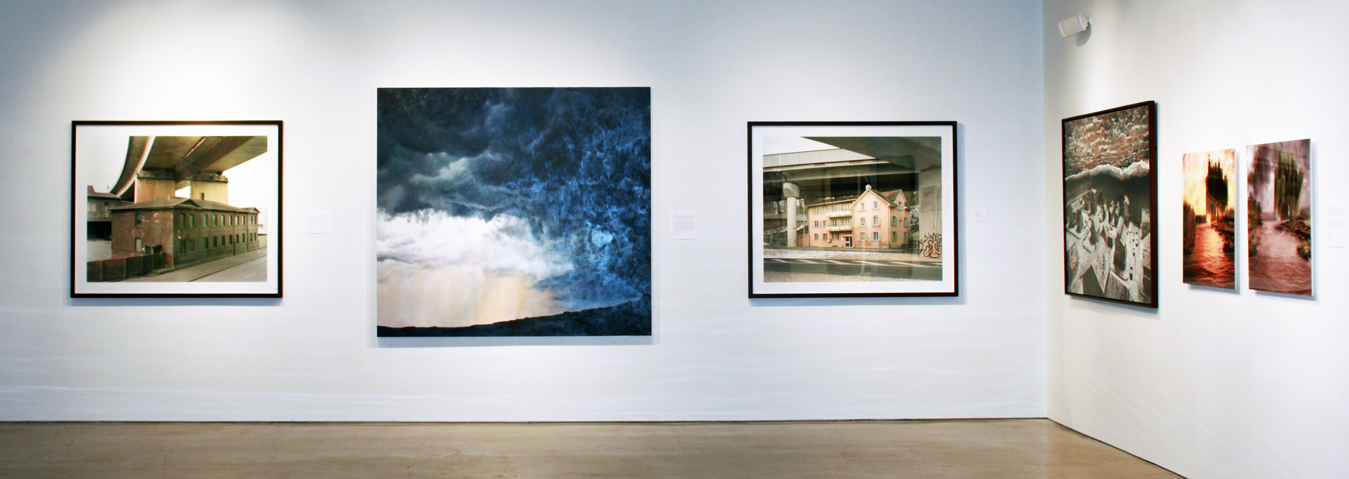
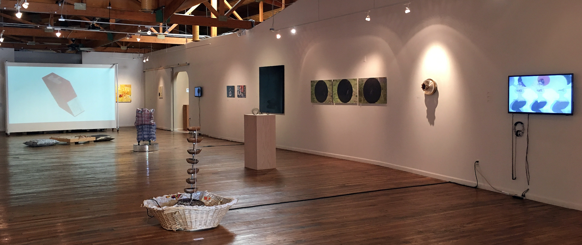
Installation Image, Round in Circles, N’Namdi Center for Contemporary Art, All Image Courtesy of the Detroit Art Review

For a gallery owner to ask someone to curate an exhibition is both exciting and a little risky.  But George N’Namdi has been in this business for more than thirty-five years, and he knows exactly what he’s doing. By inviting a guest curator Jennifer Junkermeier, he is injecting new energy into his space, one that capitalizes on Detroit-based artists (33) and may very well bring new audiences into the gallery. Simone DeSousa has done something similar in her gallery, recruiting Nancy Mitchnik to curate some 70’s aging Cass Corridor artists (she is one herself) into her gallery, and both go outside the regular season because summer is the right time to do it.  This is N’Namdi’s third annual summer show of Detroit artists with an invited curator. In 2016 it was Essay’d VI by Steve Panton, and 2015 was Mundo ‘Mericas curated by Vito Valdez.

Opening June 16, 2017, Round in Circles, is a collection of Detroit-based visual artists that provide nearly every medium, including painting, drawing, sculpture, video, projection, and literary work on the wall. If you need to tie that together with an idea, why not use the circle as a place to start, if not literally in the work, then probably in the mind of the artist, or a metaphor that applies to almost anything, dating back about 3000 years. She says in her statement, “Yes, going round in circles is dizzying, at once nauseating and exciting, impoverished and plentiful, the form that implies nothing also embraces the possibilities of being everything.”

It’s a pleasure for a writer to pick out some favorites, and say a little something because it is almost impossible to write a review when there is such a variety of work as there is in this exhibition.

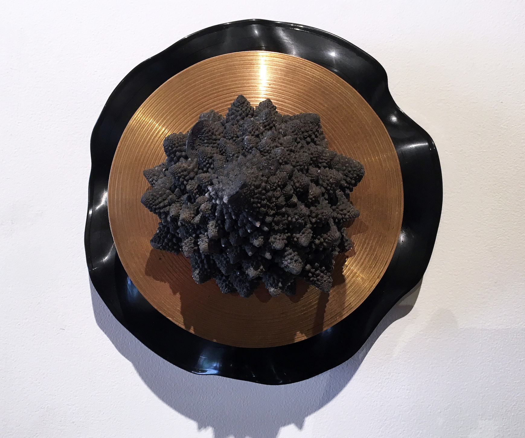
Graem White, You Are Here: Center of the Universe, Mixed Media, 11.5 x 14″

Graem Whyte is an artist that works with a wide variety of three-dimensional material, sometimes on the floor, sometimes on the wall.  Born and raised in metro Detroit, Whyte is based in Hamtramck, MI where he and his wife Faina Lerman oversee the community-based activity at Popps Packing. Whyte’s work always feels very unconventional, driven more by the idea than the material, illustrated in his one-person exhibition at Oakland University in 2012. In his work, You Are Here, it seems to play on the border, a manipulated LP record, a gold plate, and a burst of Mixed Media, suggesting that music can be concrete. Graem Whyte is an adjunct art instructor at the Center for Creative Studies.

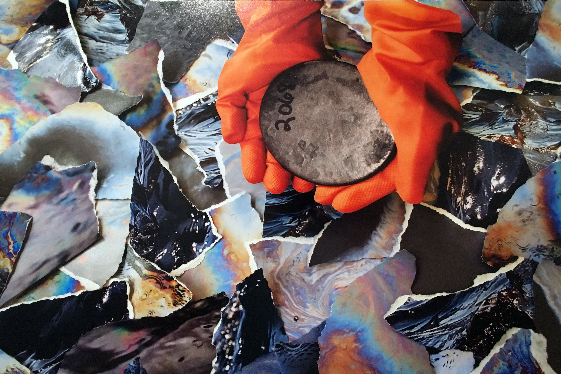
Shanna Merola, Untitled 2, from series “We All Live Downwind”, Archival inkjet pigment print, 14 x 20″

The photograph by Shanna Merola, from the series, We All Live Downwind, seems driven by her interest in documentary photography, and a deep concern for social justice. This writer is not trying to figure out the context of these orange gloves holding a ceramic dish, rather – enjoying the surrounding and colorful pieces of torn paper. Merloa was born in Bridgeport, Connecticut, 1980, earned her BFA at Virginia Commonwealth University, and an MFA Cranbrook Academy of Art.  She lives and works in Hamtramck, Michigan.

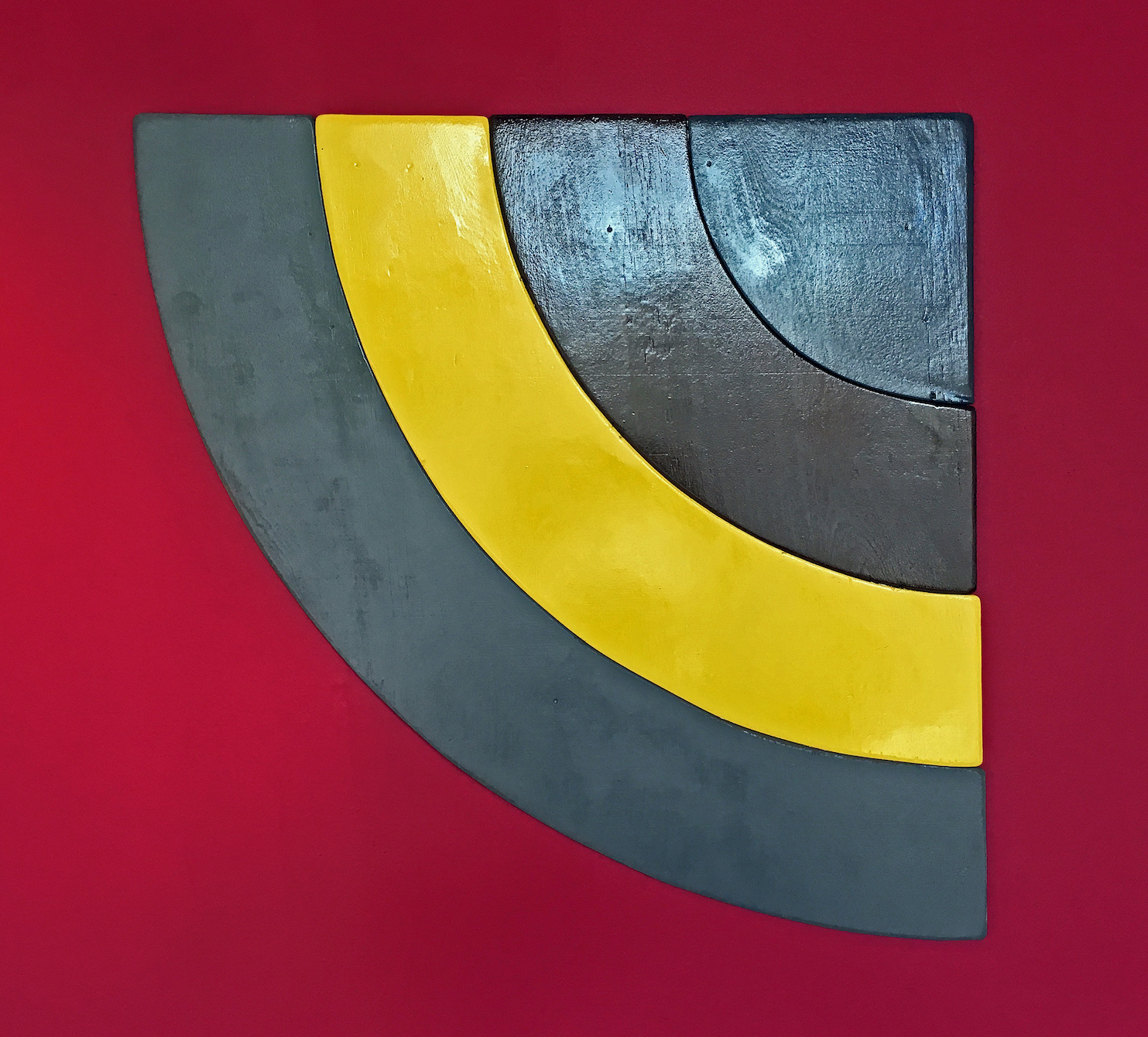
Todd Stovall, Untitled, Acrylic, Wood, 2 x 2′ 2017

Detroit artist Todd Stovall keeps the minimalist shaped canvas work alive in his work, Untitled, although this piece is entirely made of wood.  The context for this kind of approach might be artists like Charles Hinman, Ellsworth Kelly, and Frank Stella.  Stovall is not trying to do much with color, rather the simple power of shape, although the red wall is there to support his effort. 

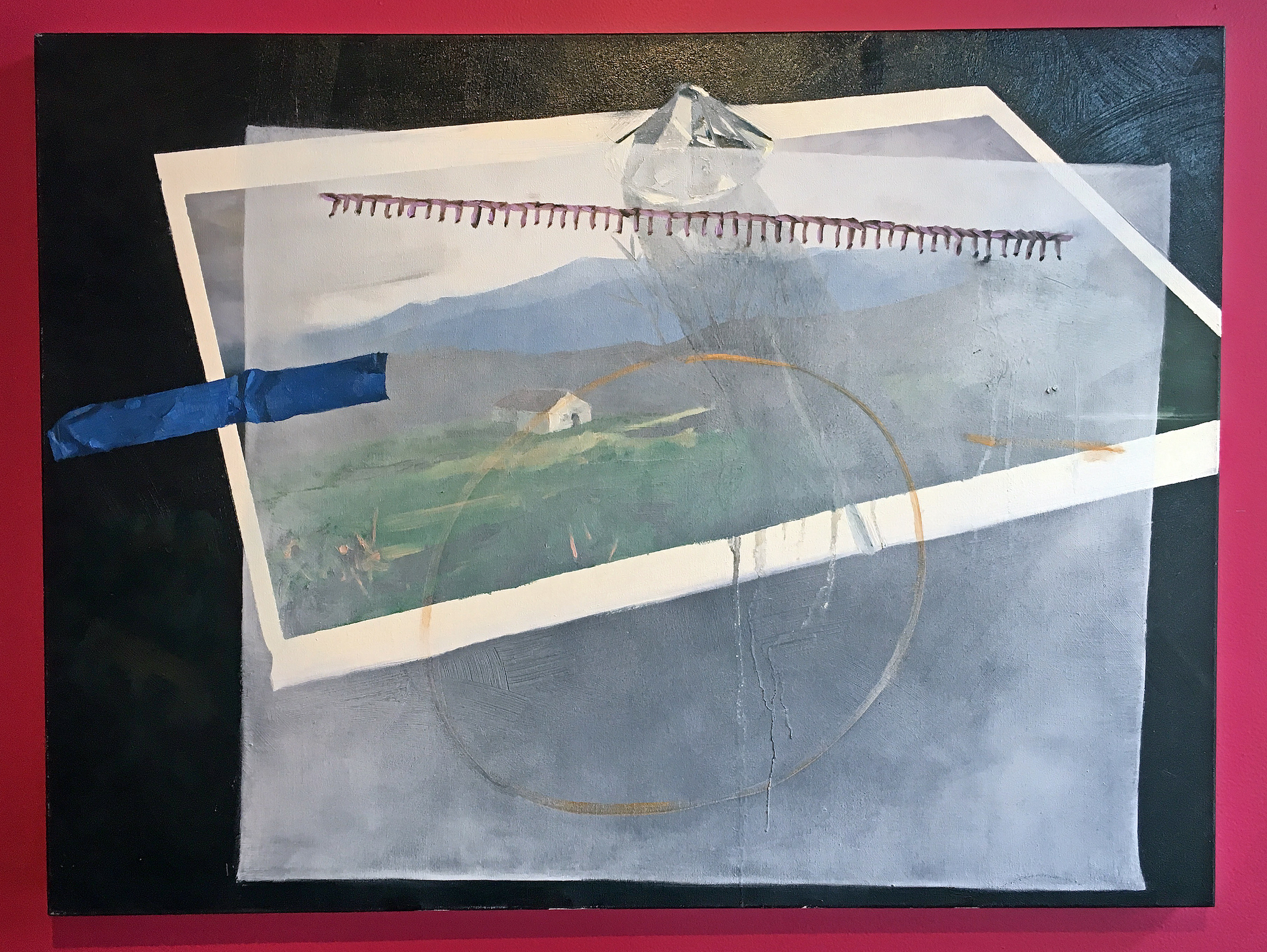
Clara DeGalan, A Veiled Asking, Oil on canvas, 2016

This oil painting, A Veiled Asking, by Clara DeGalan reflects a deep and progressive direction from her earlier work in graduate school, an MFA from Wayne State University in 2015, and a two-person exhibition in 2016 at the Birmingham Bloomfield Art Center. It’s this idea of transparency and the illusion of dimension that creates a mystery that leaves us wanting, combined with an offset but a sturdy sense of composition. All of this held together by a circle and a piece of blue tape. Lovely. 

Round in Circles is a group exhibition that explores formal and metaphorical implications of the circular.” Says Junkermeier.  The exhibition could send a signal to other galleries, to experiment (certainly some do) during your summer months, and realizing there is limited space for thirty-three artists, at least I can mention their names as part of this exhibition.

Contributing Artistis: ‘jide Aje, Danielle Aubert, Corrie Baldauf, Davin Brainard, Tyanna J. Buie, Alexander Buzzalini, Shane Darwent, Clara DeGalan, Simone DeSousa, Erin Imena Falker, Jessica Frelinghuysen, Ani Garabedian, Richard Haley, Asia Hamilton, Megan Heeres, Eli Kabir, Osman Khan, Austin Kinstler, Nicola Kuperus, Timothy van Laar, Anthony Marcellini, Adam Lee Miller, Shanna Merola, Eleanor Oakes, Ato Ribeiro, Robert Platt, Marianetta Porter, Dylan Spaysky, Todd Stovall, Gregory Tom, Graem Whyte, Elizabeth Youngblood, and Alivia Zivich

N’Namdi Center for Contemporary Art

Round in Circles through August 26, 2017

Suspended Disbelief @ Broad Museum, East Lansing

Transported Man Exhibition opens by New Director

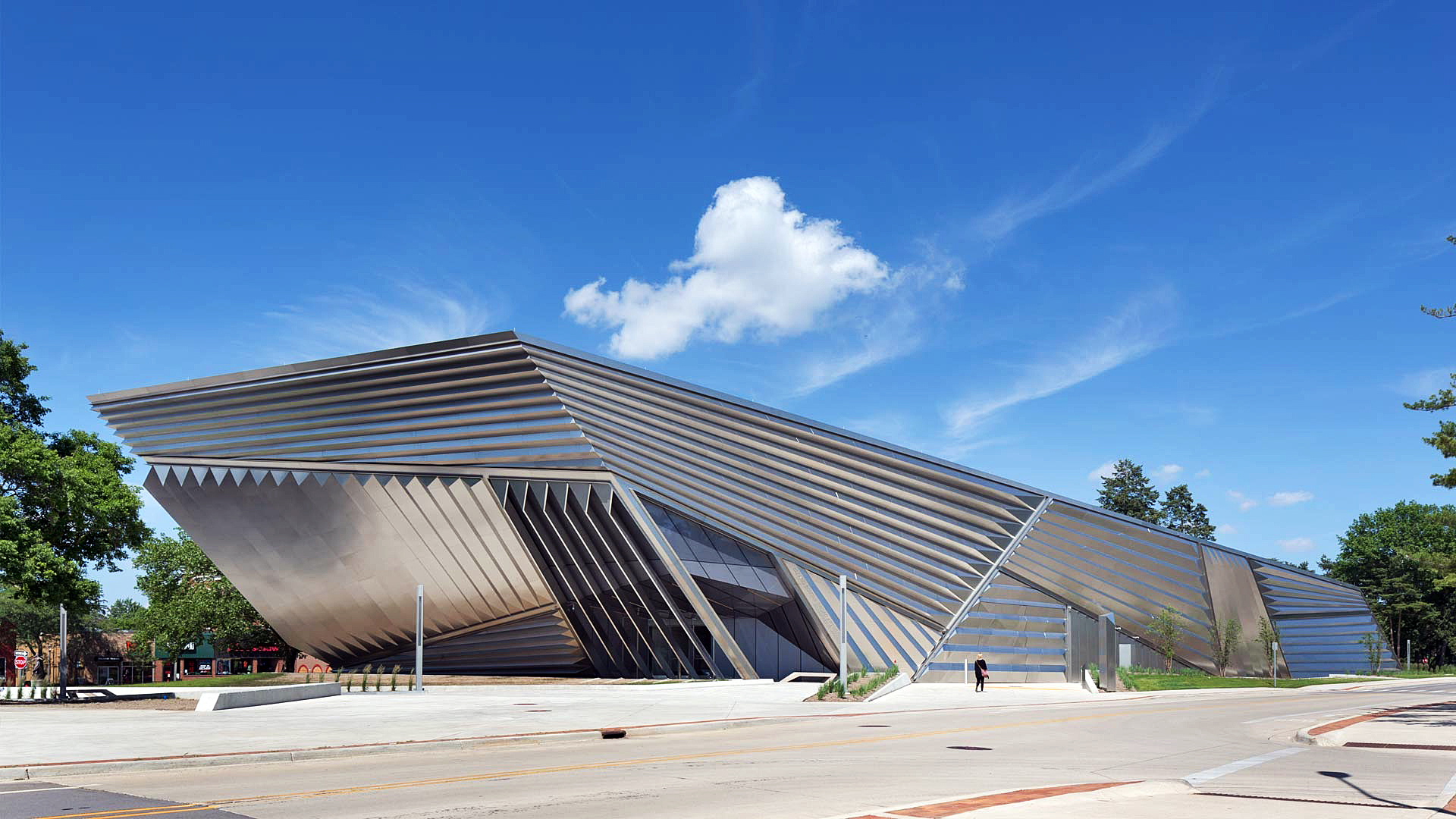
Eli and Edythe Broad Art Museum at Michigan State University, East Lansing, MI

I once entertained aspirations of being a professional magician (I was never good, but at one point I could make all the faces of a deck of cards disappear, using a trick deck, admittedly). It’s likely for the best that I never pursued that career, but the Broad Art Museum’s Transported Man suggests that perhaps the world of art and that of magic aren’t that different. Both, after all, inexorably rely on the viewer voluntarily suspending disbelief.

The Broad’s new director, Marc-Olivier Wahler has a tough act to follow. The museum’s grand opening in 2012 featured works by art world heavyweights Andy Warhol, Joseph Albers, Anselm Kiefer, and Damien Hirst. The building’s architect Zaha Hadid even made an appearance. But, with over 400 exhibitions under his belt, Wahler capably delivers a conceptually interesting and visually arresting debut exhibition. His first show is an ambitious exploration of the relationship between art and viewer, and it brings together over 40 international artists, some quite familiar (Duchamp and Magritte) and others either emerging or mid-career.

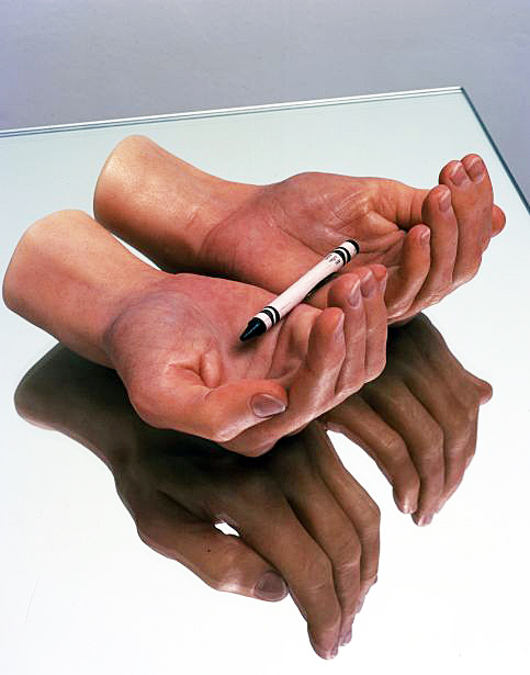
The Transported Man derives its title from the magic trick of the same name, as depicted in the novel (and movie) The Prestige. Using magic as a motif, the exhibition, broadly speaking, explores the mutability of perception. Mundane items—magically—become art objects once placed in a museum. Furthermore, the exhibition tests the limits at which art can fool us. It certainly works. By the time you’re done on the second floor, you’ll have seen so much trompe l’oeil wizardry and visual sleight-of-hand that you’ll be thoroughly confounded as to what’s real and what’s illusory. The Broad’s counterintuitively shaped spaces, replete with walls that slant every which way, make the experience even more disorienting.

The Transported Man, all images courtesy of the Eli and Edythe Broad Art Museum at Michigan State University

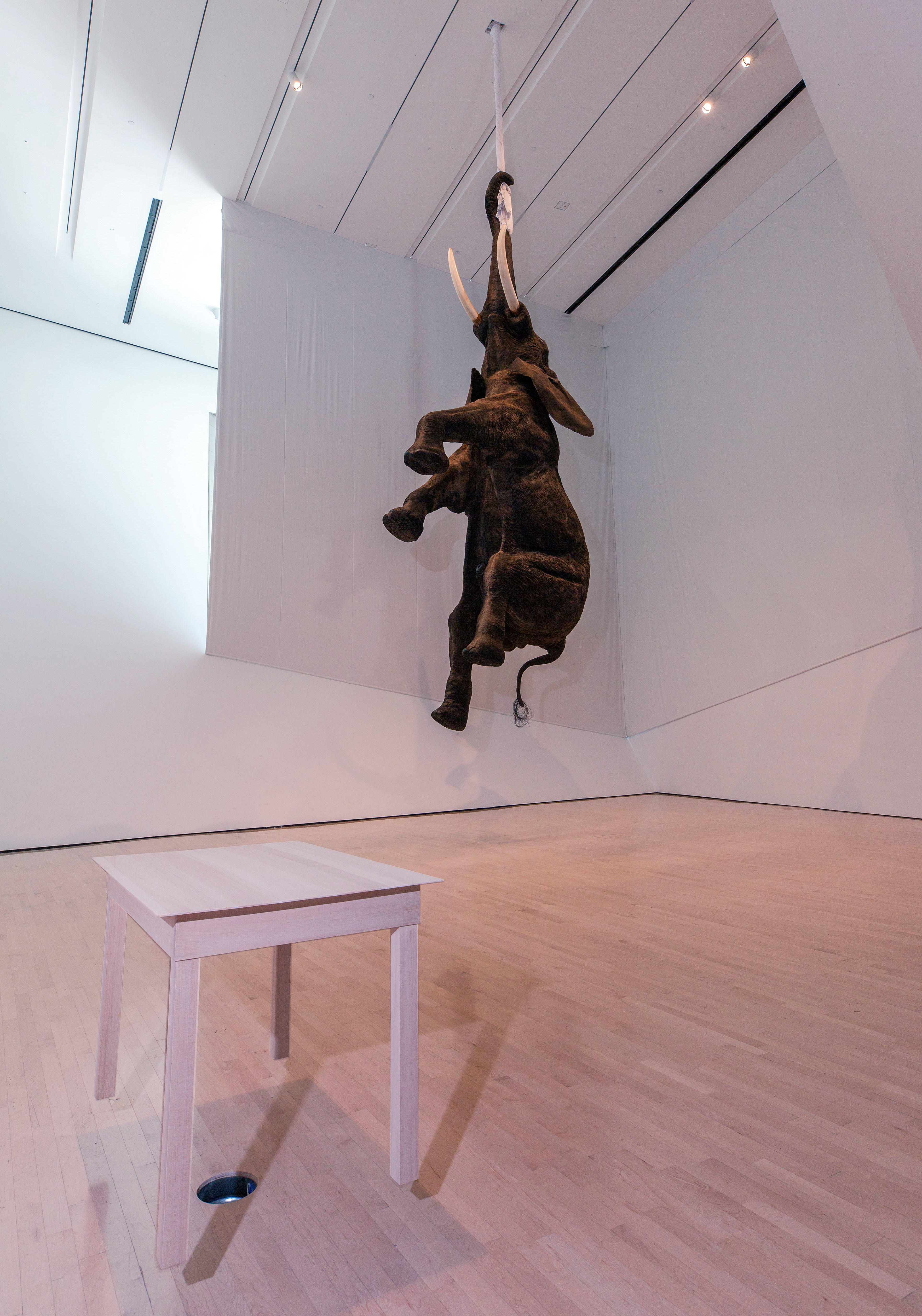
Stepping into the first level exhibition galleries, visitors will be met with a wooden table hovering in air; it’s propped up by a fan set within the floor (there’s no attempt at hiding that), yet how the air current so firmly holds the table in place remains a mystery. But the elephant in the room is, quite literally, the elephant in the room. It freely hangs with its trunk clasped around a rope affixed to the ceiling. Possessing all the convincing texture of an actual elephant, it’s actually a polyurethane resin, polyester, steel, and fiberglass sculpture by Daniel Firman. There’s something strangely beautiful and visually satisfying about the suspended creature so improbably defying gravity. (Look up Firman’s elephants on the internet; they’ve appeared in all sorts of places).

Perhaps the most disorienting work in the show is Synchronicity, an experimental work by Robin Meier and Andre Gwerder. It’s a big, black tent inside a big black tent. Step inside both and suddenly you’re walking on (and smelling, quite strongly, in fact) soil and grass, the atmosphere has suddenly become hot and extremely humid, and it’s very dark. Real crickets happily chirp away (afterhours, the lights within turn on, mimicking natural daylight, and the crickets, cicadas, and fireflies erroneously think it’s day). The work explores how we can manipulate nature through electronic stimuli. Small electronic LED lights stimulate actual synchronistic fireflies, which under the impression that it’s a hot, muggy night, flicker in a pulsating rhythm. While far from the point of the installation, I couldn’t help but reflect on our own susceptibility to electronic stimuli/media which we increasingly accept at face-value as truth.

Upstairs, the visual and sensory theatrics continue. In the corner of one gallery space you’ll find weeds sprouting improbably from the floor. They’re actually steel sculptures by Tony Matelli, and seem so convincingly real that you really do have to fight the urge to reach out and touch them…just to check.

The Transported Man, all images courtesy of the Eli and Edythe Broad Art Museum at Michigan State University

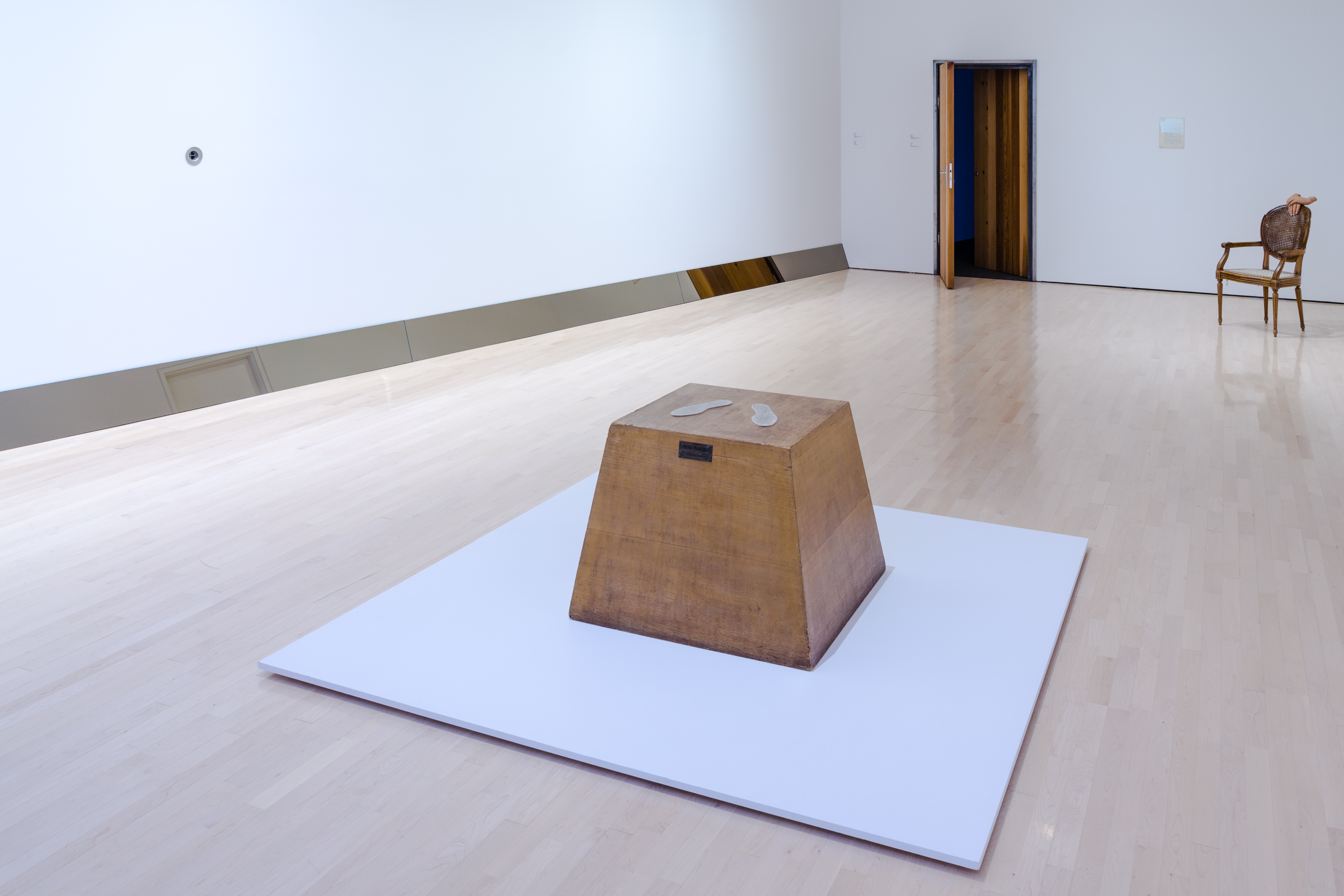
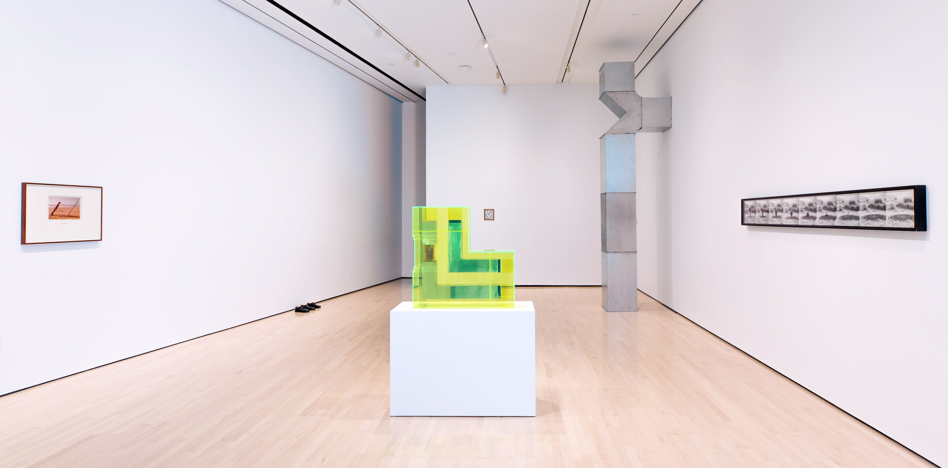
One subtext of the show is the uncanny transformation of mundane objects into works of art. The point is most explicitly made with Piero Manzoni’s Magic Base—Living Sculpture, a wooden pedestal upon which people are supposed to stand, thus momentarily turning themselves into art objects (for this exhibition, however, viewers are asked to kindly refrain from turning themselves into art objects, and thus help preserve the original base, now over half a century old). This also seems to be the point behind the many non-functional air ducts installed throughout the museum by Charlotte Posenenske, and the plywood plank (by Robert Gober) leaning against a wall. Visually, these works are uninteresting, but they nevertheless foster conversation about the nature of art, and in this respect they advance the goal of the exhibition.

The Transported Man, all images courtesy of the Eli and Edythe Broad Art Museum at Michigan State University


Perhaps ironically, the most conceptual part of the show may very well be The Transported Collection, a playfully inventive adjacent exhibition of works from the Broad’s permanent collection. About forty paintings and drawings hang on a wall in one of the Broad’s lower galleries, but without any obvious reference to their corresponding artists. The viewer is left in a quandary: which of these works are, in fact, generally recognized as great works of art? Stealthily tucked in the corner of the room are some laminated explanatory cards which identify the artists. I cheated and peaked; the list is impressive– Van Dyck, Picasso, Delacroix, Matisse, Giacometti, and others. But some of the most compelling works on view were by artists I’d not heard of, such as Federico Castelluccio, who fools the eye with a convincingly illusory painting of a torn up, wrinkled postcard of a Titian portrait which seemed to be taped back together and affixed to a wooden background. This small exhibition wittily questions the subjective process by which we determine what constitutes great works of art.

Jonathan Monk, Second Hand Daily Exchange, 2006 The Transported Man, all images courtesy of the Eli and Edythe Broad Art Museum at Michigan State University

Picasso famously said that art is a lie which points to the truth. He was right; after all, the overwhelming majority of art history is comprised of artists trying to fool us into seeing three dimensions on a two dimensional surface. But it’s while looking at illusory paintings that we’re made acutely aware of the beauty of the actual world…or the shortcomings of human nature, as the case may be. Art’s deception has a purpose; to paraphrase from Shakespeare’s Hamlet, it holds up a mirror to nature, and within that mirror’s distorted reflection, we’re more able to see ourselves.   So while the playful theatrics and visual punning makes The Transported Man an eminently enjoyable and accessible show, there’s substance behind the visual magic that speaks to art’s ability to nudge us toward beautiful, enduring– sometimes uncomfortable– truths

The Transported Man at  the Eli and Edythe Broad Art Museum at Michigan State University


Cody VanderKaay @ Oakland University Art Gallery

Cody VanderKaay, Installation image

Cody VanderKaay’s solo exhibition, Terrestrial Celestial, opened March 3, 2017, at the Oakland University Art Gallery, where Dick Goody, Art Chair, and curator at OUAG, turns inward to one of his associate professors to exhibit new work that takes the viewer in a variety of visual art directions. On the ground or in the sky, VanderKaay presents three-dimensional work that has delicacy as in the Orange Shed, versus blunt boldness, as in Six Views.

So where is this artist in his creative trajectory? I would say he is exploring an inner sensibility he has developed since his youthful years of art experience combined with his MFA at the University of Georgia, where he gives us his take on three-dimensional form.

Cody VanderKaay, Orange Shed, Latex on Basswood, 2016

The delicate relief, Orange Shed, using basswood and latex, reminds me of relief work from the 1950’s in the United States that was mostly decorative, with the exception of an artist such as David Smith. Smith combined found objects, worked in metal based on his experience working in a car body shop. The shared element with VanderKaay’s work is largely based on Constructivism, a modern art movement that flourished in Russia, then moved to Europe during the early parts of the 20th century. The central concept is placing the priority on the material employed, versus the subject matter or motif. The materials to express an idea dictate the form. The fundamental analysis of the material leads to the function. This idea shapes VanderKaay’s other work as well.

Cody VanderKaay, Six Views, Concrete 2017

Borrowing on ideas presented by Minimalist artists, be it Donald Judd or Robert Morris, the early 1980s brought a shift from Abstract Expressionism to a pared-down, three-dimensional object with little reference to real objects. The new vocabulary was simplified geometric forms created from humble industrial material. VanderKaay provides a repetition of nine “house-shaped” concrete objects in Six Views with an angled bottom that provides the observer with a parallel view.  It would seem variations on this theme could produce a body of work on its own, as the aesthetics are pleasing, even comforting to the eye, whether it appears in relief or as a taped drawing on the wall.

Cody VanderKaay, Bündner Schist, Crepe Tape on gallery wall, 2017

The large black-taped drawing on the gallery wall, Bündner Schist, reinforces elements in the overall exhibition, like a roadmap to his thinking.  He builds an amalgamation of trapezoids and variations that make his statement clear and concise, one that offsets the more three-dimensional work that dominates the overall exhibition. As part of the exhibition, we are confronted with the large assemblage of mixed media, Ball Drop, where the artist has presumably collected and large variety of materials and objects that met his fancy, not so different from when an artist collects things they like, placing them on a table (or wall) in the studio.  Not quite understanding how this fits into the overall exhibition, I asked VanderKaay to explain this in the last question presented in a short interview.

Cory VanderKaay, Ball Drop, 2017

Ron Scott: How and where did you first get interested in visual art?

Cody VanderKaay: I lived in both rural and suburban environments of the Midwestern, Southern, and Western United States. Periodic relocation and travel allowed me to experience a variety of living situations, routines, pastime activities and occupations that inevitably shaped my curiosity. As the son of a residential contractor, I was frequently exposed to architecture, trades labor, carpentry and the graphic art of drafting. As a young man, I trained myself in a number of related skills and techniques, when, eventually my proclivity for making art objects became my principal interest.

I studied sculpture at Northern Michigan University’s School of Art & Design and the University of Georgia Lamar Dodd School of Art, where I received my MFA. After graduating, I relocated to New Orleans to teach visual arts at Loyola University. Today, I am an Associate Professor of Art at Oakland University teaching sculpture, drawing, and fundamental art courses full-time.

RS: How has your worked evolved since college?

CV: The biggest and best change is an ability to identify when my intellect, technical ability and resources are in concert with one another, and encountering that moment again, in the finished artwork.

RS: How is it that you work in such a variety of material?

CV: I’m attracted to the range of qualities and technical constraints that raw materials and objects have; the combinations seem impossible to exhaust.

RS: What artists have most attracted your interest?

CV: Dil Hildebrand, Anne Truitt, Herman de Vries, Ilya Bolotowsky, Norman Dilworth, Tony Feher, and Richard Wentworth

RS: Your work seems to stand alone as single individual pieces. How does the large assemblage on plywood relate to the other work?

CV:The large plywood piece titled Ball Drop wasn’t conceived as an artwork per se, but rather as scaffolding or drawing of sorts. It’s evidence of the forms and subjects I was thinking through in the studio while making the other artworks in the exhibition. The title is a reference to the phrase ‘the penny has dropped’ and points to a realization or discovery that follows a long period of exploration and questioning. Many of the elements comprising the wall are residual, while a few are deeply personal. For example, the small oil painting of the Alps originally belonged to my Grandmother. The painting was given to her by her father when she left the Netherlands for the United States in the 1930’s. I coveted the painting as a child and acquired it after she passed. The wall doesn’t summarize the exhibition, but examining it closely will reveal more about the relationship between the other artworks on display.

RS: Anything else you would like to say?

CV: I find the challenges of working with self-imposed restrictions to be intellectually stimulating and personally significant. A large majority of my artwork is composed of irreducible elements and simplified forms, with surface qualities that raise questions about the substance and physicality of their forms. I often move between disciplines, on two or three projects at a time, and display finished work as a sequence or series of related artworks to bring formal and contextual concerns in closer harmony with one another. I use fabrication, mold making, casting, drawing and collage to produce my sculpture and two-dimensional artwork.

There are artists who focus on a subject for forty years, providing variations in size, color palette, composition and material. Cody VanderKaay is an artist who does not limit his expression to a genre. He is eclectic in his approach to creating his art and, most important, he is curious. Cody VanderKaay is giving an artist’s talk in the OUAG gallery on Thursday, April 6, at NOON.

Cody VanderKaay, Terrestrial Celestial, Open at OUAG – April 9, 2017


Love Songs: Sam Friedman @ Library Street Collective


Sam Friedman, Installation image, All images courtesy of Library Street Collective

Sam Friedman’s artist statement for Love Songs, a solo exhibition of paintings and works on paper that opened at Library Street Collective on February 11, mentions the Japanese aesthetic philosophy of Wabi Sabi as an influence in his work. This world view exults the “transience of imperfection; a beauty that is imperfect, impermanent and incomplete.” It’s hard to discern much imperfection or incompletion in Friedman’s imposing acrylic paintings, with their crisp, technically rigorous paint handling. Every mark bears an identical edge that somehow holds its own amid countless other razor sharp edges. Despite this uniformity, areas of Friedman’s paintings break down into surprising illusions of space, dazzlingly beautiful gradations, and vibrating forms that actually seem to move before the eye, and stay burned upon it. You see Friedman’s snaking forms gestures across white walls for several moments after you’ve turned your gaze away from the work.

Sam Friedman, Untitled, 2016 (48 x 48 inches; Acrylic on canvas, white floater frame)

Friedman wrings a surprising range of surface effects from a severe economy of techniques. Every one of his identically edged marks is, apparently, applied the same way- in one single, virtuosic stroke that embodies hand skill and discipline. While each painting contains a huge number of nearly identical marks, no mark is valued over any other. This doesn’t flatten the composition, or render it uninteresting. Friedman’s democratic approach to mark-making lets your eye take in both the whole of the work, and miraculous openings into smaller, more intimate moments. It’s an unusual painter who creates such an impression of deep space, foreground and background, with such a uniform, crystallographic approach to the picture plane.

Sam Friedment, Untitled, 2016 (30 x 90 inches; Acrylic on canvas, white floater frame)

Passing from the gauntlet shaped front space of Library Street Collective, where Friedman’s large paintings are displayed, into the more spacious back room of the gallery which houses a collection of smaller works on paper feels like leaving a dazzling, noisy city for a vast, light filled meadow. These works feel both more personal and riskier. This might be due to Friedman’s use of a larger range of media (acrylic, spray paint, silkscreen ink). His subject is a factor, as well- the sun setting over a body of water, revisited again and again, the horizon line splitting each piece into perfect halves that meet precisely at eye level. These works present an eternal template on which Friedman proceeds to meditate on the spatial layers he applied with such closed-loop certainty in his large acrylic paintings. The more organic forms- tall grass, flower petals, atmospheric effects- combined with the unavoidably vernacular icon of sunset over water presented on poster-scaled formats, while not mind-blowing in quite the same way as the paintings, feel vastly more personal. Friedman’s mastery of abstraction comes full circle in these works. The same blunt formal power and ease with materials shows up in them, with an added dose of freedom. The smaller formats and organic, representational subject matter seem to allow Friedman to play a bit more with imagery and surface effects- there’s a feeling that the stakes are lower here, or the imagery more deeply felt.

Sam Friedman, Untitled, Untitled, 2016, 54.5 x 37.75 inches; Acrylic and vinyl paints, silkscreen ink, and acrylic spray paint on primed Stonehenge paper

One wonderful thing Friedman’s paintings and works on paper have in common is the above-mentioned whiff of the vernacular. The large, abstract paintings have the dizzy free-fall atmospherics and sophisticated, ambiguous movements of album covers and Trapper-Keeper designs from the Seventies and Eighties, revisited with the same depth and grandeur one felt, mesmerized by them, as a young kid. Friedman’s works make it as if these foundational images grew up with us. The works on paper similarly shadow mass-produced movie or art posters. They communicate in the same language, with the same saturated, iconic forms that, in Friedman’s hands, take on a breath-taking, mature refinement.

Sam Friedman: Love Songs is on view at Library Street Collective  through April 8, 2017.

Page 9 of 9

Powered by WordPress & Theme by Anders Norén